Create a FREE Account
Instant access to 1,000+ real slides from top companies like McKinsey, BCG, Goldman Sachs, Google and many more!
First Name
Last Name
Email
Password
I agree to all
Terms & Privacy Policy
Thank you! Your submission has been received!
Oops! Something went wrong while submitting the form.
Have an account?
Sign in
Library
Templates
Courses
Pricing
My Account
My Slides
My Templates
✦ AI
AI Prompt Library
AI Search
Sign in
Start Here
Logout
My Saved Slides
Horizontal bar chart of methods used to measure employee satisfaction, highlighting surveys and feedback.
Strategic Planning
Professional Services
Focuses on various methods for measuring employee satisfaction, essential for developing effective HR strategies.
HR, measurement methods, employee satisfaction, surveys, feedback
Single Chart
PwC/Strategy&
Saved
The slide features a line chart showing correlations between stocks and sovereign bonds, with the six-month correlation in gray and the one-year correlation in purple, covering the period from 1998 to 2023.
Market Analysis and Trends
Financial Services
This slide analyzes the correlations between stocks and sovereign bonds, providing insights into market trends and investment strategies.
Stock-bond correlation, market analysis, investment strategy, financial analysis, six-month correlation, one-year correlation
Multiple Chart
JP Morgan
Saved
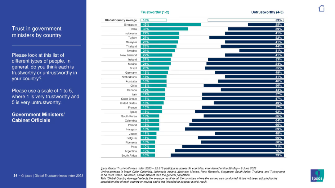
Blue sidebar and full bar graph breakdown of trust in government ministers. Includes both trustworthy and untrustworthy measures.
Risk Assessment and Management
Government & Public Sector
This slide compares trust in government ministers globally. Singapore has the highest trust, while South Africa and Argentina score lowest with overwhelming distrust.
government, ministers, cabinet, trust, political perception, Ipsos, global analysis
Mixed Chart
IPSOS
Saved
The slide displays two column charts with varying backgrounds, showing survey responses by country.
Technology and Digital Transformation
Professional Services
This slide illustrates the principle of removing backgrounds to improve the clarity of data presentations in charts, following Tufte's guidelines.
Tufte, data-to-ink, ratio, survey, responses, visualization, backgrounds, chart, clarity, design
Multiple Chart
EY
Saved
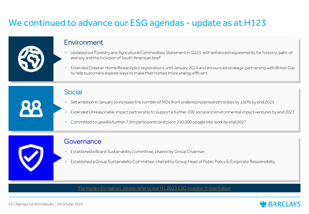
Divided into three sections: Environment, Social, and Governance, each with bullet points summarizing recent initiatives and achievements.
Market Analysis and Trends
Financial Services
Summarizes Barclays' progress on its ESG (Environmental, Social, and Governance) agendas as of H123, detailing initiatives in each area to enhance sustainability and social impact.
ESG, sustainability, environment, social, governance, Barclays, initiatives, H123, progress
Header Vertical
Barclays
Saved
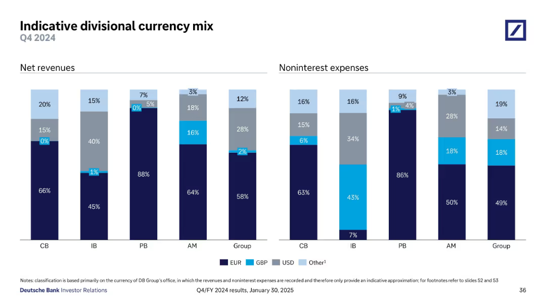
Two bar charts comparing currency mix of net revenues and expenses across divisions
Risk Assessment and Management
Financial Services
This slide shows the currency composition (EUR, GBP, USD, Other) of net revenues and noninterest expenses by division. It highlights the currency risk exposure across the bank’s operating units and supports FX risk management.
Currency Mix, FX Risk, EUR, USD, GBP, Revenue, Expenses, Divisions
Single Chart
Deutsche Bank
Saved
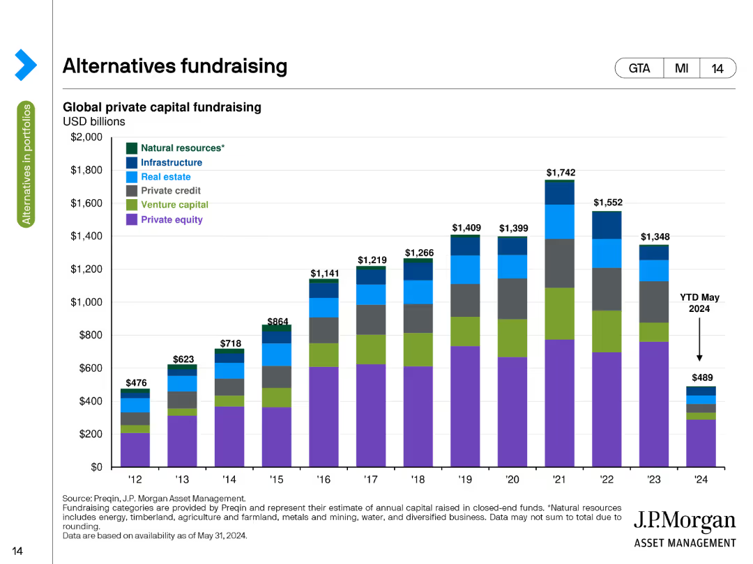
This slide contains a stacked column chart illustrating global private capital fundraising amounts in USD billions from 2012 to 2024. Different colors represent categories like natural resources, infrastructure, and private equity.
Market Analysis and Trends
Financial Services
The slide tracks global private capital fundraising by asset class over time, highlighting the amounts raised annually from 2012 to 2024, with a breakdown by categories such as natural resources, infrastructure, and private equity.
Fundraising, Private Capital, Asset Classes, USD Billions, Trends
Single Chart
JP Morgan
Saved
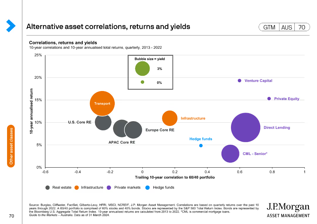
The slide features a bubble chart showing correlations, returns, and yields of alternative assets from 2013 to 2022. The x-axis represents the trailing 10-year correlation to a 60/40 portfolio, and the y-axis shows the 10-year annualized return.
Investment Analysis
Financial Services
This slide provides insights into the performance of various alternative assets, highlighting their correlations, returns, and yields for investment analysis and portfolio management.
Alternative assets, correlations, returns, yields, investment analysis, portfolio management, bubble chart
Single Chart
JP Morgan
Saved
The slide has a clean design with bullet points outlining the strategy for international market engagement. It includes flag icons representing various countries and infographics for visual representation of the number of targeted prospects and the scope of countries in the strategic plan. The use of space and imagery is effective and visually engaging.
Strategic Planning
Financial Services
This slide outlines the strategy for international expansion, focusing on targeting non-U.S. headquartered global companies and establishing teams across various regions. It details the elements of brand recognition, global solutions, risk management, and discipline in building a presence in new markets, using flags and infographics to visually support the strategic points.
international strategy, global companies, discipline, team establishment, target prospects, risk management, expansion, growth
Header Vertical
JP Morgan
Saved
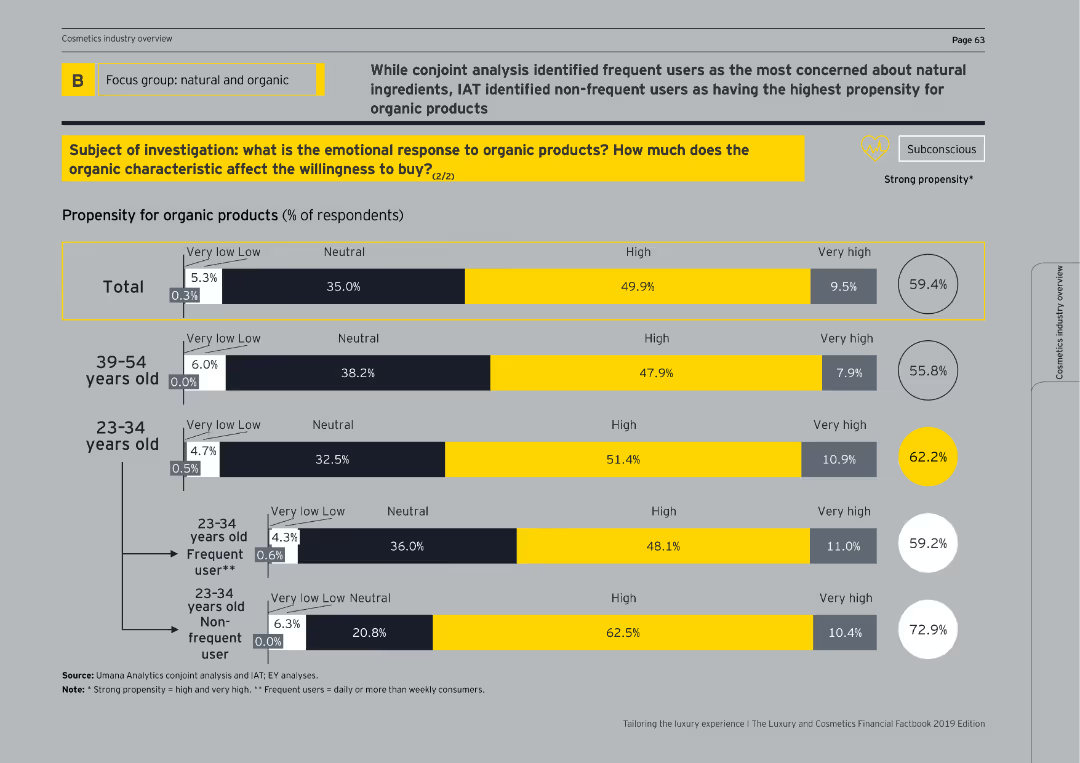
This slide features bar charts showing propensity for organic products by age groups and usage frequency, with emphasis on frequent vs. non-frequent users.
Customer and Market Segmentation
Consumer Goods
It further breaks down the propensity for organic products, highlighting differences between age groups and distinguishing between frequent and non-frequent users.
age groups, usage frequency, organic products, propensity
Single Chart
EY
Saved
The slide presents four vertical column charts in two color codes – blue for 'Bank Group (Harmonised)' and lighter blue for 'Bank Group (APRA)'. The graphs are plotted against a percentage scale with dotted lines indicating Basel III minimum standards.
Regulatory and Compliance
Financial Services
This slide illustrates the Bank Group's regulatory capital ratios as of December 2019, comparing the harmonised and APRA versions against Basel III minimums, potentially for a financial analysis or regulatory compliance presentation.
CET1, Leverage, LCR, NSFR, regulatory, ratios, Basel III, compliance, capital, banking
Multiple Chart
Goldman Sachs
Saved
A slide with multiple data presentations: bar graphs and a line graph, along with text explanations.
Risk Assessment and Management
Financial Services
This slide discusses commercial real estate (CRE) loan portfolios, risk management, and market competition. It's used for financial analysis and risk assessment in real estate banking.
CRE, Risk Management, Portfolio, Loans, Market, Banking, Real Estate, Analysis
Multiple Chart
JP Morgan
Saved
Diagram listing the top 10 levers for operational efficiency, including product portfolio, R&D, procurement, production, logistics, sales & marketing, and service & after-sales.
Strategic Planning
Financial Services
The slide presents the top 10 operational efficiency levers for 2019, focusing on key areas such as cost improvement in the product portfolio, material cost reduction, and production efficiency. It highlights the strategic initiatives that companies are prioritizing to enhance their competitiveness and operational performance.
Operational Efficiency, Cost Improvement, 2019
Table
Roland Berger
Saved
Includes a world map with trade corridors and a list of cross-border needs with accompanying icons. Blue and grey color scheme.
Financial Performance
Financial Services
Analyzes the globalization of financial services, showing trade corridors and cross-border market opportunities along with services like payments and foreign exchange.
Globalization, Trade, Financial Services, Market Opportunities, Cross-Border
Diagram
JP Morgan
Saved
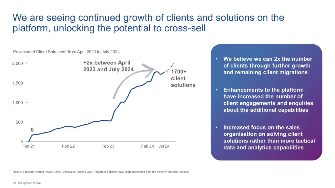
Line chart showing 2x growth in client solutions from Apr 2023 to Jul 2024 with bulleted insights.
Performance Metrics and KPIs
Financial Services
Depicts a sharp increase in provisioned client solutions to over 1700, doubling since April 2023. Accompanying text explains platform enhancements, client engagement growth, and cross-sell opportunities.
client growth, platform, Experian, KPIs, cross-sell, analytics, solutions, engagement
Mixed Chart
Barclays
Saved
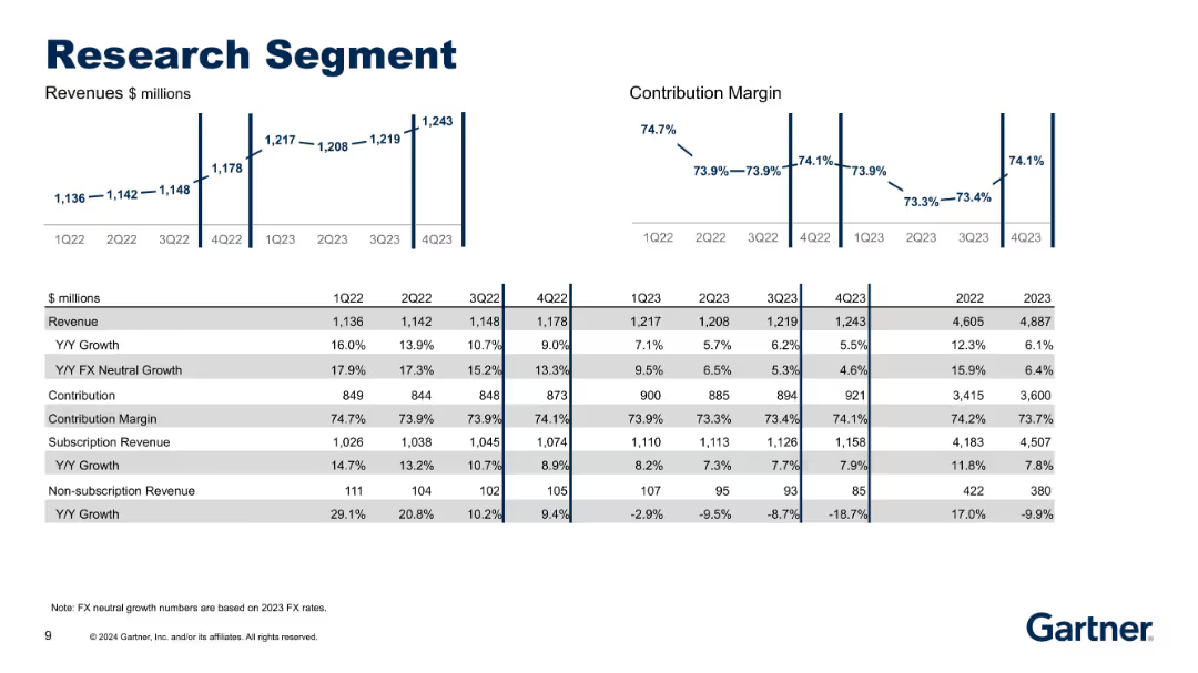
Bar and line charts with tabular financial data; left side features revenue metrics while the right shows contribution margin trends.
Performance Metrics and KPIs
Technology & Software
This slide breaks down the Research segment's quarterly and yearly revenue, contribution, and margin metrics from 1Q22 to 4Q23. It highlights stable growth in subscription revenues with declining non-subscription revenue and presents FX-neutral metrics.
Research, Revenue, Contribution, FX Neutral Growth, Subscription
Multiple Chart
Gartner
Saved
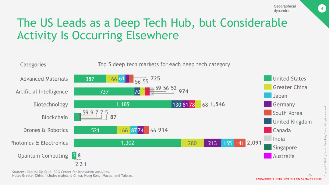
The slide contains a column chart showing the top 5 deep tech markets for various categories like advanced materials, AI, and biotechnology, with different colors representing different regions.
Market Analysis and Trends
Technology & Software
This slide compares the activity levels in deep tech across different countries, showing that while the US leads in several categories, other regions are also significant players in the market.
Deep Tech, US, Market, Comparison, Regions
Single Chart
BCG
Saved
Composed of a series of stacked column chart comparing group income over several years, focusing on variations by sector and the impact of specific securities issues on the overall financial trends.
Financial Performance
Financial Services
Analyzes the group income trends for FY23, breaking down the financial contributions by different sectors and the overall impact on the group's financial health, with specific focus on changes from previous years.
income trends, financial analysis, FY23, sectoral impact, financial health
Mixed Chart
Barclays
Saved
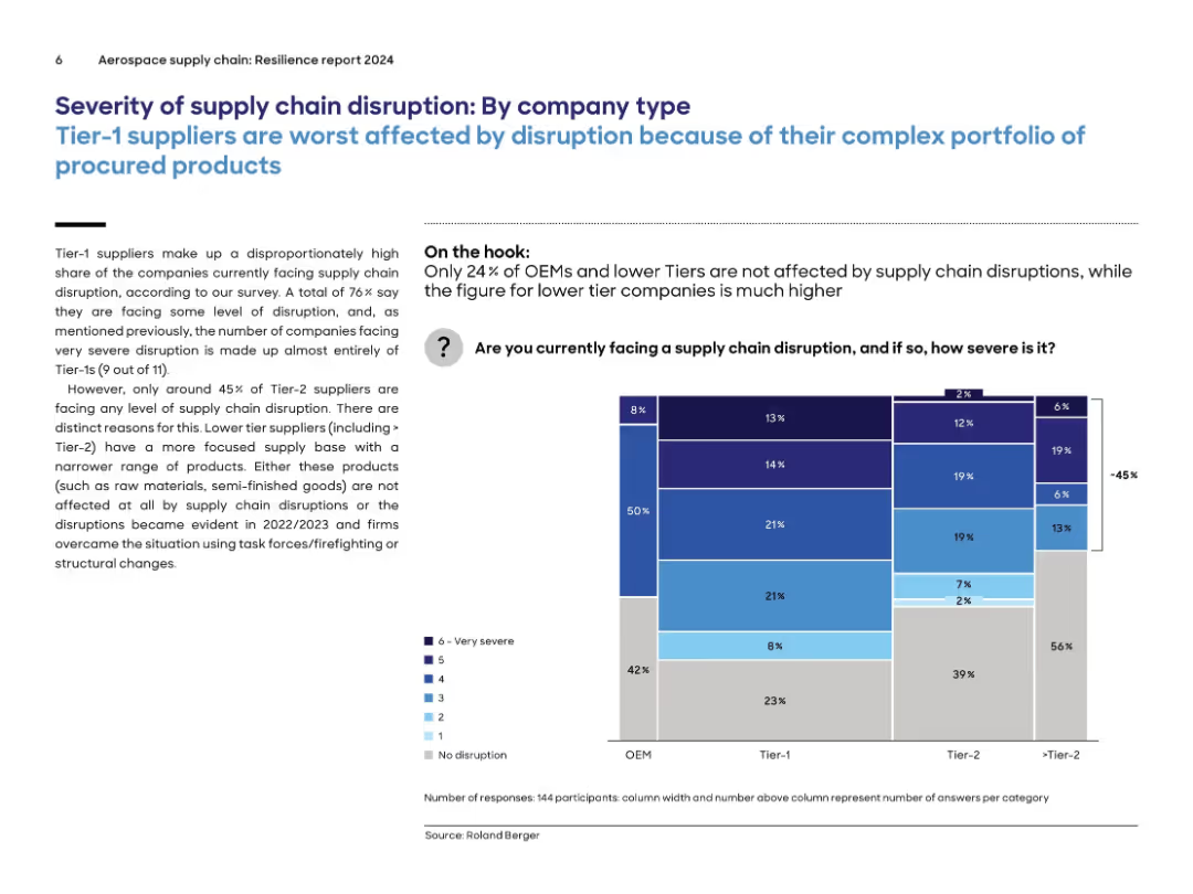
Left-aligned text with full-width stacked bar chart on right showing disruption severity across OEM, Tier-1, Tier-2, and >Tier-2 groups.
Risk Assessment and Management
Environmental Services & Sustainability
The slide shows that Tier-1 suppliers are most severely affected by supply chain disruptions, with 76% reporting issues and nearly all very severe cases found in this group. In contrast, lower-tier suppliers report less disruption, attributed to narrower product scope and past mitigation efforts. The visual chart breaks down responses by severity and company tier.
supply chain, tier-1, severity, OEM, disruption, suppliers, impact, aerospace, procurement
Mixed Chart
Roland Berger
Saved
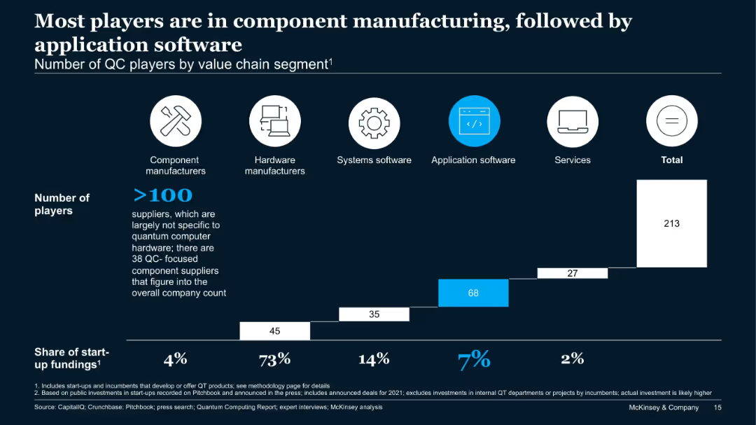
Bar chart showing number of players across five QC value chain segments and their share of start-up funding.
Product and Service Analysis
Technology & Software
This slide analyzes over 213 QC companies by value chain. Component manufacturers dominate in number, while application software sees the second-highest number of firms. However, hardware receives 73% of start-up funding, showing a funding-activity imbalance.
QC players, value chain, hardware, components, application software, start-up funding
Single Chart
McKinsey
Saved
The slide features a column chart depicting primary energy demand by fuel from 2000 to 2040 under stated policies scenario. It includes advanced biofuels, primary solid biofuels, hydro, nuclear, other renewables, gas, oil, and coal, with growth rates for each type.
Market Analysis and Trends
Energy & Utilities
This slide analyzes the projected growth rates of different energy sources, showing that wind and solar energies are expected to grow faster than advanced biomass by 2040.
primary energy demand, fuel, growth rate, wind energy, solar energy, biomass, 2040, stated policies scenario
Mixed Chart
Kearney
Saved
A content slide with text on the left and a column chart on the right. The chart identifies functional areas with centralized utility teams.
Operational Efficiency
Financial Services
The slide explores sourcing models in risk management, focusing on centralized teams for governance, data management, and machine learning capabilities.
sourcing model, centralized teams, governance, data management, machine learning
Mixed Chart
EY
Saved
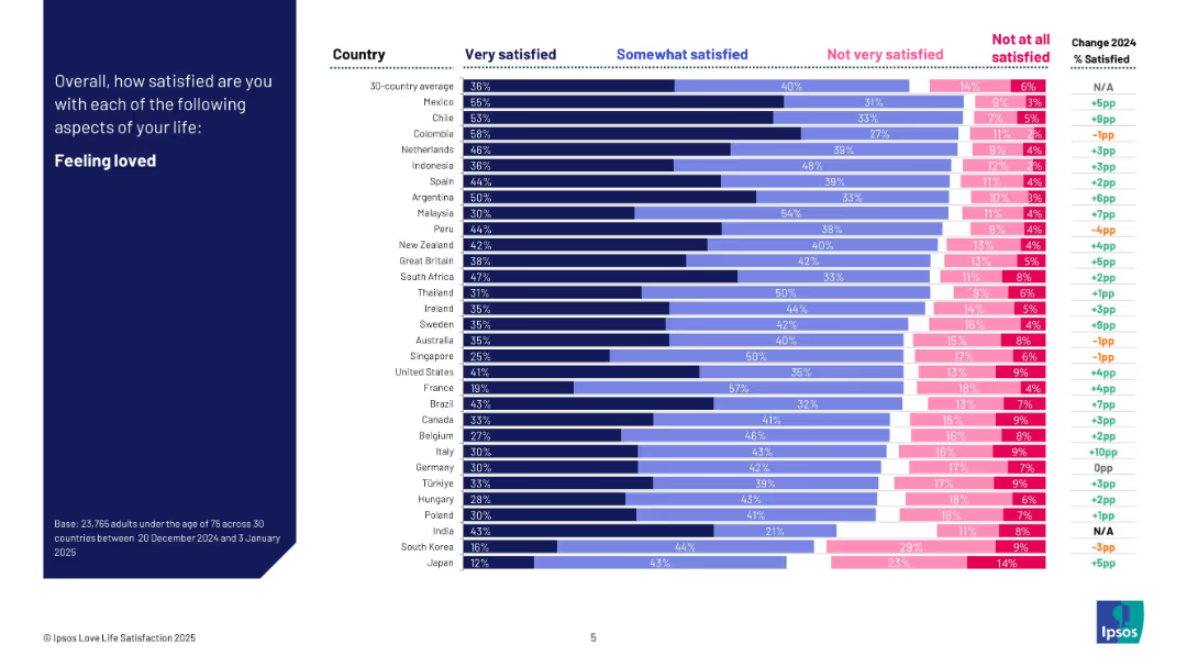
Dark blue left header; right side bar chart shows satisfaction levels by country in four response bands and change from 2024.
Human Resources and Talent Management
Professional Services
This slide visualizes how satisfied people are with feeling loved across 30 countries. It categorizes satisfaction levels and shows year-over-year change. Mexico and Colombia rank highest, while Japan and South Korea rank lowest. The chart includes detailed breakdowns per country.
feeling loved, satisfaction, emotional health, cross-country comparison, Ipsos, personal well-being, survey, 2025
Mixed Chart
IPSOS
Saved
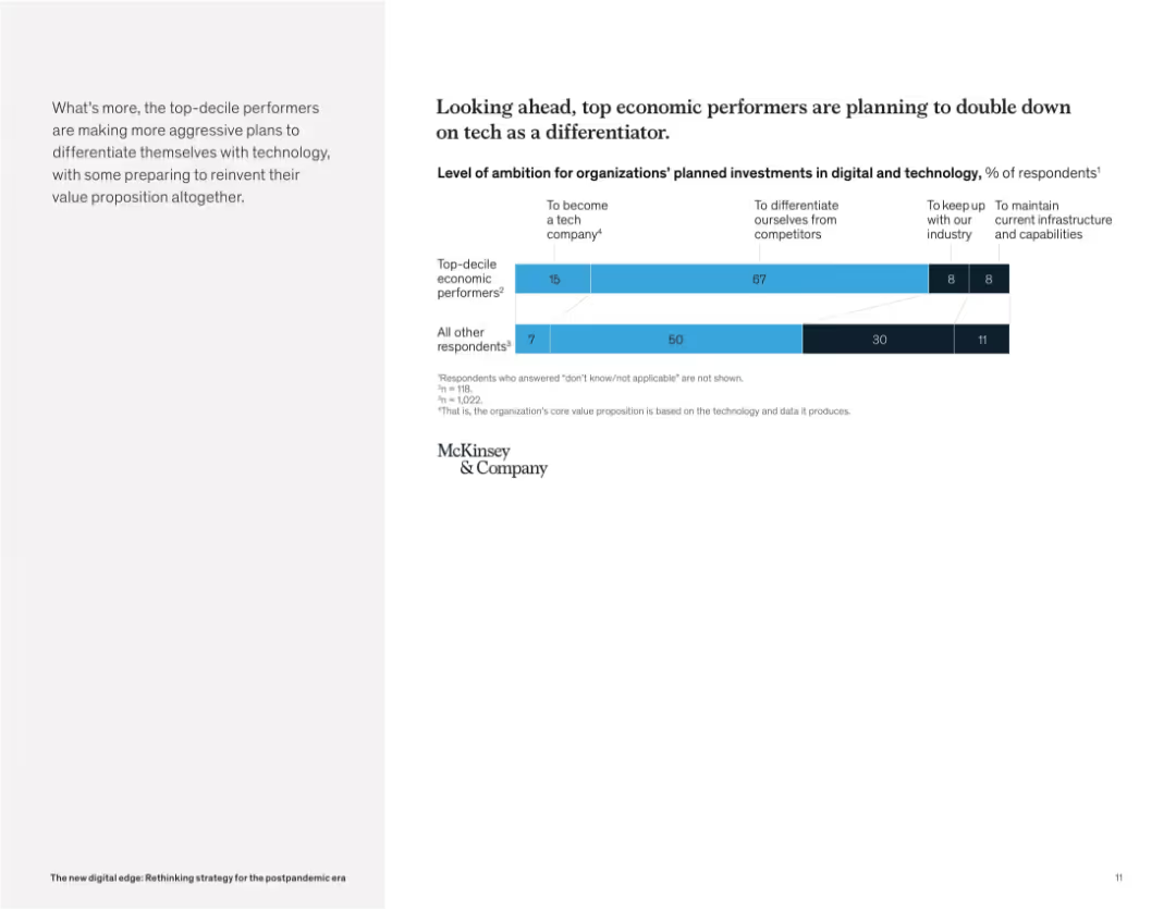
Clean layout with bar chart on the right and narrative paragraph on the left. Categories show ambition levels for tech investment.
Strategic Planning
Technology & Software
This slide reveals that top-performing companies are more likely to pursue aggressive technology strategies. The majority aim to differentiate themselves with tech or even become tech companies, unlike others who prioritize infrastructure maintenance.
digital strategy, tech differentiation, future investment, ambition, business transformation, technology leaders, innovation, McKinsey
Mixed Chart
McKinsey
Saved
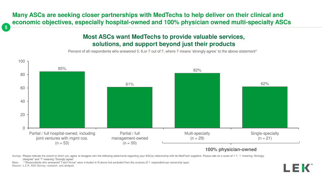
The slide includes three column charts showing ASC preferences for MedTech partnerships across different ownership models.
Client Case Studies
Healthcare & Pharmaceuticals
It presents survey data indicating the desire of ASCs for MedTech partnerships, highlighting the importance of services and support beyond just products.
ASC, MedTech, partnerships, services, survey
Single Chart
LEK
Saved
Previous
Next
If nothing, comes up, please save your slides first
Create a FREE account to continue browsing
Receive Instant Access to 1,000+ slides from companies like McKinsey, Google, and Goldman Sachs
First Name
Last Name
Email
Password
I agree to all
Terms & Privacy Policy
Thank you! Your submission has been received!
Oops! Something went wrong while submitting the form.
Have an account?
Sign in
Column Chart
Heatmap
Chevron
Org Chart
Infographic
Callouts
Timeline
List
Graphic
Picture
Process Flow
Diagram
Paragraph
Map
Table
Framework
Subtitle
Takeaway Box
Icon
Other Chart
Radar Chart
Waterfall Chart
Mekko Chart
Pie Chart
Scatter Plot
Line Chart
Bar chart
Bullet points