Create a FREE Account
Instant access to 1,000+ real slides from top companies like McKinsey, BCG, Goldman Sachs, Google and many more!
First Name
Last Name
Email
Password
I agree to all
Terms & Privacy Policy
Thank you! Your submission has been received!
Oops! Something went wrong while submitting the form.
Have an account?
Sign in
Library
Templates
Courses
Pricing
My Account
My Slides
My Templates
✦ AI
AI Prompt Library
AI Search
Sign in
Start Here
Logout
My Saved Slides
The visual complexity is moderate, presenting a bar chart and growth drivers in an informative and visually accessible manner. The layout is balanced between graphical data representation and explanatory text.
Technology and Digital Transformation
Industrial & Manufacturing
This slide illustrates the projected market growth of the global process automation industry and its concentration in key sectors. It highlights the structural growth drivers, providing a strategic outlook on the market for the audience.
Market growth, Process automation, Sector analysis, Growth drivers
Multiple Chart
LEK
Saved
A dual-axis line chart shows the percentage of banks tightening lending standards over time, contrasting US and Eurozone conditions. The slide background is white with grey recession markers.
Risk Assessment and Management
Financial Services
The slide compares credit conditions between the US and Eurozone, highlighting the risks associated with tighter lending standards. It is used to convey the potential impacts on financial stability and market conditions, likely serving as a risk assessment tool for investors or policy-makers.
Credit, US, Eurozone, Banks, Lending, Risk, Recession, Standards, 2023
Multiple Chart
JP Morgan
Saved
The slide has a dominant column chart showing the AWM adjusted expense over years with portions marked for investments, volume-/revenue-related, and structural changes. To the right, there's a column chart depicting the breakdown of expense types and investment focuses.
Operational Efficiency
Financial Services
Detailing the relation between increased expenses and revenue growth, the slide breaks down investment areas and their impact on the firm's financials. Likely to be used in financial planning or cost management sessions.
expenses, revenue, investment, asset management, cost analysis
Mixed Chart
JP Morgan
Saved
The slide features a column chart comparing the levelized cost of mobility for different train types for the year 2030.
Financial Performance
Transportation & Logistics
The slide provides a future outlook (2030) on the cost-effectiveness of hydrogen trains with different sources compared to electric and diesel trains.
hydrogen trains, cost projection, 2030, electrification, diesel trains
Mixed Chart
Kearney
Saved
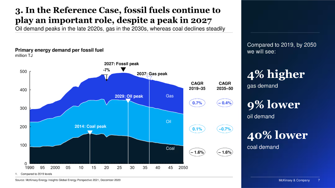
The slide features a multi-layered area chart depicting primary energy demand per fossil fuel over time, alongside key dates for peaks in coal, oil, and gas demand.
Market Analysis and Trends
Energy & Utilities
The slide shows the projected primary energy demand for fossil fuels, highlighting peak periods for coal, oil, and gas, and compares expected demand changes from 2019 to 2050.
Energy, fossil fuels, demand, projections, trends
Mixed Chart
McKinsey
Saved
Bar chart showing the most disliked aspects of vehicle financing, using different shades of green. The layout is straightforward and highlights key dislikes.
Risk Assessment and Management
Transportation & Logistics
This slide addresses the challenges and frustrations consumers face with vehicle financing, particularly the dislike for waiting for approval and completing paper-based forms, providing insights into improving customer experiences.
Financing challenges, consumer dissatisfaction, process improvement, vehicle loans
Single Chart
Deloitte
Saved
The slide includes a column chart depicting the percentage of people receiving various types of help, comparing data from May and December. Text boxes highlight key percentages.
Client Case Studies
Healthcare & Pharmaceuticals
This slide presents data on the types of help received by people in the last month, comparing survey results from May and December, with a focus on the percentage of people receiving different types of help.
help, survey, received, comparison, types of help, column chart, healthcare, public opinion, time periods
Single Chart
IPSOS
Saved
Similar dark background and white text with circular charts displaying percentages and yellow highlights.
Market Analysis and Trends
Healthcare & Pharmaceuticals
This slide demonstrates consumer openness to personalized medicine and technology-enhanced care, with 66% willing to take genetic tests, 66% open to non-urgent care at mini clinics, 64% willing to take medications made for their genetic profile, and 61% using wearables and mobile apps for health monitoring.
technology-enhanced care, personalized medicine, genetic testing, wearables, U.S. consumers
Mixed Chart
EY
Saved
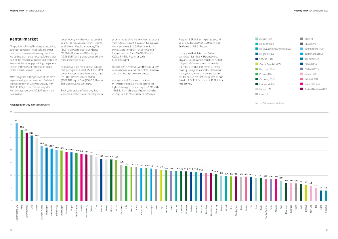
A column chart showing the average monthly rent (EUR/sqm) for different cities, with a text summary of rental market trends.
Market Analysis and Trends
Real Estate & Construction
The slide details the average monthly rent prices in various cities, offering insights into the rental market across different regions.
rental market, average rent, EUR/sqm, city comparison, market trends, real estate
Mixed Chart
Deloitte
Saved
The slide features a robotic hand reaching towards textual content against a dark blue background. It includes a two-column layout with selected AI technologies and use cases. Icons are used to represent different concepts like machine learning and risk management.
Industry Overview
Technology & Software
This slide discusses the application of AI in business, listing foundational methods and practical use cases such as risk management and service operations optimization. It suggests a growing adoption of AI across industries.
AI, Machine Learning, Risk Management, Service Operations, Technology Adoption, Business Use Cases
Header Horizontal
McKinsey
Saved
Image of a man working on a laptop. Column chart showing the extent of implementation of automation or advanced analytics in risk management.
Technology and Digital Transformation
Technology & Software
This slide addresses the implementation of AI and advanced analytics in risk management, highlighting the current adoption rates and potential risks associated with these technologies. It discusses the importance of integrating AI to enhance business innovation and operational excellence.
AI, risk management, advanced analytics, automation, technology
Multiple Chart
EY
Saved
The slide features a column chart comparing year-on-year percentage change in real GDP from 2022 to 2025 across various regions, including Global, US, Euro area, UK, Japan, China, India, Brazil, Developed markets, and Emerging markets. The chart uses different colors to represent the years.
Market Analysis and Trends
Financial Services
This slide presents projections for the global economy, highlighting expected growth trajectories from 2022 to 2025. It compares real GDP percentage changes across multiple regions, offering insights into the economic outlook for developed and emerging markets over the forecast period.
global economy, GDP, financial services, market trends, economic projections, real GDP, developed markets, emerging markets, growth trajectory, forecast
Single Chart
EY
Saved
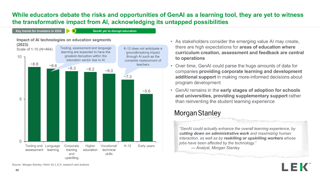
The slide has a column chart showing the impact of AI technologies on various education segments, with a narrative section explaining potential benefits and stakeholder expectations.
Technology and Digital Transformation
Education & Training
This slide explores the potential impact of AI on different segments of the education sector, highlighting areas like testing, assessment, and corporate training.
AI, Impact, Education, Segments, Technology, Testing, Assessment, Training, Benefits, Expectations
Mixed Chart
LEK
Saved
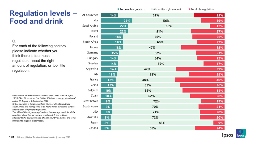
Uses the same Ipsos layout; countries listed alongside horizontal bar chart; color-coded by response type.
Regulatory and Compliance
Agriculture & Food Production
The slide explores perceptions of regulation in the food and drink sector. Responses are mostly favorable toward current regulation, but countries such as France, China, and Argentina show more concern about lax regulation. Japan and Canada see the existing framework as appropriate.
food, beverage, agriculture, regulation, policy, Ipsos, public opinion, governance, international survey, consumer safety
Mixed Chart
IPSOS
Saved
This slide features two vertical column charts comparing the transfer intentions of first-gen versus continuing-gen students at community colleges, in shades of green.
Human Resources and Talent Management
Education & Training
The slide analyzes the transfer intentions of community college students, emphasizing the confidence levels between different student demographics.
community college, students, transfer, first-gen, intentions
Multiple Chart
BCG
Saved
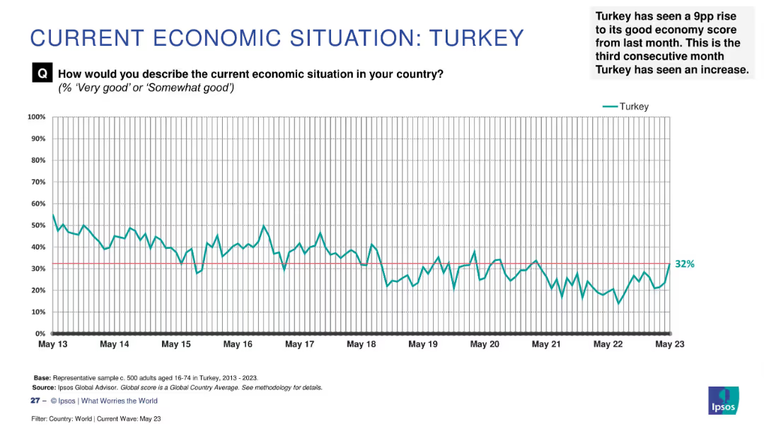
Line graph on white background showing economic sentiment from May 2013 to May 2023, with annotation at end.
Market Analysis and Trends
Government & Public Sector
This slide tracks public sentiment about Turkey's economic situation over a 10-year period. The graph reflects fluctuations in economic confidence, ending at 32% in May 2023. A note highlights a 9 percentage point increase in positive sentiment, continuing a 3-month upward trend.
Turkey, economy, perception, sentiment, Ipsos, trend, increase, data, public opinion, May 2023
Single Chart
IPSOS
Saved
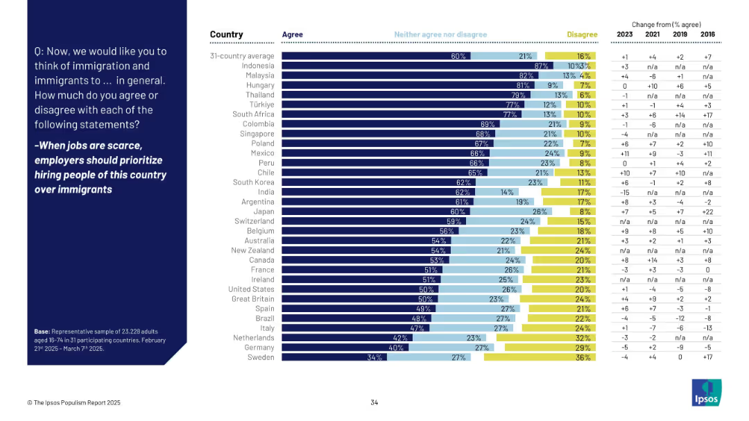
Horizontal bar chart with color-coded agreement levels by country and change over time; blue background with white text
Market Analysis and Trends
Government & Public Sector
This slide presents global survey data on the belief that native citizens should be prioritized over immigrants for jobs during times of scarcity. It shows country-wise agreement levels, disaggregated by agree, neutral, and disagree, along with historical trend comparisons from 2016 to 2025.
immigration, employment, prioritization, nationalism, global survey, Ipsos, agreement levels, trends, policy sentiment, public opinion
Mixed Chart
IPSOS
Saved
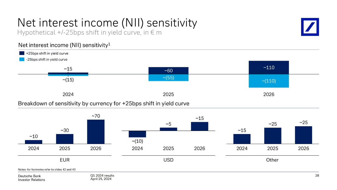
Two stacked bar graphs: Top section shows NII sensitivity for 2024–2026 under +/-25bps yield shifts; bottom section breaks down +25bps impact by currency (EUR, USD, Other).
Financial Performance
Financial Services
The slide models Deutsche Bank's net interest income sensitivity to a hypothetical ±25bps shift in the yield curve across 2024 to 2026, showing increasing sensitivity over time. The second chart segments the +25bps impact by currency, revealing EUR as the dominant contributor.
net interest income, yield curve, interest rate sensitivity, EUR, USD, projections, 2024–2026, Deutsche Bank
Multiple Chart
Deutsche Bank
Saved
The slide features a green color scheme with a large column chart comparing the average maturity scores of brands with different levels of senior sponsorship. On the right, a quote in white text from a chairman of a Thailand-based company emphasizes the importance of digital marketing development.
Market Analysis and Trends
Media & Entertainment
This slide compares the maturity scores of brands with limited senior sponsorship and those with CEO sponsorship, illustrating a significant difference. A quotation from a travel company's chairman highlights leadership's role in digital marketing initiatives.
digital marketing, leadership, maturity, brands, sponsorship, Thailand, CEO
Mixed Chart
BCG
Saved
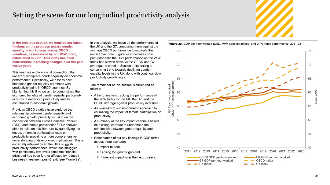
Dual-column text-heavy layout on left; performance line chart (GDP vs WiW Index) on right; orange and yellow palette used for segmentation.
Investment Analysis
Government & Public Sector
This slide sets up the productivity analysis section, connecting gender equality progress to economic output across OECD and G7 nations. It introduces the methodology and aims to correlate women’s workforce participation with GDP per hour worked. UK’s lagging productivity is noted, setting context for subsequent findings.
productivity analysis, GDP, gender equality, WiW Index, OECD, G7, UK economy, economic growth, female participation, workplace equity
Mixed Chart
PwC/Strategy&
Saved
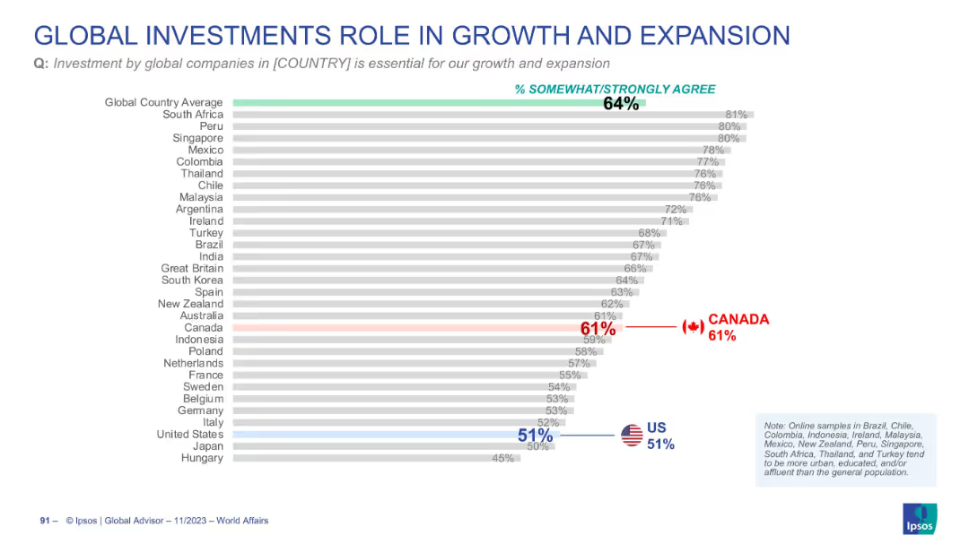
Horizontal bar chart ranking countries by agreement (% somewhat/strongly agree) on the importance of global investment for national growth; highlights global average, Canada, and the US in color. Grey bars used for other countries. Clean, professional layout.
Market Analysis and Trends
Financial Services
This slide shows how respondents in various countries perceive the importance of global investments for their nation's growth and expansion. The global average is 64%, with South Africa leading at 81%. Canada (61%) is slightly below the average, and the US (51%) is significantly lower.
global investment, economic growth, Canada, US, international perception, Ipsos, business expansion, rankings, bar chart, country comparison
Single Chart
IPSOS
Saved
This slide shows a combination of icons, text, and colored sections to illustrate risk management principles and the 'three lines of defence' model.
Risk Assessment and Management
Financial Services
It depicts Macquarie's risk management strategy, emphasizing accountability and the consistent application of core principles and frameworks, relevant for corporate governance and risk management education.
risk management, accountability, principles, three lines of defence, corporate governance
Header Horizontal
Goldman Sachs
Saved
A scatter plot showing the relationship between IT spending per employee and value-added per employee for different countries. The countries are grouped and color-coded into different regions.
Market Analysis and Trends
Technology & Software
The slide analyzes IT intensity across various countries by comparing IT spending per employee to the economic value added per employee, used for international market comparisons.
IT Intensity, Country Analysis, Economic Value, IT Spending, International Comparison
Single Chart
Gartner
Saved
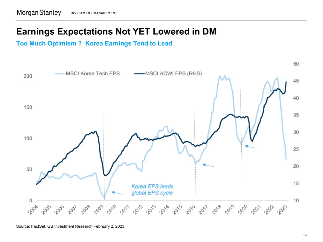
The slide features a line chart comparing MSCI Korea Tech EPS and MSCI ACWI EPS from 2004 to 2023. Two lines represent the earnings per share for each index over time.
Financial Performance
Financial Services
This slide discusses the earnings expectations in developed markets, highlighting Korea's earnings trends compared to global averages and noting optimism in projections.
Earnings Expectations, Korea EPS, MSCI, Developed Markets, Financial Performance, Market Trends, Tech Sector, EPS Comparison
Single Chart
Morgan Stanley
Saved
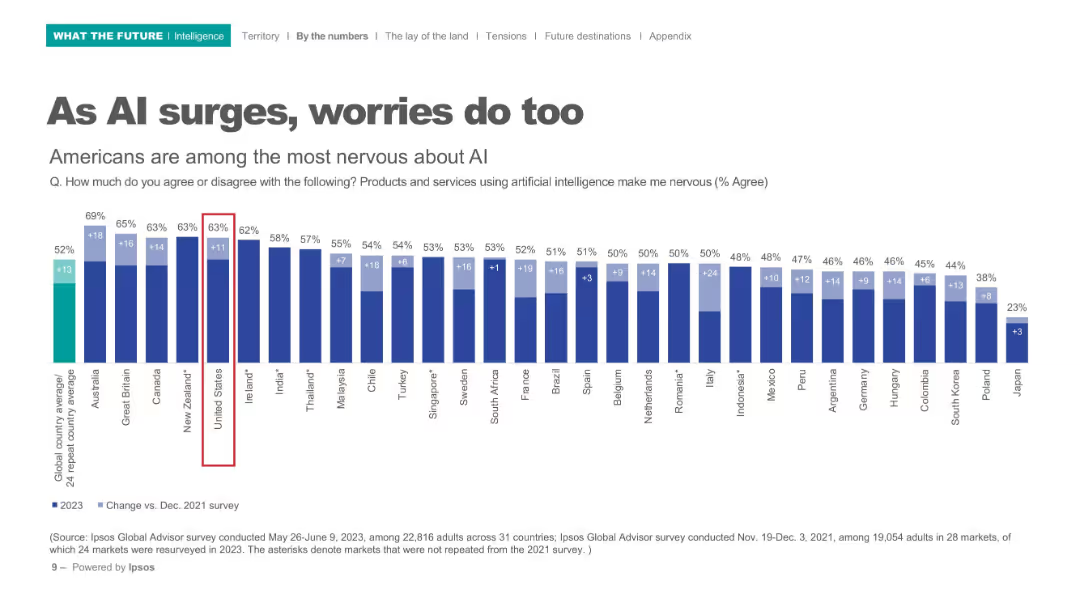
Horizontal bar chart with comparison of global nervousness about AI products/services; dark blue bars on white background.
Risk Assessment and Management
Artificial Intelligence
Depicts nervousness levels around AI across 31 countries, highlighting the U.S. as one of the most apprehensive. Bar chart includes percentage increase from 2021 to 2023.
AI concerns, public perception, international comparison, nervousness, Ipsos, technology anxiety, 2023 survey
Single Chart
IPSOS
Saved
Previous
Next
If nothing, comes up, please save your slides first
Create a FREE account to continue browsing
Receive Instant Access to 1,000+ slides from companies like McKinsey, Google, and Goldman Sachs
First Name
Last Name
Email
Password
I agree to all
Terms & Privacy Policy
Thank you! Your submission has been received!
Oops! Something went wrong while submitting the form.
Have an account?
Sign in
Column Chart
Heatmap
Chevron
Org Chart
Infographic
Callouts
Timeline
List
Graphic
Picture
Process Flow
Diagram
Paragraph
Map
Table
Framework
Subtitle
Takeaway Box
Icon
Other Chart
Radar Chart
Waterfall Chart
Mekko Chart
Pie Chart
Scatter Plot
Line Chart
Bar chart
Bullet points