Create a FREE Account
Instant access to 1,000+ real slides from top companies like McKinsey, BCG, Goldman Sachs, Google and many more!
First Name
Last Name
Email
Password
I agree to all
Terms & Privacy Policy
Thank you! Your submission has been received!
Oops! Something went wrong while submitting the form.
Have an account?
Sign in
Library
Templates
Courses
Pricing
My Account
My Slides
My Templates
✦ AI
AI Prompt Library
AI Search
Sign in
Start Here
Logout
My Saved Slides
An intricate network diagram on a dark background illustrates client and personnel connections, with color-coded dots and sector labels demonstrating operational strategies.
Operational Efficiency
Financial Services
The slide operationalizes the organization's approach, showing connectivity and key areas like collaboration and infrastructure between clients and staff.
Operational, Strategy, Clients, Personnel, Investment, Banking, Asset, Management
Uncategorized
Goldman Sachs
Saved
Column charts and icons represent loan volumes and risk metrics. Clear, visual breakdown of data by sector.
Risk Assessment and Management
Financial Services
Examines the growth in lending and maintenance of loan loss rates, detailing risk mitigation measures up to 2026.
lending, risk, loans, 2026, growth
Multiple Chart
Barclays
Saved
The slide includes a line chart comparing geological storage costs for CO2 in onshore and offshore sites.
Financial Performance
Energy & Utilities
This slide compares the costs of geological storage for CO2 in depleted oil and gas fields and saline aquifers.
CO2 storage, geological, costs, onshore, offshore
Mixed Chart
Kearney
Saved
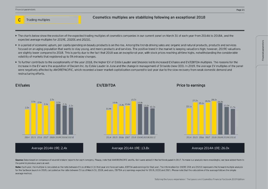
The slide includes column charts showing EV/sales, EV/EBITDA, and price to earnings ratios from 2014 to 2021E. The slide is moderately complex with a thorough analysis of the cosmetics market and factors affecting these financial multiples.
Market Analysis and Trends
Consumer Goods
The slide discusses the stabilization of cosmetics multiples following an exceptional 2018, presenting EV/sales, EV/EBITDA, and price to earnings ratios. It explains market trends, including increased spending on beauty products and the impact of organic and natural products on valuations.
Cosmetics, EV/Sales, EV/EBITDA, Price to Earnings
Multiple Chart
EY
Saved
A slide with blue column chart bars showing Chase Travel sales volume over time, with additional details on marketplace strategies and acquisitions.
Financial Performance
Technology & Software
Projects growth in consumer travel, discussing marketplace strategies and highlighting the value of recent acquisitions.
travel sales, growth projection, marketplace strategy, acquisitions, premium customers, Chase
Mixed Chart
JP Morgan
Saved
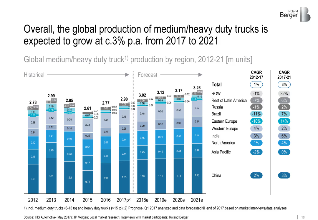
Stacked bar chart comparing truck production by region (2012–2021) with CAGR data. Segments color-coded and neatly aligned.
Financial Performance
Transportation & Logistics
This slide presents the volume and forecast of global medium/heavy duty truck production. Regional breakdowns show China as the leader, while emerging markets see modest growth. Includes CAGR data for historic and forecast periods.
['truck production', 'heavy duty', 'regional growth', 'CAGR', 'China', 'forecast', 'manufacturing', 'automotive']
Single Chart
Roland Berger
Saved
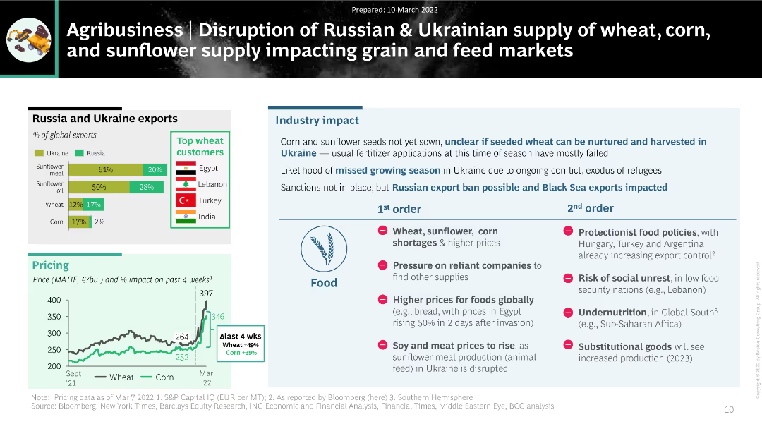
The slide uses a combination of bar charts and text to present the impact of disrupted Russian and Ukrainian exports of wheat, corn, and sunflower on global agribusiness markets.
Market Analysis and Trends
Agriculture & Food Production
The slide discusses the significant impact of disrupted grain and sunflower supply from Russia and Ukraine on global agribusiness. It highlights export percentages, top customers, and potential industry impacts, including food shortages and price increases.
agribusiness, supply disruption, wheat, corn, sunflower, exports
Multiple Chart
BCG
Saved
The slide uses horizontal bar graphs to compare the online spend of HVUs and non-HVUs in the Philippines. It features a blue and grey color scheme, with each category of spend such as transport, gaming, and travel represented by a bar. The right side of the slide includes two column charts showing changes in spend percentage. It provides demographic and geographic composition percentages through pie charts.
Customer and Market Segmentation
Technology & Software
This slide compares the online spending of high-value users (HVUs) with non-HVUs in the Philippines, emphasizing transport as a significant factor. It's useful for businesses and marketers to identify and capitalize on key differentiators in consumer spending behavior, especially in the context of transportation and e-commerce sectors.
HVUs, Non-HVUs, Philippines, Transport, Online Spend, Gaming, Travel, E-commerce, Market Segmentation
Multiple Chart
Bain
Saved
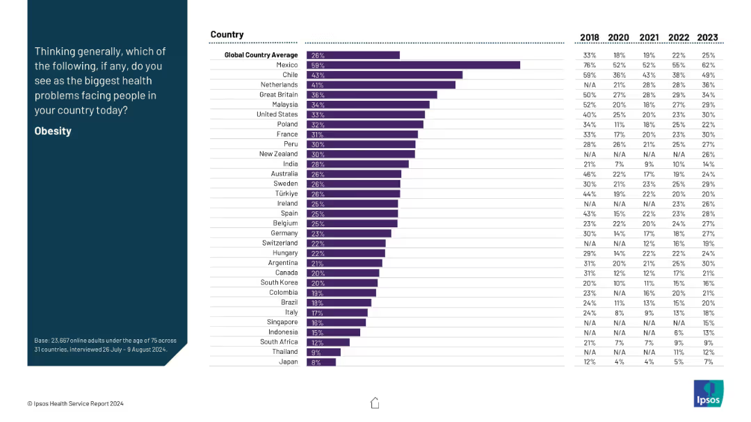
Same format as others: left-side question and right-side horizontal bar chart with six-year data trend.
Market Analysis and Trends
Healthcare & Pharmaceuticals
Obesity is presented as a major health concern, with Mexico leading by a wide margin. The data show historical shifts (2018–2023) with consistent rises in many countries. The global average sits at 26%, reflecting growing awareness of obesity as a health crisis.
obesity, lifestyle diseases, health trends, global health, survey
Mixed Chart
IPSOS
Saved
The slide contains a timeline showing changes in ownership among major companies handling Australian grain, with different colored bars for handlers, marketers, and port operators.
Competitive Landscape
Agriculture & Food Production
This slide presents a timeline of the grain industry’s changes over ten years, highlighting consolidation among bulk handlers and new market entrants in rail and ports.
Grain, Industry, Timeline, Consolidation, Ownership
Diagram
LEK
Saved
This slide showcases a close-up image of a wet umbrella, with annotations highlighting potential business challenges like Earnings miss, Liquidity crunch, etc.
Strategic Planning
Professional Services
Focuses on defining strategic goals for business resilience, enumerating critical challenges that businesses might face under stress.
Resiliency, Business challenges, Strategic planning, Liquidity, Bankruptcy
Linear Flow
Bain
Saved
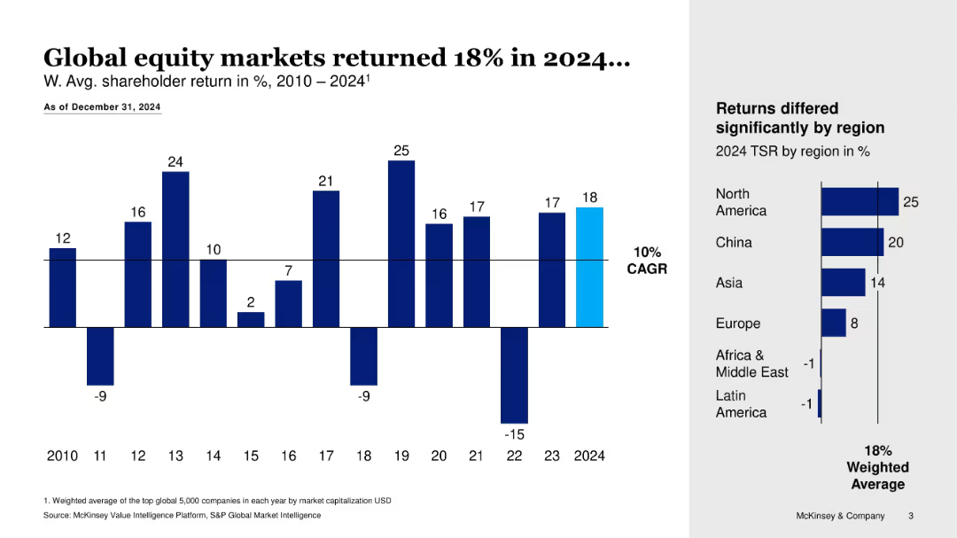
Bar chart showing annual returns 2010–2024 with side bar for 2024 TSR by region
Financial Performance
Financial Services
Summarizes global equity market performance from 2010 to 2024, highlighting an 18% return in 2024 and regional differences in TSR, with North America and China leading.
equity markets, TSR, global returns, CAGR, regional performance, financial trends
Multiple Chart
McKinsey
Saved
Contains text blocks and icons, describing four key areas critical for AI adoption in risk management.
Technology and Digital Transformation
Technology & Software
Discusses the necessary enablers for adopting AI within organizations, emphasizing governance and skills.
AI adoption, governance, skills, risk management
Pillar
PwC/Strategy&
Saved
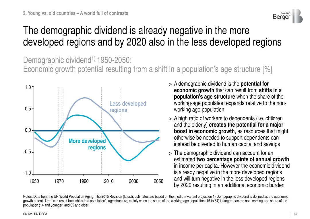
Dual-line chart with accompanying text, illustrating economic growth potential due to demographic structure shifts from 1950 to 2050.
Strategic Planning
Government & Public Sector
This slide discusses demographic dividends, showing how more developed regions have already lost growth benefits from age structure shifts, and less developed regions will follow by 2020, impacting economic output.
demographic dividend, economic growth, age structure, dependency ratio, population aging, labor force
Mixed Chart
Roland Berger
Saved
Contains a circular diagram with icons representing the firm's strengths, supplemented by text descriptions around the diagram's perimeter.
Strategic Planning
Financial Services
Articulates the unique position of the firm to support clients with their strengths, emphasizing on client experience.
Client Experience, Differentiation, Talent, Balance Sheet, Innovation, Strategic Integration
Linear Flow
JP Morgan
Saved
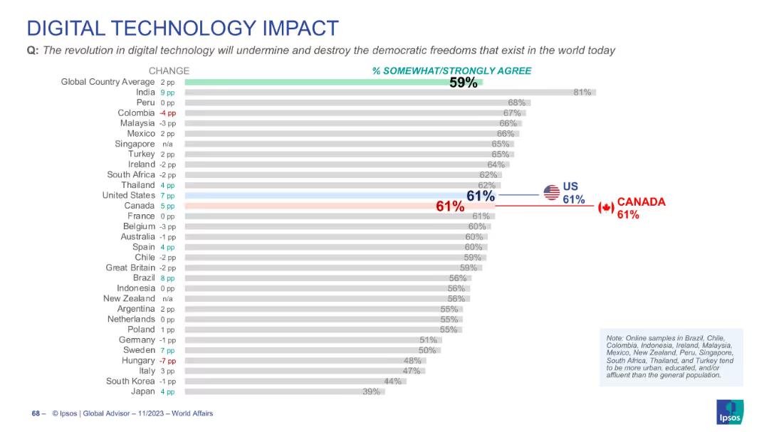
Similar bar chart format with % change and agreement levels; US and Canada marked in color; minimalistic icons and layout.
Risk Assessment and Management
Technology & Software
Survey responses indicating agreement that digital technology may undermine democratic freedoms. Global average is 59%, with the US and Canada both at 61%. The chart captures trends and shifts in public concern over digital governance.
digital tech, democracy, freedom, global opinion, risk, survey, Ipsos
Single Chart
IPSOS
Saved
The slide contrasts two key aspects: 'Superior Technology' and 'Broad Product Offering' with bullet points and icons. There's also a sidebar detailing 'Superior Technology and Automation' with specific service features highlighted.
Technology and Digital Transformation
Financial Services
Spotlights the competitive edge in technology and product offerings, detailing the trading technology, broad market access, and cost-effective rates. The slide aims to convince the audience of the company's technological superiority and extensive market coverage.
Technology, Product Offering, Trading, Market Access, Cost-Effectiveness
Diagram
Goldman Sachs
Saved
Combines column charts and tables to show the number and proceeds of IPOs across EMEIA regions, with a focus on cross-border activity.
Market Analysis and Trends
Financial Services
The slide presents an overview of IPO performance in EMEIA, detailing cross-border activity and performance metrics.
EMEIA, IPOs, cross-border, performance, metrics
Multiple Chart
EY
Saved
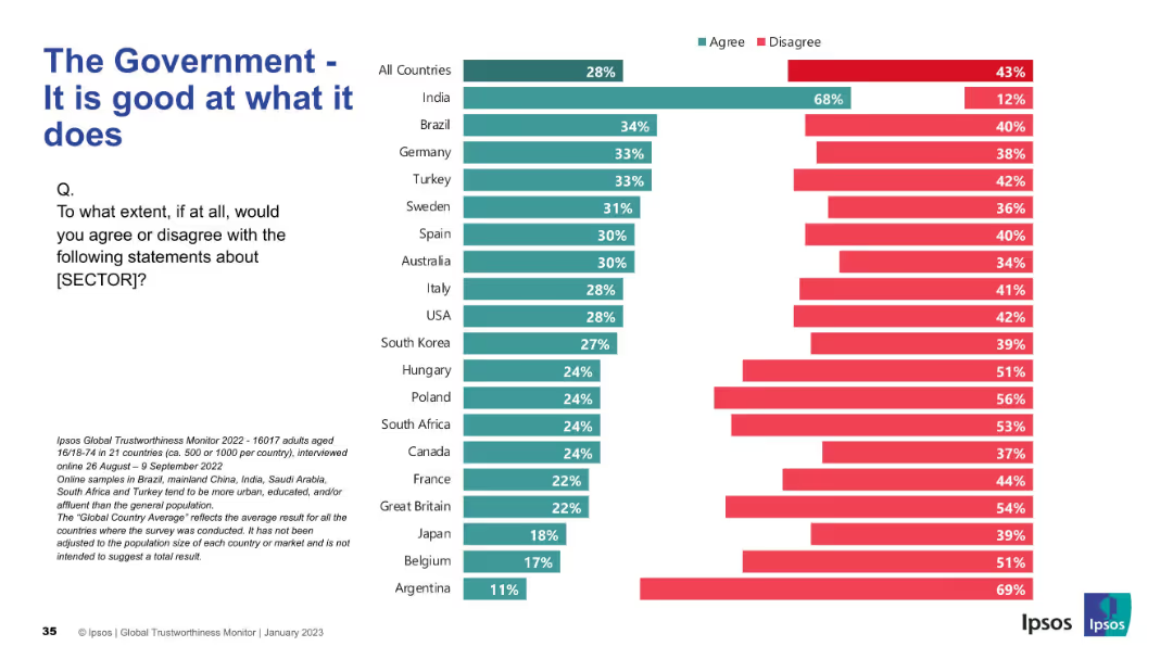
Split bar chart (green for agree, red for disagree) by country; centered layout
Strategic Planning
Government & Public Sector
This slide displays public opinion on governmental competency, with responses split into "agree" and "disagree" categories across 21 countries. India shows the most agreement.
government, competency, trust, public sector, Ipsos, survey, agree/disagree, effectiveness, administration, comparison
Mixed Chart
IPSOS
Saved
This slide features a column chart showing projected declines in general fund receipts for New York from 2020 to 2024, due to COVID-19. The charts use different shades of green to represent original budget gaps versus the impact of COVID-19.
Financial Performance
Government & Public Sector
Analyzes the fiscal impact of COVID-19 on New York’s budget, highlighting changes in fund receipts and total budget gaps. Useful for financial and governmental presentations on managing budget shortfalls during pandemics.
COVID-19, budget, New York, fund receipts, fiscal impact, projections, government finance
Single Chart
BCG
Saved
Depicts a disruption index graph comparing various industries by internet penetration levels, with personal luxury goods highlighted for 2018 and projected for 2025.
Technology and Digital Transformation
Retail & E-commerce
Discusses the impact of digital penetration on the luxury industry, comparing it to other sectors and forecasting a significant shift in industry dynamics by 2025 due to increased internet use and digital shopping behaviors.
Digital Disruption, Luxury Industry, Internet Penetration, Forecast
Single Chart
Bain
Saved
Dense text and graphics detailing 'Digital Twins' technology, its maturity, and applicability in industries, alongside sidebars for additional insights.
Technology and Digital Transformation
Technology & Software
Offers a deep dive into the technology of digital twins, explaining its functionality, benefits to companies, and industry applications. The slide also assesses the maturity and future development horizons of this technology.
Digital twins, technology analysis, industry application
Header Horizontal
McKinsey
Saved
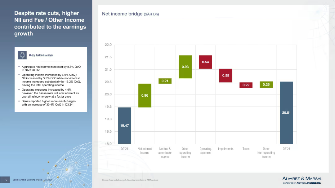
Left panel with bullet points; right side features a waterfall chart showing net income bridge components from Q2’24 to Q3’24.
Financial Performance
Financial Services
Explains net income growth through drivers such as higher net interest income, fee income, and other operating income, despite rising expenses and impairment charges. A waterfall chart visually tracks movement from Q2 to Q3.
earnings growth, NII, net income, impairments, fee income, operating income, Q3'24, cost structure, waterfall chart, SAR
Mixed Chart
Alvarez & Marsal
Saved
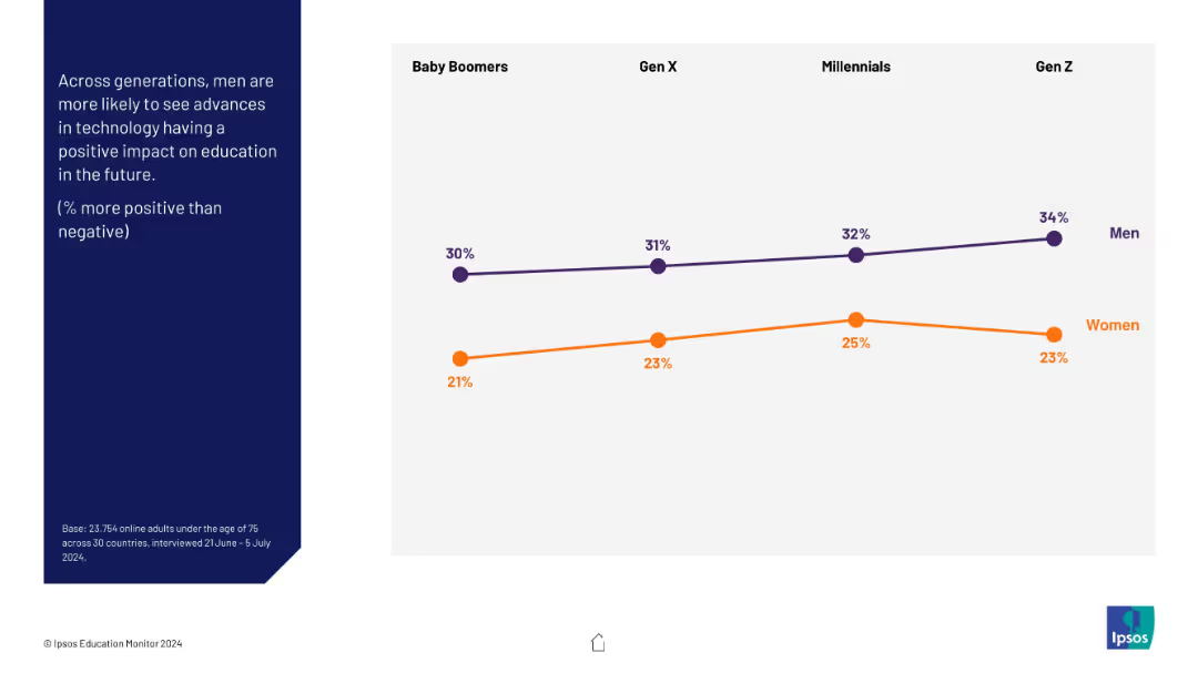
Line graph comparing men vs women across generations (Baby Boomers to Gen Z); question on left in blue
Market Analysis and Trends
Education & Training
The slide shows gender differences in optimism about technology’s impact on education. Men across all generations consistently show more optimism than women, with Gen Z men the most positive.
gender gap, perception, technology, education, AI, optimism, generations
Mixed Chart
IPSOS
Saved
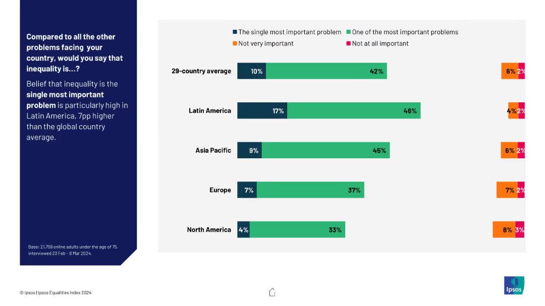
Horizontal bar chart with regional breakdown; segmented by perception type using color-coded bars; descriptive text left aligned.
Market Analysis and Trends
Government & Public Sector
This regional overview visualizes beliefs about inequality’s urgency across Latin America, Asia Pacific, Europe, and North America, showing regional trends and highlighting Latin America's elevated concern.
regional comparison, inequality perception, global attitudes, Ipsos, concern levels, urgency, public opinion
Mixed Chart
IPSOS
Saved
Previous
Next
If nothing, comes up, please save your slides first
Create a FREE account to continue browsing
Receive Instant Access to 1,000+ slides from companies like McKinsey, Google, and Goldman Sachs
First Name
Last Name
Email
Password
I agree to all
Terms & Privacy Policy
Thank you! Your submission has been received!
Oops! Something went wrong while submitting the form.
Have an account?
Sign in
Column Chart
Heatmap
Chevron
Org Chart
Infographic
Callouts
Timeline
List
Graphic
Picture
Process Flow
Diagram
Paragraph
Map
Table
Framework
Subtitle
Takeaway Box
Icon
Other Chart
Radar Chart
Waterfall Chart
Mekko Chart
Pie Chart
Scatter Plot
Line Chart
Bar chart
Bullet points