Create a FREE Account
Instant access to 1,000+ real slides from top companies like McKinsey, BCG, Goldman Sachs, Google and many more!
First Name
Last Name
Email
Password
I agree to all
Terms & Privacy Policy
Thank you! Your submission has been received!
Oops! Something went wrong while submitting the form.
Have an account?
Sign in
Library
Templates
Courses
Pricing
My Account
My Slides
My Templates
✦ AI
AI Prompt Library
AI Search
Sign in
Start Here
Logout
My Saved Slides
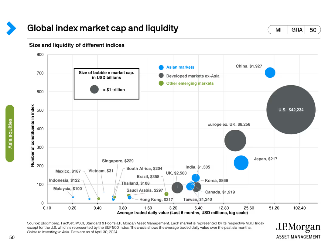
Bubble chart showing size and liquidity of different indices with average traded daily value and market cap. Bubble size represents market cap in USD billions.
Investment Analysis
Financial Services
Compares the market cap and liquidity of various global indices, highlighting differences in traded value and constituent count.
index, market cap, liquidity, bubble chart, financial analysis, global indices, daily value, investment, market size
Single Chart
JP Morgan
Saved
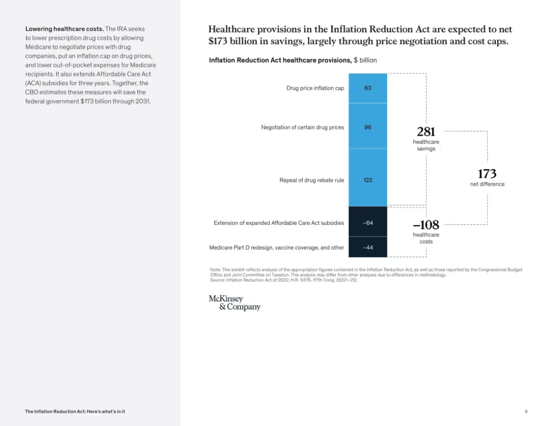
Vertical waterfall chart displaying savings and costs; two-tone column structure with dotted lines marking totals; left panel explains cost-control focus.
Financial Performance
Healthcare & Pharmaceuticals
This slide analyzes projected healthcare savings from the IRA, showing how reforms like drug price caps and rebate repeal contribute to a net savings of $173B. Costs include ACA extension and Medicare redesign.
healthcare savings, drug pricing, ACA, Medicare, subsidies, cost cap, inflation reduction
Mixed Chart
McKinsey
Saved
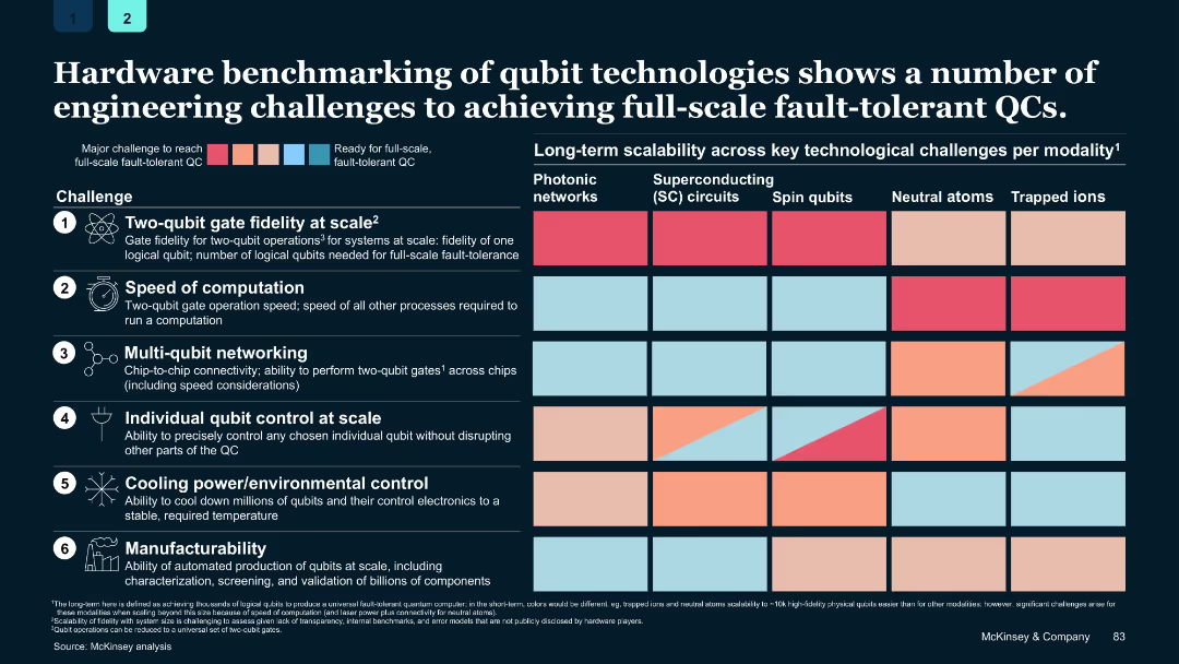
Grid-based chart with color-coded challenge levels per modality and modality categories in columns
Performance Metrics and KPIs
Technology & Software
Details six key engineering challenges for achieving full-scale fault-tolerant quantum computing and compares the readiness of various qubit technologies across these metrics.
quantum hardware, qubits, benchmarking, fault tolerance, scalability, engineering challenges
Single Chart
McKinsey
Saved
White background with black and purple column charts comparing tech investment ratios
Investment Analysis
Technology & Software
It compares the technology investment ratios of platform adopters to non-platform companies
Tech Investment, Ratios, Platform, Non-Platform, Technology Spend
Mixed Chart
Accenture
Saved
Consists of column charts showing investment return metrics for corporate equity and real estate credit, with clear distinction between post-crisis and since inception data.
Investment Analysis
Financial Services
Presents a detailed analysis of investment returns for alternative strategies, emphasizing performance metrics like IRR.
Investment Returns, Alternatives, Corporate Equity, Real Estate Credit, IRR, Post-Crisis
Multiple Chart
Goldman Sachs
Saved
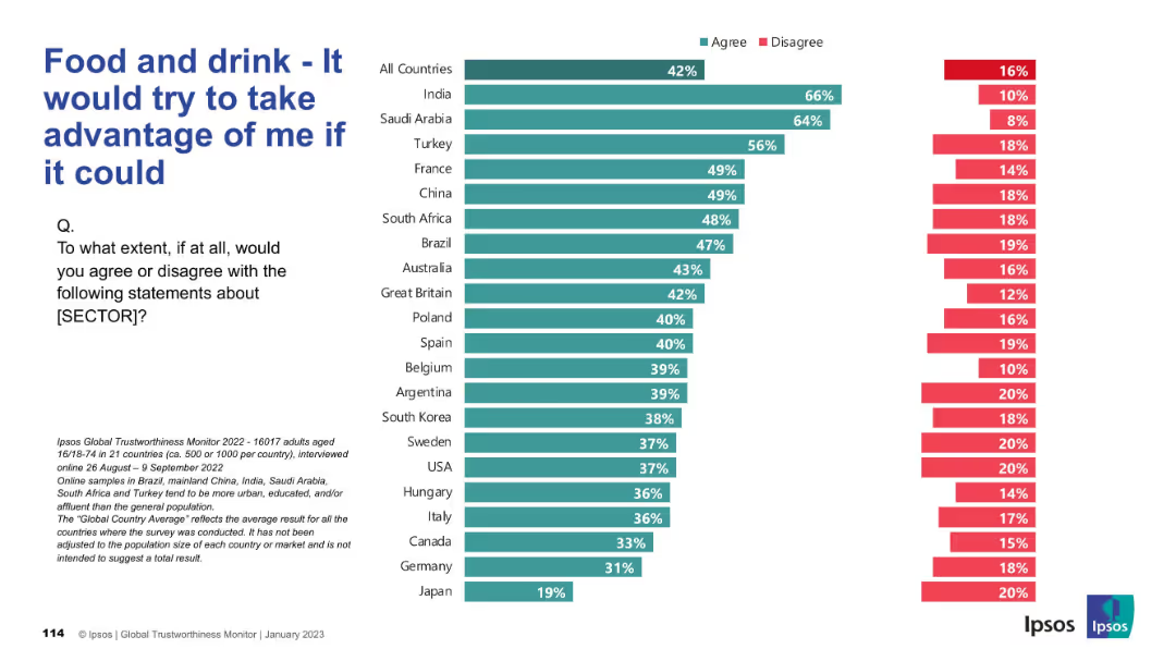
Horizontal bar chart indicating perceived exploitation potential of the food sector; disagreement on right side.
Risk Assessment and Management
Consumer Goods
The chart shows how much consumers across different countries believe the food and drink sector would exploit them if given the chance. A higher percentage in some countries indicates skepticism and perceived opportunism.
exploitation, trust, consumer risk, food industry, public perception, Ipsos, countries, bar chart, opinion, survey
Mixed Chart
IPSOS
Saved
The layout includes a bar graph labeled "FIGURE 5", textual analysis on the left, and quotes pertaining to the role of AI in skill development.
Market Analysis and Trends
Technology & Software
Focusing on China, the slide projects the future of work roles from 2017 to 2028, addressing the dominant employment sectors and the impact of automation on labor distribution.
China, Labor, Automation, Skills, Future
Mixed Chart
Accenture
Saved
Horizontal bar chart of countries showing agreement levels with anti-immigration sentiment, with trend data and change since 2016.
Market Analysis and Trends
Government & Public Sector
The slide visualizes sentiment that halting immigration would strengthen the country. Türkiye, Thailand, and Chile top the list; meanwhile, Japan shows a 12pp rise since 2021, and the U.S. has seen a decline since 2016.
immigration, sentiment, anti-immigration, policy, public opinion, 2025, Ipsos, nationalism, global comparison
Mixed Chart
IPSOS
Saved
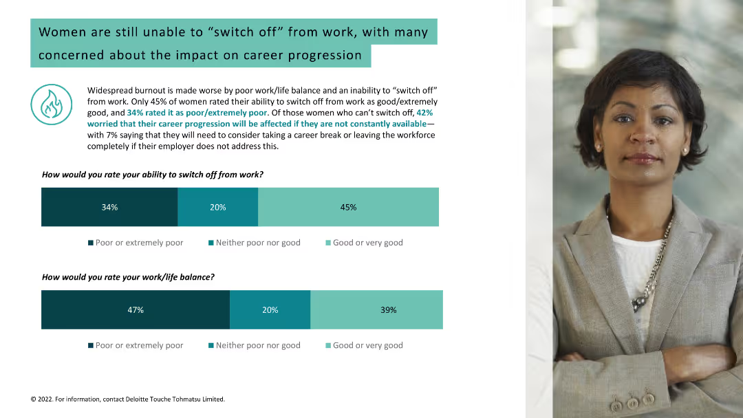
Light background with teal and black text. It includes two column charts about women's ability to switch off from work and their work/life balance, alongside a woman's photo.
Human Resources and Talent Management
Healthcare & Pharmaceuticals
Discusses widespread burnout due to poor work/life balance among women, concerns about career progression, and statistics on switching off from work and work/life balance.
burnout, work/life balance, women, career progression
Multiple Chart
Deloitte
Saved
This slide features a side-by-side column chart comparison for Millennials and Gen Z's top concerns from 2020 to 2021. The chart is color-coded in green and blue, respectively, with a clear label for each concern.
Market Analysis and Trends
Healthcare & Pharmaceuticals
The slide presents comparative data on the evolving personal concerns of Millennials and Gen Z, highlighting health care/disease prevention as a top priority due to the pandemic.
Health, Concerns, Millennials, Gen Z, Pandemic, Data, Column Chart, Survey, Environment, Prevention
Single Chart
Deloitte
Saved
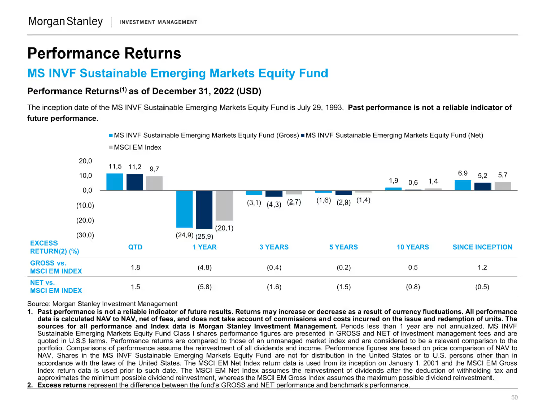
A column chart showing the performance returns of the MS INVF Sustainable Emerging Markets Equity Fund against the MSCI EM Index over different periods.
Financial Performance
Financial Services
This slide compares the performance returns of the MS INVF Sustainable Emerging Markets Equity Fund to the MSCI EM Index, highlighting excess returns.
Performance, Returns, Sustainable, Emerging Markets, Equity Fund, MSCI, Index, Financial, Comparison, Investment
Mixed Chart
Morgan Stanley
Saved
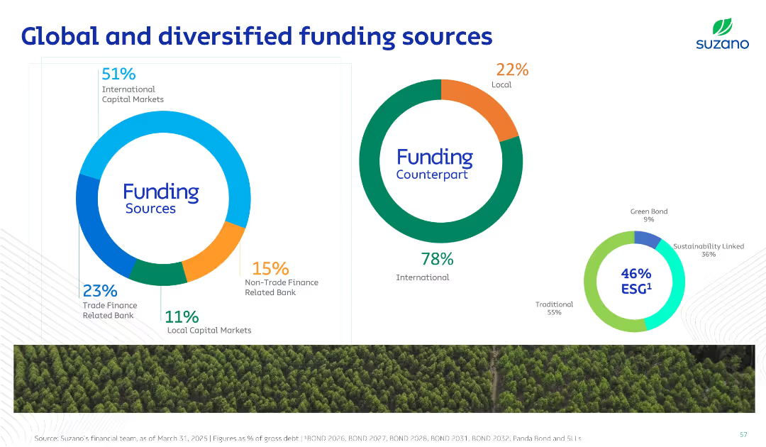
Three donut charts with distinct color schemes showing funding source distribution, counterpart breakdown (local/international), and ESG vs traditional debt split.
Investment Analysis
Consumer Goods
This slide visualizes the diversification of Suzano’s funding sources, highlighting a strong reliance on international capital and significant ESG-aligned funding. It emphasizes strategic capital sourcing and sustainability.
Funding, ESG, Capital Markets, Diversification, Debt
Single Chart
Goldman Sachs
Saved
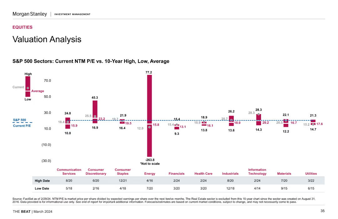
The slide includes a column chart comparing current NTM P/E ratios to 10-year high, low, and average for various S&P 500 sectors, highlighting notable variations.
Market Analysis and Trends
Financial Services
The slide offers a detailed valuation analysis of S&P 500 sectors, focusing on price-to-earnings ratios. Useful for sector-specific investment decisions.
valuation analysis, S&P 500, NTM P/E, sectors, market valuation, financial analysis
Mixed Chart
Morgan Stanley
Saved
This slide displays a column chart with six sets of bars representing different digital service sectors. It contrasts the incremental adoption in H1 2022 with adoption as of 2021. Annotations provide insights on e-commerce and digital media consumption. Colors vary in shades of blue.
Market Analysis and Trends
Technology & Software
The slide analyzes the normalization of digital adoption growth post-acceleration phase, showing the saturation in various sectors such as e-commerce and digital media. It is a market analysis tool that can be used to gauge the digital service sector's plateau in growth and the potential for market consolidation or diversification.
digital adoption, urban users, SEA, e-commerce, normalization, growth, sector saturation, column chart
Single Chart
Bain
Saved
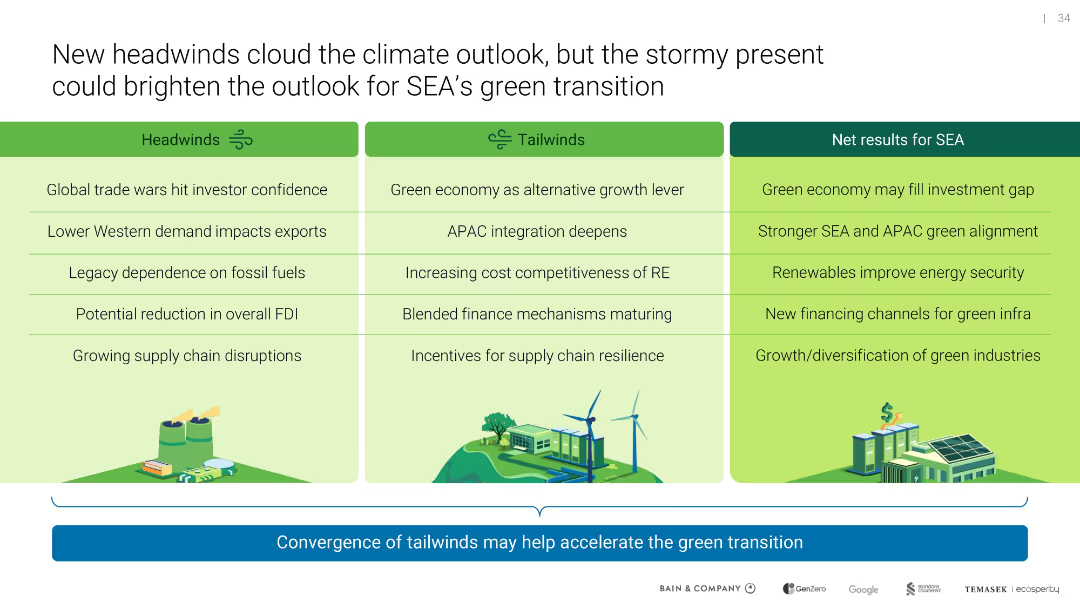
Three-column table labeled Headwinds, Tailwinds, and Net Results for SEA; icon illustrations reinforce thematic sections
Strategic Planning
Environmental Services & Sustainability
Contrasts risks and opportunities facing SEA’s green transition. Despite macroeconomic and political headwinds, tailwinds like maturing green finance and regional integration could accelerate sustainable outcomes.
headwinds, tailwinds, SEA, investment, renewables, supply chain
Table
Bain
Saved
Displays a split bar chart contrasting online and offline penetration in grocery vs. non-grocery e-commerce, accompanied by explanatory text.
Market Analysis and Trends
Retail & E-commerce
This slide identifies online grocery as a relatively untapped segment within e-commerce, presenting it as an area ripe for growth and innovation. It might be used to argue for investment in online grocery platforms or to inform strategic moves within the retail sector.
Online Grocery, E-commerce, Opportunity
Mixed Chart
Bain
Saved
Shows various graphs and charts detailing the segmentation of the European Earth Observation market over time.
Market Analysis and Trends
Technology & Software
Examines the changes and strategies within the European Earth Observation market, focusing on large satellite segments.
Market evolution, strategy, European EO market, satellite segmentation
Multiple Chart
PwC/Strategy&
Saved
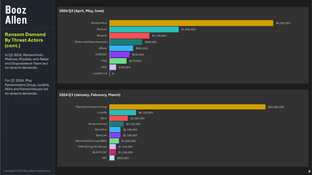
Two bar charts covering Q2 and Q1 2024 ransom demands by actor; summary text explains the leading groups per quarter; consistent layout with previous slide.
Risk Assessment and Management
Technology & Software
This continuation slide displays the ransom demands of threat actors in Q1 and Q2 2024. Play Ransomware Group dominated Q1, while RansomHub led in Q2. The diversity of actors and varying ransom amounts point to a fragmented yet aggressive threat environment across the year.
ransomware, ransom value, Booz Allen, Q1 Q2 2024, Play Ransomware, RansomHub, cyber threat actors, extortion levels, ransomware evolution
Multiple Chart
Booz Allen Hamilton
Saved
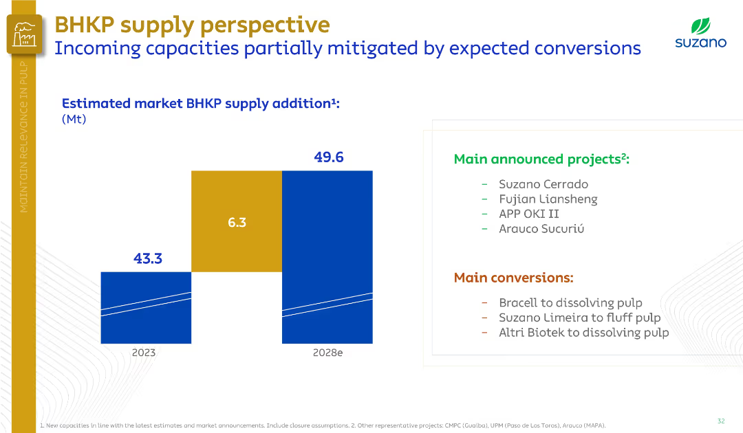
Left side shows bar chart of supply additions; right side lists new projects and conversions. Split layout, clean with minimal colors.
Market Analysis and Trends
Industrial & Manufacturing
The slide estimates BHKP market supply to increase from 43.3 Mt in 2023 to 49.6 Mt by 2028, offset by pulp conversions. Lists major new projects and planned mill conversions, helping stabilize market supply.
BHKP supply, pulp market, new projects, conversions, Suzano, capacity, 2028 forecast
Mixed Chart
Goldman Sachs
Saved
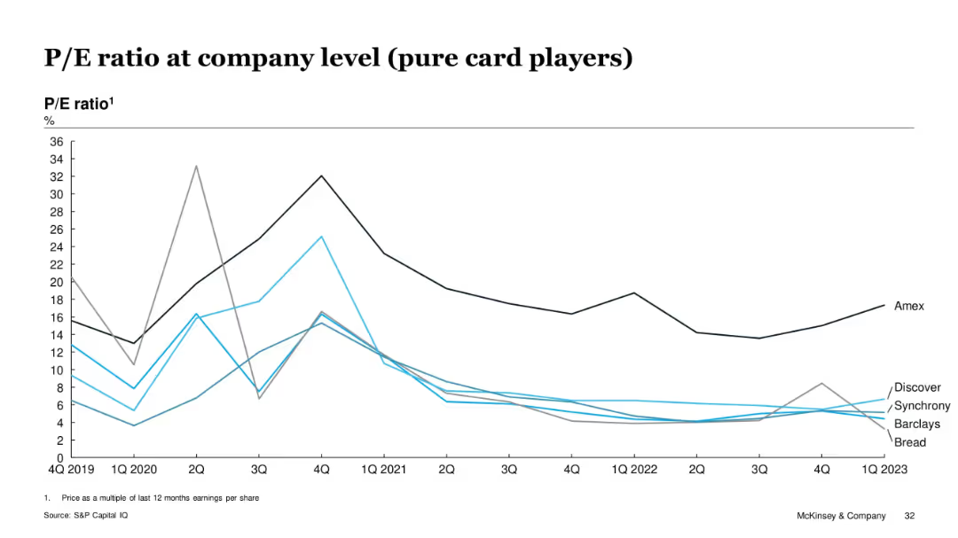
Line chart of P/E ratio trends from Q4 2019 to Q1 2023 for select pure card issuers
Investment Analysis
Financial Services
This slide tracks the P/E ratios of pure card issuers (Amex, Discover, Barclays, Synchrony, Bread) over time. Amex consistently maintains higher ratios, while others remain below, showing weaker earnings multiples. Peaks in early 2021 align with pandemic recovery effects.
P/E ratio, earnings, valuation, pure card issuers, McKinsey, stock analysis, Amex, Discover
Single Chart
McKinsey
Saved
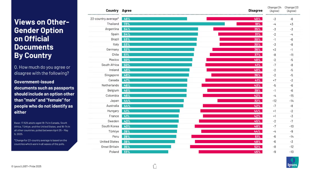
Horizontal bar chart showing country-by-country agreement/disagreement on third gender option for documents. Color-coded, with year-over-year change indicators.
Regulatory and Compliance
Government & Public Sector
This slide analyzes public sentiment in 23 countries on allowing a gender option other than "male" or "female" on official documents. It compares agreement and disagreement rates and provides context on changes since previous surveys.
gender options, nonbinary, legal documents, public opinion, transgender rights, third gender, country comparison, Ipsos, passport ID
Mixed Chart
IPSOS
Saved
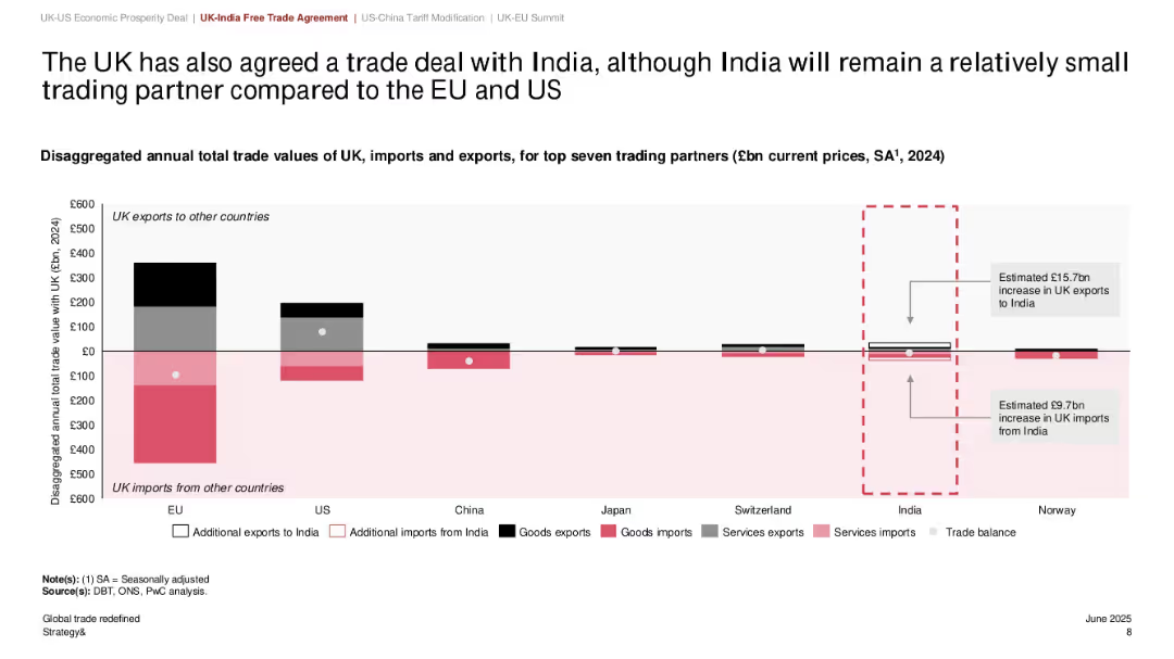
Bar chart comparing trade value with seven major countries; India trade section highlighted; use of black/red/gray with dotted annotation boxes
Strategic Planning
Government & Public Sector
The slide outlines the UK's trade relationships with major countries, emphasizing a new trade deal with India. Though India remains a small trade partner compared to the EU and US, the deal is expected to add £15.7bn in UK exports and £9.7bn in imports. The chart helps position India's role within the UK's overall trade strategy.
UK-India trade, exports, imports, trade agreement, economic relations, top partners, global strategy
Single Chart
PwC/Strategy&
Saved
Consists of textual analysis with pie charts reflecting survey data on modernization impact.
Strategic Planning
Financial Services
Discusses the advantages of digital transformation in investment firms and their future competitiveness.
digital transformation, investment, competitiveness, strategy, financial services
Mixed Chart
Deloitte
Saved
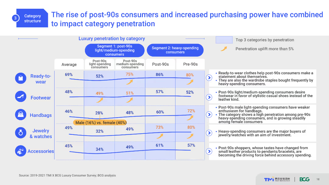
This slide includes a comparative layout with column charts and a table. It shows luxury category penetration by different consumer segments, highlighting the impact of post-90s consumers. The design is moderately complex with clear distinctions between segments and categories.
Market Analysis and Trends
Consumer Goods
This slide analyzes the influence of post-90s consumers on luxury market penetration across different categories. It compares segment-specific data, highlighting purchasing trends and the significant impact of younger consumers.
post-90s consumers, luxury market, category penetration, trends, consumer segments
Mixed Chart
BCG
Saved
Scatter plot, color-coded data, geographical references.
Risk Assessment and Management
Environmental Services & Sustainability
Compares companies' preparedness for climate change risk against natural hazard exposure.
Climate, risk, companies, preparedness, hazards, exposure, environment, strategy
Single Chart
PwC/Strategy&
Saved
Previous
Next
If nothing, comes up, please save your slides first
Create a FREE account to continue browsing
Receive Instant Access to 1,000+ slides from companies like McKinsey, Google, and Goldman Sachs
First Name
Last Name
Email
Password
I agree to all
Terms & Privacy Policy
Thank you! Your submission has been received!
Oops! Something went wrong while submitting the form.
Have an account?
Sign in
Column Chart
Heatmap
Chevron
Org Chart
Infographic
Callouts
Timeline
List
Graphic
Picture
Process Flow
Diagram
Paragraph
Map
Table
Framework
Subtitle
Takeaway Box
Icon
Other Chart
Radar Chart
Waterfall Chart
Mekko Chart
Pie Chart
Scatter Plot
Line Chart
Bar chart
Bullet points