Create a FREE Account
Instant access to 1,000+ real slides from top companies like McKinsey, BCG, Goldman Sachs, Google and many more!
First Name
Last Name
Email
Password
I agree to all
Terms & Privacy Policy
Thank you! Your submission has been received!
Oops! Something went wrong while submitting the form.
Have an account?
Sign in
Library
Templates
Courses
Pricing
My Account
My Slides
My Templates
✦ AI
AI Prompt Library
AI Search
Sign in
Start Here
Logout
My Saved Slides
Three pie charts showing the composition change of the MSCI Emerging Markets Index over time, from 2004 to 2024.
Market Analysis and Trends
Financial Services
Displays the changes in the composition of the MSCI Emerging Markets Index, illustrating shifts in regional market shares over 20 years.
emerging markets, index composition, MSCI, pie charts, market analysis, regional shifts, historical data, projections
Multiple Chart
JP Morgan
Saved
A column chart comparing the approximate values lost by users during incidents such as hacking, fraud, or scams in 2023 and 2022.
Risk Assessment and Management
Financial Services
This slide displays the reported financial losses during incidents involving hacking or fraud on crypto trading platforms, comparing 2023 and 2022.
Value, loss, incident, hacking, fraud, 2023, 2022
Mixed Chart
IPSOS
Saved
This slide features texts and percentages comparing aspects like development opportunities, compensation, and workplace conditions between Ukraine and Global statistics. There are illustrations of diverse individuals on the left side.
Human Resources and Talent Management
Professional Services
This slide presents data on how employees' influence varies by region in aspects such as development opportunities, compensation, and workplace conditions. It contrasts these aspects between Ukraine and globally, highlighting regional differences and focusing on employee empowerment strategies.
Employee, Influence, Global, Ukraine, Data
Table
Deloitte
Saved
Four quadrant charts covering Total, Venture, M&A, and PE activity in EMEA; blue and purple elements with declining trend lines
Financial Performance
Financial Services
EMEA fintech deal value in H1 2021 nearly matches all of 2020. Charts show moderate decreases in deal count but increasing deal value across all investment types, especially in venture capital. The region shows robust activity despite fewer deals, suggesting larger individual transactions.
EMEA, fintech investment, PE, VC, M&A, deal value, 2021 trends, H1 comparison
Multiple Chart
KPMG
Saved
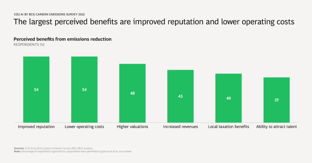
A column chart showing percentages of respondents citing various benefits from emissions reduction, including improved reputation, lower operating costs, higher valuations, increased revenues, local taxation benefits, and talent attraction.
Market Analysis and Trends
Environmental Services & Sustainability
Identifies and quantifies the primary benefits companies perceive from reducing emissions, emphasizing reputational and financial gains. Useful for advocating emissions reduction strategies to stakeholders.
benefits, emissions reduction, reputation, operating costs, survey results
Single Chart
BCG
Saved
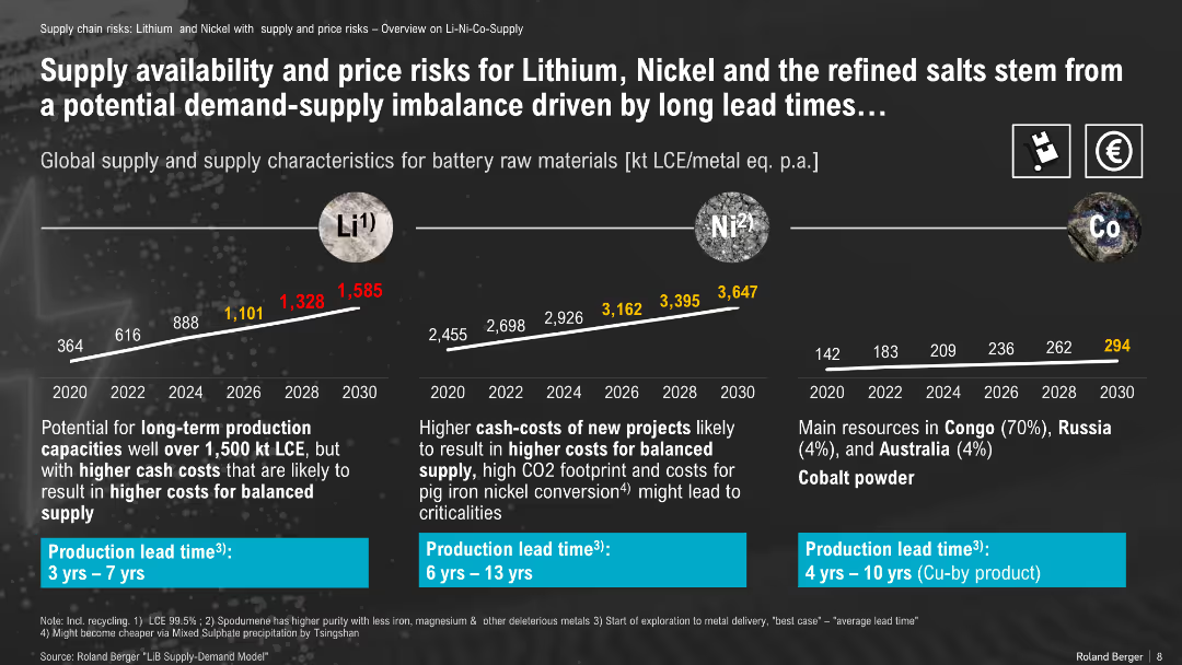
Line graph projections of material supply (Li, Ni, Co); includes mining lead times and cost risks
Risk Assessment and Management
Energy & Utilities
This slide outlines projected global supply of key battery materials (Li, Ni, Co) and highlights risks like high lead times and cost volatility due to mining complexity, regional concentration, and new project economics.
lithium, nickel, cobalt, supply chain, price risk, mining lead time, critical materials
Mixed Chart
Roland Berger
Saved
The slide contains a series of pie charts depicting the top skills required in risk management over the next three years, categorized by overall, G-SIB, and non-G-SIB responses.
Risk Assessment and Management
Financial Services
This slide identifies the top skills needed in the risk management function, such as data science, cybersecurity, and AI-based model risk management, crucial for future preparedness.
risk management, skills, pie charts, G-SIB, non-G-SIB
Multiple Chart
EY
Saved
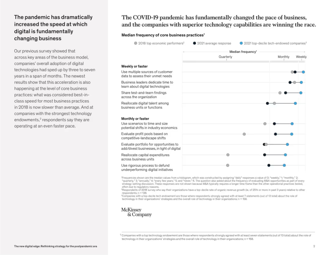
Right-heavy layout featuring dot plot chart comparing 2018 vs 2021 business process frequency across tech-maturity tiers. Left side contains narrative.
Market Analysis and Trends
Technology & Software
This slide demonstrates how COVID-19 accelerated digital transformation, especially in companies with strong tech capabilities. Business practices that were monthly in 2018 are now performed weekly, indicating a dramatic pace shift.
COVID-19 impact, digital acceleration, core processes, business transformation, tech capabilities, pace of change, pandemic disruption
Mixed Chart
McKinsey
Saved
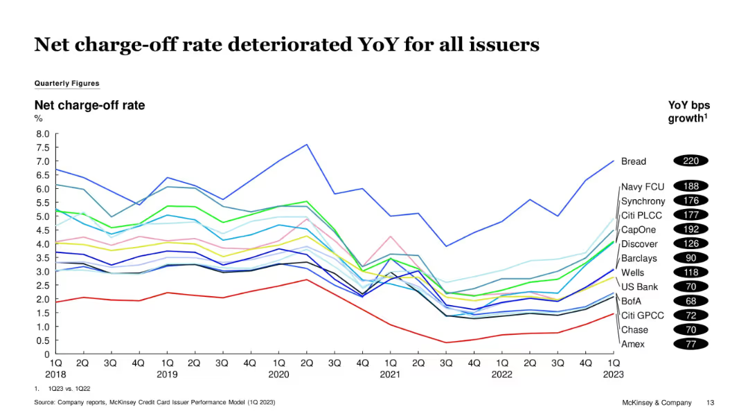
Multi-line chart displaying issuer-specific net charge-off rates from 1Q18 to 1Q23. YoY basis point growth values are shown in black ovals.
Risk Assessment and Management
Financial Services
The chart highlights a broad-based increase in credit card net charge-off rates YoY across issuers. Bread, Navy FCU, and CapOne experienced the most deterioration, suggesting growing borrower distress or looser underwriting.
Charge-offs, Credit Risk, YoY Growth, CapOne, Bread, Navy FCU, Credit Losses
Single Chart
McKinsey
Saved
The slide contains a mix of pie charts, bar graphs, and a global perspective table showing various digital strategies and their impacts.
Operational Efficiency
Technology & Software
The slide details various digital strategies that have had a positive impact on organizations, focusing on improved customer experiences, employee productivity, and adapting to remote work.
internal technology, efficiency, digital strategies, customer experiences, employee productivity
Mixed Chart
EY
Saved
Slide uses images and a circular diagram to explain the fleet composition strategy, comparing major and minor bulk vessels.
Strategic Planning
Transportation & Logistics
Describes the strategic approach of a shipping company in managing its fleet composition to optimize operational efficiency and market responsiveness.
fleet management, shipping, strategic planning, market adaptation
Header Horizontal
Deutsche Bank
Saved
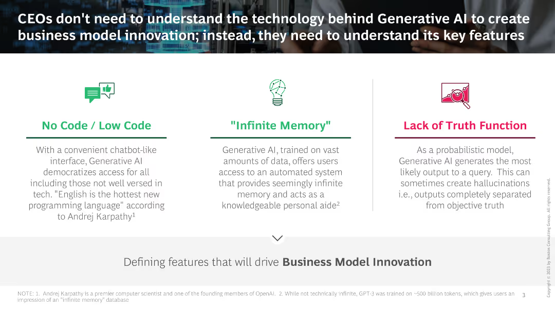
Three sections describing features of Generative AI: No Code / Low Code, "Infinite Memory", Lack of Truth Function, with icons and brief descriptions.
Technology and Digital Transformation
Technology & Software
The slide explains key features of Generative AI relevant for business model innovation, highlighting accessibility, extensive memory, and probabilistic output.
Generative AI, Business model, No code, Infinite memory, Truth function
Pillar
BCG
Saved
Timeline and bar chart showing the expected period for commercialization of various offshore wind technology innovations from 2015 to 2045.
Technology and Digital Transformation
Energy & Utilities
This slide details innovations in offshore wind technology, highlighting the potential for next-generation turbines and floating foundations to drive growth in the wind energy sector. It outlines the timeline for commercialization of various technological advancements in wind energy.
Wind Energy, Offshore Technology, Turbines
Mixed Chart
Roland Berger
Saved
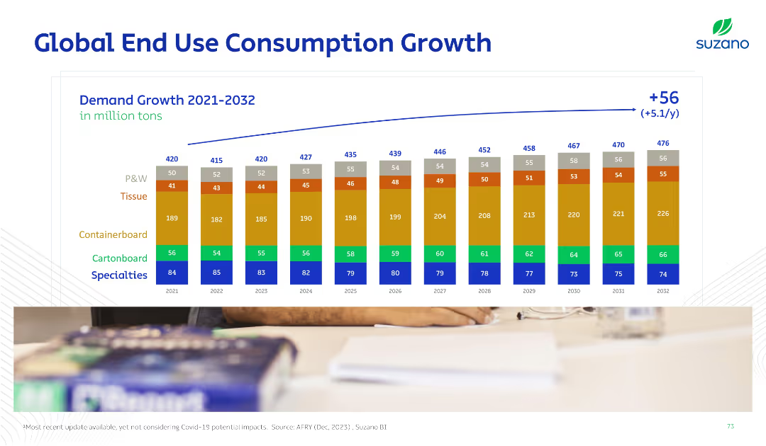
Horizontal bar chart over years with stacked categories (e.g., tissue, specialties). Blue arrow shows net increase. Color-coded for product types.
Strategic Planning
Industrial & Manufacturing
Forecasts global consumption growth across end-use pulp categories from 2021 to 2032. Categories like tissue and containerboard are emphasized, showing a +56 million ton increase with breakdowns by type.
consumption, end-use, tissue, containerboard, demand, forecast, growth, P&W, specialties
Single Chart
Goldman Sachs
Saved
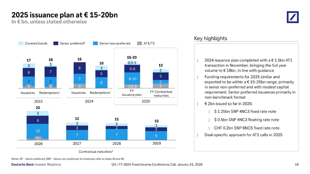
Multi-year bar charts showing issuance and redemption volumes by instrument type. The visual is compact and uses grouped colored segments. A side panel summarizes issuance plans and completions.
Strategic Planning
Financial Services
Deutsche Bank outlines its 2025 issuance plan (€15–20bn), including breakdowns of previous years (2023–2024) and upcoming maturities. It confirms the 2024 target was met with a €1.5bn AT1 issuance. The 2025 plan focuses on senior non-preferred and some capital instruments. A total of €2bn has already been issued in early 2025.
issuance plan, AT1, capital markets, funding, 2025, redemptions, maturities, senior non-preferred, Deutsche Bank
Multiple Chart
Deutsche Bank
Saved
Column chart showing financial management status of households in May 2020 and December 2020, with categories for well, quite well, getting by, etc.
Financial Performance
Financial Services
Highlights the financial management status of households during the COVID-19 pandemic, comparing perceptions between two periods.
financial management, COVID-19, household finances, comparison, economic stability
Single Chart
IPSOS
Saved
The slide presents a combination of column charts and tables, detailing the number of IPOs and proceeds across the Asia-Pacific region. It includes stock exchange data and sector breakdowns.
Market Analysis and Trends
Financial Services
The slide examines the mixed momentum in the Asia-Pacific IPO market, with a focus on the leading growth in Indonesia and Japan. It provides comprehensive data on the number of IPOs, proceeds, and top stock exchanges and sectors.
Asia-Pacific IPOs, regional growth, stock exchanges, sector analysis, financial trends
Multiple Chart
EY
Saved
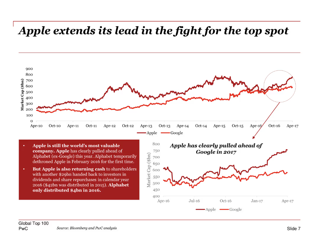
A line chart comparing the market cap of Apple and Google over time, with annotations highlighting key points in their competition.
Competitive Landscape
Technology & Software
Highlights Apple's dominance in market capitalization over Google, emphasizing key periods where Apple pulled ahead. Includes insights on Apple's shareholder returns and dividends.
Apple, Google, market cap, competition, line chart, shareholder returns, dividends, market trends
Multiple Chart
PwC/Strategy&
Saved
Three column charts comparing net new money/assets and net new deposits across different quarters and businesses.
Market Analysis and Trends
Financial Services
The slide compares wealth management and Swiss business flows, showing positive contributions from Credit Suisse quarter-to-date.
wealth, management, deposits, UBS, Credit Suisse
Multiple Chart
UBS
Saved
Slide shows bar charts and adjustments in financial figures with annotations for specific impacts like FX and IT services on Deutsche Bank's adjusted costs.
Financial Performance
Financial Services
Provides a breakdown of Deutsche Bank’s adjusted costs for Q3 2023 with a focus on year-over-year changes and specific cost drivers.
costs, financial analysis, banking, year-over-year, adjustments
Mixed Chart
Deutsche Bank
Saved
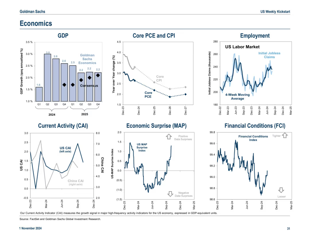
6-panel layout including GDP, inflation (CPI/PCE), employment, current activity, economic surprises, and financial conditions. Consistent blue-white aesthetic and small-multiple layout.
Market Analysis and Trends
Government & Public Sector
A macroeconomic snapshot featuring GDP growth, inflation trends, jobless claims, and sentiment indicators like CAI, MAP, and FCI. These visuals provide insight into the broader economic backdrop for market expectations.
GDP, inflation, CPI, employment, economic surprise, CAI, FCI, macroeconomic trends
Multiple Chart
Goldman Sachs
Saved
Features column charts showing inter- and intraregional merchandise export growth from 2000 to 2016 for various regions. The charts are color-coded to distinguish between years and include percentage changes.
Market Analysis and Trends
Financial Services
Provides an analysis of growth in merchandise exports over 16 years, segmented by region. Key for evaluating market trends and developing regional trade strategies.
trade, growth, exports, regional, interregional
Graphic
Roland Berger
Saved
The slide provides column charts comparing perceptions of HR leaders and non-HR leaders on the effectiveness of HR functions in delivering workforce strategy.
Market Analysis and Trends
Professional Services
Assesses differing perceptions between HR and non-HR leaders regarding the effectiveness of HR strategies in adapting to market changes and achieving organizational goals. Useful for identifying areas for improvement in HR practices and alignment with overall business strategy.
HR effectiveness, workforce strategy, leadership perceptions, organizational alignment, HR practices
Single Chart
PwC/Strategy&
Saved
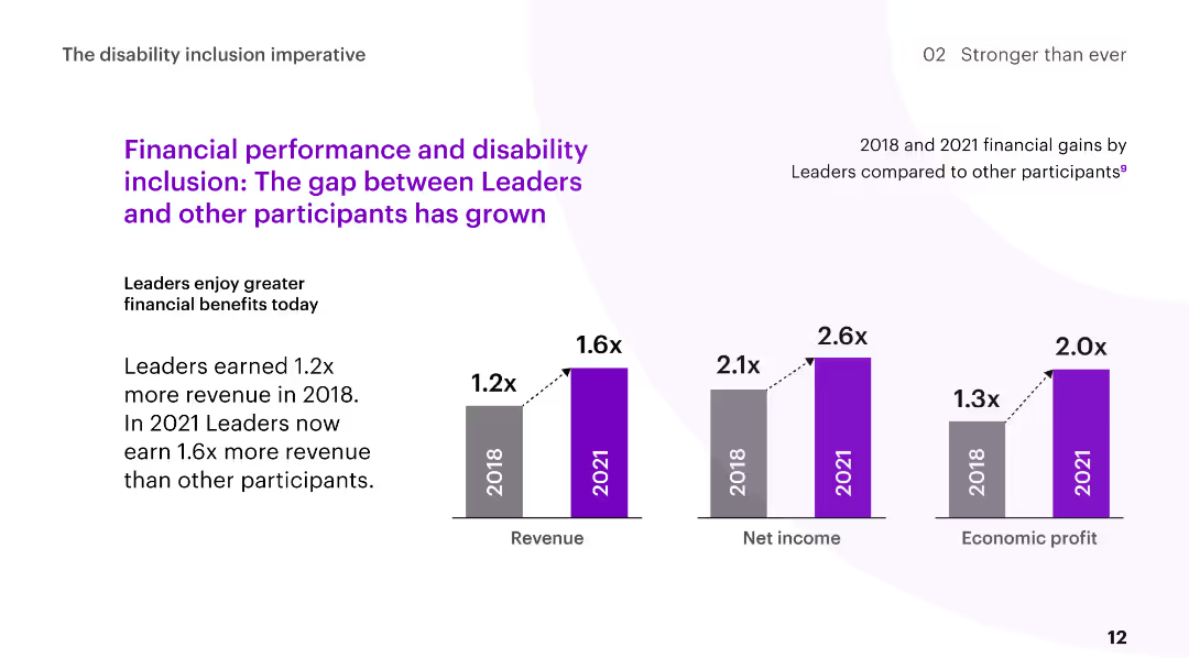
The slide features column charts comparing the financial gains of Disability Inclusion Leaders to other participants in 2018 and 2021, with commentary on the increasing gap.
Human Resources and Talent Management
Professional Services
The slide discusses the growing financial benefits for Disability Inclusion Leaders, showing higher revenue, net income, and economic profit over time compared to other participants.
disability inclusion, financial performance, revenue growth, comparison, leaders
Multiple Chart
Accenture
Saved
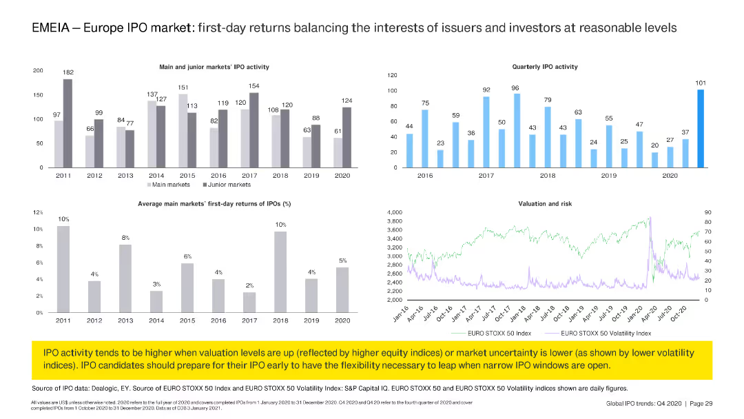
The slide includes two column charts displaying IPO activity and first-day returns in main and junior markets from 2011 to 2020. A line chart shows valuation and risk trends over time.
Market Analysis and Trends
Financial Services
Analyzes first-day returns of IPOs in Europe's main and junior markets, showing trends from 2011 to 2020. Highlights the relationship between IPO activity, valuation, and market risk.
IPO, Europe, first-day returns, market trends, valuation, risk, financial services, EMEIA
Multiple Chart
EY
Saved
Previous
Next
If nothing, comes up, please save your slides first
Create a FREE account to continue browsing
Receive Instant Access to 1,000+ slides from companies like McKinsey, Google, and Goldman Sachs
First Name
Last Name
Email
Password
I agree to all
Terms & Privacy Policy
Thank you! Your submission has been received!
Oops! Something went wrong while submitting the form.
Have an account?
Sign in
Column Chart
Heatmap
Chevron
Org Chart
Infographic
Callouts
Timeline
List
Graphic
Picture
Process Flow
Diagram
Paragraph
Map
Table
Framework
Subtitle
Takeaway Box
Icon
Other Chart
Radar Chart
Waterfall Chart
Mekko Chart
Pie Chart
Scatter Plot
Line Chart
Bar chart
Bullet points