Create a FREE Account
Instant access to 1,000+ real slides from top companies like McKinsey, BCG, Goldman Sachs, Google and many more!
First Name
Last Name
Email
Password
I agree to all
Terms & Privacy Policy
Thank you! Your submission has been received!
Oops! Something went wrong while submitting the form.
Have an account?
Sign in
Library
Templates
Courses
Pricing
My Account
My Slides
My Templates
✦ AI
AI Prompt Library
AI Search
Sign in
Start Here
Logout
My Saved Slides
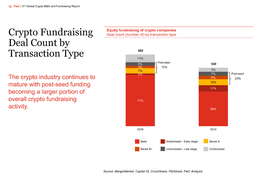
The slide contains a column chart comparing crypto fundraising deal counts by transaction type for the years 2018 and 2019. The chart shows the distribution of seed, Series A, Series B+, and undisclosed funding stages.
Market Analysis and Trends
Financial Services
The slide illustrates the maturation of the crypto industry with an increasing portion of post-seed funding. It compares the number of deals across different funding stages between 2018 and 2019, highlighting the growth in post-seed funding.
crypto, fundraising, transaction type, column chart, comparison
Mixed Chart
PwC/Strategy&
Saved
Half of the slide shows an image of hands exchanging a package, symbolizing supply chain activity. The other half lists six key steps with associated icons, designed to enhance supply chain security and efficiency.
Risk Assessment and Management
Transportation & Logistics
Offers recommendations on improving supply chain management, focusing on diversity, visibility, logistics optimization, ecosystem development, data monitoring, and ESG agenda. The slide is likely used in discussions about strengthening supply chain resilience in the face of increasing complexity and disruption.
Supply Chain, Security, Efficiency, Resilience, ESG
Boxed
Bain
Saved
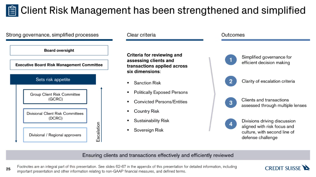
A diagram with three columns showing governance structure, criteria for reviewing clients and transactions, and outcomes. Contains text, bullet points, and arrows for escalation.
Risk Assessment and Management
Financial Services
The slide explains the enhanced and simplified client risk management process, detailing governance structures, risk criteria, and the expected outcomes for effective decision making.
governance, risk, criteria, outcomes, escalation
Header Horizontal
Credit Suisse
Saved
The slide contains column charts showing the progression of Equifax's Vitality Index over several years, emphasizing new product introductions and their impact on the index.
Performance Metrics and KPIs
Financial Services
This slide presents the performance of Equifax in terms of its Vitality Index, highlighting the success of new product introductions and their impact on company performance and strategic direction.
Vitality Index, performance, product introductions, Equifax
Mixed Chart
Barclays
Saved
A stacked column chart and pie chart slide with a segmented breakdown of revenue by region and business lines. Blue and brown hues denote different business areas.
Market Analysis and Trends
Financial Services
Showcases a financial firm’s revenue diversification and scale of operations, reflecting robust business performance across regions and services.
revenue, diversification, global, scale, financial, operations, performance, analysis
Mixed Chart
JP Morgan
Saved
The slide features three column charts and line icons in a well-organized layout. Green highlights and infographics are used to emphasize key data points.
Industry Overview
Education & Training
This slide presents data on the impact of community hubs on English language improvement and confidence boosting for immigrants. It utilizes various data visualizations to show improvements in language skills and the consequential increase in employment and social satisfaction.
community hubs, language improvement, confidence, employment, social connections
Multiple Chart
Deloitte
Saved
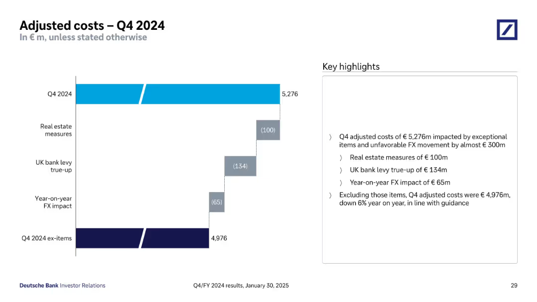
Waterfall chart showing Q4 2024 costs and exceptional item impacts; highlight bullets to the right
Operational Efficiency
Financial Services
This slide presents Q4 2024 adjusted costs of €5,276m, including exceptional items and FX impact totaling nearly €300m. A breakdown shows the impact of real estate measures, UK bank levy, and FX changes. Excluding these items, adjusted costs are €4,976m, down 6% YoY.
Adjusted Costs, Exceptional Items, FX Impact, Cost Reduction, Efficiency
Mixed Chart
Deutsche Bank
Saved
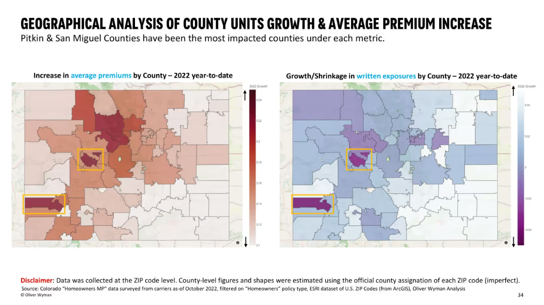
Side-by-side maps with county boundaries; left shows premium increases using a red heatmap, right shows growth/shrinkage in exposures with a blue/purple color scheme. Highlighted counties are boxed in yellow.
Market Analysis and Trends
Financial Services
This slide presents a county-level geographical comparison in Colorado, showing average premium increases and written exposure changes for 2022 YTD. Pitkin and San Miguel counties are highlighted as the most impacted. Visual heatmaps help emphasize regional differences in insurance metrics across ZIP codes mapped to counties.
geographic, premium increase, insurance, county analysis, written exposures, ZIP code, heatmap, Colorado
Multiple Chart
Oliver Wyman
Saved
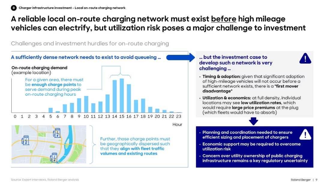
Left side shows charging demand over time and map-based charger siting need. Right section discusses investment hurdles and risks.
Regulatory and Compliance
Transportation & Logistics
The slide highlights that investment in local on-route charging must precede widespread electrification of high-mileage fleets. However, it stresses the challenge of ensuring high utilization rates to justify this upfront investment.
utilization, charging network, investment, electrification, high-mileage, planning, fleet, infrastructure
Mixed Chart
Roland Berger
Saved
The slide features multiple column charts comparing sustainability influence across generations.
Market Analysis and Trends
Environmental Services & Sustainability
Examines how sustainability influences purchasing behaviors across different generations globally.
sustainability, generations, influence, global, purchasing behavior
Multiple Chart
BCG
Saved
A set of stacked column chart with a high amount of detail, comparing global market sizes and concentration for agricultural inputs.
Market Analysis and Trends
Agriculture & Food Production
The slide compares the fragmented and concentrated sectors within the agricultural input provider market, highlighting major players.
agriculture, input providers, market concentration, fragmentation, fertilizers, seeds, equipment
Mixed Chart
EY
Saved
The slide features a column chart showing the breakdown of LCOH for the SMR example, including segments for Capex, startup costs, fuel, water, catalysts, labor and overhead, maintenance, insurance, and electricity selling. Each segment's percentage of total LCOH is displayed.
Financial Performance
Energy & Utilities
This slide provides a detailed breakdown of the LCOH for SMR, illustrating the contributions of various cost factors like Capex, fuel, and maintenance to the overall cost. It offers a financial analysis of hydrogen production using SMR.
LCOH, SMR, Cost Breakdown, Hydrogen, Financial Analysis
Single Chart
Kearney
Saved
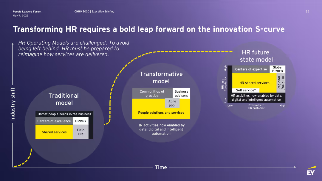
Three-part horizontal layout illustrating evolution from Traditional to Transformative to Future HR model using labeled circle diagrams, with a yellow dotted line representing industry shift over time.
Technology and Digital Transformation
Professional Services
This slide outlines the evolution of HR operating models from traditional to transformative and future-state frameworks. It highlights the impact of data, automation, and digital tools on HR service delivery. The innovation S-curve illustrates a necessary leap to stay relevant and meet business needs.
HR transformation, operating model, shared services, automation, innovation, S-curve, future of work
Single Chart
EY
Saved
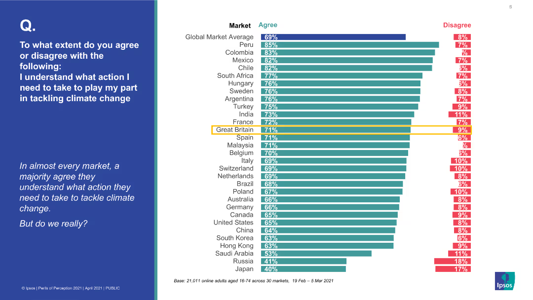
A bar chart with horizontal bars indicating the percentage of agreement and disagreement on understanding actions to tackle climate change across various countries. The left side features a blue background with a question.
Market Analysis and Trends
Environmental Services & Sustainability
The slide presents a global survey on the perception of understanding actions to tackle climate change, showing high agreement in most markets, but questioning if this understanding is real.
climate change, global survey, perception, actions, agreement, disagreement, countries, environmental understanding
Multiple Chart
IPSOS
Saved
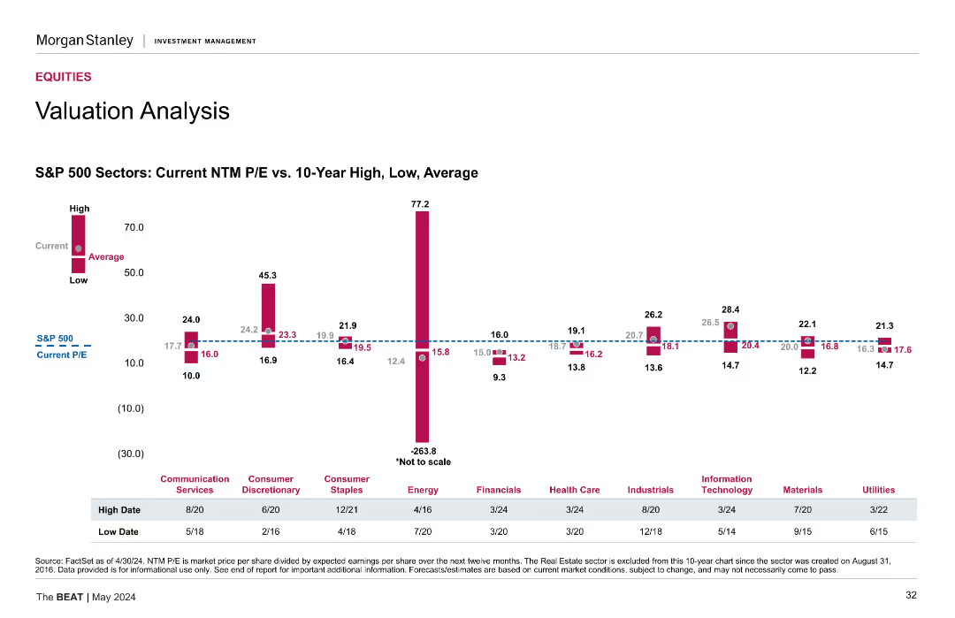
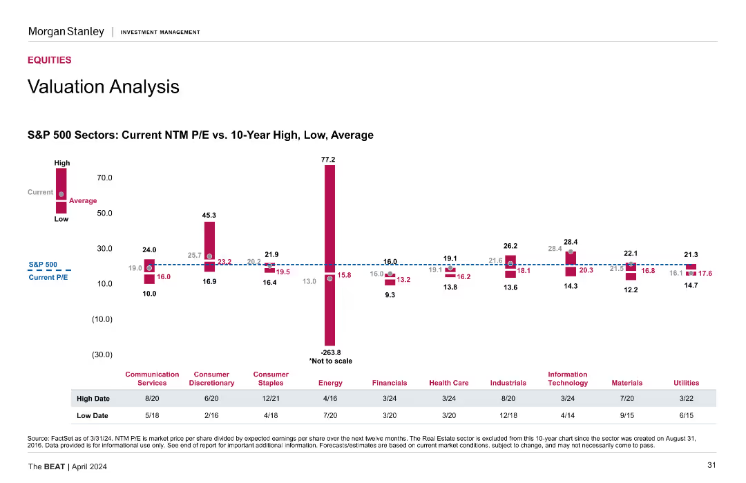
This slide presents a column chart showing the current NTM P/E ratios vs. 10-Year High, Low, and Average for S&P 500 sectors such as Communication Services, Consumer Discretionary, Energy, etc. The chart includes data points for high, current, and low P/E ratios.
Financial Performance
Financial Services
The slide offers a detailed valuation analysis of S&P 500 sectors, comparing current NTM P/E ratios with historical highs, lows, and averages.
Valuation analysis, NTM P/E, S&P 500, sectors, historical data
Mixed Chart
Morgan Stanley
Saved
Contains multiple vertical bars in two shades representing the expenditure allocations by department for two consecutive fiscal years.
Regulatory and Compliance
Government & Public Sector
This slide facilitates comparison of budget allocations across various government departments, aiding in departmental financial analysis and planning.
departmental, expenditure, budget, allocation, government, analysis, planning, fiscal, finance, comparison
Single Chart
PwC/Strategy&
Saved
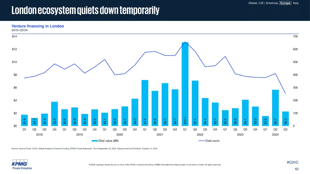
Similar to the previous slide but focused on London. Bar chart and line graph display quarterly venture deal value and count from 2018 to Q3 2024.
Market Analysis and Trends
Financial Services
Venture activity in London has declined in Q3 2024, following a peak in 2021. The chart suggests temporary cooling, possibly cyclical or linked to broader UK macro trends. The layout emphasizes historical data comparisons.
London, VC activity, deal count, quarterly trend, ecosystem, venture financing, 2024, capital flows, UK tech scene
Single Chart
KPMG
Saved
Column charts showing current NTM P/E vs. 10-year high, low, and average for different S&P 500 sectors.
Investment Analysis
Financial Services
Assesses sector-specific valuations, comparing current price-to-earnings ratios with historical data for S&P 500 sectors.
Sector Valuation, NTM P/E, S&P 500, Historical Data, Investment Analysis
Mixed Chart
Morgan Stanley
Saved
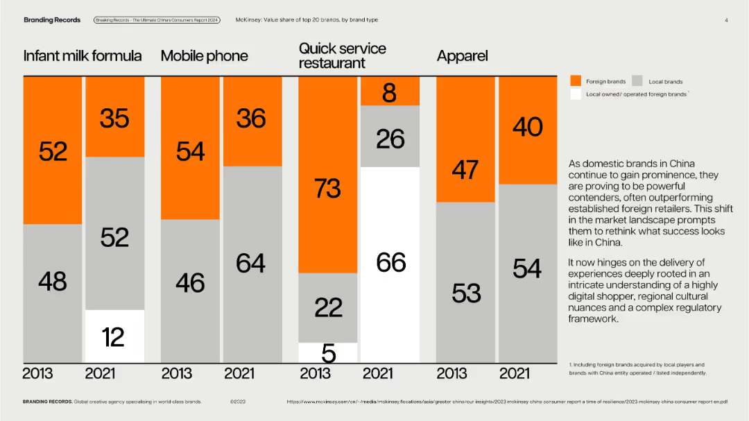
Vertical stacked bar charts with year-over-year brand type breakdowns by category; clean, grid layout.
Competitive Landscape
Consumer Goods
Displays value share of top 20 brands (foreign vs. local) in five product categories across 2013 and 2021, illustrating the growing prominence of local Chinese brands across sectors like mobile, apparel, and quick service restaurants.
local brands, market share, consumer goods, competition, China, brand shift
Mixed Chart
McKinsey
Saved
The slide is divided into four sections, each with an icon and text describing different strategies regarding talent resignation, from understanding drivers to handling exits.
Human Resources and Talent Management
Professional Services
The slide outlines a comprehensive strategy for managing talent resignation, emphasizing a preventative approach and the importance of a retention strategy for high-performing individuals. It is likely used in HR training or strategy meetings.
Retention Strategy, Talent Resignation, HR Management, Prevention
Header Horizontal
Kearney
Saved
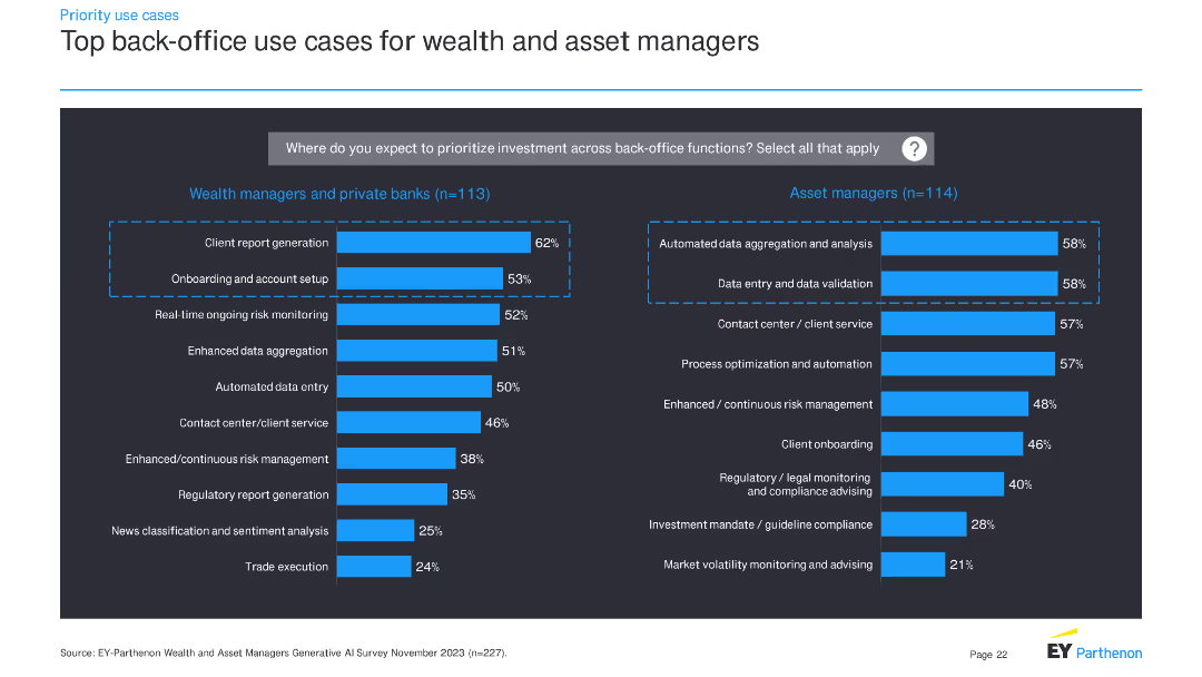
The slide presents two sets of horizontal bar charts: one for wealth managers and private banks, and another for asset managers. These charts display top back-office use cases for investment priorities.
Operational Efficiency
Financial Services
This slide details priority back-office use cases for wealth managers, private banks, and asset managers, indicating where these institutions plan to allocate investment to improve operational efficiency.
back-office, investment, use cases, financial services, wealth managers, asset managers, bar charts, priorities
Multiple Chart
EY
Saved
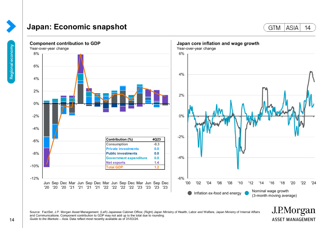
Features a column chart showing component contributions to GDP and a line chart for Japan core inflation and wage growth over time.
Market Analysis and Trends
Financial Services
Provides insights into Japan's economic performance by detailing GDP contributions and inflation trends, essential for market and economic analysis.
Japan, Economic snapshot, GDP, Inflation, Wage growth, Financial data, Market analysis, Economic trends, Forecasting
Multiple Chart
JP Morgan
Saved
This slide includes two column charts. The left chart shows UK mortgage rates over time for different loan-to-value ratios. The right chart presents UK housing market trends, including house prices and sales to stock ratio. The charts are clear with detailed annotations.
Market Analysis and Trends
Financial Services
This slide examines the UK housing market by analyzing mortgage rates, house prices, and market trends, useful for real estate market analysis and financial planning.
UK housing market, mortgage rates, house prices, sales to stock ratio, real estate
Multiple Chart
JP Morgan
Saved
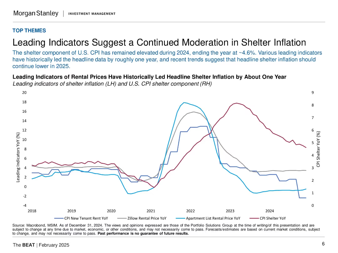
Line chart with four rental indicators and CPI shelter data. Minimal text, data-heavy with historical context.
Market Analysis and Trends
Real Estate & Construction
The slide presents rental price trends as leading indicators for shelter inflation in the U.S. It shows these indicators have declined ahead of CPI shelter, suggesting continued moderation in 2025. This is relevant for inflation expectations and interest rate decisions.
shelter inflation, CPI, rental prices, leading indicators, U.S. housing, macro trends, inflation outlook, interest rates
Single Chart
Morgan Stanley
Saved
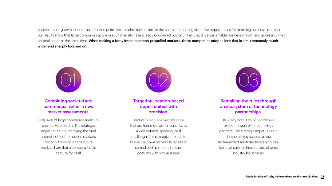
The slide is divided into three sections with circular icons, each section discussing a different strategic focus for new market assessments.
Market Analysis and Trends
Consumer Goods
The slide emphasizes the importance of combining societal and commercial value, targeting location-based opportunities, and leveraging technology partnerships for new market growth.
market assessment, societal value, commercial value, location-based, technology partnerships, consumer goods
Linear Flow
Accenture
Saved
Previous
Next
If nothing, comes up, please save your slides first
Create a FREE account to continue browsing
Receive Instant Access to 1,000+ slides from companies like McKinsey, Google, and Goldman Sachs
First Name
Last Name
Email
Password
I agree to all
Terms & Privacy Policy
Thank you! Your submission has been received!
Oops! Something went wrong while submitting the form.
Have an account?
Sign in
Column Chart
Heatmap
Chevron
Org Chart
Infographic
Callouts
Timeline
List
Graphic
Picture
Process Flow
Diagram
Paragraph
Map
Table
Framework
Subtitle
Takeaway Box
Icon
Other Chart
Radar Chart
Waterfall Chart
Mekko Chart
Pie Chart
Scatter Plot
Line Chart
Bar chart
Bullet points