Create a FREE Account
Instant access to 1,000+ real slides from top companies like McKinsey, BCG, Goldman Sachs, Google and many more!
First Name
Last Name
Email
Password
I agree to all
Terms & Privacy Policy
Thank you! Your submission has been received!
Oops! Something went wrong while submitting the form.
Have an account?
Sign in
Library
Templates
Courses
Pricing
My Account
My Slides
My Templates
✦ AI
AI Prompt Library
AI Search
Sign in
Start Here
Logout
My Saved Slides
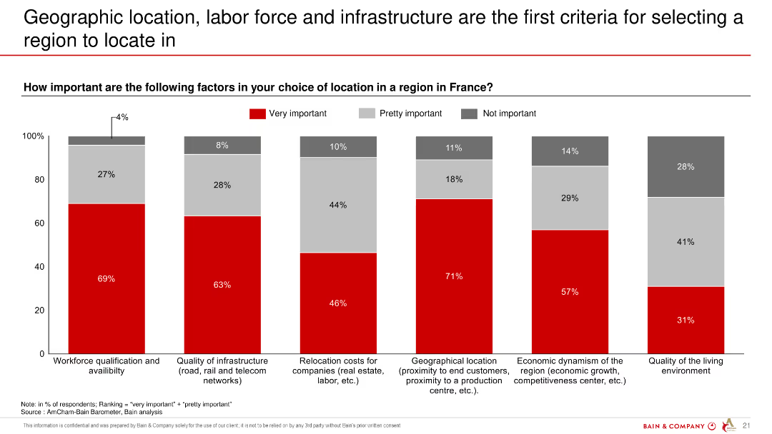
Column chart depicting the importance of various factors in choosing a location within France, highlighting workforce qualification, infrastructure, and geographic location.
Market Analysis and Trends
Professional Services
The slide discusses the key criteria for selecting a region in France, focusing on workforce qualification, infrastructure, and geographical location as primary factors.
geographic location, labor force, infrastructure, location criteria, France
Single Chart
Bain
Saved
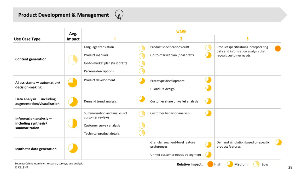
Table view; columns for Use Case Type, Avg. Impact, and Wave 1–3. Each cell includes specific examples (e.g., product specs, demand trend analysis) with impact rating icons (low, medium, high).
Product and Service Analysis
Financial Services
Maps GenAI use cases to stages of product development, showing progression from early drafts to highly tailored specs based on data insights. Tracks impact levels across waves, indicating which use cases have the greatest strategic benefit over time.
product development, AI assistant, data analysis, content generation, impact, GenAI
Single Chart
Oliver Wyman
Saved
The slide uses column charts to illustrate growth in advisors, client assets, and deposits, with a blue and green color scheme to represent different data segments over a five-year span.
Financial Performance
Financial Services
It outlines the firm's growth in terms of revenue, advisor count, client assets, and deposits, highlighting a significant positive trend in financial growth indicators.
growth, revenue, advisors, client assets, deposits
Multiple Chart
Goldman Sachs
Saved
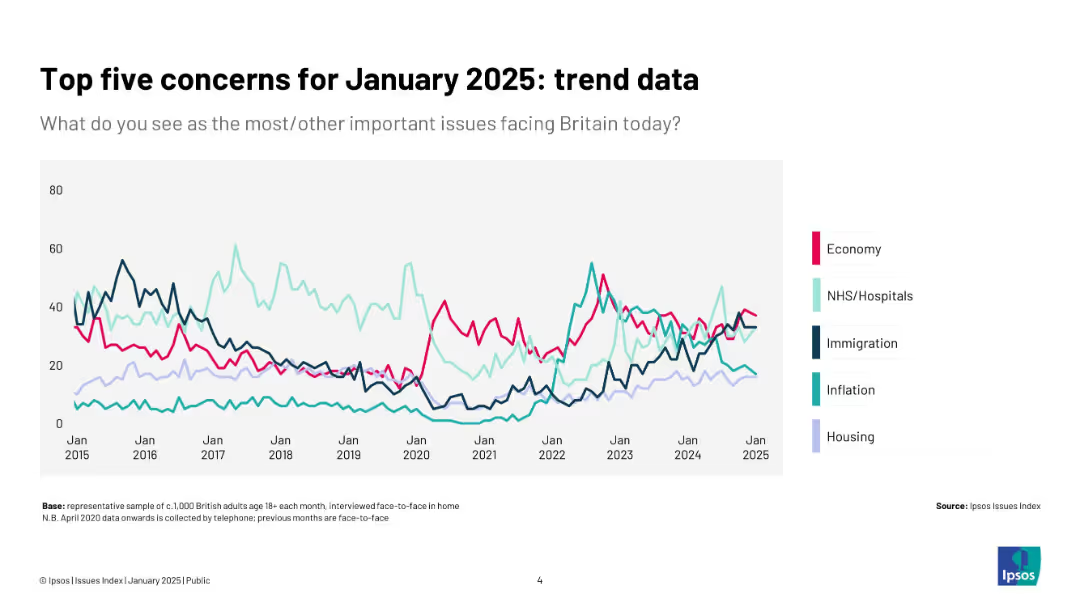
Line chart tracking five key concerns over time (2015–2025); colored lines with a legend on the right
Market Analysis and Trends
Government & Public Sector
The slide tracks trends in concern levels over a decade for economy, NHS, immigration, inflation, and housing. It shows how public concern fluctuates over time and peaks at various points.
trends, concern, Ipsos, UK, healthcare, economy, housing, inflation, immigration, public sentiment
Single Chart
IPSOS
Saved
Combination of table and column charts comparing sector performance, with emphasis on technology, financial, and communication sectors. Annotations explain key trends and figures.
Market Analysis and Trends
Financial Services
Evaluates year-over-year performance of critical economic sectors, providing a snapshot of industrial impacts on market capitalization.
sector performance, market analysis, economic trends
Mixed Chart
PwC/Strategy&
Saved
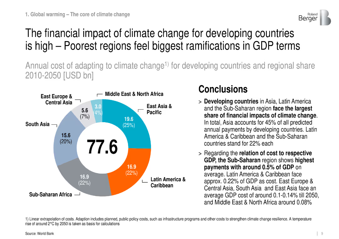
Donut chart showing regional cost distribution of climate change adaptation; key points on GDP impact.
Risk Assessment and Management
Environmental Services & Sustainability
Analyzes the disproportionate GDP cost burden of climate change adaptation on developing countries, especially Sub-Saharan Africa and Asia.
climate adaptation, GDP impact, developing countries, cost distribution
Mixed Chart
Roland Berger
Saved
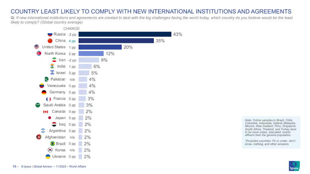
Horizontal bar chart showing which countries are perceived least likely to comply with new global agreements; dark color emphasis for top-ranked nations.
Risk Assessment and Management
Government & Public Sector
Shows that Russia (43%) and China (35%) are considered least likely to comply with new international agreements. The US follows at 20%. Chart highlights geopolitical distrust, especially toward authoritarian regimes.
compliance, international law, geopolitics, perception, global risk
Single Chart
IPSOS
Saved
The slide features column charts and a pie chart to show sector revenue diversification across various sectors including Pharma, Public Sector, GAFA, and CPG.
Market Analysis and Trends
Financial Services
The slide presents a revenue growth analysis of different sectors, highlighting CAGR from 2019-2022 and the share of revenue by sector in 2022.
Revenue diversification, sector analysis, column chart, pie chart, CAGR
Multiple Chart
IPSOS
Saved
The slide contains two sections: the top part with column charts showing adoption percentages for different technologies and the bottom part with another set of column charts illustrating use cases.
Technology and Digital Transformation
Technology & Software
This slide details the adoption rates of various emerging technologies and relevant use cases, showing the gap between current use and future willingness to adopt.
adoption curve, emerging technologies, use cases, technology adoption, future trends
Multiple Chart
EY
Saved
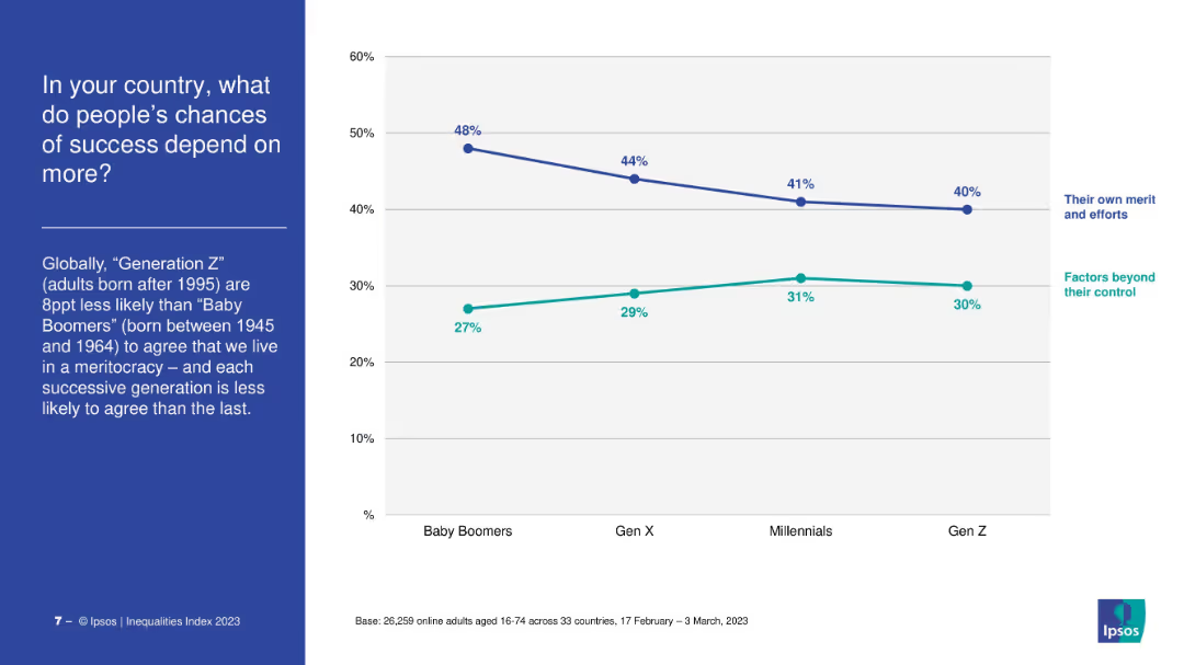
Dual-line chart comparing “merit/effort” vs. “factors beyond control” across generations. Title and text on the left.
Market Analysis and Trends
Government & Public Sector
The slide compares generational views on what influences success, revealing a decline in belief in meritocracy from Baby Boomers to Gen Z, who increasingly cite uncontrollable factors as more influential.
meritocracy, social mobility, Gen Z, inequality, generational comparison
Mixed Chart
IPSOS
Saved
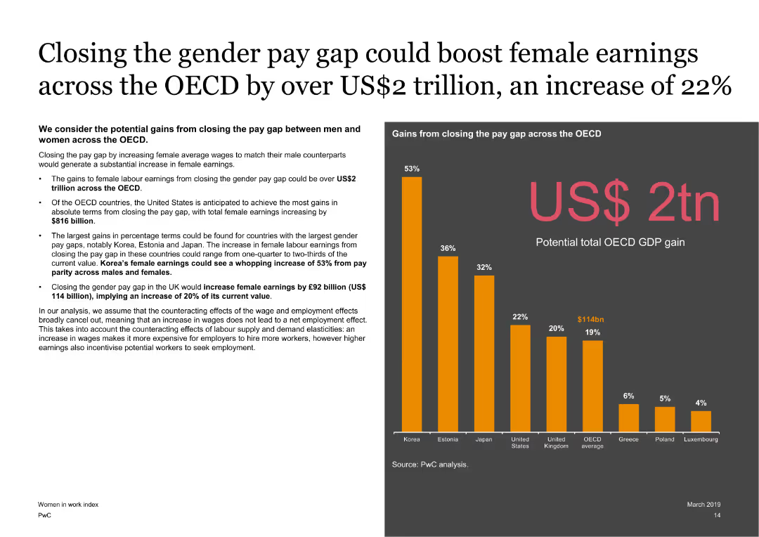
This slide features text on the left and a column chart on the right. The column chart shows gains from closing the gender pay gap across the OECD. The slide is moderately dense with detailed analysis.
Market Analysis and Trends
Government & Public Sector
Examines the potential gains from closing the gender pay gap between men and women across the OECD, highlighting significant gains in female earnings and economic benefits for various countries, especially the US and Korea.
gender pay gap, female earnings, OECD, economic impact, wage equality
Mixed Chart
PwC/Strategy&
Saved
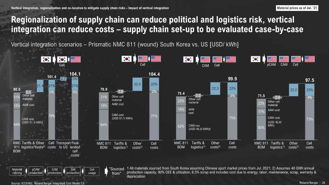
Comparative bar graphs of cost scenarios for various supply chains (South Korea vs. US); icons and flags used to denote material flow; breakdown by cost components
Operational Efficiency
Industrial & Manufacturing
The slide compares costs of vertical integration and regionalization of the battery supply chain across different configurations. It shows cost advantages of localized U.S. supply chains and how material origin affects final cell costs.
Supply Chain, Vertical Integration, Logistics, Battery Production, Cost Analysis, South Korea, U.S.
Multiple Chart
Roland Berger
Saved
The slide uses column charts and tables to present the number of IPOs and proceeds in Europe, the Middle East, India, and Africa. It also includes details on stock exchanges and sectors.
Market Analysis and Trends
Financial Services
The slide discusses the robust IPO market performance in EMEIA, despite uncertainties. It showcases data on the number of IPOs, proceeds, and details of key stock exchanges and sectors.
EMEIA IPOs, market performance, financial trends, stock exchanges, sector analysis
Multiple Chart
EY
Saved
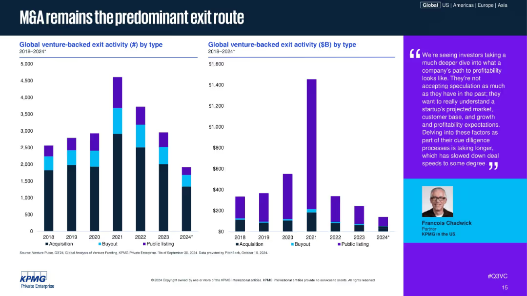
Bar charts showing exit activity by type (count & $ value), 2018–2024; color-coded by exit type (Acquisition, Buyout, Public); includes expert quote on right side.
Mergers and Acquisitions
Financial Services
The slide shows that M&A continues to be the dominant form of venture-backed exits, with public listings and buyouts significantly declining. An analyst quote underscores the increased scrutiny in due diligence, leading to slower deal speeds and more cautious exits.
M&A, venture exits, IPO, buyouts, exit strategy, acquisition trends, investor caution, startup exit, due diligence, Q3 2024
Multiple Chart
KPMG
Saved
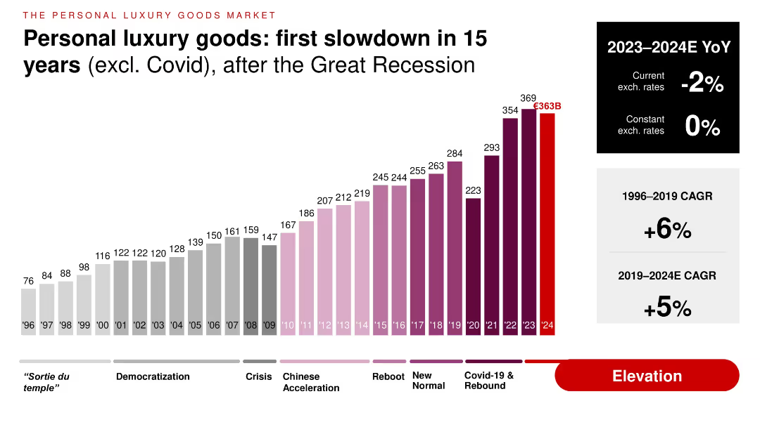
Vertical bar chart tracking market value from 1996 to 2024E, segmented by historical phases. Color-coded bars with YoY growth values noted on the right.
Financial Performance
Consumer Goods
Visualizes personal luxury goods market trajectory, highlighting a slowdown in 2024—the first decline in 15 years (excluding COVID). Displays compound annual growth rates (CAGR) over long-term and short-term periods, with a 2023–2024 YoY of -2% at current rates and 0% at constant rates.
luxury goods, CAGR, slowdown, market size, personal luxury, historical trend
Single Chart
Bain
Saved
Features a line graph showing world population estimates from 1950 to 2100, and several pie charts detailing global population characteristics in 2050 such as economic origin, residential area, and age distribution.
Market Analysis and Trends
Government & Public Sector
Slide discusses the declining rate of population growth due to lower fertility rates and its larger impact on less developed regions. Key points include the expected urbanization and the median age increase, reflecting broader demographic shifts.
population, fertility, urbanization, aging, development
Multiple Chart
Roland Berger
Saved
This slide features a simple color-coded design to showcase digital imperative achievements by different countries. Each country is represented with a flag, followed by bullet points outlining key initiatives and progress in digital infrastructure, talent, and other areas. There are no complex graphics, just organized, concise text descriptions.
Industry Overview
Technology & Software
It outlines key digital strategy achievements of various countries, like Thailand's network strategy and Estonia's e-governance. Each section lists specific initiatives, reflecting on how these countries are advancing their digital infrastructures and capabilities, investing in talent, and integrating ICT into education systems to keep pace with global technological imperatives.
Digital Strategy, Global, Thailand, Australia, Estonia, Malaysia, Singapore, South Korea, ICT, Education, Infrastructure, Talent
Header Vertical
Kearney
Saved
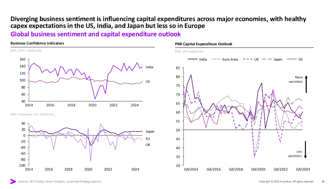
Two-panel line charts: Left shows business confidence indicators; Right shows PMI capital expenditure outlook across India, US, Euro area, UK, Japan.
Strategic Planning
Professional Services
The slide compares business sentiment and capex expectations globally. India and the US show stronger optimism, while Europe and Japan remain more subdued. It uses PMI and business confidence indicators to illustrate diverging economic outlooks.
business confidence, capex, India, US, Euro area, PMI, optimism, sentiment
Multiple Chart
Accenture
Saved
The slide includes a line chart and a bar chart. The line chart shows the 5-year excess return percentage over time. The bar chart compares various performance metrics such as gross return, net return, tracking error, and market capture.
Financial Performance
Financial Services
Evaluates the performance of J.P. Morgan's Growth Advantage Strategy SMA, focusing on risk-adjusted returns, tracking error, information ratio, and market capture metrics.
risk-adjusted returns, performance, strategy, metrics, consistency
Mixed Chart
JP Morgan
Saved
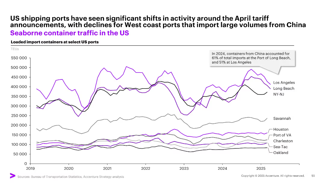
Multiline time-series graph showing TEUs of loaded imports at major US ports, color-coded by port.
Performance Metrics and KPIs
Transportation & Logistics
Depicts changes in import container volumes at key US ports from 2019–2025, noting a decline in West Coast ports due to April tariff shifts. Notes China's dominance in import origin volumes, with Long Beach and LA most affected.
shipping, TEU, tariffs, imports, China, ports, Long Beach, Los Angeles, NY-NJ, container traffic
Single Chart
Accenture
Saved
Slide with split design, left side features a bold percentage number and right side pie charts, minimal text, strong contrasting colors (green, purple), clear fonts.
Human Resources and Talent Management
Technology & Software
Discusses the influence of AI on job security and skills enhancement, highlighting differing perceptions among employees and leaders.
AI, jobs, upskilling, workforce, technology
Multiple Chart
BCG
Saved
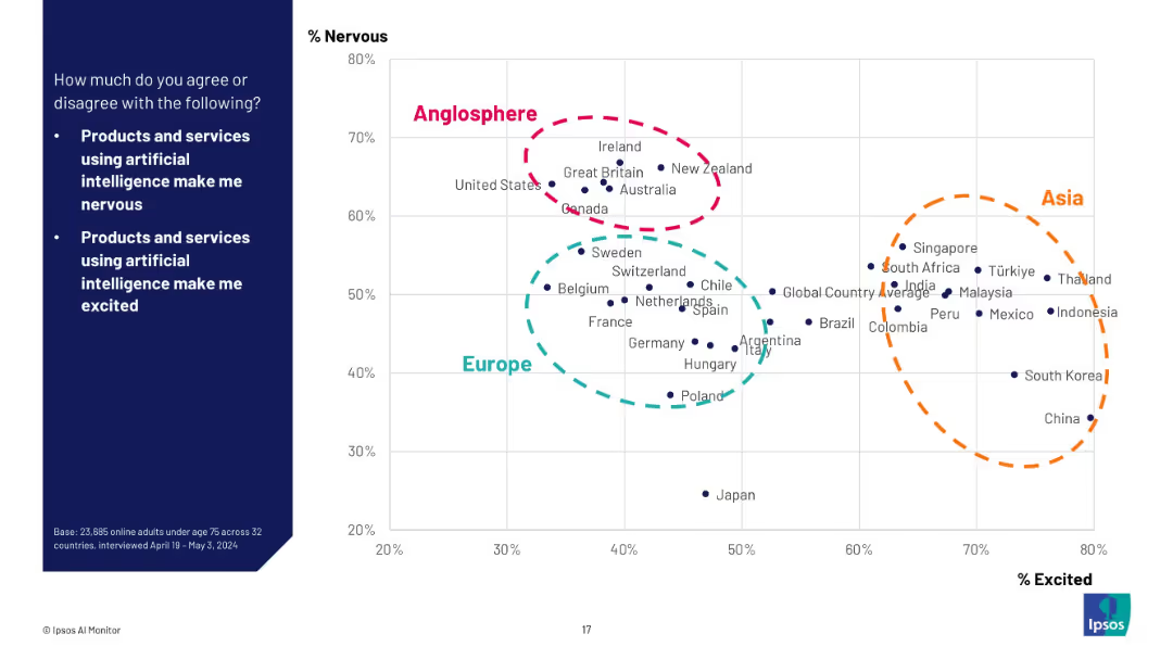
Scatterplot chart mapping countries by % Nervous (Y-axis) vs % Excited (X-axis); regions grouped (Anglosphere, Asia, Europe) using colored dashed circles.
Market Analysis and Trends
Artificial Intelligence
This visual plots countries’ attitudes toward AI on two dimensions—nervousness and excitement—highlighting regional clusters like Anglosphere, Asia, and Europe. It illustrates nuanced public opinion beyond binary agreement/disagreement.
scatterplot, sentiment mapping, AI perception, regional analysis, Ipsos, emotion, excitement vs fear, geopolitical comparison, global survey
Mixed Chart
IPSOS
Saved
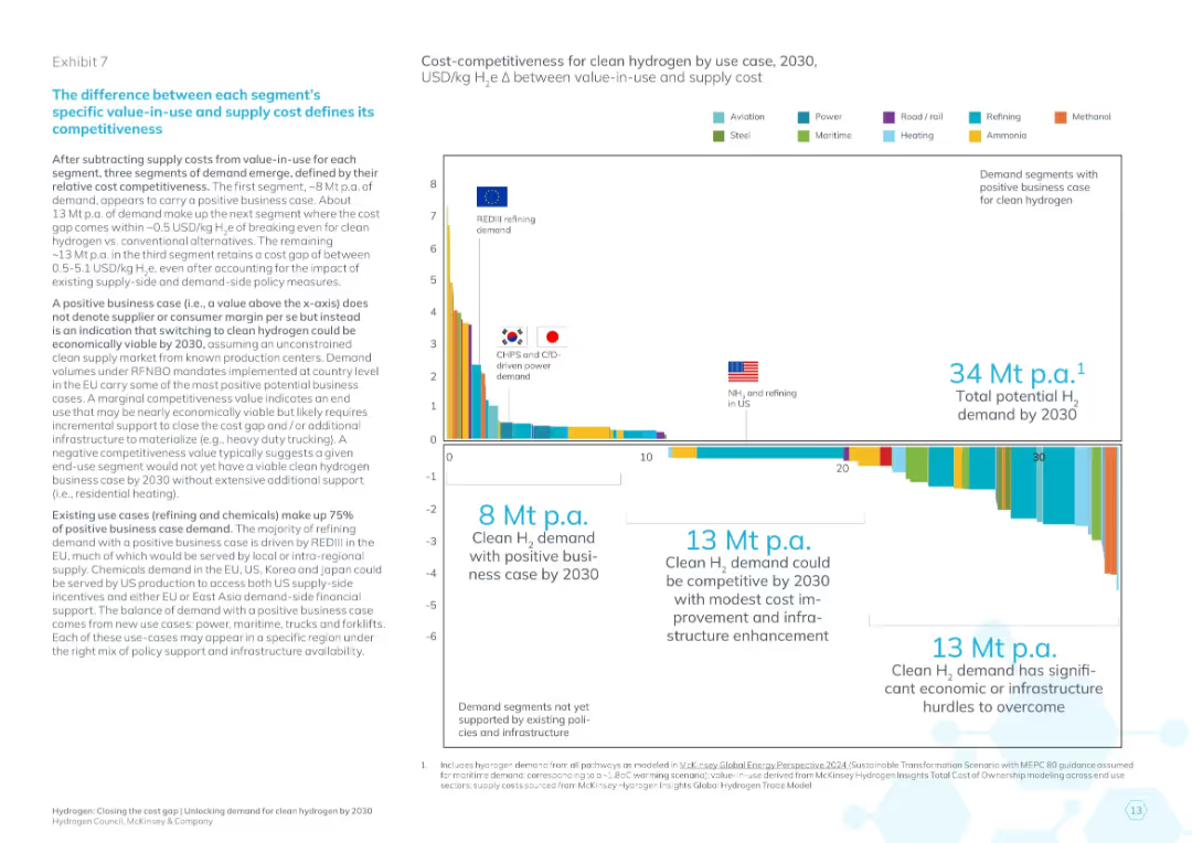
Vertical bar chart color-coded by use case; right side text box with key metrics; bottom with volume segments and annotations
Market Analysis and Trends
Energy & Utilities
This slide analyzes competitiveness by comparing value-in-use and cost of clean hydrogen across use cases. It segments demand into three groups: positive business case, marginally viable, and segments needing significant support. Key insights show which sectors and geographies are most likely to adopt clean hydrogen based on cost dynamics.
hydrogen segments, competitiveness, value-in-use, cost delta, demand breakdown, business case, EU policy, CHPS, refining
Mixed Chart
McKinsey
Saved
Features a line graph showing the projected levelized cost of energy for green hydrogen across three macro-zones in Chile until 2025.
Market Analysis and Trends
Energy & Utilities
Projects the decreasing costs of green hydrogen production in Chile's northern and southern zones, highlighting the competitive and uncompetitive regions.
Chile, hydrogen, cost analysis, LCOE, competitive zones, 2020-2025
Mixed Chart
McKinsey
Saved
This slide includes text on energy transitions, along with a graphic showing global final energy demand projections by fuel type and region.
Market Analysis and Trends
Energy & Utilities
The slide explores the varied pace of global energy transitions, predicting significant growth in renewable energy capacity and shifts in final energy demand by 2050.
energy transitions, renewable energy, global demand, fuel types, energy projections
Multiple Chart
EY
Saved
Previous
Next
If nothing, comes up, please save your slides first
Create a FREE account to continue browsing
Receive Instant Access to 1,000+ slides from companies like McKinsey, Google, and Goldman Sachs
First Name
Last Name
Email
Password
I agree to all
Terms & Privacy Policy
Thank you! Your submission has been received!
Oops! Something went wrong while submitting the form.
Have an account?
Sign in
Column Chart
Heatmap
Chevron
Org Chart
Infographic
Callouts
Timeline
List
Graphic
Picture
Process Flow
Diagram
Paragraph
Map
Table
Framework
Subtitle
Takeaway Box
Icon
Other Chart
Radar Chart
Waterfall Chart
Mekko Chart
Pie Chart
Scatter Plot
Line Chart
Bar chart
Bullet points