Create a FREE Account
Instant access to 1,000+ real slides from top companies like McKinsey, BCG, Goldman Sachs, Google and many more!
First Name
Last Name
Email
Password
I agree to all
Terms & Privacy Policy
Thank you! Your submission has been received!
Oops! Something went wrong while submitting the form.
Have an account?
Sign in
Library
Templates
Courses
Pricing
My Account
My Slides
My Templates
✦ AI
AI Prompt Library
AI Search
Sign in
Start Here
Logout
My Saved Slides
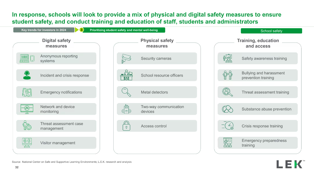
The slide has three columns listing digital safety measures, physical safety measures, and training/education/access measures. Each column includes multiple bullet points and icons representing each measure.
Strategic Planning
Education & Training
This slide outlines a comprehensive mix of safety measures for schools, covering digital and physical safety, as well as training and education for staff and students.
Safety, Measures, Training, Education, Digital, Physical, School, Security, Prevention, Strategy
Table
LEK
Saved
The slide features a green color scheme with a large column chart comparing the average maturity scores of brands with different levels of senior sponsorship. On the right, a quote in white text from a chairman of a Thailand-based company emphasizes the importance of digital marketing development.
Market Analysis and Trends
Media & Entertainment
This slide compares the maturity scores of brands with limited senior sponsorship and those with CEO sponsorship, illustrating a significant difference. A quotation from a travel company's chairman highlights leadership's role in digital marketing initiatives.
digital marketing, leadership, maturity, brands, sponsorship, Thailand, CEO
Mixed Chart
BCG
Saved
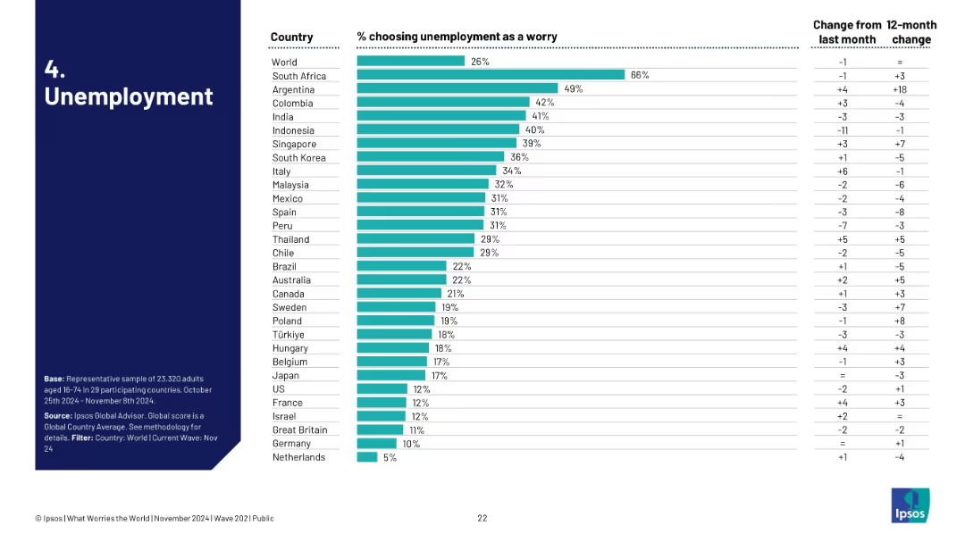
Bar chart ranked by country, showing % of people concerned with unemployment; includes monthly and yearly changes.
Market Analysis and Trends
Government & Public Sector
This slide visualizes unemployment as a global concern, ranked by country. South Africa leads with 66%, followed by Argentina and Colombia. It tracks month-over-month and 12-month shifts, showing evolving public sentiment on job insecurity.
unemployment, public concern, global trends, Ipsos, labor market, sentiment, survey, economic stress, job loss, perception
Single Chart
IPSOS
Saved
A balanced layout with three pie charts on the left and a list of bullet points on the right. The slide uses consistent color coding to categorize different investment types and geographic allocations.
Financial Performance
Financial Services
This slide examines the diversified portfolio and investment strategies, detailing the benefits for clients and shareholders, along with geographical distribution and asset class breakdown of the firm’s balance sheet investments.
Balance Sheet, Diversification, Portfolio, Investments
Multiple Chart
Goldman Sachs
Saved
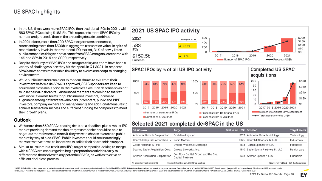
Contains column charts, tables, and detailed text sections with highlighted statistics. Uses red and yellow colors to differentiate SPAC IPO activities and data.
Market Analysis and Trends
Financial Services
Highlights US SPAC IPO activities for 2021, including key statistics, trends, sector performances, and an outlook on the SPAC market and its future.
US, SPAC, IPO, 2021 activity, market highlights, trends, sectors, performance, acquisitions, outlook
Multiple Chart
EY
Saved
Comprises a column chart depicting 'Economic benefits of Copernicus through its contribution to renewable energy monitoring' and a series of diagram depicting benefits for end and intermediate users.
Financial Performance
Energy & Utilities
Details the economic and environmental benefits derived from utilizing Copernicus data in the renewable energy sector, highlighting increased profitability and reduced GHG emissions.
Renewable Energy, Copernicus, Benefits
Mixed Chart
PwC/Strategy&
Saved
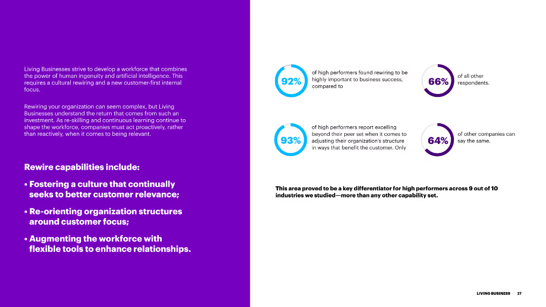
The slide features a purple background on the left and text on the right, with blue circular progress indicators. It discusses the importance of rewiring capabilities for better customer relevance.
Organizational Structure and Change
Government & Public Sector
This slide outlines the rewiring capabilities necessary for businesses to enhance customer relevance, including fostering a customer-focused culture and restructuring organizational frameworks.
rewiring, capabilities, customer relevance, culture, organizational structure
Multiple Chart
Accenture
Saved
Utilizes a white background with a complex diagram illustrating PwC's legal and operational structure across various countries and service lines. Text descriptions provide details about each entity.
Organizational Structure and Change
Professional Services
Detailed depiction of PwC's legal entities and operational hierarchy, showing the relationship between different branches worldwide. It's particularly useful for stakeholders and employees needing insight into the company's governance and legal framework.
legal structure, PwC, global operations, entities, governance
Diagram
PwC/Strategy&
Saved
Features multiple horizontal bar charts for different functions like Finance, HR, and IT, detailing specific processes like Accounts Payable and Payroll, showing their adoption rates.
Operational Efficiency
Professional Services
Details the most common processes managed through Shared Services Centers (SSCs), highlighting areas of high efficiency and common practices.
SSCs, processes, efficiency, finance, HR, IT, payroll
Multiple Chart
Deloitte
Saved
The slide presents bar graphs comparing the employment duration expectations of women with varying degrees of work flexibility. The color-coded design aids in distinguishing between the groups.
Performance Metrics and KPIs
Professional Services
Highlighting how work flexibility correlates with longer employment duration, this slide is vital for presentations on staff retention strategies and the importance of flexible working conditions.
flexibility, retention, employment, women
Multiple Chart
Deloitte
Saved
Block diagrams outline steps to create a resilient and agile organization, using a dual-tone color scheme for clarity.
Operational Efficiency
Professional Services
Details a five-step process to enhance organizational design for resilience and agility, preparing for the new reality with rapid assessment and implementation strategies.
Organizational design, Resilience, Agility, Productivity, Cost efficiency
Linear Flow
BCG
Saved
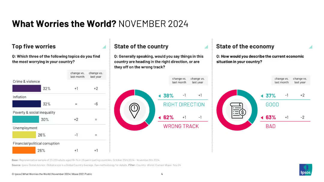
Three-column layout with bar charts, pie charts, and percentage deltas; minimalist, infographic style.
Market Analysis and Trends
Professional Services
This slide presents survey results from November 2024 identifying the top five global worries—crime/violence, inflation, inequality, unemployment, and corruption. It also reports on public sentiment regarding the direction of their country and their economy, showing more people feel things are on the wrong track.
crime, inflation, inequality, public sentiment, survey, Ipsos, trends, economy, global concerns, 2024
Multiple Chart
IPSOS
Saved
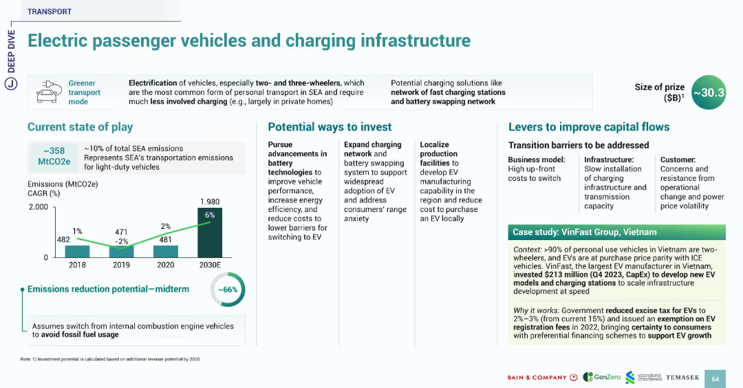
Uses familiar slide format with sections on current state, investment, barriers, and case study. Bright icons and data visualization maintain consistent transport theme.
Technology and Digital Transformation
Transportation & Logistics
Highlights the opportunity in electric passenger vehicles and associated charging infrastructure in SEA, which contributes 10% to SEA emissions. Suggests up to 66% reduction potential with a shift from fossil fuel vehicles. VinFast’s $213M investment in Vietnam illustrates local EV production and policy support. Government incentives like excise tax reduction and fee exemption are noted.
EV, charging, transport, SEA, emissions, VinFast, Vietnam, infrastructure, battery
Multiple Chart
Bain
Saved
The slide includes multiple column charts comparing the Levelized Cost of Hydrogen (LCOH) from different power sources over time (2019, 2025, 2030). Each chart shows cost variations for wind, solar, grid wind, and grid solar.
Market Analysis and Trends
Energy & Utilities
The slide analyzes the competitiveness of hydrogen production using electrolyzers powered by renewables versus grid-connected systems. It projects cost reductions over time and highlights the economic potential of renewable-powered electrolyzers.
LCOH, electrolyzer, renewable energy, hydrogen production, cost analysis
Multiple Chart
Kearney
Saved
The slide features a colorful index grid titled 'MGI Sector Digitization Index' comparing various sectors in terms of digital assets, usage, and labor. Accompanying the grid is a legend explaining the degree of digitization.
Market Analysis and Trends
Technology & Software
The slide provides an analysis of digitization levels across different sectors using an index that evaluates digital assets, usage, and labor. Each sector is color-coded to indicate its relative degree of digitization. This serves as a strategic tool to understand where digitization is most advanced and where there is potential for growth, aiding in decision-making for digital transformation initiatives.
Digitization Index, Sectors, Assets, Usage, Labor, ICT, Media, Finance, Manufacturing, Services, B2B, Technology Adoption
Mixed Chart
McKinsey
Saved
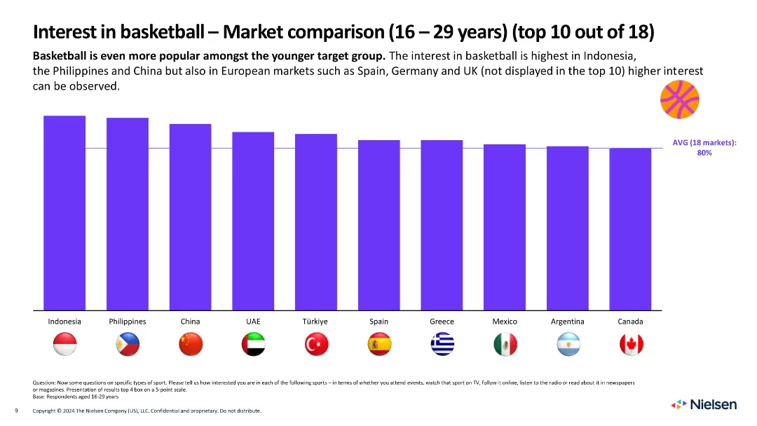
Bar chart with flags and bars representing top 10 countries by basketball interest among 16–29-year-olds; bold title, clean layout
Market Analysis and Trends
Media & Entertainment
Highlights the popularity of basketball among youth, especially in Indonesia, Philippines, and China. Visuals show rankings vs. 80% average interest across markets.
basketball, youth, market comparison, interest, global, Nielsen, countries, age group, bar chart, popularity
Single Chart
Nielsen
Saved
The slide displays a large column chart for net profit contribution over time and a donut chart for net operating income composition. It is clean and well-organized, with a white background and the Macquarie logo at the bottom left.
Financial Performance
Financial Services
Providing a financial performance review, this slide depicts the net profit contribution and net operating income sources for the commodities and global markets division. The visual data demonstrates the division's financial trajectory and income distribution across different areas.
net profit contribution, operating income, commodities, global markets, financial review, chart
Multiple Chart
Morgan Stanley
Saved
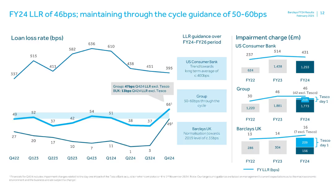
Dual-panel layout with line graphs and bar charts; impairment charge data on right; callouts and LLR commentary per business unit
Risk Assessment and Management
Financial Services
Examines Barclays' loan loss rate (LLR) trends across FY24, breaking out specific charges including Tesco acquisition effects. Guidance for 50–60bps cycle average and analysis of UK Consumer Bank and Group-level trends is presented.
loan loss rate, LLR, impairment charge, Tesco, Barclays, FY24, guidance, risk management
Multiple Chart
Barclays
Saved
This slide has two line charts and one column chart. The line charts display commercial mortgage spreads over Treasury for different asset classes, and the column chart shows commercial mortgage yields by sector for 1Q24.
Market Analysis and Trends
Financial Services
The slide analyzes commercial mortgage loans, focusing on spreads over Treasury and yields by sector, offering insights into the commercial real estate lending market.
mortgage loans, spreads, yields, commercial real estate, market analysis
Multiple Chart
JP Morgan
Saved
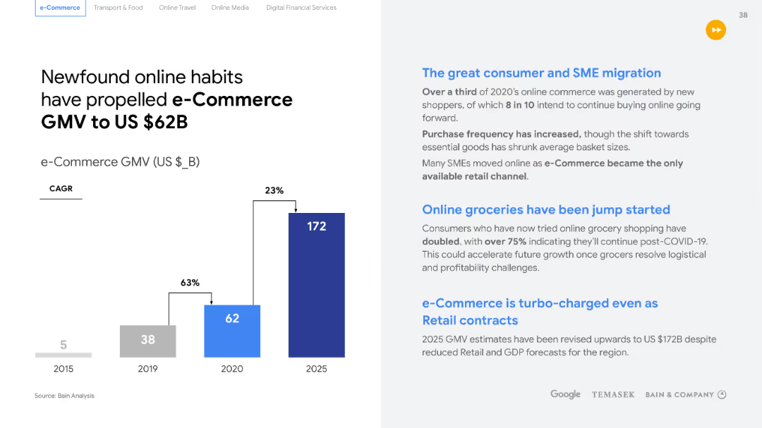
Contains a large title, two sections of text, and a column chart with projected growth figures. The layout is simple with clear separation between text and graphics.
Market Analysis and Trends
Retail & E-commerce
Highlights the surge in e-commerce GMV to $62B and explores factors like consumer and SME migration, online grocery shopping, and the diversification of e-commerce. Useful for analyzing e-commerce trends.
e-Commerce, GMV, consumer trends, SME migration, online grocery, diversification
Mixed Chart
Bain
Saved
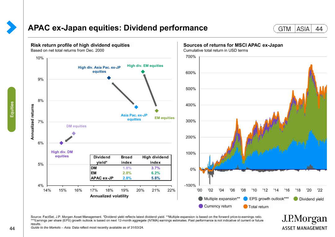
The slide includes a scatter plot showing the risk-return profile of high dividend equities and a line chart depicting sources of returns for MSCI APAC ex-Japan equities. Color coding is used to differentiate data points.
Financial Performance
Financial Services
This slide evaluates dividend performance for APAC ex-Japan equities, comparing risk-return profiles and sources of returns. It is useful for financial performance analysis and investment strategy development.
APAC, dividend performance, risk-return, equities, MSCI, financial analysis, investment strategy
Multiple Chart
JP Morgan
Saved
This slide juxtaposes "Before" and "Future" scenarios with two images, representing the shift from manufacturing to a consumer-driven economy. Includes bar graphs showing GDP contribution changes over decades.
Strategic Planning
Financial Services
Discusses China's economic transformation from a global manufacturing hub to a more diversified, consumption-driven economy. Useful for understanding shifts in economic strategies.
manufacturing, consumption, China, economic transformation, GDP, services sector
Mixed Chart
BCG
Saved
The slide features two charts: a bar chart on the left showing the average age of commercial aircraft in the U.S. from 1993 to 2022, and a column chart on the right depicting the U.S. airline passenger miles flown annually from 1970 to 2022. The charts use vertical bars to represent data points and include a clear legend.
Market Analysis and Trends
Transportation & Logistics
This slide analyzes trends in the global airline industry, focusing on the aging fleet of commercial aircraft in the U.S. and the increase in passenger miles flown. It provides insights into the operational dynamics and growth of the airline sector.
Airline industry, aircraft age, passenger miles, aviation trends, fleet management, industry analysis, air travel
Multiple Chart
JP Morgan
Saved
Includes two line graphs tracking the average spread and annual default rate over time, with color coding to distinguish between loans and high yield corporate data.
Risk Assessment and Management
Financial Services
Analyzes the risk in the corporate bond market by displaying historical trends in credit spreads and default rates, useful for assessing the volatility and stability of the bond market.
corporate bonds, risk assessment, default rate, line graphs, credit spreads, market analysis
Multiple Chart
Morgan Stanley
Saved
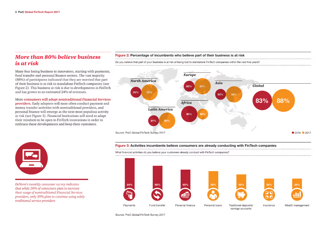
A world map highlighting regions' beliefs about business risks with percentages and a column chart showing incumbents' views on FinTech-related risks and activities.
Risk Assessment and Management
Financial Services
The slide highlights global concerns about business risks due to FinTech, supported by geographical data and incumbents' perceptions of risk.
Business risk, FinTech, Global, Incumbents, Perceptions, Activities, Concerns, Technology, Regions, Financial services
Multiple Chart
PwC/Strategy&
Saved
Previous
Next
If nothing, comes up, please save your slides first
Create a FREE account to continue browsing
Receive Instant Access to 1,000+ slides from companies like McKinsey, Google, and Goldman Sachs
First Name
Last Name
Email
Password
I agree to all
Terms & Privacy Policy
Thank you! Your submission has been received!
Oops! Something went wrong while submitting the form.
Have an account?
Sign in
Column Chart
Heatmap
Chevron
Org Chart
Infographic
Callouts
Timeline
List
Graphic
Picture
Process Flow
Diagram
Paragraph
Map
Table
Framework
Subtitle
Takeaway Box
Icon
Other Chart
Radar Chart
Waterfall Chart
Mekko Chart
Pie Chart
Scatter Plot
Line Chart
Bar chart
Bullet points