Create a FREE Account
Instant access to 1,000+ real slides from top companies like McKinsey, BCG, Goldman Sachs, Google and many more!
First Name
Last Name
Email
Password
I agree to all
Terms & Privacy Policy
Thank you! Your submission has been received!
Oops! Something went wrong while submitting the form.
Have an account?
Sign in
Library
Templates
Courses
Pricing
My Account
My Slides
My Templates
✦ AI
AI Prompt Library
AI Search
Sign in
Start Here
Logout
My Saved Slides
Composed of four column charts, this slide compares attendance rates and interim to final order ratios between two court types. It employs contrasting colors to differentiate data points across multiple years.
Regulatory and Compliance
Government & Public Sector
The slide contrasts court practices between two court types, analyzing average attendance rates and the use of interim orders. It indicates a disparity in management and suggests areas for process improvement in court proceedings.
court practice, attendance rates, interim orders, comparison
Multiple Chart
PwC/Strategy&
Saved
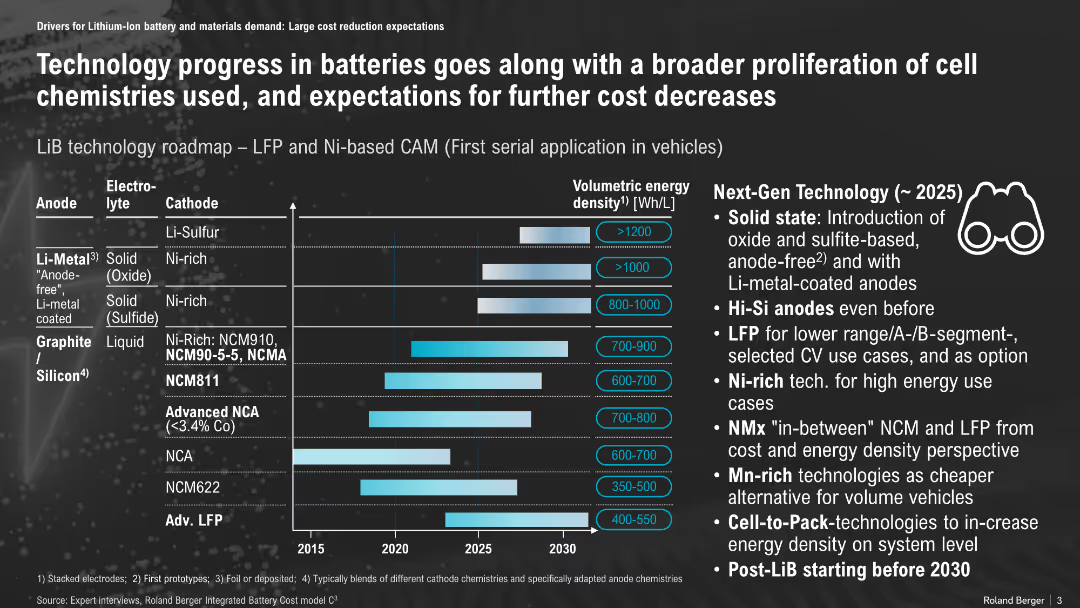
Horizontal timeline with bar chart, matrix of anode/electrolyte/cathode types and energy density projections; icons and callouts on the right
Technology and Digital Transformation
Energy & Utilities
The slide presents a roadmap of lithium-ion battery technologies, showing progress in energy density from different material combinations and their expected commercialization timeline. It emphasizes upcoming advancements like solid-state batteries, Hi-Si anodes, and LFP for specific vehicle segments.
Li-ion, battery roadmap, solid-state, energy density, LFP, NCM, anode, cathode, vehicle, cost reduction
Mixed Chart
Roland Berger
Saved
This slide features a dual column chart showing growth in the Chinese luxury market from 2015 to 2024 and the projected global market share in 2017 and 2024.
Market Analysis and Trends
Consumer Goods
Discusses the growth of Chinese luxury consumers and their impact on the global luxury market. Provides projections for future growth and market share.
growth, luxury, China, market, projection, consumer, global, retail, forecast, 2024
Multiple Chart
BCG
Saved
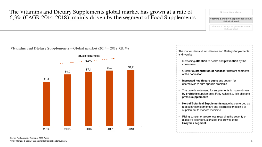
The slide has a white background with a column chart showing global market growth of vitamins and dietary supplements from 2014 to 2018.
Market Analysis and Trends
Healthcare & Pharmaceuticals
This slide presents the growth rate of the global market for vitamins and dietary supplements, highlighting the CAGR and key growth drivers.
Vitamins, dietary supplements, market growth, CAGR, global, healthcare, pharmaceuticals, trends, analysis
Mixed Chart
PwC/Strategy&
Saved
Content slide with numbered sections and a central figure showing various tax and legal implications, with green and blue text and icons.
Regulatory and Compliance
Financial Services
This slide discusses the tax, social security, and legal implications of remote work, covering topics like shifting tax costs, increased tax risk, payroll reporting requirements, and compliance management.
Tax, legal, compliance, social security, remote work
Diagram
Deloitte
Saved
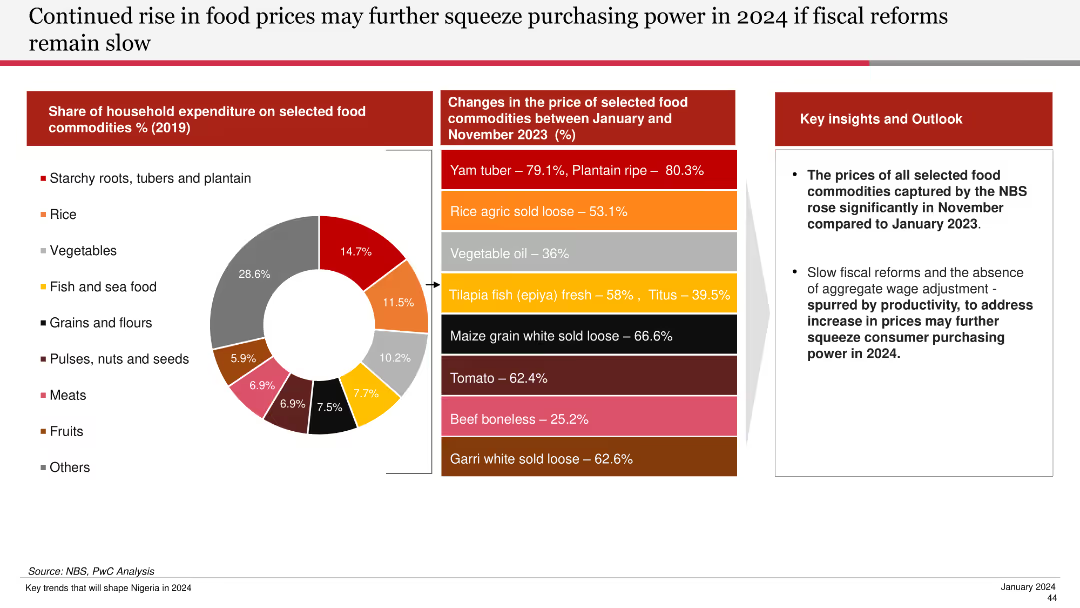
Features a pie chart of household expenditure on food commodities and a bar chart showing price changes of selected food commodities from Jan to Nov 2023.
Financial Performance
Agriculture & Food Production
Discusses the significant rise in food prices and the potential impact on purchasing power if fiscal reforms are not implemented swiftly.
food prices, purchasing power, fiscal reforms, commodities, household expenditure, 2024, food price changes
Mixed Chart
PwC/Strategy&
Saved
This slide includes two column charts. The first chart shows the contribution of the largest seven 'tech' stocks to the S&P 500. The second chart displays the contribution of the 'magnificent 7' stocks to S&P 500 return.
Competitive Landscape
Financial Services
The slide provides insights into the market concentration and impact of major tech stocks on the S&P 500, aiding in competitive landscape analysis.
equity, market concentration, tech stocks, S&P 500, market impact, analysis
Multiple Chart
JP Morgan
Saved
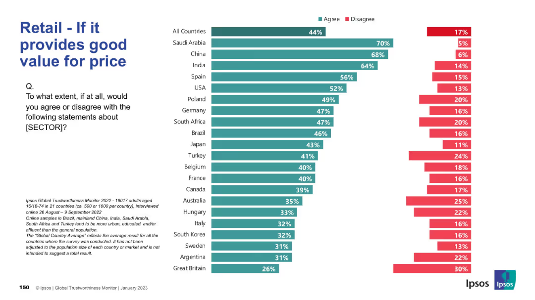
Horizontal bar chart; agreement levels on price/value alignment; same visual theme.
Pricing Strategies
Retail & E-commerce
This slide assesses how well the retail sector is seen to deliver value for money. Saudi Arabia, China, and India top the list; UK ranks lowest.
value, pricing, affordability, retail perception, customer opinion
Mixed Chart
IPSOS
Saved
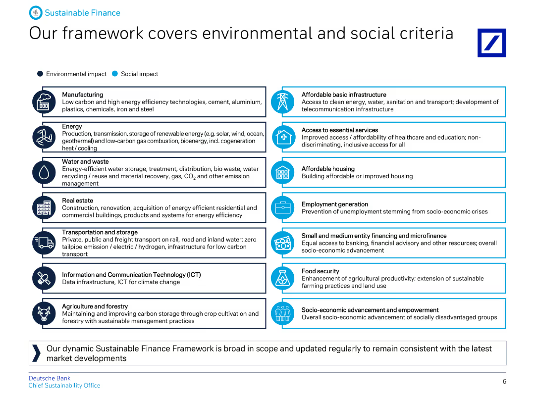
A detailed diagram categorizing various sectors under environmental and social impacts, with icons representing each category and descriptive text.
Regulatory and Compliance
Financial Services
The slide details Deutsche Bank's Sustainable Finance Framework, outlining the environmental and social criteria covered, including sectors like energy, real estate, and ICT.
Environmental, social, criteria, finance, framework, impact, sectors, sustainability, banking, regulation
Table
Deutsche Bank
Saved
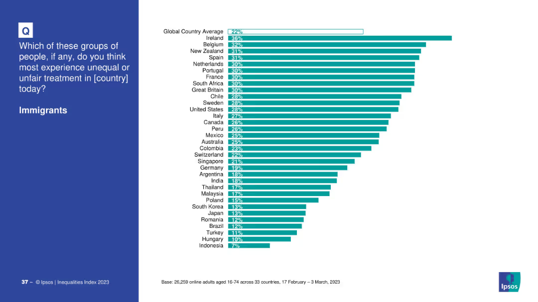
Blue left panel with the question; right side has a horizontal bar chart by country.
Market Analysis and Trends
Government & Public Sector
Depicts survey responses by country on the perceived unfair treatment of immigrants. Ireland, Belgium, and New Zealand rank highest, with a 22% global average.
immigration, inequality, countries, bar chart, discrimination, public opinion, Ipsos, 2023
Mixed Chart
IPSOS
Saved
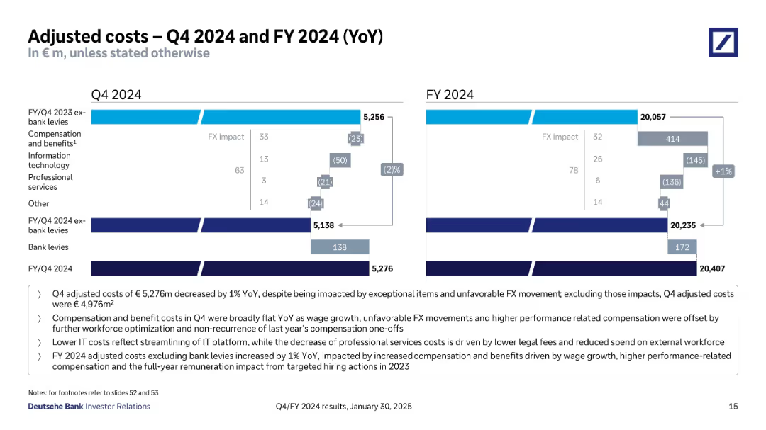
Two waterfall charts (Q4 and FY) compare costs YoY, with color-coded impact bars. Key highlights are bullet-listed below.
Operational Efficiency
Financial Services
Analyzes cost movements in Q4 and FY 2024, highlighting effects of FX, IT cost savings, and compensation changes. Distinguishes between total adjusted costs and bank levies. Shows slight YoY cost increase due to targeted hiring and wage growth.
adjusted costs, IT savings, compensation, FX impact, bank levies
Mixed Chart
Deutsche Bank
Saved
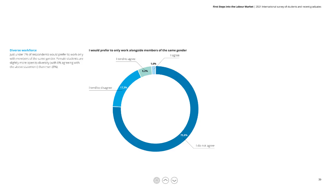
The slide includes a pie chart with segments in blue and green. The text is split into two columns, with a clear distinction between chart interpretation and additional context.
Human Resources and Talent Management
Professional Services
Shows that only 7% of respondents prefer to work with the same gender. Explores diversity preferences among male and female students.
diverse workforce, gender, respondents, preferences, diversity, male, female
Mixed Chart
Deloitte
Saved
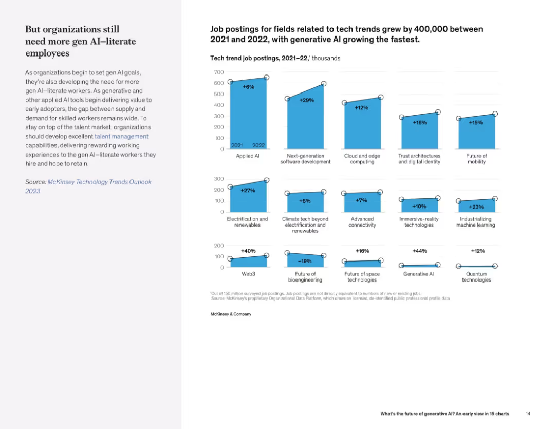
Left-aligned text with a grid of vertical bar charts on the right showing % growth in job postings across various tech fields.
Human Resources and Talent Management
Artificial Intelligence
This slide shows sharp increases in job postings in tech domains, especially for generative AI and Web3. The trend highlights growing demand for AI-literate employees.
tech hiring trends, job growth, generative AI, Web3, talent demand, AI workforce
Mixed Chart
McKinsey
Saved
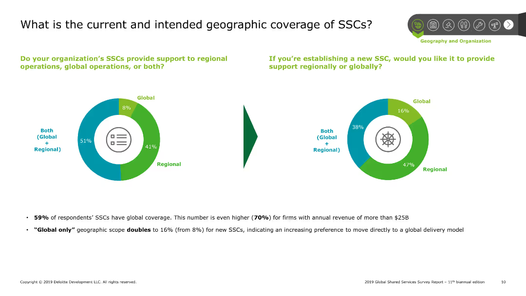
Pie charts showing current and intended geographic coverage of shared services centers (SSCs), with text explaining survey results on global and regional support.
Market Analysis and Trends
Professional Services
Explores the geographic scope of shared services centers, indicating a preference for both regional and global support among survey respondents, along with future intentions.
SSCs, geographic, coverage, global, regional
Multiple Chart
Deloitte
Saved
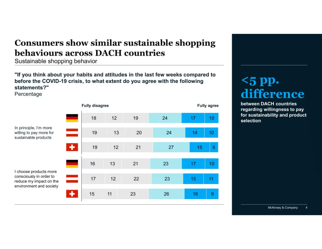
Stacked bar chart comparing sustainable shopping behavior; segmented by country
Sales and Business Development
Consumer Goods
Highlights attitudes in DACH countries toward sustainable purchasing post-COVID. Reveals <5 percentage point difference in willingness to pay more or shop consciously for sustainable goods.
sustainability, DACH, Austria, Germany, Switzerland, shopping behavior, post-COVID, willingness to pay
Mixed Chart
McKinsey
Saved
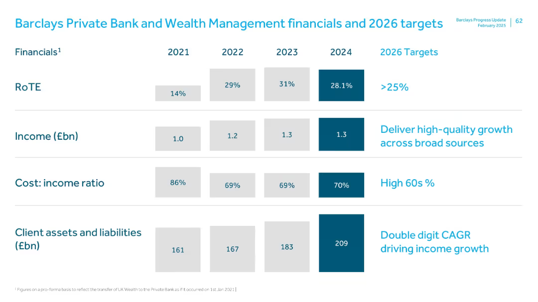
Similar tabular format as previous, showing metrics over time with 2026 targets; bold blue used to highlight 2024 figures
Financial Performance
Financial Services
This slide tracks financial performance from 2021 to 2024 for the Private Bank & Wealth Management division. Key metrics include RoTE, income, cost-income ratio, and client assets/liabilities. The 2026 targets aim for over 25% RoTE and double-digit CAGR in client assets and income.
Private banking, wealth management, RoTE, CAGR, income growth, client assets
Single Chart
Barclays
Saved
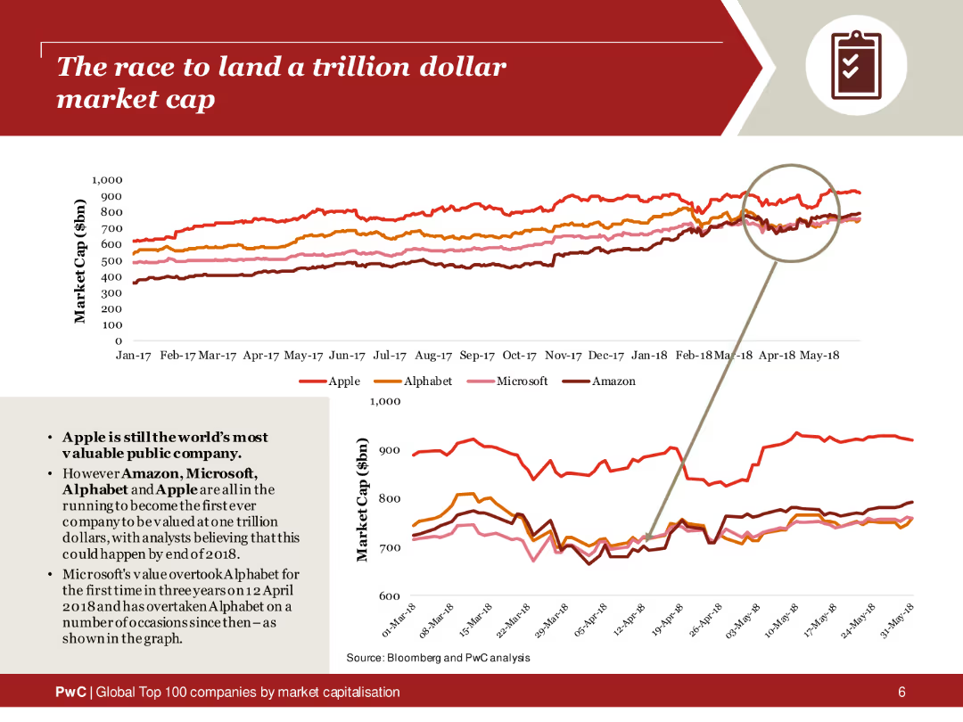
The slide features a line chart tracking the market caps of Apple, Alphabet, Microsoft, and Amazon from 2017 to 2018. The lines are color-coded for each company, with a magnified section highlighting recent trends. The layout includes a brief text summary on the left, explaining the race to a trillion-dollar valuation.
Market Analysis and Trends
Financial Services
This slide analyzes the market cap trends of major tech companies competing to reach a trillion-dollar valuation. The line chart provides a visual comparison of Apple, Alphabet, Microsoft, and Amazon over time, highlighting the competitive landscape and significant milestones in their market cap growth.
Trillion-dollar market cap, tech companies, market trends, Apple, Alphabet, Microsoft, Amazon, line chart
Multiple Chart
PwC/Strategy&
Saved
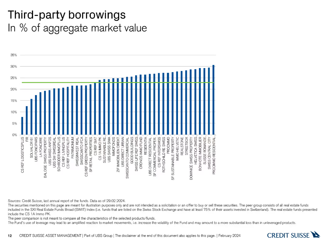
This slide contains a column chart showing the percentage of third-party borrowings in the aggregate market value for various entities.
Financial Performance
Financial Services
It presents the level of third-party borrowings as a percentage of the aggregate market value, useful for assessing financial leverage and risk among entities.
borrowings, aggregate market value, financial leverage, third-party, entities
Single Chart
Credit Suisse
Saved
Contains column charts to display financial targets and current metrics.
Financial Performance
Financial Services
Provides an overview of financial metrics and future targets for 2026.
financials, targets, growth, assets, performance
Multiple Chart
Barclays
Saved
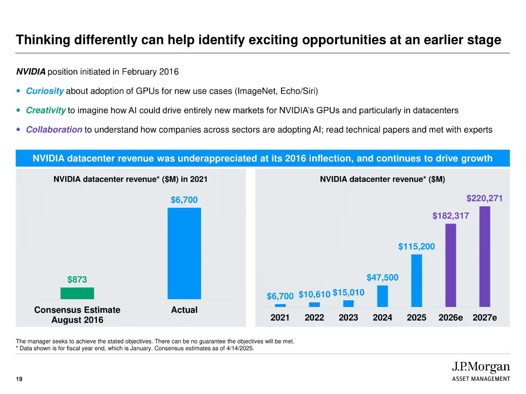
Split into two horizontal sections. Top section has bullet text with keywords in blue, green, and purple. Bottom section features two bar charts comparing consensus vs. actual and projected NVIDIA datacenter revenues. Uses bright blue and purple for visual impact.
Market Analysis and Trends
Technology & Software
This slide highlights the strategic foresight in identifying NVIDIA’s datacenter opportunity since 2016. It emphasizes attributes like curiosity, creativity, and collaboration. A dramatic gap between consensus and actual revenue is shown, followed by projections demonstrating continued strong growth, reinforcing J.P. Morgan’s proactive investment strategy.
NVIDIA, GPUs, AI, datacenter, creativity, revenue forecast, investment foresight, J.P. Morgan, early-stage opportunity
Multiple Chart
JP Morgan
Saved
A line graph tracking expenditure execution rate over several years, marked with specific years and percentage values at data points.
Financial Performance
Government & Public Sector
Analyzes historical and projected government spending efficiency, which is crucial for fiscal management and accountability assessments.
expenditure rate, fiscal efficiency, government accountability
Single Chart
PwC/Strategy&
Saved
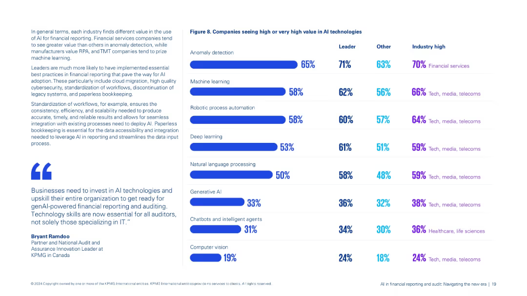
Dual-column layout: left contains contextual text and quotes; right features a bar chart comparison (Figure 8) of AI technology value perceptions.
Market Analysis and Trends
Financial Services
Compares perceived value across AI technologies like anomaly detection, machine learning, and genAI by leaders and others, highlighting industry-specific trends, especially in financial services and TMT sectors.
AI technologies, anomaly detection, machine learning, industry trends, value perception
Mixed Chart
KPMG
Saved
The slide uses a simple layout with images to indicate upcoming detailed reports on different subsectors of industrial automation, including process industry, discrete, and warehouse automation.
Market Analysis and Trends
Industrial & Manufacturing
The slide provides a preview of forthcoming reports on industrial automation subsectors, scheduled for release in summer, fall, and winter 2021.
upcoming reports, industrial automation, subsectors, process industry, discrete automation, warehouse automation
Diagram
LEK
Saved
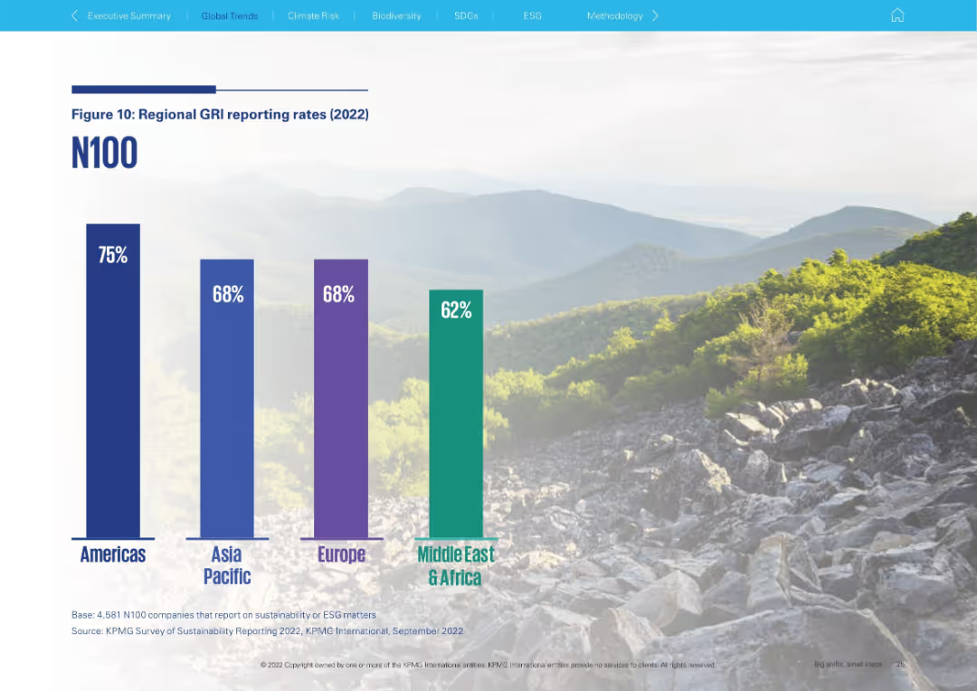
Large vertical bar chart against scenic mountain background; clean layout
Regulatory and Compliance
Professional Services
Depicts the 2022 regional breakdown of GRI reporting rates among N100 companies. The Americas lead at 75%, followed by Asia Pacific and Europe (68%), and Middle East & Africa (62%).
GRI, regional reporting, ESG, Americas, Asia Pacific, Europe, Middle East, benchmarking
Single Chart
KPMG
Saved
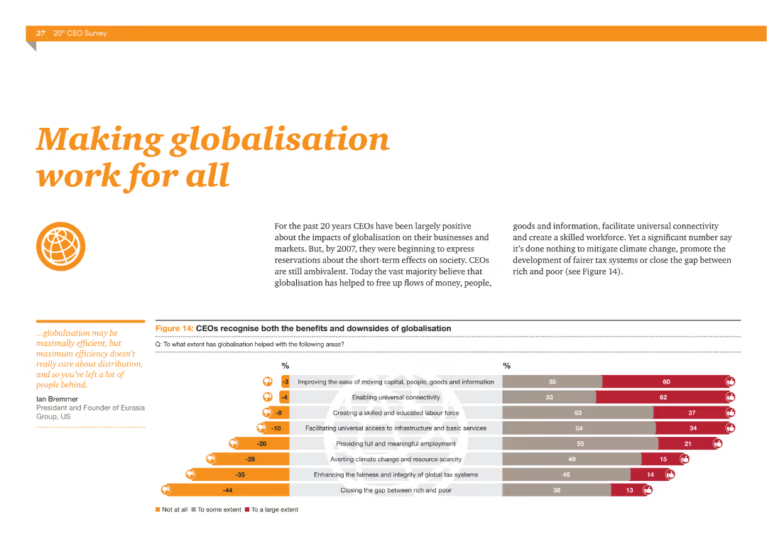
The slide features a column chart showing CEOs' views on the benefits and downsides of globalization, such as improving connectivity and creating a skilled workforce versus failing to address climate change and tax fairness.
Market Analysis and Trends
Financial Services
This slide illustrates CEOs' perspectives on globalization, highlighting both positive impacts like improved connectivity and negative aspects such as failing to address climate change and creating fair tax systems.
Globalization, benefits, downsides, connectivity, skilled workforce, climate change, tax fairness
Multiple Chart
PwC/Strategy&
Saved
Previous
Next
If nothing, comes up, please save your slides first
Create a FREE account to continue browsing
Receive Instant Access to 1,000+ slides from companies like McKinsey, Google, and Goldman Sachs
First Name
Last Name
Email
Password
I agree to all
Terms & Privacy Policy
Thank you! Your submission has been received!
Oops! Something went wrong while submitting the form.
Have an account?
Sign in
Column Chart
Heatmap
Chevron
Org Chart
Infographic
Callouts
Timeline
List
Graphic
Picture
Process Flow
Diagram
Paragraph
Map
Table
Framework
Subtitle
Takeaway Box
Icon
Other Chart
Radar Chart
Waterfall Chart
Mekko Chart
Pie Chart
Scatter Plot
Line Chart
Bar chart
Bullet points