Create a FREE Account
Instant access to 1,000+ real slides from top companies like McKinsey, BCG, Goldman Sachs, Google and many more!
First Name
Last Name
Email
Password
I agree to all
Terms & Privacy Policy
Thank you! Your submission has been received!
Oops! Something went wrong while submitting the form.
Have an account?
Sign in
Library
Templates
Courses
Pricing
My Account
My Slides
My Templates
✦ AI
AI Prompt Library
AI Search
Sign in
Start Here
Logout
My Saved Slides
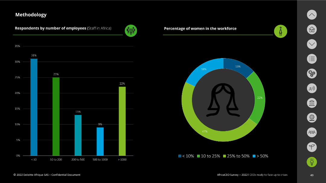
The slide shows bar charts representing the number of employees and the percentage of women in the workforce among survey respondents.
Strategic Planning
Professional Services
It details the number of employees and the gender distribution in the workforce of companies surveyed, highlighting workforce diversity metrics.
employees, workforce, gender distribution, survey respondents, Africa CEO Survey
Multiple Chart
Deloitte
Saved
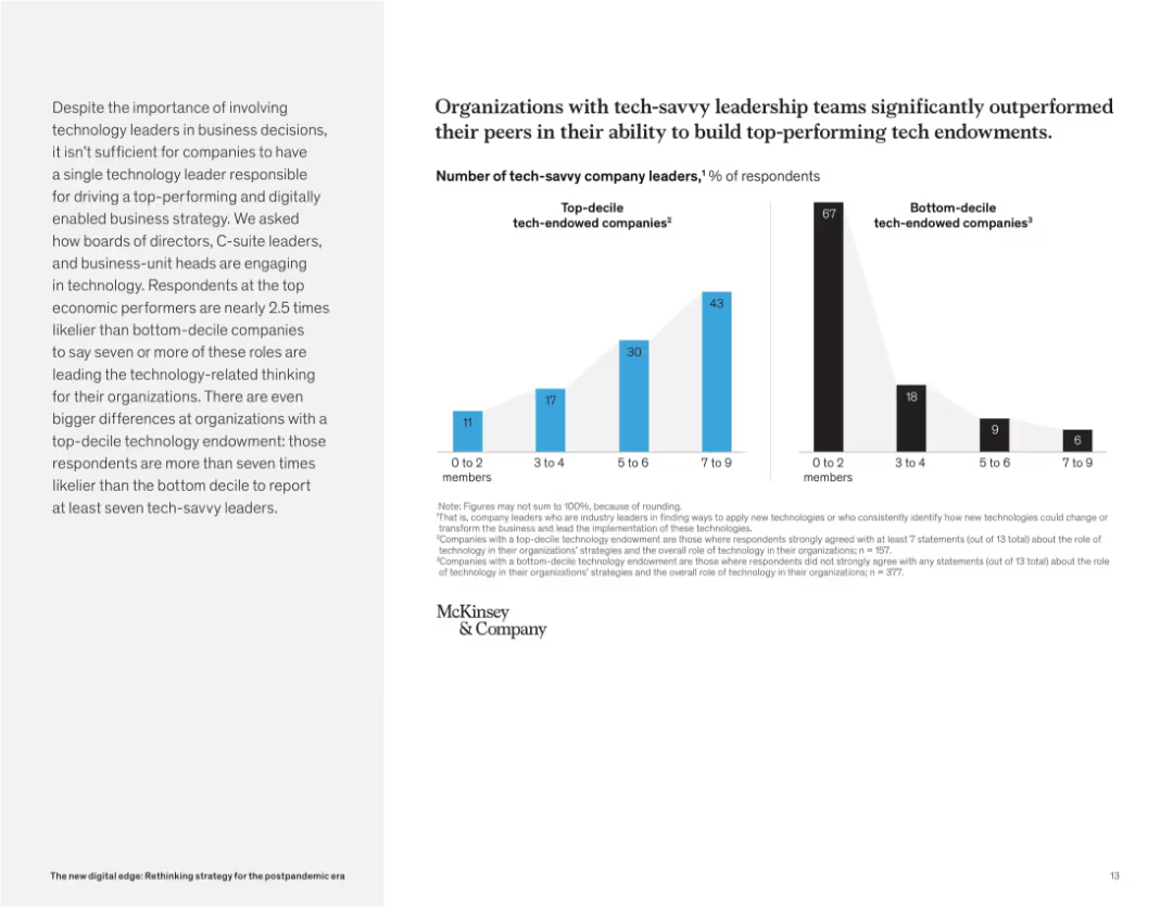
Side-by-side bar charts comparing the number of tech-savvy leaders in top-decile vs. bottom-decile companies. Accompanied by text on the left.
Organizational Structure and Change
Technology & Software
This slide shows that companies with more tech-savvy leaders (across leadership roles) are far more likely to develop strong tech capabilities. Top performers show greater representation of such leadership compared to bottom performers.
tech endowment, leadership, digital strategy, executive roles, McKinsey, performance, C-suite, technology engagement
Mixed Chart
McKinsey
Saved
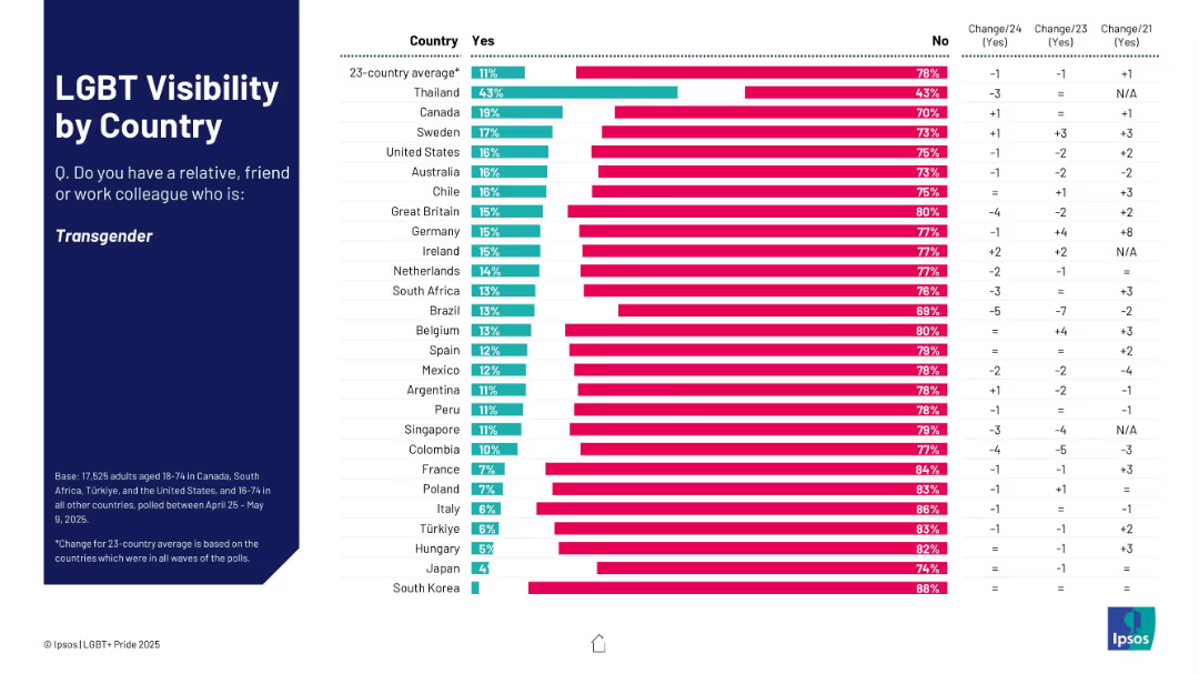
Bar chart showing % who know someone transgender; ranked by country with yes/no breakdown.
Market Analysis and Trends
Government & Public Sector
This slide assesses how many respondents know a transgender person, broken down by country. Thailand shows the highest visibility; South Korea and Japan the lowest. Change data is also displayed.
transgender, visibility, country ranking, social awareness, Ipsos survey
Mixed Chart
IPSOS
Saved
This slide combines text blocks and a color-coded text blocks illustrating transitions from stable to efficient, and efficient to predictive, up to future-ready stages, highlighted in purple and pink tones.
Operational Efficiency
Technology & Software
Outlines strategic steps for organizations to enhance their operations maturity. It describes transitions from stable to efficient, efficient to predictive, and predictive to future-ready, suggesting focused improvements at each stage.
operations maturity, strategic steps, efficiency, predictive, future-ready, transformation, business roadmap, Accenture Research
Linear Flow
Accenture
Saved
Slide uses multiple bar graphs to compare budget allocations across ten departments, using color coding to differentiate between higher and lower spending areas.
Financial Performance
Government & Public Sector
Showcases Namibia's budget allocation priorities for 2018/19, highlighting significant investments in education, health, and defense. The slide provides a clear view of governmental fiscal priorities and sectoral funding.
Budget, Allocations, Government, Sectors
Single Chart
PwC/Strategy&
Saved
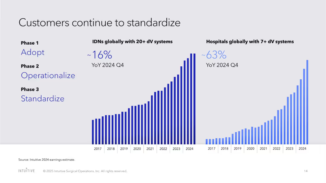
Split bar chart view with two timelines for IDNs and hospitals, showing adoption trends and standardization
Organizational Structure and Change
Healthcare & Pharmaceuticals
Tracks hospital and IDN adoption of da Vinci systems globally, segmented by deployment phases, with YoY growth highlighted.
hospital adoption, IDN, standardization, phases, growth trends, da Vinci, organizational change
Multiple Chart
JP Morgan
Saved
The slide includes a table matrix showing various heavy industries (e.g., cement, steel) and the potential application of CCUS and other decarbonization technologies. Each cell is color-coded to indicate the maturity of the technology.
Risk Assessment and Management
Industrial & Manufacturing
This slide discusses the importance of CCUS for heavy industries that are hard to decarbonize, showing the potential and maturity of different technologies that can be applied to reduce emissions in these sectors.
CCUS, heavy industries, decarbonization, technology maturity, emission reductions
Table
Kearney
Saved
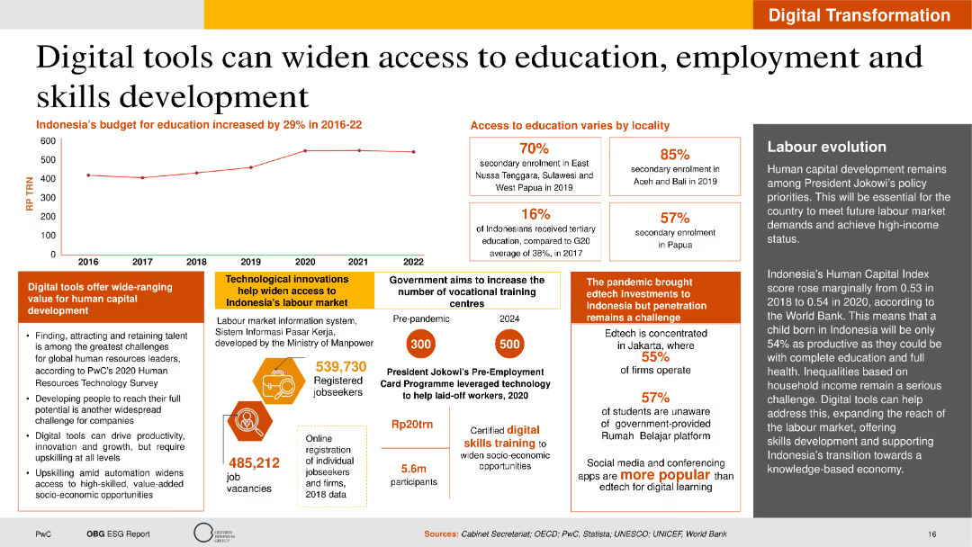
The slide includes text on digital tools, a line chart of education budget, and statistics on education access. The layout is structured to highlight key points with clear sections and supportive visual elements.
Technology and Digital Transformation
Education & Training
This slide highlights how digital tools can improve access to education and employment in Indonesia. It discusses technological innovations, government initiatives, and the impact of digital learning on human capital development.
Digital Tools, Education, Employment, Indonesia, Innovation
Mixed Chart
PwC/Strategy&
Saved
Charts showing the maturity level distribution across various industries.
Technology and Digital Transformation
Media & Entertainment
Analyzes the distribution of maturity levels within industries like retail, consumer goods, and telco.
industry, maturity, distribution, retail, CPG, telco
Multiple Chart
BCG
Saved
Depicts a series of blue column charts showing annual free cash flow over time, annotated with percentages and monetary goals.
Financial Performance
Consumer Goods
Illustrates the company's ability to generate substantial free cash flow, emphasizing improvements and future goals in financial management.
free cash flow, financial growth, goals, annual, cash management
Single Chart
Barclays
Saved
Slide contains a bar chart with green bars, showing the percentage of companies planning to use different financing methods to enhance productivity.
Financial Performance
Professional Services
Analyzes financing strategies companies are employing to fund productivity enhancements, such as equity from investors or debt financing.
finance, productivity, equity, investment, debt
Single Chart
Deloitte
Saved
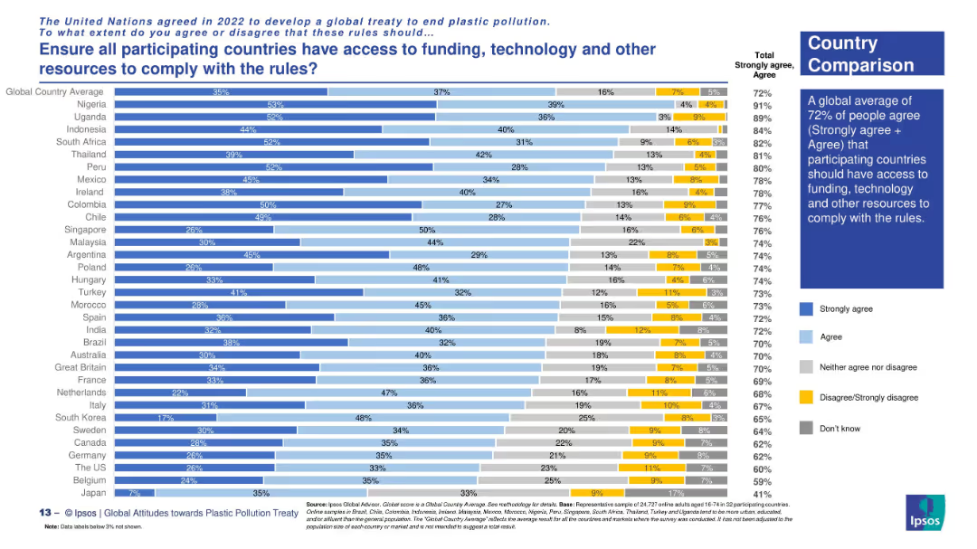
Country comparison via horizontal stacked bars with clear response categories.
Regulatory and Compliance
Environmental Services & Sustainability
The slide explores support across nations for ensuring equitable access to resources for treaty compliance. Highest support comes from Nigeria, Uganda, and South Africa. The global average for agreement is 72%.
global equity, treaty implementation, resource access, plastic rules, funding support, Ipsos survey, environmental policy, country views
Mixed Chart
IPSOS
Saved
The slide features a column chart displaying the average CO2 price per ton (€) from 2012 to 2023. On the right, there are two bar charts comparing CCGT marginal price variation in low vs. high prices. The color scheme is green and dark grey, with green bars and texts. The layout is dense with data, providing a clear visual representation of the ETS and CCGT prices' impact.
Market Analysis and Trends
Energy & Utilities
This slide shows the increase in ETS price over the years and its significant impact on market dynamics, focusing on CO2 prices and CCGT marginal price variations. It highlights the substantial rise in CO2 price and how it affects the contribution mix and marginal prices, providing a detailed analysis of the economic implications.
CO2 price, ETS, market dynamics, CCGT price, impact
Multiple Chart
EY
Saved
Features pie charts and bullet points detailing real estate investment distributions by type and region. Clean and structured layout with annotations.
Investment Analysis
Real Estate & Construction
Discusses the real estate portfolio's distribution and risk, useful for investment analysis and decision-making in real estate.
real estate, investment, risk analysis, portfolio distribution, CRE
Multiple Chart
Deutsche Bank
Saved
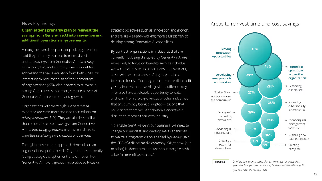
This slide combines text and a circular diagram to explain how organizations plan to reinvest savings from Generative AI into innovation and operational improvements. The layout is clean and color-coded for clarity.
Strategic Planning
Technology & Software
It discusses how companies plan to reinvest savings from Generative AI in driving innovation, improving operations, and developing new products, with a focus on strategic reinvestment areas.
reinvestment, savings, AI, innovation, operations
Mixed Chart
Deloitte
Saved
Two sections: a column chart on satisfaction drivers and a column chart on issues faced by EV owners, with detailed metrics on various satisfaction aspects.
Market Analysis and Trends
Transportation & Logistics
Identifies the primary drivers of EV owner satisfaction and key issues they face, with emphasis on driving experience and operating costs.
satisfaction drivers, issues, EV owners, survey, regional comparison
Multiple Chart
PwC/Strategy&
Saved
This slide is filled with textual content and data-centric elements, including a column chart with red annotations and a table with numeric values. The use of blue color coding organizes the information into three sections, highlighting key business metrics from 2014 to 2019.
Financial Performance
Financial Services
It demonstrates the momentum across key business drivers, with comparisons of year-over-year and compound annual growth rates in consumer and business banking. The included data elements and textual descriptions suggest that the slide is used to convey the financial strength and growth within the banking sector, specifically focusing on JPMorgan Chase & Co.'s performance.
Consumer Banking, Business Banking, Growth, Deposits, Investments, CAGR, Financial Strength, JPMorgan Chase & Co.
Table
JP Morgan
Saved
The slide has a list format with color-coded sections, each providing key points about the investment thesis, and a company logo in the top right corner.
Strategic Planning
Financial Services
The slide articulates a financial institution's investment thesis, highlighting the pillars of earnings, risk management, and capital allocation. It's useful for communicating the company's strategic positioning and investment potential to stakeholders or potential investors.
Investment Thesis, Earnings, Risk Management, Capital Allocation, Strategic Position, Financial Institution
Table
Morgan Stanley
Saved
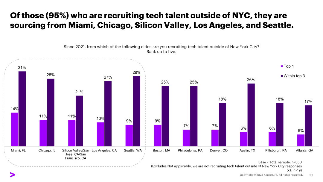
A column chart showing the top cities organizations are recruiting tech talent from outside of NYC, including Miami, Chicago, and others, with percentage values.
Human Resources and Talent Management
Professional Services
The slide indicates the cities where organizations are sourcing tech talent from outside of NYC, providing insights into geographic recruitment strategies.
recruitment, tech talent, NYC, sourcing cities, survey
Single Chart
Accenture
Saved
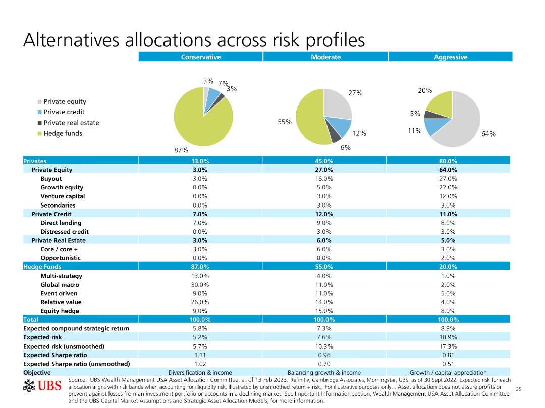
Pie charts and a table showing allocations across different risk profiles (Conservative, Moderate, Aggressive) for various investment types.
Investment Analysis
Financial Services
The slide details how different types of investments (equity, credit, real estate, hedge funds) are allocated based on risk profiles, providing expected returns and risks.
Allocations, Risk Profiles, Private Equity, Hedge Funds, Expected Returns
Multiple Chart
UBS
Saved
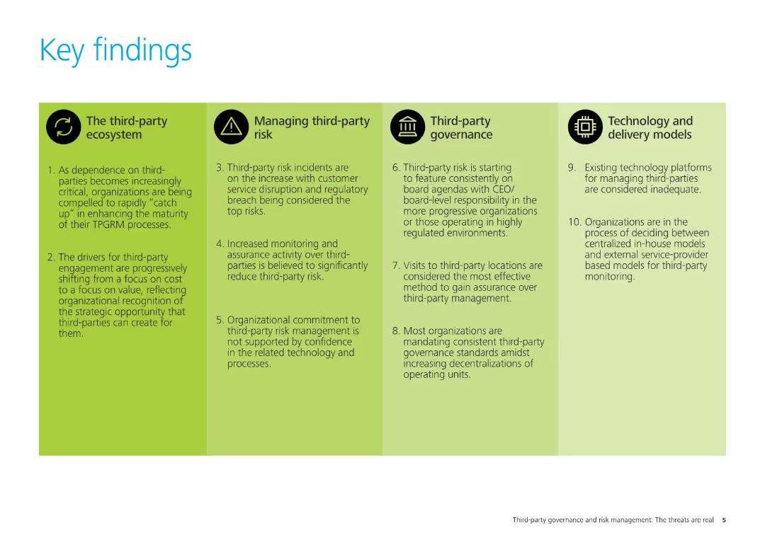
The slide has four sections with icons and text, summarizing the key findings related to the third-party ecosystem, managing third-party risk, third-party governance, and technology and delivery models.
Strategic Planning
Professional Services
This slide summarizes the key findings of the study, covering four main areas: third-party ecosystem, managing third-party risk, third-party governance, and technology and delivery models. It outlines critical insights for organizational strategy.
key findings, third-party risk, governance, technology, delivery models, strategic planning, professional services
Pillar
Deloitte
Saved
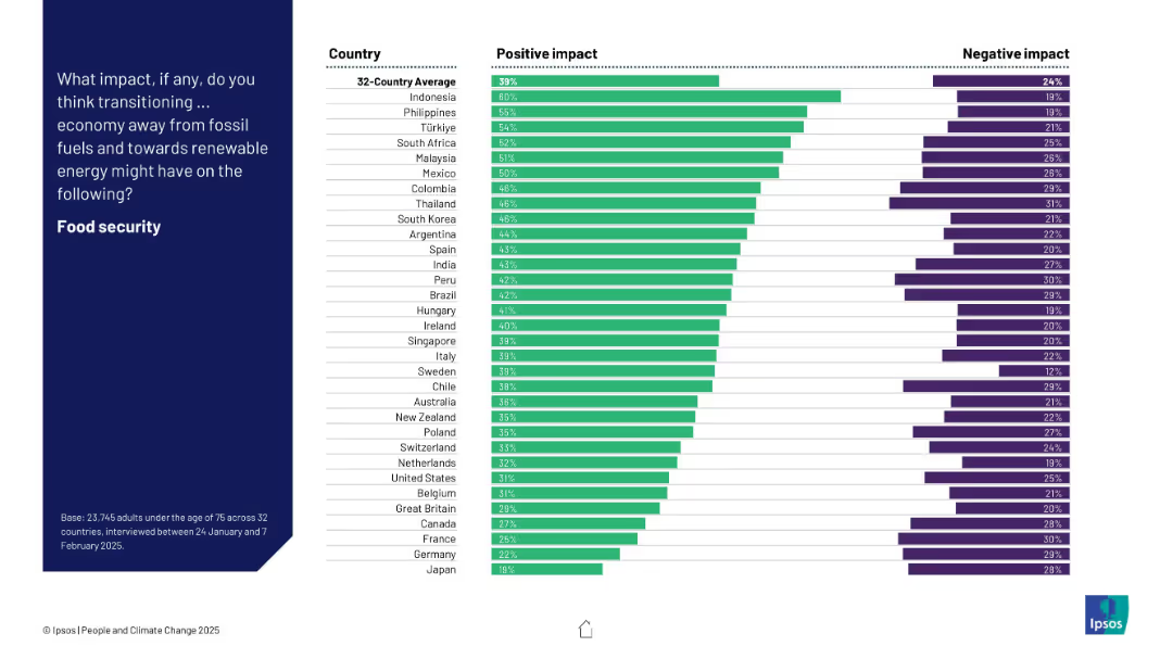
Bar chart of 32 countries ranking positive and negative expectations about the energy transition’s effect on food security.
Technology and Digital Transformation
Environmental Services & Sustainability
This slide captures global attitudes toward how moving to renewable energy affects food security. Indonesia, the Philippines, and Türkiye are most optimistic, while Japan and Germany rank lowest. Net positive views dominate across most countries.
food security, renewables, perception, climate, energy transition, bar chart, Ipsos, global opinion
Mixed Chart
IPSOS
Saved
Contains a bar chart comparing greenhouse gas emissions by country in Sub-Saharan Africa, using distinct colors for visual clarity and emphasis.
Regulatory and Compliance
Environmental Services & Sustainability
Details Nigeria's position among Sub-Saharan countries in greenhouse gas emissions, highlighting the need for renewable energy solutions like solar power.
GHG emissions, Nigeria, renewable energy, Sub-Saharan Africa, environmental impact
Single Chart
BCG
Saved
Contains a vertical column chart depicting the advantages of digital commerce channels, and doughnut charts indicating challenges. Accompanied by text boxes with detailed explanations.
Strategic Planning
Consumer Goods
The slide presents survey results showing the perceived advantages and challenges of digital commerce channels, focusing on marketing capabilities, cost reduction, and customer service.
digital marketing, e-commerce, survey, operational cost, customer service, marketing capabilities, channel conflict
Multiple Chart
Deloitte
Saved
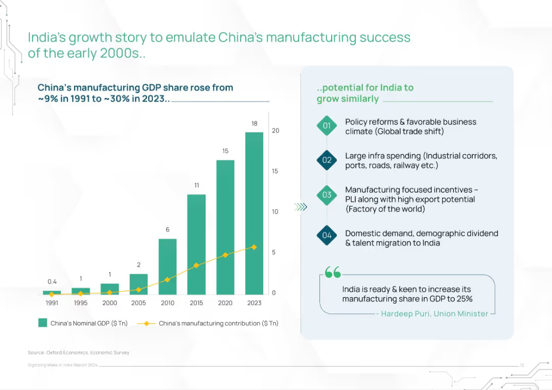
Left bar and line chart showing China’s GDP and manufacturing growth; right panel lists India’s policy and economic enablers
Strategic Planning
Industrial & Manufacturing
This slide draws parallels between China’s early 2000s manufacturing rise and India’s current opportunity. It outlines India’s potential to grow similarly via policy reforms, infrastructure investment, export incentives, and demographic trends, supported by charts and government commentary.
manufacturing growth, China comparison, India strategy, economic reform, industrial policy, infrastructure push, PLI
Mixed Chart
BCG
Saved
Previous
Next
If nothing, comes up, please save your slides first
Create a FREE account to continue browsing
Receive Instant Access to 1,000+ slides from companies like McKinsey, Google, and Goldman Sachs
First Name
Last Name
Email
Password
I agree to all
Terms & Privacy Policy
Thank you! Your submission has been received!
Oops! Something went wrong while submitting the form.
Have an account?
Sign in
Column Chart
Heatmap
Chevron
Org Chart
Infographic
Callouts
Timeline
List
Graphic
Picture
Process Flow
Diagram
Paragraph
Map
Table
Framework
Subtitle
Takeaway Box
Icon
Other Chart
Radar Chart
Waterfall Chart
Mekko Chart
Pie Chart
Scatter Plot
Line Chart
Bar chart
Bullet points