Create a FREE Account
Instant access to 1,000+ real slides from top companies like McKinsey, BCG, Goldman Sachs, Google and many more!
First Name
Last Name
Email
Password
I agree to all
Terms & Privacy Policy
Thank you! Your submission has been received!
Oops! Something went wrong while submitting the form.
Have an account?
Sign in
Library
Templates
Courses
Pricing
My Account
My Slides
My Templates
✦ AI
AI Prompt Library
AI Search
Sign in
Start Here
Logout
My Saved Slides
This slide uses a dark background with white and blue text. It includes a list of technologies under categories like ACES and adjacent tech. Visuals include stylized icons representing each technology category.
Technology and Digital Transformation
Transportation & Logistics
It outlines innovative technologies in the mobility sector, such as autonomy and electrification, with descriptions of each. Additional adjacent technologies like lightweight materials are also presented.
autonomy, connectivity, electrification, smart mobility, lightweight technologies, decarbonization
Header Horizontal
McKinsey
Saved
Bar chart showing the share of consumers by age who describe themselves as addicted to social media in 2019, and a column chart showing the average daily time spent on social media from 2012 to 2021.
Market Analysis and Trends
Media & Entertainment
The slide highlights the impact of social media addiction, particularly among younger age groups. It presents data on the percentage of users addicted to social media by age and the increasing amount of time spent on social media daily, raising concerns about the negative societal effects of pervasive social media use.
Social Media, Addiction, Time Spent, Age Groups
Multiple Chart
Roland Berger
Saved
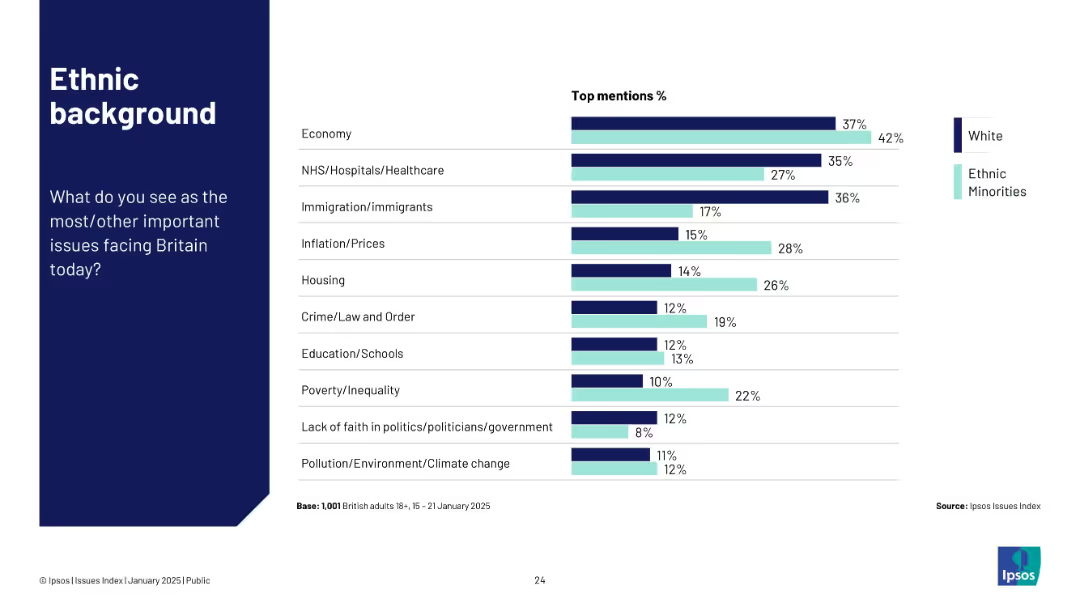
Horizontal bar chart comparing White and Ethnic Minority groups on top national issues.
Customer and Market Segmentation
Government & Public Sector
This slide compares ethnic backgrounds on top concerns in the UK. Ethnic minorities place higher emphasis on housing, inflation, and crime than White respondents. Economy remains a key issue across both groups.
ethnicity, public opinion, inflation, housing, crime, Ipsos
Mixed Chart
IPSOS
Saved
Contains sections with icons and brief descriptions of various business units. Design is clean, using a blue and white color scheme.
Product and Service Analysis
Technology & Software
Provides an overview of different business units and their products, highlighting data assets across sectors. Useful for internal company presentations or product portfolio reviews.
business units, product overview, data assets, market segmentation
Pillar
Barclays
Saved
Column charts showing tax-equivalent yield and correlation with municipals.
Investment Analysis
Financial Services
Analysis of municipal bonds yields, assessing tax implications and correlations for investment choices.
Municipal Bonds, Tax-equivalent Yield, Correlation, Investment Choices, Bar Chart, Column Chart, Morgan Stanley, Market Monitor
Multiple Chart
Morgan Stanley
Saved
A bar graph highlights the F-Series' revenue in comparison to other notable companies.
Financial Performance
Transportation & Logistics
Shows the F-Series' revenue outperforming that of many major companies in 2019.
F-Series, revenue, companies, financial performance
Single Chart
BCG
Saved
Horizontal bar charts comparing agreement and disagreement on statements about societal change, conflict, immigration, and leadership, with a focus on specific concerns.
Market Analysis and Trends
Government & Public Sector
This slide addresses concerns related to rapid societal changes, such as values conflict, immigration issues, and weak leadership, highlighting agreement and disagreement levels.
societal change, conflict, immigration, leadership, concerns, bar chart, agreement, disagreement
Mixed Chart
IPSOS
Saved
Bar chart showing quarterly Canadian GDP growth (annualized) from Q1 2015 to a forecast in Q2 2021, with notable changes in Q2 2020.
Market Analysis and Trends
Real Estate & Construction
The slide analyzes and forecasts economic recovery trends, highlighting significant GDP changes due to the pandemic and projecting recovery.
economic recovery, GDP growth, forecast, 2021, quarterly data, Canada
Single Chart
IPSOS
Saved
A column chart comparing revenue growth of local versus multinational companies from 2012 to 2021.
Competitive Landscape
Professional Services
Discusses the rising market share of local companies in various industries and their competitive strategies against multinationals.
Local competition, market share, industry growth, competitive strategies
Mixed Chart
Accenture
Saved
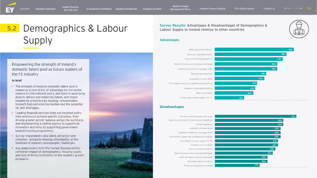
Balanced layout with left-side narrative and right-side dual bar charts (advantages/disadvantages). Icons and soft backgrounds create visual segmentation.
Human Resources and Talent Management
Professional Services
Focuses on Ireland's domestic talent pool as an advantage in FS industry growth. Survey results show strengths in education and migration, with drawbacks including retention issues and high taxes. The slide discusses workforce balance, housing concerns, and government training policies.
demographics, labor supply, talent, migration, education, retention
Multiple Chart
EY
Saved
Contains a table comparing performance targets across several years with headers and rows for different banking services, such as 'Business Banking' and 'Card Services'.
Financial Performance
Financial Services
This slide showcases JP Morgan's performance targets for different sectors within consumer and community banking, reflecting past data and future outlooks. Useful in presenting measurable objectives to investors or stakeholders.
Performance Targets, Banking, Forecast, ROE, Net Charge-Off Rate
Table
JP Morgan
Saved
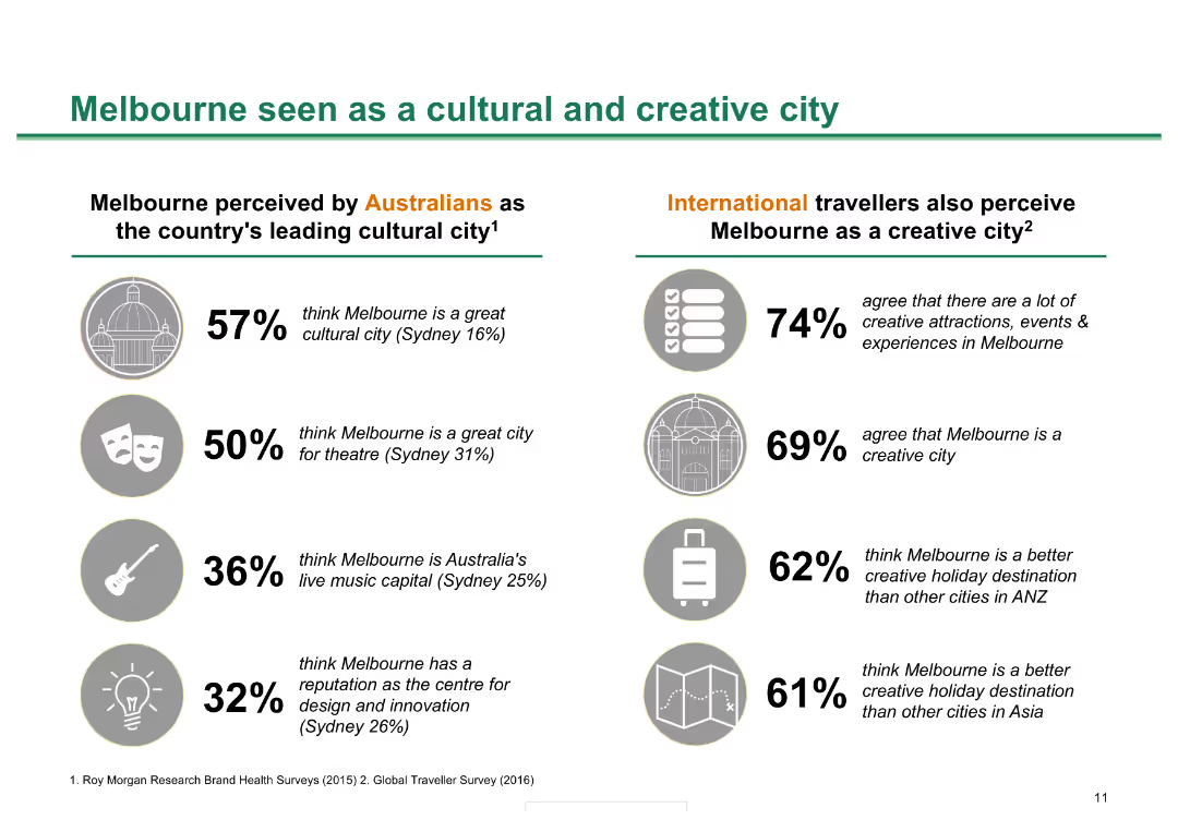
Split layout with icons and statistics comparing Australian and international perceptions of Melbourne as a cultural and creative city.
Market Analysis and Trends
Hospitality & Tourism
This slide compares perceptions of Melbourne's cultural and creative appeal among Australians and international travelers, using survey statistics and key insights.
Melbourne, cultural city, creative city, perceptions, survey, Australians, international travelers, statistics, insights
Header Horizontal
BCG
Saved
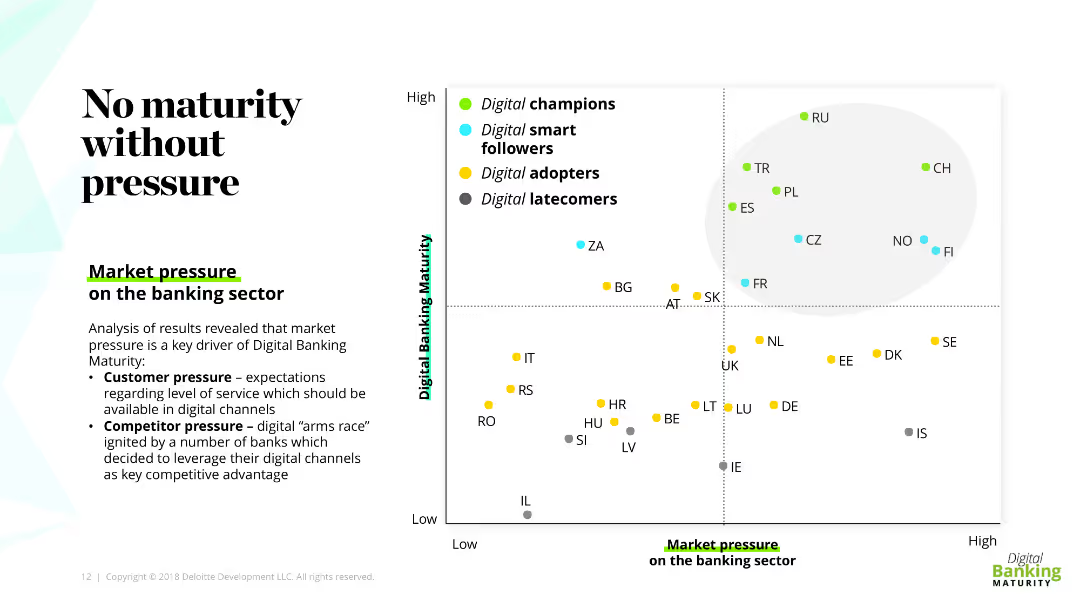
Scatter plot showing digital banking maturity against market pressure on the banking sector, segmented into champions, followers, adopters, and latecomers.
Market Analysis and Trends
Financial Services
Analyzes the impact of market pressure on digital banking maturity, with insights into customer and competitor pressure influencing digital channels in the banking sector.
digital banking, maturity, market pressure, customer pressure, scatter plot
Mixed Chart
Deloitte
Saved
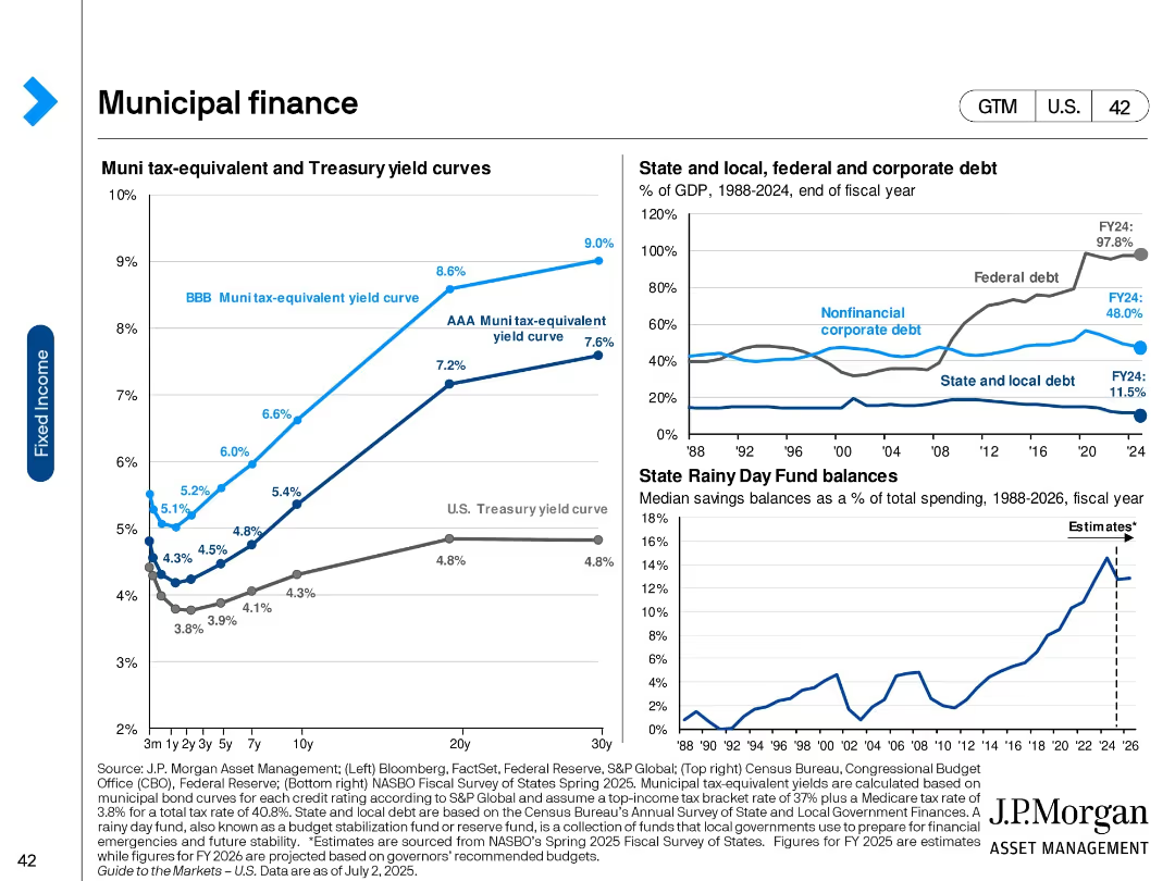
Three-panel slide with yield curves, government debt as % of GDP, and state savings fund balances.
Regulatory and Compliance
Government & Public Sector
This slide explores the municipal finance landscape with a focus on tax-equivalent muni yields, debt levels across sectors (federal, state, corporate), and fiscal preparedness through rainy day funds.
Municipal bonds, yields, government debt, state finance, treasury curve, savings funds, tax-equivalent, fiscal policy
Multiple Chart
JP Morgan
Saved
Column chart showing agreement and disagreement percentages on the belief that all diseases will be curable across countries.
Market Analysis and Trends
Healthcare & Pharmaceuticals
The slide examines the belief in the future curability of all medical conditions, with significant variation across countries.
medical advancements, future expectations, public opinion, global health, curability
Multiple Chart
IPSOS
Saved
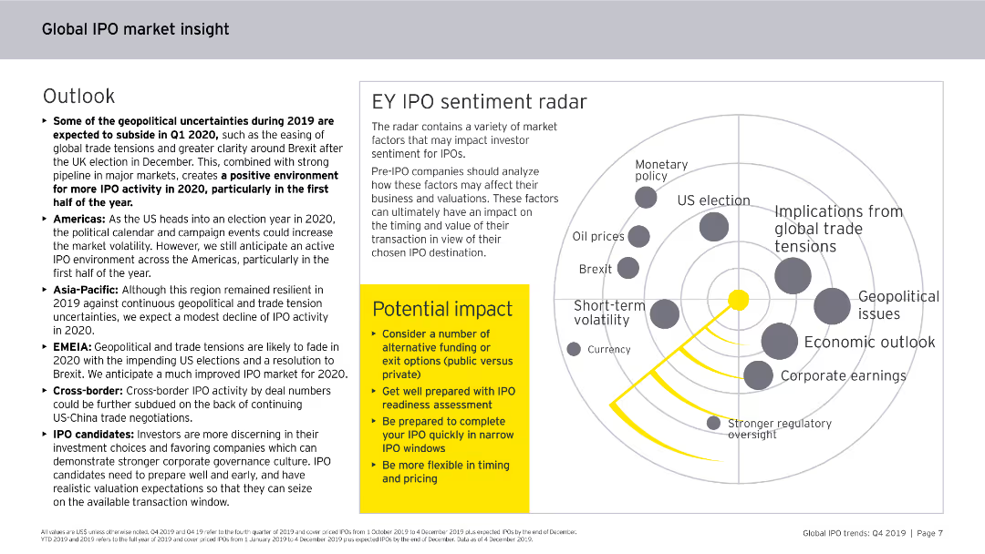
Features a radar chart, bullet points, and a callout box. The slide is visually engaging, focusing on IPO sentiment and potential impacts on the market.
Market Analysis and Trends
Financial Services
Examines the geopolitical uncertainties and their effects on IPO activities, with a detailed sentiment analysis radar chart and strategic insights for IPO candidates.
IPO sentiment, geopolitical, market impact, 2020, trends
Boxed
EY
Saved
The slide includes pie and column charts displaying trends in liquidity ratios and funding sources over several quarters. The information is organized in a clear, easy-to-follow layout.
Financial Performance
Financial Services
Outlines the funding and liquidity status of a financial institution, highlighting the diversified deposit base and liquidity ratios. Useful for financial analysis and discussions on maintaining liquidity in banking operations.
funding, liquidity, finance, banking, stability
Multiple Chart
Deutsche Bank
Saved
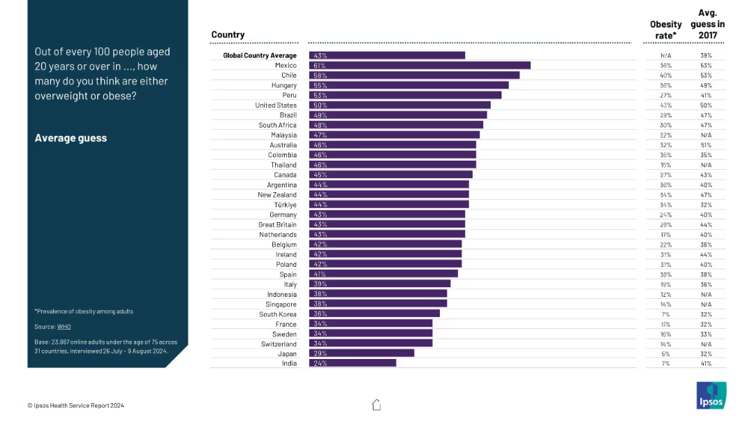
Ranked bar chart per country showing average guess of obesity prevalence; includes obesity rate and 2017 guess for context.
Performance Metrics and KPIs
Healthcare & Pharmaceuticals
The slide compares perceived vs actual obesity rates across nations, highlighting public health awareness and changes since 2017. It identifies discrepancies and improvements in perception accuracy over time.
obesity guess, overweight rate, perception vs reality, health trends, KPI, obesity stats
Mixed Chart
IPSOS
Saved
Bar chart showing the estimated time for financial recovery among households post-COVID-19. Categories range from one year to more than five years.
Risk Assessment and Management
Financial Services
The slide details the estimated time for Canadian households to recover financially from COVID-19, with responses indicating a range from one year to more than five years. It also notes a small percentage of respondents who feel their finances were not significantly impacted.
COVID-19, Financial Recovery, Canadian, Households, Pandemic
Mixed Chart
IPSOS
Saved
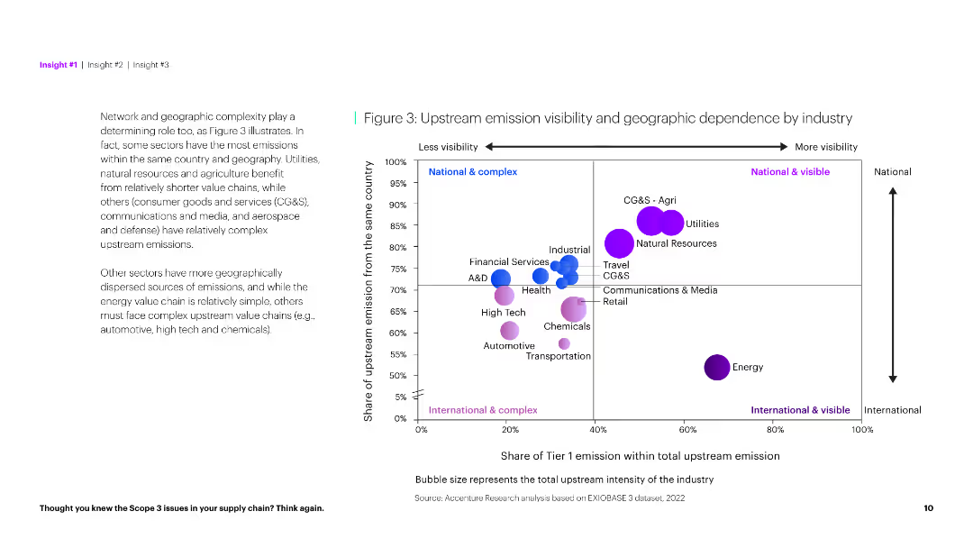
The slide uses a scatter plot to show the geographic dependency of upstream emissions and a textual analysis on the left. It has a clear and informative layout.
Market Analysis and Trends
Environmental Services & Sustainability
This slide explores the relationship between upstream emission visibility and geographic dependence across industries, identifying complex and simple sectors.
Emission visibility, geographic dependence, industry, complexity, analysis, environmental impact, sustainability, data visualization, scatter plot, insights
Mixed Chart
Accenture
Saved
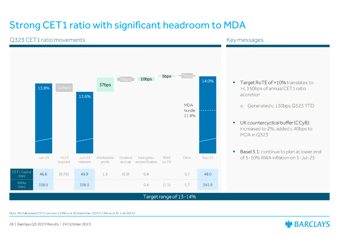
Displays a vertical bar chart showing CET1 ratio movements and key messages. The layout is clean, with a strong focus on data points and explanatory text.
Financial Performance
Financial Services
The slide illustrates the CET1 ratio movements and key messages related to financial health and regulatory requirements, emphasizing the bank's robust capital position and strategic targets.
CET1 ratio, MDA, capital, financial health, regulatory, key messages, capital position
Mixed Chart
Barclays
Saved
This slide shows a set of circular charts displaying Australian consumers' top values in healthcare, such as access to care, cost-effectiveness, and relief from pain and anxiety.
Market Analysis and Trends
Healthcare & Pharmaceuticals
It presents the top values Australian consumers hold in healthcare, emphasizing the importance of access to care, cost-effectiveness, and relief from negative experiences.
Australian consumers, healthcare values, access to care, cost-effectiveness, pain relief
Mixed Chart
EY
Saved
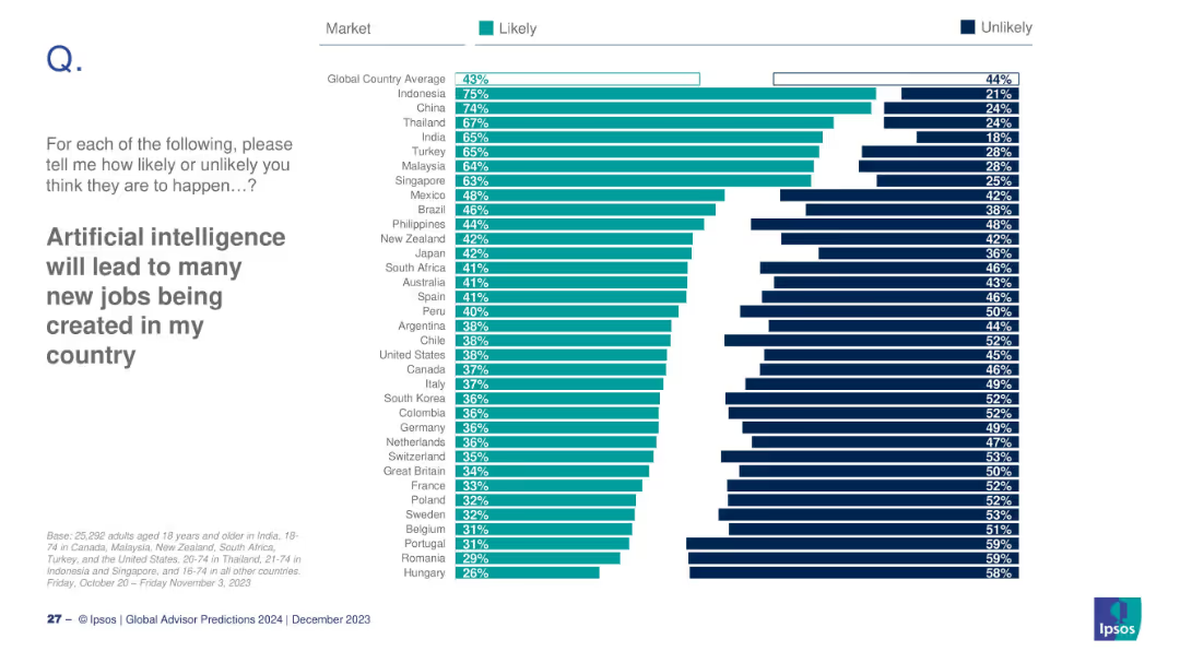
Country-level breakdown of likely/unlikely responses
Technology and Digital Transformation
Artificial Intelligence
A global snapshot of expectations around AI's potential to create new jobs. This slide ranks countries based on their optimism or skepticism about AI-driven job creation and compares percentages of likely and unlikely responses.
AI, job creation, workforce, optimism, future jobs
Mixed Chart
IPSOS
Saved
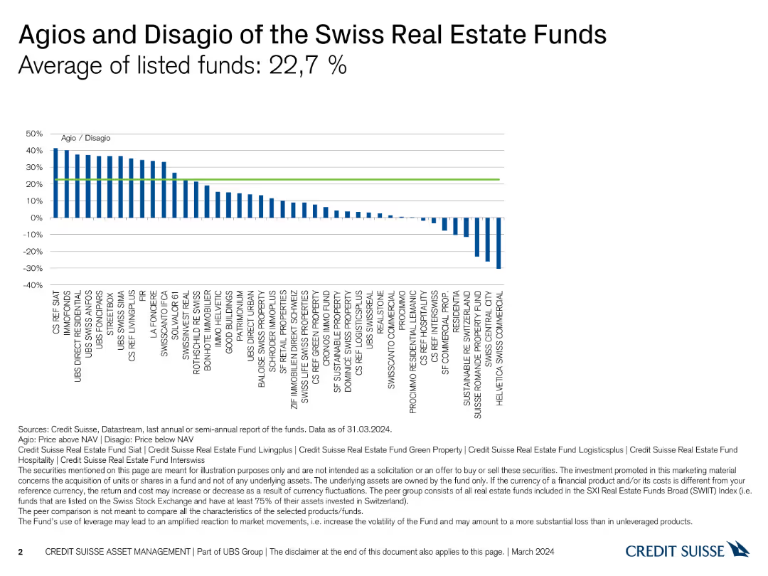
The slide includes a column chart showing agios and disagio of various Swiss real estate funds. It is moderately complex with clear visual data representation.
Investment Analysis
Real Estate & Construction
The slide analyzes the average agios and disagio of Swiss real estate funds, providing insights into fund performance as of March 2024.
agios, disagio, real estate, funds, performance
Single Chart
Credit Suisse
Saved
A multi-line chart showing FDI variations across several Central American countries from 2015 to 2022. Each country is represented by a different color.
Investment Analysis
Financial Services
This slide compares the Foreign Direct Investment trends in various Central American countries, indicating significant events and their impact on FDI for each country.
FDI, Central America, country comparison, trends
Single Chart
Deloitte
Saved
Previous
Next
If nothing, comes up, please save your slides first
Create a FREE account to continue browsing
Receive Instant Access to 1,000+ slides from companies like McKinsey, Google, and Goldman Sachs
First Name
Last Name
Email
Password
I agree to all
Terms & Privacy Policy
Thank you! Your submission has been received!
Oops! Something went wrong while submitting the form.
Have an account?
Sign in
Column Chart
Heatmap
Chevron
Org Chart
Infographic
Callouts
Timeline
List
Graphic
Picture
Process Flow
Diagram
Paragraph
Map
Table
Framework
Subtitle
Takeaway Box
Icon
Other Chart
Radar Chart
Waterfall Chart
Mekko Chart
Pie Chart
Scatter Plot
Line Chart
Bar chart
Bullet points