Create a FREE Account
Instant access to 1,000+ real slides from top companies like McKinsey, BCG, Goldman Sachs, Google and many more!
First Name
Last Name
Email
Password
I agree to all
Terms & Privacy Policy
Thank you! Your submission has been received!
Oops! Something went wrong while submitting the form.
Have an account?
Sign in
Library
Templates
Courses
Pricing
My Account
My Slides
My Templates
✦ AI
AI Prompt Library
AI Search
Sign in
Start Here
Logout
My Saved Slides
This slide includes two column charts. The left chart shows UK mortgage rates over time for different loan-to-value ratios. The right chart presents UK housing market trends, including house prices and sales to stock ratio. The charts are clear with detailed annotations.
Market Analysis and Trends
Financial Services
This slide examines the UK housing market by analyzing mortgage rates, house prices, and market trends, useful for real estate market analysis and financial planning.
UK housing market, mortgage rates, house prices, sales to stock ratio, real estate
Multiple Chart
JP Morgan
Saved
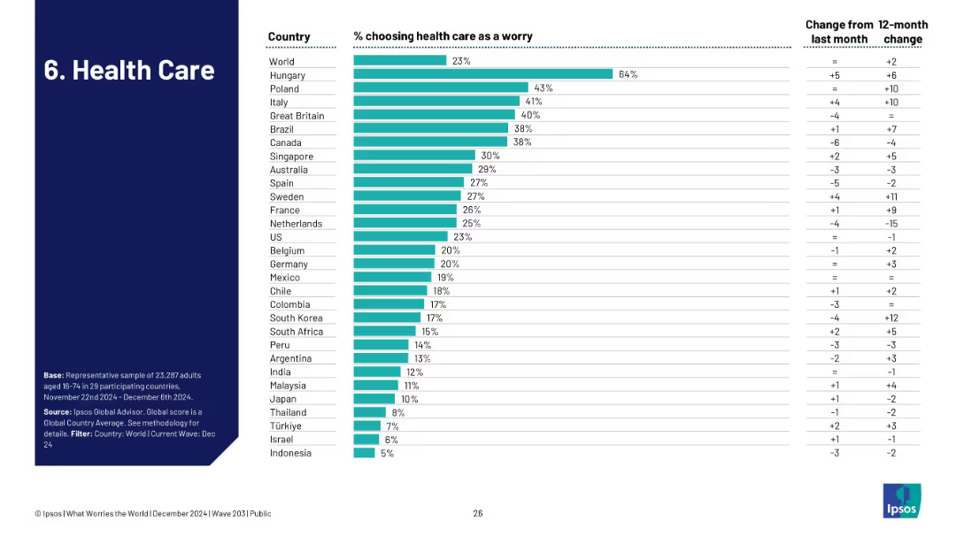
Bar chart showing how many in each country identify health care as a top concern, including trends from the previous month/year.
Risk Assessment and Management
Healthcare & Pharmaceuticals
The slide shows healthcare concerns at 23% globally, led by Hungary (64%). It provides a comparative look at how health systems and concerns differ by region, tracking recent perception changes.
healthcare, system strain, patient care, Ipsos, global health, concern levels
Single Chart
IPSOS
Saved
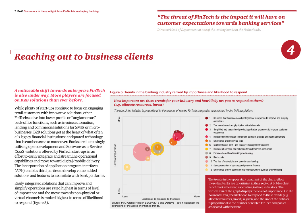
The slide includes a bubble chart ranking trends in the banking industry by importance and likelihood to respond. Text on the left discusses the focus on B2B solutions and their impact on business clients.
Sales and Business Development
Financial Services
The slide highlights the importance of B2B solutions in the FinTech industry, ranking various trends and emphasizing the need for banks to adopt these solutions to improve operations and client engagement.
FinTech, B2B solutions, trends, business clients, engagement
Mixed Chart
PwC/Strategy&
Saved
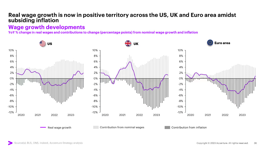
The slide contains three column charts comparing YoY % change in real wages and contributions from nominal wage growth and inflation for the US, UK, and Euro area from 2020 to 2023.
Market Analysis and Trends
Professional Services
The slide shows real wage growth is now positive across the US, UK, and Euro area amidst subsiding inflation.
wage growth, real wages, inflation, US, UK, Euro area, column chart
Multiple Chart
Accenture
Saved
This slide includes bar charts showing IG convert issuance over time and the growth of global private debt institutional funds.
Financial Performance
Financial Services
The slide discusses the trend of firms turning to alternative financing methods such as convertible debt and private credit in response to higher interest rates. It highlights the increasing attractiveness and flexibility of these options. The slide can be used for financial strategy and performance analysis discussions.
financing, convertible debt, private credit, interest rates, alternative financing
Multiple Chart
JP Morgan
Saved
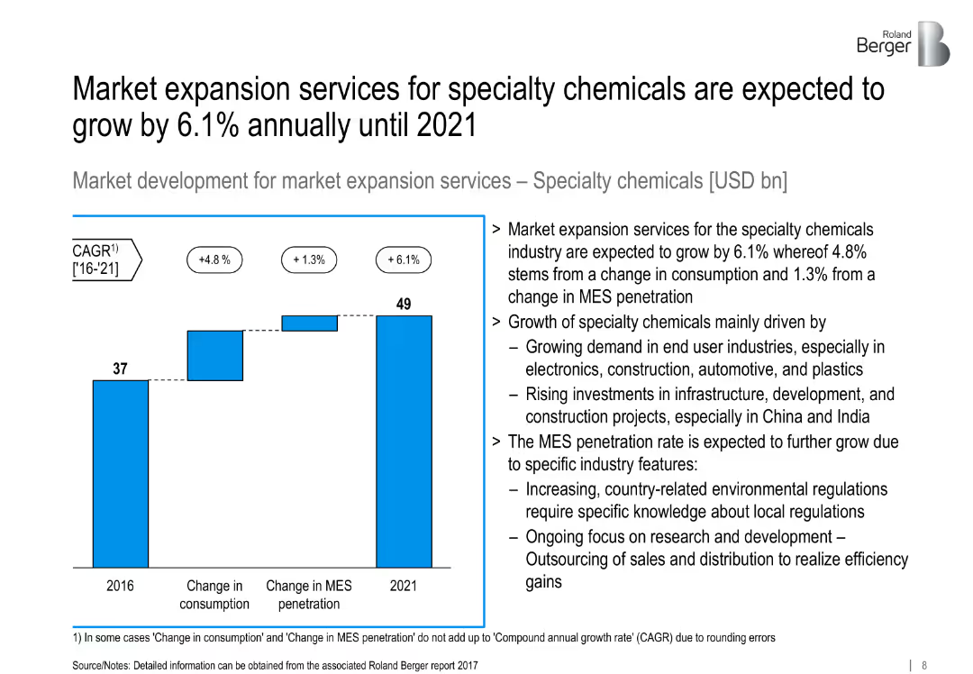
Bar chart showing growth from 2016 to 2021; supporting analysis on industry trends.
Market Analysis and Trends
Industrial & Manufacturing
Projects 6.1% CAGR in MES for specialty chemicals, driven by end-user demand, infrastructure development, and increasing R&D outsourcing.
specialty chemicals, MES, infrastructure, consumption, R&D outsourcing
Mixed Chart
Roland Berger
Saved
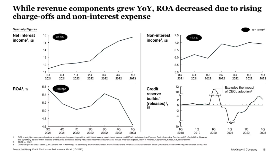
Four-panel layout with line graphs: net interest income, non-interest income, ROA, and credit reserve builds/releases. Includes YoY % or bps change in each panel.
Financial Performance
Financial Services
Despite increases in interest and non-interest income, ROA declined due to rising charge-offs and credit reserve adjustments. Visuals support that revenue growth was offset by risk-related impacts, particularly in 1Q23.
ROA, Credit Reserves, Net Interest, Non-Interest Income, Charge-offs, Financial Trends
Single Chart
McKinsey
Saved
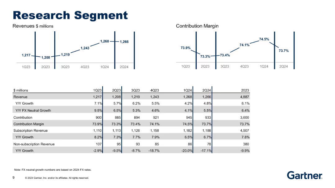
Charts showing revenue and contribution margins above a detailed table. Table includes growth metrics and breakdown into subscription categories.
Performance Metrics and KPIs
Technology & Software
Provides updated data for the Research segment through 2Q24. Tracks sustained subscription growth and contraction in non-subscription revenue, alongside steady contribution margins and FX-neutral growth.
Research, Revenue, Contribution Margin, Subscription, FX Growth
Multiple Chart
Gartner
Saved
The slide has a color-coded, segmented arrow graphic that illustrates various contributions of the Tempest program. The design is professional, using a mix of red, black, and white color scheme with clear, bold fonts and highlighted numerical data. The layout is moderately dense with text and graphical elements.
Industry Overview
Government & Public Sector
This slide provides an overview of the Tempest programme’s economic impact, job creation, and regional contribution from 2021 to 2050. It is used to demonstrate the significance of a government defense project in terms of economic and employment benefits.
Tempest programme, GDP contribution, employment, economic impact, long-term value, productivity, regional benefits
Diagram
PwC/Strategy&
Saved
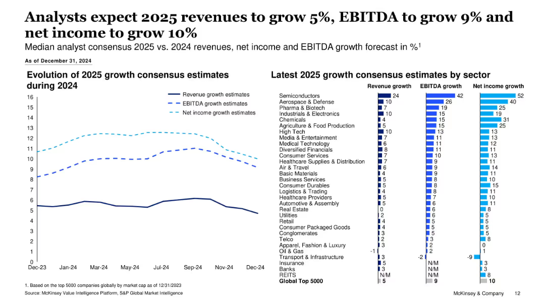
Combination of line chart and bar chart; left side tracks consensus growth estimate evolution, right side shows sector-specific 2025 growth forecasts.
Financial Performance
Financial Services
This slide outlines 2025 growth expectations for revenue, EBITDA, and net income across major sectors. Analysts forecast moderate growth, with semiconductors leading in all three metrics. Visuals show how estimates evolved over 2024.
Growth Forecast, Revenue, EBITDA, Net Income, 2025 Estimates, Sector Analysis, Consensus Estimates, Financial Performance
Multiple Chart
McKinsey
Saved
Split layout with bar charts detailing digital capability preferences by generation on the right and an image on the left.
Market Analysis and Trends
Healthcare & Pharmaceuticals
Shows that younger consumers are more likely to choose medical providers offering digital capabilities, with preferences varying by generation.
medical, providers, digital, preferences, generation
Multiple Chart
Accenture
Saved
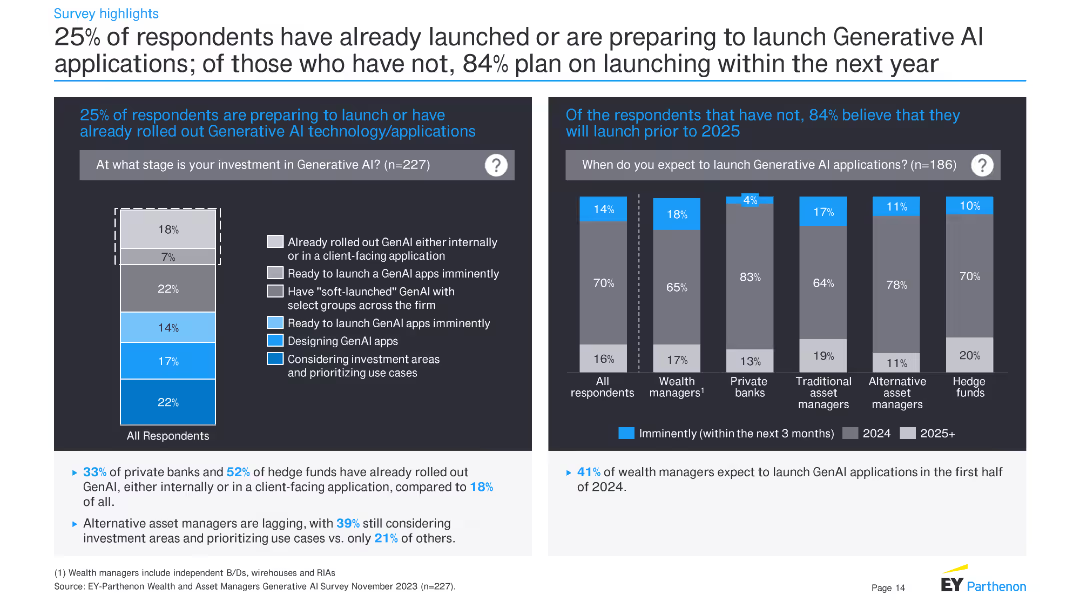
This slide contains two bar charts: one showing the stages of investment in GenAI applications and another on the expected timeline for launching GenAI applications. Text explains survey responses regarding investment and launch plans.
Technology and Digital Transformation
Financial Services
The slide presents survey data on the stages of investment in GenAI applications and expected timelines for launching these applications. It provides insights into the current state and future plans for GenAI adoption.
GenAI, investment, stages, launch plans, financial services, survey, technology, adoption
Multiple Chart
EY
Saved
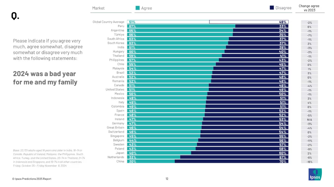
Horizontal bar chart similar to previous slide, but measuring personal/family sentiment by country; includes % agree/disagree and change vs 2023.
Market Analysis and Trends
Professional Services
This slide details how people around the world felt about their personal and family well-being in 2024. Peru (67%) tops the list, while China (30%) and Netherlands (33%) are lowest. Global average is 51%.
personal sentiment, family impact, 2024 hardship, global perspective, Ipsos survey, public opinion
Mixed Chart
IPSOS
Saved
This slide includes a column chart comparing the capital expenditure outlook on medical devices/equipment across different regions over three time periods.
Strategic Planning
Healthcare & Pharmaceuticals
This slide discusses the optimistic outlook on future capital expenditure by hospitals, highlighting expected increases in spending on medical devices and equipment.
capital expenditure, medical devices, equipment, hospital spending, regional comparison
Single Chart
LEK
Saved
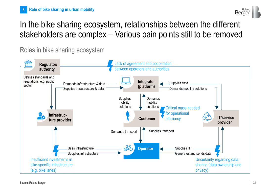
Flowchart-style diagram showing stakeholder interactions in the ecosystem with directional arrows, text boxes, and pain points highlighted in blue.
Operational Efficiency
Transportation & Logistics
The slide maps out interactions among key stakeholders in bike sharing—operators, customers, regulators, integrators, and IT providers—highlighting collaboration pain points like regulation, infrastructure, and data issues.
bike sharing, ecosystem, stakeholder roles, pain points, infrastructure, IT providers, mobility
Diagram
Roland Berger
Saved
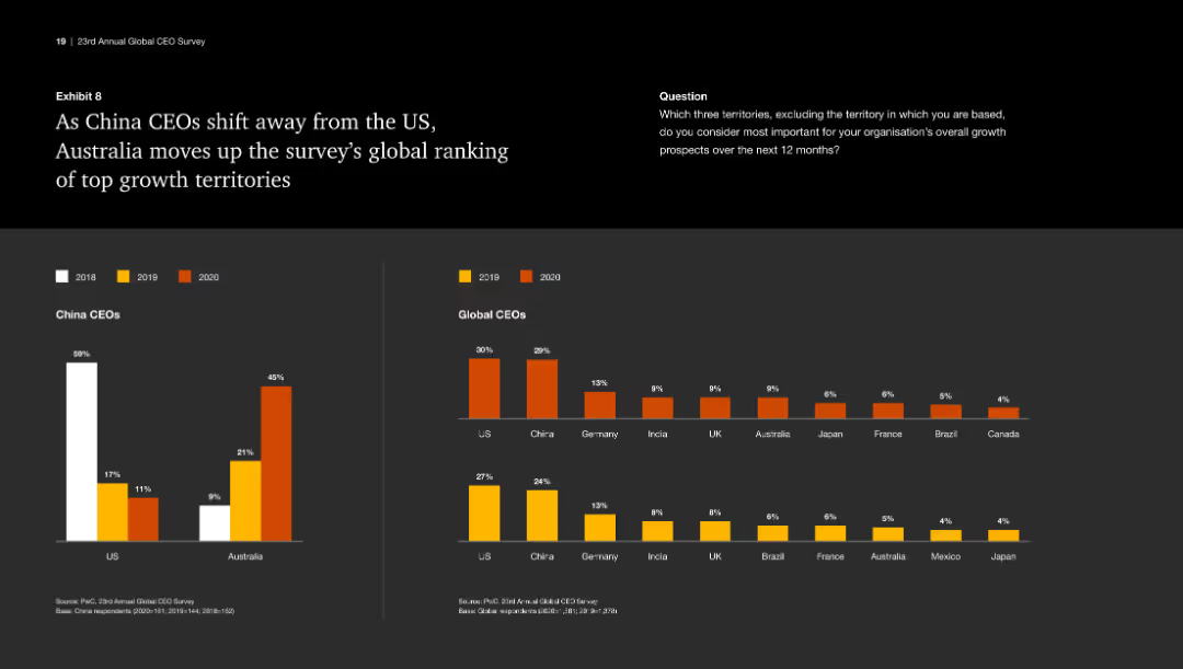
This slide features a column chart showing the ranking of US and Australia in terms of attractiveness to China CEOs from 2018 to 2020. It uses color to differentiate each year.
Market Analysis and Trends
Industrial & Manufacturing
The slide highlights the shift of China CEOs' preference from the US to Australia as a top growth territory, showcasing the rankings and changes over the years.
Growth territories, China CEOs, Australia, US, ranking
Multiple Chart
PwC/Strategy&
Saved
Slide visualizes the "Loyalty Business" as a pathway, showing relationships between data integration and customer personalization.
Technology and Digital Transformation
Retail & E-commerce
Describes how a strategic approach to loyalty involves using data to drive better customer personalization and engagement.
loyalty, data strategy, personalization, customer engagement, pathway
Diagram
BCG
Saved
The slide features a black background with a large orange header. It contains a text block and three bar charts displaying the percentage of employees discussing political and social issues at work, segmented by different groups.
Organizational Structure and Change
Government & Public Sector
Discusses the frequency and impact of political and social discussions at work. It examines the positive and negative outcomes of these discussions across various demographic groups, revealing that such interactions can have both beneficial and detrimental effects on workplace dynamics.
workplace discussions, political issues, social issues, demographics
Multiple Chart
PwC/Strategy&
Saved
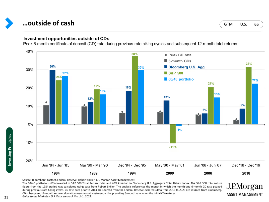
A column chart comparing investment returns of CDs, bonds, and portfolios during past rate hiking cycles.
Investment Analysis
Financial Services
Analyzes investment opportunities beyond cash, focusing on CDs, bonds, and portfolio performance during rate hikes.
Investment, CDs, bonds, portfolios, rate hikes, performance, analysis, opportunities, returns
Single Chart
JP Morgan
Saved
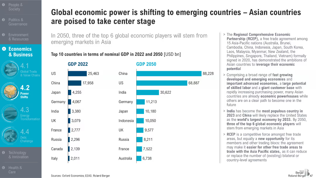
Side-by-side bar chart comparing GDP in 2022 vs. projected 2050; right-hand text box summarizes key implications; simple layout with bold labels
Strategic Planning
Financial Services
The slide forecasts a major global power shift by 2050, with emerging markets like China and India overtaking developed nations in GDP rankings. The Regional Comprehensive Economic Partnership (RCEP) is highlighted as a driver of this trend.
GDP growth, emerging markets, RCEP, China, India, economic power shift, Asia, 2050 projection, global economy, trade
Mixed Chart
Roland Berger
Saved
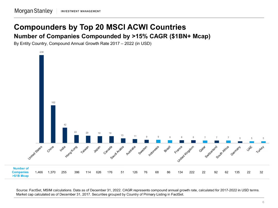
A column chart showing the number of companies with >15% CAGR from top 20 MSCI ACWI countries. The layout is simple and focuses on data presentation.
Market Analysis and Trends
Financial Services
This slide showcases the number of companies achieving significant annual growth rates across top global markets, useful for identifying leading investment regions.
compounders, MSCI ACWI, CAGR, global markets, investment
Single Chart
Morgan Stanley
Saved
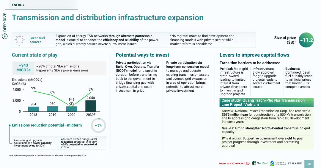
Consistent block design with emission graphs, investment options, challenges, and green-shaded case study section. Blue and green color scheme emphasizing energy and infrastructure.
Strategic Planning
Energy & Utilities
Discusses the critical need to expand SEA's energy transmission and distribution to improve reliability and accommodate renewable energy. Midterm emissions reduction is ~5%. Investment paths include private participation via BOOT and concession models. The Vietnam-based case study illustrates a $675M loan to expand transmission infrastructure to reduce grid congestion.
transmission, grid, energy, BOOT, investment, Vietnam, infrastructure, emissions
Multiple Chart
Bain
Saved
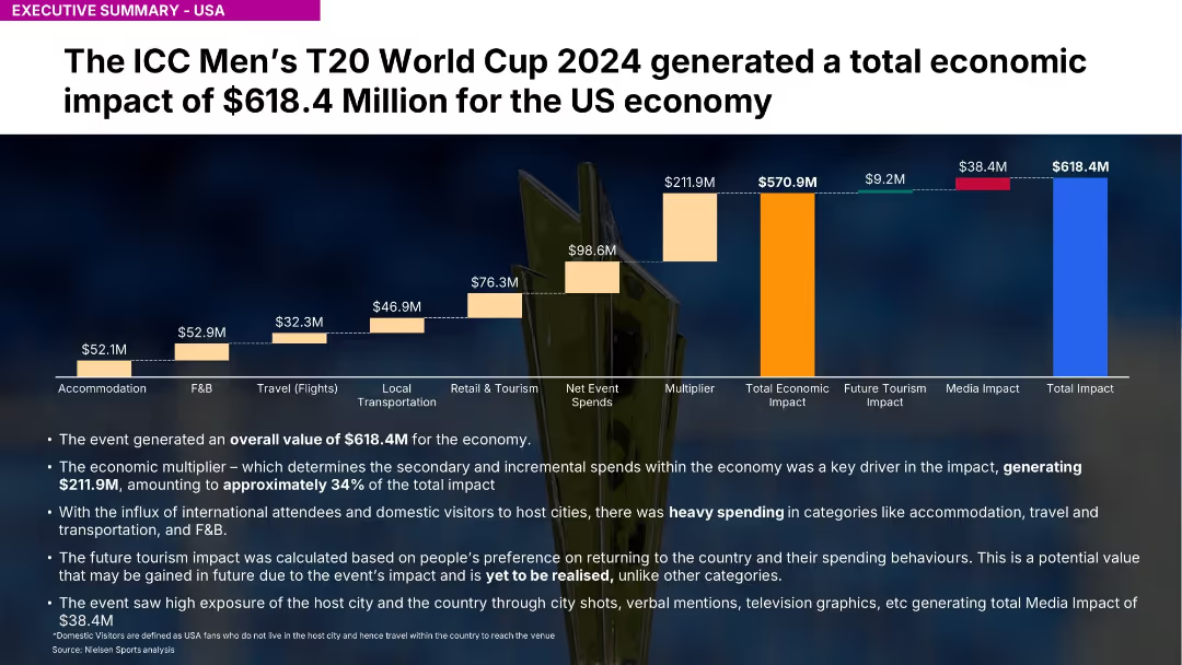
Similar chart structure to 18667 but covering entire USA; highlights $618.4M impact
Investment Analysis
Media & Entertainment
Highlights USA's $618.4M contribution to economic impact. Strong spending in F&B, accommodation, and tourism. Media exposure generated $38.4M.
USA, ICC, T20, economic value, spending, travel, Nielsen, event impact, media exposure, multiplier
Mixed Chart
Nielsen
Saved
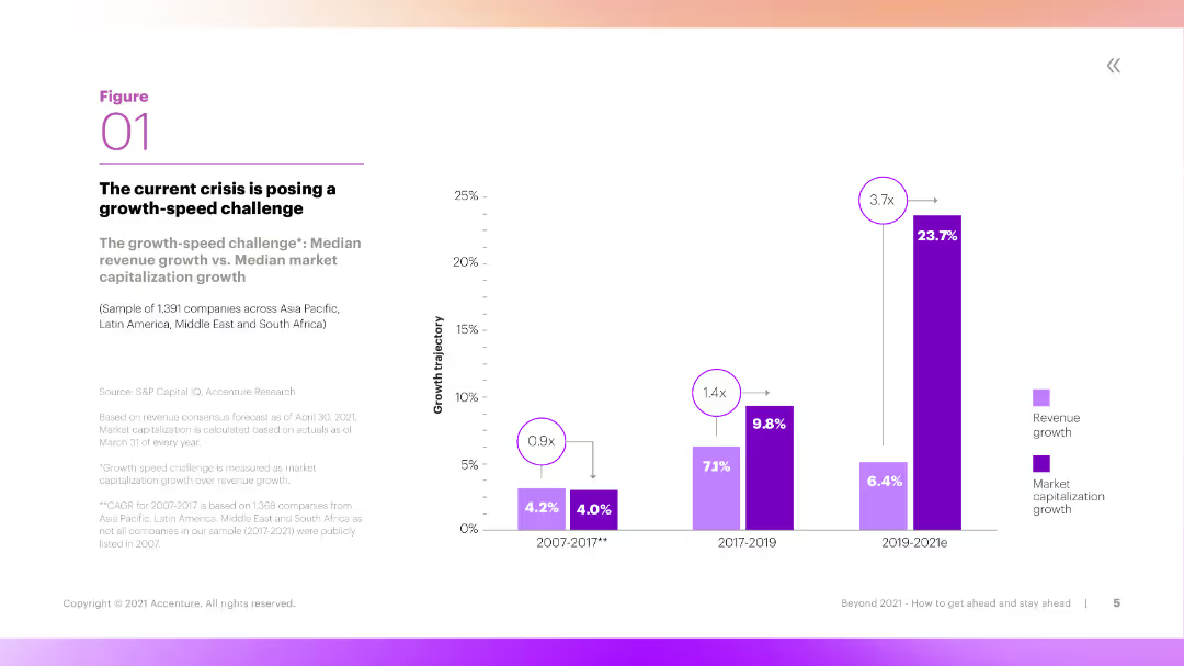
This slide features a column chart comparing median revenue growth and median market capitalization growth over three periods. The chart uses vibrant colors and clear labels to differentiate the data sets.
Market Analysis and Trends
Financial Services
The slide discusses the 'growth-speed challenge,' comparing revenue growth with market capitalization growth across three time periods. It highlights the challenges companies face in maintaining growth during crises.
Growth, Revenue, Market Capitalization, Crisis, Challenge
Mixed Chart
Accenture
Saved
Displays a composite of multiple line charts illustrating the revenue trajectories of different media segments from 2019 to 2024 in India. Each segment, such as internet, TV, and newspapers, is color-coded for clarity, highlighting the divergent paths of digital versus traditional media.
Market Analysis and Trends
Media & Entertainment
Provides an analysis of growth trends in various media segments, with a stark contrast between the robust growth of digital platforms and the decline of traditional media. This slide is used to facilitate strategic discussions on budget allocation, advertising strategies, and preparing for long-term shifts in media consumption patterns.
media trends, digital growth, traditional decline
Mixed Chart
PwC/Strategy&
Saved
Previous
Next
If nothing, comes up, please save your slides first
Create a FREE account to continue browsing
Receive Instant Access to 1,000+ slides from companies like McKinsey, Google, and Goldman Sachs
First Name
Last Name
Email
Password
I agree to all
Terms & Privacy Policy
Thank you! Your submission has been received!
Oops! Something went wrong while submitting the form.
Have an account?
Sign in
Column Chart
Heatmap
Chevron
Org Chart
Infographic
Callouts
Timeline
List
Graphic
Picture
Process Flow
Diagram
Paragraph
Map
Table
Framework
Subtitle
Takeaway Box
Icon
Other Chart
Radar Chart
Waterfall Chart
Mekko Chart
Pie Chart
Scatter Plot
Line Chart
Bar chart
Bullet points