Create a FREE Account
Instant access to 1,000+ real slides from top companies like McKinsey, BCG, Goldman Sachs, Google and many more!
First Name
Last Name
Email
Password
I agree to all
Terms & Privacy Policy
Thank you! Your submission has been received!
Oops! Something went wrong while submitting the form.
Have an account?
Sign in
Library
Templates
Courses
Pricing
My Account
My Slides
My Templates
✦ AI
AI Prompt Library
AI Search
Sign in
Start Here
Logout
My Saved Slides
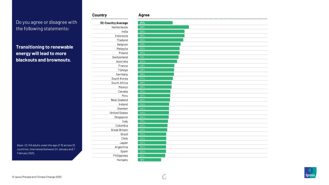
Dark left panel, right side shows ranked bar chart with 32 countries based on agreement level.
Market Analysis and Trends
Energy & Utilities
This slide explores public concerns about the reliability of renewable energy, specifically the risk of blackouts. The Netherlands has the highest concern rate.
blackouts, renewable energy, power grid, energy transition, reliability, public concern, Ipsos, energy security, brownouts, country opinion
Mixed Chart
IPSOS
Saved
The slide utilizes a mix of icons, text, and a three-part list to describe Macquarie's risk management approach. It has a clear and straightforward design, with good use of whitespace and a structured layout. The slide uses a color scheme consistent with the Macquarie brand.
Risk Assessment and Management
Financial Services
It outlines the core principles and model of risk management at Macquarie, emphasizing business accountability and stability. This slide is intended to communicate Macquarie’s established risk culture and its alignment with industry-standard 'three lines of defence' risk management to stakeholders.
risk management, Macquarie, business accountability, stability, principles, three lines of defence, operational risk, corporate governance
Header Horizontal
Morgan Stanley
Saved
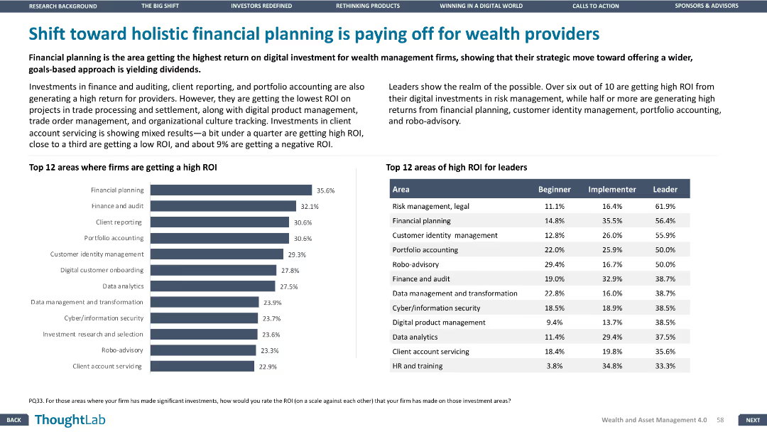
Column charts illustrating high ROI areas for firms and leaders by different categories.
Strategic Planning
Financial Services
Discusses the areas where wealth management firms are seeing high ROI from digital investments, focusing on financial planning.
ROI, financial, planning, digital, wealth
Mixed Chart
Deloitte
Saved
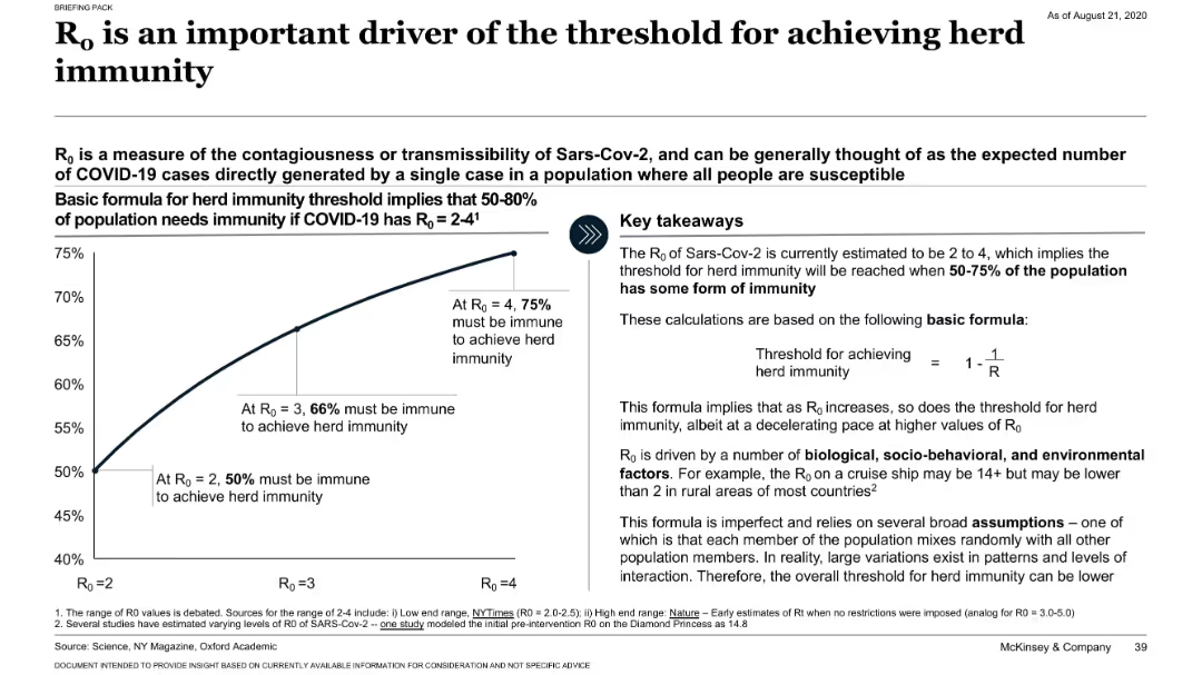
Split layout with a left-side chart showing immunity thresholds by R₀ value, and a right-side text box with key takeaways and formula. Minimalistic, clinical.
Risk Assessment and Management
Healthcare & Pharmaceuticals
The slide explains how the basic reproduction number (R₀) influences the threshold required for herd immunity, using a simple mathematical formula. It visualizes that with an R₀ of 2 to 4, between 50% to 75% of a population must be immune. It discusses variability due to biological, behavioral, and environmental factors.
R₀, herd immunity, COVID-19, transmission, infection rate, public health
Mixed Chart
McKinsey
Saved
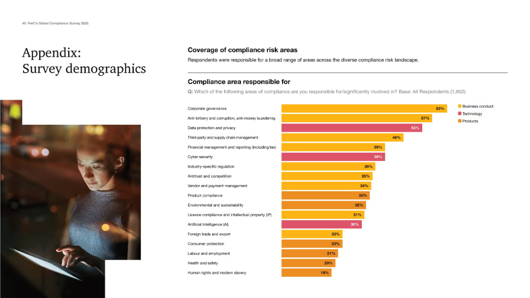
Clean design with a demographic chart showing responsibility across compliance areas.
Industry Overview
Professional Services
Final appendix slide showing the range of compliance areas respondents are responsible for. Corporate governance, anti-bribery, and data privacy top the list. Categorized into business conduct, tech, and product areas. Demonstrates the breadth of responsibilities handled by compliance professionals today.
survey demographics, compliance areas, governance, data privacy, AI
Mixed Chart
PwC/Strategy&
Saved
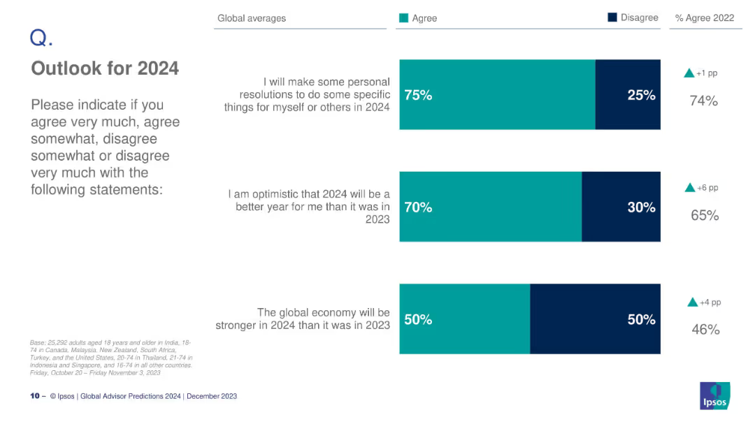
Bar chart with three global statements on 2024 optimism: resolutions, optimism for better year, and global economy strength.
Strategic Planning
Professional Services
This slide forecasts sentiment for 2024, highlighting that 75% plan resolutions, 70% are optimistic it will be a better year, and 50% believe the economy will improve.
optimism, 2024, resolutions, economy, sentiment, Ipsos, predictions, outlook
Mixed Chart
IPSOS
Saved
Combines text with a column chart of top strategic risks for the next three years, emphasizing the ubiquity of cyber threats and geopolitical risks.
Risk Assessment and Management
Financial Services
This slide discusses the top external forces impacting CROs, focusing on the increasing threat of cyber attacks and geopolitical tensions, supported by survey data on strategic risks.
External Forces, Cyber Threats, Geopolitical Risks, Strategic Risks
Single Chart
EY
Saved
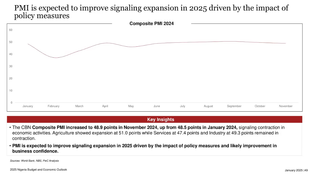
Line chart tracking Composite PMI across 2024, with key insights in red box below. Clean, spacious layout.
Performance Metrics and KPIs
Financial Services
The slide displays Nigeria's 2024 PMI trend, noting a slight improvement in November and projecting expansion in 2025 due to policy impacts. The insights emphasize sectoral variations and growing business confidence.
PMI, economic expansion, policy impact, business sentiment, composite index, Nigeria 2025, sectoral growth
Mixed Chart
PwC/Strategy&
Saved
The slide includes a column chart displaying confidence levels in audience data across different regions. It uses shades of blue to differentiate between levels of agreement.
Market Analysis and Trends
Professional Services
This slide presents data on global marketers' confidence in their audience data, revealing that only 26% feel fully confident. It emphasizes the need for improved data strategies.
audience data, confidence, global marketers, data strategies, regional differences
Mixed Chart
Nielsen
Saved
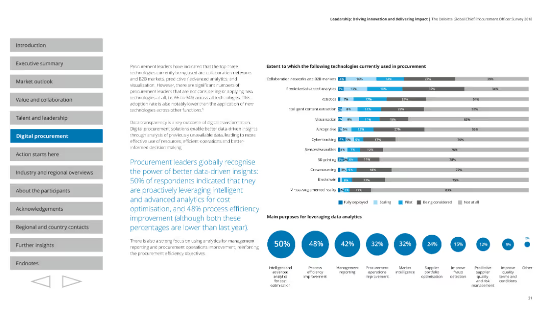
Shows a variety of charts including column and pie charts, focused on the current usage and scaling of different technologies in procurement.
Technology and Digital Transformation
Professional Services
Highlights the importance of data-driven insights in procurement, detailing the main purposes and current use of various technologies.
Data analytics, procurement, technology usage, scaling
Multiple Chart
Deloitte
Saved
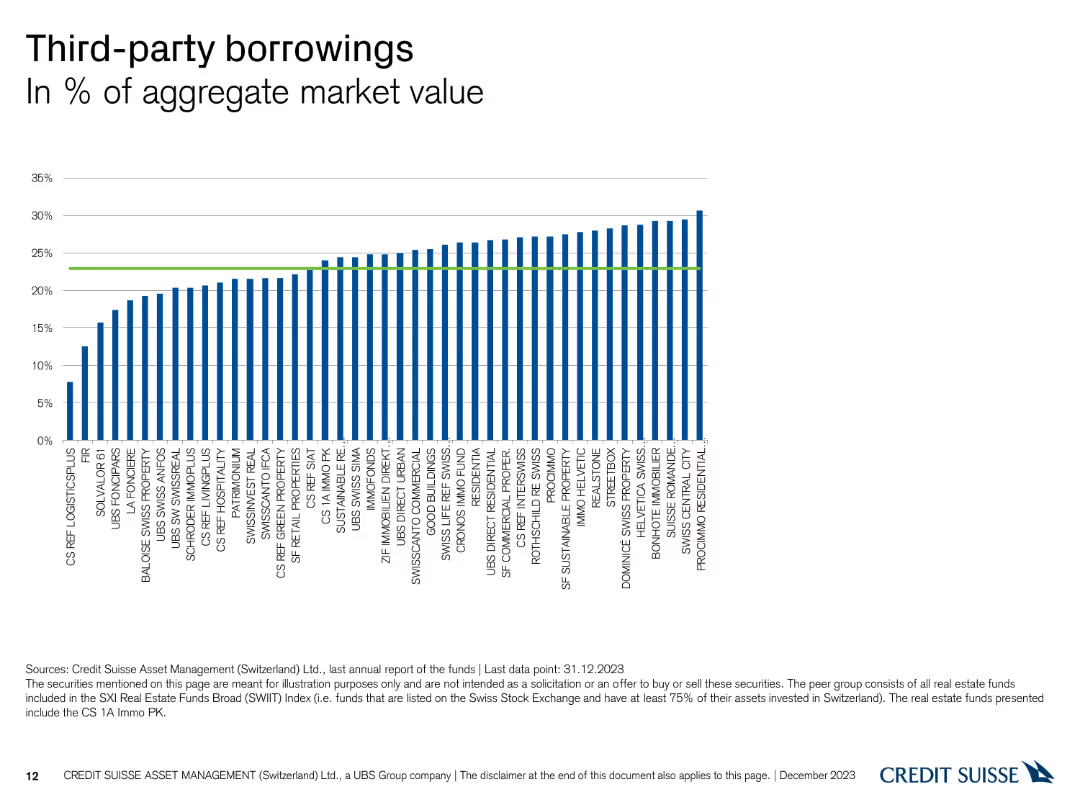
The slide features a column chart illustrating the percentage of third-party borrowings across different funds.
Financial Performance
Financial Services
This slide presents the percentage of third-party borrowings in aggregate market value for various funds managed by Credit Suisse as of December 31, 2023.
third-party, borrowings, market value, funds, Credit Suisse
Single Chart
Credit Suisse
Saved
Features comparative bar charts and graphical representations analyzing societal impact and motivations for corporate initiatives. The design is structured to highlight differences between German and global perspectives.
Strategic Planning
Professional Services
Analyzes how organizations measure success through societal impact, comparing motivations and approaches between German and global companies. This slide is useful for discussions on corporate social responsibility and strategic planning.
Societal impact, corporate strategy, German vs. global, CSR, strategic planning
Multiple Chart
Deloitte
Saved
This slide features line charts and bar charts to display agent capacity and available skills in field service management. It uses a dark background with blue and green lines and bars to differentiate between data points.
Operational Efficiency
Energy & Utilities
The slide offers insights into field service management, focusing on agent capacity and available skills, using line and bar charts to visualize the data, enhancing operational efficiency in managing field services.
Field Service, Management, Agent Capacity, Skills, Data Visualization
Multiple Chart
EY
Saved
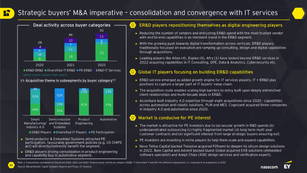
Bar chart comparing buyer categories over 3 years and stacked subsegment chart; side bullet points highlighting three strategic themes.
Strategic Planning
Technology & Software
The slide explains how ER&D players and global IT firms are converging through M&A to build digital engineering capabilities. It highlights shifting buyer strategies, rising interest in automation, and favorable conditions for PE investors due to government policies and secular growth in R&D spend.
ER&D, M&A, IT services, digital engineering, private equity, strategic buyers, consolidation
Multiple Chart
EY
Saved
Central pie chart with a breakdown of online spend allocation surrounded by images and bar graphs detailing platform and player types in alternative eCommerce.
Market Analysis and Trends
Retail & E-commerce
Showcases the impact of social media on alternative e-Commerce, indicating that it constitutes a significant portion of online spending.
social media, e-commerce, online spending, alternative, dominance, platform, market
Multiple Chart
Bain
Saved
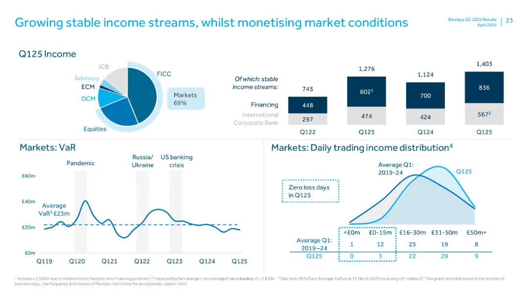
Pie chart and bar charts showing Q125 income mix, VaR, and trading income distribution metrics.
Performance Metrics and KPIs
Financial Services
Focuses on stable income from core sources, with charts on Q125 income split, market risk (VaR), and daily trading income. Notes high portion of stable income and zero loss days in Q125.
Income Streams, VaR, Trading Income, FICC, Markets, Q125, Stable Revenue, ICB
Multiple Chart
Barclays
Saved
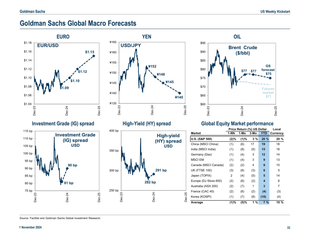
3x2 grid with forecasted exchange rates, spreads, and oil prices. Table on the right shows equity market performance across global indices. Trend arrows and dotted forecast lines included.
Strategic Planning
Financial Services
This macro forecast slide projects exchange rates (EUR/USD, USD/JPY), oil prices, and credit spreads. It also ranks global equity market performance, highlighting U.S. and international returns in both local and USD terms.
macro forecast, exchange rates, oil, IG/HY spreads, global equities, market return
Multiple Chart
Goldman Sachs
Saved
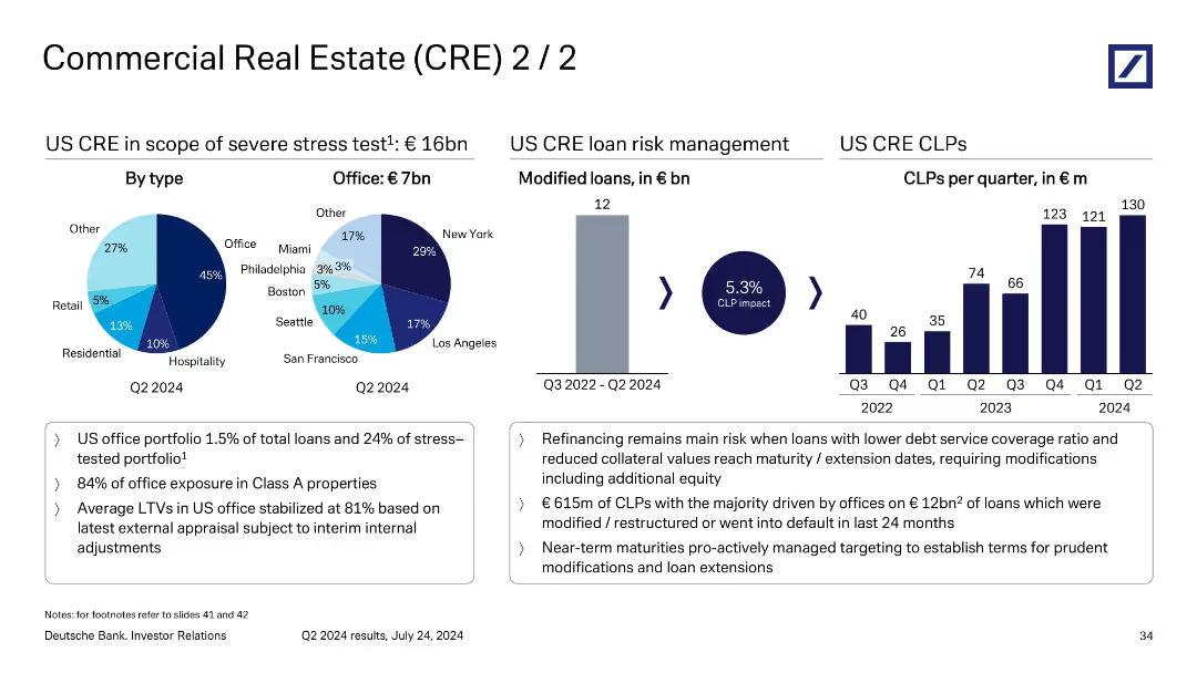
Multi-section layout with pie charts, bar chart, and supporting bullet points; visually divides analysis by loan type, office risk, and CLP trends.
Risk Assessment and Management
Financial Services
This slide delves deeper into US CRE loan risks, particularly the €16bn under stress testing, of which €7bn are office-related. It tracks €615m of CLPs linked to €12bn of restructured or defaulted office loans. A chart shows rising CLPs per quarter, emphasizing risk from refinancing and lower collateral values.
US CRE, CLP impact, refinancing risk, loan modification, office exposure
Multiple Chart
Deutsche Bank
Saved
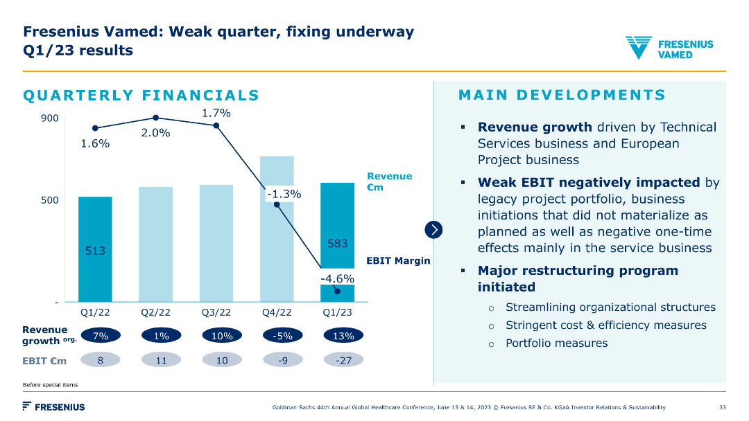
A column chart depicting quarterly financial results with a focus on revenue and EBIT margin. Accompanied by bullet points on main developments and restructuring programs.
Financial Performance
Healthcare & Pharmaceuticals
The slide details Fresenius Vamed's Q1/23 financial results, emphasizing revenue growth drivers, EBIT impact from legacy projects, and major restructuring initiatives to improve performance.
Q1 results, financials, restructuring, EBIT, revenue
Mixed Chart
Goldman Sachs
Saved
The slide includes multiple column charts showing trends in equities and FICC, market share gains, and annual income analysis.
Financial Performance
Financial Services
It examines the impact of global markets on the corporate investment bank's income, highlighting specific areas such as equities and FICC with historical data comparison.
equities, FICC, market share, income, trends
Multiple Chart
Barclays
Saved
Contains graphical data on smartphone prices and data tariffs, employing color contrasts and icons for a clear representation.
Market Analysis and Trends
Retail & E-commerce
This slide presents the driving forces behind the growth in digital consumption, including price drops and tariff reductions. Crucial for market strategy planning.
Smartphone Prices, Data Tariffs, Market Forces, India, Digital Growth, Technology Trends, Price Analysis, Economic Factors
Multiple Chart
BCG
Saved
Slide includes two column representations. The design is comprehensive with a systematic arrangement of sections, facilitating a clear understanding of complex processes.
Strategic Planning
Environmental Services & Sustainability
Discusses strategies to enhance the viability and scale of projects within the carbon trading sector, emphasizing regulatory improvements and market accessibility. It also highlights key actions for accelerating growth and development in the sector.
scalability, carbon trading, regulations, market access, strategic actions
Header Horizontal
Bain
Saved
Displays stacked bar graphs comparing sustainable fuel demand by sector and feedstock type, with a clear legend and annotations.
Investment Analysis
Energy & Utilities
Highlights the demand for different types of sustainable fuel feedstocks, which is critical information for investors considering the bioenergy sector.
Sustainable Fuels, Bioenergy, Feedstock Demand, Investment Analysis, Sector Comparison, 2050 Trends
Multiple Chart
McKinsey
Saved
Column chart comparing the levelized cost of energy for gas combined cycle plants with CCS, under retrofit and new-build scenarios, with and without subsidies.
Financial Performance
Energy & Utilities
The slide compares the costs of gas combined cycle plants with CCS, analyzing both retrofit and new-build scenarios and showing cost differences due to subsidies.
CCS, Gas combined cycle, Cost analysis, Retrofit, New-build
Single Chart
Roland Berger
Saved
Contains bar charts and numeric rankings showing investment priorities by region (North America, Europe, Asia), particularly in innovation, cyber security, and talent development.
Strategic Planning
Financial Services
Analyzes regional investment priorities, emphasizing how different areas are leveraging investments in technology, security, and talent to position themselves competitively in the global market.
regional investments, technology, security, talent development, competitive positioning
Multiple Chart
BCG
Saved
Previous
Next
If nothing, comes up, please save your slides first
Create a FREE account to continue browsing
Receive Instant Access to 1,000+ slides from companies like McKinsey, Google, and Goldman Sachs
First Name
Last Name
Email
Password
I agree to all
Terms & Privacy Policy
Thank you! Your submission has been received!
Oops! Something went wrong while submitting the form.
Have an account?
Sign in
Column Chart
Heatmap
Chevron
Org Chart
Infographic
Callouts
Timeline
List
Graphic
Picture
Process Flow
Diagram
Paragraph
Map
Table
Framework
Subtitle
Takeaway Box
Icon
Other Chart
Radar Chart
Waterfall Chart
Mekko Chart
Pie Chart
Scatter Plot
Line Chart
Bar chart
Bullet points