Create a FREE Account
Instant access to 1,000+ real slides from top companies like McKinsey, BCG, Goldman Sachs, Google and many more!
First Name
Last Name
Email
Password
I agree to all
Terms & Privacy Policy
Thank you! Your submission has been received!
Oops! Something went wrong while submitting the form.
Have an account?
Sign in
Library
Templates
Courses
Pricing
My Account
My Slides
My Templates
✦ AI
AI Prompt Library
AI Search
Sign in
Start Here
Logout
My Saved Slides
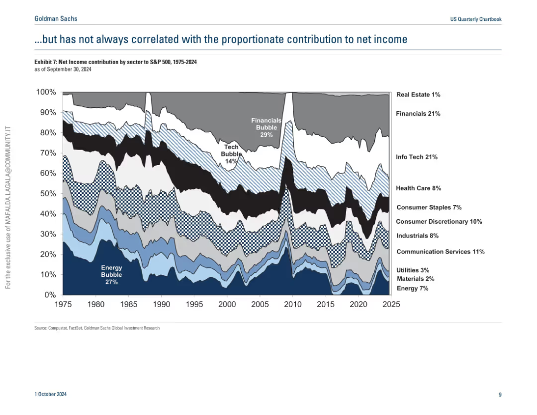
Similar streamgraph as previous slide but shows net income contribution by sector instead of market cap.
Industry Overview
Financial Services
This slide contrasts sector market capitalization with net income contribution over time, showing that dominance in market cap doesn't always translate to proportional profitability. It reveals discrepancies during bubbles and highlights the underperformance or overperformance of certain sectors relative to their size.
net income, sector comparison, S&P 500, market cap, profitability, energy, tech
Single Chart
Goldman Sachs
Saved
A bar graph compares the F-Series' revenue with other major consumer products and sports leagues.
Client Case Studies
Transportation & Logistics
Demonstrates the F-Series' revenue size in comparison to well-known products and major sports leagues' combined revenue.
F-Series, consumer products, sports leagues, revenue comparison
Single Chart
BCG
Saved
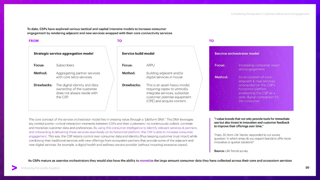
Three-column "FROM–TO–TO" visual structure with boxed content. Bottom has a paragraph block and a quote with purple highlights. Consistent use of purple theme and gradient for emphasis.
Strategic Planning
Telecommunications
Compares three CSP service models: aggregation, service build, and orchestrator. Emphasizes the orchestrator model’s benefit in owning data and driving engagement via a horizontal platform, providing tailored, adjacent services to customers.
CSP models, aggregation, platform DNA, engagement, monetization, orchestrator
Header Horizontal
Accenture
Saved
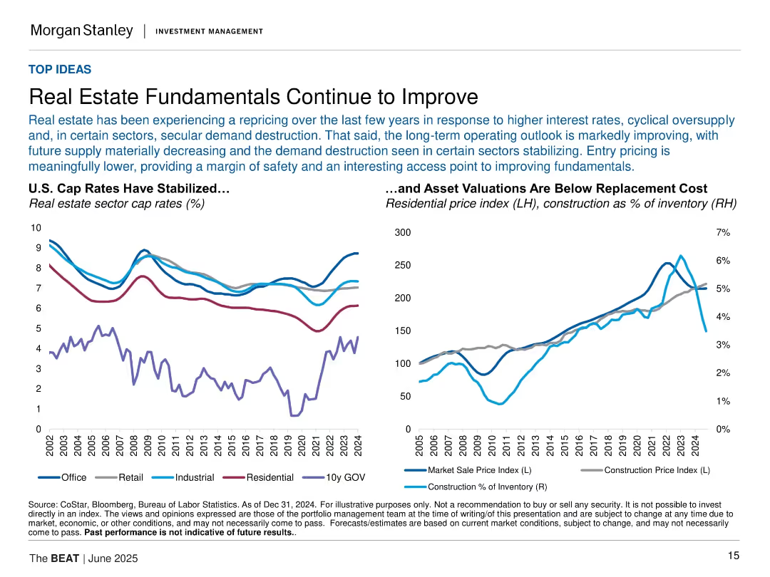
Two line charts: one for cap rates by sector, another for price and construction metrics; stylized and dual-axis.
Market Analysis and Trends
Real Estate & Construction
This slide describes improving real estate fundamentals due to pricing adjustments and shrinking supply. It includes charts on sector cap rates and residential asset valuations compared to replacement cost metrics.
real estate, cap rates, pricing, supply, valuation, fundamentals, market sale index, construction, investment
Multiple Chart
Morgan Stanley
Saved
Contains segmented column charts showing direct and indirect contributions of tourism to the GDP and employment in Europe.
Strategic Planning
Hospitality & Tourism
Examines the direct and indirect economic impacts of tourism in Europe, including contributions to GDP and employment figures.
Tourism, GDP, Employment, Economic impact, Europe
Mixed Chart
Bain
Saved
The slide has a central illustration of a 70% statistic on a presentation screen, accompanied by text boxes and a person holding a magnifying glass. The right side has text detailing training initiatives.
Human Resources and Talent Management
Financial Services
The slide discusses the importance of training employees in data analytics and provides examples from the banking sector, including on-the-job training, external training, and in-house programs.
data analytics, training, workforce, banking sector, on-the-job, external, in-house, employee upskilling, AI, ML
Mixed Chart
Deloitte
Saved
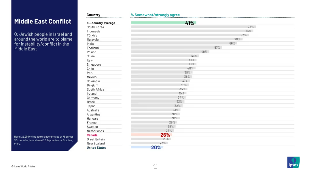
Same format as previous; this slide assesses blame on Jewish people for Middle East instability. Ranked bar chart across countries with average highlighted.
Regulatory and Compliance
Government & Public Sector
This slide presents survey results on whether people agree that Jewish populations are responsible for Middle East conflicts. The data showcases varying levels of agreement across nations, reflecting sensitive geopolitical narratives.
Jewish people, Middle East, blame, conflict, public sentiment, Ipsos, international opinion, survey, religious tension, geopolitical
Mixed Chart
IPSOS
Saved
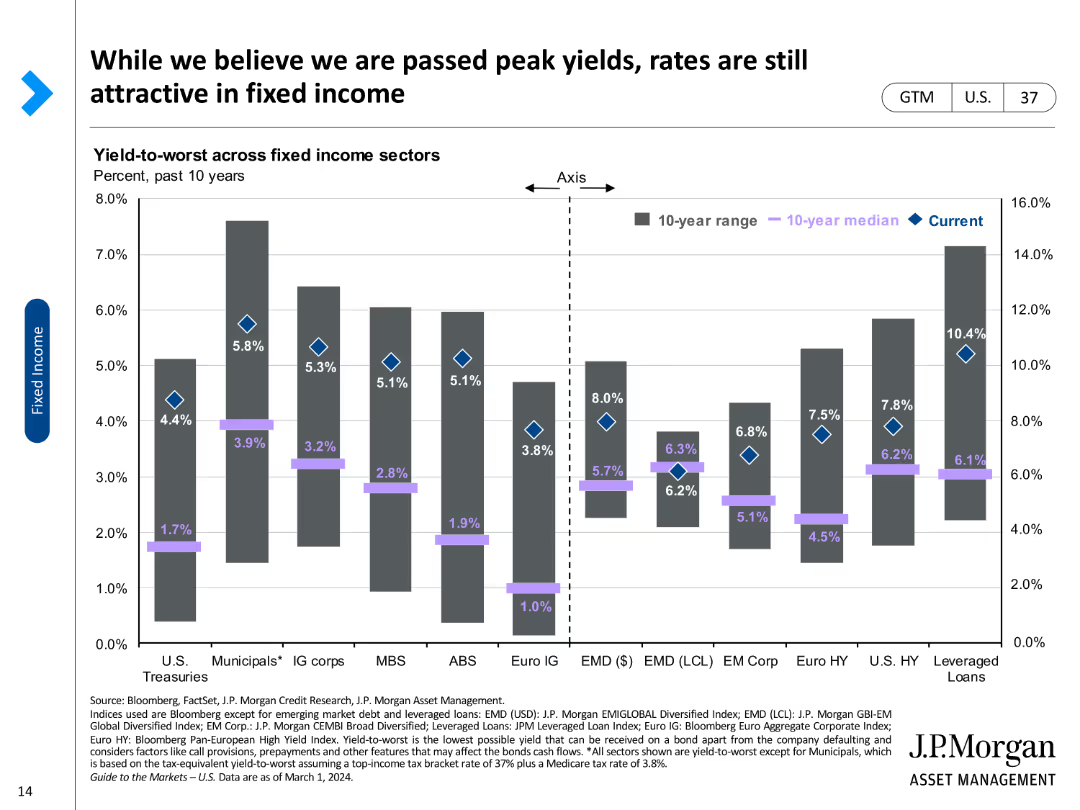
A column chart comparing yield-to-worst across various fixed income sectors, marked with current rates and historical medians.
Investment Analysis
Financial Services
Reviews yield-to-worst metrics across different fixed income sectors, highlighting investment attractiveness in the current market.
Fixed income, yield-to-worst, investment, bonds, sectors, median, current rates, attractiveness, analysis
Single Chart
JP Morgan
Saved
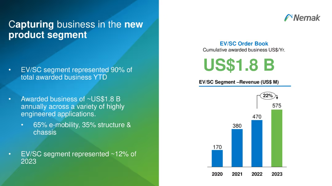
Split design with text on the left and a vertical bar chart on the right in blue and green gradients.
Sales and Business Development
Industrial & Manufacturing
This slide highlights Nemak's success in securing US$1.8B in EV/SC business, representing 90% of total awarded projects. It shows revenue growth from 2020 to 2023 and emphasizes Nemak's diversification into high-tech engineered applications, especially in e-mobility.
EV, product segment, revenue, business capture, e-mobility, engineering
Mixed Chart
Barclays
Saved
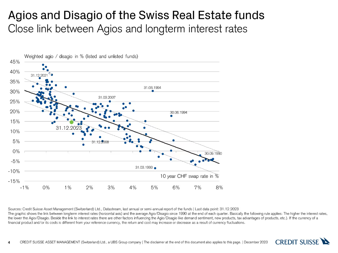
A scatter plot showing the relationship between Agio/Disagio percentages and long-term interest rates, with a trend line illustrating the correlation.
Financial Performance
Financial Services
This slide demonstrates the correlation between the Agio/Disagio percentages of Swiss real estate funds and long-term interest rates, based on data since 1990.
Agio, Disagio, Interest Rates, Correlation, Funds
Single Chart
Credit Suisse
Saved
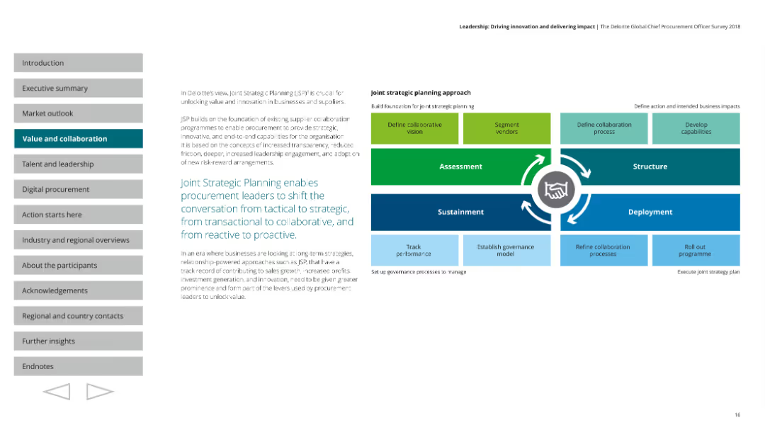
A diagram depicting the joint strategic planning approach with stages like Assessment, Structure, Sustainment, and Deployment. Text on the left, and a colorful diagram on the right with arrows and boxes indicating different planning steps.
Strategic Planning
Professional Services
Describes the concept of Joint Strategic Planning (JSP) to shift procurement from tactical to strategic, enhancing collaboration and proactive approaches. Outlines the planning stages and their importance for unlocking value and innovation.
strategic planning, procurement, collaboration, innovation, value
Diagram
Deloitte
Saved
Continues the format of the previous slide with added industries. The layout is consistent, featuring a list format with industry icons.
Market Analysis and Trends
Transportation & Logistics
Continues from the previous slide, discussing the secondary implications of mobility trends on various industries and the shifts in resource demands and value pools.
materials usage, electricity demand, solutions integration, claims portfolio, city infrastructure
Header Vertical
McKinsey
Saved
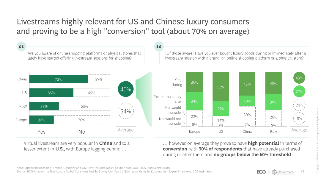
Bar chart showing awareness and purchase behavior related to livestream shopping among luxury consumers in different regions. Includes text with insights on conversion rates.
Market Analysis and Trends
Media & Entertainment
Discusses the relevance and impact of livestream shopping for luxury consumers, focusing on awareness and purchase conversion rates across regions.
livestream, luxury consumers, conversion, awareness, purchase behavior
Multiple Chart
BCG
Saved
The slide shows a progressive blue column chart indicating growth in investment banking revenue over years, accompanied by a small pie chart and annotations. It's well-organized and visually straightforward.
Financial Performance
Financial Services
Details the growth in commercial banking investment banking revenue, emphasizing the bank's commitment to delivering quality services. Useful in financial reviews and investor presentations, highlighting performance and goals.
investment banking, revenue growth, commercial banking, financial review, performance
Single Chart
JP Morgan
Saved
Contains a map of Australia, graph legends, and explanatory text detailing the geographic impact of broadband speeds.
Strategic Planning
Telecommunications
Models the benefits of broadband at a regional level in Australia, highlighting the significant speed increases and economic effects at the SA2 level.
broadband, Australia, regional analysis, SA2, internet speeds, economic impact, mapping
Graphic
Accenture
Saved
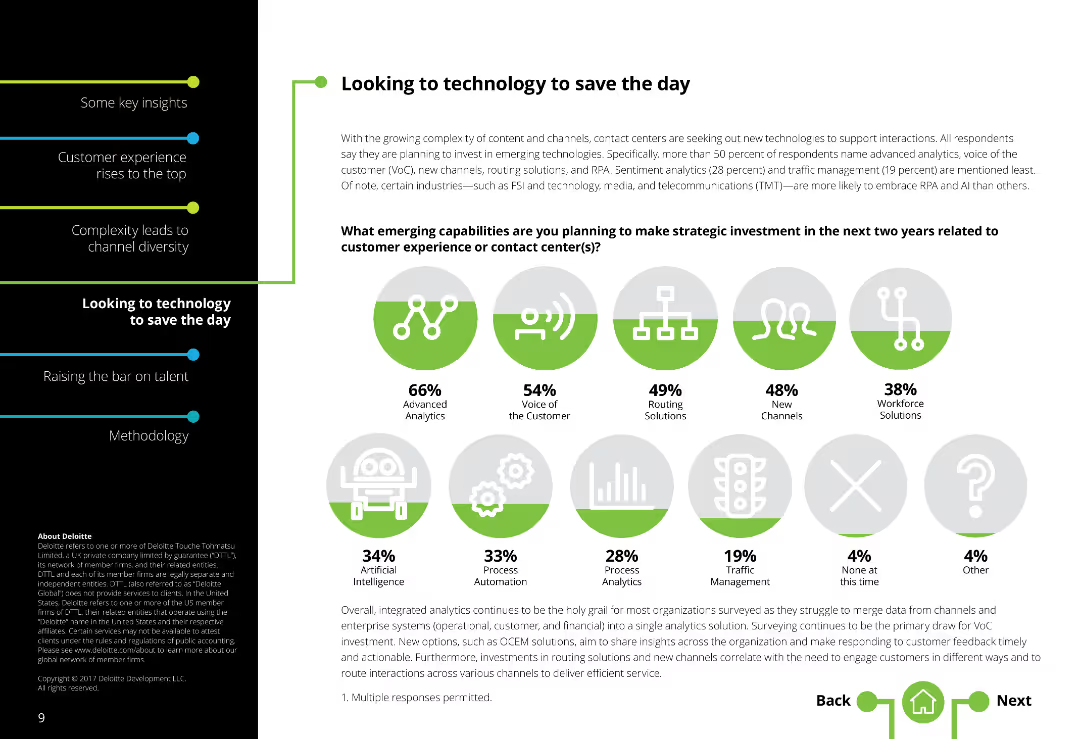
Two-column layout with text on the left and a series of icons representing emerging capabilities on the right. Moderately dense text.
Market Analysis and Trends
Technology & Software
Discusses emerging technologies and strategic investments in contact centers, focusing on analytics, voice of the customer, routing solutions, and workforce solutions.
Technology investments, Contact centers, Emerging technologies, Analytics, Voice of customer, Routing solutions, Workforce solutions
Mixed Chart
Deloitte
Saved
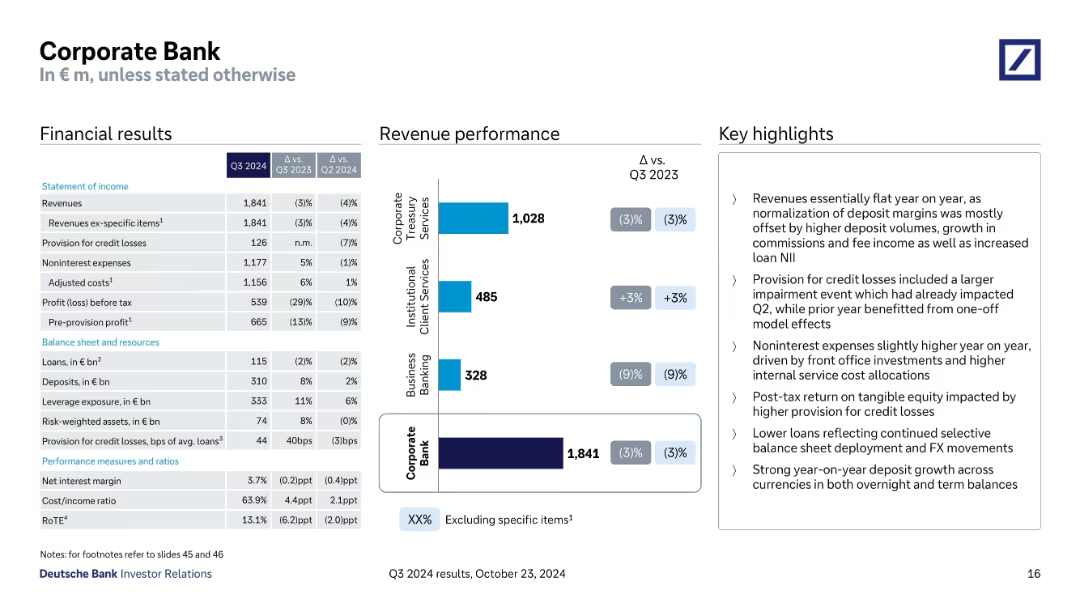
Split into financial results table, revenue chart, and highlights; detailed KPI breakdown.
Financial Performance
Financial Services
Covers Q3 2024 performance of the Corporate Bank, including revenue declines, cost management, credit loss provisions, and segment revenue breakdown. Discusses deposit growth, margin normalization, and internal service cost increases.
Corporate Bank, deposit growth, credit losses, revenue mix, RoTE
Mixed Chart
Deutsche Bank
Saved
The slide uses a simple layout with color blocks to denote different stages of a pandemic response. Icons and brief descriptions provide quick visual cues to the viewer.
Operational Efficiency
Healthcare & Pharmaceuticals
This content-oriented slide breaks down the various stages of pandemic response, from identification to recovery, with accompanying descriptions of epidemiological, economic, and social indicators, serving as an educational or planning resource in healthcare and government contexts.
Pandemic Stages, Healthcare, Response, Epidemiological Indicators, Economic Impacts, Social Indicators, Education, Planning
Vertical Flow
McKinsey
Saved
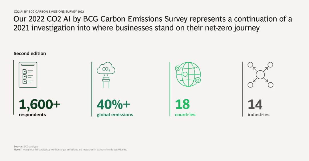
The slide features key statistics from the CO2 AI by BCG Carbon Emissions Survey 2022, including the number of respondents, percentage of global emissions covered, countries involved, and industries surveyed. Icons and brief text highlight these statistics.
Market Analysis and Trends
Environmental Services & Sustainability
Summarizes the scope and reach of the 2022 CO2 AI by BCG Carbon Emissions Survey, indicating the survey's extensive coverage across respondents, global emissions, countries, and industries. This sets the context for the following analysis and findings.
carbon emissions, survey, global reach, industries, respondents
Pillar
BCG
Saved
The slide uses a timeline to show key phases from 2022 to 2025 onwards, with bullets detailing specific actions and goals for each phase.
Strategic Planning
Financial Services
Presents the strategic roadmap for transforming Credit Suisse, highlighting deleveraging, cost reduction, and growth initiatives to restore stakeholder trust.
roadmap, Credit Suisse, strategic planning, cost reduction, stakeholder trust
Linear Flow
Credit Suisse
Saved
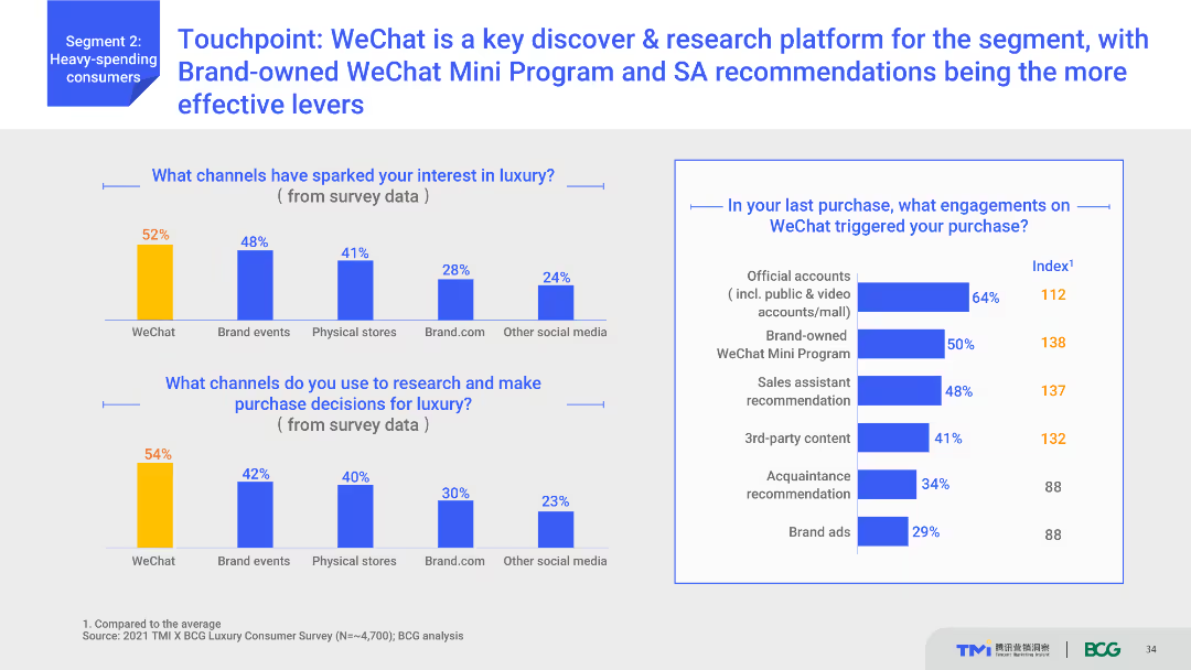
Column charts illustrating channels that spark interest in luxury and research channels, with a focus on WeChat. Additional text highlights specific engagements on WeChat that trigger purchases.
Strategic Planning
Media & Entertainment
Highlights WeChat as a crucial platform for discovery and research among luxury consumers. Shows which WeChat engagements (like Mini Programs and SA recommendations) are most effective in triggering purchases.
WeChat, social media, luxury research, consumer engagement, Mini Programs
Multiple Chart
BCG
Saved
Contains a flowchart and projected growth charts for food service channels, visually distinguishing between various service types like home delivery and eat-in with color coding and labels.
Strategic Planning
Consumer Goods
Analyzes the expected long-term changes in the food service industry due to the pandemic, focusing on the rise in off-premises dining and digital service adoption. Discusses how these trends could reshape the industry landscape.
Food Service, COVID-19, Digital Services, Industry Shift
Mixed Chart
BCG
Saved
A line graph correlating TCE increases with EBITDA gains, alongside a column chart of yearly EBITDA, illustrating financial leverage across a fleet.
Operational Efficiency
Transportation & Logistics
Demonstrates how adjustments in freight charge rates substantially affect annual earnings, providing insights into strategic financial management.
operating leverage, EBITDA, financial management, freight rates, strategic planning
Multiple Chart
Deutsche Bank
Saved
The slide features a title, two complex column charts comparing quarterly financial results, and a detailed text section highlighting key points in bullet format.
Financial Performance
Financial Services
This slide presents a comparative financial analysis of consumer and wealth management revenues over different quarters. It is used to highlight year-over-year growth and other financial metrics like net revenues and credit loss provisions.
Financial, Wealth Management, Quarterly Analysis, Growth, Net Revenue, Credit Loss, Management Fees, Consumer Banking, Revenue Highlights
Multiple Chart
Goldman Sachs
Saved
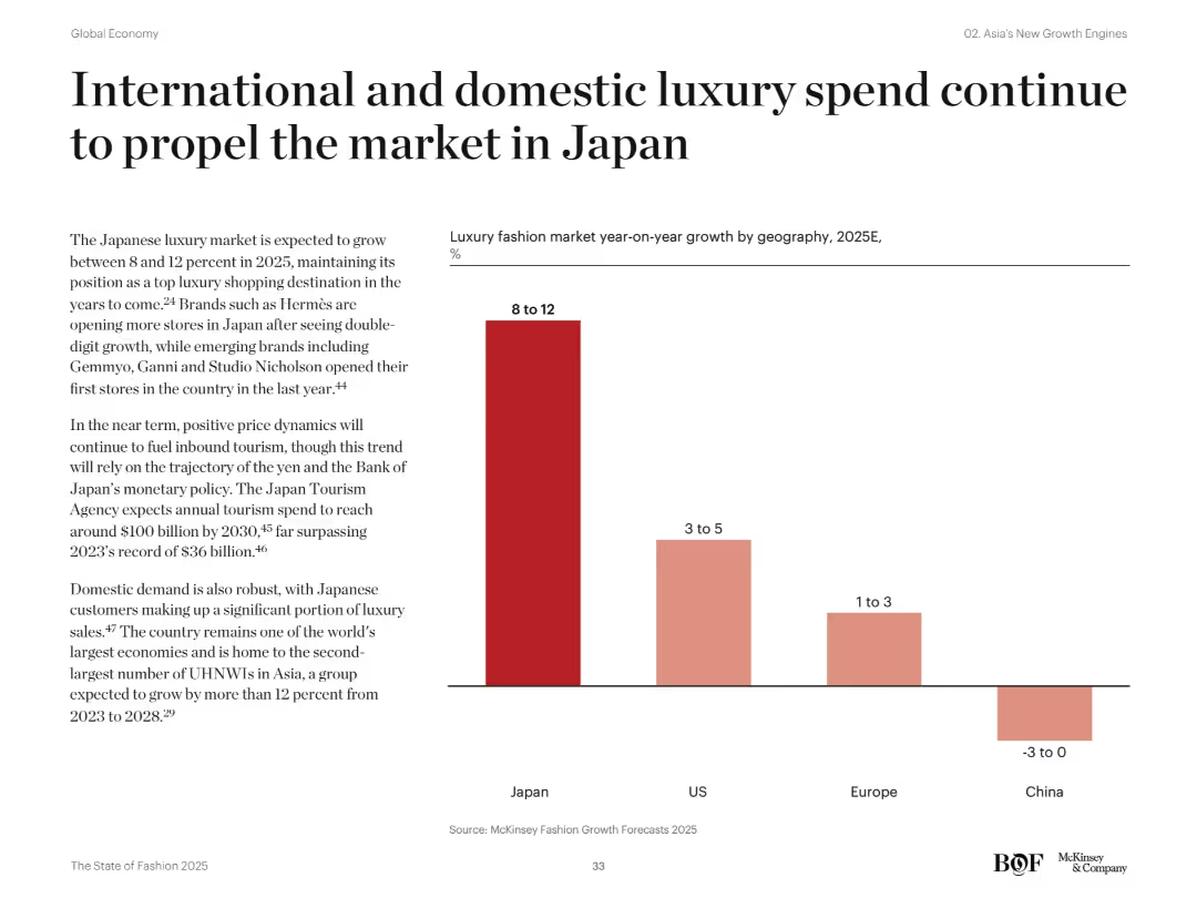
Vertical bar chart comparing luxury market growth forecasts across regions for 2025. Text highlights brand openings and macroeconomic factors.
Financial Performance
Consumer Goods
Japan’s luxury market is expected to grow 8–12% in 2025, driven by both domestic and tourist spending. The country outpaces the US, Europe, and China in growth outlook, with brands expanding presence and rising UHNWIs fueling demand.
Japan, luxury growth, domestic demand, tourism, UHNWIs, retail forecast, fashion brands, consumer spending, Asia markets, market outlook
Mixed Chart
McKinsey
Saved
Previous
Next
If nothing, comes up, please save your slides first
Create a FREE account to continue browsing
Receive Instant Access to 1,000+ slides from companies like McKinsey, Google, and Goldman Sachs
First Name
Last Name
Email
Password
I agree to all
Terms & Privacy Policy
Thank you! Your submission has been received!
Oops! Something went wrong while submitting the form.
Have an account?
Sign in
Column Chart
Heatmap
Chevron
Org Chart
Infographic
Callouts
Timeline
List
Graphic
Picture
Process Flow
Diagram
Paragraph
Map
Table
Framework
Subtitle
Takeaway Box
Icon
Other Chart
Radar Chart
Waterfall Chart
Mekko Chart
Pie Chart
Scatter Plot
Line Chart
Bar chart
Bullet points