Create a FREE Account
Instant access to 1,000+ real slides from top companies like McKinsey, BCG, Goldman Sachs, Google and many more!
First Name
Last Name
Email
Password
I agree to all
Terms & Privacy Policy
Thank you! Your submission has been received!
Oops! Something went wrong while submitting the form.
Have an account?
Sign in
Library
Templates
Courses
Pricing
My Account
My Slides
My Templates
✦ AI
AI Prompt Library
AI Search
Sign in
Start Here
Logout
My Saved Slides
The slide contains a column chart comparing Gen Zs and Millennials on statements related to burnout and employer responses. The layout is clean, with a text section at the top and a chart at the bottom.
Risk Assessment and Management
Professional Services
This slide discusses burnout levels among Gen Zs and Millennials and highlights the percentage of respondents agreeing with statements about workload intensity, organizational burnout, and employer responses to burnout.
Burnout, retention, employers, Gen Z, Millennials, workload
Mixed Chart
Deloitte
Saved
Contains a large green area chart showing the relative impact of public health measures, virus monitoring, and vaccines over time throughout 2021.
Strategic Planning
Healthcare & Pharmaceuticals
Analyzes the steps required to defeat the pandemic by Q3 2021 through a multi-phase approach, focusing on public health measures, virus monitoring, and vaccine rollout.
pandemic, recovery, public health, monitoring, vaccines
Mixed Chart
BCG
Saved
Three-panel infographic showing organic growth, operating profit, and balance sheet strength.
Financial Performance
Financial Services
The slide presents financial metrics from 2019–2023, demonstrating consistent operating margin growth and healthy cash flow, debt, and leverage indicators, reinforcing Ipsos’ financial strength.
financials, CAGR, profit margin, free cash flow, leverage, organic growth, Ipsos, performance metrics, investor information
Mixed Chart
IPSOS
Saved
A bar chart showing the percentage of agreement in 2019 and 2021 that social media firms have too much power, across various countries.
Market Analysis and Trends
Media & Entertainment
The slide illustrates the change in perception regarding the power of social media firms, comparing data from 2019 and 2021 across countries.
Social Media, Power, Perception, 2019-2021, Countries
Single Chart
IPSOS
Saved
A line chart showing historical CO2 concentrations, highlighting significant increases over millennia and recent years.
Regulatory and Compliance
Environmental Services & Sustainability
Offers historical context for current CO2 levels, underscoring the urgency in addressing climate change for policy makers and environmental planners.
CO2 levels, climate change, environmental policy, historical data, sustainability
Single Chart
BCG
Saved
Two vertical bar charts: left shows number of exits by type; right shows exit value ($B) by type. Color-coded by acquisition, buyout, and public listing.
Mergers and Acquisitions
Financial Services
Public listings have dropped significantly since 2021, with M&A dominating exit types. Total exit values are down across the board, showing limited liquidity events and a slowdown in large-scale buyouts and IPOs.
IPOs, M&A, buyouts, exit activity, venture exits, liquidity events, public listing decline, 2024 exits
Multiple Chart
KPMG
Saved
The slide displays a series of bar charts detailing the percentage of respondents planning cost actions in 2023, segmented by region and type of action like redesigning processes or simplifying organizational structures.
Market Analysis and Trends
Financial Services
This slide presents the strategic plans for cost reduction and improving efficiency in 2023 across different regions, comparing North America, Europe, and Asia in their approaches to handling operational models and organizational structures.
cost actions, organizational efficiency, operational model, regional comparison
Multiple Chart
BCG
Saved
Two-column comparison format, with icons and bullet points, contrasting two strategies. Uses a mix of text and imagery to convey information.
Strategic Planning
Financial Services
Details capabilities to boost an affluent strategy, contrasting the First Republic model with the CCB affluent strategy across various service dimensions.
affluent strategy, relationship-based lending, expert advice, service model, product benefits, wealth management
Table
JP Morgan
Saved
A bar graph displays the percentage of investors' expectations regarding the timing of an economic recession in the US. Colored bars represent different time periods, and percentages are listed atop each bar.
Market Analysis and Trends
Financial Services
The slide presents survey results of investors' beliefs about the timing of the next US recession, with the majority expecting it within the year.
US recession, investor expectations, economic analysis, survey results, 2023 outlook
Single Chart
BCG
Saved
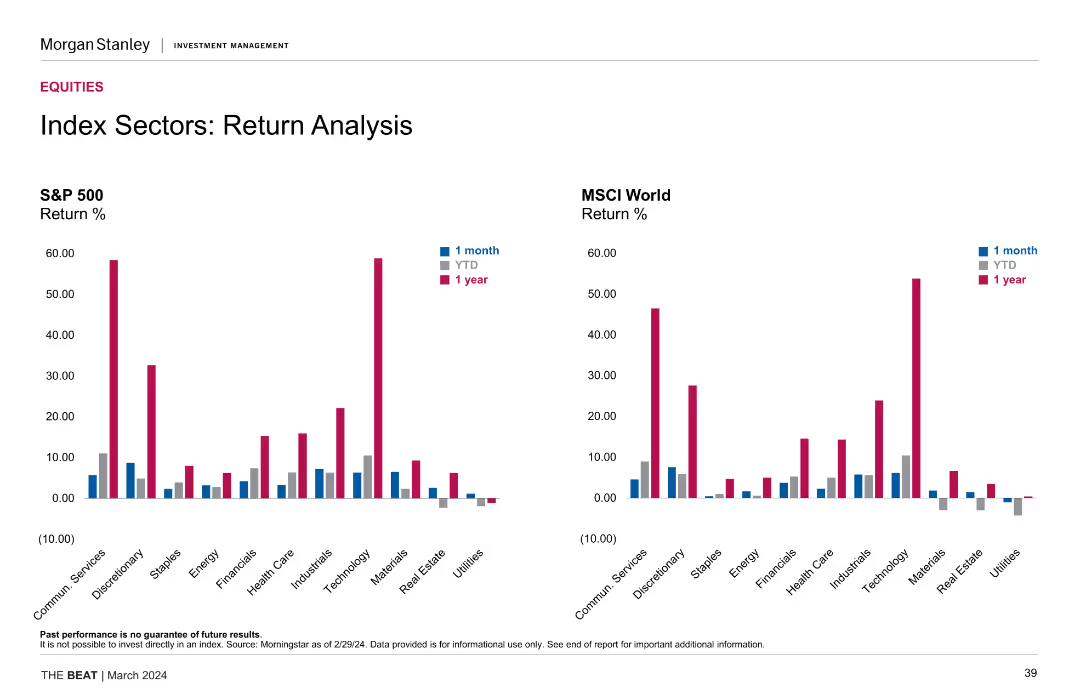
Grid heatmaps on the left and bar charts on the right; performance returns segmented by size, style, and sectors
Market Analysis and Trends
Financial Services
This slide analyzes market performance across equity size and style segments, with a focus on quarterly and trailing twelve-month (TTM) index returns. Sector performance comparisons from the S&P 500 are provided to contextualize current trends and investment positioning.
Market returns, TTM, Q1 2025, index performance, equity size, equity style, S&P 500, sector analysis, heatmap
Multiple Chart
JP Morgan
Saved
Contains a mixed-chart layout showing social return on investment values and the breakdown of benefits from the National Community Hubs Program.
Financial Performance
Government & Public Sector
Summarizes the financial impact and social return on investment of the National Community Hubs Program, detailing benefit distribution across various sectors.
Social return, investment, NCHP, financial impact, benefits distribution
Mixed Chart
Deloitte
Saved
Three-column layout with charts and text; shows high spend, low delinquency, and premium product adoption.
Customer and Market Segmentation
Financial Services
Emphasizes that AXP attracts high-spending and low-risk international consumers, particularly in Japan, Mexico, UK, and Australia. Also shows that 82% of 2023 international consumer billing came from premium fee-based products.
premium customers, credit quality, card spend, delinquency rate, fee-based products, international consumers, segmentation
Multiple Chart
McKinsey
Saved
Vertical stacked bar chart comparing available vs. required capital buffers. Uses color-coded segments for different debt instruments. Key highlights are listed on the right in a text box.
Regulatory and Compliance
Financial Services
This slide highlights Deutsche Bank's strong capital position at the end of Q4 2024, with available MREL/TLAC significantly exceeding regulatory requirements. The €23bn surplus results from AT1 and senior preferred issuances. Requirements and subordination buffers are visualized to show surplus against thresholds.
MREL, TLAC, surplus, AT1, CET1, senior preferred, regulatory buffer, Q4 2024, capital instruments
Mixed Chart
Deutsche Bank
Saved
Contains line charts depicting the growth in exports and FDI outflows for several country groups, presented with a clean and organized layout.
Market Analysis and Trends
Financial Services
This slide explores the projection of export capabilities and FDI flows, crucial for understanding future economic interactions and investments.
exports, FDI flows, economic analysis, BRICS, investment opportunities
Mixed Chart
Roland Berger
Saved
Triple-panel design comparing spend growth, age gap, and delinquency rate by age cohort.
Strategic Planning
Financial Services
Shows that Millennials and Gen Z ramp up spending faster and have lower delinquency rates, with an expected higher lifetime value due to younger acquisition age.
customer lifetime value, millennials, gen Z, spend growth, age gap, credit performance, delinquency
Mixed Chart
McKinsey
Saved
Dark background with line graphs showing the volume of removal credits and their share in annual retirements. Color-coded for clarity.
Financial Performance
Environmental Services & Sustainability
Highlights the essential role of removal credits in achieving net zero scenarios and their projected volumes over time.
removal credits, net zero, volume projections
Multiple Chart
EY
Saved
The slide contains a complex table and a graph, contrasting five consumer demographics with their digital adoption stages. A call-out box provides additional insights. The table is detailed, using a blue and white color scheme, and the slide has a side bar with symbolic icons.
Customer and Market Segmentation
Technology & Software
This slide breaks down the Southeast Asian digital population into five consumer demographics based on location, income, and age. It's valuable for segmenting the market and developing targeted digital strategies. The slide also updates the classification method from previous reports, making it relevant for current market analysis.
consumer demographics, digital adoption, SEA, market segmentation, targeted strategies, population analysis
Table
Bain
Saved
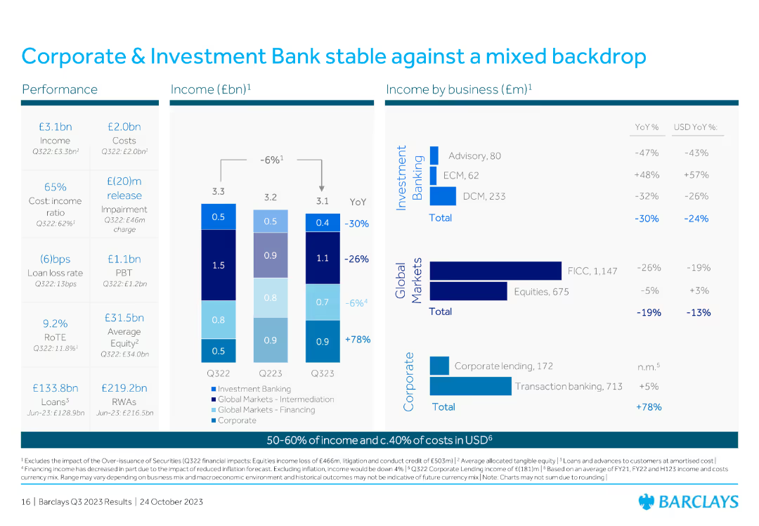
Featuring a series of column charts, the slide depicts the return on tangible equity over the years and distribution amounts.
Financial Performance
Financial Services
Highlights the growth in return on tangible equity over recent years and the increased capital distributions to shareholders.
RoTE, distributions, growth, equity, shareholders
Multiple Chart
Barclays
Saved
The slide features three sections each with a circular icon, title, and bulleted lists. Icons are colored blue, green, and teal. The layout is clean with distinct sections.
Industry Overview
Financial Services
The slide presents three market topics: Growth in Equities, Impact of Electronification, and Performance of Client Franchise with details on each.
markets, equities, electronification, performance, finance
Table
JP Morgan
Saved
Flow diagram with metrics on collection, recovery, export, landfill, and C2C processing, with takeaways on right side
Risk Assessment and Management
Environmental Services & Sustainability
The slide outlines aluminium can flows in Australia, emphasizing strong collection/recovery rates but no local closed-loop recycling (C2C). It shows reliance on export markets, highlights gaps in local remelting, and presents inefficiencies in sorting and CDS participation.
aluminium recycling, collection, recovery, export, C2C, waste flow, landfill, Australia
Multiple Chart
Roland Berger
Saved
Line charts depicting US unit labor cost and labor productivity growth y/y from 2007 to 2023.
Operational Efficiency
Professional Services
Highlights how robust productivity growth buffers against compensation growth, reducing unit labor costs and easing inflation pressures.
productivity growth, labor costs, compensation, inflation, line chart, labor productivity, economic buffer, 2007-2023, US economy
Mixed Chart
EY
Saved
Two line graphs, one dashed, illustrate Series B & C funding and secondary market trends over time. There's a significant spike in secondary market data for 2017.
Investment Analysis
Technology & Software
The slide presents data on the sharp increase in secondary-market funding round sizes for technology in 2017, emphasizing the growth in mega rounds and key investments. Suitable for discussions on market shifts and investment strategies.
Technology, Secondary Market, Series B, Series C, Investment
Multiple Chart
Oliver Wyman
Saved
The slide features pie charts showing the development of self-confidence, presentation skills, and business networking skills among care-experienced youth.
Client Case Studies
Education & Training
The slide presents the Beyond Your Limits program, which provides targeted support for care-experienced young people through skills training and mentoring.
Beyond Your Limits, care-experienced, skills training, mentoring
Multiple Chart
EY
Saved
The slide compares brand key purchasing criteria (KPCs) for high-end and mainstream users, using text boxes, icons, and a column chart in the center.
Customer and Market Segmentation
Consumer Goods
It highlights the top three brand KPCs for users spending over SEK 50k and those spending less than SEK 10k annually, with supporting quotes.
Quality, durability, innovation, mainstream, value for money, brand KPCs, purchasing criteria, consumer goods, segmentation, analysis
Header Horizontal
EY
Saved
Column chart depicting perceptions of President Joe Biden's impact on transatlantic relations, with segmented responses indicating varying degrees of positivity and negativity.
Market Analysis and Trends
Government & Public Sector
Shows the impact of President Joe Biden's election on transatlantic relations, with a majority seeing it positively, as indicated by a survey of respondents.
Biden, transatlantic, relations, perceptions, survey
Single Chart
Bain
Saved
Previous
Next
If nothing, comes up, please save your slides first
Create a FREE account to continue browsing
Receive Instant Access to 1,000+ slides from companies like McKinsey, Google, and Goldman Sachs
First Name
Last Name
Email
Password
I agree to all
Terms & Privacy Policy
Thank you! Your submission has been received!
Oops! Something went wrong while submitting the form.
Have an account?
Sign in
Column Chart
Heatmap
Chevron
Org Chart
Infographic
Callouts
Timeline
List
Graphic
Picture
Process Flow
Diagram
Paragraph
Map
Table
Framework
Subtitle
Takeaway Box
Icon
Other Chart
Radar Chart
Waterfall Chart
Mekko Chart
Pie Chart
Scatter Plot
Line Chart
Bar chart
Bullet points