Create a FREE Account
Instant access to 1,000+ real slides from top companies like McKinsey, BCG, Goldman Sachs, Google and many more!
First Name
Last Name
Email
Password
I agree to all
Terms & Privacy Policy
Thank you! Your submission has been received!
Oops! Something went wrong while submitting the form.
Have an account?
Sign in
Library
Templates
Courses
Pricing
My Account
My Slides
My Templates
✦ AI
AI Prompt Library
AI Search
Sign in
Start Here
Logout
My Saved Slides
Three bold blocks emphasizing strategic growth areas, with a brief descriptor under each. Very minimal text and high contrast.
Strategic Planning
Financial Services
Explains three strategic priorities for growth, likely for presenting to investors or company executives.
Strategy, Growth, Wealth, Digital, Consumer Bank
Boxed
Goldman Sachs
Saved
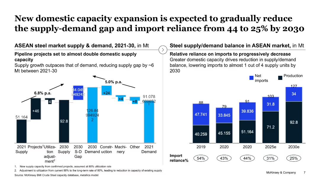
The slide shows a column chart and a line chart displaying supply and demand balance in the ASEAN market, highlighting domestic capacity expansion projects.
Strategic Planning
Industrial & Manufacturing
This slide projects a reduction in the supply-demand gap in the ASEAN steel market by 2030 through new domestic capacity expansions, aimed at reducing import reliance.
domestic capacity, supply-demand gap, ASEAN market, steel, import reliance
Multiple Chart
McKinsey
Saved
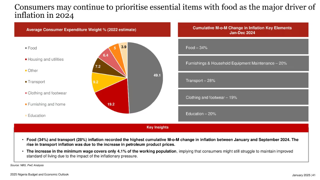
Pie chart of 2022 expenditure weights; bar-style panel of 2024 inflation contributors; insights below in red.
Market Analysis and Trends
Consumer Goods
Highlights that food and transport costs drove inflation in 2024. Consumers focused on essential items, and the new minimum wage had limited impact, covering just 4.1% of the workforce. Inflationary pressure likely to continue shaping spending behavior in 2025.
inflation, consumer spending, food, transport, minimum wage, Nigeria, 2024, price pressure, essential goods
Mixed Chart
PwC/Strategy&
Saved
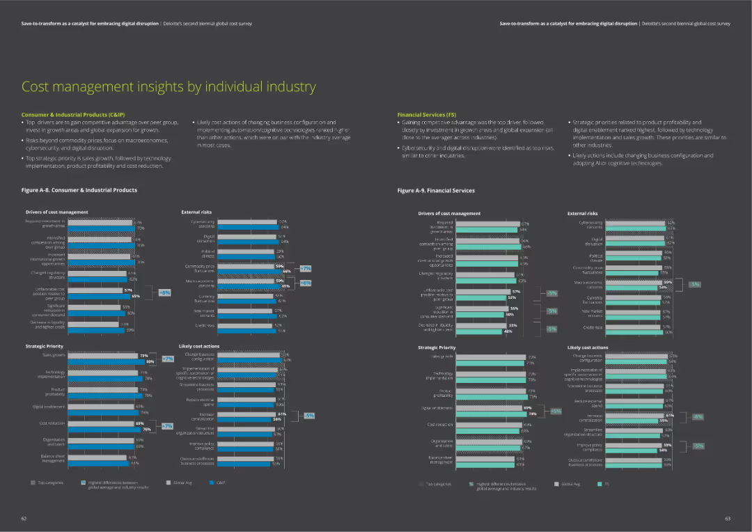
The slide contains two column charts comparing drivers of cost management, external risks, strategic priorities, and likely cost actions for Consumer & Industrial Products and Financial Services sectors.
Market Analysis and Trends
Financial Services
Insights on cost management, including drivers, risks, priorities, and actions for Consumer & Industrial Products and Financial Services. Helps understand industry-specific trends.
cost management, industry insights, risks, priorities, actions
Multiple Chart
Deloitte
Saved
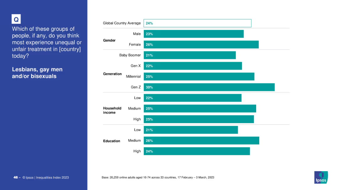
Horizontal bar chart segmented by gender, generation, income, and education on white background
Market Analysis and Trends
Government & Public Sector
The slide shows demographic breakdowns of global responses to unfair treatment of LGB individuals, categorized by gender, generation, household income, and education. Gen Z and females reported the highest perception of inequality.
demographics, inequality, LGB, Ipsos, Gen Z, gender, education, income, survey, 2023
Mixed Chart
IPSOS
Saved
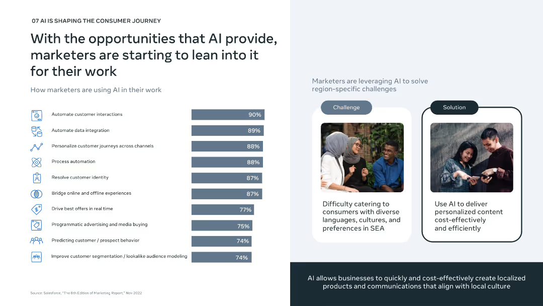
Left: horizontal bar chart of top AI marketing uses; Right: challenge-solution layout with visuals showing cultural relevance; minimalistic design.
Technology and Digital Transformation
Artificial Intelligence
Focuses on how marketers are adopting AI to solve regional challenges in SEA. Major uses include automating interactions, integrating data, and personalizing customer journeys. AI helps address the complexity of cultural and linguistic diversity in a scalable, cost-effective way.
marketing AI, personalization, automation, cultural relevance, SEA
Mixed Chart
Bain
Saved
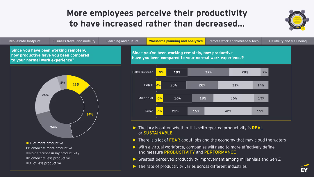
A donut chart showing productivity levels since remote work began. A column chart compares productivity across Baby Boomer, Gen X, Millennial, and Gen Z generations.
Human Resources and Talent Management
Professional Services
This slide shows perceptions of productivity changes since remote work began, comparing different generations. It questions the sustainability of self-reported productivity.
Productivity, Remote Work, Generations, Performance, Sustainability
Multiple Chart
EY
Saved
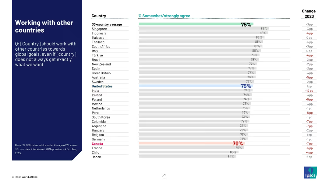
Similar layout. Assesses support for global cooperation even without perfect outcomes. Canada shown near bottom.
Strategic Planning
Government & Public Sector
Evaluates international attitudes toward cooperation with other nations on global issues. Despite some skepticism, most countries show strong support. Canada's support is relatively low at 70%.
global cooperation, diplomacy, international policy, strategic alignment, Ipsos research
Mixed Chart
IPSOS
Saved
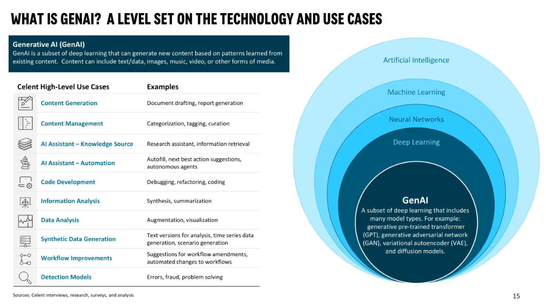
Left side shows a table of GenAI high-level use cases with examples; right side has concentric rings showing relationship of AI → ML → NN → DL → GenAI.
Technology and Digital Transformation
Artificial Intelligence
Defines Generative AI and places it within the broader AI ecosystem. Lists high-level use cases with real-world examples including content generation, automation, data analysis, and code development. The goal is to orient the audience to GenAI's capabilities and application relevance.
GenAI, AI hierarchy, use cases, content generation, automation, knowledge source, deep learning
Table
Oliver Wyman
Saved
Combination of two column charts detailing upcoming debt maturities and available liquidity.
Financial Performance
Transportation & Logistics
Provides a financial outlook by showcasing Aircastle's debt maturity schedule and liquidity status.
debt, maturity, financial outlook, liquidity, unsecured, bonds
Multiple Chart
Deutsche Bank
Saved
Contains multiple bar charts and lists, comparing urban and rural populations across various income categories, using shades of blue and gray.
Market Analysis and Trends
Environmental Services & Sustainability
Analyzes the impact of urbanization on global population distribution, emphasizing the need for Earth Observation data in urban planning and disaster risk management.
urbanization, Earth Observation, population, global, disaster risk, data analysis, planning
Mixed Chart
PwC/Strategy&
Saved
The slide features a combination of pie charts and column charts. Pie charts show percentages of Gen Zs and Millennials who agree on mental health focus and comfort speaking about mental health challenges, with column charts on reasons for time off.
Market Analysis and Trends
Healthcare & Pharmaceuticals
The slide provides insights into Gen Z and Millennial perspectives on their organizations' focus on mental health. It compares perceptions of organizational efforts with the actual comfort levels in discussing mental health challenges and reasons for taking time off work.
Mental health, organizations, Gen Z, Millennials, comfort, time off
Multiple Chart
Deloitte
Saved
A dual-axis line chart shows the percentage of banks tightening lending standards over time, contrasting US and Eurozone conditions. The slide background is white with grey recession markers.
Risk Assessment and Management
Financial Services
The slide compares credit conditions between the US and Eurozone, highlighting the risks associated with tighter lending standards. It is used to convey the potential impacts on financial stability and market conditions, likely serving as a risk assessment tool for investors or policy-makers.
Credit, US, Eurozone, Banks, Lending, Risk, Recession, Standards, 2023
Multiple Chart
JP Morgan
Saved
The slide features two donut charts showing the composition of a servicing portfolio and a limited servicing portfolio. They are color-coded and labeled with different sectors like Fannie Mae, Freddie Mac, and others. There is a list of notes below explaining key points related to the data shown.
Financial Performance
Financial Services
It illustrates the composition and performance of a company's servicing portfolio, highlighting its diversification and year-over-year revenue increase. It is valuable for investors or management reviewing financial health and diversification in revenue sources, particularly in financial servicing sectors.
Servicing Portfolio, Revenue, TTM, Financial Health, Diversification, Fannie Mae, Freddie Mac
Single Chart
Goldman Sachs
Saved
The slide includes a diagram illustrating best practices in supply chain management, with examples from the US and France, covering stages like road freight, ports, depot, and planning.
Operational Efficiency
Transportation & Logistics
It highlights the benefits of private control and consistent regulation in supply chain infrastructure in the US and France, using examples to illustrate the efficiency gains at various stages of the supply chain.
supply chain, private control, regulation, efficiency, US, France
Table
LEK
Saved
Features a column chart depicting the deployment of risk-weighted assets (RWA) across various divisions within the bank from 2023 to 2026.
Financial Performance
Financial Services
This slide shows the strategic allocation of approximately £30 billion in risk-weighted assets across different banking divisions to bolster market presence and share, particularly focusing on competitive pricing and enhanced decision-making. Essential for understanding strategic financial allocation.
RWA, Allocation, Banking, Market Share, Strategy
Mixed Chart
Barclays
Saved
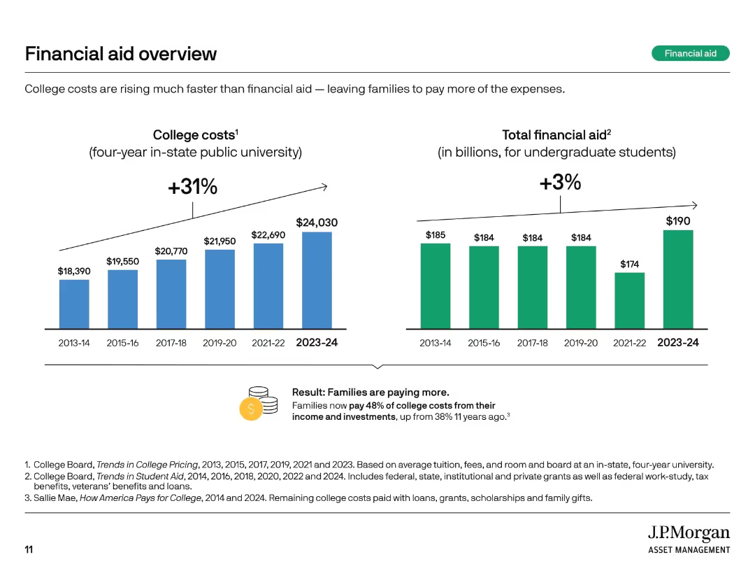
Two vertical bar charts comparing college costs and total financial aid over time. Summary box notes shifting burden to families.
Financial Performance
Education & Training
This slide highlights how college costs have risen 31% over 10 years, while financial aid increased only 3%. Families now bear a larger share of expenses, with 48% of college costs covered from income and investments compared to 38% a decade ago.
financial aid, rising costs, student burden, tuition trends, aid gap, college expenses, cost growth, funding shortfall, family responsibility
Multiple Chart
JP Morgan
Saved
Features a column chart comparing the contribution to income growth from different business areas like Investment Banking and Global Markets in 2023.
Strategic Planning
Financial Services
Discusses the drivers behind Barclays' income growth, emphasizing management's strategic actions in investment banking and global markets.
income growth, management, strategy, investment, global markets
Single Chart
Barclays
Saved
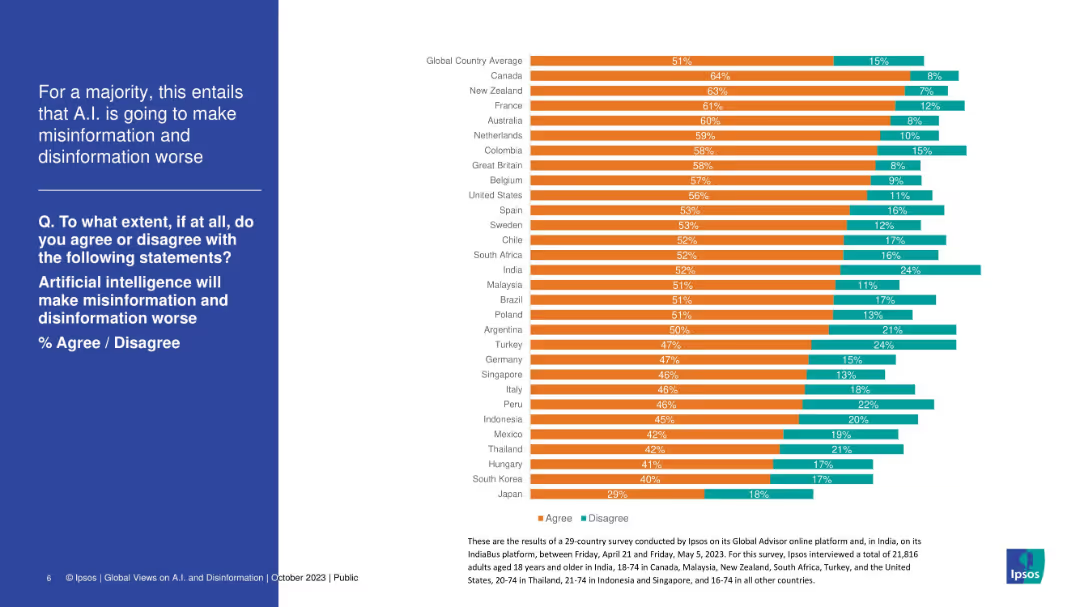
Side-by-side layout; left side features text with white font on blue background, right side shows horizontal bar chart with country comparisons (agree/disagree %)
Risk Assessment and Management
Artificial Intelligence
This slide presents the percentage of people in various countries who believe AI will worsen misinformation and disinformation. It shows a global average of 51% agreement, with Canada and New Zealand among the highest. The visual illustrates broad concern about AI's societal impact.
AI, misinformation, disinformation, public perception, survey, global comparison, risk, Ipsos, technology, ethics
Mixed Chart
IPSOS
Saved
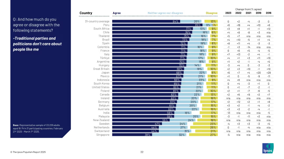
Horizontal bar chart comparing 31 countries' agreement rates on political alienation. Right-hand column includes multi-year trend comparisons.
Market Analysis and Trends
Government & Public Sector
This slide focuses on political alienation across countries. Agreement is highest in Peru, South Africa, and Chile, with sentiment increasing in many countries. Japan saw a 29pp rise since 2016, indicating growing distrust in traditional political institutions.
political alienation, distrust, Ipsos, traditional parties, public opinion, international trends, populism
Mixed Chart
IPSOS
Saved
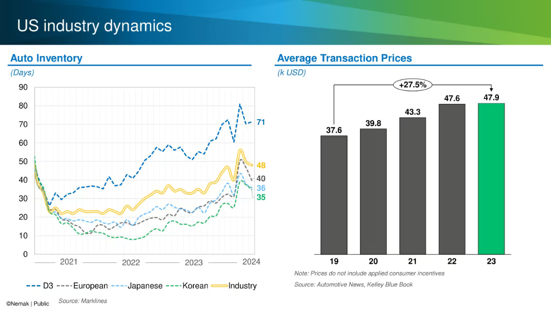
Dual chart layout showing auto inventory levels by origin and average transaction prices from 2019–2023.
Operational Efficiency
Industrial & Manufacturing
This slide compares US auto inventory levels across manufacturers (domestic, Japanese, Korean, European) and tracks average transaction prices over time. It notes a 27.5% increase in prices since 2019 and shows varying inventory recovery patterns by region and brand.
US market, auto inventory, pricing, transaction cost, OEM trends
Multiple Chart
Barclays
Saved
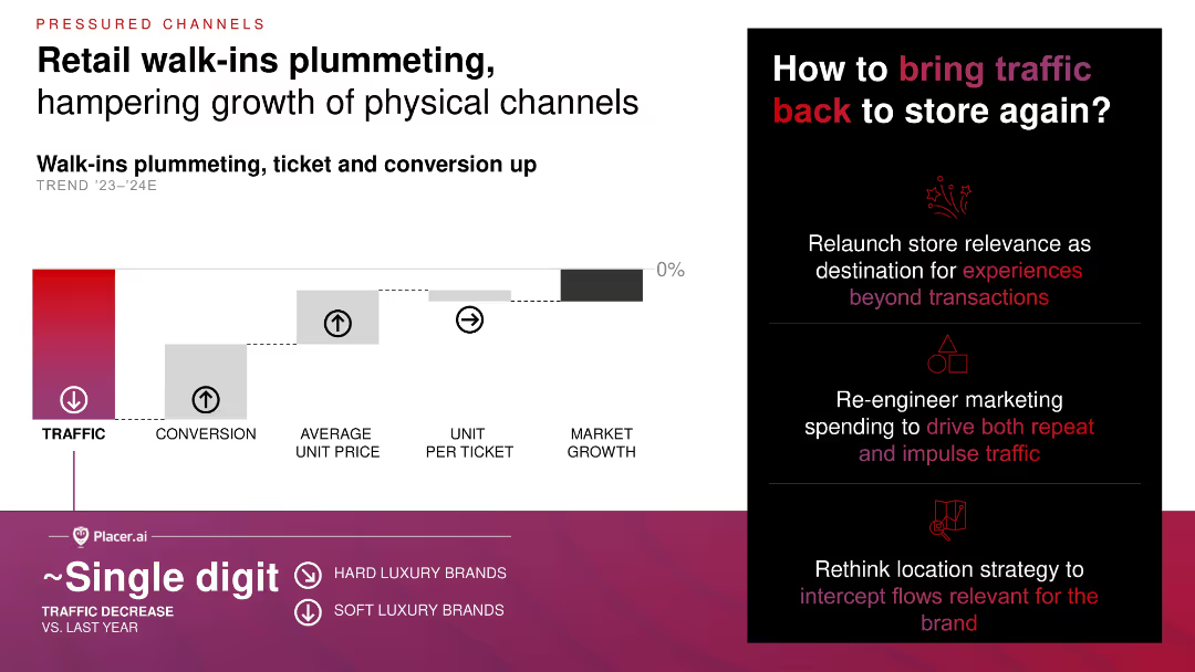
Step diagram visualizing impact of declining foot traffic vs. increases in conversion and average ticket; right column offers strategic suggestions with icons.
Operational Efficiency
Consumer Goods
Walk-in traffic for retail is dropping, but average ticket size and conversion rates are up, neutralizing overall market growth. The slide suggests marketing, location strategy, and experiential enhancements to reverse footfall trends.
foot traffic, conversion rate, physical retail, marketing strategy, experiential retail
Mixed Chart
Bain
Saved
Depicts twelve key activities grouped under four categories with simple icons and text, laid out evenly across the slide. The design is clean and facilitates easy comprehension of the information.
Operational Efficiency
Media & Entertainment
Discusses twelve key digital marketing activities considered across various maturity stages, categorized under data-driven targeting, automated activation, measurement & attribution, and organizational collaboration. This is valuable for enhancing operational efficiency in digital marketing initiatives.
digital marketing, activities, data-driven targeting, automated activation, measurement, organizational collaboration, operational efficiency, maturity
Pillar
BCG
Saved
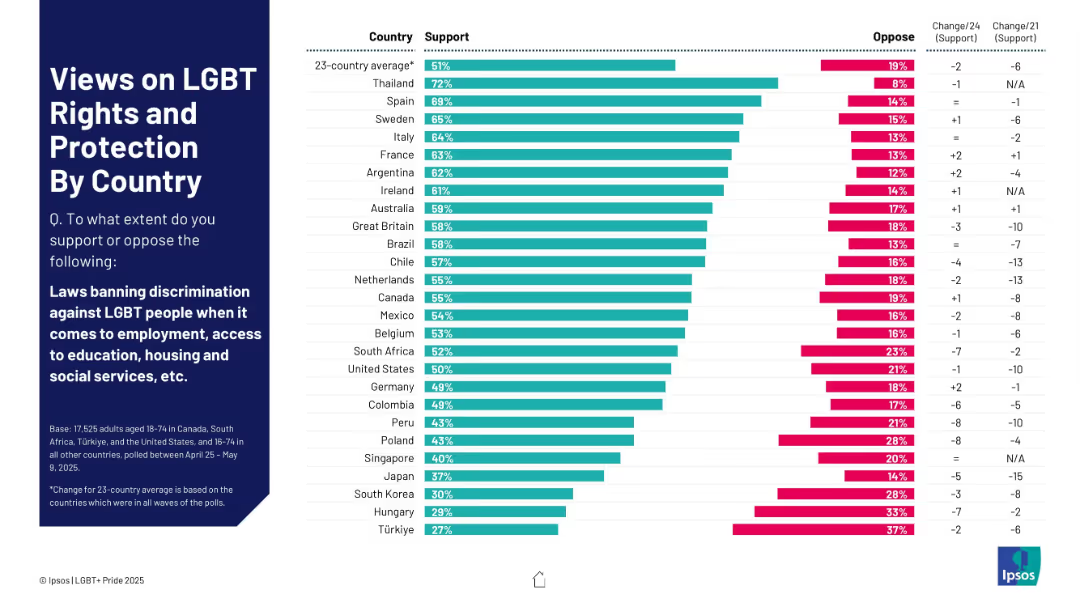
Horizontal bar chart showing levels of support/opposition to anti-discrimination laws by country
Regulatory and Compliance
Government & Public Sector
The slide measures support for laws banning LGBT discrimination in employment, education, housing, and social services across 23 countries. Thailand leads in support (72%), while Türkiye ranks lowest (27%). Change indicators over time highlight sociopolitical trends.
LGBT rights, anti-discrimination, support levels, employment, legislation, opinion data, countries
Mixed Chart
IPSOS
Saved
The slide uses a comparative layout with color-coded sections for each major spending area: Health, Finance, Education, Public Safety, and Social Welfare. Each section has key financial figures.
Financial Performance
Government & Public Sector
Summarizes the fiscal priorities of the government, emphasizing areas of significant financial input and strategic importance.
budget priorities, fiscal strategy, public spending
Pillar
PwC/Strategy&
Saved
Previous
Next
If nothing, comes up, please save your slides first
Create a FREE account to continue browsing
Receive Instant Access to 1,000+ slides from companies like McKinsey, Google, and Goldman Sachs
First Name
Last Name
Email
Password
I agree to all
Terms & Privacy Policy
Thank you! Your submission has been received!
Oops! Something went wrong while submitting the form.
Have an account?
Sign in
Column Chart
Heatmap
Chevron
Org Chart
Infographic
Callouts
Timeline
List
Graphic
Picture
Process Flow
Diagram
Paragraph
Map
Table
Framework
Subtitle
Takeaway Box
Icon
Other Chart
Radar Chart
Waterfall Chart
Mekko Chart
Pie Chart
Scatter Plot
Line Chart
Bar chart
Bullet points