PRO
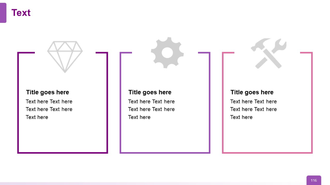
Three vertical cards with outline borders and icons above bold titles
PRO
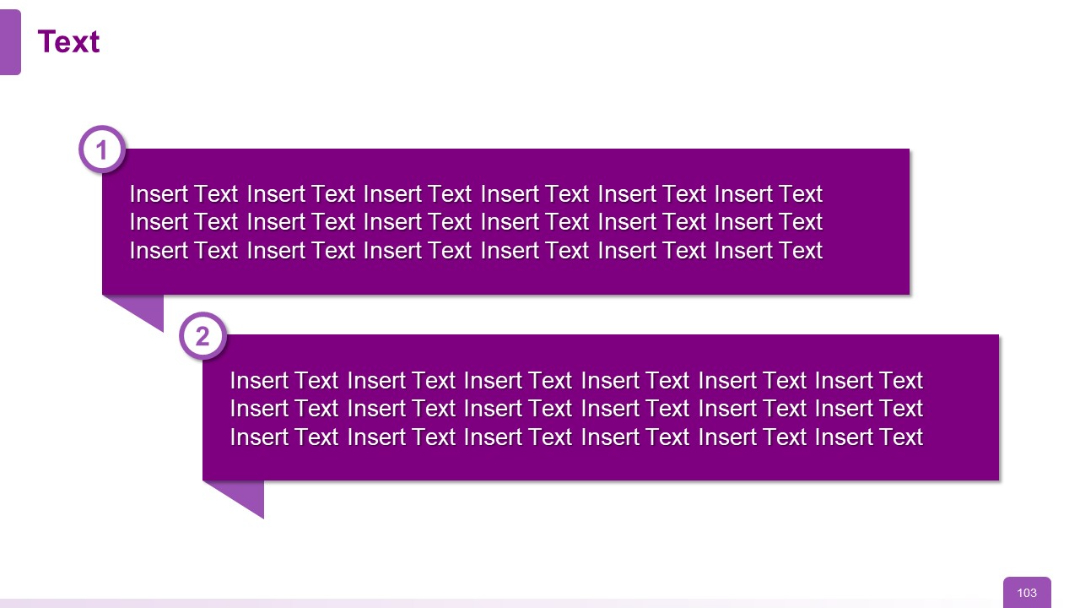
Two large speech bubble-like rectangles in dark purple with numbered circle markers (1 and 2) to the left. Both contain text paragraphs.
PRO
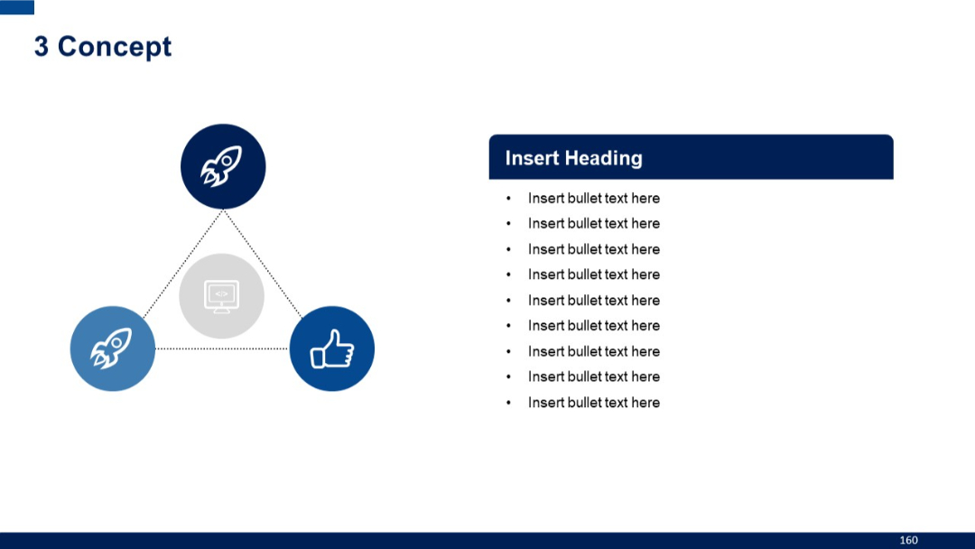
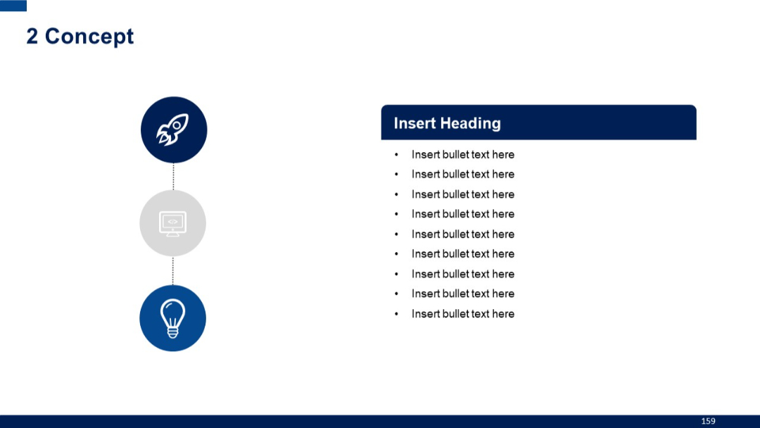
Triangular icon layout with dotted lines connecting each icon, central icon highlighted. Text content on right with bullet points.
PRO
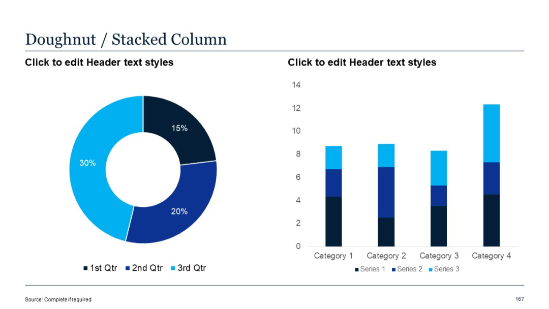
Doughnut chart on the left and stacked vertical column chart on the right showing values for three series.
PRO
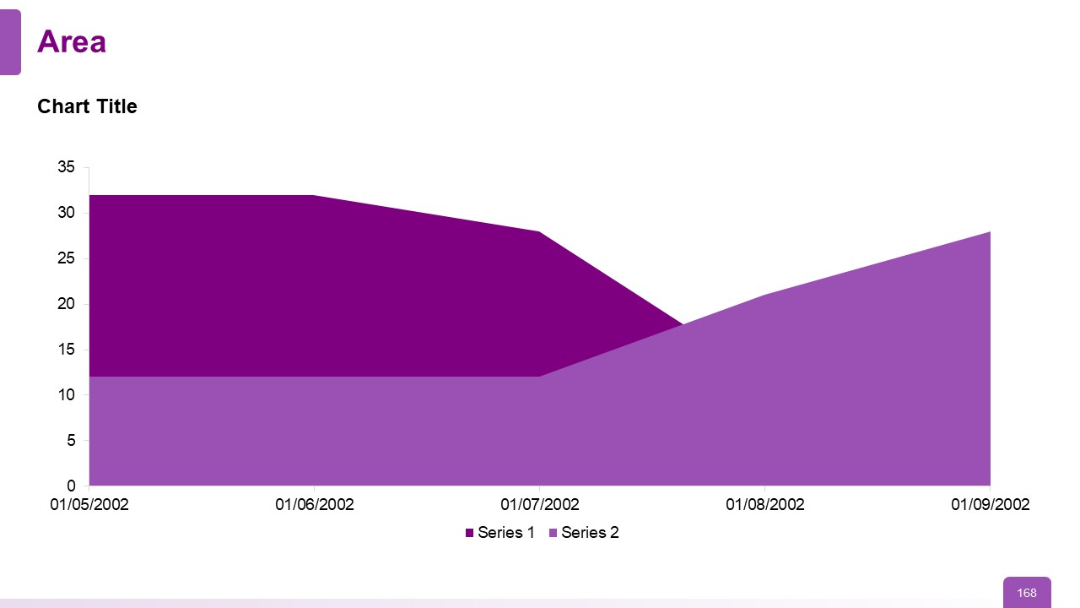
Area chart with two series plotted across a date-based x-axis; purple gradient fill areas with clear y-axis values; includes placeholder labels.
PRO
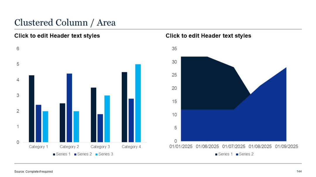
Left chart is a clustered column chart with 3 series across 4 categories; right is a standard area chart with two series over time.
PRO
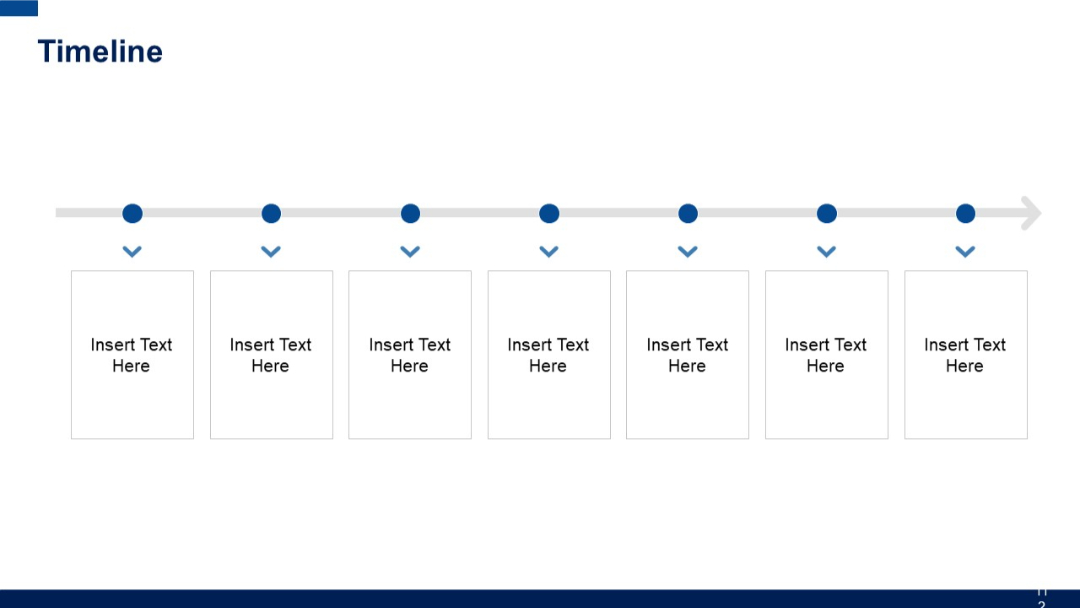
A straight horizontal timeline with seven equally spaced dots leading to vertically stacked text boxes below each dot and downward arrows indicating flow.
PRO
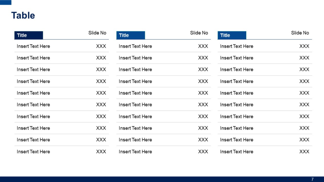
Three columns with headers "Title" and "Slide No" repeated across; suitable for large indexes or content reference lists.
PRO
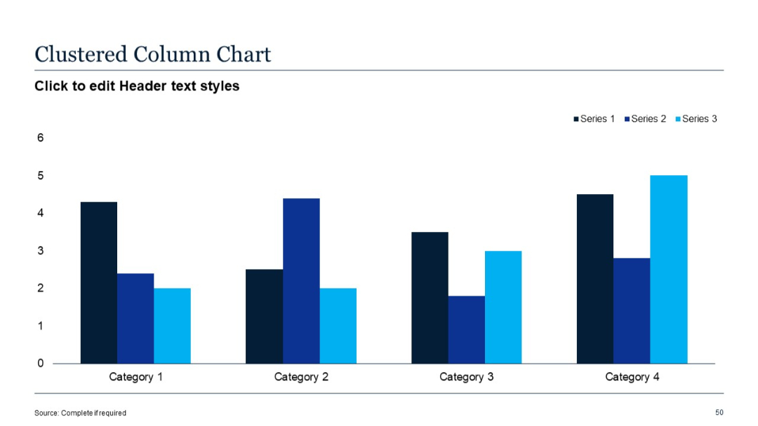
Clustered vertical bar chart with three data series shown across four categories. Each category contains grouped bars in different shades of blue.
PRO
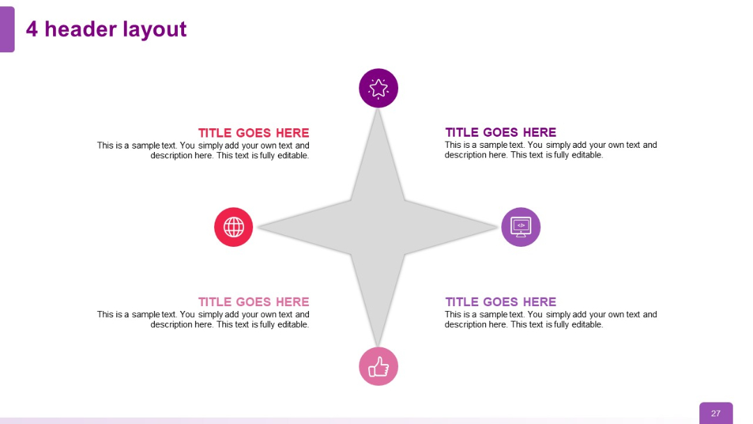
Four headers in a cross layout around a star-like central shape. Each corner has an icon with a text block.
PRO
Left-aligned vertical title column with dark blue background, connected to horizontally oriented data fields for each row.

PRO
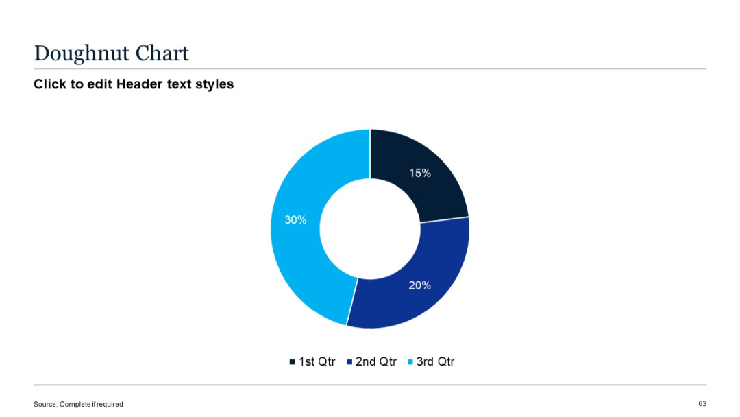
Circular doughnut chart with three segments labeled by percentage; clean white background.
PRO
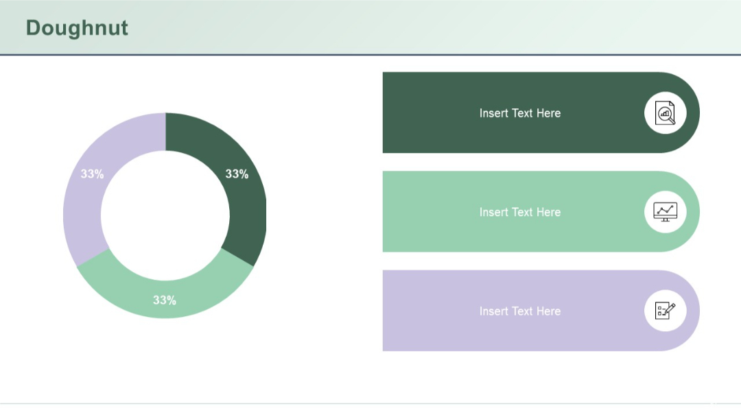
A single donut chart (33% split three ways) with three large rounded text boxes and icons to the right.
PRO
Vertical process with three circular icons along a dotted line, aligned left. Bullet-point content block on the right side.
PRO
Horizontal arrow-based layout split into Q1, Q2, and Q3 sections. Each quarter has a title and placeholder text.

PRO
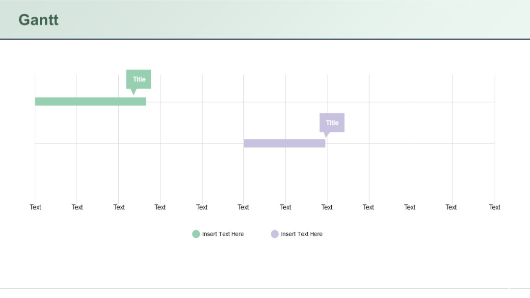
Clean Gantt chart with timeline on horizontal axis. Two colored bars (green and purple) include title boxes above them. Legend at bottom.
PRO
Three-column layout with color blocks, each featuring header and list
PRO
White background grid layout filled with outlined vector icons in multiple rows, clean and minimalist with black thin-line icons.
PRO
Clean agenda layout with 10 points, two columns of bullet items, breaks clearly marked, and placeholder text.

PRO
Four circular icons placed along a horizontal arrow. Each icon has a colored circle and space below for text. Modern and vibrant visual.

PRO
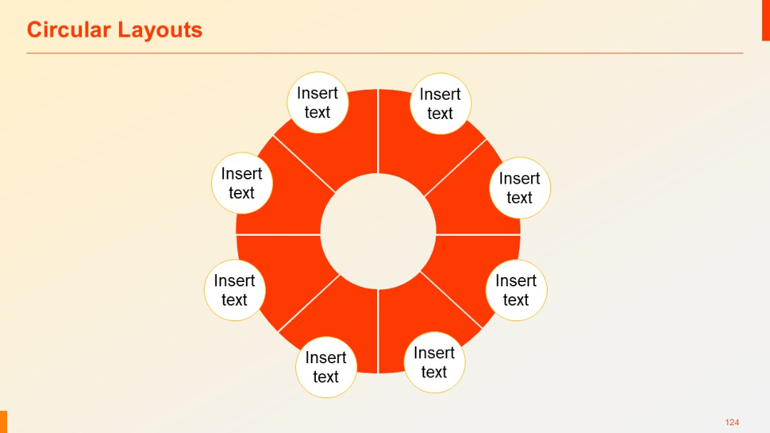
Eight-segment red circular diagram with labeled white text circles placed symmetrically around it.
PRO
Four side-by-side pillar columns with circular icons and bullet point text below each header. Neatly segmented for clarity.

PRO
Semi-circular three-part arc diagram with a central circular heading. Text boxes and icons surround the arcs.

PRO
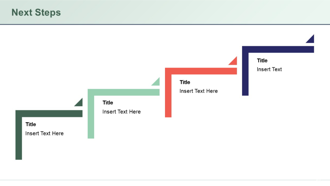
L-shaped staggered path illustration with four stages, each marked by a color-coded arrow and text block.
PRO
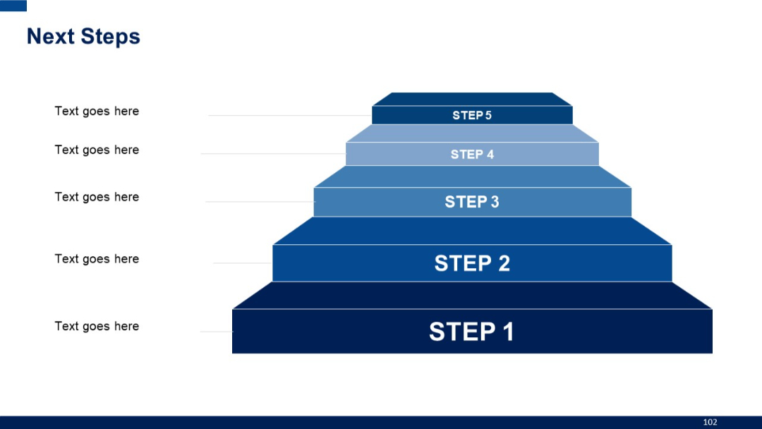
A 3D pyramid-style staircase graphic with five ascending steps, each labeled from Step 1 to Step 5, aligned with text on the left.
PRO
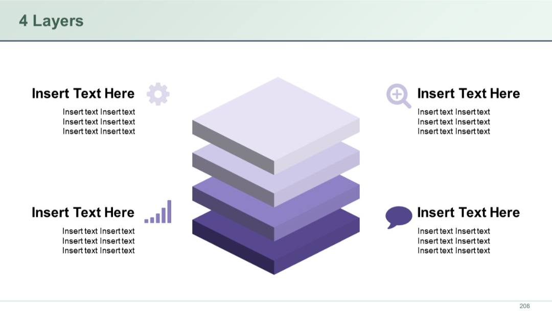
3D-style layered stack at center with four quadrants around it, each containing icons and text. Visual hierarchy implies depth or structure.
PRO
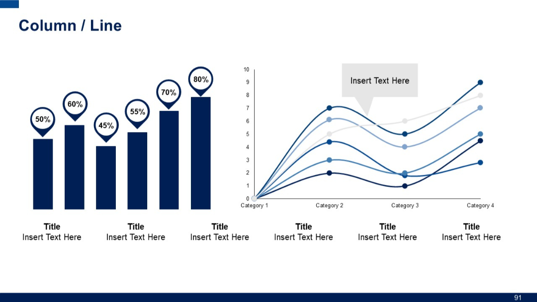
Split slide with two chart types: bar chart with percentage markers (left), multi-line graph with data labels (right); clean layout with icons and placeholders.
PRO
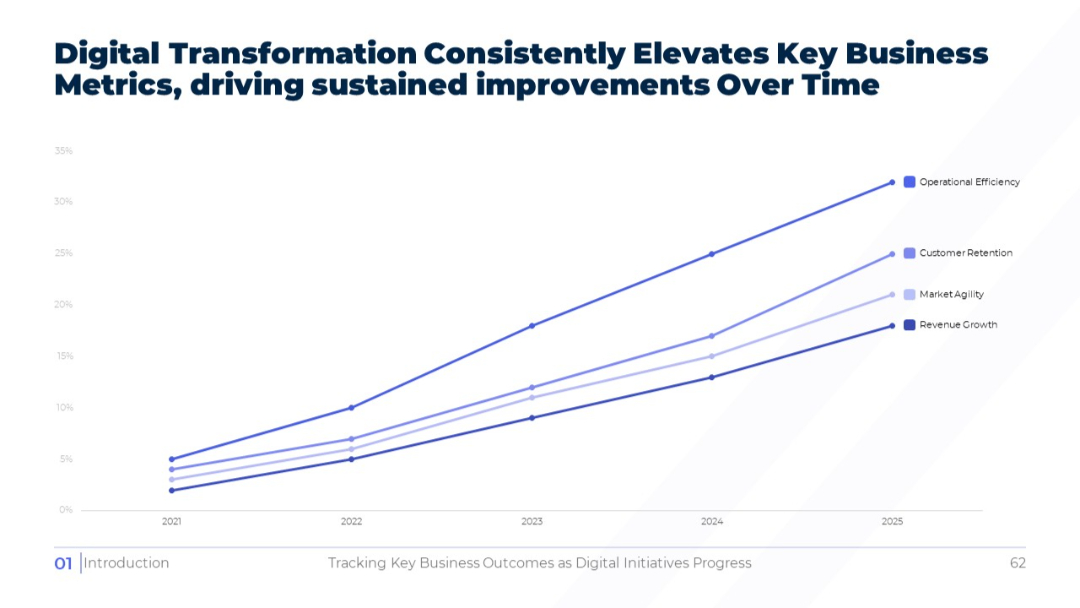
Full-width line graph on white background showing upward trends for key metrics from 2021 to 2025. Legend to the right identifies lines by color and label.
PRO
3x3 grid matrix with colored headers and side labels; each cell includes placeholder bullet text. Uses purple and pink shades for styling.
PRO
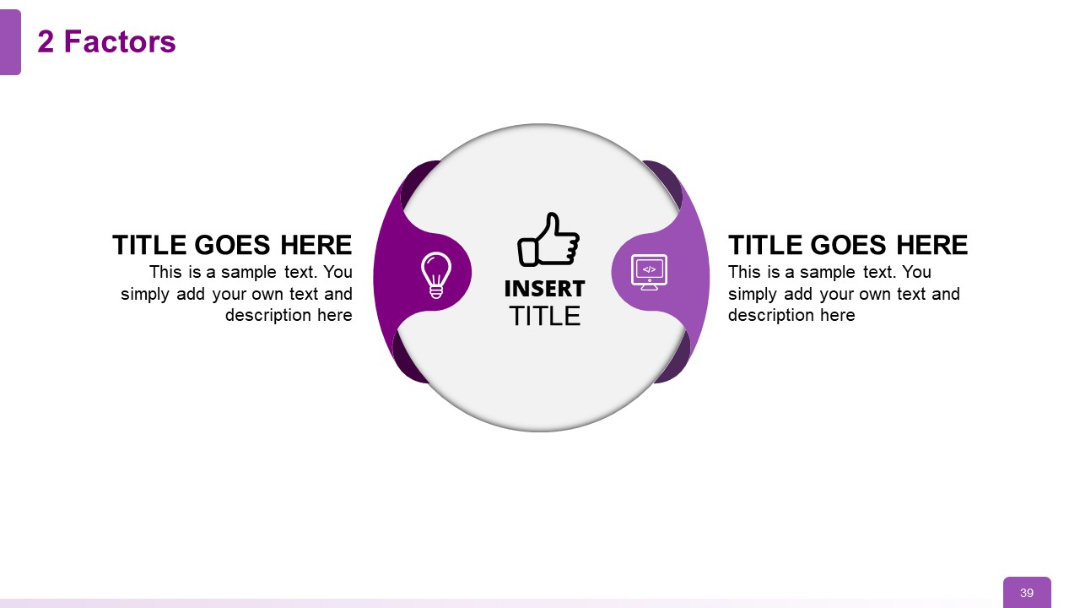
Circular core shape with two external headers on either side; icons for lightbulb and code reflect idea and execution pairing.