PRO
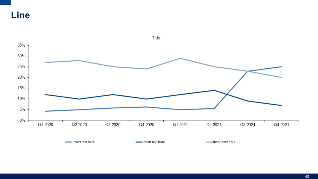
Simple line chart with three data series plotted across quarterly intervals from Q1 2020 to Q4 2021. Two lines in lighter shades, one darker.
PRO
Matrix chart with quadrant analysis and right-aligned explanatory text. Dark theme with bold white and blue text.

PRO
Vertical flow layout with four checkmark icons inside gear shapes connected by a line; text to the right of each.

PRO
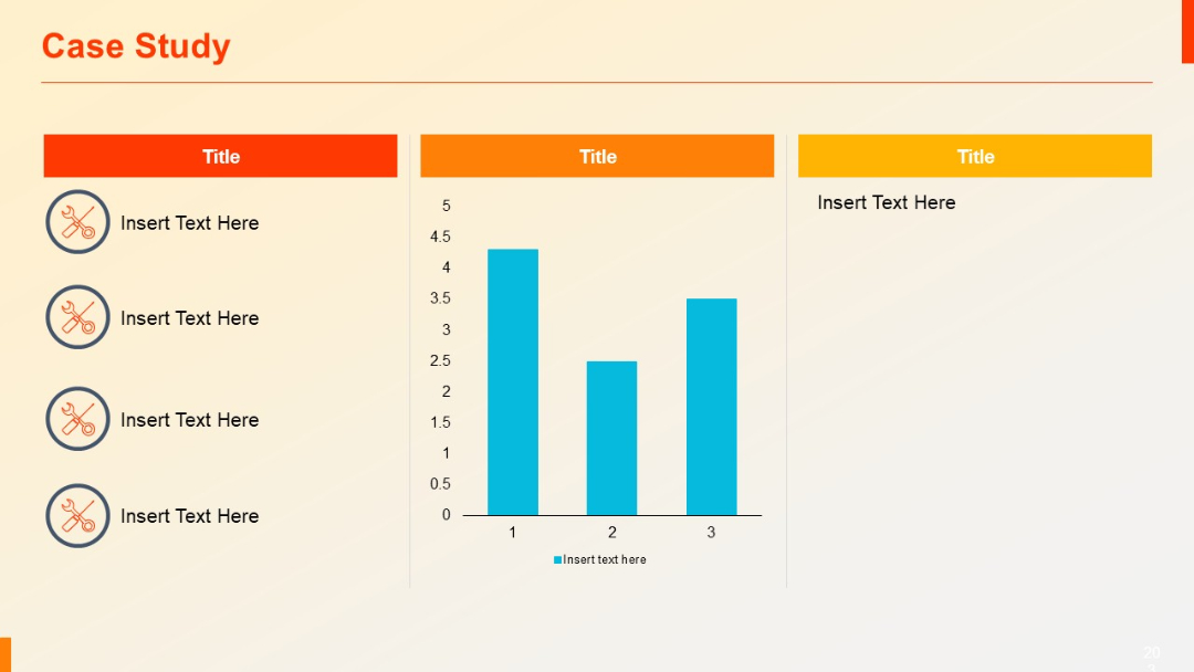
Three-column layout: left column has vertical icon-text pairs, center includes a bar chart, right holds placeholder text.
PRO
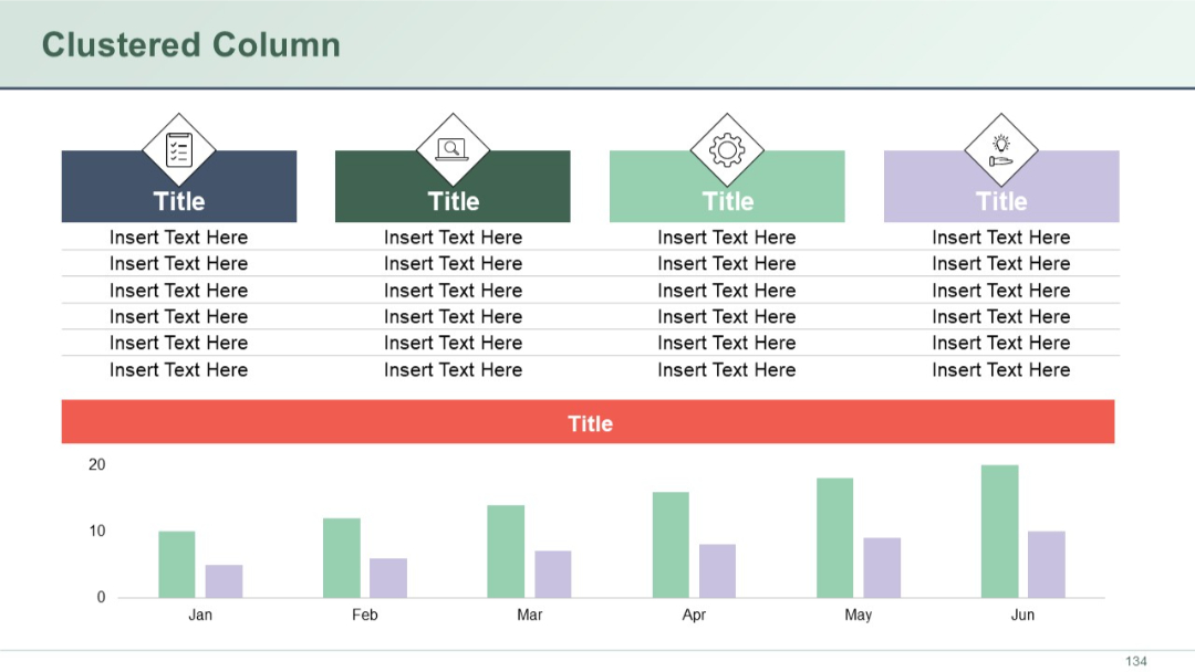
Slide with a combination of top data tables and a clustered column chart on the bottom. Visual icons and color blocks used in top sections.
PRO
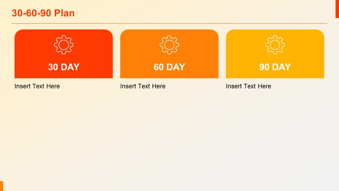
Three colorful blocks labeled 30, 60, and 90 Day, each with gear icon and space for descriptive text.
PRO
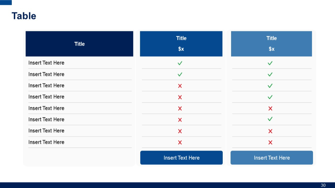
3-column version of Slide 29. Still includes feature list with visual check/cross icons, pricing headers, and bottom CTA buttons.
PRO
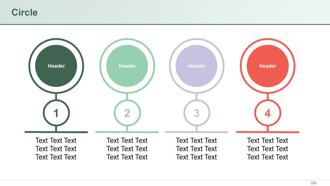
Vertical circular icons numbered 1 to 4, each linked below a larger header circle. Text placed beneath each number.
PRO
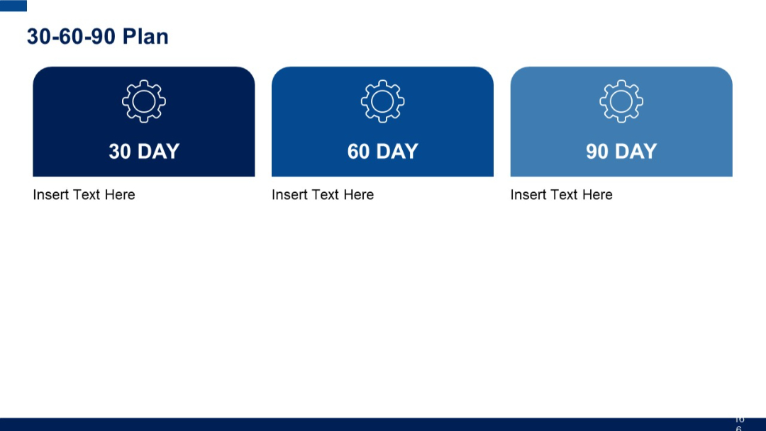
Three rounded rectangular boxes labeled 30, 60, and 90 DAY, in gradient blue shades with gear icons. Each section has placeholder for text.
PRO
Simple grid layout with six identical rows, each with a number and placeholder text. Minimal design with consistent spacing and alignment.
PRO
Circular infographic with four surrounding icons and text, evenly spaced in a balanced radial layout.

PRO
Horizontally oriented table with red top-row headers. The lower section has two wide rows with empty placeholder fields.
PRO
A three-branch infographic layout with icons and placeholder text extending from a central circle.
PRO
Full-width overlapping area chart with two data series over time, simple white background, logo at bottom left, and horizontal date-based x-axis.
PRO
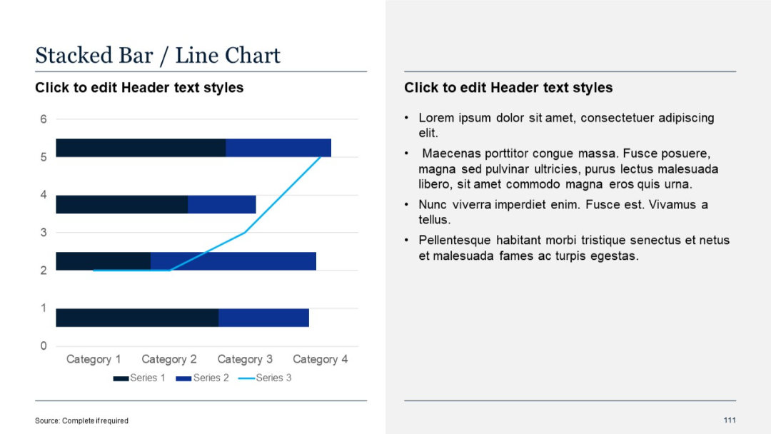
Split layout: left side with horizontal stacked bar chart and overlaid line chart; right side with bulleted placeholder text.
PRO
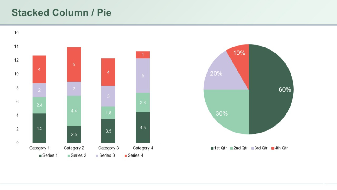
Combined slide showing stacked columns for four categories on the left and a pie chart on the right; clear use of color to represent four series.
PRO
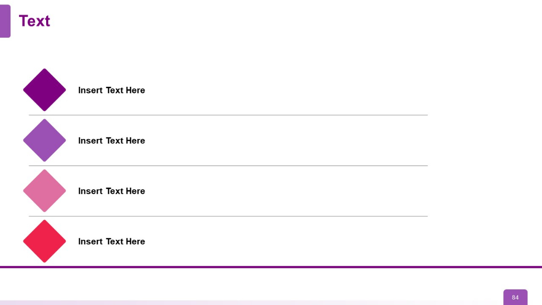
Vertically aligned colored diamonds on the left connected to horizontal text blocks. Each row has a distinct hue.
PRO
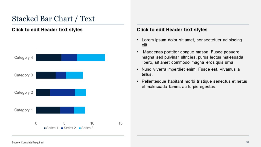
Horizontal stacked bar chart showing multiple data series per category; text on the right.
PRO
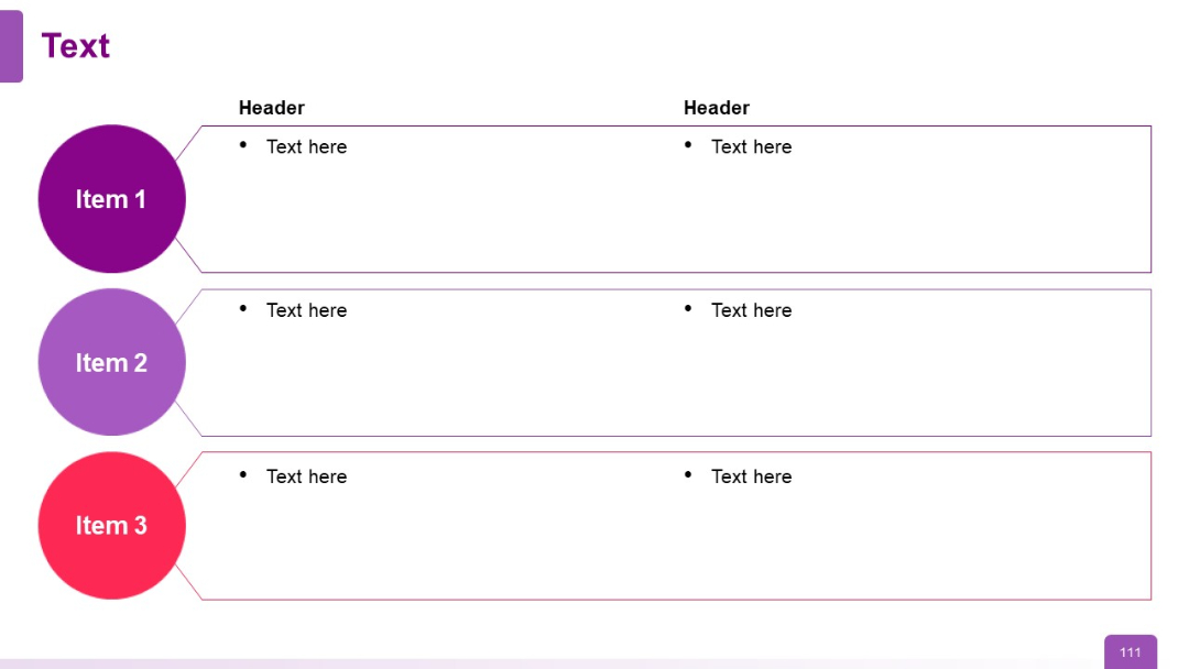
Three horizontal rows with left-side colored circular labels (Items 1–3) and two-column text boxes
PRO
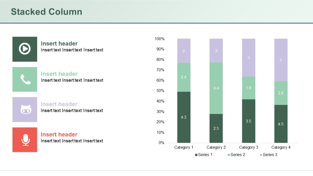
Stacked vertical columns comparing four categories across three series, with colored icons and text headers on the left.
PRO
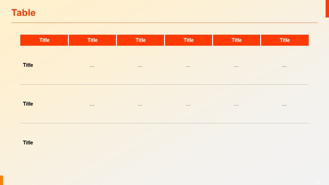
Similar layout to previous, but includes three rows. Top headers in red, lower rows with dotted placeholder content (“...”).
PRO
Four hexagonal segments connected horizontally, each with an icon inside. Clean lines and modern color gradient borders.

PRO
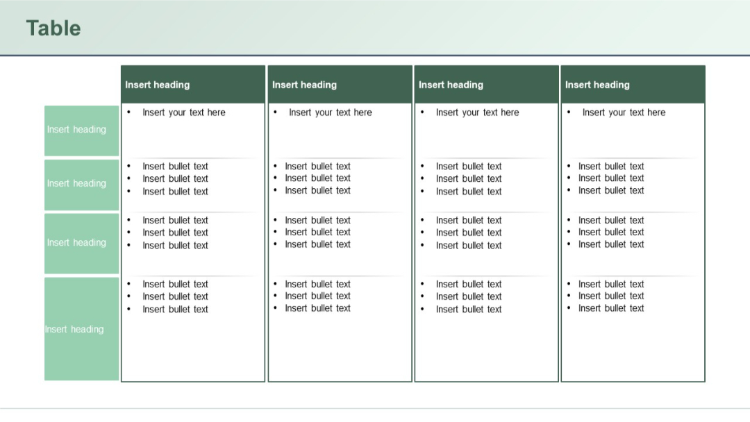
Multi-column table with side headers and top headers. Content areas have bullet lists, likely for detailed task breakdowns or role mapping.
PRO
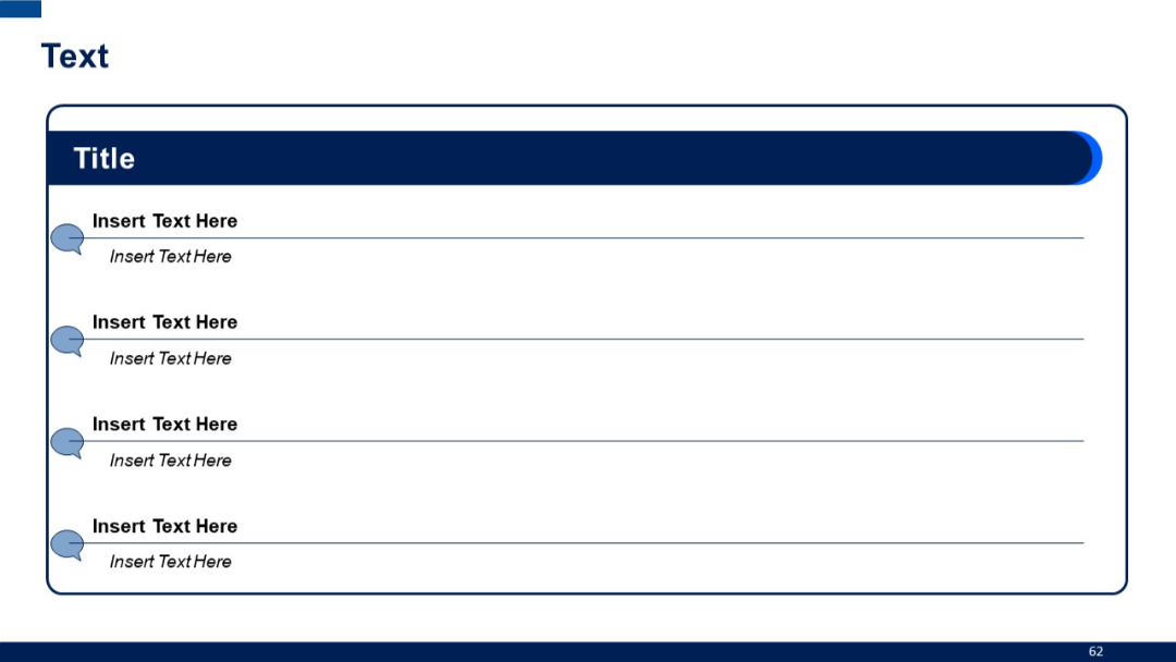
Structured container with a header labeled "Title" and four speech bubble icons aligned vertically, each with two levels of placeholder text.
PRO
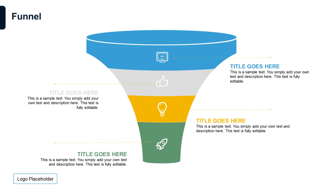
Classic vertical funnel layout with five stages in distinct colors. Each stage has icons and editable text pointing outward to the right or left.
PRO
Visual model layout with Porter’s 5 Forces mapped around a central diamond labeled “Industry Rivalry.” Each force is annotated with how digital transformation affects it.

PRO
A half-doughnut-shaped circular diagram divided in two, with placeholder text on both halves. Minimalist design with central cutout.

PRO
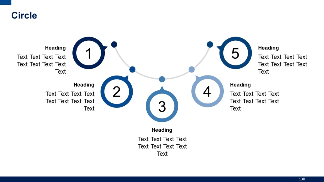
Five numbered circles connected by a curved timeline-like path. Text and headings accompany each number.
PRO
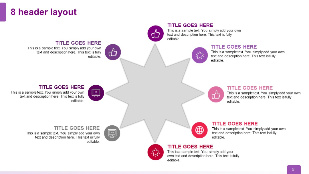
Circular radial layout with 8 headers surrounding a central 8-point star; each header includes an icon and editable text section.
PRO
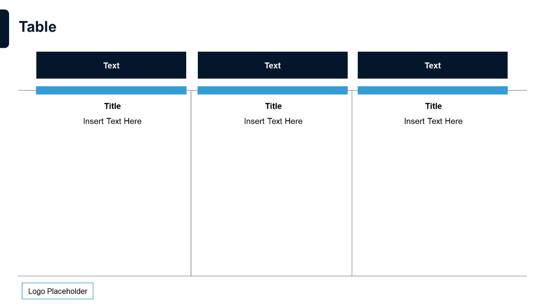
Three-column table format. Bold dark headers with horizontal highlights. Simple design for showcasing three entities or features.