PRO
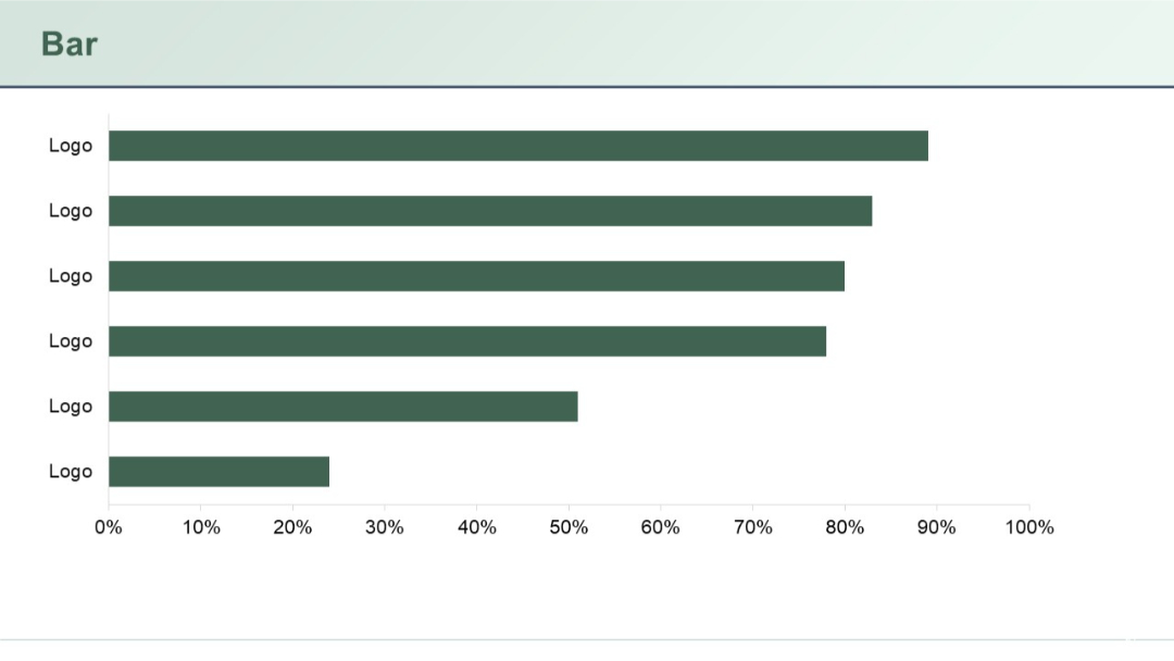
Horizontal bar chart with six bars labeled “Logo”, showing comparative percentage values.
PRO
Two side-by-side bar charts, each with identical structure, above bullet-pointed text. Standard 5-series, 4-category chart layout.

PRO
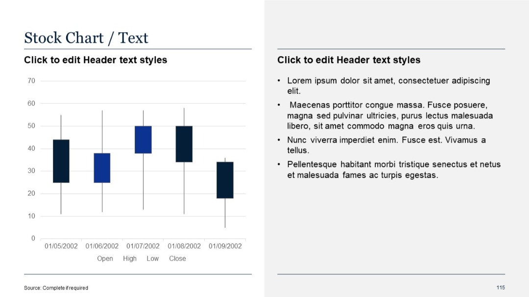
Left side includes candlestick stock chart over time; right contains placeholder bullet text.
PRO
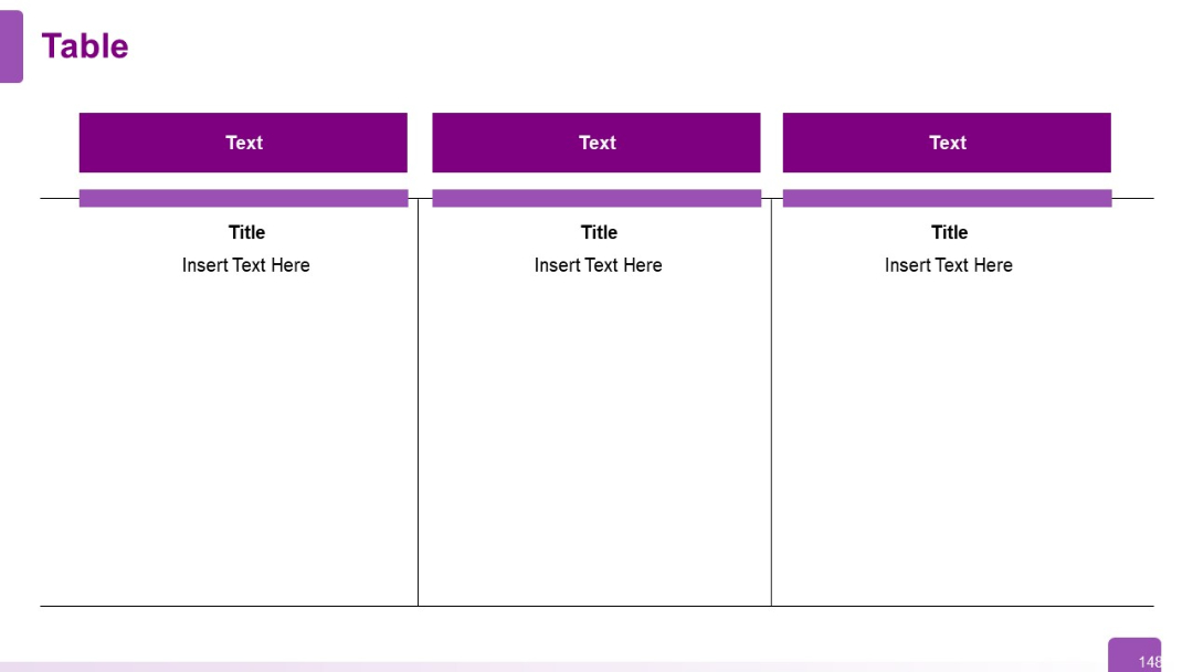
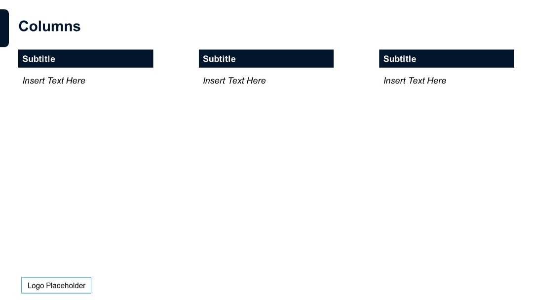
Three-column layout with purple headers and large vertical sections for text. Visual emphasis on column-wise comparison.
PRO
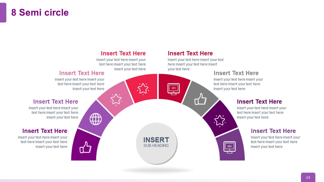
Semi-circle with 8 gradient-colored segments and icons. Each segment includes space for text. Central grey circle labeled “Insert Sub-heading.”
PRO
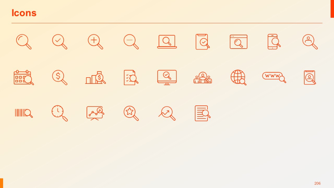
Grid of 28 line-style icons (e.g., magnifying glass, calendar, search, data) in red on a light background.
PRO
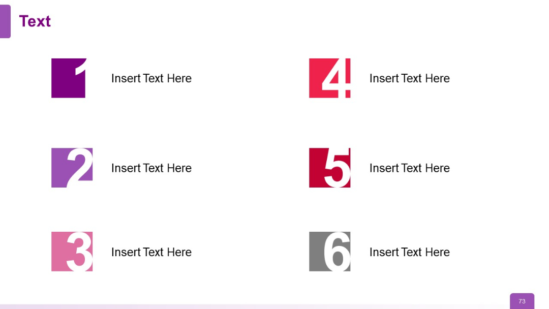
Two-column layout with six numbered square icons (1–6) paired with text, arranged in three rows. Bold colors differentiate each pair.
PRO
Numbered circular path from 1 to 5 in an arc. Icons and headings accompany each number.

PRO
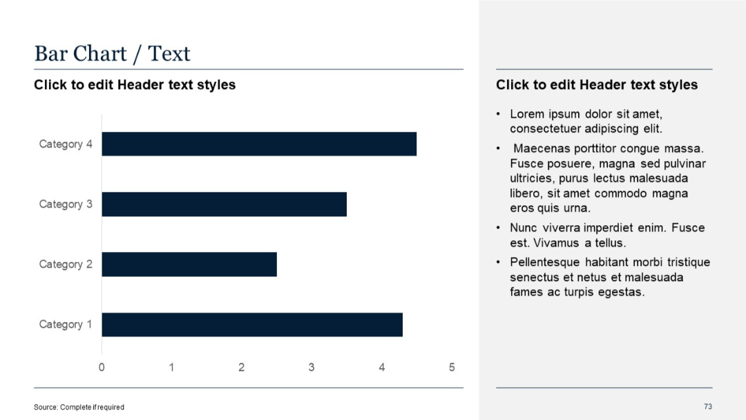
Horizontal bar chart with four categories on the left and a bullet text section on the right. Uniform color for all bars.
PRO
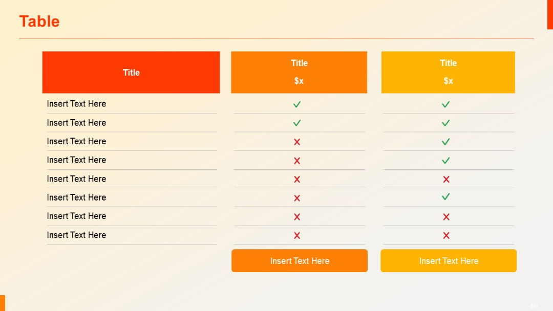
Similar to slide 48, but with three comparison columns instead of four. Uses same check/cross format and CTA buttons below.
PRO
A radial diagram split into 8 colored wedges, surrounding a central circle labeled "Header." Text descriptions are placed outside each wedge.

PRO
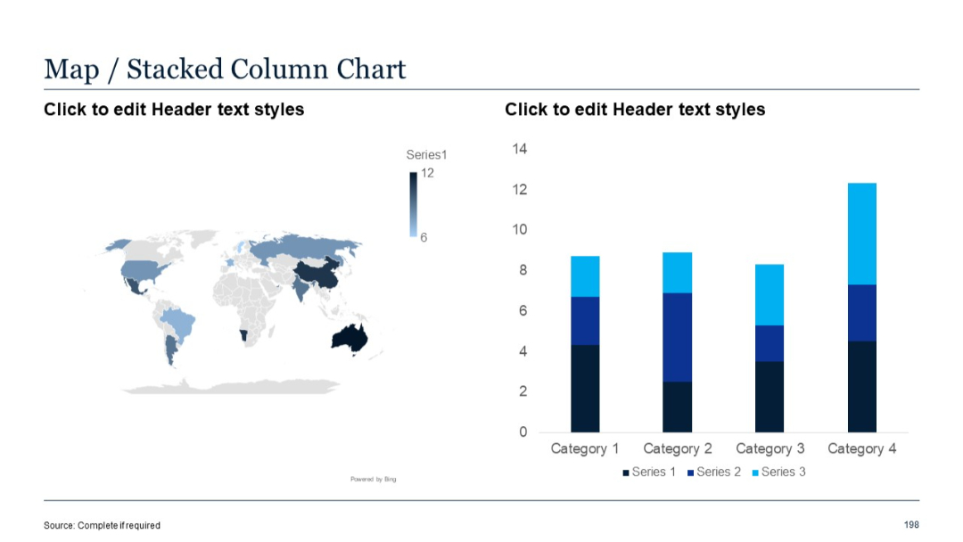
Left: world map; Right: stacked column chart with three series per category.
PRO
A vertical funnel divided into five segments with icons in the center of each layer and descriptive text boxes placed on alternating sides.

PRO
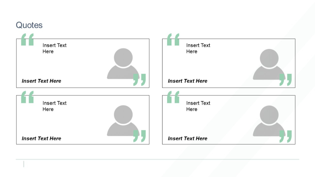
Grid of four testimonials featuring avatars, quote marks, and text boxes. Balanced two-column layout with user profile icons.
PRO
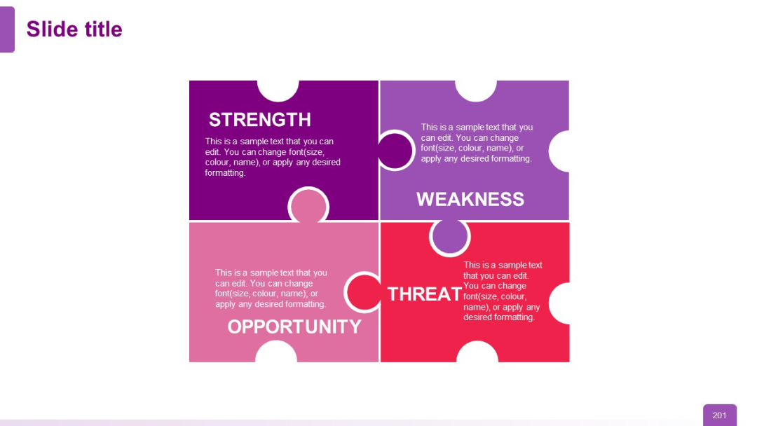
A 2x2 grid in puzzle piece format, each colored block represents SWOT elements: Strength (purple), Weakness (light purple), Opportunity (pink), Threat (red).
PRO
Side-by-side world maps for 2020 and 2025 showing country adoption maturity in darker/lighter shades; explanatory text at the bottom.

PRO
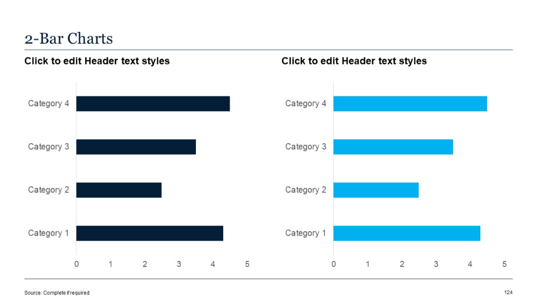
Two horizontal bar charts side-by-side with single-color bars. Left is navy, right is cyan.
PRO
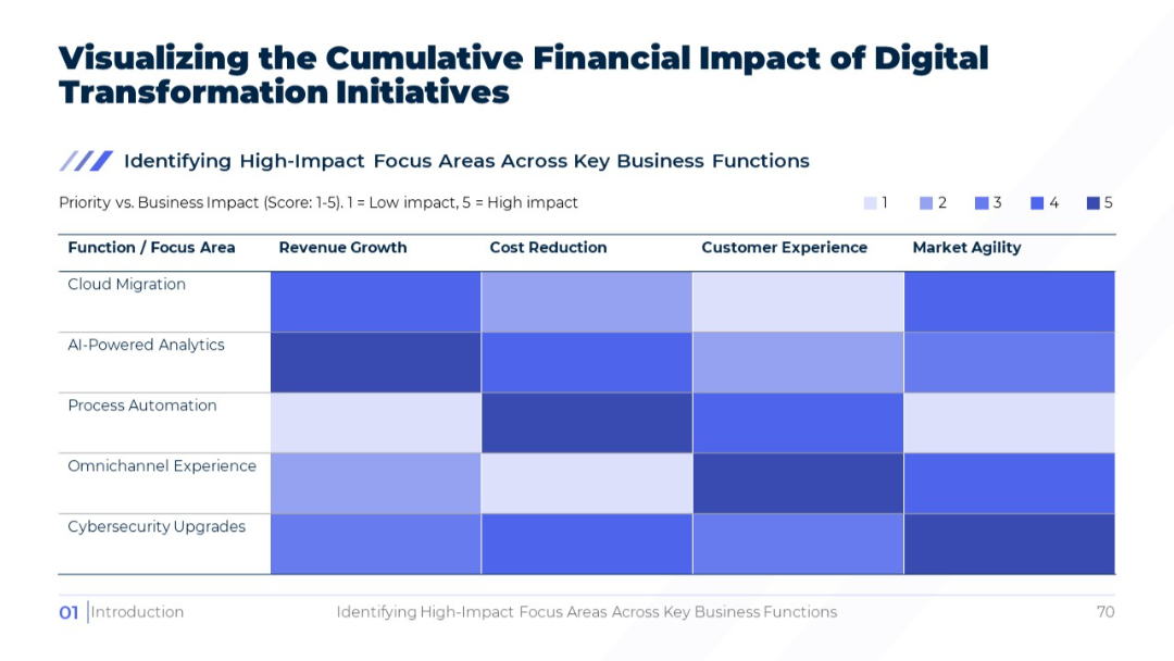
Heatmap matrix showing impact scores (1–5) across functions like cloud migration and AI-powered analytics. Blue gradient used to indicate impact intensity.
PRO
Two-column layout with stylized square numeric icons (1–6) paired with short text blocks. Icons are large, colored, and visually dominant.
PRO
Dark-themed version of Slide 21 with vertical bullet point timeline on the left and detailed text on right.

PRO
Vertical timeline with blue icons and time slots on both left and right sides of the slide.
PRO
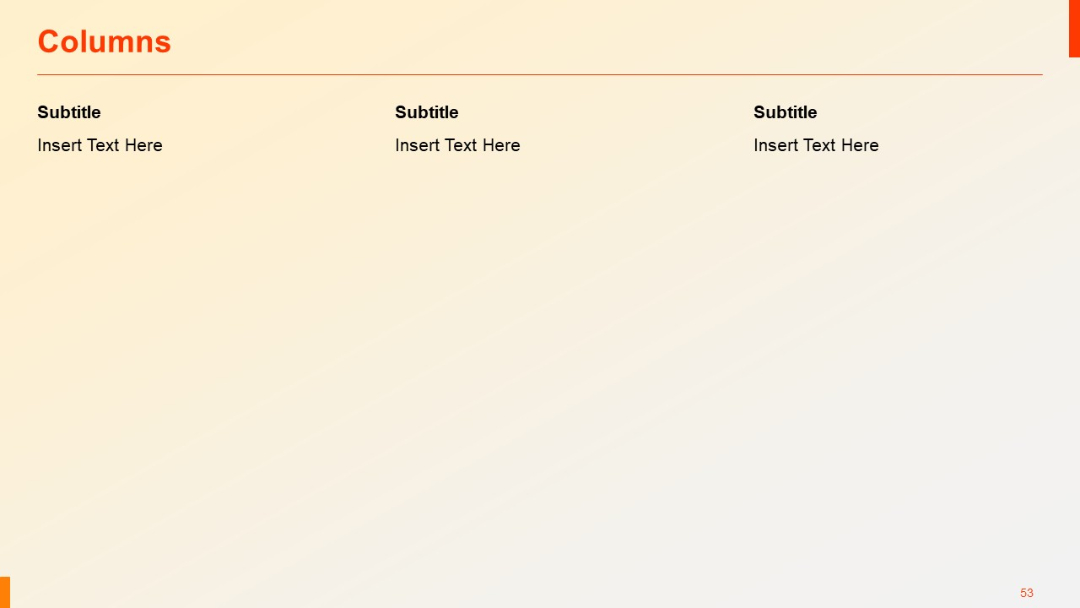
Three evenly spaced vertical columns with subtitles and text placeholders. Balanced design, ideal for comparisons or listing items in parallel.
PRO
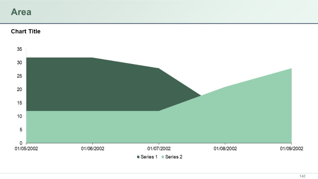
A simple stacked area chart with two data series, using dark green and light green colors, charting values over time with dates as the X-axis labels.
PRO
Three-column layout with bold dark header bars; equal spacing; white background; subtitles and italic body text.
PRO
A 5-column, 3-row table layout. The first column has red-highlighted blocks for each row. Remaining columns are light with placeholder text.

PRO
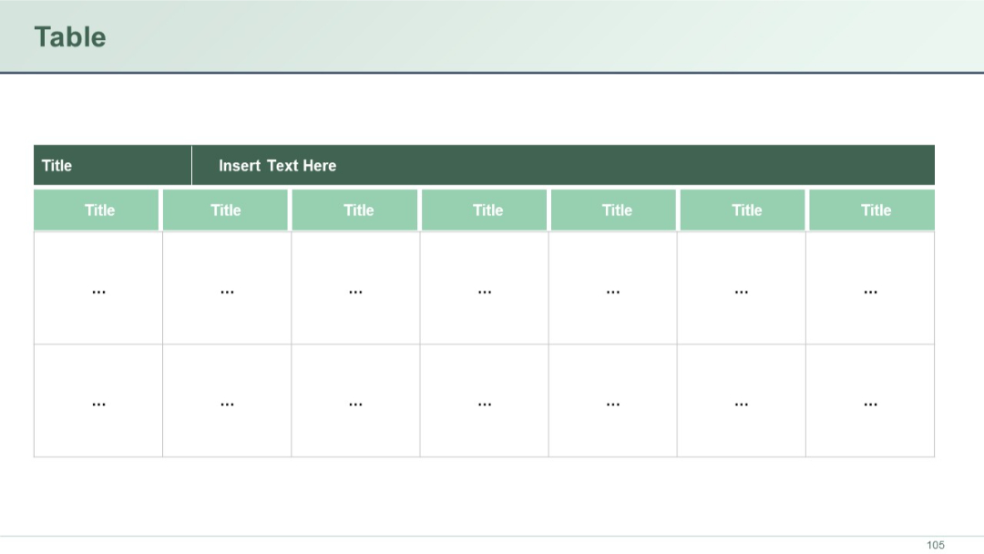
Clean table with horizontal and vertical headers; light green and dark green shades; placeholder dots used within cells.
PRO
Two-row, five-column table with wide first column (purple block titles), followed by plain text columns. Balanced spacing.

PRO
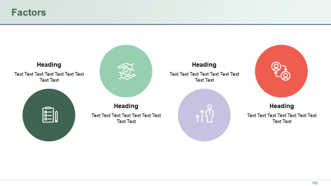
Circular icons with headings below. Five factors spread across the slide. Clean, balanced spacing.
PRO
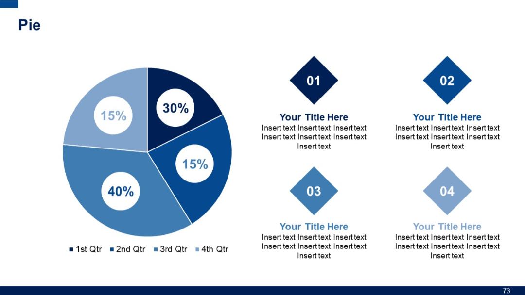
A large pie chart on the left with four segments, and diamond-shaped text placeholders on the right labeled 01 to 04.
PRO
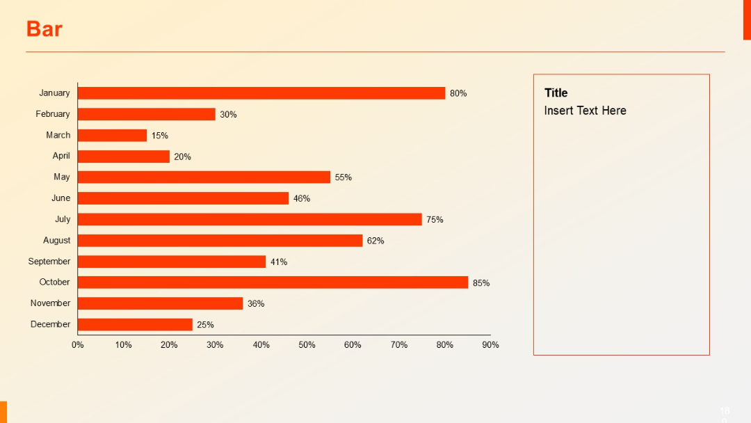
Horizontal bar chart showing months (January to December) on Y-axis, with orange bars and percentages. Text placeholder box on the right.