PRO
Section divider slide with bold “03” and “Quantitative Slides” on a purple gradient banner; minimalistic and clean.

PRO
Two-column split with purple headers. Each side features a large content area with title and text placeholder. Symmetrical and balanced layout.
PRO
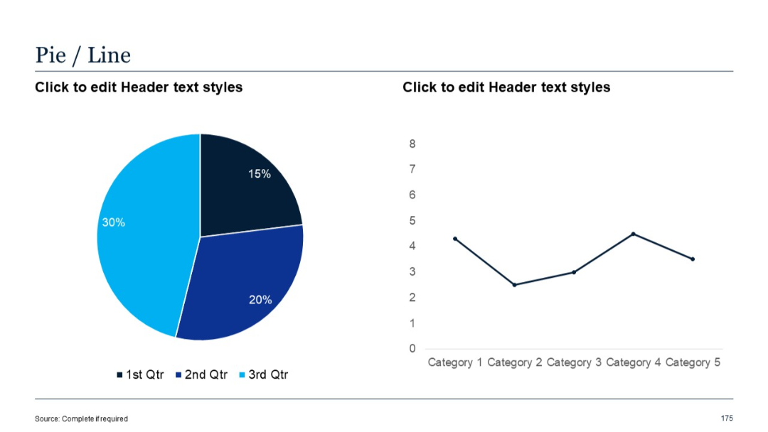
Pie chart on the left and a simple line chart on the right.
PRO
Four-part segmented circular graphic with color-coded quadrants, each labeled with numbers and text headings.

PRO
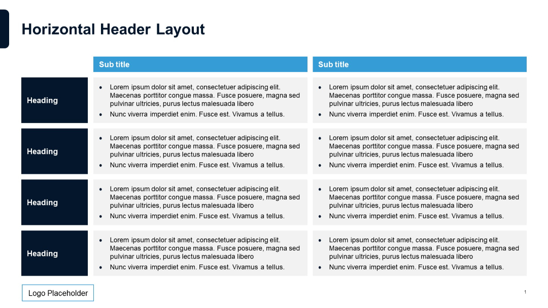
Alternating light and dark sections. Left column contains headers; right two columns contain bulleted text under sub titles. A grid layout with a light blue subtitle banner.
PRO
Four-column version of the side-by-side format, using consistent formatting with shaded headers and underlined section titles. Clean and symmetrical design.
PRO
Vertical timeline-style layout with alternating icons: checkmarks and circles. Each row has placeholder text aligned to the right of the timeline line.
PRO
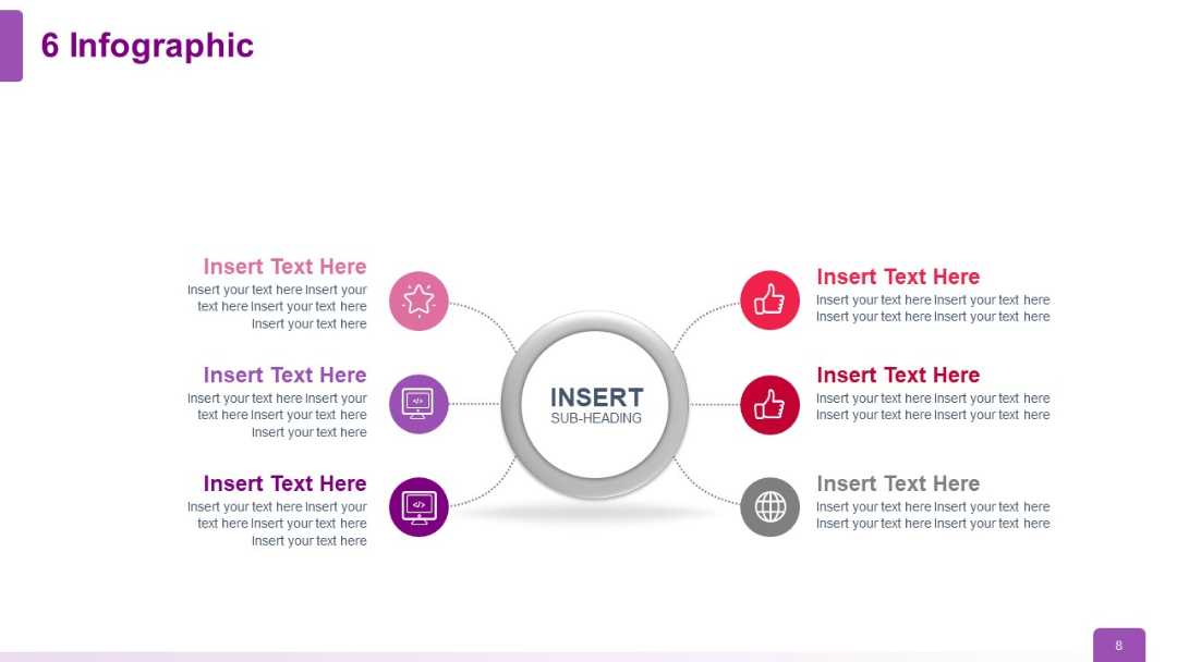
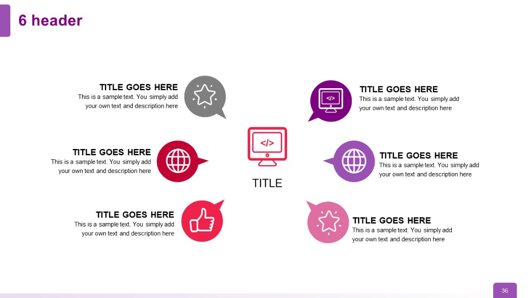
Six icons and text elements in a radial format with even distribution around a central circle.
PRO
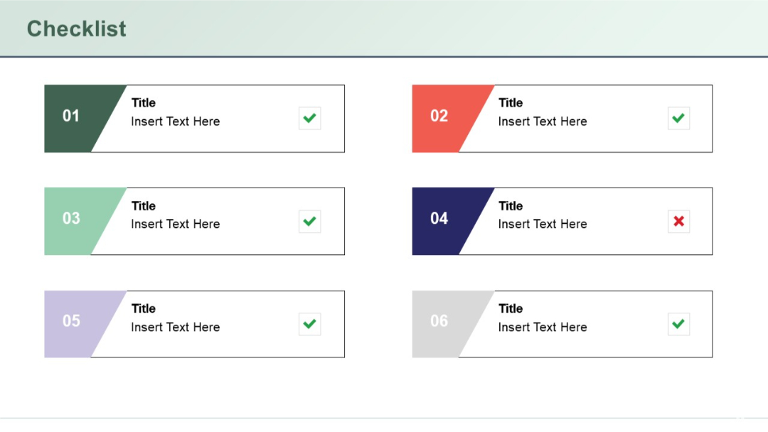
Two-column layout with six colored checklist blocks numbered 01–06, each with a title, description placeholder, and check or cross icon on the right.
PRO
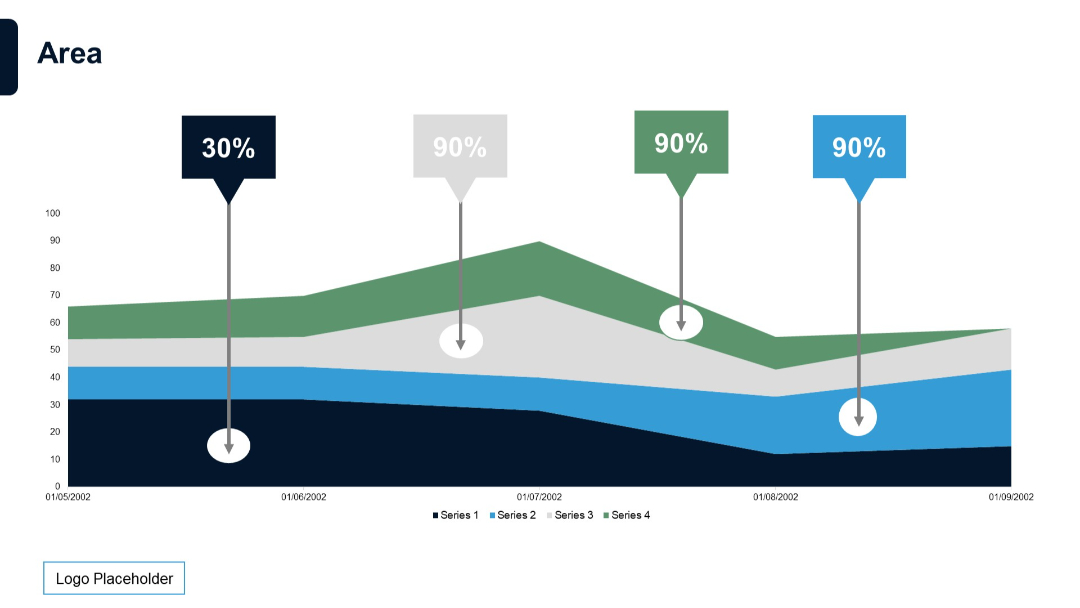
Stacked area chart with annotations (percentages on callouts) and four series. Emphasizes key data points over a time series.
PRO
Two horizontal blocks with circular icons and header bars in purple shades; bulleted text follows each header.
PRO
Process-style table with arrows indicating flow; three horizontal columns with input boxes and descriptive bullet text below each; two vertical boxes on the left.
PRO
Grid format with five vertical columns and five horizontal sections; each cell contains bullet lists and text blocks.
PRO
Clean three-column layout with numbered headings and icons. Each pillar is supported by a short descriptive paragraph explaining its strategic importance.

PRO
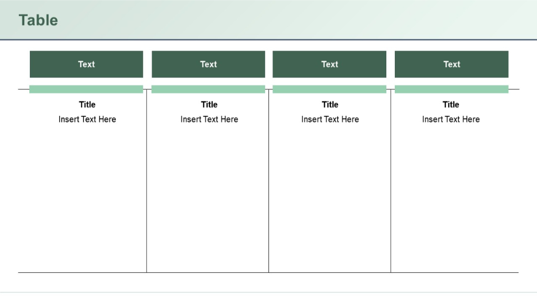
Three content panels with headers titled "Text", followed by titled sections. Vertical separators enhance clarity and segmentation.
PRO
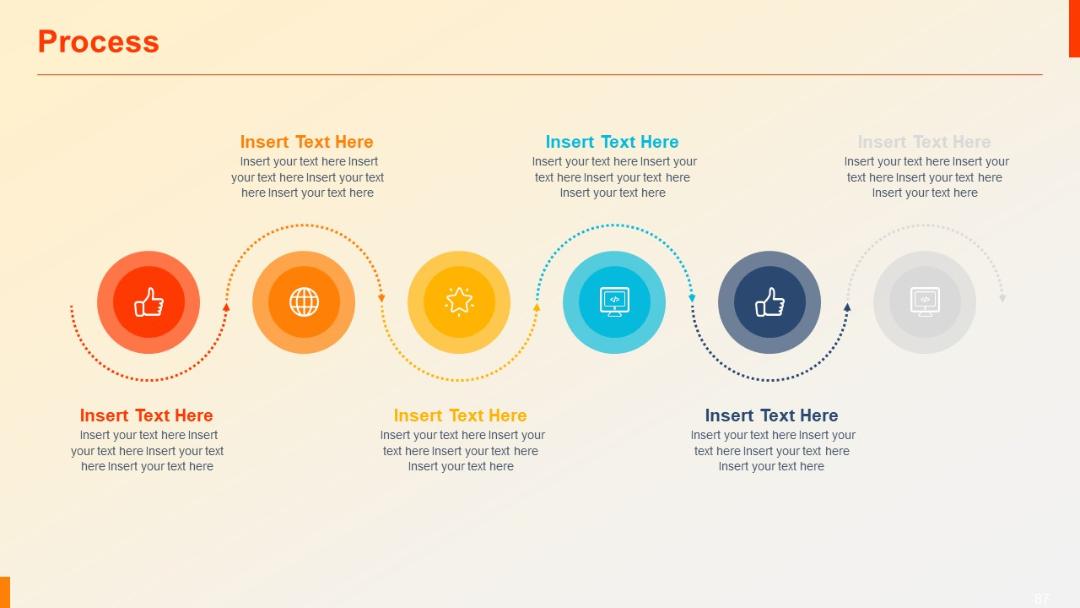
Dotted-line path connecting six circular icons in gradient shades. Balanced visual flow suggesting a journey or roadmap.
PRO
A four-part circular quadrant layout with a central pie chart. Each quadrant is labeled numerically (01–04) and includes editable text outside the circle.

PRO
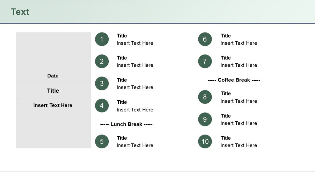
Agenda layout with 10 circular numbered items and a left-side gray box for date and event title. Mid-points for lunch and coffee breaks are included.
PRO
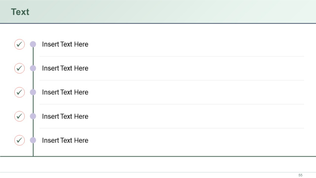
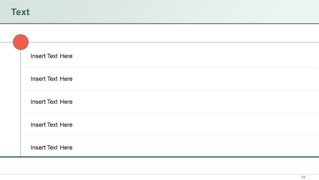
Vertical list layout with five text entries aligned right of a vertical line. A single large red circle at the top-left serves as a visual anchor.
PRO
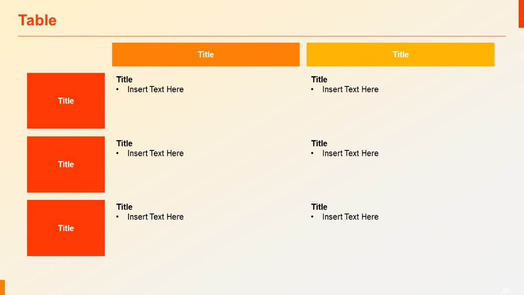
Two large header blocks in orange/yellow. Left column uses red blocks for row titles. Right-hand columns include bulleted placeholder items.
PRO
Clustered column chart (4 categories) with percentage labels above each series. Minimalist layout focused on comparing percentages.

PRO
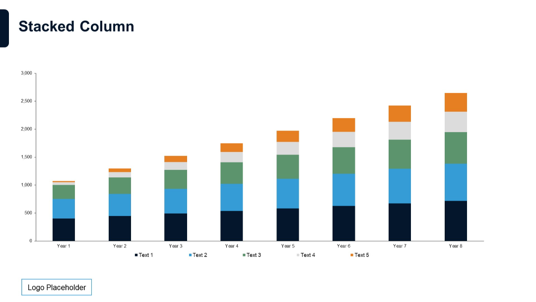
Vertical stacked column chart for 8 years. Each column is divided into five color-coded segments with legend.
PRO
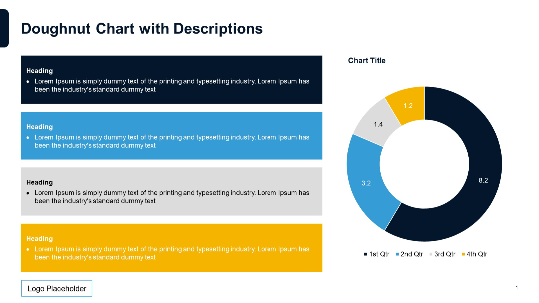
Left side contains four color-coded description boxes stacked vertically, each with a heading and text. Right side features a doughnut chart.
PRO
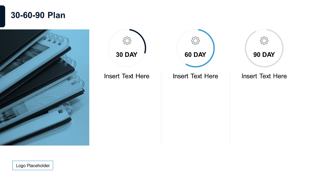
Visual layout with circular progress indicators for 30, 60, and 90 days, plus a photo of stacked notebooks.
PRO
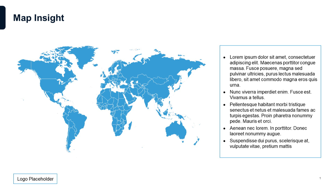
Full-width world map in blue with a bulleted text box on the right and a logo placeholder at bottom left.
PRO
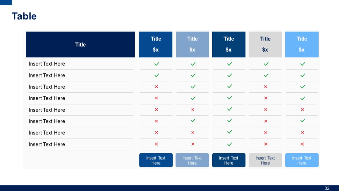
Extended horizontal table with six columns and eight rows; consistent use of checkmarks/crosses for feature comparison; each column uses different color tones.
PRO
Left chart uses 100% stacked columns, while the right shows standard stacked columns for 3 series across 4 categories.

PRO
Two-layered circular layout with six icons and headers encircling a central icon; arrows and speech bubble icons add a dynamic flow.
PRO
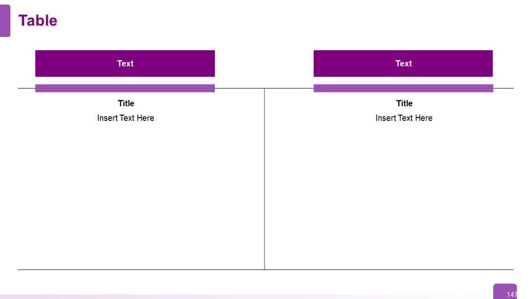
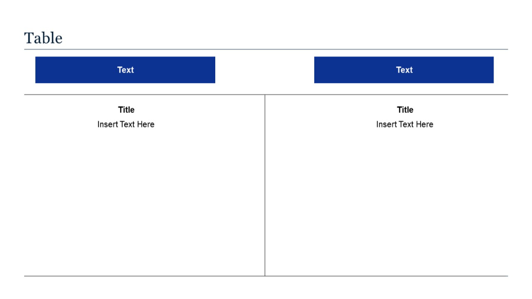
Split vertical layout with two large columns; each side includes a blue header labeled "Text" and corresponding content below with a title placeholder.
PRO
Left side shows a stacked column chart with numeric labels across four categories and four series. Right side presents a pie chart with labeled segments.


