PRO
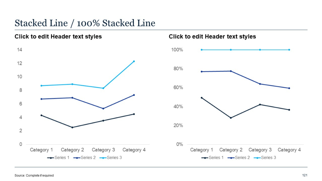
Two line charts side-by-side: left is a stacked line chart, right is a 100% stacked line chart. Minimal labels.
PRO
Horizontal layout with three rounded rectangular blocks labeled 30, 60, and 90 DAY. Each block includes an icon and editable text area.
PRO
Horizontal path divided into four sections with upward arrows, each block featuring editable title and body text along a progression path.
PRO
Two-column vertical list with two headers titled "Title" and checklist items below, each accompanied by a checkmark icon.
PRO
Circular quadrant with SWOT sections around a donut chart in center; each quadrant labeled and color-coded.
PRO
Vertical funnel with four layers, each with an icon and matching title and description on the right.
PRO
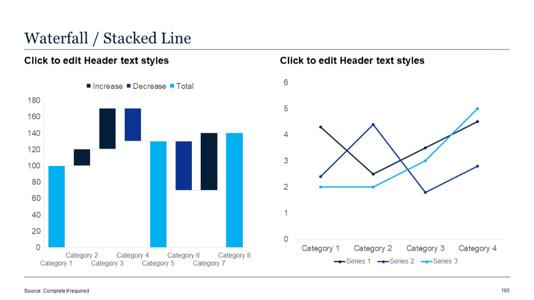
Left side is a waterfall chart; right side presents a stacked line chart with three data series across four categories.
PRO
Single stacked column chart with green hues and positive/negative axis values. No data labels; minimal layout.

PRO
Area chart with two series on the left; bullet point list on the right; smooth filled shapes.
PRO
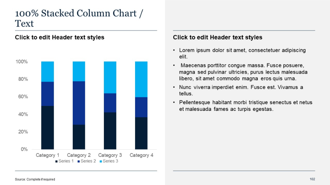
Two-column layout; left side has a 100% stacked column chart, right side contains bullet point text.
PRO
Section title slide with large "02" and the label "Quantitative Slides"; minimal design with angled lines on the right.

PRO
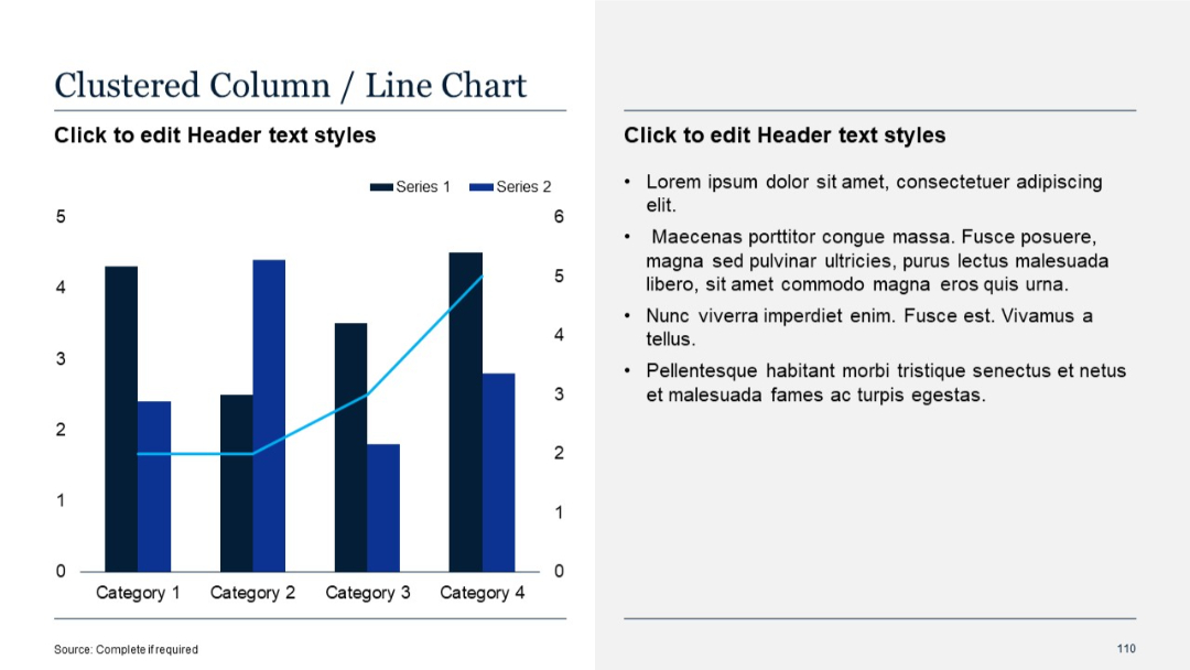
Combo chart (bar and line) on left; bullet point text on right.
PRO
Numbered vertical timeline with round icons and color transitions for visual segmentation.

PRO
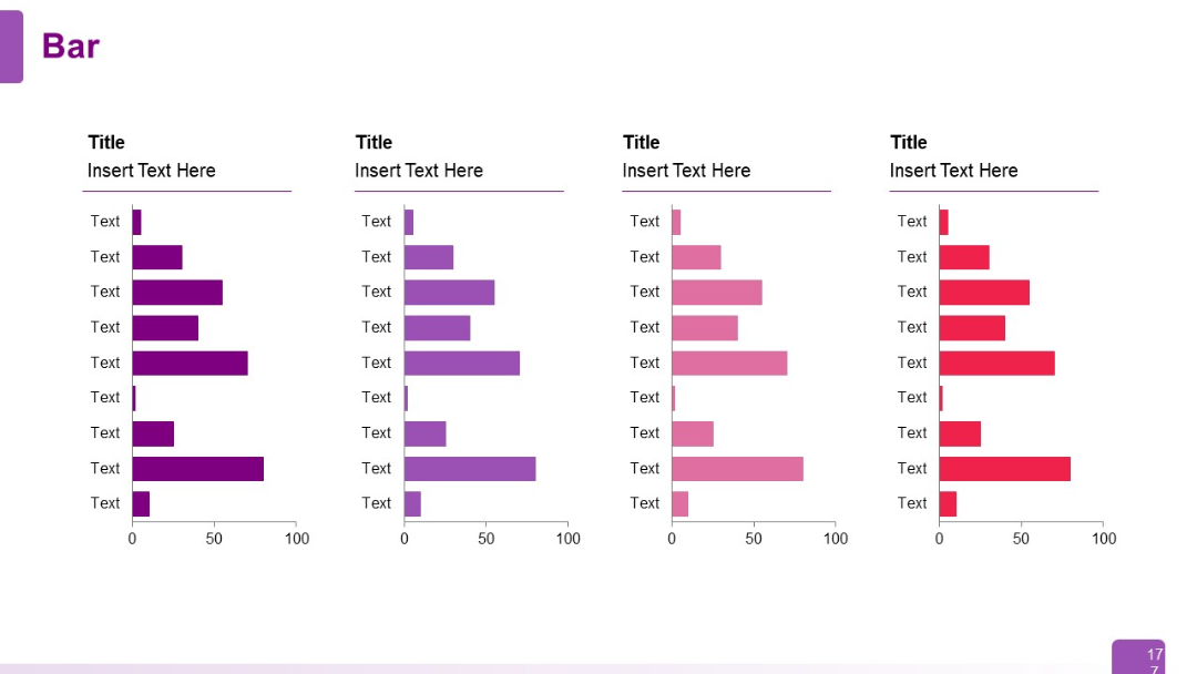
Four sets of vertically stacked horizontal bar charts in different shades, each with category labels and placeholder titles/text.
PRO
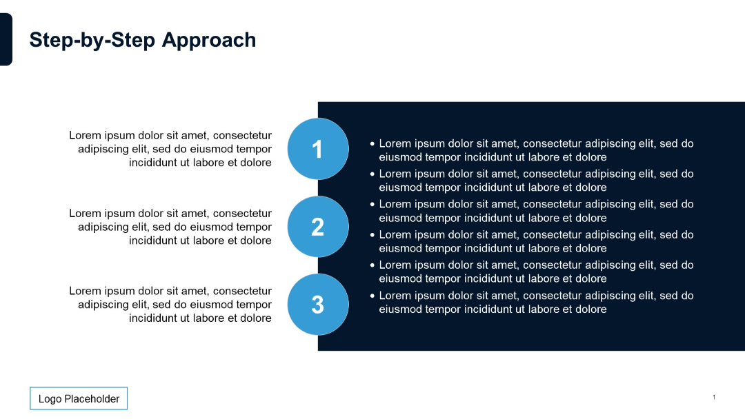
Left-aligned numbers 1–3 with adjacent bullet point sections and supporting paragraph text on left.
PRO
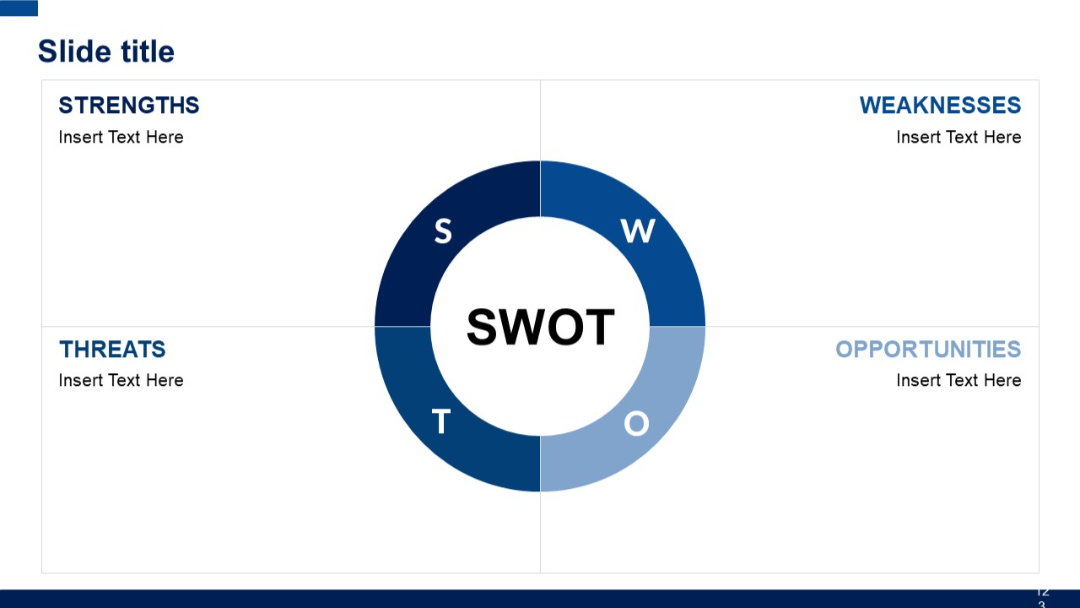
Circular segmented SWOT chart centered in slide with four quadrants labeled Strengths, Weaknesses, Opportunities, and Threats. Balanced layout.
PRO
All-white background with faint diagonal lines, no visible content except slide number.

PRO
Section divider slide with a large “02” and the subtitle “Quantitative Slides” over a blue gradient banner.

PRO
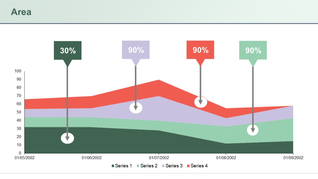
A colorful, multi-series stacked area chart with four data series, each highlighted with prominent percentage labels above.
PRO
A basic area chart showing two series over time. No additional descriptive text, minimalistic layout focused on the chart itself.

PRO
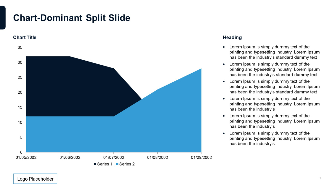
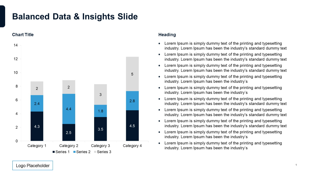
Left-aligned vertical stacked bar chart with four categories. Right side has bulleted text. Minimalist layout with navy and white theme. Logo placeholder at bottom left.
PRO
Horizontal layout with arrow icons leading into five rows of text. A solid header bar at the top displays the slide title with contrasting end block.
PRO
Left side features an area chart with two series shaded in purple gradients. Right side includes two donut charts for 2023 and 2024 with percent values, each above text boxes.

PRO
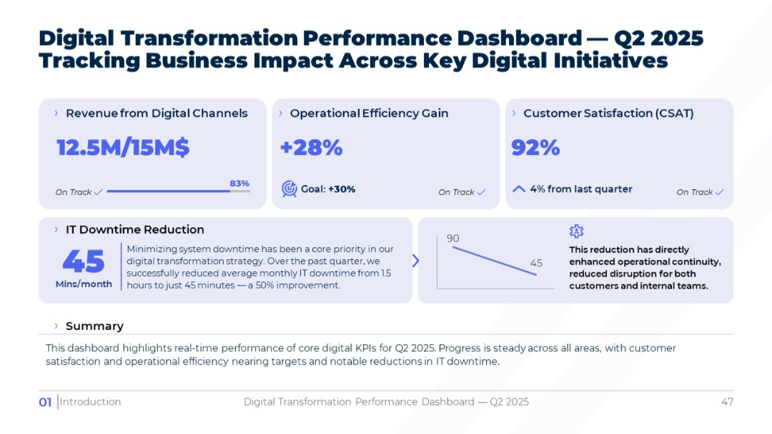
Light theme dashboard; sectioned layout with pastel panels; each KPI highlighted with figures and contextual summaries; chart and icons included.
PRO
A 2x2 grid of interlocking puzzle pieces in bold colors (red, orange, yellow, blue) representing SWOT components with sample text placeholders.

PRO
A circular arrow layout with five connected arrowheads pointing clockwise. Each stage is labeled with editable text and icons.

PRO
Image grid layout on a dark background, similar to Slide 34, but includes all four business focus areas with accompanying icons and summary text for each.

PRO
Light-themed comparison table showing regional maturity levels from 2020 to 2025 across five global regions.

PRO
Another grid of line-style icons related to education, communication, and recognition displayed in rows.

PRO
Five icons inside circular shapes arranged in a triangle pattern. Headings and short text surround each icon.