PRO
One large centered quote with big opening and closing quotation marks. Dark blue header and surrounding box with rounded corners.
PRO
Two-column table with four rows. Each row features a left icon + title in dark green with corresponding text on the right in white space.
PRO
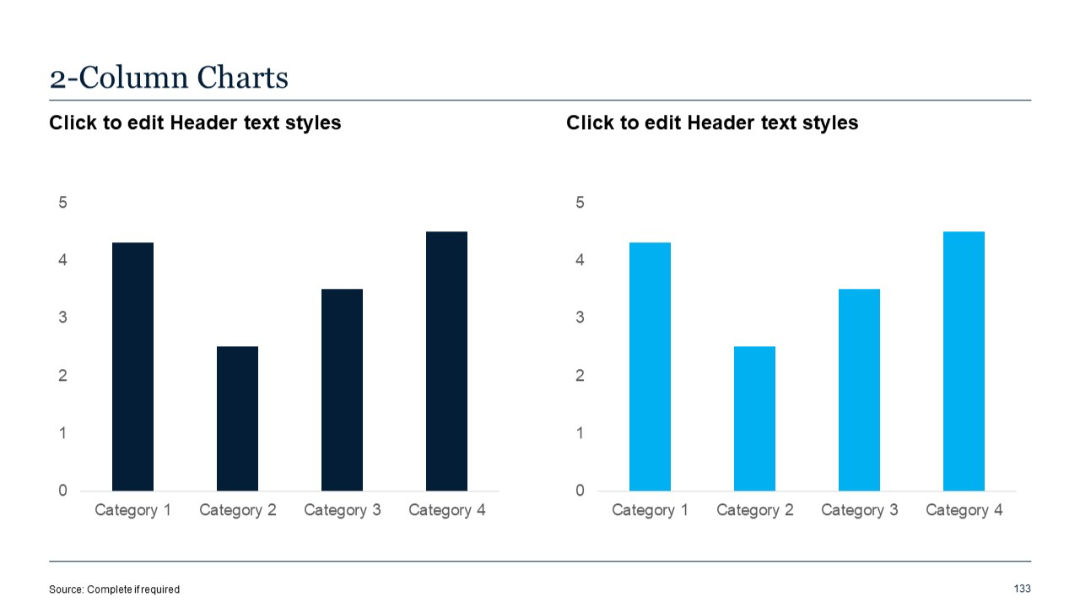
Two side-by-side bar charts, each with identical structure, above bullet-pointed text. Standard 5-series, 4-category chart layout.

PRO
Vertical list with arrow icons beside text entries and a title bar at the top. Bold orange and cyan accents on beige background.
PRO
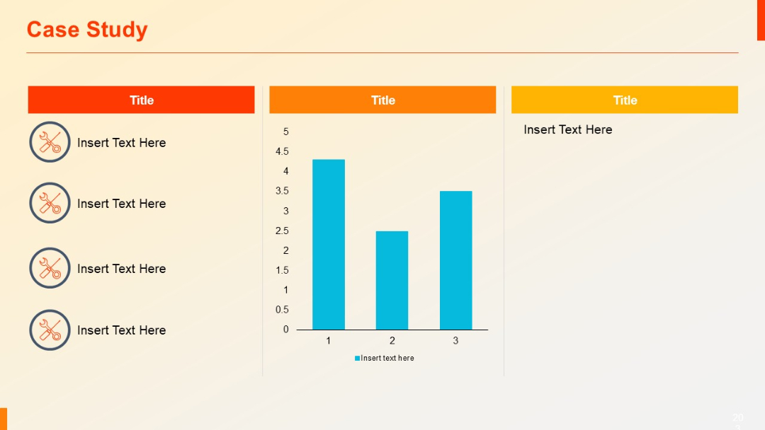
Three-column layout: left column has vertical icon-text pairs, center includes a bar chart, right holds placeholder text.
PRO
Modern horizontal org chart using rounded rectangles and photos/icons for each position.
PRO
Two semi-circle segments forming a half-donut shape; icons include thumbs up and computer; editable text sections on both ends; central circular label.

PRO
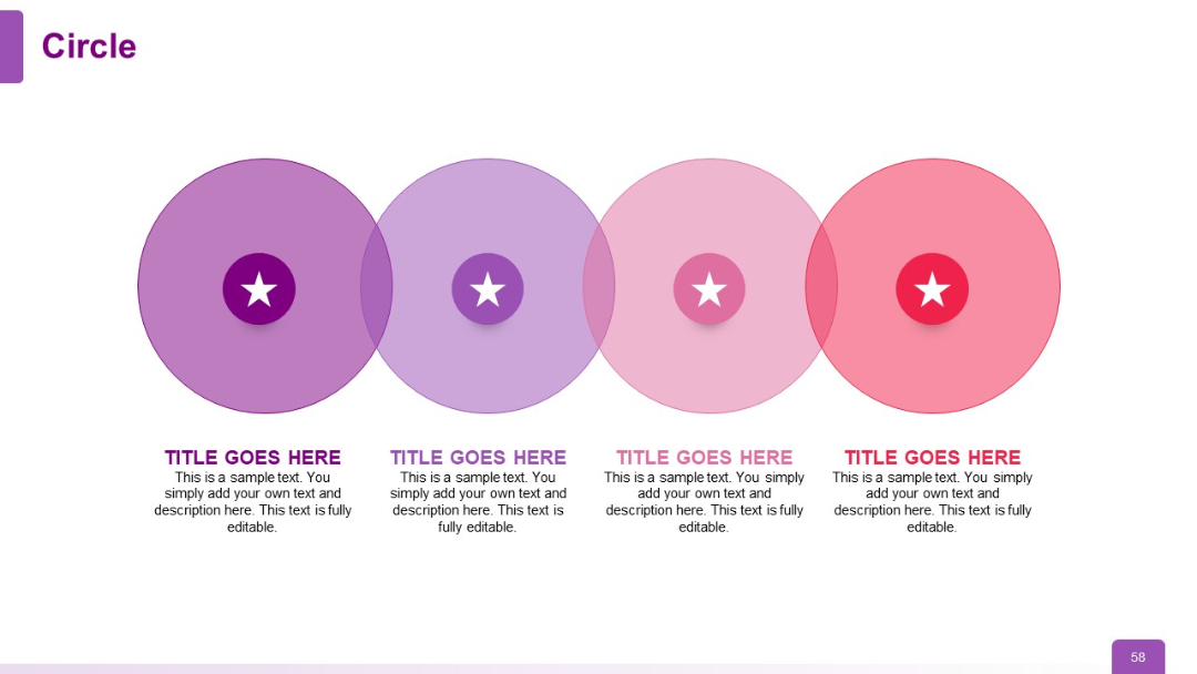
Four large overlapping circles in a horizontal row, each with a central icon, title, and description below. Color fades from purple to red.
PRO
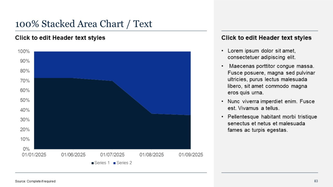
Same two-column structure with 100% stacked area chart on the left and placeholder text on the right
PRO
Two vertical column charts side-by-side. Left chart uses dark blue; right chart uses cyan blue. Each bar represents one value per category.
PRO
Split layout: top has two columns with numbered lists, bottom section contains a wide horizontal text box and icons.
PRO
Two-column layout over a background image. Left side features grayscale architecture image with blue overlay. Right side includes two subtopics with short paragraphs in blue text. Balanced visual and textual design.

PRO
Two wide columns with subtitles in bold white on blue, and body text below. Clean separation and balance between the columns.
PRO
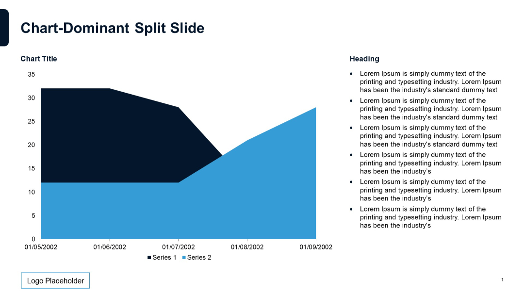
Area chart with two series on the left; bullet point list on the right; smooth filled shapes.
PRO
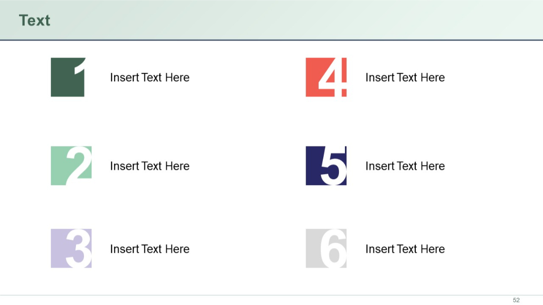
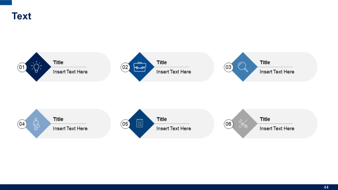
Two-column layout with stylized square numeric icons (1–6) paired with short text blocks. Icons are large, colored, and visually dominant.
PRO
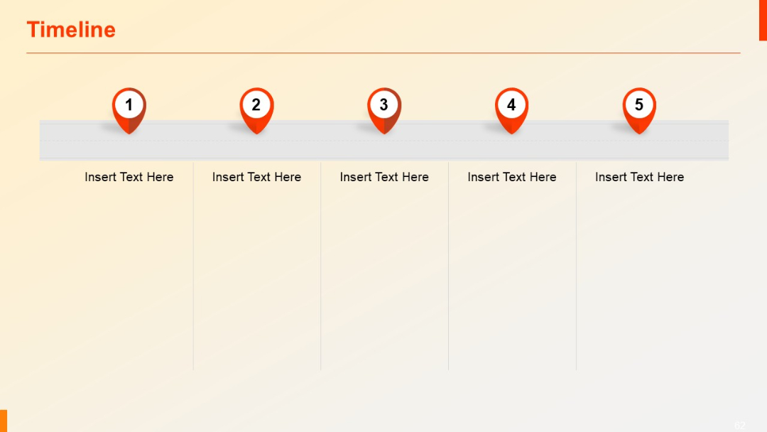
Horizontal layout with map pin-style markers and text areas below each of the five numbered points.
PRO
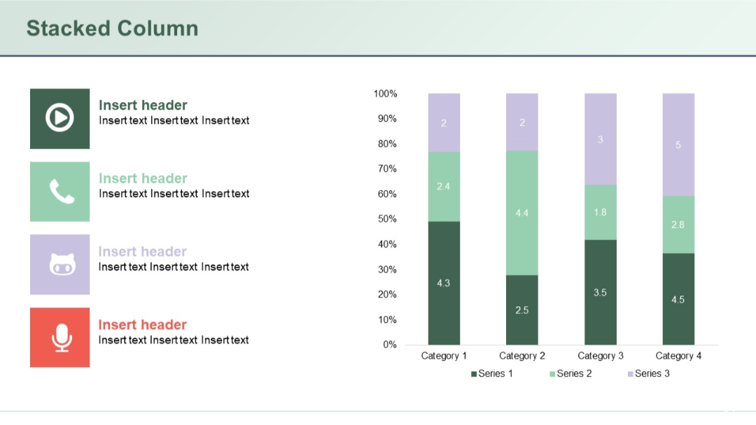
Stacked vertical columns comparing four categories across three series, with colored icons and text headers on the left.
PRO
Two vertical content panels with a top and mid header section, separated by lines. Blue headers titled "Text", followed by titled body sections.
PRO
Two-row horizontal layout with numbered, icon-labeled steps and rounded rectangles for descriptions.
PRO
100% horizontal stacked bar chart; bars scaled to 100%; uniform height.

PRO
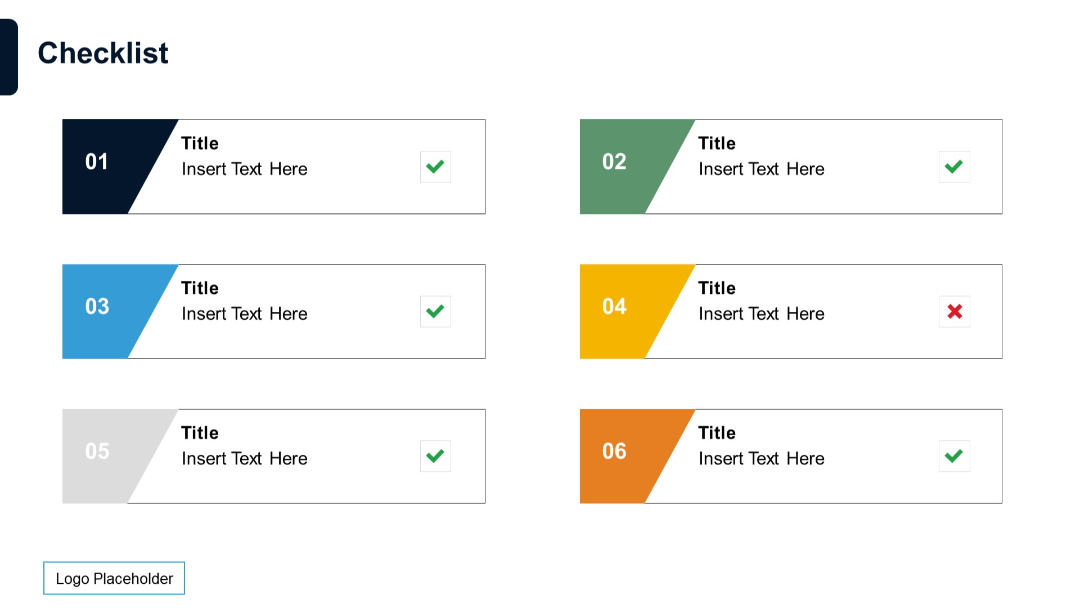
Six rectangular checklist items split into two columns. Each item has a colored number badge, placeholder text, and a checkmark or cross icon for completion status.
PRO
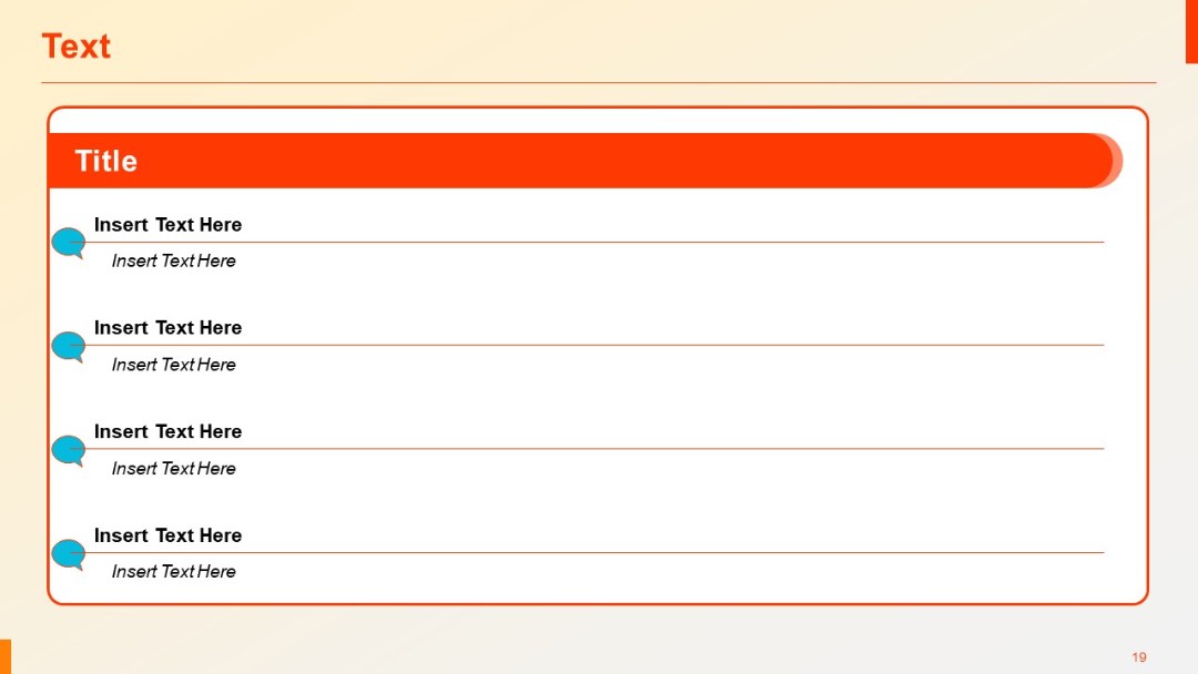
Speech bubble icons aligned vertically with alternating large text and smaller subtitles. Red header title bar on top.
PRO
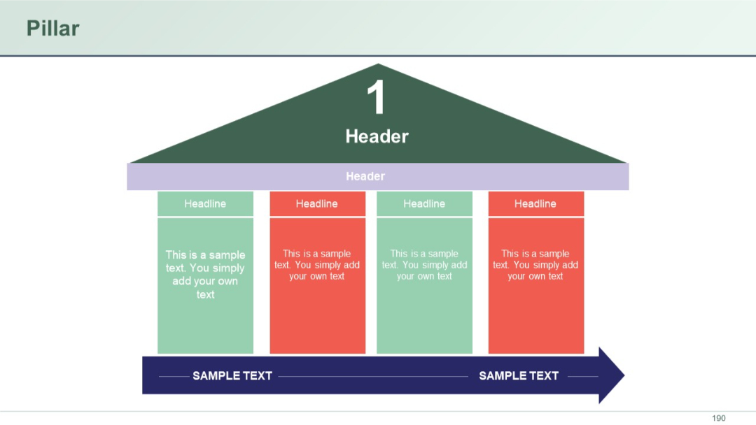
Pillar graphic resembling a building with a triangular roof, supported by 4 vertical columns labeled "Headline."
PRO
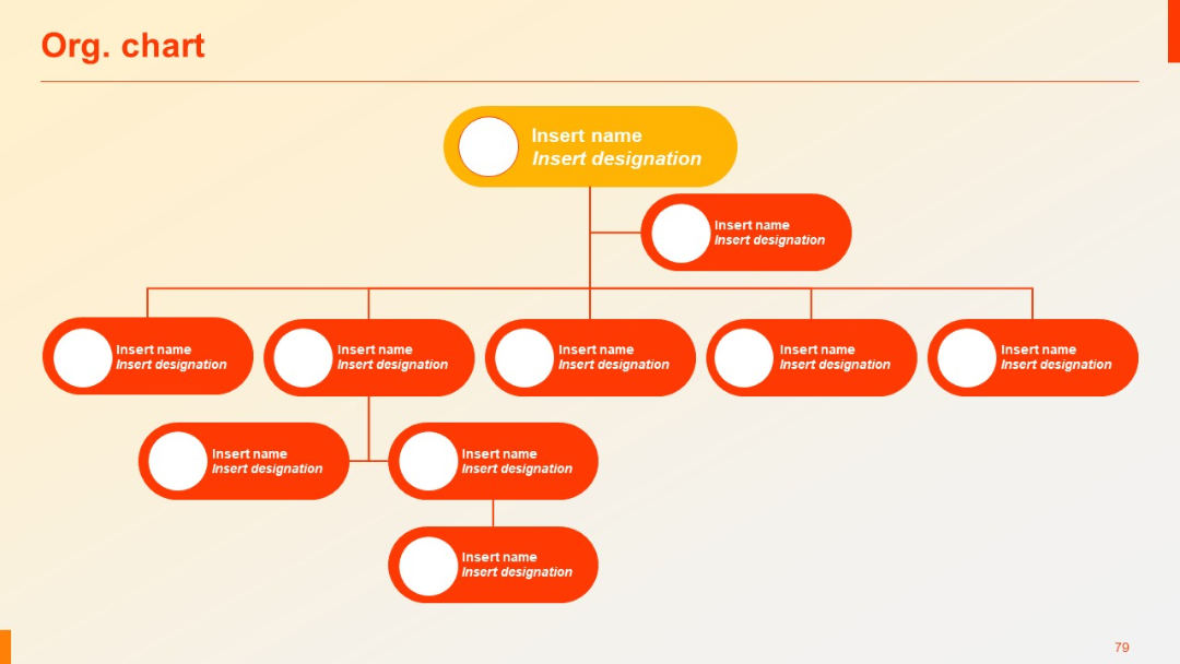
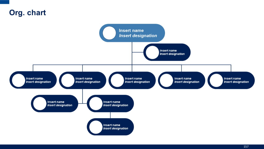
Horizontal org chart with rounded rectangles, connected by vertical and horizontal lines. Clear top-down structure.
PRO
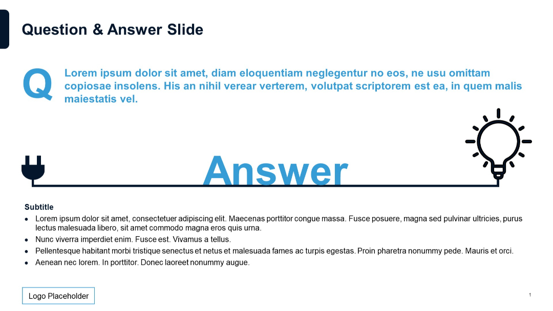
Large “Q” and “Answer” text with plug-to-lightbulb metaphor line design. Subtitle and bullet list below. White background with blue icons.
PRO
3x4 grid with horizontal and vertical headers in colored boxes; minimalist icons and placeholder text used throughout.
PRO
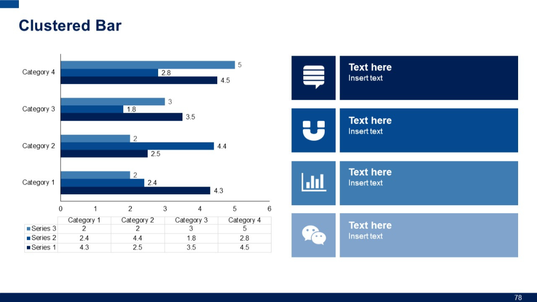
Clustered bar chart with four categories, showing three series per category. Includes icon-based text boxes on the right.
PRO
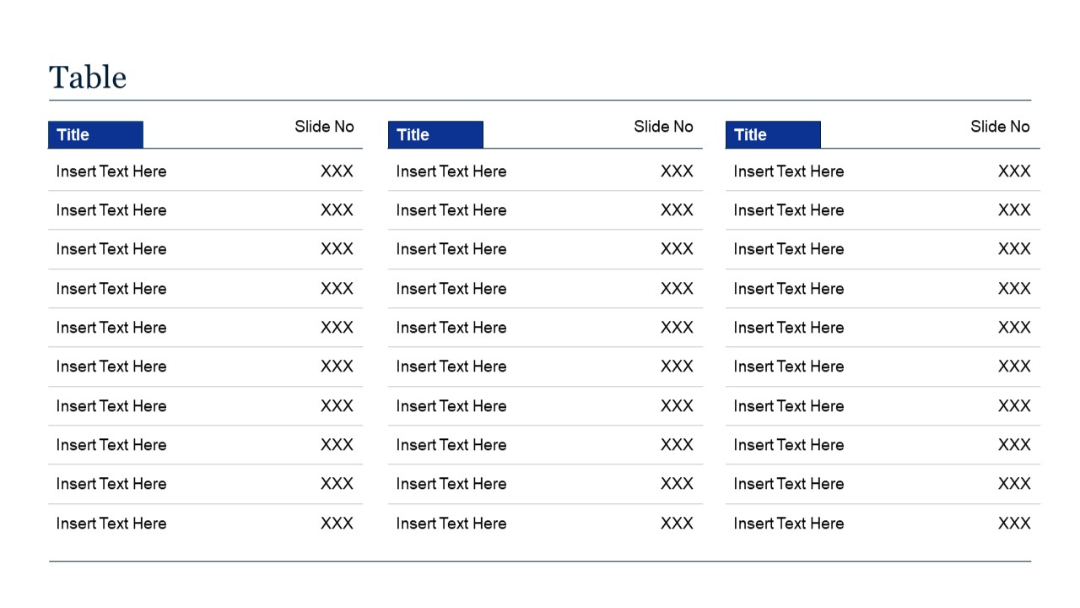
Three-column layout, each with "Title" and "Slide No" columns. Structured as an extended version of Slide 21, fitting more rows for dense indexing.
PRO
Section divider slide with dark blue background and curved line pattern. Large text shows section number and title.

PRO
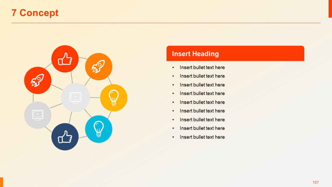
Circular layout with seven icons (rocket, bulb, thumbs up, code), interconnected and forming a concept ring; bullet points to the side.