PRO
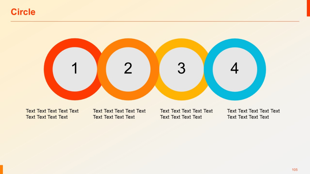
Four large numbered circles in a horizontal row with surrounding text; each circle has distinct color coding and central focus.
PRO
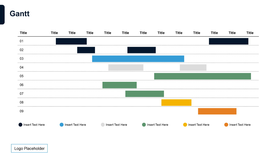
Dense, multi-row Gantt chart with horizontal bars color-coded across nine tasks. Black header with repeating "Title".
PRO
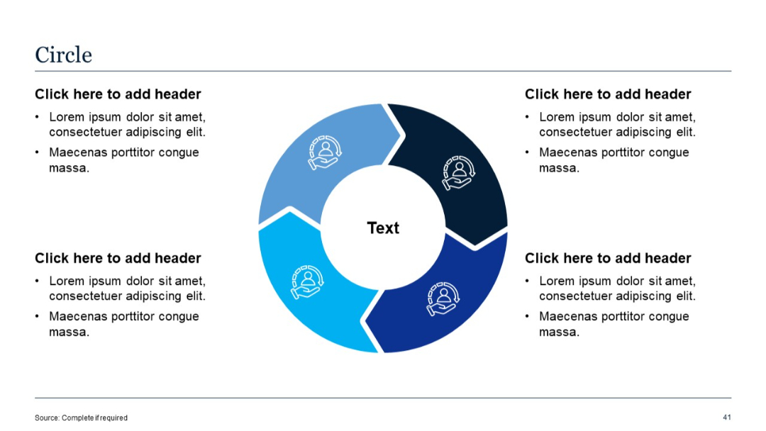
Circular infographic with four colored segments (in different shades of blue), each containing an icon. Text boxes with bullets placed on each side of the circle.
PRO
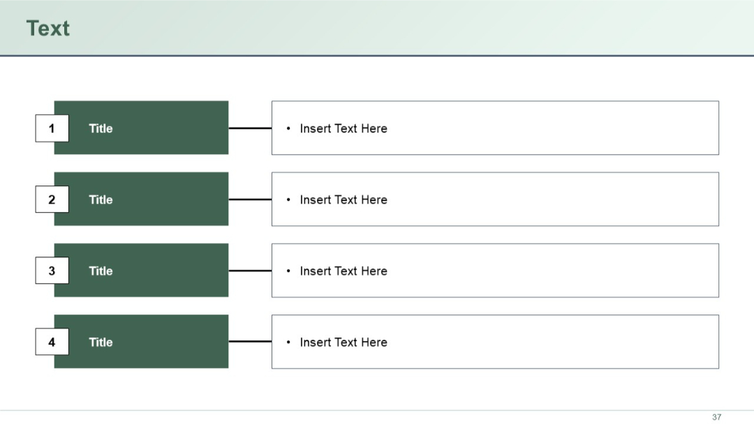
Left-aligned numbered blocks connecting to bullet points on the right.
PRO
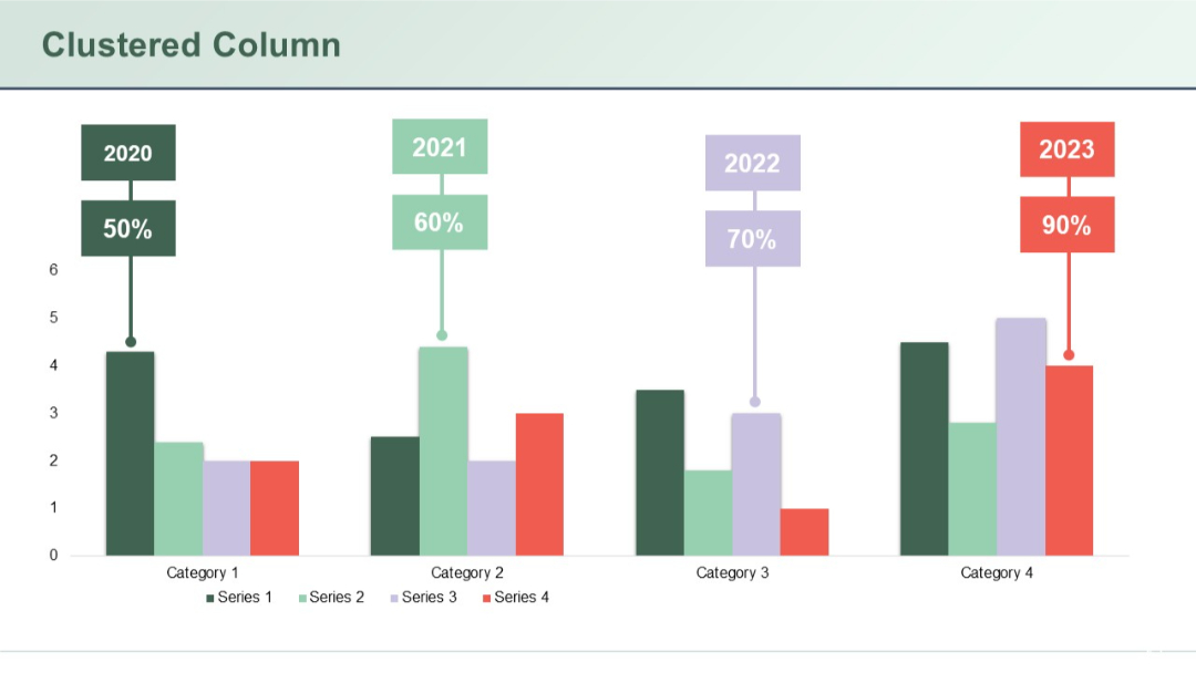
Grouped column chart comparing four categories across four series. Color-coded data points with percentages and year tags above each group.
PRO
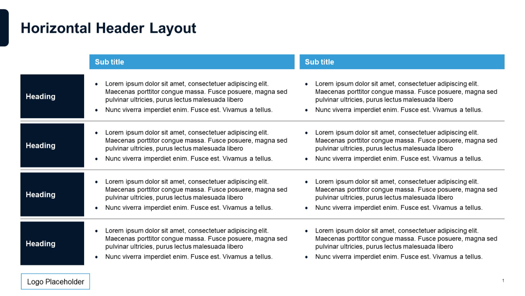
Similar to previous slide but with clearer line separations between rows. Left column with headings, two right columns under subtitle headers with bulleted text. Simple layout with grid style.
PRO
Four-row, five-column grid; similar style as slide 41. Red column headers with beige cells and placeholder text.

PRO
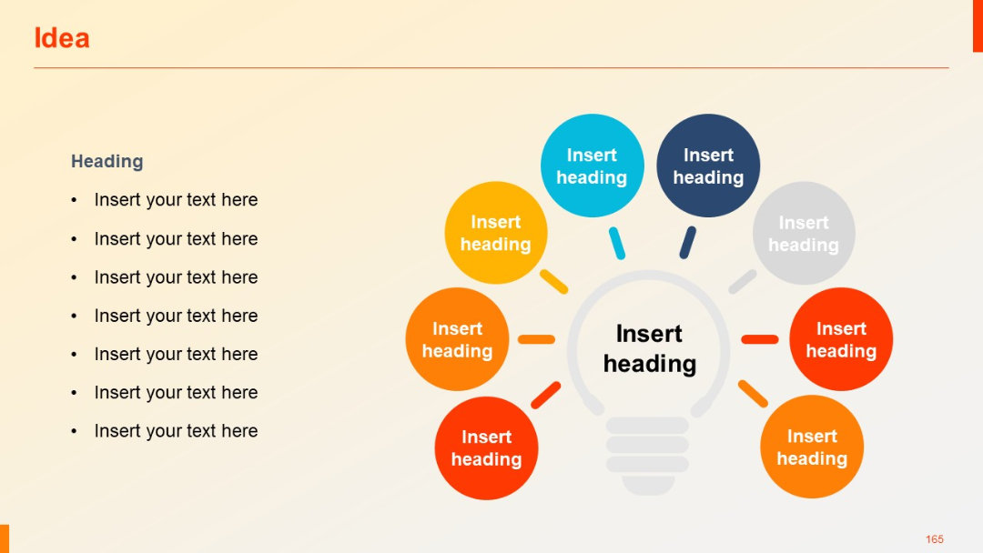
Eight surrounding color-coded circles around the central lightbulb; balanced radial layout with consistent design.
PRO
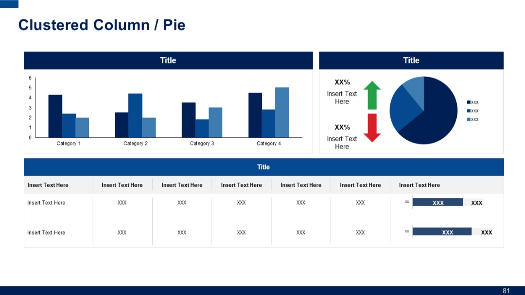
Two top panels with a clustered column chart (left) and a pie chart with icons and arrows (right). Bottom section includes a data table with horizontal bar visualizations.
PRO
Four-column layout with repeating “Title” and “Slide No.” fields across three side-by-side tables. Extensive list format.
PRO
Grid of small vertical bar charts arranged in a table format. Blue bars in each cell with numerical values inside.
PRO
Shows some charts and data points with minor style or spacing variation.
PRO
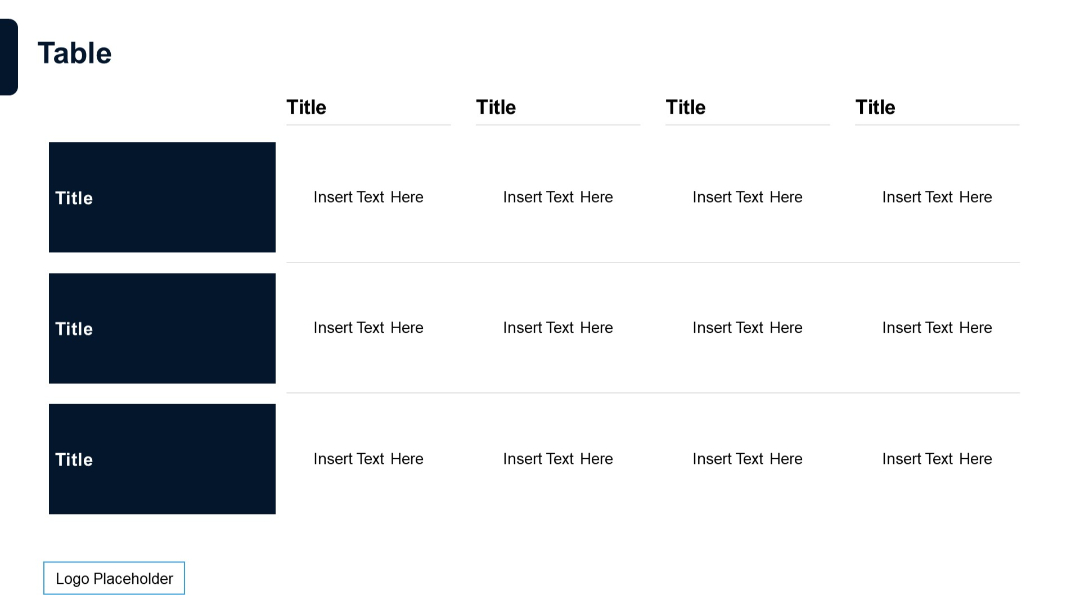
Matrix layout with 3 rows and 4 columns; bold titles on left; top row headers; alternating white rows; logo bottom left.
PRO
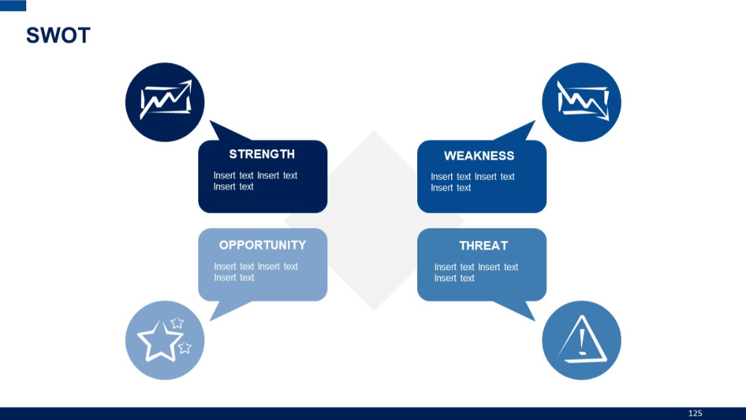
Icon-based SWOT diagram with arrows pointing from icons to rectangular text boxes, symmetrically arranged around a central diamond.
PRO
A section divider slide with a purple-to-white gradient background and bold text indicating a new section start.

PRO
Duplicate of Slide 133 – Semi-circular design with five labeled segments and a central heading.

PRO
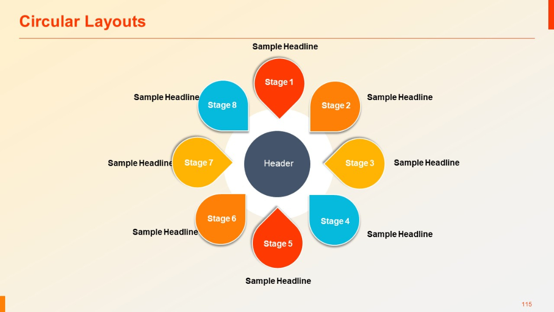
A circular petal-shaped diagram with 8 stages, each petal pointing outward. Each stage is color-coded and accompanied by a headline.
PRO
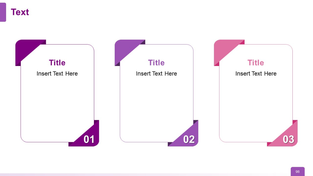
Three-card layout with folded corner design; each card has a number, title, and placeholder text. Distinct color shades for visual segmentation.
PRO
Bar chart with dark background, vertical bars representing performance metrics. Text explanation to the right of the chart, aligned in two columns.

PRO
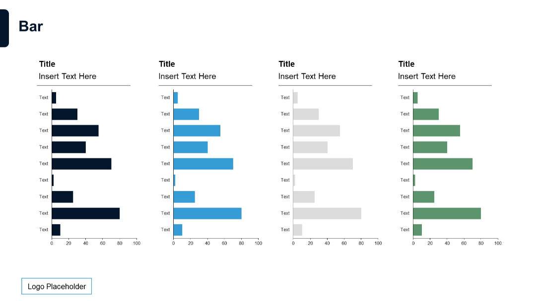
Four grouped horizontal bar charts with color-coded bars (dark blue, light blue, gray, green). Each chart has title and labeled y-axis.
PRO
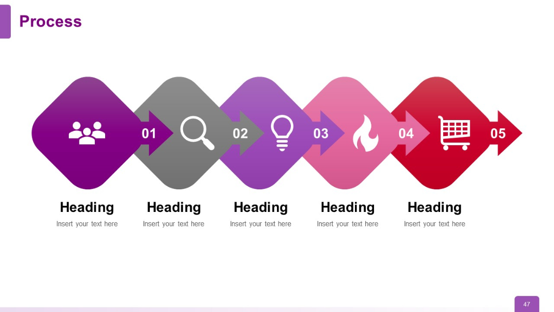
Diagonal zigzag path with five arrows in gradient colors and icons. Each step is numbered and includes a title and space for description text.
PRO
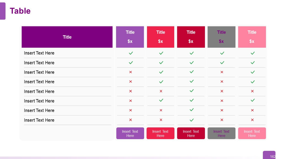
A six-column horizontal comparison table with alternating header colors; checkmarks and crosses used for quick visual comparison.
PRO
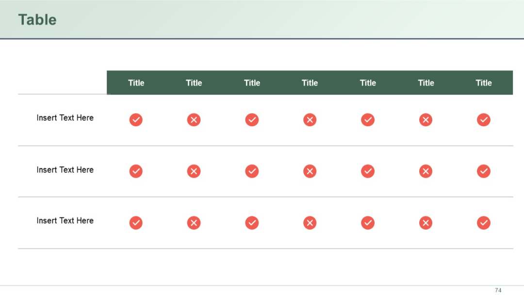
A comparison grid with checkmarks and Xs across a 7-column matrix. The header row is dark green and the table is neatly aligned.
PRO
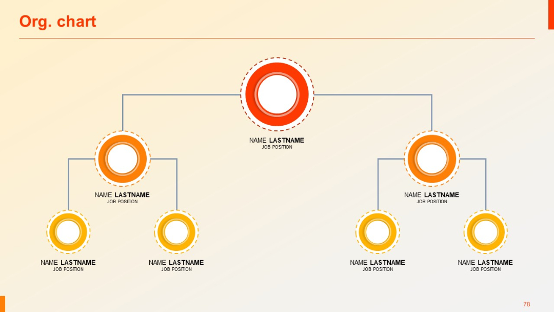
Classic vertical org chart with circular nodes and job titles, top-down reporting structure.
PRO
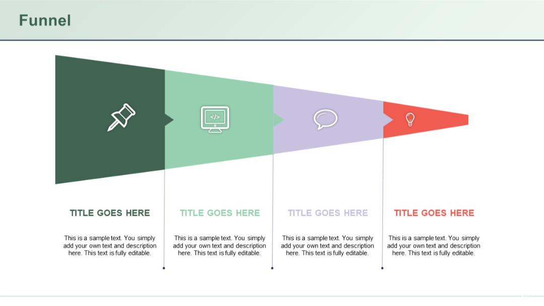
Triangular horizontal funnel with four sections, each containing an icon and text area below the funnel shape.
PRO
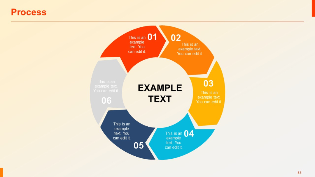
Circular, clockwise infographic with six numbered segments surrounding a central text area. Gradient and colored wedges provide visual segmentation.
PRO
Five-section circular infographic with vibrant colors, numbered steps, and connected external text fields.

PRO
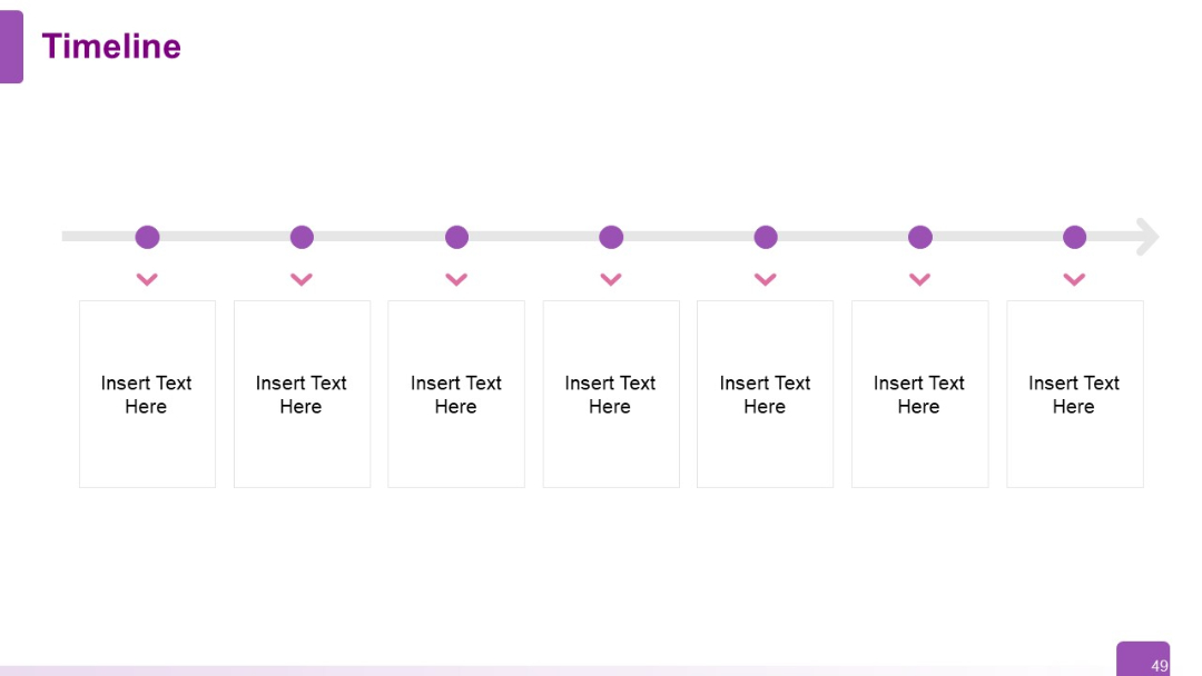
Clean timeline with 7 points marked by circles and arrows pointing to editable boxes below. Layout is symmetrical and minimalist.
PRO
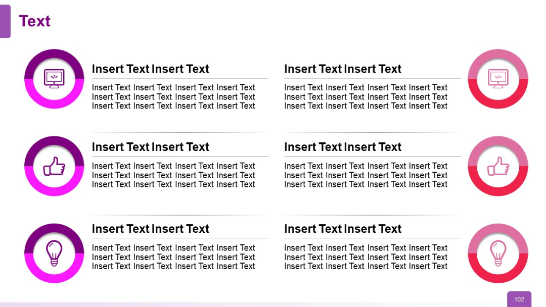
Grid layout with six cells (two columns, three rows), each pairing an icon on the left with bold header text and a paragraph. Icons vary (screen, thumbs-up, bulb), encircled with gradient rings.
PRO
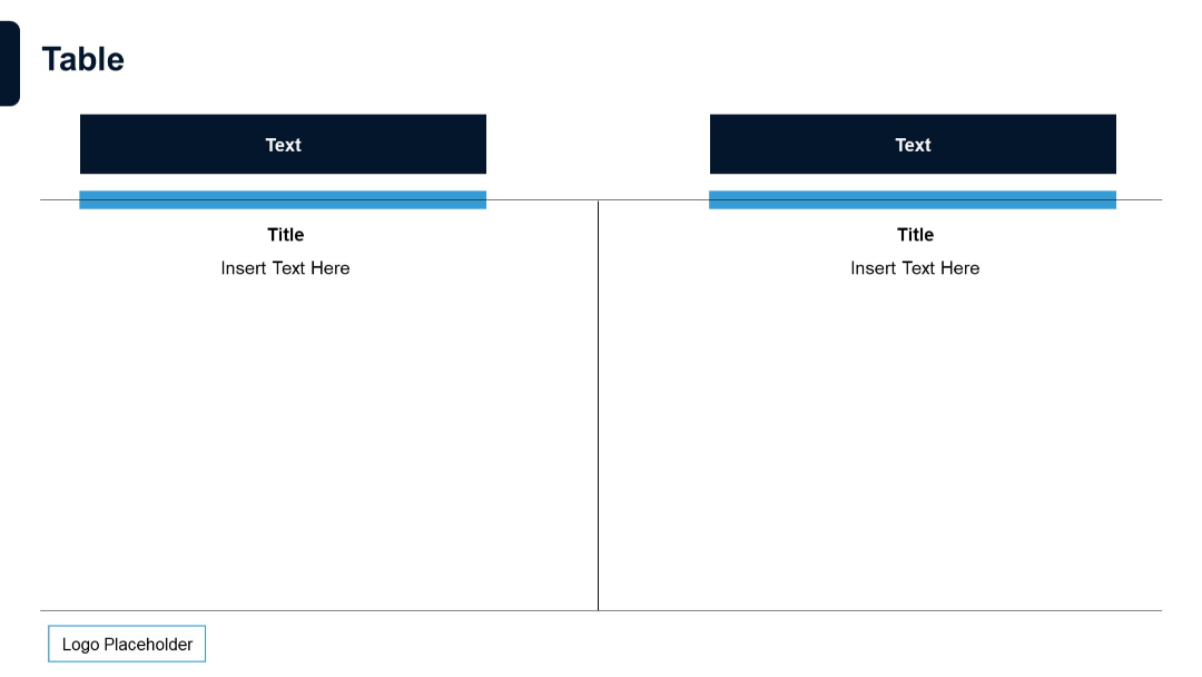
Two-column split table with large header blocks. Horizontal blue lines under headers, logo at bottom. Clean split layout.