PRO
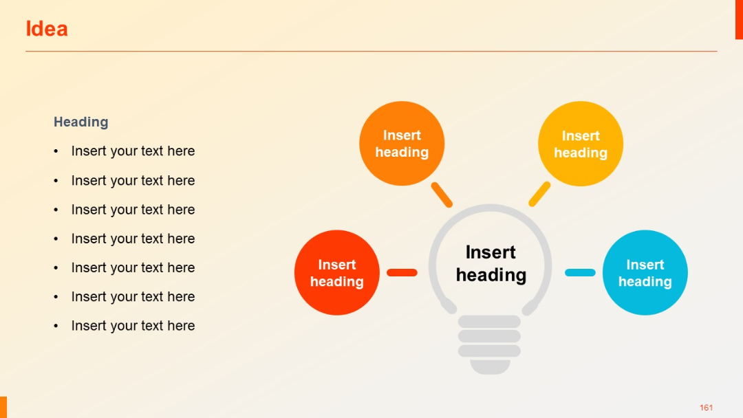
Light beige background, title on top left, left-aligned bullet list, central lightbulb graphic with 4 colored circles branching out.
PRO
Three-column layout with subtitle headers, evenly spaced across the slide; empty placeholders for future input.
PRO
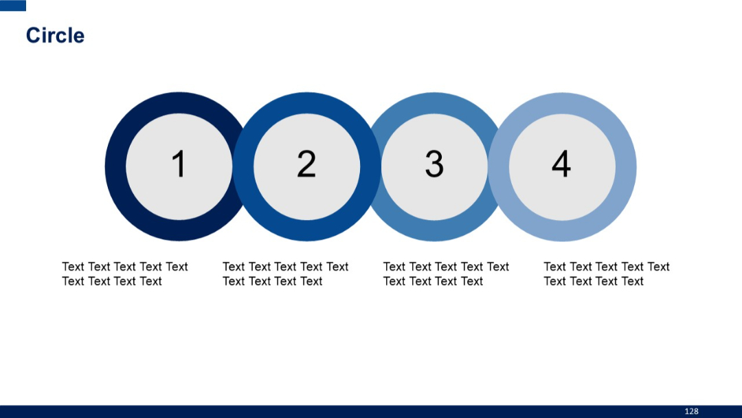
Four sequentially numbered circular shapes (1–4), arranged horizontally with descriptive text under each. Increasingly lighter shade of blue left to right.
PRO
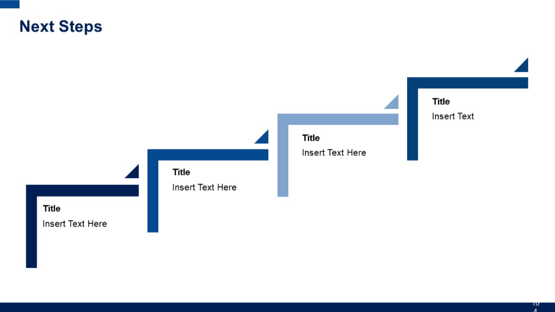
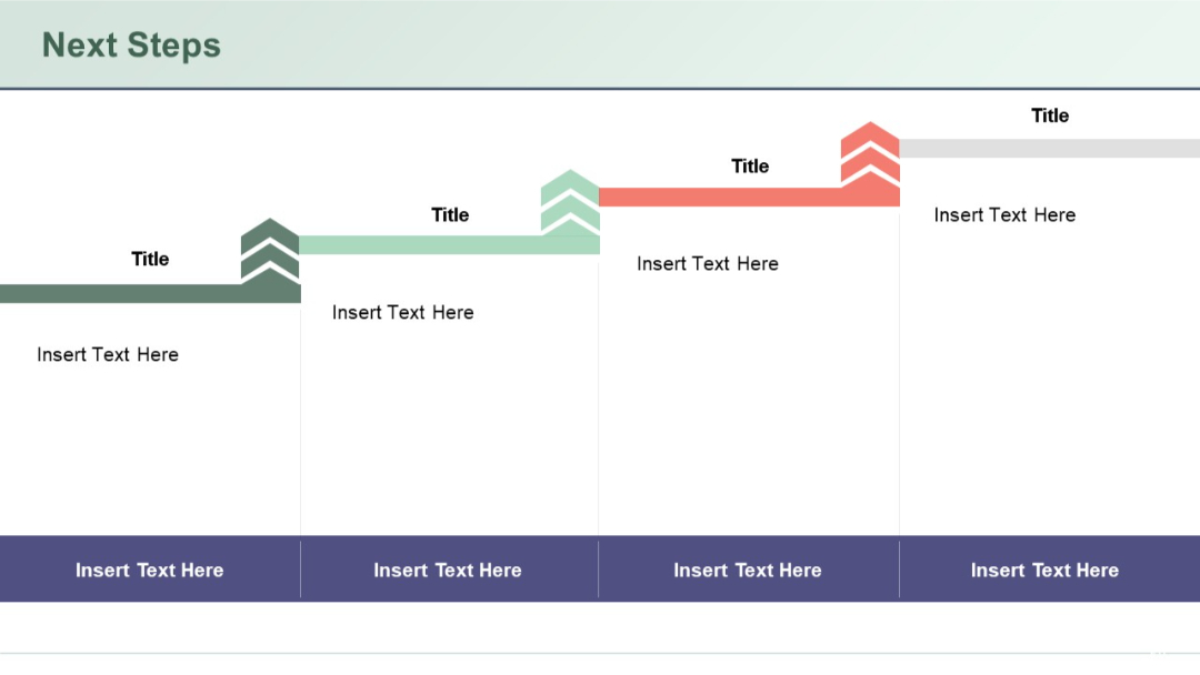
Four L-shaped blocks arranged like stairs, each with a title and text area, using gradient coloring for progression.
PRO
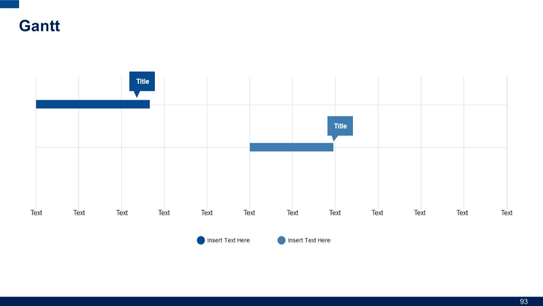
Minimalist Gantt chart with two horizontal task bars, milestone markers, and repeated "Text" labels along the horizontal axis; clean and spacious layout.
PRO
Four-segment circular flow diagram with arrows and icons, centered around a bold header. Each quadrant is paired with text on the outer edges.

PRO
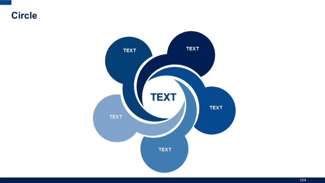
Five interconnected swirls with circular nodes, all revolving around a large central circle labeled “TEXT.” Abstract and flowing layout.
PRO
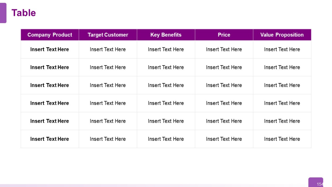
Same structure as previous, extended to six rows; enables broader product comparisons.
PRO
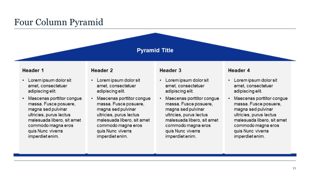
A blue pyramid-shaped header spans across four vertical columns below it, each containing a bold header and bullet points. Clean, symmetrical layout.
PRO
Simple vertical list with one large circle and five horizontal text entries connected by lines. Minimal color with one blue circle icon.
PRO
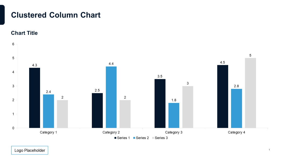
Vertical clustered column chart with labeled data points; three series across four categories; neutral grid and clear formatting.
PRO
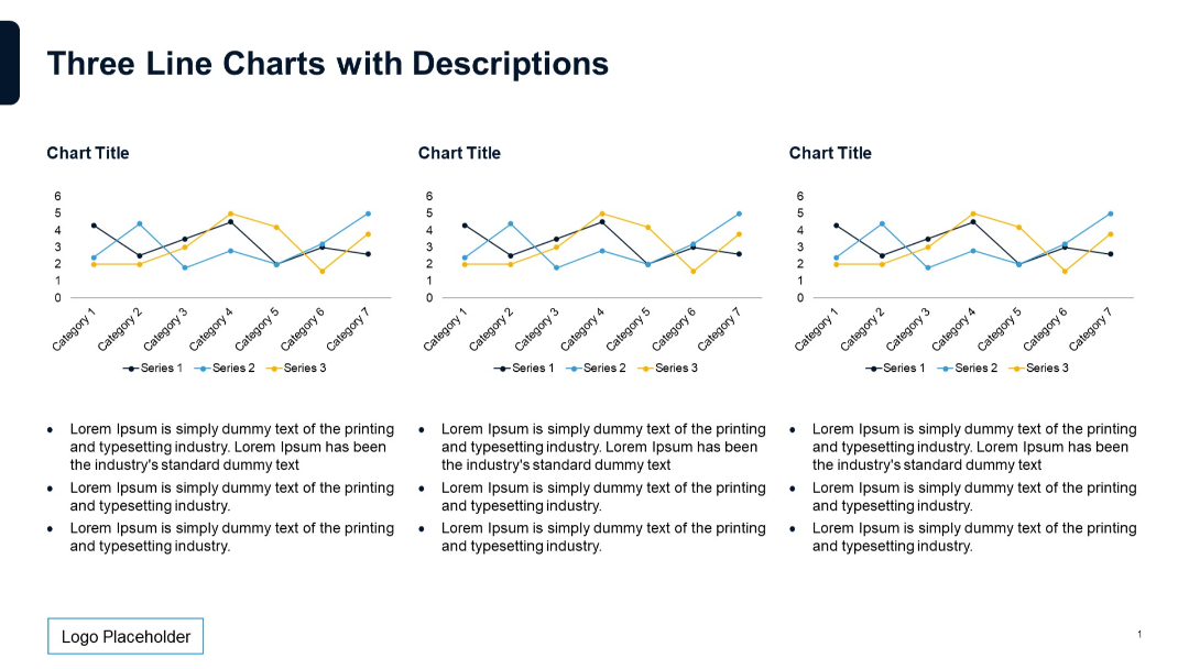
Three line charts placed horizontally, each with a 3-series trend over 7 categories. Text below each chart in bullet format.
PRO
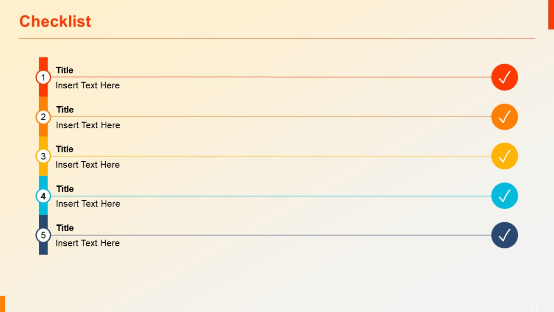
Vertical checklist with colored icons and check marks at the right end of each line.
PRO
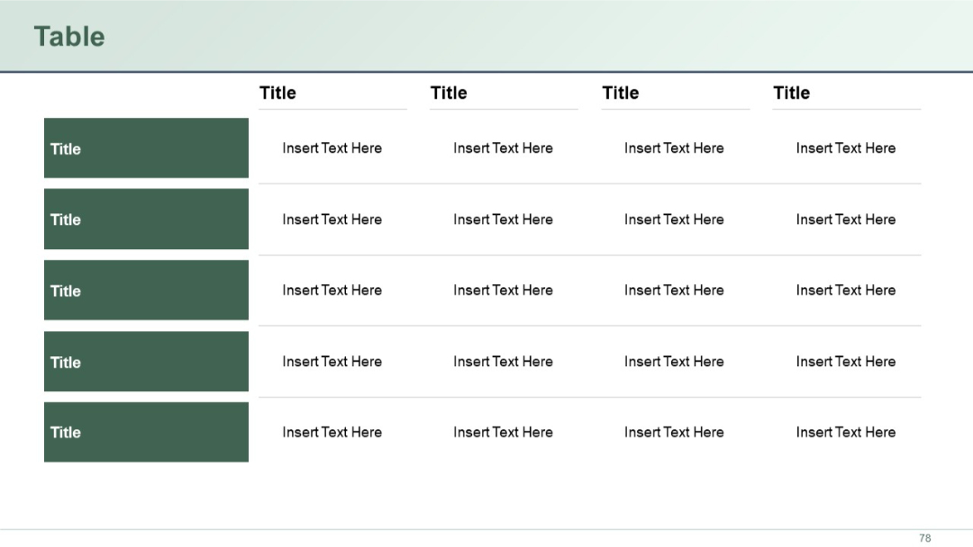
5-row, 5-column table with green block headers on the leftmost column. Clean table design with placeholders in each cell.
PRO
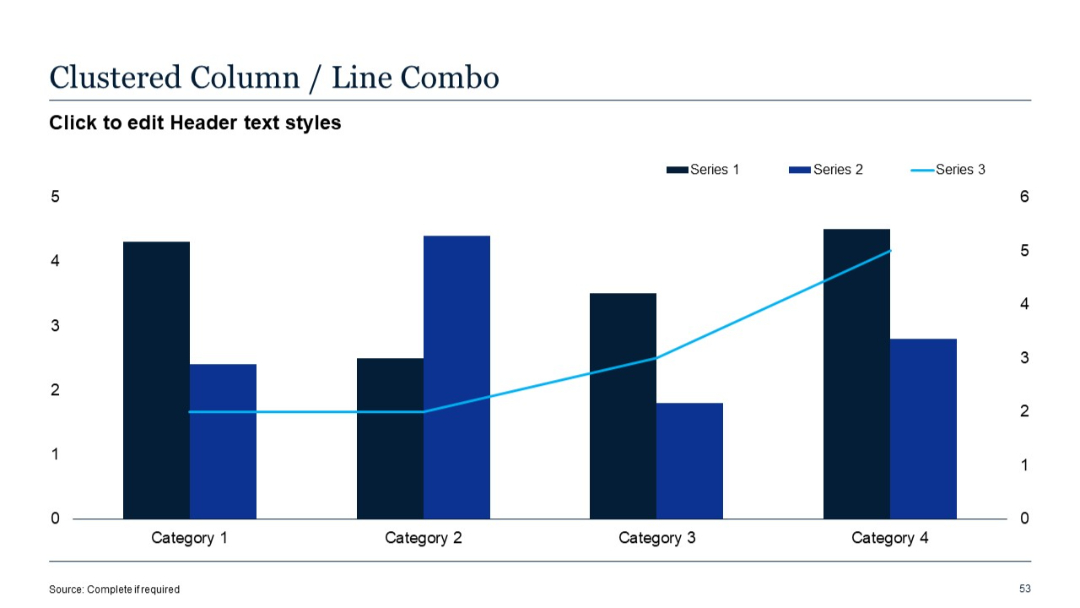
Combination chart with vertical clustered columns for Series 1 & 2 and a line graph for Series 3.
PRO
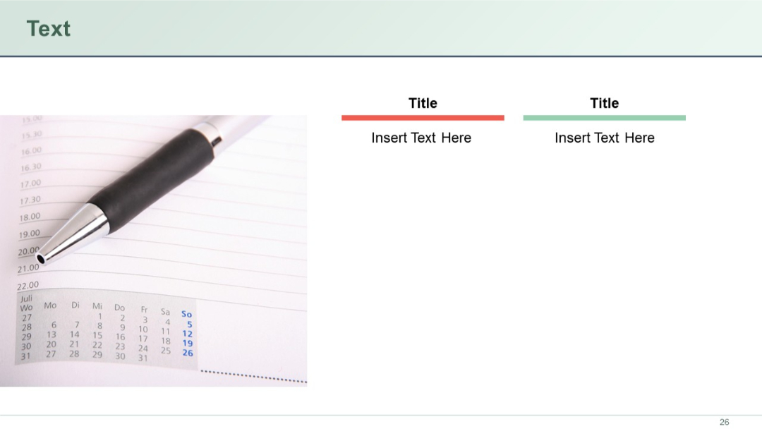
Left-aligned image (pen and planner) with two title and text content boxes on the right side using subtle colored bars.
PRO
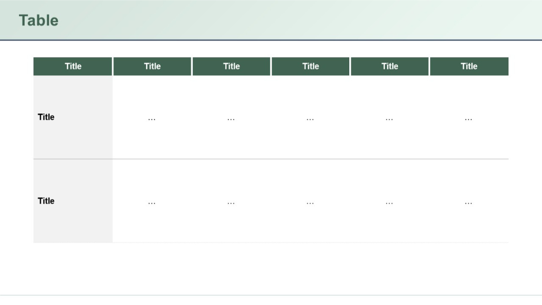
Classic table structure with vertical headers and minimal text (represented by ellipses) in cells. Two-row format, each with six column headers.
PRO
Grid of line-style icons related to education, training, communication, evaluation, and teamwork.
PRO
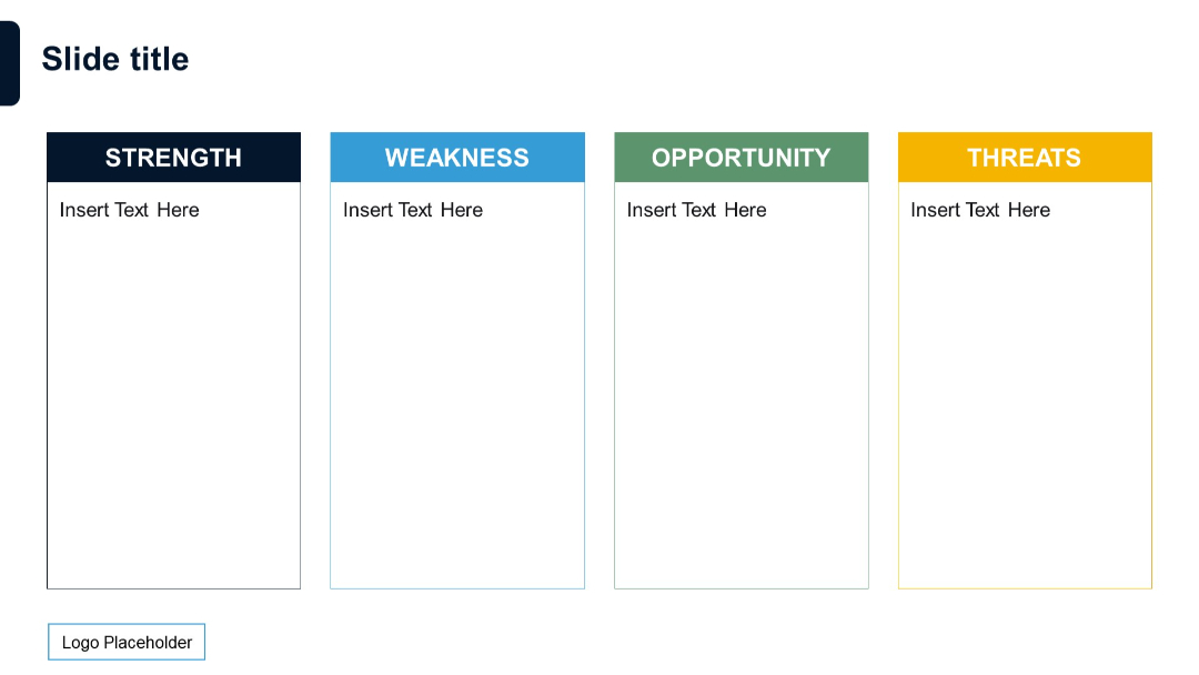
Vertical four-column layout with title and text placeholder for each SWOT category in color-coded boxes.
PRO
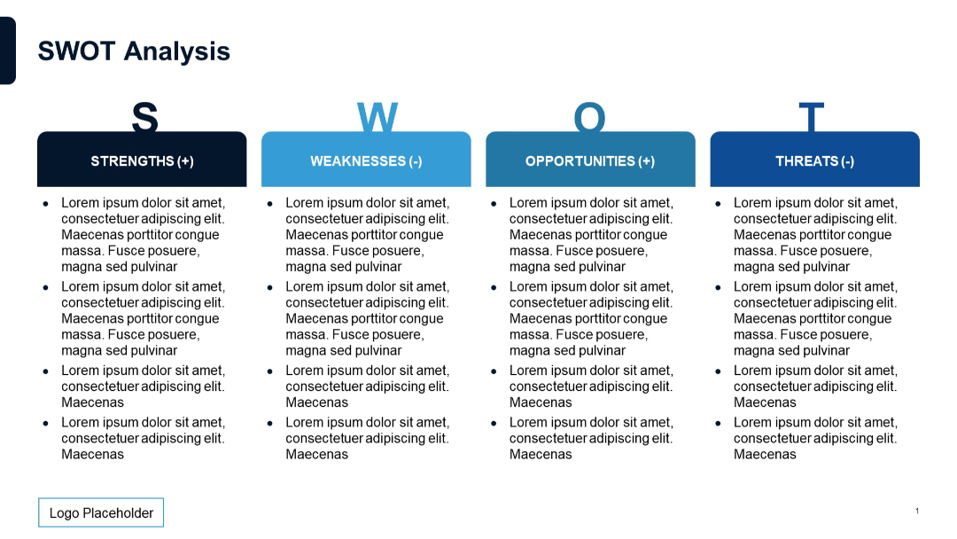
A horizontal four-column SWOT layout with bold headers and bulleted text under each section.
PRO
Image grid format on a dark background with text blocks and icons highlighting the same focus areas as the previous slide. Centralized description emphasizes visual storytelling of transformation initiatives.

PRO
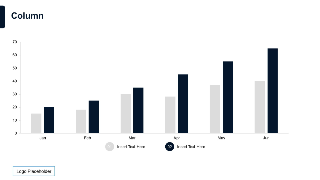
Dual-color vertical column chart for Jan–Jun, showing two data series. Below, two circular text placeholders marked 01 and 02.
PRO
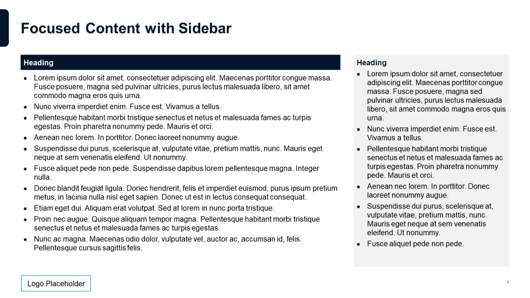
Main content on left with bullet points and dark heading. Light grey sidebar on right containing a shorter list with same structure.
PRO
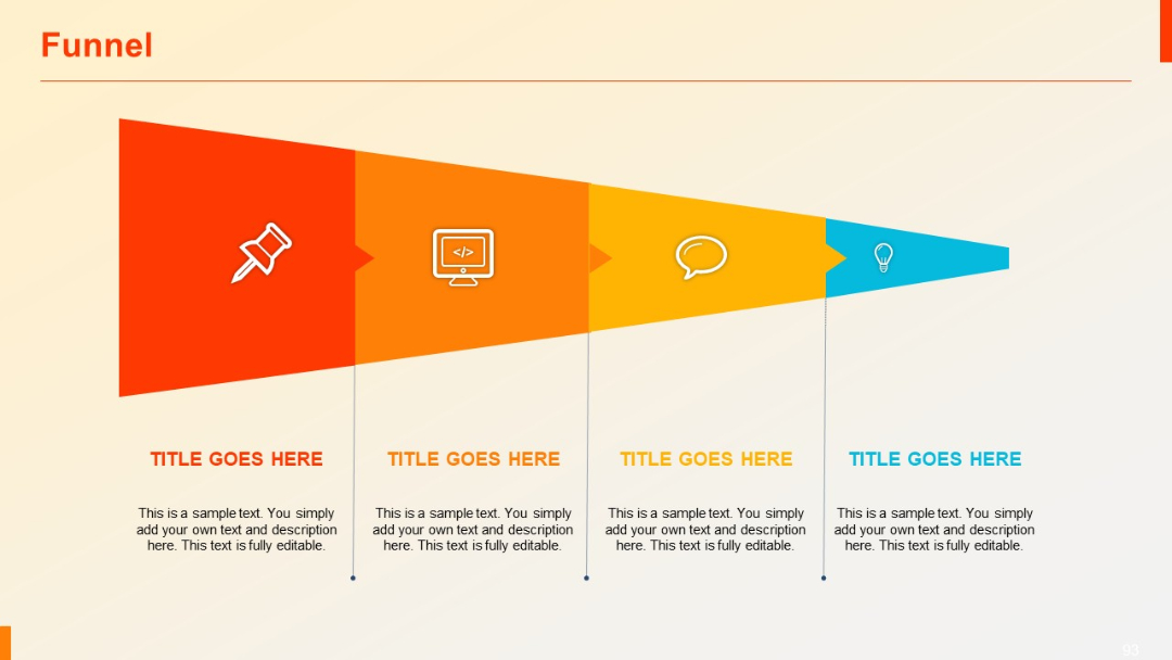
Funnel shown as a segmented triangle with four vertical sections from left (wide) to right (narrow), each with icons and editable text.
PRO
A full-width horizontal stacked bar chart with six rows, each bar divided into three color segments with percentage axis on the x-axis.

PRO
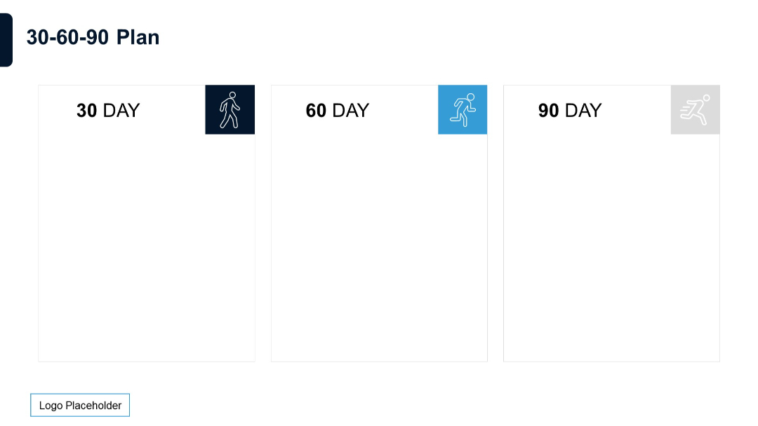
Clean, minimalist boxes for each time period (30/60/90 days) with corresponding motion-themed icons in box corners.
PRO
Flat layout with four vertical chevrons indicating direction across equal sections, each with a title and content area.
PRO
A visually engaging slide with 3 interwoven, curved arrows in orange, red, and blue, pointing right. Text placeholders are positioned above, below, and beside arrows.

PRO
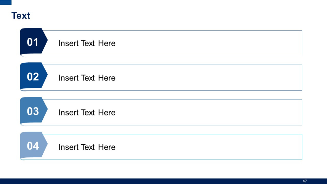
Numbered banner-style blocks in vertical order with modern arrow-tab designs.
PRO
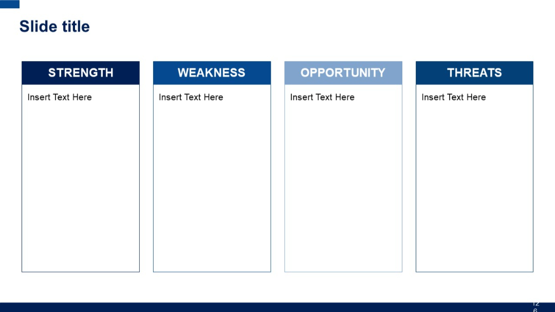
Four tall vertical boxes side by side, labeled Strength, Weakness, Opportunity, and Threats. Simple rectangular layout with header in each section.