My Account
My Slides
Search by Category
Companies
Slide Type
Use Case
Industry
Pricing
Templates
View All Templates
Download Template Slides
✦ AI
AI Prompt Library
AI Search
Feedback
Login
Logout
Get Started
Browse all Slides
Browse all Slides
Create a FREE Account
Instant access to 1,000+ real slides from top companies like McKinsey, BCG, Goldman Sachs, Google and many more!
First Name
Last Name
Email
Password
I agree to all
Terms & Privacy Policy
Thank you! Your submission has been received!
Oops! Something went wrong while submitting the form.
Have an account?
Sign in
Saved Slides
Total No. of slides saved
0
↻ Refresh
✖ Clear all
The slide includes column charts depicting net revenues, cost/income ratio, assets under management, and more for Asset Management.
Financial Performance
Financial Services
This slide details the financial performance of Credit Suisse's Asset Management sector, focusing on revenues, cost/income ratio, and return on capital.
asset management, net revenues, cost/income ratio, assets under management, return on capital
false
Financial Performance
Financial Services
Multiple Chart
Credit Suisse
Add to my slides
Remove from favorites
With a title at the top, the slide features a table of financial results, column chart of net revenues by segment, and a highlighted points section. It balances detailed data with clear visual elements.
Financial Performance
Financial Services
Designed to report the financial results of asset and wealth management, the slide compares quarter-over-quarter and year-to-date metrics. It may be used in financial analysis, strategic planning, or investor relations to showcase performance and operational highlights.
Asset Management, Net Revenues, Management Fees, Operating Expenses
false
Financial Performance
Financial Services
Mixed Chart
Goldman Sachs
Add to my slides
Remove from favorites
This slide comprises multiple small column charts comparing JPM's investment performance against benchmarks/public market indexes across various financial products. Each chart displays net returns, yield, and AUM over time, with associated performance metrics such as SEC Yield and Sharpe Ratio for some products.
Investment Analysis
Financial Services
Aimed at investors or financial analysts, this slide evaluates investment performance across different asset classes, comparing firm-managed funds with benchmarks to highlight performance strengths and asset growth.
asset management, performance, benchmarks, investments
false
Investment Analysis
Financial Services
Multiple Chart
JP Morgan
Add to my slides
Remove from favorites
This slide is divided into three sections: 'Scale', 'Competitive advantages', and '5-year performance'. It combines bullet points and a column chart, comparing traditional and alternative asset performances. The design is sleek with good use of space and contrasting elements for readability.
Investment Analysis
Financial Services
It compares key aspects of asset and wealth management, such as scale and performance over five years, relevant for investor insights into the company's market position and competitive advantages in asset management.
Asset management, performance, competitive
false
Investment Analysis
Financial Services
Table
Goldman Sachs
Add to my slides
Remove from favorites
The slide contains a column chart and detailed lists of key drivers with explanatory notes. The layout is neatly organized for clear comprehension of complex financial information.
Financial Performance
Financial Services
Focuses on the financial performance of Macquarie Asset Management, particularly base and performance fees. It’s useful for financial reviews and assessing the impact of operating expenses on net income.
Asset Management, Performance Fees, Operating Expenses, Financial Review, Net Income
false
Financial Performance
Financial Services
Mixed Chart
Goldman Sachs
Add to my slides
Remove from favorites
A visually dense slide featuring tables, a variety of column chart, and sections for textual highlights. The color scheme is blue, gray, and white.
Investment Analysis
Financial Services
Details asset management performance, highlighting net revenues and investment areas. It's used for evaluating asset management strategies and performance.
Asset, Management, Performance, Investment, Net, Revenues, Strategies, Evaluation, Pie Chart, Table
false
Investment Analysis
Financial Services
Mixed Chart
Goldman Sachs
Add to my slides
Remove from favorites
This slide includes bar charts and a column chart reflecting revenue and asset management performance metrics.
Financial Performance
Financial Services
This slide offers an overview of the asset management performance, detailing revenue streams, assets under management, and net flows. It is tailored for stakeholders or analysts in finance, providing a snapshot of financial health and operational changes in asset management, including discussions on net inflows, passive revenue generation, and expense management strategies.
Asset Management, Performance, Revenue, Net Flows, Financial Analysis
false
Financial Performance
Financial Services
Multiple Chart
Deutsche Bank
Add to my slides
Remove from favorites
Column charts and line items detailing changes in assets under management by product group and business unit.
Investment Analysis
Financial Services
Provides an overview of asset management trends within the private banking sector, detailing net flows and investments across different time periods. Used for investment strategy discussions.
asset management, private banking, investment trends, Q3 2023
false
Investment Analysis
Financial Services
Multiple Chart
Deutsche Bank
Add to my slides
Remove from favorites
Bar charts depict profit before tax, operating income, and cost/income ratios.
Financial Performance
Financial Services
Discusses strong performance in asset management, highlighting profit growth and net new money inflows.
asset management, profit growth, net new money, operating income, cost/income ratio
false
Financial Performance
Financial Services
Multiple Chart
UBS
Add to my slides
Remove from favorites
The slide features two distinct column chart sections with annotations, a CAGR arrow, and a segmented arrow.
Financial Performance
Financial Services
This slide presents a financial performance forecast, showing revenue growth and a plan to reduce historical principal investments. It's used to convey long-term growth strategies and financial trajectories.
Asset Management, Revenue Growth, Investment, CAGR
false
Financial Performance
Financial Services
Multiple Chart
Goldman Sachs
Add to my slides
Remove from favorites
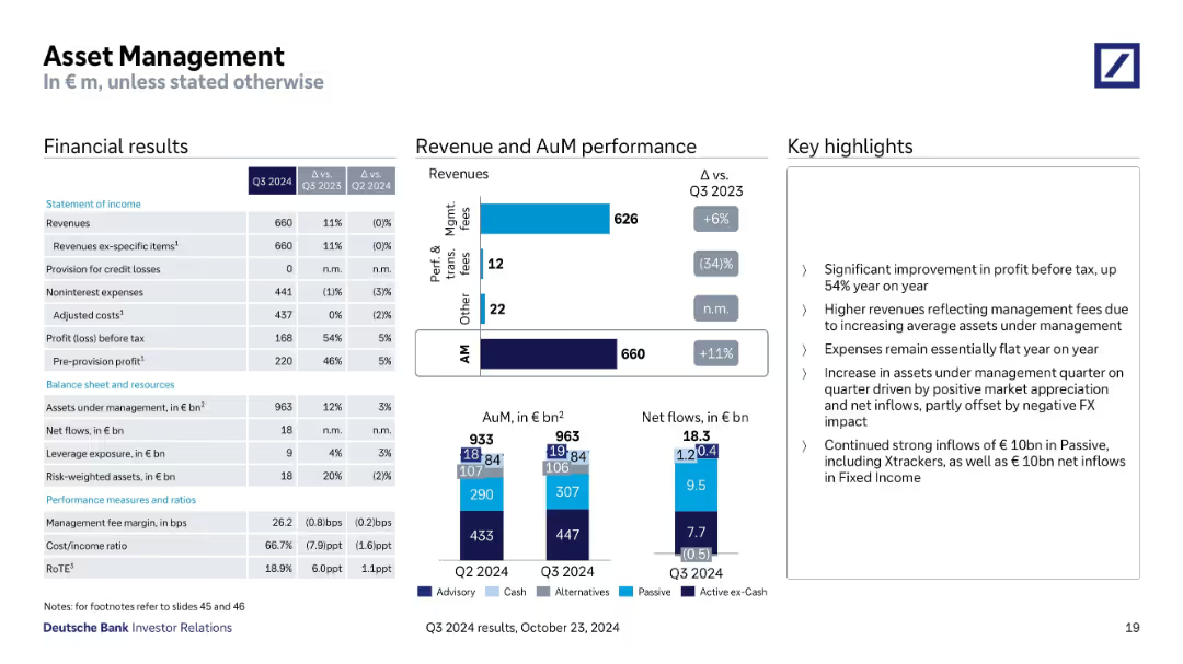
Three-column layout with financial tables, bar charts for revenue & AuM, and bullet-point key highlights; clean, data-dense design with corporate branding and subtle blue color palette.
Financial Performance
Financial Services
This slide provides quarterly financial data for Deutsche Bank's Asset Management division. It includes income statement metrics, AuM performance, net inflows, and fee breakdowns. Key messages highlight revenue growth, flat expenses, and strong passive inflows.
asset management, revenue, inflows, AuM, profit, fees, Q3, Deutsche Bank
false
Financial Performance
Financial Services
Multiple Chart
Deutsche Bank
Add to my slides
Remove from favorites
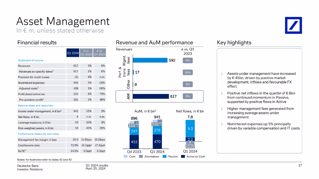
A column chart showing revenue and assets under management performance, with a table of financial results and key highlights. The slide is moderately dense with a balanced mix of text and visuals.
Financial Performance
Financial Services
The slide provides an overview of Q1 2024 financial results for Asset Management, detailing revenue, assets under management, and net flows, with key insights on performance and future outlook.
Asset Management, revenue performance, financial results, assets under management
false
Financial Performance
Financial Services
Multiple Chart
Deutsche Bank
Add to my slides
Remove from favorites
Column charts and tables presenting total revenues, profit before tax, and cost/income ratios for different periods.
Financial Performance
Financial Services
Shows total revenues and profit before tax for asset management, highlighting key performance metrics for Q3 2022.
Asset management, revenues, profit, cost/income ratio, UBS, financial performance, Q3 2022, net management fees
false
Financial Performance
Financial Services
Multiple Chart
UBS
Add to my slides
Remove from favorites
A complex slide with a balance between text and structured lists, comparing traditional assets under supervision (AUS) and alternative asset strategies.
Market Analysis and Trends
Financial Services
It analyzes a financial institution's asset management depth, contrasting traditional asset supervision with alternative investment strategies, to inform about breadth of offerings and strategic asset allocation.
asset management, strategy, investment, traditional, alternatives
false
Market Analysis and Trends
Financial Services
Table
Goldman Sachs
Add to my slides
Remove from favorites
Dense information slide featuring tables, pie charts, and a significant amount of text to convey detailed data.
Financial Performance
Financial Services
It examines assets under supervision with a detailed breakdown of inflows, outflows, and net changes, used in financial planning or asset management reviews.
Asset Management, Supervision, AUS, Financial Data
false
Financial Performance
Financial Services
Multiple Chart
Goldman Sachs
Add to my slides
Remove from favorites
Contains small text blocks and icons. There's a strategic pillar graphic at the bottom.
Industry Overview
Financial Services
Provides an overview of market leadership, strategic principles, and innovation within JPMorgan's Asset and Wealth Management, illustrating their market position and investment in research.
asset management, wealth, innovation, JPMorgan, market lead
false
Industry Overview
Financial Services
Pillar
JP Morgan
Add to my slides
Remove from favorites
This slide consists of column chart and text sections detailing forward catalysts for growth. The layout is straightforward, with a focus on financial data and key strategic areas.
Operational Efficiency
Financial Services
This slide illustrates the financial growth in management fees and highlights key areas for further expansion, such as workplace wealth and sustainability. It is suitable for discussing the operational scale and potential areas for business growth.
asset management, wealth management, CAGR, Goldman Sachs, management fees, expansion, sustainability
false
Operational Efficiency
Financial Services
Mixed Chart
Goldman Sachs
Add to my slides
Remove from favorites
A diagram with three categories (breadth, scale, and insights) and their sub-components, representing the asset and wealth management capabilities of the firm.
Product and Service Analysis
Financial Services
An overview of the asset and wealth management services offered by the firm, categorizing them into breadth, scale, and insights. It showcases the firm's diverse asset management portfolio and its approach to providing comprehensive client solutions.
asset management, wealth management, client solutions, service analysis, comparative layout
false
Product and Service Analysis
Financial Services
Pillar
Goldman Sachs
Add to my slides
Remove from favorites
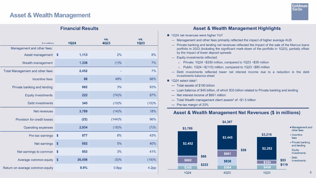
A table detailing financial results for the Asset & Wealth Management segment, accompanied by bar charts and key highlights.
Financial Performance
Financial Services
Presents financial results for the Asset & Wealth Management segment, highlighting revenues, operating expenses, and earnings.
asset management, wealth management, financial results, bar chart, net revenue, operating expenses, earnings
false
Financial Performance
Financial Services
Mixed Chart
Goldman Sachs
Add to my slides
Remove from favorites
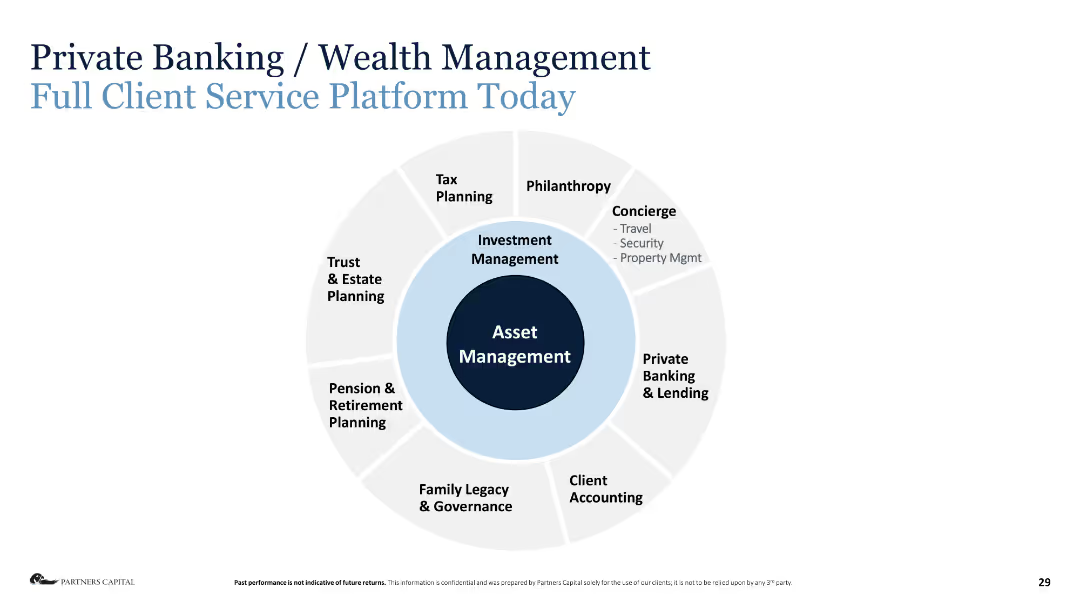
Circular diagram with various financial services listed around Asset Management in the center.
Industry Overview
Financial Services
The slide provides an overview of the full client service platform today in private banking and wealth management.
asset management, wealth management, financial services, tax planning, estate planning, private banking, lending
false
Industry Overview
Financial Services
Diagram
Deloitte
Add to my slides
Remove from favorites
This slide features a central circular graphic and several textual elements. It has a clean design with blue tones and clearly labeled sections. The pie chart is centrally positioned and surrounded by key data points.
Market Analysis and Trends
Financial Services
Discussing Goldman Sachs’ position as a leading asset and wealth manager, this slide showcases their scale and scope in the industry. It's designed for presentations emphasizing market leadership and client-oriented approaches.
asset management, wealth management, global, Goldman Sachs, AUS, client-oriented, scale
false
Market Analysis and Trends
Financial Services
Framework
Goldman Sachs
Add to my slides
Remove from favorites
Features a rising trend line graph overlaid on column charts, showing increasing net revenues with key strategic differentiators listed.
Financial Performance
Financial Services
This slide demonstrates growth in durable revenues and earnings within Asset & Wealth Management, using trend data and strategic differentiators.
asset management, wealth management, growth
false
Financial Performance
Financial Services
Mixed Chart
Goldman Sachs
Add to my slides
Remove from favorites
The slide is split into two sections, "Execution of Strategic Priorities" and "Market Dynamics," with bullet points and numerical data. There are checkmarks next to market dynamics points. The layout is clean with a mix of blue and green text for emphasis.
Market Analysis and Trends
Financial Services
The slide discusses the integration of investing businesses and market dynamics in asset management and wealth management. It highlights key financial data and strategic priorities, suggesting a focus on growth and addressing industry trends such as market consolidation and a shift towards alternative investments.
Asset management, Wealth management, Market dynamics, Consolidation, Strategic priorities
false
Market Analysis and Trends
Financial Services
Header Horizontal
Goldman Sachs
Add to my slides
Remove from favorites
Features a column chart displaying 'Asset & Wealth Management Net Revenues' and a financial results table detailing various types of fees and revenues, with year-over-year and quarter-over-quarter comparisons.
Investment Analysis
Financial Services
The slide provides a financial summary of the Asset & Wealth Management sector, showing revenue generation from management fees, private banking, and investments. Useful for evaluating financial health and opportunities in asset management.
Asset Management, Wealth Management, Net Revenue, Management Fees, Private Banking, Investment, Revenue Analysis, Financial Results
false
Investment Analysis
Financial Services
Mixed Chart
Goldman Sachs
Add to my slides
Remove from favorites
This slide contains a combination of column chart and table, using a mix of blues and grays. It gives a breakdown of net revenues and other financial statistics for asset and wealth management segments.
Financial Performance
Financial Services
Offering an overview of asset and wealth management financials, this slide is aimed at stakeholders interested in understanding the revenue streams and performance of these sectors. It breaks down revenues by different services such as private banking and lending.
asset management, wealth management, revenues, financials, banking
false
Financial Performance
Financial Services
Mixed Chart
Goldman Sachs
Add to my slides
Remove from favorites
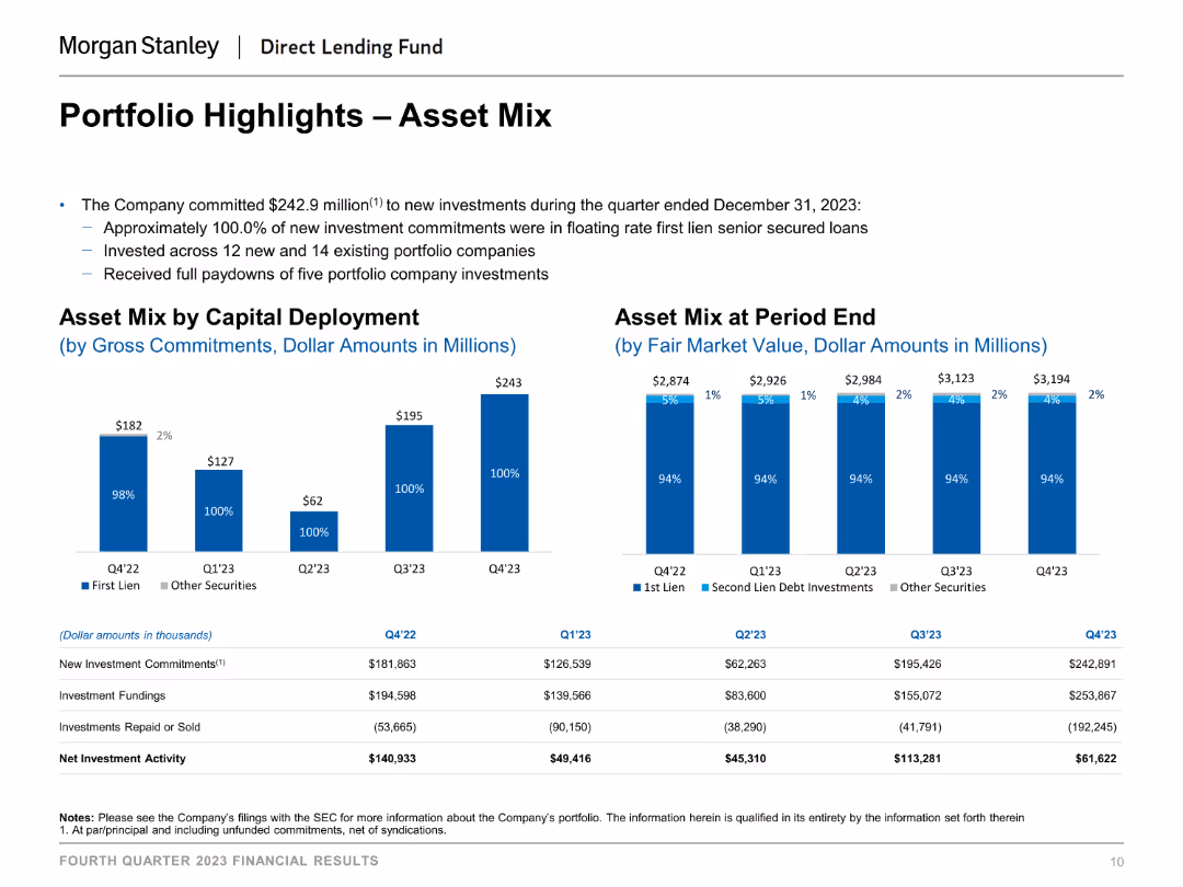
The slide includes column charts that depict the asset mix by capital deployment and at period end. Each chart uses distinct colors to differentiate between types of investments, such as first lien, second lien debt investments, and other securities.
Investment Analysis
Financial Services
The slide provides an overview of the portfolio's asset mix, showing how capital is deployed and the composition of assets at the end of different periods, aiding in investment analysis and portfolio management.
asset mix, capital deployment, investment analysis, financial services, portfolio management, period end asset composition
false
Investment Analysis
Financial Services
Multiple Chart
Morgan Stanley
Add to my slides
Remove from favorites
This slide presents pie charts and donut charts detailing equity and lending investments, using colors to distinguish between sectors and asset classes. The information is well-organized, making it visually accessible.
Investment Analysis
Financial Services
The slide illustrates the diversification and categorization of assets in equity and lending investments. It provides a breakdown by industry, asset class, and region, offering a detailed overview for investment analysis and decision-making processes within asset management.
Asset mix, Equity investments, Lending, Investment analysis, Asset management
false
Investment Analysis
Financial Services
Multiple Chart
Goldman Sachs
Add to my slides
Remove from favorites
A dense, color-coded table displays annual asset performance from 1999 to 2023. Various asset classes are represented in colored squares, forming a grid that provides a visual performance history. Below, the source information is cited.
Investment Analysis
Financial Services
The slide is a comprehensive visual representation of the relative performance of various asset classes over a 25-year period, serving as a valuable tool for investment analysis and understanding market trends.
Asset performance, investment analysis, market trends, historical data, annual comparison, asset classes, financial history, relative performance, market research, data visualization
false
Investment Analysis
Financial Services
Table
Morgan Stanley
Add to my slides
Remove from favorites
A combination slide with a table on the left showing a breakdown of loan portfolios and a pie chart on the right detailing corporate loans by industry. Key credit metrics are presented below the table. The slide is data-heavy and designed for an analytical audience.
Financial Performance
Financial Services
The slide provides an overview of loan portfolio allocations and credit quality with specific focus on corporate loans distribution across various industries. It also includes key credit metrics like net charge-off rates. This could be used in investor briefings to explain the company's asset quality and credit management.
Asset Quality, Credit Overview, Loan Portfolio, Corporate Loans, Credit Metrics, Industry Distribution
false
Financial Performance
Financial Services
Mixed Chart
Goldman Sachs
Add to my slides
Remove from favorites
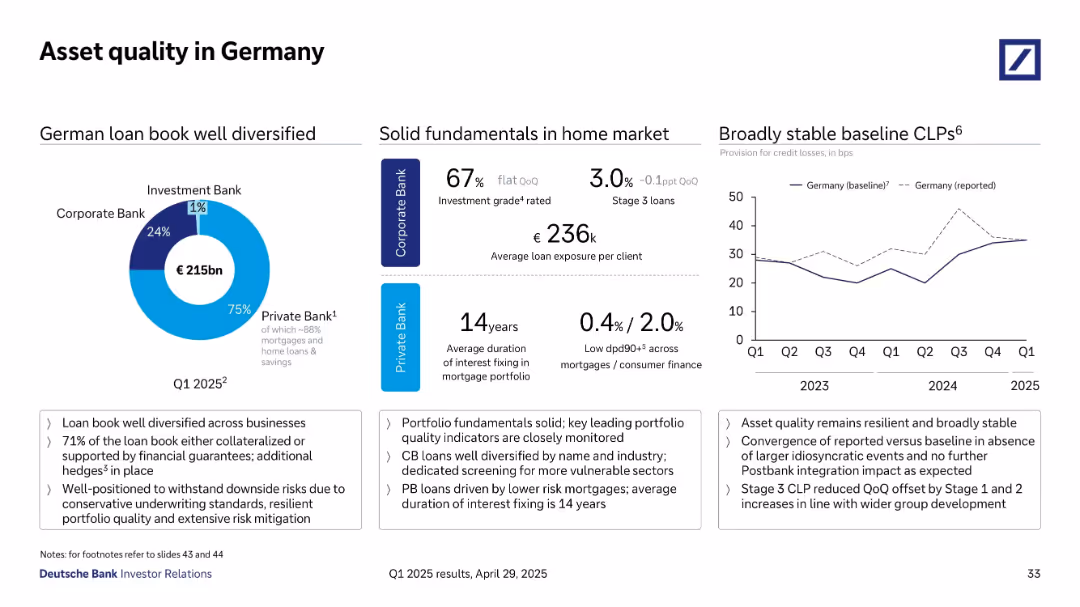
Divided layout with pie chart (loan distribution), data points (ratings, durations), and a line graph showing credit loss trends over time.
Risk Assessment and Management
Financial Services
The slide assesses German asset quality, emphasizing a well-diversified loan book totaling €215bn, predominantly in the Private Bank. Key indicators such as investment grade share, average loan size, and Stage 3 loan percentages are presented, alongside a trend graph showing stable provision for credit losses since 2023.
asset quality, Germany, diversification, CLP trends, loan performance
false
Risk Assessment and Management
Financial Services
Multiple Chart
Deutsche Bank
Add to my slides
Remove from favorites
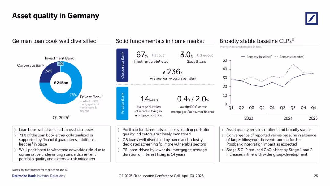
Three-panel layout with donut chart, performance metrics, and time series line graph.
Risk Assessment and Management
Financial Services
Highlights the German loan book composition (€215bn), with 75% in Private Bank. Emphasizes solid fundamentals like investment grade ratios and low delinquencies. CLP baseline and reported trends are shown. Key indicators include a 14-year interest fixing duration, low dpd90+ ratios, and broad risk mitigation across sectors.
asset quality, Germany, loan diversification, mortgage, Private Bank, CLP, investment grade, interest fixing, risk mitigation
false
Risk Assessment and Management
Financial Services
Multiple Chart
Deutsche Bank
Add to my slides
Remove from favorites
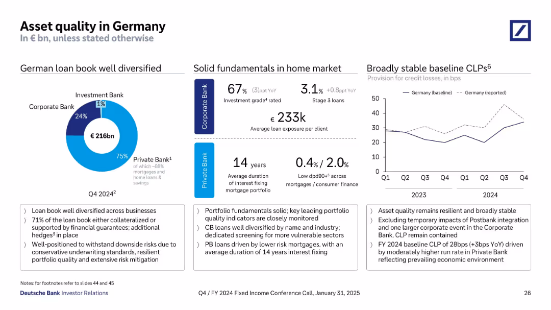
Multi-panel layout: donut chart, metrics, and line chart on credit loss provisions. Blue tones used for segmentation. Data-rich design with key stats and YoY comparisons.
Risk Assessment and Management
Financial Services
This slide focuses on Deutsche Bank's German loan portfolio (€216bn), with 75% in the Private Bank and high levels of mortgage exposure. It reports solid asset quality indicators: 67% investment grade in Corporate Bank and low delinquency rates in Private Bank. A line graph shows provision trends for credit losses over the last 8 quarters, highlighting resilience and stability.
asset quality, Germany, mortgages, credit loss provisions, delinquency, investment grade, Deutsche Bank, portfolio quality
false
Risk Assessment and Management
Financial Services
Multiple Chart
Deutsche Bank
Add to my slides
Remove from favorites
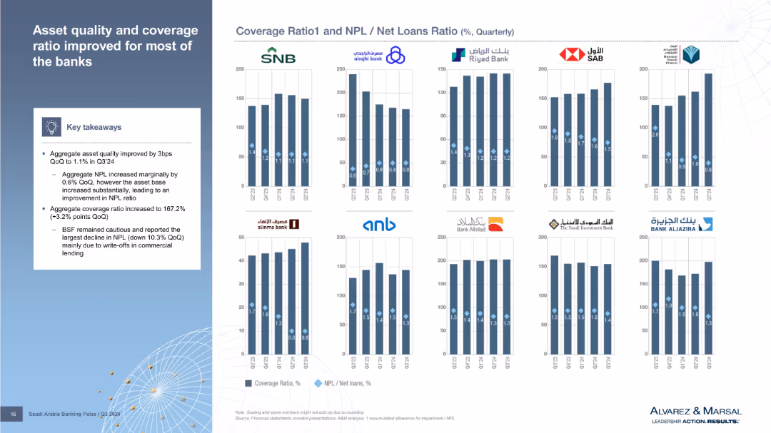
Grid of small bar charts per bank comparing Coverage Ratio and NPL/Net Loans across five quarters. Key takeaways box on the left with summary trends. Blue and diamond markers distinguish different metrics.
Risk Assessment and Management
Financial Services
Shows improved asset quality and higher coverage ratios among most banks. Although NPLs rose slightly, a larger asset base improved ratios. BSF saw the largest NPL drop due to commercial loan write-offs. Data is visually segmented per bank to show individual performance.
asset quality, NPL, coverage ratio, Q3 2024, bank performance, write-offs
false
Risk Assessment and Management
Financial Services
Mixed Chart
Alvarez & Marsal
Add to my slides
Remove from favorites
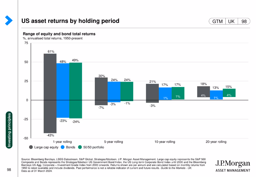
Column chart comparing returns of large cap equity, bonds, and 50/50 portfolios over different holding periods.
Investment Analysis
Financial Services
Highlights the returns of different assets over varying holding periods, emphasizing the importance of investment duration.
Asset returns, holding period, equity, bonds, portfolio
false
Investment Analysis
Financial Services
Single Chart
JP Morgan
Add to my slides
Remove from favorites
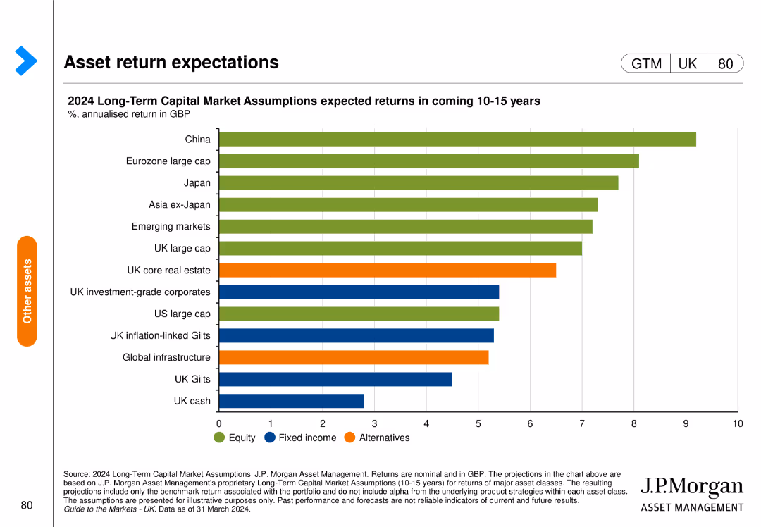
The slide features a horizontal bar chart depicting expected annualized returns of various asset classes over the next 10-15 years in GBP. The bars are color-coded by asset type.
Investment Analysis
Financial Services
The slide shows the expected returns for various asset classes such as equities, fixed income, and alternatives, providing insights for long-term investment strategies.
asset returns, investment, equities, fixed income, alternatives, J.P. Morgan, financial forecast, capital markets, annualized return, GBP
false
Investment Analysis
Financial Services
Single Chart
JP Morgan
Add to my slides
Remove from favorites
This slide features a column chart showing asset sales, mark-ups/mark-downs, and net dispositions. The layout is simple with a significant focus on the data represented by blue columns against a grey backdrop with green accent lines.
Risk Assessment and Management
Financial Services
Highlights the progress in asset sales and balance sheet management over a period. It can be used to inform stakeholders of risk management and asset optimization strategies.
Asset Sales, Equity Investments, Balance Sheet
false
Risk Assessment and Management
Financial Services
Single Chart
Goldman Sachs
Add to my slides
Remove from favorites
The slide shows a column chart comparing the market size of assets by revenue in Southeast Asia. The bars are segmented by different revenue size categories, with annotations indicating the total market size.
Investment Analysis
Education & Training
It illustrates the market size distribution of education assets by revenue in Southeast Asia, emphasizing the challenge of asset scale for investors. The contrast between the broad range of smaller revenue assets and the limited number of larger ones is used to discuss investment strategies.
Asset Scale, Investors, Education, Southeast Asia, Market Size, Revenue, Challenge
false
Investment Analysis
Education & Training
Single Chart
EY
Add to my slides
Remove from favorites
Two graphs presented; a line graph for coal power assets' age distribution between OECD and China, and a column chart for median plant age by energy source.
Operational Efficiency
Energy & Utilities
The slide examines the age distribution of coal power assets, comparing OECD countries and China, and provides median plant ages for various energy sources, emphasizing the durability and age of these assets.
assets, energy, resilience, age distribution, coal
false
Operational Efficiency
Energy & Utilities
Multiple Chart
BCG
Add to my slides
Remove from favorites
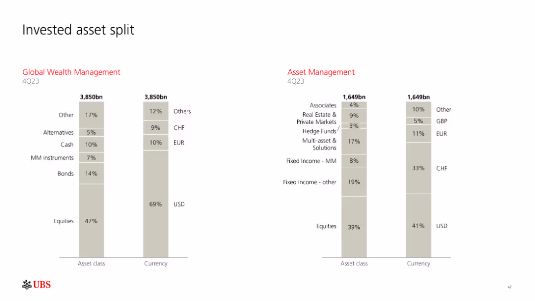
Column charts comparing Global Wealth Management and Asset Management invested asset splits
Investment Analysis
Financial Services
Compares asset class and currency splits in Global Wealth Management and Asset Management
assets, investment, split, GWM, AM
false
Investment Analysis
Financial Services
Multiple Chart
UBS
Add to my slides
Remove from favorites
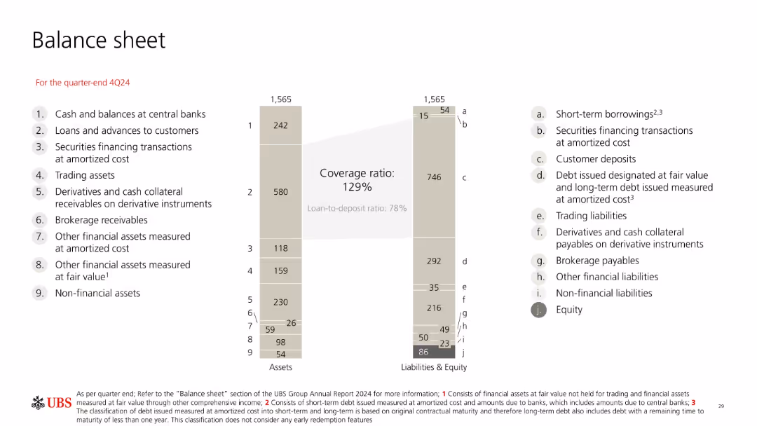
Mirror-style bar chart showing total assets vs. liabilities & equity at 4Q24. Each item is labeled numerically and alphabetically. Central emphasis on deposit-to-loan coverage ratio.
Financial Performance
Financial Services
Presents a balanced snapshot of UBS’s 4Q24 balance sheet totaling 1,565bn, with detailed breakdowns of both asset and liability categories. Emphasizes customer deposits, debt, and equity levels with associated ratios like coverage and loan-to-deposit.
assets, liabilities, balance sheet, equity, debt, deposits, UBS
false
Financial Performance
Financial Services
Mixed Chart
UBS
Add to my slides
Remove from favorites
Consists of two pie charts and two column charts showing the composition and quarterly movement of Level 3 assets and liabilities, with textual highlights.
Financial Performance
Financial Services
Analyzes the financial instruments classified as Level 3 assets and liabilities, detailing their valuation uncertainty and movements over the quarter.
assets, liabilities, financial, Level 3, risk management, valuation, uncertainty, banking
false
Financial Performance
Financial Services
Multiple Chart
Deutsche Bank
Add to my slides
Remove from favorites
Column chart displaying asset and liability composition. Layout is clean, with each chart and graph clearly labeled.
Financial Performance
Financial Services
Overview of company's assets and liabilities at the end of the year, useful for financial analysis and understanding company structure.
assets, liabilities, financial stability, balance sheet, equity
false
Financial Performance
Financial Services
Multiple Chart
Deutsche Bank
Add to my slides
Remove from favorites
Displays column charts detailing assets under management by business unit and product group, with clear textual annotations.
Financial Performance
Financial Services
Details the growth and distribution of assets under management within the private banking sector, highlighting net flows and product distribution.
assets, management, banking, financial, growth, distribution, private, investment
false
Financial Performance
Financial Services
Multiple Chart
Deutsche Bank
Add to my slides
Remove from favorites
Contains column charts and pie charts showing the development of assets under management, segmented by asset class over time.
Financial Performance
Financial Services
Reviews the asset management performance, focusing on quarterly growth and composition changes in assets under management.
assets, management, financial, growth, quarterly, asset class, banking, performance
false
Financial Performance
Financial Services
Multiple Chart
Deutsche Bank
Add to my slides
Remove from favorites
Detailed column charts illustrating assets under management by business unit and product group over time.
Financial Performance
Financial Services
Displays the trend of assets under management within Deutsche Bank's Private Bank, highlighting changes and net flows.
assets management, private banking, financial trends, investment products
false
Financial Performance
Financial Services
Multiple Chart
Deutsche Bank
Add to my slides
Remove from favorites
This slide contains multiple pie charts, a column chart, and detailed text sections.
Financial Performance
Financial Services
The slide presents a financial comparison of firmwide assets and management fees, along with asset mix and regional distribution.
Assets, Management, Wealth, Distribution, Pie Chart, Column Chart, Financial, Regional, Supervision, Fees
false
Financial Performance
Financial Services
Multiple Chart
Goldman Sachs
Add to my slides
Remove from favorites
The slide displays pie charts and tables alongside textual information, breaking down assets under supervision by asset class and region. It uses contrasting colors to delineate various sections and facilitate comprehension of data distribution.
Investment Analysis
Financial Services
It discusses the distribution and changes in assets under supervision, targeting financial analysts and investors analyzing portfolio diversification and regional asset allocation to guide investment decisions.
assets, supervision, investment, portfolio diversification, asset allocation
false
Investment Analysis
Financial Services
Multiple Chart
Goldman Sachs
Add to my slides
Remove from favorites
Multiple tables and pie charts depict firmwide asset supervision and distribution. The layout is evenly split between visual and textual information.
Market Analysis and Trends
Financial Services
Analyzes firmwide assets under supervision, detailing asset distribution by class and region, as well as historical organic net flows. It also emphasizes the mix of assets under supervision, highlighting the firm's financial growth and market presence.
Assets, Supervision, Market Analysis, Financial Growth, Distribution
false
Market Analysis and Trends
Financial Services
Multiple Chart
Goldman Sachs
Add to my slides
Remove from favorites
The slide contains column charts and pie charts showing assets under management development, including net flows, market performance, and asset class distribution.
Financial Performance
Financial Services
Discusses the development of assets under management in asset management, highlighting quarterly changes, asset class distribution, and market performance.
assets under management, asset management, net flows, market performance, asset class, financial performance
false
Financial Performance
Financial Services
Multiple Chart
Deutsche Bank
Add to my slides
Remove from favorites
Multiple column charts show the change in assets under management (AuM) for Wealth Management, Swiss Bank, and Asset Management from 3Q22 to 4Q22.
Market Analysis and Trends
Financial Services
Details the impact of market events on asset management, with significant net asset outflows and adverse FX impacts, contributing to an 8% decrease in AuM.
assets under management, market events, net outflows, FX impact, financial services
false
Market Analysis and Trends
Financial Services
Multiple Chart
Credit Suisse
Add to my slides
Remove from favorites
This slide features multiple column charts showing assets under management by business unit and product group, including net flows and product categories over quarters.
Financial Performance
Financial Services
Provides a detailed overview of assets under management in the private bank, showing breakdowns by product group, business unit, and quarterly changes.
assets under management, private bank, business units, product groups, net flows, financial performance
false
Financial Performance
Financial Services
Multiple Chart
Deutsche Bank
Add to my slides
Remove from favorites
The slide includes pie charts, and a table, all showing assets under supervision (AUS). It has a title at the top and key highlights on the right, using a moderate design.
Investment Analysis
Financial Services
This slide focuses on the distribution and changes in assets under supervision for asset and wealth management. Ideal for financial reviews, investor updates, or internal strategic planning, providing insight into asset allocation and client channels.
Assets Under Supervision, AUS Mix, Net Inflows, Equity
false
Investment Analysis
Financial Services
Multiple Chart
Goldman Sachs
Add to my slides
Remove from favorites
Tables depict asset distribution by class and region, accompanied by column chart showing asset and net flow changes over time.
Investment Analysis
Financial Services
The slide breaks down firmwide assets under supervision by segment, asset class, and region, with highlights on annual changes. It is useful for assessing investment distributions and monitoring long-term net asset flows.
Assets Under Supervision, Investment, Equity, Fixed Income, Regional Distribution, Net Flows, Asset Class, Financial Analysis, Firmwide Assets
false
Investment Analysis
Financial Services
Multiple Chart
Goldman Sachs
Add to my slides
Remove from favorites
Comprises pie charts depicting 'AUS by Asset Class' and 'AUS Mix', and a table summarizing the assets under supervision rollforward. Each graphical element is accompanied by explanatory notes and highlights.
Investment Analysis
Financial Services
A detailed overview of assets under supervision, including class mix and regional distribution, designed for financial analysis and strategic investment planning. Highlights changes in asset valuation and inflows/outflows for the quarter.
Asset Supervision, Asset Class, Client Channel, AUS, Net Inflows, Net Market Appreciation, Investment Strategy, Regional Distribution
false
Investment Analysis
Financial Services
Multiple Chart
Goldman Sachs
Add to my slides
Remove from favorites
This slide features tables and pie charts alongside numerical data for AUS and fees. It maintains consistency with a blue color theme and clear segmentation of data, contributing to a structured layout.
Financial Performance
Financial Services
Reviewing asset supervision and management fees, this slide details quarterly and annual data for asset management and consumer & wealth management. It's likely intended for financial review and performance tracking, emphasizing growth and fee management within these financial sectors.
Asset supervision, Management fees, Wealth management, Financial review, Performance tracking
false
Financial Performance
Financial Services
Multiple Chart
Goldman Sachs
Add to my slides
Remove from favorites
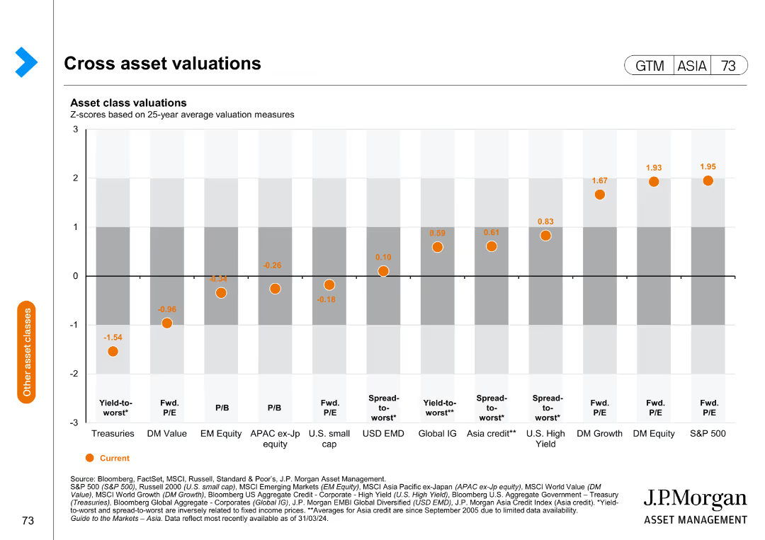
The slide presents a column chart displaying asset class valuations based on 25-year average valuation measures, with different asset classes plotted along the x-axis.
Financial Performance
Financial Services
This slide offers a comparative analysis of asset class valuations, helping in assessing relative value and making informed investment decisions.
asset valuations, financial analysis, investment, comparative analysis, market performance
false
Financial Performance
Financial Services
Single Chart
JP Morgan
Add to my slides
Remove from favorites
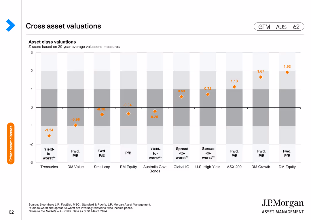
The slide includes a column chart displaying asset class valuations based on Z-scores of 20-year average valuation measures for various asset classes.
Market Analysis and Trends
Financial Services
It provides an overview of cross-asset valuations, highlighting relative value across different asset classes, useful for investment strategy and asset allocation.
asset valuations, Z-score, 20-year average, cross-asset, relative value
false
Market Analysis and Trends
Financial Services
Single Chart
JP Morgan
Add to my slides
Remove from favorites
Features two sets of column charts comparing equity investments and lending asset yields over a three-year period. It utilizes a simple color scheme to differentiate data from the background.
Financial Performance
Financial Services
Analyzes on-balance sheet investment performance, showing asset yields for equity investments and lending, indicating a consistent track record of strong performance over recent years.
Asset Yield, Performance, Equity, Lending
false
Financial Performance
Financial Services
Multiple Chart
Goldman Sachs
Add to my slides
Remove from favorites
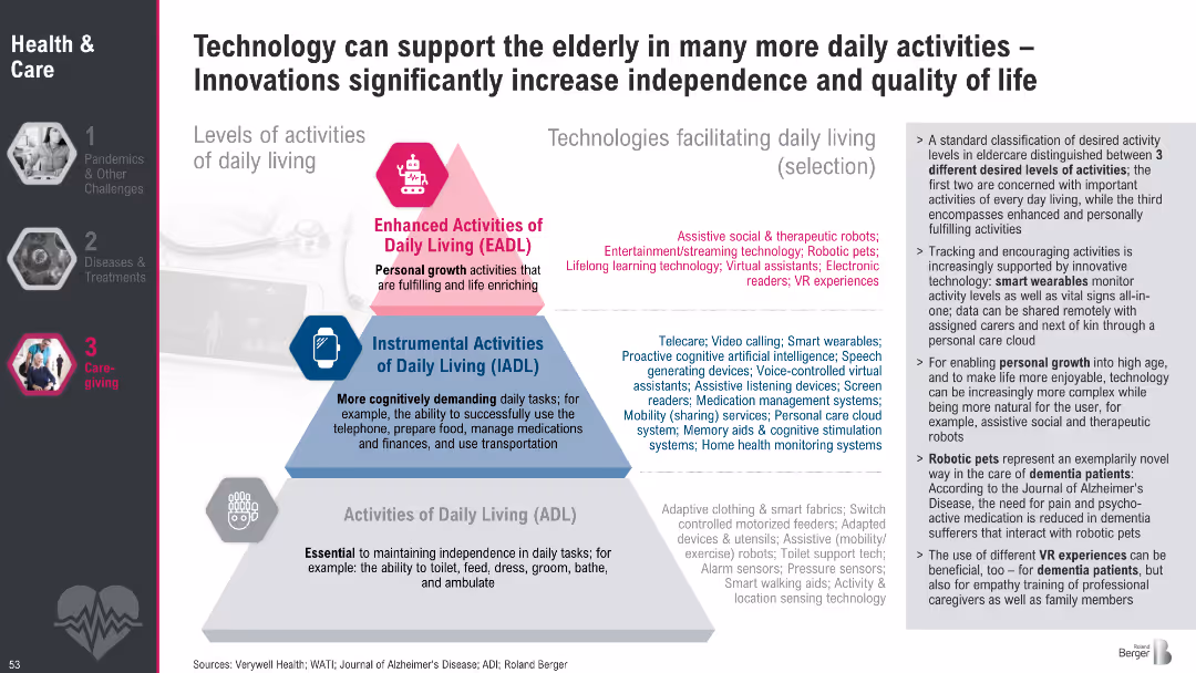
Pyramid diagram of daily living activity levels (ADL, IADL, EADL) paired with lists of enabling technologies; descriptive text on the right
Technology and Digital Transformation
Healthcare & Pharmaceuticals
This slide categorizes levels of daily living activities and aligns them with applicable assistive technologies. It shows how innovations can promote independence and quality of life, especially for elderly or dementia patients.
assistive tech, elderly care, daily living, independence, robotics, smart wearables, dementia, eldercare innovation
false
Technology and Digital Transformation
Healthcare & Pharmaceuticals
Framework
Roland Berger
Add to my slides
Remove from favorites
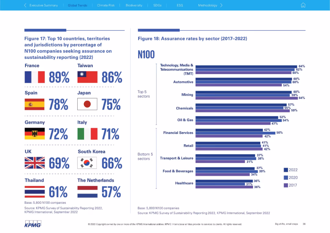
Dual-chart slide: left shows top countries by assurance % with flags; right has sector-based bar chart showing assurance rate trends over time. Visually segmented top 5 and bottom 5 sectors.
Performance Metrics and KPIs
Professional Services
The slide ranks countries by their N100 assurance reporting and displays sector-based assurance rate trends. France and Taiwan lead in assurance adoption, while TMT and Automotive sectors show high assurance rates, contrasting with lagging sectors like Healthcare.
assurance, countries, sectors, France, Taiwan, TMT, automotive, KPMG
false
Performance Metrics and KPIs
Professional Services
Mixed Chart
KPMG
Add to my slides
Remove from favorites
This slide utilizes a red and white color palette and presents four circle diagrams showing net revenue and operating profit for 2016/2017 and 2017/2018 in euros. Text boxes detail the financial performance metrics and relevant business commentary.
Financial Performance
Financial Services
The slide provides a comprehensive overview of PwC's Assurance business unit's financial results over two fiscal years, highlighting increased demand and investments in quality and workforce. It's aimed at stakeholders reviewing fiscal health and strategic decisions made in the Assurance domain.
assurance, financial results, investments, growth, PwC
false
Financial Performance
Financial Services
Multiple Chart
PwC/Strategy&
Add to my slides
Remove from favorites
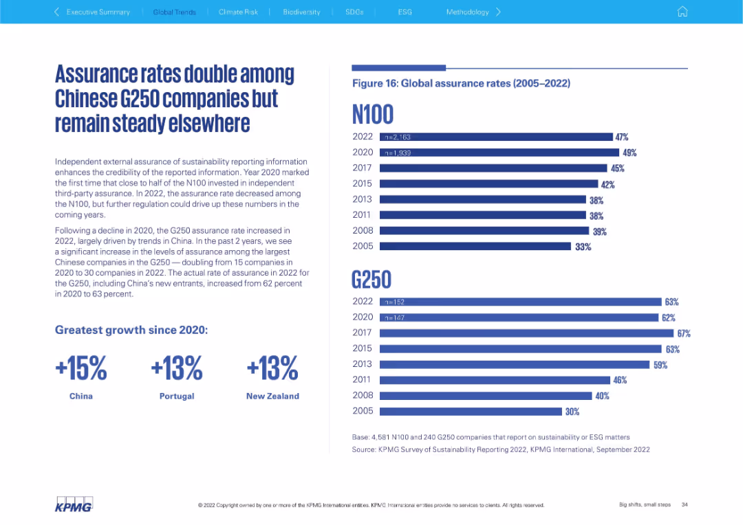
Split layout: left side features bold header, paragraph text, and callouts for growth; right side displays horizontal bar chart showing assurance rate trends (2005–2022) for N100 and G250. Clean KPMG branding and design.
Performance Metrics and KPIs
Professional Services
This slide highlights the trends in independent external assurance of sustainability reporting among global companies, noting a doubling in assurance rates among Chinese G250 firms. It compares N100 and G250 assurance rates over time and emphasizes regional increases since 2020.
assurance, G250, N100, sustainability, China, trends, metrics, growth
false
Performance Metrics and KPIs
Professional Services
Mixed Chart
KPMG
Add to my slides
Remove from favorites
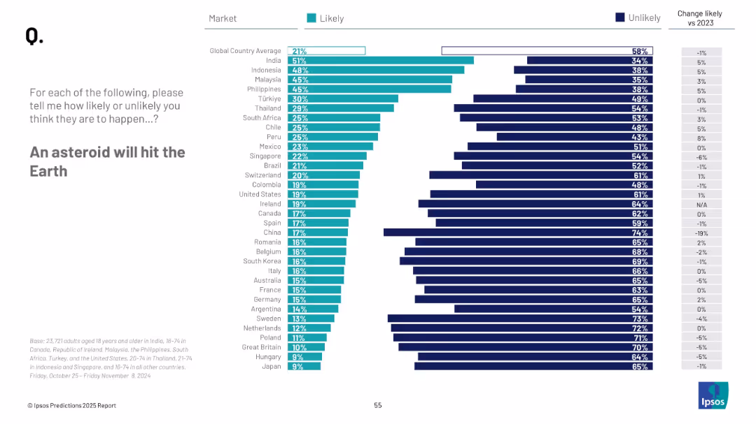
Bar chart by country; uses teal and navy bars to represent likely/unlikely; legend and changes from 2023 on right
Risk Assessment and Management
Environmental Services & Sustainability
This slide highlights global beliefs about the chance of an asteroid impact on Earth. It compares perceived likelihood across countries, with average trends and year-over-year changes.
asteroid impact, global fears, natural disaster, public sentiment, 2025, survey, likelihood, Ipsos
false
Risk Assessment and Management
Environmental Services & Sustainability
Mixed Chart
IPSOS
Add to my slides
Remove from favorites
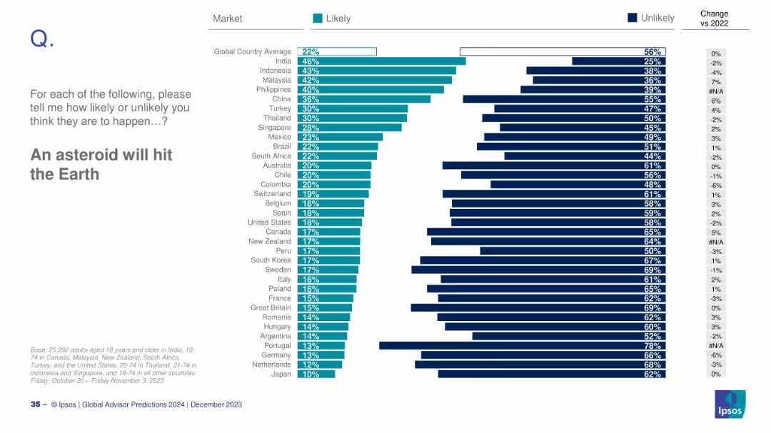
Bar chart ranked by countries on perceived asteroid impact risk; includes changes vs 2022.
Risk Assessment and Management
Government & Public Sector
The slide explores global public belief in the likelihood of an asteroid striking Earth. India shows the highest concern, while Japan shows the least. The global average is 22%, with minimal change since 2022.
asteroid, risk, global disaster, Ipsos, public belief, 2024 prediction
false
Risk Assessment and Management
Government & Public Sector
Mixed Chart
IPSOS
Add to my slides
Remove from favorites
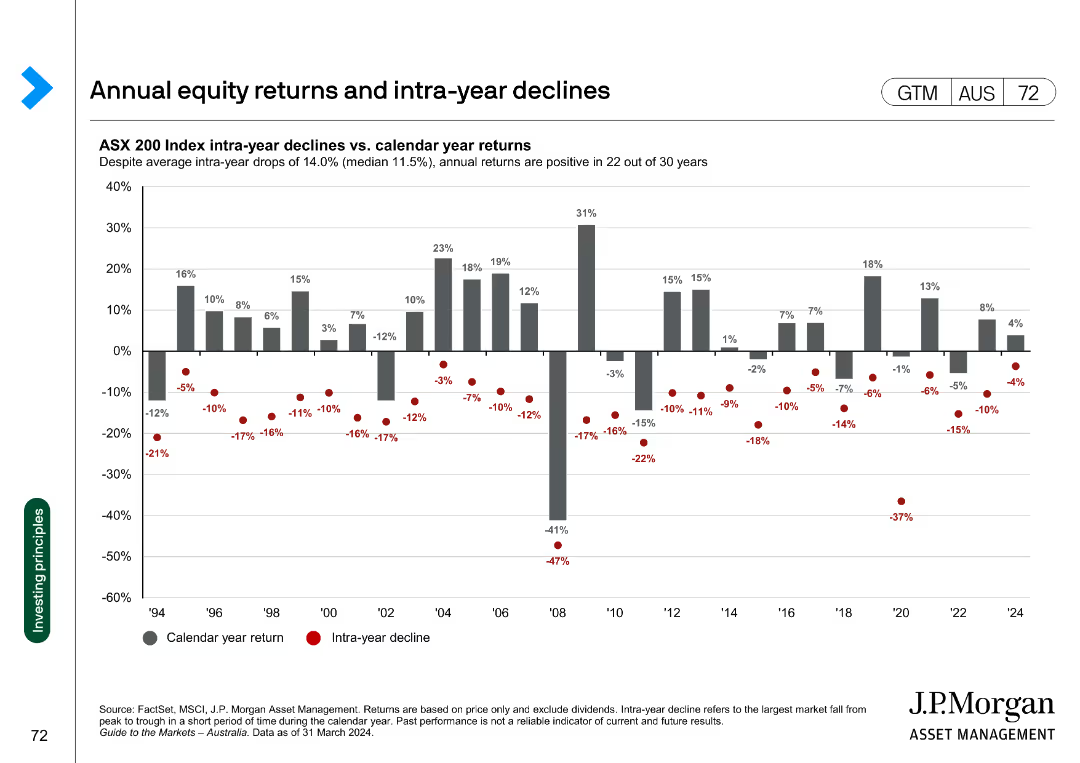
The slide presents a column chart showing ASX 200 Index intra-year declines versus calendar year returns, with calendar year returns as gray bars and intra-year declines as red dots.
Financial Performance
Financial Services
Compares the annual returns and intra-year declines of the ASX 200 Index over 30 years, highlighting that annual returns were positive in 22 out of 30 years.
ASX 200, returns, declines, financial performance, annual returns, intra-year, column chart
false
Financial Performance
Financial Services
Single Chart
JP Morgan
Add to my slides
Remove from favorites
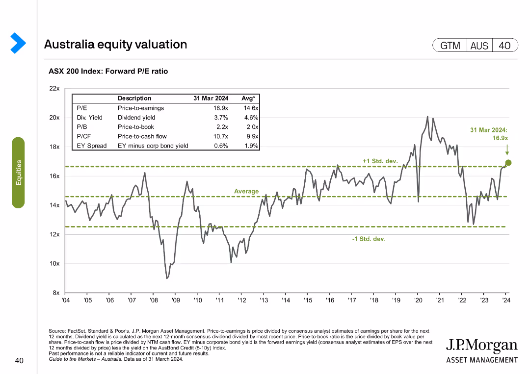
The slide presents a line chart with ASX 200 Index forward P/E ratio over time and a table with different valuation metrics as of March 2024 compared to historical averages.
Financial Performance
Financial Services
This slide evaluates the ASX 200 Index's forward P/E ratio and other valuation metrics, comparing current figures to historical averages.
ASX 200, valuation, metrics, forward P/E, historical
false
Financial Performance
Financial Services
Single Chart
JP Morgan
Add to my slides
Remove from favorites
This slide contains four column charts and a set of small data tables. The charts are used to compare different types of capital requirements and their respective buffers at a given point in time, alongside future projections for capital in graphical and tabular formats.
Risk Assessment and Management
Financial Services
The slide discusses the management of AT1 and T2 capital needs across the total capital structure, emphasizing the strategic approach to maintaining buffer levels to manage financial risks and requirements effectively.
AT1, T2, capital management, buffer, projections
false
Risk Assessment and Management
Financial Services
Multiple Chart
Barclays
Add to my slides
Remove from favorites
Horizontal bar chart by gender/division with icon row below; sidebar text in light gray box.
Market Analysis and Trends
Education & Training
This slide addresses common misconceptions about athletic scholarships, showing average scholarship values by division and gender, while stressing their rarity. Only about 2% of high school athletes receive these scholarships. It also identifies sports eligible for full-ride scholarships.
athletic scholarships, Division I, Division II, college costs, sports
false
Market Analysis and Trends
Education & Training
Mixed Chart
JP Morgan
Add to my slides
Remove from favorites
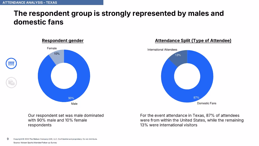
Two donut charts showing respondent gender and type (domestic vs international); text summaries
Customer and Market Segmentation
Media & Entertainment
Attendance in Texas was heavily male-dominated (90%) and largely domestic (87%). Provides demographic insight into event attendees.
attendance, demographics, Texas, ICC, domestic fans, male audience, gender split, survey, Nielsen, international attendees
false
Customer and Market Segmentation
Media & Entertainment
Single Chart
Nielsen
Add to my slides
Remove from favorites
A horizontal bar chart comparing conservative and aggressive investment attitudes before and during the pandemic, with a small shift chart showing more conservative or risky attitudes over time.
Market Analysis and Trends
Financial Services
Examines how Canadian investors' attitudes toward investing have shifted due to the pandemic, comparing conservative and aggressive investment attitudes before and after.
attitude, investing, conservative, aggressive, shift
false
Market Analysis and Trends
Financial Services
Multiple Chart
IPSOS
Add to my slides
Remove from favorites
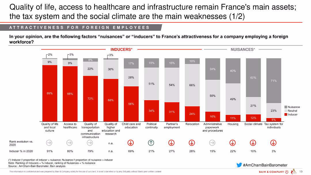
This slide contains a combination of column charts showing factors influencing France's attractiveness for foreign employees. Factors are categorized as Inducers and Nuisances.
Market Analysis and Trends
Professional Services
The slide analyzes various factors that influence France's attractiveness for foreign employees, showing the percentage of respondents who see each factor as an inducer or nuisance.
attractiveness, France, foreign employees, factors, analysis, inducers, nuisances, professional services
false
Market Analysis and Trends
Professional Services
Single Chart
Bain
Add to my slides
Remove from favorites
The slide shows a rock climber in a scenic location. Next to it is a column chart listing reasons for Greece’s attractiveness to improve, with yellow bars indicating the percentage of respondents.
Market Analysis and Trends
Professional Services
The slide highlights reasons investors expect Greece’s attractiveness to improve, citing infrastructure quality, availability of skilled talent, sustainability, and R&D opportunities.
attractiveness, improve, Greece, reasons, infrastructure, talent, sustainability
false
Market Analysis and Trends
Professional Services
Multiple Chart
EY
Add to my slides
Remove from favorites
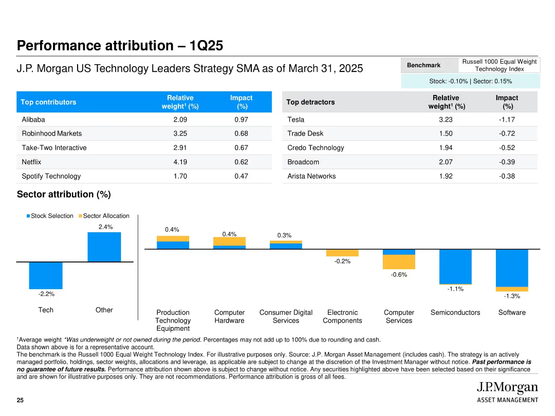
Top half is a table showing top contributors and detractors with weights and impact. Bottom half features a horizontal bar chart of sector attribution split by stock selection and allocation, color-coded blue and yellow. Simple grid layout with clear headings.
Performance Metrics and KPIs
Financial Services
This slide reports the Q1 2025 performance attribution of the J.P. Morgan US Technology Leaders Strategy. It breaks down relative performance impacts by top/bottom contributors and by sector, highlighting where alpha was generated or lost. Notable performance gains came from names like Alibaba and Robinhood, while Tesla and Trade Desk detracted. The sector attribution chart helps assess the role of selection vs. allocation.
attribution, Q1 2025, stock performance, sector impact, contributors, detractors, portfolio analysis, J.P. Morgan, tech strategy
false
Performance Metrics and KPIs
Financial Services
Mixed Chart
JP Morgan
Add to my slides
Remove from favorites
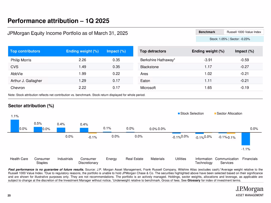
Table of top contributors/detractors alongside sector attribution bar charts.
Performance Metrics and KPIs
Financial Services
Breaks down Q1 2025 performance attribution by highlighting best and worst performing stocks and sectors. Includes impact percentages and stock weights. A stacked bar chart shows attribution by stock selection vs. sector allocation.
attribution, Q1 2025, top contributors, performance, financials, benchmark, sector allocation
false
Performance Metrics and KPIs
Financial Services
Mixed Chart
JP Morgan
Add to my slides
Remove from favorites
The slide presents a column chart showing the difficulty levels marketers face with various audience data elements like data access and GDPR compliance.
Market Analysis and Trends
Professional Services
This slide details the challenges marketers encounter with audience data, such as data access and GDPR compliance, highlighting areas that need improvement.
audience data, challenges, marketers, data access, GDPR compliance
false
Market Analysis and Trends
Professional Services
Mixed Chart
Nielsen
Add to my slides
Remove from favorites
The slide includes a column chart displaying confidence levels in audience data across different regions. It uses shades of blue to differentiate between levels of agreement.
Market Analysis and Trends
Professional Services
This slide presents data on global marketers' confidence in their audience data, revealing that only 26% feel fully confident. It emphasizes the need for improved data strategies.
audience data, confidence, global marketers, data strategies, regional differences
false
Market Analysis and Trends
Professional Services
Mixed Chart
Nielsen
Add to my slides
Remove from favorites
Features an image of a creatively colored cow, alongside mobile interfaces and a strategic model diagram.
Market Analysis and Trends
Financial Services
The slide humorously uses a cow image to represent "growing our audience," linked to a new credit access program, highlighting strategic partnerships and market segment targeting, which are crucial for expanding consumer access and data acquisition.
audience growth, strategic partnerships, marketing, credit access, innovation
false
Market Analysis and Trends
Financial Services
Mixed Chart
Barclays
Add to my slides
Remove from favorites
The slide features a bubble chart showing the importance of various factors in campaign performance, with audience targeting and ad creative being the most critical.
Market Analysis and Trends
Professional Services
This slide highlights the critical role of audience targeting in campaign performance, showing its significant impact compared to other factors like ad creative and data quality.
audience targeting, campaign performance, ad creative, data quality, marketing
false
Market Analysis and Trends
Professional Services
Mixed Chart
Nielsen
Add to my slides
Remove from favorites
The slide features column charts with different color-coded bars representing total population, radio listeners, and podcast listeners. The chart measures consumer willingness to shop and make purchases.
Market Analysis and Trends
Media & Entertainment
The slide highlights that audio consumers are more willing to engage in various activities like shopping and travel post-pandemic. It compares the willingness of the total population with radio and podcast listeners.
Audio, consumers, recovery, shopping, travel, pandemic, willingness, market trends, Nielsen
false
Market Analysis and Trends
Media & Entertainment
Multiple Chart
Nielsen
Add to my slides
Remove from favorites
This slide features a bar chart under "FIGURE 3" and bulleted points discussing the potential of worker time being augmented/automated by intelligent technologies.
Market Analysis and Trends
Technology & Software
The slide details which roles are most susceptible to automation and augmentation by intelligent technologies, with a focus on how worker activities evolve with these advancements.
Augmentation, Automation, Employment, Trends, AI
false
Market Analysis and Trends
Technology & Software
Mixed Chart
Accenture
Add to my slides
Remove from favorites
The slide features a prominent image of a person using augmented reality, with text on the right and a trend assessment.
Technology and Digital Transformation
Technology & Software
Highlights the rise of augmented, mixed, and virtual reality, focusing on new opportunities in the consumer industry.
Augmented Reality, Virtual Reality, Mixed Reality, Consumer Industry, Immersive Experience, Virtual Collaboration
false
Technology and Digital Transformation
Technology & Software
Multiple Chart
Deloitte
Add to my slides
Remove from favorites
Compares AR and VR technologies, discussing current status and future requirements.
Technology and Digital Transformation
Technology & Software
Evaluates AR and VR's current technological capabilities and the significant advancements needed for widespread adoption.
augmented reality, virtual reality, technology development, immersive experience, industry application
false
Technology and Digital Transformation
Technology & Software
Boxed
McKinsey
Add to my slides
Remove from favorites
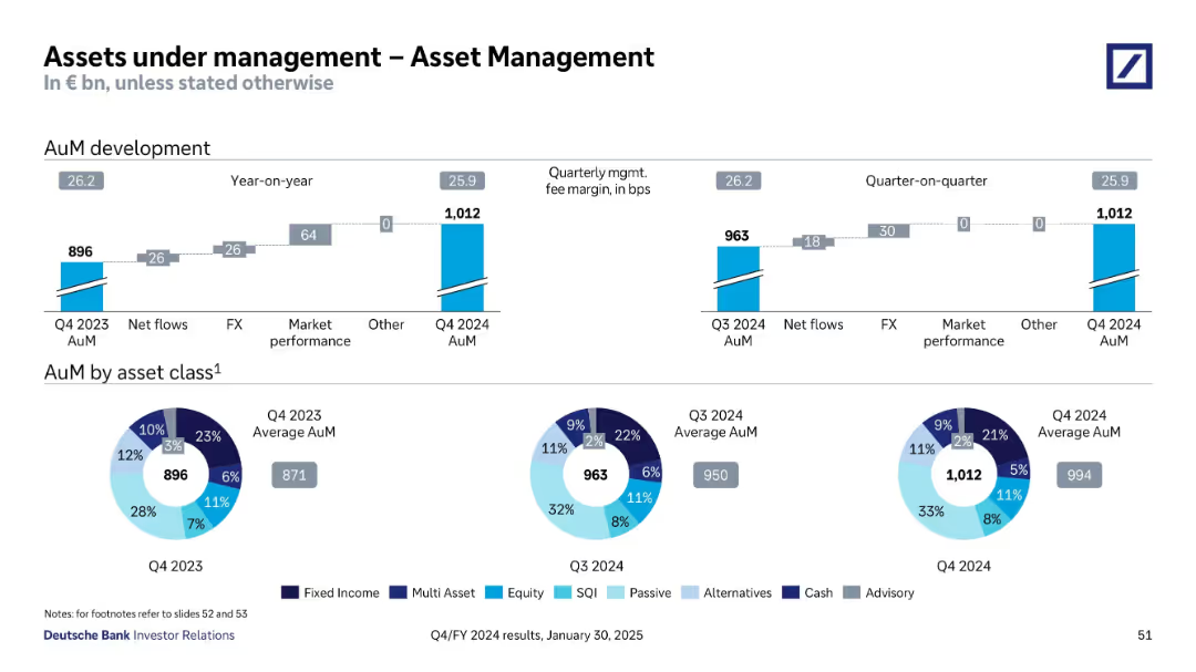
Combined bar and donut charts; top bar shows year-over-year and quarterly development of AuM; bottom pie charts show breakdown by asset class
Financial Performance
Financial Services
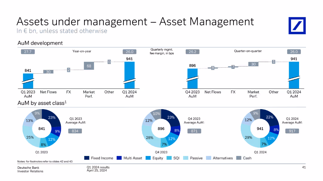
The slide shows growth in asset management AuM from Q4 2023 to Q4 2024, detailing sources of growth such as net flows, FX, and market performance. It also includes asset allocation breakdowns by class.
AuM, asset classes, asset management, net flows, FX impact, market performance, Deutsche Bank
false
Financial Performance
Financial Services
Multiple Chart
Deutsche Bank
Add to my slides
Remove from favorites
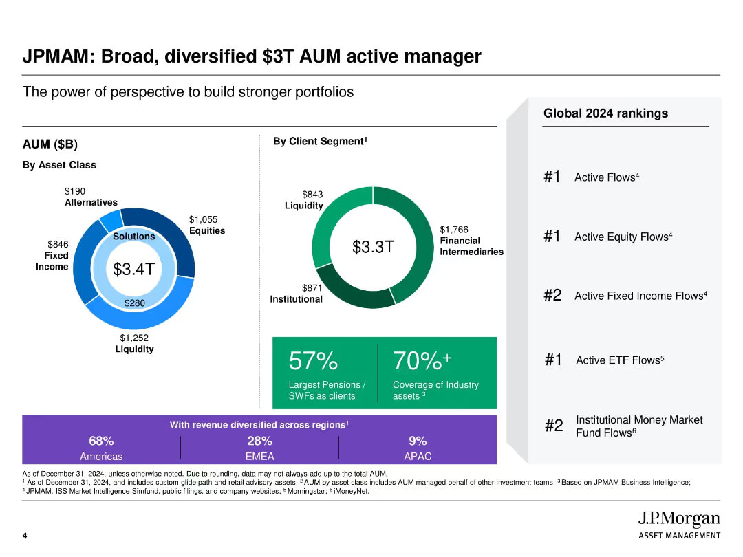
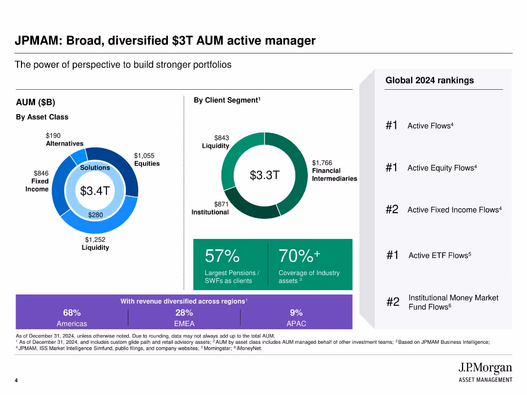
Circular infographics and bar charts showing AUM distribution by asset class and client type; ranking list on the right
Industry Overview
Financial Services
Highlights the scale and diversification of JPMorgan Asset Management, emphasizing its $3.3T AUM and strong global rankings in various asset classes. Shows distribution by client segments, asset classes, and regional revenue breakdown, reinforcing JPMAM’s breadth and reach.
AUM, asset classes, global rankings, client segment, JPMorgan, diversification, industry leader
false
Industry Overview
Financial Services
Multiple Chart
JP Morgan
Add to my slides
Remove from favorites
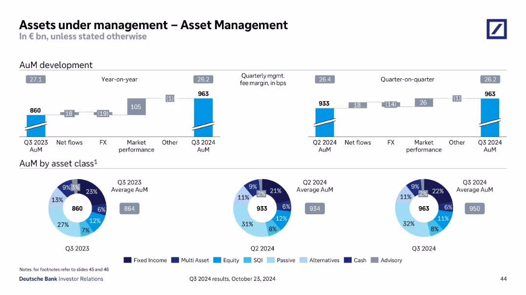
Top shows AuM development bar chart (YoY and QoQ), bottom features pie charts of AuM by asset class for 3 quarters.
Financial Performance
Financial Services
Analyzes changes in Asset Management AuM from Q3 2023 to Q3 2024, highlighting impact from market performance and FX. Pie charts show diversification across fixed income, equity, passive, and other asset classes.
AuM, Asset Management, FX, Market Performance, Fixed Income, Equity
false
Financial Performance
Financial Services
Multiple Chart
Deutsche Bank
Add to my slides
Remove from favorites
The slide contains two column charts showing yearly and quarterly assets under management (AuM) development and a set of pie charts detailing asset class distributions for different quarters.
Investment Analysis
Financial Services
Provides detailed analysis of asset management growth through net flows, market performance, and fee margins, alongside the composition of assets under management segmented by class, aiding strategic investment decisions.
AuM, asset management, growth analysis, asset class distribution, market performance
false
Investment Analysis
Financial Services
Multiple Chart
Deutsche Bank
Add to my slides
Remove from favorites
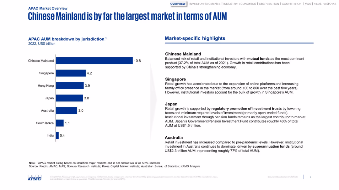
Bar chart with jurisdictional AUM and a column of highlights. Structured and minimalistic with strong blue tones.
Market Analysis and Trends
Financial Services
Breaks down APAC AUM by country, highlighting China’s dominance. The sidebar notes market-specific factors like regulatory frameworks, pension fund dominance, and online platform growth in Singapore and Japan.
AUM, China, Japan, Singapore, investment, retail growth, pensions
false
Market Analysis and Trends
Financial Services
Mixed Chart
KPMG
Add to my slides
Remove from favorites
This slide is visually dense with column charts comparing different financial metrics from 2014 and 2019. It employs color coding to distinguish between the years.
Operational Efficiency
Financial Services
It analyzes the impact of secular trends on various financial services and how a company can navigate through them. It’s meant for discussing strategies in overcoming industry challenges.
AUM, commission rates, trading volume, net revenue
false
Operational Efficiency
Financial Services
Multiple Chart
JP Morgan
Add to my slides
Remove from favorites
Column chart with labeled segments showing changes in Assets Under Management (AUM) over time.
Financial Performance
Financial Services
The slide shows the AUM movement within Macquarie Asset Management, detailing the effects of various business activities and market conditions. This visual aids in the analysis of asset growth and investment strategies, suitable for investor updates and strategic planning discussions.
AUM, investment, growth, assets, management
false
Financial Performance
Financial Services
Single Chart
Morgan Stanley
Add to my slides
Remove from favorites
Data-driven layout with donut charts, bar segments, and ranked bullet points; split into asset class, client segment, and global rankings.
Industry Overview
Financial Services
This slide presents J.P. Morgan Asset Management’s total assets under management (AUM) by asset class and client segment, totaling $3.3T. It emphasizes global rankings, client coverage, and geographic revenue diversification.
AUM, JPMorgan, asset management, global ranking, institutional clients, financial intermediaries, liquidity, EMEA, APAC
false
Industry Overview
Financial Services
Multiple Chart
JP Morgan
Add to my slides
Remove from favorites
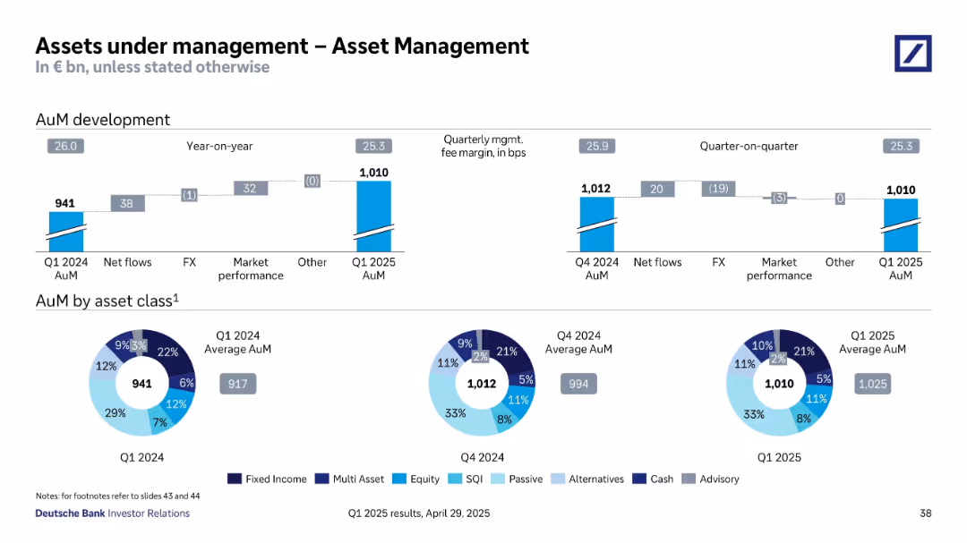
Split into two sections: AuM development (bar chart with net flows, FX, etc.) and pie charts of AuM by asset class.
Financial Performance
Financial Services
The slide details changes in Assets under Management (AuM) over time (YoY and QoQ), showing net flows, FX impacts, and market performance. It also shows the breakdown of AuM by asset class for Q1 2024, Q4 2024, and Q1 2025 with a visual pie chart comparison.
AuM, net flows, market performance, FX, asset classes, equity, fixed income, cash, alternatives, Q1 2025, Deutsche Bank
false
Financial Performance
Financial Services
Multiple Chart
Deutsche Bank
Add to my slides
Remove from favorites
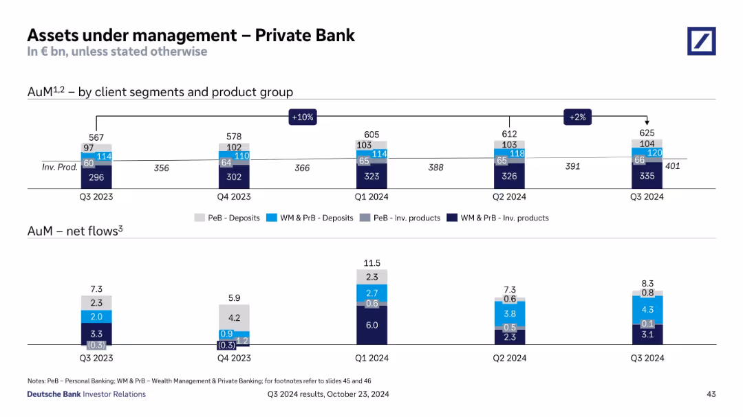
Two sections: stacked bar chart (top) showing AuM by segment/product over time, and bottom chart for net flows.
Financial Performance
Financial Services
Reports AuM growth from Q3 2023 to Q3 2024 in Private Bank, segmented by deposits and investment products. Shows consistent net inflows, peaking in Q1 2024. Indicates client segment behavior and investment trends.
AuM, Private Bank, Deposits, Investment Products, Net Flows
false
Financial Performance
Financial Services
Single Chart
Deutsche Bank
Add to my slides
Remove from favorites
Bar graphs show quarterly AuM by segment and product type, with net flows detailed below. Color-coded by product and client type.
Performance Metrics and KPIs
Financial Services
This slide tracks assets under management (AuM) for the Private Bank from Q1 2024 to Q1 2025, segmented by product type (deposits vs investment products) and client segment. It also presents net flow trends, showing continued positive inflows despite a dip in Q4 2024, suggesting strong client engagement and growth potential.
AuM, private banking, investment products, deposits, net flows, clients
false
Performance Metrics and KPIs
Financial Services
Single Chart
Deutsche Bank
Add to my slides
Remove from favorites
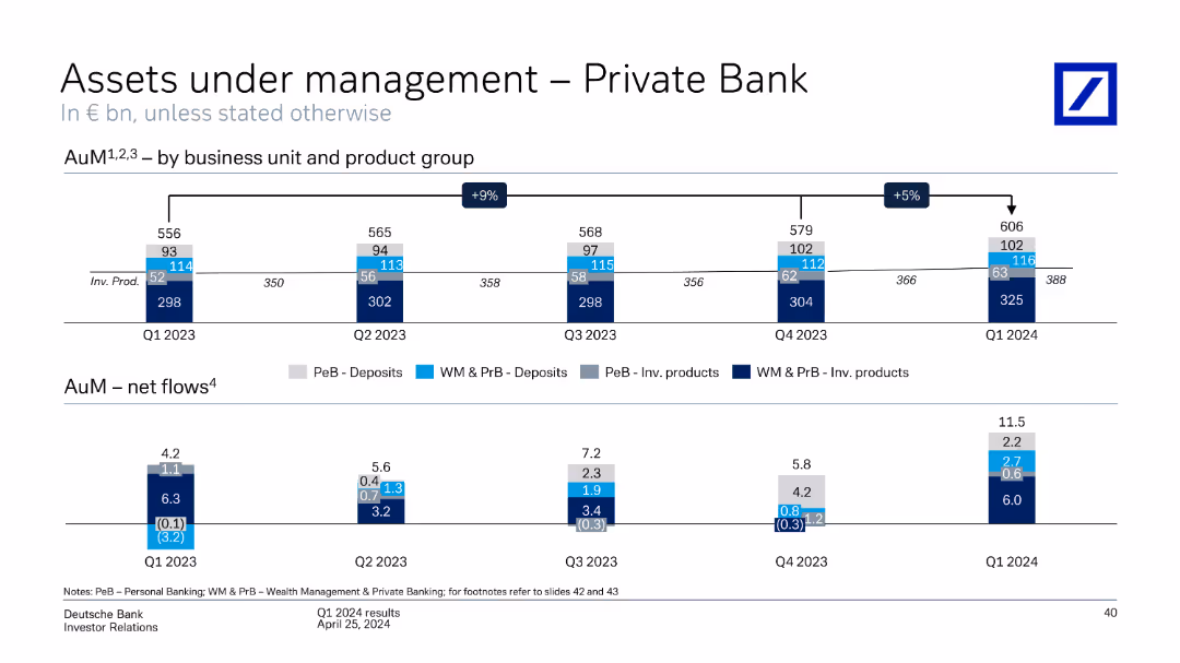
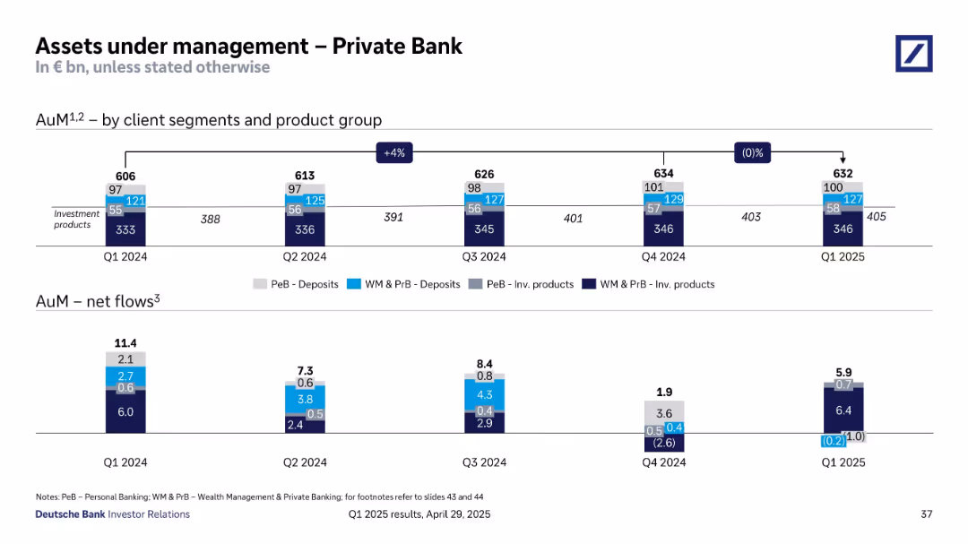
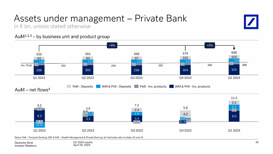
Split into top and bottom sections. Top shows stacked bar chart over time, bottom shows bar charts of net flows by quarter and category.
Financial Performance
Financial Services
The slide tracks AuM evolution across business units and products in Deutsche Bank’s Private Bank from Q1 2023 to Q1 2024. It highlights growth (+5% QoQ), net flows, and diversification across deposits and investment products.
AuM, Private Bank, Net Flows, Deposits, Investment Products, Growth, Q1 2024, KPIs, Revenue
false
Financial Performance
Financial Services
Single Chart
Deutsche Bank
Add to my slides
Remove from favorites
This slide features a series of column charts showing assets under management (AuM) over several quarters for different product groups, and a detailed bar chart showing net flows by quarter.
Investment Analysis
Financial Services
The slide presents quarterly financial data of a private bank's assets under management categorized by product type and net flows. This allows for analysis of trends and investment product performance across quarters.
AuM, private bank, net flows, quarterly data, investment products, financial trends
false
Investment Analysis
Financial Services
Multiple Chart
Deutsche Bank
Add to my slides
Remove from favorites
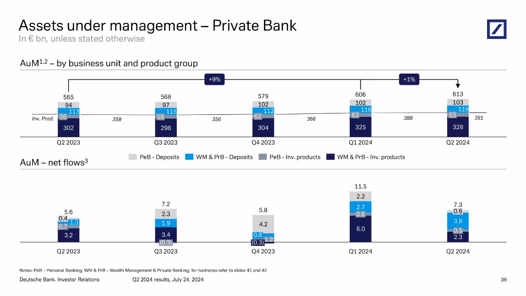
Dual-tier bar chart layout: top tracks AuM over time, bottom shows net flows per segment; business units and product types are color-coded.
Performance Metrics and KPIs
Financial Services
The slide outlines AuM growth in the Private Bank, from €565bn in Q2 2023 to €613bn in Q2 2024. It breaks down contributions by deposits and investment products across personal and wealth segments. It also shows quarterly net flows, demonstrating ongoing client activity and trends in fund allocations.
AuM, Private Bank, net flows, wealth management, deposits, investments
false
Performance Metrics and KPIs
Financial Services
Single Chart
Deutsche Bank
Add to my slides
Remove from favorites
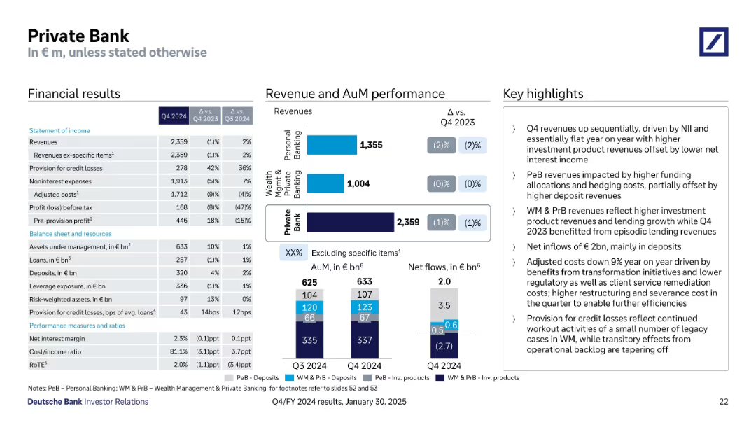
Layout includes financial tables, revenue performance bar charts, and AuM visuals with bullet-point notes
Financial Performance
Financial Services
This slide outlines the Private Bank’s Q4 2024 performance, indicating flat revenues YoY, net inflows of €2bn, and reduced adjusted costs. Revenue is broken down into Wealth Management and Personal Banking. Highlights mention higher deposit revenues, transformation benefits, and credit losses tied to legacy cases.
AuM, Revenues, Deposits, Credit Losses, Transformation, WM, PeB
false
Financial Performance
Financial Services
Multiple Chart
Deutsche Bank
Add to my slides
Remove from favorites
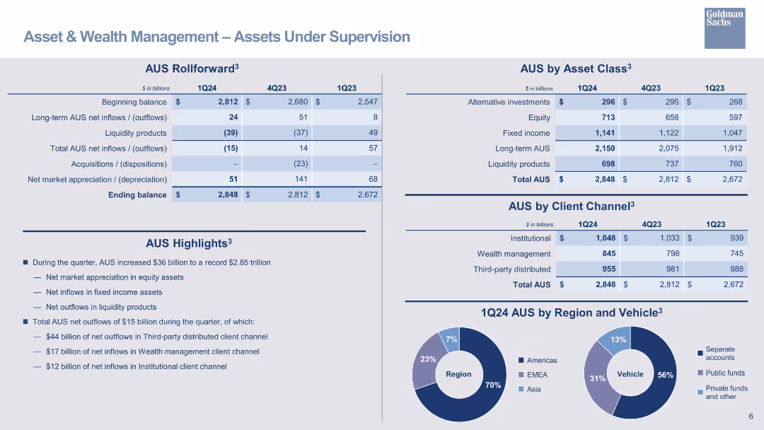
Tables showing AUS rollforward and AUS by asset class, client channel, and region, with pie charts for regional and vehicle distribution.
Operational Efficiency
Financial Services
Provides a detailed overview of assets under supervision, including net inflows/outflows and asset class breakdown.
AUS, assets under supervision, net inflows, asset class, client channel, region, pie chart
false
Operational Efficiency
Financial Services
Mixed Chart
Goldman Sachs
Add to my slides
Remove from favorites
Features two column charts: Left chart shows firmwide AUS in trillions from 2019 to Q1 2022. Right chart illustrates firmwide management and other fees in billions from 2019 to 2024 targets. An arrow indicates a CAGR of +12%.
Financial Performance
Financial Services
This slide analyzes the growth in assets under supervision (AUS) and associated fees over time, projecting a continuous upward trend. It presents past performance and future targets, positioning the firm's growth within the financial services industry.
AUS growth, fee analysis, financial performance, CAGR, projections, column chart
false
Financial Performance
Financial Services
Multiple Chart
Goldman Sachs
Add to my slides
Remove from favorites
The slide features a comprehensive table and icons showing policy strategies, enablers, and interventions for developing the battery industry in Australia.
Competitive Landscape
Energy & Utilities
This slide presents six key policy strategies needed to establish a competitive battery industry in Australia. It categorizes strategies and their impact on industry facilitation and regional partnerships.
Australia, battery industry, policy strategies, international competition, speed and scale
false
Competitive Landscape
Energy & Utilities
Table
Accenture
Add to my slides
Remove from favorites
Previous
Next
You don't have any favorites yet.
Please wait loading your favorites slides...
Create a FREE account to continue browsing
Receive Instant Access to 1,000+ slides from companies like McKinsey, Google, and Goldman Sachs
First Name
Last Name
Email
Password
I agree to all
Terms & Privacy Policy
Thank you! Your submission has been received!
Oops! Something went wrong while submitting the form.
Have an account?
Sign in
Upgrade to PRO to Save slides
Advanced Search and Filters
Access to 15,000+ slides
Access to Category Pages
Save/Bookmark Slides
PowerPoint Template Library
Pick a Plan
MONTHLY
$12/month
Billed every month, Cancel anytime.
YEARLY
$9/year
Billed $108 annually, Cancel anytime.
Checkout for $12/month
Checkout for $108/yr
Secured by Stripe | AES-256 bit encryption