My Account
My Slides
Search by Category
Companies
Slide Type
Use Case
Industry
Pricing
Templates
View All Templates
Download Template Slides
✦ AI
AI Prompt Library
AI Search
Feedback
Login
Logout
Get Started
Browse all Slides
Browse all Slides
Create a FREE Account
Instant access to 1,000+ real slides from top companies like McKinsey, BCG, Goldman Sachs, Google and many more!
First Name
Last Name
Email
Password
I agree to all
Terms & Privacy Policy
Thank you! Your submission has been received!
Oops! Something went wrong while submitting the form.
Have an account?
Sign in
Saved Slides
Total No. of slides saved
0
↻ Refresh
✖ Clear all
Line and bar charts comparing domestic vs. export-oriented earnings and revenue exposure for Asian companies, highlighting revenue derived domestically.
Market Analysis and Trends
Financial Services
Examines earnings and revenue sources for Asia ex-Japan companies, contrasting domestic and export-oriented businesses to understand revenue exposure and trends.
Asia ex-Japan, earnings, revenue exposure, line chart, bar chart, financial analysis, domestic, export-oriented, market trends
false
Market Analysis and Trends
Financial Services
Multiple Chart
JP Morgan
Add to my slides
Remove from favorites
The slide includes two doughnut charts comparing Asia’s investment values for 2012 and 2016, highlighting the rise in China and Southeast Asia.
Market Analysis and Trends
Financial Services
Discusses the rapid increase in investment values within Asia, particularly in China and Southeast Asia, over the four-year period.
Asia, Investment, China, Southeast Asia, Trends
false
Market Analysis and Trends
Financial Services
Multiple Chart
Kearney
Add to my slides
Remove from favorites
The slide shows a comparative analysis using two doughnut charts illustrating global investment values by region for 2012 and 2016.
Market Analysis and Trends
Financial Services
Highlights the growth of Asia in global investment values, showing significant increases from 2012 to 2016, emphasizing Asia’s growing market share.
Asia, Investment, Global Market, Trends
false
Market Analysis and Trends
Financial Services
Multiple Chart
Kearney
Add to my slides
Remove from favorites
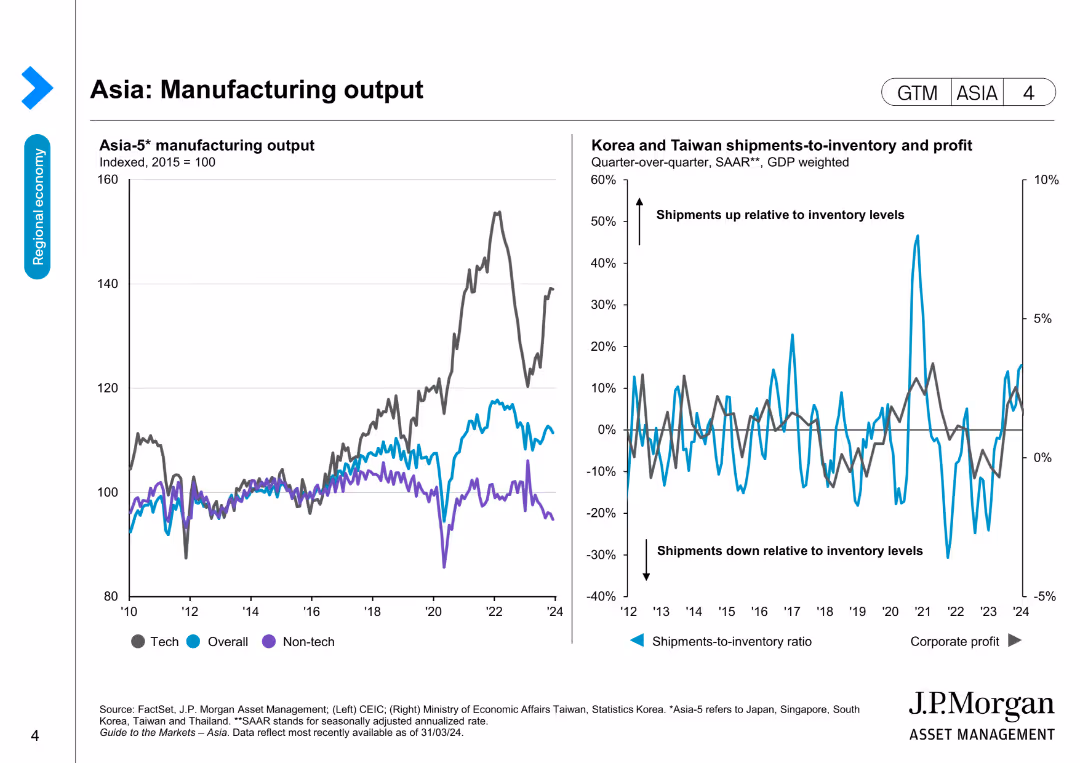
The slide has two line charts: one showing Asia-5 manufacturing output and another comparing shipments-to-inventory ratios and corporate profit for Korea and Taiwan.
Market Analysis and Trends
Industrial & Manufacturing
This slide assesses the manufacturing output in Asia and its correlation with shipments-to-inventory ratios and corporate profits in Korea and Taiwan.
Asia, manufacturing output, shipments, inventory, corporate profit
false
Market Analysis and Trends
Industrial & Manufacturing
Multiple Chart
JP Morgan
Add to my slides
Remove from favorites
Lists key facts about the firm's Asian operations using bullet points and a simple map to indicate locations. The design is straightforward with blue highlights.
Market Analysis and Trends
Professional Services
Provides an overview of Alvarez & Marsal’s presence in Asia, detailing their office locations, years of operation, and team experience. The slide aims to position the firm as a seasoned player in the Asian market with extensive regional expertise.
Asia, market presence, senior team, operational experience, client portfolio
false
Market Analysis and Trends
Professional Services
Header Vertical
Alvarez & Marsal
Add to my slides
Remove from favorites
The slide contains multiple column charts showing Asian GDP growth, FX reserves growth, Asian debt markets, and the capitalization of Chinese banks. It uses a clean layout with blue and grey tones.
Strategic Planning
Financial Services
This slide discusses long-term growth dynamics in Asia despite current market concerns, highlighting key economic indicators such as GDP growth, FX reserves, debt markets, and bank capitalization through various charts.
Asian Growth, GDP, FX Reserves, Debt Markets, Capitalization
false
Strategic Planning
Financial Services
Multiple Chart
Credit Suisse
Add to my slides
Remove from favorites
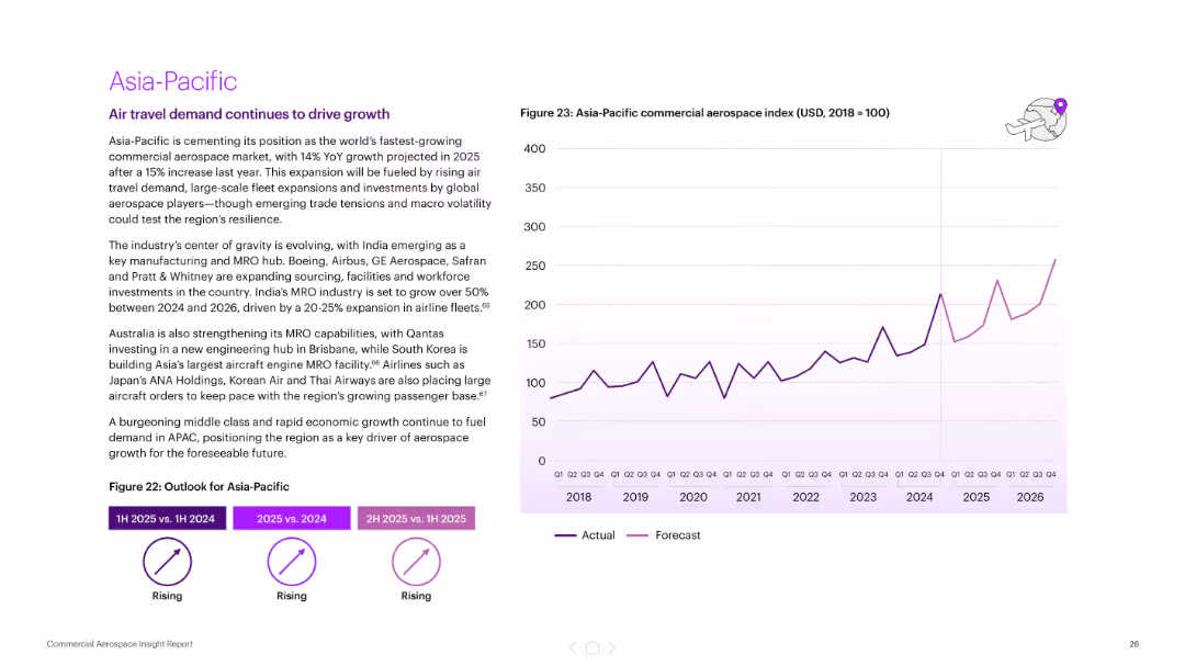
Text on left highlighting growth factors; right shows a rising trend chart of Asia-Pacific aerospace index. Purple chart lines.
Market Analysis and Trends
Industrial & Manufacturing
Projects 14% YoY growth in Asia-Pacific aerospace for 2025. Key factors include high passenger demand, MRO investment, and fleet expansion. India and South Korea are highlighted as emerging aerospace hubs.
Asia-Pacific, aerospace growth, MRO, fleet expansion, India, South Korea, forecast, commercial aviation
false
Market Analysis and Trends
Industrial & Manufacturing
Mixed Chart
Accenture
Add to my slides
Remove from favorites
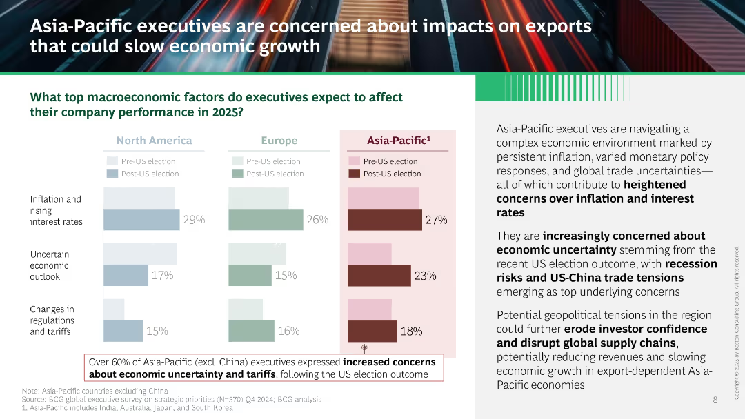
Similar visual structure to Slide 15801. Bar chart compares three regions, with Asia-Pacific data emphasized in dark red. Right panel includes narrative text and boxed note about rising concerns in Asia-Pacific post-US election.
Market Analysis and Trends
Professional Services
Asia-Pacific executives cite inflation, economic uncertainty, and tariffs as top concerns for 2025, worsened by US election results. Slide warns of export-driven slowdown, geopolitical risks, and weakened investor confidence.
Asia-Pacific, inflation, trade tensions, US-China, uncertainty, tariffs, exports, economic growth, geopolitical
false
Market Analysis and Trends
Professional Services
Mixed Chart
BCG
Add to my slides
Remove from favorites
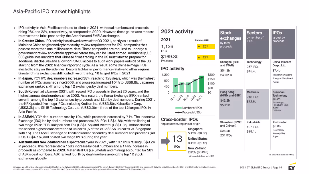
The slide presents multiple column charts, tables, and bullet points, using a green and yellow color scheme to highlight key figures and changes from 2020.
Market Analysis and Trends
Financial Services
Analyzes IPO activities in the Asia-Pacific region for 2021, detailing performance in different countries and sectors, as well as the top exchanges by proceeds.
Asia-Pacific, IPO, 2021 activity, market highlights, stock exchanges, sectors, proceeds, cross-border IPOs, China, Japan
false
Market Analysis and Trends
Financial Services
Mixed Chart
EY
Add to my slides
Remove from favorites
The slide features column charts comparing main and junior market IPO activities, highlighting the performance in Greater China, Japan, Australia, New Zealand, and ASEAN.
Market Analysis and Trends
Financial Services
Analyzes the Asia-Pacific IPO market's performance in 2020, noting increases in both deal numbers and proceeds, with detailed regional breakdowns.
Asia-Pacific, IPO growth, regional analysis, main market, junior market
false
Market Analysis and Trends
Financial Services
Multiple Chart
EY
Add to my slides
Remove from favorites
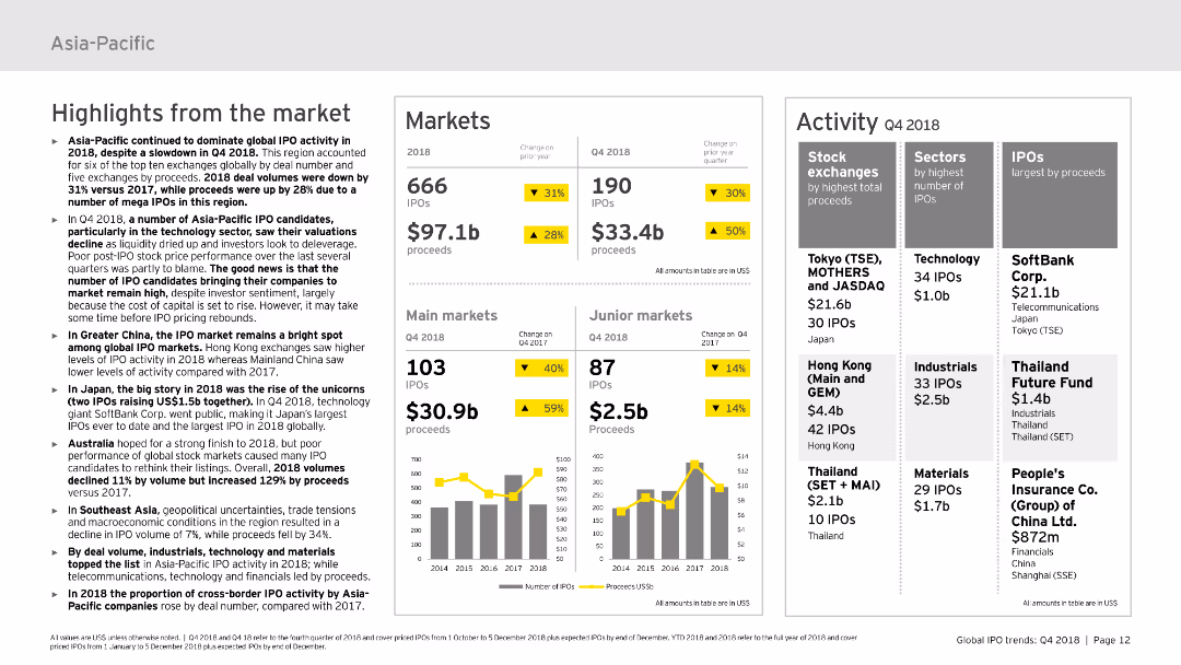
This slide is divided into three main sections: highlights from the market, markets, and activity. It includes various column charts and tables to display the data on IPOs, proceeds, and market activities. The design is moderately complex with a mix of text and visual elements to convey the data effectively.
Market Analysis and Trends
Financial Services
Discusses the IPO market activity in the Asia-Pacific region for 2018, including market performance, highlights, and specific data on different sectors and stock exchanges. It’s useful for understanding regional market dynamics.
Asia-Pacific, IPO, market activity, sectors, stock exchanges
false
Market Analysis and Trends
Financial Services
Multiple Chart
EY
Add to my slides
Remove from favorites
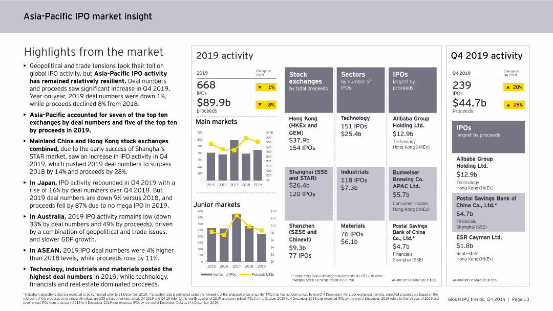
Features column charts, data tables, and bullet points. The slide is visually detailed, focusing on IPO activities and trends in the Asia-Pacific region for 2019.
Market Analysis and Trends
Financial Services
Analyzes IPO market trends in the Asia-Pacific region for 2019, including major stock exchanges, sector performances, and the impact of geopolitical and trade tensions on IPO activities.
Asia-Pacific, IPO, market insight, 2019, trends
false
Market Analysis and Trends
Financial Services
Multiple Chart
EY
Add to my slides
Remove from favorites
The slide presents a combination of column charts and tables, detailing the number of IPOs and proceeds across the Asia-Pacific region. It includes stock exchange data and sector breakdowns.
Market Analysis and Trends
Financial Services
The slide examines the mixed momentum in the Asia-Pacific IPO market, with a focus on the leading growth in Indonesia and Japan. It provides comprehensive data on the number of IPOs, proceeds, and top stock exchanges and sectors.
Asia-Pacific IPOs, regional growth, stock exchanges, sector analysis, financial trends
false
Market Analysis and Trends
Financial Services
Multiple Chart
EY
Add to my slides
Remove from favorites
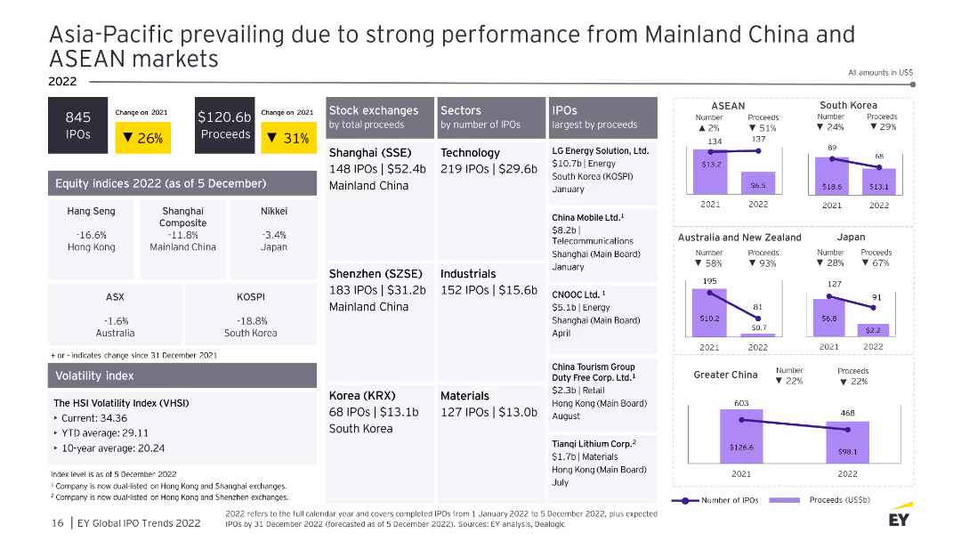
The slide features multiple column charts and data tables showing IPO performance across major Asia-Pacific stock exchanges, sectors, and countries. The visuals are well-organized and detailed.
Market Analysis and Trends
Financial Services
This slide summarizes the IPO market performance in the Asia-Pacific region, highlighting strong performance from Mainland China and ASEAN markets, with detailed breakdowns by stock exchange and sector.
Asia-Pacific, IPO, stock exchange, performance, 2022
false
Market Analysis and Trends
Financial Services
Multiple Chart
EY
Add to my slides
Remove from favorites
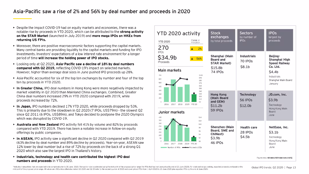
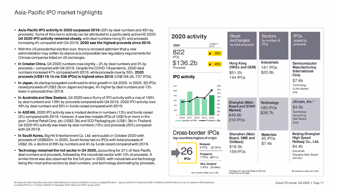
The slide features column charts and bar charts summarizing IPO activity in the Asia-Pacific region, highlighting key stock exchanges and sectors by proceeds.
Market Analysis and Trends
Financial Services
The slide provides an overview of IPO activity in the Asia-Pacific region in 2020, emphasizing key stock exchanges, sectors by proceeds, and cross-border IPOs.
Asia-Pacific, IPO, stock exchanges, sectors, 2020
false
Market Analysis and Trends
Financial Services
Mixed Chart
EY
Add to my slides
Remove from favorites
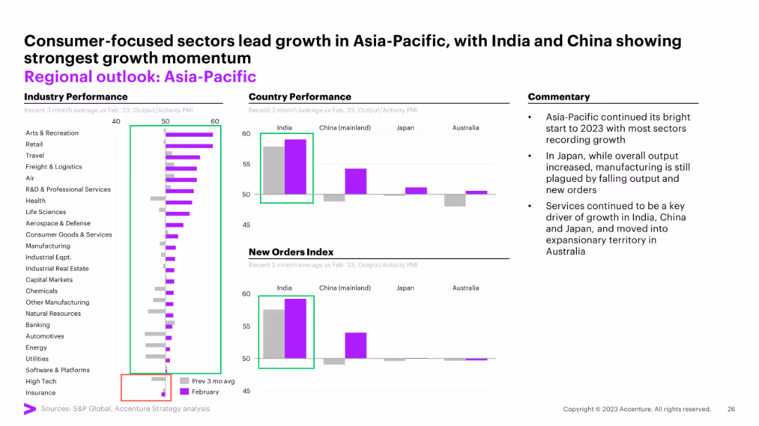
The slide contains two column charts comparing country performance and new orders index for India, China, Japan, and Australia. There is a commentary section with three bullet points on the right.
Market Analysis and Trends
Financial Services
The slide shows India's strong growth momentum within Asia-Pacific, China's stable growth, and Australia's contraction.
Asia-Pacific, performance, growth, India, China, Japan, Australia, new orders, PMI
false
Market Analysis and Trends
Financial Services
Multiple Chart
Accenture
Add to my slides
Remove from favorites
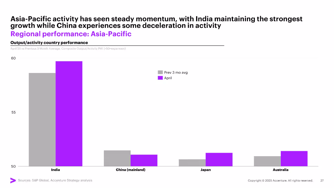
Bar chart showing April activity vs 3-month average PMI for India, China, Japan, and Australia; consistent color scheme; clean layout.
Performance Metrics and KPIs
Industrial & Manufacturing
This slide reviews recent business activity in the Asia-Pacific region. India leads with strong performance, while China shows signs of deceleration. It provides insight into which regional markets are showing momentum and which are softening.
Asia-Pacific, PMI, India growth, China slowdown, regional comparison, business activity
false
Performance Metrics and KPIs
Industrial & Manufacturing
Single Chart
Accenture
Add to my slides
Remove from favorites
Column charts for industry performance, country performance, and new orders index
Market Analysis and Trends
Financial Services
The slide analyzes the performance of the Asia-Pacific region, highlighting consumer-focused sectors and growth momentum.
Asia-Pacific, regional outlook, industry performance, growth momentum, new orders
false
Market Analysis and Trends
Financial Services
Multiple Chart
Accenture
Add to my slides
Remove from favorites
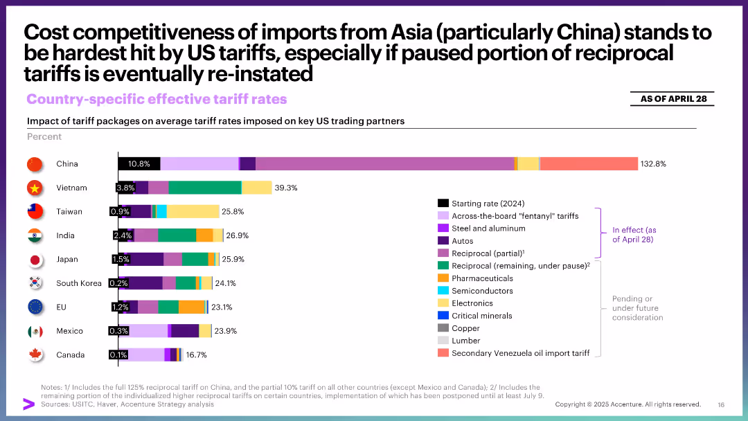
Bar chart with color-coded segments showing total effective tariff rate by country. Categories marked by implementation status.
Pricing Strategies
Industrial & Manufacturing
This slide compares the impact of tariff packages on key US trade partners, especially Asian economies. China faces the most severe rate increases, with potential reinstatement of paused measures likely to intensify effects.
Asia trade, tariffs, pricing, China, competitiveness, imports, implementation, policy impact
false
Pricing Strategies
Industrial & Manufacturing
Single Chart
Accenture
Add to my slides
Remove from favorites
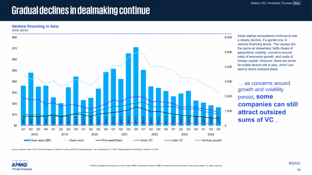
Bar chart (deal value) with multi-line overlays (deal count, pre-seed, early VC, later VC, venture growth). Text box at right provides analysis and contextual interpretation.
Market Analysis and Trends
Financial Services
Highlights sustained decline in venture dealmaking across Asia from 2018 to Q3 2024. Despite headwinds like geopolitical volatility and foreign capital costs, some companies still attract large investments.
Asia, VC Trends, Early Stage, Later VC, Venture Growth, Deal Count, 2024 Q3
false
Market Analysis and Trends
Financial Services
Mixed Chart
KPMG
Add to my slides
Remove from favorites
The slide features a column chart comparing U/HNW wealth pool growth between APAC and the rest of the world. Additional metrics show the significant share of client wallet held by top firms in the region, with supporting bullet points on key trends.
Market Analysis and Trends
Financial Services
The slide projects substantial wealth growth in Asia, with top firms capturing a large share of client wallets. It highlights the trends driving this growth, including the rise of first and second-generation entrepreneurs and the increasing management of wealth pools by top players.
Asia, wealth growth, client wallet, top players, market trends
false
Market Analysis and Trends
Financial Services
Multiple Chart
Credit Suisse
Add to my slides
Remove from favorites
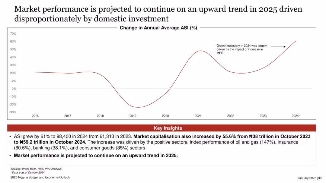
Line graph showing % change in ASI from 2016 to 2024 with a projected increase; red insights box at bottom.
Financial Performance
Financial Services
Nigeria's All Share Index (ASI) rose significantly in 2024 driven by domestic investments, with projections of continued growth in 2025. Sectors like oil & gas, insurance, and banking were major contributors to this performance.
ASI, stock market, Nigeria, 2025, domestic investment, capital market, market cap, sector performance, MPR
false
Financial Performance
Financial Services
Mixed Chart
PwC/Strategy&
Add to my slides
Remove from favorites
Slide presents a quadrant layout with icons and brief text blocks highlighting aspirations in customer experience, business model, IT, and profitability.
Strategic Planning
Financial Services
Sets forth the aspirational goals for various aspects of the banking business, providing a strategic overview. It’s suitable for discussions on aligning business objectives with technology and customer expectations.
Aspirational Goals, Strategy, Digital Business, Customer Experience, IT Efficiency, Profitability, NPS
false
Strategic Planning
Financial Services
Pillar
Morgan Stanley
Add to my slides
Remove from favorites
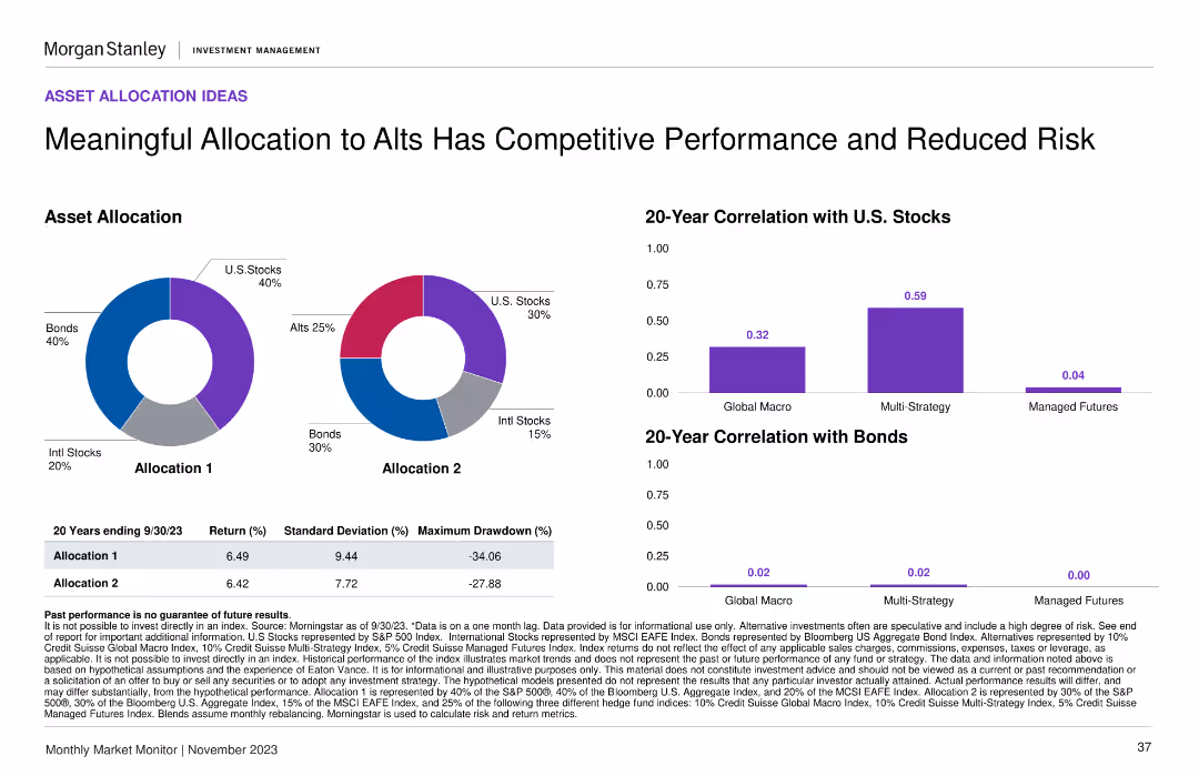
Two pie charts showing asset allocation models, alongside two column charts comparing 20-year correlations with U.S. stocks and bonds.
Investment Analysis
Financial Services
This slide presents different asset allocation models and their long-term performance correlations with U.S. stocks and bonds, highlighting the benefits of alternative investments.
asset allocation, alternative investments, performance, risk, correlation
false
Investment Analysis
Financial Services
Multiple Chart
Morgan Stanley
Add to my slides
Remove from favorites
This slide features two pie charts illustrating different asset allocation strategies and a set of bar charts depicting their correlation with stocks and bonds.
Strategic Planning
Financial Services
Showcases alternative asset allocation models that balance performance with risk, pivotal for formulating a resilient investment strategy.
asset allocation, alternative investments, performance, risk management, pie charts, correlation analysis, strategy development
false
Strategic Planning
Financial Services
Multiple Chart
Morgan Stanley
Add to my slides
Remove from favorites
Pie charts comparing asset allocation scenarios, tables with performance metrics.
Strategic Planning
Financial Services
Demonstrates how alternative assets can impact performance and risk, aiding strategic asset allocation.
Asset Allocation, Alternatives, Performance, Risk, Pie Charts, Tables, Strategic Planning, Morgan Stanley, Market Monitor
false
Strategic Planning
Financial Services
Multiple Chart
Morgan Stanley
Add to my slides
Remove from favorites
Grid layout with asset classes on the left, sentiment indicators in the center, and commentary on the right
Strategic Planning
Financial Services
Presents tactical asset allocation views from Morgan Stanley's Portfolio Solutions Group. It categorizes various asset types (e.g., Bonds, Equities, Alternatives) by current and previous allocation views with explanations for shifts in positioning and macroeconomic context.
asset allocation, bonds, equities, alternatives, duration, credit, commentary, portfolio strategy, macro outlook
false
Strategic Planning
Financial Services
Table
Morgan Stanley
Add to my slides
Remove from favorites
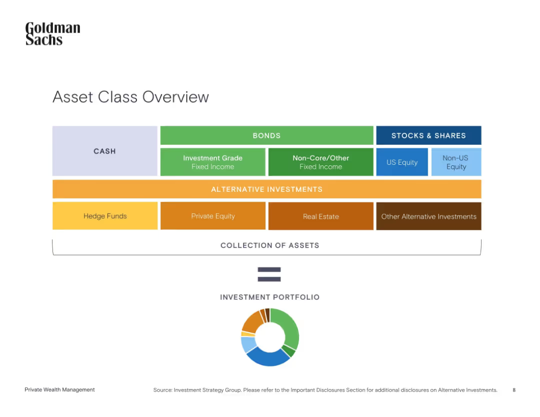
Clean horizontal layout of colored boxes grouped by asset class with a circular diagram below summarizing asset types.
Strategic Planning
Financial Services
This slide categorizes different types of investment assets into groups like cash, bonds, stocks, and alternative investments. It demonstrates how these components form a diversified investment portfolio and shows the visual balance via a pie chart.
asset allocation, cash, bonds, equities, alternatives, portfolio, diversification, investment strategy, Goldman Sachs
false
Strategic Planning
Financial Services
Single Chart
Goldman Sachs
Add to my slides
Remove from favorites
The slide presents two side-by-side column charts, showing current and potential future portfolio distributions. Categories such as 'Grade A Office' and 'Logistics' are color-coded. There are descriptive boxes with percentages, arrows indicating the transition from the current to the future state, and a disclaimer at the bottom left corner.
Investment Analysis
Real Estate & Construction
Shows a real estate investment fund's strategic asset allocation plan, indicating divestments and developments, aimed at portfolio enhancement over the coming years.
Asset Allocation, Divestments, Real Estate Investment, Portfolio Enhancement, Strategic Development, Financial Planning
false
Investment Analysis
Real Estate & Construction
Single Chart
Morgan Stanley
Add to my slides
Remove from favorites
A hexagon-shaped diagram in the center connected to multiple client types like Pensions, Insurers, etc. It uses shades of blue and has a balanced distribution of text and graphic elements.
Financial Performance
Financial Services
The slide illustrates the firm's capabilities in providing holistic solutions through asset allocation, market views, and risk management, targeting various institutional client types.
Asset Allocation, Holistic, Solutions, Management
false
Financial Performance
Financial Services
Framework
Goldman Sachs
Add to my slides
Remove from favorites
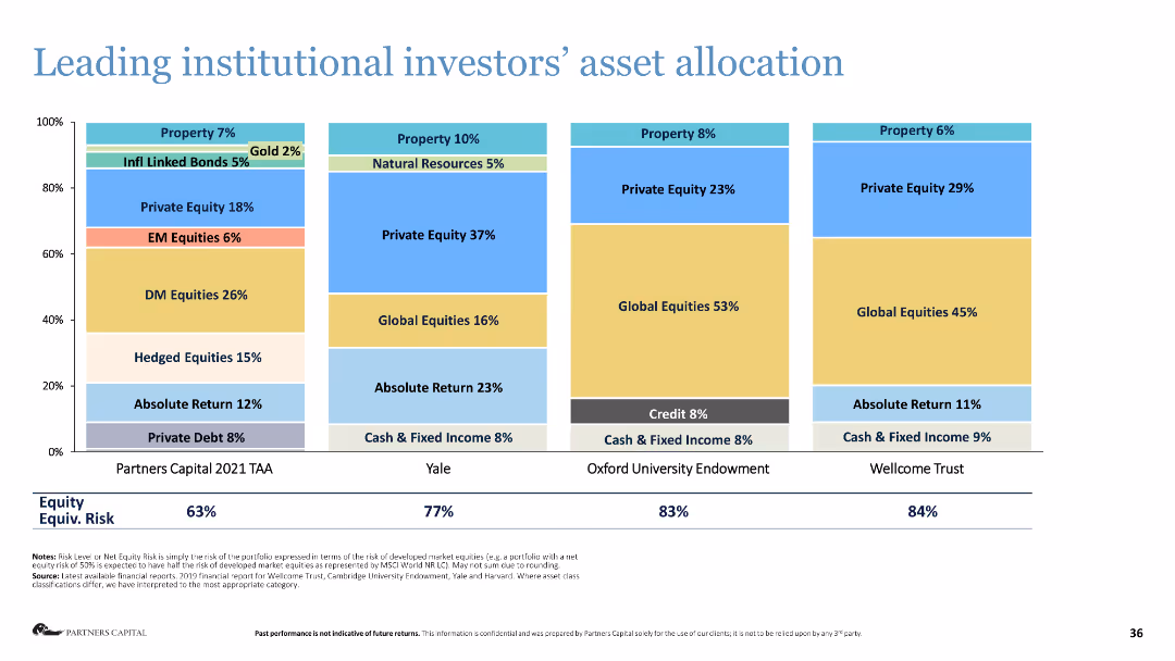
Stacked bar chart showing the asset allocation of leading institutional investors.
Investment Analysis
Financial Services
The slide presents the asset allocation strategies of major institutional investors, highlighting their investment preferences.
asset allocation, institutional investors, investment strategy, financial analysis, equities
false
Investment Analysis
Financial Services
Single Chart
Deloitte
Add to my slides
Remove from favorites
Pie charts showing strategic asset allocation recommendations by Morgan Stanley's Global Investment Committee.
Strategic Planning
Financial Services
Provides asset allocation advice based on investor risk tolerance and net worth, with detailed recommendations.
Asset allocation, investment, strategy
false
Strategic Planning
Financial Services
Multiple Chart
Morgan Stanley
Add to my slides
Remove from favorites
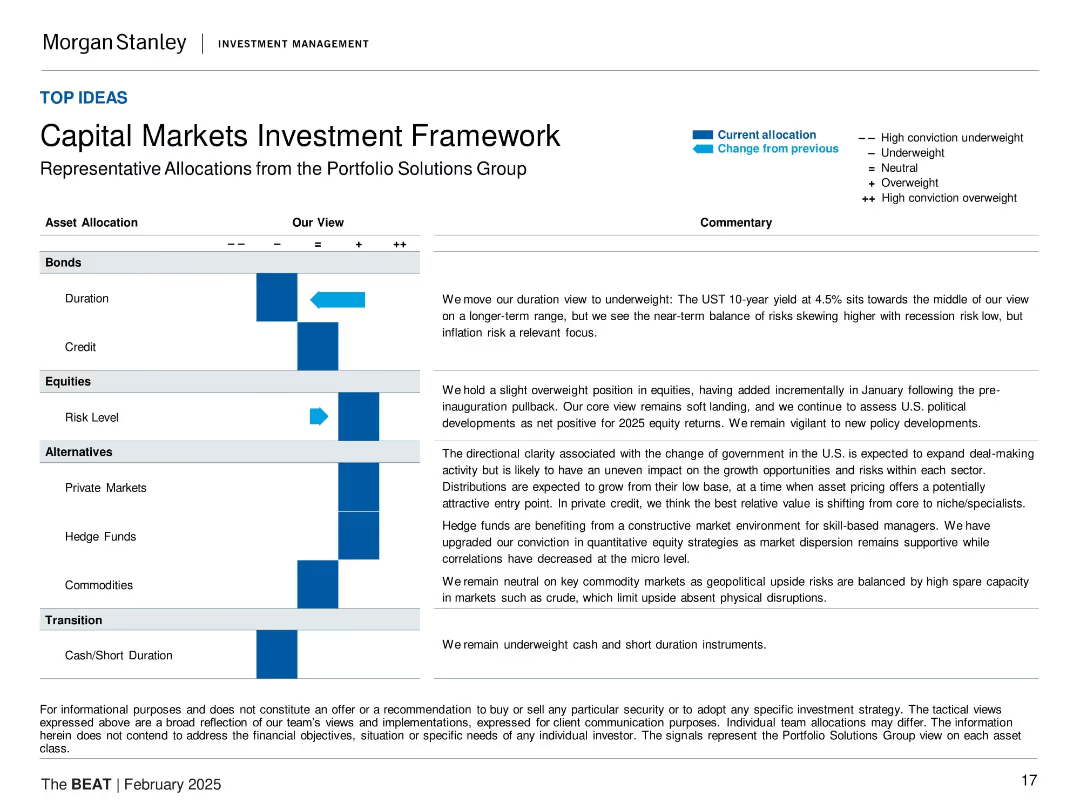
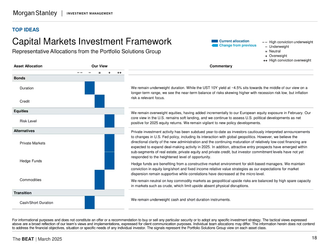
Matrix table layout with asset categories on the left, conviction scale (+/−), and commentaries on the right. Blue arrows show change in allocation. Each segment (Bonds, Equities, Alternatives, Transition) is discussed with corresponding text.
Strategic Planning
Financial Services
This slide outlines Morgan Stanley’s current capital markets positioning by asset class. It shows a tilt toward equities and private markets, with underweights in bonds and cash. Commentary addresses macro conditions such as recession risk, inflation, and geopolitical developments.
asset allocation, investment strategy, capital markets, equities, private markets, fixed income, alternatives, inflation risk, geopolitics
false
Strategic Planning
Financial Services
Table
Morgan Stanley
Add to my slides
Remove from favorites
Two pie charts showing asset allocation changes between 2019 and 2020, accompanied by a list of offered solutions.
Risk Assessment and Management
Financial Services
Depicts how asset allocation in UHNW RM book is expected to change due to negative interest rates, with a projected margin uplift of +20bps.
Asset allocation, negative interest rates, UHNW, RM book, solutions
false
Risk Assessment and Management
Financial Services
Multiple Chart
Credit Suisse
Add to my slides
Remove from favorites
The slide is divided into upper and lower sections with colorful tables displaying annual return percentages across different asset classes, highlighting higher and lower performances from 2013 to YTD.
Investment Analysis
Financial Services
This retrospective analysis of annual returns across asset classes aids investors in understanding historical performance trends for strategic planning.
Asset class analysis, annual returns, historical performance, financial trends, strategic planning, investment review
false
Investment Analysis
Financial Services
Table
Morgan Stanley
Add to my slides
Remove from favorites
Composed of a colorful performance matrix, this slide visually distinguishes annual returns across various asset classes over multiple years for quick analysis.
Investment Analysis
Financial Services
Ideal for identifying historical performance trends, this data-driven slide allows investors to discern patterns and outliers in asset class returns over an extended period, aiding long-term strategic investment planning.
Asset Class, Annual Returns, Performance Trends, Data Matrix, Long-term Analysis, Color-Coded, Financial Planning
false
Investment Analysis
Financial Services
Table
Morgan Stanley
Add to my slides
Remove from favorites
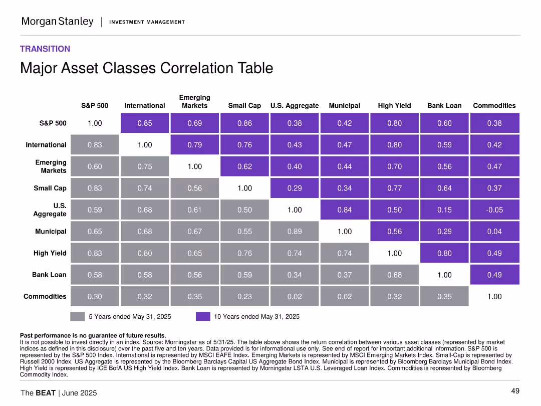
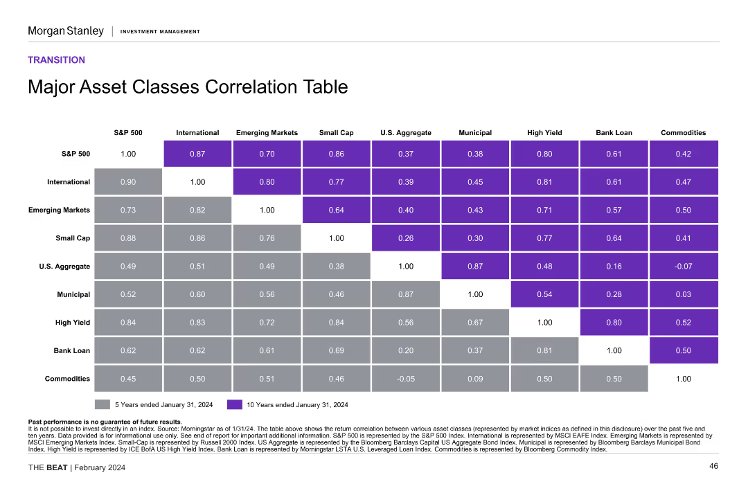
Matrix-style table of 5-year and 10-year correlations among asset classes with color-coding for correlation strength.
Investment Analysis
Financial Services
This slide presents a correlation matrix across major asset classes, revealing diversification benefits and co-movement trends. It shows strong correlations among equities and weaker ties to commodities, helping to inform portfolio construction and risk mitigation.
asset class correlation, portfolio construction, diversification, equities, fixed income, commodities
false
Investment Analysis
Financial Services
Table
Morgan Stanley
Add to my slides
Remove from favorites
A correlation table showing the return correlation between various asset classes over 5 and 10 years. The design uses color-coding for clarity.
Financial Performance
Financial Services
This slide provides a correlation matrix for major asset classes, helping in understanding their performance relationships over time, useful for portfolio diversification strategies.
asset classes, correlation, return, performance, portfolio diversification
false
Financial Performance
Financial Services
Table
Morgan Stanley
Add to my slides
Remove from favorites
Table showing correlation values between asset classes over 5 and 10 years.
Risk Assessment and Management
Financial Services
Provides asset class correlation data for portfolio risk management and investment strategy.
Asset Classes, Correlation, Risk Management, Portfolio, Table, Investment Strategy, Data, Morgan Stanley, Market Monitor
false
Risk Assessment and Management
Financial Services
Table
Morgan Stanley
Add to my slides
Remove from favorites
The slide presents a correlation table with color-coded cells, comparing major asset classes over 5 and 10-year periods.
Financial Performance
Financial Services
It shows the correlation between different major asset classes over five and ten years, helping to understand their interrelationships.
asset classes, correlation table, financial performance, 5-year, 10-year
false
Financial Performance
Financial Services
Table
Morgan Stanley
Add to my slides
Remove from favorites
A correlation table showing the relationships between various asset classes such as S&P 500, International, Emerging Markets, Small Cap, U.S. Aggregate, Municipal, High Yield, Bank Loan, and Commodities over 5 and 10 year periods.
Investment Analysis
Financial Services
Presents the correlation between major asset classes over 5 and 10 years, providing insights into diversification benefits and investment strategy. Useful for portfolio management and risk assessment.
asset classes, correlation table, investment analysis, diversification, portfolio management
false
Investment Analysis
Financial Services
Table
Morgan Stanley
Add to my slides
Remove from favorites
Pie charts and text outlining asset class split, investment strategies, and medium-term priorities.
Strategic Planning
Financial Services
It discusses AM's strategic positioning and priorities, including asset class diversification and growth market strategies.
asset classes, investment strategies, AM, growth markets, diversification
false
Strategic Planning
Financial Services
Multiple Chart
UBS
Add to my slides
Remove from favorites
Contains a heat map to represent asset class performance from 2013 to the current year. It uses color coding to depict returns, with red indicating lower returns and green indicating higher returns. The layout is a complex grid with numerous data points for comparison.
Investment Analysis
Financial Services
Providing a yearly performance comparison of various asset classes, this slide serves as a tool for investors or financial advisors to assess historical returns. It visually distinguishes between high and low performers, facilitating strategic investment decisions based on past market behavior.
Asset Classes, Performance, Heat Map, Returns, Analysis
false
Investment Analysis
Financial Services
Table
Morgan Stanley
Add to my slides
Remove from favorites
Heat map with assorted colors indicating asset class performance over years. Text-heavy, small font size.
Market Analysis and Trends
Financial Services
Historical performance comparison of asset classes, useful for trend analysis and portfolio diversification.
Asset Classes, Performance, Heat Map, Trends, Diversification, Historical Data, Morgan Stanley, Market Monitor
false
Market Analysis and Trends
Financial Services
Table
Morgan Stanley
Add to my slides
Remove from favorites
A complex, color-coded heatmap matrix displays asset class performance over a decade. The spectrum from higher to lower returns is visually delineated by color intensity.
Market Analysis and Trends
Financial Services
The slide offers a comparative return analysis across different asset classes over multiple years, showcasing performance trends which are critical for strategic asset allocation.
asset classes, return analysis, performance trends, heatmap, strategic allocation, decade comparison, financial strategy
false
Market Analysis and Trends
Financial Services
Table
Morgan Stanley
Add to my slides
Remove from favorites
Color-coded table showing asset class returns, sortable by year. Dense with data.
Market Analysis and Trends
Financial Services
Overview of asset class returns over years, useful for historical performance analysis and strategy development.
Asset Classes, Returns, Color-coded Table, Historical Performance, Strategy Development, Dense Data, Morgan Stanley, Market Monitor
false
Market Analysis and Trends
Financial Services
Table
Morgan Stanley
Add to my slides
Remove from favorites
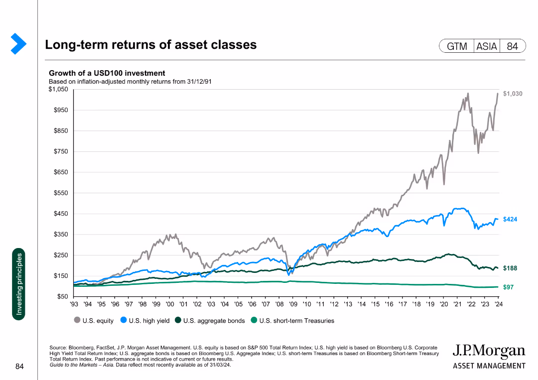
Line chart showing the growth of a USD100 investment in various asset classes, adjusted for inflation, from 1993 to 2024.
Investment Analysis
Financial Services
This slide presents the long-term returns of different asset classes, illustrating the growth of a USD100 investment over time across various asset categories.
asset classes, returns, investment, inflation, growth
false
Investment Analysis
Financial Services
Single Chart
JP Morgan
Add to my slides
Remove from favorites
Column chart indicating "Spread Percentile" for various asset classes across three different time points: December 2021, 2022, and 2023. Each asset class is represented by a column with three bars corresponding to the respective time points.
Investment Analysis
Financial Services
Slide provides an investment perspective by comparing the tightness of spreads for various asset classes over the last three years. Used to assess market changes and investment strategy formulation.
asset classes, spreads, investment, comparison
false
Investment Analysis
Financial Services
Single Chart
Morgan Stanley
Add to my slides
Remove from favorites
Features a heat map table categorizing various asset classes and their respective returns over the years, color-coded to indicate performance levels.
Investment Analysis
Financial Services
The slide breaks down historical returns by asset class, serving as a tool for retrospective analysis and guiding future investment decisions based on past performance.
asset class, return analysis, heat map, historical data, investment, performance
false
Investment Analysis
Financial Services
Table
Morgan Stanley
Add to my slides
Remove from favorites
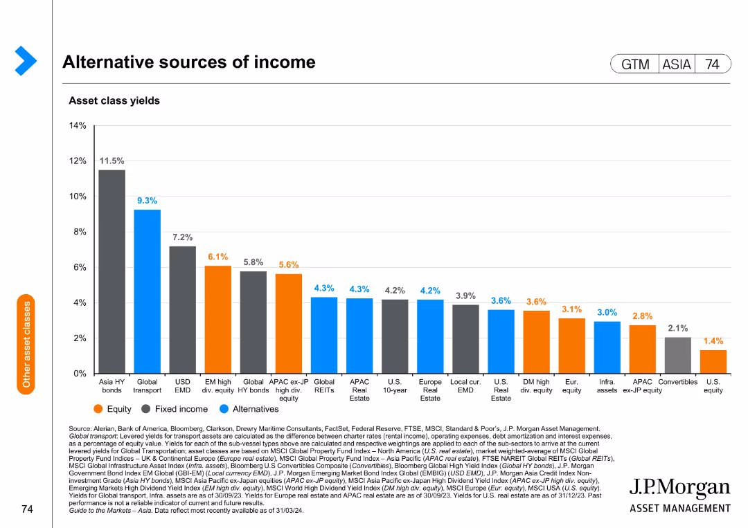
This slide includes a bar chart depicting asset class yields for equity, fixed income, and alternative investments, with yield percentages on the y-axis.
Investment Analysis
Financial Services
The slide compares different asset classes in terms of yield, providing insights into potential income sources for diversified investment portfolios.
asset class yields, income sources, investment, equity, fixed income
false
Investment Analysis
Financial Services
Single Chart
JP Morgan
Add to my slides
Remove from favorites
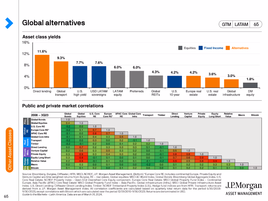
The slide features a column chart depicting asset class yields and a table showing public and private market correlations. It is moderately complex.
Market Analysis and Trends
Financial Services
The slide presents yields across various asset classes and correlations between public and private markets. It is used to analyze investment performance in global alternatives.
asset class yields, market correlations, equities, fixed income, alternatives, global investment, financial analysis, performance trends
false
Market Analysis and Trends
Financial Services
Multiple Chart
JP Morgan
Add to my slides
Remove from favorites
The slide features a column chart showing the asset composition of the non-core unit, divided into various categories, and highlights key metrics and risk distribution.
Market Analysis and Trends
Financial Services
This slide analyzes the composition of a non-core unit, showing risk-weighted assets and leverage exposure along with key metrics such as asset types and their impact on the group.
asset composition, non-core unit, financial risk, investment bank, leverage exposure
false
Market Analysis and Trends
Financial Services
Multiple Chart
Credit Suisse
Add to my slides
Remove from favorites
The slide presents a correlation table for major asset classes, showing 5-year and 10-year correlations between different indices. The table uses different shades to represent correlation values, enhancing visual clarity.
Risk Assessment and Management
Financial Services
This slide provides a comprehensive correlation analysis of major asset classes over 5-year and 10-year periods, useful for risk assessment and portfolio diversification strategies by highlighting the interrelationships between various asset classes.
asset correlation, major asset classes, risk assessment, financial analysis, portfolio diversification, correlation analysis
false
Risk Assessment and Management
Financial Services
Table
Morgan Stanley
Add to my slides
Remove from favorites
The slide includes a line chart illustrating 'The asset creation journey' across development, construction, and operational phases, and a side image with a caption describing the 'Murra Warra wind farm' case study.
Strategic Planning
Energy & Utilities
It explains the stages of asset creation for energy projects, complemented by a case study of the Murra Warra wind farm. Aimed at conveying project development timelines and investment growth potential.
Asset Creation, Energy Projects, Development, Case Study, Investment Growth
false
Strategic Planning
Energy & Utilities
Linear Flow
Morgan Stanley
Add to my slides
Remove from favorites
The slide contains pie charts showing the distribution of assets within the firm across different channels, using shades of blue and text annotations.
Operational Efficiency
Financial Services
Meant to illustrate how a firm manages and distributes its assets, highlighting the operational structure of asset management and wealth management.
Asset Distribution, Operational Structure, Asset Management, Wealth Management, Fee-Earning, Total Assets
false
Operational Efficiency
Financial Services
Multiple Chart
Goldman Sachs
Add to my slides
Remove from favorites
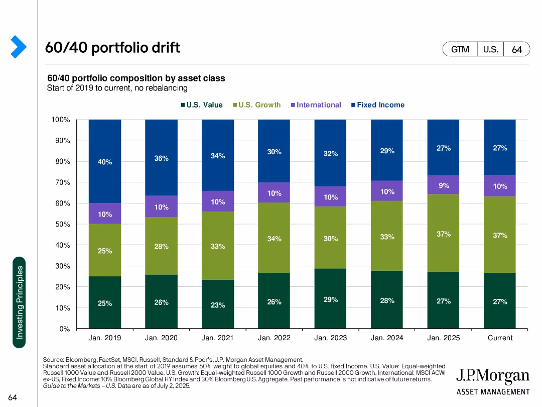
Stacked bar chart over time showing evolving composition of a 60/40 portfolio without rebalancing
Strategic Planning
Financial Services
Visualizes how a 60/40 portfolio's asset composition has shifted from 2019 to 2025 due to market movements without rebalancing. Highlights growth of U.S. Growth equity share.
asset drift, 60/40 portfolio, rebalancing, portfolio composition, U.S. growth, fixed income, equity allocation
false
Strategic Planning
Financial Services
Single Chart
JP Morgan
Add to my slides
Remove from favorites
It contains a column chart and a dot matrix grid comparing asset flows across different products and channels, utilizing a diverse color code for quick visual differentiation.
Market Analysis and Trends
Financial Services
The slide compares total client asset flows by asset class, product, and region, showing a diversified financial platform's power and market position through clear data visualization.
Asset Flows, Diversification, Financial Platform, Market Position, Comparison, Asset Class, Products, Region, Channels
false
Market Analysis and Trends
Financial Services
Mixed Chart
JP Morgan
Add to my slides
Remove from favorites
Features a column chart depicting JPMC's total client asset flows over time with an accompanying dot matrix that breaks down asset class by product, channel, and region. Another section compares 5-year total client asset flows against peers.
Market Analysis and Trends
Financial Services
Analyzes JPMC's diversified platform, showcasing robust asset flow growth across various classes and markets over a decade, comparing favorably with industry peers in market share.
asset flows, diversification, financial services, JPMC, market analysis, investment, regional distribution, product breakdown
false
Market Analysis and Trends
Financial Services
Multiple Chart
JP Morgan
Add to my slides
Remove from favorites
This slide has two sections showing bar graphs of firmwide AUS growth and a ranking chart for organic growth, all depicted in shades of blue.
Client Case Studies
Financial Services
Illustrates the growth in assets under supervision and compares organic growth rates among top public asset managers.
Asset Growth, AUS, Organic Growth, Rankings, Client Relationships, Asset Managers
false
Client Case Studies
Financial Services
Multiple Chart
Goldman Sachs
Add to my slides
Remove from favorites
Two column charts: Left chart illustrates asset growth in billions from Q4 2019 to Q1 2022. Right chart shows bank assets as a percentage of firmwide assets from Q4 2019 to Q1 2022. A box lists key growth drivers. The footer includes strategic statements about asset utilization.
Financial Performance
Financial Services
This slide compares the growth of assets over time and the allocation of assets within bank entities, highlighting key drivers such as financing activities and liquidity. The focus is on strategic asset growth and bank support for client activities.
asset growth, financing activities, liquidity, bank entities, strategic placement, column chart
false
Financial Performance
Financial Services
Multiple Chart
Goldman Sachs
Add to my slides
Remove from favorites
The slide displays column charts in varying shades of blue, showcasing asset growth over time with annotations. Arrows are used to indicate trends and future projections.
Financial Performance
Financial Services
This slide presents asset growth data and projections for future growth, illustrating traditional and alternative net inflows, with the ultimate goal of reaching a projected AUS of approximately $2.2 trillion.
Asset, Growth, Inflows, Projections, Financial
false
Financial Performance
Financial Services
Single Chart
Goldman Sachs
Add to my slides
Remove from favorites
Features column chart and a checklist of key highlights. The charts depict the strategic asset growth in bank entities over several years, showing a trend of increasing asset percentages. The slide uses a clear, simple layout for the display of quantitative growth data.
Strategic Planning
Financial Services
This slide illustrates the strategic growth of assets within bank entities over time, highlighting the firm's objectives such as diversifying business and optimizing capital position. This slide is typically used in strategic planning sessions to discuss growth objectives and performance against benchmarks.
Asset Growth, Strategic Planning, Bank Entities, Performance, Capital Optimization
false
Strategic Planning
Financial Services
Mixed Chart
Goldman Sachs
Add to my slides
Remove from favorites
A single, large pie chart divided into segments representing different asset classes, supplemented by a side list detailing the types of investments within each class, set against a white and blue backdrop.
Financial Performance
Financial Services
This slide positions the firm among the top 5 alternative asset managers, breaking down their $320bn in alternative assets by type and emphasizing their full asset class capabilities.
Asset Management, Alternatives, Ranking, Capabilities
false
Financial Performance
Financial Services
Single Chart
Goldman Sachs
Add to my slides
Remove from favorites
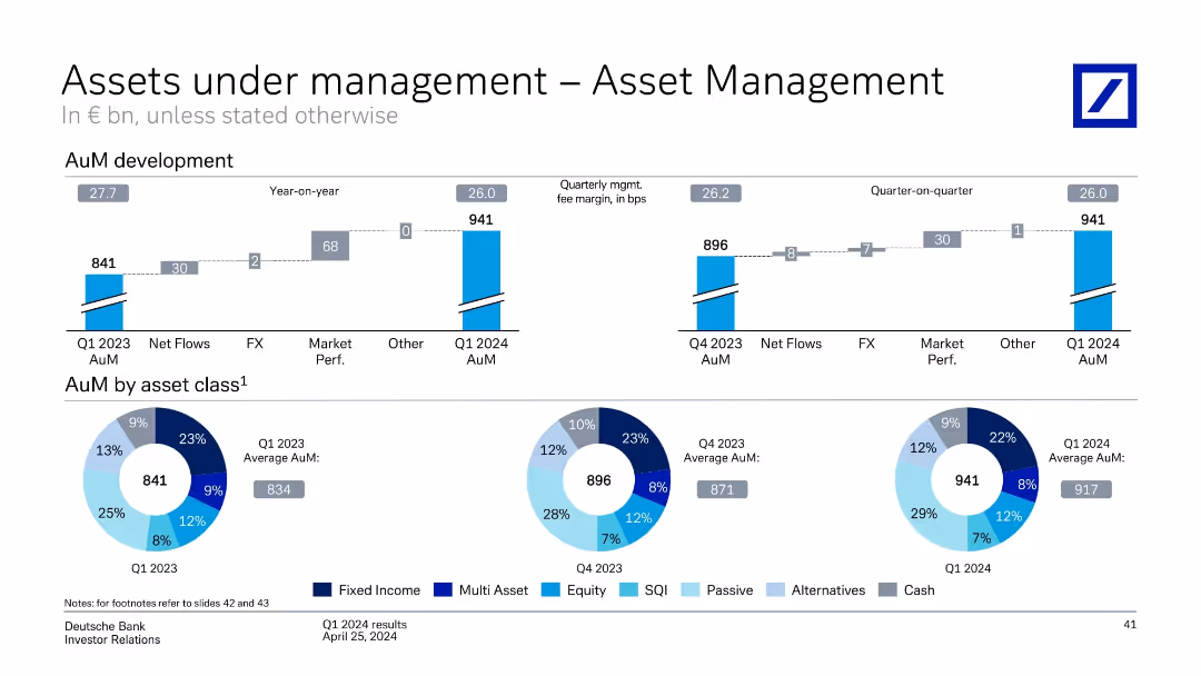
Horizontal bar charts and pie charts showing AuM development and distribution by asset class. Yearly and quarterly comparisons shown.
Financial Performance
Financial Services
The slide presents AuM development for Asset Management, noting year-over-year growth from €841bn to €941bn. It includes asset allocation breakdown (e.g., equity, passive, fixed income) and changes from Q1 2023 to Q1 2024.
Asset Management, AuM, Asset Allocation, Equity, Passive, Fixed Income, Net Flows, Market Performance
false
Financial Performance
Financial Services
Multiple Chart
Deutsche Bank
Add to my slides
Remove from favorites
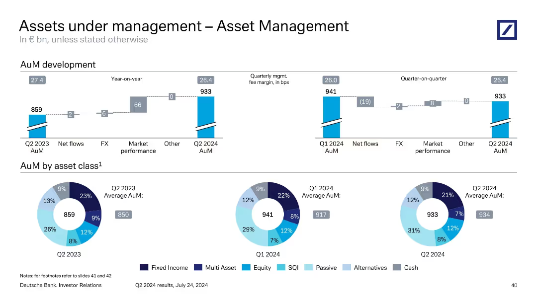
Mixed layout: stacked bar showing year-on-year AuM movement; pie charts show asset class composition across three periods.
Performance Metrics and KPIs
Financial Services
This slide shows the development of Asset Management’s AuM, which grew from €859bn in Q2 2023 to €933bn in Q2 2024. It identifies key drivers such as market performance and FX. The asset composition is visualized by class, with noticeable growth in passive and SQI categories, reflecting investor preference shifts.
asset management, AuM, asset classes, FX impact, market performance
false
Performance Metrics and KPIs
Financial Services
Multiple Chart
Deutsche Bank
Add to my slides
Remove from favorites
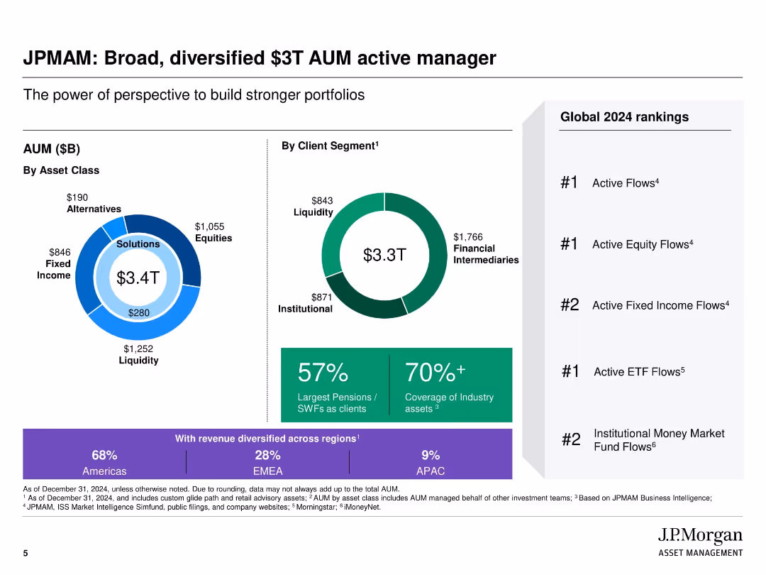
Visually segmented slide with donut and pie charts showing AUM by asset class and client segment; right column with global rankings
Industry Overview
Financial Services
The slide highlights J.P. Morgan Asset Management's diversified $3T AUM, showcasing asset class distribution, client segments, and geographic revenue split. It emphasizes leadership in global rankings across multiple fund flow categories and the firm's wide industry asset coverage.
Asset management, AUM, client segmentation, fund flows, industry leadership, global rankings, J.P. Morgan, diversified portfolio
false
Industry Overview
Financial Services
Multiple Chart
JP Morgan
Add to my slides
Remove from favorites
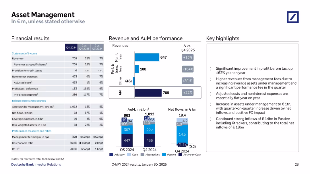
Structured with financial tables, stacked bar charts for AuM & net flows, and performance highlights
Financial Performance
Financial Services
The Asset Management division reported a 22% YoY increase in revenue, driven by strong net inflows and higher management and performance fees. Assets under management reached €1,012bn with inflows of €18.4bn. Adjusted costs remained flat, and profit before tax rose by 162% YoY.
Asset Management, AuM, Net Flows, Fees, Profit, Expenses, Inflows
false
Financial Performance
Financial Services
Multiple Chart
Deutsche Bank
Add to my slides
Remove from favorites
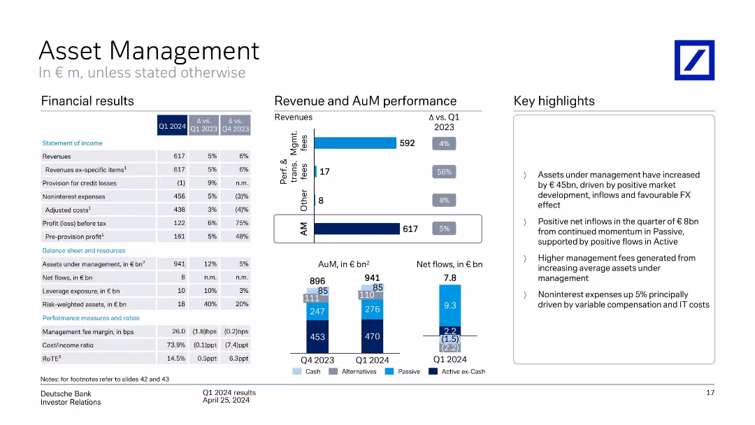
Financial table on left, revenue/AuM bar charts in center, highlights on right
Financial Performance
Financial Services
Asset Management unit posted growth in assets under management and revenues in Q1 2024. Highlights include favorable FX, passive inflows, and higher fees. Expenses rose due to compensation and IT costs.
asset management, AuM, net flows, passive investment, revenue, FX
false
Financial Performance
Financial Services
Multiple Chart
Deutsche Bank
Add to my slides
Remove from favorites
The slide includes large numerical data, icons representing different segments of the asset management division, and a background image of industrial equipment.
Investment Analysis
Financial Services
Details the financial performance and asset management capabilities of Macquarie, including FY19 net profit and assets under management, relevant for investment analysis and company profiling.
asset management, AUM, net profit, investment, MIRA, MIM, performance
false
Investment Analysis
Financial Services
Mixed Chart
Goldman Sachs
Add to my slides
Remove from favorites
Features tables and pie charts depicting assets under supervision, broken down by asset class and client channel. The design incorporates varying shades of blue and text annotations for clarity.
Investment Analysis
Financial Services
Analyzes assets under supervision, illustrating the distribution across different classes and client channels. It provides insights into asset management trends and client preferences, relevant for investors and financial consultants.
Asset Management, AUS, Client Channels, Investment
false
Investment Analysis
Financial Services
Multiple Chart
Goldman Sachs
Add to my slides
Remove from favorites
A slide of moderate visual complexity featuring a multilevel diagram that illustrates the progression and capabilities of maintenance management systems from the 1980s to the 2010s. It integrates icons and text to delineate the functionalities of CMMS, EAM, and APM.
Technology and Digital Transformation
Industrial & Manufacturing
This slide provides an overview of Asset Management solutions, showcasing the functionalities and capabilities of CMMS, EAM, and APM systems. It emphasizes how Asset Performance Management (APM) has emerged to optimize the trade-off between asset availability and utilization, and outlines the benefits of integrating these systems into enterprise IT platforms.
Asset Management, CMMS, EAM, APM, System functionalities, Capability evolution
false
Technology and Digital Transformation
Industrial & Manufacturing
Vertical Flow
LEK
Add to my slides
Remove from favorites
Mix of pie charts, circular diagrams, and ample descriptive texts.
Financial Performance
Financial Services
A comprehensive financial summary detailing asset supervision, management fees, and distribution channels.
Asset, Management, Consumer, Wealth, Supervision, Fees, Pie Chart, Distribution, Financial, Summary, Details
false
Financial Performance
Financial Services
Multiple Chart
Goldman Sachs
Add to my slides
Remove from favorites
Features concentric pie charts detailing the equity and CIE portfolios, with additional charts breaking down the data by geography and sector.
Investment Analysis
Financial Services
The slide presents the equity balance sheet for asset management, showcasing the distribution of investments by type, region, and sector. It's valuable for reviewing asset allocations and identifying trends in private equity investments.
Asset Management, Equity Balance, Private Equity, Real Estate, TMT, Healthcare, Consumer, Financials, Geography, Vintage, Sector Distribution
false
Investment Analysis
Financial Services
Multiple Chart
Goldman Sachs
Add to my slides
Remove from favorites
The slide is split into two sections, each with multiple pie charts and a doughnut chart showcasing equity and debt investment distribution by industry, asset class, and region.
Investment Analysis
Financial Services
The slide presents a breakdown of a company's asset management strategy, detailing the mix of equity investments and lending and debt investments, with a focus on public and private distribution, and the regional spread of these investments.
Asset Management, Equity, Debt, Investments, Distribution, Financial, Regional, Public, Private
false
Investment Analysis
Financial Services
Multiple Chart
Goldman Sachs
Add to my slides
Remove from favorites
Features a table, a column chart, and detailed textual descriptions.
Financial Performance
Financial Services
Discusses management fees, incentive fees, equity investments, and net revenue impacts with year-on-year comparisons.
Asset, Management, Fees, Incentives, Investments, Bar Chart, Revenue, Performance, Net Earnings, Financial
false
Financial Performance
Financial Services
Mixed Chart
Goldman Sachs
Add to my slides
Remove from favorites
Features a complex set of tables and column chart detailing financial results for asset management. Graphs and tables are arranged for a comparative analysis of management fees, investments, and net revenues. Graphs are in blue and purple.
Financial Performance
Financial Services
Details financial performance in asset management, including management fees and investment results. It's suitable for financial analysts or investors looking at asset management efficiency and revenue generation capabilities.
Asset Management, Fees, Investments, Net Revenue
false
Financial Performance
Financial Services
Mixed Chart
Goldman Sachs
Add to my slides
Remove from favorites
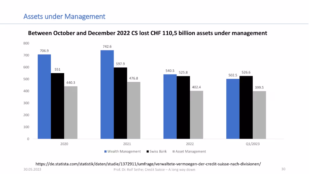
Bar chart comparing Wealth Management, Swiss Bank, and Asset Management from 2020 to Q1 2023; uses blue, black, and grey color scheme.
Financial Performance
Financial Services
This slide shows how Credit Suisse’s assets under management declined significantly between 2022 and Q1 2023, highlighting a CHF 110.5 billion drop following the October–December 2022 period. Values are broken down by business unit.
asset management, financial decline, Credit Suisse, portfolio, AUM
false
Financial Performance
Financial Services
Single Chart
Credit Suisse
Add to my slides
Remove from favorites
Complex display of column charts and pie charts comparing asset management growth and composition over time.
Financial Performance
Financial Services
Shows asset management growth at Deutsche Bank, with a focus on types of assets managed and yearly performance.
asset management, financial growth, performance analysis, investment strategies
false
Financial Performance
Financial Services
Multiple Chart
Deutsche Bank
Add to my slides
Remove from favorites
The slide includes bar charts and column charts showing revenue and asset under management performance, with distinct colors for different categories and detailed annotations.
Financial Performance
Financial Services
This slide discusses the Q4 2023 performance of the asset management division, focusing on revenue changes and asset inflows.
asset management, financial performance, revenue analysis, Q4 2023, asset inflows
false
Financial Performance
Financial Services
Multiple Chart
Deutsche Bank
Add to my slides
Remove from favorites
Features multiple horizontal column chart and a table to represent asset mix, with a clear, professional layout in blue, purple, and gray tones, for various financial metrics in the asset management sector.
Financial Performance
Financial Services
Summarizes the asset management division's performance, detailing net revenues, asset mix, and financial results compared to previous years.
asset management, financial results, asset mix, equity investments, net revenues
false
Financial Performance
Financial Services
Mixed Chart
Goldman Sachs
Add to my slides
Remove from favorites
The slide includes detailed financial data presented as table and a list. Blue highlights draw attention to positive figures, and gray to negative ones. A side panel adds context with bullet points summarizing base fees, performance fees, and other financial insights.
Financial Performance
Financial Services
Summarizes the financial results of Macquarie Asset Management, including base and performance fees, and provides an analysis of net operating income and equity under management, pertinent for financial review and strategy planning.
asset management, financial results, base fees, performance fees, operating income, equity management
false
Financial Performance
Financial Services
Table
Goldman Sachs
Add to my slides
Remove from favorites
Presents bar and column charts with financial results and revenues related to asset management, along with detailed textual information on performance metrics and asset under management (AuM) growth.
Financial Performance
Financial Services
This slide focuses on the Q2 2023 financial results for Deutsche Bank's Asset Management division, detailing revenue distribution and highlighting growth in assets under management.
Asset management, financial results, revenue distribution, AuM growth, Deutsche Bank, Q2 2023
false
Financial Performance
Financial Services
Multiple Chart
Deutsche Bank
Add to my slides
Remove from favorites
The slide features a column chart showing pre-tax income growth in CHF mm and a table detailing product mix, distribution channels, platform improvements, and business mix. Additional bullet points discuss growth strategies in asset management.
Strategic Planning
Financial Services
The slide outlines the transformed asset management model, showing income growth and detailing enhancements in product offerings, distribution, platform modernization, and overall business mix. It emphasizes scaling franchises and launching differentiated products.
asset management, growth, distribution, platform, product mix
false
Strategic Planning
Financial Services
Mixed Chart
Credit Suisse
Add to my slides
Remove from favorites
Features growth curves and financial data represented through line graphs and comparative data points.
Financial Performance
Financial Services
The slide reviews a decade of growth in asset management at JPMorgan, focusing on client assets, revenue, and pre-tax income.
Asset management, growth, financial performance, revenue, client assets, investment returns
false
Financial Performance
Financial Services
Multiple Chart
JP Morgan
Add to my slides
Remove from favorites
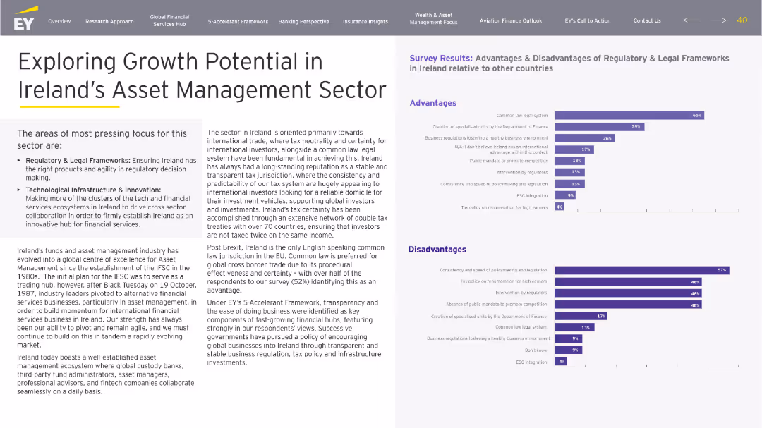
Structured layout with left-side sectioned narrative and right-side survey bar charts. Purple color scheme aligns with legal focus. Clearly segmented advantages/disadvantages.
Investment Analysis
Financial Services
Discusses growth prospects for Ireland's asset management sector, emphasizing regulatory clarity and tech innovation. Survey results show strong sentiment on legal stability and tax neutrality as advantages. Critiques focus on slow policy changes and lack of promotion.
asset management, growth, legal, tax neutrality, regulation, innovation
false
Investment Analysis
Financial Services
Multiple Chart
EY
Add to my slides
Remove from favorites
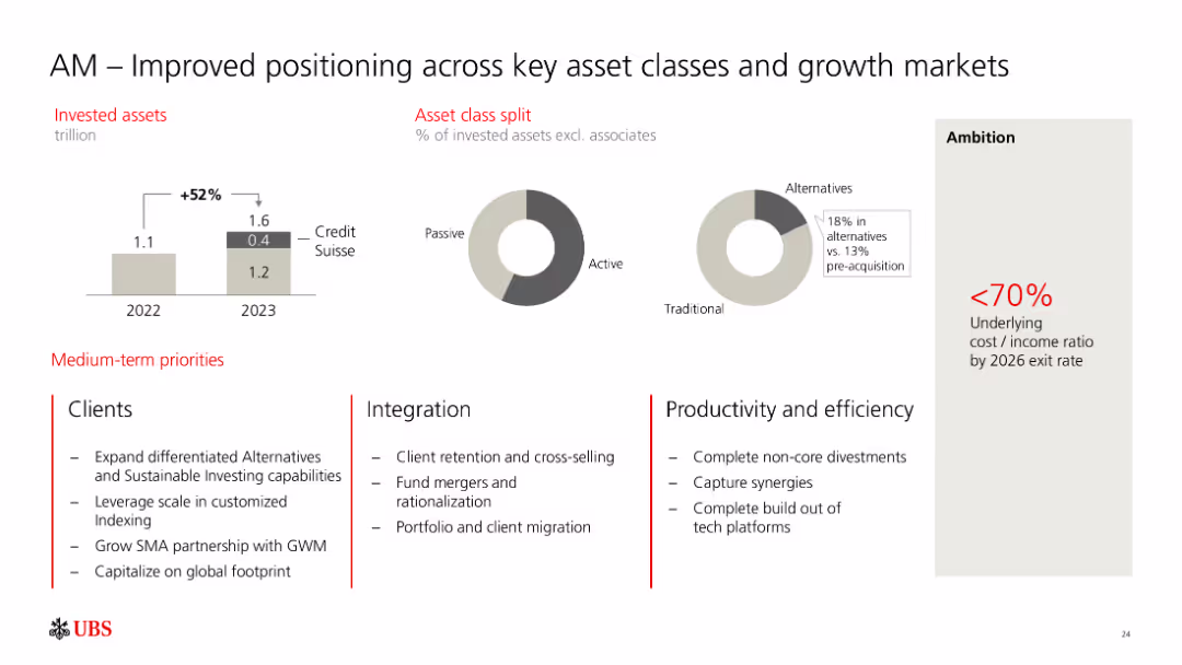
The slide shows bar graphs indicating invested assets growth from 1.1 trillion in 2022 to 1.6 trillion in 2023, including Credit Suisse assets. Pie charts display the asset class split between passive, active, and alternatives. Text outlines medium-term priorities for clients, integration, and productivity.
Market Analysis and Trends
Financial Services
The slide highlights improved positioning of asset management across key asset classes and growth markets. It details asset growth, asset class distribution, and strategic priorities in client services, integration, and productivity. This slide is suitable for discussing asset management strategies and market positioning.
asset management, growth markets, asset classes, strategic priorities, Credit Suisse
false
Market Analysis and Trends
Financial Services
Multiple Chart
UBS
Add to my slides
Remove from favorites
The slide presents tables and bullet points to illustrate financial data, with contrasting colors for different categories and emphasis on key figures.
Financial Performance
Financial Services
Outlines the financial results of Macquarie Asset Management, detailing various income and expense categories, and highlighting performance fee contributions.
Asset Management, Income, Fees, AUM, Profit
false
Financial Performance
Financial Services
Table
Morgan Stanley
Add to my slides
Remove from favorites
Large column chart with annotations on the right. Color-coded elements differentiate data points.
Financial Performance
Financial Services
This slide highlights the financial performance of Macquarie Asset Management, with a focus on income related to specific transactions. It's intended for analyzing financial results and understanding factors affecting performance, useful for investor briefings and performance assessments.
asset management, income, performance, financial
false
Financial Performance
Financial Services
Mixed Chart
Morgan Stanley
Add to my slides
Remove from favorites
Consists of pie charts and bar graphs, a table, and a key point section, all maintaining a professional blue, gray, and white color scheme.
Investment Analysis
Financial Services
Analyzes asset management investment distribution by sector and geography, offering insights for strategic investment decisions.
Asset, Management, Investment, Distribution, Sector, Geography, Analysis, Insights, Strategic, Decisions
false
Investment Analysis
Financial Services
Multiple Chart
Goldman Sachs
Add to my slides
Remove from favorites
Presents column chart to depict asset management growth, alongside textual annotations. The design is straightforward, utilizing different shades of blue to distinguish between categories.
Investment Analysis
Financial Services
Shows asset under management movement, useful for investment analysis and understanding the impact of various financial factors such as foreign exchange and market movements on asset management.
Asset Management, Investment Growth, MAM, MIRA, Financial Impact
false
Investment Analysis
Financial Services
Single Chart
Goldman Sachs
Add to my slides
Remove from favorites
A donut chart dominates the slide, showcasing the distribution of a firm's investment platform across various asset classes, complemented by performance metrics on the right.
Investment Analysis
Financial Services
The slide indicates a financial firm’s asset and wealth management capabilities, detailing the distribution of firmwide investments and their performance over five years. Suitable for demonstrating the firm's diversified asset management and strong performance history.
asset management, investment, performance, diversification, growth
false
Investment Analysis
Financial Services
Mixed Chart
Goldman Sachs
Add to my slides
Remove from favorites
Column and pie charts analyzing asset management trends, including net flows, market performance, and asset class distribution.
Investment Analysis
Financial Services
Discusses overall asset management performance, highlighting year-on-year and quarter-on-quarter changes, used for evaluating investment strategies and market conditions.
asset management, investment performance, market trends, Q3 2023
false
Investment Analysis
Financial Services
Multiple Chart
Deutsche Bank
Add to my slides
Remove from favorites
The slide includes pie charts and donut charts illustrating equity investments, debt investments, and consolidated investment entities by vintage, region, and industry. The color scheme uses different shades of blue and grey with clear labels.
Investment Analysis
Financial Services
Describes the asset management portfolio mix, providing insights into equity and debt investments, which is beneficial for investors and managers assessing diversification and investment strategies.
Asset Management, Investment Portfolio, Equity, Debt
false
Investment Analysis
Financial Services
Multiple Chart
Goldman Sachs
Add to my slides
Remove from favorites
The slide presents a series of stacked column charts with highlights, showcasing asset management across investments, deposits, and loans. The design uses blue and purple hues, with annotations for key data.
Financial Performance
Financial Services
It shows year-end balances for investments, deposits, and loans, with highlights on significant achievements, indicating a robust asset management strategy focused on serving clients comprehensively.
Asset Management, Investments, Deposits, Loans, Client Service, Balance Sheet, Financial Services, Highlights, Growth
false
Financial Performance
Financial Services
Multiple Chart
JP Morgan
Add to my slides
Remove from favorites
Contains bar charts and diagrams explaining asset lifecycle management in energy sectors, including case study of Iberdrola.
Operational Efficiency
Energy & Utilities
Details the importance of asset lifecycle management in the energy industry, using a case study to illustrate effective predictive maintenance.
asset management, lifecycle management, energy industry, predictive maintenance, Iberdrola, operational efficiency
false
Operational Efficiency
Energy & Utilities
Mixed Chart
Accenture
Add to my slides
Remove from favorites
This slide presents information through a combination of text, charts, and awards images. It balances a high density of data with a clear layout and consistent branding colors. Visual elements are well-arranged to guide the viewer's attention systematically across the slide.
Investment Analysis
Financial Services
It communicates key figures and accolades of Macquarie Asset Management, serving to highlight its market position and growth. The slide is likely used to provide a detailed analysis of the asset management division's performance, assets under management, and recognition in the industry.
asset management, Macquarie, financial performance, market position, awards, growth, investments, assets under management
false
Investment Analysis
Financial Services
Mixed Chart
Morgan Stanley
Add to my slides
Remove from favorites
Utilizes pie charts and circular diagrams to showcase investment distributions and asset classes.
Investment Analysis
Financial Services
Analyzes the asset mix in equity investments and lending, as well as debt investments, by various categorizations such as industry and region.
Asset, Management, Mix, Equity, Investments, Lending, Debt, Pie Chart, Diagram, Region, Industry, Allocation
false
Investment Analysis
Financial Services
Multiple Chart
Goldman Sachs
Add to my slides
Remove from favorites
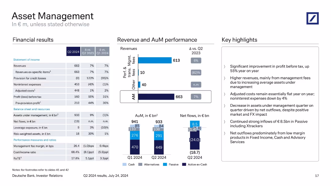
Standard three-panel layout with financials on the left, revenue and AuM visuals center, and performance notes right. Uses a bar and stacked column chart to illustrate asset flows and revenue mix.
Financial Performance
Financial Services
Q2 2024 results highlight a 55% YoY rise in pre-tax profit driven by higher management fees and strong inflows in passive strategies. Despite positive market and FX, net outflows in low-margin products led to a decline in total AuM.
asset management, net flows, AuM, revenues, fees, performance
false
Financial Performance
Financial Services
Multiple Chart
Deutsche Bank
Add to my slides
Remove from favorites
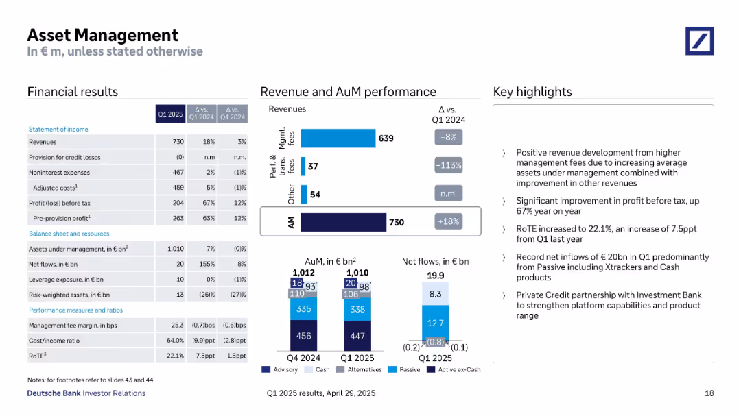
Three-part layout with financials, detailed revenue and AuM performance charts, and key highlights.
Financial Performance
Financial Services
Asset Management reported strong results for Q1 2025 with an 18% revenue increase, 67% higher profit before tax, and €20B in net inflows. Growth was driven by management fees and passive investment products like Xtrackers and Cash.
asset management, net inflows, passive funds, management fees, revenue growth, RoTE, Q1 2025
false
Financial Performance
Financial Services
Multiple Chart
Deutsche Bank
Add to my slides
Remove from favorites
Three sets of column charts compare net profit contribution, base fees, and assets under management (AUM) over fiscal years and semesters.
Financial Performance
Financial Services
Analyzes the asset management division's financial performance over time, displaying trends in profit contribution, base fees, and AUM, suitable for historical performance analysis or financial planning.
asset management, net profit, base fees, AUM, financial, performance, trends
false
Financial Performance
Financial Services
Multiple Chart
Goldman Sachs
Add to my slides
Remove from favorites
Previous
Next
You don't have any favorites yet.
Please wait loading your favorites slides...
Create a FREE account to continue browsing
Receive Instant Access to 1,000+ slides from companies like McKinsey, Google, and Goldman Sachs
First Name
Last Name
Email
Password
I agree to all
Terms & Privacy Policy
Thank you! Your submission has been received!
Oops! Something went wrong while submitting the form.
Have an account?
Sign in
Upgrade to PRO to Save slides
Advanced Search and Filters
Access to 15,000+ slides
Access to Category Pages
Save/Bookmark Slides
PowerPoint Template Library
Pick a Plan
MONTHLY
$12/month
Billed every month, Cancel anytime.
YEARLY
$9/year
Billed $108 annually, Cancel anytime.
Checkout for $12/month
Checkout for $108/yr
Secured by Stripe | AES-256 bit encryption