My Account
My Slides
Search by Category
Pricing
Templates
View All Templates
Download Template Slides
✦ AI Search
Feedback
Login
Logout
Get Started
Browse all Slides
Browse all Slides
Create a FREE Account
Instant access to 1,000+ real slides from top companies like McKinsey, BCG, Goldman Sachs, Google and many more!
First Name
Last Name
Email
Password
I agree to all
Terms & Privacy Policy
Thank you! Your submission has been received!
Oops! Something went wrong while submitting the form.
Have an account?
Sign in
Saved Slides
Total No. of slides saved
0
↻ Refresh
✖ Clear all
This slide features two column charts. The first chart shows IT Run-the-Bank spend, indicating a 9% reduction from 2015 to 2018. The second chart displays IT incidents, showing a 21% reduction.
Operational Efficiency
Financial Services
The slide presents data on IT spending and incident reduction, highlighting the success of strategic cost transformation in improving system stability.
IT spend, cost reduction, IT incidents, stability, transformation, system improvement, strategic cost, IT efficiency, financial metrics, P&L
false
Operational Efficiency
Financial Services
Multiple Chart
Credit Suisse
Add to my slides
Remove from favorites
The slide has a column chart and a bar chart, with a focus on the differences in IT spending over the last two years and the next two years. The layout is moderately dense.
Technology and Digital Transformation
Financial Services
The slide discusses the planned increase in IT spending by firms over the next two years, particularly in advanced digital technologies like AI, open platforms, and workflow automation.
IT spending, digital transformation, advanced technologies, AI, workflow automation
false
Technology and Digital Transformation
Financial Services
Mixed Chart
Deloitte
Add to my slides
Remove from favorites
The slide contains a column chart comparing IT spending in various technologies (e.g., AI, Blockchain, Cloud) across APAC, Europe, and North America, measured in billions.
Market Analysis and Trends
Technology & Software
It provides a comparison of IT spending across regions and technologies, highlighting areas where Europe lags or leads, and stressing the need for increased investment.
IT Spending, Europe, Technology, Investment, Comparison
false
Market Analysis and Trends
Technology & Software
Mixed Chart
Accenture
Add to my slides
Remove from favorites
The slide features a bar chart showing the percentage of global IT spending by different countries and regions, highlighting areas with no direct impact. The bars are displayed horizontally with labels.
Market Analysis and Trends
Technology & Software
The slide analyzes global IT spending by country and region, identifying areas with minimal impact and presenting the data in a clear, horizontal bar chart format.
IT spending, global, countries, regions, impact, bar chart, percentage, analysis, minimal impact, regions
false
Market Analysis and Trends
Technology & Software
Single Chart
Gartner
Add to my slides
Remove from favorites
The slide features a circular chart illustrating global IT spending and growth for 2022, segmented into categories like communication services, data center systems, software, devices, and IT services.
Market Analysis and Trends
Technology & Software
The slide provides an overview of global IT spending and growth for 2022, with a focus on different segments like communication services, data center systems, software, and devices.
IT spending, growth, 2022, global, communication, data center, software, devices, services, categories
false
Market Analysis and Trends
Technology & Software
Single Chart
Gartner
Add to my slides
Remove from favorites
The slide displays a bubble chart depicting IT spending by vertical industry, with bubbles representing different industries like healthcare, retail, and banking, indicating growth rates and market sizes.
Market Analysis and Trends
Technology & Software
The slide offers insights into IT spending across various vertical industries, including healthcare, retail, and banking, with a focus on growth rates and market sizes for each industry.
IT spending, vertical industry, healthcare, retail, banking, growth rates, market sizes, industries, 2022
false
Market Analysis and Trends
Technology & Software
Single Chart
Gartner
Add to my slides
Remove from favorites
Column chart showing IT spend in 2015 and 2018, with segments for "Run-the-Bank" and "Change-the-Bank" categories.
Operational Efficiency
Financial Services
This slide details IT spending optimization efforts, highlighting the balance between maintaining current operations and investing in new technologies.
IT, spend, optimization, financial, technology
false
Operational Efficiency
Financial Services
Mixed Chart
Credit Suisse
Add to my slides
Remove from favorites
The slide features multiple bar graphs and line charts showing percentage changes in IT costs over time. It uses a clean, professional layout with color differentiation for various data points.
Market Analysis and Trends
Technology & Software
The slide analyzes IT cost changes in the technology sector, showing trends in TCO, Opex, and Capex from 2021 to 2026. It indicates how costs are projected to change over time.
IT, TCO, Opex, Capex, technology costs, financial trends
false
Market Analysis and Trends
Technology & Software
Multiple Chart
Accenture
Add to my slides
Remove from favorites
Slide includes text and a bar chart, illustrating top barriers to IT transformation such as enterprise-wide change and budget constraints.
Technology and Digital Transformation
Technology & Software
Discusses significant obstacles to IT transformation, emphasizing enterprise-wide change, budget constraints, and internal culture as primary barriers.
IT transformation, barriers, budget constraints, enterprise change
false
Technology and Digital Transformation
Technology & Software
Mixed Chart
Accenture
Add to my slides
Remove from favorites
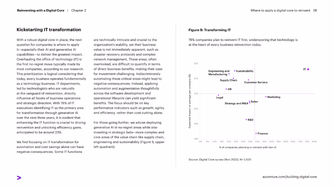
Two-column layout: text on left explains IT transformation priority; right features scatterplot of functions showing expected impact vs. GenAI reinvention planning.
Strategic Planning
Technology & Software
Argues for prioritizing IT transformation in digital reinvention strategies. Shows that companies expect the highest impact from reinventing IT with GenAI, followed by functions like supply chain and sustainability.
IT transformation, GenAI, strategy, scatterplot, business reinvention, impact
false
Strategic Planning
Technology & Software
Mixed Chart
Accenture
Add to my slides
Remove from favorites
Diagram and text outlining IT functional vacancy rates over time. Specific IT vacancies are highlighted in an organizational chart.
Human Resources and Talent Management
Technology & Software
Analysis of IT functional vacancy rates within NH DHHS, showing increased vacancies impacting strategic decision-making and planning, especially during COVID-19.
IT Vacancies, DHHS, Staffing, Organizational Chart, COVID-19
false
Human Resources and Talent Management
Technology & Software
Header Horizontal
Alvarez & Marsal
Add to my slides
Remove from favorites
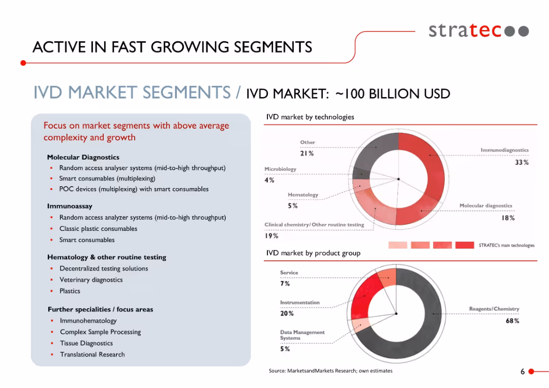
Split layout: text-heavy left box with bullet points on market segments; right side features two donut charts with red highlights and technology/product breakdowns.
Market Analysis and Trends
Healthcare & Pharmaceuticals
Highlights the high-growth and high-complexity segments within the IVD (In Vitro Diagnostics) market, valued at ~$100B. Focus areas include molecular diagnostics, immunoassays, and smart consumables. Two charts segment the market by technologies and product groups.
IVD, immunoassay, smart consumables, molecular diagnostics, healthcare, market segmentation, diagnostics, STRATEC, medical technology
false
Market Analysis and Trends
Healthcare & Pharmaceuticals
Mixed Chart
Goldman Sachs
Add to my slides
Remove from favorites
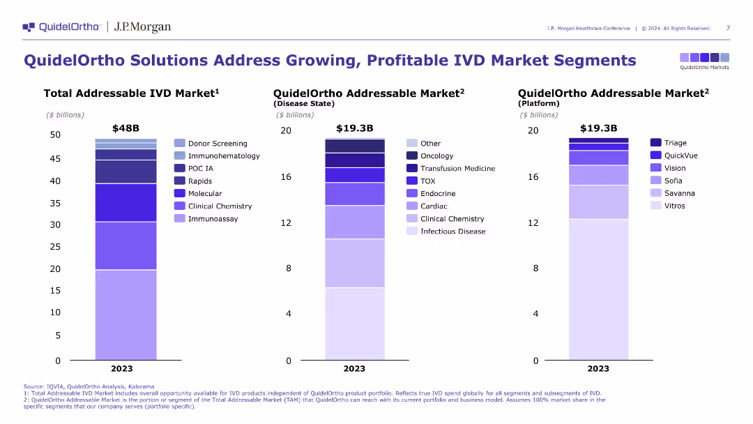
The slide shows three vertical bar charts comparing the total addressable IVD market, QuidelOrtho addressable market by disease state, and platform. The design is clear and uses distinct colors for different segments.
Market Analysis and Trends
Healthcare & Pharmaceuticals
The slide provides an analysis of the in-vitro diagnostics (IVD) market, illustrating QuidelOrtho's market opportunities and competitive positioning within various market segments.
IVD market, QuidelOrtho, market analysis
false
Market Analysis and Trends
Healthcare & Pharmaceuticals
Multiple Chart
JP Morgan
Add to my slides
Remove from favorites
A gray and purple map highlights selected cities with their economic contribution in bubbles, and explanatory text to the side, with a clean and effective presentation of data.
Financial Performance
Technology & Software
Demonstrates the significant economic contribution of Greater Jakarta to Indonesia's GDP, offering a geographic and economic overview for potential investors or policymakers.
Jakarta, GDP, economic contribution, Indonesian economy
false
Financial Performance
Technology & Software
Single Chart
Kearney
Add to my slides
Remove from favorites
This slide features a line chart displaying the average price for the month of January from 1988 to 2021. The line is blue, indicating a steady rise in average prices over the years.
Market Analysis and Trends
Real Estate & Construction
The slide presents historical data on the average price of homes in January, illustrating long-term price trends and growth in the real estate market.
January 2021, average price, line chart, price trends, real estate
false
Market Analysis and Trends
Real Estate & Construction
Single Chart
IPSOS
Add to my slides
Remove from favorites
This slide features a line chart comparing sales and new listings for January over several years. The lines represent sales (blue) and new listings (gray) with clear data points and trend lines.
Market Analysis and Trends
Real Estate & Construction
The slide shows historical data on sales and new listings for January, providing insights into market trends and performance over time.
January 2021, sales, new listings, line chart, market trends
false
Market Analysis and Trends
Real Estate & Construction
Single Chart
IPSOS
Add to my slides
Remove from favorites
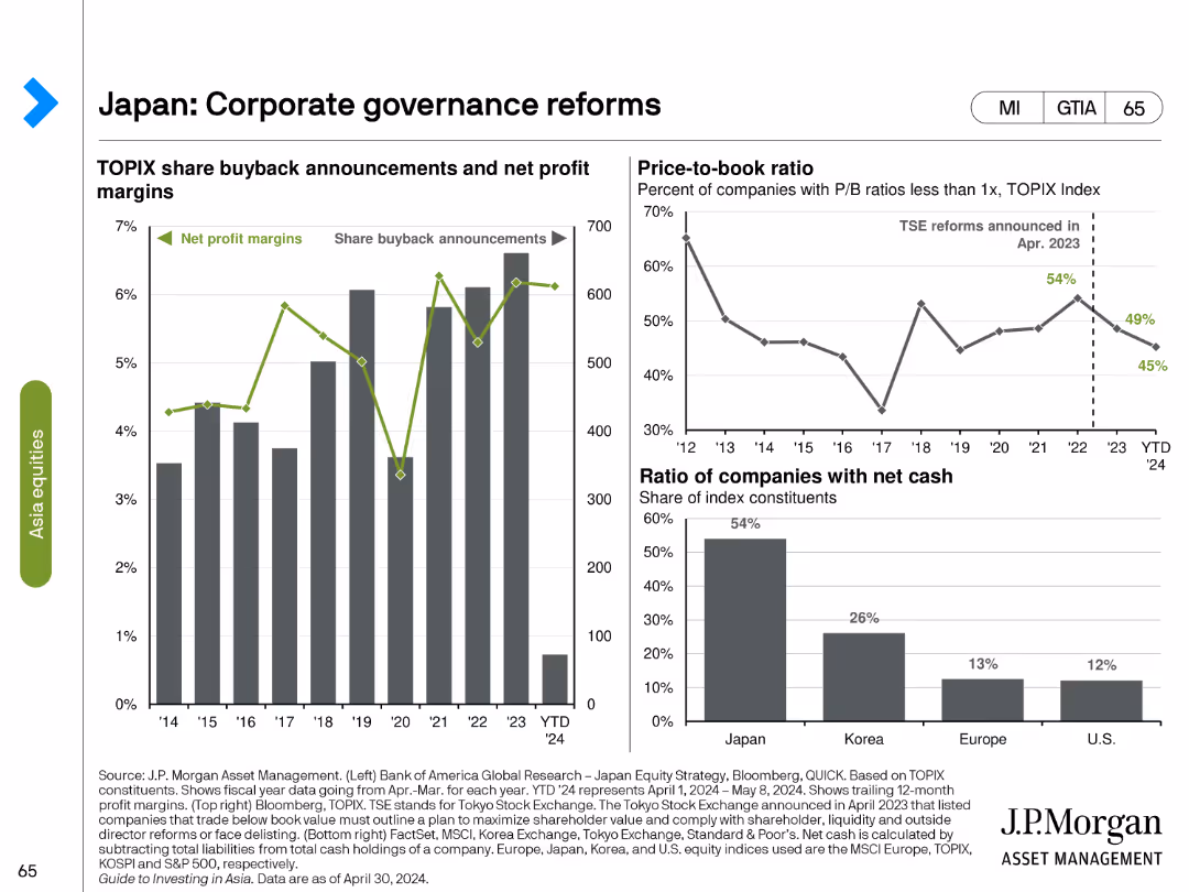
This slide includes three charts: a line chart showing TOPIX share buyback announcements and net profit margins, a line chart on the price-to-book ratio, and a bar chart showing the ratio of companies with net cash.
Regulatory and Compliance
Financial Services
The slide reviews the impact of corporate governance reforms in Japan, highlighting trends in share buybacks, net profit margins, price-to-book ratios, and the financial health of companies with net cash positions.
Japan, corporate governance, share buybacks, net profit margins, price-to-book ratio, financial health, net cash, regulatory reforms, compliance, financial analysis
false
Regulatory and Compliance
Financial Services
Multiple Chart
JP Morgan
Add to my slides
Remove from favorites
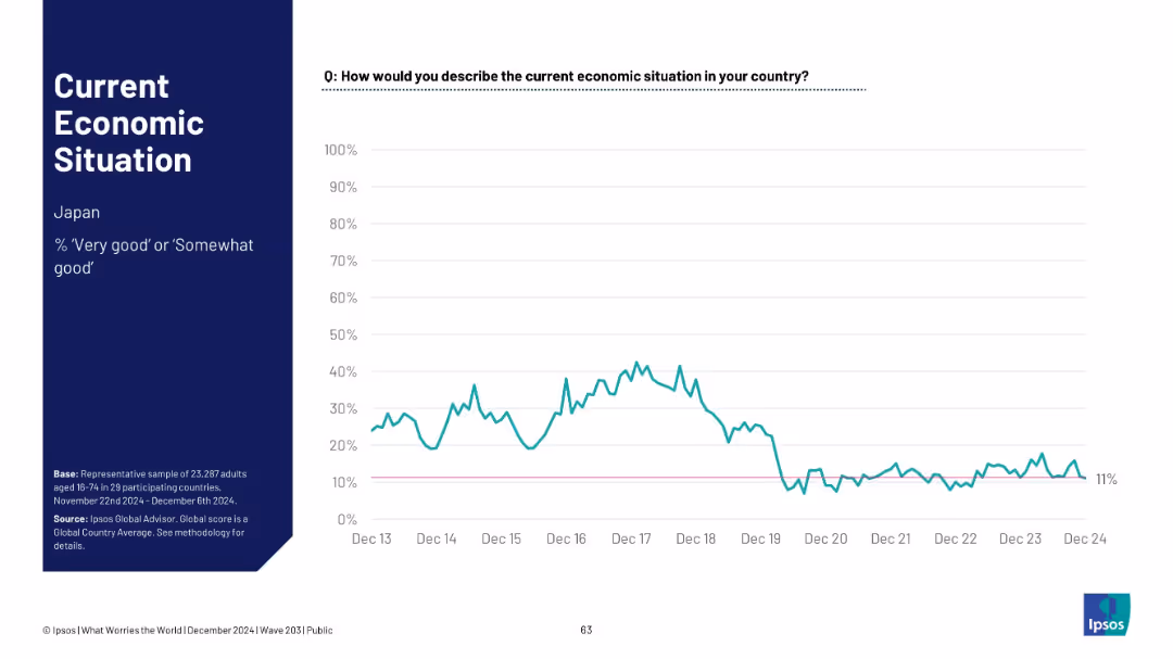
Historical timeline line chart for Japan; sentiment remains low; includes baseline marker at 11%.
Market Analysis and Trends
Financial Services
Japan's economic sentiment has consistently remained low, now at 11%. The chart shows little change in perception over the past several years, post-2019 dip.
Japan, economic perception, long-term decline, Ipsos, low sentiment, public opinion, macroeconomic trend, 2024
false
Market Analysis and Trends
Financial Services
Mixed Chart
IPSOS
Add to my slides
Remove from favorites
Japan-focused slide. Left: title and score; Right: historical sentiment line chart
Market Analysis and Trends
Government & Public Sector
Japan’s public perception of the economy has dropped to 12%, among the lowest recorded. The chart reveals consistently low sentiment with brief upticks that quickly faded.
Japan, economic perception, low sentiment, trendline, Ipsos study, economy view, Asia economics
false
Market Analysis and Trends
Government & Public Sector
Single Chart
IPSOS
Add to my slides
Remove from favorites
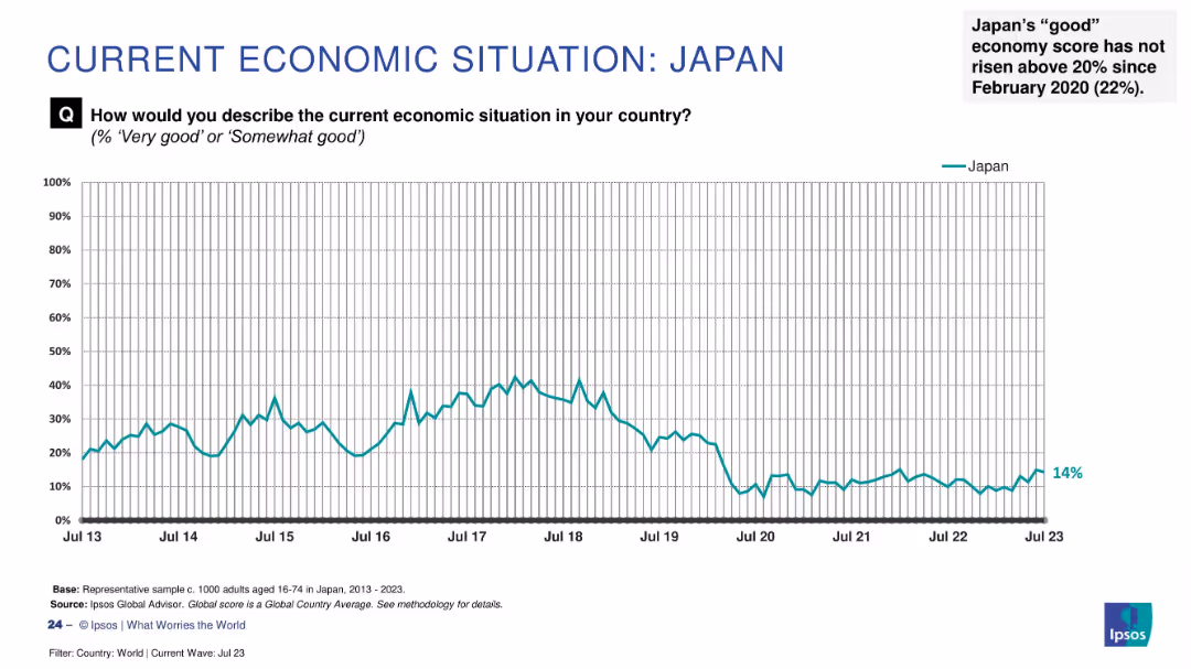
Line graph showing sentiment trend from 2013 to July 2023, marked with latest score (14%) and annotation.
Market Analysis and Trends
Financial Services
Japan's public perception of its economy has remained low, not surpassing 20% since February 2020. This slide reflects long-term pessimism with little improvement over the past three years.
Japan, economic sentiment, low confidence, Ipsos, trend analysis, public perception, long-term data, economic pessimism, survey, time series
false
Market Analysis and Trends
Financial Services
Single Chart
IPSOS
Add to my slides
Remove from favorites
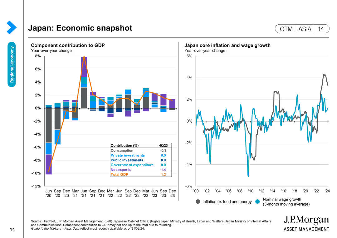
Features a column chart showing component contributions to GDP and a line chart for Japan core inflation and wage growth over time.
Market Analysis and Trends
Financial Services
Provides insights into Japan's economic performance by detailing GDP contributions and inflation trends, essential for market and economic analysis.
Japan, Economic snapshot, GDP, Inflation, Wage growth, Financial data, Market analysis, Economic trends, Forecasting
false
Market Analysis and Trends
Financial Services
Multiple Chart
JP Morgan
Add to my slides
Remove from favorites
The slide presents three line charts showing Japan y/y real GDP (2005-25F), Japan unemployment rate (2005-25F), and Japan y/y CPI (2005-25F). The charts are clear with historical data and future projections, complemented by detailed text.
Market Analysis and Trends
Financial Services
This slide forecasts Japan's economic trends, predicting constraints due to soft consumer spending, cautious capex, and weak global growth. It discusses easing inflation and its potential impact on purchasing power and economic recovery.
Japan economy, GDP, unemployment, CPI, forecast
false
Market Analysis and Trends
Financial Services
Multiple Chart
EY
Add to my slides
Remove from favorites
This slide features multiple line charts showing Japan's inflation, wage growth, correlation between yen and equity market, and a column chart showing the price-to-book ratio of Japanese companies.
Market Analysis and Trends
Financial Services
The slide provides an economic overview of Japan, covering inflation and wage growth trends, currency market correlation with equity, and valuation metrics for Japanese companies, useful for market analysis.
Japan, economy, inflation, wage growth, yen, equity market, price-to-book ratio, Japanese companies, market analysis
false
Market Analysis and Trends
Financial Services
Multiple Chart
JP Morgan
Add to my slides
Remove from favorites
This slide features two line charts. The first chart shows TOPIX earnings and performance over time. The second chart compares TOPIX and the yen vs. the US dollar over time.
Market Analysis and Trends
Financial Services
The slide examines the TOPIX earnings performance and the exchange rate trends between the yen and the US dollar, offering market insights.
Japan, equity, market, currency, TOPIX, performance, yen, US dollar
false
Market Analysis and Trends
Financial Services
Multiple Chart
JP Morgan
Add to my slides
Remove from favorites
Features a column chart detailing the reconciliation of ERR scalar for Japan from 2015 to current with steps outlined in text.
Market Analysis and Trends
Financial Services
This slide explains the reconciliation process of the ERR scalar for Japan, detailing the steps involved and the resulting scalar value for 2023.
Japan, ERR scalar, financial services, market trends, reconciliation
false
Market Analysis and Trends
Financial Services
Mixed Chart
Oliver Wyman
Add to my slides
Remove from favorites
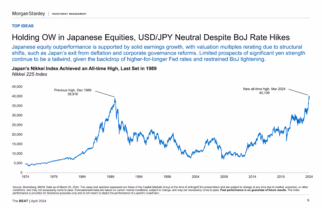
A line chart of Japan's Nikkei Index from 1974 to 2024, showing its historical and recent highs.
Investment Analysis
Financial Services
This slide provides insights into Japanese equities, showing the Nikkei Index's performance and suggesting holding an overweight position despite BOJ rate hikes.
Japanese Equities, Nikkei Index, BOJ, Investment, Historical Performance
false
Investment Analysis
Financial Services
Mixed Chart
Morgan Stanley
Add to my slides
Remove from favorites
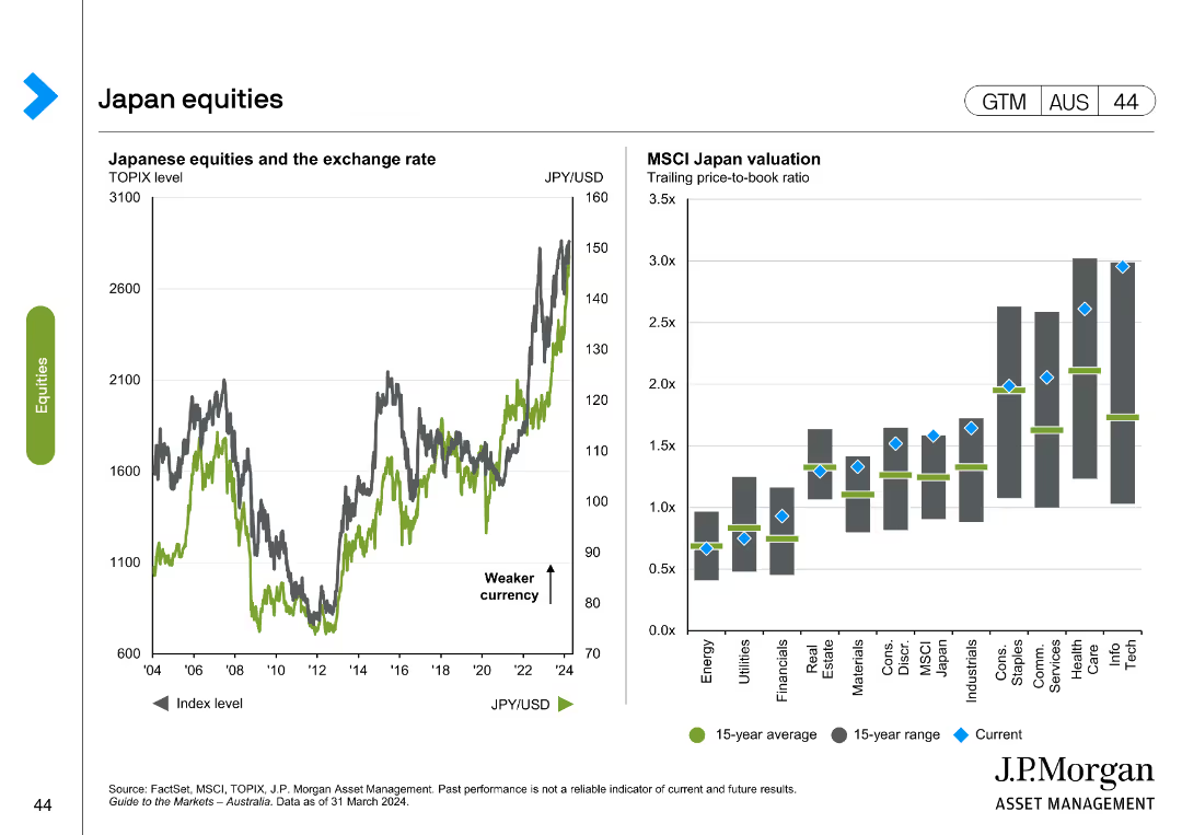
The slide features a line chart on the left showing the TOPIX level and JPY/USD exchange rate over time, and a column chart on the right comparing MSCI Japan valuation across sectors.
Market Analysis and Trends
Financial Services
The slide analyzes Japanese equities, illustrating the relationship between the TOPIX level and exchange rate, and comparing MSCI Japan valuation across different sectors.
Japanese equities, TOPIX, MSCI Japan, valuation, exchange rate, financial analysis, market trends, sector comparison
false
Market Analysis and Trends
Financial Services
Multiple Chart
JP Morgan
Add to my slides
Remove from favorites
Includes a column chart comparing Japan GCC scalars/factors for study years 2020 and 2023, with text highlighting key findings.
Market Analysis and Trends
Financial Services
This slide compares the Japan Life and Health GCC scalars from 2020 to 2023, noting significant increases and emphasizing the stability of the health adjustment factor.
Japan, GCC scalar, financial services, comparison, health adjustment
false
Market Analysis and Trends
Financial Services
Mixed Chart
Oliver Wyman
Add to my slides
Remove from favorites
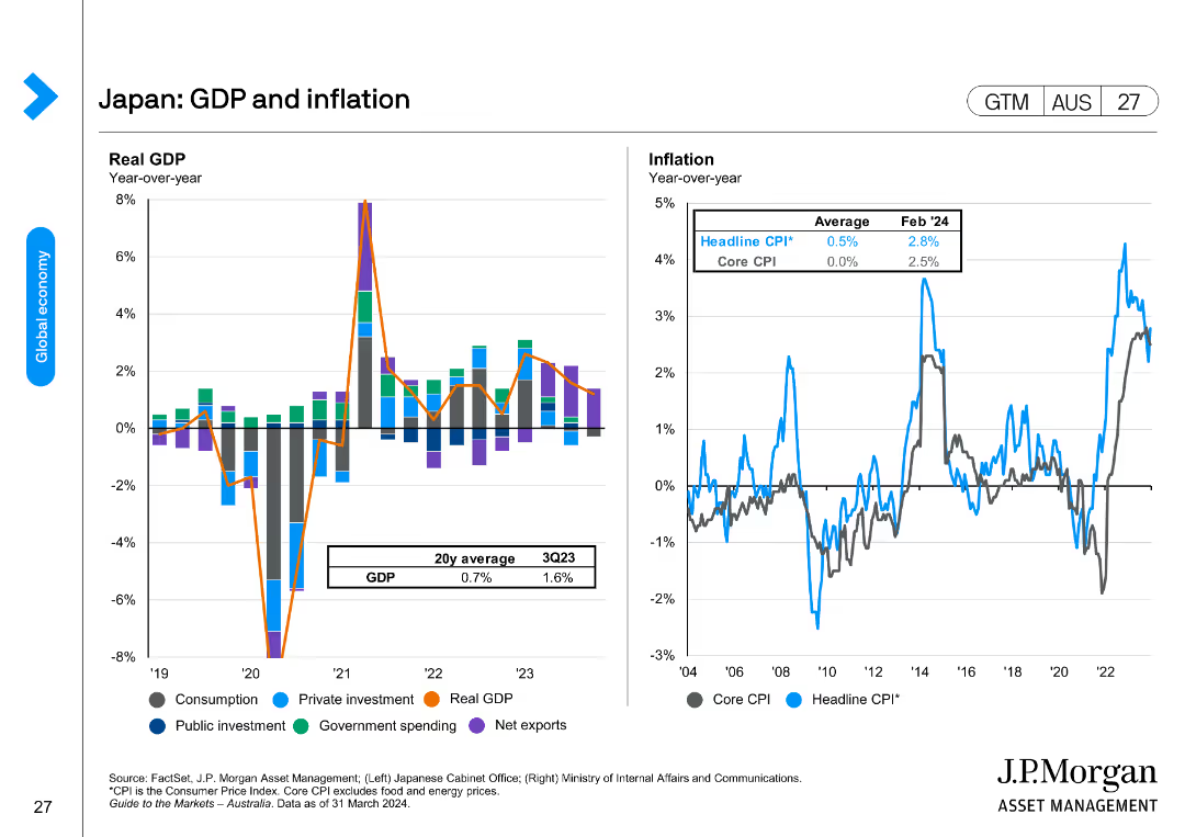
Two charts showing Japan's GDP growth with contributions from different sectors, and inflation rates, including headline and core CPI.
Market Analysis and Trends
Financial Services
The slide analyzes Japan's GDP growth and inflation, with sectoral contributions and trends in consumer prices, emphasizing public and private investment impacts.
Japan, GDP, inflation, consumption, private investment, public investment
false
Market Analysis and Trends
Financial Services
Multiple Chart
JP Morgan
Add to my slides
Remove from favorites
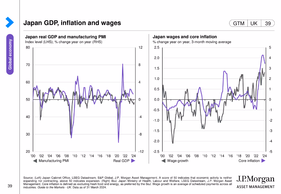
Two charts: one shows Japan's real GDP and manufacturing PMI, and the other depicts Japan's wage growth and core inflation trends over several years.
Market Analysis and Trends
Financial Services
This slide analyzes the economic indicators for Japan, including GDP, manufacturing PMI, wage growth, and core inflation. Used for economic performance review and forecasting in the Japanese market.
Japan, GDP, inflation, wages, PMI
false
Market Analysis and Trends
Financial Services
Multiple Chart
JP Morgan
Add to my slides
Remove from favorites
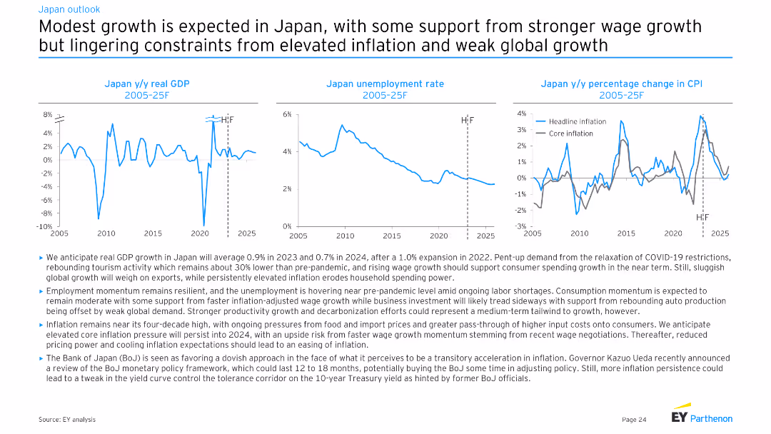
Three line charts showing Japan y/y real GDP, Japan unemployment rate, and Japan y/y percentage change in CPI from 2005-25F. Moderate complexity, well-structured for presenting economic projections and trends.
Market Analysis and Trends
Financial Services
This slide forecasts modest economic growth in Japan, supported by wage growth and rebounding tourism. It addresses ongoing inflation, employment trends, and the impact of global demand on economic performance.
Japan, GDP, unemployment, inflation, growth
false
Market Analysis and Trends
Financial Services
Multiple Chart
EY
Add to my slides
Remove from favorites
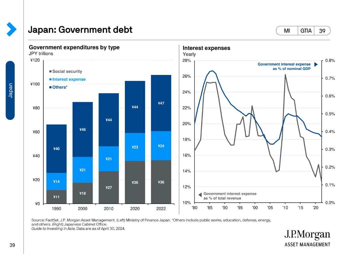
The slide features a column chart on the left and a line chart on the right. The column chart shows government expenditures by type from 1990 to 2022. The line chart depicts interest expenses as a percentage of GDP from 1980 to 2020. Visual elements are clean and data-focused.
Financial Performance
Financial Services
The slide provides an overview of Japan's government debt, showing expenditure breakdowns and interest expenses over time. It aims to analyze fiscal policy and financial health.
Japan, government debt, fiscal policy, financial health, expenditure
false
Financial Performance
Financial Services
Multiple Chart
JP Morgan
Add to my slides
Remove from favorites
Displays a line chart showing the Japan Specific Health Adjustment Factor (SMR) over time, with text detailing the proposed factor for 2023.
Market Analysis and Trends
Financial Services
This slide proposes a Japan Specific Health Adjustment Factor for 2023, using a rolling 3-year weighted average, showing the historical data trend.
Japan, health adjustment, SMR, financial services, market trends
false
Market Analysis and Trends
Financial Services
Mixed Chart
Oliver Wyman
Add to my slides
Remove from favorites
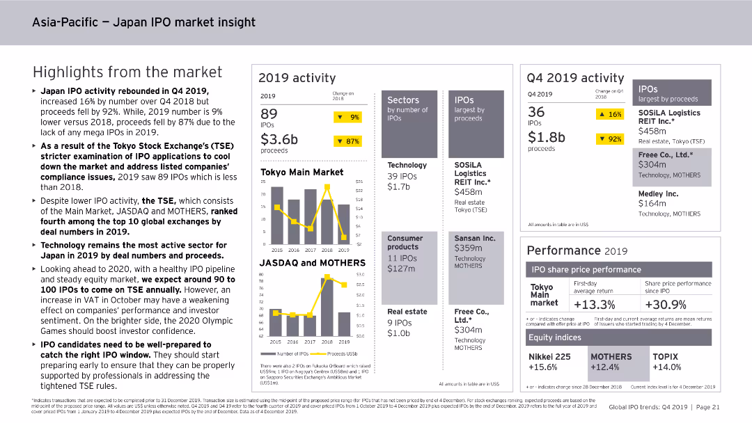
This slide features column charts, numerical data points, and text summaries. It displays highlights from the Japan IPO market in 2019, including activity levels, sectors, and performance metrics.
Market Analysis and Trends
Financial Services
The slide summarizes Japan's IPO market activity in 2019, noting the number of IPOs, proceeds, and key sectors. It also covers performance metrics, such as average returns and changes in IPO numbers and proceeds.
Japan, IPO, Market Analysis, Financial Services, Trends, Activity, Sectors, Performance, 2019
false
Market Analysis and Trends
Financial Services
Multiple Chart
EY
Add to my slides
Remove from favorites
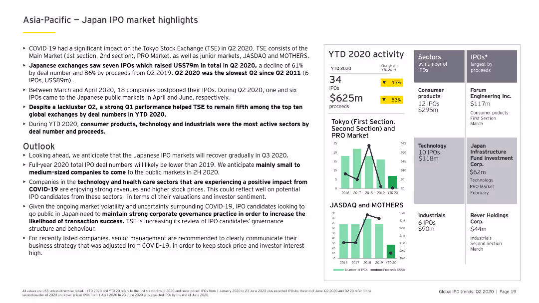
Includes column charts detailing YTD 2020 IPO activity in Japan, sector-specific analysis, and prominent IPOs, with a focus on consumer products and technology.
Market Analysis and Trends
Financial Services
Reviews the Japanese IPO market's performance in 2020, focusing on trends and challenges faced by different sectors, particularly consumer products and technology.
Japan, IPO market, consumer products, technology, YTD 2020
false
Market Analysis and Trends
Financial Services
Multiple Chart
EY
Add to my slides
Remove from favorites
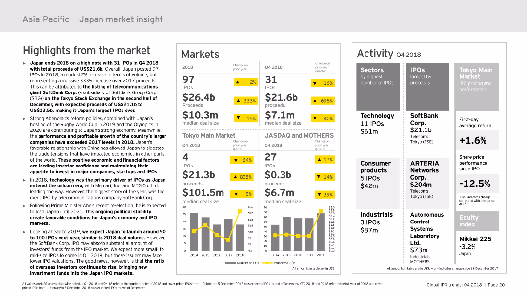
This slide presents market highlights, market data, and activity details using column charts and tables. It covers the performance of Japan’s IPO market with a focus on specific sectors and companies. The layout is moderately complex, with a mix of textual data and visual elements to ensure clarity.
Market Analysis and Trends
Financial Services
Details the IPO market activities in Japan for 2018, including market highlights, performance, and sector-specific data. Provides insights into key trends and market dynamics in Japan.
Japan, IPO, market insight, sectors, performance
false
Market Analysis and Trends
Financial Services
Multiple Chart
EY
Add to my slides
Remove from favorites
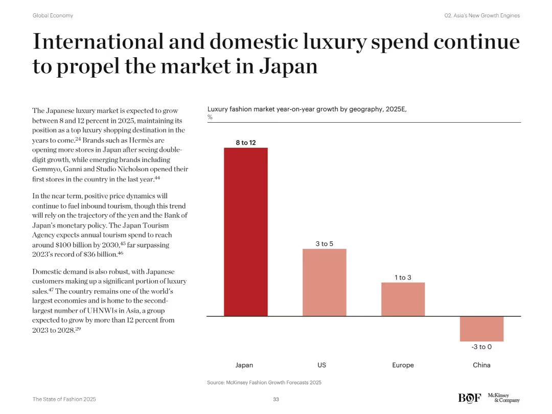
Vertical bar chart comparing luxury market growth forecasts across regions for 2025. Text highlights brand openings and macroeconomic factors.
Financial Performance
Consumer Goods
Japan’s luxury market is expected to grow 8–12% in 2025, driven by both domestic and tourist spending. The country outpaces the US, Europe, and China in growth outlook, with brands expanding presence and rising UHNWIs fueling demand.
Japan, luxury growth, domestic demand, tourism, UHNWIs, retail forecast, fashion brands, consumer spending, Asia markets, market outlook
false
Financial Performance
Consumer Goods
Mixed Chart
McKinsey
Add to my slides
Remove from favorites
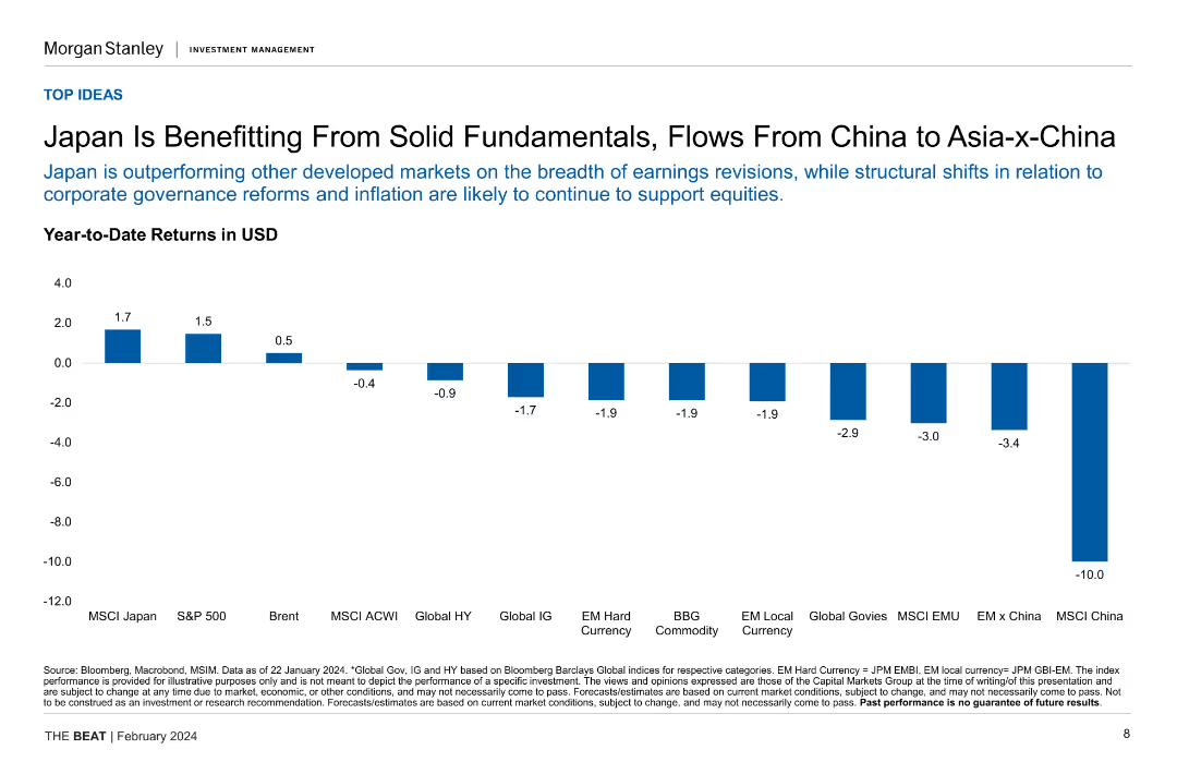
Column chart showing year-to-date returns in USD for various indices, emphasizing Japan's performance.
Market Analysis and Trends
Financial Services
This slide presents Japan's strong market performance in comparison to other developed markets, attributing it to solid fundamentals and regional investment flows.
Japan, market performance, investment flows, year-to-date returns, regional investment
false
Market Analysis and Trends
Financial Services
Single Chart
Morgan Stanley
Add to my slides
Remove from favorites
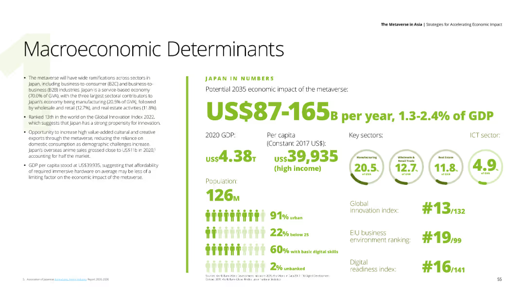
This slide features text on the left detailing economic impacts of the metaverse on Japan, and a section on the right with numerical data and key sectors like manufacturing, wholesale and retail trade, and real estate. The background is white, and the text is in black and green.
Market Analysis and Trends
Financial Services
Highlights the potential economic impact of the metaverse on Japan's GDP by 2035, providing data on GDP, per capita income, and key sectors contributing to the economy.
Japan, metaverse, GDP, economic impact, key sectors
false
Market Analysis and Trends
Financial Services
Mixed Chart
Deloitte
Add to my slides
Remove from favorites
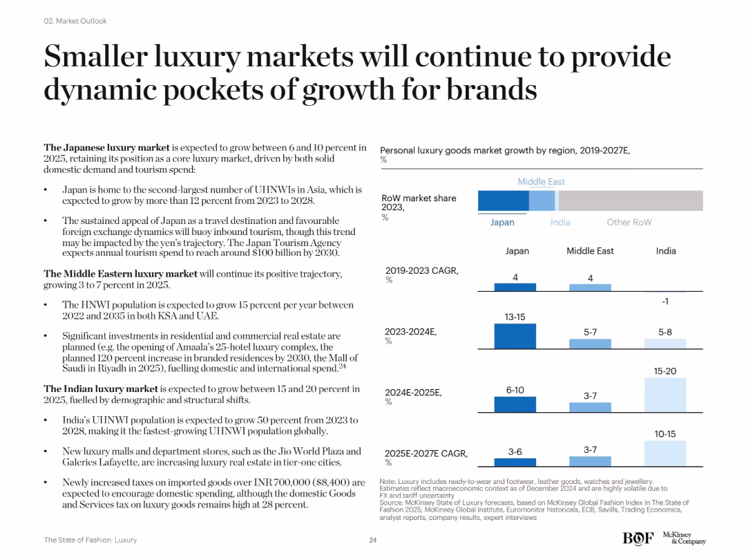
Text-heavy slide with three vertical bar graphs showing past and projected CAGR for Japan, Middle East, and India. Also features a horizontal bar indicating 2023 RoW market share.
Market Analysis and Trends
Consumer Goods
The slide highlights growth potential in smaller markets like Japan, the Middle East, and India. Japan's appeal as a travel destination, real estate investments in the Middle East, and India's expanding UHNW population are noted as major contributors to sustained market expansion through 2027.
Japan, Middle East, India, emerging markets, UHNW growth, CAGR, regional luxury
false
Market Analysis and Trends
Consumer Goods
Multiple Chart
McKinsey
Add to my slides
Remove from favorites
The slide features two column charts. The left chart shows Japan's key interest rates over time, with various milestones and trends annotated. The right chart illustrates the BoJ's holdings of ETFs and JGBs, with two lines indicating ownership percentages.
Market Analysis and Trends
Financial Services
The slide provides an analysis of Japan's monetary policy, highlighting key interest rates and the Bank of Japan's holdings in exchange trade funds and government bonds. It is used to discuss monetary trends and their implications on the financial market.
Japan, monetary policy, interest rates, BoJ, ETFs, JGBs, financial trends, market analysis, central bank, government bonds
false
Market Analysis and Trends
Financial Services
Multiple Chart
JP Morgan
Add to my slides
Remove from favorites
Line graph with red dots showing Japan’s rank (2008–2023) in NBI, placed on a white background.
Strategic Planning
Government & Public Sector
Japan has steadily risen in the Nation Brand Index (NBI) rankings, moving from 5th in 2019 to 1st in 2023. The graph highlights the progress over 15 years, with a sharp upward trend post-2020.
Japan, NBI, ranking, reputation, national brand, 2023, progress, strategy, Ipsos
false
Strategic Planning
Government & Public Sector
Single Chart
IPSOS
Add to my slides
Remove from favorites
This slide has two line charts: one showing the correlation between the yen and Japanese equities, and the other showing growth in nominal exports and earnings per share.
Market Analysis and Trends
Financial Services
The slide analyzes key performance drivers of Japanese equities, focusing on the correlation with the yen, and the impact of export growth and earnings per share, providing insights into factors influencing market performance.
Japan, performance drivers, yen correlation, equities, exports, earnings per share, market analysis, financial performance, investment insights, economic factors
false
Market Analysis and Trends
Financial Services
Multiple Chart
JP Morgan
Add to my slides
Remove from favorites
Split layout: left side with bold white-on-blue title text; right side features a multicolored line chart showing 2016–2025 trend across countries.
Market Analysis and Trends
Government & Public Sector
The slide shows how belief in the idea that "traditional parties and politicians don’t care about people like me" has changed over time. It highlights a significant 29 percentage point increase in Japan since 2016.
Japan, politics, trust, traditional parties, trend, perception, Ipsos, global comparison, 2025, populism
false
Market Analysis and Trends
Government & Public Sector
Mixed Chart
IPSOS
Add to my slides
Remove from favorites
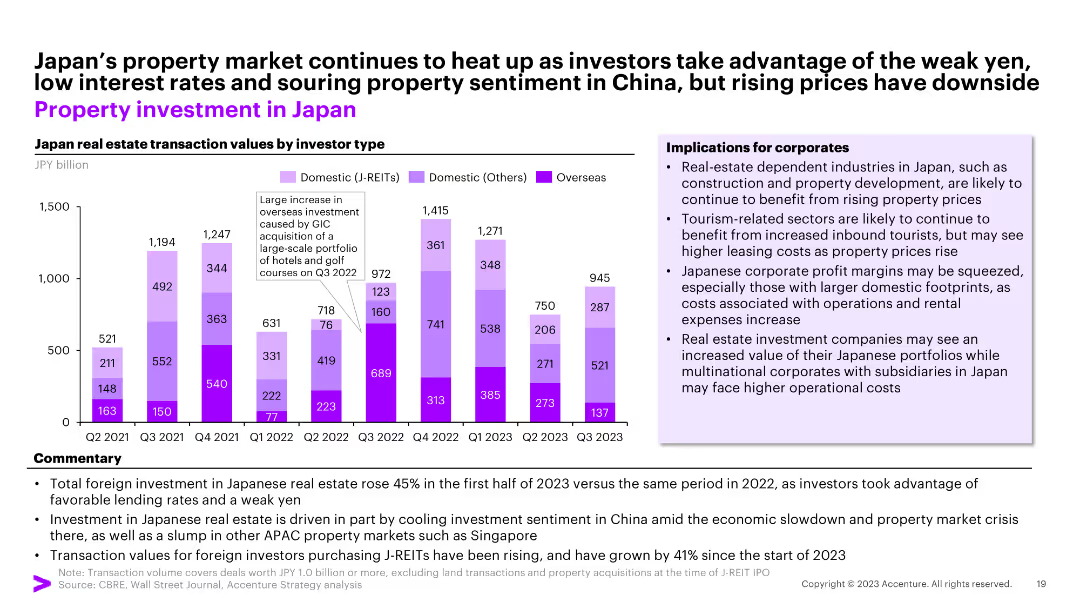
Column chart showing Japan real estate transaction values by investor type over multiple quarters. The slide includes commentary and a section on implications for corporates.
Market Analysis and Trends
Real Estate & Construction
This slide analyzes the trends in Japan’s property investment market, highlighting the increase in foreign investment and implications for corporates in the industry.
Japan, property, investment, trends, corporates
false
Market Analysis and Trends
Real Estate & Construction
Mixed Chart
Accenture
Add to my slides
Remove from favorites
The slide features a white background with text and a column chart showing company-level ESR ratios for Japan. It discusses Japan's transition to a new capital regime (ESR) by 2025, including changes to regulatory intervention points and the use of company-level data for initial calibration of the ESR scalar.
Regulatory and Compliance
Financial Services
This slide provides an example of a regime change in Japan, focusing on the move to an economic value-based capital regime (ESR) and the use of company-level data for calibration. It highlights the upward trend in ESR ratios and the expected analysis refresh in 2025.
Japan, regime change, ESR, capital regime, calibration
false
Regulatory and Compliance
Financial Services
Mixed Chart
Oliver Wyman
Add to my slides
Remove from favorites
This slide contains two column charts. The first chart shows MSCI Japan earnings growth estimates by sector for 2024 and 2025. The second chart shows MSCI Japan price-to-book ratios by sector. Color coding is used to differentiate data points.
Financial Performance
Financial Services
The slide analyzes sector earnings and valuations in Japan, focusing on earnings growth estimates and price-to-book ratios for different sectors. It is used for financial performance evaluation and investment decision-making.
Japan, sector earnings, valuations, MSCI, price-to-book, financial performance, investment
false
Financial Performance
Financial Services
Multiple Chart
JP Morgan
Add to my slides
Remove from favorites
Includes a bar chart comparing the sector weight analysis of the Japan industry and company-specific mix over time, with text explaining the analysis.
Market Analysis and Trends
Financial Services
This slide refreshes the sector weight analysis for Japan, comparing company-specific and industry-wide mixes to highlight material differences.
Japan, sector weight, financial services, market analysis, comparison
false
Market Analysis and Trends
Financial Services
Mixed Chart
Oliver Wyman
Add to my slides
Remove from favorites
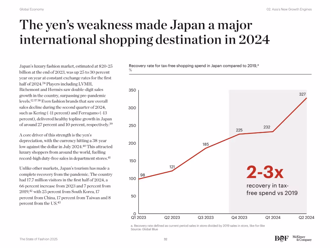
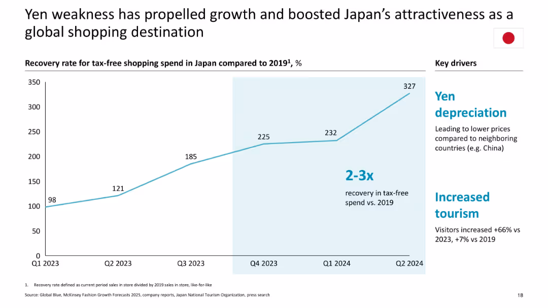
Line graph tracks recovery rate in tax-free spending in Japan from Q1 2023 to Q2 2024. Accompanying text highlights yen depreciation and tourism rebound.
Market Analysis and Trends
Consumer Goods
The slide presents Japan's strong rebound as a luxury shopping hub in 2024, fueled by yen depreciation and a surge in international tourism. It shows a 2–3x increase in tax-free spending over 2019 levels, with contributions from travelers across Asia and the US.
Japan, tax-free shopping, yen depreciation, luxury market, tourism, sales recovery, international shoppers, fashion retail, exchange rate
false
Market Analysis and Trends
Consumer Goods
Mixed Chart
McKinsey
Add to my slides
Remove from favorites
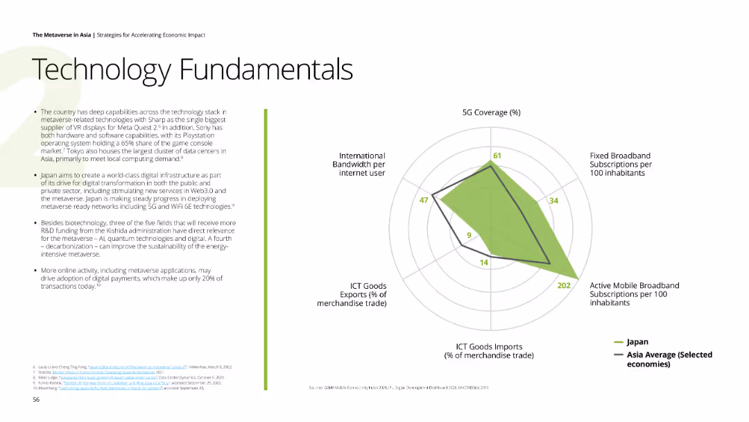
Contains a spider chart comparing Japan's 5G coverage, broadband subscriptions, mobile broadband subscriptions, ICT goods imports, and international bandwidth per internet user with Asia average. The slide has a white background and green accents.
Technology and Digital Transformation
Technology & Software
Describes Japan's advanced technology capabilities, including VR displays, data centers, and digital infrastructure efforts, highlighting Japan's leading position in ICT goods exports and 5G coverage.
Japan, technology, 5G, digital infrastructure, ICT goods exports
false
Technology and Digital Transformation
Technology & Software
Mixed Chart
Deloitte
Add to my slides
Remove from favorites
Bar and line chart tracking venture financing in Japan (2018–Q3 2024), accompanied by an expert quote on VC trends.
Market Analysis and Trends
Financial Services
VC investments in Japan rose notably in Q3 2024, largely driven by a few large outlier deals. The accompanying quote emphasizes growing foreign interest in Japanese VC funds and notes this could accelerate deeptech and innovation ecosystem development.
Japan, venture capital, outlier deals, deeptech, foreign investment, KPMG
false
Market Analysis and Trends
Financial Services
Mixed Chart
KPMG
Add to my slides
Remove from favorites
Single line graph tracking recovery in shopping spend; highlights drivers in a sidebar
Market Analysis and Trends
Consumer Goods
Illustrates Japan's rise in tax-free luxury shopping due to yen depreciation and increased tourism, showing a 2–3x recovery vs. 2019; growth backed by competitive pricing and travel surge.
Japan, yen depreciation, tax-free shopping, recovery, tourism, 2024 data, luxury retail
false
Market Analysis and Trends
Consumer Goods
Mixed Chart
McKinsey
Add to my slides
Remove from favorites
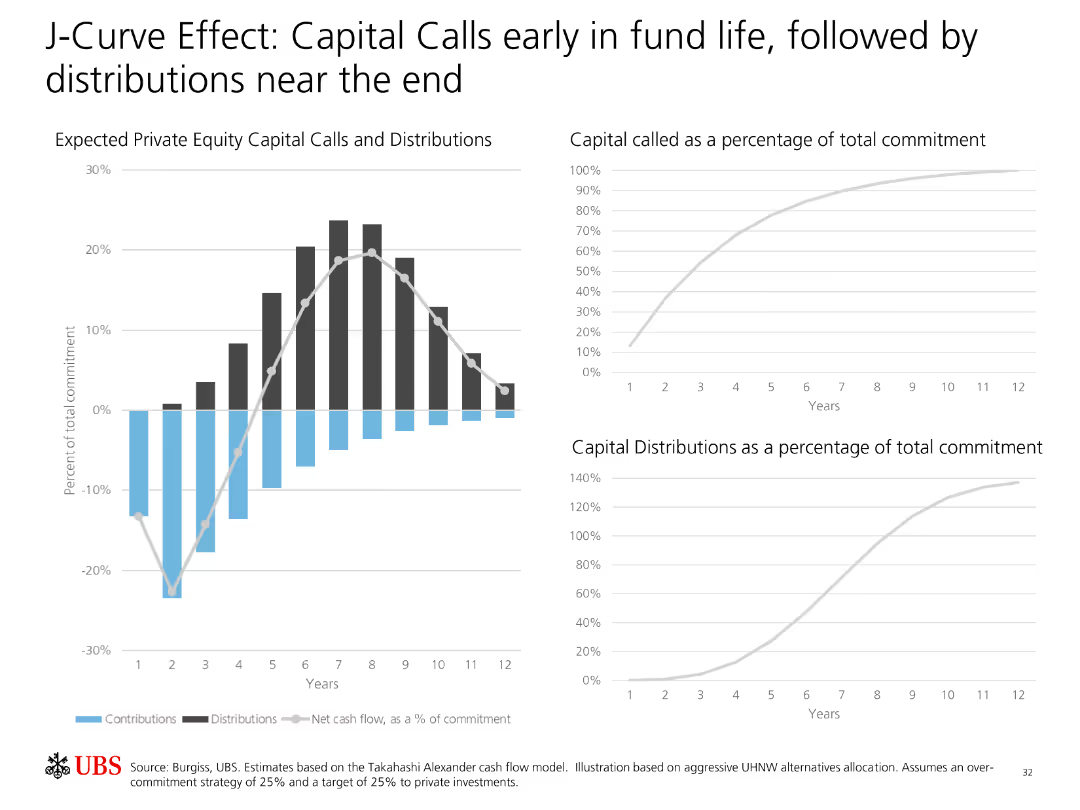
Contains two line charts and one bar chart illustrating expected private equity capital calls and distributions over the fund's lifecycle.
Financial Performance
Financial Services
Explains the J-Curve effect in private equity, showing how capital calls are concentrated early in the fund's life while distributions increase later.
J-Curve, Private Equity, Capital Calls, Distributions, Fund Lifecycle, Investment, Analysis, Cash Flow, Strategy
false
Financial Performance
Financial Services
Multiple Chart
UBS
Add to my slides
Remove from favorites
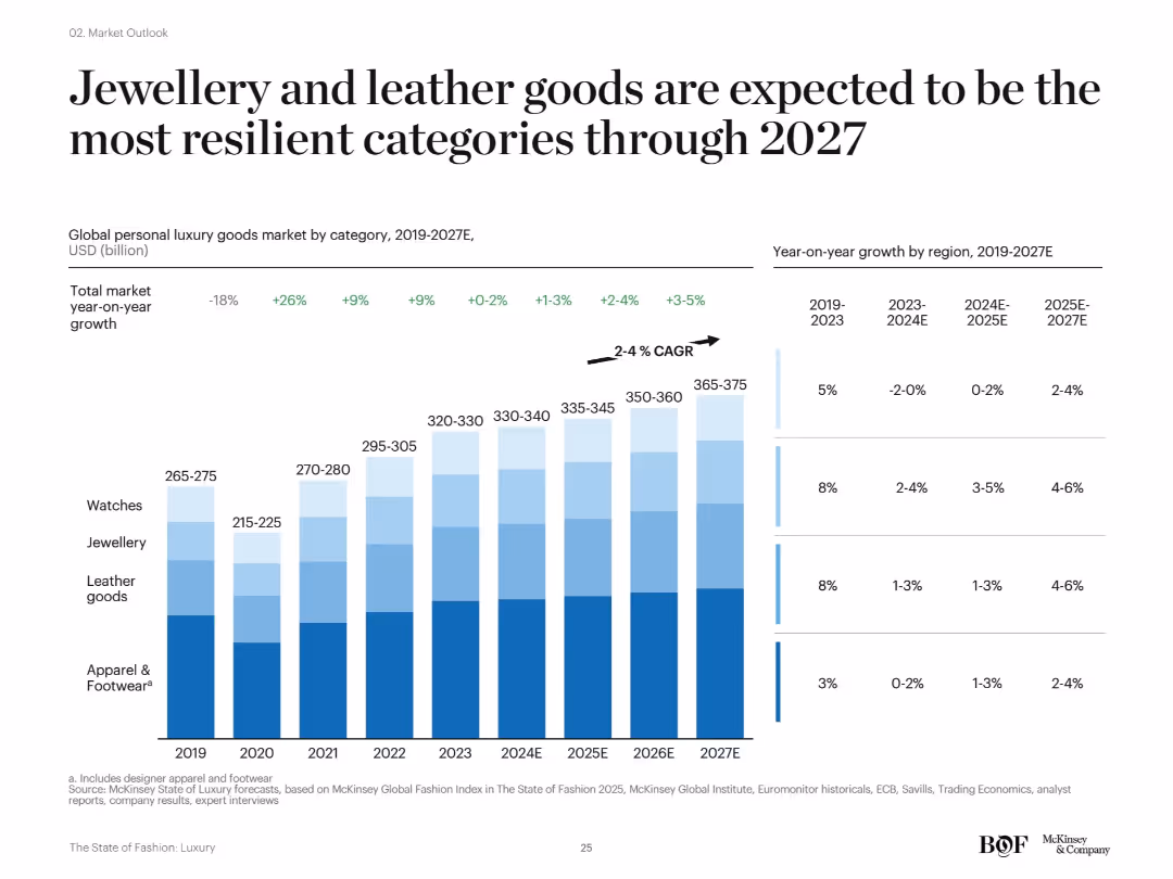
Stacked bar chart showing personal luxury goods market by category (2019–2027E) with YoY growth and CAGR on the right.
Market Analysis and Trends
Consumer Goods
This slide shows projections of category-wise performance in the luxury market, identifying jewellery and leather goods as the most resilient segments. CAGR data through 2027 suggests steady growth, while apparel and watches are expected to recover more slowly.
jewellery, leather goods, growth resilience, luxury categories, CAGR, forecast, 2027
false
Market Analysis and Trends
Consumer Goods
Single Chart
McKinsey
Add to my slides
Remove from favorites
Same format as previous; this slide assesses blame on Jewish people for Middle East instability. Ranked bar chart across countries with average highlighted.
Regulatory and Compliance
Government & Public Sector
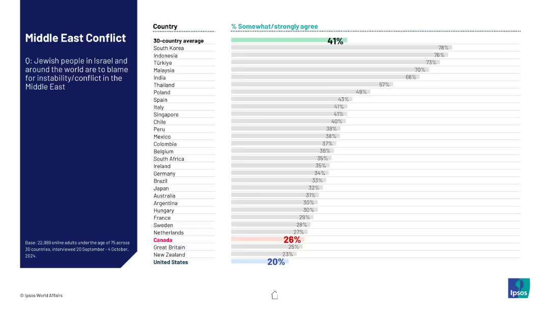
This slide presents survey results on whether people agree that Jewish populations are responsible for Middle East conflicts. The data showcases varying levels of agreement across nations, reflecting sensitive geopolitical narratives.
Jewish people, Middle East, blame, conflict, public sentiment, Ipsos, international opinion, survey, religious tension, geopolitical
false
Regulatory and Compliance
Government & Public Sector
Mixed Chart
IPSOS
Add to my slides
Remove from favorites
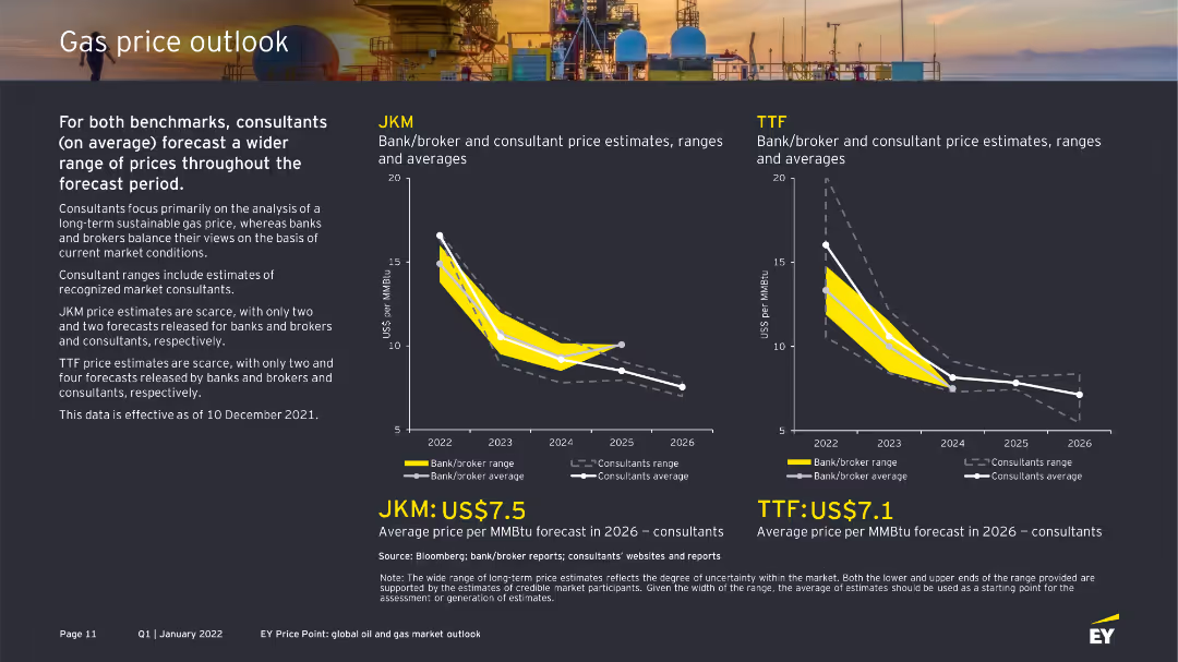
The slide presents two graphs: one for JKM and another for TTF gas prices. Both graphs show consultant and bank/broker price estimates using distinct colors. The background image includes gas facilities, and text details the forecast ranges.
Market Analysis and Trends
Energy & Utilities
This slide discusses the gas price outlook for JKM and TTF, comparing consultant and bank/broker price estimates. It highlights the price trends and provides average forecasts for 2026, considering market uncertainties.
JKM, TTF, gas prices, forecasts, consultants, bank/broker
false
Market Analysis and Trends
Energy & Utilities
Multiple Chart
EY
Add to my slides
Remove from favorites
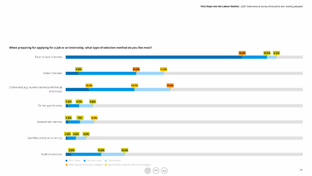
This slide features a horizontal bar chart with data on preferred job application selection methods, including face-to-face interviews and online tests.
Market Analysis and Trends
Professional Services
The slide details preferences for different job selection methods, showing face-to-face interviews as the most favored. It helps in understanding recruitment preferences.
Job applications, selection methods, survey, interviews, recruitment
false
Market Analysis and Trends
Professional Services
Single Chart
Deloitte
Add to my slides
Remove from favorites
This slide has a column chart showing the historical rate of middle-skill job displacement due to technological change over different time periods, with an estimate for future years. The colors differentiate the level of estimate confidence.
Risk Assessment and Management
Professional Services
The slide gives an insight into the job displacement trends over the years, attributing the cause to technological advancement. It provides historical data and projects the rate of middle-skill job automation into the future. This serves as a critical reference for workforce planning and development strategies in the face of increasing automation.
Job Automation, Middle-Skill, Technological Change, Displacement Trends, Workforce Planning, Future Estimates, Professional Services
false
Risk Assessment and Management
Professional Services
Single Chart
McKinsey
Add to my slides
Remove from favorites
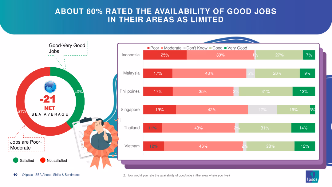
Circle chart and bar charts depicting perceptions of job availability in SEA countries.
Market Analysis and Trends
Financial Services
The slide discusses perceptions of job availability in SEA, with a majority rating availability as poor to moderate.
job availability, SEA, circle chart, bar chart, perceptions
false
Market Analysis and Trends
Financial Services
Multiple Chart
IPSOS
Add to my slides
Remove from favorites
A bar chart and bullet points detailing reasons highly skilled workers consider job changes.
Human Resources and Talent Management
Professional Services
Analyzes the motivations for job changes among highly skilled workers, including pay, career progression, and work environment.
Job change, skilled workers, career progression, work environment
false
Human Resources and Talent Management
Professional Services
Mixed Chart
Accenture
Add to my slides
Remove from favorites
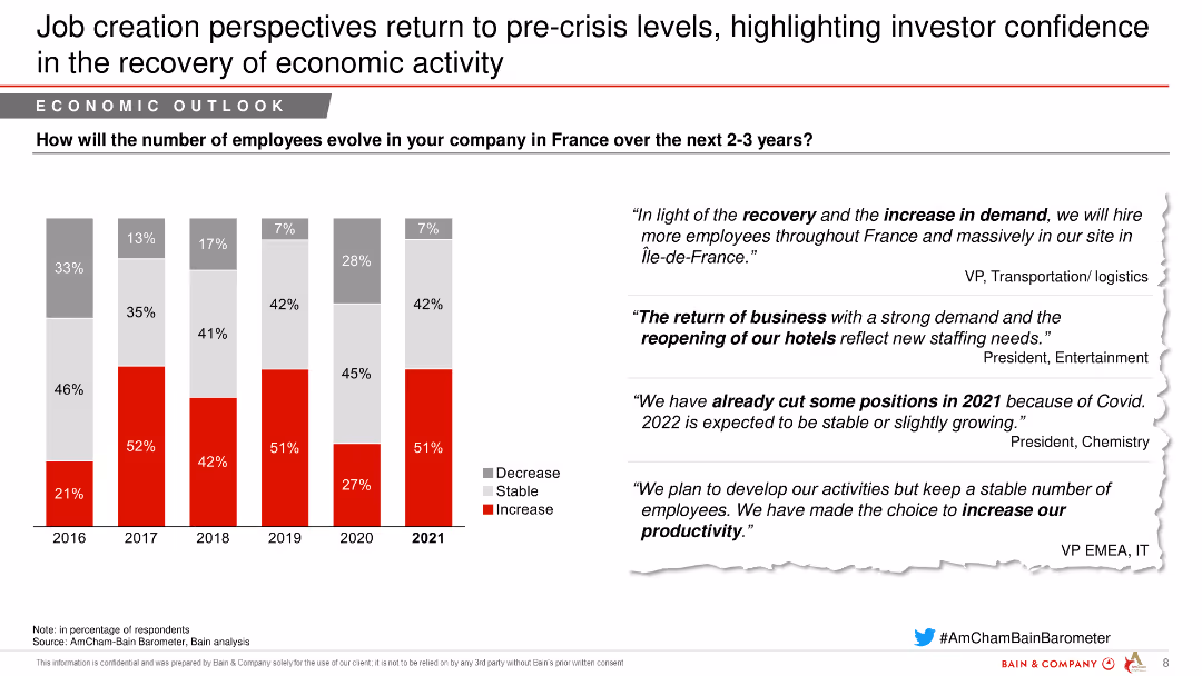
The slide features a column chart showing the percentage of companies expecting a decrease, stability, or increase in employee numbers from 2016 to 2021. On the right, there are quotes from industry leaders.
Market Analysis and Trends
Transportation & Logistics
This slide highlights the recovery in job creation perspectives in France over the next 2-3 years, with a focus on increased hiring in the transportation and logistics sector.
Job creation, Economic recovery, Employee trends, Transportation, Logistics
false
Market Analysis and Trends
Transportation & Logistics
Mixed Chart
Bain
Add to my slides
Remove from favorites
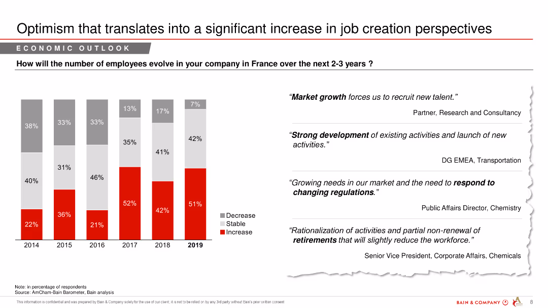
A column chart showing predicted changes in employee numbers over the next 2-3 years, with text quotes from industry experts.
Market Analysis and Trends
Financial Services
The slide discusses anticipated changes in employment levels in France over the next few years, reflecting optimism in job creation.
job creation, employee numbers, economic outlook, financial services, market analysis, predictions
false
Market Analysis and Trends
Financial Services
Mixed Chart
Bain
Add to my slides
Remove from favorites
Features a column chart detailing the evolution of employee numbers in companies in France from 2013-2018, alongside quotes from business leaders.
Human Resources and Talent Management
Professional Services
Discusses trends in job creation within companies in France, noting a positive outlook and highlighting factors influencing hiring practices.
job creation, employee numbers, France, business trends, hiring practices
false
Human Resources and Talent Management
Professional Services
Mixed Chart
Bain
Add to my slides
Remove from favorites
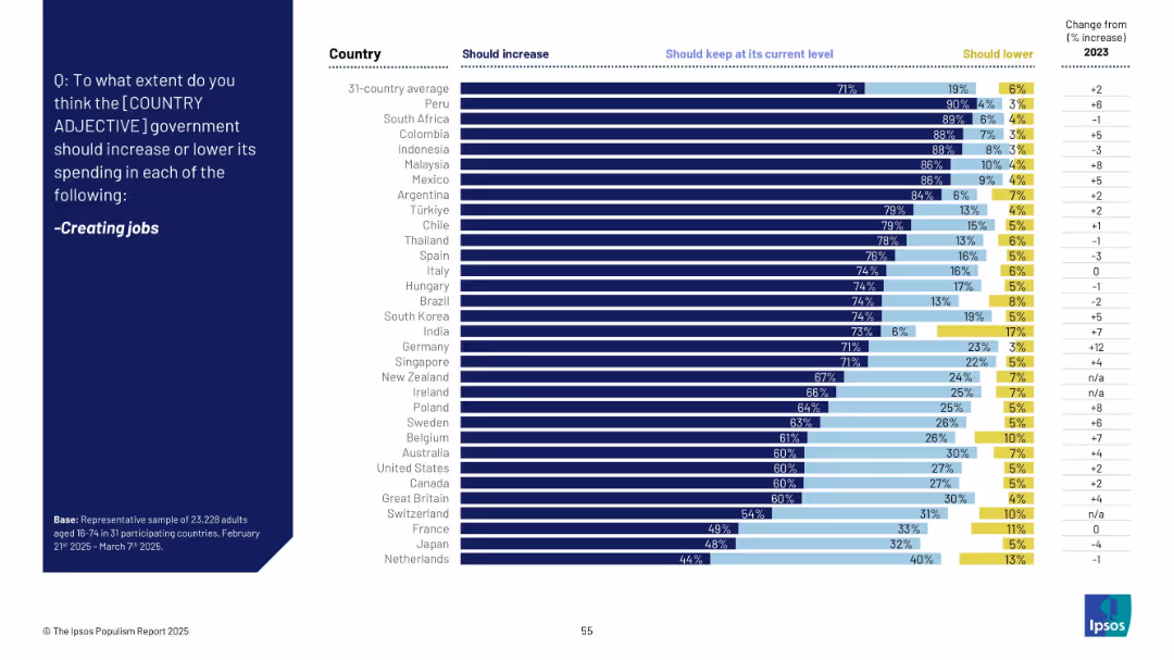
Bar chart segmented into "Should increase", "Keep at current level", and "Should lower", with change from 2023.
Strategic Planning
Government & Public Sector
Job creation remains a top priority for most populations surveyed, with 71% globally supporting increased government spending. Peru and South Africa show the strongest support. Countries like France, Japan, and the Netherlands show more moderate levels of agreement.
job creation, employment, economic policy, public spending, opinion, labor market, Ipsos, bar chart
false
Strategic Planning
Government & Public Sector
Mixed Chart
IPSOS
Add to my slides
Remove from favorites
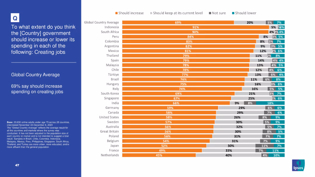
Split slide: left side has text on a blue background, right side has a horizontal bar chart with color-coded responses from multiple countries.
Market Analysis and Trends
Government & Public Sector
The slide shows public opinion across multiple countries on whether governments should increase spending on creating jobs. 69% globally support increased spending. The bar chart ranks countries by percentage agreeing with this view.
job creation, government spending, public opinion, global survey, policy support, country comparison, economic priorities, Ipsos, employment policy, chart visualization
false
Market Analysis and Trends
Government & Public Sector
Mixed Chart
IPSOS
Add to my slides
Remove from favorites
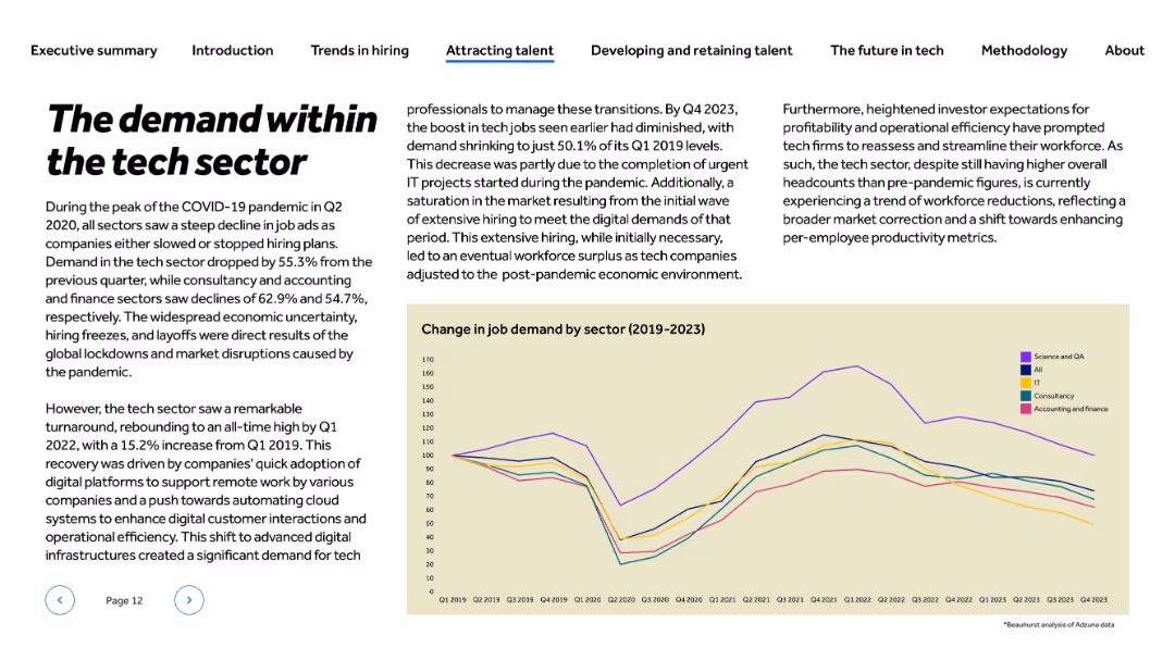
Title and text left-aligned; line chart at bottom-right showing trend from 2019 to 2023 across five sectors
Market Analysis and Trends
Technology & Software
This slide tracks job demand changes in the tech sector from 2019 to 2023. It highlights the Q2 2020 hiring dip during COVID-19 and the post-pandemic recovery, peaking in 2022. By Q4 2023, demand fell again due to market saturation and completed projects. The content discusses shifts in hiring needs driven by automation, digital adoption, and investor expectations.
job demand, COVID-19 impact, hiring trends, digital transformation, tech workforce, automation, recovery, investor pressure
false
Market Analysis and Trends
Technology & Software
Mixed Chart
Barclays
Add to my slides
Remove from favorites
Horizontal bar chart ranked by agreement level; colors show agree/neutral/disagree; dark blue sidebar with bold prompt text
Market Analysis and Trends
Government & Public Sector
This slide presents public perceptions of immigrants taking jobs from natives across 31 countries. It categorizes responses into agree, neutral, and disagree, and includes change data from 2016 to 2025. Agreement levels are highest in Thailand and lowest in Sweden and Germany.
job displacement, immigration perception, native workers, public opinion, global attitudes, employment, Ipsos, xenophobia
false
Market Analysis and Trends
Government & Public Sector
Mixed Chart
IPSOS
Add to my slides
Remove from favorites
The slide displays a combination of text and a column chart. The chart illustrates the job loyalty trend from 2016 to 2021, highlighting differences between millennials and Gen Z with green and blue bars respectively. The slide is clean and uses color effectively to differentiate data points.
Human Resources and Talent Management
Technology & Software
The slide investigates job loyalty trends among millennials and Gen Z, noting a peak in 2020 and subsequent decline. A bar chart compares the percentage of those likely to stay with their current employer versus seeking new opportunities, shedding light on workforce dynamics and talent retention strategies.
Job Loyalty, Millennials, Gen Z, Trends, Workforce Dynamics, Bar Chart, Talent Retention, Employment Trends
false
Human Resources and Talent Management
Technology & Software
Mixed Chart
Deloitte
Add to my slides
Remove from favorites
Features two column charts side by side comparing Gen Zs’ and millennials’ satisfaction with their organizations' societal impact, diversity and inclusion efforts, and sustainability commitments.
Human Resources and Talent Management
Professional Services
The slide examines the correlation between job loyalty and satisfaction with companies' commitments to societal impact, diversity, and sustainability among Gen Zs and millennials. It includes data visuals comparing satisfaction levels and job loyalty metrics.
Job loyalty, societal impact, diversity, inclusion, sustainability
false
Human Resources and Talent Management
Professional Services
Multiple Chart
Deloitte
Add to my slides
Remove from favorites
Line chart showing job satisfaction by number of job dimensions, labeled with percentages of respondents satisfied with their jobs.
Market Analysis and Trends
Professional Services
Analyzes job satisfaction levels related to the complexity of job roles, showing increased satisfaction with more cognitively demanding roles.
job satisfaction, cognitive dimensions, workforce analysis, professional growth, career development, creativity in work
false
Market Analysis and Trends
Professional Services
Mixed Chart
Accenture
Add to my slides
Remove from favorites
Consists of a column chart showing job satisfaction levels (dissatisfied, neutral, satisfied) in France compared to a general view, using shades of green and grey.
Market Analysis and Trends
Professional Services
Discusses job satisfaction trends among deskless workers in France relative to other countries, useful for comparative market analysis in HR.
job satisfaction, France, comparison, deskless workers, column chart
false
Market Analysis and Trends
Professional Services
Multiple Chart
BCG
Add to my slides
Remove from favorites
The slide features a donut chart, column charts, and text blocks. The left side shows job satisfaction ratings, and the right side displays retention likelihood.
Performance Metrics and KPIs
Professional Services
Explains job satisfaction and retention likelihood based on survey results. Includes Net Promoter Score and likelihood of staying for 12 months.
job satisfaction, retention, survey, Net Promoter Score, employee sentiment
false
Performance Metrics and KPIs
Professional Services
Mixed Chart
EY
Add to my slides
Remove from favorites
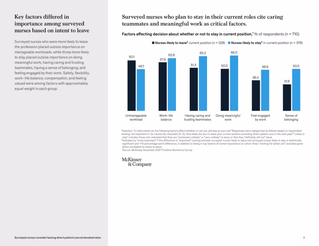
Bar graph comparing responses of nurses likely to leave vs. likely to stay across several factors; blue vs. black bars
Human Resources and Talent Management
Healthcare & Pharmaceuticals
This slide highlights statistically significant differences in how surveyed nurses rate job factors. Nurses likely to stay emphasize meaningful work and trusting teammates, while those likely to leave prioritize reducing unmanageable workloads. The analysis aids in understanding divergent priorities between these groups.
job satisfaction, workforce risk, survey data, nurse priorities, meaningful work, teamwork, burnout
false
Human Resources and Talent Management
Healthcare & Pharmaceuticals
Mixed Chart
McKinsey
Add to my slides
Remove from favorites
Multi-bar chart illustrating jobs lost and gained from automation by adoption scenarios. Color-coded for clarity.
Strategic Planning
Industrial & Manufacturing
Evaluates job loss and creation in New Zealand due to varying levels of automation adoption, important for workforce planning.
Jobs, Automation, New Zealand, Impact, Forecast
false
Strategic Planning
Industrial & Manufacturing
Multiple Chart
McKinsey
Add to my slides
Remove from favorites
Multi-bar chart with detailed job gains and losses by region in New Zealand. Provides a clear visual breakdown.
Strategic Planning
Industrial & Manufacturing
Detailed analysis of job market changes in New Zealand’s regions, highlighting areas with net job gains or losses, critical for HR and regional planners.
Jobs, Detail, New Zealand, Regions, Analysis
false
Strategic Planning
Industrial & Manufacturing
Multiple Chart
McKinsey
Add to my slides
Remove from favorites
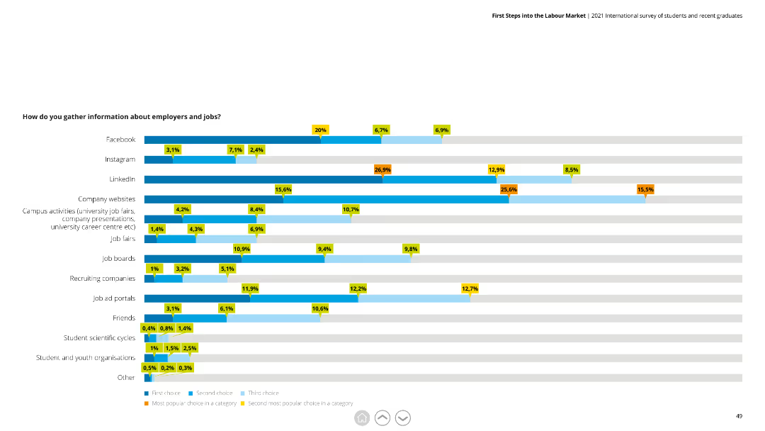
The slide includes a horizontal bar chart displaying different sources used by respondents to gather information about employers and jobs, with categories like Facebook, LinkedIn, and job fairs.
Market Analysis and Trends
Professional Services
The slide shows various sources for job information gathering, highlighting social media platforms and company websites as major sources. It is useful for analyzing job search behaviors.
Job search, information sources, survey, social media, employment
false
Market Analysis and Trends
Professional Services
Single Chart
Deloitte
Add to my slides
Remove from favorites
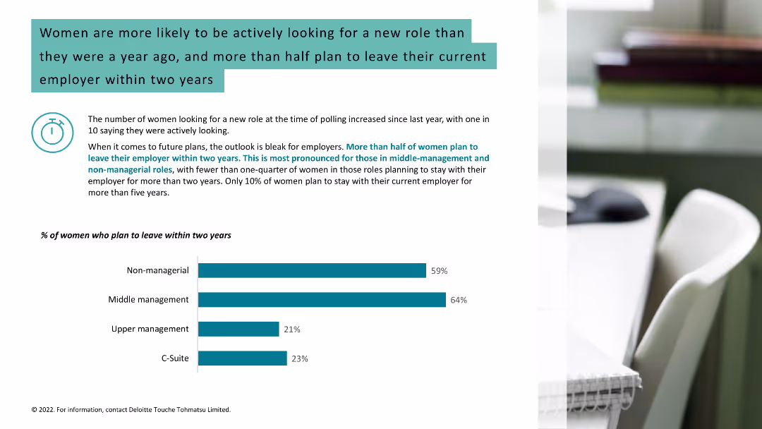
Light background with teal and black text. It features a column chart showing the percentage of women planning to leave their employer within two years, alongside a workspace image.
Human Resources and Talent Management
Healthcare & Pharmaceuticals
Highlights that more women are actively seeking new roles and planning to leave their employers within two years, with statistics on different management levels.
job search, women, career change, employer, workplace
false
Human Resources and Talent Management
Healthcare & Pharmaceuticals
Mixed Chart
Deloitte
Add to my slides
Remove from favorites
An image of two women on inflatable rings in a pool, with bar charts beside showing opinions on AI's impact on jobs and workplace roles.
Organizational Structure and Change
Professional Services
Explores worker concerns regarding AI potentially replacing or altering their job roles, with survey data on their attitudes.
job security, AI impact, workplace changes, employee concerns, survey results
false
Organizational Structure and Change
Professional Services
Mixed Chart
Deloitte
Add to my slides
Remove from favorites
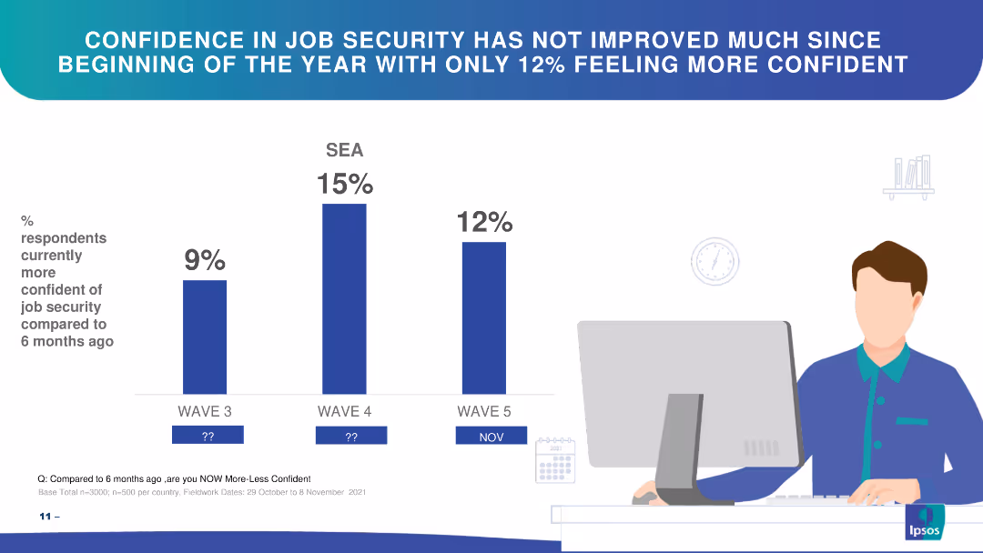
Bar chart showing changes in confidence in job security over three waves in SEA.
Market Analysis and Trends
Financial Services
The slide highlights respondents' confidence in job security over time, showing slight improvements.
job security, confidence, SEA, bar chart, trends
false
Market Analysis and Trends
Financial Services
Single Chart
IPSOS
Add to my slides
Remove from favorites
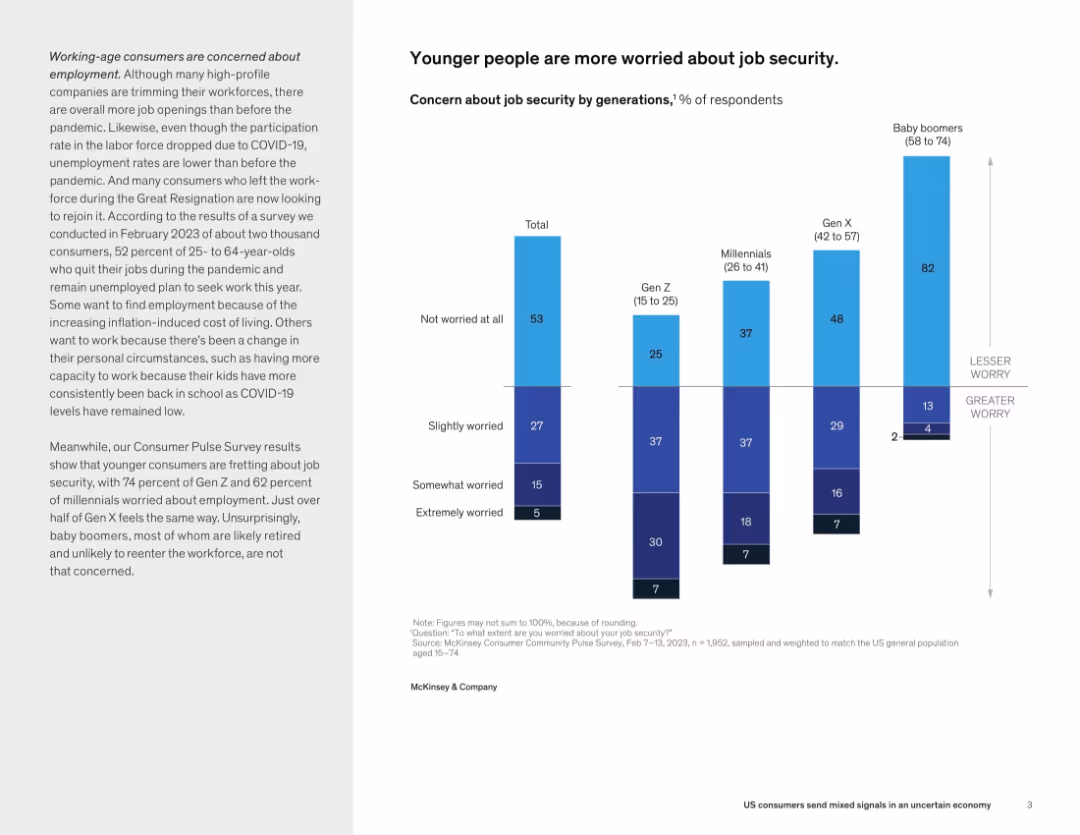
Split layout with descriptive text on left and vertical stacked bar chart on right showing job security concern by generation.
Human Resources and Talent Management
Professional Services
This slide conveys that younger generations, particularly Gen Z and millennials, are much more concerned about job security compared to Gen X and baby boomers. This reflects generational differences in employment sentiment post-pandemic.
job security, generational worry, Gen Z, millennials, employment concerns, workforce, consumer sentiment
false
Human Resources and Talent Management
Professional Services
Mixed Chart
McKinsey
Add to my slides
Remove from favorites
Top half has title and commentary; lower half includes a sentiment bar chart and AI-themed image illustrating optimism vs. fear regarding job impact.
Human Resources and Talent Management
Artificial Intelligence
This slide addresses the tension between fear of job displacement and hope for task simplification via AI. Survey results show more people believe AI will help than harm in the workplace.
job security, productivity, survey, AI, labor
false
Human Resources and Talent Management
Artificial Intelligence
Mixed Chart
IPSOS
Add to my slides
Remove from favorites
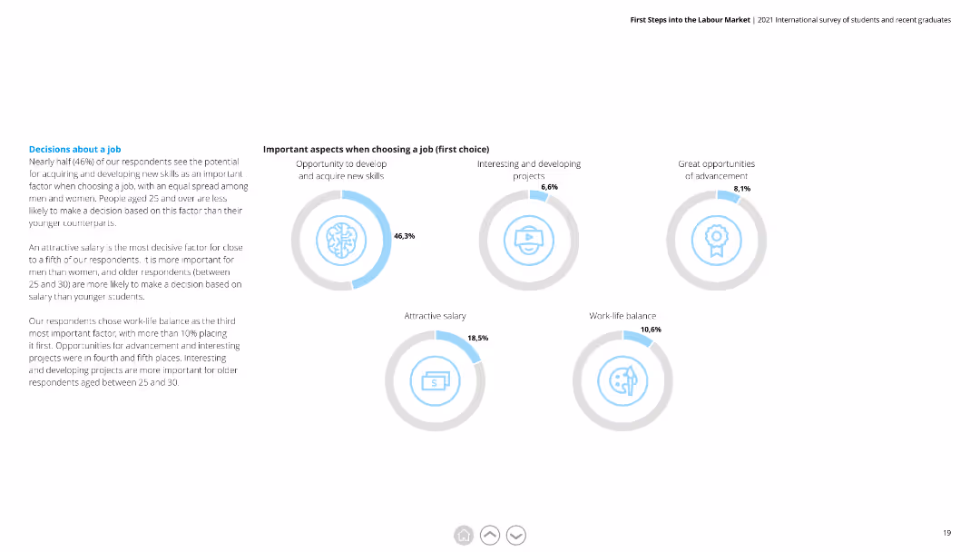
Circular diagrams showing percentages for various factors when choosing a job, including skill development and salary.
Market Analysis and Trends
Professional Services
Highlights key considerations for job selection among respondents, with a focus on skill acquisition, interesting projects, and salary.
Job Selection, Factors, Skill Development, Salary, Projects, Considerations
false
Market Analysis and Trends
Professional Services
Multiple Chart
Deloitte
Add to my slides
Remove from favorites
Bar graph showcasing job vulnerability across different occupational categories with color coding based on median annual wage.
Risk Assessment and Management
Professional Services
Analyzes the vulnerability of various jobs during the COVID-19 crisis, highlighting those at higher risk.
jobs, vulnerability, COVID-19, occupational categories, risk assessment
false
Risk Assessment and Management
Professional Services
Single Chart
McKinsey
Add to my slides
Remove from favorites
The slide includes a vertical bar chart showing the job titles of survey participants, with an image of a professional woman using a tablet on the right.
Human Resources and Talent Management
Professional Services
Breakdown of survey participants' job titles, indicating a significant presence of C-suite executives.
Job titles, survey participants, C-suite, demographics, HR
false
Human Resources and Talent Management
Professional Services
Mixed Chart
EY
Add to my slides
Remove from favorites
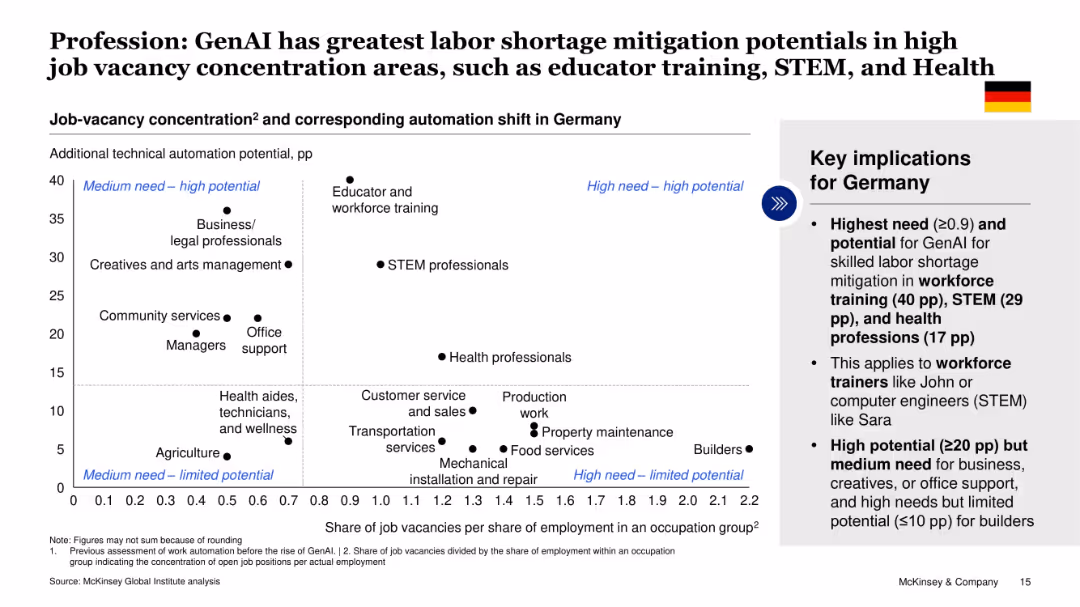
Scatter plot with quadrants categorizing professions by job vacancy concentration and GenAI automation potential. Germany-focused insights.
Human Resources and Talent Management
Artificial Intelligence
This slide maps professions by their job vacancy intensity and potential GenAI automation shift. It identifies workforce training, STEM, and healthcare as high-need, high-potential areas for mitigating labor shortages in Germany.
job vacancies, GenAI, profession mapping, automation shift, Germany, labor market, workforce demand, McKinsey
false
Human Resources and Talent Management
Artificial Intelligence
Mixed Chart
McKinsey
Add to my slides
Remove from favorites
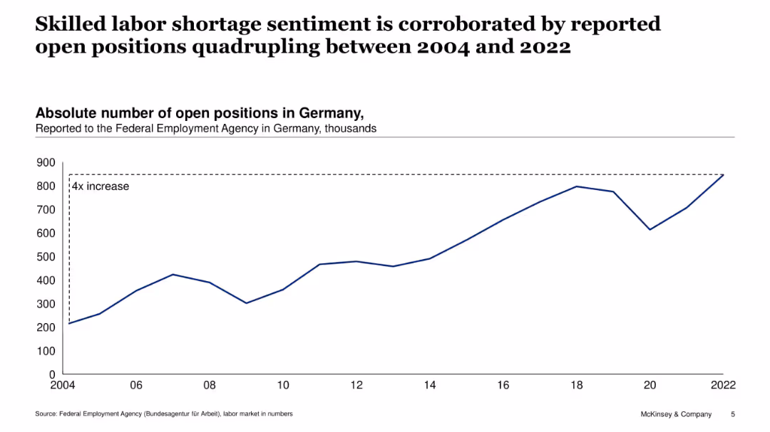
Single line chart showing number of open positions in Germany (2004–2022). Dashed annotation indicates a fourfold increase.
Human Resources and Talent Management
Government & Public Sector
Reinforcing the previous slide, this chart shows a fourfold increase in reported job openings in Germany between 2004 and 2022, supporting the perception of rising skilled labor shortages across the economy.
job vacancies, labor shortage, Germany, workforce demand, employment, hiring trends, open positions, Federal Employment Agency
false
Human Resources and Talent Management
Government & Public Sector
Single Chart
McKinsey
Add to my slides
Remove from favorites
This slide is divided into four areas, each listing key data points and small pie charts related to Seadrill's joint ventures and investment holdings. The charts are simple and color-coded, matching the text for clarity. Key financial figures are highlighted, and additional notes at the bottom provide context for the data presented. The design is clean and professional, with effective use of space and clear visual separation of different sections.
Investment Analysis
Energy & Utilities
This slide details Seadrill's various joint ventures and investment holdings, showcasing key financial data like market cap, debt, and cash positions. It emphasizes the company's strategic partnerships and financial health. This could be used in presentations to potential investors or company stakeholders, helping them understand Seadrill's financial stakes and operational breadth in different ventures, enhancing transparency and providing a basis for financial decision-making.
joint ventures, investments, financials, Seadrill, market cap, debt, partnerships, pie charts, cash positions, transparency
false
Investment Analysis
Energy & Utilities
Table
Barclays
Add to my slides
Remove from favorites
Map-based slide with overview metrics, modal split diagram, and trade data; includes key policy targets in green box.
Strategic Planning
Transportation & Logistics
Jordan’s slide outlines plans for a standard gauge rail network linking to neighboring countries. The modal share is heavily road-dominated. Key objectives include increasing freight rail use and completing the Aqaba-Amman link. Trade statistics and network visuals support the argument.
Jordan rail, cross-border connectivity, standard gauge, freight transport, regional links, Amman, Aqaba, modal share, logistics policy
false
Strategic Planning
Transportation & Logistics
Multiple Chart
Roland Berger
Add to my slides
Remove from favorites
The slide provides a breakdown of preparers responsible for dining and hotel sales journal entries, with detailed tables showing percentage of activity by preparer.
Regulatory and Compliance
Financial Services
This slide details the number of preparers for dining and hotel sales, analyzing their activity percentages to identify any discrepancies or patterns that warrant further investigation.
journal entries, preparers, dining sales, hotel sales, financial oversight
false
Regulatory and Compliance
Financial Services
Mixed Chart
EY
Add to my slides
Remove from favorites
The slide contains a bar graph showing monthly activity by revenue source, categorized into cash receipts, credit card receipts, checks, and regular JVs, with a color key.
Regulatory and Compliance
Financial Services
This slide explains the different sources of journal entries for revenue accounts, highlighting the significance of credit card receipts which account for 97% of total sources.
journal entries, revenue sources, credit card receipts, financial transactions, data analysis
false
Regulatory and Compliance
Financial Services
Mixed Chart
EY
Add to my slides
Remove from favorites
The slide includes detailed textual descriptions of the transaction flow for credit card transactions for hotel sales, along with a visual representation of the transaction process.
Regulatory and Compliance
Financial Services
This slide walks through the transaction flow for credit card transactions for hotel sales, illustrating the role of the preparer and the debit to cash for confirmation of understanding.
journal entries, transaction flow, credit card transactions, hotel sales, financial analysis
false
Regulatory and Compliance
Financial Services
Mixed Chart
EY
Add to my slides
Remove from favorites
Left panel describes the survey question, right has horizontal bars split between "trustworthy" and "untrustworthy" scores by country.
Market Analysis and Trends
Media & Entertainment
Trust in journalists varies widely; Indonesia and India top the trust ratings, while Hungary and South Korea rank lowest. Global average trust is 25%.
journalism, public opinion, trust, countries, Ipsos, reporters, news, global sentiment
false
Market Analysis and Trends
Media & Entertainment
Mixed Chart
IPSOS
Add to my slides
Remove from favorites
The slide shows a matrix-like table categorizing asset flows across different financial products and regions from 2013 to Q1 2023. It uses green and red dots to indicate increases or decreases in assets, respectively.
Financial Performance
Financial Services
It analyzes JPMorgan Chase's client asset flows over time, showcasing the performance across different sectors and regions. This slide is used for financial performance reviews and strategic planning.
JPMC, asset flows, financial analysis, product performance, regional analysis, strategic planning, client assets.
false
Financial Performance
Financial Services
Single Chart
JP Morgan
Add to my slides
Remove from favorites
The slide presents a central circular diagram with concentric circles highlighting the integration between business sectors like Banking, Cards, and Market Leadership Teams, and core areas like CB, CIB, and AWM. Rectangular sections on the sides list JPMC's advantages and cross-LOB partnership metrics, complemented by icons and percentage figures.
Market Analysis and Trends
Financial Services
Focuses on JPMC's strategic advantages and partnership statistics within its divisions, highlighting cybersecurity, AI/ML expertise, and brand strength, alongside the synergies and client engagement across different lines of business.
JPMC, cybersecurity, AI/ML, strategic planning, partnerships, financial services, market analysis, brand value, cross-LOB, industry synergy
false
Market Analysis and Trends
Financial Services
Diagram
JP Morgan
Add to my slides
Remove from favorites
The layout includes a central diagram with a circular flow and additional text sections.
Organizational Structure and Change
Financial Services
Demonstrates JPMC's cross-LOB (line of business) partnership and its global leadership reach, emphasizing the company's unique market position and offerings.
JPMC, Partnership, LOB, Global, Leadership
false
Organizational Structure and Change
Financial Services
Framework
JP Morgan
Add to my slides
Remove from favorites
Central Venn diagram showing integration of JPMorgan Chase's services, surrounded by key strategic points with icons.
Competitive Landscape
Financial Services
The slide presents JPMorgan Chase's integrated platform, highlighting relationships, liquidity solutions, digital solutions, and data analytics. Ideal for discussing competitive advantages and corporate synergy.
JPMorgan Chase, competitive advantage, integrated platform, relationships, liquidity, digital solutions, data analytics, branches
false
Competitive Landscape
Financial Services
Framework
JP Morgan
Add to my slides
Remove from favorites
The slide features column chart for revenue and net income, with lines illustrating return on equity (ROE) trends for different sectors. The columns are deep blue, while the lines are in purple and green, set against a white background. A red circle highlights a specific point of interest.
Financial Performance
Financial Services
The slide highlights JPMorgan's strong financial performance in 2019, showing increased revenue and net income. It details the company's return on equity (ROE) for different sectors with bar charts and line graphs, emphasizing their market position and successful business strategy in the financial sector.
JPMorgan, Financial Results, Revenue, Net Income, ROE, Bar Chart, Line Graph, Market Position, Business Strategy
false
Financial Performance
Financial Services
Single Chart
JP Morgan
Add to my slides
Remove from favorites
Slide with bulleted lists and a table presenting inflation performance data. The table includes comparative inflation figures from 2009-2019 and quarterly figures from 4Q20 to 4Q22 across different regions.
Financial Performance
Financial Services
Discusses JPMorgan's inflation predictions, contrasting short-term demand surge against medium-term fiscal policy effects. The slide is used to inform financial strategies and economic expectations.
JPMorgan, inflation, forecast, financial analysis, core inflation performance, demand, fiscal policy, monetary support, pandemic impact.
false
Financial Performance
Financial Services
Table
JP Morgan
Add to my slides
Remove from favorites
This slide features a mix of column charts, pie charts, and arrows indicating trends. There are multiple graphs showing leadership positions, market share gains, and regional performance comparisons. The design incorporates shades of blue and green, with concise textual information.
Financial Performance
Financial Services
This slide showcases the market leadership and growth of JPMorgan's Corporate & Investment Bank (CIB). It displays their global leadership positions in bar charts and pie charts detailing regional market share gains. There's a focus on the strategic business expansion and investments made since 2015. It illustrates the company's successful growth and competitive edge in the financial services industry.
JPMorgan, Market Leadership, Growth, Financial Services, CIB, Market Share, Bar Chart, Pie Chart, Investment
false
Financial Performance
Financial Services
Multiple Chart
JP Morgan
Add to my slides
Remove from favorites
This slide includes a title, column charts contrasting the number of cases finalised per FTE in FCoA and FCC, and a sidebar explaining differences in judicial output.
Regulatory and Compliance
Government & Public Sector
The slide details the differences in case finalisation per FTE between FCoA and FCC, with a focus on the lower finalisation rate in FCoA despite its higher number of non-judicial staff, pointing to differences in case complexity.
judicial efficiency, FCoA, FCC, finalisation rate, full-time equivalent, case complexity
false
Regulatory and Compliance
Government & Public Sector
Multiple Chart
PwC/Strategy&
Add to my slides
Remove from favorites
Previous
Next
You don't have any favorites yet.
Please wait loading your favorites slides...
Create a FREE account to continue browsing
Receive Instant Access to 1,000+ slides from companies like McKinsey, Google, and Goldman Sachs
First Name
Last Name
Email
Password
I agree to all
Terms & Privacy Policy
Thank you! Your submission has been received!
Oops! Something went wrong while submitting the form.
Have an account?
Sign in
Upgrade to PRO to Save slides
Advanced Search and Filters
Access to 15,000+ slides
Access to Category Pages
Save/Bookmark Slides
PowerPoint Template Library
Pick a Plan
MONTHLY
$12/month
Billed every month, Cancel anytime.
YEARLY
$9/year
Billed $108 annually, Cancel anytime.
Checkout for $12/month
Checkout for $108/yr
Secured by Stripe | AES-256 bit encryption


![Immigrants take jobs away from real… [NOUN FOR PEOPLE FROM COUNTRY, PLURAL]](https://cdn.prod.website-files.com/654e70fb59937215cac87b19/6899bb070727c755a855c9e4_LIRvwiBq7v2DhJKlZcy5pDdtCKh3z00KctiiUcKSrL4.avif)