My Account
My Slides
Search by Category
Pricing
Templates
View All Templates
Download Template Slides
✦ AI Search
Feedback
Login
Logout
Get Started
Browse all Slides
Browse all Slides
Create a FREE Account
Instant access to 1,000+ real slides from top companies like McKinsey, BCG, Goldman Sachs, Google and many more!
First Name
Last Name
Email
Password
I agree to all
Terms & Privacy Policy
Thank you! Your submission has been received!
Oops! Something went wrong while submitting the form.
Have an account?
Sign in
Saved Slides
Total No. of slides saved
0
↻ Refresh
✖ Clear all
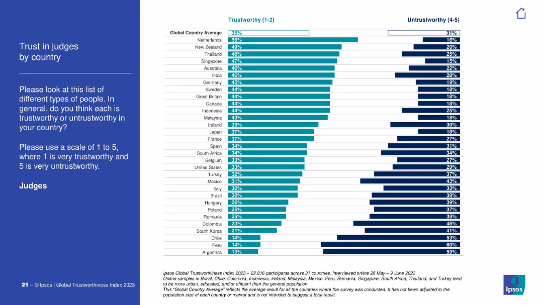
Similar bar chart design displaying trust levels in judges by country. Both trust and untrust metrics shown.
Customer and Market Segmentation
Government & Public Sector
Trust in judicial systems varies globally, with the Netherlands leading and Argentina, Peru, and Chile ranked lowest. The global average for trust in judges is 35%, showing moderate to low confidence in judiciary systems worldwide.
judiciary, trust in judges, country breakdown, Ipsos, legal system perception
false
Customer and Market Segmentation
Government & Public Sector
Mixed Chart
IPSOS
Add to my slides
Remove from favorites
The slide features a column chart, pie chart, and text boxes. It is moderately dense with visual elements and data.
Market Analysis and Trends
Education & Training
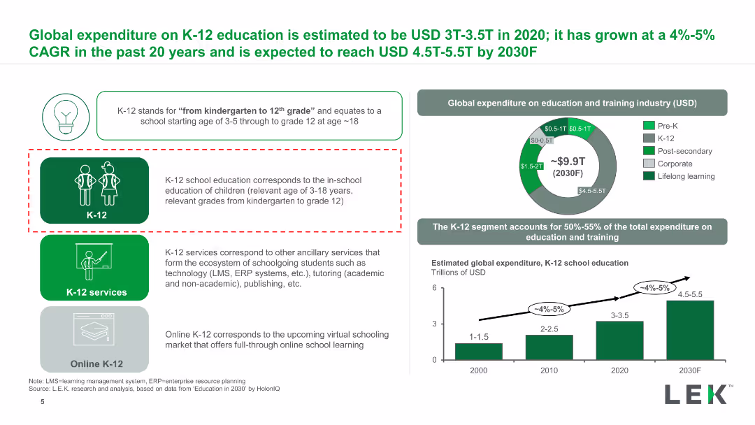
Describes the global expenditure on K-12 education, its growth rate, and future projections.
K-12, expenditure, education, CAGR, global, services
false
Market Analysis and Trends
Education & Training
Multiple Chart
LEK
Add to my slides
Remove from favorites
Slide with icons and text blocks showing demand drivers, business model innovations, and evidence of success.
Market Analysis and Trends
Education & Training
It discusses the rising middle class and poor public education quality driving demand for budget K-12 schools.
K-12, opportunities, demand drivers, budget, education
false
Market Analysis and Trends
Education & Training
Pillar
LEK
Add to my slides
Remove from favorites
Multiple column charts and text boxes presenting data on various factors driving the attractiveness of private K-12.
Market Analysis and Trends
Education & Training
Analyzes the drivers making private K-12 education attractive, including PISA scores, IELTS takers, and education outcomes.
K-12, private, attractiveness, PISA, IELTS, outcomes
false
Market Analysis and Trends
Education & Training
Multiple Chart
LEK
Add to my slides
Remove from favorites
The slide includes a world map with highlighted regions and text boxes indicating market size and growth rates.
Market Analysis and Trends
Education & Training
Highlights the private K-12 market growth with enrollment numbers and CAGR between 2015 and 2019.
K-12, private market, enrollment, growth, global
false
Market Analysis and Trends
Education & Training
Mixed Chart
LEK
Add to my slides
Remove from favorites
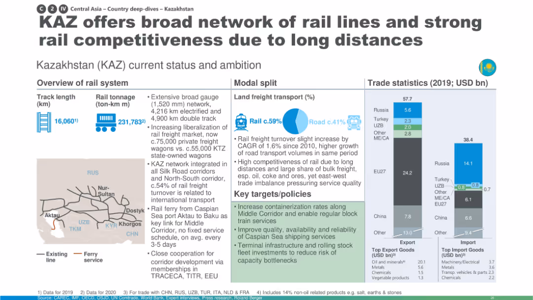
Map-heavy layout with large pie chart for modal share; emphasis on long-distance transport and containerization.
Industry Overview
Transportation & Logistics
Kazakhstan is presented as a key player in rail freight across Central Asia due to its extensive network, liberalized market, and integration into multiple corridors. The slide focuses on capacity enhancements and future development goals to maintain competitiveness.
Kazakhstan, containerization, rail freight, Caspian ferry, competitiveness, infrastructure
false
Industry Overview
Transportation & Logistics
Multiple Chart
Roland Berger
Add to my slides
Remove from favorites
Product-focused layout with brand positioning, global sales bar chart, and future growth perspectives. Text-heavy with bullets outlining clinical strength and market opportunity. Uses blue tones and brand color.
Product and Service Analysis
Healthcare & Pharmaceuticals
Highlights Kerendia’s role in treating CKD and heart failure, emphasizing clinical differentiation and market potential. Sales growth is driven by indications in underpenetrated markets, with plans to expand into broader CKD spectrum and heart failure populations, particularly in China and the US.
Kerendia, CKD, heart failure, T2D, pharma launch, clinical growth, Bayer
false
Product and Service Analysis
Healthcare & Pharmaceuticals
Mixed Chart
JP Morgan
Add to my slides
Remove from favorites
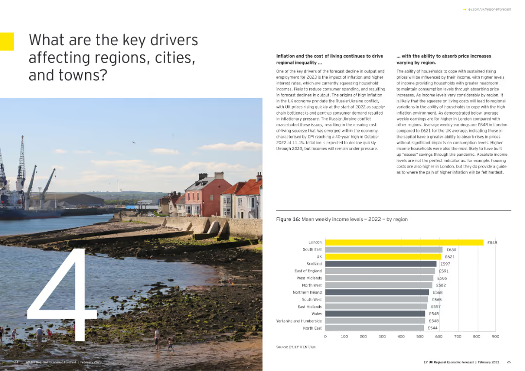
Features a large number "4" with an image of a coastal town, and a column chart showing mean weekly income levels by region for 2022.
Market Analysis and Trends
Government & Public Sector
Identifies key drivers affecting regions, cities, and towns, focusing on inflation, cost of living, and income disparities across the UK.
key drivers, regional impact, inflation, income levels, 2022, column chart
false
Market Analysis and Trends
Government & Public Sector
Mixed Chart
EY
Add to my slides
Remove from favorites
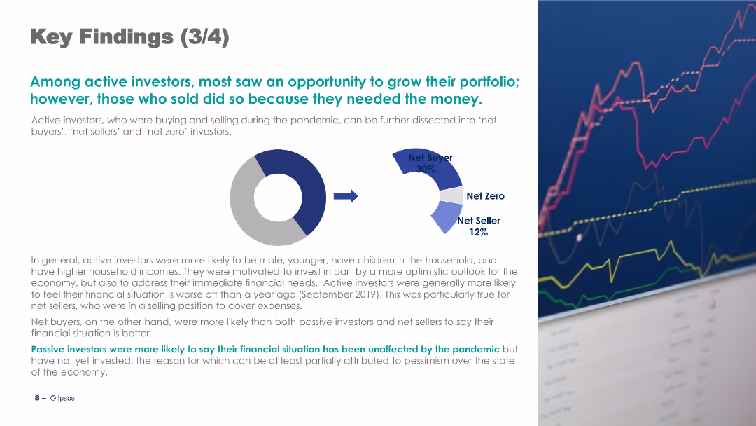
The slide features a pie chart and text, discussing active investors' behaviors during the pandemic with key statistics.
Strategic Planning
Financial Services
It summarizes the behaviors of active investors during the pandemic, highlighting motivations and financial impacts.
Key Findings, Active Investors, Pandemic, Behavior, Financial, Investment, Pie Chart, Text, Image, Strategic Planning
false
Strategic Planning
Financial Services
Mixed Chart
IPSOS
Add to my slides
Remove from favorites
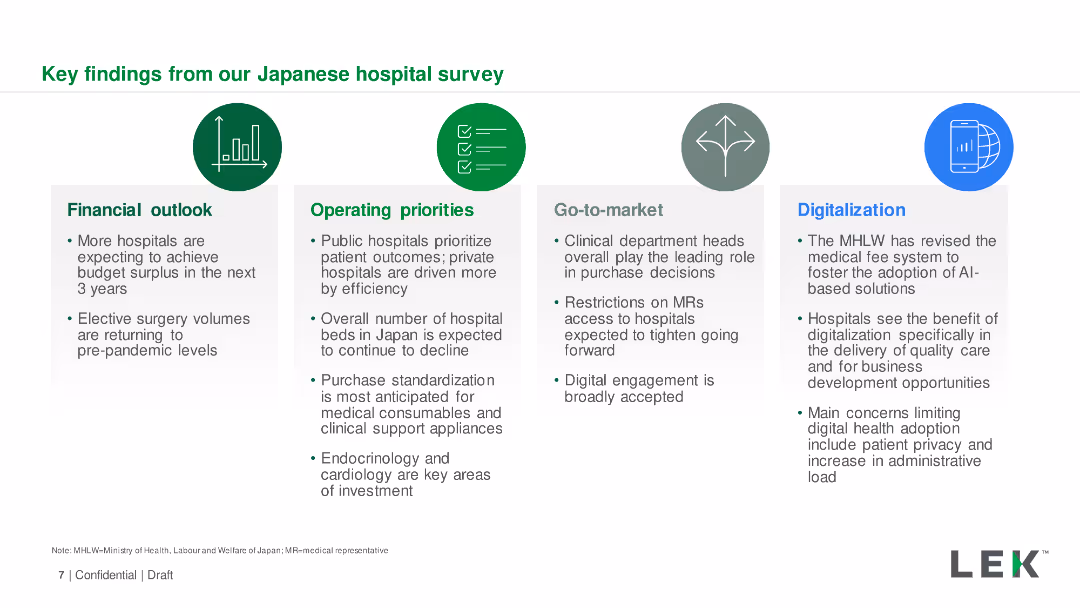
Icons and text boxes summarizing key survey findings in four categories: Financial outlook, Operating priorities, Go-to-market, Digitalization.
Market Analysis and Trends
Healthcare & Pharmaceuticals
Summary of key insights from the Japanese hospital survey, covering financial outlook, operating priorities, market strategies, and digitalization efforts.
Key Findings, Hospital Survey, Japan, Digitalization, Financial Outlook
false
Market Analysis and Trends
Healthcare & Pharmaceuticals
Pillar
LEK
Add to my slides
Remove from favorites
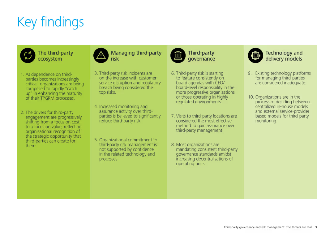
The slide has four sections with icons and text, summarizing the key findings related to the third-party ecosystem, managing third-party risk, third-party governance, and technology and delivery models.
Strategic Planning
Professional Services
This slide summarizes the key findings of the study, covering four main areas: third-party ecosystem, managing third-party risk, third-party governance, and technology and delivery models. It outlines critical insights for organizational strategy.
key findings, third-party risk, governance, technology, delivery models, strategic planning, professional services
false
Strategic Planning
Professional Services
Pillar
Deloitte
Add to my slides
Remove from favorites
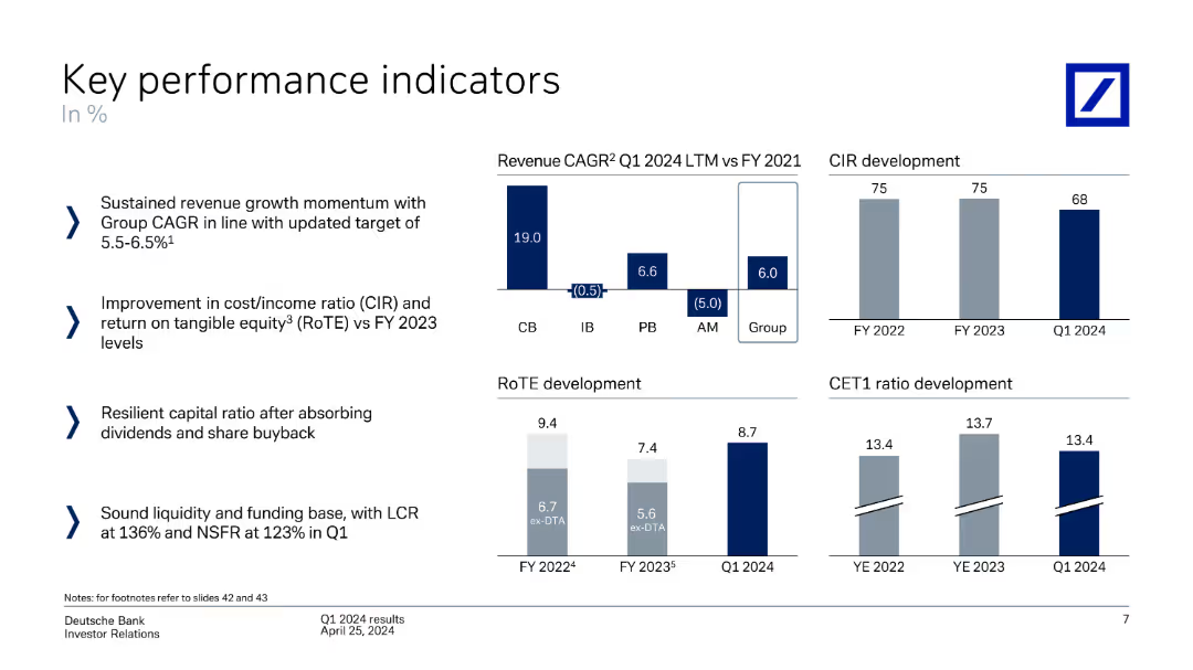
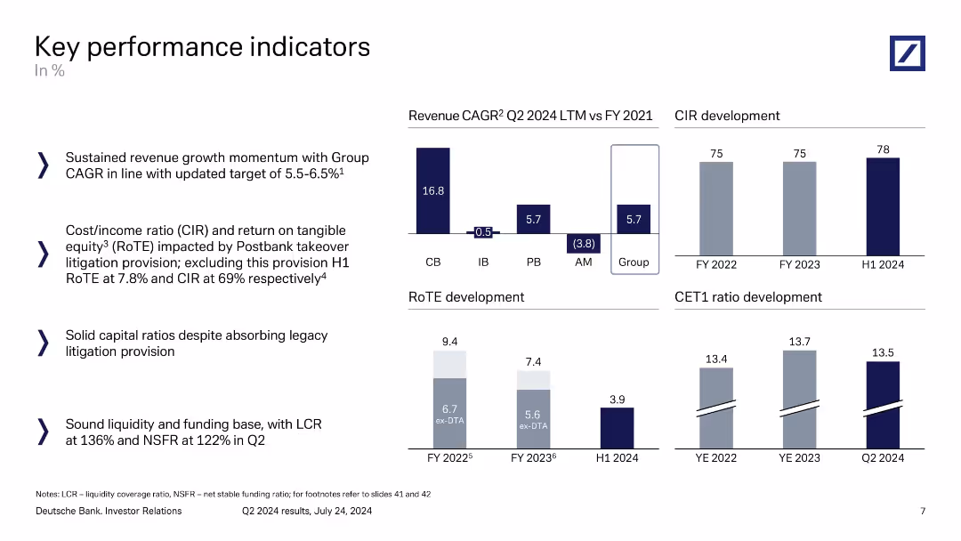
The slide presents several column charts comparing KPIs like revenue CAGR, CIR development, RoTE development, and CET1 ratio development across fiscal years and quarters.
Performance Metrics and KPIs
Financial Services
It highlights key performance indicators for Deutsche Bank, focusing on revenue growth, cost/income ratio, return on equity, and CET1 ratio over time.
key performance indicators, revenue CAGR, CIR, RoTE, CET1 ratio, Deutsche Bank, performance analysis
false
Performance Metrics and KPIs
Financial Services
Multiple Chart
Deutsche Bank
Add to my slides
Remove from favorites
Combination of bar charts, textual data, and statistical outlines, highlighting various performance and demographic metrics, including an engagement index and gender distribution in hiring.
Strategic Planning
Professional Services
Provides a detailed look at key performance and operational statistics for a consultancy, including engagement, audit outcomes, and employee demographics.
key statistics, performance, demographics, bar chart
false
Strategic Planning
Professional Services
Multiple Chart
PwC/Strategy&
Add to my slides
Remove from favorites
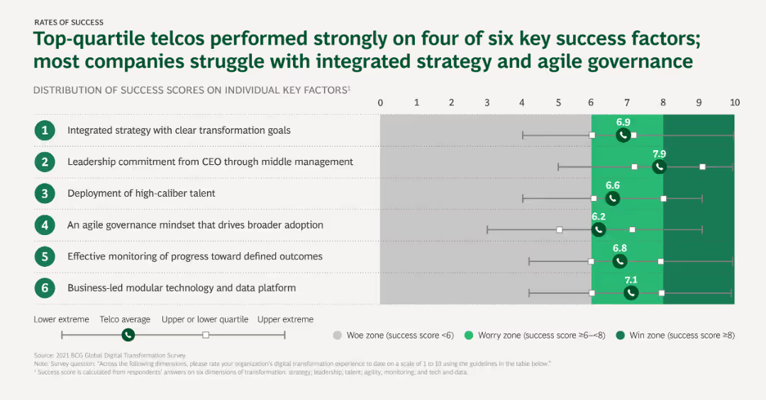
The slide uses horizontal bar charts to depict the distribution of success scores on individual key factors for digital transformation, with a focus on strategy, leadership, and talent.
Performance Metrics and KPIs
Telecommunications
This slide analyzes the key success factors for digital transformation in the telco sector, showing how top-quartile telcos perform better on specific factors compared to the average.
Key success factors, Digital transformation, Telcos, Strategy, Leadership, Talent
false
Performance Metrics and KPIs
Telecommunications
Mixed Chart
BCG
Add to my slides
Remove from favorites
This is a bullet point list slide outlining the key tasks for the second half of 2019 and 2020. It utilizes green circles as bullet points to emphasize each task, arranged in a vertical flow for easy reading.
Strategic Planning
Financial Services
The slide lists strategic tasks set for the near future, focusing on platform delivery, acquisitions, optimisation, and capital return strategies. It can be used for strategic briefings and setting priorities.
Key Tasks, Strategy, Priorities, Platform Delivery, Capital Return
false
Strategic Planning
Financial Services
Vertical Flow
Morgan Stanley
Add to my slides
Remove from favorites
The slide lists key themes in three sections: revenue initiatives, cost discipline and operating leverage, and prudent risk management, with a central diagram for risk.
Strategic Planning
Financial Services
This slide outlines the strategic themes for 2020, focusing on revenue initiatives, cost discipline, operating leverage, and risk management within the Swiss Universal Bank.
Key themes, 2020, strategic planning, revenue initiatives, risk management
false
Strategic Planning
Financial Services
Diagram
Credit Suisse
Add to my slides
Remove from favorites
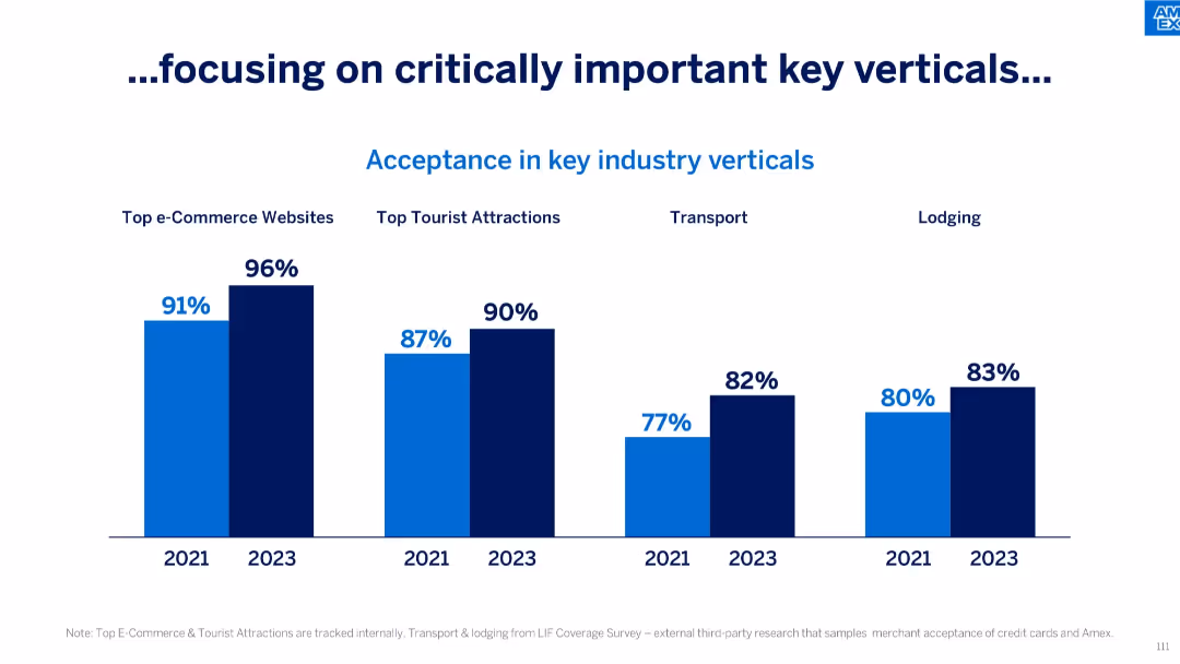
Four grouped bar comparisons between 2021 and 2023 across industry verticals: e-commerce, tourist attractions, transport, and lodging.
Competitive Landscape
Financial Services
This slide presents improvement in Amex acceptance across key verticals, showing growth in top e-commerce sites, tourist attractions, transport, and lodging between 2021 and 2023, reinforcing strategic focus areas.
Key Verticals, Industry Acceptance, E-commerce, Lodging, Tourist Attractions, Transport, Growth
false
Competitive Landscape
Financial Services
Single Chart
McKinsey
Add to my slides
Remove from favorites
Various pie charts illustrating Knorr's global sales, profitability, and market segments. Includes a pie chart for market distribution and column charts for financial metrics.
Product and Service Analysis
Consumer Goods
Provides an in-depth analysis of Knorr’s performance across different market segments, emphasizing its profitability and widespread market presence. Discusses strategic positioning and product diversity.
Knorr, Global Sales, Profitability, Market Segments, Product Diversity
false
Product and Service Analysis
Consumer Goods
Multiple Chart
Deutsche Bank
Add to my slides
Remove from favorites
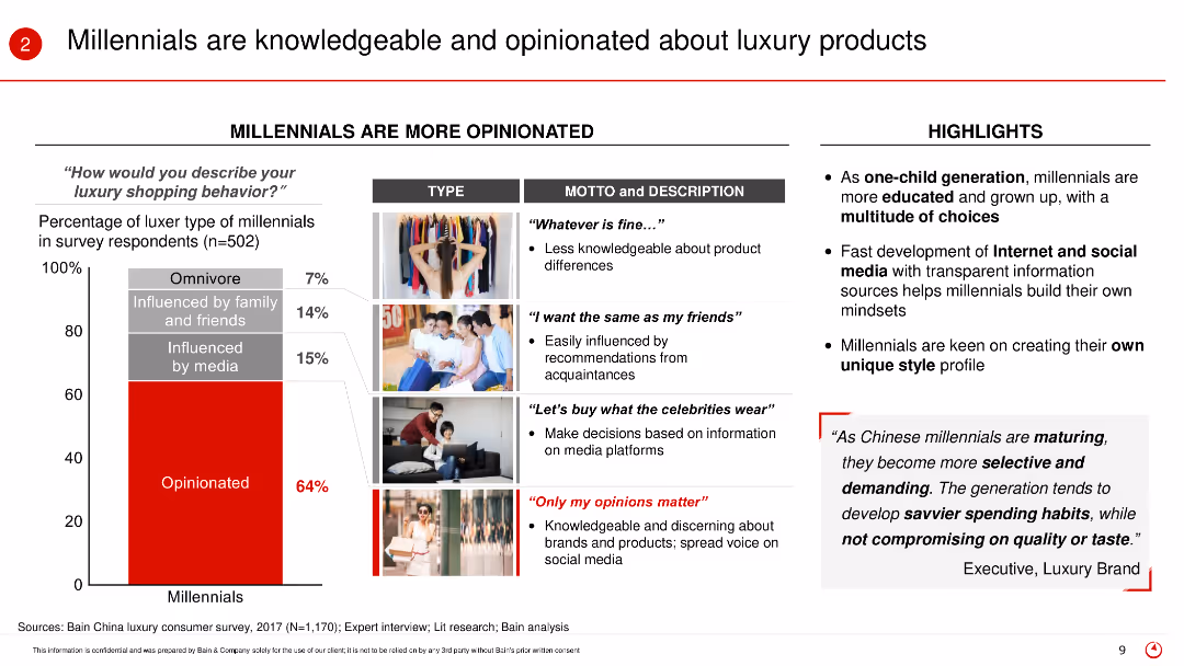
The slide features a vertical bar (column) chart and images to describe the luxury shopping behavior of Millennials. It highlights the different types of Millennials and their shopping mottos, along with key highlights about their opinions and behaviors.
Market Analysis and Trends
Retail & E-commerce
The slide examines the knowledge and opinions of Millennials regarding luxury products. It categorizes Millennials based on their shopping behavior and describes their tendencies to be influenced by media, friends, or personal opinions. The highlights emphasize their education, digital literacy, and selective shopping habits.
Knowledgeable consumers, Millennials, luxury products, shopping behavior, media influence, consumer opinions, digital literacy, selective habits
false
Market Analysis and Trends
Retail & E-commerce
Mixed Chart
Bain
Add to my slides
Remove from favorites
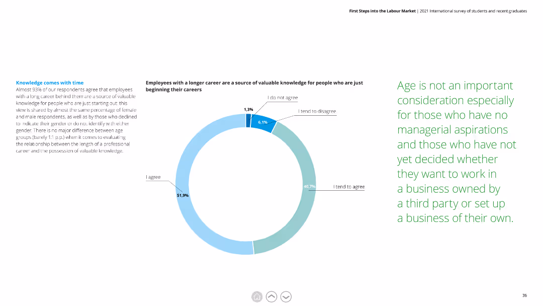
The slide features a pie chart with multiple segments. The text is organized into three distinct columns, with clear headings and subheadings. The chart uses shades of blue and green.
Market Analysis and Trends
Education & Training
Highlights that 93% of respondents agree that employees with a longer career are a valuable knowledge source. It explores the impact of career length on knowledge sharing, including gender and age differences.
knowledge, career, valuable, respondents, gender, age, knowledge sharing
false
Market Analysis and Trends
Education & Training
Mixed Chart
Deloitte
Add to my slides
Remove from favorites
The slide shows a column chart indicating the average crypto asset knowledge score and the number of correct answers participants provided on a knowledge quiz.
Technology and Digital Transformation
Financial Services
This slide measures the average knowledge score of participants regarding crypto assets, based on a series of quiz questions.
Knowledge, crypto assets, quiz, score, participants
false
Technology and Digital Transformation
Financial Services
Mixed Chart
IPSOS
Add to my slides
Remove from favorites
The slide features a column chart representing the participants' responses to true or false statements about crypto assets, with correct answers highlighted.
Market Analysis and Trends
Financial Services
This slide evaluates the general knowledge of participants about crypto assets through true/false statements and indicates the percentage of correct answers.
Knowledge, crypto assets, survey, true/false, general knowledge
false
Market Analysis and Trends
Financial Services
Mixed Chart
IPSOS
Add to my slides
Remove from favorites
Text with a quote and a map of Europe, highlighting the reliability and speed of Ipsos surveys. Three numbered points describing the benefits of knowledge panel expansion.
Product and Service Analysis
Professional Services
Describes the expansion of Ipsos' knowledge panels and their benefits, including brand recognition, market revenue gains, and EU market presence. Emphasizes the reliability of data.
Knowledge Panels, Expansion, Reliability, EU Market, Surveys
false
Product and Service Analysis
Professional Services
Boxed
IPSOS
Add to my slides
Remove from favorites
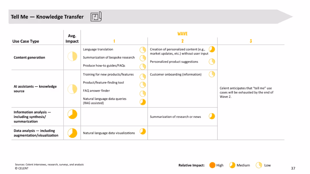
Table with use case types by wave, average impact, and projected evolution. Uses visual impact indicators (circles).
Customer and Market Segmentation
Financial Services
Focuses on GenAI’s role in knowledge transfer for customer inquiries. Shows low to medium impact use cases such as FAQs, translations, and data summarization evolving toward personalized suggestions and onboarding automation.
knowledge transfer, FAQs, onboarding, content generation, GenAI, financial services
false
Customer and Market Segmentation
Financial Services
Single Chart
Oliver Wyman
Add to my slides
Remove from favorites
Column chart showing the follower percentages of top KOLs, image of a light bulb
Market Analysis and Trends
Media & Entertainment
Evaluates the importance of Key Opinion Leaders in luxury consumer engagement
KOLs, Luxury, Consumer Engagement, Influence
false
Market Analysis and Trends
Media & Entertainment
Single Chart
BCG
Add to my slides
Remove from favorites
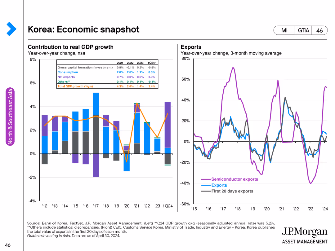
The slide has a stacked column chart on the left showing the contribution to GDP growth by various factors from 2012 to Q1 2024. The right side features line charts for semiconductor exports and total exports' year-over-year change.
Market Analysis and Trends
Financial Services
This slide offers a comprehensive view of Korea's economy, focusing on GDP growth contributions and export trends, including a specific focus on semiconductor exports.
Korea, GDP growth, economic snapshot, semiconductor exports, total exports
false
Market Analysis and Trends
Financial Services
Multiple Chart
JP Morgan
Add to my slides
Remove from favorites
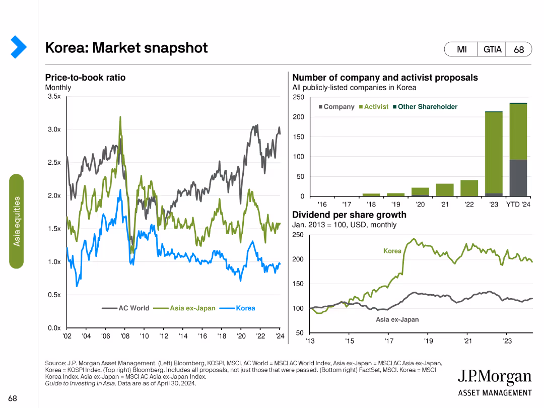
This slide contains three charts: a line chart on the price-to-book ratio, a bar chart on the number of company and activist proposals, and a line chart showing dividend per share growth.
Market Analysis and Trends
Financial Services
The slide offers a snapshot of the Korean market, highlighting trends in price-to-book ratios, shareholder activism, and dividend growth, providing a comprehensive view of market dynamics and investment opportunities.
Korea, market snapshot, price-to-book ratio, activist proposals, dividend growth, shareholder activism, market dynamics, investment opportunities, financial analysis
false
Market Analysis and Trends
Financial Services
Multiple Chart
JP Morgan
Add to my slides
Remove from favorites
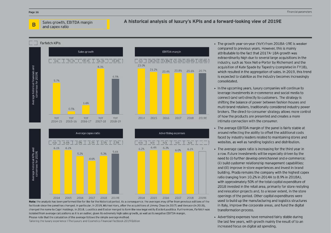
This slide features bar charts and line graphs analyzing historical and projected KPIs for luxury companies, including sales growth, EBITDA margins, and capex ratios.
Financial Performance
Consumer Goods
The slide provides a historical analysis and forward-looking view of key performance indicators for luxury companies, examining trends in sales, margins, and capital expenditures.
KPI analysis, luxury companies, financial performance, sales growth, EBITDA margin
false
Financial Performance
Consumer Goods
Multiple Chart
EY
Add to my slides
Remove from favorites
Slide displays a mix of column charts and statistical bullet points, summarizing financial KPIs like revenue CAGR, RoTE, CET1 ratio, and liquidity. Visuals are complemented by concise bullet points that explain the key trends.
Performance Metrics and KPIs
Financial Services
Outlines Deutsche Bank's main performance indicators, showing financial health through revenue trends, cost efficiency, and liquidity metrics. Targets financial analysts and investors by providing crucial KPI updates.
KPI, financial health, revenue trends, CET1, liquidity
false
Performance Metrics and KPIs
Financial Services
Multiple Chart
Deutsche Bank
Add to my slides
Remove from favorites
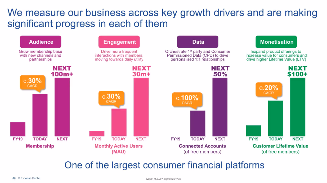
Four vertical bar charts under categories: Audience, Engagement, Data, Monetisation. Each includes growth metrics and future projections.
Performance Metrics and KPIs
Financial Services
This slide communicates Experian’s core growth KPIs—membership, engagement, data usage, and monetization. It provides current performance (FY25) and future targets, emphasizing strong CAGR and commitment to scaling platform value.
KPIs, Engagement, Monetization, User growth, Data, Membership, Lifetime value
false
Performance Metrics and KPIs
Financial Services
Single Chart
Barclays
Add to my slides
Remove from favorites
Slide features column charts with annotations.
Performance Metrics and KPIs
Financial Services
Displays financial performance indicators for FY 2023.
KPIs, financial, performance, FY2023
false
Performance Metrics and KPIs
Financial Services
Multiple Chart
Deutsche Bank
Add to my slides
Remove from favorites
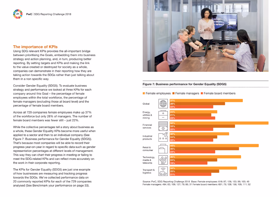
The slide features a column chart comparing the performance on gender equality (SDG5) across different industries. It includes a picture of a meeting with four people, one presenting, and text explaining the importance of KPIs.
Performance Metrics and KPIs
Professional Services
The slide explains the significance of using SDG-related KPIs to bridge business strategy and societal value creation. It highlights gender equality KPIs, showing the percentage of female employees, managers, and board members in various industries.
KPIs, gender equality, SDG5, performance, business strategy, industries, professional services, column chart, meeting
false
Performance Metrics and KPIs
Professional Services
Mixed Chart
PwC/Strategy&
Add to my slides
Remove from favorites
The slide features a table listing key performance indicators (KPIs) for each stage of the grain supply chain, including cost, emissions, and utilization metrics.
Performance Metrics and KPIs
Agriculture & Food Production
The slide outlines the KPIs used to evaluate the competitiveness of the grain supply chain, providing benchmarks for cost efficiency, emissions, and other operational metrics.
KPIs, grain supply chain, performance metrics, cost efficiency, emissions, utilization, benchmarking, agriculture, food production
false
Performance Metrics and KPIs
Agriculture & Food Production
Table
LEK
Add to my slides
Remove from favorites
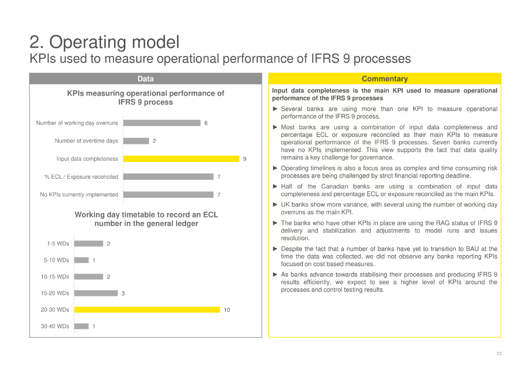
Displays column charts measuring operational performance of IFRS 9 processes using KPIs such as input data completeness and working day timetable, with a commentary discussing the main KPIs and their impact on operational performance.
Operational Efficiency
Financial Services
Evaluates the operational performance of IFRS 9 processes using various KPIs, emphasizing the importance of data completeness and timelines, and analyzing the effectiveness of current KPIs in measuring performance.
KPIs, operational performance, IFRS 9, data completeness, working day timetable
false
Operational Efficiency
Financial Services
Multiple Chart
EY
Add to my slides
Remove from favorites
Four-panel layout: revenue CAGR, CIR, RoTE, and CET1 ratio development, alongside explanatory bullet points.
Performance Metrics and KPIs
Financial Services
A summary of Deutsche Bank’s key performance indicators including revenue growth (CAGR), cost-income ratio, return on tangible equity, and CET1 ratios. Commentary highlights sustained momentum, capital strength, and sound liquidity metrics, despite litigation provisions.
KPIs, revenue growth, CIR, RoTE, CET1 ratio, liquidity, Deutsche Bank
false
Performance Metrics and KPIs
Financial Services
Multiple Chart
Deutsche Bank
Add to my slides
Remove from favorites
Informative text with supporting icons and diagrams focusing on KPIs and predictive modeling, emphasizing a customer-centric measurement approach.
Technology and Digital Transformation
Retail & E-commerce
Suggests a paradigm shift in success measurement, advocating for customer-centric KPIs and predictive models for accurate ROI analysis.
KPIs, ROI, Customer-Centric, Predictive Modeling, Success Metrics, Channel Strategy
false
Technology and Digital Transformation
Retail & E-commerce
Header Horizontal
BCG
Add to my slides
Remove from favorites
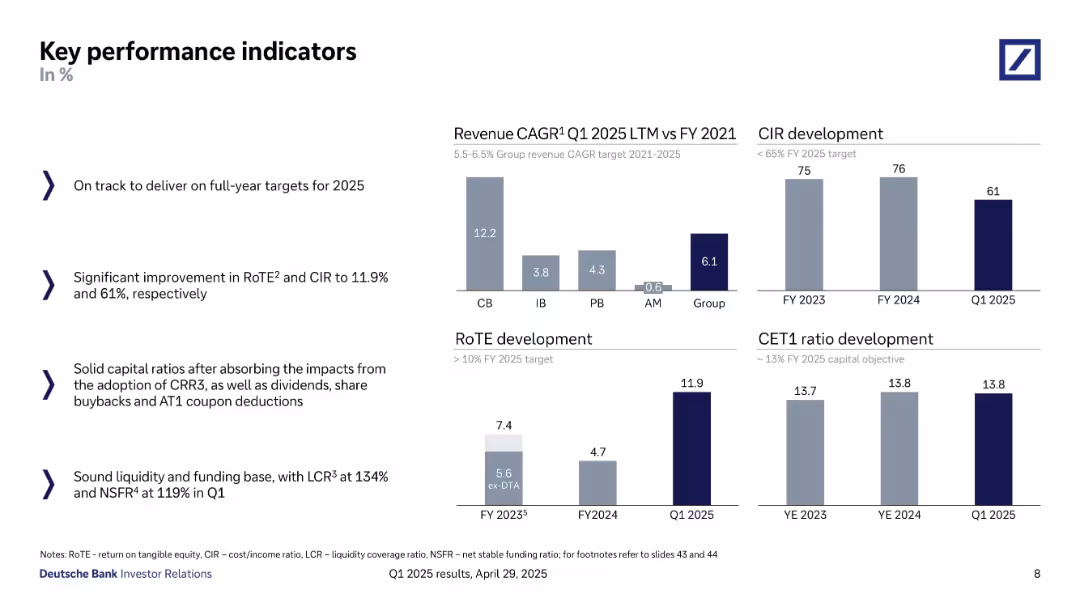
Bar charts and text blocks; displays revenue CAGR, CIR, RoTE, CET1 ratio with supporting commentary
Performance Metrics and KPIs
Financial Services
A snapshot of Deutsche Bank’s KPIs including CIR, RoTE, and CET1 ratio through Q1 2025. It tracks progress toward 2025 targets, showcasing strong revenue CAGR and improved cost/income ratio.
KPIs, RoTE, CIR, CET1 ratio, revenue CAGR, Deutsche Bank, performance targets, Q1 2025
false
Performance Metrics and KPIs
Financial Services
Multiple Chart
Deutsche Bank
Add to my slides
Remove from favorites
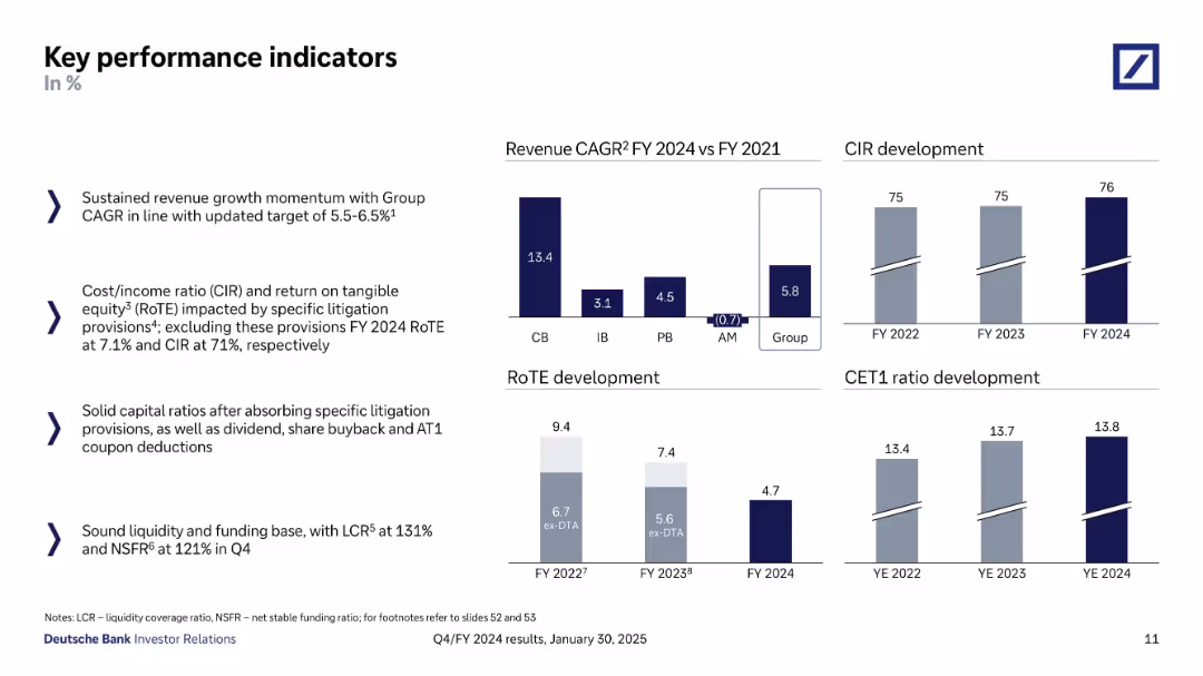
Split layout with bullet points on the left and four mini bar charts on the right. Each chart visualizes metrics like revenue CAGR, RoTE, CIR, and CET1. Dark blue for actual values and grey for comparatives.
Performance Metrics and KPIs
Financial Services
Highlights Deutsche Bank’s FY 2024 performance on key indicators including revenue CAGR, return on equity, cost/income ratio, and capital ratios. It provides both numerical insights and year-over-year development visually and textually.
KPIs, RoTE, CIR, CET1, revenue growth, banking performance
false
Performance Metrics and KPIs
Financial Services
Multiple Chart
Deutsche Bank
Add to my slides
Remove from favorites
Slide is text-heavy, divided into several sections, detailing firmwide initiatives and KPIs with a complex structure, using a mixture of blue, teal, and black font colors.
Financial Performance
Financial Services
Detailing performance targets and KPI progress across various business divisions, this slide aims to communicate achievements and goals to stakeholders. It highlights strategic initiatives, efficiency ratios, and capital management metrics.
KPIs, targets, firmwide initiatives, performance, progress
false
Financial Performance
Financial Services
Table
Goldman Sachs
Add to my slides
Remove from favorites
Performance-gap chart comparing Central Asia's rail freight with benchmarks; detailed improvement areas listed.
Performance Metrics and KPIs
Transportation & Logistics
The slide evaluates current vs. target performance of rail freight in Central Asia, focusing on key dimensions such as transport time, availability, price, and ease of use. It highlights needed improvements to meet development goals and become competitive with the North Corridor and sea freight.
KPIs, transport time, pricing, performance, service development, Central Asia, rail gaps
false
Performance Metrics and KPIs
Transportation & Logistics
Mixed Chart
Roland Berger
Add to my slides
Remove from favorites
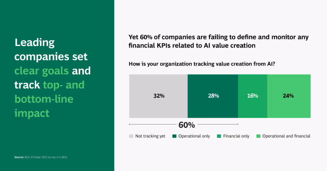
Horizontal stacked bar chart with four tracking categories; headline emphasizes top-line and bottom-line KPIs.
Performance Metrics and KPIs
Artificial Intelligence
Shows that 60% of companies don’t track financial KPIs for AI impact. Highlights importance of aligning AI efforts with measurable business value.
KPI tracking, AI value, goals, impact, financial, operational, BCG, metrics
false
Performance Metrics and KPIs
Artificial Intelligence
Single Chart
BCG
Add to my slides
Remove from favorites
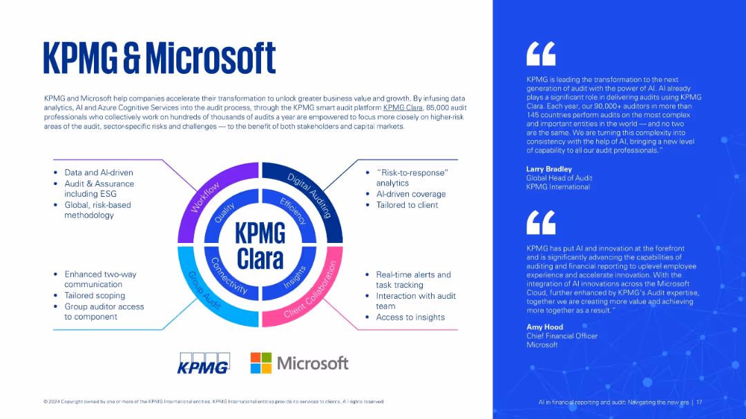
Three-part layout: left with bullet points, center circular infographic labeled "KPMG Clara", right with testimonials. Bright and engaging design.
Strategic Planning
Technology & Software
Describes the KPMG-Microsoft collaboration for AI-powered auditing via the KPMG Clara platform. Focuses on AI-driven insights, real-time tracking, and enhanced communication in audits.
KPMG Clara, Microsoft, audit technology, AI platform, collaboration, data insights
false
Strategic Planning
Technology & Software
Boxed
KPMG
Add to my slides
Remove from favorites
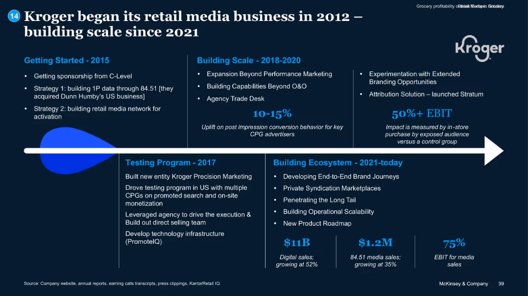
Timeline format; segmented into years with supporting text blocks; highlights and metrics in blue
Client Case Studies
Retail & E-commerce
The slide traces Kroger’s retail media journey from 2012, emphasizing milestones such as 1P data acquisition, performance marketing, attribution solutions, and recent scale. It showcases strategic investments and results like EBIT impact, digital/media sales, and growth figures.
Kroger, Retail Media, Digital Sales, EBIT, 1P Data, Strategy
false
Client Case Studies
Retail & E-commerce
Linear Flow
McKinsey
Add to my slides
Remove from favorites
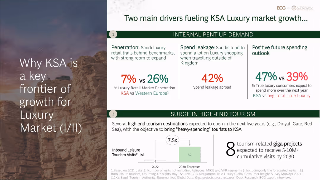
Two-section layout: left half with title overlaying image; right half with text blocks, stats, and a bar chart about tourism growth
Strategic Planning
Consumer Goods
KSA’s luxury market growth is driven by internal demand and high-end tourism. Despite current low luxury retail penetration (7% vs. 26% in Western Europe), consumer spending outlook is strong (47% vs. 39% average). High-end tourism is projected to expand significantly by 2030.
KSA, luxury retail, tourism, spending outlook, penetration, high-end travel, giga-projects
false
Strategic Planning
Consumer Goods
Mixed Chart
BCG
Add to my slides
Remove from favorites
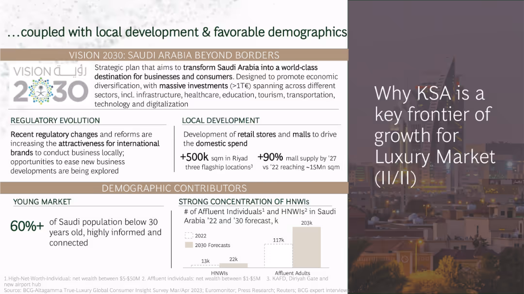
Layered layout with Vision 2030 branding, multiple data callouts, and demographic graphs
Strategic Planning
Consumer Goods
KSA's luxury growth is further supported by regulatory changes, infrastructure development, and favorable demographics. Vision 2030 includes large-scale investments in malls and retail. Over 60% of the population is under 30, and affluent individuals are expected to nearly double by 2030.
KSA, Vision 2030, demographics, affluent consumers, retail development, regulation, malls
false
Strategic Planning
Consumer Goods
Mixed Chart
BCG
Add to my slides
Remove from favorites
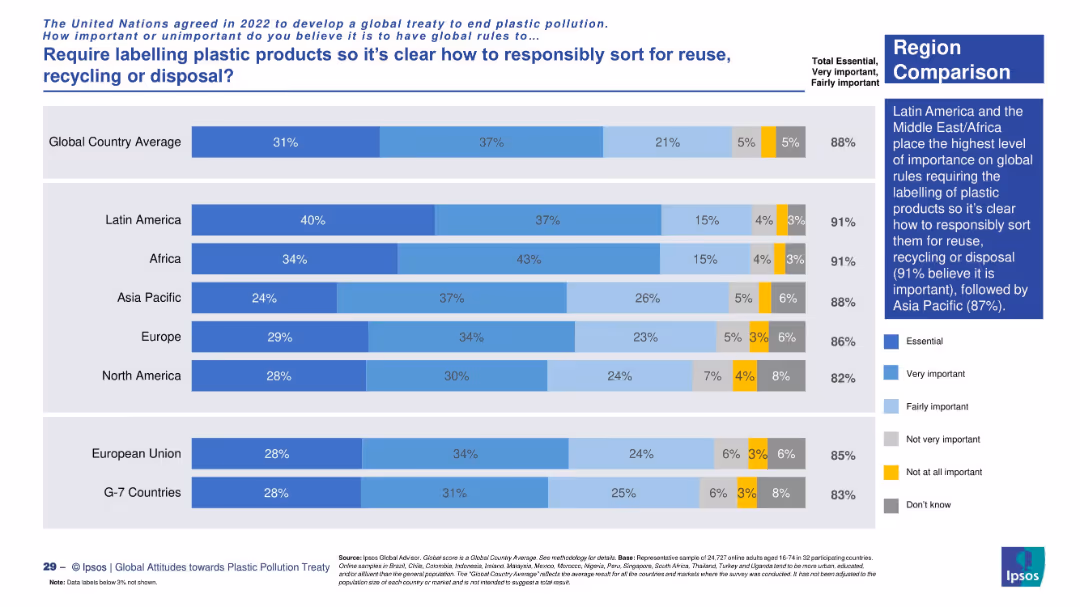
Regional comparison using a horizontal stacked bar chart. Blue gradients reflect levels of agreement, yellow and gray for disagreement and uncertainty. Right-side text block summarizes key findings.
Regulatory and Compliance
Environmental Services & Sustainability
This slide compares regions on support for labeling plastic products. Latin America and Africa lead in agreement (91%). The visual structure emphasizes the consistency of global concern over labeling for recycling and reuse.
labeling, plastic recycling, sustainability, consumer opinion, regional comparison, reuse, environmental policy, Ipsos data
false
Regulatory and Compliance
Environmental Services & Sustainability
Mixed Chart
IPSOS
Add to my slides
Remove from favorites
Country comparison bar chart using color gradients to show levels of agreement with labeling requirements. Sidebar includes global insight and key data points.
Regulatory and Compliance
Environmental Services & Sustainability
This slide highlights public opinion across countries on mandatory labeling of plastic products for proper disposal. The global average support is 88%, with the highest in Uganda, Indonesia, and Nigeria. It emphasizes consumer demand for clarity in waste sorting.
labeling, recycling, reuse, plastic products, regulation, waste management, sustainability, Ipsos, global opinion, country data
false
Regulatory and Compliance
Environmental Services & Sustainability
Mixed Chart
IPSOS
Add to my slides
Remove from favorites
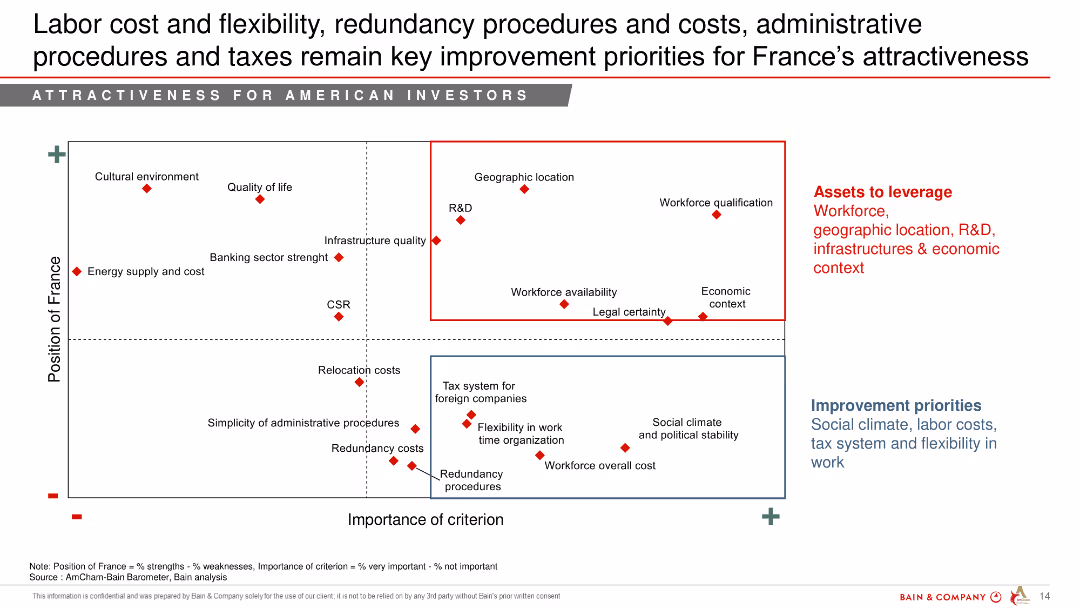
Scatter plot showing the position of France across various improvement priorities such as labor cost and flexibility, redundancy procedures, and taxes.
Strategic Planning
Professional Services
The slide highlights key improvement priorities for France to enhance its attractiveness for American investors, emphasizing labor costs, flexibility, and administrative procedures.
labor cost, flexibility, improvement priorities, France, attractiveness, American investors
false
Strategic Planning
Professional Services
Mixed Chart
Bain
Add to my slides
Remove from favorites
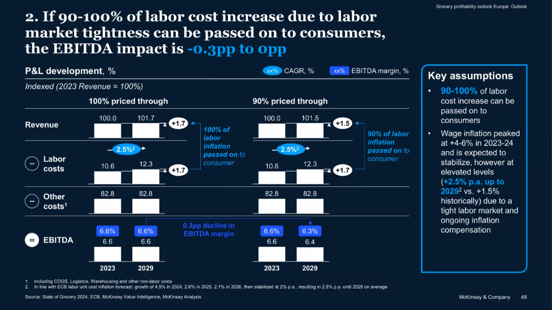
Similar format to 15538; bar charts for two pricing scenarios with labor cost inflation assumptions
Risk Assessment and Management
Retail & E-commerce
Labor cost inflation (assumed at +2.5% p.a. through 2029) may reduce EBITDA by up to 0.3pp if not fully passed on to consumers. The slide outlines two pricing scenarios and ties labor costs to margin outcomes.
Labor Cost, Inflation, EBITDA, Pricing, Retail Economics, Workforce Cost
false
Risk Assessment and Management
Retail & E-commerce
Mixed Chart
McKinsey
Add to my slides
Remove from favorites
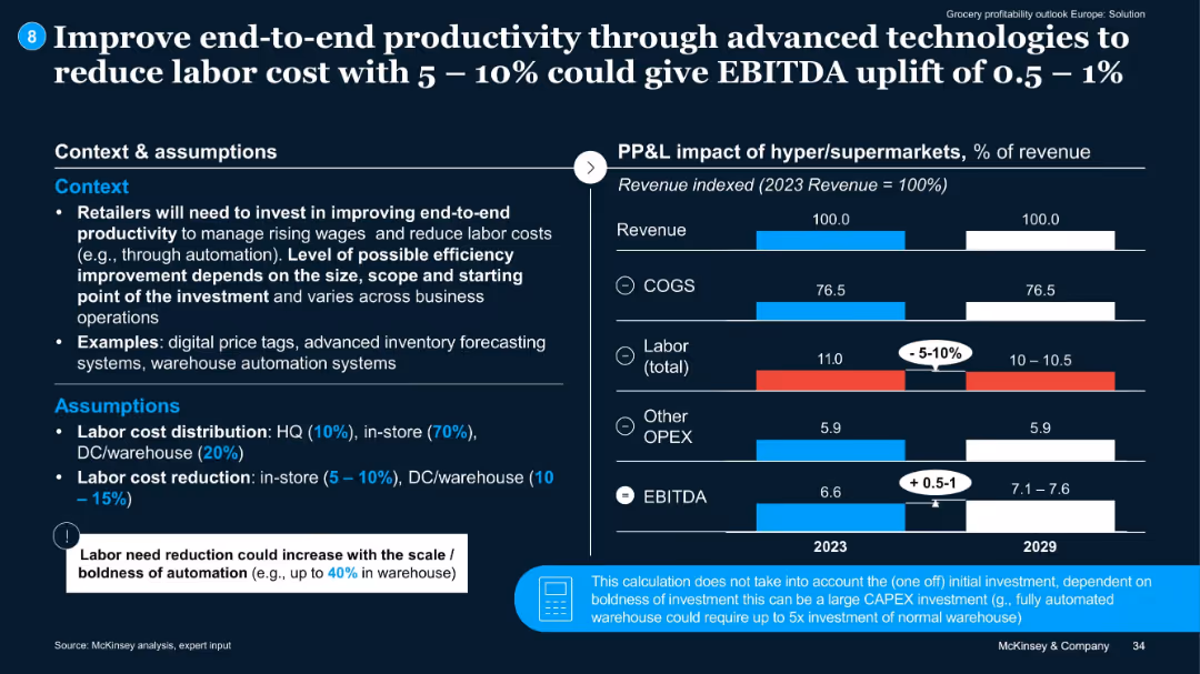
Layout with assumptions and context on left, and P&L impact bar charts on right. Notes on investment not included.
Technology and Digital Transformation
Retail & E-commerce
Advocates for reducing labor costs via automation, potentially achieving 0.5–1% EBITDA uplift. Examples include inventory systems and digital tools.
labor cost, productivity, automation, EBITDA, investment
false
Technology and Digital Transformation
Retail & E-commerce
Mixed Chart
McKinsey
Add to my slides
Remove from favorites
Contains multiple column charts comparing labor market parameters (vacancy development, unemployment rate, hourly labor wage growth) across Germany, USA, and China. Includes a line chart showing key supplier performance indicators globally.
Operational Efficiency
Transportation & Logistics
Examines the impact of high inflation and labor shortages on labor costs in the automotive industry. Analyzes different labor market parameters and how they contribute to the overall structural challenges faced by suppliers.
Labor Costs, Inflation, Automotive, Workforce, Performance
false
Operational Efficiency
Transportation & Logistics
Multiple Chart
Roland Berger
Add to my slides
Remove from favorites
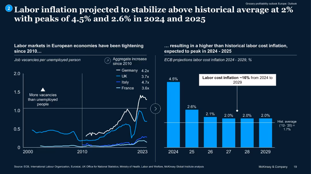
Dual chart layout: line chart on job vacancies vs unemployment, and bar chart of projected labor inflation.
Market Analysis and Trends
Retail & E-commerce
Highlights sustained tight labor markets across Europe since 2010 and forecasts labor cost inflation (~16% from 2024–2029). Projects peak inflation in 2024–2025, pressuring retailers’ cost structures despite passing on most costs to consumers.
labor cost, wage inflation, labor market, grocery, EU, workforce
false
Market Analysis and Trends
Retail & E-commerce
Multiple Chart
McKinsey
Add to my slides
Remove from favorites
Line charts showing US job opening rates and labor force participation rates from January 2006 to January 2024.
Operational Efficiency
Professional Services
Indicates balanced US labor market conditions with reduced churn and slower labor demand, suggesting gradual cooling of wage growth.
labor demand, job openings, labor force, participation rates, wage growth, line chart, market conditions, US, 2006-2024
false
Operational Efficiency
Professional Services
Multiple Chart
EY
Add to my slides
Remove from favorites
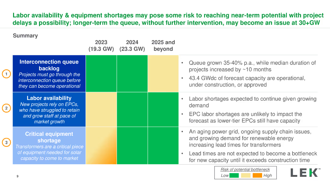
Summary table and bullet points detailing interconnection queues, labor availability, and equipment shortages for 2023-2025. Dense with key insights.
Risk Assessment and Management
Energy & Utilities
Overview of risks to solar project timelines due to labor shortages, interconnection queues, and equipment delays, and their potential impact on capacity.
Labor, Equipment, Solar Projects, Interconnection, Risk Management
false
Risk Assessment and Management
Energy & Utilities
Table
LEK
Add to my slides
Remove from favorites
This slide features multiple column charts and bar charts displaying data about labor force distribution, GDP, and poverty rates across various regions in Indonesia.
Strategic Planning
Telecommunications
The slide compares economic indicators like labor force distribution, GDP per capita, and poverty rates to emphasize the need for tailored school connectivity solutions.
labor force, GDP, poverty, connectivity, regions, Indonesia, economic indicators, school connectivity
false
Strategic Planning
Telecommunications
Multiple Chart
BCG
Add to my slides
Remove from favorites
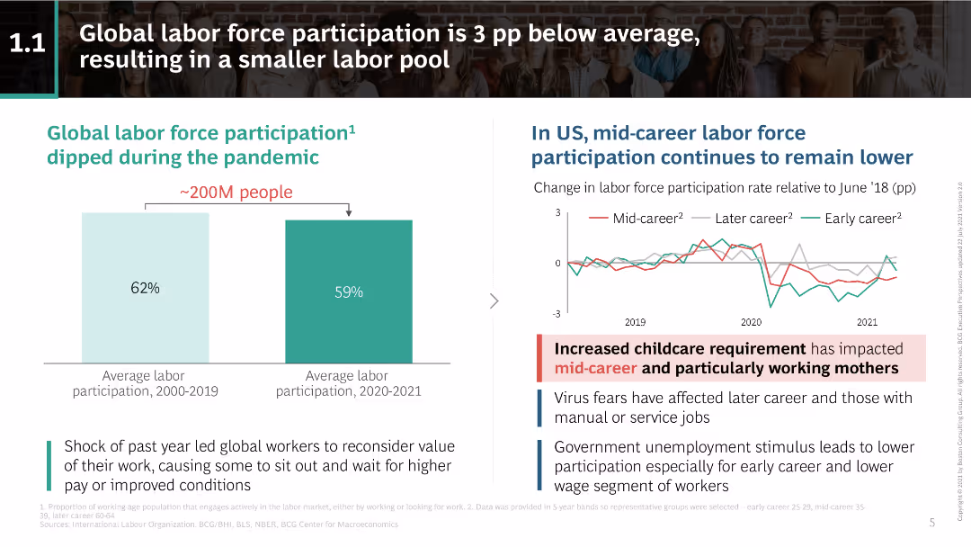
Column chart showing labor force participation pre and during pandemic; line chart displaying US mid-career labor force participation trends.
Market Analysis and Trends
Financial Services
Discusses the decline in global labor force participation during the pandemic and the continuous lower participation of mid-career workers in the US.
labor force participation, pandemic impact, US labor trends, mid-career workers, childcare requirement, virus fears, unemployment stimulus
false
Market Analysis and Trends
Financial Services
Multiple Chart
BCG
Add to my slides
Remove from favorites
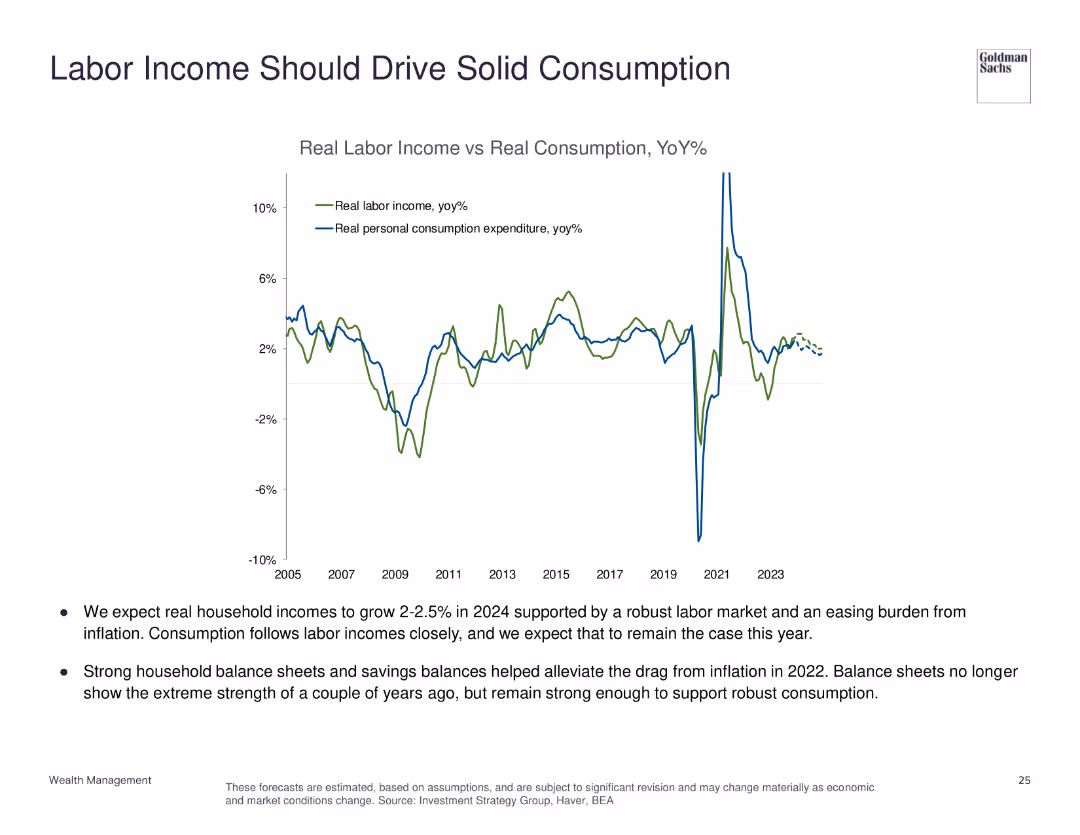
The slide features a line chart comparing real labor income vs. real personal consumption expenditure from 2005 to 2023, with annotations for key trends.
Market Analysis and Trends
Financial Services
This slide examines the relationship between labor income and consumption, predicting robust household income growth and solid consumption.
labor income, personal consumption, economic analysis, household income, consumption trends
false
Market Analysis and Trends
Financial Services
Mixed Chart
Goldman Sachs
Add to my slides
Remove from favorites
Matrix chart showing the dynamics of occupations due to automation, with job losses and gains across various sectors like transport, healthcare, and construction.
Market Analysis and Trends
Technology & Software
This slide analyzes the structural changes in the labor market due to automation, robotics, and AI. It presents a matrix of job dynamics, highlighting which sectors are likely to experience job losses or gains, and emphasizes the transformative impact of technology on employment.
Labor Market, Automation, Robotics, Job Dynamics
false
Market Analysis and Trends
Technology & Software
Table
Roland Berger
Add to my slides
Remove from favorites
The slide includes three charts: a line chart of unemployment rates, a column chart of employment cost index and private average hourly earnings growth, and a line chart of labor demand versus supply. The layout is clean with a blue and white color scheme, and key points are highlighted.
Market Analysis and Trends
Professional Services
The slide discusses the challenges of a tight labor market, rising compensation costs, and shifting employee expectations, supported by data on unemployment rates, employment costs, and labor supply versus demand.
labor market, employment, compensation, mobility, talent
false
Market Analysis and Trends
Professional Services
Multiple Chart
EY
Add to my slides
Remove from favorites
The slide includes a bar chart showing US month-over-month change in total nonfarm employment from January 2021 to June 2023 and a line chart showing US real consumption expenditures and disposable income from January 2020 to May 2023.
Market Analysis and Trends
Financial Services
This slide indicates a resilient US labor market, but predicts a slowdown with reduced hiring and increased layoffs, while examining trends in consumer spending and disposable income.
labor market, employment, consumption, disposable income, slowdown
false
Market Analysis and Trends
Financial Services
Multiple Chart
EY
Add to my slides
Remove from favorites
Bar and line charts showing US monthly change in total nonfarm employment and jobless claims from January 2021 to January 2024.
Operational Efficiency
Professional Services
Analyzes the US labor market's robustness and discerning hiring practices, predicting slower momentum in 2024.
labor market, employment, hiring, jobless claims, trends, bar chart, line chart, nonfarm employment, 2021-2024, US economy
false
Operational Efficiency
Professional Services
Multiple Chart
EY
Add to my slides
Remove from favorites
Two sets of line charts, one on each side. Left charts represent "Labor Slack" with lines for "Labor Force," "Nonfarm Employment + Job Openings," and "Supply/Demand Gap." Right chart shows "Median Wage (12-Month Moving Average)" with wage percentiles.
Market Analysis and Trends
Financial Services
This slide analyzes labor market conditions, presenting data on employment, job openings, and median wages across different percentiles. It is useful for economic forecasts and labor market strategies.
labor market, employment, job openings, median wage
false
Market Analysis and Trends
Financial Services
Multiple Chart
Morgan Stanley
Add to my slides
Remove from favorites
The slide includes three line charts showing Euro area employment and unemployment rate (2015-25F), Euro area labor demand and supply (2016-23), and Euro area y/y wage growth and HICP (2015-25F). The charts are well-organized, with detailed explanations provided in the text.
Market Analysis and Trends
Financial Services
This slide examines the resilience of the Euro area labor market, projecting wage growth trends amid gradual rebalancing. It highlights key indicators of employment, labor demand and supply, and wage growth, discussing their impact on the overall economy.
labor market, employment, wage growth, euro area, resilience
false
Market Analysis and Trends
Financial Services
Multiple Chart
EY
Add to my slides
Remove from favorites
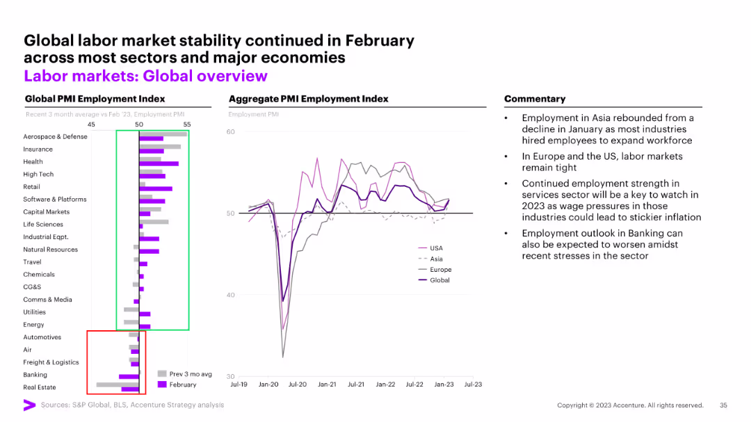
This slide shows a bar chart comparing the PMI employment index across various sectors and a line chart illustrating aggregate PMI employment index trends for the USA, Asia, Europe, and globally. Commentary provides additional insights.
Market Analysis and Trends
Industrial & Manufacturing
The slide discusses global labor market stability, noting that employment rebounded in Asia and remained tight in the US and Europe. It compares employment trends across sectors and regions, highlighting key factors affecting labor markets.
labor market, global, PMI, employment, stability
false
Market Analysis and Trends
Industrial & Manufacturing
Multiple Chart
Accenture
Add to my slides
Remove from favorites
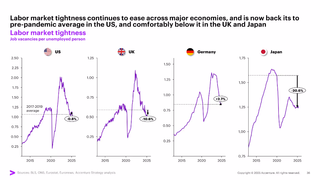
Four separate line graphs show job vacancies per unemployed person for US, UK, Germany, and Japan, benchmarked against pre-pandemic averages.
Human Resources and Talent Management
Professional Services
The slide tracks labor market tightness by measuring job vacancies per unemployed person. It reveals easing labor conditions across major economies, with Japan and UK notably below pre-pandemic levels, while Germany remains tighter.
labor market, job vacancies, unemployment, tightness, post-COVID, US, UK, Germany, Japan, workforce dynamics
false
Human Resources and Talent Management
Professional Services
Multiple Chart
Accenture
Add to my slides
Remove from favorites
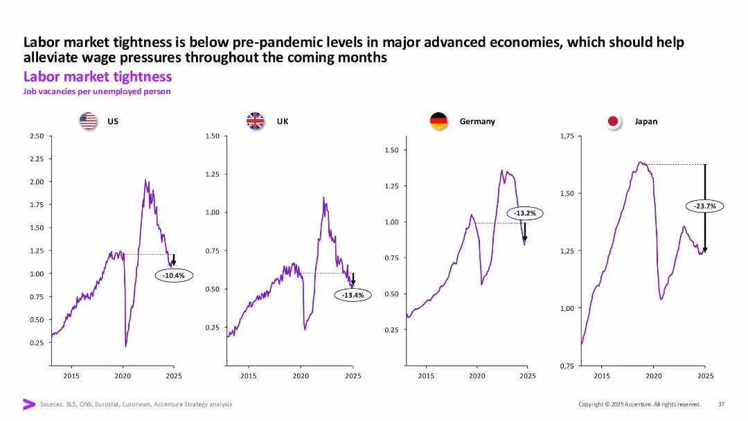
Four line charts (US, UK, Germany, Japan) showing job vacancies per unemployed person over time; each chart includes recent % decline annotations.
Human Resources and Talent Management
Professional Services
Labor market tightness in major economies is below pre-pandemic levels. Japan shows the sharpest decline in job vacancies per unemployed person, indicating easing pressure on wage inflation.
Labor Market, Job Vacancies, Wage Pressure, Unemployment, US, UK, Germany, Japan
false
Human Resources and Talent Management
Professional Services
Multiple Chart
Accenture
Add to my slides
Remove from favorites
Three-panel layout showing JOLTS job openings, quits, and layoffs with long-term historical data. All charts are line graphs with recession periods shaded. Current values as of May 2025 are labeled.
Performance Metrics and KPIs
Financial Services
Examines labor market tightness through job openings, quits, and layoffs. Openings are down from 2022 peaks but still above pre-pandemic norms. Quits have stabilized, while layoffs remain low, indicating resilient labor demand.
labor market, JOLTS, job openings, quits, layoffs, workforce, recession, May 2025, employment trends
false
Performance Metrics and KPIs
Financial Services
Multiple Chart
JP Morgan
Add to my slides
Remove from favorites
Features a column chart for nonfarm payroll gains, a line chart for labor force participation, and a heatmap for key labor market indicators.
Market Analysis and Trends
Financial Services
The slide analyzes the slowing momentum in the labor market by examining payroll gains, labor force participation, and various labor market indicators.
labor market, payroll gains, labor force participation, market indicators, economic slowdown
false
Market Analysis and Trends
Financial Services
Multiple Chart
JP Morgan
Add to my slides
Remove from favorites
A data-heavy slide with a blue and black bar graph showing the percentage of vulnerable private-sector jobs in small firms.
Risk Assessment and Management
Government & Public Sector
The slide provides a statistical breakdown of private-sector jobs at risk, segmented by industry and company size, highlighting the concentration in smaller firms.
labor market, private sector, small firms, job vulnerability, industry analysis
false
Risk Assessment and Management
Government & Public Sector
Single Chart
McKinsey
Add to my slides
Remove from favorites
Column and dot graphs showing the density of highly skilled workers and total labor force in various countries.
Strategic Planning
Professional Services
Analyzes the labor market potential by assessing the density of skilled workers and their distribution across multiple countries.
Labor market, skilled workers, workforce density, strategic planning
false
Strategic Planning
Professional Services
Single Chart
Accenture
Add to my slides
Remove from favorites
Two line charts showing U.S. unemployment rate vs. Atlanta Fed wage growth and EU unemployment vs. compensation growth.
Market Analysis and Trends
Financial Services
This slide evaluates the labor market trends in the U.S. and EU, highlighting signs of normalization in the U.S. and decline in EU wages compared to the U.S.
Labor Markets, Unemployment, Wage Growth, U.S., EU, Comparison
false
Market Analysis and Trends
Financial Services
Multiple Chart
Morgan Stanley
Add to my slides
Remove from favorites
Two charts: a line chart showing unemployment rates from 2014-2023 for various regions, and a column chart showing nominal wage growth rates for Q3 2023 compared to 2017-19 average for various countries.
Market Analysis and Trends
Financial Services
The slide discusses rebalancing labor markets leading to easing wage growth pressures and positive inflation-adjusted wage growth, supporting purchasing power.
labor markets, wage growth, unemployment, purchasing power, inflation-adjusted, 2023
false
Market Analysis and Trends
Financial Services
Multiple Chart
EY
Add to my slides
Remove from favorites
The slide displays three line graphs showing job vacancies per unemployed person in the US, UK, and Germany from 2012 to 2024.
Market Analysis and Trends
Professional Services
The slide highlights a persistent difficult hiring environment across the US and Europe, with signs of labor market cooling.
labor market, tightness, job vacancies, unemployment, US, UK, Germany, line graph
false
Market Analysis and Trends
Professional Services
Multiple Chart
Accenture
Add to my slides
Remove from favorites
The slide contains two line charts. The left chart shows the U.S. unemployment rate and wage growth from 1985 to 2024. The right chart depicts the U.S. quits rate and wage growth year-on-year from 2004 to 2024.
Market Analysis and Trends
Financial Services
This slide analyzes the U.S. labor market by examining unemployment, wage growth, and quits rate, providing insights into employment trends and economic conditions.
Labor Market, Unemployment, Wage Growth, U.S., Trends
false
Market Analysis and Trends
Financial Services
Multiple Chart
JP Morgan
Add to my slides
Remove from favorites
The slide contains two line charts: one displaying the unemployment rate and wage growth, and the other showing vacancies and employment conditions.
Market Analysis and Trends
Financial Services
Reviews the labor market conditions, including unemployment rates and wage growth trends, along with employment vacancies, useful for labor market analysis.
labor market, unemployment, wage growth, vacancies, employment
false
Market Analysis and Trends
Financial Services
Multiple Chart
JP Morgan
Add to my slides
Remove from favorites
The slide has two line charts comparing labor market indicators between the US and Euro area, with commentary on the right side and labeled data sources at the bottom.
Market Analysis and Trends
Financial Services
The slide discusses recent labor market movements in the US and Euro area, highlighting worker hoarding and labor market adjustments.
labor market, US, Euro area, employment, vacancies
false
Market Analysis and Trends
Financial Services
Multiple Chart
Accenture
Add to my slides
Remove from favorites
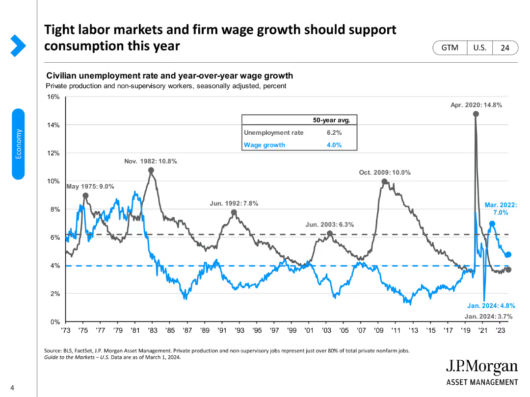
The slide displays a line chart comparing civilian unemployment rates with year-over-year wage growth, using different colors for clarity.
Market Analysis and Trends
Financial Services
It illustrates the relationship between tight labor markets, wage growth, and their impact on consumption trends in the current year.
labor market, wage growth, consumption, unemployment, economic trends
false
Market Analysis and Trends
Financial Services
Single Chart
JP Morgan
Add to my slides
Remove from favorites
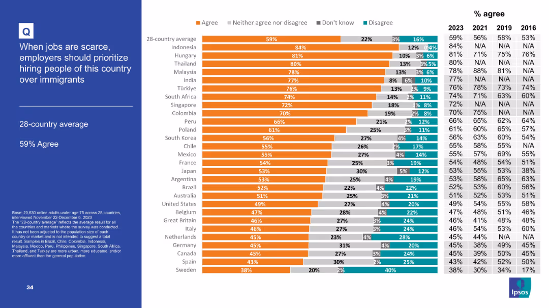
Similar to Slide 19112 in layout; includes a horizontal bar chart ranked by agreement levels across 28 countries and historical data points from 2016–2023.
Market Analysis and Trends
Government & Public Sector
This slide elaborates on attitudes toward prioritizing nationals over immigrants in employment, using a ranked bar chart. Agreement levels are broken down for each country, along with historical comparisons, offering a clear view of shifts in immigration-related labor opinions.
labor preference, nationalism, immigrant jobs, public views, Ipsos, employment policy, bar chart, temporal comparison
false
Market Analysis and Trends
Government & Public Sector
Mixed Chart
IPSOS
Add to my slides
Remove from favorites
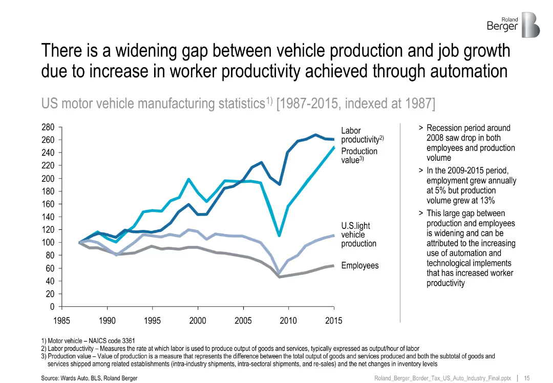
Line chart (1987–2015) comparing labor productivity, production value, and employment.
Human Resources and Talent Management
Industrial & Manufacturing
Illustrates how rising productivity and automation have decoupled vehicle production from employment growth, especially after the 2008 recession.
labor productivity, automation, job gap, vehicle manufacturing, employment
false
Human Resources and Talent Management
Industrial & Manufacturing
Mixed Chart
Roland Berger
Add to my slides
Remove from favorites
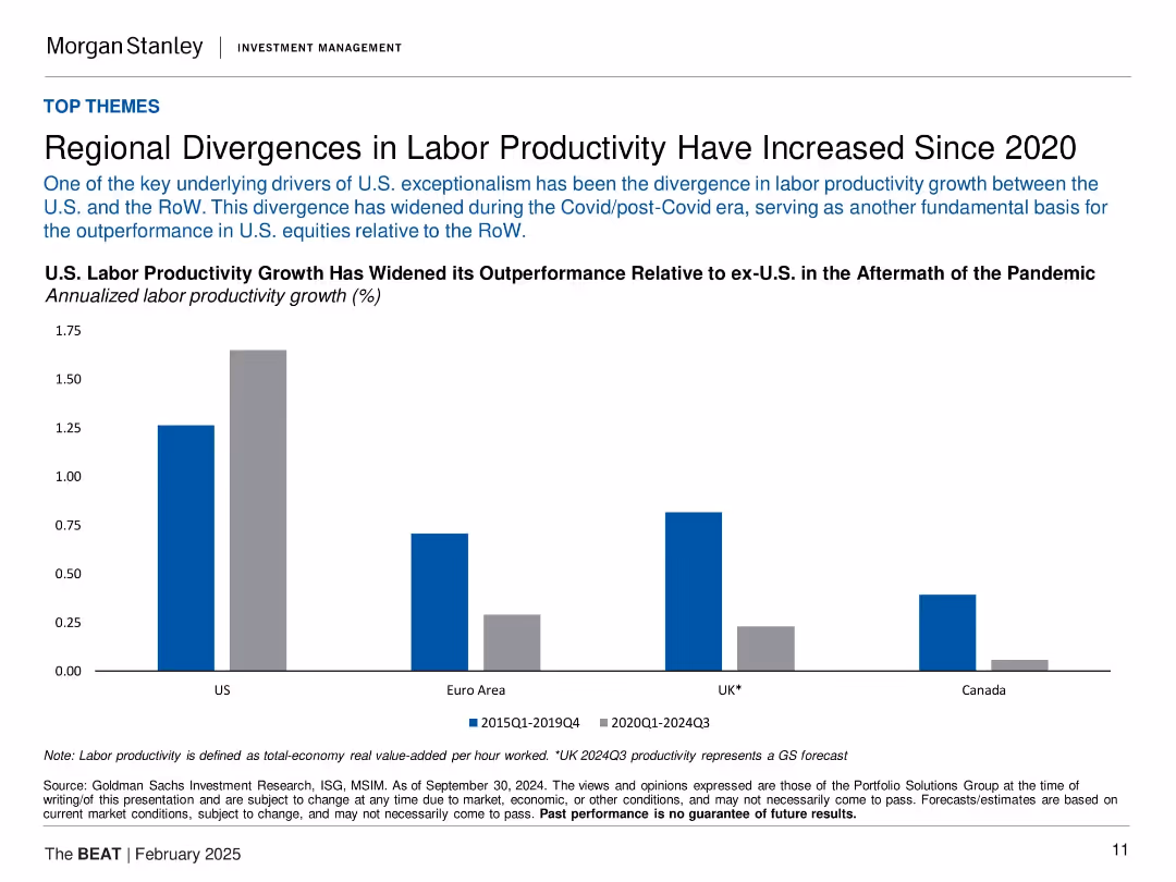
Bar chart comparing labor productivity growth in US, Euro Area, UK, and Canada for 2015–2019 vs. 2020–2024 periods.
Strategic Planning
Professional Services
This slide highlights the growing gap in labor productivity growth between the U.S. and other developed economies post-COVID. It attributes U.S. equity outperformance partly to this productivity divergence, especially in contrast with Canada and the Euro Area. The bars clearly contrast the two periods to emphasize acceleration in the U.S. and stagnation elsewhere.
labor productivity, COVID impact, U.S. outperformance, global comparison, economic efficiency, macro trend
false
Strategic Planning
Professional Services
Single Chart
Morgan Stanley
Add to my slides
Remove from favorites
Column charts comparing the average annual growth rates of labor productivity and average wages from 2010 to 2019 for France, Germany, Switzerland, and the US.
Technology and Digital Transformation
Technology & Software
This slide compares the decoupling of labor productivity growth and average wage growth across different countries. It highlights the impact of technological change on labor markets, showing that increased productivity does not always translate to higher wages.
Labor Productivity, Wages, Decoupling
false
Technology and Digital Transformation
Technology & Software
Multiple Chart
Roland Berger
Add to my slides
Remove from favorites
The slide uses column charts to compare labor availability issues in France from 2022 to 2023 across all industries, with contextual insights from industry professionals about regional recruitment challenges.
Human Resources and Talent Management
Professional Services
Explores the labor shortage crisis in France, detailing sector-specific challenges and geographic disparities in labor availability, and assessing the impact on industries such as logistics and high-tech.
labor shortage, France, industry impact, recruitment challenges, regional analysis
false
Human Resources and Talent Management
Professional Services
Mixed Chart
Bain
Add to my slides
Remove from favorites
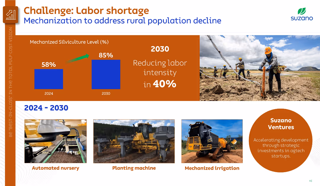
Combination of bar chart (mechanization levels), text, and images of mechanized equipment and planting.
Human Resources and Talent Management
Agriculture & Food Production
Addresses the impact of rural labor shortages on silviculture operations, proposing increased mechanization from 58% to 85% by 2030. Shows equipment like automated nurseries and planting machines along with Suzano Ventures’ agtech focus.
labor shortage, mechanization, silviculture, agtech, Suzano Ventures
false
Human Resources and Talent Management
Agriculture & Food Production
Mixed Chart
Goldman Sachs
Add to my slides
Remove from favorites
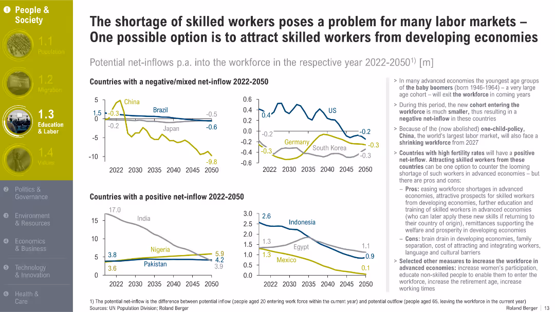
Dual-panel line chart showing projected workforce net-inflows in selected countries from 2022–2050; supported by bullet points with analysis.
Human Resources and Talent Management
Professional Services
This slide shows that developed countries are facing skilled labor shortages due to aging populations and shrinking workforces. It suggests attracting skilled workers from high-fertility countries as a solution.
labor shortage, workforce, skilled migration, demographics, baby boomers, aging, labor market
false
Human Resources and Talent Management
Professional Services
Multiple Chart
Roland Berger
Add to my slides
Remove from favorites
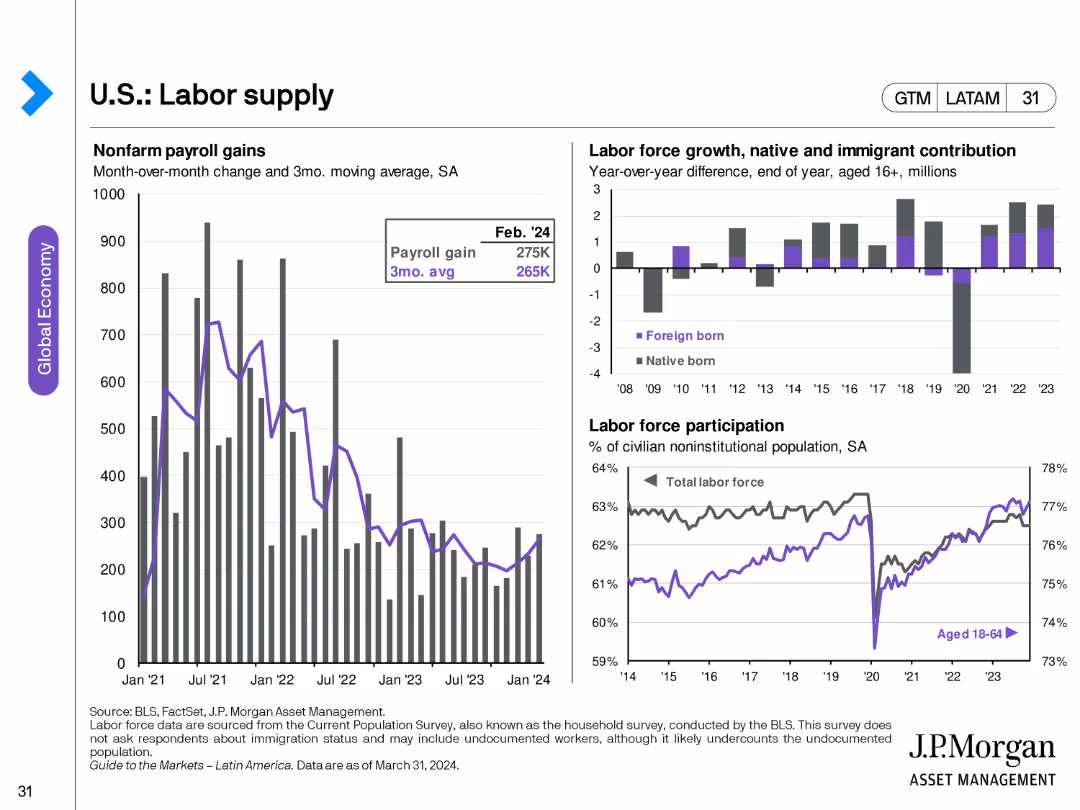
The slide features three charts: a bar chart for nonfarm payroll gains, a bar chart showing labor force growth by native and immigrant contributions, and a line chart for labor force participation rates.
Market Analysis and Trends
Financial Services
This slide analyzes labor supply in the U.S., including nonfarm payroll changes, labor force growth by demographics, and participation rates. Useful for understanding employment trends.
labor supply, nonfarm payroll, labor force, employment trends, demographics, participation rate
false
Market Analysis and Trends
Financial Services
Multiple Chart
JP Morgan
Add to my slides
Remove from favorites
Three charts: payroll gains (bar), labor force growth by origin (stacked bar), and participation rate (line). Shows monthly, annual, and demographic trends in workforce metrics.
Human Resources and Talent Management
Financial Services
Tracks U.S. labor supply trends, including native vs. foreign-born contributions to growth. Participation rates are rising post-pandemic, with a June 2025 payroll gain of 147K and steady labor force reentry by working-age individuals.
labor supply, payroll, participation rate, immigrant labor, workforce trends, native-born, foreign-born, employment
false
Human Resources and Talent Management
Financial Services
Multiple Chart
JP Morgan
Add to my slides
Remove from favorites
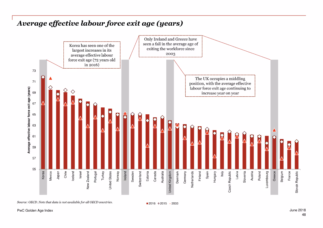
Column chart showing the average effective labour force exit age in years for various countries over three periods.
Market Analysis and Trends
Professional Services
The slide analyzes the average age at which people exit the labor force in different countries for 2003, 2015, and 2016.
labour force exit, age, employment, OECD, trend
false
Market Analysis and Trends
Professional Services
Single Chart
PwC/Strategy&
Add to my slides
Remove from favorites
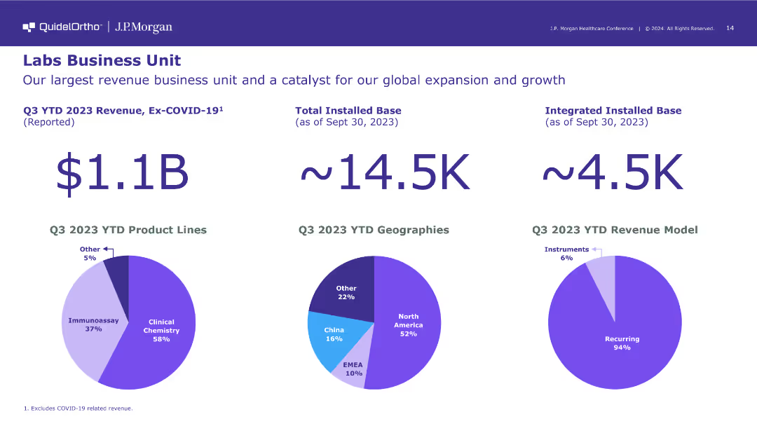
The slide shows large text for revenue figures and three pie charts depicting Q3 2023 YTD product lines, geographies, and revenue model. The visual elements are well-organized and informative.
Financial Performance
Healthcare & Pharmaceuticals
The slide presents financial performance metrics for QuidelOrtho's Labs Business Unit, highlighting its revenue, geographic distribution, and the recurring nature of its revenue model.
labs business, revenue, geographies
false
Financial Performance
Healthcare & Pharmaceuticals
Multiple Chart
JP Morgan
Add to my slides
Remove from favorites
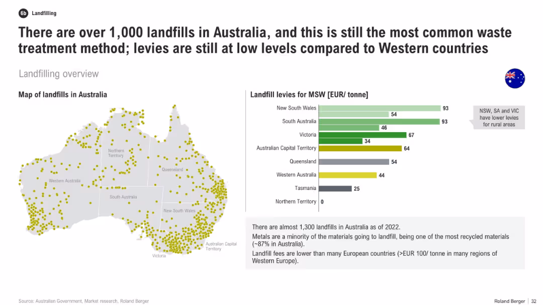
Split layout with a map of landfill locations in Australia (left) and a bar chart of landfill levies per state/territory (right). Clean and minimalistic design with subdued colors.
Market Analysis and Trends
Environmental Services & Sustainability
The slide provides an overview of landfill usage in Australia, highlighting the prevalence of landfilling with over 1,000 sites and comparing landfill levies across states. It points out that Australia has relatively low levies, especially in rural areas, and compares this to higher levies in Western Europe.
landfill, waste, levies, Australia, sustainability, recycling, MSW, map, comparison, waste management
false
Market Analysis and Trends
Environmental Services & Sustainability
Mixed Chart
Roland Berger
Add to my slides
Remove from favorites
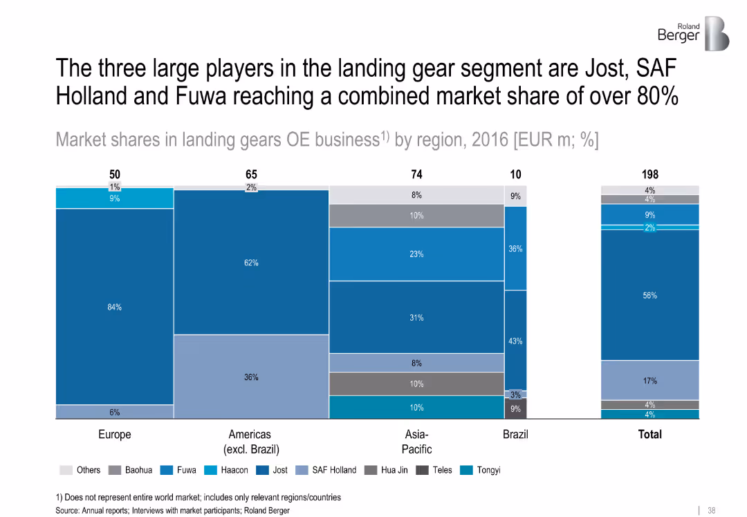
Bar chart showing 2016 landing gear market shares by region and company; color-coded segments
Competitive Landscape
Transportation & Logistics
Jost, SAF Holland, and Fuwa dominate the landing gear market with over 80% combined share. Regional charts illustrate varying dominance by player. Asia-Pacific and Brazil show more diversity among manufacturers.
landing gears, Jost, SAF Holland, Fuwa, market share, OE business, regional competition
false
Competitive Landscape
Transportation & Logistics
Single Chart
Roland Berger
Add to my slides
Remove from favorites
The slide features a column chart showing various land management practices to improve carbon sequestration. It includes detailed descriptions of actions like cropland carbon sequestration and savanna fire management.
Regulatory and Compliance
Agriculture & Food Production
This slide discusses improved land management practices in agriculture to enhance carbon sequestration. It covers actions such as cropland carbon sequestration, degraded farmland restoration, and improved pasture management.
Land management, Carbon sequestration, Agriculture, Pasture, Savanna
false
Regulatory and Compliance
Agriculture & Food Production
Mixed Chart
EY
Add to my slides
Remove from favorites
This slide presents a pair of pie charts comparing land use in 2015 versus projected use in 2030. It breaks down categories like cropland, pasture, and natural forests. Annotations provide additional information on percentage changes and the significance of each type of land use. The design is clear, with distinct colors for different land types and percentages that detail the slight increase in cropland and pasture due to efficiency gains in agriculture.
Market Analysis and Trends
Agriculture & Food Production
The slide provides a visual comparison of land use changes over time, showing minimal increases in cropland and pasture by 2030 due to agricultural efficiency gains. It emphasizes the critical role of improved agricultural practices in meeting future food demand while managing land resources sustainably.
land use, agriculture efficiency, cropland, pasture, future projections, environmental sustainability, resource management, food production, conservation, agriculture trends
false
Market Analysis and Trends
Agriculture & Food Production
Multiple Chart
Roland Berger
Add to my slides
Remove from favorites
The slide presents a column chart depicting land use changes and their impact on carbon sequestration. It includes sections on reforestation and developing integrated shelterbelts, with examples of initiatives.
Regulatory and Compliance
Agriculture & Food Production
This slide focuses on land use changes in agriculture to enhance carbon sequestration. It discusses reforestation of marginal land and developing integrated shelterbelts, providing examples of specific projects and their benefits.
Land use, Reforestation, Carbon sequestration, Agriculture, Shelterbelts
false
Regulatory and Compliance
Agriculture & Food Production
Mixed Chart
EY
Add to my slides
Remove from favorites
A text slide with pie charts depicting language challenges and customer acceptance levels for chatbots, voicebots, and biometrics.
Market Analysis and Trends
Technology & Software
The slide outlines language challenges and varying levels of customer acceptance for chatbots, voicebots, and biometrics.
language challenges, customer acceptance, chatbots, voicebots, biometrics, market analysis
false
Market Analysis and Trends
Technology & Software
Multiple Chart
Deloitte
Add to my slides
Remove from favorites
Horizontal bar chart with country-wise comparison of importance of language proficiency; 2-color segmentation
Customer and Market Segmentation
Government & Public Sector
This slide evaluates public opinion on whether speaking the national language is essential to being a true citizen. Over 85% of respondents globally agree, with highest importance in countries like Indonesia and France, and relatively lower importance in India and the U.S.
language, citizenship, integration, communication, national identity, Ipsos, survey analysis, belonging
false
Customer and Market Segmentation
Government & Public Sector
Mixed Chart
IPSOS
Add to my slides
Remove from favorites
Displays regional maps with data points on language and local market insights, using visual elements like flags and percentages to highlight diversity within ASEAN. The design is informative and focuses on data clarity.
Human Resources and Talent Management
Technology & Software
Discusses the diversity in language and cultural understanding required across the ASEAN region, stressing the need for local talent that can navigate these complexities. It could be used to discuss strategies for talent management and localization in ASEAN markets.
language, market understanding, ASEAN, talent pool, localization
false
Human Resources and Talent Management
Technology & Software
Boxed
Kearney
Add to my slides
Remove from favorites
The slide is split into two main sections, with a red theme. On the left, bullet points are aligned vertically, detailing the SASB standard. On the right, bullet points explain the TCFD standard, alongside their respective logos.
Financial Performance
Industrial & Manufacturing
This slide explains LANXESS’s improvement in reporting standards according to SASB and TCFD, outlining key performance indicators and acknowledging the need for better climate-related financial disclosures.
LANXESS, SASB, TCFD, sustainability, reporting standards, climate-related disclosures, KPIs, financial information, environmental, governance
false
Financial Performance
Industrial & Manufacturing
Table
Morgan Stanley
Add to my slides
Remove from favorites
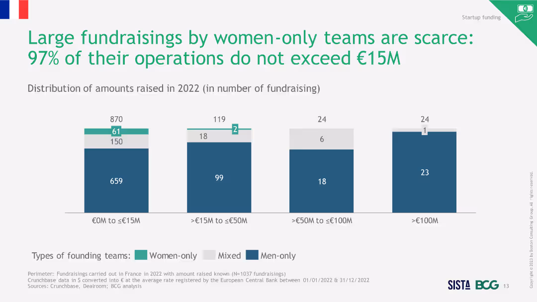
Column chart showing the distribution of amounts raised in 2022 by different founding teams, highlighting the scarcity of large fundraisings by women.
Investment Analysis
Financial Services
The slide emphasizes that large fundraisings by women-only teams are rare, with most fundraisings not exceeding €15M in 2022.
large fundraisings, women-only teams, scarcity, 2022
false
Investment Analysis
Financial Services
Single Chart
BCG
Add to my slides
Remove from favorites
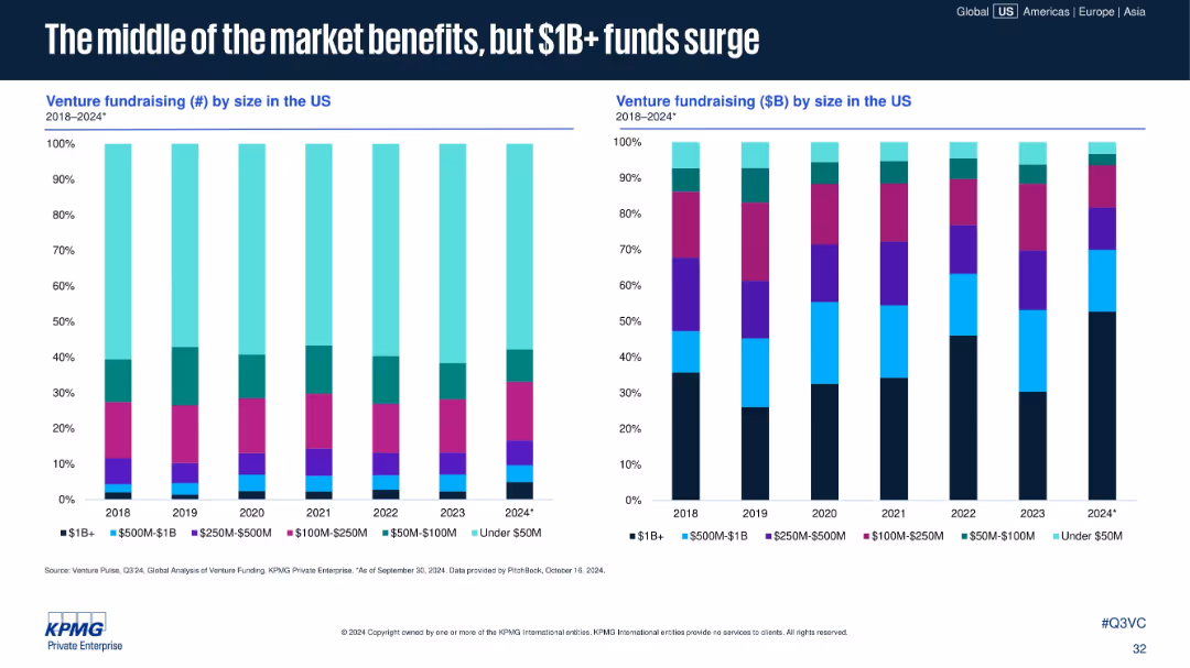
Two stacked bar charts: left shows fundraising count by size; right shows fundraising amount ($B) by size. Categories include <$50M to $1B+.
Investment Analysis
Financial Services
Larger VC funds ($1B+) are gaining share in both count and capital raised, even as mid-sized funds see stable or slight increases. Smaller funds under $50M continue to shrink in both volume and total capital raised.
large funds, $1B+ fundraising, venture capital, fund size, mid-market funds, capital allocation, US fundraising, 2024 trends
false
Investment Analysis
Financial Services
Multiple Chart
KPMG
Add to my slides
Remove from favorites
The slide is divided into two columns, each with an image at the top and text below. Includes a trend assessment with a bar chart for impact on industry and time of adoption.
Technology and Digital Transformation
Retail & E-commerce
Explains the importance of last mile solutions in retail, focusing on delivery efficiency and customer satisfaction.
Last Mile, Delivery, Customer Satisfaction, Retail, Logistics, Real-time Notifications, Delivery Times, Eco-friendly, Customer Experience
false
Technology and Digital Transformation
Retail & E-commerce
Multiple Chart
Deloitte
Add to my slides
Remove from favorites
Previous
Next
You don't have any favorites yet.
Please wait loading your favorites slides...
Create a FREE account to continue browsing
Receive Instant Access to 1,000+ slides from companies like McKinsey, Google, and Goldman Sachs
First Name
Last Name
Email
Password
I agree to all
Terms & Privacy Policy
Thank you! Your submission has been received!
Oops! Something went wrong while submitting the form.
Have an account?
Sign in
Upgrade to PRO to Save slides
Advanced Search and Filters
Access to 15,000+ slides
Access to Category Pages
Save/Bookmark Slides
PowerPoint Template Library
Pick a Plan
MONTHLY
$12/month
Billed every month, Cancel anytime.
YEARLY
$9/year
Billed $108 annually, Cancel anytime.
Checkout for $12/month
Checkout for $108/yr
Secured by Stripe | AES-256 bit encryption


![To be able to speak [LANGUAGE OF SURVEY]](https://cdn.prod.website-files.com/654e70fb59937215cac87b19/6899bb25ab40f0a37d1e3bf4_72pjbRjZOgM-1jEZbXLwIGbQRbvsN3sOVvBNQ5wW2yI.avif)