My Account
My Slides
Search by Category
Pricing
Templates
View All Templates
Download Template Slides
✦ AI Search
Feedback
Login
Logout
Get Started
Browse all Slides
Browse all Slides
Create a FREE Account
Instant access to 1,000+ real slides from top companies like McKinsey, BCG, Goldman Sachs, Google and many more!
First Name
Last Name
Email
Password
I agree to all
Terms & Privacy Policy
Thank you! Your submission has been received!
Oops! Something went wrong while submitting the form.
Have an account?
Sign in
Saved Slides
Total No. of slides saved
0
↻ Refresh
✖ Clear all
This slide uses a combination of icons and text to highlight common themes and strengths of leading companies, such as innovation, niche market leadership, diversification, global solutions, and software-enabled products. It includes statistical data such as growth rates and workforce impacts.
Competitive Landscape
Industrial & Manufacturing
The slide identifies key traits of successful companies in various segments, emphasizing innovation, niche leadership, diversification, global solutions, and the importance of software-enabled and connected products.
Leading Companies, Common Themes, Innovation, Market Leadership, Diversification, Global Solutions, Software-Enabled Products
false
Competitive Landscape
Industrial & Manufacturing
Table
LEK
Add to my slides
Remove from favorites
A vertical list of five leading practices with corresponding icons: Networking is learning, Leverage the boss, Obtain a sponsor, Create a pilot program, Give leaders freedom.
Human Resources and Talent Management
Financial Services
Outlines key lessons and leading practices for effective leadership and organizational development, emphasizing networking, leveraging support, and creating pilot programs.
Leading practices, lessons learned, leadership, networking, pilot program
false
Human Resources and Talent Management
Financial Services
Vertical Flow
Deloitte
Add to my slides
Remove from favorites
A column chart depicting IT budget allocation before and after a strategic flip to innovation. Text explains the factors contributing to becoming a leapfrogger.
Market Analysis and Trends
Technology & Software
The slide explains the characteristics and budgetary strategies of leapfroggers, emphasizing the shift from operational expenses to innovation-focused spending.
Leapfrogger, IT Budget, Innovation, Operations, Savings
false
Market Analysis and Trends
Technology & Software
Mixed Chart
Accenture
Add to my slides
Remove from favorites
The slide presents pie charts and bar charts that reflect employee opinions on training and educational resources, and what actions they want employers to take post-COVID-19.
Human Resources and Talent Management
Education & Training
The slide discusses the need for updating health care plans, leave policies, pay programs, and enhancing online learning, with employee preferences for post-COVID-19 training and educational improvements.
learning, culture, training, education, employee preferences
false
Human Resources and Talent Management
Education & Training
Multiple Chart
EY
Add to my slides
Remove from favorites
The slide presents bar charts and timelines, focusing on learning and growth opportunities across various life stages.
Strategic Planning
Education & Training
Discusses the enduring relevance of learning and personal development, with an emphasis on its impact on different generations and industries.
learning, education, personal growth, Gen X, life changes
false
Strategic Planning
Education & Training
Multiple Chart
Bain
Add to my slides
Remove from favorites
The slide contains a column chart showing learning loss in different countries, and a column chart comparing NAEP test scores for Mathematics and Reading from 2019 to 2023.
Strategic Planning
Education & Training
This slide analyzes the learning gaps caused by COVID-19, presenting data on learning loss across countries and trends in US NAEP test scores for Math and Reading.
Learning, Gap, COVID-19, Test Scores, Education, Analysis, Trends, Data, Recovery, Impact
false
Strategic Planning
Education & Training
Multiple Chart
LEK
Add to my slides
Remove from favorites
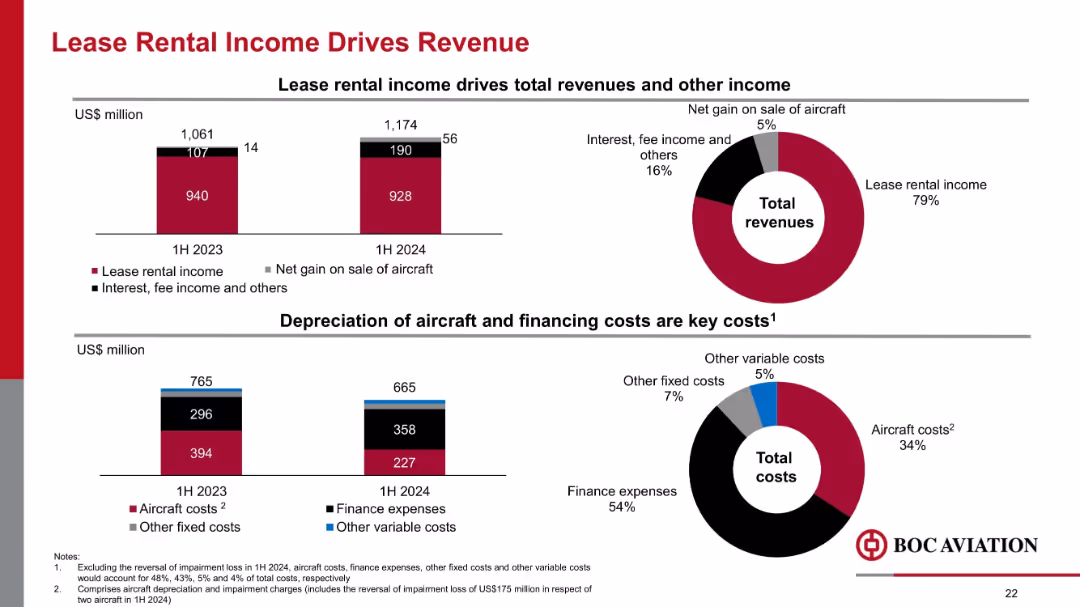
Combination of bar and donut charts showing revenue and cost composition in 1H 2023 vs. 1H 2024, focused on lease income and costs.
Financial Performance
Transportation & Logistics
Lease rental income remains the dominant revenue stream at 79% in 1H 2024. Gains from aircraft sales and fee income also contribute. On the cost side, finance expenses and aircraft costs make up the bulk of expenditures.
lease income, revenue, cost structure, aircraft depreciation, finance expenses, BOC Aviation
false
Financial Performance
Transportation & Logistics
Multiple Chart
Goldman Sachs
Add to my slides
Remove from favorites
Three sets of column charts compare the percentage of lease breaks and expiries by Weighted Average Lease Expiry (WALE) and Weighted Average Lease Break (WALB) across different years. The charts are color-coded by segment, comparing the overall portfolio with light industrial/logistics and office segments. Annotations provide additional insights into the risk management process.
Risk Assessment and Management
Real Estate & Construction
Highlights the risk mitigation strategies applied to lease breaks and expirations within a real estate portfolio, emphasizing proactive management and future planning.
Lease Management, Risk Mitigation, Real Estate Portfolio, Strategic Planning, WALE, WALB, Proactive Measures
false
Risk Assessment and Management
Real Estate & Construction
Multiple Chart
Morgan Stanley
Add to my slides
Remove from favorites
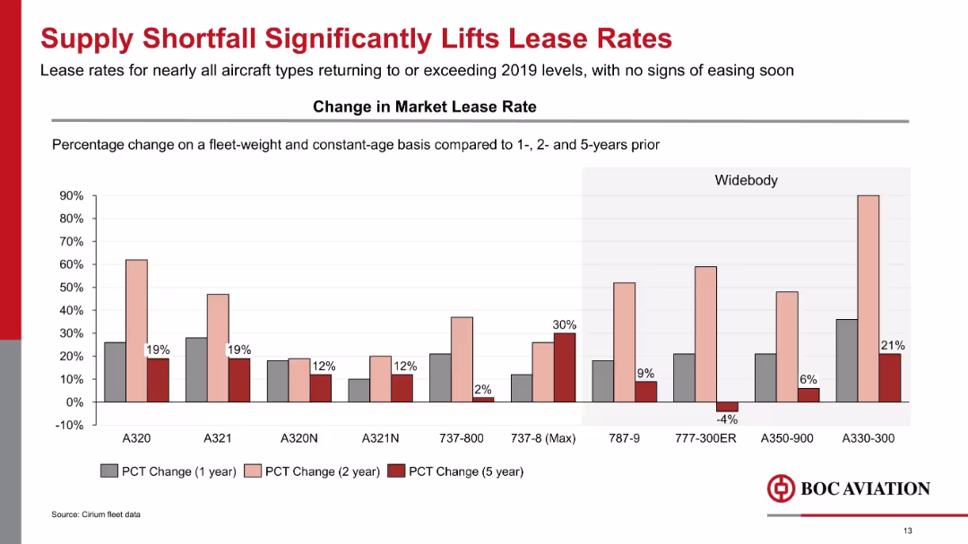
Bar chart showing percentage change in market lease rates for various aircraft types over 1, 2, and 5-year spans.
Pricing Strategies
Transportation & Logistics
Lease rates for aircraft have significantly increased due to supply constraints, with widebodies like A330-300 showing the largest rise. Most models now exceed 2019 lease levels, driven by market shortfalls and high demand.
lease rates, supply shortfall, pricing, A320, A330, widebody, narrowbody, aircraft leasing
false
Pricing Strategies
Transportation & Logistics
Single Chart
Goldman Sachs
Add to my slides
Remove from favorites
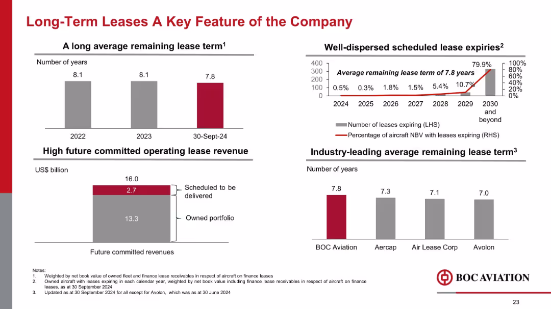
Multi-panel layout with bar charts and line graph; red and grey color scheme; financial and lease data visualized
Financial Performance
Financial Services
Highlights BOC Aviation’s strong lease fundamentals with an average lease term of 7.8 years, dispersed expiries, and high future committed revenues. Benchmarks industry peers, emphasizing the company’s long-term revenue visibility.
leases, lease term, revenue, aviation, aircraft, expiries, NBV, financial performance, committed revenue, comparison
false
Financial Performance
Financial Services
Multiple Chart
Goldman Sachs
Add to my slides
Remove from favorites
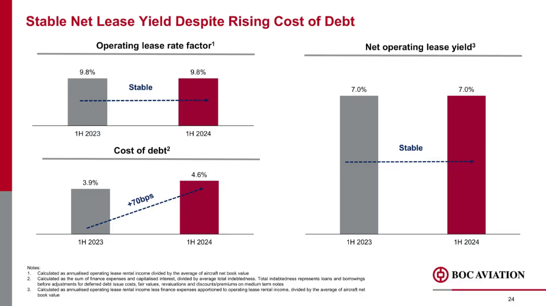
Two-panel financial bar chart layout; includes visual trend indicators with dotted arrows; red and grey palette
Financial Performance
Financial Services
Despite a 70bps increase in the cost of debt from 3.9% to 4.6%, BOC Aviation maintained a stable lease rate factor and net operating lease yield at 9.8% and 7.0% respectively between 1H 2023 and 1H 2024.
lease yield, debt cost, operating lease, financial stability, aviation, finance expense, lease rate, 1H 2024
false
Financial Performance
Financial Services
Single Chart
Goldman Sachs
Add to my slides
Remove from favorites
Column chart showing historical aircraft utilization rates over several years, highlighting impacts of COVID-19.
Operational Efficiency
Transportation & Logistics
Discusses utilization trends in Aircastle’s fleet, emphasizing operational challenges and recovery efforts.
leasing, aircraft, utilization, COVID-19, operational, trends
false
Operational Efficiency
Transportation & Logistics
Mixed Chart
Deutsche Bank
Add to my slides
Remove from favorites
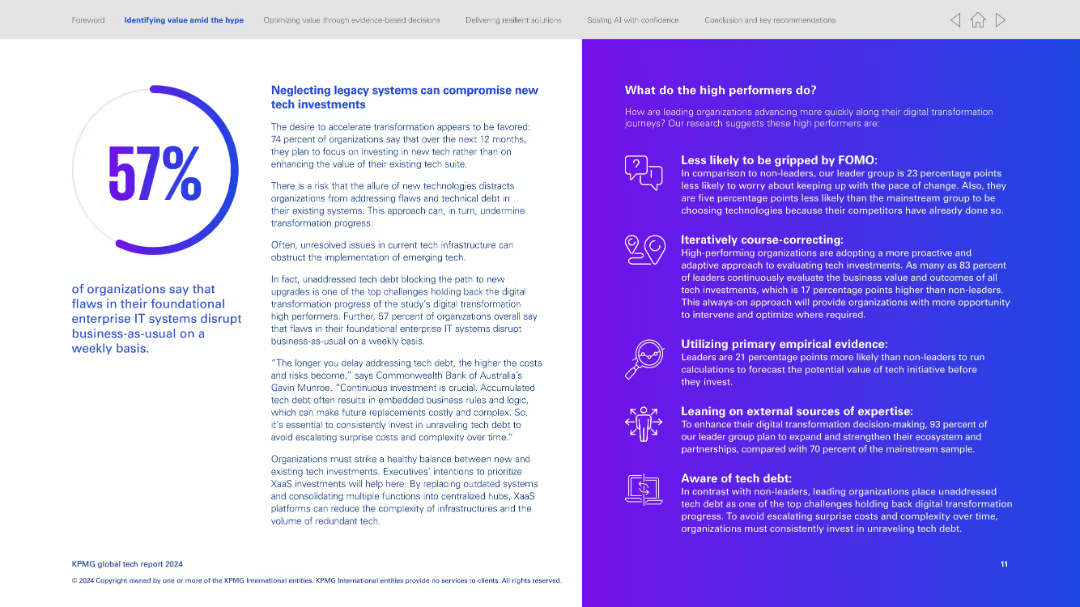
Two-column layout; left side presents text and a circular percentage visualization; right side uses an icon-text list with gradient background.
Operational Efficiency
Technology & Software
Emphasizes the risks of not addressing legacy IT systems, which disrupt operations. Explains that 57% report foundational IT flaws affect weekly operations. Right column identifies strategies high performers use—proactive evaluation, empirical data use, tech debt awareness.
Legacy systems, tech debt, operational disruption, proactive tech investment, digital transformation strategy, empirical evaluation, high performers
false
Operational Efficiency
Technology & Software
Mixed Chart
KPMG
Add to my slides
Remove from favorites
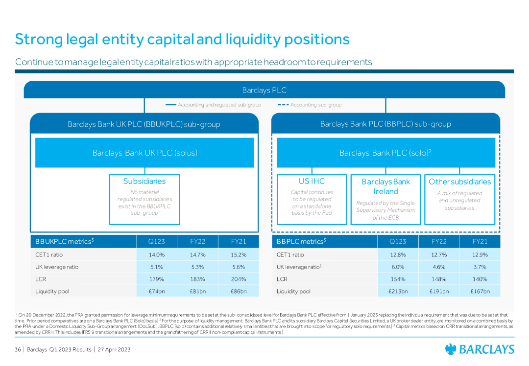
The slide includes a flowchart of legal entities and a table comparing key financial metrics across different periods.
Risk Assessment and Management
Financial Services
This slide details the capital and liquidity positions of legal entities within the bank, comparing metrics like CET1 ratio and leverage ratio across different timeframes, underscoring the strong financial health and regulatory compliance.
legal entities, capital, liquidity, financial metrics
false
Risk Assessment and Management
Financial Services
Diagram
Barclays
Add to my slides
Remove from favorites
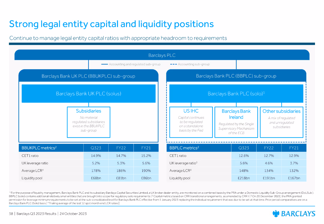
The slide is structured with a hierarchical diagram showing Barclays PLC's organizational structure. Below it are key financial metrics in tabular format.
Regulatory and Compliance
Financial Services
Provides an overview of Barclays' organizational structure and key capital and liquidity metrics for different legal entities within the group, ensuring regulatory compliance.
legal entity, capital, liquidity, Barclays, structure, compliance, regulatory, metrics, financial
false
Regulatory and Compliance
Financial Services
Diagram
Barclays
Add to my slides
Remove from favorites
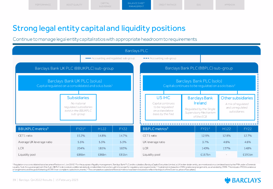
Diagram of Barclays' legal entity structure with accompanying tables of financial metrics.
Regulatory and Compliance
Financial Services
Outlines the capital and liquidity positions of Barclays' legal entities, including detailed financial ratios and regulatory compliance information.
legal entity, capital, liquidity, compliance, metrics
false
Regulatory and Compliance
Financial Services
Diagram
Barclays
Add to my slides
Remove from favorites
Simplified organizational chart of planned legal entity changes
Organizational Structure and Change
Financial Services
Outlines planned legal entity changes within UBS Group AG
legal, entity, changes, UBS, structure
false
Organizational Structure and Change
Financial Services
Diagram
UBS
Add to my slides
Remove from favorites
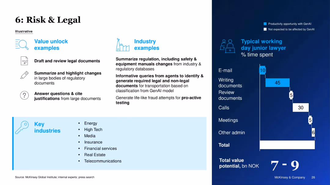
Two-column layout with icons and bullet points on the left; text and bar chart on the right with a blue background. Mix of white and light blue text, structured with headers, icons, and value metrics.
Operational Efficiency
Professional Services
This slide outlines how generative AI can streamline legal tasks such as drafting, summarizing, and reviewing documents, with application examples across industries. It also breaks down junior lawyers' time allocation, highlighting GenAI’s potential to boost productivity in document tasks.
legal, GenAI, productivity, regulation, documents, junior lawyer, fraud
false
Operational Efficiency
Professional Services
Mixed Chart
McKinsey
Add to my slides
Remove from favorites
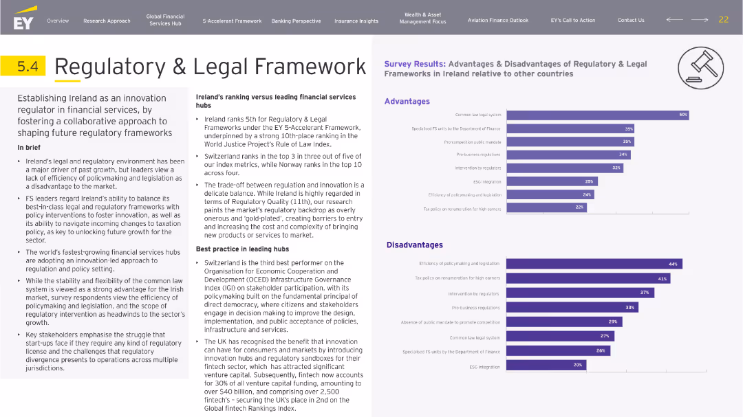
Left text-heavy narrative with supporting survey data on right in stacked bar chart format. Purple theme aligns with legal branding. Icons reinforce slide topic.
Regulatory and Compliance
Financial Services
Discusses Ireland’s legal framework and FS regulation environment. While viewed positively for its stability and common law system, inefficiencies in policymaking are seen as major drawbacks. Switzerland and the UK are cited as leaders. Survey responses reflect a mixed outlook on regulatory efficiency and innovation support.
legal, regulation, policymaking, taxation, innovation, Switzerland
false
Regulatory and Compliance
Financial Services
Multiple Chart
EY
Add to my slides
Remove from favorites
This slide contains a complex, color-coded map showing Deutsche Bank's global operations and their division into regions with a focus on corporate structure.
Organizational Structure and Change
Financial Services
Overview of Deutsche Bank’s global legal entity structure, highlighting significant branches and subsidiaries across different regions.
Legal, structure, global, branches, corporate, Deutsche Bank, map, entities, organization
false
Organizational Structure and Change
Financial Services
Table
Deutsche Bank
Add to my slides
Remove from favorites
Utilizes a white background with a complex diagram illustrating PwC's legal and operational structure across various countries and service lines. Text descriptions provide details about each entity.
Organizational Structure and Change
Professional Services
Detailed depiction of PwC's legal entities and operational hierarchy, showing the relationship between different branches worldwide. It's particularly useful for stakeholders and employees needing insight into the company's governance and legal framework.
legal structure, PwC, global operations, entities, governance
false
Organizational Structure and Change
Professional Services
Diagram
PwC/Strategy&
Add to my slides
Remove from favorites
Timeline showing legislative milestones affecting the North Carolina Department of Transportation's financial balances, with brief descriptions and impacts noted under each legislative act.
Regulatory and Compliance
Government & Public Sector
Reviews the legislative history affecting the financial status of NCDOT, useful for discussions on public administration, finance, and policy making.
legislation, finance, government, NCDOT, impact
false
Regulatory and Compliance
Government & Public Sector
Linear Flow
McKinsey
Add to my slides
Remove from favorites
Displays bar charts showing recovery in domestic airline ticketing volumes during holidays and discusses changes in business travel post-COVID.
Market Analysis and Trends
Transportation & Logistics
Focuses on the pent-up demand for leisure travel and the evolving structure of business travel, including flexibility in remote working and reduced budgets.
leisure travel, business travel, airline ticketing, remote working, travel demand, holidays
false
Market Analysis and Trends
Transportation & Logistics
Mixed Chart
BCG
Add to my slides
Remove from favorites
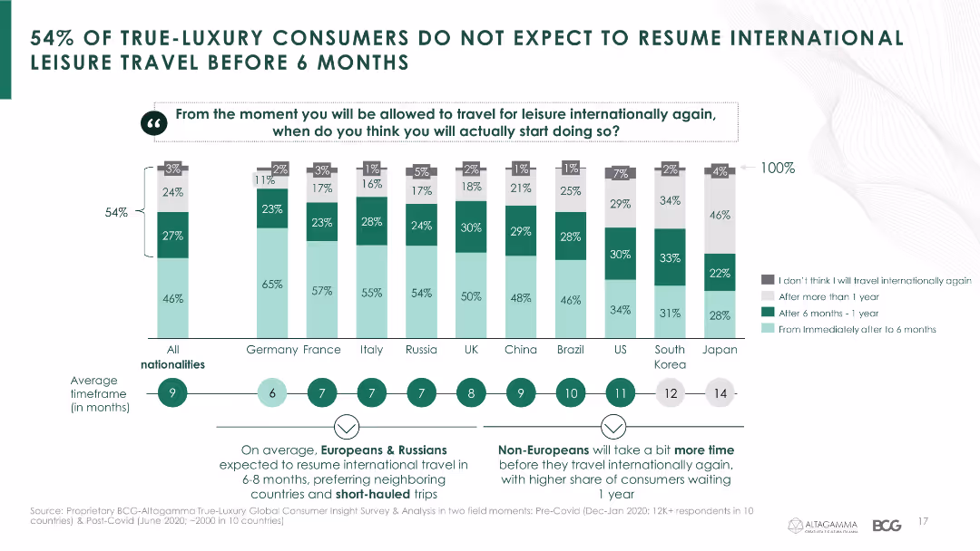
The slide features a column chart indicating the expected timelines for resuming international leisure travel among luxury consumers from various countries.
Market Analysis and Trends
Hospitality & Tourism
It provides insights into luxury consumers' expectations on when they will resume international travel, showing a significant delay due to the pandemic.
leisure travel, luxury consumers, travel expectations, COVID-19, international travel, country comparison
false
Market Analysis and Trends
Hospitality & Tourism
Mixed Chart
BCG
Add to my slides
Remove from favorites
This slide features interconnected graphics and bullet points detailing acquisitions and statistics in premium leisure travel, with the Chase Travel brand prominently displayed.
Market Analysis and Trends
Technology & Software
Focuses on the growth in the travel sector due to recent acquisitions, emphasizing Chase's relationships with affluent customers and partnerships.
leisure travel, market growth, acquisitions, affluent customers, travel partnerships, Chase Travel
false
Market Analysis and Trends
Technology & Software
Diagram
JP Morgan
Add to my slides
Remove from favorites
The slide features a column chart and several smaller graphics to indicate performance highlights and future outlook. It has a structured, clean design with distinct sections for each topic.
Market Analysis and Trends
Financial Services
Showcases performance highlights and strategic vision of a financial service provider in the leisure travel sector, focusing on sales volume growth and customer engagement through technology and personalization.
leisure travel, sales growth, strategic vision, customer engagement
false
Market Analysis and Trends
Financial Services
Single Chart
JP Morgan
Add to my slides
Remove from favorites
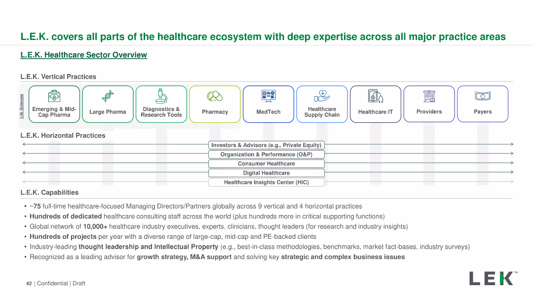
The slide outlines L.E.K.'s healthcare sector capabilities using a horizontal layout. It includes icons and text boxes to detail vertical and horizontal practices, capabilities, and global reach. Colors and icons are used for visual categorization.
Industry Overview
Professional Services
The slide provides an overview of L.E.K.'s comprehensive involvement in the healthcare ecosystem, covering vertical and horizontal practices, capabilities, and their global network. It highlights their expertise and range of services in the healthcare sector.
L.E.K., healthcare, ecosystem, vertical practices, horizontal practices, capabilities, global reach, services
false
Industry Overview
Professional Services
Diagram
LEK
Add to my slides
Remove from favorites
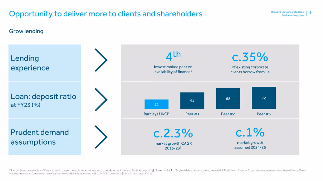
Similar layout to previous slide. Sections for lending experience, loan:deposit ratio, and demand assumptions with relevant benchmarks.
Sales and Business Development
Financial Services
Focuses on growing lending as a strategic priority. Barclays UKCB is underperforming in loan:deposit ratio compared to peers, indicating an opportunity. It notes current client borrowing levels (35%) and conservative growth forecasts.
lending, borrowing, loan:deposit ratio, market assumptions, peer comparison, business development, client financing
false
Sales and Business Development
Financial Services
Mixed Chart
Barclays
Add to my slides
Remove from favorites
Includes column charts showing loan and deposit developments over several quarters, with FX adjustments noted. The layout is simple and focused on trends.
Financial Performance
Financial Services
Analyzes stable lending trends and increasing deposit volumes in Q4 2023 across various bank divisions, reflecting on strategic responses to regulatory changes and market conditions. It also discusses the balance of loan and deposit flows, providing insights into the bank's operational stability and growth in the financial sector.
Lending, Deposits, Financial Stability, Market Trends, Operational Strategy
false
Financial Performance
Financial Services
Multiple Chart
Deutsche Bank
Add to my slides
Remove from favorites
Features multiple column charts and statistics.
Financial Performance
Financial Services
Reviews lending, deposits, and money market fund trends with a focus on firm stability and client trust, indicated by EOP balances and net migration rates.
Lending, Deposits, Money Market, Stability, Trust
false
Financial Performance
Financial Services
Multiple Chart
JP Morgan
Add to my slides
Remove from favorites
Includes column charts comparing lending and deposit figures over three years, supplemented with text outlining future growth strategies.
Sales and Business Development
Financial Services
Analyzes Barclays' current market positioning in lending, its strategies for growth, and approaches to attract new clients by leveraging its financial services strengths and focusing on competitive pricing and sector-specific solutions.
lending, growth, market share, finance, strategy
false
Sales and Business Development
Financial Services
Mixed Chart
Barclays
Add to my slides
Remove from favorites
This slide is data-driven, containing three separate graphs: two bar graphs and one pie chart. It has a clear, concise layout with annotations and a side panel with textual information about Kredivo's services.
Customer and Market Segmentation
Financial Services
The slide presents growth metrics for a lending company, Kredivo, focusing on the expansion in non-tier 1 cities. It highlights the increase in loan disbursement, user activation, and transaction frequency.
Lending, Growth, Non-Tier 1 Cities, Kredivo, Loan Disbursement, User Activation, Transaction Frequency
false
Customer and Market Segmentation
Financial Services
Multiple Chart
Kearney
Add to my slides
Remove from favorites
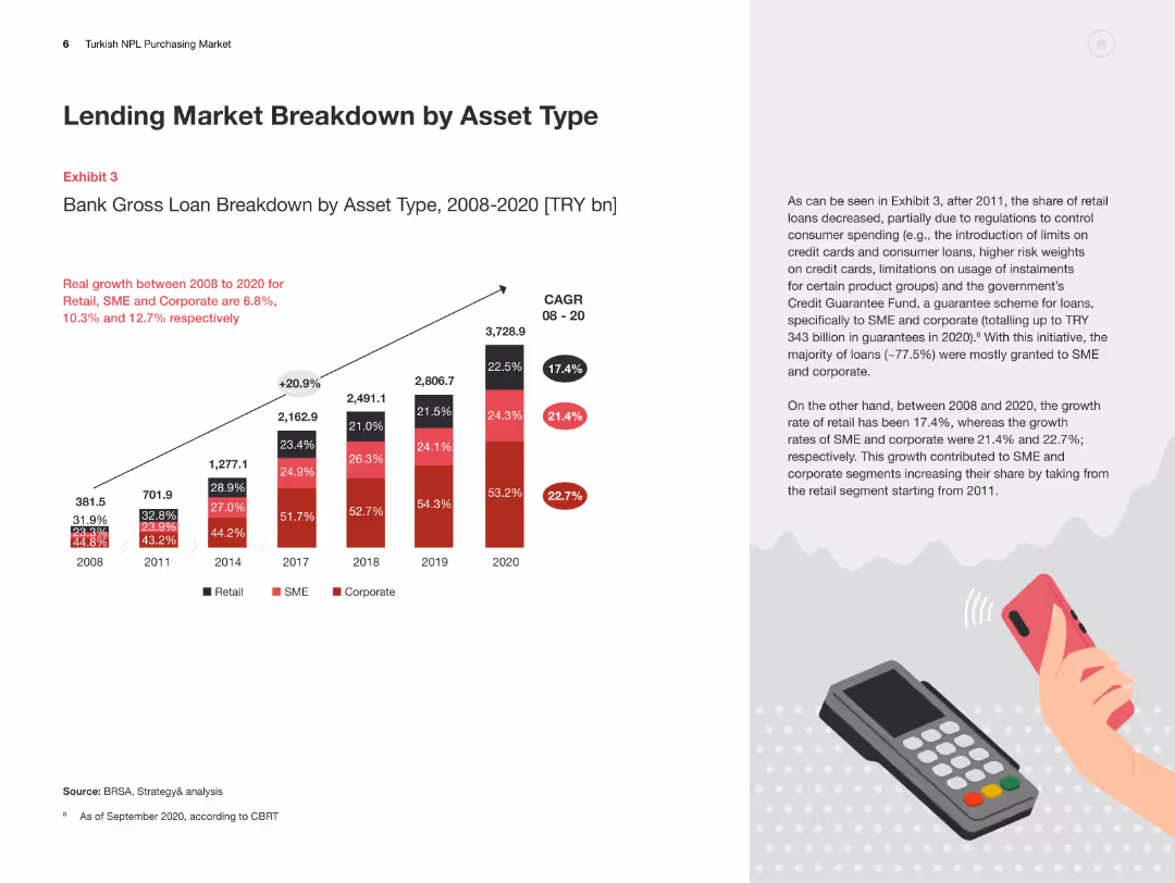
The slide features a column chart detailing the bank gross loan breakdown by asset type from 2008 to 2020, with accompanying text on trends and growth rates.
Market Analysis and Trends
Financial Services
This slide presents a detailed analysis of the Turkish lending market by asset type, showing the growth trends in retail, SME, and corporate loans over time.
Lending Market, Asset Type, Turkey, Retail Loans, SME Loans
false
Market Analysis and Trends
Financial Services
Mixed Chart
PwC/Strategy&
Add to my slides
Remove from favorites
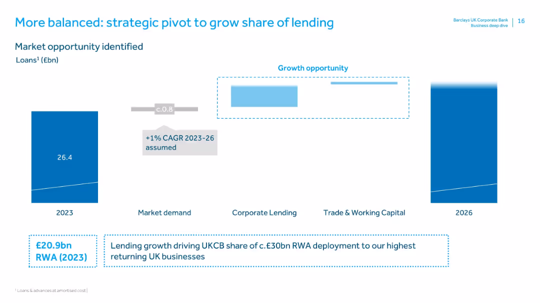
Vertical bar chart showing 2023 loans, with growth opportunity highlighted across market segments. Emphasis on CAGR and RWA deployment.
Investment Analysis
Financial Services
Identifies a lending growth opportunity based on market demand, aiming to shift more RWA to UKCB’s high-returning segments. Projects modest loan growth (1% CAGR) and targets £30bn RWA deployment by 2026.
lending, market opportunity, CAGR, RWA, investment analysis, corporate lending, working capital
false
Investment Analysis
Financial Services
Mixed Chart
Barclays
Add to my slides
Remove from favorites
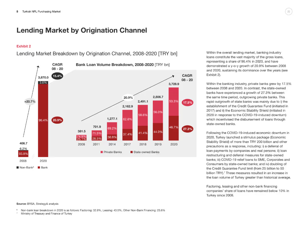
This slide includes a column chart breaking down the lending market by origination channel from 2008 to 2020, with an accompanying explanation of trends and growth rates.
Market Analysis and Trends
Financial Services
The slide analyzes the breakdown of the Turkish lending market by origination channel, highlighting the growth of private and state-owned banks and overall market dynamics.
Lending Market, Origination Channel, Turkey, Private Banks, State-owned Banks
false
Market Analysis and Trends
Financial Services
Multiple Chart
PwC/Strategy&
Add to my slides
Remove from favorites
Presents data and future strategies in lending market share through various graphs.
Market Analysis and Trends
Financial Services
Discusses strategies to increase lending market share and improve service models.
lending, market share, strategies, service model
false
Market Analysis and Trends
Financial Services
Linear Flow
Barclays
Add to my slides
Remove from favorites
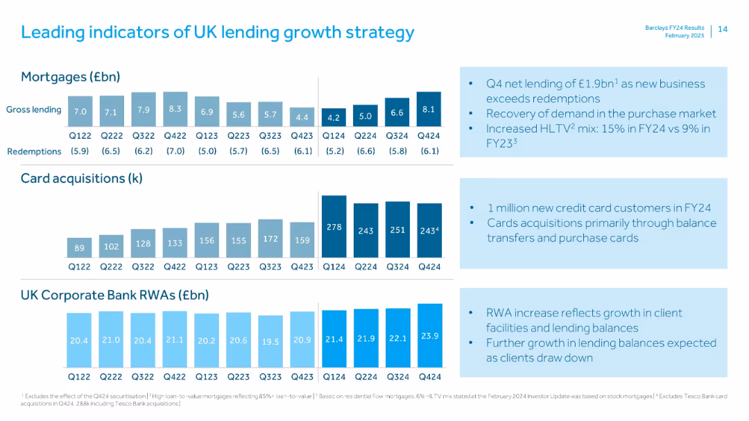
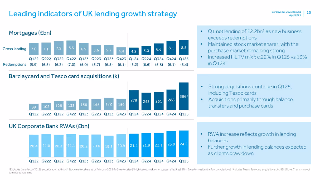
Three-section vertical chart layout: mortgages, card acquisitions, and UK Corporate Bank RWAs; consistent quarterly bar charts
Strategic Planning
Financial Services
Displays leading growth indicators in UK lending including mortgage net lending, card acquisition volumes, and corporate banking risk-weighted assets. Q4 shows notable improvements in net lending and acquisitions, indicating a recovery in credit demand.
lending, mortgages, cards, UK Corporate Bank, RWAs, growth, Q424, net lending, Barclays
false
Strategic Planning
Financial Services
Multiple Chart
Barclays
Add to my slides
Remove from favorites
The slide includes a line graph and column charts about funded loans and net interest income, with supplemental textual descriptions. The slide design effectively balances detailed data and explanatory text.
Financial Performance
Financial Services
Provides an overview of progress in lending across the franchise, detailing growth in funded loans, net interest income, and lending strategies for different client segments.
Lending, Net Interest Income, Funded Loans, Franchise Growth, PWM, GS Select, Institutional Financing, Client Strategy
false
Financial Performance
Financial Services
Multiple Chart
Goldman Sachs
Add to my slides
Remove from favorites
Column charts and icons represent loan volumes and risk metrics. Clear, visual breakdown of data by sector.
Risk Assessment and Management
Financial Services
Examines the growth in lending and maintenance of loan loss rates, detailing risk mitigation measures up to 2026.
lending, risk, loans, 2026, growth
false
Risk Assessment and Management
Financial Services
Multiple Chart
Barclays
Add to my slides
Remove from favorites
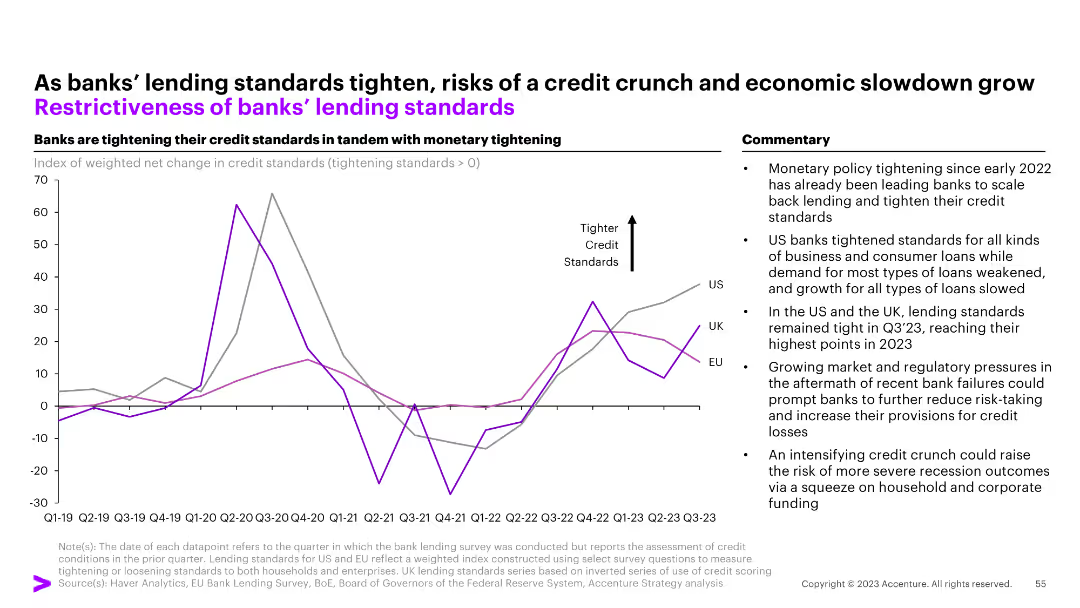
The slide shows a line chart of the restrictiveness of banks' lending standards for the UK, EU, and US from Q1 2019 to Q4 2022.
Risk Assessment and Management
Financial Services
The slide discusses the tightening of banks' lending standards in response to monetary policy changes and potential economic impacts.
lending standards, banks, monetary policy, financial services, risk management
false
Risk Assessment and Management
Financial Services
Mixed Chart
Accenture
Add to my slides
Remove from favorites
A line chart tracks changes in credit standards for US, UK, and EU banks, with a commentary section on the right. The y-axis shows net changes, and the x-axis displays quarters/years.
Risk Assessment and Management
Financial Services
The slide outlines the tightening of banks' lending standards in response to monetary policy, highlighting the impact on business and consumer loans and potential for a credit crunch.
Lending standards, credit, monetary policy, banks, credit crunch
false
Risk Assessment and Management
Financial Services
Mixed Chart
Accenture
Add to my slides
Remove from favorites
Three rows of small bar charts for mortgages, card acquisitions, and RWA, alongside bulleted insights.
Strategic Planning
Financial Services
Highlights key metrics driving Barclays' UK lending strategy, including mortgage gross lending, Barclaycard & Tesco card acquisitions, and Corporate Bank RWA. Notes continued market strength and higher loan-to-value mortgages.
Lending, Strategy, Mortgages, RWAs, Tesco, Cards, HLTV, Growth, UK Market
false
Strategic Planning
Financial Services
Multiple Chart
Barclays
Add to my slides
Remove from favorites
Depicts Lenovo's evolution with a central graphic highlighting core modernization areas and financial milestones, complemented by a clear layout with purple and white design elements.
Market Analysis and Trends
Technology & Software
This slide reflects on Lenovo's transformation through continuous innovation in technology and processes. It illustrates Lenovo's journey from a hardware-centric company to an intelligent solutions provider, highlighting strategic areas such as supply chain and IT transformation.
Lenovo, core modernization, enterprise reinvestment, market penetration, intelligent solutions, ERP overhaul, IT model redesign, supply chain, finance transformation
false
Market Analysis and Trends
Technology & Software
Diagram
Accenture
Add to my slides
Remove from favorites
Includes pie charts and column charts detailing the composition and changes in Level 3 assets and liabilities.
Risk Assessment and Management
Financial Services
Analyzes the Level 3 assets and liabilities as of March 31, 2023, noting the changes and reasons behind these valuations.
Level 3 assets, financial risk, liabilities, asset management
false
Risk Assessment and Management
Financial Services
Multiple Chart
Deutsche Bank
Add to my slides
Remove from favorites
Pie charts for assets and liabilities distribution, bar charts for movements in balances, with key highlights on the right.
Financial Performance
Financial Services
Provides an overview of Level 3 assets and liabilities, including movements in balances and valuation uncertainty mitigation.
Level 3, assets, liabilities, balances, valuation, uncertainty, financial instruments
false
Financial Performance
Financial Services
Multiple Chart
Deutsche Bank
Add to my slides
Remove from favorites
Uses pie charts and column charts in blue tones. Visualizes complex financial data about asset levels and movements.
Risk Assessment and Management
Financial Services
Details the uncertainty in asset valuation and changes in level 3 assets and liabilities, with focus on risk management.
Level 3 assets, liabilities, financial risk, valuation, asset management, financial reporting
false
Risk Assessment and Management
Financial Services
Multiple Chart
Deutsche Bank
Add to my slides
Remove from favorites
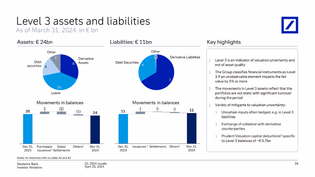
This slide includes pie charts and bar charts showing Deutsche Bank's Level 3 assets and liabilities, movements in balances, and key highlights as of March 31, 2024.
Financial Performance
Financial Services
The slide provides an overview of Deutsche Bank's Level 3 assets and liabilities as of March 31, 2024, detailing movements in balances and key highlights of the valuation and uncertainty of these assets.
Level 3 assets, liabilities, movements, balances, valuation, uncertainty, Deutsche Bank, March 31, 2024
false
Financial Performance
Financial Services
Multiple Chart
Deutsche Bank
Add to my slides
Remove from favorites
Features pie charts for assets and liabilities, bar charts for movement in balances over time, and a bulleted key highlights section.
Regulatory and Compliance
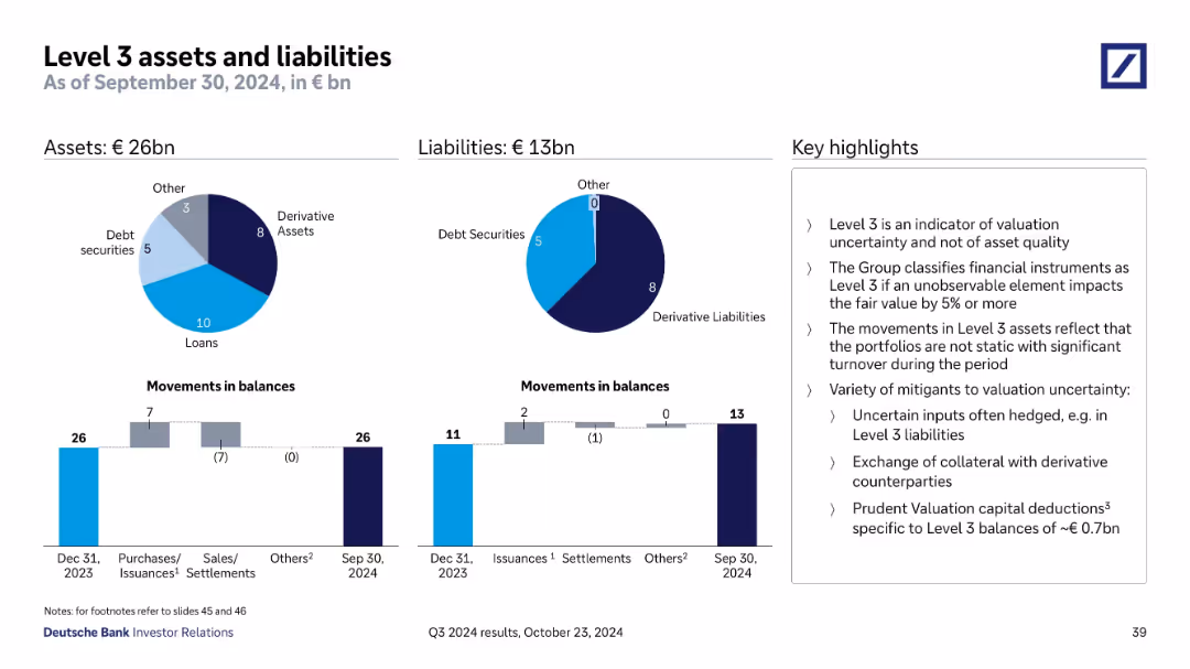
Financial Services
Summarizes Level 3 assets (€26bn) and liabilities (€13bn), categorizing by type (loans, derivatives, debt securities). Emphasizes valuation uncertainty and hedging strategies, and outlines balance movement from 2023 to Q3 2024.
Level 3, Assets, Liabilities, Valuation, Derivatives, Loans
false
Regulatory and Compliance
Financial Services
Multiple Chart
Deutsche Bank
Add to my slides
Remove from favorites
Two pie charts and bar charts tracking changes in Level 3 items; highlights on right.
Regulatory and Compliance
Financial Services
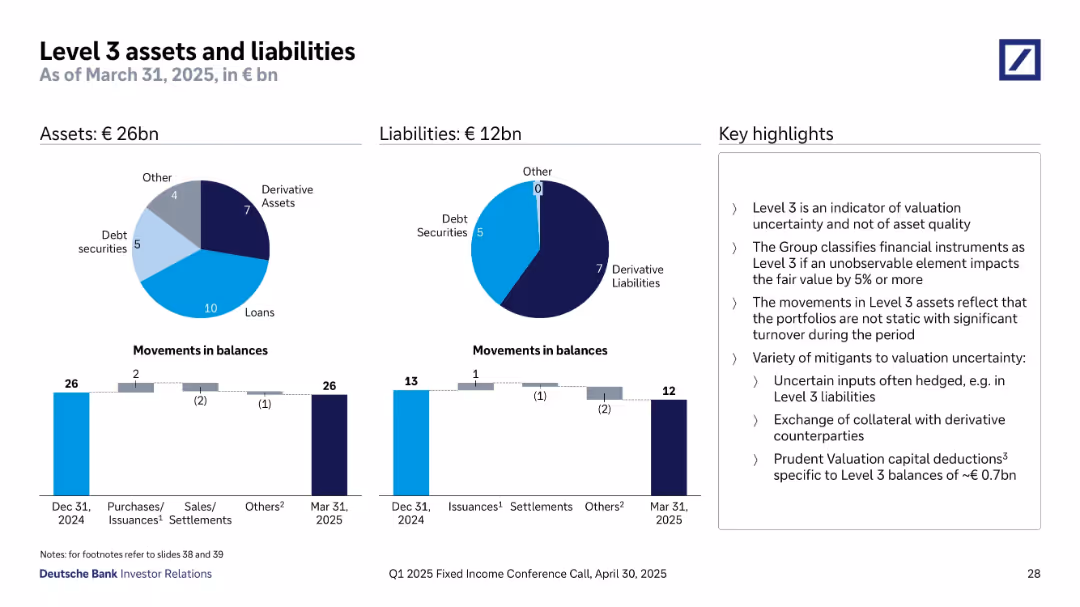
Presents Level 3 assets (€26bn) and liabilities (€12bn) as of March 31, 2025. Highlights valuation uncertainty and inputs subject to change >5%. Charts show breakdown by asset type (loans, derivatives, etc.) and movement across periods. Emphasizes that Level 3 is not a sign of asset quality deterioration, but reflects unobservable market factors and risk mitigants.
level 3 assets, liabilities, valuation uncertainty, derivatives, fair value, risk mitigation, IFRS, asset breakdown, financial instruments
false
Regulatory and Compliance
Financial Services
Multiple Chart
Deutsche Bank
Add to my slides
Remove from favorites
This slide utilizes pie charts and column charts to illustrate the distribution and movement of Level 3 assets and liabilities, including details on types of assets and liabilities and their changes over time. Includes key highlight points on regulatory implications and valuation uncertainties.
Regulatory and Compliance
Financial Services
Details the complexity of Level 3 assets and liabilities, key for understanding the risks associated with valuation uncertainties. Important for compliance and regulatory reporting, aiding in financial risk management and strategic planning within financial institutions.
Level 3 assets, liabilities, valuation uncertainty, regulatory compliance, financial institutions, risk management
false
Regulatory and Compliance
Financial Services
Multiple Chart
Deutsche Bank
Add to my slides
Remove from favorites
Two pie charts showing asset/liability composition; bar charts showing movements in balances; key points on classification and valuation uncertainty.
Regulatory and Compliance
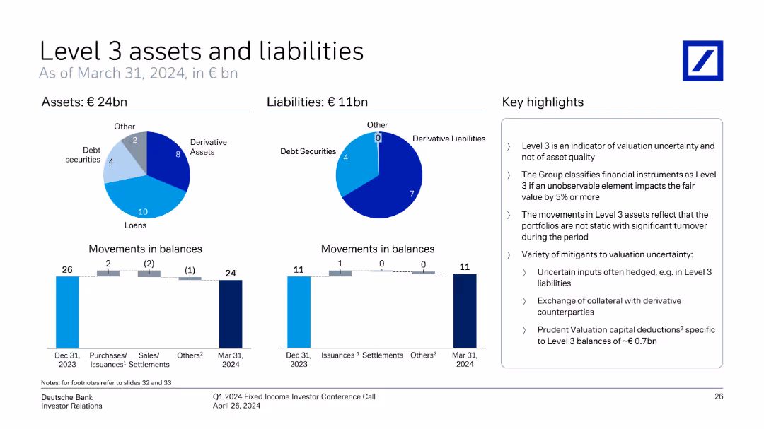
Financial Services
Shows Deutsche Bank’s Level 3 financial instruments as of March 31, 2024, with €24bn in assets and €11bn in liabilities. Visuals classify asset types (loans, derivatives) and illustrate quarterly changes. Highlights focus on valuation uncertainty, turnover, and mitigating practices.
Level 3 assets, valuation uncertainty, derivative liabilities, Q1 2024, balance movement, Deutsche Bank
false
Regulatory and Compliance
Financial Services
Multiple Chart
Deutsche Bank
Add to my slides
Remove from favorites
Two pie charts showing asset and liability composition, supported by bar charts for balance movements. Sidebar highlights key interpretations.
Regulatory and Compliance
Financial Services
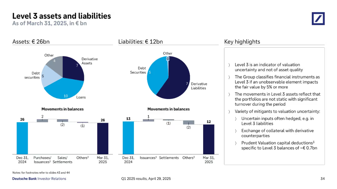
This slide discusses Level 3 assets (€26bn) and liabilities (€12bn) as of March 31, 2025, indicating valuation uncertainty rather than asset quality. It details changes in balances due to purchases, settlements, and issuance, while noting the mitigants used to manage valuation risk, such as collateral exchange and prudent valuation deductions.
Level 3, valuation, derivative, balance movement, fair value, compliance
false
Regulatory and Compliance
Financial Services
Multiple Chart
Deutsche Bank
Add to my slides
Remove from favorites
Two donut charts for asset/liability composition; two bar charts for balance movements; right-aligned text summary.
Financial Performance
Financial Services
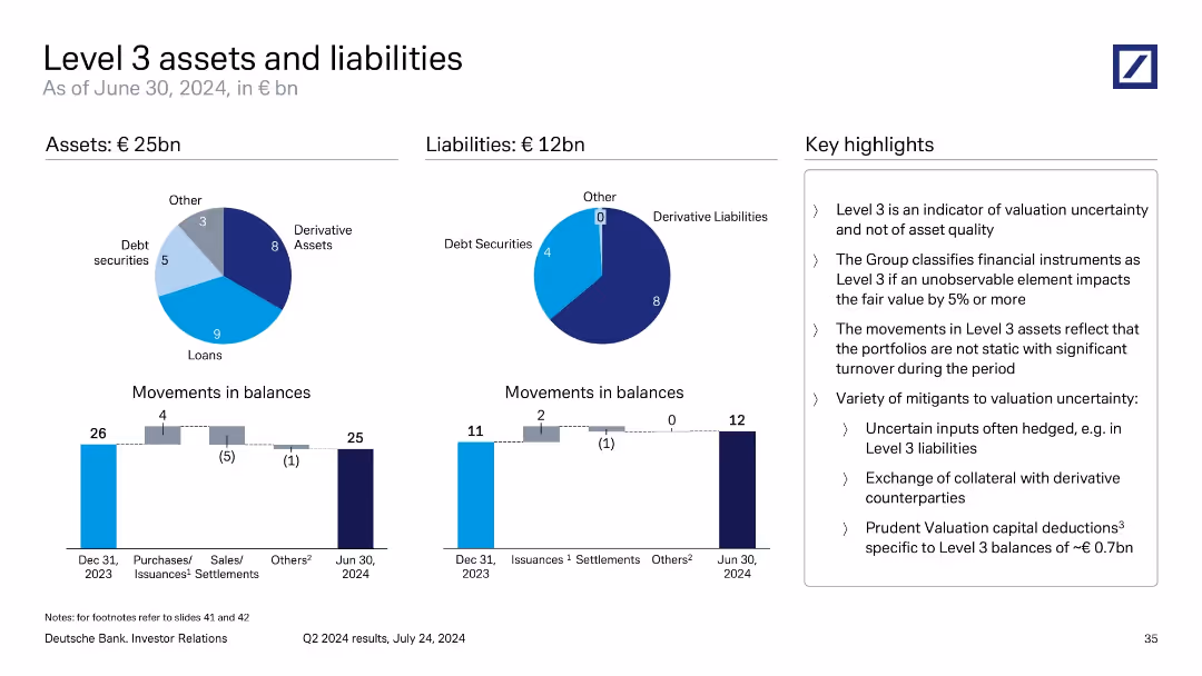
The slide explains €25bn in Level 3 assets and €12bn in liabilities, categorized into loans, derivatives, and debt securities. It emphasizes valuation uncertainty rather than quality and outlines mitigants like collateral exchange and hedging. Movements in balances suggest active portfolio management despite uncertainty.
Level 3, valuation risk, asset uncertainty, derivatives, loan balances
false
Financial Performance
Financial Services
Multiple Chart
Deutsche Bank
Add to my slides
Remove from favorites
Two pie charts and two bar charts show breakdown and changes in Level 3 assets and liabilities; key messages on valuation risk
Regulatory and Compliance
Financial Services
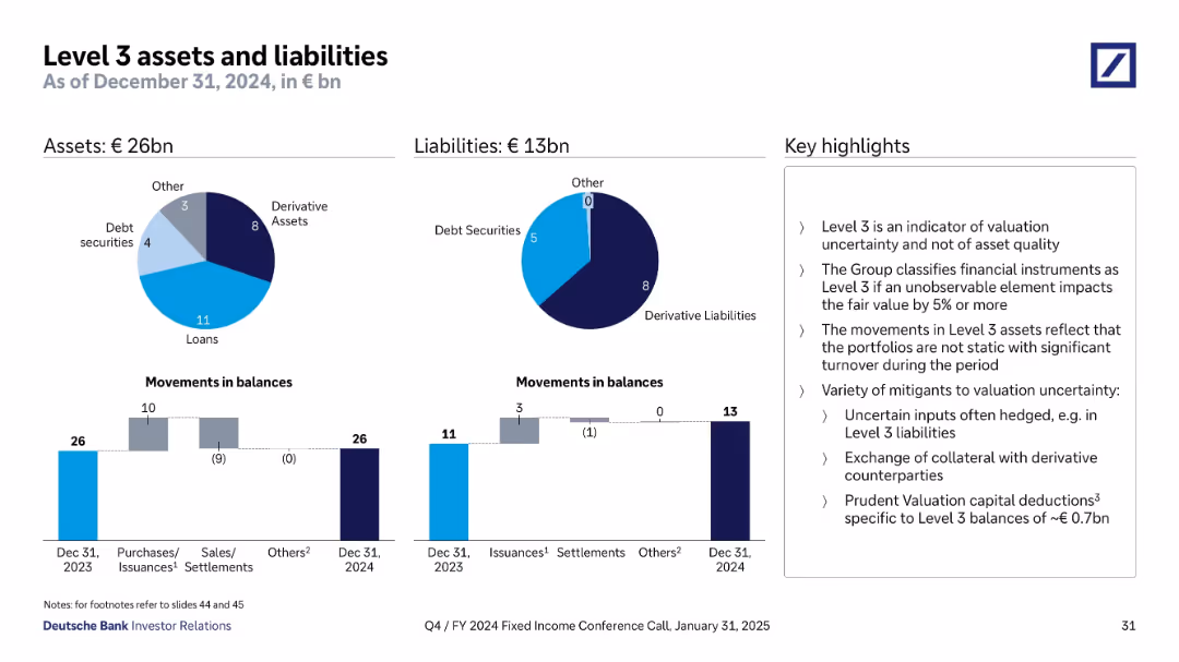
Level 3 exposures amount to €26bn in assets and €13bn in liabilities. Loans and derivatives form the bulk. Bar charts depict balance changes. Discussion focuses on valuation uncertainty, classification criteria, and risk mitigation strategies such as collateral exchanges and hedging practices.
Level 3, valuation risk, derivatives, regulatory, asset-liability
false
Regulatory and Compliance
Financial Services
Multiple Chart
Deutsche Bank
Add to my slides
Remove from favorites
Pie charts for assets and liabilities; bar charts for movements; boxed key highlights on the right; circular and vertical bar visuals
Regulatory and Compliance
Financial Services
Shows Deutsche Bank’s Level 3 assets and liabilities as of September 30, 2024, emphasizing valuation uncertainty. Includes breakdowns by asset class and tracks changes in balances, along with commentary on mitigating valuation risks.
Level 3, valuation uncertainty, derivative assets, financial reporting, liabilities, Deutsche Bank, balance sheet, asset classification
false
Regulatory and Compliance
Financial Services
Multiple Chart
Deutsche Bank
Add to my slides
Remove from favorites
Two pie charts show Q4 2024 Level 3 assets (€26bn) and liabilities (€13bn) by type; bar charts below show movements during the year; key points listed on the right.
Financial Performance
Financial Services
Summarizes Level 3 instruments representing high valuation uncertainty. Explains composition, changes over the year, and risk mitigants such as hedging and collateral. Notes prudent valuation capital deductions of ~€0.7bn.
Level 3, valuation uncertainty, derivatives, assets, liabilities, fair value
false
Financial Performance
Financial Services
Multiple Chart
Deutsche Bank
Add to my slides
Remove from favorites
The slide uses column charts to show the levelized cost of energy injection over different years and scenarios. It is visually detailed with clear data points.
Financial Performance
Energy & Utilities
Analyzes the potential cost reduction of energy blending by 2030, comparing it with biomass gas, using cost data and projections over several years.
levelized cost, energy blending, biomass gas, 2030, MWh, cost reduction, financial analysis, grid utilization
false
Financial Performance
Energy & Utilities
Multiple Chart
Kearney
Add to my slides
Remove from favorites
Bar chart comparing the levelized cost of energy for various renewable and conventional energy sources. Separate analysis showing the impact of U.S. federal tax subsidies.
Market Analysis and Trends
Energy & Utilities
Compares the cost-effectiveness of renewable energy technologies versus conventional ones, emphasizing the cost benefits under different scenarios including U.S. federal tax subsidies.
levelized cost of energy, renewable energy, conventional energy, cost comparison, tax subsidies, energy analysis
false
Market Analysis and Trends
Energy & Utilities
Single Chart
Roland Berger
Add to my slides
Remove from favorites
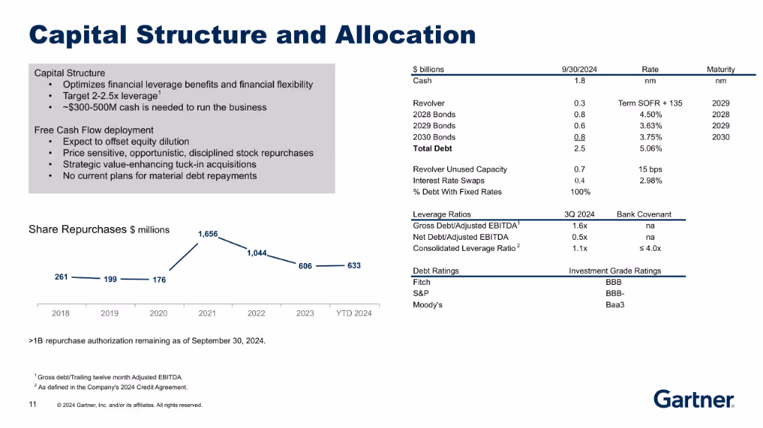
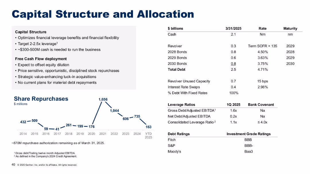
Updated version of 18625 with new year-to-date financials and slightly adjusted data points. Same format with strategy points, debt summary, and repurchase trends.
Corporate Finance and Valuation
Financial Services
Provides updated capital structure metrics and year-to-date (YTD) share repurchases. Reinforces strategic allocation of free cash flow and emphasizes disciplined financial management amid shifting debt and leverage positions.
leverage, capital allocation, debt profile, stock buyback, free cash flow
false
Corporate Finance and Valuation
Financial Services
Mixed Chart
Gartner
Add to my slides
Remove from favorites
Features a sequence of column chart illustrating changes in the leverage ratio over a period, complemented by a smaller bar chart depicting tier 1 capital data. Key highlights are noted on the right for quick reference.
Financial Performance
Financial Services
Focuses on the stability of the leverage ratio within a financial institution over time, emphasizing changes in regulatory treatment and capital adjustments. It provides insights into strategic financial planning and regulatory compliance.
leverage, capital, financial, compliance, stability
false
Financial Performance
Financial Services
Mixed Chart
Deutsche Bank
Add to my slides
Remove from favorites
Identical layout and content to slide 18615.
Corporate Finance and Valuation
Financial Services
Duplicate of slide 18615, reiterating Gartner’s approach to capital management, debt structure, and repurchase strategies. May serve as reinforcement or repeated placement in a presentation.
leverage, capital structure, cash flow, debt, repurchases, allocation, financial strategy, Gartner
false
Corporate Finance and Valuation
Financial Services
Mixed Chart
Gartner
Add to my slides
Remove from favorites
The slide includes two line graphs titled "Average EBITDA purchase price multiple for leveraged buyout transactions" for the US and Europe from 2000 to 2022. The data points are highlighted in red, indicating specific values of 11.9x for the US and 10.7x for Europe, contrasting against a gray background.
Financial Performance
Financial Services
Examines leveraged buyout purchase price multiples, suggesting robust competition and asset quality in the US and European markets, valuable for assessing investment purchase strategies and market entry considerations.
Leveraged Buyout, EBITDA, Multiples, US, Europe, Investment Strategy, Asset Quality
false
Financial Performance
Financial Services
Single Chart
Bain
Add to my slides
Remove from favorites
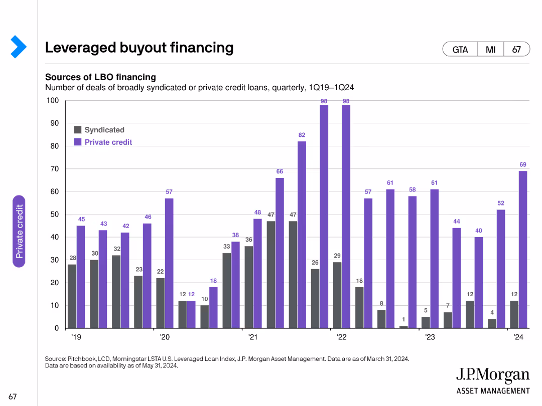
The slide contains a column chart showing the number of deals of broadly syndicated or private credit loans used for leveraged buyouts from Q1 2019 to Q1 2024. Deals are color-coded by type.
Investment Analysis
Financial Services
This slide examines the trends in leveraged buyout financing, highlighting the number of deals and the types of financing used, offering insights into the leveraged buyout market.
leveraged buyout, financing, syndicated loans, private credit, trends
false
Investment Analysis
Financial Services
Single Chart
JP Morgan
Add to my slides
Remove from favorites
Split layout with left-side bullets and right-side financial table; bottom chart showing share repurchases.
Corporate Finance and Valuation
Financial Services
Describes Gartner’s capital strategy, including leverage targets (2–2.5x), free cash flow usage, and recent debt breakdown. Share repurchase history is charted from 2014–2025, showing disciplined allocation of capital.
leverage, debt, capital structure, allocation, share repurchase, financial flexibility, cash deployment, Gartner
false
Corporate Finance and Valuation
Financial Services
Mixed Chart
Gartner
Add to my slides
Remove from favorites
The slide has a comparative layout with text boxes and percentages, including a horizontal flowchart depicting various stages.
Strategic Planning
Financial Services
The slide outlines the partnership between IBCM and GM in delivering leveraged finance services, showing coverage areas and their contributions to revenues.
leveraged finance, partnership, IBCM, GM, revenues, contributions, global markets, strategy, sponsors, coverage
false
Strategic Planning
Financial Services
Linear Flow
Credit Suisse
Add to my slides
Remove from favorites
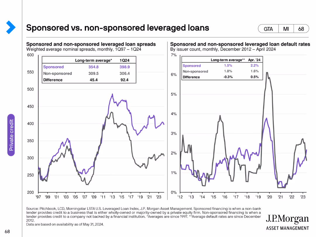
This slide includes two line charts. The first chart compares weighted average nominal spreads of sponsored and non-sponsored leveraged loans from 1997 to Q1 2024. The second chart shows default rates for these loans by issuer count from December 2012 to April 2024.
Risk Assessment and Management
Financial Services
The slide analyzes the differences in spreads and default rates between sponsored and non-sponsored leveraged loans, offering insights into risk and performance characteristics in the leveraged loan market.
leveraged loans, sponsored, non-sponsored, spreads, default rates
false
Risk Assessment and Management
Financial Services
Multiple Chart
JP Morgan
Add to my slides
Remove from favorites
The slide displays bar charts of leverage exposure and risk-weighted assets over time, with detailed breakdowns and key highlights.
Financial Performance
Financial Services
It details Deutsche Bank's leverage exposure and risk-weighted assets, providing insights into different asset classes and risk metrics.
leverage exposure, risk-weighted assets, bar charts, asset classes, risk metrics, Deutsche Bank
false
Financial Performance
Financial Services
Multiple Chart
Deutsche Bank
Add to my slides
Remove from favorites
Bar charts comparing Q4 2024 and Q1 2025 leverage exposures and risk-weighted assets.
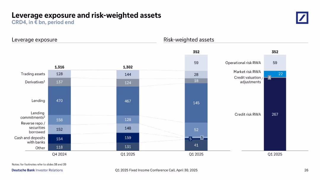
Financial Performance
Financial Services
The slide outlines leverage exposure and risk-weighted assets under CRD4 regulation. Key elements include lending (€467bn), derivatives (€124bn), and risk weights categorized into operational, market, and credit risks. Comparison with Q4 2024 shows stability in leverage with minor changes in exposures and risk segmentation.
leverage exposure, risk-weighted assets, CRD4, lending, credit risk, derivatives, Q1 2025, regulatory capital, operational risk
false
Financial Performance
Financial Services
Multiple Chart
Deutsche Bank
Add to my slides
Remove from favorites
Two tall bar graphs: one for leverage exposure and another for RWAs; values are broken down into categories such as lending and credit risk.
Regulatory and Compliance
Financial Services
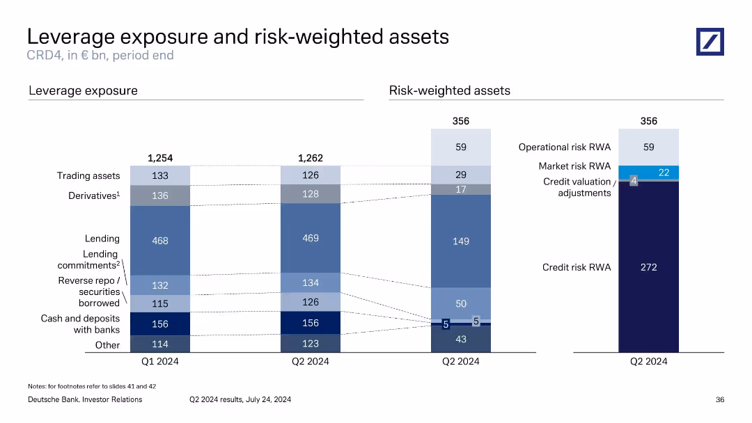
This slide provides Deutsche Bank’s leverage exposure (€1,262bn in Q2 2024) and risk-weighted assets (€356bn), showing category-level details like trading assets and lending commitments. It distinguishes components contributing to credit, market, and operational risks, essential for regulatory capital adequacy assessment.
leverage exposure, risk-weighted assets, CRD4, RWAs, capital adequacy
false
Regulatory and Compliance
Financial Services
Multiple Chart
Deutsche Bank
Add to my slides
Remove from favorites
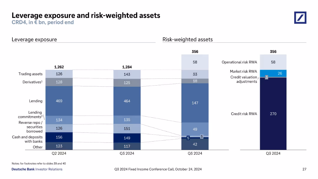
Split bar charts showing leverage exposure and risk-weighted assets across categories; clean layout, muted color palette; side-by-side comparison of Q2 and Q3 2024
Risk Assessment and Management
Financial Services
The slide breaks down Deutsche Bank’s leverage exposure and risk-weighted assets by asset class as of Q2 and Q3 2024, including lending, trading, and derivatives. It highlights shifts between quarters and categorizes risks (credit, market, operational).
leverage exposure, risk-weighted assets, derivatives, lending, credit risk, market risk, operational risk, Q3 2024, Deutsche Bank, financial risk
false
Risk Assessment and Management
Financial Services
Multiple Chart
Deutsche Bank
Add to my slides
Remove from favorites
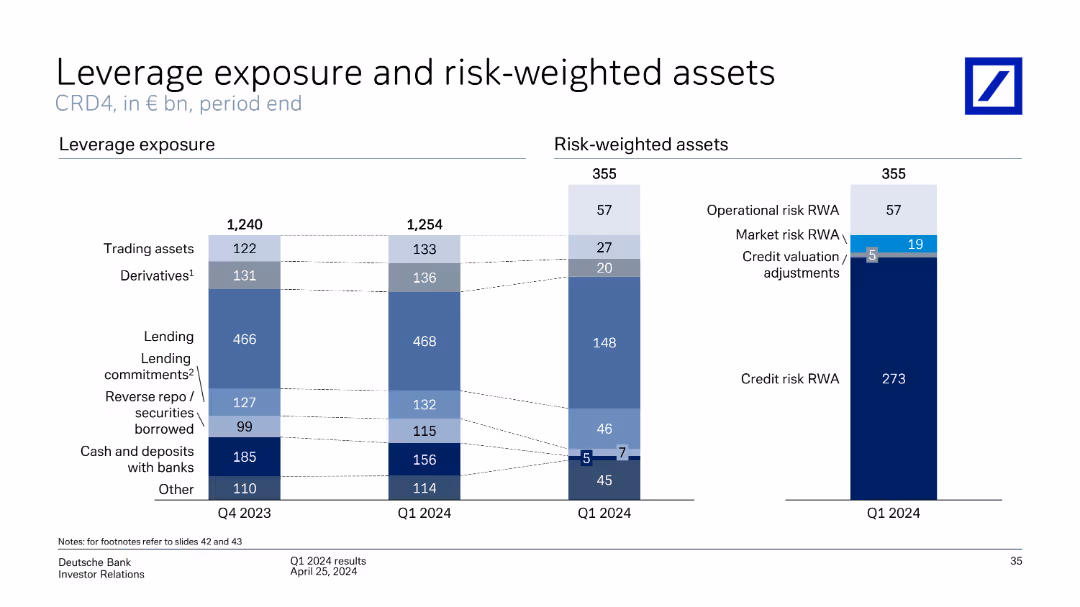
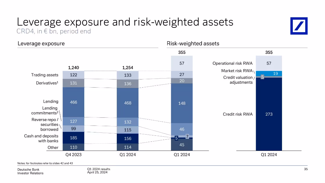
The slide contains two column charts comparing leverage exposure and risk-weighted assets for Q4 2023 and Q1 2024, broken down by categories like trading assets, derivatives, lending, etc.
Financial Performance
Financial Services
Compares leverage exposure and risk-weighted assets over two quarters, highlighting changes in various asset categories, and includes credit risk evaluation.
leverage, exposure, risk-weighted, assets, derivatives, lending, credit risk, trading assets
false
Financial Performance
Financial Services
Multiple Chart
Deutsche Bank
Add to my slides
Remove from favorites
Features dual column charts detailing leverage exposure and risk-weighted assets in various categories, with textual overlays indicating specific figures and changes over quarters.
Risk Assessment and Management
Financial Services
Provides a comprehensive view of the bank's leverage exposure and risk-weighted assets, crucial for assessing financial stability and compliance with regulatory capital requirements. Aids in internal risk assessments and informing stakeholders about financial positioning and risk management strategies.
leverage exposure, risk-weighted assets, financial stability, regulatory compliance, risk management
false
Risk Assessment and Management
Financial Services
Multiple Chart
Deutsche Bank
Add to my slides
Remove from favorites
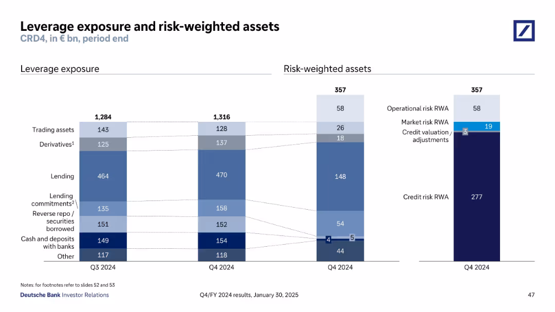
Two vertical bar charts compare Q3 vs Q4 2024: leverage exposure breakdown by asset type on left, and risk-weighted assets on right.
Financial Performance
Financial Services
Illustrates Deutsche Bank’s balance sheet structure at Q4 2024, comparing leverage exposure across asset classes and risk-weighted asset types. Credit risk RWA dominates, with detailed breakdown by operational, market, and credit risk components.
leverage exposure, RWA, CRD4, credit risk, derivatives, lending, capital
false
Financial Performance
Financial Services
Multiple Chart
Deutsche Bank
Add to my slides
Remove from favorites
Dual bar chart comparing leverage exposure and RWA components; clean layout with labeled segments
Financial Performance
Financial Services
Summarizes leverage exposure and risk-weighted assets at Q4 2024. Lending and derivatives are the largest components. RWA is dominated by credit risk, followed by operational and market risk. Provides insights into balance sheet structure and regulatory risk measurement under CRD4 framework.
leverage exposure, RWA, CRD4, credit risk, operational risk, lending
false
Financial Performance
Financial Services
Single Chart
Deutsche Bank
Add to my slides
Remove from favorites
Dual column charts: left for leverage exposure components over two quarters, right for Q1 2024 risk-weighted asset categories.
Regulatory and Compliance
Financial Services
The slide analyzes leverage exposure changes from Q4 2023 to Q1 2024 and breaks down Q1 2024 risk-weighted assets (RWAs). Lending and derivative assets are the largest leverage contributors. Credit risk dominates RWAs, followed by operational and market risks.
leverage exposure, RWA, credit risk, derivatives, CRD4, Deutsche Bank
false
Regulatory and Compliance
Financial Services
Multiple Chart
Deutsche Bank
Add to my slides
Remove from favorites
The slide features column charts showing portfolio recovery returns with and without leverage, alongside margin call thresholds. It uses a combination of text, numerical data, and graphical elements.
Investment Analysis
Financial Services
The slide illustrates the benefits of using leverage to enhance growth during market recoveries, comparing different portfolio strategies and their performance.
leverage, growth, recovery, portfolio, financial analysis
false
Investment Analysis
Financial Services
Single Chart
UBS
Add to my slides
Remove from favorites
Features a line graph detailing the history of net leverage ratios, with contextual annotations such as 'COVID-19' and 'Spin-Off'. The design employs a dark and light blue color scheme to differentiate between periods and data points.
Financial Performance
Financial Services
This slide illustrates the company's leverage history and current financial positioning, emphasizing stability despite economic fluctuations. It's beneficial for discussions on financial health and strategic financial planning.
leverage history, financial stability, strategic planning
false
Financial Performance
Financial Services
Single Chart
Goldman Sachs
Add to my slides
Remove from favorites
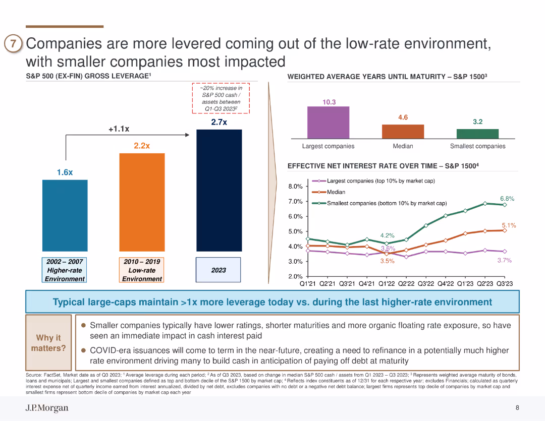
The slide features column charts comparing gross leverage across different time periods and line charts showing effective net interest rates over time for various company sizes.
Risk Assessment and Management
Financial Services
The slide examines how companies, particularly smaller firms, are dealing with increased leverage in a higher-rate environment. It highlights the risks associated with higher debt levels and the potential impact on smaller companies. The slide can be used for risk assessment and financial strategy discussions.
leverage, interest rates, small companies, risk, debt
false
Risk Assessment and Management
Financial Services
Multiple Chart
JP Morgan
Add to my slides
Remove from favorites
There are two sets of dual column charts, displaying trends over a period from 2013 to 2023 in leverage and interest coverage for U.S. investment-grade and loan markets.
Financial Performance
Financial Services
This slide analyzes the leverage and interest coverage in the U.S. loan market, highlighting stability and declines respectively. Suitable for financial review meetings.
leverage, interest, US, market, investment, financial, performance, stability, decline, coverage
false
Financial Performance
Financial Services
Multiple Chart
Morgan Stanley
Add to my slides
Remove from favorites
The slide contains a table and column charts showing leverage levels, drawdown percentages, and margin call data. Visual elements include a mix of text and numerical data in both tabular and graphical formats.
Risk Assessment and Management
Financial Services
The slide discusses how maintaining prudent levels of leverage can help avoid margin calls during significant market drawdowns, providing historical analysis data.
leverage, margin call, drawdown, financial risk, prudent levels
false
Risk Assessment and Management
Financial Services
Mixed Chart
UBS
Add to my slides
Remove from favorites
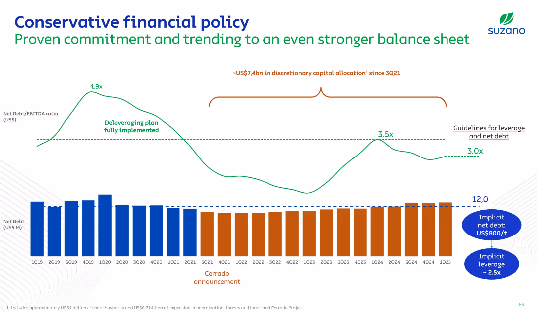
Timeline chart with leverage ratio trend (line graph) and stacked net debt bars by quarter; key events like Cerrado project announcement annotated.
Risk Assessment and Management
Consumer Goods
This slide illustrates Suzano’s financial discipline, highlighting a deleveraging trajectory, net debt levels, and commitment to a conservative financial policy. It contextualizes capital allocations against leverage management.
Leverage, Net Debt, Financial Policy, Risk, Timeline
false
Risk Assessment and Management
Consumer Goods
Single Chart
Goldman Sachs
Add to my slides
Remove from favorites
The slide features two large column charts representing CCB expenses for 2018 and 2019, with overlaid text describing contributing factors to the changes in expenses.
Operational Efficiency
Financial Services
It showcases how operational leverage was achieved through a breakdown of expenses in Consumer & Community Banking. The contributing factors to the financial performance and efficiency are listed to provide insight into expense management strategies.
leverage, operational, expenses, revenue, efficiency, banking, CCB
false
Operational Efficiency
Financial Services
Single Chart
JP Morgan
Add to my slides
Remove from favorites
The slide contains a line chart comparing different portfolios' returns and risks, including leveraged and non-leveraged options.
Investment Analysis
Financial Services
This slide explains how low-cost leverage can enhance portfolio returns while maintaining competitive risk levels, compared to higher-risk portfolios.
leverage, portfolio returns, risk, investment strategy, borrowing costs
false
Investment Analysis
Financial Services
Single Chart
UBS
Add to my slides
Remove from favorites
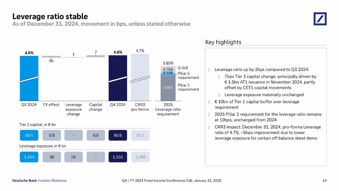
Horizontal bar graph and waterfall chart in a clean, corporate layout with blue-to-gray gradients. Accompanied by numerical tables and key highlights in a boxed section on the right.
Financial Performance
Financial Services
This slide shows Deutsche Bank’s leverage ratio progression from Q3 to Q4 2024 and compares it to 2025 regulatory requirements. It emphasizes stability in leverage ratio (4.6%) and details drivers such as capital changes and leverage exposure. The bank maintains a €10bn buffer above the minimum requirement.
leverage ratio, capital, CRR3, Tier 1, regulatory requirement, Q4 2024, CET1, FX effect, capital change, leverage exposure
false
Financial Performance
Financial Services
Mixed Chart
Deutsche Bank
Add to my slides
Remove from favorites
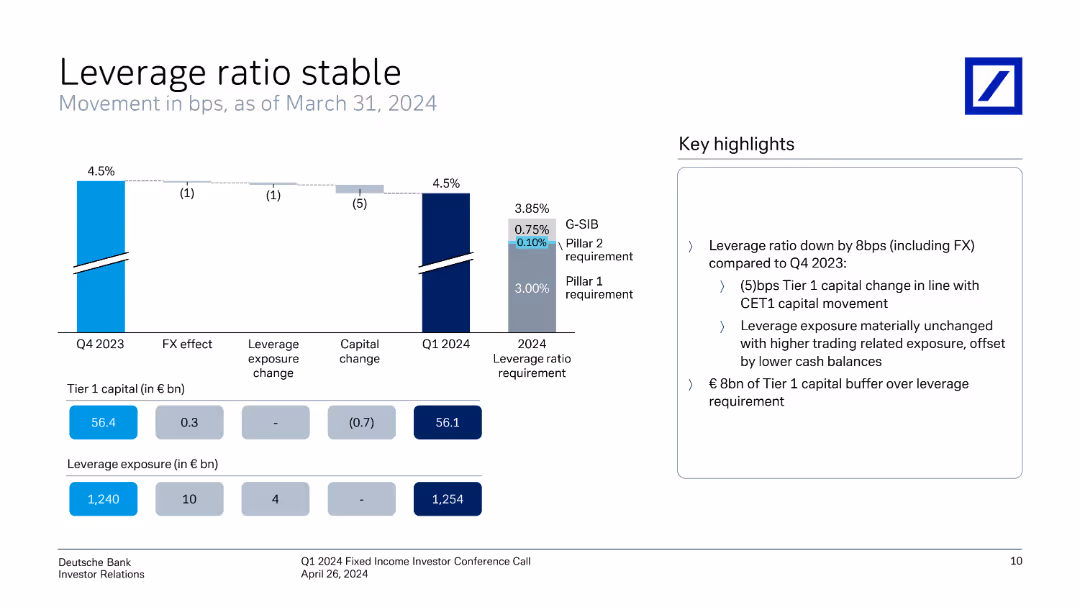
The slide includes a vertical column chart showing leverage ratio movements, supported by key highlights on the right.
Risk Assessment and Management
Financial Services
The slide details Deutsche Bank's leverage ratio stability, illustrating changes and factors affecting the ratio from Q4 2023 to Q1 2024.
leverage ratio, financial stability, risk management, Deutsche Bank, Q1 2024, investor relations, financial metrics, quarterly performance, capital adequacy
false
Risk Assessment and Management
Financial Services
Mixed Chart
Deutsche Bank
Add to my slides
Remove from favorites
Composed of column chart tracking the leverage ratio across quarters with explanations for changes due to FX effects, capital adjustments, and exposure variations.
Regulatory and Compliance
Financial Services
Explores the slight decrease in the leverage ratio of Q4 2023, discussing factors such as trading activities and liquidity reserves. It details the implications for financial strategies and regulatory compliance, highlighting proactive measures to maintain a robust leverage framework.
Leverage Ratio, Financial Strategy, Regulatory Compliance, Trading Activities, Liquidity Management
false
Regulatory and Compliance
Financial Services
Mixed Chart
Deutsche Bank
Add to my slides
Remove from favorites
It includes a line chart of leverage measures and a column chart of global credit maturity schedules.
Financial Performance
Financial Services
The slide examines U.S. high yield bond fundamentals, focusing on leverage ratios and the maturity schedule of global credit.
leverage ratios, credit maturity, high yield bonds, financial analysis, credit risk
false
Financial Performance
Financial Services
Multiple Chart
JP Morgan
Add to my slides
Remove from favorites
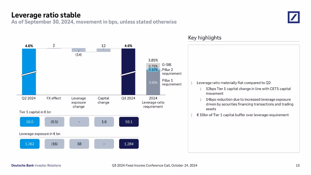
Bar chart showing leverage ratio movements and contributing factors. Includes figures for Tier 1 capital and exposure. Sidebar explains key developments.
Regulatory and Compliance
Financial Services
The leverage ratio remains stable at 4.6%, supported by capital increases and FX-neutral exposure growth. Tier 1 capital buffer is maintained above requirements, with exposure impacted by trading assets and securities financing.
leverage ratio, Tier 1 capital, exposure, securities financing, capital change, Q3 2024, regulatory ratio
false
Regulatory and Compliance
Financial Services
Mixed Chart
Deutsche Bank
Add to my slides
Remove from favorites
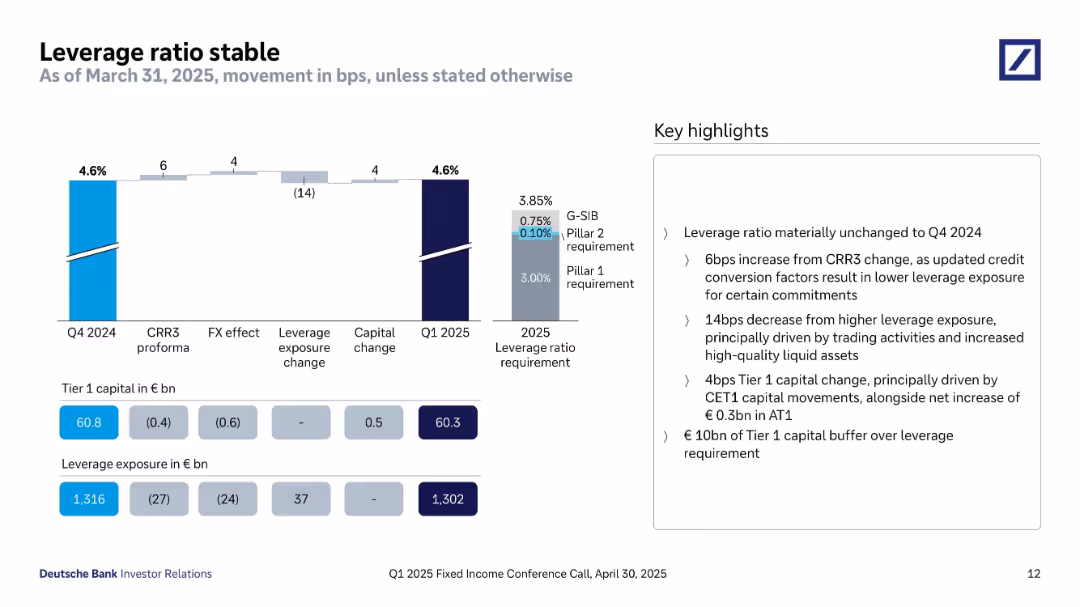
A bar chart tracks changes in leverage ratio across CRR3, FX, exposure, and capital from Q4 2024 to Q1 2025, alongside Tier 1 capital and leverage exposure values. A vertical bar displays the 2025 leverage ratio requirement. Highlights are shown on the right.
Financial Performance
Financial Services
The slide shows the leverage ratio remains unchanged at 4.6%, meeting the 3.85% regulatory requirement. It presents the components contributing to the movement: a reduction in leverage exposure and a small positive impact from capital changes. The Tier 1 capital buffer over requirement is €10bn. Key highlights address the specific impacts of trading activities, capital shifts, and credit conversion factor updates under CRR3.
leverage ratio, Tier 1 capital, leverage exposure, CRR3, capital change, liquidity, regulatory compliance
false
Financial Performance
Financial Services
Mixed Chart
Deutsche Bank
Add to my slides
Remove from favorites
The slide features a line chart comparing expected returns and volatility across different leverage levels and asset allocations.
Investment Analysis
Financial Services
This slide assesses how prudent use of leverage can potentially enhance returns more effectively than adding high-risk assets, given various loan costs.
leverage, risk assets, expected returns, volatility, investment strategy
false
Investment Analysis
Financial Services
Multiple Chart
UBS
Add to my slides
Remove from favorites
Slide with column charts showing quarterly leverage exposure and risk-weighted assets, divided into categories like lending and derivatives.
Financial Performance
Financial Services
Provides an overview of the bank's financial exposure and risk through various asset categories, highlighting changes in leverage and risk management.
leverage, risk, assets, financial, banking, exposure, derivatives, management
false
Financial Performance
Financial Services
Multiple Chart
Deutsche Bank
Add to my slides
Remove from favorites
Contains stacked column charts for leverage exposure and risk-weighted assets, split into categories such as trading and lending.
Financial Performance
Financial Services
Analyzes the bank's exposure to different types of financial risk at the end of Q3 2023, presenting quantitative leverage and risk data. Used for evaluating financial stability.
leverage, risk, financial analysis, Q3 2023
false
Financial Performance
Financial Services
Multiple Chart
Deutsche Bank
Add to my slides
Remove from favorites
Side-by-side bar charts: left for leverage exposure by asset class, right for risk-weighted assets with detailed breakdowns.
Risk Assessment and Management
Financial Services
Displays Q3 2024 data for €1,284bn in leverage exposure and €356bn in risk-weighted assets. Breaks down exposure across trading, lending, repo, cash, and others; risk-weighted assets include credit, market, and operational risk.
Leverage, Risk-Weighted Assets, Credit Risk, Exposure, Q3 2024
false
Risk Assessment and Management
Financial Services
Multiple Chart
Deutsche Bank
Add to my slides
Remove from favorites
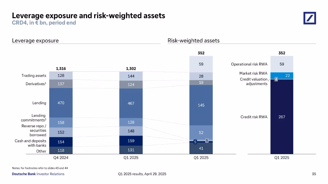
Stacked bar charts depicting components of leverage exposure and risk-weighted assets as of Q1 2025. Each category is color-coded and proportionally sized.
Regulatory and Compliance
Financial Services
The slide summarizes Deutsche Bank’s leverage exposure (€1,302bn) and risk-weighted assets (€352bn) across key categories such as trading assets, derivatives, credit risk, and operational risk. It provides a breakdown of regulatory capital measures, reflecting the bank’s risk positioning under CRD4 standards.
leverage, risk-weighted assets, exposure, CRD4, capital requirements
false
Regulatory and Compliance
Financial Services
Multiple Chart
Deutsche Bank
Add to my slides
Remove from favorites
Features two large column charts showing leverage exposure and risk-weighted assets, with annotations for detail.
Risk Assessment and Management
Financial Services
Compares Q4 2022 and Q1 2023 data regarding Deutsche Bank's leverage and risk-weighted assets, segmented by categories.
leverage, risk-weighted assets, financial data, banking
false
Risk Assessment and Management
Financial Services
Multiple Chart
Deutsche Bank
Add to my slides
Remove from favorites
Column charts and detailed textual information, utilizing shades of blue to illustrate financial data points.
Risk Assessment and Management
Financial Services
Provides insights into leverage and risk-weighted assets, essential for risk management and regulatory compliance.
Leverage, risk-weighted assets, financial risk, compliance, banking, operational risk, market risk
false
Risk Assessment and Management
Financial Services
Multiple Chart
Deutsche Bank
Add to my slides
Remove from favorites
Features a column chart comparing the relative sales ROI performance across digital average, SFVC, and LFVC, with LFVC showing double the performance.
Performance Metrics and KPIs
Media & Entertainment
Highlights the unexpectedly low media spend on LFVC despite its high performance, suggesting a misalignment in investment priorities.
LFVC, media spend, ROI, performance analysis, investment misalignment
false
Performance Metrics and KPIs
Media & Entertainment
Single Chart
Accenture
Add to my slides
Remove from favorites
Contains two pie charts showing the growth rates of LFVC viewership and ad spend, highlighting a 12% market disconnect between the two.
Market Analysis and Trends
Media & Entertainment
Examines the disparity in growth rates between LFVC viewership and advertising spend, illustrating a potential misalignment in market investment.
LFVC, viewership growth, ad spend, CAGR, market disconnect
false
Market Analysis and Trends
Media & Entertainment
Multiple Chart
Accenture
Add to my slides
Remove from favorites
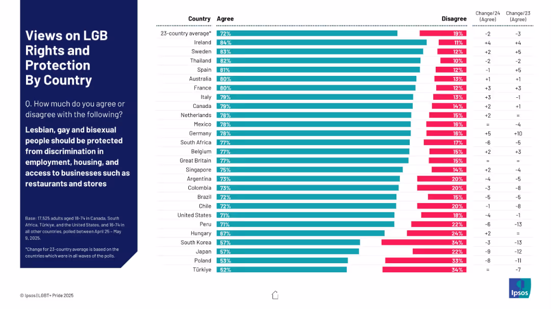
Horizontal bar chart comparing agreement/disagreement across countries
Market Analysis and Trends
Government & Public Sector
This slide gauges agreement with protecting LGB people from discrimination in employment, housing, and business access. Ireland, Sweden, and Thailand show high levels of agreement (80%+). Notable increases in agreement are seen in countries like Germany and Canada.
LGB, discrimination, agreement levels, protection, global attitudes, Ipsos, policy, social inclusion
false
Market Analysis and Trends
Government & Public Sector
Mixed Chart
IPSOS
Add to my slides
Remove from favorites
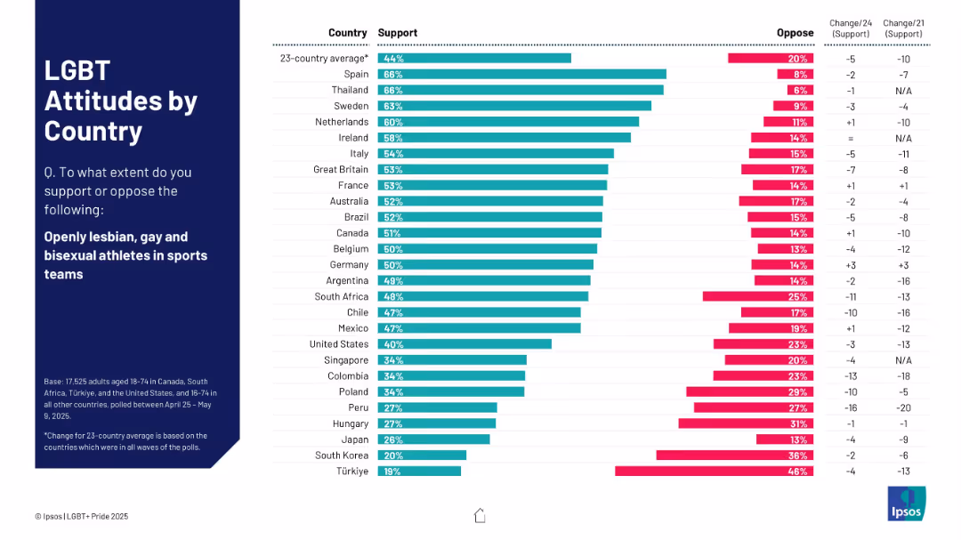
Horizontal bar chart ranking countries by support for openly LGBT athletes. Includes oppose levels and changes over time.
Market Analysis and Trends
Government & Public Sector
Assesses international support for openly LGBT athletes. Spain and Thailand show high acceptance; Great Britain moderately supportive. Includes data on shifts from 2021 and 2024 polls.
LGBT athletes, sports inclusivity, international survey, Ipsos, public attitudes
false
Market Analysis and Trends
Government & Public Sector
Mixed Chart
IPSOS
Add to my slides
Remove from favorites
Previous
Next
You don't have any favorites yet.
Please wait loading your favorites slides...
Create a FREE account to continue browsing
Receive Instant Access to 1,000+ slides from companies like McKinsey, Google, and Goldman Sachs
First Name
Last Name
Email
Password
I agree to all
Terms & Privacy Policy
Thank you! Your submission has been received!
Oops! Something went wrong while submitting the form.
Have an account?
Sign in
Upgrade to PRO to Save slides
Advanced Search and Filters
Access to 15,000+ slides
Access to Category Pages
Save/Bookmark Slides
PowerPoint Template Library
Pick a Plan
MONTHLY
$12/month
Billed every month, Cancel anytime.
YEARLY
$9/year
Billed $108 annually, Cancel anytime.
Checkout for $12/month
Checkout for $108/yr
Secured by Stripe | AES-256 bit encryption