My Account
My Slides
Search by Category
Pricing
Templates
View All Templates
Download Template Slides
✦ AI Search
Feedback
Login
Logout
Get Started
Browse all Slides
Browse all Slides
Create a FREE Account
Instant access to 1,000+ real slides from top companies like McKinsey, BCG, Goldman Sachs, Google and many more!
First Name
Last Name
Email
Password
I agree to all
Terms & Privacy Policy
Thank you! Your submission has been received!
Oops! Something went wrong while submitting the form.
Have an account?
Sign in
Saved Slides
Total No. of slides saved
0
↻ Refresh
✖ Clear all
The slide features multiple column and line charts. The column charts represent quarterly data, with blue bars indicating take-up and yellow lines showing vacancy rates. There are smaller column charts to the right showing e-commerce growth and vacancy rates by country. The color scheme is blue, yellow, and grey.
Market Analysis and Trends
Transportation & Logistics
This slide presents an analysis of the logistics market, showing quarterly take-up, vacancy rates, and market rent growth. It highlights a record low 2.3% market vacancy and the continued growth of rent. The side charts focus on the increase in e-commerce sales and comparative vacancy rates by country. This could be used in discussions on market entry or logistics investment opportunities.
logistics, vacancy rates, market growth, e-commerce, country comparison
false
Market Analysis and Trends
Transportation & Logistics
Multiple Chart
Morgan Stanley
Add to my slides
Remove from favorites
Includes pie charts and icons, showing market share and activities of the London Market, a major global commercial and specialty risk market.
Market Analysis and Trends
Financial Services
Explains the role and scale of the London Market in global insurance, emphasizing its influence in various sectors such as aviation and energy.
London Market, global insurance, market share, commercial risk, specialty risk, financial services
false
Market Analysis and Trends
Financial Services
Multiple Chart
PwC/Strategy&
Add to my slides
Remove from favorites
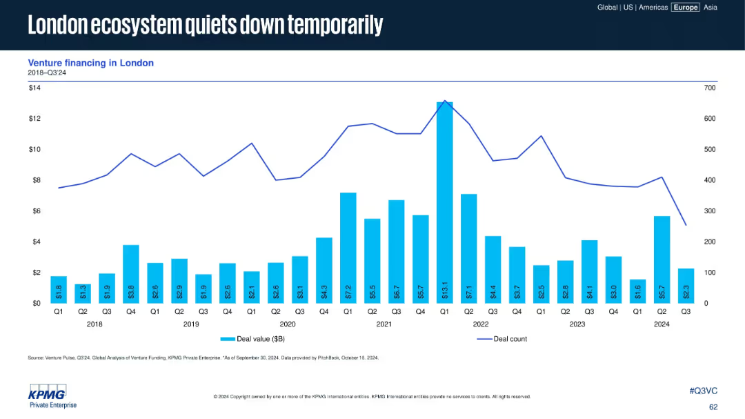
Similar to the previous slide but focused on London. Bar chart and line graph display quarterly venture deal value and count from 2018 to Q3 2024.
Market Analysis and Trends
Financial Services
Venture activity in London has declined in Q3 2024, following a peak in 2021. The chart suggests temporary cooling, possibly cyclical or linked to broader UK macro trends. The layout emphasizes historical data comparisons.
London, VC activity, deal count, quarterly trend, ecosystem, venture financing, 2024, capital flows, UK tech scene
false
Market Analysis and Trends
Financial Services
Single Chart
KPMG
Add to my slides
Remove from favorites
The slide has a title at the top, text in the middle, and a column chart at the bottom showing issues faced during self-isolation, such as loneliness and difficulties accessing food/medicine.
Risk Assessment and Management
Healthcare & Pharmaceuticals
Highlights issues faced by self-isolated individuals, with 30% experiencing loneliness. Other issues include difficulties accessing food/medicine and loss of income from work.
Loneliness, Self-Isolation, Survey, Health, Data
false
Risk Assessment and Management
Healthcare & Pharmaceuticals
Single Chart
IPSOS
Add to my slides
Remove from favorites
The slide includes a column chart showing the percentage of people feeling lonely at various frequencies, comparing data from May and December. Text boxes highlight key percentages and changes.
Customer and Market Segmentation
Healthcare & Pharmaceuticals
This slide presents data on the frequency of loneliness, comparing May and December survey results, showing a decrease in people feeling lonely at least some of the time.
loneliness, survey, comparison, frequencies, column chart, public opinion, time periods, healthcare
false
Customer and Market Segmentation
Healthcare & Pharmaceuticals
Mixed Chart
IPSOS
Add to my slides
Remove from favorites
Similar to the previous, this Cartesian coordinate system chart displays shifts in various factors over 12 years. It uses red dots connected by dashed lines to denote changes, showing general improvements and deterioration.
Market Analysis and Trends
Professional Services
This slide provides a longitudinal study of France's business environment over 12 years, highlighting improvements in key assets and persistent challenges, particularly in social legislation.
longitudinal analysis, business environment, France, improvement, social legislation
false
Market Analysis and Trends
Professional Services
Single Chart
Bain
Add to my slides
Remove from favorites
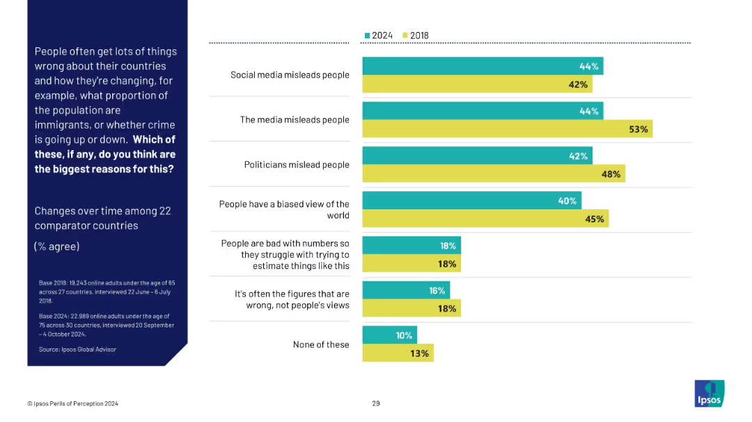
Vertical bar chart comparing 2024 vs 2018 agreement on reasons why people misunderstand national change. Focuses on media, social media, bias, and numeric ability.
Market Analysis and Trends
Media & Entertainment
This slide compares 2024 and 2018 public beliefs on why people misperceive national data (e.g., crime, immigration). It shows slight shifts over time, especially declining trust in media and increased concern about social media.
longitudinal study, perception change, Ipsos, misinformation, media influence, bias, numeracy, public trust
false
Market Analysis and Trends
Media & Entertainment
Mixed Chart
IPSOS
Add to my slides
Remove from favorites
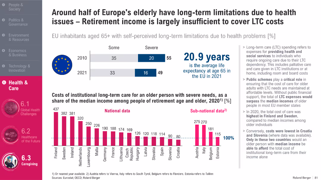
Split layout with bar chart, EU flag, bold heading, infographic on costs, and detailed bullet points on the right; prominent magenta vertical sidebar
Market Analysis and Trends
Healthcare & Pharmaceuticals
This slide highlights the financial challenges of long-term care (LTC) for Europe’s elderly, showing that LTC costs can exceed median retirement incomes in many EU countries. It includes statistics on elderly limitations due to health issues and life expectancy, and emphasizes the critical role of public support in managing LTC affordability.
Long-term care, aging population, Europe, healthcare costs, public schemes, life expectancy, EU, retirement income, health limitations, LTC dependency
false
Market Analysis and Trends
Healthcare & Pharmaceuticals
Multiple Chart
Roland Berger
Add to my slides
Remove from favorites
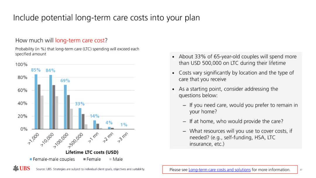
The slide includes a column chart showing probabilities and a text box with bullet points. It is moderately complex with multiple visual elements and detailed text.
Financial Performance
Healthcare & Pharmaceuticals
The slide discusses the probability and cost of long-term care, emphasizing the importance of including these costs in financial planning.
long-term care, costs, probability, planning, financial
false
Financial Performance
Healthcare & Pharmaceuticals
Mixed Chart
UBS
Add to my slides
Remove from favorites
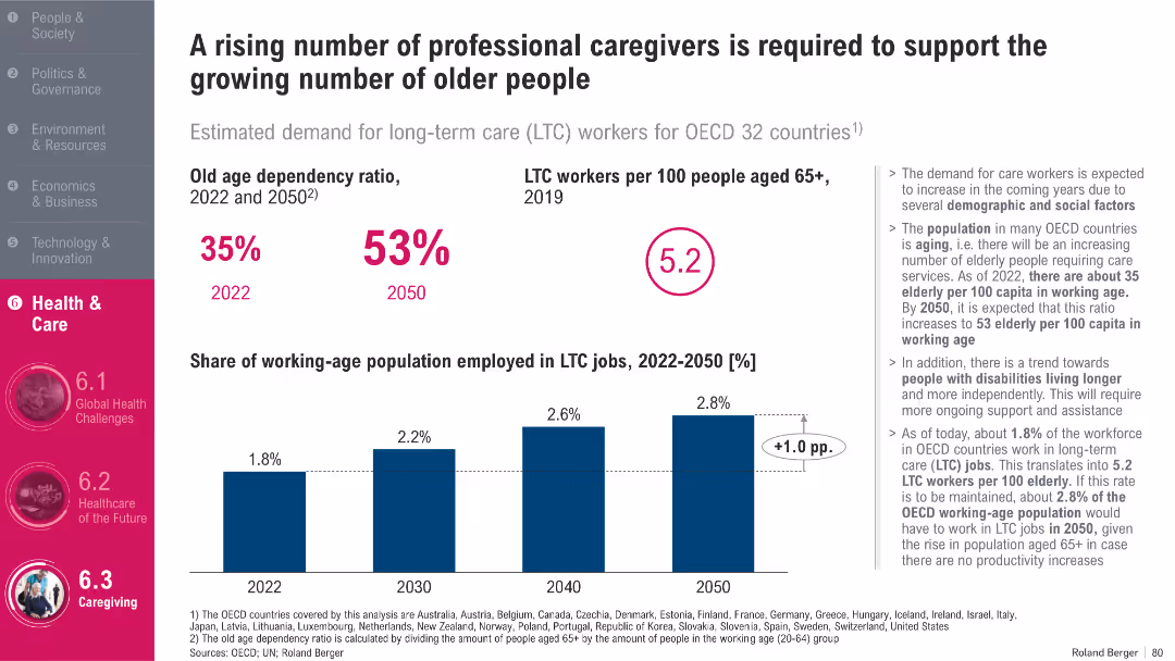
Bar charts on caregiver ratios and employment trends; summary stats and annotations; OECD focus
Human Resources and Talent Management
Healthcare & Pharmaceuticals
The slide analyzes the growing need for long-term care (LTC) workers across OECD countries. It forecasts an increase in the old-age dependency ratio and a slight rise in the share of the working population in LTC jobs. The data stresses the urgency for workforce expansion to meet the rising demand for elderly care.
Long-Term Care, Elderly, Workforce, OECD, Health Jobs, Dependency Ratio
false
Human Resources and Talent Management
Healthcare & Pharmaceuticals
Mixed Chart
Roland Berger
Add to my slides
Remove from favorites
Two circular diagrams comparing the effectiveness of initiatives implemented within 1 month vs 4+ months.
Strategic Planning
Professional Services
Discusses the necessity of long-term commitments in transformations for delivering planned value.
long-term, commitments, transformations, planning, effectiveness
false
Strategic Planning
Professional Services
Multiple Chart
McKinsey
Add to my slides
Remove from favorites
The slide juxtaposes bullet-pointed text with column chart representations of financial maturity and liquidity.
Investment Analysis
Industrial & Manufacturing
This slide discusses long-term financing, the liquidity profile, and the management of LANXESS's maturity profile, indicating secured and planned financing sources.
long-term financing, liquidity profile, maturity management, LANXESS, financial security, diversified financing, credit facility, interest rate
false
Investment Analysis
Industrial & Manufacturing
Mixed Chart
Morgan Stanley
Add to my slides
Remove from favorites
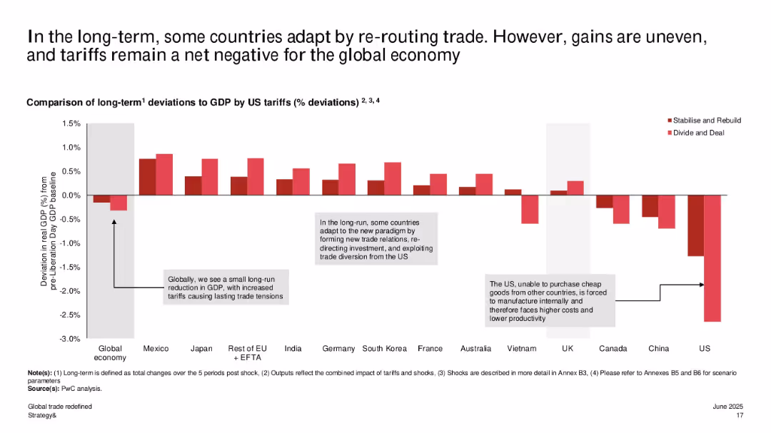
Bar chart displaying long-term GDP deviations by country; positive/negative bars in two tones show outcomes under different scenarios.
Market Analysis and Trends
Government & Public Sector
This slide explores long-term GDP effects, noting some countries benefit from trade rerouting while others like the US and China face sustained losses. Adaptation by smaller economies offsets some negative effects, but global GDP still trends negative overall.
long-term GDP, global adaptation, rerouting trade, trade policy, country impact, tariffs, US-China, scenario planning
false
Market Analysis and Trends
Government & Public Sector
Single Chart
PwC/Strategy&
Add to my slides
Remove from favorites
A slide with a header and column chart arranged horizontally, showing trends over three years. The colors are used systematically to represent different years, and a small pie chart with a 4% YOY increase label is included. The overall design is clean and the data is easy to follow.
Market Analysis and Trends
Financial Services
This slide indicates the changing employee priorities regarding equity compensation benefits, particularly emphasizing long-term investment goals. It’s suitable for discussions on financial planning, benefits structuring, and HR policies within the financial industry.
long-term goals, equity compensation, investment, employee views
false
Market Analysis and Trends
Financial Services
Multiple Chart
Goldman Sachs
Add to my slides
Remove from favorites
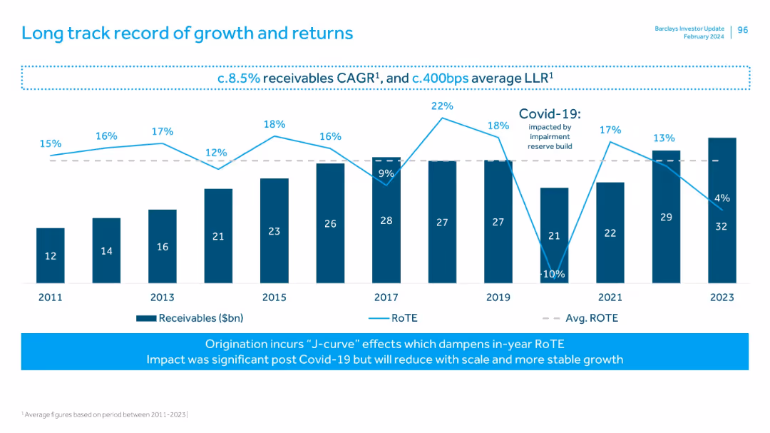
Bar and line chart combination showing Receivables and RoTE over time (2011–2023), with commentary on J-curve effects and COVID-19 impact.
Performance Metrics and KPIs
Financial Services
Tracks Barclays' receivables and return metrics over 12 years, showing consistent growth with fluctuations in RoTE, particularly around the COVID-19 period. Highlights average performance and structural dynamics like the J-curve effect in origination.
long-term growth, RoTE, receivables, CAGR, COVID-19, impairment, financial history, J-curve
false
Performance Metrics and KPIs
Financial Services
Mixed Chart
Barclays
Add to my slides
Remove from favorites
The slide features a pie chart and bar charts showing the education/employment status and employment types of young people involved in the program.
Performance Metrics and KPIs
Education & Training
The slide evaluates the long-term impact of the program, showing high percentages of participants in education or employment and satisfaction with their jobs.
long-term impact, education, employment, program evaluation
false
Performance Metrics and KPIs
Education & Training
Multiple Chart
EY
Add to my slides
Remove from favorites
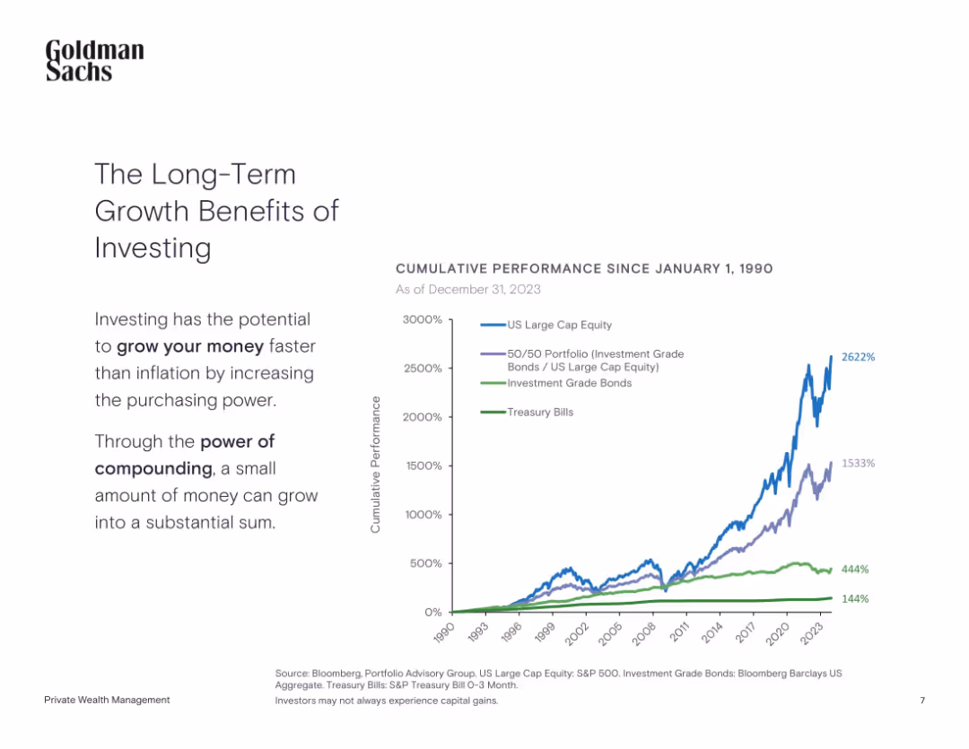
Left-aligned text with a line chart showing cumulative performance since 1990
Investment Analysis
Financial Services
The slide highlights the power of long-term investing by comparing cumulative returns from equities, bonds, and treasury bills since 1990.
Long-Term Investing, Compounding, Equities, Bonds, Treasury, Performance
false
Investment Analysis
Financial Services
Mixed Chart
Goldman Sachs
Add to my slides
Remove from favorites
Line chart tracing investor priorities over time with additional explanatory text boxes highlighting changes during and post-COVID-19.
Financial Performance
Financial Services
Examines shifts in investor priorities towards long-term investments and maintaining short-term results, crucial for understanding market trends and investor expectations.
long-term investments, COVID-19, investor priorities, short-term results, market trends
false
Financial Performance
Financial Services
Mixed Chart
BCG
Add to my slides
Remove from favorites
The slide includes a series of bullet points with accompanying icons, outlining the areas of investment such as 'Digital experience and innovation' and 'Branch expansion'.
Investment Analysis
Financial Services
Outlines JP Morgan's investment portfolio expected to yield long-term efficiency and innovation results, detailing various strategic areas from marketing to regulatory compliance. It serves to inform investors and stakeholders about the company’s future-focused financial decisions.
Long-Term Investments, Digital Innovation, Branch Expansion, Efficiency
false
Investment Analysis
Financial Services
Table
JP Morgan
Add to my slides
Remove from favorites
Horizontal bars showing agreement/disagreement about long-term optimism by country; ranked from highest to lowest agreement.
Market Analysis and Trends
Professional Services
The slide examines national outlooks on long-term future optimism in 2025, listing countries by percentage of respondents who agree. Lower global optimism is reflected compared to personal expectations.
long-term optimism, national outlook, survey results, future expectations, Ipsos, 2025, sentiment
false
Market Analysis and Trends
Professional Services
Mixed Chart
IPSOS
Add to my slides
Remove from favorites
Line charts tracking company performance metrics over several years, with highlights on recent increases. Colors are purple and grey.
Financial Performance
Financial Services
Provides a long-term view of company performance metrics, highlighting significant growth in the recent period.
long-term, performance, growth, financial services, trends, metrics
false
Financial Performance
Financial Services
Single Chart
Deloitte
Add to my slides
Remove from favorites
Line graphs displaying long-term growth trends and resilience during and post-pandemic across various companies.
Investment Analysis
Financial Services
Explores the relationship between long-term profitability, resilience, and performance improvement post-pandemic in different companies.
long-term profitability, growth trends, pandemic recovery, resilience, companies, performance improvement, post-pandemic, investment analysis
false
Investment Analysis
Financial Services
Multiple Chart
Accenture
Add to my slides
Remove from favorites
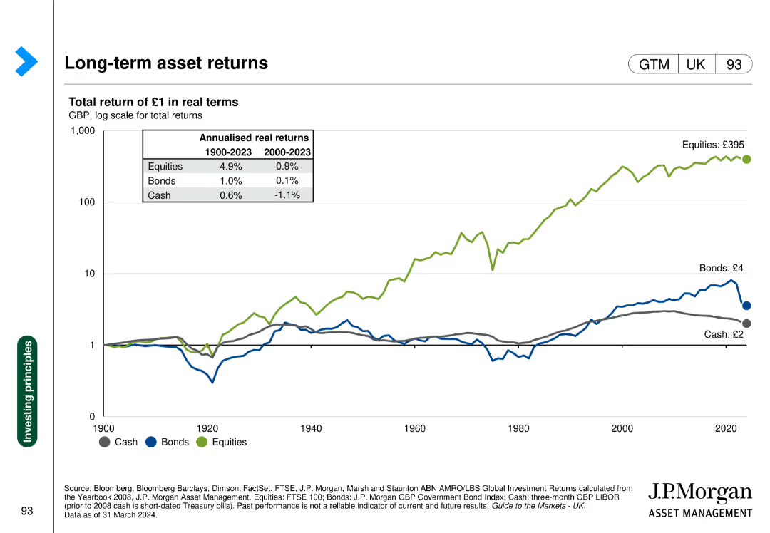
Line chart showing the real returns of cash, bonds, and equities over time.
Investment Analysis
Financial Services
Presents the historical real returns of different asset classes, aiding in long-term investment decisions.
Long-term returns, asset classes, real returns, cash, bonds, equities
false
Investment Analysis
Financial Services
Single Chart
JP Morgan
Add to my slides
Remove from favorites
The slide is divided into two areas. The top has a statement on business management with icons, and the bottom shows six boxes with different focus areas. Each box contains a short text description with corresponding icons, laid out on a blue background.
Strategic Planning
Financial Services
Aimed at strategic communication, this slide details the company's long-term business management approach, highlighting key areas like current outlook, benefits, customer relationships, diversification, operational discipline, and investment strategies. It underscores a commitment to sustainability through cycles with a forward-looking ROE guidance.
Long-term strategy, Business cycles, Operational discipline, Customer relationships, ROE guidance, Investment
false
Strategic Planning
Financial Services
Header Vertical
JP Morgan
Add to my slides
Remove from favorites
A table focusing on different business segments and their projected financial growth and contributions to the company's overall strategy.
Strategic Planning
Financial Services
This slide outlines Equifax's long-term financial strategy, showcasing expected revenue growth from various segments and their contribution to the overall financial framework, indicating strategic focuses and financial targets.
long-term strategy, financial growth, EFX, revenue
false
Strategic Planning
Financial Services
Table
Barclays
Add to my slides
Remove from favorites
Contains several data visualizations including column charts and projections with clear labeling and strategic color use to differentiate between past projections and future targets. The layout is clean with a focus on financial metrics.
Investment Analysis
Industrial & Manufacturing
Provides a detailed outlook of Stoneridge's long-term financial targets, emphasizing revenue and EBITDA growth. Useful for investors or stakeholders analyzing the company's financial health and growth trajectory over the next few years.
long-term strategy, revenue, EBITDA, growth, targets
false
Investment Analysis
Industrial & Manufacturing
Multiple Chart
Deutsche Bank
Add to my slides
Remove from favorites
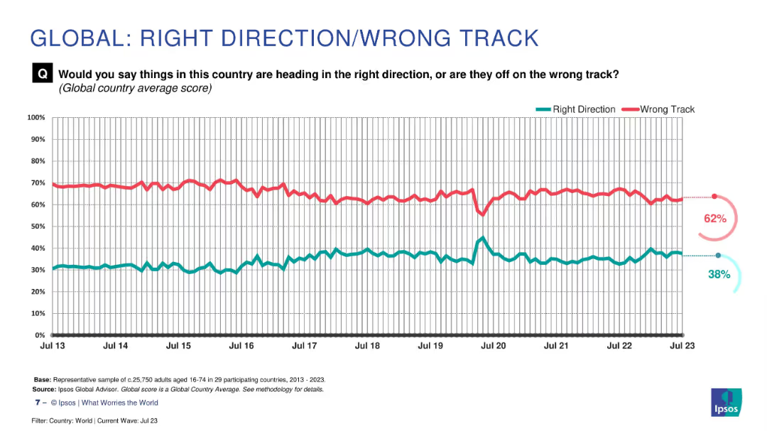
Historical line graph from 2013 to 2023 showing global right vs. wrong direction sentiment. Smooth trend lines with labeled endpoints.
Market Analysis and Trends
Professional Services
This slide presents a decade-long view of global sentiment about whether countries are heading in the right direction. The majority consistently believe things are on the wrong track, highlighting long-term pessimism.
long-term trends, global direction, public sentiment, Ipsos, wrong track, historical data
false
Market Analysis and Trends
Professional Services
Multiple Chart
IPSOS
Add to my slides
Remove from favorites
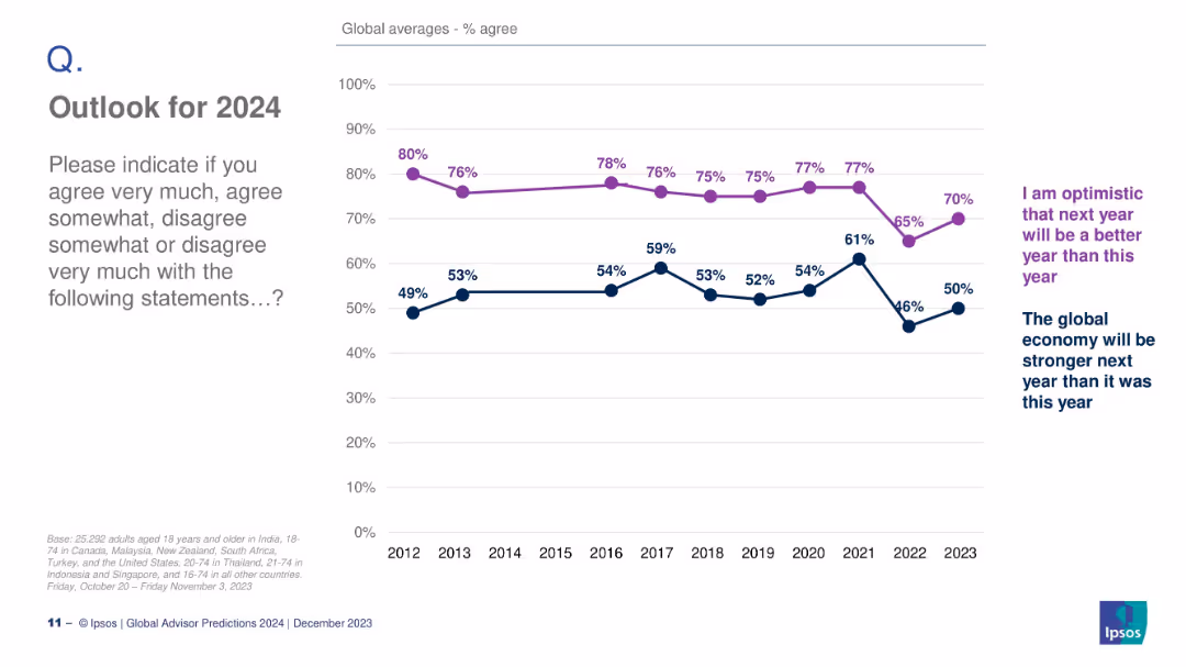
Line graph tracking optimism about personal outcomes and the global economy from 2012 to 2023. Two trend lines shown.
Strategic Planning
Professional Services
This slide charts long-term global sentiment about future optimism and economic strength. Optimism about personal outcomes declined recently but rebounded in 2023.
long-term trends, optimism, economy, Ipsos, 2024 outlook, sentiment
false
Strategic Planning
Professional Services
Mixed Chart
IPSOS
Add to my slides
Remove from favorites
Circular and bar charts showing importance and extent of monitoring nonfinancial metrics, with explanatory text.
Performance Metrics and KPIs
Financial Services
Highlights the belief in monitoring nonfinancial metrics to drive long-term value among APAC family offices.
long-term value, metrics, APAC, family offices, nonfinancial performance
false
Performance Metrics and KPIs
Financial Services
Multiple Chart
EY
Add to my slides
Remove from favorites
The slide presents a structured layout with four sections, each containing logos of brands categorized under Professional products, Consumer products, L'Oréal Luxe, and Active cosmetics.
Market Analysis and Trends
Consumer Goods
This slide displays L'Oréal's diverse brand portfolio, segmented into various product categories with associated market share percentages, demonstrating the company's market positioning.
L'Oréal, brand portfolio, market share, consumer products, professional products
false
Market Analysis and Trends
Consumer Goods
Table
Deutsche Bank
Add to my slides
Remove from favorites
Slide contains a column chart showcasing the types of deposits and their respective values in loss-absorbing capacity terms.
Regulatory and Compliance
Financial Services
Explains the bank's loss-absorbing capacity with detailed breakdowns of liability categories and regulatory implications, highlighting financial resilience strategies.
loss-absorbing, regulatory, capacity, liabilities, banking, financial resilience, strategy
false
Regulatory and Compliance
Financial Services
Mixed Chart
Deutsche Bank
Add to my slides
Remove from favorites
Displays column chart showing MREL and TLAC requirements versus actual levels, with additional metrics on senior preferred and non-preferred statuses.
Risk Assessment and Management
Financial Services
Highlights the bank's Q4 2023 capacity to absorb losses, staying significantly above regulatory requirements. It focuses on the MREL framework, illustrating how the bank maintains a buffer and provides flexibility in financial planning and risk management.
Loss Absorption, MREL, TLAC, Regulatory Compliance, Risk Management
false
Risk Assessment and Management
Financial Services
Mixed Chart
Deutsche Bank
Add to my slides
Remove from favorites
This slide presents column charts and a table detailing additional losses required for a margin call across various leverage levels, showing peak-to-trough data and recovery times.
Risk Assessment and Management
Financial Services
It provides an analysis of the additional losses necessary to trigger margin calls, highlighting the buffer provided by recommended leverage levels during downturns.
losses, margin call, leverage, financial risk, recovery
false
Risk Assessment and Management
Financial Services
Mixed Chart
UBS
Add to my slides
Remove from favorites
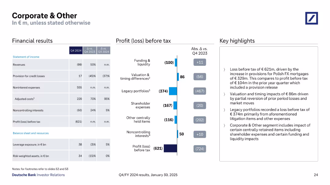
Split view with financial summary, waterfall-style loss breakdown, and concise highlight bullets
Financial Performance
Financial Services
This slide reports a loss before tax of €621m for the Corporate & Other segment, attributed mainly to increased provisions for Polish FX mortgages and legacy portfolio impacts. It also highlights valuation/timing differences and shareholder-related expenses.
Loss, Provisions, Legacy Portfolios, FX Mortgages, Shareholder Expenses
false
Financial Performance
Financial Services
Mixed Chart
Deutsche Bank
Add to my slides
Remove from favorites
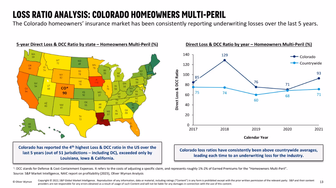
Left: US map color-coded by state loss ratio; right: line chart comparing Colorado vs countrywide over 5 years; blue callout boxes summarize insights; color scheme emphasizes high-loss states.
Financial Performance
Financial Services
This slide highlights Colorado's consistently high Loss & DCC ratios in the Homeowners Multi-Peril segment. Ranked 4th highest in the U.S. over five years, Colorado has persistently exceeded national average loss ratios, driving underwriting losses. Both visual and textual elements emphasize Colorado’s outlier position in insurance performance.
loss ratio, homeowners insurance, Colorado, state comparison, DCC, underwriting losses, insurance profitability, national ranking
false
Financial Performance
Financial Services
Mixed Chart
Oliver Wyman
Add to my slides
Remove from favorites
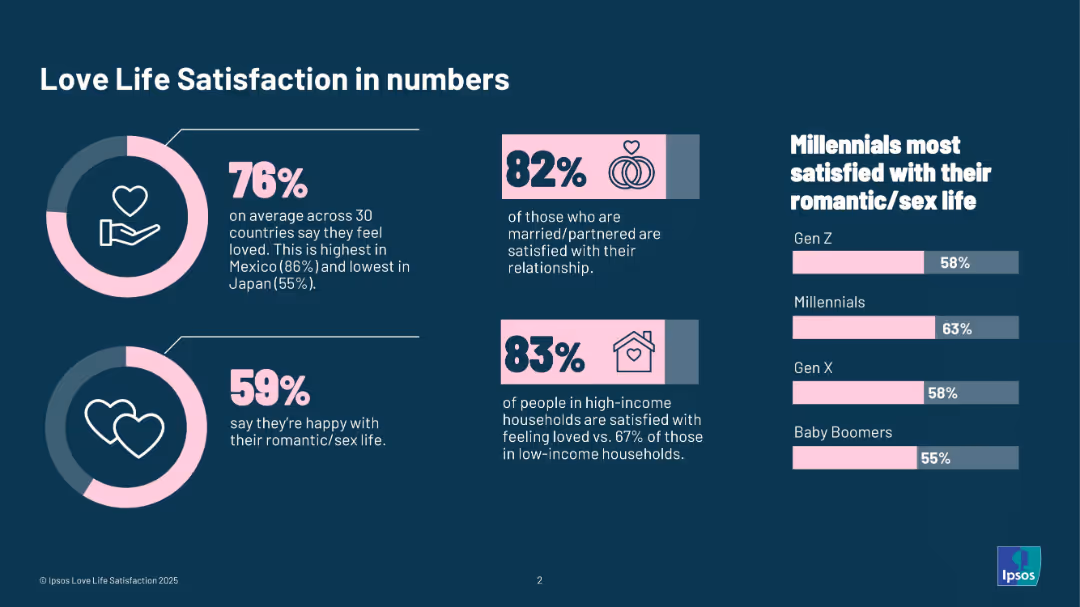
Dark background with icons and statistics displayed in infographic format using pink and white on blue.
Human Resources and Talent Management
Professional Services
This infographic summarizes global sentiments around love life satisfaction. It includes statistics on feeling loved, satisfaction by relationship status, income level, and generational breakdowns—highlighting that Millennials are most satisfied with their romantic/sex lives.
love life, satisfaction, relationship, income, generation, statistics, Ipsos, romantic life, emotional well-being
false
Human Resources and Talent Management
Professional Services
Multiple Chart
IPSOS
Add to my slides
Remove from favorites
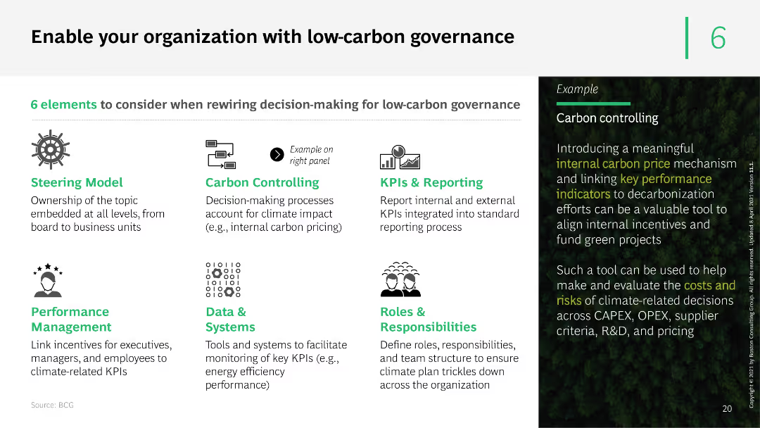
The slide features a series of icons and text boxes outlining six elements of low-carbon governance. It uses a clean layout with green accents to highlight key points and examples of carbon controlling mechanisms.
Organizational Structure and Change
Professional Services
The slide presents six elements to consider for low-carbon governance, including steering models, carbon controlling, KPIs, performance management, data systems, and roles. It provides a practical example of implementing internal carbon pricing.
low-carbon governance, carbon controlling, KPIs, performance management, data systems
false
Organizational Structure and Change
Professional Services
Boxed
BCG
Add to my slides
Remove from favorites
This slide features a column chart comparing the delivered levelized cost of low-carbon ammonia across various regions. It distinguishes between 'green' hydrogen (renewable energy) and 'blue' hydrogen (carbon capture) across the pre-IRA and post-IRA periods. The slide background is dark with text and graph elements highlighted in green, blue, and gray, showcasing clear visual distinctions between different data points.
Market Analysis and Trends
Energy & Utilities
The slide analyzes the cost competitiveness of low-carbon hydrogen in North Asia, contrasting pre and post-Inflation Reduction Act scenarios in the U.S. and other regions. It highlights how U.S. hydrogen production becomes more competitive internationally post-IRA, affecting global energy market dynamics.
low-carbon hydrogen, North Asia, IRA, energy market, competitiveness, renewable energy, carbon capture, cost analysis
false
Market Analysis and Trends
Energy & Utilities
Mixed Chart
BCG
Add to my slides
Remove from favorites
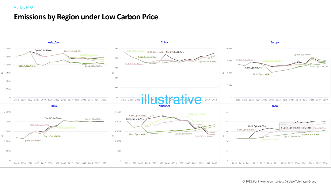
This slide features line charts comparing emissions by region under low carbon price scenarios. It highlights differences in emissions trends across regions and how low carbon pricing affects these trends over time.
Risk Assessment and Management
Environmental Services & Sustainability
The slide examines the effects of low carbon pricing on regional emissions, providing insights into how minimal carbon costs influence environmental outcomes and policy effectiveness in various regions.
Low carbon price, emissions, regions, policy impact, carbon pricing
false
Risk Assessment and Management
Environmental Services & Sustainability
Multiple Chart
Deloitte
Add to my slides
Remove from favorites
Column chart showing projected global capital expenditure by low-carbon technology in US$ from 2025 to 2050.
Investment Analysis
Energy & Utilities
This slide discusses how investment in low-carbon technology will increase, emphasizing the need for annual investments to scale up financial resources.
Low-carbon, technology, investment, capital, expenditure, energy systems, global, growth, infrastructure, renewable
false
Investment Analysis
Energy & Utilities
Mixed Chart
EY
Add to my slides
Remove from favorites
The slide features a column chart predicting global low-CO2 flat steel demand growth, with percentage labels for different years.
Market Analysis and Trends
Environmental Services & Sustainability
This slide forecasts a significant increase in global demand for low-CO2 flat steel by 2040, driven by sustainability efforts and carbon emission reduction technologies.
low-CO2 steel, demand growth, sustainability, carbon reduction, global market
false
Market Analysis and Trends
Environmental Services & Sustainability
Mixed Chart
McKinsey
Add to my slides
Remove from favorites
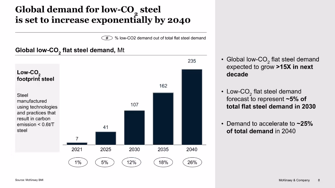
The slide includes a bar chart showing global low-CO2 flat steel demand projections from 2021 to 2040, with growth rates and percentage shares of total demand.
Market Analysis and Trends
Environmental Services & Sustainability
This slide projects an exponential increase in global demand for low-CO2 steel by 2040, indicating significant growth rates and market share changes, driven by environmental initiatives.
Low-CO2 steel, demand, projections, 2040, environmental, sustainability, market analysis, growth, global trends
false
Market Analysis and Trends
Environmental Services & Sustainability
Single Chart
BCG
Add to my slides
Remove from favorites
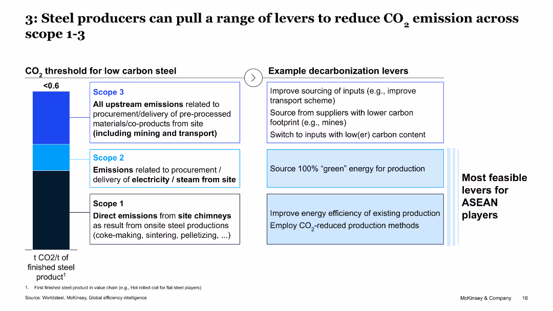
The slide has a table showing various low-CO2 steel technologies and their applicability in ASEAN, with color-coded circles indicating applicability levels.
Technology and Digital Transformation
Industrial & Manufacturing
The slide evaluates different technologies for reducing CO2 emissions in the steel industry and their feasibility for ASEAN players.
low-CO2, steel technology, ASEAN, applicability, decarbonization
false
Technology and Digital Transformation
Industrial & Manufacturing
Mixed Chart
McKinsey
Add to my slides
Remove from favorites
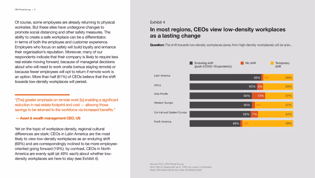
Contains a column chart showing regional differences in CEOs' views on the permanence of low-density workplaces post-COVID-19, with different colors for the type of shift.
Market Analysis and Trends
Professional Services
This slide presents survey results on CEOs' perspectives across different regions regarding the permanence of low-density workplaces, highlighting enduring versus temporary shifts.
low-density, workplaces, CEOs, regional differences
false
Market Analysis and Trends
Professional Services
Mixed Chart
PwC/Strategy&
Add to my slides
Remove from favorites
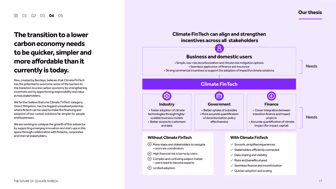
This slide features a balanced layout with text and a diagram. The text discusses the transition to a lower carbon economy and the barriers to achieving this. The diagram illustrates how Climate FinTech can align incentives across different stakeholders.
Strategic Planning
Financial Services
The slide discusses the challenges and necessity of transitioning to a lower carbon economy, emphasizing the role of Climate FinTech in simplifying and accelerating this process. It includes a diagram showing the alignment of incentives across various stakeholders to support this transition.
Lower carbon economy, Climate FinTech, transition, incentives, stakeholders
false
Strategic Planning
Financial Services
Boxed
Barclays
Add to my slides
Remove from favorites
Column chart showing other actions taken to manage lower income during the COVID-19 pandemic, comparing May 2020 and December 2020 data.
Financial Performance
Financial Services
Discusses additional measures households took to cope with lower income during the pandemic, such as food banks and grants.
lower income, financial management, food banks, COVID-19, household actions
false
Financial Performance
Financial Services
Single Chart
IPSOS
Add to my slides
Remove from favorites
Column chart depicting actions taken to manage lower income during COVID-19, comparing data from May 2020 and December 2020.
Financial Performance
Financial Services
Details the actions households took to manage lower incomes during the pandemic, with a focus on non-essential spending.
lower income, financial management, non-essential spending, COVID-19, household actions
false
Financial Performance
Financial Services
Single Chart
IPSOS
Add to my slides
Remove from favorites
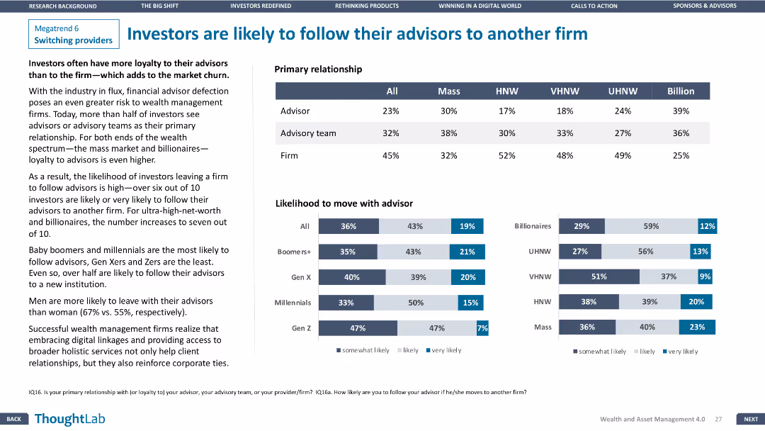
Column charts comparing primary relationships and likelihood of moving with advisors across different wealth segments. Clear and focused design.
Customer and Market Segmentation
Financial Services
Analyzes investor loyalty to advisors versus firms, with data on primary relationships and likelihood of moving with advisors, segmented by wealth tiers.
loyalty, advisors, firms, relationships, wealth
false
Customer and Market Segmentation
Financial Services
Multiple Chart
Deloitte
Add to my slides
Remove from favorites
Slide visualizes the "Loyalty Business" as a pathway, showing relationships between data integration and customer personalization.
Technology and Digital Transformation
Retail & E-commerce
Describes how a strategic approach to loyalty involves using data to drive better customer personalization and engagement.
loyalty, data strategy, personalization, customer engagement, pathway
false
Technology and Digital Transformation
Retail & E-commerce
Diagram
BCG
Add to my slides
Remove from favorites
A table with items comparing loyalty program elements like gamification and customer segmentation.
Technology and Digital Transformation
Hospitality & Tourism
Discusses loyalty program stages, emphasizing what differentiates the more successful programs.
loyalty, engagement, gamification, segmentation, rewards
false
Technology and Digital Transformation
Hospitality & Tourism
Multiple Chart
BCG
Add to my slides
Remove from favorites
Features a multi-part diagram describing various aspects of successful loyalty programs, like simplicity and functionality.
Strategic Planning
Retail & E-commerce
Explains the components of effective loyalty programs, including gamification and personalization, to enhance customer engagement.
loyalty, gamification, personalization, engagement, diagram
false
Strategic Planning
Retail & E-commerce
Diagram
BCG
Add to my slides
Remove from favorites
Ranked factors influencing loyalty-driven revenue in various sectors.
Strategic Planning
Retail & E-commerce
Analyzes key factors that impact revenue through loyalty programs across different industries, emphasizing a tailored approach for maximum effectiveness.
loyalty, program, revenue, industry, factors
false
Strategic Planning
Retail & E-commerce
Table
BCG
Add to my slides
Remove from favorites
Graphical elements and text boxes detail the loyalty program structures and impacts on a Japanese e-commerce and media company's market growth.
Customer and Market Segmentation
Retail & E-commerce
This slide showcases the success of a loyalty program in retaining market leadership and expanding market share, highlighting the incentives and rewards that encourage repeat customer engagement in a Japanese e-commerce context.
Loyalty programs, e-commerce, Japan, market growth
false
Customer and Market Segmentation
Retail & E-commerce
Framework
BCG
Add to my slides
Remove from favorites
Contains a grid layout showing the maturity of loyalty programs across various industries with color-coded maturity levels.
Strategic Planning
Retail & E-commerce
Summarizes the state of loyalty programs in industries such as retail, CPG, and BFSI, suggesting potential for strategic improvements.
loyalty programs, industry comparison, strategic planning, maturity levels, grid
false
Strategic Planning
Retail & E-commerce
Table
BCG
Add to my slides
Remove from favorites
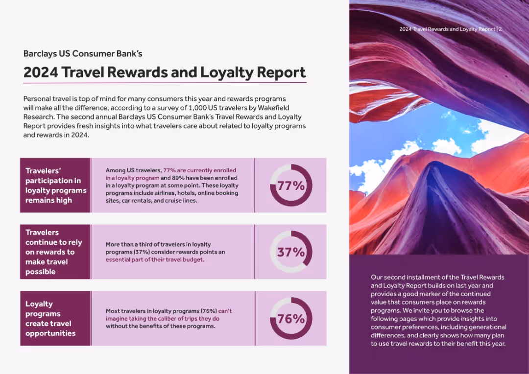
Split page with purple and white design, circular stat graphics on left, large image on right. Text-heavy with visually segmented stats.
Market Analysis and Trends
Financial Services
Summarizes key insights from a survey of US travelers on travel rewards: 77% are enrolled in loyalty programs, rewards drive travel decisions, and loyalty creates travel opportunities.
loyalty programs, rewards, travel insights, Barclays, US travelers, enrollment, incentives, 2024 trends
false
Market Analysis and Trends
Financial Services
Mixed Chart
Barclays
Add to my slides
Remove from favorites
Stages of a loyalty program's maturity with descriptive milestones.
Strategic Planning
Professional Services
Outlines a detailed roadmap for setting up a loyalty program, from nascent stages to pioneering, highlighting necessary steps and metrics to track.
loyalty, roadmap, maturity, program, stages
false
Strategic Planning
Professional Services
Table
BCG
Add to my slides
Remove from favorites
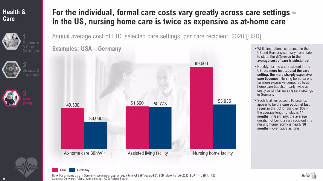
Bar chart comparing LTC costs for at-home, assisted living, and nursing homes between USA and Germany; text outlines implications of institutional vs. home care.
Pricing Strategies
Healthcare & Pharmaceuticals
The slide compares LTC costs in different settings and highlights stark cost differences between the US and Germany. It emphasizes that more institutionalized care leads to higher expenses, particularly in the US, with policy implications for affordability and planning.
LTC cost, nursing homes, assisted living, at-home care, USA vs. Germany, eldercare expenses, care settings
false
Pricing Strategies
Healthcare & Pharmaceuticals
Mixed Chart
Roland Berger
Add to my slides
Remove from favorites
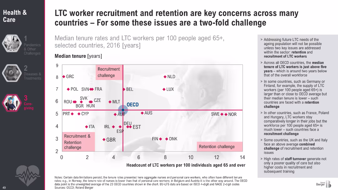
Scatter plot quadrant chart with median tenure on Y-axis and headcount of LTC workers on X-axis; quadrant labels for types of challenges; supporting bullet text on the right; dark theme on left menu
Human Resources and Talent Management
Healthcare & Pharmaceuticals
This slide analyzes long-term care (LTC) worker availability across countries using median tenure and headcount per 100 elderly. It categorizes countries by whether they face recruitment, retention, or both challenges. The OECD average is used as a benchmark. Commentary on workforce trends and high turnover is provided on the right.
LTC, recruitment, retention, tenure, aging, workforce, OECD, healthcare, staffing, elder care
false
Human Resources and Talent Management
Healthcare & Pharmaceuticals
Mixed Chart
Roland Berger
Add to my slides
Remove from favorites
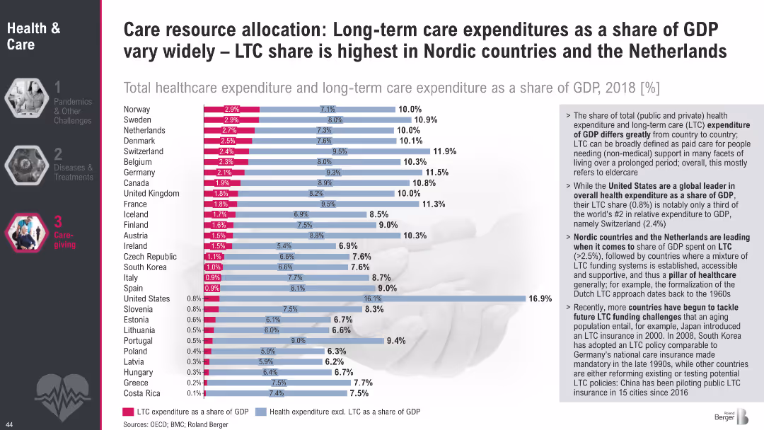
Horizontal bar chart comparing total healthcare and LTC spending (% of GDP) across countries; text highlights key takeaways on system structures and funding.
Financial Performance
Healthcare & Pharmaceuticals
This slide compares national LTC spending as a share of GDP, showing major differences in resource allocation. Nordic countries lead in LTC expenditure, reflecting strong public systems. Insights include challenges faced by countries like the US with lower LTC shares but higher total health costs.
LTC spending, GDP share, healthcare financing, eldercare, international comparison, Nordic model, public health funding
false
Financial Performance
Healthcare & Pharmaceuticals
Mixed Chart
Roland Berger
Add to my slides
Remove from favorites
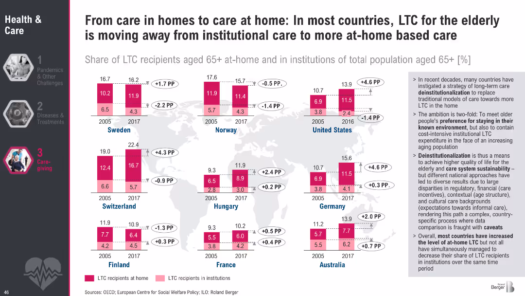
World map with bar graphs showing LTC recipients (home vs. institutions) across countries in 2005 vs. 2017; explanatory sidebar discusses trends.
Strategic Planning
Healthcare & Pharmaceuticals
This slide presents the global trend toward de-institutionalization of elderly care, with most countries increasing the share of LTC recipients being cared for at home. It shows a shift in policy focus to improve quality of life and reduce institutional costs.
LTC trends, deinstitutionalization, eldercare, home care, policy shift, international comparison, aging population
false
Strategic Planning
Healthcare & Pharmaceuticals
Multiple Chart
Roland Berger
Add to my slides
Remove from favorites
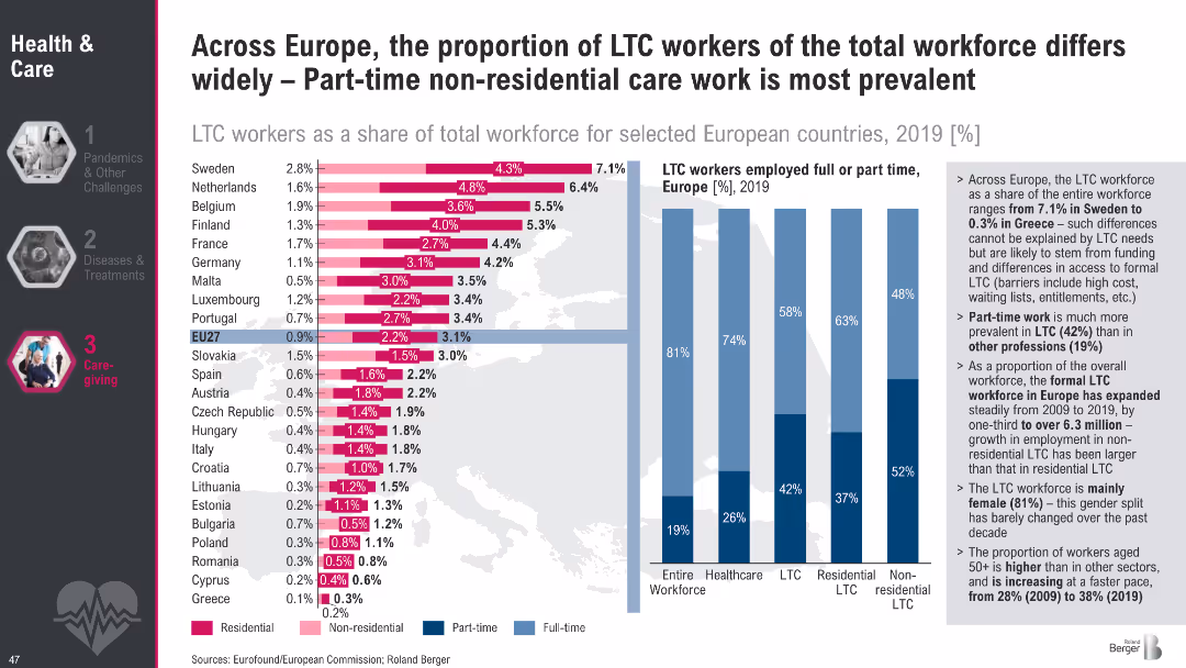
Bar chart of LTC workers as % of total workforce across countries, segmented by residential/non-residential care; vertical bars show part-time/full-time ratios.
Human Resources and Talent Management
Healthcare & Pharmaceuticals
The slide examines employment trends in the LTC workforce across Europe, highlighting variation in workforce size, part-time prevalence, and the distinction between residential and non-residential care. It also underscores gender imbalance and the aging workforce.
LTC workforce, part-time care, non-residential care, employment trends, Europe, healthcare labor, care sector
false
Human Resources and Talent Management
Healthcare & Pharmaceuticals
Multiple Chart
Roland Berger
Add to my slides
Remove from favorites
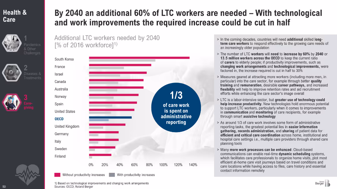
Horizontal bar chart comparing LTC workforce needs by country with and without productivity improvements; infographic circle notes 1/3 of care work is administrative; explanatory text to the right
Strategic Planning
Healthcare & Pharmaceuticals
This slide presents projected increases in demand for LTC workers by 2040, with and without productivity gains. It emphasizes how improving processes and leveraging technology could halve workforce needs. The text explains contributing factors and areas where tech could boost efficiency.
LTC, workforce, projections, productivity, administrative burden, eldercare, 2040, care work, staffing needs
false
Strategic Planning
Healthcare & Pharmaceuticals
Mixed Chart
Roland Berger
Add to my slides
Remove from favorites
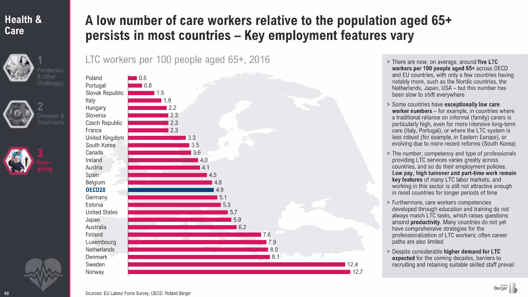
Bar chart ranking countries by LTC workers per 100 people aged 65+; side text outlines causes for variation and key challenges in care employment.
Human Resources and Talent Management
Healthcare & Pharmaceuticals
This slide highlights the low number of LTC workers relative to aging populations in most countries, with wide variations. It points to systemic employment challenges, including low pay, high turnover, and insufficient professional training.
LTC workforce shortage, care worker density, aging population, eldercare employment, international comparison, labor market
false
Human Resources and Talent Management
Healthcare & Pharmaceuticals
Mixed Chart
Roland Berger
Add to my slides
Remove from favorites
Venn diagram showing the overlap of content consumption across LTV, OTT, and movie studios, with consumer quotes on their viewing preferences.
Customer and Market Segmentation
Media & Entertainment
This slide presents the seamless transition of consumers between LTV and OTT platforms, supported by a Venn diagram and consumer quotes.
LTV, OTT, transition, consumers, preferences
false
Customer and Market Segmentation
Media & Entertainment
Mixed Chart
BCG
Add to my slides
Remove from favorites
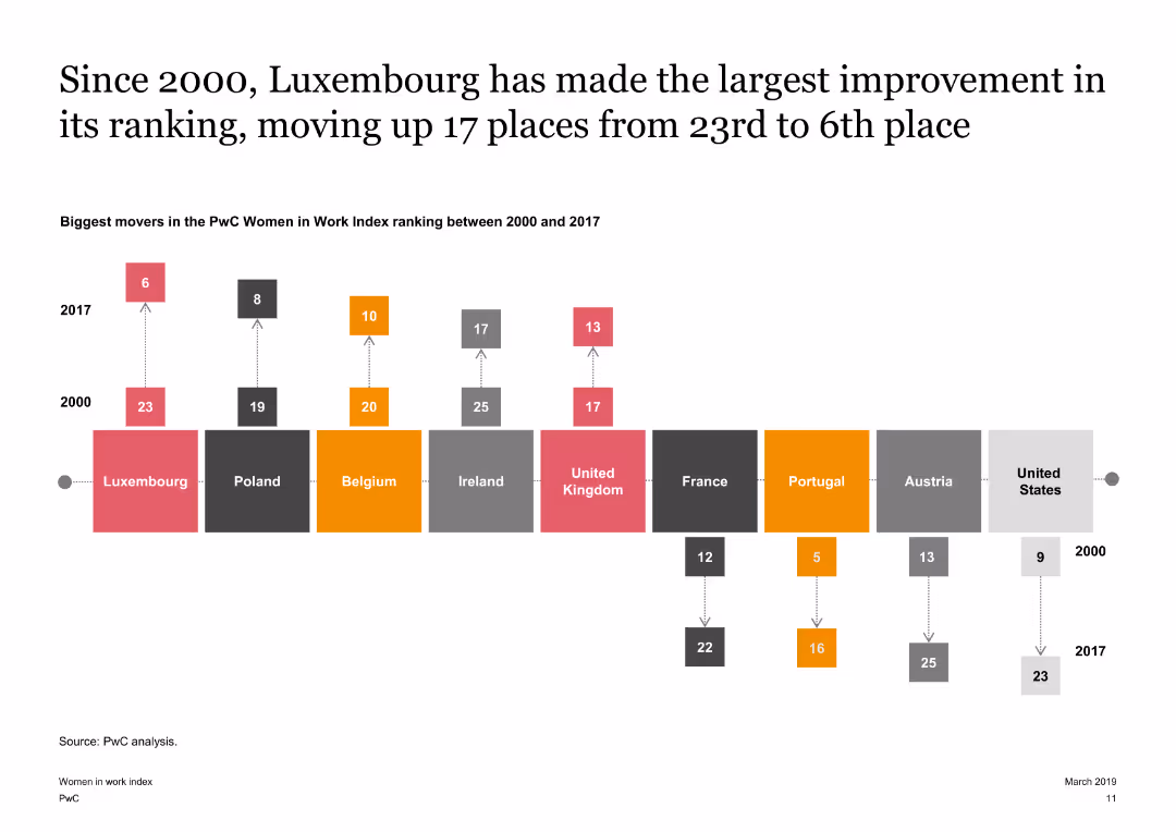
The slide features a timeline diagram showing the biggest movers in the PwC Women in Work Index between 2000 and 2017. It highlights Luxembourg’s significant improvement in ranking over the years.
Market Analysis and Trends
Financial Services
It highlights the countries that have made significant improvements in the Women in Work Index since 2000, with a focus on Luxembourg’s progress in enhancing female economic participation.
Luxembourg, Improvement, Timeline, Index, Gender
false
Market Analysis and Trends
Financial Services
Linear Flow
PwC/Strategy&
Add to my slides
Remove from favorites
Utilizes column charts to depict consumer awareness and preference statistics across different generations and nationalities.
Competitive Landscape
Retail & E-commerce
Analyzes consumer awareness of luxury brand collaborations, emphasizing the influence of younger generations and Chinese consumers.
Luxury brands, collaborations, consumer awareness, generations, Millennials, Gen Z, Chinese, market influence
false
Competitive Landscape
Retail & E-commerce
Multiple Chart
BCG
Add to my slides
Remove from favorites
Features a comparative diagram illustrating the shift in luxury brands' roles from producers to broadcasters, pre and post-COVID-19. Highlights include traditional and evolved roles around a central product image.
Strategic Planning
Consumer Goods
This slide analyzes the strategic transformation of luxury brands due to COVID-19, transitioning from a product-centric to a consumer interaction focus. It visually compares the old and new roles of brands in engaging consumers, indicating a significant shift towards digital and media-driven interaction.
luxury brands, COVID-19, digital transformation, consumer engagement, strategic shift
false
Strategic Planning
Consumer Goods
Framework
Bain
Add to my slides
Remove from favorites
Circular flow diagram centered around "Core Promise & Value Proposition" surrounded by strategies like "Elevation" and "Reach Expansion".
Strategic Planning
Consumer Goods
Discusses the evolution of luxury brands towards more unique, opinion-driven products as a way to fuel modern aspiration, emphasizing the transition from traditional to bespoke luxury goods.
Luxury Brands, Strategy, Trends
false
Strategic Planning
Consumer Goods
Diagram
Bain
Add to my slides
Remove from favorites
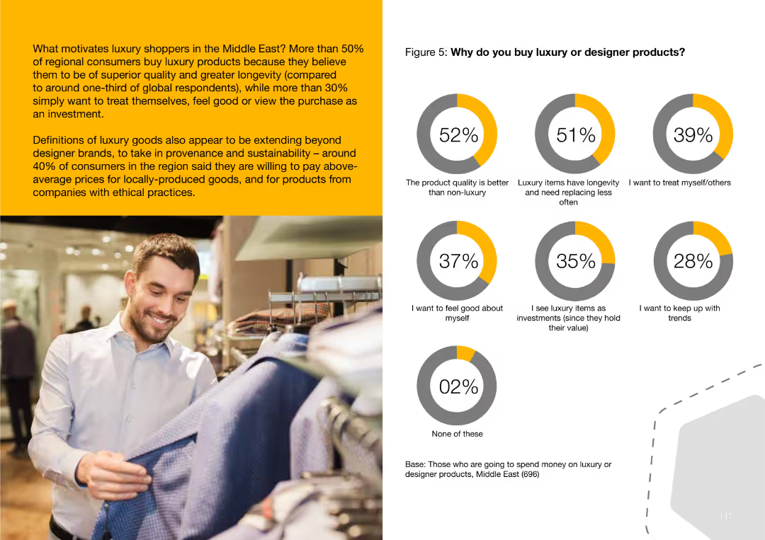
This slide features a pie chart showing reasons why consumers buy luxury goods, including superior quality and longevity, desire to treat oneself, and viewing the purchase as an investment.
Customer and Market Segmentation
Consumer Goods
The slide examines why Middle Eastern consumers buy luxury goods, highlighting motivations such as product quality, longevity, self-treating, and viewing luxury items as investments.
luxury, buying, consumer, Middle East, quality, longevity, investment
false
Customer and Market Segmentation
Consumer Goods
Multiple Chart
PwC/Strategy&
Add to my slides
Remove from favorites
Slide has text and icons related to luxury sub-segments like yachts and jets.
Product and Service Analysis
Consumer Goods
Examines specific luxury segments, noting growth trends and market changes, particularly focusing on sustainable options and innovations in luxury transport.
luxury cars, yachts, sustainable, market growth
false
Product and Service Analysis
Consumer Goods
Pillar
Bain
Add to my slides
Remove from favorites
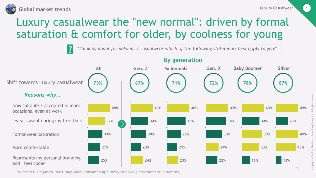
This slide features a combination of text and horizontal bar charts to explain the reasons behind the shift towards luxury casualwear, segmented by different age groups.
Market Analysis and Trends
Consumer Goods
The slide explains the reasons for the shift towards luxury casualwear, emphasizing comfort for older generations and coolness for younger ones, supported by survey data.
luxury casualwear, new normal, age groups, bar chart, survey data
false
Market Analysis and Trends
Consumer Goods
Multiple Chart
BCG
Add to my slides
Remove from favorites
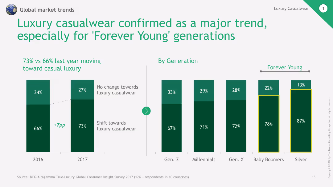
This slide includes a column chart comparing the shift towards luxury casualwear over two years and by different generations. It uses green and dark green bars for visual clarity.
Market Analysis and Trends
Consumer Goods
The slide discusses the growing trend of luxury casualwear, especially among the 'Forever Young' generations, supported by comparative data from 2016 and 2017.
luxury casualwear, trend analysis, generational comparison, column chart, market shift
false
Market Analysis and Trends
Consumer Goods
Multiple Chart
BCG
Add to my slides
Remove from favorites
Circular diagrams, text blocks.
Market Analysis and Trends
Retail & E-commerce
Explores shift towards access and circular fashion.
luxury, circular, rental, fashion, models
false
Market Analysis and Trends
Retail & E-commerce
Linear Flow
Bain
Add to my slides
Remove from favorites
Column charts showing traffic distribution by type, focusing on mobile
Market Analysis and Trends
Technology & Software
Analyzes the predominant focus of luxury consumers on mobile platforms
Luxury, Consumer Attention, Mobile, Traffic Distribution
false
Market Analysis and Trends
Technology & Software
Single Chart
BCG
Add to my slides
Remove from favorites
Line graphs showing app usage over time, bar charts showing daily mobile time usage per app
Market Analysis and Trends
Technology & Software
Examines luxury consumers' app usage patterns, highlighting preferred platforms
Luxury, Consumer Behavior, Apps, Usage Patterns
false
Market Analysis and Trends
Technology & Software
Multiple Chart
BCG
Add to my slides
Remove from favorites
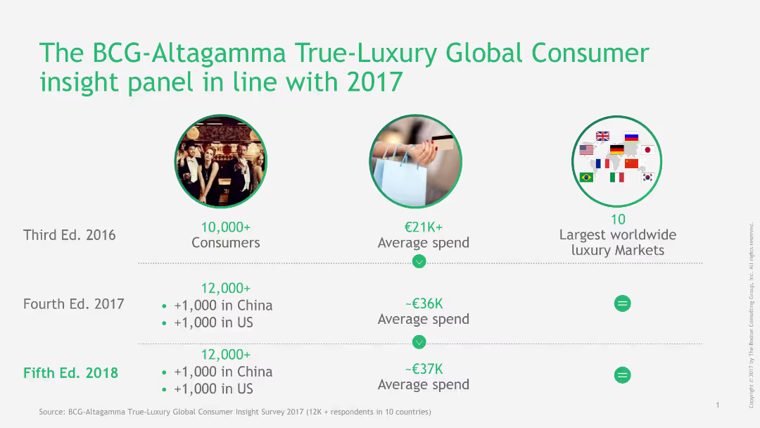
Circular images and text summarizing key metrics of the BCG-Altagamma True-Luxury Global Consumer Insight panel, including consumer numbers and spending.
Market Analysis and Trends
Consumer Goods
This slide presents an overview of the BCG-Altagamma True-Luxury Global Consumer Insight panel, highlighting consumer participation and average spending trends over the years.
luxury, consumer insight, BCG-Altagamma, market trends, consumer spending, panel, global, metrics, circular images, text
false
Market Analysis and Trends
Consumer Goods
Table
BCG
Add to my slides
Remove from favorites
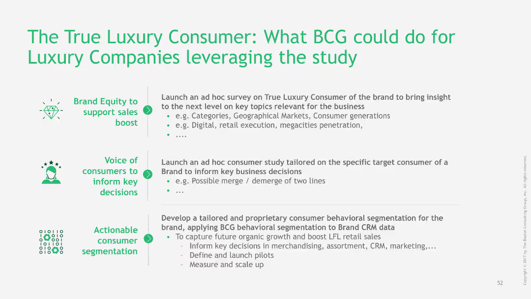
The slide lists actionable insights and strategies for luxury companies based on a study of true luxury consumers.
Strategic Planning
Consumer Goods
The slide provides strategic recommendations for luxury companies to leverage insights from true luxury consumer studies.
luxury consumers, BCG, strategic planning, actionable insights, recommendations
false
Strategic Planning
Consumer Goods
Table
BCG
Add to my slides
Remove from favorites
A map of China highlighting luxury consumer percentages by province, and pie charts on the right
Market Analysis and Trends
Retail & E-commerce
Analyzes geographical distribution of luxury consumers in China and categorizes city tiers
Luxury, Consumers, China, City Tiers, Geography
false
Market Analysis and Trends
Retail & E-commerce
Multiple Chart
BCG
Add to my slides
Remove from favorites
Slide with bar charts reflecting consumer preferences for collaborations, segmented by nationality.
Market Analysis and Trends
Retail & E-commerce
Delve into the preferences of luxury consumers towards collaborations, showing strong appeal in different styles and collections.
Luxury consumers, collaborations, preferences, styles, collections, nationality, consumer insights, market trends
false
Market Analysis and Trends
Retail & E-commerce
Multiple Chart
BCG
Add to my slides
Remove from favorites
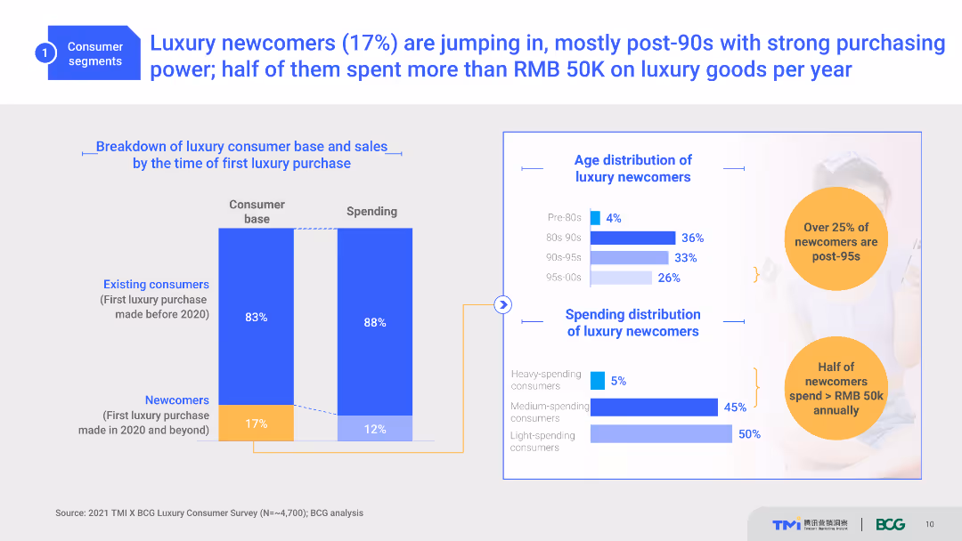
A slide with two column charts depicting the consumer base and spending, and bar charts showing age and spending distribution. Light blue, white, and orange colors are used with text explanations.
Customer and Market Segmentation
Consumer Goods
The slide shows the breakdown of luxury consumers by the time of their first luxury purchase, age distribution, and spending habits of newcomers, primarily post-90s.
Luxury, Consumer Segmentation, Spending, Age Distribution, Post-90s
false
Customer and Market Segmentation
Consumer Goods
Multiple Chart
BCG
Add to my slides
Remove from favorites
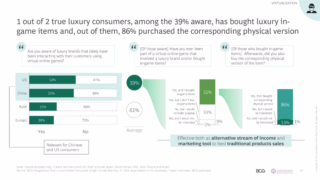
Column chart showing survey data on awareness and purchase behavior of luxury in-game items across different regions. Layout includes text boxes and summary insights.
Market Analysis and Trends
Media & Entertainment
Analyzes consumer awareness and purchase behavior of luxury in-game items, highlighting regional differences and the correlation between virtual and physical purchases.
luxury consumers, in-game items, survey, awareness, purchase behavior
false
Market Analysis and Trends
Media & Entertainment
Multiple Chart
BCG
Add to my slides
Remove from favorites
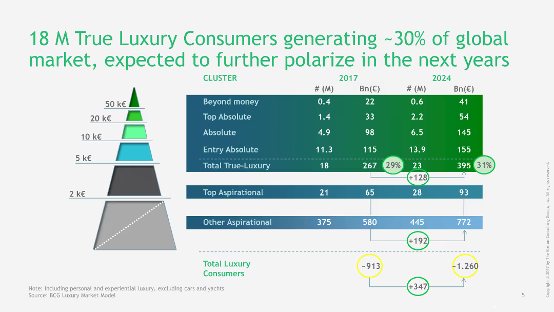
Pyramid chart showing the segmentation of true luxury consumers and their market contribution in 2017 and projected for 2024, with detailed figures.
Market Analysis and Trends
Consumer Goods
This slide provides a detailed segmentation of true luxury consumers, showing their contribution to the global market in 2017 and projections for 2024.
luxury, consumers, market segmentation, global market, projections, 2017, 2024, pyramid chart, detailed figures, market analysis
false
Market Analysis and Trends
Consumer Goods
Table
BCG
Add to my slides
Remove from favorites
A set of bar charts shows the net sentiment on consumer spending across different types of fashion brands, segmented by consumer income levels.
Market Analysis and Trends
Consumer Goods
Explores consumer spending sentiments on various fashion brands, particularly highlighting differences in spending habits between high-income and general consumers. Useful for targeted marketing strategies.
luxury, consumer, spending, fashion, brands
false
Market Analysis and Trends
Consumer Goods
Multiple Chart
BCG
Add to my slides
Remove from favorites
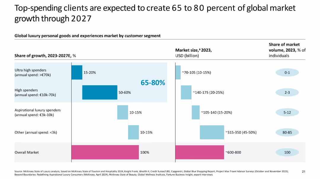
Bar chart comparing segments by growth share, market size, and population volume
Customer and Market Segmentation
Consumer Goods
Analyzes the global luxury market by spending segments, showing ultra-high and high spenders to drive 65–80% of growth through 2027, despite making up a very small share of the population.
luxury consumers, segmentation, ultra-high spenders, market growth, income tiers, 2027 forecast, share of wallet
false
Customer and Market Segmentation
Consumer Goods
Multiple Chart
McKinsey
Add to my slides
Remove from favorites
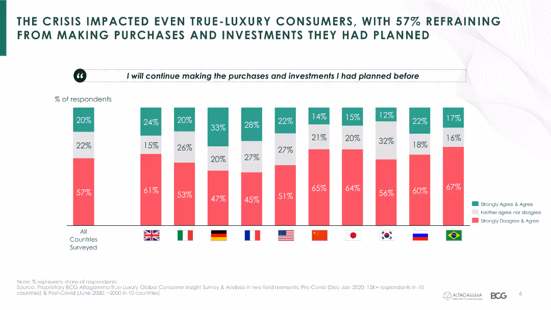
This slide presents a column chart showing the percentage of respondents from various countries who refrained from making planned luxury purchases and investments.
Market Analysis and Trends
Consumer Goods
The slide provides survey data on the impact of the crisis on luxury consumers' purchasing behaviors across different countries.
luxury consumers, survey, purchasing behavior, investment, COVID-19, country comparison
false
Market Analysis and Trends
Consumer Goods
Single Chart
BCG
Add to my slides
Remove from favorites
Pyramid graphs, text overlays and column chart
Market Analysis and Trends
Retail & E-commerce
Predicts expansion of luxury market consumer base.
luxury, customer base, 2025, Asia
false
Market Analysis and Trends
Retail & E-commerce
Multiple Chart
Bain
Add to my slides
Remove from favorites
Diagram with a central circle labeled "Luxury Market" connected to four disruptive forces.
Strategic Planning
Consumer Goods
Identifies key disruptive forces shaping the luxury market in 2024, such as sustainability and technology.
Luxury, Disruption, Forces, 2024, Market
false
Strategic Planning
Consumer Goods
Framework
Kearney
Add to my slides
Remove from favorites
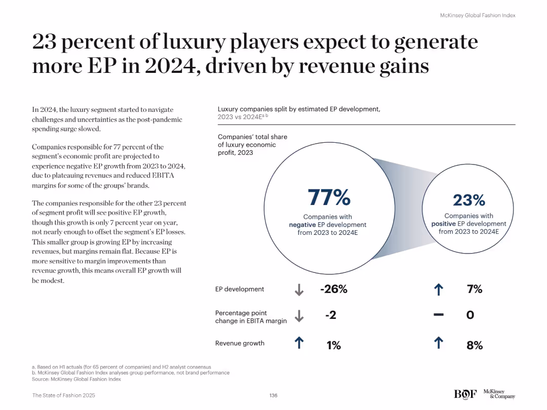
Split layout with a large infographic on the right showing 77% vs. 23% split. Text on left explains segment performance.
Financial Performance
Retail & E-commerce
Only 23% of luxury brands are forecast to grow EP in 2024, mostly via revenue gains rather than margin improvement. The remaining 77% face negative EP due to declining margins. This reflects challenges in the post-pandemic luxury market.
Luxury, EP growth, revenue, margins, fashion industry, 2024 forecast, profitability, segment disparity, economic outlook
false
Financial Performance
Retail & E-commerce
Mixed Chart
McKinsey
Add to my slides
Remove from favorites
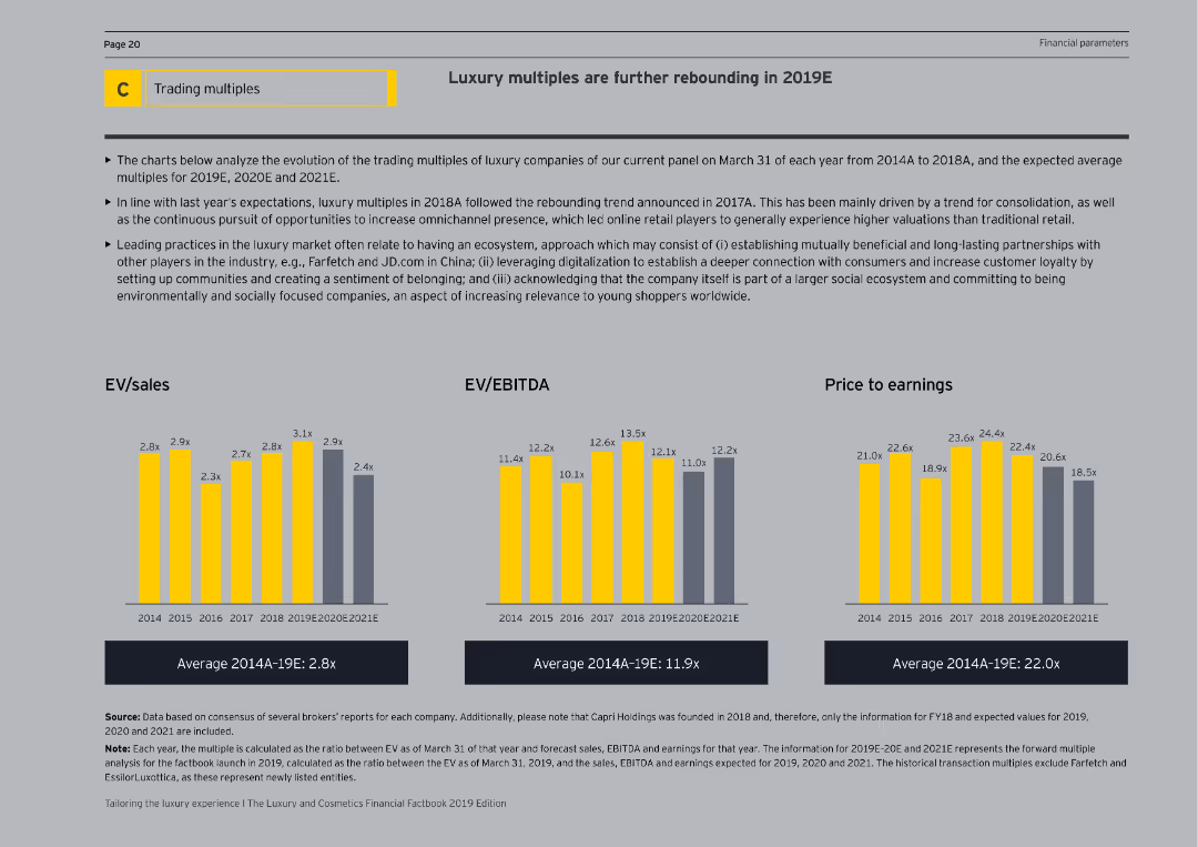
The slide features column charts representing EV/sales, EV/EBITDA, and price to earnings ratios from 2014 to 2021E. The visual complexity is moderate, with clearly labeled axes and a detailed explanation on the right side of the slide.
Financial Performance
Consumer Goods
The slide analyzes the rebound in luxury multiples, focusing on EV/sales, EV/EBITDA, and price to earnings ratios. It compares historical data with future projections, explaining trends and factors driving these financial metrics in the luxury market.
Luxury, EV/Sales, EV/EBITDA, Price to Earnings
false
Financial Performance
Consumer Goods
Multiple Chart
EY
Add to my slides
Remove from favorites
Split design: left half has a dark green background with summary text; right half shows a vertical bar chart illustrating satisfaction levels with a photo backdrop.
Performance Metrics and KPIs
Consumer Goods
Reveals that less than half of luxury consumers report being truly satisfied with their virtual fashion experience. 44% found it satisfactory, 45% sufficient, and 11% underwhelming, indicating an experience gap versus expectations.
luxury experience, satisfaction, customer feedback, performance metrics, unmet expectations
false
Performance Metrics and KPIs
Consumer Goods
Mixed Chart
BCG
Add to my slides
Remove from favorites
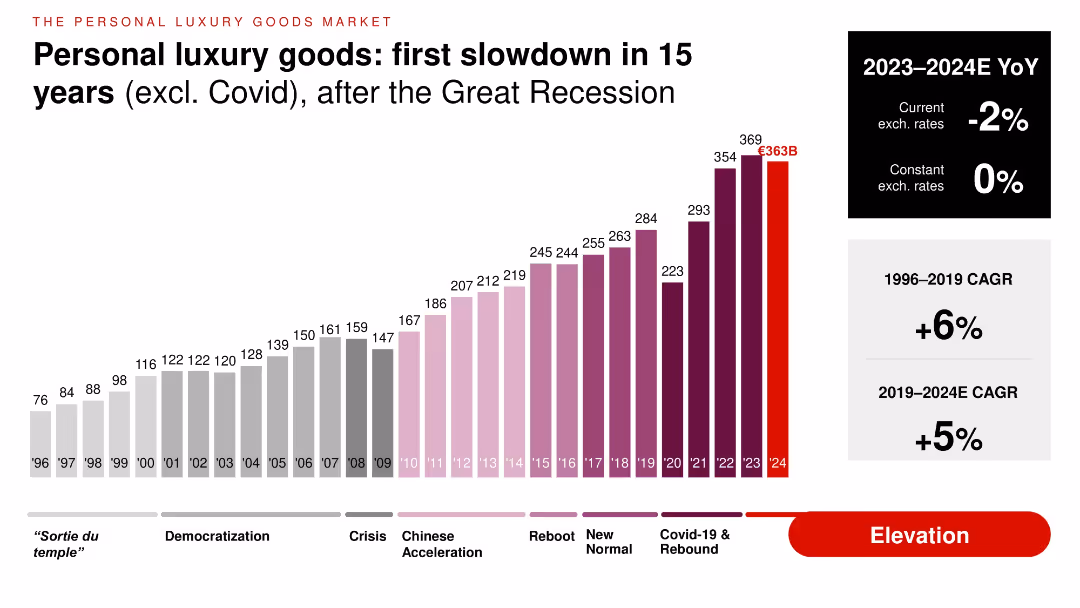
Vertical bar chart tracking market value from 1996 to 2024E, segmented by historical phases. Color-coded bars with YoY growth values noted on the right.
Financial Performance
Consumer Goods
Visualizes personal luxury goods market trajectory, highlighting a slowdown in 2024—the first decline in 15 years (excluding COVID). Displays compound annual growth rates (CAGR) over long-term and short-term periods, with a 2023–2024 YoY of -2% at current rates and 0% at constant rates.
luxury goods, CAGR, slowdown, market size, personal luxury, historical trend
false
Financial Performance
Consumer Goods
Single Chart
Bain
Add to my slides
Remove from favorites
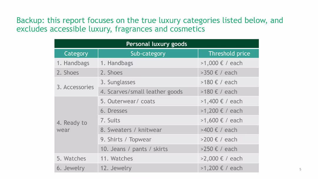
A table listing categories, sub-categories, and threshold prices of personal luxury goods. The table is organized with clear lines and a green header.
Product and Service Analysis
Consumer Goods
This slide provides a detailed breakdown of personal luxury goods categories, including handbags, shoes, accessories, and their respective price thresholds.
Luxury Goods, Categories, Threshold Prices, Product Analysis, Personal Luxury
false
Product and Service Analysis
Consumer Goods
Table
BCG
Add to my slides
Remove from favorites
Presents multiple column charts showing preferences for luxury goods by country from 2014 to 2018.
Competitive Landscape
Consumer Goods
Discusses shifts in consumer preferences for the country of origin in luxury goods over time.
luxury goods, consumer preferences, country of origin, trends
false
Competitive Landscape
Consumer Goods
Multiple Chart
BCG
Add to my slides
Remove from favorites
Includes line graphs comparing growth rates of different luxury sectors.
Market Analysis and Trends
Consumer Goods
Analyzes the growth trends in the luxury goods market, comparing personal goods with experience-based goods and discussing recent market dynamics.
luxury goods, growth rates, market trends, comparison
false
Market Analysis and Trends
Consumer Goods
Mixed Chart
Bain
Add to my slides
Remove from favorites
Uses line and column charts to compare preferences for luxury goods made in Italy, France, and US.
Competitive Landscape
Consumer Goods
Analyzes the growing preference for Italian-made luxury goods among Millennials and Chinese consumers.
luxury goods, Made-in Italy, Millennials, Chinese consumers
false
Competitive Landscape
Consumer Goods
Multiple Chart
BCG
Add to my slides
Remove from favorites
The slide features a column chart with bold red background with multiple circular and linear elements indicating various stages and changes in the personal luxury goods market from 1996 to 2017. Various periods are marked such as "Sortie du Temple," "Democratization," "Crisis," "Chinese Bulimia," and "Reboot."
Market Analysis and Trends
Consumer Goods
This slide presents the growth trajectory and critical transformations in the personal luxury goods market, emphasizing shifts during different economic periods and their impact on market values, especially highlighting the "Reboot" phase starting in 2015 leading to a new normal in 2017.
luxury goods, market analysis, growth, crisis, Chinese market
false
Market Analysis and Trends
Consumer Goods
Single Chart
Bain
Add to my slides
Remove from favorites
Slide includes a title and two column charts; one chart displays the market size before and after revision, and the other separates the core and non-core categories.
Market Analysis and Trends
Consumer Goods
Focuses on revising the market scope for personal luxury goods, comparing historical and restated market sizes. Useful for industry analysis and strategic marketing decisions.
luxury goods, market analysis, scope revision, market size, strategic decisions
false
Market Analysis and Trends
Consumer Goods
Single Chart
Bain
Add to my slides
Remove from favorites
Line graph and forecasts showing quarterly luxury goods market trends in 2020 with scenario analysis for Q4 outcomes.
Market Analysis and Trends
Consumer Goods
Forecasts the Q4 luxury goods market performance for 2020 with scenario analysis and key drivers affecting the market.
luxury goods, market forecast, 2020, Q4 predictions, market trends
false
Market Analysis and Trends
Consumer Goods
Mixed Chart
Bain
Add to my slides
Remove from favorites
Contains a column chart and bullet points of key market drivers.
Strategic Planning
Consumer Goods
Predicts the luxury goods market's growth through 2025, emphasizing digital trends and the evolving role of physical stores.
luxury goods, market forecast, 2025, digital trends
false
Strategic Planning
Consumer Goods
Mixed Chart
Bain
Add to my slides
Remove from favorites
This slide contains multiple column charts across a timeline from 1996 to 2019, separated into phases labeled "Sortie du temple," "Democratization," "Crisis," and others.
Market Analysis and Trends
Consumer Goods
The slide presents a timeline of the luxury goods market growth from 1996 to 2019, highlighting various market phases and projecting growth. It is used to analyze market trends.
Luxury goods, Market growth, Crisis, Projection
false
Market Analysis and Trends
Consumer Goods
Single Chart
Bain
Add to my slides
Remove from favorites
Previous
Next
You don't have any favorites yet.
Please wait loading your favorites slides...
Create a FREE account to continue browsing
Receive Instant Access to 1,000+ slides from companies like McKinsey, Google, and Goldman Sachs
First Name
Last Name
Email
Password
I agree to all
Terms & Privacy Policy
Thank you! Your submission has been received!
Oops! Something went wrong while submitting the form.
Have an account?
Sign in
Upgrade to PRO to Save slides
Advanced Search and Filters
Access to 15,000+ slides
Access to Category Pages
Save/Bookmark Slides
PowerPoint Template Library
Pick a Plan
MONTHLY
$12/month
Billed every month, Cancel anytime.
YEARLY
$9/year
Billed $108 annually, Cancel anytime.
Checkout for $12/month
Checkout for $108/yr
Secured by Stripe | AES-256 bit encryption


![In 2025 people in [COUNTRY] will start to feel more optimistic about the long-term future](https://cdn.prod.website-files.com/654e70fb59937215cac87b19/6899b90d6776ac9c1506b2cb_NYLe9ymR6ChjEm8C43wWzawCUSxAqhfR-rJZrvMvLIU.avif)