My Account
My Slides
Search by Category
Pricing
Templates
View All Templates
Download Template Slides
✦ AI Search
Feedback
Login
Logout
Get Started
Browse all Slides
Browse all Slides
Create a FREE Account
Instant access to 1,000+ real slides from top companies like McKinsey, BCG, Goldman Sachs, Google and many more!
First Name
Last Name
Email
Password
I agree to all
Terms & Privacy Policy
Thank you! Your submission has been received!
Oops! Something went wrong while submitting the form.
Have an account?
Sign in
Saved Slides
Total No. of slides saved
0
↻ Refresh
✖ Clear all
Contains vertical column charts showing the number of spinouts from Manchester universities, with descriptions of notable spinouts.
Industry Overview
Education & Training
Discusses spinouts from Manchester universities, focusing on their number, active status, and contributions to technology and clinical diagnostics.
Manchester, universities, spinouts, innovation, University of Manchester, Salford University, technology transfer, academic impact, healthcare sector, wastewater treatment
false
Industry Overview
Education & Training
Mixed Chart
Barclays
Add to my slides
Remove from favorites
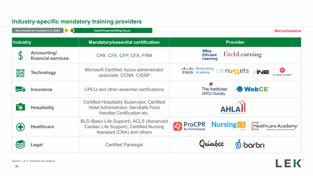
The slide presents a table with three columns: Industry, Mandatory/essential certification, and Provider. Various industries are listed along with corresponding certifications and providers. It includes logos of providers and icons for each industry.
Operational Efficiency
Professional Services
This slide details mandatory certifications for various industries and the corresponding providers. It serves as a resource for understanding industry-specific training requirements.
Mandatory, Certification, Provider, Industry, Training, Education, Professional Services, Qualifications, Skills, Compliance
false
Operational Efficiency
Professional Services
Table
LEK
Add to my slides
Remove from favorites
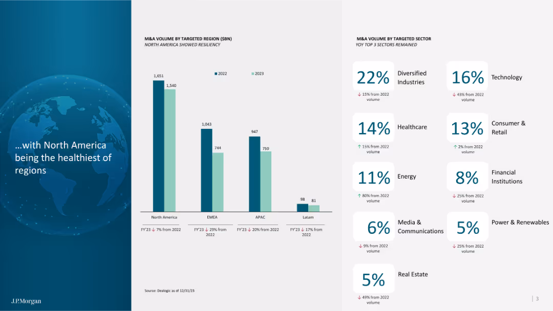
Column charts showing M&A volume by region and sector, highlighting trends in North America and other regions.
Market Analysis and Trends
Financial Services
Analyzes M&A trends by region and sector, emphasizing North America's performance and sectoral trends.
M&A, North America, regions, sectors, trends, analysis, performance, volume, 2023
false
Market Analysis and Trends
Financial Services
Mixed Chart
JP Morgan
Add to my slides
Remove from favorites
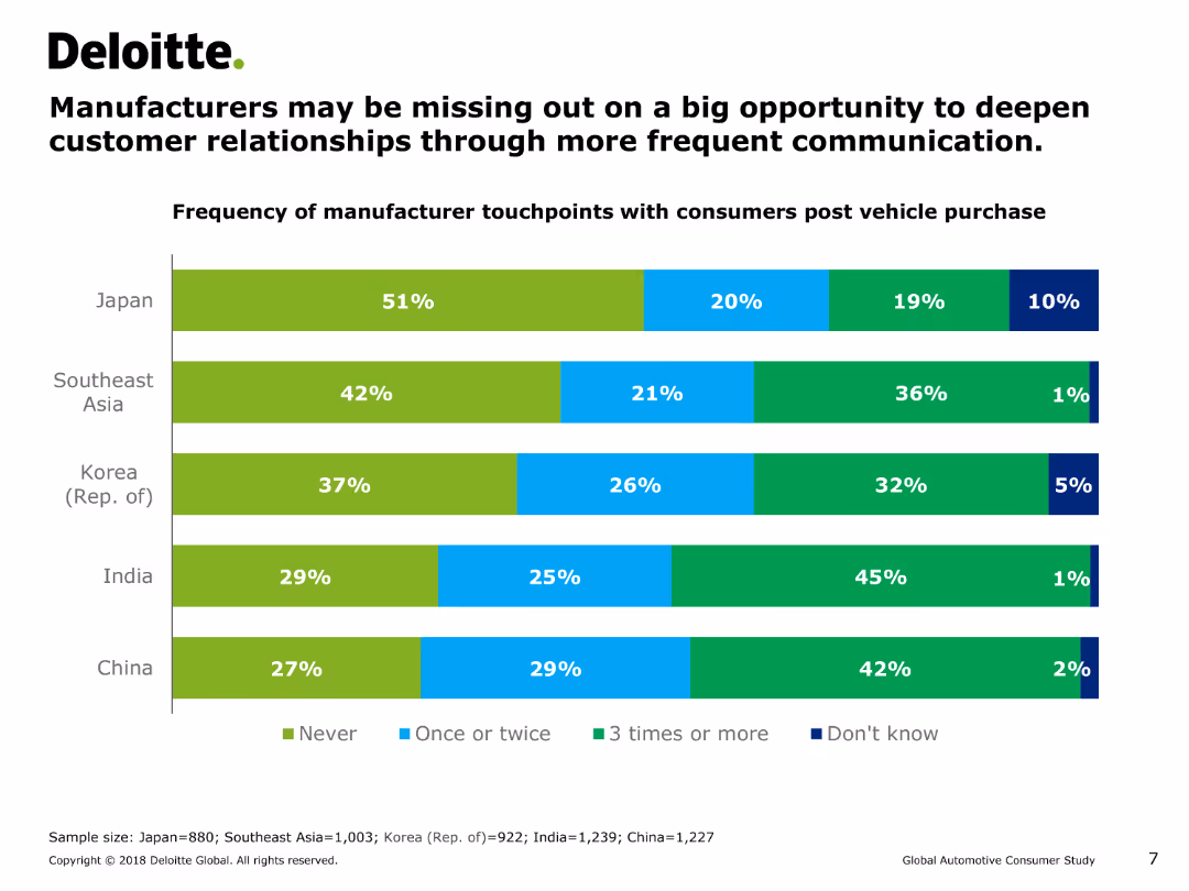
This slide features a horizontal bar chart (bar chart) showing the frequency of manufacturer touchpoints with consumers post vehicle purchase across various regions.
Customer and Market Segmentation
Consumer Goods
The slide shows the frequency of post-purchase interactions between manufacturers and consumers in Japan, Southeast Asia, Korea, India, and China. It suggests that manufacturers may be missing opportunities for deeper customer relationships.
manufacturer touchpoints, customer relationships, post-purchase interaction, bar chart, consumer behavior, automotive industry, Asia
false
Customer and Market Segmentation
Consumer Goods
Single Chart
Deloitte
Add to my slides
Remove from favorites
This slide juxtaposes "Before" and "Future" scenarios with two images, representing the shift from manufacturing to a consumer-driven economy. Includes bar graphs showing GDP contribution changes over decades.
Strategic Planning
Financial Services
Discusses China's economic transformation from a global manufacturing hub to a more diversified, consumption-driven economy. Useful for understanding shifts in economic strategies.
manufacturing, consumption, China, economic transformation, GDP, services sector
false
Strategic Planning
Financial Services
Mixed Chart
BCG
Add to my slides
Remove from favorites
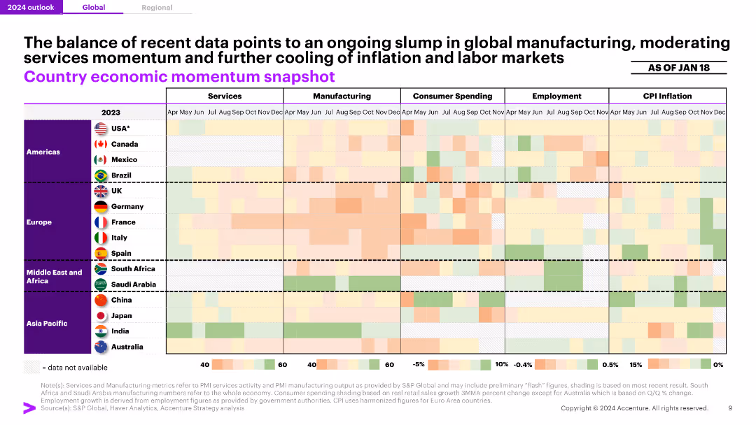
A heatmap displaying economic momentum across various metrics (services, manufacturing, consumer spending, employment, CPI inflation) for different countries, indicating an overall slump in global manufacturing.
Market Analysis and Trends
Professional Services
The slide highlights a continued downturn in global manufacturing, with varied momentum in services and consumer spending, and moderation in inflation and labor markets.
Manufacturing, Economic Momentum, Global, Services, Inflation
false
Market Analysis and Trends
Professional Services
Table
Accenture
Add to my slides
Remove from favorites
Slide shows column charts tracking material margin over time and a line graph depicting intercompany volumes, supplemented with performance data annotations.
Operational Efficiency
Industrial & Manufacturing
Examines the production efficiency and financial success in the specialty products sector, focusing on trends in material costs and production volumes.
manufacturing, efficiency, production, financial, trends
false
Operational Efficiency
Industrial & Manufacturing
Multiple Chart
Barclays
Add to my slides
Remove from favorites
The slide compares ESG strategies, emission targets, and DEI practices between manufacturing and services companies using horizontal bar charts. Each section details specific metrics within these categories, highlighting the differences in their approach.
Market Analysis and Trends
Environmental Services & Sustainability
This slide highlights the differences in ESG strategies, emission targets, and DEI measures between manufacturing and services companies. It shows that manufacturing companies are more proactive in these areas, using horizontal bar charts for clear comparison.
manufacturing, ESG, DEI, strategies, targets
false
Market Analysis and Trends
Environmental Services & Sustainability
Multiple Chart
Kearney
Add to my slides
Remove from favorites
A world map pinpoints manufacturing locations, accompanied by stats on global presence and strategic positioning. Visuals include icons and location counts per region which are highlighted in different colors.
Operational Efficiency
Industrial & Manufacturing
This slide illustrates TI Fluid Systems' global manufacturing footprint, emphasizing strategic location near key customers to optimize logistics and reduce costs, reflecting their operational efficiency and global market integration.
manufacturing, global footprint, operational efficiency, map
false
Operational Efficiency
Industrial & Manufacturing
Graphic
Deutsche Bank
Add to my slides
Remove from favorites
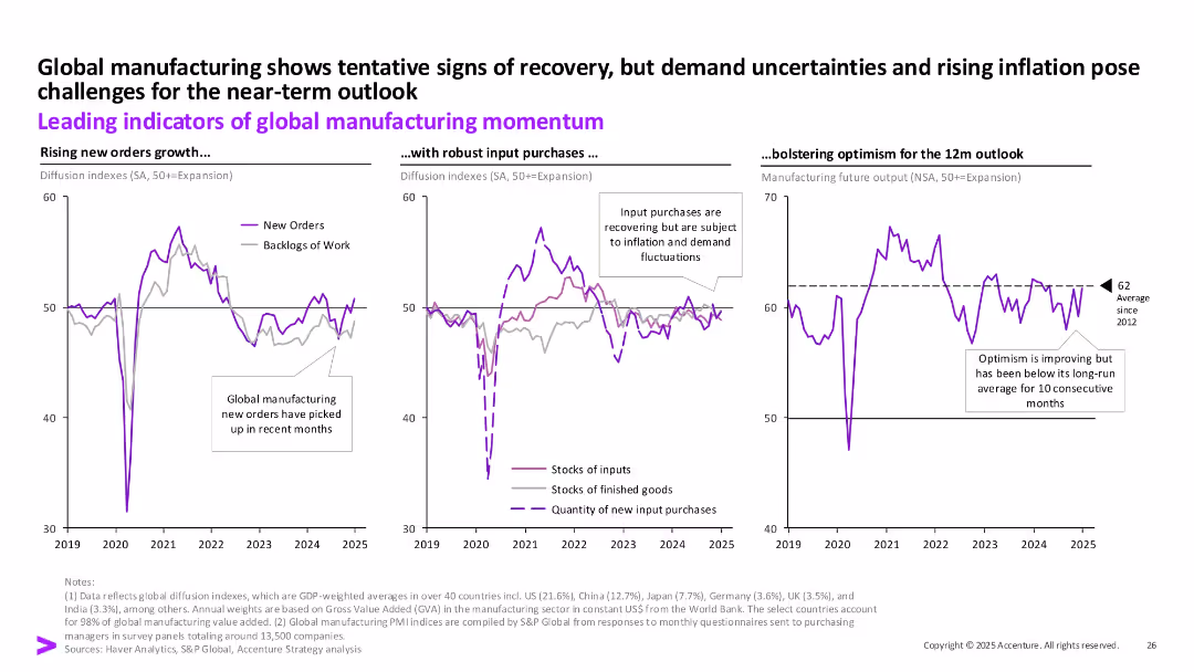
Three time-series charts (new orders, input purchases, output outlook) tracking manufacturing trends globally. Callouts and long-term average line.
Performance Metrics and KPIs
Industrial & Manufacturing
This slide presents key indicators of global manufacturing momentum—new orders, input purchases, and 12-month output outlook. While signs of recovery are emerging, challenges like inflation and demand uncertainty still cloud near-term expectations.
manufacturing, global, indicators, new orders, output, inflation, input
false
Performance Metrics and KPIs
Industrial & Manufacturing
Multiple Chart
Accenture
Add to my slides
Remove from favorites
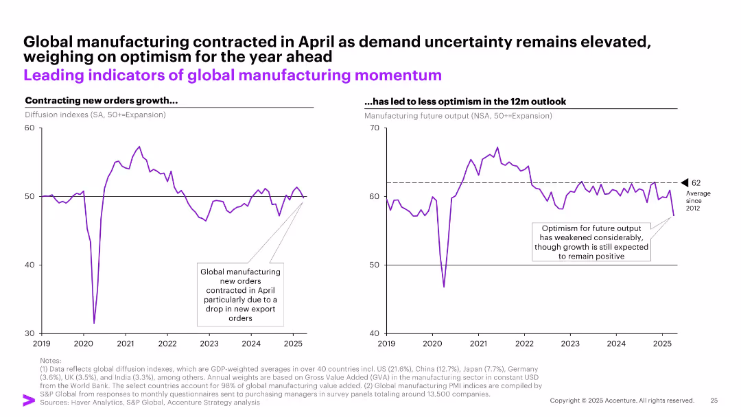
Dual line chart format showing contraction in new orders and outlook for future output; consistent purple color scheme; annotations clarify key points; includes side implications.
Strategic Planning
Industrial & Manufacturing
The slide outlines a decline in global manufacturing new orders and a weakening outlook for future output, driven by falling export demand. It urges businesses to temper optimism and focus on resilience planning amid ongoing global uncertainty.
manufacturing, global outlook, new orders, demand, export slowdown, strategic forecasting
false
Strategic Planning
Industrial & Manufacturing
Multiple Chart
Accenture
Add to my slides
Remove from favorites
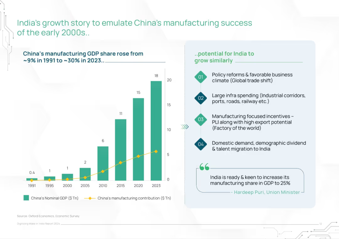
Left bar and line chart showing China’s GDP and manufacturing growth; right panel lists India’s policy and economic enablers
Strategic Planning
Industrial & Manufacturing
This slide draws parallels between China’s early 2000s manufacturing rise and India’s current opportunity. It outlines India’s potential to grow similarly via policy reforms, infrastructure investment, export incentives, and demographic trends, supported by charts and government commentary.
manufacturing growth, China comparison, India strategy, economic reform, industrial policy, infrastructure push, PLI
false
Strategic Planning
Industrial & Manufacturing
Mixed Chart
BCG
Add to my slides
Remove from favorites
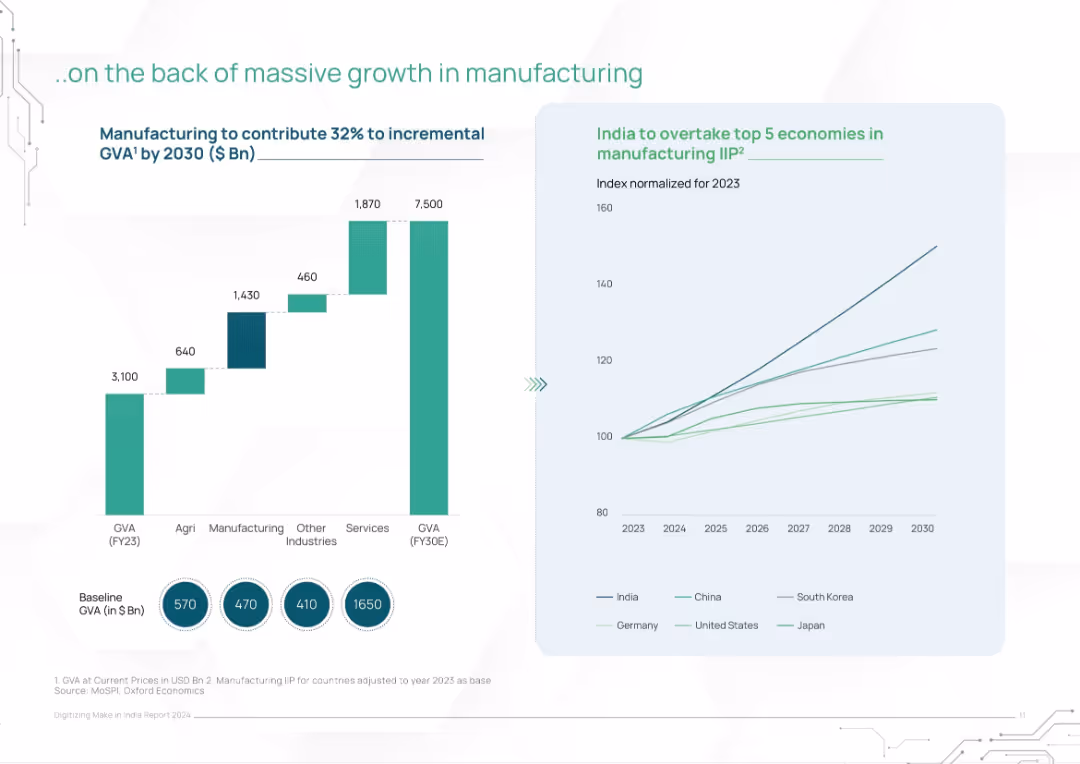
Left bar chart on GVA contribution by sector; right line chart of IIP vs global peers
Performance Metrics and KPIs
Industrial & Manufacturing
The slide showcases India's strong manufacturing sector as the driver of GDP growth to 2030. It highlights that manufacturing is expected to contribute 32% of incremental GVA and illustrates India surpassing peers in manufacturing IIP performance.
manufacturing, GVA, IIP, India growth, sector contribution, GDP, industrial expansion, economic outlook
false
Performance Metrics and KPIs
Industrial & Manufacturing
Multiple Chart
BCG
Add to my slides
Remove from favorites
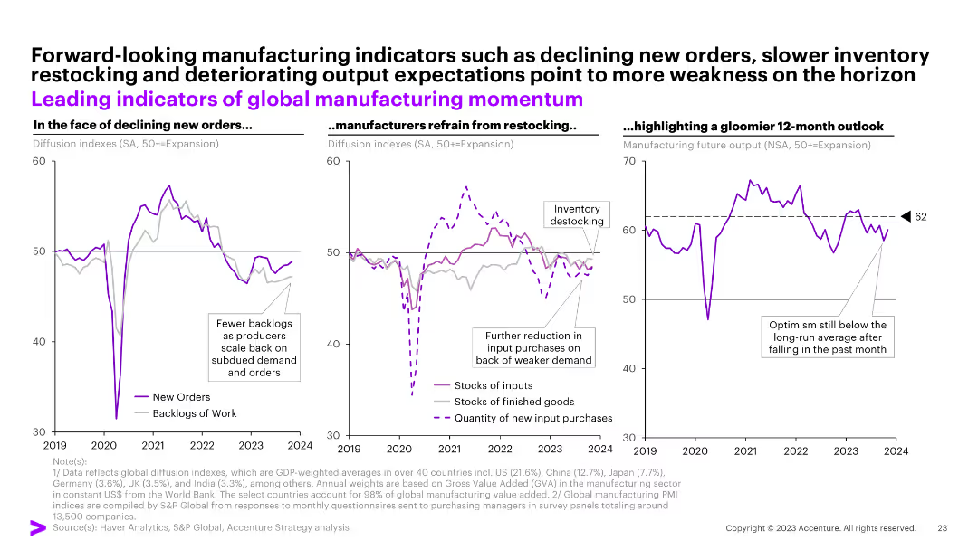
Three column charts showing global manufacturing indicators such as new orders, inventory restocking, and future output expectations.
Market Analysis and Trends
Industrial & Manufacturing
This slide focuses on forward-looking indicators in the global manufacturing sector, highlighting declining orders, inventory restocking issues, and a gloomy 12-month outlook.
manufacturing, indicators, orders, inventory, outlook
false
Market Analysis and Trends
Industrial & Manufacturing
Multiple Chart
Accenture
Add to my slides
Remove from favorites
Two-column layout with line and column charts depicting US ISM manufacturing index and US industrial production indexes from 2019-2024.
Market Analysis and Trends
Industrial & Manufacturing
Analyzes US manufacturing and industrial activity trends, highlighting constraints and expected improvements in 2024.
manufacturing, industrial production, US economy, interest rates, global demand
false
Market Analysis and Trends
Industrial & Manufacturing
Multiple Chart
EY
Add to my slides
Remove from favorites
Features two line graphs showing year-over-year industrial production growth in the U.S. and EU. The slide uses red and blue lines against a light green background for clarity.
Operational Efficiency
Industrial & Manufacturing
Discusses recent trends in manufacturing and industrial production in the U.S. and EU, highlighting changes in growth rates. This slide is beneficial for understanding sectoral health and economic conditions.
Manufacturing, Industrial Production, US, EU, Growth Rates
false
Operational Efficiency
Industrial & Manufacturing
Single Chart
Deutsche Bank
Add to my slides
Remove from favorites
Bar chart detailing inefficiencies at various stages of the manufacturing value chain. Accompanied by detailed descriptions of inefficiencies and potential improvements.
Operational Efficiency
Industrial & Manufacturing
Analyzes specific inefficiencies in the manufacturing value chain, highlighting areas with potential for improvement in sustainability and efficiency. It provides a breakdown of problems and solutions at different stages such as product design, sourcing, and end-of-life disposal.
manufacturing, inefficiencies, value chain, sustainability, operational efficiency
false
Operational Efficiency
Industrial & Manufacturing
Mixed Chart
Accenture
Add to my slides
Remove from favorites
This advanced slide features a U.S. map, a bar chart, and a line graph to represent data visually. The map is color-coded to show regional spending, the bar chart depicts manufacturing loans as a percentage of C&I loans by peer, and the line graph shows the trend in announced U.S. manufacturing jobs. Text boxes provide additional context for the visual data presented, all within a coherent color scheme.
Strategic Planning
Financial Services
The slide discusses how the company’s 'footprint' is well-positioned to benefit from the resurgence of domestic manufacturing and infrastructure spending. It analyzes potential growth areas and strategic advantages for the company in terms of investment and lending opportunities related to this trend. Intended for strategic planning and investment analysis.
Manufacturing, Infrastructure, Strategic Positioning, Loans, Job Growth, Investment, Regional Analysis, Economic Resurgence
false
Strategic Planning
Financial Services
Multiple Chart
Morgan Stanley
Add to my slides
Remove from favorites
Contains multiple bar charts tracking the Purchasing Managers’ Index by country and month, color-coded by performance levels.
Operational Efficiency
Industrial & Manufacturing
This slide tracks manufacturing performance globally, useful for assessing economic health and recovery momentum in the industrial sector.
manufacturing, PMI, global industry, economic recovery, performance tracking
false
Operational Efficiency
Industrial & Manufacturing
Multiple Chart
BCG
Add to my slides
Remove from favorites
The slide shows a bar chart for each country representing Manufacturing PMI data before and after COVID-19.
Strategic Planning
Industrial & Manufacturing
Examines the recovery of manufacturing sectors across various countries using PMI data, indicating economic health and recovery rates.
manufacturing, PMI, recovery, analysis
false
Strategic Planning
Industrial & Manufacturing
Multiple Chart
BCG
Add to my slides
Remove from favorites
Multiple small column charts showing monthly PMI data for several countries, indicating levels of manufacturing activity with color coding for various performance levels.
Market Analysis and Trends
Financial Services
Tracks the recovery in global manufacturing post-pandemic through Purchasing Managers' Index (PMI) data, detailing the ups and downs across different nations.
manufacturing, PMI, recovery, global, countries
false
Market Analysis and Trends
Financial Services
Multiple Chart
BCG
Add to my slides
Remove from favorites
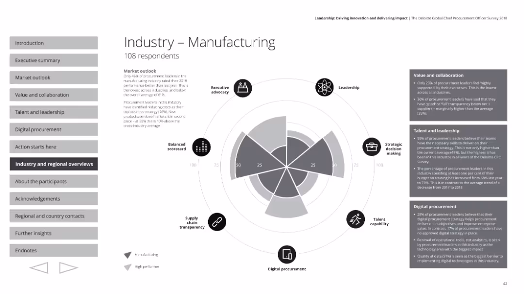
The slide includes a radar chart depicting various performance metrics, text boxes with detailed survey insights, and small icons representing different aspects.
Industry Overview
Industrial & Manufacturing
This slide presents the manufacturing industry's procurement performance based on survey results. It includes sections on executive advocacy, leadership, strategic decision making, talent capability, digital procurement, and supply chain transparency, alongside a market outlook and specific metrics on value, collaboration, talent, and leadership.
Manufacturing, procurement, industry performance, radar chart, market outlook
false
Industry Overview
Industrial & Manufacturing
Mixed Chart
Deloitte
Add to my slides
Remove from favorites
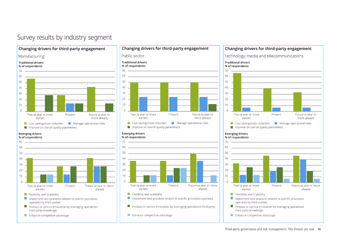
The slide contains three column charts illustrating the changing drivers for third-party engagement in Manufacturing, Public Sector, and Technology, Media & Telecom.
Market Analysis and Trends
Professional Services
It analyzes survey results segmented by industry, showing traditional and emerging drivers for third-party engagement across different industries.
Manufacturing, Public Sector, Technology, Media, Telecommunications, third-party engagement, survey results
false
Market Analysis and Trends
Professional Services
Multiple Chart
Deloitte
Add to my slides
Remove from favorites
The slide has a blue and white color scheme with three comparative shift pattern diagrams for a manufacturing setting. It utilizes arrow graphics to indicate shift durations across different days of the week, with corresponding textual explanations in separate columns for description, pros, and cons.
Operational Efficiency
Industrial & Manufacturing
This slide compares current shift patterns in manufacturing with three proposed options to enhance on-site employee safety by reducing exposure. Each option is accompanied by a brief description, pros, and cons, outlining the implications of implementation. It is used for decision-making in operational management.
manufacturing, safety, shift patterns, exposure reduction, operational management, employee well-being
false
Operational Efficiency
Industrial & Manufacturing
Header Horizontal
McKinsey
Add to my slides
Remove from favorites
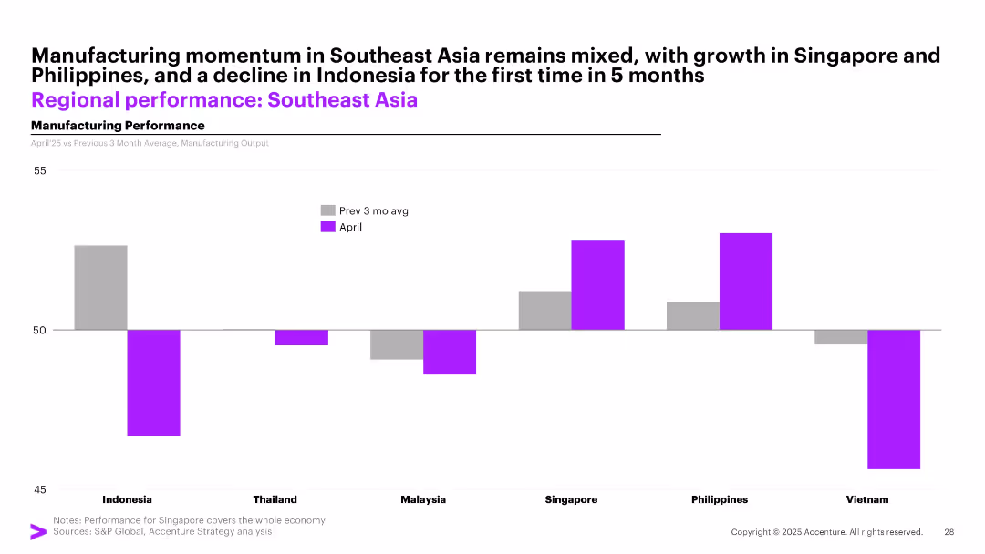
Bar chart with vertical bars comparing April manufacturing performance against the previous 3-month average for 6 Southeast Asian countries.
Performance Metrics and KPIs
Industrial & Manufacturing
The slide compares April 2025 manufacturing output with the previous 3-month average across Southeast Asia, showing mixed performance with growth in Singapore and the Philippines, and declines in countries like Indonesia and Vietnam.
manufacturing, Southeast Asia, Singapore, Indonesia, PMI, output, April, comparison, trends, performance
false
Performance Metrics and KPIs
Industrial & Manufacturing
Single Chart
Accenture
Add to my slides
Remove from favorites
Slide with column charts comparing offensive and defensive M&A strategies by industry, showing the adoption rates of various tactics.
Strategic Planning
Financial Services
Compares offensive and defensive M&A strategies across different industries, illustrating which tactics are prioritized and the level of adoption.
M&A, offensive strategies, defensive strategies, industry, adoption rates, tactics, column chart
false
Strategic Planning
Financial Services
Mixed Chart
Deloitte
Add to my slides
Remove from favorites
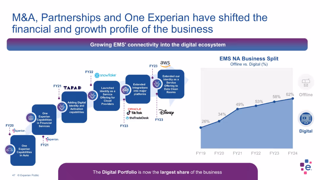
Flowchart timeline with M&A and partnership logos on left; area chart on right
Mergers and Acquisitions
Technology & Software
The slide showcases Experian’s digital transformation through M&A and partnerships, emphasizing digital portfolio growth. Logos from AWS, TikTok, Disney, and Oracle are included. The area chart shows an increasing shift toward digital revenue share.
M&A, partnerships, Experian, digital transformation, cloud, EMS, growth
false
Mergers and Acquisitions
Technology & Software
Mixed Chart
Barclays
Add to my slides
Remove from favorites
Contains multiple bar graphs and textual analysis. Utilizes a clean, professional layout focusing on M&A trends in the Philippines, including top bidders and deal values.
Mergers and Acquisitions
Financial Services
Provides a detailed analysis of domestic and inbound M&A in the Philippines, including major deals and sector breakdown for top bidders from 2018 to 2020.
M&A, Philippines, domestic, inbound, deal analysis, sectors, bidders
false
Mergers and Acquisitions
Financial Services
Mixed Chart
Deloitte
Add to my slides
Remove from favorites
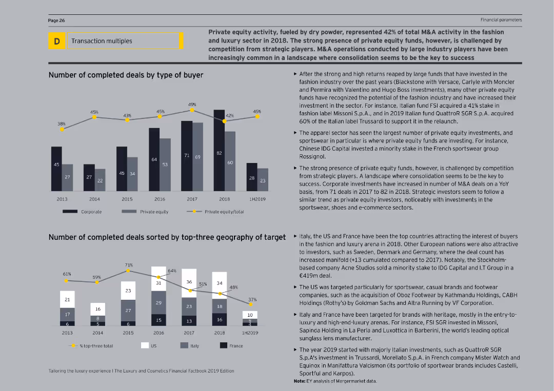
The slide features column charts illustrating the number of completed deals by type of buyer and top-three geography of targets from 2013 to 1H2019. The visual complexity is moderate, with clear segmentation of data by corporate and private equity.
Mergers and Acquisitions
Consumer Goods
The slide analyzes the significant role of private equity in M&A activity within the fashion and luxury sectors, showing the number of deals by buyer type and geographical targets. It provides insights into trends, such as the increasing interest from private equity funds and their strategic motivations.
M&A, Private Equity, Fashion, Luxury, Deals
false
Mergers and Acquisitions
Consumer Goods
Multiple Chart
EY
Add to my slides
Remove from favorites
Displays a detailed flowchart illustrating the end-to-end M&A process from strategy development to post-merger integration. It includes phases like target screening, due diligence, transaction execution, and integration steps highlighted in green.
Mergers and Acquisitions
Professional Services
Details the comprehensive steps involved in M&A transactions, providing a roadmap for successful execution from initial strategy to final integration, emphasizing the importance of each phase in the process.
M&A, Process, Strategy, Due Diligence, Integration, Execution, Roadmap
false
Mergers and Acquisitions
Professional Services
Linear Flow
Deloitte
Add to my slides
Remove from favorites
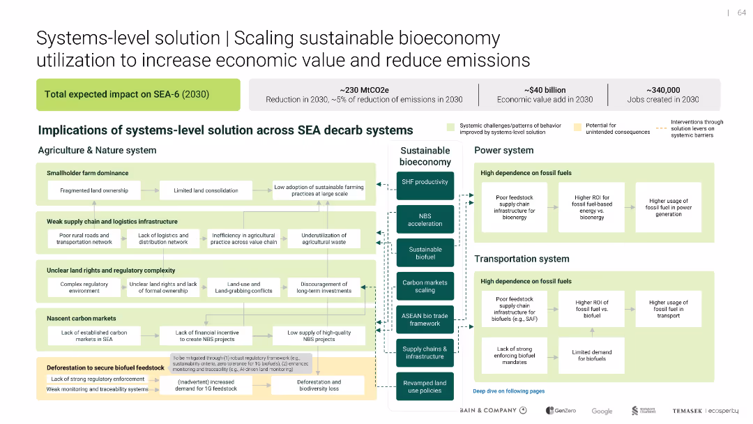
Scaling sustainable bioeconomy utilization
Technology and Digital Transformation
Environmental Services & Sustainability
Technology and Digital Transformation
Maps how a sustainable bioeconomy can impact agriculture, energy, and transport systems in SEA. Identifies system inefficiencies and outlines intervention points to unlock ~$40B value and reduce emissions by ~230 MtCO2e.
false
Technology and Digital Transformation
Environmental Services & Sustainability
Uncategorized
Bain
Add to my slides
Remove from favorites
The slide includes a map of Maranoa and several infographics showing economic output, employment, and emissions data for the region.
Client Case Studies
Agriculture & Food Production
This case study slide presents the current state of the Maranoa electorate in Southern Queensland, highlighting economic output, employment statistics, and emissions data for the agriculture sector.
Maranoa, Case study, Economic output, Employment, Emissions
false
Client Case Studies
Agriculture & Food Production
Multiple Chart
EY
Add to my slides
Remove from favorites
Features column charts showing the growth of loans originated and deposits, with a side bar detailing key attributes of the Marcus platform. The design is clean, with visual emphasis on data points.
Product and Service Analysis
Financial Services
Highlights the performance of Marcus, a consumer lending platform, with emphasis on technology, risk management, and growth since its inception, as well as customer-friendly features and deposit growth.
Marcus, Consumer Lending, Technology, Risk Management, Growth, Deposits, Loans Originated, Customer Experience, NerdWallet
false
Product and Service Analysis
Financial Services
Multiple Chart
Goldman Sachs
Add to my slides
Remove from favorites
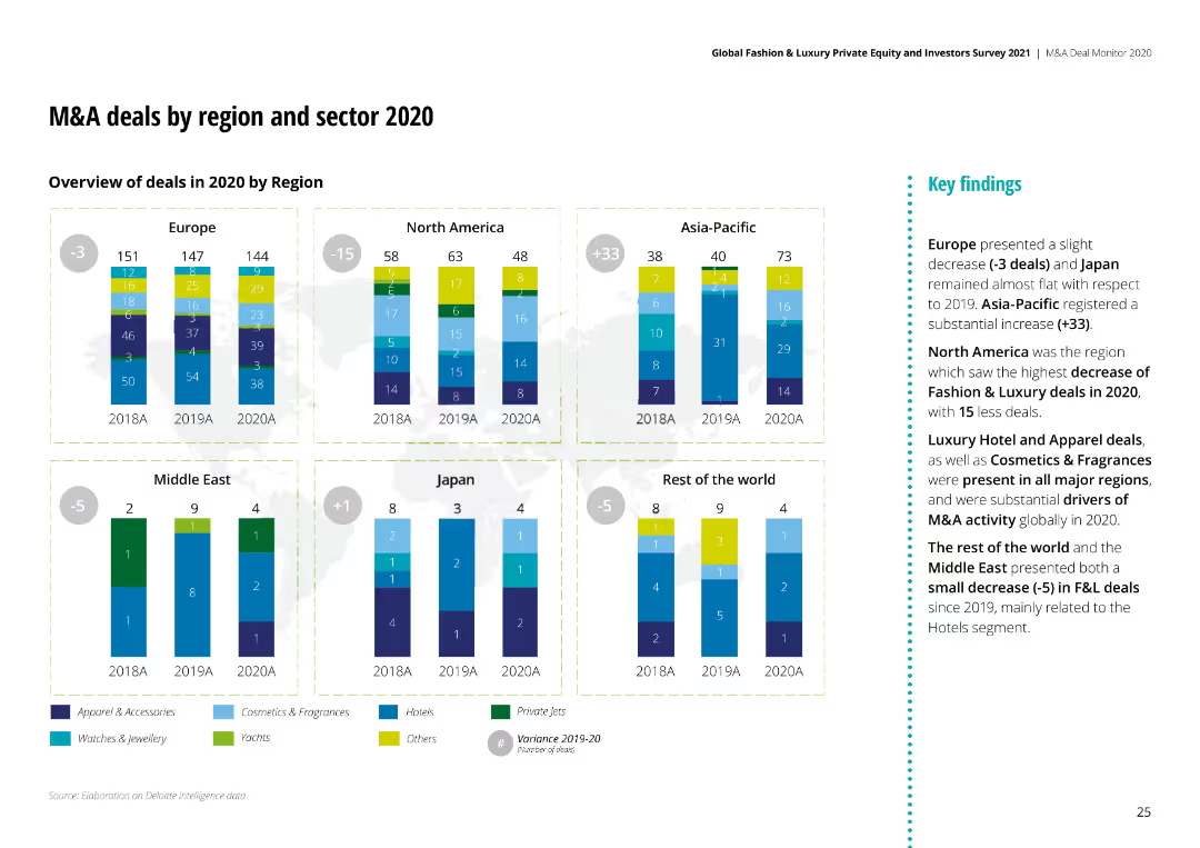
The slide shows column charts for M&A deals in 2020 by region, comparing different sectors like Apparel, Cosmetics, and Hotels.
Market Analysis and Trends
Consumer Goods
It analyzes M&A deals across different regions and sectors, showing the number of deals and the key findings from the data.
M&A, Region, Sector, 2020, Analysis, Apparel, Cosmetics
false
Market Analysis and Trends
Consumer Goods
Multiple Chart
Deloitte
Add to my slides
Remove from favorites
Slide shows column charts detailing EBIT margin growth projections with annotations on financial discipline.
Financial Performance
Transportation & Logistics
Outlines the financial strategy aimed at margin expansion through cost management and revenue growth.
margin growth, financial strategy, cost management, revenue growth, EBIT
false
Financial Performance
Transportation & Logistics
Mixed Chart
Deutsche Bank
Add to my slides
Remove from favorites
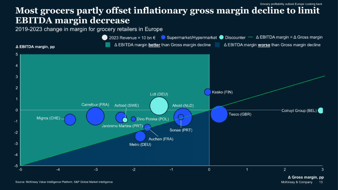
Bubble chart plotting EBITDA vs gross margin changes (2019–2023) by company, with bubble size representing revenue.
Performance Metrics and KPIs
Retail & E-commerce
Shows how various European grocers managed margin pressures, with discounters like Lidl performing better than supermarkets. Larger bubbles (e.g. Carrefour) illustrate scale vs margin shifts. Some outperformed gross margin declines with strong EBITDA defense.
margin management, bubble chart, EBITDA, Lidl, grocery Europe, inflation
false
Performance Metrics and KPIs
Retail & E-commerce
Single Chart
McKinsey
Add to my slides
Remove from favorites
Two halves divided; the left has text and a line graph showing margin and EBIT changes. The right half shows three overlapped area graphs depicting contributions to S&P 500 EPS growth. Both have analyst attribution and links to reports.
Market Analysis and Trends
Financial Services
The slide details the forecasted margin pressures in the US and Europe, using data visualizations to highlight the impact on EBIT margins and contributions to S&P 500 EPS growth.
Margin pressure, financial forecast, EBIT margins, S&P 500, EPS growth, market analysis, economic recession, wage costs, inventory, US and Europe markets
false
Market Analysis and Trends
Financial Services
Multiple Chart
Morgan Stanley
Add to my slides
Remove from favorites
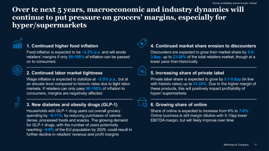
Icon-based numbered list (1-6) on a two-column layout, highlighting key trends with small supporting text blocks.
Strategic Planning
Retail & E-commerce
Forecasts six major trends affecting grocers' margins: food inflation, labor tightness, GLP-1 drug impacts, discounter growth, private label expansion, and online growth. Highlights margin pressure especially for hyper/supermarkets.
margin pressure, forecast, private label, discounters, inflation
false
Strategic Planning
Retail & E-commerce
Header Vertical
McKinsey
Add to my slides
Remove from favorites
A table with key financial metrics on the left, a list of goals as a 5-year consumer opportunity in the center, and a column chart displaying forward pre-tax margin on the right.
Financial Performance
Financial Services
A financial overview showcasing past earnings and future goals for consumer and wealth management margins, indicating a strategic focus on increasing profitability.
Margins, consumer, wealth, profitability, financial
false
Financial Performance
Financial Services
Mixed Chart
Goldman Sachs
Add to my slides
Remove from favorites
Presents column charts with revenue and EBIT margin data across different product focuses (Tires, Electronics/Infotainment, Powertrain, etc.). Also includes a comparison of EBIT margins between traditional and new vehicle domains.
Financial Performance
Transportation & Logistics
Analyzes the deterioration of margins across different automotive domains. Highlights the performance of new vehicle domains like battery and semiconductor suppliers compared to traditional suppliers.
Margins, Performance, Automotive, Revenue, EBIT
false
Financial Performance
Transportation & Logistics
Multiple Chart
Roland Berger
Add to my slides
Remove from favorites
Includes a column chart showing the economic impact of Copernicus for marine environments, detailed bullet points describing the key applications and benefits, and a visual layout designed to focus on marine themes.
Regulatory and Compliance
Environmental Services & Sustainability
The slide explores the contributions of Copernicus to coastal and marine exploitation and preservation, detailing how accurate, near-real-time data supports better decision-making in marine activities. It addresses the increasing demands on marine environments due to climate change and human activities.
marine, Copernicus, environmental monitoring, coastal preservation, data utilization
false
Regulatory and Compliance
Environmental Services & Sustainability
Mixed Chart
PwC/Strategy&
Add to my slides
Remove from favorites
Slide contains three main visual elements: two column charts showing 'Container port traffic in the European Union (in million TEU)' and 'Total fisheries production in the European Union (in metric tons)', and various text blocks including a large title and bulleted list.
Industry Overview
Environmental Services & Sustainability
The slide discusses various activities and economic impacts of coastal and marine exploitation and preservation, highlighting data from Earth observation and related EU directives. Emphasis on fisheries management and maritime protection.
Marine, Fisheries, Conservation, EU, Management
false
Industry Overview
Environmental Services & Sustainability
Multiple Chart
PwC/Strategy&
Add to my slides
Remove from favorites
Features a circular ecosystem diagram with different industry roles such as Upgrader and Recycler, connected by arrows to indicate workflow, accompanied by descriptive text.
Operational Efficiency
Transportation & Logistics
Highlights the necessity for collaboration in the maritime industry to optimize resource use and enhance sustainability through a circular economic model.
maritime, collaboration, circular economy, sustainability, optimization
false
Operational Efficiency
Transportation & Logistics
Diagram
Accenture
Add to my slides
Remove from favorites
Features a list and several icons representing inefficiencies, alongside a table chart assessing inefficiency levels, with the maritime industry focus prominently displayed.
Operational Efficiency
Transportation & Logistics
Analyzes inefficiencies within the maritime industry, promoting greener solutions and the utilization of shared platforms to reduce waste and enhance customer relations.
maritime, inefficiencies, greener solutions, lifecycle, platforms
false
Operational Efficiency
Transportation & Logistics
Header Vertical
Accenture
Add to my slides
Remove from favorites
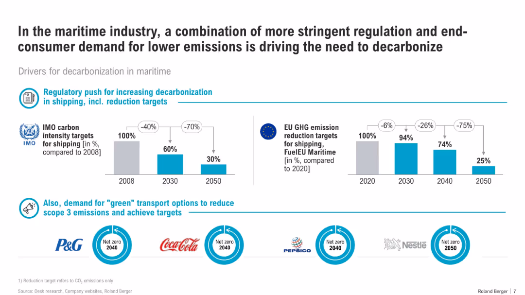
Bar charts comparing IMO and EU emission targets over time, supported by corporate commitments at the bottom. Balanced layout.
Regulatory and Compliance
Transportation & Logistics
The slide highlights regulatory and consumer-driven decarbonization pressures in the maritime industry. It compares shipping emission targets from the IMO and EU and includes net-zero pledges by major brands like Nestlé and Coca-Cola.
maritime, regulation, IMO, EU targets, decarbonization, net zero, emissions, shipping, climate goals
false
Regulatory and Compliance
Transportation & Logistics
Mixed Chart
Roland Berger
Add to my slides
Remove from favorites
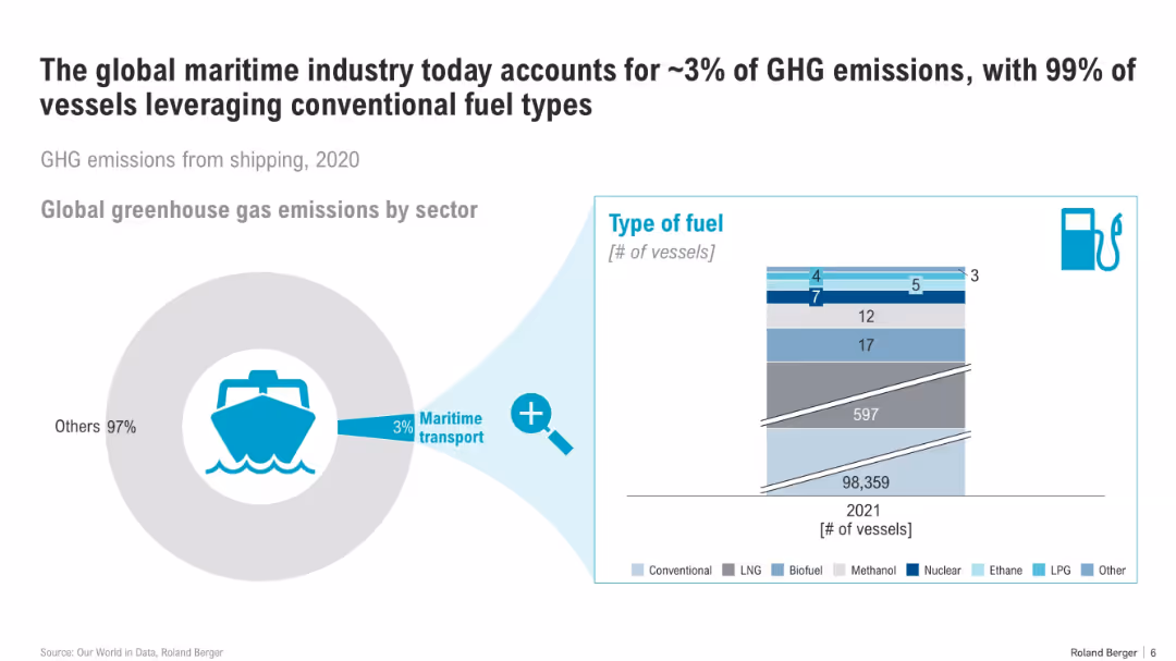
Left side: donut chart highlighting maritime sector’s share. Right: stacked bar showing vessel fuel types. Minimal text, infographic style.
Industry Overview
Transportation & Logistics
This slide presents the maritime sector’s contribution to global GHG emissions and emphasizes that nearly all vessels still use conventional fuels. It shows the limited adoption of alternative fuels such as LNG, biofuel, and nuclear.
maritime, shipping, GHG, conventional fuel, vessel types, emissions, energy, sector share
false
Industry Overview
Transportation & Logistics
Multiple Chart
Roland Berger
Add to my slides
Remove from favorites
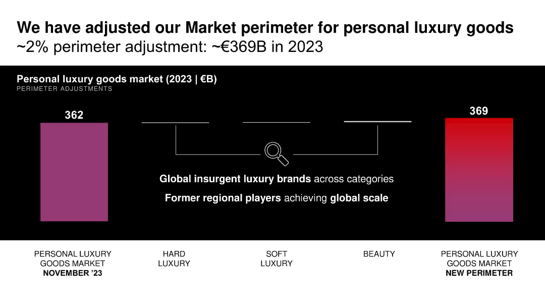
Black-themed layout with two vertical bar comparisons and magnifying glass icon showing adjustment logic; simple structure.
Strategic Planning
Consumer Goods
Announces a ~2% adjustment to the 2023 market perimeter for personal luxury goods (€362B to €369B) based on inclusion of global insurgent and scaled-up regional brands.
market adjustment, perimeter, luxury goods, strategic planning, valuation, brands
false
Strategic Planning
Consumer Goods
Single Chart
Bain
Add to my slides
Remove from favorites
Features two column charts displaying market size by generation in 2017 and projected for 2025, with annotations for generational contributions to market growth.
Market Analysis and Trends
Retail & E-commerce
Analyzes the luxury goods market size and growth contribution by generation, projecting significant impacts from Gen Y and Gen Z by 2025.
market analysis, generational impact, luxury goods, future projections, consumer demographics
false
Market Analysis and Trends
Retail & E-commerce
Multiple Chart
Bain
Add to my slides
Remove from favorites
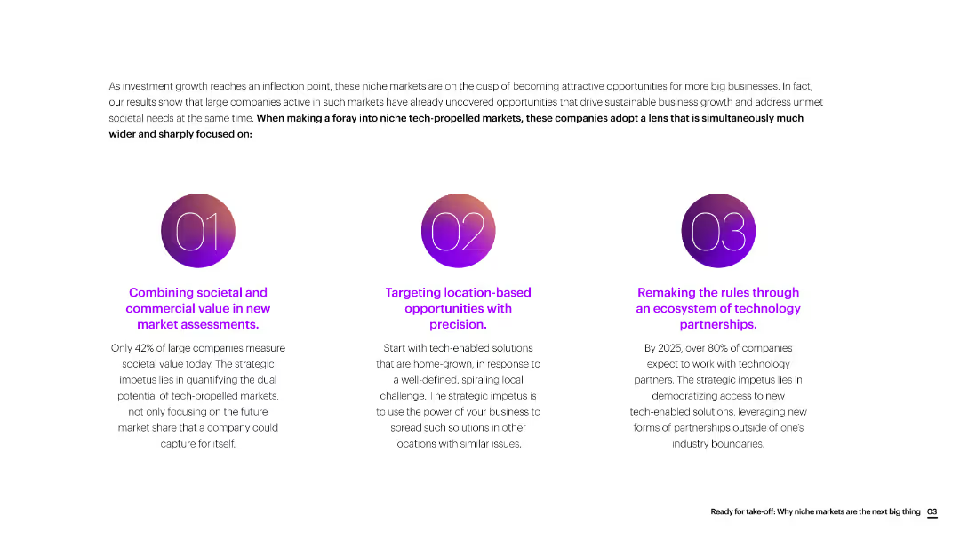
The slide is divided into three sections with circular icons, each section discussing a different strategic focus for new market assessments.
Market Analysis and Trends
Consumer Goods
The slide emphasizes the importance of combining societal and commercial value, targeting location-based opportunities, and leveraging technology partnerships for new market growth.
market assessment, societal value, commercial value, location-based, technology partnerships, consumer goods
false
Market Analysis and Trends
Consumer Goods
Linear Flow
Accenture
Add to my slides
Remove from favorites
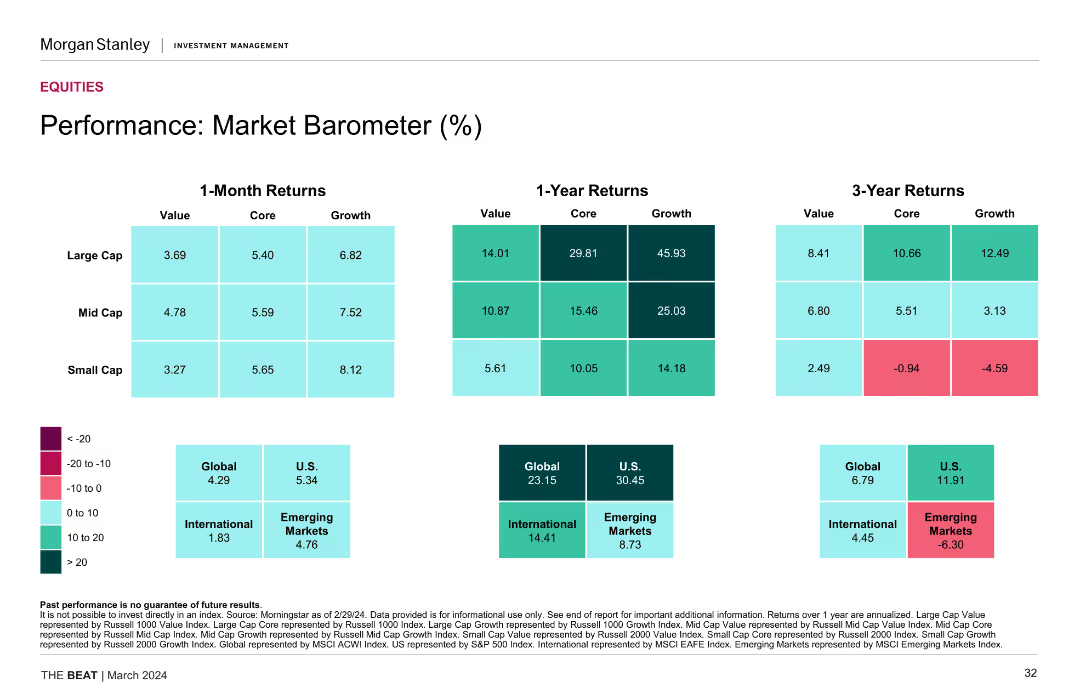
The slide features a set of heatmaps showing 1-month, 1-year, and 3-year returns for different market segments (large cap, mid cap, small cap) and regions (Global, U.S., International).
Financial Performance
Financial Services
The slide analyzes market performance, comparing returns across various market segments and regions. Useful for investment strategy evaluation.
market barometer, performance, returns, large cap, mid cap, small cap, global, U.S., international
false
Financial Performance
Financial Services
Table
Morgan Stanley
Add to my slides
Remove from favorites
This slide displays a series of tables comparing 1-month, 1-year, and 3-year returns of different market segments. It uses a color gradient to signify performance levels and is easy to read, with distinct sections for 'Large Cap', 'Mid Cap', and 'Small Cap'.
Market Analysis and Trends
Financial Services
The slide presents a market barometer indicating the performance of various market caps over multiple timeframes. Suitable for market analysts and investors, it helps in evaluating short-term and long-term investment returns, playing a vital role in portfolio management and investment strategy formation.
Market Barometer, Returns, Investment, Cap Size, Analysis
false
Market Analysis and Trends
Financial Services
Table
Morgan Stanley
Add to my slides
Remove from favorites
Displays a multi-part column chart, detailing second-hand market behaviors between Chinese and US consumers in green and yellow tones.
Market Analysis and Trends
Retail & E-commerce
Compares second-hand luxury market behaviors between Chinese and US consumers, highlighting differences in selling and buying trends.
market behavior, Chinese consumers, US consumers, second-hand luxury, buying and selling trends
false
Market Analysis and Trends
Retail & E-commerce
Single Chart
BCG
Add to my slides
Remove from favorites
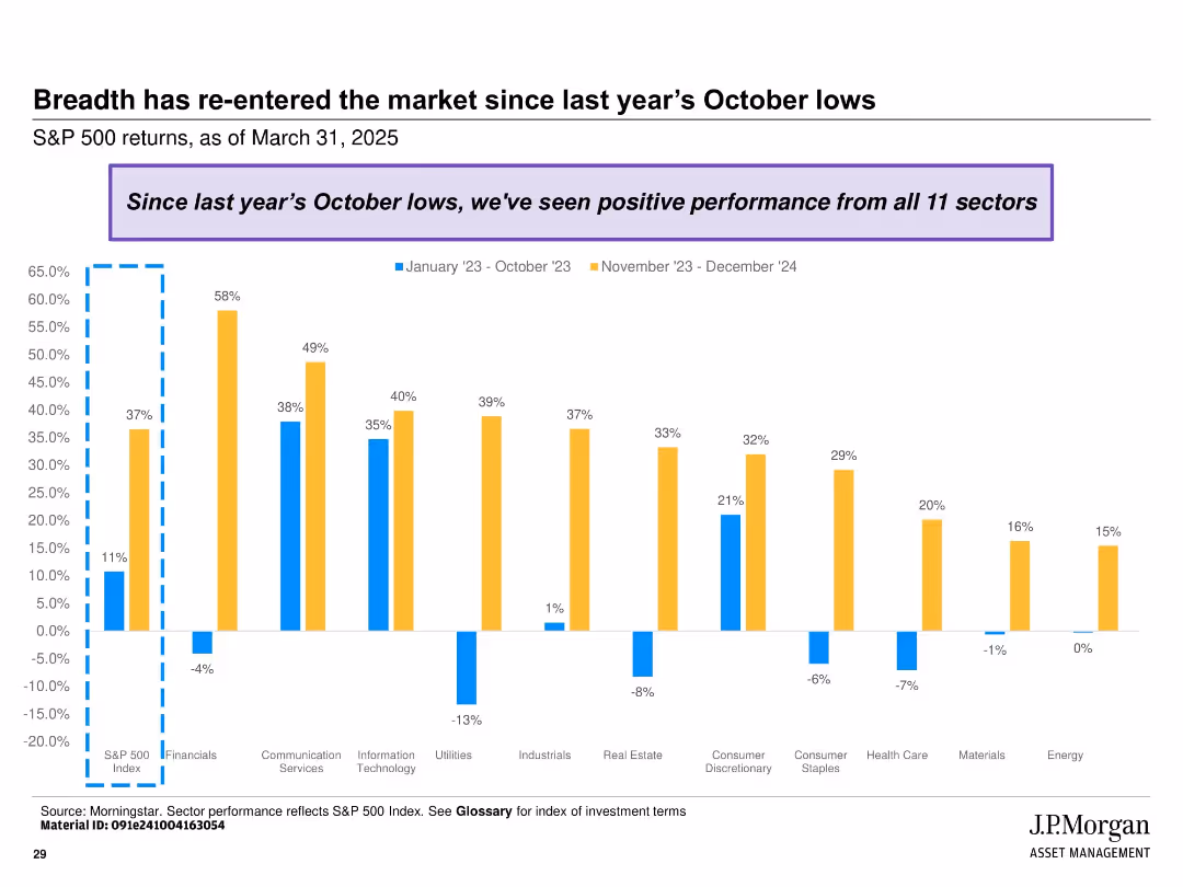
Clustered bar chart showing sectoral returns across two periods (Jan-Oct 2023 and Nov 2023-Dec 2024); color-coded with annotation box at top.
Market Analysis and Trends
Financial Services
Highlights the broad-based recovery of the S&P 500 with all 11 sectors showing positive performance since October 2023. Contrasts performance between early and late periods across various industries.
market breadth, S&P 500, sector performance, recovery, returns, 2023, 2024, equity sectors, rebound, financial analysis
false
Market Analysis and Trends
Financial Services
Single Chart
JP Morgan
Add to my slides
Remove from favorites
A column chart showing the market cap of Brazil's top companies in 2010, 2015, and 2019 with significant downturns and recoveries noted.
Investment Analysis
Financial Services
Presents Brazil's top 10 companies' market cap fluctuations and recovery over the decade, providing insights into the economic conditions and recovery phases.
market cap, Brazil, top companies, economic recovery, investment
false
Investment Analysis
Financial Services
Mixed Chart
McKinsey
Add to my slides
Remove from favorites
This slide features bar charts comparing 2010 and 2019 market caps of top companies in Brazil, with tech vs. non-tech categorization.
Competitive Landscape
Technology & Software
Illustrates the dominance of traditional companies over tech companies in Brazil's top market cap rankings, and how this landscape has evolved over the decade.
market cap, Brazil, traditional sectors, tech companies, innovation
false
Competitive Landscape
Technology & Software
Multiple Chart
McKinsey
Add to my slides
Remove from favorites
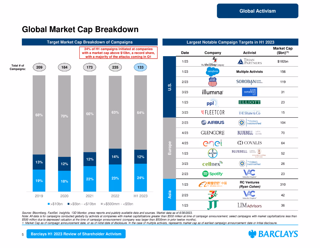
The slide features a column chart and a table listing notable campaign targets by market cap. It focuses on the breakdown of campaigns by market cap and notable targets in different regions.
Market Analysis and Trends
Financial Services
Analyzes the breakdown of market cap for activist campaigns, identifying notable targets and regional differences in campaign activities.
market cap, campaign targets, regional analysis, activist campaigns, notable targets
false
Market Analysis and Trends
Financial Services
Mixed Chart
Barclays
Add to my slides
Remove from favorites
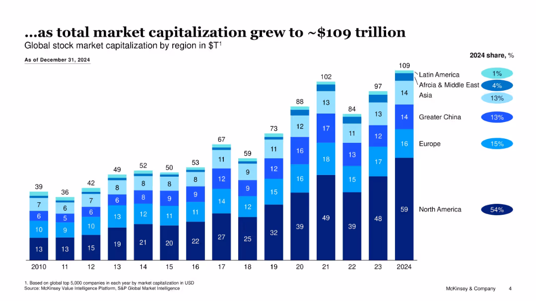
Stacked bar chart showing regional market cap in $T from 2010–2024 with share percentages
Market Analysis and Trends
Financial Services
Tracks growth in global stock market capitalization to $109T by 2024, with North America holding the majority share; visualizes regional contributions over time.
market cap, global stocks, regional share, financial growth, stock markets, valuation
false
Market Analysis and Trends
Financial Services
Single Chart
McKinsey
Add to my slides
Remove from favorites
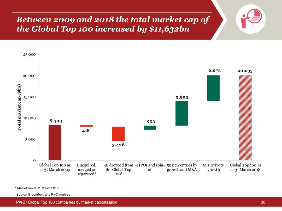
Column chart depicting the total market cap increase of the Global Top 100 companies from 2009 to 2018, highlighting growth areas and key contributors.
Financial Performance
Financial Services
Analysis of the market cap increase of the Global Top 100 companies over a decade, emphasizing significant growth and contributing factors.
market cap, global top 100, 2009, 2018, increase
false
Financial Performance
Financial Services
Single Chart
PwC/Strategy&
Add to my slides
Remove from favorites
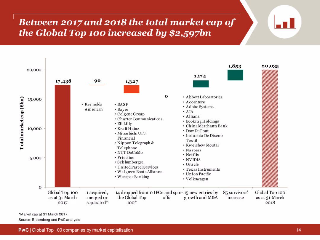
Column chart depicting changes in the total market cap of the Global Top 100 companies from 2017 to 2018, with sections showing new entries and survivors.
Financial Performance
Financial Services
Analysis of the market cap increase of the Global Top 100 companies, showing growth driven by new entries and existing companies.
market cap, global top 100, 2017, 2018, increase
false
Financial Performance
Financial Services
Single Chart
PwC/Strategy&
Add to my slides
Remove from favorites
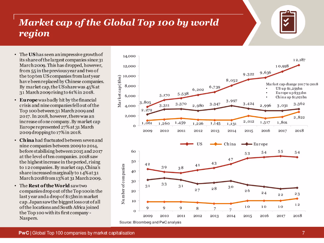
This slide features a line chart comparing the market cap changes over time for the US, China, and Europe. The slide includes textual analysis and bullet points on the left side.
Market Analysis and Trends
Financial Services
Analysis of market cap trends of the Global Top 100 companies by world region from 2009 to 2018, showing significant changes and growth patterns.
market cap, global top 100, trends, US, China, Europe
false
Market Analysis and Trends
Financial Services
Multiple Chart
PwC/Strategy&
Add to my slides
Remove from favorites
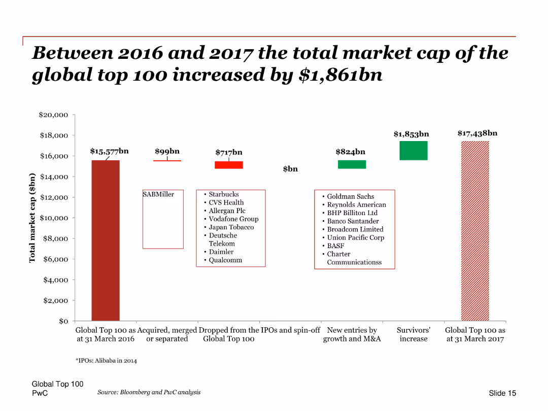
A column chart depicting the increase in total market cap of the Global Top 100 companies from 2016 to 2017, highlighting different contributing factors such as new entries, survivors, and companies that exited the list.
Financial Performance
Financial Services
This slide shows the increase in the total market capitalization of the Global Top 100 companies between 2016 and 2017. It breaks down the contributions from new entries, survivors, and companies that exited, offering insights into market trends and growth drivers.
Market cap, increase, 2016, 2017, Global Top 100, financial growth, column chart, contributors
false
Financial Performance
Financial Services
Single Chart
PwC/Strategy&
Add to my slides
Remove from favorites
Line graph comparing market capitalization of companies investing in innovation through a crisis versus the S&P 500 benchmark.
Strategic Planning
Professional Services
Discusses the financial performance of companies that maintain a focus on innovation through economic downturns, showing their market outperformance during and after a crisis.
market cap, innovation, crisis, recovery, S&P 500, financial performance, companies
false
Strategic Planning
Professional Services
Single Chart
McKinsey
Add to my slides
Remove from favorites
Slide contains two overlaid column charts comparing numbers of companies in different market capitalisation ranges between March 2023 and March 2022. Bars are color-coded in two shades of red, indicating the count for each year. Includes minimal text, primarily annotations for data values.
Market Analysis and Trends
Financial Services
This slide analyzes the spread of market capitalisation among the top 100 global companies over two consecutive years, showing growth or shrinkage in different ranges. Useful for financial analysis and investment insights.
Market Capitalisation, Financial Analysis, Global Top 100, Growth, Investment
false
Market Analysis and Trends
Financial Services
Single Chart
PwC/Strategy&
Add to my slides
Remove from favorites
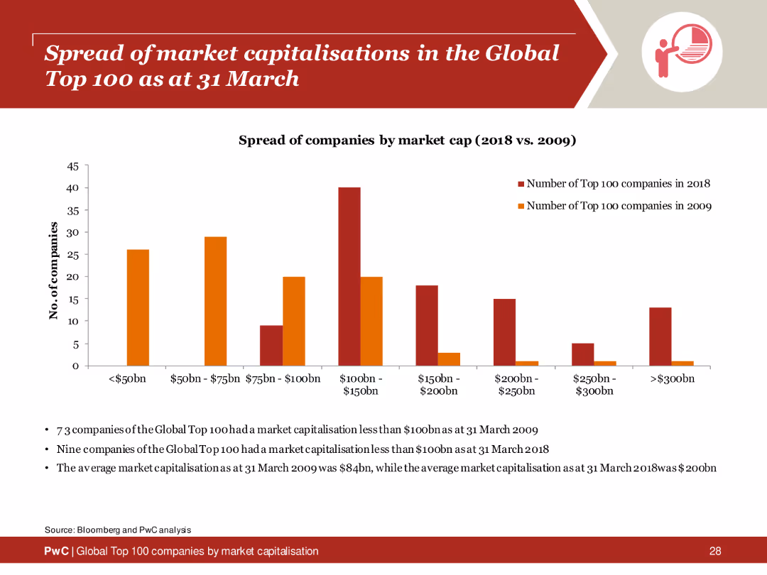
Column chart showing the distribution of market capitalizations of the Global Top 100 companies in 2009 and 2018, with textual analysis below.
Market Analysis and Trends
Financial Services
Comparison of the spread of market capitalizations among the Global Top 100 companies between 2009 and 2018, highlighting growth and changes.
market capitalisation, global top 100, 2009, 2018, spread
false
Market Analysis and Trends
Financial Services
Mixed Chart
PwC/Strategy&
Add to my slides
Remove from favorites
The slide contains a column chart comparing the number of companies by market capitalization ranges. The design is clear with well-defined data segments.
Market Analysis and Trends
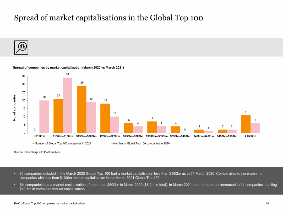
Financial Services
This slide details the distribution of companies within the Global Top 100 based on market capitalization ranges, comparing data from March 2020 to March 2021.
market capitalization, company distribution, financial analysis, 2020-2021, comparative data
false
Market Analysis and Trends
Financial Services
Mixed Chart
PwC/Strategy&
Add to my slides
Remove from favorites
The slide has a column chart comparing the number of companies by market capitalization ranges. The design is clear with well-defined data segments.
Market Analysis and Trends
Financial Services
This slide details the distribution of companies within the Global Top 100 based on market capitalization ranges, comparing data from March 2020 to March 2021.
market capitalization, company distribution, financial analysis, 2020-2021, comparative data
false
Market Analysis and Trends
Financial Services
Mixed Chart
PwC/Strategy&
Add to my slides
Remove from favorites
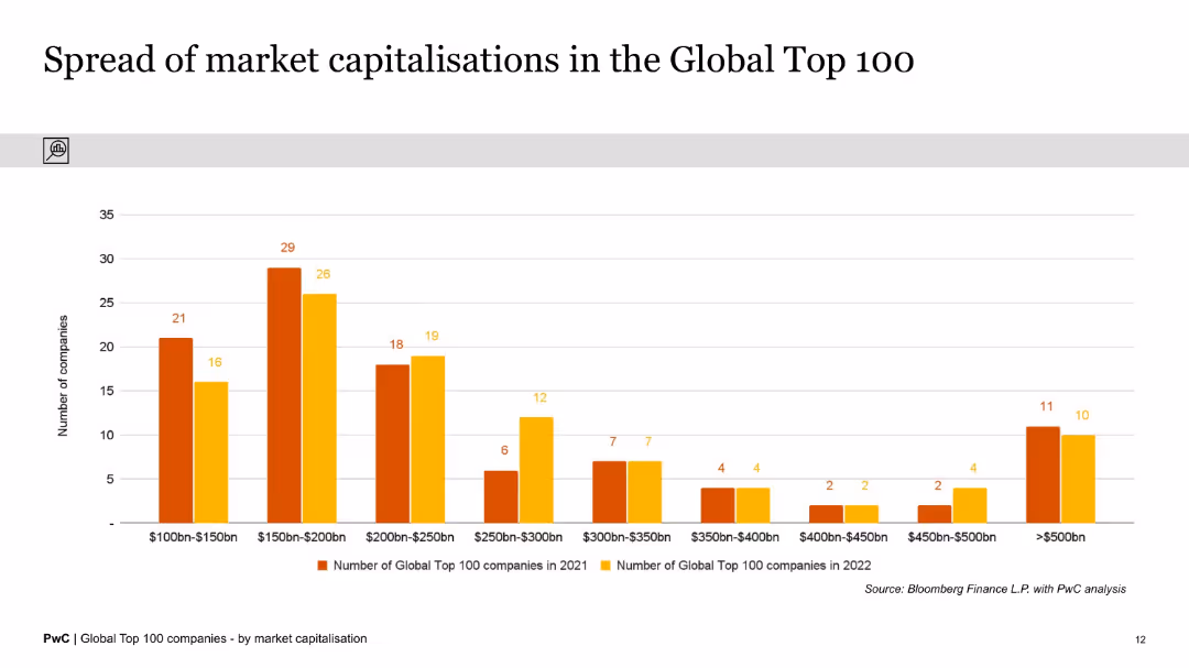
This slide displays a column chart showing the distribution of market capitalizations of the Global Top 100 companies in various ranges from $100bn to over $500bn, comparing the years 2021 and 2022.
Market Analysis and Trends
Financial Services
The slide provides an analysis of the spread of market capitalizations within the Global Top 100 companies, indicating the number of companies within specific market cap ranges and highlighting changes between 2021 and 2022.
Market Capitalization, Distribution, Global Top 100, Financial Analysis, Trends, Column Chart, Comparison, Years, Data Spread, Analysis
false
Market Analysis and Trends
Financial Services
Single Chart
PwC/Strategy&
Add to my slides
Remove from favorites
The slide features a column chart displaying the total market capitalization of the Global Top 100 companies from 2012 to 2022. The chart highlights significant growth over the period, with key CAGR figures noted.
Market Analysis and Trends
Financial Services
This slide illustrates the substantial increase in the total market capitalization of the Global Top 100 companies over a decade, emphasizing a 10-year CAGR of 10% and a 5-year CAGR of 15%. It provides a clear historical growth perspective.
Market Capitalization, Global Top 100, Growth, Historical Data, CAGR, Financial Analysis, Column Chart, Trends, Decade, Performance
false
Market Analysis and Trends
Financial Services
Single Chart
PwC/Strategy&
Add to my slides
Remove from favorites
The slide contains two column charts showing total market capitalization data over the years, with text explanations on the side. The design is clear and data-centric.
Market Analysis and Trends
Financial Services
This slide highlights the market capitalization growth of the top 100 companies from 2010 to 2021, emphasizing the significant increase observed in the recent years.
market capitalization, growth, top companies, data analysis, 2010-2021, financial trends
false
Market Analysis and Trends
Financial Services
Multiple Chart
PwC/Strategy&
Add to my slides
Remove from favorites
Two column charts compare the market capitalization growth between US and China from 2010 to 2019, using flags for country identification and growth multiples noted on lines connecting the columns.
Market Analysis and Trends
Financial Services
This slide compares the growth in market capitalization of the top 10 companies in the US and China over nearly a decade, highlighting significant growth particularly in the US.
market capitalization, growth, US, China, top companies
false
Market Analysis and Trends
Financial Services
Multiple Chart
McKinsey
Add to my slides
Remove from favorites
This slide contains a bar graph showing weighted average year-to-date local currency shareholder returns by industry, with varying bar widths representing market cap sizes. It has a clear title, a source line, and annotations for data points.
Market Analysis and Trends
Financial Services
The slide presents market capitalization trends across various industries, indicating a decline with varying degrees. It serves to compare sectors and provide insights into the economic impact on market values.
Market capitalization, Industry comparison, Shareholder returns, Economic trends, Data analysis
false
Market Analysis and Trends
Financial Services
Single Chart
McKinsey
Add to my slides
Remove from favorites
The slide contains a detailed table listing the market capitalization, number of companies, and ranking of various countries in the Global Top 100 companies by market capitalization from March 2021 to March 2022.
Financial Performance
Financial Services
This slide presents data on the market capitalization and rankings of the top 100 global companies by country, with a focus on the UK's performance, showing an increase in market cap and an improved ranking despite economic challenges.
Market Capitalization, Rankings, Countries, Financial Performance, UK, Global Companies, Economic Analysis, Table, Trends, Growth
false
Financial Performance
Financial Services
Table
PwC/Strategy&
Add to my slides
Remove from favorites
Column charts and text comparison of market capitalization changes in different regions, highlighting Europe's growth against other regions. Each region's performance is detailed with supporting data.
Market Analysis and Trends
Financial Services
Focuses on regional economic performance, particularly Europe's market dynamics, useful for understanding shifts in global market capitalization.
market capitalization, regional analysis, economic growth
false
Market Analysis and Trends
Financial Services
Mixed Chart
PwC/Strategy&
Add to my slides
Remove from favorites
Stacked bar chart showing global market cap by industry sector over time (2010–2024), color-coded by performance tiers.
Market Analysis and Trends
Financial Services
This slide illustrates the evolution of industry market capitalization shares over 15 years. It shows a rise in tech-related sectors and a decline in traditional sectors like banks and oil & gas.
Market Capitalization, Sector Shifts, Long-Term Trends, Tech Growth, Declining Sectors, Equity Markets, Global Trends
false
Market Analysis and Trends
Financial Services
Single Chart
McKinsey
Add to my slides
Remove from favorites
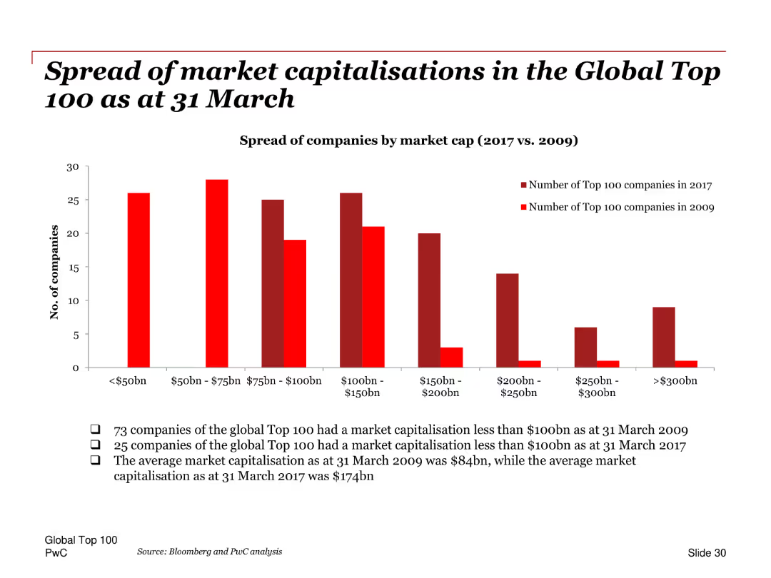
A column chart comparing the number of companies in different market cap ranges (<$50bn, $50bn-$75bn, etc.) for the years 2009 and 2017. Each range is represented by separate columns for each year.
Market Analysis and Trends
Financial Services
This slide compares the spread of market capitalizations among the Global Top 100 companies as of March 31 for the years 2009 and 2017. It provides insights into the distribution of company sizes within the top 100, highlighting shifts in market value categories over time.
Market capitalizations, Global Top 100, 2009, 2017, distribution, company sizes, column chart
false
Market Analysis and Trends
Financial Services
Mixed Chart
PwC/Strategy&
Add to my slides
Remove from favorites
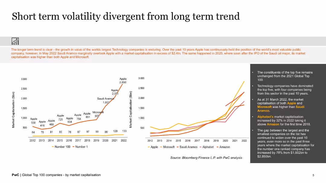
The slide includes line charts and text, showing market capitalization trends of top technology companies and volatility over time.
Market Analysis and Trends
Financial Services
The slide analyzes the market capitalization trends of the largest technology companies, highlighting short-term volatility against long-term growth trends.
market capitalization, technology companies, volatility, trends, analysis, growth
false
Market Analysis and Trends
Financial Services
Multiple Chart
PwC/Strategy&
Add to my slides
Remove from favorites
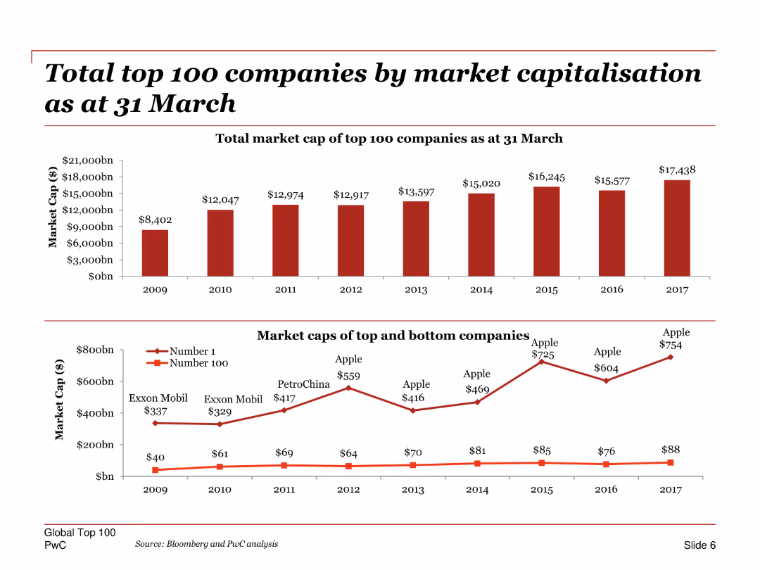
A slide with column charts depicting the market cap of top 100 companies over time and a line chart showing market caps of top and bottom companies.
Market Analysis and Trends
Financial Services
Shows the total market capitalization of the top 100 companies as of March 31 and compares the market caps of the top and bottom companies from 2009 to 2017.
Market capitalization, top 100 companies, column chart, line chart, financial trends, market cap, comparison, historical data
false
Market Analysis and Trends
Financial Services
Multiple Chart
PwC/Strategy&
Add to my slides
Remove from favorites
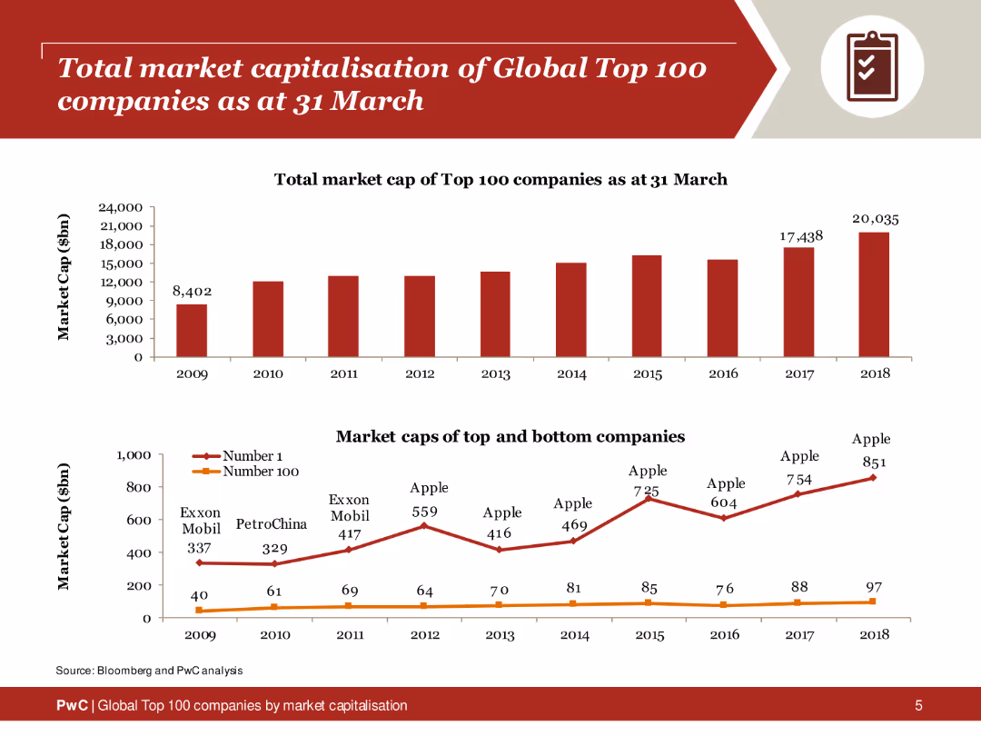
The slide displays two column charts: one showing the total market cap of the top 100 companies from 2009 to 2018, and another comparing the market caps of the top and bottom companies within this group. A red color scheme is used for the charts, with clear labels and data points for each year.
Market Analysis and Trends
Financial Services
This slide presents a detailed analysis of the total market capitalization of the global top 100 companies over a decade. It highlights the growth in market cap and compares the top and bottom companies within this group, providing insights into market trends and the distribution of company values.
Market capitalization, top 100 companies, financial analysis, market trends, column charts
false
Market Analysis and Trends
Financial Services
Multiple Chart
PwC/Strategy&
Add to my slides
Remove from favorites
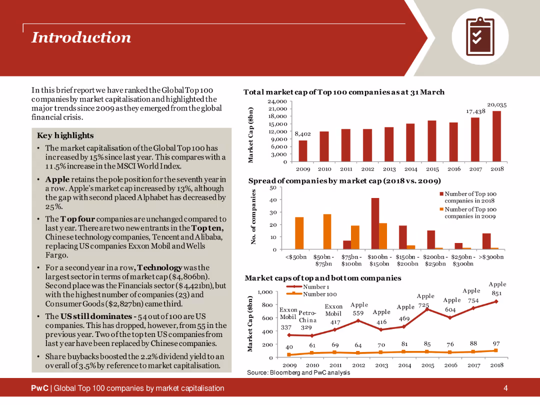
The slide features a title section with key highlights in bullet points. On the right side, several column charts display data about the market capitalization of top companies and the spread of companies by market cap. The slide uses a red and orange color scheme, with icons for quick reference to data points.
Industry Overview
Financial Services
This introductory slide provides an overview of the global top 100 companies by market capitalization. It includes key highlights and trends since 2009, supported by column charts that illustrate changes in market cap and the distribution of companies by market capitalization.
Market capitalization, top companies, industry overview, financial trends, column charts, key highlights
false
Industry Overview
Financial Services
Multiple Chart
PwC/Strategy&
Add to my slides
Remove from favorites
This slide uses two bar charts to show market cap values in 2010 versus 2019 for companies in the US and China, with a percentage of tech companies noted.
Competitive Landscape
Technology & Software
Analyzing the shift in market capitalization among top companies in the US and China from 2010 to 2019, the slide indicates a significant increase in the proportion of tech companies.
market cap, tech companies, US, China, 2010 vs 2019
false
Competitive Landscape
Technology & Software
Multiple Chart
McKinsey
Add to my slides
Remove from favorites
Featuring two bar charts comparing the decline in market cap for tech and non-tech segments in the S&P500 and the equity capital distribution in global buyout deals, categorized by industry sectors with a significant red section representing technology, specifically software and hardware.
Market Analysis and Trends
Financial Services
This slide highlights the discrepancy in tech sector representation between public markets and private equity portfolios, pertinent to strategic discussions on portfolio composition and market exposure.
Market Cap, Tech Sector, Non-Tech, Private Equity, Public Markets, Portfolio Composition
false
Market Analysis and Trends
Financial Services
Multiple Chart
Bain
Add to my slides
Remove from favorites
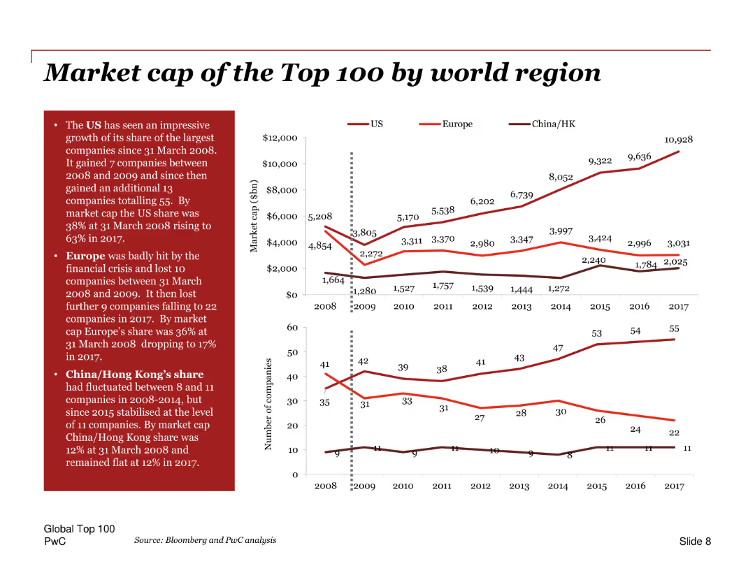
Line charts showing the market cap of top 100 companies by region over time, with annotations and comparison of the US, Europe, and China/Hong Kong.
Market Analysis and Trends
Financial Services
Analyzes the market capitalization of the top 100 companies by region, highlighting the growth in the US share, the impact of the financial crisis on Europe, and trends in China/Hong Kong.
Market cap, top 100, regions, US, Europe, China, financial crisis, growth, trends, comparison
false
Market Analysis and Trends
Financial Services
Multiple Chart
PwC/Strategy&
Add to my slides
Remove from favorites
Features a column chart displaying changes in planned premiums and exposure for 2019 versus 2018 across multiple insurance lines, highlighted with color differentiation.
Risk Assessment and Management
Financial Services
Outlines expected changes in insurance market exposures and premiums, especially highlighting significant reductions in Aviation. Gives insights into strategic adjustments for the year ahead.
market changes, insurance premiums, 2019 forecasts, aviation, exposure
false
Risk Assessment and Management
Financial Services
Single Chart
PwC/Strategy&
Add to my slides
Remove from favorites
A slide with vertical column charts analyzing the market share by different retail channels from 2014 to 2019, including online, department stores, and specialty stores.
Market Analysis and Trends
Consumer Goods
Focuses on the growth trends in the luxury goods market through various sales channels, emphasizing the rise of online sales.
Market channels, Growth trends, Online sales
false
Market Analysis and Trends
Consumer Goods
Multiple Chart
Bain
Add to my slides
Remove from favorites
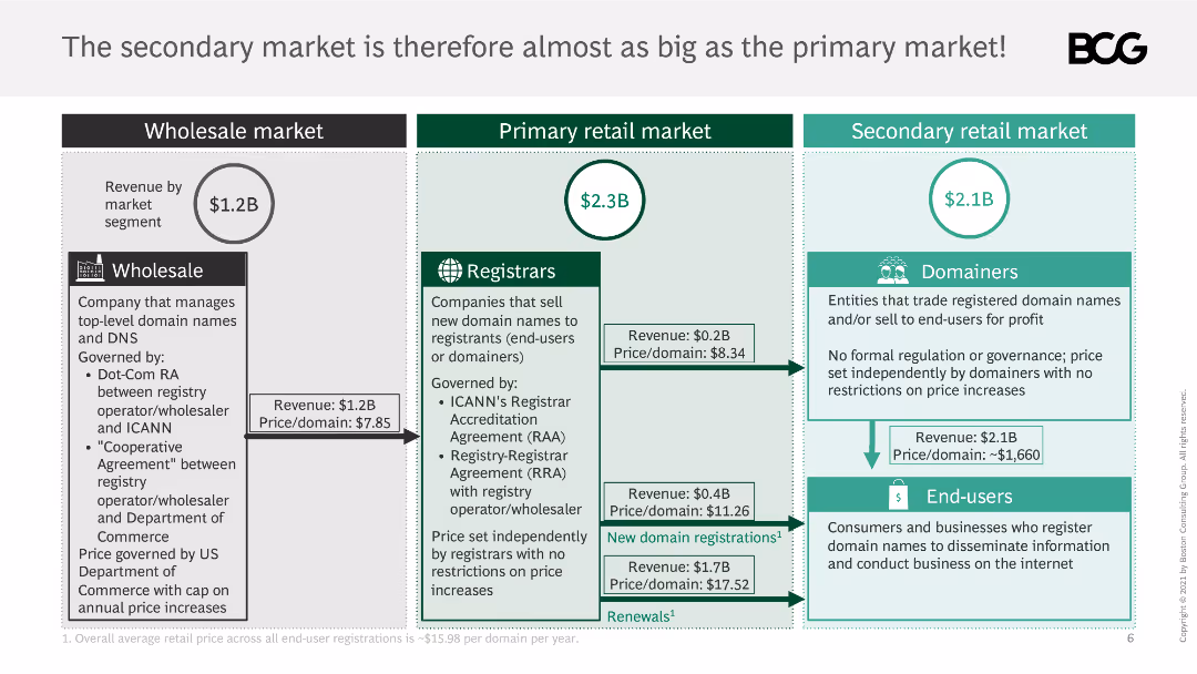
This slide uses a combination of text boxes and flowcharts to compare the wholesale, primary retail, and secondary retail markets, with revenue and price per domain details.
Market Analysis and Trends
Retail & E-commerce
It compares the size of the secondary market to the primary market, detailing revenue and price per domain, and explaining market governance and pricing mechanisms.
market comparison, wholesale, primary retail, secondary retail, revenue, price per domain
false
Market Analysis and Trends
Retail & E-commerce
Table
BCG
Add to my slides
Remove from favorites
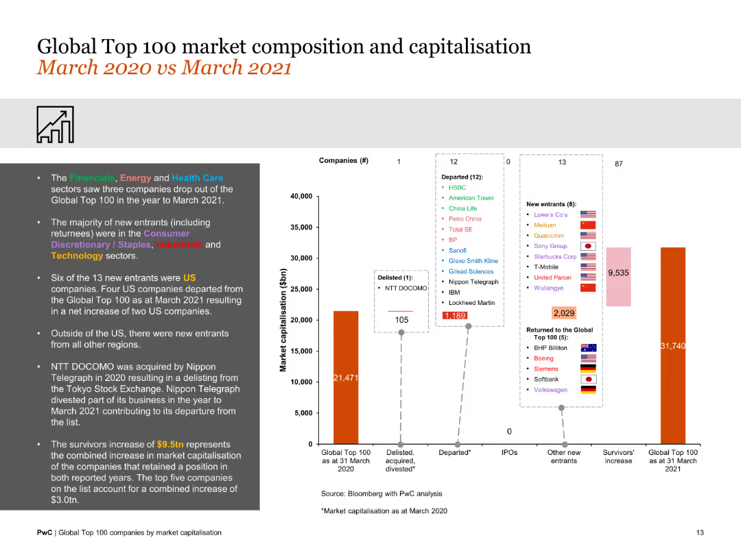
Features a column chart and lists of companies showing changes in market composition and capitalization. The slide is moderately dense with visual and textual data.
Market Analysis and Trends
Financial Services
This slide compares the market composition and capitalization changes of the top 100 companies between March 2020 and March 2021, noting new entrants and exits.
market composition, 2020-2021, new entrants, exits, capitalization changes, financial comparison
false
Market Analysis and Trends
Financial Services
Mixed Chart
PwC/Strategy&
Add to my slides
Remove from favorites
The slide contains a column chart showing market concentration levels across different access modes, including direct, search, and social media referrals. Annotations explain the concentration differences across access modes.
Market Analysis and Trends
Telecommunications
This slide examines market concentration levels (HHI) by access mode, comparing direct traffic with traffic referred by search engines, social media, and other channels, highlighting the concentration patterns in the media market.
Market Concentration, Access Mode, HHI, Column Chart, Media Market
false
Market Analysis and Trends
Telecommunications
Mixed Chart
IPSOS
Add to my slides
Remove from favorites
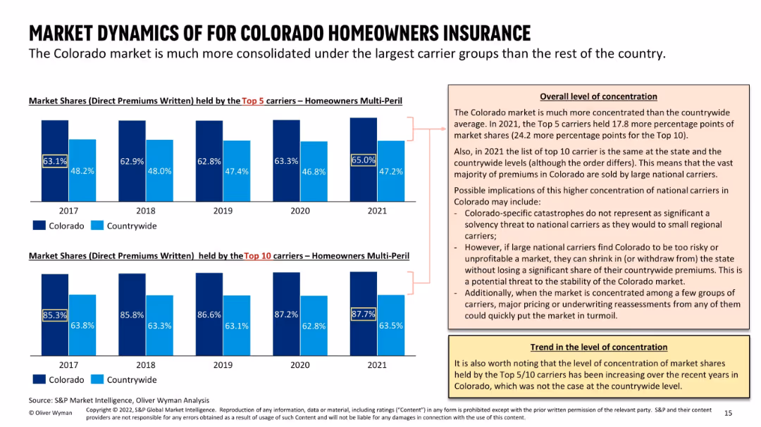
Dual bar charts comparing Colorado vs countrywide market share of top 5 and top 10 carriers (2017–2021); two callout boxes explain implications and trends; consistent dark/light blue coloring.
Market Analysis and Trends
Financial Services
The slide demonstrates a highly consolidated homeowners insurance market in Colorado, where top 5/10 carriers dominate more than the national average. This concentration raises potential volatility if major carriers shift their strategies. The analysis flags implications for market stability and strategic exposure for national carriers operating in the state.
market concentration, carrier share, homeowners insurance, Colorado, top 10 carriers, national vs state, volatility, strategic withdrawal
false
Market Analysis and Trends
Financial Services
Multiple Chart
Oliver Wyman
Add to my slides
Remove from favorites
Includes line charts and a bar chart comparing the performance, valuation, and earnings contribution of the top 10 stocks in the S&P 500.
Market Analysis and Trends
Financial Services
It discusses investor concerns regarding market concentration, focusing on the performance and valuation of top S&P 500 stocks.
market concentration, S&P 500, stock performance, valuation, earnings contribution
false
Market Analysis and Trends
Financial Services
Multiple Chart
JP Morgan
Add to my slides
Remove from favorites
This slide features a combination chart with a column chart for sales growth percentage (gray) and a line chart for sales and new listings forecast (blue and gray).
Market Analysis and Trends
Real Estate & Construction
The slide provides forecasts and historical data on market conditions, indicating tightening trends in sales and new listings, and highlighting key market dynamics for 2021.
market conditions, 2021 forecast, sales growth, column chart, line chart
false
Market Analysis and Trends
Real Estate & Construction
Multiple Chart
IPSOS
Add to my slides
Remove from favorites
The slide includes a column chart comparing annual sales and new listings growth by home type.
Market Analysis and Trends
Real Estate & Construction
It discusses the differing impacts on various housing segments, showing data on sales and new listings growth or decline.
Market conditions, housing segments, sales, new listings, growth, decline, comparison, data, analysis, column chart
false
Market Analysis and Trends
Real Estate & Construction
Single Chart
IPSOS
Add to my slides
Remove from favorites
The slide includes multiple vertical column charts showing underlying profit/loss before tax across various business units in Q3 2023.
Financial Performance
Financial Services
This slide presents the financial performance of different business units, emphasizing progress despite market challenges.
market conditions, profit, loss, business units, financial performance
false
Financial Performance
Financial Services
Mixed Chart
UBS
Add to my slides
Remove from favorites
Line graph illustrating the loss ratio progression for cargo accounts from 2014 to Q2 2018.
Market Analysis and Trends
Financial Services
Evaluates the impact of soft market conditions on Lloyd's reserve strength, specifically for cargo lines, detailing how optimism in business planning affects financial results.
Market, Conditions, Reserves, Impact, Cargo
false
Market Analysis and Trends
Financial Services
Single Chart
PwC/Strategy&
Add to my slides
Remove from favorites
Features a Venn diagram illustrating the crossover between fashion and sportswear, supplemented by a pyramid graph showing market segments.
Strategic Planning
Consumer Goods
Discusses the blending of fashion and sportswear into a singular lifestyle market, exploring the dynamics of cross-segment competition.
market convergence, fashion, sportswear, lifestyle trends, competitive analysis
false
Strategic Planning
Consumer Goods
Mixed Chart
Bain
Add to my slides
Remove from favorites
The slide includes lists and icons categorizing main demand areas and suppliers, complemented by descriptive texts. The layout is clean, with well-sectioned content.
Market Analysis and Trends
Environmental Services & Sustainability
Describes key demand areas and main suppliers in the European EO market, highlighting the role of SMEs. This slide is useful for identifying major market players and understanding demand dynamics in defense, energy, and natural resources sectors.
market demand, suppliers, SMEs, defense, energy, resources
false
Market Analysis and Trends
Environmental Services & Sustainability
Mixed Chart
PwC/Strategy&
Add to my slides
Remove from favorites
The slide contains a matrix and a column chart. The matrix shows the index returns for large, mid, and small caps across value, core, and growth categories for the first quarter of 2024. The column chart shows sector returns for the S&P 500 index over the same period.
Market Analysis and Trends
Financial Services
Provides an overview of the market environment, including index returns by market cap and style, as well as sector performance within the S&P 500 for the first quarter of 2024.
market environment, index returns, sector performance, S&P 500, first quarter
false
Market Analysis and Trends
Financial Services
Multiple Chart
JP Morgan
Add to my slides
Remove from favorites
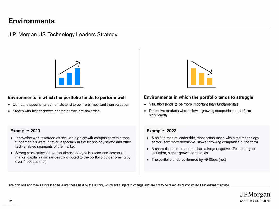
Split into two columns: favorable vs. unfavorable environments for portfolio performance. Icons show upward/downward trends. Includes examples from 2020 and 2022. Clean text-heavy layout with large headings and bullets.
Risk Assessment and Management
Financial Services
The slide outlines market conditions where the J.P. Morgan US Technology Leaders Strategy tends to perform well or struggle. Favorable environments reward high-growth stocks and fundamentals, while struggles arise in valuation-driven or defensive markets. Examples from 2020 (strong outperformance) and 2022 (significant underperformance) offer historical context for risk sensitivity.
market environment, portfolio performance, risk, valuation, fundamentals, J.P. Morgan, 2020, 2022, strategy performance, tech investing
false
Risk Assessment and Management
Financial Services
Pillar
JP Morgan
Add to my slides
Remove from favorites
Shows various graphs and charts detailing the segmentation of the European Earth Observation market over time.
Market Analysis and Trends
Technology & Software
Examines the changes and strategies within the European Earth Observation market, focusing on large satellite segments.
Market evolution, strategy, European EO market, satellite segmentation
false
Market Analysis and Trends
Technology & Software
Multiple Chart
PwC/Strategy&
Add to my slides
Remove from favorites
Contains a map of the U.S. highlighting market expansion, two column charts contrasting new account openings and deposit balances by source, and explanatory text.
Market Analysis and Trends
Financial Services
Highlights the expansion and market penetration strategies of a financial service provider, showing early results in new markets and overall growth in customer balances.
Market Expansion, Banking, New Accounts, Customer Balances, Growth Strategy
false
Market Analysis and Trends
Financial Services
Multiple Chart
JP Morgan
Add to my slides
Remove from favorites
This slide emphasizes expansion strategy with bullet points detailing market attractiveness, cross-LOB customers, omni-channel strategy, and smart footprint, alongside a column chart showing an increase in U.S. customer footprint from 69% to 93%. The layout is clean, with the chart on the right and the bullet points arranged on the left for easy comparison and reference.
Market Analysis and Trends
Financial Services
It explains the bank's strategic approach to market expansion and its effective implementation, as evidenced by growth in U.S. customer reach. It may be used to discuss market development strategies and the rationale behind successful expansions.
market expansion, customer base, strategy, omni-channel
false
Market Analysis and Trends
Financial Services
Mixed Chart
JP Morgan
Add to my slides
Remove from favorites
Previous
Next
You don't have any favorites yet.
Please wait loading your favorites slides...
Create a FREE account to continue browsing
Receive Instant Access to 1,000+ slides from companies like McKinsey, Google, and Goldman Sachs
First Name
Last Name
Email
Password
I agree to all
Terms & Privacy Policy
Thank you! Your submission has been received!
Oops! Something went wrong while submitting the form.
Have an account?
Sign in
Upgrade to PRO to Save slides
Advanced Search and Filters
Access to 15,000+ slides
Access to Category Pages
Save/Bookmark Slides
PowerPoint Template Library
Pick a Plan
MONTHLY
$12/month
Billed every month, Cancel anytime.
YEARLY
$9/year
Billed $108 annually, Cancel anytime.
Checkout for $12/month
Checkout for $108/yr
Secured by Stripe | AES-256 bit encryption


![The margin deterioration is visible across all domains, with tires and electronics/infotainment being the most stable Key supplier performance indicators by product focus [%]](https://cdn.prod.website-files.com/654e70fb59937215cac87b19/680b5328121d10e37464cdd2_oSwk6Mev3dD8Aq_2CtvtPs6DwAZrSOSCbdkel5D86PI.avif)