My Account
My Slides
Search by Category
Pricing
Templates
View All Templates
Download Template Slides
✦ AI Search
Feedback
Login
Logout
Get Started
Browse all Slides
Browse all Slides
Create a FREE Account
Instant access to 1,000+ real slides from top companies like McKinsey, BCG, Goldman Sachs, Google and many more!
First Name
Last Name
Email
Password
I agree to all
Terms & Privacy Policy
Thank you! Your submission has been received!
Oops! Something went wrong while submitting the form.
Have an account?
Sign in
Saved Slides
Total No. of slides saved
0
↻ Refresh
✖ Clear all
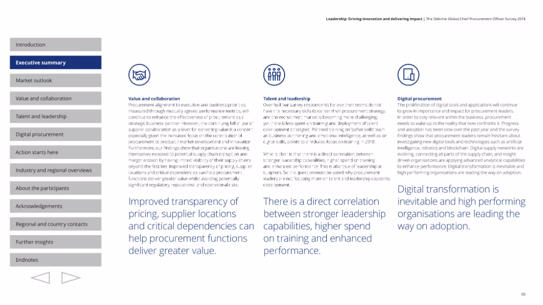
A grid illustrating strategic business areas with adjacent opportunities, indicating expansion directions with arrows.
Strategic Planning
Financial Services
Explores expansion strategies by leveraging synergies between existing and new business areas, essential for strategic market expansion discussions.
Market Expansion, Strategic Adjacencies, Business Development, Growth, Addressable Market
false
Strategic Planning
Financial Services
Framework
Goldman Sachs
Add to my slides
Remove from favorites
The slide uses a combination of column charts and text to compare historical growth, COVID-19 impact, recovery, and long-term growth outlook from different sources like market participant interviews and end-user surveys.
Market Analysis and Trends
Energy & Utilities
The slide presents an analysis of the lighting solutions market forecast using data from market participant interviews, end-user surveys, and secondary research. It highlights growth trends and the impact of COVID-19 on the market.
Market forecast, growth outlook, COVID-19 impact, sources, lighting solutions
false
Market Analysis and Trends
Energy & Utilities
Multiple Chart
EY
Add to my slides
Remove from favorites
This slide features a column chart showing projections for the personal luxury goods market from 2016 through 2020, with emphasis on yearly growth rates and key demographic drivers like the Chinese middle class. The background and charts utilize shades of gray and red with circular highlight elements.
Market Analysis and Trends
Consumer Goods
Projects growth in the personal luxury goods market, focusing on demographic trends and economic recovery. It forecasts a consistent annual growth rate, emphasizing the role of emerging markets and generational changes in driving future market expansions.
market forecast, growth rate, luxury goods, economic recovery
false
Market Analysis and Trends
Consumer Goods
Single Chart
Bain
Add to my slides
Remove from favorites
This slide presents a forward-looking column chart forecasting the growth of the personal luxury goods market from 2018 to 2025, highlighting potential market drivers.
Market Analysis and Trends
Consumer Goods
Forecasts the growth of the personal luxury goods market, discussing underlying economic fundamentals and potential challenges. Useful for long-term strategic planning.
market forecast, luxury goods, economic fundamentals, growth potential, strategic planning
false
Market Analysis and Trends
Consumer Goods
Mixed Chart
Bain
Add to my slides
Remove from favorites
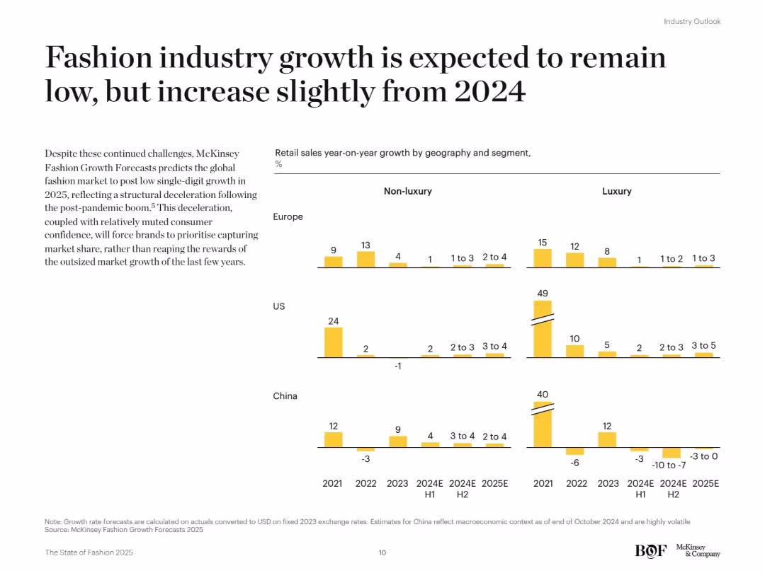
Grid of bar charts by region (Europe, US, China) and segment (luxury vs. non-luxury), visualizing year-on-year sales growth from 2021 to 2025E. Yellow color scheme with side text explanation.
Market Analysis and Trends
Consumer Goods
This slide presents McKinsey forecasts indicating a slow recovery in fashion industry growth post-pandemic, with low single-digit increases expected in 2025. The data is broken down by geography and luxury vs. non-luxury segments, highlighting regional disparities.
market forecast, retail growth, luxury vs non-luxury, regional trends, fashion industry, year-on-year growth
false
Market Analysis and Trends
Consumer Goods
Mixed Chart
McKinsey
Add to my slides
Remove from favorites
Combines a column chart with the forecasted market size and textual annotations detailing strategic imperatives for the luxury goods sector.
Strategic Planning
Retail & E-commerce
Forecasts the luxury goods market and outlines strategic mantras focused on proactive customer engagement and leveraging technology.
market forecast, strategic planning, luxury goods, technology integration, customer engagement
false
Strategic Planning
Retail & E-commerce
Mixed Chart
Bain
Add to my slides
Remove from favorites
This slide features multiple line charts tracking performance forecasts across three categories: passenger cars/light trucks, trucks, and specialties. Each chart includes two lines representing the years 2022 and 2023 with shaded areas between them, illustrating projections and past performance. Icons represent each category and textual annotations provide additional context and previous forecast comparisons.
Market Analysis and Trends
Transportation & Logistics
The slide presents a market scenario for fiscal year 2023, with slight improvements in passenger cars/light trucks and ongoing destocking in trucks. It includes a detailed analysis of trends in various sub-categories of the tire industry such as mining, aircraft, and two-wheel tires. It aims to provide an updated market outlook and forecast changes, suggesting industry trends and market conditions.
market, forecast, tires, performance, trend, passenger, truck, specialty, projections, destocking
false
Market Analysis and Trends
Transportation & Logistics
Multiple Chart
Morgan Stanley
Add to my slides
Remove from favorites
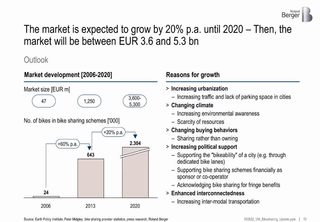
Bar chart with historic and forecasted bike counts; text panel on right lists growth drivers; blue circular callouts for market size
Strategic Planning
Transportation & Logistics
The bike-sharing market is projected to grow significantly due to urbanization, climate concerns, changing buying behaviors, political support, and improved interconnectivity. Forecast puts 2020 market size between EUR 3.6–5.3 billion.
market growth, bike sharing, urbanization, sustainability, investment, climate, public policy
false
Strategic Planning
Transportation & Logistics
Mixed Chart
Roland Berger
Add to my slides
Remove from favorites
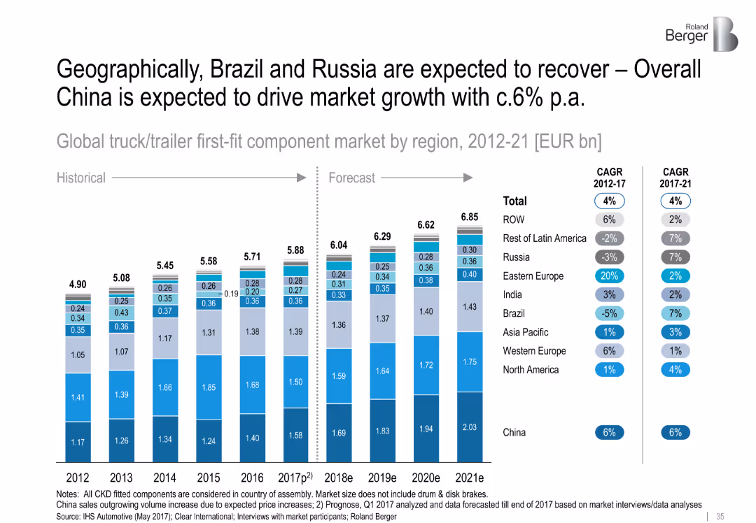
Stacked column chart (historical and forecasted market sizes by region); CAGR annotations on the side
Market Analysis and Trends
Transportation & Logistics
Forecasts the growth of the global truck/trailer first-fit component market from 2012 to 2021. China is the dominant growth driver with ~6% CAGR, while Brazil and Russia show signs of recovery post-2017. Western Europe and ROW also contribute moderately.
market growth, China, Brazil, Russia, CAGR, truck/trailer components, global forecast, regional performance
false
Market Analysis and Trends
Transportation & Logistics
Single Chart
Roland Berger
Add to my slides
Remove from favorites
The slide is segmented into different sections with icons representing various end-markets, activities, and growth drivers. It provides insights into market growth prospects through 2022-2027 for different segments within the engineered fabrics and films industry.
Market Analysis and Trends
Industrial & Manufacturing
Analyzing the potential for market growth in various sectors related to engineered fabrics and films, this slide indicates where high-growth opportunities exist, guiding strategic planning for companies in these markets. It's tailored for executives and strategists focused on expanding their market reach.
market growth, end-markets, strategic planning, growth drivers
false
Market Analysis and Trends
Industrial & Manufacturing
Table
Morgan Stanley
Add to my slides
Remove from favorites
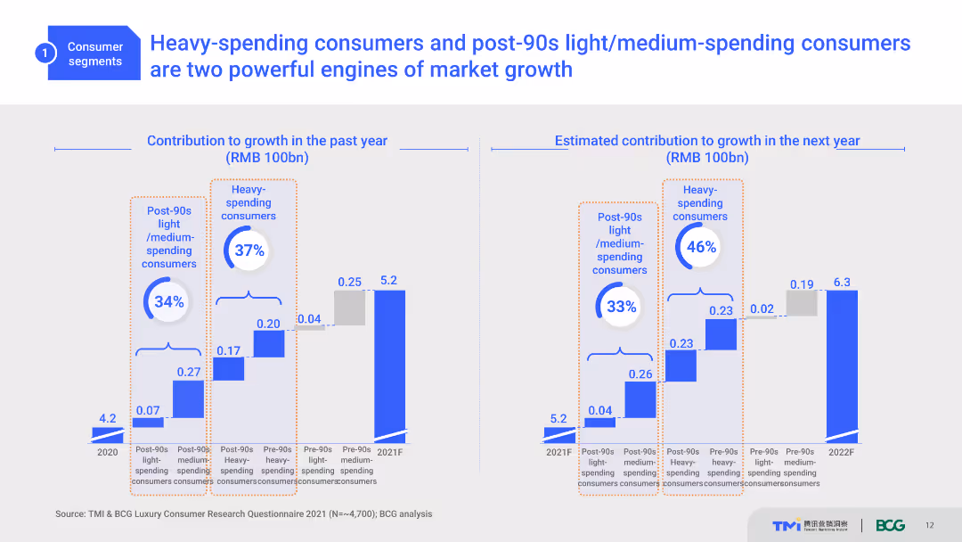
Two column charts compare the contribution to growth in the past year and estimated contribution for the next year by different consumer groups. Blue and orange colors highlight key data points.
Market Analysis and Trends
Consumer Goods
This slide analyzes the contributions of heavy-spending and post-90s light/medium-spending consumers to market growth, both past and projected future contributions.
Market Growth, Heavy-spending, Light-spending, Projections, Consumer Analysis
false
Market Analysis and Trends
Consumer Goods
Multiple Chart
BCG
Add to my slides
Remove from favorites
Includes a line graph and a pie chart showing market share and revenue mix with institutional and corporate clients from 2014 to 2018.
Financial Performance
Financial Services
Analyzes JP Morgan's market share growth with institutional and corporate clients, showing sustained growth and client diversity.
market growth, institutional clients, corporate clients, revenue
false
Financial Performance
Financial Services
Multiple Chart
JP Morgan
Add to my slides
Remove from favorites
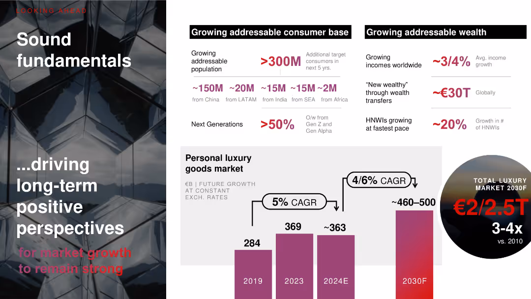
Dual panel layout with dark mirrored background (left) and white content zone (right); includes bar chart and macro indicators.
Market Analysis and Trends
Consumer Goods
Illustrates strong future growth prospects in luxury goods market, driven by demographic expansion (300M+ consumers) and wealth transfers. Personal luxury market expected to reach €460–500B by 2030 with 4–6% CAGR.
market growth, luxury, CAGR, consumer base, Gen Z, HNWIs, demographics, income
false
Market Analysis and Trends
Consumer Goods
Mixed Chart
Bain
Add to my slides
Remove from favorites
This slide features column charts representing market predictions for luxury goods from 2019 to 2025, broken down by nationality, region, and consumer generation. Colors vary to differentiate the data points.
Investment Analysis
Consumer Goods
Projecting the market growth for luxury goods through 2025, this slide provides detailed insights into how different consumer bases—like Chinese buyers and online platforms—will predominantly influence market trends. It offers a granular breakdown of growth expectations by consumer demographics and purchasing channels.
market growth, luxury goods, 2025 forecast, consumer demographics, online sales
false
Investment Analysis
Consumer Goods
Multiple Chart
Bain
Add to my slides
Remove from favorites
Features multiple column charts and tables. Charts compare luxury market growth by geography and consumer nationality from 2017 to 2018 with color coding for different regions.
Market Analysis and Trends
Retail & E-commerce
Analyzes the luxury goods market growth in 2018, highlighting the contributions from various geographies and consumer nationalities. It points to significant growth led by Chinese consumers.
Market Growth, Luxury Goods, Geography, Consumer, 2018
false
Market Analysis and Trends
Retail & E-commerce
Multiple Chart
Bain
Add to my slides
Remove from favorites
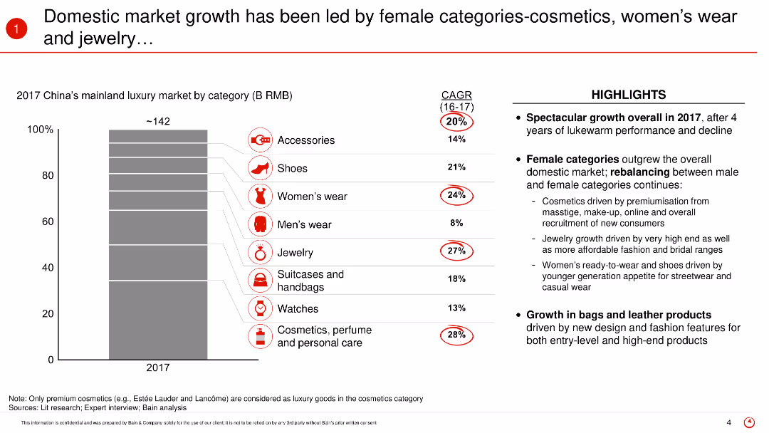
The slide contains a vertical bar (column) chart showing the market share of various luxury categories in 2017. It uses icons and text to highlight the categories led by female consumers and the respective compound annual growth rates (CAGR).
Market Analysis and Trends
Retail & E-commerce
The slide highlights the significant growth in China's luxury market driven by female categories such as cosmetics, women’s wear, and jewelry in 2017. It showcases the compound annual growth rates of these categories and emphasizes the shift in market dynamics towards female-led consumption.
Market growth, luxury market, female consumers, cosmetics, women’s wear, jewelry, China, 2017, market dynamics, CAGR
false
Market Analysis and Trends
Retail & E-commerce
Mixed Chart
Bain
Add to my slides
Remove from favorites
A column chart compare the year-on-year growth of different luxury product categories like shoes, jewelry, and beauty products.
Market Analysis and Trends
Retail & E-commerce
Examines the specific categories driving growth in the luxury market in 2018, highlighting the success of accessories and beauty products.
market growth, luxury products, beauty industry, accessories, sales analysis
false
Market Analysis and Trends
Retail & E-commerce
Mixed Chart
Bain
Add to my slides
Remove from favorites
The visual complexity is moderate, presenting a bar chart and growth drivers in an informative and visually accessible manner. The layout is balanced between graphical data representation and explanatory text.
Technology and Digital Transformation
Industrial & Manufacturing
This slide illustrates the projected market growth of the global process automation industry and its concentration in key sectors. It highlights the structural growth drivers, providing a strategic outlook on the market for the audience.
Market growth, Process automation, Sector analysis, Growth drivers
false
Technology and Digital Transformation
Industrial & Manufacturing
Multiple Chart
LEK
Add to my slides
Remove from favorites
Slide with three sets of column charts displaying deposit share growth in different cities. Each set is complemented by corresponding branch share and deposit growth statistics.
Market Analysis and Trends
Financial Services
Examines regional market growth by comparing deposit shares and branch expansion in Los Angeles, Atlanta, and Boston, showcasing the bank's adaptability and market penetration.
market growth, regional strategy, banking, deposit share, branch expansion, Los Angeles, Atlanta, Boston, financial services, market penetration
false
Market Analysis and Trends
Financial Services
Multiple Chart
JP Morgan
Add to my slides
Remove from favorites
This slide contains a column chart for Equities market share and industry wallet, a stacked column chart for FICC, and a comparative market share bar chart alongside a not-to-scale Marginal ROE chart for Equities and FICC.
Market Analysis and Trends
Financial Services
Tailored for market analysts and investors, this slide reviews the market business’s growth and returns, particularly in Equities and FICC, offering insights into market share increases and investment returns, pertinent for financial strategy development.
market growth, returns, Equities, FICC, market share, investment, financial strategy
false
Market Analysis and Trends
Financial Services
Multiple Chart
JP Morgan
Add to my slides
Remove from favorites
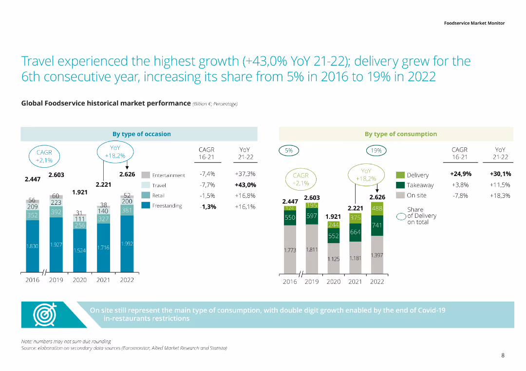
The slide includes a column chart and a bar chart displaying historical market performance by type of occasion and type of consumption from 2016 to 2022. The chart uses different colors to distinguish categories and percentages.
Market Analysis and Trends
Hospitality & Tourism
The slide shows the growth of the travel sector and delivery services within the global foodservice market. It details the historical market performance and consumption trends, highlighting significant growth areas from 2016 to 2022.
Market growth, travel, delivery, consumption trends, foodservice market
false
Market Analysis and Trends
Hospitality & Tourism
Multiple Chart
Deloitte
Add to my slides
Remove from favorites
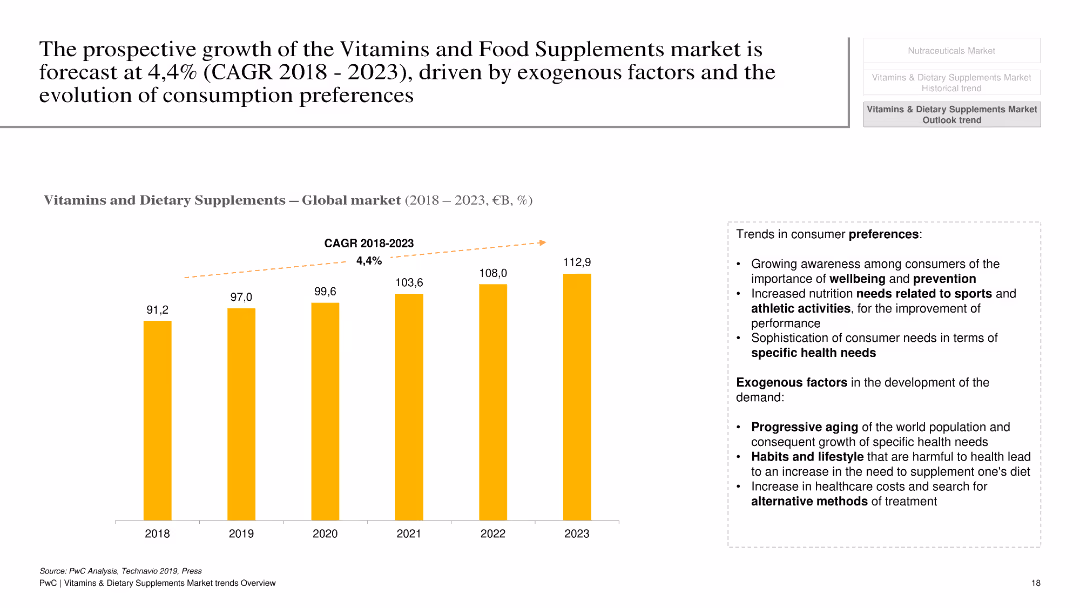
This slide contains a column chart showing the global market growth of vitamins and dietary supplements from 2018 to 2023, with a projected CAGR of 4.4%. Additional bullet points on the right side summarize trends in consumer preferences and exogenous factors affecting demand.
Market Analysis and Trends
Healthcare & Pharmaceuticals
The slide projects the growth of the global vitamins and dietary supplements market, highlighting key trends driving this growth, such as increasing awareness of well-being, sports nutrition needs, and demographic changes. It provides a forecast and insights into market dynamics and consumer preferences.
market growth, vitamins, dietary supplements, consumer trends, CAGR, global market
false
Market Analysis and Trends
Healthcare & Pharmaceuticals
Mixed Chart
PwC/Strategy&
Add to my slides
Remove from favorites
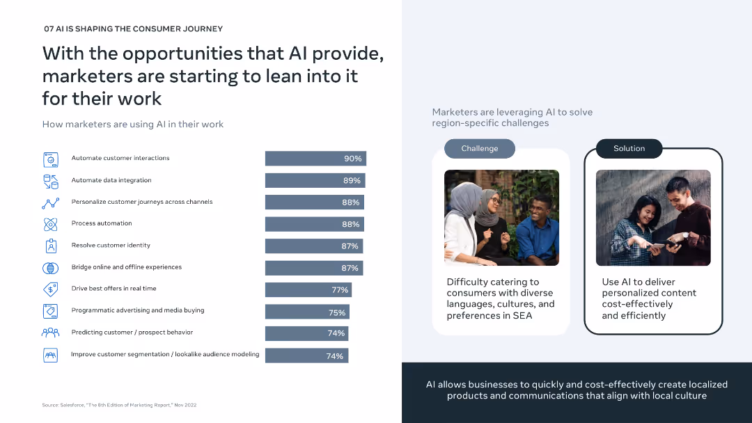
Left: horizontal bar chart of top AI marketing uses; Right: challenge-solution layout with visuals showing cultural relevance; minimalistic design.
Technology and Digital Transformation
Artificial Intelligence
Focuses on how marketers are adopting AI to solve regional challenges in SEA. Major uses include automating interactions, integrating data, and personalizing customer journeys. AI helps address the complexity of cultural and linguistic diversity in a scalable, cost-effective way.
marketing AI, personalization, automation, cultural relevance, SEA
false
Technology and Digital Transformation
Artificial Intelligence
Mixed Chart
Bain
Add to my slides
Remove from favorites
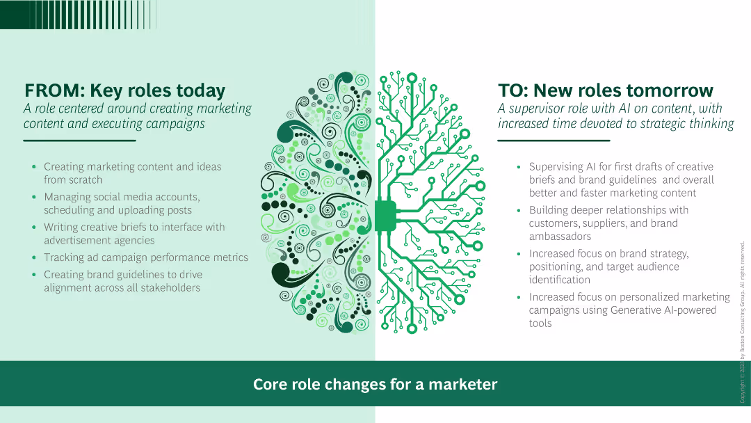
Side-by-side comparison with text explaining the current roles on the left and future roles with AI on the right. Visuals include icons and a central illustration of a brain.
Human Resources and Talent Management
Professional Services
Shows the evolution of marketing roles with the adoption of AI, emphasizing the shift from content creation to supervisory roles.
marketing, AI, role evolution, content creation, supervisory roles
false
Human Resources and Talent Management
Professional Services
Boxed
BCG
Add to my slides
Remove from favorites
Slide with multiple bar charts comparing sectors.
Financial Performance
Technology & Software
Compares marketing analytics spending across different firm sizes and industry sectors, highlighting the variations in budget allocation.
Marketing, Analytics, Budget, Comparison, Industry Sectors, Firm Size, Bar Charts, Allocation, Spending
false
Financial Performance
Technology & Software
Multiple Chart
Deloitte
Add to my slides
Remove from favorites
Contains a line graph showing trends over time.
Financial Performance
Technology & Software
Shows historical data and future projections on marketing analytics spending, emphasizing its growth within the marketing budget.
Marketing, Analytics, Budget, Trends, Projection, Line Graph, Spending Growth, Future, Historical Data
false
Financial Performance
Technology & Software
Single Chart
Deloitte
Add to my slides
Remove from favorites
Displays column charts comparing the importance of analytical versus creative skills among marketing leaders.
Operational Efficiency
Professional Services
Analyzes trends in the prioritization of analytical skills over creative expertise in marketing, driven by data-intense market demands.
marketing, analytics, creative, skills, leadership, technology, efficiency
false
Operational Efficiency
Professional Services
Mixed Chart
Deloitte
Add to my slides
Remove from favorites
Slide contains multiple bar charts detailing sector data.
Strategic Planning
Technology & Software
Analyzes the adoption of marketing analytics in decision-making across various sectors, showing differences in usage percentages.
Marketing, Analytics, Decision Making, Sectors, Usage, Bar Charts, Company Use, Adoption, Sector Differences
false
Strategic Planning
Technology & Software
Multiple Chart
Deloitte
Add to my slides
Remove from favorites
Features a line graph and small text sections for insights.
Strategic Planning
Technology & Software
Discusses the increasing use of marketing analytics in decision-making processes, with data points over time and projected trends.
Marketing, Analytics, Decision Making, Trends, Projection, Line Graph, Use, Strategic Planning, Data Points
false
Strategic Planning
Technology & Software
Mixed Chart
Deloitte
Add to my slides
Remove from favorites
Includes a line graph and summary text.
Performance Metrics and KPIs
Technology & Software
Reviews the perceived impact of marketing analytics on company performance, with a focus on improvements over time and future potential.
Marketing, Analytics, Performance, Improvement, Impact, Company, Future Potential, Line Graph, Perceived Impact
false
Performance Metrics and KPIs
Technology & Software
Mixed Chart
Deloitte
Add to my slides
Remove from favorites
Features bar charts showing performance metrics.
Performance Metrics and KPIs
Technology & Software
Evaluates how different sectors perceive the impact of marketing analytics on performance, with specific metrics highlighted.
Marketing, Analytics, Performance, Sectors, Metrics, Bar Charts, Evaluation, Impact, Sector Differences
false
Performance Metrics and KPIs
Technology & Software
Multiple Chart
Deloitte
Add to my slides
Remove from favorites
Slide includes an area chart showing marketing budget allocation over time with a prediction for the future. Title and data points are clearly labeled.
Market Analysis and Trends
Professional Services
This slide analyzes marketing budget trends targeting China, illustrating past allocations and future predictions, useful for strategy planning in technology and financial sectors.
marketing, budget, China, prediction, technology, financial, trend, strategy, allocation, planning
false
Market Analysis and Trends
Professional Services
Mixed Chart
Deloitte
Add to my slides
Remove from favorites
Two-column layout with text on the left and a table on the right. The text discusses the rebalance of marketing efforts, while the table shows the expected budget change over the next 12 months among global marketers with various channels.
Market Analysis and Trends
Media & Entertainment
This slide introduces the challenges faced by brands in the past years and their marketing strategy adjustments. It also provides expected changes in budget allocations for various marketing channels over the next year.
Marketing, Budget, Global, Channels, Strategy
false
Market Analysis and Trends
Media & Entertainment
Mixed Chart
Nielsen
Add to my slides
Remove from favorites
Slide showcases a line chart tracing marketing budgets as a percentage of overall budgets and revenues over several years.
Financial Performance
Professional Services
Analyzes historical data on marketing budgets as a percentage of total budgets and revenues, offering insights into trends and recovery post-pandemic.
marketing budgets, financial analysis, budget trends, revenue analysis, pandemic impact
false
Financial Performance
Professional Services
Single Chart
Deloitte
Add to my slides
Remove from favorites
Features multiple bar charts grouped by firm size, revenue, and sector showing the percentage of budgets and revenues.
Financial Performance
Financial Services
Compares marketing budget allocations across different sectors and scales of business, indicating sector-specific investment tendencies. Ideal for sector analysis and budget planning.
marketing, budgets, industry, comparison, financial, sectors, planning, allocation
false
Financial Performance
Financial Services
Multiple Chart
Deloitte
Add to my slides
Remove from favorites
The slide contains column charts depicting the marketing channels used to develop a pipeline of external candidates in 2018, 2020, and 2022. Categories include notifying peers, third-party websites, internal posting, and more.
Human Resources and Talent Management
Professional Services
The slide examines the effectiveness of various marketing channels used to attract external candidates for firm positions.
marketing channels, recruitment, external candidates, hiring pipeline, DEI strategies
false
Human Resources and Talent Management
Professional Services
Multiple Chart
Deloitte
Add to my slides
Remove from favorites
Slide contains five circular icons each with a unique symbol representing different marketing channels, aligned horizontally with accompanying bar charts below detailing percentages.
Market Analysis and Trends
Professional Services
This slide analyzes changes in marketing channels across different sectors, highlighting industry-specific preferences and shifts towards or away from certain marketing strategies. Useful for understanding market dynamics and strategic planning.
marketing, channels, strategy, analysis, industry, trends, shifts, digital
false
Market Analysis and Trends
Professional Services
Table
Deloitte
Add to my slides
Remove from favorites
With accompanying text and a circular chart illustrating marketing data strategy shifts.
Market Analysis and Trends
Technology & Software
Discusses the shift in marketing strategies towards first-party data, emphasizing the competitive advantage and strategic importance in high-growth companies.
marketing, data, strategy, first-party, high-growth, technology, cookies, GDPR, digital, transformation
false
Market Analysis and Trends
Technology & Software
Mixed Chart
Deloitte
Add to my slides
Remove from favorites
Diagram with icons for seven key dimensions of customer engagement. Predominantly green.
Technology and Digital Transformation
Professional Services
Details seven dimensions of the SHoP framework for improving customer engagement.
marketing, engagement, loyalty, commerce, data, analytics, tech
false
Technology and Digital Transformation
Professional Services
Framework
BCG
Add to my slides
Remove from favorites
Contains multiple bar charts and percentage data illustrating growth in marketing organizations by employee count and revenue, set in a purple color scheme.
Organizational Structure and Change
Professional Services
Discusses growth trends in marketing teams, providing data segmented by company size and revenue, helpful for HR and organizational planning.
marketing growth, employee count, revenue, organizational development, HR planning
false
Organizational Structure and Change
Professional Services
Multiple Chart
Deloitte
Add to my slides
Remove from favorites
Features various bar charts displaying growth in marketing teams by number of employees, sales, and revenue brackets.
Organizational Structure and Change
Professional Services
Examines the expansion of marketing departments across different sectors, highlighting the most significant growth areas.
marketing growth, team expansion, sector analysis, employee count, bar graph
false
Organizational Structure and Change
Professional Services
Multiple Chart
Deloitte
Add to my slides
Remove from favorites
Presents a layered area chart showing marketing strategies employed by high-growth vs. negative-growth companies.
Market Analysis and Trends
Technology & Software
Analyzes the adoption of advanced marketing strategies like dynamic creative optimization and programmatic media by high-growth brands.
marketing, high-growth, strategies, data, first-party, digital, optimization, technology, brands, insights
false
Market Analysis and Trends
Technology & Software
Mixed Chart
Deloitte
Add to my slides
Remove from favorites
Column chart comparing the impact of marketing on employee training and acquisition, scored from 1 to 7 across different sectors. Includes numerical scores for sectors like B2B and B2C.
Customer and Market Segmentation
Professional Services
Focuses on the role of marketing in employee acquisition and training, comparing its impact across different business sectors. Highlights stronger marketing and HR collaboration in improving recruitment processes.
Marketing, HR, Employee Acquisition, Training, Bar Chart, Sector Comparison, Collaboration
false
Customer and Market Segmentation
Professional Services
Mixed Chart
Deloitte
Add to my slides
Remove from favorites
Bar chart showing changes in the perceived importance of marketing roles over time, segmented by survey date.
Market Analysis and Trends
Professional Services
Discusses the evolving role of marketing within companies, supported by statistical trends over recent years, useful for strategic insights.
marketing importance, role evolution, strategic impact, trend analysis, survey data
false
Market Analysis and Trends
Professional Services
Single Chart
Deloitte
Add to my slides
Remove from favorites
Displays column charts analyzing demographic responsiveness to inclusive marketing across various industries.
Market Analysis and Trends
Professional Services
Discusses the impact of inclusive marketing on consumer perceptions and brand loyalty, focusing on diverse demographics.
marketing, inclusive, demographics, brand loyalty, advertising, consumer perception
false
Market Analysis and Trends
Professional Services
Mixed Chart
Deloitte
Add to my slides
Remove from favorites
Multiple column charts comparing percentages of spending increases across different types of marketing knowledge areas from 2017 to 2022.
Market Analysis and Trends
Professional Services
Analyzes investment trends in marketing knowledge, highlighting significant increases in spending across multiple areas.
marketing investment, education, professional services, spending trends
false
Market Analysis and Trends
Professional Services
Single Chart
Deloitte
Add to my slides
Remove from favorites
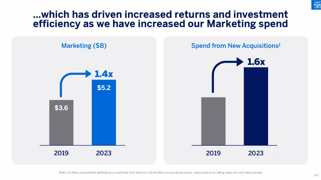
Dual bar charts comparing 2019 vs 2023 marketing spend and spend from new acquisitions. Notable growth highlighted with multipliers (1.4x, 1.6x).
Strategic Planning
Financial Services
The slide shows a strategic increase in marketing investment, growing from $3.6B in 2019 to $5.2B in 2023, with a 1.6x boost in returns from new acquisitions. It signals enhanced marketing efficiency and improved ROI on customer acquisition efforts.
marketing investment, ROI, acquisition spend, customer growth, budget efficiency, strategic marketing, financial growth
false
Strategic Planning
Financial Services
Single Chart
McKinsey
Add to my slides
Remove from favorites
A column chart depicting the longevity of marketing investments' effects on customers, ranging from a day to over ten years.
Market Analysis and Trends
Professional Services
Analyzes the duration of marketing investments' impacts on customers, indicating most effects last several months.
marketing investments, customer impact, investment longevity
false
Market Analysis and Trends
Professional Services
Single Chart
Deloitte
Add to my slides
Remove from favorites
Column chart showing a slight increase from 5.1 to 5.2 between August 2021 and September 2022 in marketing leaders' effectiveness at demonstrating marketing's bottom-line impact to other C-suite members.
Customer and Market Segmentation
Professional Services
Discusses the effectiveness of marketing leaders in communicating the value of marketing strategies to other executives, showing a positive trend in their ability to link marketing efforts to company financials.
Marketing, Leadership, C-Suite, Communication, Bar Chart, Bottom-Line Impact, 2021-2022
false
Customer and Market Segmentation
Professional Services
Mixed Chart
Deloitte
Add to my slides
Remove from favorites
A small bar chart and large pie charts showing frequency of senior marketing leaders' participation in board meetings and earnings call preparations, rated from 1 to 7. Includes percentage of companies above average participation.
Customer and Market Segmentation
Professional Services
Evaluates the involvement of senior marketing leaders in high-level corporate activities, distinguishing between their roles in board meetings versus earnings calls and noting a higher engagement in the former.
Marketing, Leadership, C-Suite, Graph, Board Meetings, Earnings Calls, Participation Frequency
false
Customer and Market Segmentation
Professional Services
Multiple Chart
Deloitte
Add to my slides
Remove from favorites
Left side features percentage boxes, right side has a column chart
Market Analysis and Trends
Media & Entertainment
Adoption and expectations of generative AI in marketing, highlighting its integration into MarTech stacks
marketing, MarTech, generative AI, adoption, trends
false
Market Analysis and Trends
Media & Entertainment
Multiple Chart
Gartner
Add to my slides
Remove from favorites
Features column charts and bullet points detailing marketing spend and performance metrics. It's well-structured with color-coding for easy distinction between categories.
Financial Performance
Financial Services
Details marketing spend and key performance metrics, which could be relevant in financial and marketing strategy sessions.
marketing, performance metrics, financial strategy, cash marketing spend
false
Financial Performance
Financial Services
Multiple Chart
JP Morgan
Add to my slides
Remove from favorites
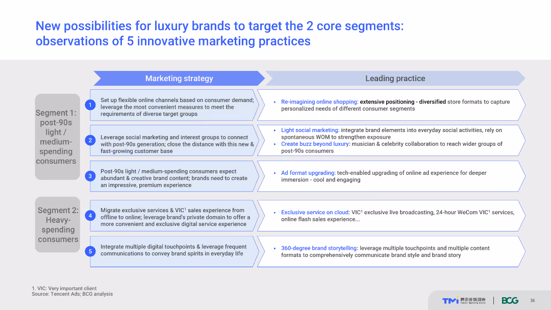
List of five innovative marketing practices for targeting core consumer segments. Each practice is paired with an explanation of its implementation and potential benefits. Text-heavy with supporting visuals.
Strategic Planning
Retail & E-commerce
Provides a strategic overview of innovative marketing practices for luxury brands, focusing on targeting post-90s light/medium-spending consumers and heavy-spending consumers. Highlights practical examples and potential outcomes of these strategies.
Marketing practices, luxury brands, consumer targeting, innovation, strategic planning
false
Strategic Planning
Retail & E-commerce
Table
BCG
Add to my slides
Remove from favorites
Image of a tree cross-section, with text discussing how organizations are redefining their purpose beyond profit.
Market Analysis and Trends
Professional Services
Explores how brands are shifting focus towards purpose-driven strategies, with insights from the Edelman Trust Barometer.
marketing, purpose, trends, strategy, organizations, branding, Edelman
false
Market Analysis and Trends
Professional Services
Mixed Chart
Deloitte
Add to my slides
Remove from favorites
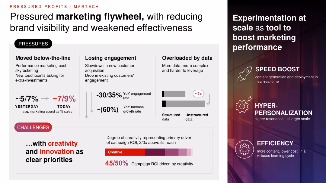
Split layout with left panel showing challenges (text + data), right panel showing solutions (icons + keywords); muted background with gradient overlay.
Product and Service Analysis
Consumer Goods
Details challenges in marketing efficiency—rising spend, lower engagement, data overload. Advocates for experimentation, personalization, and creative ROI to boost campaign impact. Emphasizes creativity's disproportionate contribution to ROI.
marketing, ROI, creativity, engagement, personalization, data overload, spend
false
Product and Service Analysis
Consumer Goods
Multiple Chart
Bain
Add to my slides
Remove from favorites
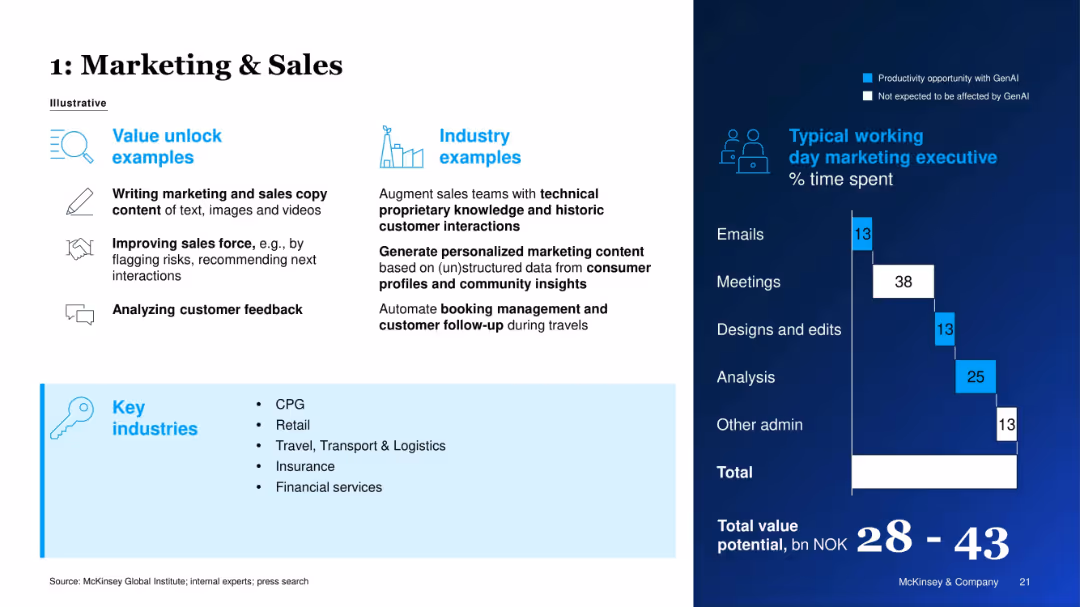
Two-column layout with value unlock examples and industry examples on the left; right side shows time allocation bar chart.
Sales and Business Development
Retail & E-commerce
The slide presents GenAI applications in marketing and sales, including content creation and customer feedback analysis. A time breakdown of a marketing executive’s typical day highlights productivity gains achievable through GenAI. Key industries benefiting include CPG, retail, and financial services.
Marketing, Sales Automation, GenAI Use Case, Productivity, Retail, Time Allocation, Personalization, Industry Application
false
Sales and Business Development
Retail & E-commerce
Mixed Chart
McKinsey
Add to my slides
Remove from favorites
Graphic illustration showing the convergence of marketing, sales, and services with icons and text, stressing on cross-functional collaboration.
Technology and Digital Transformation
Professional Services
Advocates for the removal of silos between marketing, sales, and services, suggesting a united approach with a focus on innovation and cross-channel effectiveness.
Marketing, Sales, Services, Innovation, Cross-Channel, Collaboration, Talent Management
false
Technology and Digital Transformation
Professional Services
Diagram
BCG
Add to my slides
Remove from favorites
Slide includes multiple bar charts detailing marketing budgets as percentages of overall budgets and revenues, segmented by various company attributes.
Financial Performance
Professional Services
Provides a detailed breakdown of how marketing budgets as percentages of overall budgets and revenues differ across company sizes and sectors.
marketing spend, industry comparison, budget analysis, revenue percentages, business analysis
false
Financial Performance
Professional Services
Multiple Chart
Deloitte
Add to my slides
Remove from favorites
Featuring multiple bar charts organized by employee size, revenue, and sector with a focus on marketing spend changes, the layout is dense with categorized data.
Market Analysis and Trends
Professional Services
This slide provides a detailed breakdown of marketing spending growth by company size, revenue, and economic sector, useful for market analysis and planning.
marketing, spending, growth, analysis, sector
false
Market Analysis and Trends
Professional Services
Multiple Chart
Deloitte
Add to my slides
Remove from favorites
The slide includes a single line chart tracking changes in marketing spending over time with annotations for significant points and a note on projected future increases.
Financial Performance
Professional Services
This slide tracks the historical and projected changes in marketing spending, showing a significant increase anticipated over the next year.
marketing, spending, growth, projection, trend
false
Financial Performance
Professional Services
Single Chart
Deloitte
Add to my slides
Remove from favorites
Line and dashed line chart comparing past and predicted future changes in overall and digital marketing spending.
Market Analysis and Trends
Financial Services
Evaluates historical and projected marketing spending trends, highlighting a slowdown in growth. Useful for future budgeting and strategic planning in marketing investments.
marketing, spending, trends, prediction, budgets, digital, planning, growth
false
Market Analysis and Trends
Financial Services
Single Chart
Deloitte
Add to my slides
Remove from favorites
Comparative column chart showing marketing spends as a percentage of industry revenue among various countries and sectors, including India.
Competitive Landscape
Media & Entertainment
This slide compares marketing spends in the Indian media industry with international peers and other domestic sectors, highlighting the need for digital investment.
marketing, spends, digital, capabilities, India
false
Competitive Landscape
Media & Entertainment
Multiple Chart
BCG
Add to my slides
Remove from favorites
Similar to the previous slide but focuses on marketing insights, with interconnected text boxes explaining various aspects of strategic marketing.
Strategic Planning
Technology & Software
Details Experian's marketing strategies utilizing auto data to provide detailed consumer insights, enhancing target marketing efforts and campaign measurement in the automotive sector.
marketing strategy, auto data, consumer insights, campaign measurement, target marketing
false
Strategic Planning
Technology & Software
Table
Barclays
Add to my slides
Remove from favorites
Features a dual graph layout showing marketing spend alongside key performance metrics. The design is data-intensive but remains clear due to the effective use of colors and spacing.
Sales and Business Development
Financial Services
The slide breaks down the card marketing strategy and its impact on scale and distribution, displaying a disciplined approach to marketing and its direct correlation with performance growth in terms of sales and account acquisition.
Marketing Strategy, Performance Growth, Sales Volume, Account Acquisition, Business Scaling
false
Sales and Business Development
Financial Services
Single Chart
JP Morgan
Add to my slides
Remove from favorites
Column charts showing the trend in perceived importance of marketing within companies from June 2020 to September 2022. Includes percentages for 'Increased in Importance,' 'Decreased in Importance,' and 'No Change.'
Customer and Market Segmentation
Professional Services
This slide tracks changes in the perceived importance of marketing roles within companies over several survey points. It shows a general increase in importance but notes a slowing growth rate, indicating a stabilization in marketers' roles within business structures.
Marketing, Trend Analysis, Column Chart, 2020-2022, Business Roles, Survey Data, Growth Rate
false
Customer and Market Segmentation
Professional Services
Single Chart
Deloitte
Add to my slides
Remove from favorites
This slide features a pie chart with a flower-like design. The chart uses shades of green and yellow to illustrate the percentage (75%) of executives planning to invest in hybrid experiences over the next 12 months.
Market Analysis and Trends
Professional Services
The slide presents data from a global marketing trend report, emphasizing the significant investment in hybrid customer experiences post-digital transformation. It discusses the transition from physical to digital interactions and the permanent adoption of remote work as highlighted by the trend 'Building the intelligent creative engine.'
marketing trends, hybrid experiences, digital transformation, remote work, investment
false
Market Analysis and Trends
Professional Services
Mixed Chart
Deloitte
Add to my slides
Remove from favorites
A title slide with a large, blue numeral '7' on the right side. The slide's background is white, transitioning to a light blue gradient behind the number. Titles are in bold, sans-serif font.
Industry Overview
Financial Services
This introductory slide presents the title for a market insights report, likely used to preface a detailed financial analysis covering market trends, updates, and strategies relevant as of June 2023. It introduces the chief market strategist who will be discussing the insights.
Market, Insights, Financial, Guide, Trends, Analysis, 2023, EMEA, Strategy
false
Industry Overview
Financial Services
Title
JP Morgan
Add to my slides
Remove from favorites
A pie chart indicates client coverage across sectors and a parallel comparative table shows global league table rankings from 2010 to 2019. It's visually clean with a light blue theme and organized layout.
Market Analysis and Trends
Financial Services
This slide highlights Goldman Sachs' market leadership and consistent performance over time, contrasting rankings in various financing activities, aimed at market analysts or potential clients to demonstrate the firm's competitive positioning.
Market leadership, client coverage, financial rankings, performance, Goldman Sachs
false
Market Analysis and Trends
Financial Services
Framework
Goldman Sachs
Add to my slides
Remove from favorites
This slide is data-rich with multiple column charts comparing industry share of wallet, and rankings of JPMorgan Chase against competitors. It uses blue tones for the charts and is laid out to easily compare 2017 and 2021 data side by side.
Competitive Landscape
Financial Services
The slide provides a competitive analysis of JPMorgan Chase's market position, showing improved share of wallet and client market share across various segments. It's suitable for investor relations or competitive strategy meetings, offering a visual representation of market leadership and competitive gains.
Market Leadership, Competitive Analysis, Share of Wallet, Institutional Clients, Equities, FICC, Corporate FX, APAC
false
Competitive Landscape
Financial Services
Multiple Chart
JP Morgan
Add to my slides
Remove from favorites
This slide is divided into three content blocks, each with icons and bullet points to represent different aspects of business banking growth, like market share and digital engagement.
Market Analysis and Trends
Financial Services
It presents opportunities for growth in business banking, illustrating industry leadership, strong unit economics, and a widespread network. Data points include the formation of 450k small businesses and 80% client digital activity.
Market Leadership, Growth Opportunities, Digital Activity, Small Business, Banking
false
Market Analysis and Trends
Financial Services
Table
JP Morgan
Add to my slides
Remove from favorites
This slide has bullet points, growth metrics, and a mix of traditional and alternative assets bar graphs.
Financial Performance
Financial Services
Highlights the decade-long growth of JPMorgan's Asset & Wealth Management and Private Bank sectors, emphasizing its market-leading position with data comparisons and client asset flows in a visually dense layout.
market-leading, growth, JPMorgan, asset management, private bank
false
Financial Performance
Financial Services
Multiple Chart
JP Morgan
Add to my slides
Remove from favorites
A centered diamond-shaped graphic unites four business sectors, with a blue bar graph showing a case study's results.
Competitive Landscape
Financial Services
Depicts how the firm's integrated approach across various sectors enhances its position as a market maker, demonstrated by a multiplier effect case study.
market maker, integration, business sectors, Goldman Sachs, case study, multiplier effect, competitive advantage
false
Competitive Landscape
Financial Services
Single Chart
Goldman Sachs
Add to my slides
Remove from favorites
The slide presents a header, two key areas with bullet points: "World-Class Market Making Franchise" and "Strategic Priorities". The background is white with blue accents.
Strategic Planning
Financial Services
This slide outlines strategic priorities and market-making approaches emphasizing client relationships and technology platforms. It is likely used in a financial services context.
Market Making, Strategic, Priorities, Client Relationships, Technology Platforms, Financial Services
false
Strategic Planning
Financial Services
Table
Goldman Sachs
Add to my slides
Remove from favorites
The slide contains a flowchart illustrating the components of the market model, including vehicle production volumes, hydrogen penetration rates, and market value calculation.
Strategic Planning
Financial Services
Describes the framework for building the market model based on expert views, covering key factors like production volumes and hydrogen capacity per vehicle.
market model, hydrogen, vehicle production, penetration rate, market value, framework, calculation, expert views
false
Strategic Planning
Financial Services
Diagram
Roland Berger
Add to my slides
Remove from favorites
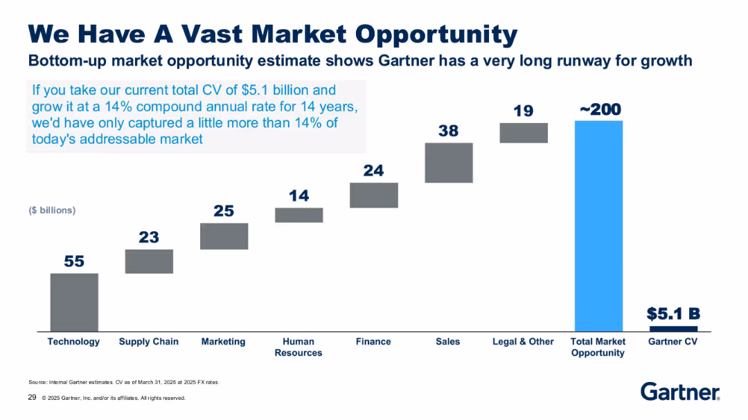
Bar chart with stepped grey bars and one bright blue bar, labeled with market size in billions.
Market Analysis and Trends
Technology & Software
The slide highlights Gartner’s potential market opportunity of ~$200B across several sectors, compared to its current $5.1B CV. It emphasizes the growth potential if Gartner continues growing at a 14% CAGR over 14 years.
market opportunity, CAGR, technology, finance, growth, Gartner, $5.1B, CV, potential, industry size
false
Market Analysis and Trends
Technology & Software
Single Chart
Gartner
Add to my slides
Remove from favorites
This slide features a bar chart illustrating the total market opportunity by various industries with an overall market estimate at the top.
Market Analysis and Trends
Technology & Software
The slide outlines the vast market opportunity for Gartner, with a bar chart showing potential growth in different sectors such as technology and supply chain.
Market, Opportunity, Growth, Technology, Gartner
false
Market Analysis and Trends
Technology & Software
Single Chart
Gartner
Add to my slides
Remove from favorites
Features a visual continuum that illustrates wealth segmentation, with corresponding client balances and market opportunities. The design uses a combination of text and visual segmentation for clarity.
Market Analysis and Trends
Financial Services
The slide analyzes market opportunity across different wealth segments, offering insights on the firm's positioning and potential within the wealth continuum.
Market Opportunity, Wealth Management, Client Balances, Market Segmentation, CAGR, BAC Internal Opportunity, Wealth Continuum
false
Market Analysis and Trends
Financial Services
Table
Morgan Stanley
Add to my slides
Remove from favorites
Bar chart showing market growth strategies on the left and market optimization strategies on the right.
Strategic Planning
Financial Services
Describes strategies for optimizing market footprint and focusing investments on high-priority markets.
market optimization, investment, strategy, priority markets, growth
false
Strategic Planning
Financial Services
Mixed Chart
Credit Suisse
Add to my slides
Remove from favorites
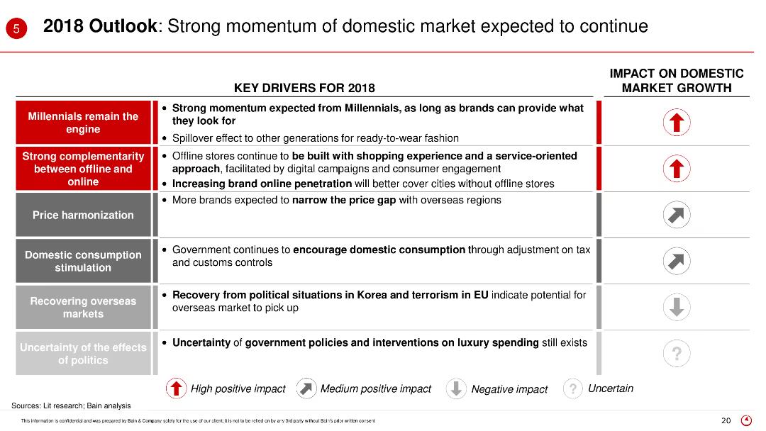
The slide outlines key drivers for 2018 in a structured layout, listing factors such as millennials' impact, complementarity between online and offline, price harmonization, and government policies, with impact icons on the right.
Market Analysis and Trends
Retail & E-commerce
This slide provides an outlook for the domestic market in 2018, highlighting significant drivers like millennial influence, online and offline complementarity, and government initiatives, with their expected impacts.
Market outlook, 2018 trends, domestic market, key drivers, millennial influence
false
Market Analysis and Trends
Retail & E-commerce
Table
Bain
Add to my slides
Remove from favorites
Includes circular charts showing prioritization of business strategies and a narrative on the global economic outlook.
Market Analysis and Trends
Professional Services
Provides an overview of the economic outlook for 2018, focusing on key business strategies and priorities among procurement leaders.
market outlook, business strategies, economic trends, procurement
false
Market Analysis and Trends
Professional Services
Pillar
Deloitte
Add to my slides
Remove from favorites
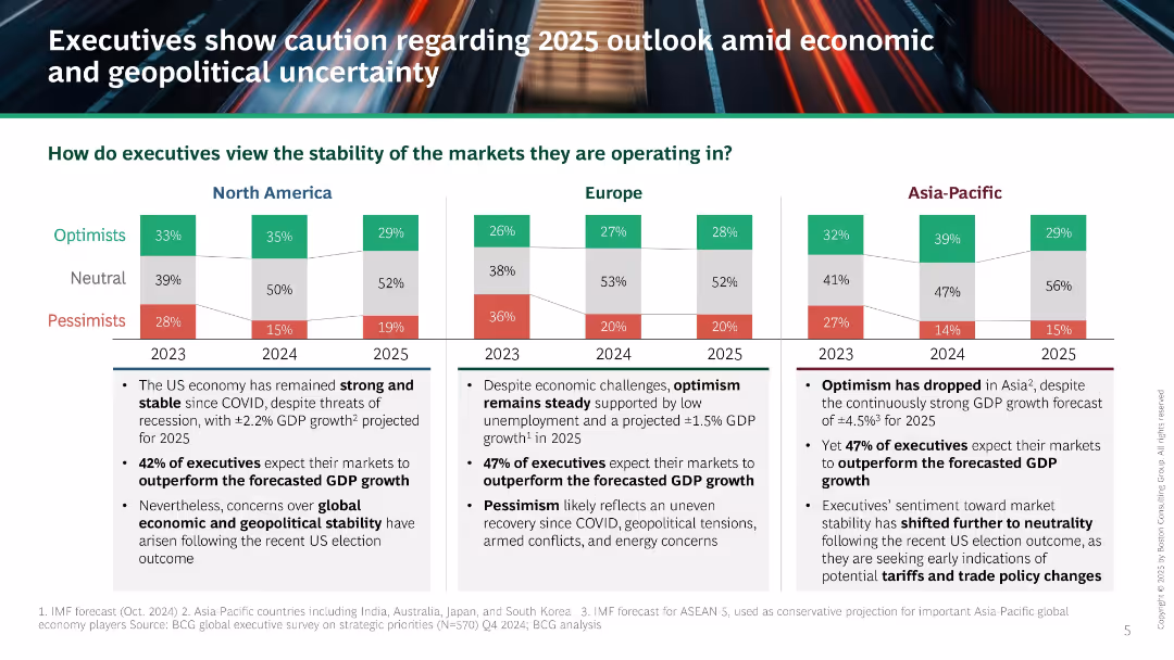
Comparative bar chart across three regions (NA, Europe, APAC) with Optimists/Neutral/Pessimists segments; bullet points underneath each chart; black headline area.
Market Analysis and Trends
Professional Services
The slide summarizes executive sentiment about market stability in 2025, highlighting regional variations in optimism and pessimism. Key points include projected GDP, geopolitical concerns, and shifts toward neutrality due to global uncertainties and recent election outcomes.
market outlook, executive sentiment, geopolitical risk, GDP forecast, economic stability, 2025
false
Market Analysis and Trends
Professional Services
Mixed Chart
BCG
Add to my slides
Remove from favorites
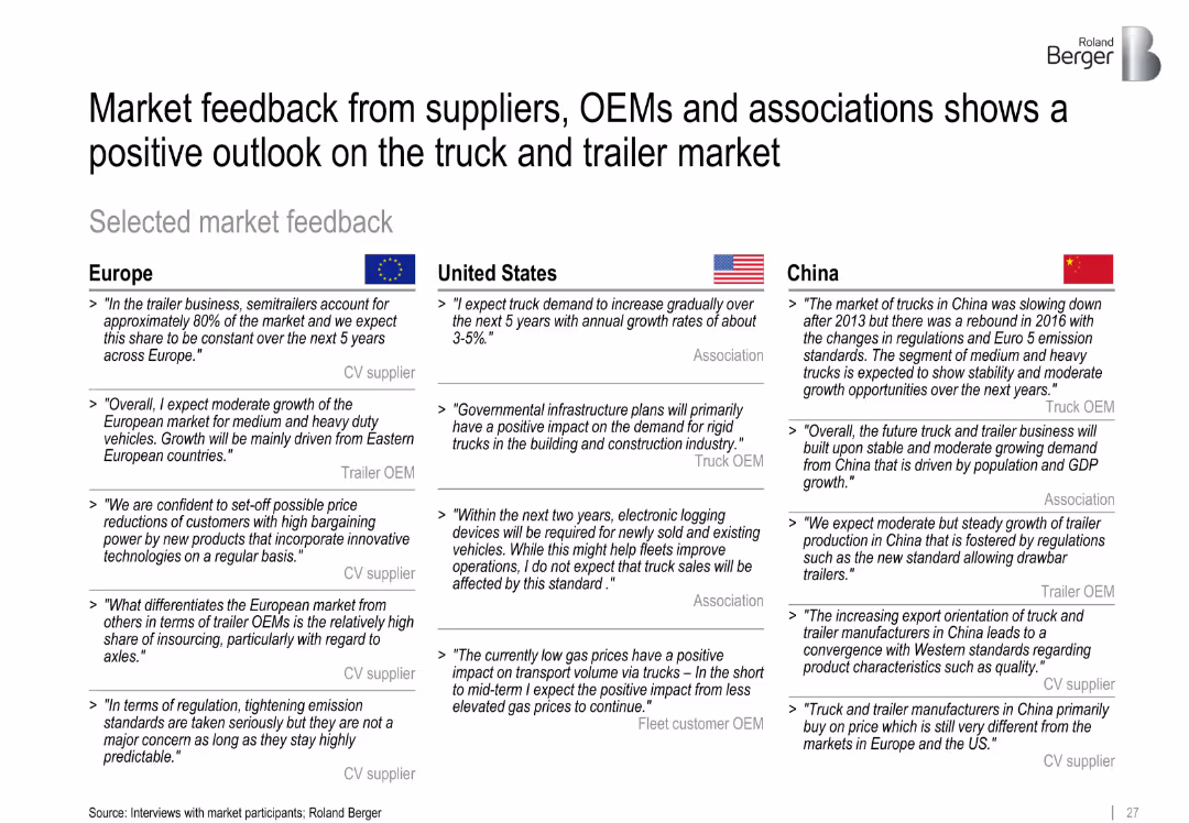
Three-column text layout with quotes from Europe, US, and China
Strategic Planning
Transportation & Logistics
This slide compiles qualitative market feedback from stakeholders in Europe, the US, and China, summarizing optimism about demand growth, infrastructure support, and regulatory adaptation. Key quotes highlight regional sentiment.
market outlook, feedback, OEM, infrastructure, regulations, regional insights
false
Strategic Planning
Transportation & Logistics
Table
Roland Berger
Add to my slides
Remove from favorites
This matrix slide compares market outlooks across several regions and sectors, using color-coded arrows to indicate market conditions. Regions are listed vertically, while markets—housing, real estate, and infrastructure—are organized horizontally. Each cell contains an arrow representing the market condition: green for improving, orange for stable, and pink for weakening. The visual simplicity makes the data immediately accessible, while the cityscape in the background relates it to real estate and construction. The footer includes event identification.
Market Analysis and Trends
Real Estate & Construction
Provides an at-a-glance view of the Q2 market outlook across various regions, crucial for strategic decision-making in the context of housing, real estate, and infrastructure markets.
market outlook, regional analysis, housing market, real estate, infrastructure, market conditions, Q2 forecast, stability, visibility, strategic decision-making
false
Market Analysis and Trends
Real Estate & Construction
Table
Goldman Sachs
Add to my slides
Remove from favorites
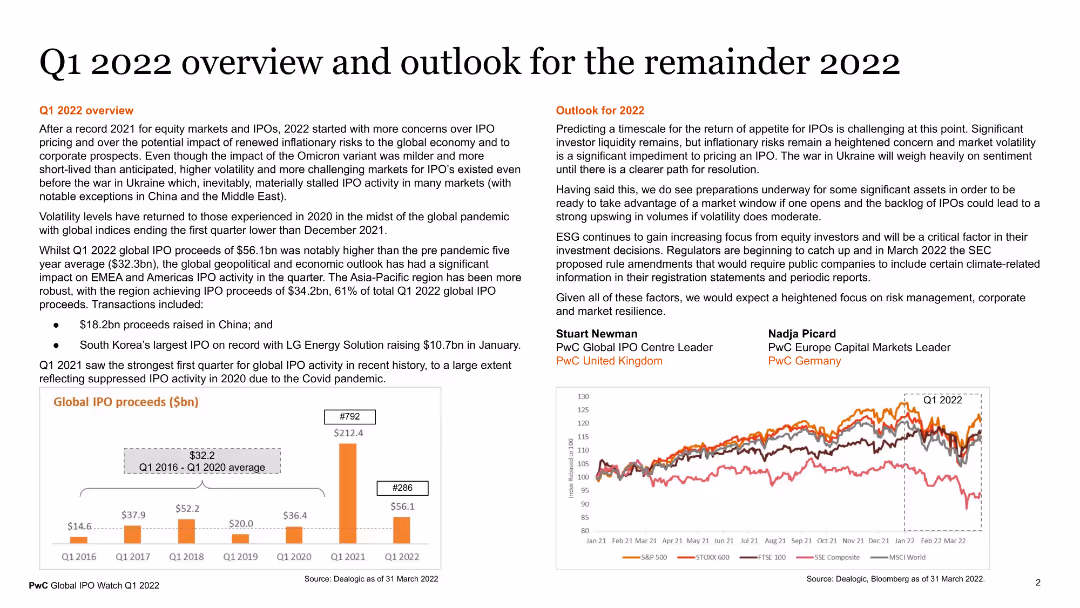
The slide contains a detailed overview of Q1 2022 and the outlook for the remainder of the year. It includes sections on Q1 2022 overview, predicting market trends, and key points from experts. The slide is text-heavy with supporting data on IPO proceeds shown in a column chart, highlighting regions and trends in global IPO activity.
Market Analysis and Trends
Financial Services
This slide provides a comprehensive overview of the financial market performance in Q1 2022 and predictions for the rest of the year. It includes data on IPO proceeds and expert commentary on future trends. It is useful for market analysts and financial strategists to understand recent market dynamics and forecast future developments.
market overview, Q1 2022, IPOs, financial trends, predictions
false
Market Analysis and Trends
Financial Services
Multiple Chart
PwC/Strategy&
Add to my slides
Remove from favorites
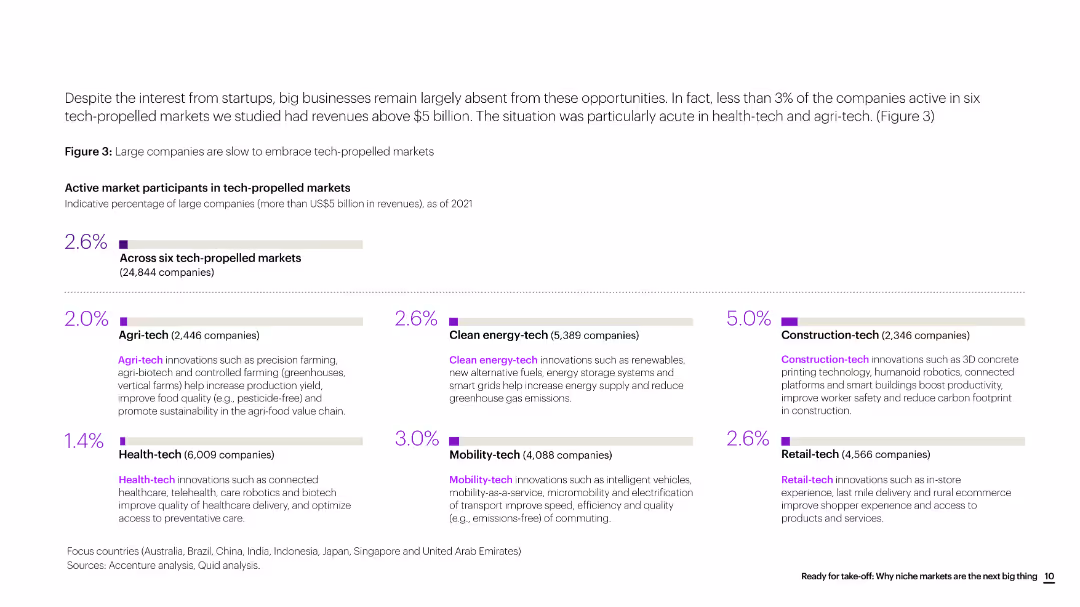
The slide contains a bar chart showing the percentage of large companies participating in various tech-propelled markets, with a focus on six key sectors.
Market Analysis and Trends
Technology & Software
The slide analyzes the participation of large companies in tech-propelled markets, highlighting the low involvement despite the potential growth opportunities.
market participants, tech markets, large companies, analysis, technology, bar chart
false
Market Analysis and Trends
Technology & Software
Multiple Chart
Accenture
Add to my slides
Remove from favorites
This slide offers a visual representation of market penetration over time, combining a line graph with photographs of cityscapes and a color gradient to show the length of presence in various markets. It's informative with a creative design.
Market Analysis and Trends
Financial Services
Discusses market penetration in new markets and the realization of value over time. It provides an engaging overview for discussions on strategic market entry or expansion, with a focus on long-term growth.
market penetration, value realization, new markets, cityscapes, strategic growth, long-term
false
Market Analysis and Trends
Financial Services
Linear Flow
JP Morgan
Add to my slides
Remove from favorites
A comparative color-coded table contrasts the performance of different market segments over one month, one year, and three years.
Performance Metrics and KPIs
Financial Services
Offers a concise visual comparison of market performance across different capitalization sizes and timeframes, allowing for a quick assessment of market trends.
market performance, barometer, market segments, capitalization, KPIs, comparative analysis
false
Performance Metrics and KPIs
Financial Services
Table
Morgan Stanley
Add to my slides
Remove from favorites
The slide features two visual elements. The first is a multi-line graph showing occupancy by country over several years, with different lines representing different countries. The second is a horizontal bar chart showing portfolio weighting by country. The line graph and bar chart are color-coded to differentiate the countries and show occupancy trends over time, with annotations for specific data points.
Market Analysis and Trends
Real Estate & Construction
Demonstrates the steady performance of the company's core markets, represented by consistent occupancy rates and portfolio distribution by country.
Market Performance, Core Markets, Real Estate Occupancy, Country Analysis, Portfolio Weighting, Trend Analysis
false
Market Analysis and Trends
Real Estate & Construction
Multiple Chart
Morgan Stanley
Add to my slides
Remove from favorites
This slide presents two line charts showing the long-term and recent market performance of the waste management and environmental services sectors, compared to the S&P 500 Index.
Financial Performance
Environmental Services & Sustainability
The slide analyzes the market performance of waste management and environmental services sectors, highlighting their recovery from COVID-19 impacts and long-term growth trends, with detailed financial data and comparative analysis.
Market performance, COVID-19 recovery, environmental services, waste management, financial analysis, S&P 500, long-term growth
false
Financial Performance
Environmental Services & Sustainability
Multiple Chart
LEK
Add to my slides
Remove from favorites
This slide presents a line chart showing the market performance of publicly listed companies in discrete automation over the last five years, categorized by segments like machine vision & sensors, drives/motion control, robotics, system integrators, and machine builders. It also includes logos of notable companies in each segment.
Market Analysis and Trends
Industrial & Manufacturing
The slide analyzes the market performance of companies in discrete automation, comparing segments like machine vision, drives, robotics, system integrators, and machine builders, with a focus on EV/EBITDA ratios.
Market Performance, Discrete Automation, Public Companies, Machine Vision, Robotics, System Integrators, Machine Builders, EV/EBITDA
false
Market Analysis and Trends
Industrial & Manufacturing
Mixed Chart
LEK
Add to my slides
Remove from favorites
This slide features a combination of column chart and descriptive analyses focusing on the performance of luxury dining, fine art, and hospitality industries during 2020. Detailed performance metrics are displayed alongside the charts.
Market Analysis and Trends
Consumer Goods
Assessing the disparate impacts of the pandemic on luxury markets, this slide contrasts the sectors that showed resilience with those that experienced steep declines. It specifically highlights how luxury dining, art, and hospitality have been affected, offering insights into recovery prospects and market adjustments.
market performance, luxury markets, pandemic impact, recovery prospects, industry analysis
false
Market Analysis and Trends
Consumer Goods
Mixed Chart
Bain
Add to my slides
Remove from favorites
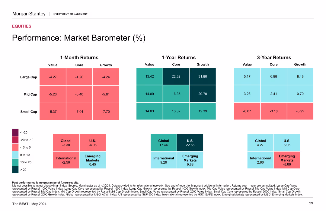
This slide presents a series of heatmaps showing 1-Month, 1-Year, and 3-Year returns for Large Cap, Mid Cap, and Small Cap stocks, categorized by Value, Core, and Growth. The heatmaps use color gradients to represent the performance data.
Financial Performance
Financial Services
The slide analyzes the market performance of different stock categories over various time frames, using heatmaps to visualize returns for large, mid, and small caps.
Market performance, returns, large cap, mid cap, small cap, heatmaps
false
Financial Performance
Financial Services
Table
Morgan Stanley
Add to my slides
Remove from favorites
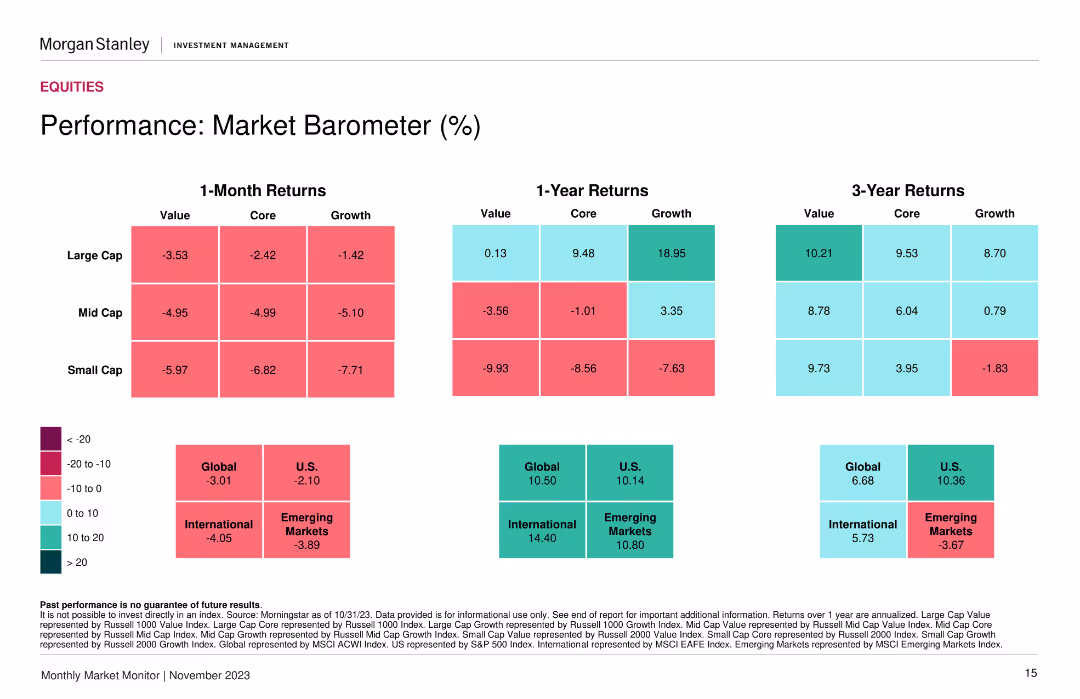
Heatmap showing returns for value, core, and growth across large, mid, and small caps over 1 month, 1 year, and 3 years.
Financial Performance
Financial Services
A market barometer showing performance metrics across different market segments and time periods, aiding in evaluating market performance and trends.
Market performance, returns, segments
false
Financial Performance
Financial Services
Table
Morgan Stanley
Add to my slides
Remove from favorites
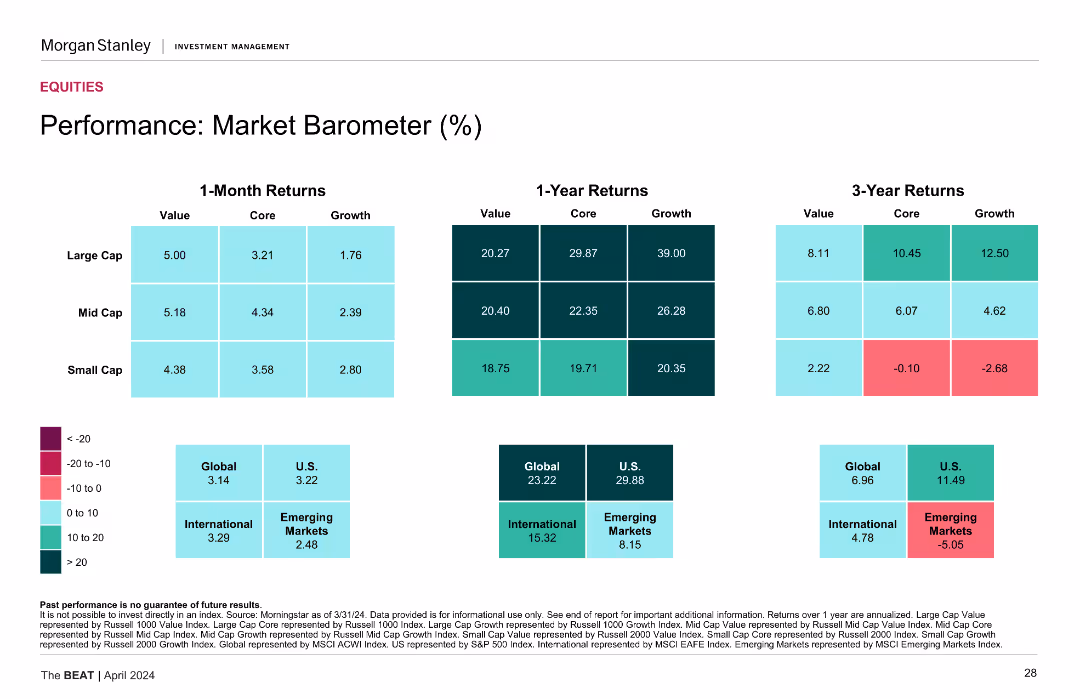
Heatmaps displaying returns by value, core, and growth for large, mid, and small cap stocks over different time periods.
Performance Metrics and KPIs
Financial Services
Measures market performance, showing returns over 1-month, 1-year, and 3-year periods for various stock categories.
Market Performance, Stock Returns, Value Stocks, Growth Stocks, Financial Metrics
false
Performance Metrics and KPIs
Financial Services
Table
Morgan Stanley
Add to my slides
Remove from favorites
The slide has a map highlighting market shares in building construction and civil engineering across different regions, with percentages and icons for different sectors.
Industry Overview
Real Estate & Construction
Used to communicate the company’s market strength in urban development to investors or stakeholders.
Market Position, Construction, Engineering, Urban Development, Mapping, Shares, Regions
false
Industry Overview
Real Estate & Construction
Multiple Chart
Goldman Sachs
Add to my slides
Remove from favorites
The slide has a bar graph, two column charts and market share comparisons among top industry players, using dark and light shades.
Market Analysis and Trends
Financial Services
Evaluates the market franchise's position with an outlook on industry wallet and market share relative to competitors.
market position, investment banking, market opportunities, ROE, industry trends
false
Market Analysis and Trends
Financial Services
Mixed Chart
JP Morgan
Add to my slides
Remove from favorites
The slide combines graphical representations of JPMC's market share in various banking sectors with icons of Fortune's top 5 companies, creating a strong visual impact with its segmented circular graphic and bold text captions.
Industry Overview
Financial Services
Showcasing JPMC's industry dominance and comparing it to the most admired companies globally, the slide is utilized for market positioning and corporate presentations.
market position, JPMC, banking sectors, Fortune 500, admired companies, industry dominance, corporate presentation.
false
Industry Overview
Financial Services
Framework
JP Morgan
Add to my slides
Remove from favorites
Contains a list ranking top countries by market position, bar graphs showing sales percentage in leading positions, and a pie chart indicating consumer trust.
Competitive Landscape
Consumer Goods
Analyzes Nestlé's market dominance and customer trust across key emerging markets, showcasing their leading positions and competitive advantages. This slide is useful for assessing market leadership and brand trustworthiness.
market positions, consumer trust, sales, leading positions, Nestlé
false
Competitive Landscape
Consumer Goods
Mixed Chart
Deutsche Bank
Add to my slides
Remove from favorites
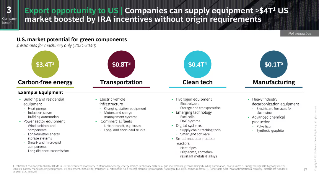
This slide uses a comparative layout featuring four colored circles representing potential market values for different sectors: Carbon-free energy, Transportation, Clean tech, and Manufacturing.
Market Analysis and Trends
Energy & Utilities
The slide presents a comparative analysis of the U.S. market potential for green components across different sectors. It includes examples of equipment and their respective sectors.
Market potential, Carbon-free energy, Transportation, Clean tech, Manufacturing, US market
false
Market Analysis and Trends
Energy & Utilities
Pillar
BCG
Add to my slides
Remove from favorites
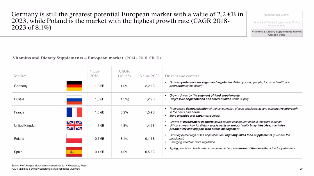
This slide compares the vitamins and dietary supplements markets across several European countries, using a table format. It includes columns for market value, CAGR, and key drivers for each country. Flags of the respective countries are also displayed.
Market Analysis and Trends
Healthcare & Pharmaceuticals
The slide compares market potential for vitamins and dietary supplements across Germany, Russia, France, the UK, Poland, and Spain. It provides a detailed analysis of market size, growth rates, and key factors driving market trends in each country, emphasizing Germany's potential and Poland's high growth rate.
market potential, Germany, Europe, vitamins, dietary supplements, growth rate
false
Market Analysis and Trends
Healthcare & Pharmaceuticals
Table
PwC/Strategy&
Add to my slides
Remove from favorites
Previous
Next
You don't have any favorites yet.
Please wait loading your favorites slides...
Create a FREE account to continue browsing
Receive Instant Access to 1,000+ slides from companies like McKinsey, Google, and Goldman Sachs
First Name
Last Name
Email
Password
I agree to all
Terms & Privacy Policy
Thank you! Your submission has been received!
Oops! Something went wrong while submitting the form.
Have an account?
Sign in
Upgrade to PRO to Save slides
Advanced Search and Filters
Access to 15,000+ slides
Access to Category Pages
Save/Bookmark Slides
PowerPoint Template Library
Pick a Plan
MONTHLY
$12/month
Billed every month, Cancel anytime.
YEARLY
$9/year
Billed $108 annually, Cancel anytime.
Checkout for $12/month
Checkout for $108/yr
Secured by Stripe | AES-256 bit encryption