My Account
My Slides
Search by Category
Pricing
Templates
View All Templates
Download Template Slides
✦ AI Search
Feedback
Login
Logout
Get Started
Browse all Slides
Browse all Slides
Create a FREE Account
Instant access to 1,000+ real slides from top companies like McKinsey, BCG, Goldman Sachs, Google and many more!
First Name
Last Name
Email
Password
I agree to all
Terms & Privacy Policy
Thank you! Your submission has been received!
Oops! Something went wrong while submitting the form.
Have an account?
Sign in
Saved Slides
Total No. of slides saved
0
↻ Refresh
✖ Clear all
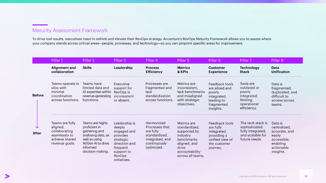
Structured table format with eight pillars showing "Before" and "After" states. Purple headings and a vertical arrow indicate maturity transformation.
Performance Metrics and KPIs
Professional Services
Provides a framework for assessing RevOps maturity across eight pillars, from alignment and skills to tech stack and data. Each pillar outlines current challenges and the target state for improved performance, collaboration, and integration using Gen AI and standardization strategies.
maturity framework, RevOps, collaboration, KPIs, integration, skills
false
Performance Metrics and KPIs
Professional Services
Table
Accenture
Add to my slides
Remove from favorites
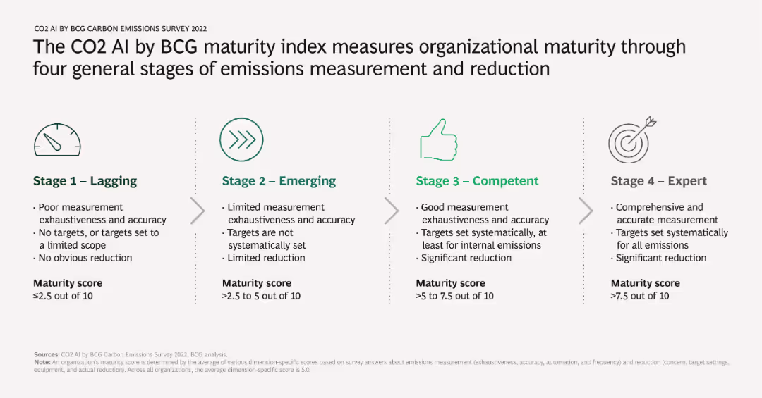
Diagram illustrating four stages of organizational maturity in emissions measurement and reduction: Lagging, Emerging, Competent, and Expert. Each stage includes criteria such as measurement exhaustiveness, accuracy, target setting, and reduction achievements.
Strategic Planning
Environmental Services & Sustainability
Outlines the maturity index used by BCG to evaluate how well organizations measure and reduce emissions. Provides a framework for companies to assess their current level and identify areas for improvement.
maturity index, emissions measurement, organizational stages, BCG, reduction
false
Strategic Planning
Environmental Services & Sustainability
Linear Flow
BCG
Add to my slides
Remove from favorites
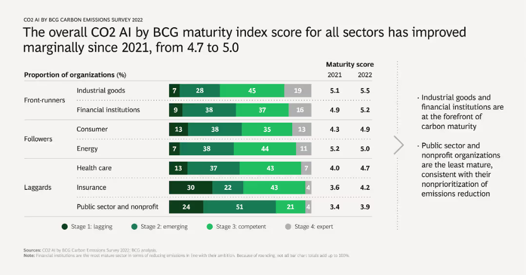
A mixed chart with horizontal bars representing the proportion of organizations at different maturity stages in various sectors, along with a line chart showing the average maturity score for 2021 and 2022. Includes sector-specific analysis.
Market Analysis and Trends
Environmental Services & Sustainability
Evaluates the progress in emissions measurement and reduction across different sectors, noting a slight overall improvement. Highlights leaders and laggards in environmental maturity, useful for benchmarking and setting goals.
maturity index, sector analysis, progress, emissions reduction, benchmarking
false
Market Analysis and Trends
Environmental Services & Sustainability
Mixed Chart
BCG
Add to my slides
Remove from favorites
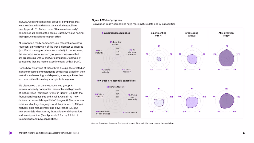
Radar charts compare three company groups (experimenting, progressing, AI reinvention-ready) across foundational and new AI capabilities. Left-aligned descriptive text.
Performance Metrics and KPIs
Artificial Intelligence
Introduces a capability maturity model, showing how companies fall into three AI adoption categories. Uses radar charts to illustrate progress in foundational and new Gen AI capabilities, including LLMOps, data governance, and talent practices. Reinvention-ready firms show the highest maturity across all axes.
maturity model, AI readiness, radar chart, data capabilities, LLMOps
false
Performance Metrics and KPIs
Artificial Intelligence
Mixed Chart
Accenture
Add to my slides
Remove from favorites
This slide uses a linear graphic showing a maturity model with stages (Foundational, Programmatic, Strategic, Integrated) ranked by survey participants, emphasizing the continuous evolution of inclusion and diversity.
Strategic Planning
Professional Services
The slide discusses a maturity model for organizational inclusion and diversity, ranking each cornerstone from foundational to integrated stages, based on survey feedback.
Maturity Model, Inclusion, Diversity, Organizational, Survey, Evolution, Stages, Foundational, Integrated
false
Strategic Planning
Professional Services
Linear Flow
Accenture
Add to my slides
Remove from favorites
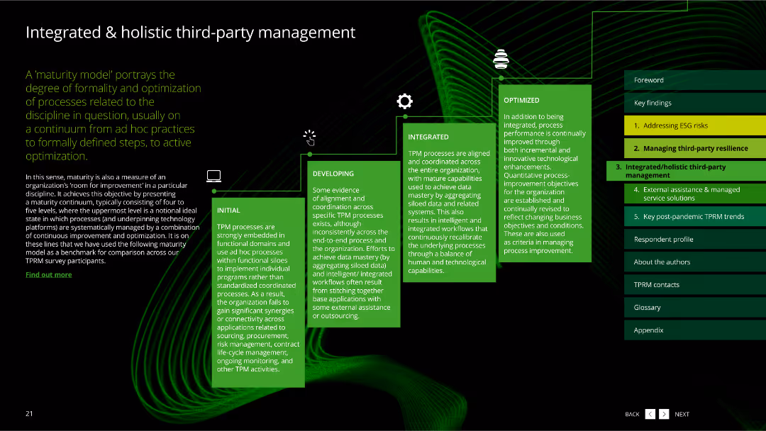
The slide features a dark background with a green wavy line pattern. It includes a flowchart with five green boxes describing the stages of third-party management maturity.
Risk Assessment and Management
Professional Services
The slide explains a maturity model for third-party management, portraying the degree of formality and optimization of processes from initial to optimized stages.
maturity model, third-party management, stages, process optimization, professional services
false
Risk Assessment and Management
Professional Services
Linear Flow
Deloitte
Add to my slides
Remove from favorites
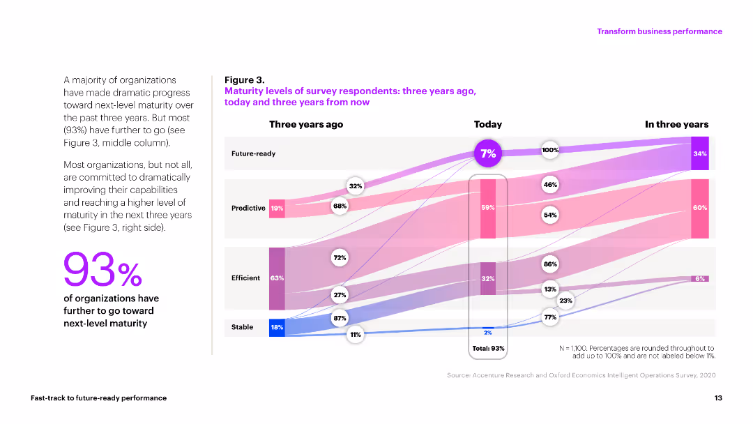
The slide contains a flow diagram comparing maturity levels of organizations over three years. The visual shows progression from stable to future-ready with multiple colored bands representing different stages.
Market Analysis and Trends
Professional Services
The slide depicts the maturity levels of organizations from three years ago, today, and projected for three years into the future. It highlights that only 7% are currently future-ready with 93% aiming to improve.
maturity, progress, organizations, future, stages
false
Market Analysis and Trends
Professional Services
Mixed Chart
Accenture
Add to my slides
Remove from favorites
Icons and items with tier descriptions across different maturity levels. Green and white colors.
Technology and Digital Transformation
Technology & Software
Compares four tiers of company maturity in the SHoP framework, describing each tier's characteristics.
maturity, tiers, pioneer, progressive, emerging, nascent
false
Technology and Digital Transformation
Technology & Software
Header Vertical
BCG
Add to my slides
Remove from favorites
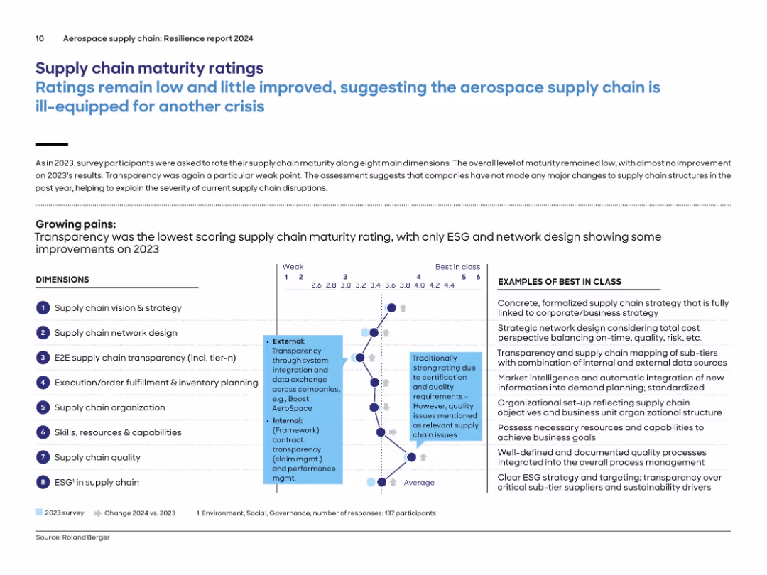
Radar chart-style diagram of 8 supply chain dimensions on left and "Best in Class" definitions on the right; annotated horizontal scale from 1 to 6.
Performance Metrics and KPIs
Environmental Services & Sustainability
Companies rated their maturity on 8 dimensions of supply chain management. Transparency and data exchange scored lowest again in 2024. Ratings remained largely unchanged from 2023, suggesting insufficient structural improvement. The diagram and accompanying list define what “best in class” looks like for each area such as network design, skills, and ESG.
maturity, transparency, KPIs, supply chain, network design, resilience, ESG, capabilities
false
Performance Metrics and KPIs
Environmental Services & Sustainability
Mixed Chart
Roland Berger
Add to my slides
Remove from favorites
A colorful table showing variation in maturity across different SHoP dimensions.
Technology and Digital Transformation
Professional Services
Examines how companies vary in maturity across different dimensions such as marketing, loyalty, and tech stack.
maturity, variation, marketing, loyalty, commerce, analytics
false
Technology and Digital Transformation
Professional Services
Multiple Chart
BCG
Add to my slides
Remove from favorites
Features green-colored blocks outlining the rationale and questions to consider for creating value through M&A. It emphasizes traditional and forward-looking synergies like revenue and cost efficiencies, risk mitigation, and knowledge generation.
Strategic Planning
Financial Services
Provides a strategic framework for evaluating M&A opportunities, focusing on identifying synergies, assessing risks, and understanding cost benefits to maximize deal value.
M&A, Value Creation, Synergies, Strategy, Risk Mitigation, Cost Efficiency
false
Strategic Planning
Financial Services
Table
Deloitte
Add to my slides
Remove from favorites
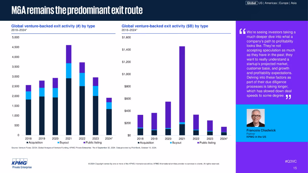
Bar charts showing exit activity by type (count & $ value), 2018–2024; color-coded by exit type (Acquisition, Buyout, Public); includes expert quote on right side.
Mergers and Acquisitions
Financial Services
The slide shows that M&A continues to be the dominant form of venture-backed exits, with public listings and buyouts significantly declining. An analyst quote underscores the increased scrutiny in due diligence, leading to slower deal speeds and more cautious exits.
M&A, venture exits, IPO, buyouts, exit strategy, acquisition trends, investor caution, startup exit, due diligence, Q3 2024
false
Mergers and Acquisitions
Financial Services
Multiple Chart
KPMG
Add to my slides
Remove from favorites
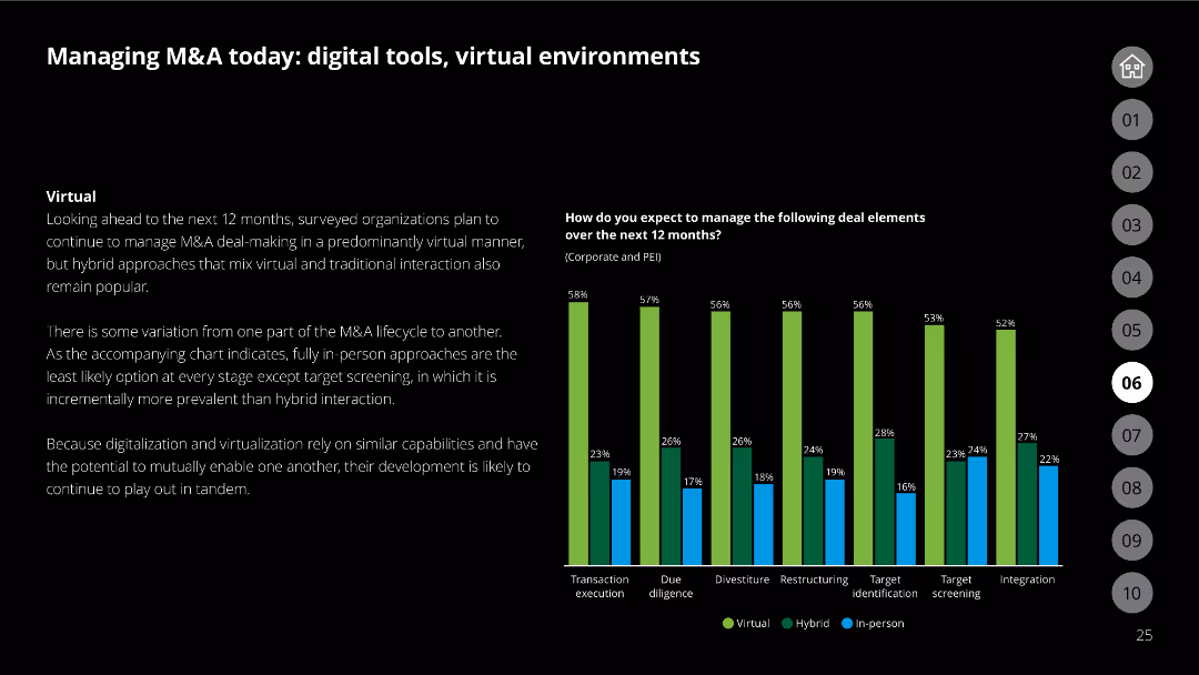
The slide has a black background, text discussing virtual management of M&A, and a column chart comparing deal element management methods (virtual, hybrid, in-person) for the next 12 months.
Mergers and Acquisitions
Financial Services
Covers how organizations plan to manage M&A deals in the next year, highlighting the use of virtual and hybrid approaches for different deal elements based on survey results.
M&A, virtual management, deal elements, survey results, hybrid approach
false
Mergers and Acquisitions
Financial Services
Mixed Chart
Deloitte
Add to my slides
Remove from favorites
A multi-bar column chart shows the percentage of mortgages in forbearance by type, with a time series comparison from 2020 to 2023.
Risk Assessment and Management
Financial Services
Assesses mortgage-backed securities (MBS) risk by highlighting the sharp reduction in forbearance rates since the pandemic, valuable for financial risk managers.
MBS, forbearance, mortgages, pandemic, risk, reduction, securities, financial, management
false
Risk Assessment and Management
Financial Services
Single Chart
Morgan Stanley
Add to my slides
Remove from favorites
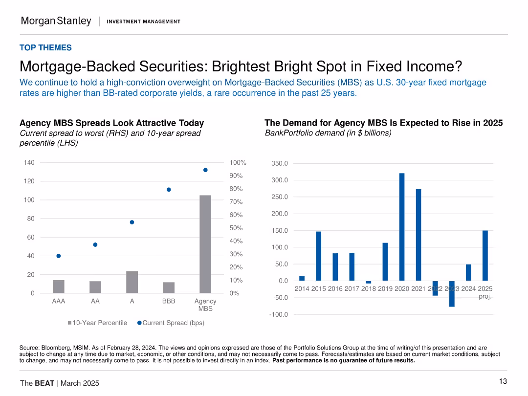
Two charts: left bar/point combo showing spreads and percentiles; right bar chart of bank demand. Light background, data-focused layout.
Investment Analysis
Financial Services
Highlights the attractiveness of agency MBS, with higher spreads than BB-rated corporates and strong historical percentile positioning. Demand is projected to rise significantly in 2025 after recent declines, signaling renewed institutional interest.
MBS, spreads, fixed income, mortgage rates, bank demand, agency bonds, yield, investment opportunity
false
Investment Analysis
Financial Services
Multiple Chart
Morgan Stanley
Add to my slides
Remove from favorites
Slide features a circular diagram labeled "McKinsey Sustainability Compass," surrounded by various business areas influenced by SDG initiatives, such as innovation, risk management, and talent management, in a clean, professional design.
Strategic Planning
Professional Services
Explains how McKinsey uses the UN Sustainable Development Goals to drive value in areas like diversity and inclusion, environmental sustainability, and circular economy practices within its business operations and consulting services.
McKinsey, sustainability, SDGs, business strategy, corporate practices
false
Strategic Planning
Professional Services
Diagram
McKinsey
Add to my slides
Remove from favorites
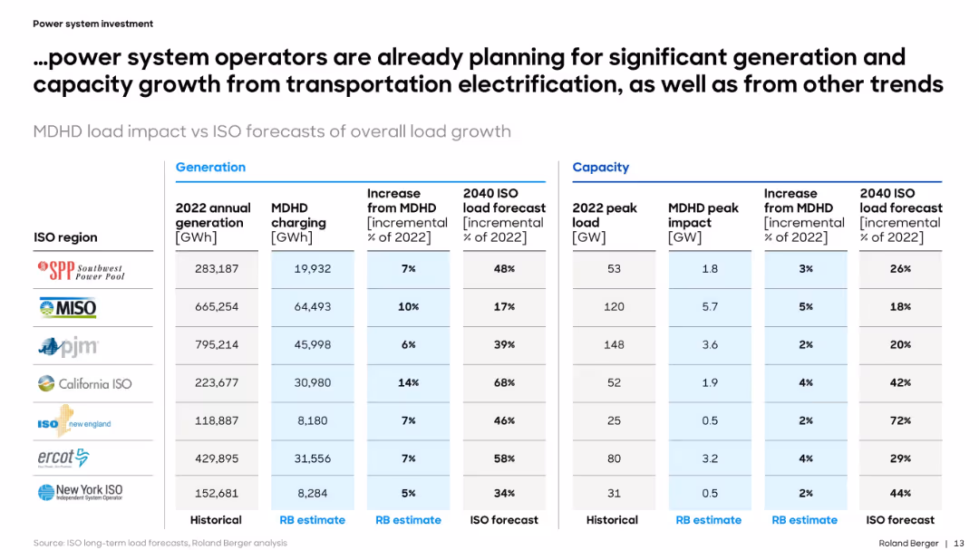
Tabular comparison of power generation, load forecast, and MDHD impact across ISO regions. Organized and data-heavy format.
Performance Metrics and KPIs
Energy & Utilities
The slide provides a detailed forecast of how MDHD vehicle electrification will impact generation and peak load in major U.S. ISO regions. It quantifies incremental demand and contextualizes it within broader electricity system planning.
MDHD, power, ISO, forecast, generation, load, electrification, capacity, utilities, metrics
false
Performance Metrics and KPIs
Energy & Utilities
Table
Roland Berger
Add to my slides
Remove from favorites
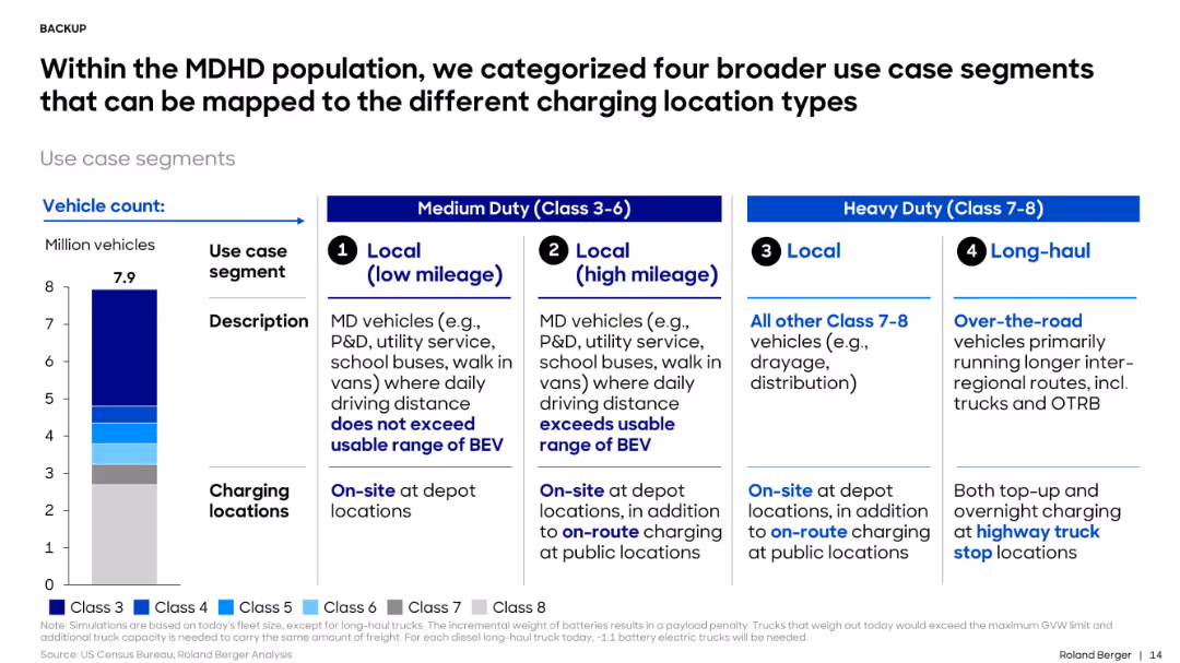
4-column layout; left shows a bar chart of vehicle counts by class; right side displays four categorized use cases in separate text boxes, separated by bolded titles.
Customer and Market Segmentation
Transportation & Logistics
The slide categorizes medium and heavy-duty vehicles into four charging location use cases: local low mileage, local high mileage, local heavy-duty, and long-haul. Each segment includes description and applicable charging locations.
MDHD, use case, charging, vehicle class, long-haul, local, BEV, depot, on-route, fleet
false
Customer and Market Segmentation
Transportation & Logistics
Mixed Chart
Roland Berger
Add to my slides
Remove from favorites
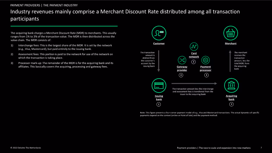
The slide describes the components of the Merchant Discount Rate (MDR) with a flow diagram showing how MDR is distributed among participants. Text details the breakdown of fees and the roles of different entities in the payment process.
Financial Performance
Financial Services
This slide provides an overview of the Merchant Discount Rate (MDR) in the payment industry, explaining how fees are distributed among banks, networks, and processors, and highlighting the financial implications for merchants and other stakeholders.
MDR, payment industry, fees, revenue distribution, roles
false
Financial Performance
Financial Services
Diagram
Deloitte
Add to my slides
Remove from favorites
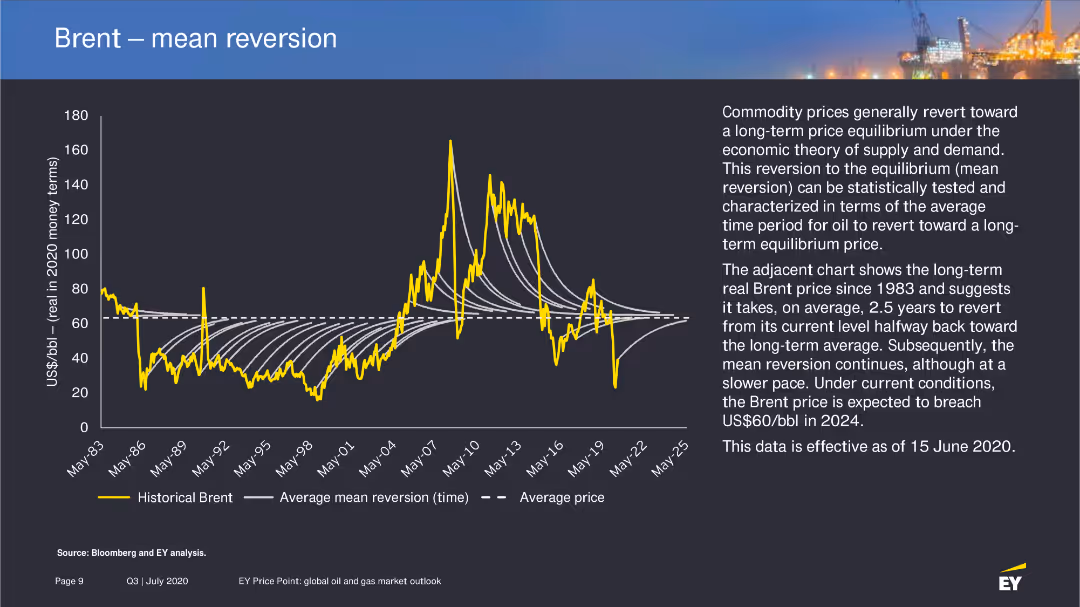
The slide includes a line chart showing historical Brent prices and the average mean reversion time, with a detailed explanation of the concept of mean reversion in commodity prices.
Market Analysis and Trends
Energy & Utilities
Explores the theory of mean reversion in oil prices, presenting historical data and future projections to explain the expected price adjustments over time.
mean reversion, Brent prices, oil market, 2020
false
Market Analysis and Trends
Energy & Utilities
Mixed Chart
EY
Add to my slides
Remove from favorites
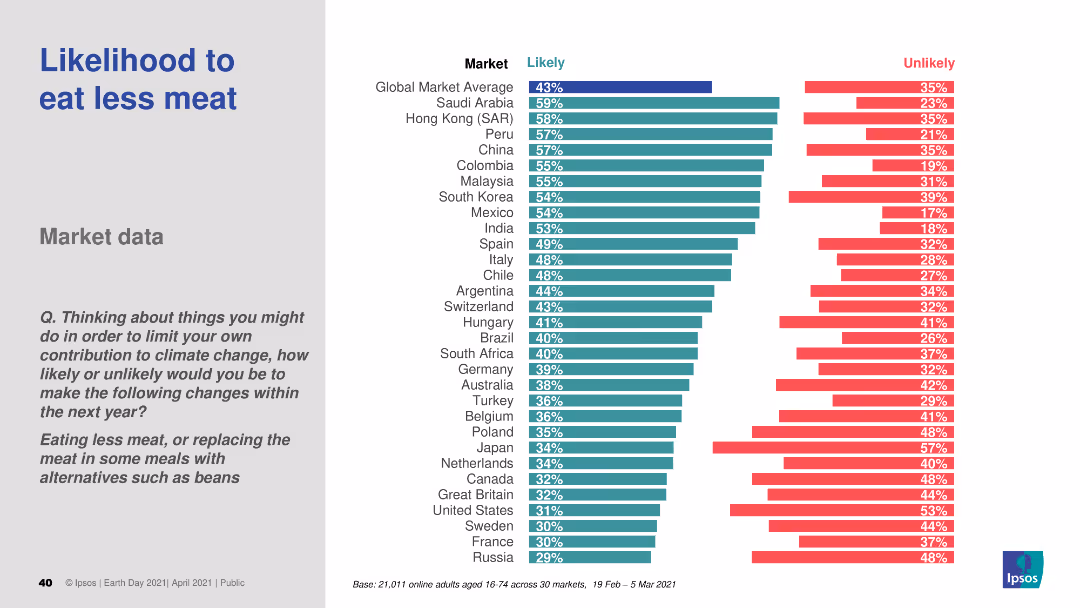
A bar chart (horizontal) showing the likelihood of eating less meat across various countries. The chart differentiates between likely and unlikely responses using distinct colors.
Market Analysis and Trends
Agriculture & Food Production
The slide explores global consumer trends towards reducing meat consumption. It includes comparative data from different countries, providing insights into dietary changes for environmental reasons.
meat consumption, dietary changes, sustainability, consumer behavior, comparative data
false
Market Analysis and Trends
Agriculture & Food Production
Multiple Chart
IPSOS
Add to my slides
Remove from favorites
Includes bubble charts and linear indicators to evaluate digital transformation's impact in media, with focuses on personalized content and OTT services.
Market Analysis and Trends
Media & Entertainment
Evaluates the $1.3 trillion potential from digital transformation in media, stressing the role of OTT and personalized advertising.
Media, Digital Transformation, Personalization, OTT, Industry Value
false
Market Analysis and Trends
Media & Entertainment
Mixed Chart
Accenture
Add to my slides
Remove from favorites
A bar chart illustrating the perceived effectiveness of various traditional paid media channels like linear TV, radio, and print. Each bar is segmented to show different confidence levels among marketers.
Market Analysis and Trends
Media & Entertainment
This slide presents survey data on marketers' confidence in the effectiveness of traditional paid media channels. It highlights the perceived effectiveness of channels like TV, radio, and print for brand building and consumer acquisition.
Media, Effectiveness, Traditional, Channels, Confidence
false
Market Analysis and Trends
Media & Entertainment
Mixed Chart
Nielsen
Add to my slides
Remove from favorites
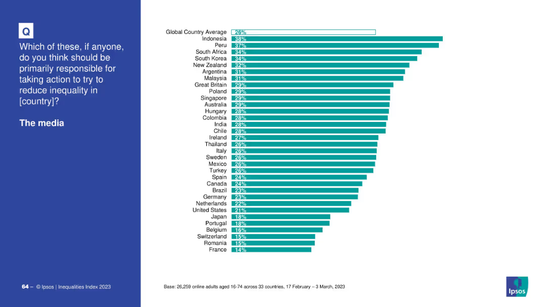
Country-based bar chart showing who thinks the media should reduce inequality.
Market Analysis and Trends
Media & Entertainment
This bar chart shows opinions across countries on whether media should be responsible for reducing inequality. Indonesia and Peru show the highest support; France and Romania the lowest.
media, inequality, responsibility, countries, Ipsos, global opinion, bar chart, public perception
false
Market Analysis and Trends
Media & Entertainment
Mixed Chart
IPSOS
Add to my slides
Remove from favorites
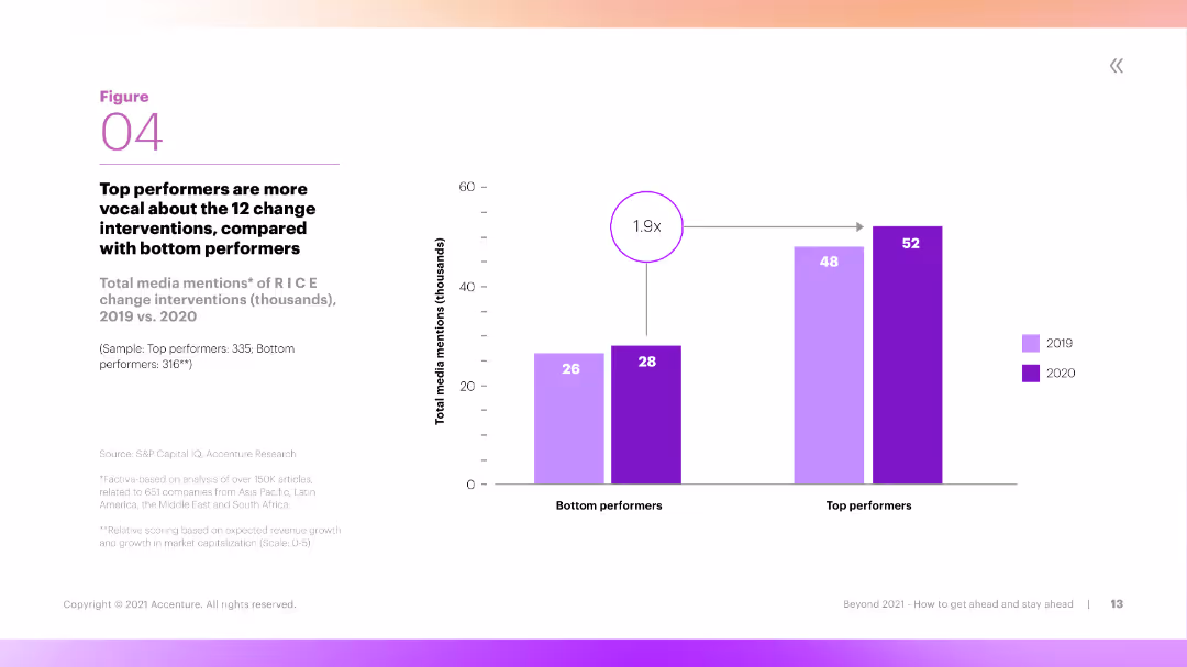
The slide features a column chart showing the number of media mentions of RICE change interventions by top and bottom performers over two years. The chart is clear, with distinct colors for different years and performance levels.
Performance Metrics and KPIs
Professional Services
The slide compares the total media mentions of RICE change interventions between top and bottom performers in 2019 and 2020. It shows that top performers are significantly more vocal about these interventions, indicating proactive engagement.
Media Mentions, RICE, Top Performers, Interventions, Engagement
false
Performance Metrics and KPIs
Professional Services
Mixed Chart
Accenture
Add to my slides
Remove from favorites
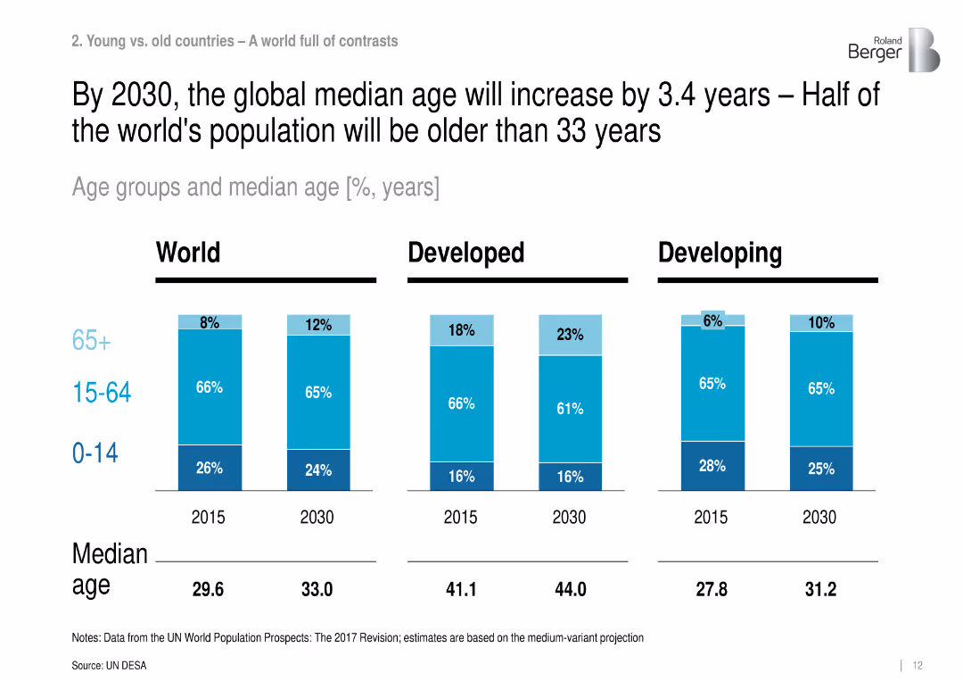
Bar charts showing population age structure (0-14, 15-64, 65+) for World, Developed, and Developing regions for 2015 and 2030.
Strategic Planning
Government & Public Sector
The slide compares population age groups and median age across global, developed, and developing regions in 2015 and 2030. It highlights aging trends, especially in developed nations, and increasing global median age.
median age, demographics, aging population, youth population, developed countries, developing countries, global aging
false
Strategic Planning
Government & Public Sector
Single Chart
Roland Berger
Add to my slides
Remove from favorites
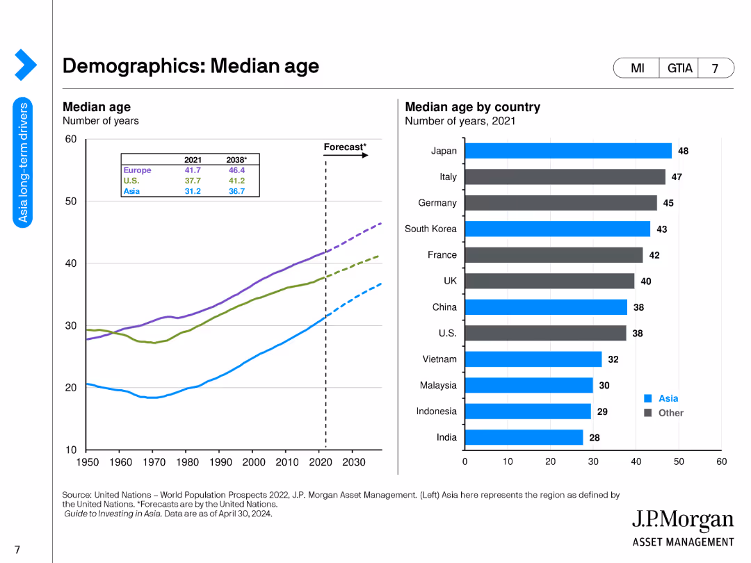
The slide contains a line chart showing the median age of various regions from 1950 to 2030, and a bar chart listing the median age by country in 2021.
Market Analysis and Trends
Financial Services
This slide provides an analysis of median age trends across different regions and countries, highlighting demographic shifts and their potential impact on economic and social structures.
Median Age, Demographics, Regions, Countries, Trends
false
Market Analysis and Trends
Financial Services
Multiple Chart
JP Morgan
Add to my slides
Remove from favorites
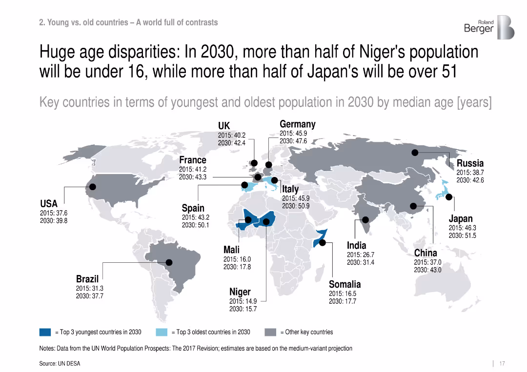
World map highlighting countries with youngest and oldest projected median ages in 2030.
Customer and Market Segmentation
Government & Public Sector
Compares countries with the youngest and oldest projected populations in 2030 by median age, revealing extreme disparities between nations like Niger (15.7) and Japan (51.5).
median age, population disparities, aging, youth bulge, demographic contrast, Niger, Japan
false
Customer and Market Segmentation
Government & Public Sector
Single Chart
Roland Berger
Add to my slides
Remove from favorites
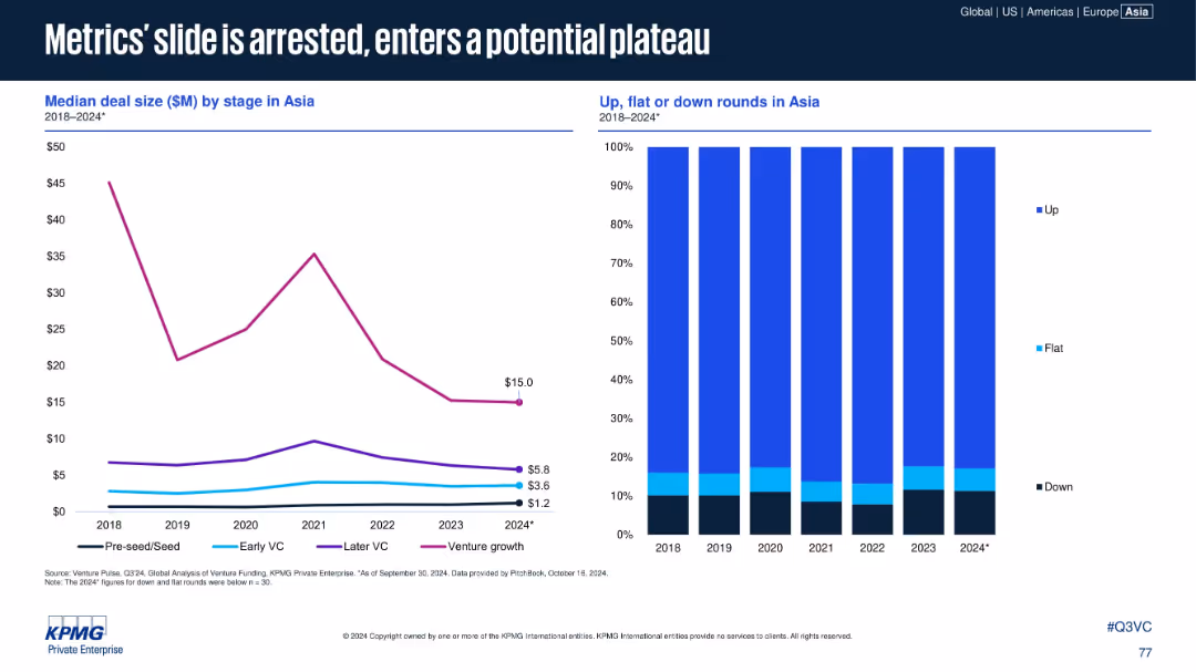
Two charts: Line chart on left (median deal size by stage) and stacked bar chart on right (up/flat/down rounds share). Balanced layout, clean color coding by stage.
Performance Metrics and KPIs
Financial Services
Analyzes median deal sizes across VC stages in Asia from 2018–2024, showing recent stabilization. The right chart indicates round valuation trends—up rounds remain dominant, with flat/down rounds steady across years.
Median Deal Size, VC Rounds, Asia, Up Rounds, Down Rounds, Flat Rounds, Trends
false
Performance Metrics and KPIs
Financial Services
Multiple Chart
KPMG
Add to my slides
Remove from favorites
This slide includes two column charts displaying median time to trial for family law final order cases over several years. Each chart shows a series of bars grouped by year, indicating an upward trend in the time required for trial.
Regulatory and Compliance
Government & Public Sector
The slide illustrates the increasing median time to trial in family law courts, emphasizing the growing backlog problem. It displays a comparative analysis of the time to trial over five years, signifying challenges in case handling and judicial efficiency.
median time, trial, family law, backlog, efficiency
false
Regulatory and Compliance
Government & Public Sector
Multiple Chart
PwC/Strategy&
Add to my slides
Remove from favorites
Two sets of column charts for 2015 and 2025 show the SEA online media market size, focusing on gaming and online ads.
Market Analysis and Trends
Media & Entertainment
This slide illustrates the fivefold growth of SEA's online media market by 2025, driven by mobile gaming and online ads, with textual details on the contributing factors.
media, SEA, growth, gaming, online ads
false
Market Analysis and Trends
Media & Entertainment
Mixed Chart
Bain
Add to my slides
Remove from favorites
Bar chart showing growth projections across various media segments globally towards 2023 with red bars of varying heights.
Market Analysis and Trends
Media & Entertainment
Examines growth projections for various media segments like virtual reality and OTT video, highlighting their leadership towards 2023.
Media Segments, Growth, Virtual Reality, OTT Video, 2023, Global
false
Market Analysis and Trends
Media & Entertainment
Single Chart
PwC/Strategy&
Add to my slides
Remove from favorites
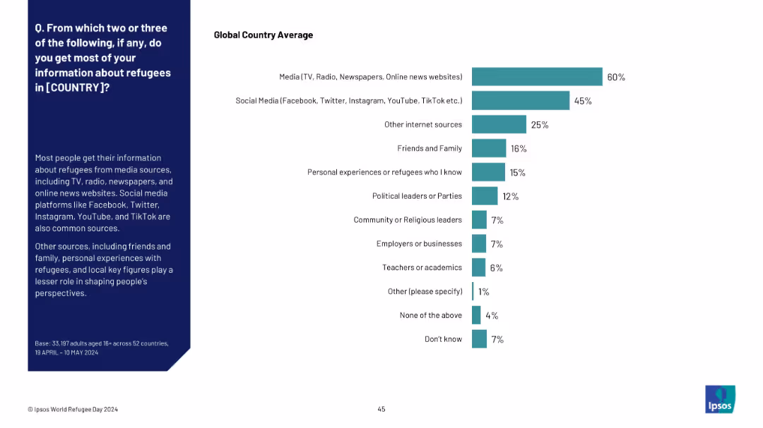
Horizontal bar chart showing ranked sources of refugee-related information, from media to personal networks. Sidebar text explains the role of traditional and social media.
Market Analysis and Trends
Media & Entertainment
This slide explores where people primarily get information about refugees, revealing traditional media and social media as dominant sources. Lesser-used sources include personal experience and political or religious figures.
media sources, social media, refugee awareness, public opinion, information channels, Ipsos, source trust, communications
false
Market Analysis and Trends
Media & Entertainment
Mixed Chart
IPSOS
Add to my slides
Remove from favorites
Pie charts comparing current vs. optimal media spend allocations in TV and digital media, indicating areas of over and underinvestment.
Market Analysis and Trends
Media & Entertainment
Discusses media budget allocation strategies, suggesting optimal spends for TV and digital platforms to maximize ROI.
media, spend, allocation, TV, digital, strategy, marketing, investment, ROI
false
Market Analysis and Trends
Media & Entertainment
Multiple Chart
Accenture
Add to my slides
Remove from favorites
Column charts showing current vs. optimal media spend allocations across different industries, including automotive, telecom, CPG, and OTC pharma.
Investment Analysis
Media & Entertainment
Provides an industry-wide comparison of media spend allocations, identifying discrepancies between current expenditures and optimal investments.
media, spend, automotive, telecom, CPG, pharma, industries, analysis, investment
false
Investment Analysis
Media & Entertainment
Single Chart
Accenture
Add to my slides
Remove from favorites
Bar charts and icons displaying media spend across key verticals in Canada including automotive, CPG, OTC pharma, and telecom.
Financial Performance
Media & Entertainment
Examines media expenditure by Canadian firms across various industries, highlighting the proportion spent on digital and traditional media.
media, spend, Canada, automotive, financial, performance, digital, traditional, industries
false
Financial Performance
Media & Entertainment
Mixed Chart
Accenture
Add to my slides
Remove from favorites
Bar chart comparing media spend as a percentage of overall revenues between Canadian and U.S. firms, with a focus on media's impact on sales.
Market Analysis and Trends
Media & Entertainment
Analyzes media investment efficiency in Canada, comparing it to the U.S., and discusses the impact on sales and ROI.
media, spend, revenue, Canada, US, financial, analysis, investment, ROI
false
Market Analysis and Trends
Media & Entertainment
Mixed Chart
Accenture
Add to my slides
Remove from favorites
The slide contains a large title at the top, a significant central column chart detailing revenue from Canadian media spend, and a smaller red arrow chart highlighting a 4% gap.
Market Analysis and Trends
Media & Entertainment
This slide addresses the revenue missed by national brands in Canada due to media spending, quantifying the potential increase in sales.
media spend, revenue gap, sales increase, Canadian advertisers, optimization
false
Market Analysis and Trends
Media & Entertainment
Single Chart
Accenture
Add to my slides
Remove from favorites
Features a pie chart and icon indicators, illustrating the optimal allocation of a hypothetical 5% increase in media spend, with the majority allocated to TV.
Investment Analysis
Media & Entertainment
Suggests strategies for optimizing media spend over the next four years, focusing on the advantageous allocation to TV for maximizing ROI.
media spend, ROI, TV advertising, strategic allocation, future planning
false
Investment Analysis
Media & Entertainment
Mixed Chart
Accenture
Add to my slides
Remove from favorites
Displays a composite of multiple line charts illustrating the revenue trajectories of different media segments from 2019 to 2024 in India. Each segment, such as internet, TV, and newspapers, is color-coded for clarity, highlighting the divergent paths of digital versus traditional media.
Market Analysis and Trends
Media & Entertainment
Provides an analysis of growth trends in various media segments, with a stark contrast between the robust growth of digital platforms and the decline of traditional media. This slide is used to facilitate strategic discussions on budget allocation, advertising strategies, and preparing for long-term shifts in media consumption patterns.
media trends, digital growth, traditional decline
false
Market Analysis and Trends
Media & Entertainment
Mixed Chart
PwC/Strategy&
Add to my slides
Remove from favorites
The slide shows a timeline of newspaper revenue from 2003 to 2019 in Western Europe, with stacked column charts depicting revenue sources such as print and online. The decline in total revenue is clearly marked, showing a significant reduction over the years.
Industry Overview
Media & Entertainment
Analyzes the decline in newspaper revenues in Western Europe, focusing on changes in revenue sources such as print and online advertising. This information is critical for understanding the shifting landscape of the media industry and could influence strategic decisions in media management and business model adaptation.
media trends, revenue decline, print advertising, online growth, market analysis
false
Industry Overview
Media & Entertainment
Mixed Chart
Accenture
Add to my slides
Remove from favorites
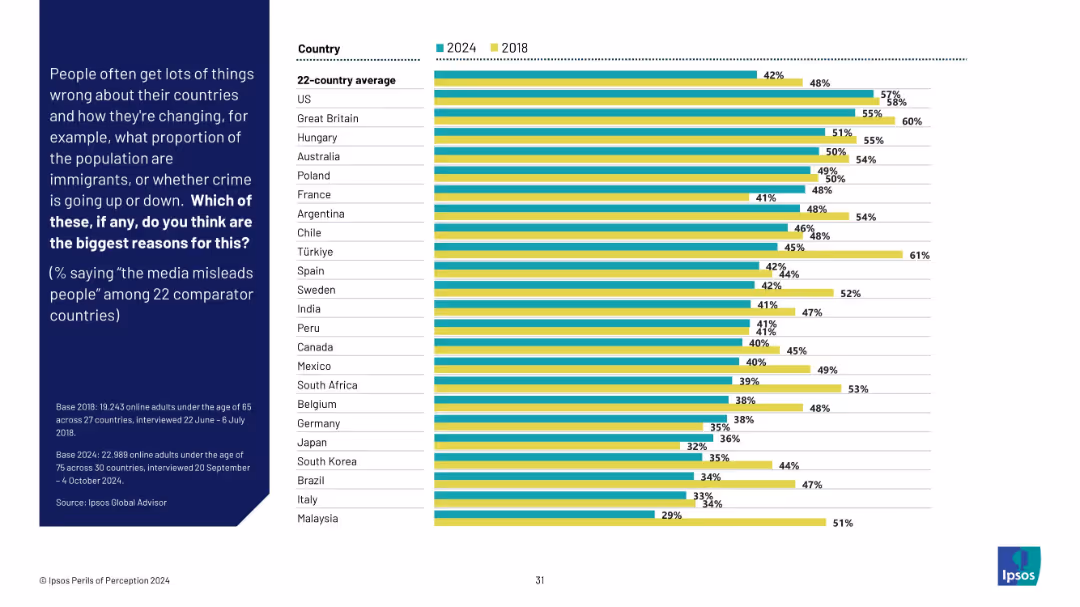
Grouped bar chart of 2024 vs 2018 results by country on media misinformation. Shows variation in trust over time.
Market Analysis and Trends
Media & Entertainment
This slide examines changes in perceived media misinformation across 22 countries. Overall trust in media has declined in many nations, highlighting a growing skepticism toward traditional news sources.
media trust, misinformation, survey trends, public perception, Ipsos, global media, international comparison
false
Market Analysis and Trends
Media & Entertainment
Mixed Chart
IPSOS
Add to my slides
Remove from favorites
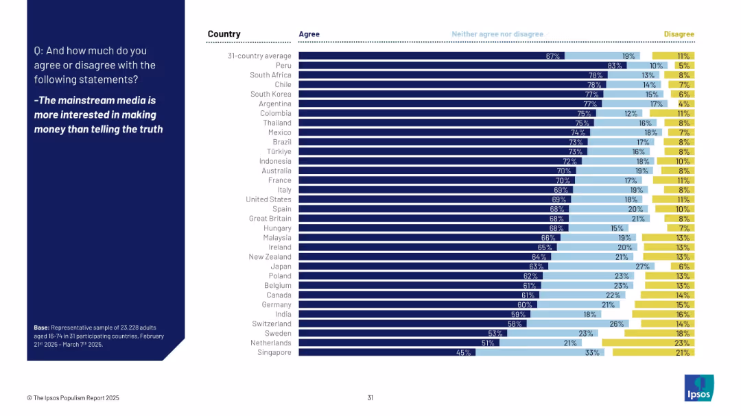
Horizontal bar chart showing agreement across countries that media prioritizes profit over truth, with neutral/disagree splits and ranking.
Market Analysis and Trends
Media & Entertainment
The slide reveals skepticism toward mainstream media, with 67% of global respondents agreeing that media prioritizes money over truth. Japan (63%) ranks above average, while countries like Peru and South Africa show the highest agreement.
media, truth, profit, skepticism, public trust, Ipsos, journalism, populism, 2025, perception
false
Market Analysis and Trends
Media & Entertainment
Mixed Chart
IPSOS
Add to my slides
Remove from favorites
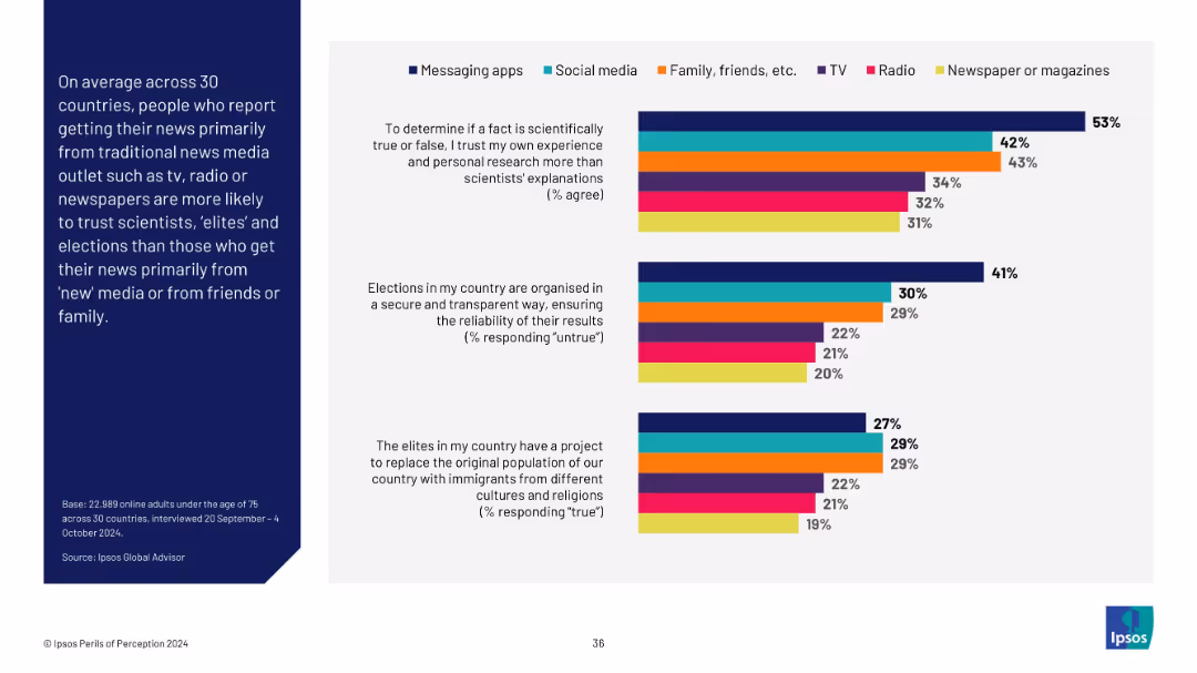
Bar chart with six color-coded categories comparing attitudes toward science, elites, and elections based on primary news source; left text panel explanation.
Market Analysis and Trends
Media & Entertainment
Demonstrates that individuals who rely on traditional media (TV, newspapers, radio) trust scientists and elections more than those who use messaging apps or social media for news.
media types, news source, trust, elections, scientists, misinformation, Ipsos, attitudes
false
Market Analysis and Trends
Media & Entertainment
Mixed Chart
IPSOS
Add to my slides
Remove from favorites
Column chart slide showing the average time spent per day on various media, with different colors representing different activities like TV, radio, and internet.
Market Analysis and Trends
Media & Entertainment
Details the average daily media usage, emphasizing the significant amount of time adults spend consuming various forms of media.
media usage, time spent, TV, radio, internet, daily consumption
false
Market Analysis and Trends
Media & Entertainment
Single Chart
Nielsen
Add to my slides
Remove from favorites
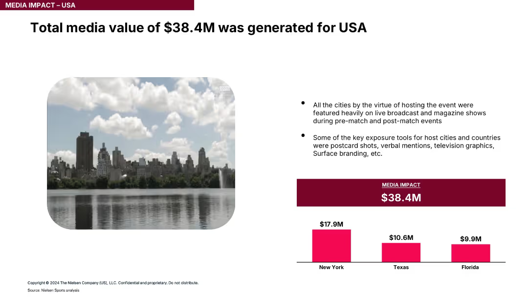
Large image of NYC with bullet points and pink bar chart comparing media value generated by city.
Market Analysis and Trends
Media & Entertainment
The slide estimates total media exposure value from the event at $38.4M, with New York leading, followed by Texas and Florida. It attributes value to TV coverage, branding, and visual content.
media value, exposure, television, branding, event marketing, city coverage, ROI
false
Market Analysis and Trends
Media & Entertainment
Mixed Chart
Nielsen
Add to my slides
Remove from favorites
Features multiple line charts showing enrollment numbers by eligibility type over time. Detailed text explains trends and implications of the data shown.
Regulatory and Compliance
Healthcare & Pharmaceuticals
Analyzes changes in Medicaid care management enrollment during 2020, showing growth trends across different eligibility groups and monthly increases in enrollment.
Medicaid, care management, enrollment, eligibility
false
Regulatory and Compliance
Healthcare & Pharmaceuticals
Multiple Chart
Alvarez & Marsal
Add to my slides
Remove from favorites
The slide features three line charts comparing enrollment numbers across three health plans (AmeriHealth Caritas, NH Healthy Families, Well Sense) over different periods. The table below summarizes enrollment data. The slide aims to analyze the impact of performance incentives on health plan enrollment.
Regulatory and Compliance
Healthcare & Pharmaceuticals
Examines health plan performance incentives in Medicaid care management, showing trends in membership growth for different health plans and the impact of incentives.
Medicaid, health plan, performance, incentives, trends
false
Regulatory and Compliance
Healthcare & Pharmaceuticals
Multiple Chart
Alvarez & Marsal
Add to my slides
Remove from favorites
The slide presents three line charts showing the enrollment distribution percentages across three health plans (AmeriHealth Caritas, NH Healthy Families, Well Sense) over several fiscal years. The table below provides specific distribution percentages. The focus is on market share impact.
Regulatory and Compliance
Healthcare & Pharmaceuticals
Analyzes the impact of performance incentives on health plan market share, showing enrollment distribution changes for various health plans in the Medicaid program.
Medicaid, health plan, performance, market share
false
Regulatory and Compliance
Healthcare & Pharmaceuticals
Multiple Chart
Alvarez & Marsal
Add to my slides
Remove from favorites
Column chart showing agreement and disagreement percentages on the belief that all diseases will be curable across countries.
Market Analysis and Trends
Healthcare & Pharmaceuticals
The slide examines the belief in the future curability of all medical conditions, with significant variation across countries.
medical advancements, future expectations, public opinion, global health, curability
false
Market Analysis and Trends
Healthcare & Pharmaceuticals
Multiple Chart
IPSOS
Add to my slides
Remove from favorites
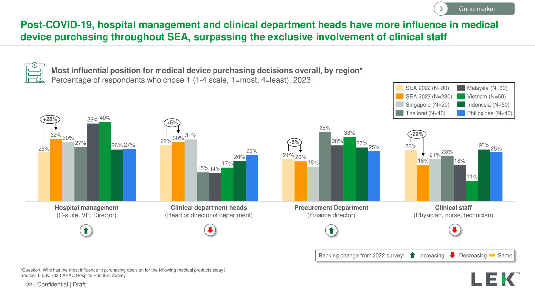
Vertical column chart comparing influential positions for medical device purchasing across various SEA countries. Bars are color-coded for regions and roles.
Market Analysis and Trends
Healthcare & Pharmaceuticals
Shows how post-COVID-19, hospital management and clinical department heads in SEA have increased influence on medical device purchasing, surpassing clinical staff.
medical device, purchasing, influence, post-COVID-19, SEA, hospital management, clinical department heads
false
Market Analysis and Trends
Healthcare & Pharmaceuticals
Multiple Chart
LEK
Add to my slides
Remove from favorites
Column chart showing change in hospital expenditure on medical devices/equipment over the past three years.
Market Analysis and Trends
Healthcare & Pharmaceuticals
This slide details the expected increase in spending on medical devices across various APAC countries.
medical devices, expenditure, APAC, healthcare, growth
false
Market Analysis and Trends
Healthcare & Pharmaceuticals
Single Chart
LEK
Add to my slides
Remove from favorites
Diagram plotting the likelihood and impact of selected technological innovations in health and medicine by 2050, such as the end of cancer, bionic eyes, and gene editing.
Technology and Digital Transformation
Healthcare & Pharmaceuticals
The slide highlights the potential for technological innovations to advance medical progress and improve human health by 2050. It plots various medical breakthroughs in terms of their likelihood and impact, emphasizing the transformative effects these innovations could have on eradicating diseases and enhancing the quality of life.
Medical Progress, Health Innovations, 2050
false
Technology and Digital Transformation
Healthcare & Pharmaceuticals
Mixed Chart
Roland Berger
Add to my slides
Remove from favorites
Split layout with bar charts detailing digital capability preferences by generation on the right and an image on the left.
Market Analysis and Trends
Healthcare & Pharmaceuticals
Shows that younger consumers are more likely to choose medical providers offering digital capabilities, with preferences varying by generation.
medical, providers, digital, preferences, generation
false
Market Analysis and Trends
Healthcare & Pharmaceuticals
Multiple Chart
Accenture
Add to my slides
Remove from favorites
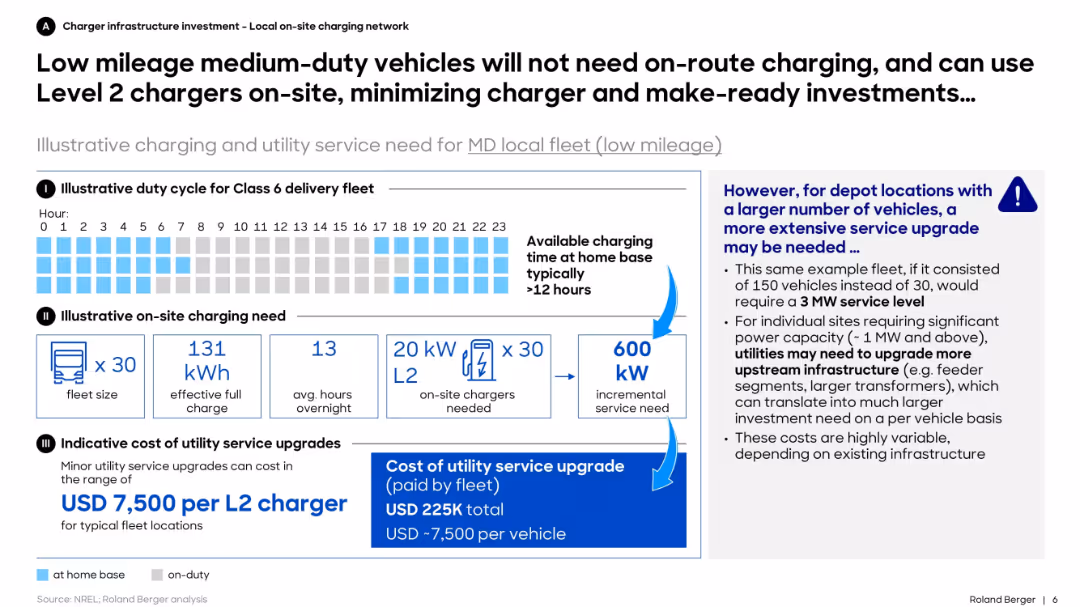
Three sections: duty cycle timeline, on-site charging need visualization, and cost breakdown. Includes side note on larger depots and utility upgrades.
Operational Efficiency
Transportation & Logistics
The slide demonstrates that low-mileage medium-duty electric fleets can rely on overnight Level 2 charging at depots, minimizing infrastructure investment. It also warns that larger depots may require significant service upgrades for power capacity.
medium-duty, EV, fleet, charging, Level 2, utility, cost, investment, overnight, infrastructure
false
Operational Efficiency
Transportation & Logistics
Mixed Chart
Roland Berger
Add to my slides
Remove from favorites
Includes two column charts showing GVA and employment growth in major cities for 2024-2026.
Strategic Planning
Government & Public Sector
Details medium-term growth prospects for major cities, emphasizing sector specialisms and differential growth rates across regions.
medium-term growth, major cities, sector specialism, GVA, employment, column chart
false
Strategic Planning
Government & Public Sector
Multiple Chart
EY
Add to my slides
Remove from favorites
Bar chart ranking the top 8 MedTech companies perceived to deliver the best hospital solutions in APAC.
Competitive Landscape
Healthcare & Pharmaceuticals
This slide ranks the MedTech companies based on hospital solutions' perception in various APAC markets.
MedTech, hospital solutions, APAC, ranking, healthcare
false
Competitive Landscape
Healthcare & Pharmaceuticals
Mixed Chart
LEK
Add to my slides
Remove from favorites
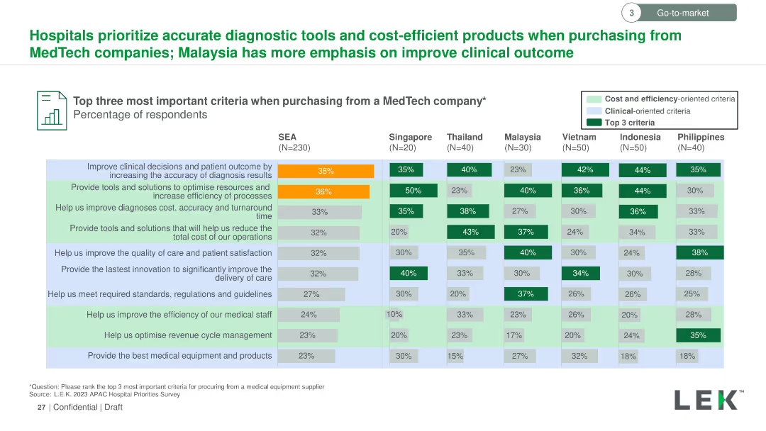
Vertical column chart comparing criteria for purchasing from MedTech companies across SEA countries. Color-coded bars for different criteria.
Market Analysis and Trends
Healthcare & Pharmaceuticals
Highlights the top three most important criteria when purchasing from MedTech companies in SEA, focusing on diagnostic accuracy, resource optimization, and process efficiency.
MedTech, purchasing criteria, diagnostic accuracy, resource optimization, process efficiency, SEA
false
Market Analysis and Trends
Healthcare & Pharmaceuticals
Multiple Chart
LEK
Add to my slides
Remove from favorites
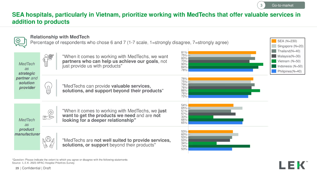
Text-based slide with horizontal bar graphs showing percentage responses from SEA hospitals regarding their relationship preferences with MedTech companies.
Strategic Planning
Healthcare & Pharmaceuticals
Analyzes SEA hospitals' preference for MedTech companies as strategic partners rather than just product suppliers, focusing on services and support beyond products.
MedTech, SEA hospitals, strategic partnerships, services, support, product suppliers
false
Strategic Planning
Healthcare & Pharmaceuticals
Multiple Chart
LEK
Add to my slides
Remove from favorites
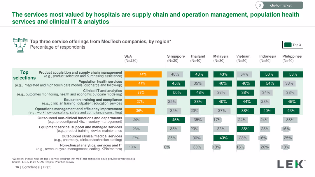
Vertical column chart listing the top three valued services from MedTech companies by region. Color-coded bars indicate the percentage of respondents per service.
Market Analysis and Trends
Healthcare & Pharmaceuticals
Outlines the top three service offerings from MedTech companies valued by hospitals, such as supply chain management, population health services, and clinical IT & analytics, with regional preferences detailed.
MedTech, valued services, hospitals, supply chain management, population health, clinical IT, analytics
false
Market Analysis and Trends
Healthcare & Pharmaceuticals
Multiple Chart
LEK
Add to my slides
Remove from favorites
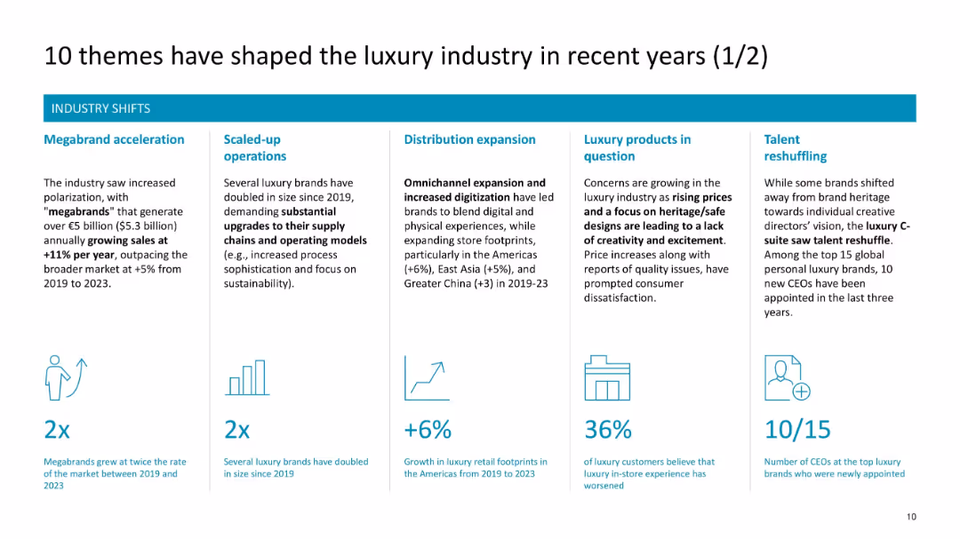
Horizontal layout with six themed boxes (icons + text) on industry shifts
Strategic Planning
Consumer Goods
This slide presents six key industry-wide changes including megabrand growth, operational scaling, distribution expansion, concerns over product creativity, and CEO reshuffling trends.
megabrands, operations, distribution, reshuffling, industry shifts, retail expansion, price sensitivity
false
Strategic Planning
Consumer Goods
Pillar
McKinsey
Add to my slides
Remove from favorites
Displays a map with overlaid proportional circles representing the population of major cities in 2020 and projected for 2035.
Market Analysis and Trends
Government & Public Sector
Focuses on population growth in major cities, particularly in Asia, to discuss urban infrastructure needs.
megacities, Asia, population growth, 2035, infrastructure
false
Market Analysis and Trends
Government & Public Sector
Graphic
Roland Berger
Add to my slides
Remove from favorites
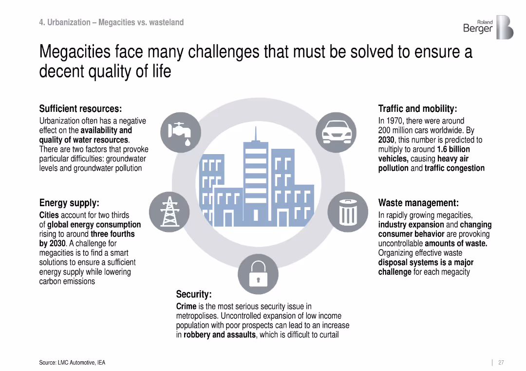
Circular city icon in center with six icons describing quality-of-life issues (resources, mobility, etc.).
Market Analysis and Trends
Government & Public Sector
Highlights challenges faced by megacities such as energy demand, water scarcity, crime, traffic congestion, and waste, emphasizing the need for sustainable urban infrastructure solutions.
megacities, quality of life, urbanization, infrastructure, sustainability
false
Market Analysis and Trends
Government & Public Sector
Uncategorized
Roland Berger
Add to my slides
Remove from favorites
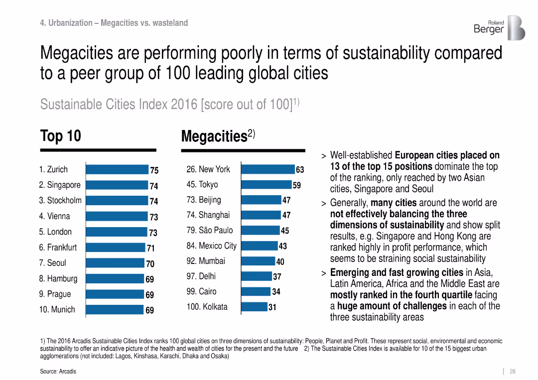
Dual bar chart groups: “Top 10” cities and “Megacities”, with rankings and text commentary.
Market Analysis and Trends
Government & Public Sector
Compares the sustainability scores of major global cities, highlighting that megacities score significantly lower due to imbalance in environmental, social, and economic dimensions.
megacities, sustainability, urban planning, global cities, environmental index
false
Market Analysis and Trends
Government & Public Sector
Mixed Chart
Roland Berger
Add to my slides
Remove from favorites
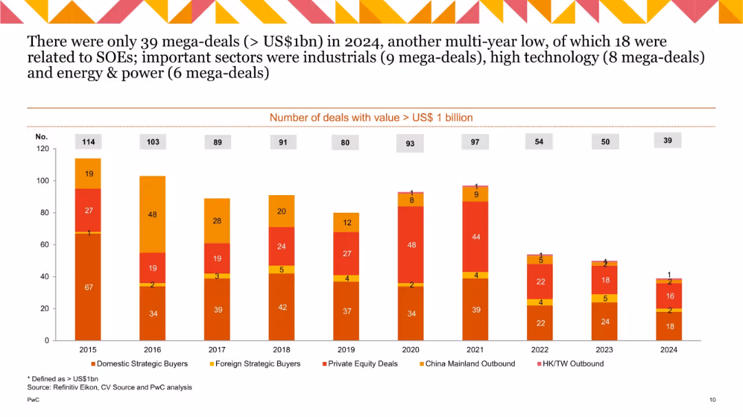
Stacked bar chart tracking number of mega-deals (> US$1bn) from 2015 to 2024 by buyer type; declining trend visible; segment colors match categories.
Performance Metrics and KPIs
Financial Services
Tracks annual number of mega-deals by type. 2024 saw only 39, the lowest in a decade. Industrial, technology, and energy sectors dominated. Many were state-owned enterprise-driven, reflecting weak private mega-deal activity.
mega-deals, US$1bn, deal count, strategic buyers, SOEs, sectors
false
Performance Metrics and KPIs
Financial Services
Single Chart
PwC/Strategy&
Add to my slides
Remove from favorites
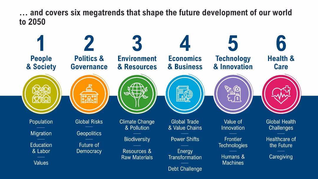
Six icons representing megatrends from 1 to 6, each with a brief description and keywords below: People & Society, Health & Care, Environment & Resources, Economics & Business, Technology & Innovation, Politics & Governance.
Strategic Planning
Financial Services
The slide outlines six major trends that will shape global development until 2050, covering areas such as society, health, environment, economy, technology, and politics. It highlights the importance of these trends for strategic planning and long-term forecasting in various industries.
Megatrends, 2050, Strategic Planning
false
Strategic Planning
Financial Services
Pillar
Roland Berger
Add to my slides
Remove from favorites
Moderate visual complexity with iconography linking megatrends to new applications in process automation, and the technologies enabling these applications. The layout is well-organized, using colors and icons to differentiate between elements.
Technology and Digital Transformation
Industrial & Manufacturing
This slide connects global megatrends to their corresponding new process automation applications and the digital technologies that enable them. It aims to demonstrate how advancing technology responds to and leverages megatrends to innovate within process automation.
Megatrends, Automation applications, Digital technology, Innovation
false
Technology and Digital Transformation
Industrial & Manufacturing
Header Vertical
LEK
Add to my slides
Remove from favorites
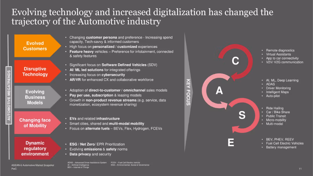
Left vertical layout lists six megatrends with arrow blocks; right side visualizes the CASE framework (Connected, Autonomous, Shared, Electric) and key focus areas.
Technology and Digital Transformation
Industrial & Manufacturing
Describes six megatrends influencing the automotive industry, including evolved customers, disruptive tech, business models, mobility, and regulation. The CASE framework reinforces strategic shifts in tech integration, customer focus, and infrastructure adaptation.
megatrends, CASE, automotive tech, mobility, EV, cybersecurity, AI, business models
false
Technology and Digital Transformation
Industrial & Manufacturing
Table
PwC/Strategy&
Add to my slides
Remove from favorites
Simplistic design with a central diagram surrounded by brief text explanations. Focuses on interlinking of various global megatrends.
Industry Overview
Financial Services
Provides a synopsis of interrelated global megatrends impacting all sectors, essential for overarching strategic considerations.
Megatrends, Climate Change, Technological Disruption, Global Impact, Strategic Insights
false
Industry Overview
Financial Services
Framework
PwC/Strategy&
Add to my slides
Remove from favorites
Features six hexagonal icons representing different global megatrends.
Industry Overview
Professional Services
Provides an overview of six megatrends projected to impact global development until 2050, including population dynamics, healthcare evolution, and technological advancements, serving as a strategic tool for future-oriented business and policy planning.
megatrends, global impact, strategic planning, future outlook, societal development
false
Industry Overview
Professional Services
Pillar
Roland Berger
Add to my slides
Remove from favorites
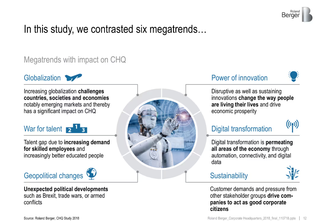
Circular layout with six labeled arrows around a central image of a robot; each arrow includes an icon and brief descriptive text
Market Analysis and Trends
Professional Services
This slide outlines six global megatrends—Globalization, War for Talent, Geopolitical Changes, Power of Innovation, Digital Transformation, and Sustainability—that significantly impact corporate headquarters (CHQ). Each trend is described briefly with emphasis on its implications.
megatrends, globalization, innovation, digital transformation, sustainability, talent, geopolitical
false
Market Analysis and Trends
Professional Services
Framework
Roland Berger
Add to my slides
Remove from favorites
The slide is divided into four quadrants, each with a title, image, and bullet points discussing various megatrends. It uses a clear, readable font, with a color palette that enhances readability and focus. Images are contemporary and relevant to the text content.
Market Analysis and Trends
Professional Services
Explores the key megatrends shaping the future of business and productivity, such as urbanization, digitalization, sustainability, and changing demography, crucial for trend analysis and business development planning.
megatrends, growth, productivity, urbanization, digitalization, sustainability, demography, business trends
false
Market Analysis and Trends
Professional Services
Table
Goldman Sachs
Add to my slides
Remove from favorites
Moderate visual complexity, this slide contains text blocks and icons representing various megatrends affecting the process industries. The design is organized to facilitate easy reading and identification of each megatrend and its impact.
Technology and Digital Transformation
Industrial & Manufacturing
The slide discusses the major global megatrends impacting process industries and the challenges they pose. It outlines the areas such as environmental sustainability and health & safety where these industries need to adapt and innovate, offering a strategic perspective on navigating these shifts.
Megatrends, Process industries, Environmental sustainability, Safety
false
Technology and Digital Transformation
Industrial & Manufacturing
Header Vertical
LEK
Add to my slides
Remove from favorites
Infographic-style layout with icons and color-coded sections representing six global megatrends (People, Politics, Environment, Business, Tech, Health)
Strategic Planning
Professional Services
This slide presents six global megatrends projected to shape societal and economic development through 2050, spanning demographics, governance, climate, business, innovation, and healthcare. Each trend is categorized and visually represented.
Megatrends, Society, Environment, Governance, Innovation, Future, Global Trends, 2050
false
Strategic Planning
Professional Services
Pillar
Roland Berger
Add to my slides
Remove from favorites
A vibrant title slide with a blend of textual information and a large, bold header.
Strategic Planning
Professional Services
This slide introduces the Roland Berger Trend Compendium 2050, which discusses global megatrends influencing future developments, aiming to incorporate these insights into strategic business planning.
megatrends, strategic planning, future, global development, Roland Berger
false
Strategic Planning
Professional Services
Header Vertical
Roland Berger
Add to my slides
Remove from favorites
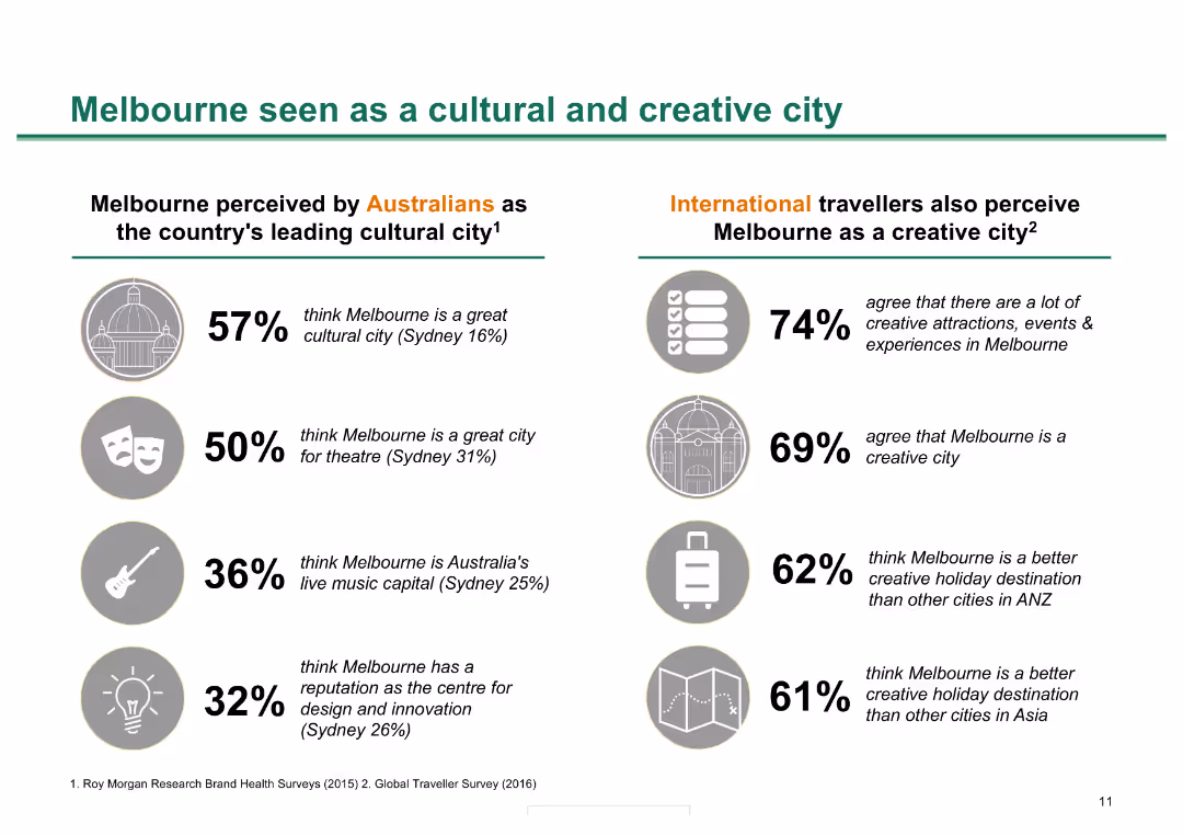
Split layout with icons and statistics comparing Australian and international perceptions of Melbourne as a cultural and creative city.
Market Analysis and Trends
Hospitality & Tourism
This slide compares perceptions of Melbourne's cultural and creative appeal among Australians and international travelers, using survey statistics and key insights.
Melbourne, cultural city, creative city, perceptions, survey, Australians, international travelers, statistics, insights
false
Market Analysis and Trends
Hospitality & Tourism
Header Horizontal
BCG
Add to my slides
Remove from favorites
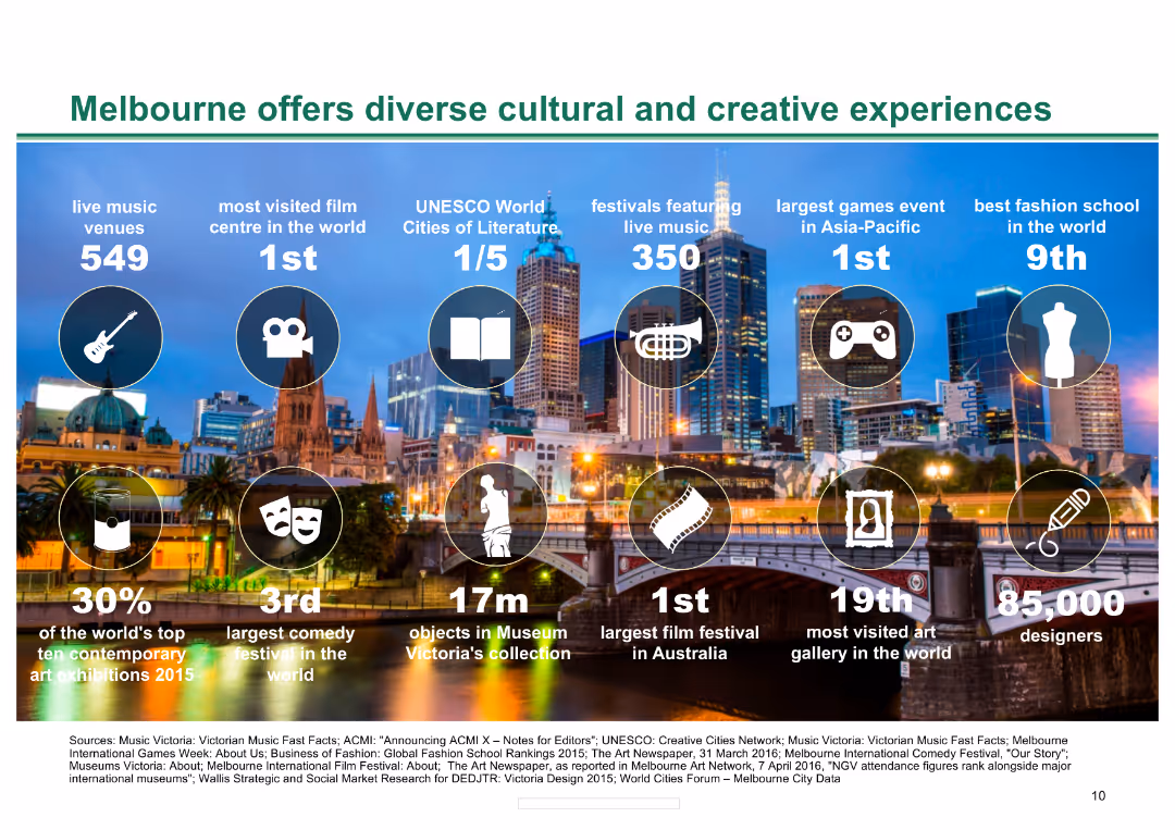
Background image of Melbourne skyline with icons and statistics about Melbourne's cultural and creative offerings, including music venues, film centres, and festivals.
Market Analysis and Trends
Hospitality & Tourism
The slide presents key statistics about Melbourne's cultural and creative experiences, highlighting the city's strengths in various cultural sectors and its international rankings.
Melbourne, cultural, creative, music, film, festivals, experiences, tourism, hospitality, rankings
false
Market Analysis and Trends
Hospitality & Tourism
Pillar
BCG
Add to my slides
Remove from favorites
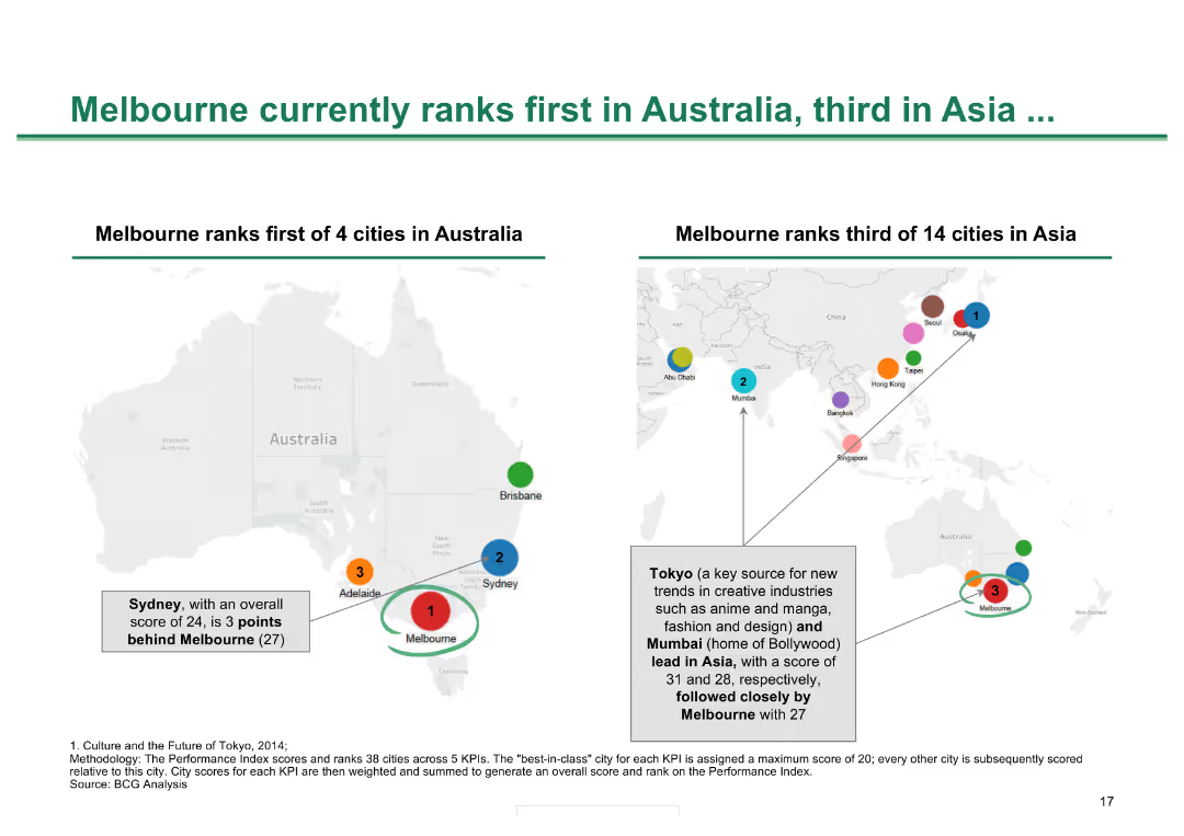
Two maps, one of Australia and one of Asia, showing city rankings with colored dots and text annotations
Competitive Landscape
Hospitality & Tourism
Shows Melbourne's rankings in cultural and creative city indexes within Australia and Asia, demonstrating its status
Melbourne ranking, city comparison, cultural cities, Asia, Australia, city performance
false
Competitive Landscape
Hospitality & Tourism
Header Horizontal
BCG
Add to my slides
Remove from favorites
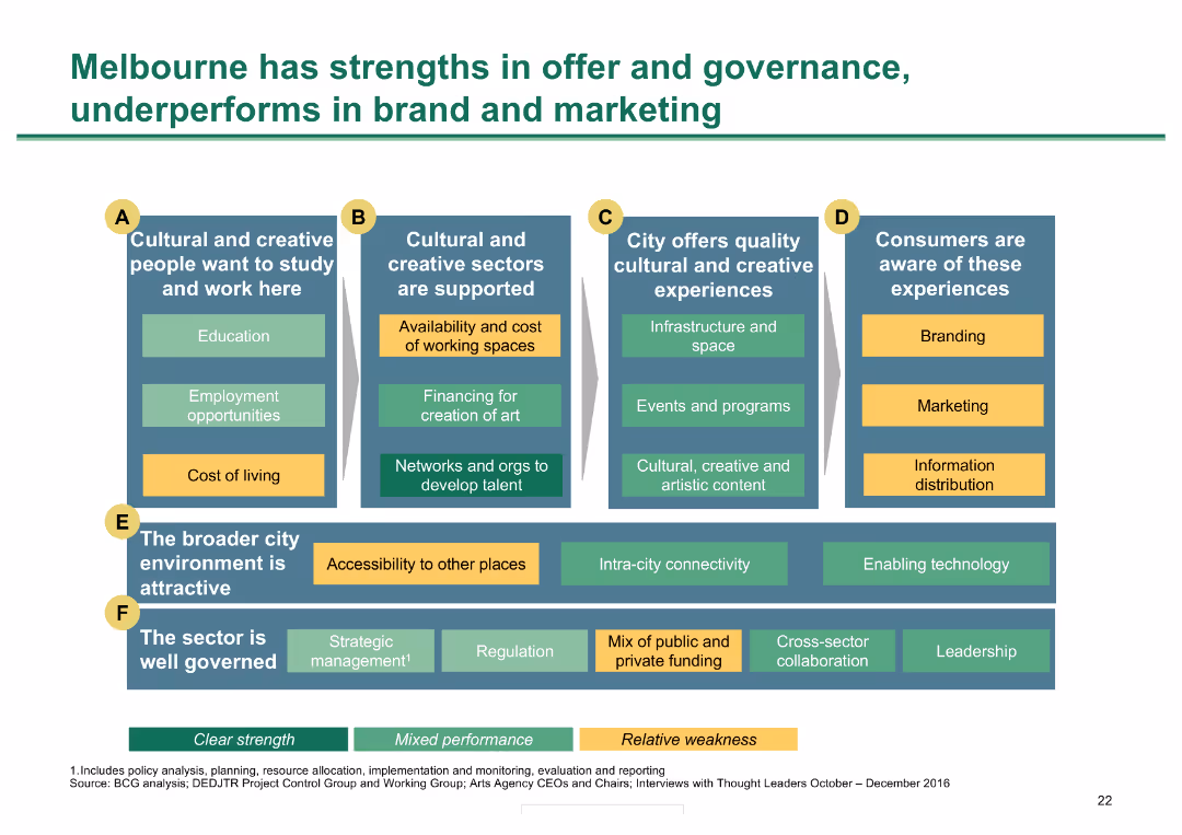
Grid with six categories of metrics; color-coded for strengths, mixed performance, and weaknesses
Market Analysis and Trends
Hospitality & Tourism
Analyzes Melbourne's strengths and weaknesses in various aspects of cultural and creative sector performance
Melbourne strengths, governance, cultural sectors, performance analysis, city metrics
false
Market Analysis and Trends
Hospitality & Tourism
Diagram
BCG
Add to my slides
Remove from favorites
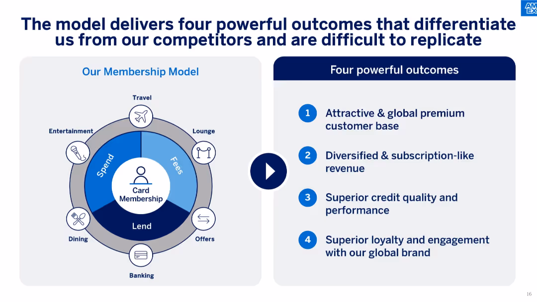
Split layout with a circular membership model diagram on the left and four listed outcomes on the right. Blue tones, icons, and structured text.
Strategic Planning
Financial Services
Highlights how the company's membership model delivers four distinct competitive advantages: a premium customer base, subscription-like revenue, strong credit quality, and brand loyalty. Visual emphasizes ecosystem of services contributing to this model.
membership model, brand loyalty, subscription revenue, premium customers, competitive advantage, financial model, ecosystem, spend, fees, lending, card membership
false
Strategic Planning
Financial Services
Boxed
McKinsey
Add to my slides
Remove from favorites
Includes column charts, tables, and text boxes showing the impact of geopolitical situations on IPO numbers and proceeds.
Risk Assessment and Management
Financial Services
It analyzes the decline in IPOs and proceeds in EMEIA, highlighting the rise in MENA IPO proceeds due to two major IPOs.
MENA, EMEIA, IPOs, geopolitical, mega IPOs
false
Risk Assessment and Management
Financial Services
Multiple Chart
EY
Add to my slides
Remove from favorites
The slide includes a line chart showing the performance of various MENA equity indices throughout 2022. The chart uses multiple colored lines to represent different indices. The bottom section includes a detailed narrative of market performance.
Market Analysis and Trends
Financial Services
This slide depicts the performance of MENA equity markets in 2022, with a line chart tracking various equity indices. It also provides a narrative analysis of market trends, key events, and economic factors influencing the equity performance over the year.
MENA equity markets, financial services, market trends, equity indices, market performance, financial data, year analysis, investment
false
Market Analysis and Trends
Financial Services
Mixed Chart
EY
Add to my slides
Remove from favorites
Features three charts: a column chart for y/y real GDP (2021-2025F), a line chart for interest rates (2005-2025F), and a line chart for y/y CPI (2005-2025F).
Market Analysis and Trends
Financial Services
Discusses economic growth prospects in the MENA region, focusing on GDP, interest rates, and inflation trends.
MENA, GDP, Inflation, Interest Rates, 2024
false
Market Analysis and Trends
Financial Services
Multiple Chart
EY
Add to my slides
Remove from favorites
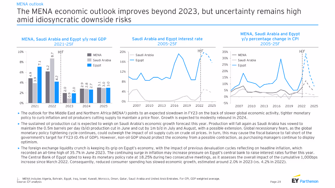
Three charts showing MENA, Saudi Arabia, and Egypt's y/y real GDP, interest rates, and y/y percentage change in CPI from 2021-25F. Moderate complexity, presenting detailed economic trends and projections for the region.
Market Analysis and Trends
Financial Services
This slide analyzes the MENA economic outlook, highlighting GDP growth, interest rates, and inflation trends for Saudi Arabia and Egypt. It discusses the impacts of oil production cuts, monetary policy, and global economic conditions.
MENA, GDP, interest rate, CPI, economy
false
Market Analysis and Trends
Financial Services
Multiple Chart
EY
Add to my slides
Remove from favorites
Professionally designed slide featuring text, a photograph of a woman working on a computer, and a graph. The use of circular shapes and a blue-green color scheme creates a visually cohesive and focused layout.
Technology and Digital Transformation
Healthcare & Pharmaceuticals
Addresses the stigma surrounding menopause, illustrating the percentage of women who work through menopausal symptoms and their comfort level in discussing these in a workplace context.
menopause, workplace, stigma, health challenges, discussion comfort, symptoms
false
Technology and Digital Transformation
Healthcare & Pharmaceuticals
Single Chart
Deloitte
Add to my slides
Remove from favorites
A composite slide with two images of women, text, and a graph detailing statistics about women's menstrual health at work. The design is informative, with clear sections for textual explanation and data visualization in a professional blue and green color scheme.
Technology and Digital Transformation
Healthcare & Pharmaceuticals
The slide presents statistical data on menstrual health challenges affecting women in the workplace, suggesting the need for policy changes regarding paid leave for menstrual symptoms.
menstrual health, workplace, statistics, policy, paid leave, health challenges
false
Technology and Digital Transformation
Healthcare & Pharmaceuticals
Single Chart
Deloitte
Add to my slides
Remove from favorites
Column chart depicting agreement levels by different age groups that they need to do more for their mental well-being, with color-coded segments showing various levels of agreement.
Customer and Market Segmentation
Healthcare & Pharmaceuticals
Focuses on the challenges of mental health across age groups, emphasizing that younger individuals feel a more acute need to address mental well-being compared to older age groups.
mental health, age groups, challenges, survey, agreement
false
Customer and Market Segmentation
Healthcare & Pharmaceuticals
Mixed Chart
IPSOS
Add to my slides
Remove from favorites
This slide includes text, an image of a person, and column charts depicting stress and burnout levels among Gen Z and millennials.
Risk Assessment and Management
Healthcare & Pharmaceuticals
The slide examines the persistent stress and burnout affecting Gen Zs and millennials, identifying groups more likely to experience anxiety and stress.
mental health, burnout, stress, Gen Z, millennials, workplace pressure, anxiety
false
Risk Assessment and Management
Healthcare & Pharmaceuticals
Mixed Chart
Deloitte
Add to my slides
Remove from favorites
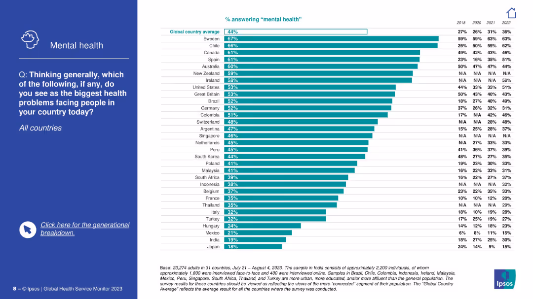
Blue side panel with focus on mental health; right side is a ranked bar chart showing country-level concern over mental health, with historic trend columns.
Market Analysis and Trends
Healthcare & Pharmaceuticals
The slide focuses exclusively on perceptions of mental health as a critical health issue. Sweden, Chile, and Canada top the list. A trend section shows how mental health concern has grown across countries over recent years.
mental health, concern trends, global comparison, Ipsos, public perception, awareness, health priorities, international ranking, time series
false
Market Analysis and Trends
Healthcare & Pharmaceuticals
Mixed Chart
IPSOS
Add to my slides
Remove from favorites
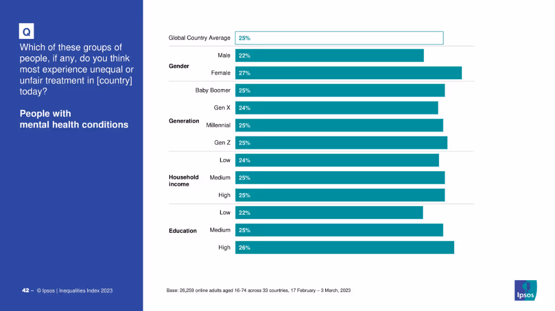
Same layout as others: demographic breakdown chart on right side.
Market Analysis and Trends
Healthcare & Pharmaceuticals
Survey responses are segmented by gender, generation, household income, and education to show varying perceptions of discrimination toward mental health issues.
mental health, demographics, income, gender, education, perception, inequality, Ipsos
false
Market Analysis and Trends
Healthcare & Pharmaceuticals
Mixed Chart
IPSOS
Add to my slides
Remove from favorites
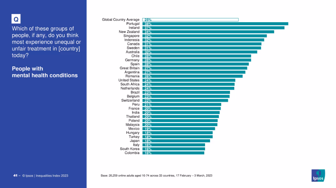
Blue question panel with right-hand bar chart ranking countries by perceived unfair treatment.
Market Analysis and Trends
Healthcare & Pharmaceuticals
Ranks countries based on the percentage of people who believe those with mental health conditions face unfair treatment. Portugal and Ireland are highest.
mental health, discrimination, country comparison, inequality, treatment, global perception
false
Market Analysis and Trends
Healthcare & Pharmaceuticals
Mixed Chart
IPSOS
Add to my slides
Remove from favorites
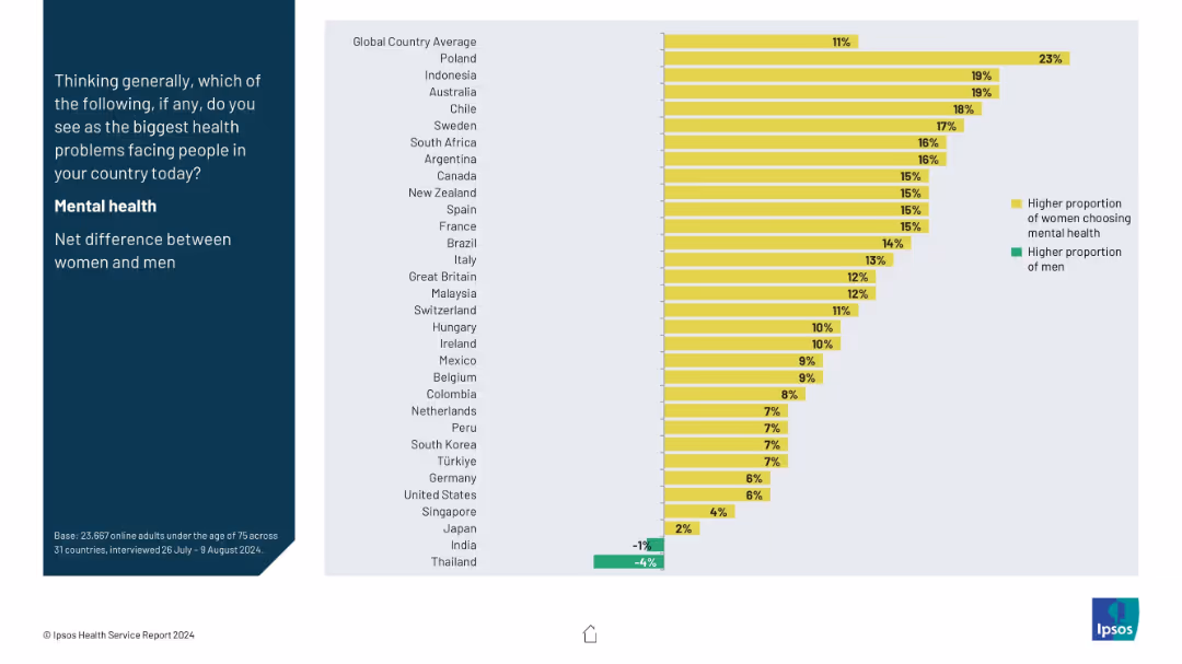
Split-panel layout with a vertical question prompt on the left in a dark blue block, and a horizontal bar chart on the right side using yellow and green bars.
Market Analysis and Trends
Healthcare & Pharmaceuticals
This slide shows the gender-based net difference in selecting mental health as the biggest health concern across countries. Yellow bars represent higher female concern, while green shows male. Poland leads with the highest female-male gap, while Thailand has a higher male concern rate.
mental health, gender gap, health perception, global comparison, survey
false
Market Analysis and Trends
Healthcare & Pharmaceuticals
Mixed Chart
IPSOS
Add to my slides
Remove from favorites
The slide features a column chart comparing the frequency of mental health visits among different generations.
Market Analysis and Trends
Healthcare & Pharmaceuticals
This slide presents data on how often different generations seek mental health support, highlighting generational differences in mental health care engagement.
Mental health, generational differences, survey, healthcare, mental health visits
false
Market Analysis and Trends
Healthcare & Pharmaceuticals
Mixed Chart
IPSOS
Add to my slides
Remove from favorites
The slide is dense with multiple column charts and text blocks, including bar and donut charts, to present a detailed analysis of mental health statistics across demographics.
Market Analysis and Trends
Healthcare & Pharmaceuticals
Provides an in-depth look at mental health concerns within younger demographics, using survey data to discuss stress, anxiety, and the impacts of social factors on mental well-being.
mental health, Gen Z, millennials, survey analysis, stress, anxiety, demographics, healthcare trends, social impact, psychological research
false
Market Analysis and Trends
Healthcare & Pharmaceuticals
Multiple Chart
Deloitte
Add to my slides
Remove from favorites
This slide is visually complex, containing a mixture of column charts along with text explanations, depicting mental health statistics and trends among Gen Z and Millennials.
Market Analysis and Trends
Healthcare & Pharmaceuticals
Provides a comprehensive overview of mental health trends among younger demographics, offering insights into stress levels, contributing factors, and potential interventions.
mental health, Gen Z, millennials, survey data, health trends, stress levels, demographic analysis, health interventions, psychological statistics, mental wellness
false
Market Analysis and Trends
Healthcare & Pharmaceuticals
Mixed Chart
Deloitte
Add to my slides
Remove from favorites
This slide is designed with bar charts and data comparisons, showing the usage of mental health resources between Gen Z and Millennials. It utilizes a clear, professional layout with distinct color coding to differentiate between the groups.
Market Analysis and Trends
Professional Services
Focuses on the underutilization of workplace mental health resources among Gen Z and Millennials, emphasizing the gap between offerings and actual usage.
mental health, Gen Z, Millennials, workplace support, resource gap, utilization
false
Market Analysis and Trends
Professional Services
Multiple Chart
Deloitte
Add to my slides
Remove from favorites
Column chart showing percentage agreement that mental health needs more attention, with countries sorted from highest to lowest agreement.
Customer and Market Segmentation
Healthcare & Pharmaceuticals
Highlights the importance of mental health globally, with Nigeria showing the highest agreement. Indicates the global trend toward prioritizing mental health along with physical health.
mental health, global, priority, survey, agreement
false
Customer and Market Segmentation
Healthcare & Pharmaceuticals
Multiple Chart
IPSOS
Add to my slides
Remove from favorites
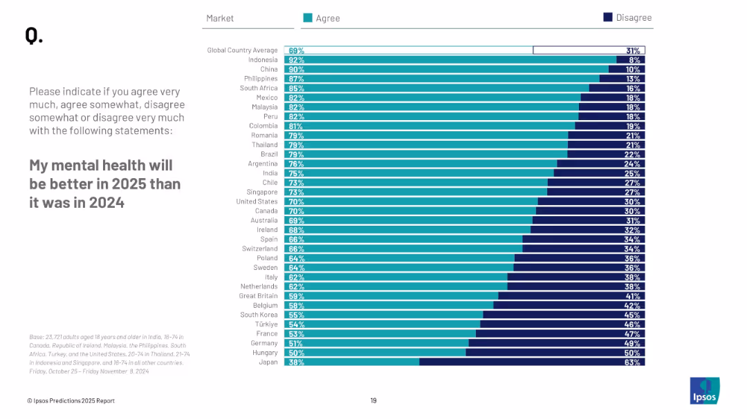
Horizontal bar chart with "Agree" and "Disagree" columns; left-aligned title and instructions; countries ranked by optimism in mental health.
Market Analysis and Trends
Healthcare & Pharmaceuticals
This slide displays how optimistic individuals are regarding their mental health in 2025 compared to 2024. It breaks down agreement/disagreement percentages per country with a global average.
mental health, optimism, wellbeing, survey, countries, Ipsos, 2025, expectations, global trends
false
Market Analysis and Trends
Healthcare & Pharmaceuticals
Mixed Chart
IPSOS
Add to my slides
Remove from favorites
The slide features a combination of pie charts and column charts. Pie charts show percentages of Gen Zs and Millennials who agree on mental health focus and comfort speaking about mental health challenges, with column charts on reasons for time off.
Market Analysis and Trends
Healthcare & Pharmaceuticals
The slide provides insights into Gen Z and Millennial perspectives on their organizations' focus on mental health. It compares perceptions of organizational efforts with the actual comfort levels in discussing mental health challenges and reasons for taking time off work.
Mental health, organizations, Gen Z, Millennials, comfort, time off
false
Market Analysis and Trends
Healthcare & Pharmaceuticals
Multiple Chart
Deloitte
Add to my slides
Remove from favorites
The slide includes column charts showing Americans' coping mechanisms during the pandemic and generational differences in mental health perceptions.
Market Analysis and Trends
Healthcare & Pharmaceuticals
This slide explores changing attitudes towards mental health in America, particularly in light of the pandemic, and highlights the differences in mental health views and coping strategies across generations.
Mental health, pandemic impact, generational differences, survey, wellness
false
Market Analysis and Trends
Healthcare & Pharmaceuticals
Multiple Chart
IPSOS
Add to my slides
Remove from favorites
Previous
Next
You don't have any favorites yet.
Please wait loading your favorites slides...
Create a FREE account to continue browsing
Receive Instant Access to 1,000+ slides from companies like McKinsey, Google, and Goldman Sachs
First Name
Last Name
Email
Password
I agree to all
Terms & Privacy Policy
Thank you! Your submission has been received!
Oops! Something went wrong while submitting the form.
Have an account?
Sign in
Upgrade to PRO to Save slides
Advanced Search and Filters
Access to 15,000+ slides
Access to Category Pages
Save/Bookmark Slides
PowerPoint Template Library
Pick a Plan
MONTHLY
$12/month
Billed every month, Cancel anytime.
YEARLY
$9/year
Billed $108 annually, Cancel anytime.
Checkout for $12/month
Checkout for $108/yr
Secured by Stripe | AES-256 bit encryption