My Account
My Slides
Search by Category
Pricing
Templates
View All Templates
Download Template Slides
✦ AI Search
Feedback
Login
Logout
Get Started
Browse all Slides
Browse all Slides
Create a FREE Account
Instant access to 1,000+ real slides from top companies like McKinsey, BCG, Goldman Sachs, Google and many more!
First Name
Last Name
Email
Password
I agree to all
Terms & Privacy Policy
Thank you! Your submission has been received!
Oops! Something went wrong while submitting the form.
Have an account?
Sign in
Saved Slides
Total No. of slides saved
0
↻ Refresh
✖ Clear all
The slide presents comparative data between 2022 and 2023 about women's mental and physical health in a workplace setting, using bar graphs and a pie chart. The design is professional with a mix of text and data visualization elements.
Market Analysis and Trends
Professional Services
The slide highlights declines in women's mental well-being, with data on the ability to switch off from work and overall physical health, comparing trends over two years. It could be used to analyze wellness trends and inform workplace health initiatives.
mental health, physical health, women, workplace, well-being, decline, work-life balance, 2022, 2023, presenteeism
false
Market Analysis and Trends
Professional Services
Multiple Chart
Deloitte
Add to my slides
Remove from favorites
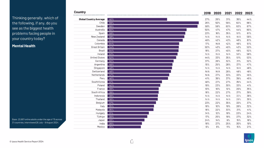
Horizontal bar chart by country showing % citing mental health as top issue; includes historical data from 2018–2023.
Strategic Planning
Healthcare & Pharmaceuticals
This slide ranks countries by the proportion of people naming mental health as the biggest issue, revealing a steady rise since 2018. It supports the global increase in awareness and concern about mental health.
mental health, public concern, historical trend, country ranking, global health, survey
false
Strategic Planning
Healthcare & Pharmaceuticals
Mixed Chart
IPSOS
Add to my slides
Remove from favorites
The slide has text, an image of a person, and column charts showing the use of mental health support tools among Gen Zs and millennials.
Risk Assessment and Management
Healthcare & Pharmaceuticals
This slide highlights the ongoing focus on mental health, acknowledging progress but noting the persistent stigma and under-utilization of mental health resources.
mental health, stigma, support tools, Gen Z, millennials, workplace wellness, mental health apps
false
Risk Assessment and Management
Healthcare & Pharmaceuticals
Multiple Chart
Deloitte
Add to my slides
Remove from favorites
Text-dense slide with key points underlined and supported by a graphic to emphasize statistics on mental health.
Technology and Digital Transformation
Professional Services
Discusses the persistent stigma and challenges associated with mental health among women at work, and the disparity in experiences among different groups.
Mental Health, Stigma, Women, Workplace, Challenges
false
Technology and Digital Transformation
Professional Services
Mixed Chart
Deloitte
Add to my slides
Remove from favorites
Light background with teal and black text. It includes a column chart showing statements about stress and mental health among women, alongside a professional woman's photo.
Human Resources and Talent Management
Healthcare & Pharmaceuticals
Highlights women's mental health issues, increased stress levels, and burnout, presenting statistics on support from employers and openness about mental health challenges.
mental health, stress, burnout, women, workplace
false
Human Resources and Talent Management
Healthcare & Pharmaceuticals
Mixed Chart
Deloitte
Add to my slides
Remove from favorites
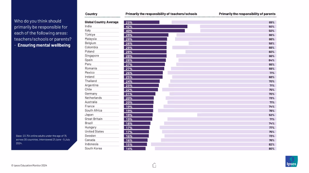
Chart showing a strong parental skew in responsibility for children's mental wellbeing across most countries; dark and light bars contrast responses.
Risk Assessment and Management
Healthcare & Pharmaceuticals
This slide reports global attitudes on mental wellbeing responsibility. Parents are overwhelmingly considered primary caretakers, with schools playing a lesser role.
mental health, wellbeing, responsibility, parents, education, children, support, global survey, Ipsos, emotional health
false
Risk Assessment and Management
Healthcare & Pharmaceuticals
Mixed Chart
IPSOS
Add to my slides
Remove from favorites
A minimalist slide design featuring bar charts and pie charts comparing the impact of various factors on mental health-related stress between Gen Z and Millennials. Color distinctions facilitate comparison.
Market Analysis and Trends
Healthcare & Pharmaceuticals
Analyzes how mental health concerns contribute to stress in the workplace, highlighting the need for better support systems in professional settings.
mental health, workplace stress, Gen Z, millennials, professional environment, stress factors, health impact, employee support, comparative analysis, mental well-being
false
Market Analysis and Trends
Healthcare & Pharmaceuticals
Multiple Chart
Deloitte
Add to my slides
Remove from favorites
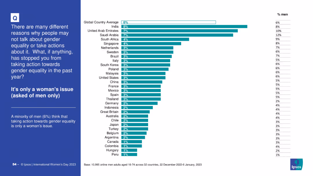
Men-only bar chart indicating belief that gender equality is a women’s issue; consistent design with previous charts; note on sample base at bottom.
Customer and Market Segmentation
Government & Public Sector
The chart focuses on male respondents who see gender equality as solely a women’s issue. The global average is 6%, with India and UAE leading. It reflects cultural and gendered perceptions of responsibility.
men, women's issue, gender equality, segmentation, Ipsos, perception
false
Customer and Market Segmentation
Government & Public Sector
Mixed Chart
IPSOS
Add to my slides
Remove from favorites
A stacked bar chart showing the percentage of total merchandise exports by type for various countries, and a column chart showing commodity exports by type in USD billions.
Market Analysis and Trends
Financial Services
The slide categorizes merchandise exports by type across different countries and details the value of commodity exports by type.
merchandise exports, export types, commodities, countries, economic analysis, trade, financial insights, export values, financial trends, development
false
Market Analysis and Trends
Financial Services
Multiple Chart
JP Morgan
Add to my slides
Remove from favorites
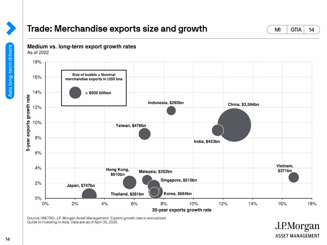
A bubble chart showing the merchandise export growth rates and sizes for various countries.
Market Analysis and Trends
Financial Services
The slide analyzes the medium vs. long-term export growth rates of merchandise exports for different countries, represented by bubble sizes corresponding to export values.
merchandise exports, growth rates, economic analysis, countries, trade, export values, financial trends, bubbles, development, export growth
false
Market Analysis and Trends
Financial Services
Single Chart
JP Morgan
Add to my slides
Remove from favorites
Includes bar graphs and percentages showcasing merchant use of digital platforms and expectations for future use. Bright, contrasting colors.
Strategic Planning
Technology & Software
Discusses the reliance of Thai merchants on digital platforms and their plans for increased utilization of digital and financial services.
Merchants, Digital, Technology, Thailand, Future, Financial Services, Tools, Adaptation
false
Strategic Planning
Technology & Software
Multiple Chart
Bain
Add to my slides
Remove from favorites
The slide features a two-column layout with bullet points. On the left, text is accompanied by a header "Take payments from virtually anywhere – Merchant Services". On the right, four smaller headers "Optimize contactless payments", "Reimagine the checkout experience", "Drive loyalty through your app", and "Meet your customers where they are" each followed by bullet points with benefits for customers and providers. The slide's background is white with a slight texture.
Market Analysis and Trends
Financial Services
This slide presents various strategies for enhancing merchant services, such as optimizing contactless payments, reimagining the checkout experience, and driving app loyalty. It is used to propose business solutions for improving customer interactions and operational efficiency.
merchant services, contactless payments, checkout experience, customer loyalty, business solutions
false
Market Analysis and Trends
Financial Services
Header Horizontal
JP Morgan
Add to my slides
Remove from favorites
The slide presents a mixed layout with arrows, lines and a table of data. It features a color scheme of blues and greens, with icons illustrating various growth strategies.
Financial Performance
Financial Services
The slide details the growth in merchant services, compares volume growth to revenue, and outlines strategies for continued margin expansion.
Merchant services, growth, revenue, strategies, margin expansion, financial analysis, comparison, APIs, international expansion
false
Financial Performance
Financial Services
Mixed Chart
JP Morgan
Add to my slides
Remove from favorites
Table depicting synergy targets and a pie chart showing forecasted annual run rate synergies.
Mergers and Acquisitions
Energy & Utilities
Provides an update on merger integrations, focusing on cost and tax synergy targets and achievements.
merger, integration, synergy, forecast, cost
false
Mergers and Acquisitions
Energy & Utilities
Mixed Chart
Barclays
Add to my slides
Remove from favorites
Contains stacked column charts representing M&A activities in the US crop value chain from 2007-2015, with a focus on different segments.
Market Analysis and Trends
Agriculture & Food Production
Examines M&A trends within the US crops industry, highlighting the most active segments and overarching trends in consolidation.
mergers, acquisitions, crop industry, value chain, consolidation trends
false
Market Analysis and Trends
Agriculture & Food Production
Single Chart
EY
Add to my slides
Remove from favorites
This slide includes a column chart showing global M&A activity by acquirer type and a bar chart presenting M&A multiples by sector, with clear data points and averages.
Mergers and Acquisitions
Financial Services
It offers insights into global mergers and acquisitions, detailing activity by acquirer type and multiples by sector to highlight industry trends and market behavior.
mergers, acquisitions, global, M&A, acquirer type, sector, multiples, trends, financial, data analysis
false
Mergers and Acquisitions
Financial Services
Multiple Chart
JP Morgan
Add to my slides
Remove from favorites
Includes a pie chart displaying ownership structure post-transaction and a series of bullet points explaining transaction details.
Mergers and Acquisitions
Financial Services
Explains the merger between CDEV and Colgate, outlining the ownership distribution and transaction terms, focusing on shareholder approval and financial considerations.
mergers, acquisitions, ownership structure, shareholder approval, transaction details, equity
false
Mergers and Acquisitions
Financial Services
Mixed Chart
Barclays
Add to my slides
Remove from favorites
The slide is organized into columns that each discuss a different company involved in M&A. It provides a brief overview of each company's focus and contribution to JPM's strategy. Icons and bullet points enhance visual structure. Company details include assets, employee counts, and key strategic foci such as ESG and tax management.
Mergers and Acquisitions
Financial Services
This slide provides insights into recent M&A activities, detailing the strategic benefits and integrations of newly acquired firms within JPM's larger corporate strategy. Ideal for strategic planning sessions or presentations to executive boards.
mergers, acquisitions, strategy, integration, corporate growth
false
Mergers and Acquisitions
Financial Services
Table
JP Morgan
Add to my slides
Remove from favorites
Includes three column charts that show historical data alongside current metrics to illustrate the progress made since a merger. The charts depict 'Adjusted Tangible Efficiency Ratio' and 'Adjusted Return on Average Tangible Common Equity'.
Mergers and Acquisitions
Financial Services
Communicates the achievement of merger-related targets with visual emphasis on improved financial ratios. It compares the current state against past projections and against peers, underlining the success of the integration strategy in achieving operational efficiencies.
Merger, Targets, Financial Ratios, Integration, Operational Efficiency, Peer Comparison
false
Mergers and Acquisitions
Financial Services
Multiple Chart
Goldman Sachs
Add to my slides
Remove from favorites
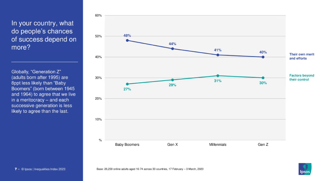
Dual-line chart comparing “merit/effort” vs. “factors beyond control” across generations. Title and text on the left.
Market Analysis and Trends
Government & Public Sector
The slide compares generational views on what influences success, revealing a decline in belief in meritocracy from Baby Boomers to Gen Z, who increasingly cite uncontrollable factors as more influential.
meritocracy, social mobility, Gen Z, inequality, generational comparison
false
Market Analysis and Trends
Government & Public Sector
Mixed Chart
IPSOS
Add to my slides
Remove from favorites
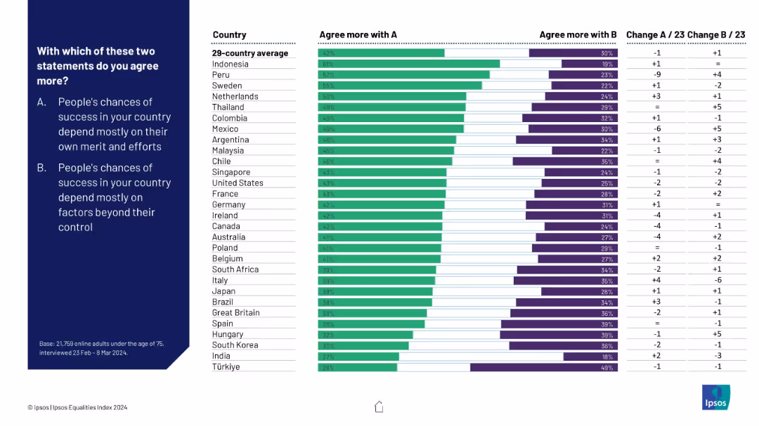
Dual-bar format comparing responses to two statements: success by merit vs factors beyond control; includes country rankings
Market Analysis and Trends
Education & Training
This comparison chart shows public belief in meritocracy vs structural barriers. Countries vary widely, with Indonesia and Peru leaning toward personal merit, while Turkey and India attribute outcomes to external factors.
meritocracy, social mobility, success factors, public opinion, structural inequality, Ipsos, international comparison
false
Market Analysis and Trends
Education & Training
Mixed Chart
IPSOS
Add to my slides
Remove from favorites
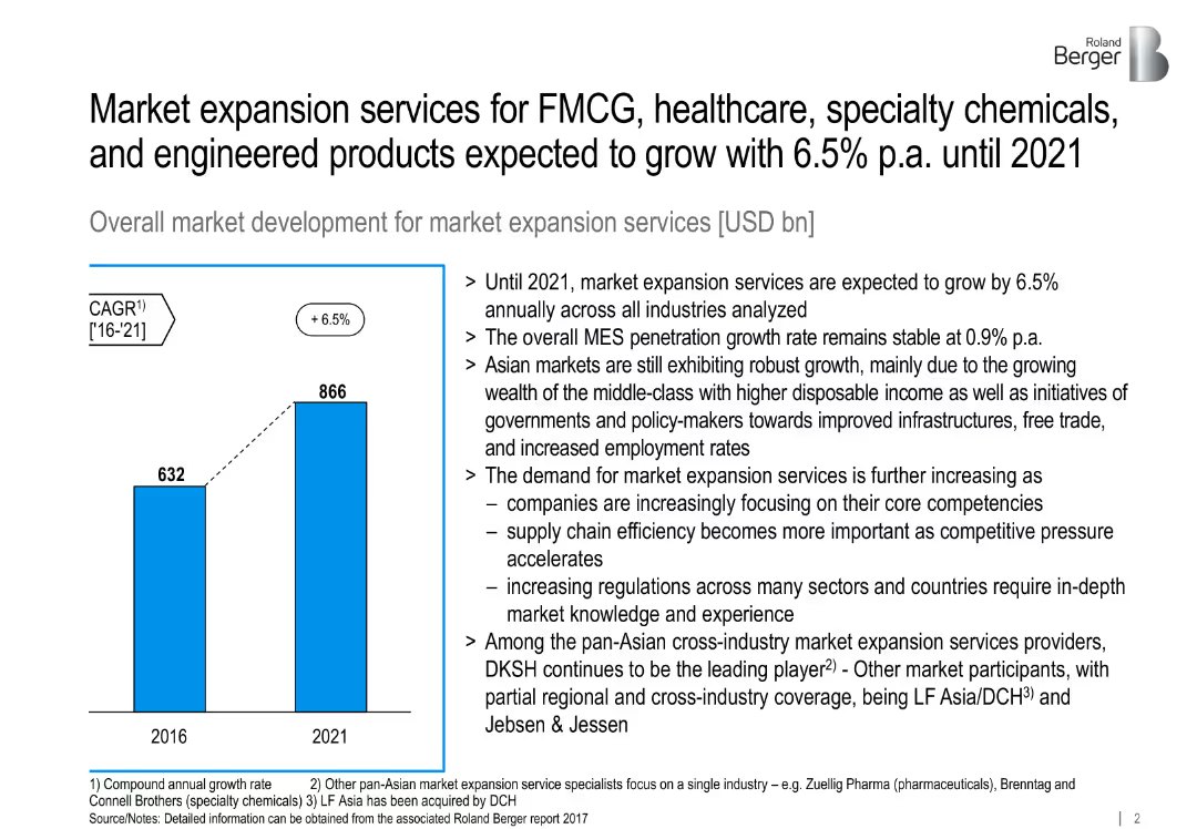
Bar chart comparing 2016 vs 2021 global MES volume; bullet points explaining drivers.
Market Analysis and Trends
Professional Services
Projects global MES (market expansion services) growth to reach $866B by 2021, citing demand, Asian market drivers, and increased efficiency focus across sectors.
MES, CAGR, global growth, Asia, FMCG, infrastructure, outsourcing
false
Market Analysis and Trends
Professional Services
Mixed Chart
Roland Berger
Add to my slides
Remove from favorites
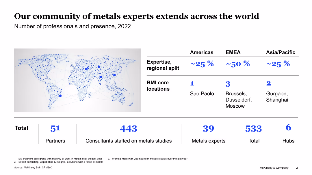
The slide shows a world map with blue dots representing the presence of professionals. It also includes a table with regional splits and a column chart detailing numbers of professionals.
Human Resources and Talent Management
Industrial & Manufacturing
This slide showcases the global presence of metals experts, detailing the number of partners, consultants, and experts in different regions, highlighting core locations.
metals experts, global presence, regional split, professionals, core locations
false
Human Resources and Talent Management
Industrial & Manufacturing
Graphic
McKinsey
Add to my slides
Remove from favorites
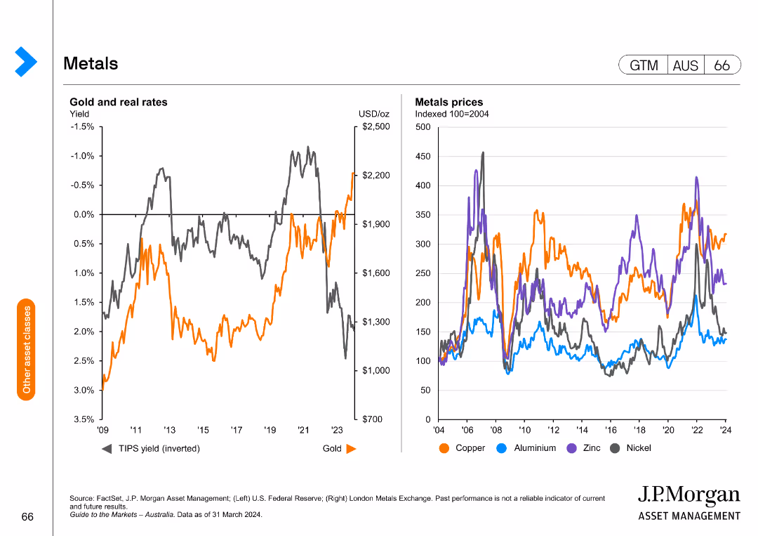
The slide features two line charts side by side. The left chart displays gold and real rates with the inverted TIPS yield and gold price trends. The right chart shows metal prices for copper, aluminum, zinc, and nickel.
Market Analysis and Trends
Financial Services
This slide analyzes trends in metal prices and real rates, providing insights into gold and other metals' performance, useful for market analysis and investment decision-making.
Metals, gold, real rates, TIPS yield, market analysis, investment, trends, copper, aluminum, zinc, nickel
false
Market Analysis and Trends
Financial Services
Multiple Chart
JP Morgan
Add to my slides
Remove from favorites
The slide contains two column charts comparing the upstream emissions of the metals industry in the US and India by various sources. It is visually rich.
Market Analysis and Trends
Industrial & Manufacturing
This slide compares the upstream emissions in the metals industry between the United States and India, detailing emissions by different sources and tiers.
Metals industry, upstream emissions, US, India, source comparison, environmental impact, sustainability, column charts, data visualization, emission sources
false
Market Analysis and Trends
Industrial & Manufacturing
Multiple Chart
Accenture
Add to my slides
Remove from favorites
Features bar graphs showing the percentage of metaverse-related tech usage in Southeast Asia by country and a side text explanation.
Market Analysis and Trends
Technology & Software
Analyzes the distribution of metaverse-related technologies across Southeast Asian countries, indicating regional market preferences.
Metaverse, AR, VR, Cryptocurrencies, NFTs, Market Distribution, Southeast Asia, Technology Usage
false
Market Analysis and Trends
Technology & Software
Multiple Chart
Bain
Add to my slides
Remove from favorites
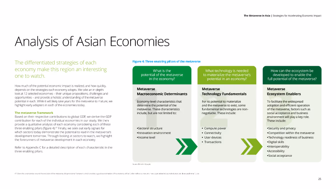
Text-heavy slide with three columns discussing the potential of the metaverse in the economy, technology fundamentals, and ecosystem enablers.
Market Analysis and Trends
Government & Public Sector
The slide analyzes the differentiated strategies of Asian economies to harness the metaverse, highlighting key enablers and determinants.
metaverse, Asian economies, technology, ecosystem, strategy
false
Market Analysis and Trends
Government & Public Sector
Header Horizontal
Deloitte
Add to my slides
Remove from favorites
This slide includes a text section on the left and a column chart on the right showing cumulative percentage timing for engaging with the metaverse by industry.
Market Analysis and Trends
Technology & Software
The content addresses the increasing interest of various industries in engaging with the metaverse, including challenges and concerns faced by brands in adopting metaverse technologies. A supporting column chart shows engagement timing by industry.
Metaverse, engagement, industries, technology, challenges
false
Market Analysis and Trends
Technology & Software
Mixed Chart
Deloitte
Add to my slides
Remove from favorites
This slide contains a mix of charts and infographics that detail the projected potential of metaverse platforms, consumer readiness, and the involvement of major tech companies.
Technology and Digital Transformation
Retail & E-commerce
Provides insights into the expected growth and significance of the metaverse, and its influence on consumer behavior and corporate investment strategies.
Metaverse, Extended Reality, Consumer Trends, Tech Investment, Big Tech, Virtual Reality, Market Potential, Digital Platforms, Augmented Reality, Strategic Investments
false
Technology and Digital Transformation
Retail & E-commerce
Header Horizontal
BCG
Add to my slides
Remove from favorites
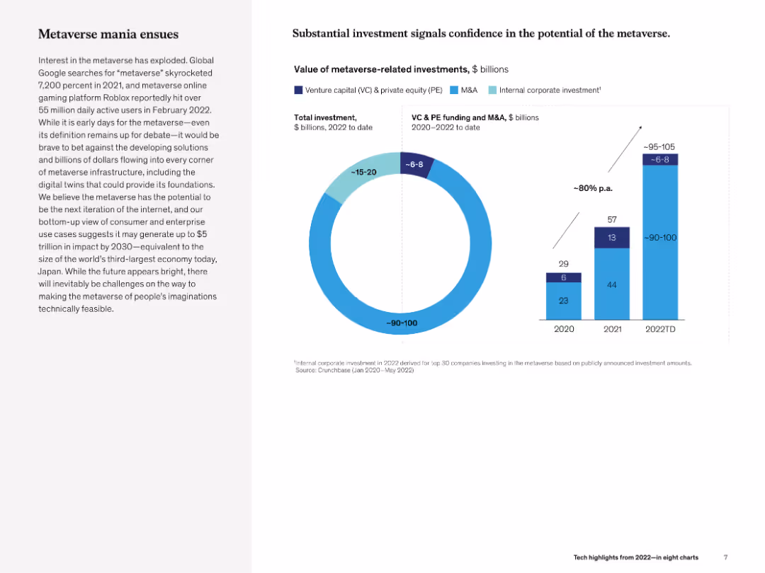
Left narrative on hype/investment trends and right combo chart (doughnut and bar) showing investment volumes and sources by year.
Investment Analysis
Media & Entertainment
The slide explores metaverse-related investments, noting rising confidence and projected impact of up to $5T by 2030. Charts illustrate growing VC and corporate spending in 2020–2022, showing increasing investor interest.
metaverse, investment, VC, M&A, infrastructure, McKinsey, growth, 2030 projections
false
Investment Analysis
Media & Entertainment
Multiple Chart
McKinsey
Add to my slides
Remove from favorites
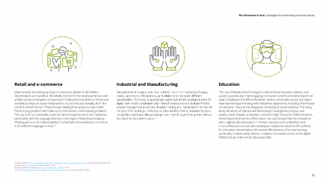
Three sections with icons representing retail, manufacturing, and education, each with descriptive text.
Market Analysis and Trends
Technology & Software
The slide covers the impact of the metaverse on retail, industrial, manufacturing, and education sectors.
metaverse, retail, manufacturing, education, market trends
false
Market Analysis and Trends
Technology & Software
Pillar
Deloitte
Add to my slides
Remove from favorites
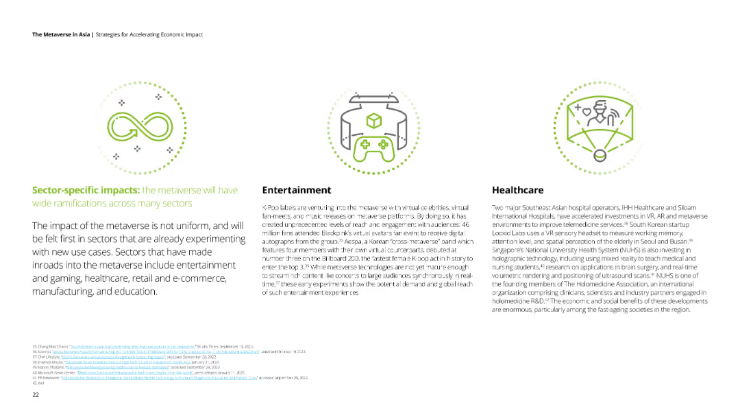
Three sections with icons representing infinity, a game controller, and a healthcare professional. Each section has text explaining impacts on different sectors.
Market Analysis and Trends
Technology & Software
The slide discusses the varying impacts of the metaverse on different sectors, highlighting entertainment and healthcare.
metaverse, sector impacts, entertainment, healthcare, technology
false
Market Analysis and Trends
Technology & Software
Pillar
Deloitte
Add to my slides
Remove from favorites
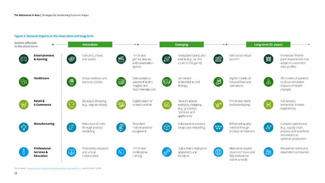
A table with icons and text divided into immediate, emerging, and long-term impacts across various sectors like gaming, healthcare, and e-commerce.
Market Analysis and Trends
Technology & Software
The slide outlines the short-term, emerging, and long-term impacts of the metaverse across multiple sectors.
metaverse, sector impacts, short-term, long-term, emerging trends
false
Market Analysis and Trends
Technology & Software
Table
Deloitte
Add to my slides
Remove from favorites
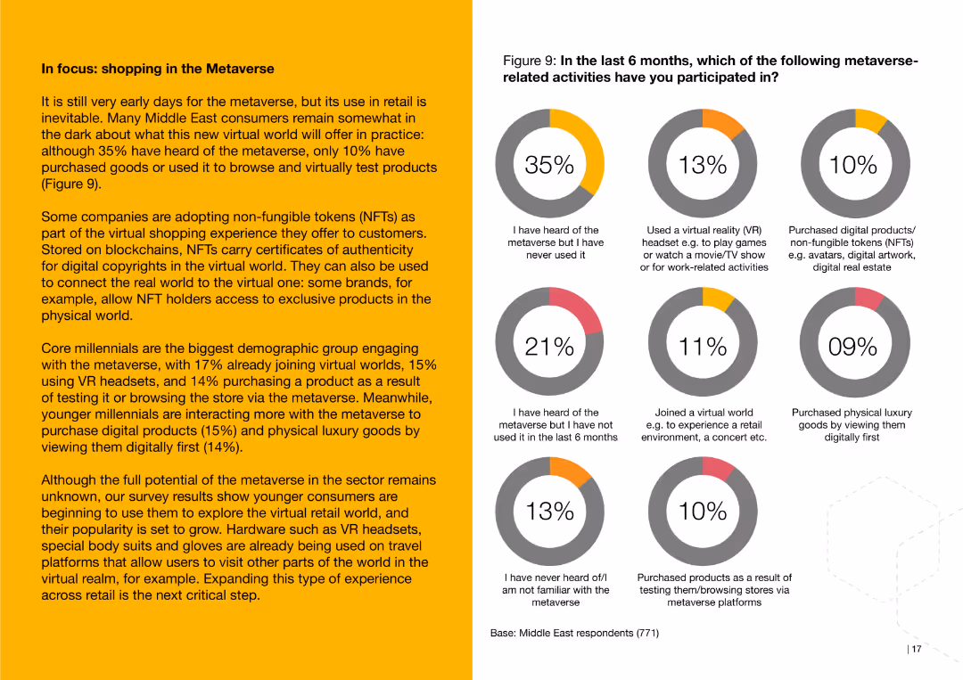
This slide features a pie chart depicting consumer participation in metaverse-related activities, such as using VR headsets and purchasing digital products, along with a text description of the potential of the metaverse in retail.
Technology and Digital Transformation
Retail & E-commerce
The slide discusses the early adoption of metaverse shopping in the Middle East, detailing activities like using VR headsets and purchasing digital goods, and highlighting the potential impact on retail.
metaverse, shopping, consumer, Middle East, VR, digital products, retail
false
Technology and Digital Transformation
Retail & E-commerce
Multiple Chart
PwC/Strategy&
Add to my slides
Remove from favorites
Diagram describing the metaverse and its components (Meta world, Meta space, Meta reality, Meta economy), with text explaining its potential impact on society.
Technology and Digital Transformation
Technology & Software
The slide explores the concept of the metaverse, discussing how it could extend the impact of social media to create a fully digital and virtual society. It highlights the different aspects of the metaverse and their potential to transform daily life and global society, suggesting that social media is a precursor to this broader change.
Metaverse, Social Media, Virtual Society, Impact
false
Technology and Digital Transformation
Technology & Software
Vertical Flow
Roland Berger
Add to my slides
Remove from favorites
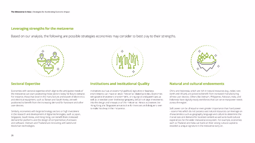
Three sections with icons representing sectoral expertise, institutions, and natural resources, each with text.
Strategic Planning
Government & Public Sector
The slide suggests strategies for economies to leverage their strengths for the metaverse, focusing on sectoral expertise, institutions, and resources.
metaverse, strengths, sectoral expertise, institutions, natural resources
false
Strategic Planning
Government & Public Sector
Pillar
Deloitte
Add to my slides
Remove from favorites
Features three pie charts detailing the growing familiarity with the metaverse, accompanied by a photograph of a woman using VR gear.
Market Analysis and Trends
Telecommunications
Discusses increasing public knowledge and interest in the metaverse, reflecting broader trends in technology engagement.
metaverse, technology adoption, VR, public knowledge, market trends
false
Market Analysis and Trends
Telecommunications
Multiple Chart
Deloitte
Add to my slides
Remove from favorites
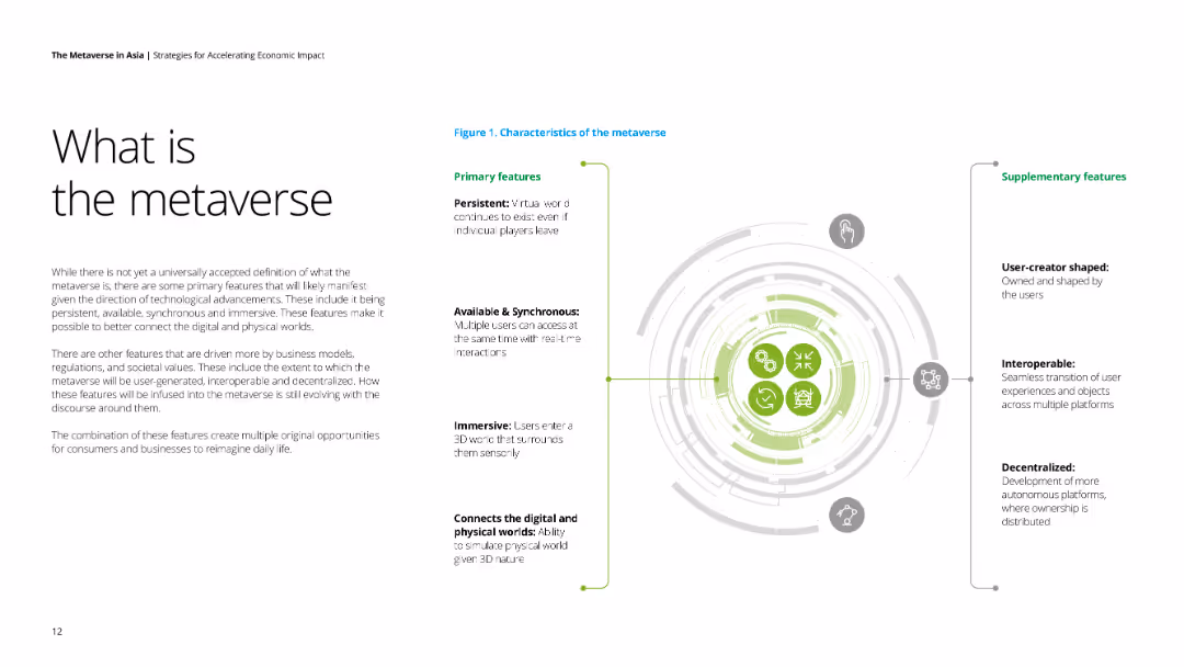
The slide has a textual explanation of the metaverse, accompanied by an illustrative diagram of its primary and supplementary features. The design is clean with ample white space and clear section headings.
Technology and Digital Transformation
Technology & Software
This slide defines the metaverse, describing its primary features like persistence, availability, and immersiveness, as well as supplementary aspects like user-creator shaped and decentralized nature. Useful for tech trend presentations.
Metaverse, technology, digital transformation, primary features, supplementary features
false
Technology and Digital Transformation
Technology & Software
Framework
Deloitte
Add to my slides
Remove from favorites
The slide showcases a Sankey diagram illustrating the flow of meter point analytics data, detailing agent handover processes. The diagram uses various color-coded paths to represent data flow and changes.
Operational Efficiency
Energy & Utilities
This slide offers an analysis of meter point data, focusing on agent handovers within the utility sector, using a Sankey diagram to visualize the flow and changes in data.
Meter Point, Analytics, Agent Handover, Data Flow, Visualization
false
Operational Efficiency
Energy & Utilities
Single Chart
EY
Add to my slides
Remove from favorites
The slide features a horizontal bar chart that displays the effectiveness of exception closure in meter point analytics. Each bar represents a different category, showing closure rates in red and green colors.
Operational Efficiency
Energy & Utilities
This slide evaluates the effectiveness of exception closures in meter point analytics, using a horizontal bar chart to compare closure rates across different categories, helping improve operational processes.
Meter Point, Analytics, Exception Closure, Effectiveness, Bar Chart
false
Operational Efficiency
Energy & Utilities
Single Chart
EY
Add to my slides
Remove from favorites
This slide contains a Sankey diagram highlighting exception paths in meter point analytics. It uses different color paths to show various categories and resolutions, emphasizing where exceptions occur and how they are resolved.
Risk Assessment and Management
Energy & Utilities
The slide details the paths of exceptions in meter point analytics, showing how exceptions are categorized and resolved, aiding in identifying and managing risks within the utility sector.
Meter Point, Analytics, Exception Path, Resolution, Risk
false
Risk Assessment and Management
Energy & Utilities
Single Chart
EY
Add to my slides
Remove from favorites
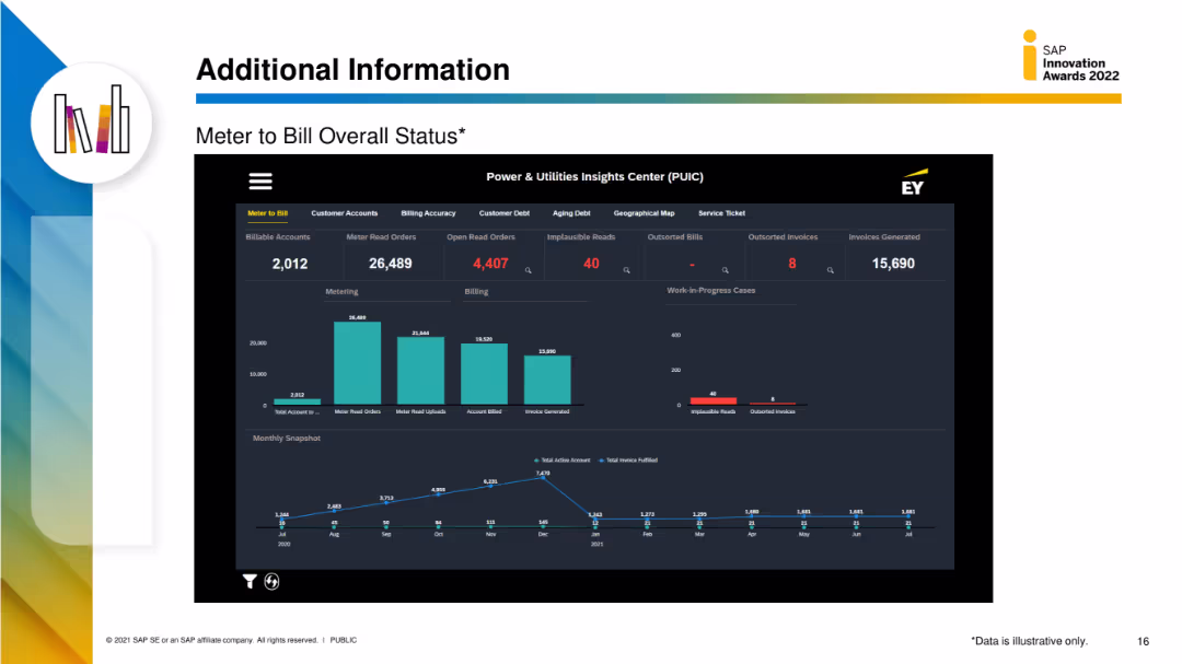
The slide features a detailed dashboard with multiple data visualizations, including column charts and metrics for meter to bill status, customer accounts, and billing accuracy.
Performance Metrics and KPIs
Energy & Utilities
This slide provides detailed metrics on the meter-to-bill process, including the number of billable accounts, meter read orders, and billing accuracy, displayed through various data visualizations.
meter to bill, status, utilities, customer accounts, billing accuracy
false
Performance Metrics and KPIs
Energy & Utilities
Multiple Chart
EY
Add to my slides
Remove from favorites
The slide includes a detailed table comparing various aspects of methanation value chains such as capacity, capex, opex, and efficiency for different MW scales.
Technology and Digital Transformation
Energy & Utilities
Explains methanation and presents a comprehensive comparison of its value chain elements, including technical and financial metrics for different scales of operations.
methanation, hydrogen, synthetic methane, gas grid, value chain, capacity, capex, opex, efficiency
false
Technology and Digital Transformation
Energy & Utilities
Table
Kearney
Add to my slides
Remove from favorites
The slide features column charts comparing the levelized cost of energy for methanation with other energy sources across different years and scenarios. Detailed visual.
Financial Performance
Energy & Utilities
Assesses the cost projections of methanation compared to biogas and injection, highlighting potential uncompetitiveness by 2030 using detailed financial data.
methanation, levelized cost, energy, biogas, injection, 2030, financial projections, cost comparison
false
Financial Performance
Energy & Utilities
Multiple Chart
Kearney
Add to my slides
Remove from favorites
The slide features a column chart showing the distribution of methane reduction efforts. It includes several text boxes outlining various technologies and solutions to reduce methane production in livestock and waste.
Technology and Digital Transformation
Agriculture & Food Production
This slide discusses strategies to reduce methane emissions in agriculture, focusing on livestock and waste. It details the potential abatement, associated costs, and specific technologies like feed supplements and biogas capture.
Methane reduction, Livestock, Emissions, Technology, Agriculture
false
Technology and Digital Transformation
Agriculture & Food Production
Mixed Chart
EY
Add to my slides
Remove from favorites
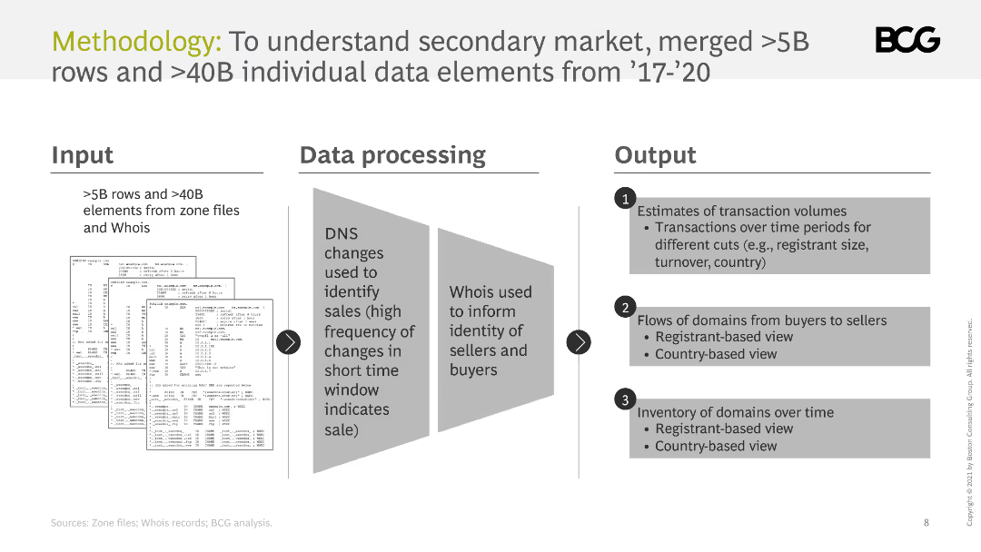
The slide outlines the methodology for understanding the secondary market, including inputs, data processing, and outputs. It uses diagrams to illustrate the process.
Technology and Digital Transformation
Professional Services
It describes the methodology used to analyze the secondary market, including data sources, processing techniques, and the types of outputs generated.
methodology, data processing, secondary market, analysis, inputs, outputs
false
Technology and Digital Transformation
Professional Services
Linear Flow
BCG
Add to my slides
Remove from favorites
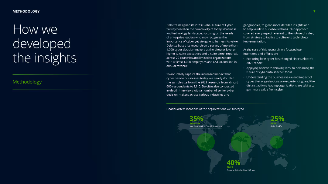
The slide features a world map with highlighted regions, accompanied by text boxes explaining the methodology used in developing the insights, including survey details and participant demographics.
Risk Assessment and Management
Professional Services
Describes the methodology behind the research, including the survey's scope, participant demographics, and objectives to ensure comprehensive insights into the business and technology landscape.
methodology, insights, survey, demographics, research, professional services, global, participant, business, technology
false
Risk Assessment and Management
Professional Services
Mixed Chart
Deloitte
Add to my slides
Remove from favorites
Contains a complex layout with multiple components explaining the methodology of retail value calculation, including various graphs and text explanations.
Market Analysis and Trends
Professional Services
Details the methodology used in calculating retail values in studies, providing a breakdown of approaches and estimated contributions by sector.
methodology, retail value, sales estimation, market analysis, calculation methods
false
Market Analysis and Trends
Professional Services
Mixed Chart
Bain
Add to my slides
Remove from favorites
Features a large circular diagram in red and white, divided into four segments, each containing text descriptions.
Strategic Planning
Professional Services
Describes the ADP team's methodology in reviewing applications, focusing on four aspects: project management, evaluation process, evaluator training, and criteria application.
methodology, review, applications, evaluation, process
false
Strategic Planning
Professional Services
Framework
Accenture
Add to my slides
Remove from favorites
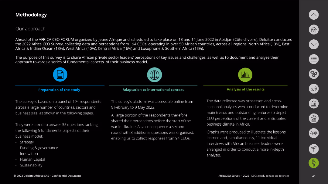
This slide provides an overview of the methodology with textual descriptions and icons.
Strategic Planning
Professional Services
It outlines the approach, preparation, adaptation, and analysis processes used in conducting the 2022 Africa CEO Survey.
methodology, survey approach, data analysis, Africa CEO Survey, preparation
false
Strategic Planning
Professional Services
Pillar
Deloitte
Add to my slides
Remove from favorites
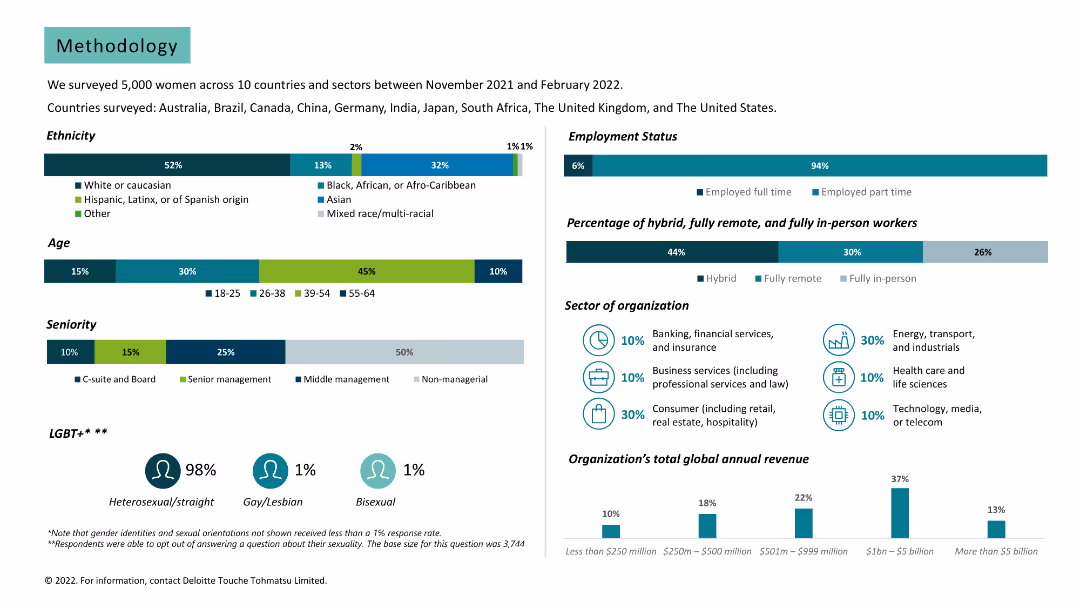
Various charts and text. Data on survey demographics, including ethnicity, age, seniority, employment status, and sector of organization.
Market Analysis and Trends
Professional Services
Provides detailed methodology of the survey, including participant demographics and organization details.
methodology, survey, demographics, ethnicity, age, seniority, employment status, sector, organization
false
Market Analysis and Trends
Professional Services
Multiple Chart
Deloitte
Add to my slides
Remove from favorites
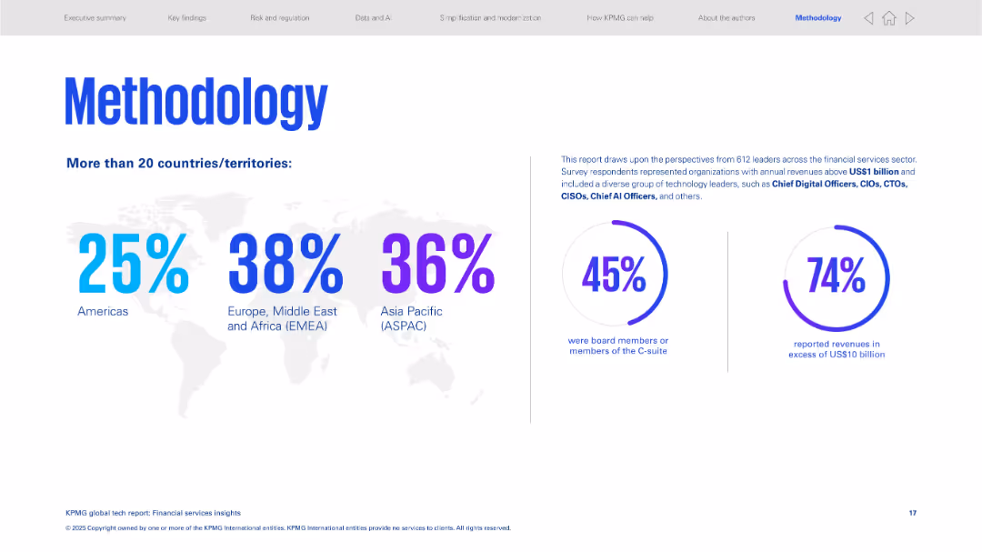
Clean design with a world map, percentage breakdown by region, and two large statistic circles on right.
Strategic Planning
Financial Services
Explains the methodology of the study, which included tech leaders across global financial sectors. Provides a regional breakdown of respondents and outlines their roles and revenue levels to validate the report's credibility.
methodology, survey, financial services, regional distribution, C-suite, high revenue firms
false
Strategic Planning
Financial Services
Mixed Chart
KPMG
Add to my slides
Remove from favorites
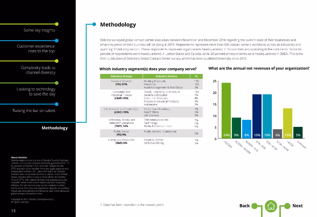
Two-column layout with text on the left and a table along with a column chart on the right. Text is moderately dense.
Market Analysis and Trends
Professional Services
Provides an overview of the survey methodology, including industry segments served and annual net revenues of respondent organizations.
Methodology, Survey, Industry segments, Contact centers, Annual revenues, Respondent demographics
false
Market Analysis and Trends
Professional Services
Mixed Chart
Deloitte
Add to my slides
Remove from favorites
The slide features a column chart indicating confidence levels in measuring various metrics such as sales, brand awareness, and engagement. The design is moderately dense.
Market Analysis and Trends
Professional Services
This slide shows global marketers' confidence in measuring key performance metrics. It highlights areas of high and low confidence, with data on different geographic regions.
metrics, confidence, measurement, global marketers, performance
false
Market Analysis and Trends
Professional Services
Mixed Chart
Nielsen
Add to my slides
Remove from favorites
A table and bar chart combination highlighting important marketing metrics like engagement, viewability, and ROI. Each metric is presented with a percentage indicating its importance according to survey respondents.
Market Analysis and Trends
Media & Entertainment
This slide lists the most important marketing metrics as identified by survey respondents. It includes metrics such as engagement, viewability, marketing mix modeling, and full-funnel media ROI, showing their relative importance.
Metrics, Engagement, Viewability, ROI, Survey
false
Market Analysis and Trends
Media & Entertainment
Mixed Chart
Nielsen
Add to my slides
Remove from favorites
This slide presents a column chart comparing unlinked metro rides annually. Annotations and year markers provide a clear depiction of trends and significant data points.
Risk Assessment and Management
Transportation & Logistics
Offers a decade-long review of rail ridership, illustrating trends and discussing the factors influencing these patterns.
metro rides, annual trends, ridership data, transportation analysis
false
Risk Assessment and Management
Transportation & Logistics
Single Chart
BCG
Add to my slides
Remove from favorites
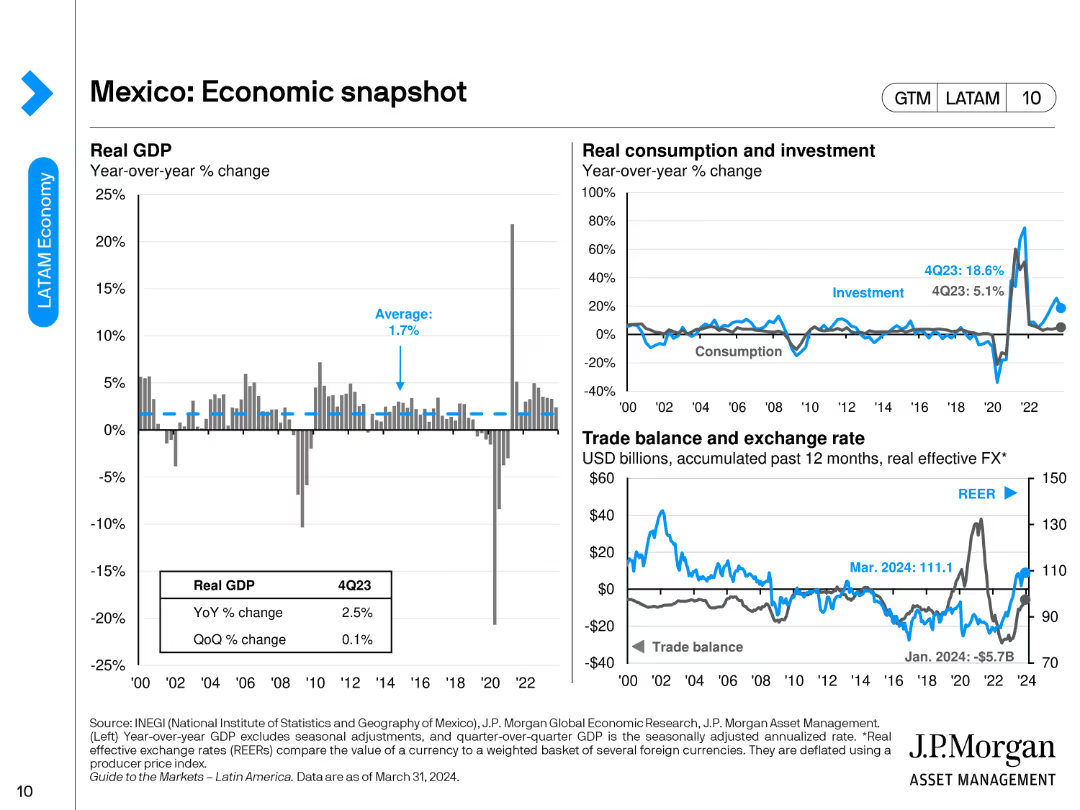
The slide includes a bar chart for real GDP year-over-year change, a line chart for consumption and investment, and a combined line/bar chart for trade balance and exchange rate.
Market Analysis and Trends
Financial Services
The slide provides an economic overview of Mexico, detailing GDP changes, consumption, investment trends, and trade balance with exchange rate metrics.
Mexico, economic snapshot, GDP, trade balance, investment
false
Market Analysis and Trends
Financial Services
Multiple Chart
JP Morgan
Add to my slides
Remove from favorites
Slide presents icons and column charts detailing GDP growth, inflation trends, and policy rates, supplemented with financial performance indicators of major institutions.
Market Analysis and Trends
Financial Services
Analyzes Mexico's economic conditions and stability, emphasizing factors like GDP growth, inflation control, and policy adjustments beneficial for investment decisions.
Mexico, economy, inflation, GDP, investment
false
Market Analysis and Trends
Financial Services
Multiple Chart
Barclays
Add to my slides
Remove from favorites
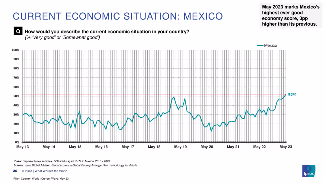
Line graph displaying Mexico’s economic perception (2013–2023); right-hand annotation notes milestone.
Strategic Planning
Financial Services
Mexico’s “good economy” sentiment reached a historic high of 52% in May 2023, up 3 percentage points from the previous month. The trend line shows steady improvement over time, reflecting increased confidence and stability in economic perception.
Mexico, economy, record high, public confidence, Ipsos, economic trend, growth, financial perception, optimism
false
Strategic Planning
Financial Services
Single Chart
IPSOS
Add to my slides
Remove from favorites
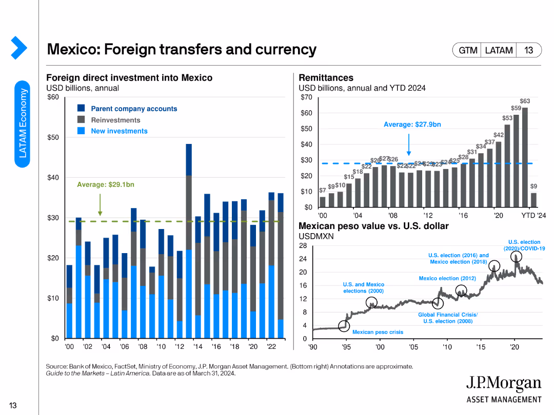
The slide features three column charts and a line chart. The charts show foreign direct investment, remittances, and Mexican peso value vs. the U.S. dollar.
Market Analysis and Trends
Financial Services
This slide details foreign direct investment into Mexico, remittances, and the value of the Mexican peso versus the U.S. dollar, showcasing economic and currency trends.
Mexico, foreign investment, remittances, peso value, currency trends
false
Market Analysis and Trends
Financial Services
Multiple Chart
JP Morgan
Add to my slides
Remove from favorites
Comprises line charts, column chart, and an image of a city. Moderate visual complexity.
Market Analysis and Trends
Financial Services
Showcases Mexico's GDP growth, BBVA Bancomer's profit growth, and market trends.
Mexico, GDP, BBVA, profit
false
Market Analysis and Trends
Financial Services
Multiple Chart
Morgan Stanley
Add to my slides
Remove from favorites
The slide features a line chart for inflation targeting and accumulated change, another line chart breaking down inflation into goods and services, and a line chart showing target policy rate and expectations.
Market Analysis and Trends
Financial Services
The slide discusses Mexico's inflation trends, monetary policy targets, and the breakdown of inflation between goods and services.
Mexico, inflation, monetary policy, target rate, economic trends
false
Market Analysis and Trends
Financial Services
Multiple Chart
JP Morgan
Add to my slides
Remove from favorites
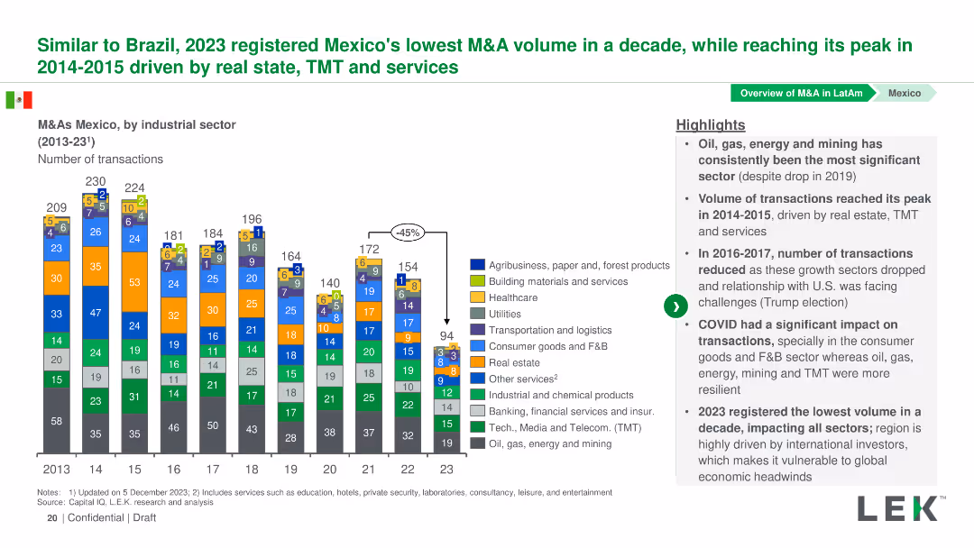
Column chart showing the number of M&A transactions by industrial sector in Mexico from 2013-2023. Sectors are color-coded and detailed in a legend.
Market Analysis and Trends
Financial Services
This slide presents the volume of M&A transactions in various industrial sectors in Mexico from 2013-2023, with an analysis of trends and significant changes.
Mexico, M&A, Industrial Sectors, Transactions, Trends
false
Market Analysis and Trends
Financial Services
Mixed Chart
LEK
Add to my slides
Remove from favorites
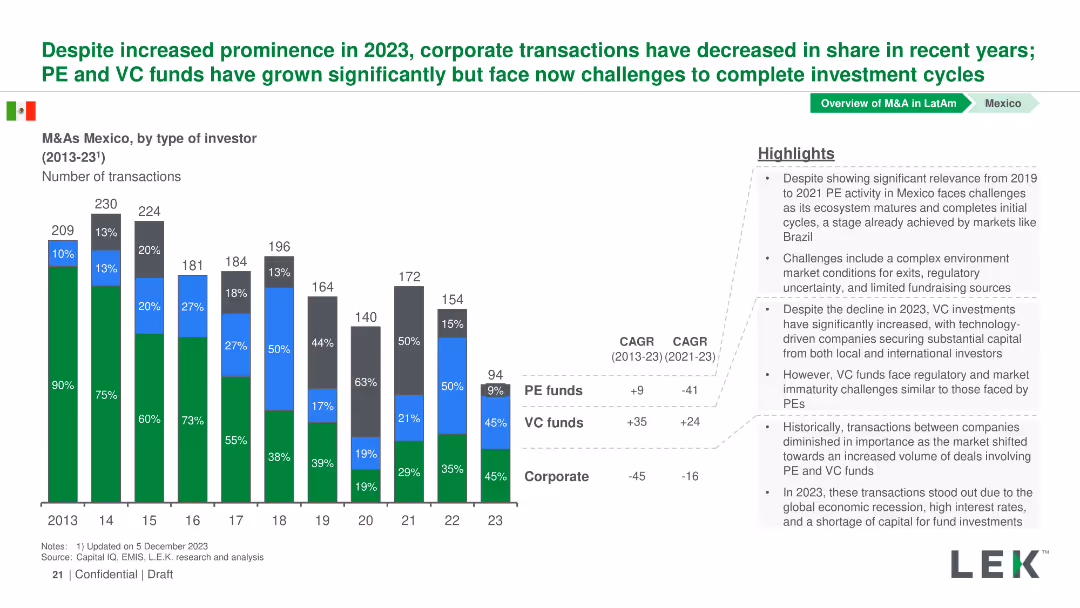
Column chart displaying the number of M&A transactions by type of investor in Mexico from 2013-2023, with investors categorized into PE funds, VC funds, and Corporate.
Market Analysis and Trends
Financial Services
This slide shows trends in M&A transactions in Mexico categorized by type of investor from 2013-2023, highlighting the growth of PE and VC funds compared to Corporate.
Mexico, M&A, Investors, Private Equity, Venture Capital
false
Market Analysis and Trends
Financial Services
Mixed Chart
LEK
Add to my slides
Remove from favorites
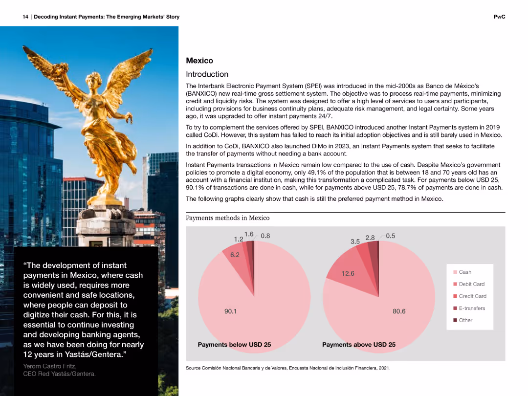
Image of a statue with accompanying text about Mexico's payment methods and pie charts showing payment methods below and above USD 25.
Market Analysis and Trends
Financial Services
Discusses Mexico's payment methods, focusing on the high reliance on cash for transactions below and above USD 25, and the introduction of instant payments systems.
Mexico, payments, cash, methods, instant, systems, transactions, financial, services
false
Market Analysis and Trends
Financial Services
Multiple Chart
PwC/Strategy&
Add to my slides
Remove from favorites
The slide has two column charts and one line chart. The column charts compare gross fixed investment and gross debt as a percentage of GDP.
Financial Performance
Financial Services
This slide presents Mexico's public finances and private sector data, including gross debt, gross fixed investment, and public sector revenues and expenditures as GDP.
Mexico, public finance, private sector, GDP, investment, debt, revenues, expenditures
false
Financial Performance
Financial Services
Multiple Chart
JP Morgan
Add to my slides
Remove from favorites
Contains bullet points explaining industry-wide solvency ratios for Mexico, a table with top 10 Mexican life insurers' data, and column charts showing ratios.
Market Analysis and Trends
Financial Services
This slide analyzes the solvency ratios of Mexican life insurers, highlighting data inconsistencies, volatility, and proposing a subset for company data inclusion.
Mexico, solvency ratios, insurers, analysis, company data, financial services, market trends
false
Market Analysis and Trends
Financial Services
Mixed Chart
Oliver Wyman
Add to my slides
Remove from favorites
Features column charts showing Mexico's export growth to the U.S. and a map highlighting key investment regions, emphasizing Mexico's trade advantages and sectors like automotive.
Market Analysis and Trends
Financial Services
Highlights Mexico's competitive position in international trade and investment, particularly in relation to the U.S., with a focus on nearshoring opportunities and sectoral growth.
Mexico, trade, investment, nearshoring, automotive
false
Market Analysis and Trends
Financial Services
Mixed Chart
Barclays
Add to my slides
Remove from favorites
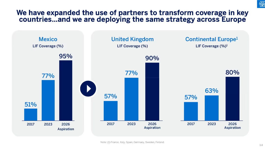
Side-by-side bar charts for Mexico, UK, and Continental Europe, highlighting LIF coverage from 2017 to 2026 aspirational targets.
Market Analysis and Trends
Financial Services
This slide compares LIF coverage improvements over time across Mexico, the UK, and key European countries. It shows historical coverage data, recent progress, and 2026 aspirations, emphasizing partnership strategies to drive growth.
Mexico, UK, Europe, LIF coverage, aspirational goals, strategic partners, Amex growth, regional analysis
false
Market Analysis and Trends
Financial Services
Single Chart
McKinsey
Add to my slides
Remove from favorites
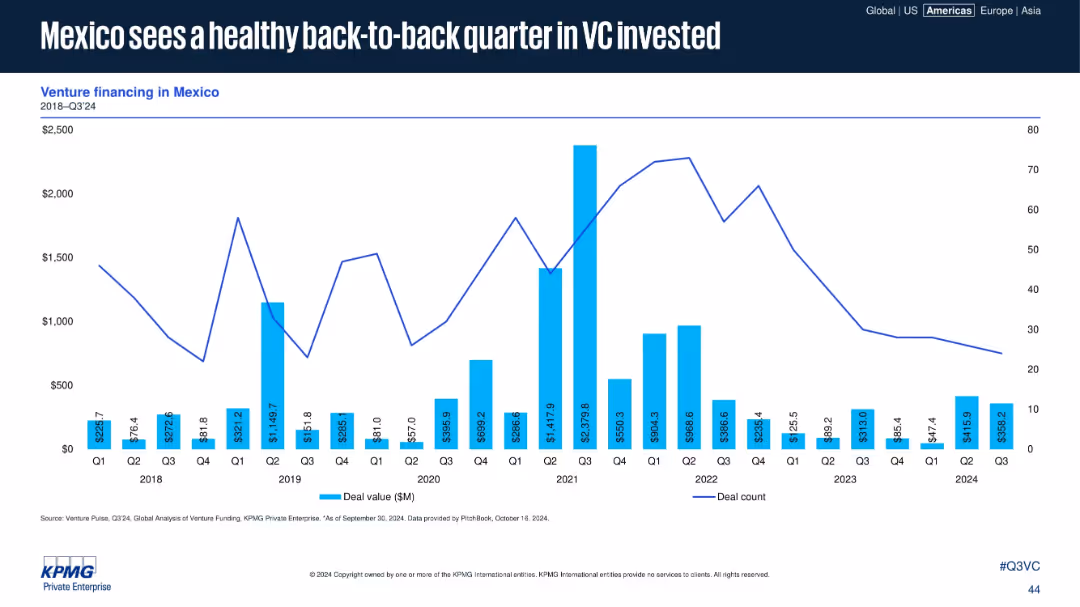
Bar and line graph tracking Mexico’s VC deal value and count from 2018 to Q3 2024.
Financial Performance
Financial Services
The slide presents Mexico’s VC performance, showing two consecutive strong quarters in 2024. Deal counts remain modest, but significant funding events contribute to short-term surges in deal value, indicating resilient investor activity.
Mexico, VC, Q3 2024, deal value, investment activity, back-to-back growth, LATAM, funding surge
false
Financial Performance
Financial Services
Single Chart
KPMG
Add to my slides
Remove from favorites
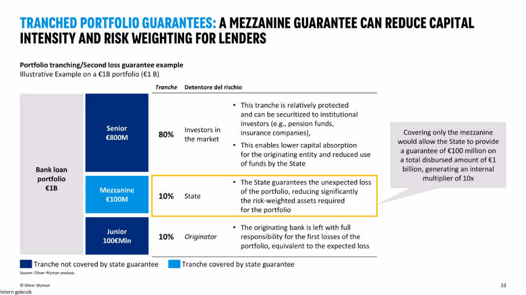
Vertical layout with a 3-part tranche diagram (Senior, Mezzanine, Junior), color-coded; bullet points explain the role of each tranche; highlighted box explains state guarantee logic; grey sidebar on right emphasizes multiplier impact.
Risk Assessment and Management
Financial Services
This slide illustrates how mezzanine guarantees by the state can lower the capital intensity and risk-weighted assets for lenders. It explains the tranching of a €1B bank loan portfolio and how a 10% state guarantee on the mezzanine tranche can enable a 10x leverage effect. The visual aids clarify the risk distribution and impact on investors and the state.
mezzanine guarantee, tranching, risk management, capital relief, portfolio structure, state guarantee, senior tranche, junior tranche, leverage, bank loans
false
Risk Assessment and Management
Financial Services
Mixed Chart
Oliver Wyman
Add to my slides
Remove from favorites
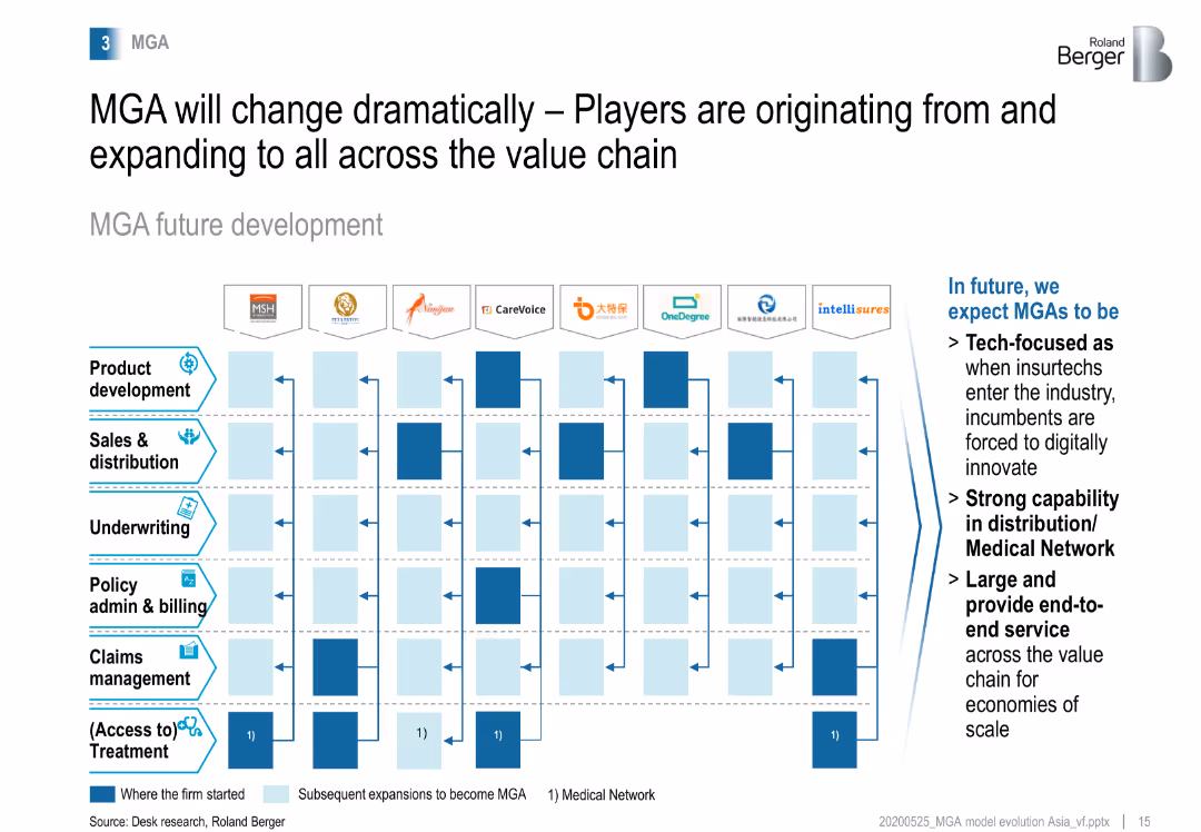
Matrix showing the future development of MGAs, highlighting the expansion across the value chain from product development to claims management, with a focus on tech and distribution.
Strategic Planning
Financial Services
Examines the future development of MGAs, emphasizing their expansion across the value chain and the integration of technology and strong distribution capabilities.
MGA development, value chain, technology, distribution
false
Strategic Planning
Financial Services
Table
Roland Berger
Add to my slides
Remove from favorites
Bar chart comparing the sources of funding for MGAs, showing a higher proportion of private equity ownership compared to brokers, and the increasing interest from private equity.
Investment Analysis
Financial Services
Analyzes the funding sources for MGAs, emphasizing the significant role of private equity and the fast growth of MGAs due to their value-adding services to insurers.
MGA funding, private equity, investment, brokers, growth
false
Investment Analysis
Financial Services
Header Horizontal
Roland Berger
Add to my slides
Remove from favorites
Bar chart showing the growth of MGAs relative to brokers in the UK from 2010 to 2019, highlighting a significant increase in the number of MGAs over the period.
Market Analysis and Trends
Financial Services
Examines the growth trends of Managing General Agents (MGAs) compared to brokers in the UK, showing a 41% increase in MGAs from 2010 to 2019.
MGA growth, brokers, UK, market trends, 2019
false
Market Analysis and Trends
Financial Services
Multiple Chart
Roland Berger
Add to my slides
Remove from favorites
Matrix showing MGAs in Greater China and SEA by geography and value chain activities, emphasizing their partnerships to provide end-to-end services.
Strategic Planning
Financial Services
Analyzes how MGAs in Greater China and Southeast Asia partner with other companies to offer comprehensive services across the value chain, focusing on end-to-end service provision.
MGA partnerships, end-to-end services, Greater China, SEA
false
Strategic Planning
Financial Services
Table
Roland Berger
Add to my slides
Remove from favorites
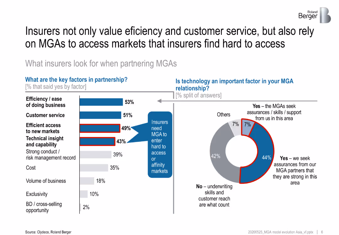
Bar chart and pie chart showing the key factors insurers consider when partnering with MGAs and the importance of technology in these partnerships.
Strategic Planning
Financial Services
Discusses the key factors insurers value when partnering with MGAs, including efficiency, customer service, and market access, and the role of technology in these partnerships.
MGAs, insurers, partnerships, key factors, technology
false
Strategic Planning
Financial Services
Multiple Chart
Roland Berger
Add to my slides
Remove from favorites
Bar chart and pie chart showing the key factors MGAs consider when partnering with insurers and the importance of technology in these relationships.
Strategic Planning
Financial Services
Highlights the key factors MGAs look for in insurer partnerships, such as market reputation and claims record, and the role of technology in enhancing these relationships.
MGAs, insurers, partnerships, key factors, technology
false
Strategic Planning
Financial Services
Mixed Chart
Roland Berger
Add to my slides
Remove from favorites
This slide features a circular flow diagram centered around a tire, with various stages such as raw materials, production, and supply chain illustrated with icons and dates. The slide also highlights 'green tire' innovation and life-cycle analysis targets.
Industry Overview
Industrial & Manufacturing
The slide details Michelin's leadership in tire industry innovations, focusing on the progression from the first radial tire to the future targets for life-cycle analysis of their product ranges, emphasizing sustainability.
Michelin, Tire Industry, Radial Tire, Green Tire, Life-Cycle Analysis, Sustainability, Innovation, Supply Chain, Production, Raw Materials
false
Industry Overview
Industrial & Manufacturing
Diagram
Morgan Stanley
Add to my slides
Remove from favorites
Includes a circular design and pie charts to represent statistical data, with an emphasis on workplace experiences of minority groups.
Organizational Structure and Change
Professional Services
This slide provides statistics on workplace microaggressions, particularly among LGBT+ women and ethnic minorities, useful in diversity and inclusion training sessions or discussions on improving corporate culture and sensitivity training.
microaggressions, LGBT+, workplace, diversity
false
Organizational Structure and Change
Professional Services
Multiple Chart
Deloitte
Add to my slides
Remove from favorites
This slide presents a bar graph on the left and a photo of a woman speaking on the right, circled by a semi-transparent design that indicates a thematic continuation.
Organizational Structure and Change
Professional Services
Highlights an increase in women reporting workplace microaggressions to their employers, indicating a shift toward addressing such issues. This slide is valuable for discussing changes in workplace culture and the effectiveness of reporting mechanisms.
microaggressions, reporting, workplace, culture
false
Organizational Structure and Change
Professional Services
Multiple Chart
Deloitte
Add to my slides
Remove from favorites
Features bar graphs depicting reasons for not reporting workplace behaviors, complemented by a circular design element that frames the right side of the slide.
Risk Assessment and Management
Professional Services
Discusses perceptions of microaggressions' seriousness and their impact on reporting behaviors. This slide is pertinent for analyzing the psychological barriers to reporting workplace issues and could be used in diversity and inclusion training.
microaggressions, seriousness, reporting, HR
false
Risk Assessment and Management
Professional Services
Table
Deloitte
Add to my slides
Remove from favorites
Graphical representations with text for optimizing micro-moments, going beyond segmentation, and driving consistent communication, including examples.
Strategic Planning
Retail & E-commerce
Discusses the importance of personalizing interactions across different channels to maintain customer attention, supported by case study examples.
Micro-Moments, Personalization, Channel Strategy, Customer Engagement, Attention Wars
false
Strategic Planning
Retail & E-commerce
Header Horizontal
BCG
Add to my slides
Remove from favorites
Hype Cycle chart illustrating the current position of microservices in the Trough of Disillusionment phase, with predictions about their future market maturity and potential recovery.
Technology and Digital Transformation
Technology & Software
The slide discusses the position of microservices within the Gartner Hype Cycle, currently in the Trough of Disillusionment, and speculates on their future progression towards the Plateau of Productivity.
microservices, hype cycle, market maturity, Gartner
false
Technology and Digital Transformation
Technology & Software
Single Chart
Gartner
Add to my slides
Remove from favorites
Line chart segmented by phases (Pre-COVID to Correction) with a performance comparison, side metric table, and bullet points on the left. Background is dark-themed.
Financial Performance
Financial Services
This slide compares the performance of Indian and Global large caps, digital assets, and mid & small caps across different market phases. It highlights how MSCs and Digital outperformed other segments post-COVID, even amid corrections. It also explains valuation trends, profitability focus, and shifts in investor sentiment.
midcap, smallcap, valuation, EV/EBITDA, digital, profitability, correction, return, public markets
false
Financial Performance
Financial Services
Mixed Chart
EY
Add to my slides
Remove from favorites
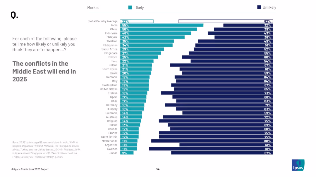
Consistent visual format with horizontal bars and national ranking; clean and symmetrical chart layout
Strategic Planning
Government & Public Sector
The slide evaluates expectations regarding peace in the Middle East by 2025. It aggregates perceptions from various countries, showing likelihood percentages and identifying major shifts in sentiment compared to the previous year.
Middle East, conflict resolution, peace prediction, 2025, survey, perception, geopolitics, regional conflict
false
Strategic Planning
Government & Public Sector
Mixed Chart
IPSOS
Add to my slides
Remove from favorites
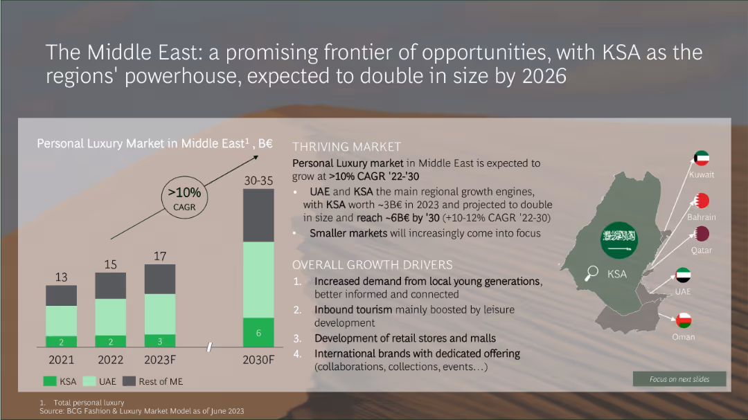
Infographic with a bar chart projecting Middle East luxury market growth and a map showing key Gulf countries
Market Analysis and Trends
Consumer Goods
The Middle Eastern luxury market is expected to double by 2030, growing at over 10% CAGR. KSA and UAE are the primary growth engines, driven by increased demand from younger consumers, tourism, retail development, and international brand expansion.
Middle East, KSA, luxury market, CAGR, retail growth, tourism, youth demand, market size
false
Market Analysis and Trends
Consumer Goods
Mixed Chart
BCG
Add to my slides
Remove from favorites
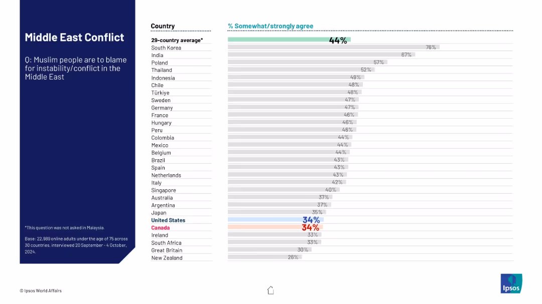
Visual format remains consistent; shows level of agreement that Muslim people are to blame for Middle East instability. Horizontal bars, ranked by country.
Regulatory and Compliance
Government & Public Sector
This slide measures public attitudes across countries regarding the perceived responsibility of Muslim populations in Middle East conflicts. Data reveals polarization in viewpoints and potential for bias or stereotyping in perceptions.
Middle East, Muslim blame, public opinion, Ipsos, conflict perception, bias, stereotype, geopolitical tension, survey, international sentiment
false
Regulatory and Compliance
Government & Public Sector
Mixed Chart
IPSOS
Add to my slides
Remove from favorites
The slide visually connects leadership, middle management, and teams with arrows and icons in a flowchart-like format, using a blue and teal color scheme to highlight text areas.
Organizational Structure and Change
Professional Services
Highlights the crucial role of middle management in shaping team culture and providing feedback, suitable for discussions on organizational behavior and change management.
middle management, team culture, organizational behavior, change management, feedback, leadership
false
Organizational Structure and Change
Professional Services
Diagram
Kearney
Add to my slides
Remove from favorites
A U.S. map highlights locations and prospective clients in the Middle Market Banking & Specialized Industries sector, using color-coding to differentiate data. The slide is data-driven and informative with minimal text for clarity.
Market Analysis and Trends
Financial Services
Offers a geographical overview of opportunities in the Middle Market segment, ideal for strategic discussions or investor presentations focused on expansion and market potential.
Middle Market, client franchise, growth opportunity, geographical overview, market potential
false
Market Analysis and Trends
Financial Services
Graphic
JP Morgan
Add to my slides
Remove from favorites
This slide is visually dense with a large column chart showing expansion market revenue over time and its CAGR. The chart is complemented by statistical data points and a map outline. Textual content is minimal, focusing on numerical growth representation, making it suitable for audiences interested in financial growth patterns.
Financial Performance
Financial Services
The slide presents a financial overview of a middle market expansion strategy, highlighting the consistent growth in revenue over several years. The visual focus is a column chart depicting rising figures with a target projection, supported by data on clients, loans, and deposits, emphasizing a steady increase in business performance.
middle market, expansion, revenue, growth, clients, CAGR, bankers, financial analysis, loans, deposits
false
Financial Performance
Financial Services
Single Chart
JP Morgan
Add to my slides
Remove from favorites
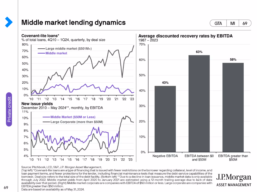
The slide has two line charts and one bar chart. The first line chart shows the percentage of covenant-lite loans by deal size from Q4 2010 to Q1 2024. The second line chart displays new issue yields from December 2010 to May 2024. The bar chart shows average discounted recovery rates by EBITDA from 1987 to 2023.
Market Analysis and Trends
Financial Services
This slide provides a detailed analysis of middle market lending dynamics, focusing on covenant-lite loans, new issue yields, and recovery rates, offering a comprehensive view of middle market lending trends.
middle market, lending dynamics, covenant-lite loans, new issue yields, recovery rates
false
Market Analysis and Trends
Financial Services
Multiple Chart
JP Morgan
Add to my slides
Remove from favorites
The slide includes a map of the United States with overlays indicating the company's footprint and prospective client density. It also has graphical elements such as circles of varying sizes representing data points, with a key to interpret these visual elements. The design is straightforward, focusing on market potential and presence.
Market Analysis and Trends
Financial Services
Aimed at demonstrating market strength and opportunities, the slide features a map visualizing the firm’s market presence and prospective client density in the middle market segment. It uses graphical representations to highlight the scale and scope of the company’s reach, underscoring the strategic positioning for growth within this segment.
middle market, market opportunity, banking, client prospects, presence, strategic positioning, footprint, growth potential
false
Market Analysis and Trends
Financial Services
Diagram
JP Morgan
Add to my slides
Remove from favorites
The slide uses a dark blue to light blue gradient column chart to showcase revenue growth from 2010 to 2018, with a projection line indicating the target. The layout includes a footer with small text and numbers denoting client, loan, and deposit details.
Market Analysis and Trends
Financial Services
Presents revenue growth in the middle market sector, with historical data and future targets, emphasizing the successful execution of the bank's organic expansion strategy. Ideal for investor briefings or market analysis presentations.
middle market, revenue growth, expansion strategy, historical data, future targets, organic growth
false
Market Analysis and Trends
Financial Services
Single Chart
JP Morgan
Add to my slides
Remove from favorites
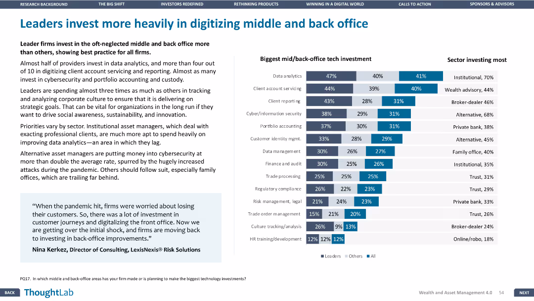
This slide has a bar chart and a detailed table. The layout is moderately dense, focusing on tech investments in middle and back office areas.
Operational Efficiency
Financial Services
The slide highlights the significant investments made by leader firms in digitizing middle and back-office functions, with data on the biggest tech investments and sectors investing the most in these areas.
Middle office, back office, tech investments, digitization, operational efficiency
false
Operational Efficiency
Financial Services
Mixed Chart
Deloitte
Add to my slides
Remove from favorites
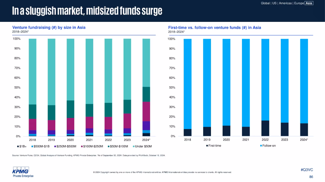
Two vertical stacked bar charts: left shows venture fundraising by size; right compares first-time vs. follow-on funds in Asia (2018–2024).
Market Analysis and Trends
Financial Services
The slide reveals a rise in mid-sized funds ($100M–$500M) and a consistent dominance of follow-on funds over first-time venture funds. The market favors experienced fund managers in a more cautious fundraising environment, with under-$50M funds also growing in proportion in 2024.
midsize funds, first-time funds, follow-on funds, Asia, venture capital, fundraising
false
Market Analysis and Trends
Financial Services
Multiple Chart
KPMG
Add to my slides
Remove from favorites
Includes icons and arrows illustrating migration drivers across political, social, economic, and environmental categories.
Market Analysis and Trends
Government & Public Sector
Discusses comprehensive factors influencing migration decisions globally.
migration, drivers, social, economic, global
false
Market Analysis and Trends
Government & Public Sector
Diagram
Roland Berger
Add to my slides
Remove from favorites
Column chart show migration volumes between and within regions, using contrasting colors for clarity.
Market Analysis and Trends
Government & Public Sector
Analyzes regional and interregional migration patterns, highlighting European mobility.
migration, Europe, interregional, patterns, analysis
false
Market Analysis and Trends
Government & Public Sector
Mixed Chart
Roland Berger
Add to my slides
Remove from favorites
A world map with overlaid column charts depicts changes in migration pressures by region between 2020 and 2050.
Market Analysis and Trends
Government & Public Sector
Forecasts future migration pressures, underscoring the impact on Europe, Central Asia, and North America.
migration, forecast, 2050, pressures, global
false
Market Analysis and Trends
Government & Public Sector
Multiple Chart
Roland Berger
Add to my slides
Remove from favorites
Features bar charts comparing top origin and destination countries for international migrants.
Market Analysis and Trends
Government & Public Sector
Provides an overview of major migration corridors, focusing on India and the US.
migration, India, US, corridors, global
false
Market Analysis and Trends
Government & Public Sector
Multiple Chart
Roland Berger
Add to my slides
Remove from favorites
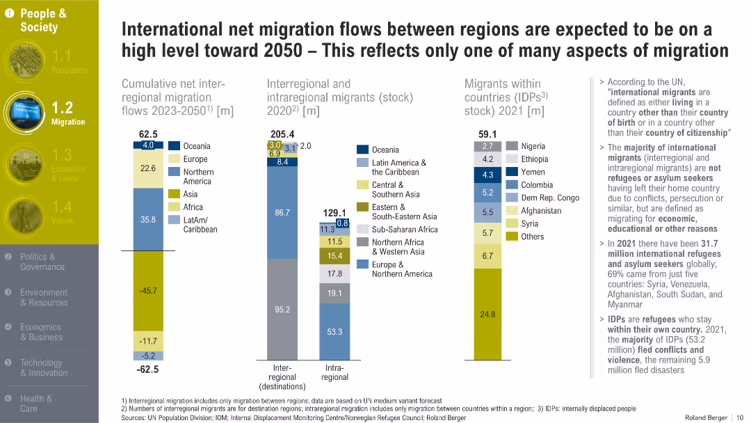
Multi-column bar charts with migration metrics, segmented by regions, accompanied by annotations and definitions on the right. Yellow-highlighted section headers and icons on the left.
Market Analysis and Trends
Government & Public Sector
The slide outlines migration trends through 2050, emphasizing regional flows, migrant stocks, and internally displaced persons. It distinguishes between types of migration and explains the driving forces like economic opportunity and conflict.
migration, international migrants, IDPs, regional flows, demographic shifts, refugees, asylum seekers, displacement, migration forecasts
false
Market Analysis and Trends
Government & Public Sector
Multiple Chart
Roland Berger
Add to my slides
Remove from favorites
Previous
Next
You don't have any favorites yet.
Please wait loading your favorites slides...
Create a FREE account to continue browsing
Receive Instant Access to 1,000+ slides from companies like McKinsey, Google, and Goldman Sachs
First Name
Last Name
Email
Password
I agree to all
Terms & Privacy Policy
Thank you! Your submission has been received!
Oops! Something went wrong while submitting the form.
Have an account?
Sign in
Upgrade to PRO to Save slides
Advanced Search and Filters
Access to 15,000+ slides
Access to Category Pages
Save/Bookmark Slides
PowerPoint Template Library
Pick a Plan
MONTHLY
$12/month
Billed every month, Cancel anytime.
YEARLY
$9/year
Billed $108 annually, Cancel anytime.
Checkout for $12/month
Checkout for $108/yr
Secured by Stripe | AES-256 bit encryption