My Account
My Slides
Search by Category
Pricing
Templates
View All Templates
Download Template Slides
✦ AI Search
Feedback
Login
Logout
Get Started
Browse all Slides
Browse all Slides
Create a FREE Account
Instant access to 1,000+ real slides from top companies like McKinsey, BCG, Goldman Sachs, Google and many more!
First Name
Last Name
Email
Password
I agree to all
Terms & Privacy Policy
Thank you! Your submission has been received!
Oops! Something went wrong while submitting the form.
Have an account?
Sign in
Saved Slides
Total No. of slides saved
0
↻ Refresh
✖ Clear all
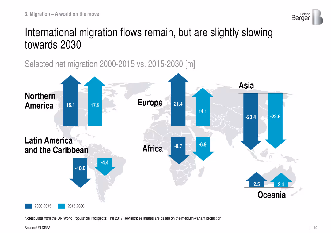
World map with directional arrows comparing net migration (2000–2015 vs. 2015–2030) across continents.
Market Analysis and Trends
Government & Public Sector
Depicts changes in international migration trends, showing continued but slowing net migration towards regions like North America and Europe, while Asia and Africa continue to lose population through emigration.
migration, net flows, international mobility, regional trends, demographic movement, UN DESA
false
Market Analysis and Trends
Government & Public Sector
Mixed Chart
Roland Berger
Add to my slides
Remove from favorites
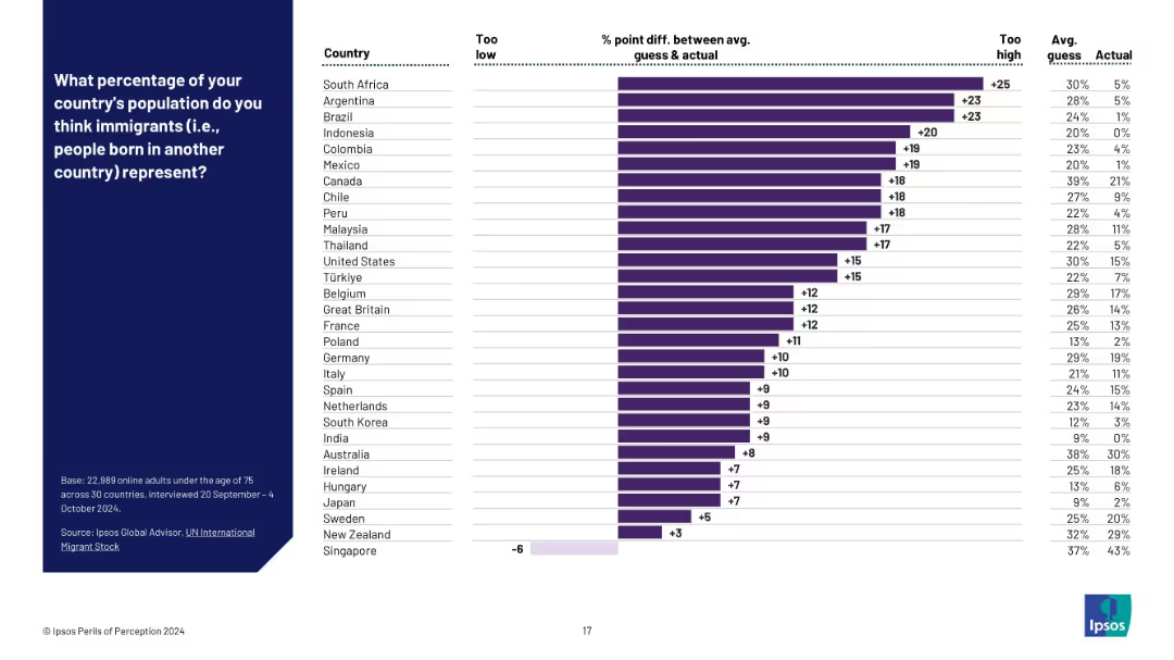
Bar chart showing % point difference between guessed and actual values; sorted by size of overestimation.
Market Analysis and Trends
Government & Public Sector
This slide emphasizes the extent of overestimation about immigrant population shares by showing the % difference between perception and actual data. It ranks countries by how much their populations misjudged immigration levels.
migration perception, misperception, survey data, population share, immigration overestimation, Ipsos study, public misunderstanding
false
Market Analysis and Trends
Government & Public Sector
Mixed Chart
IPSOS
Add to my slides
Remove from favorites
Provides definitions and statistics for various types of migrants, including refugees and internally displaced persons, with clear segmentation.
Market Analysis and Trends
Government & Public Sector
Educates on the complexities of migration and the varying statuses of migrants worldwide.
migration, refugees, IDPs, status, education
false
Market Analysis and Trends
Government & Public Sector
Mixed Chart
Roland Berger
Add to my slides
Remove from favorites
Slide includes a bar graph for top remittance receiving countries and a column chart for international migrant stock by region. Text descriptions and icons for population, migration, and education sectors are present.
Market Analysis and Trends
Government & Public Sector
This slide presents statistical data on international labor migration and remittances, highlighting economic impacts and demographic shifts. It aims to inform on the scale and financial implications of labor mobility globally.
migration, remittances, labor, economics, international, finance, data, demographics, global economy
false
Market Analysis and Trends
Government & Public Sector
Multiple Chart
Roland Berger
Add to my slides
Remove from favorites
Visual timeline from 2020 to 2022 with icons and images representing key corporate milestones.
Organizational Structure and Change
Financial Services
Details significant organizational changes and strategic decisions impacting company growth and market position from 2020 to 2022.
Milestones, Organizational Change, Growth
false
Organizational Structure and Change
Financial Services
Linear Flow
Barclays
Add to my slides
Remove from favorites
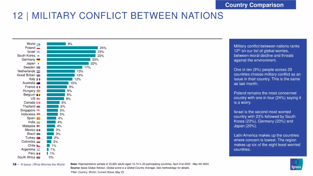
Bar chart of countries worried about military conflict; right side includes explanatory narrative.
Risk Assessment and Management
Government & Public Sector
This slide tracks concerns about military conflict globally. Poland (24%) is the most concerned, followed by Israel and South Korea (23%). Latin American nations show minimal concern. The global average is 9%, unchanged from the previous month.
military conflict, geopolitical risk, global survey, Ipsos, Poland, Israel, national security, global concerns
false
Risk Assessment and Management
Government & Public Sector
Mixed Chart
IPSOS
Add to my slides
Remove from favorites
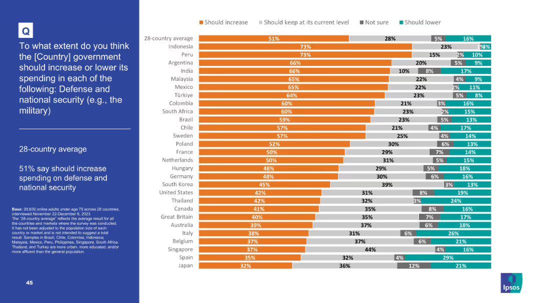
Horizontal bar chart of country rankings with color-coded segments indicating opinions
Strategic Planning
Government & Public Sector
This slide compares how people in 28 countries feel about increasing or maintaining military/defense spending. While 51% on average favor an increase, support is highest in Indonesia and Peru (73%). Japan has the lowest at 32%.
Military, defense spending, national security, global opinion, survey, public policy, bar chart, Ipsos, government priorities, strategic investment
false
Strategic Planning
Government & Public Sector
Mixed Chart
IPSOS
Add to my slides
Remove from favorites
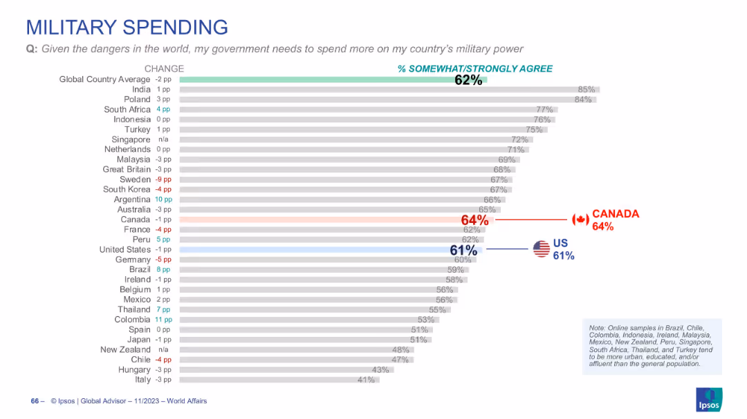
Horizontal bar chart showing national agreement with the need for higher military spending due to global dangers.
Strategic Planning
Government & Public Sector
This slide presents how strongly people agree that their country needs increased military spending. India, Poland, and South Africa lead in agreement, while support is lower in countries like Sweden, Italy, and Germany.
military spending, defense budget, global perception, Ipsos data, national security, international trends
false
Strategic Planning
Government & Public Sector
Single Chart
IPSOS
Add to my slides
Remove from favorites
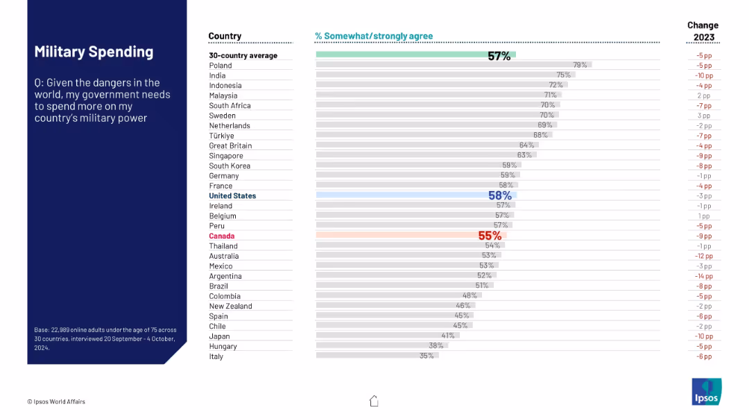
Bar chart showing agreement levels across countries on the need to increase national military spending due to global dangers. Same layout structure.
Risk Assessment and Management
Government & Public Sector
This slide reveals global sentiment on whether governments should invest more in military power given current global threats. Country-specific results are compared with the 30-country average and previous year's data.
military spending, global security, defense investment, public opinion, Ipsos, international threat, national defense, survey data, geopolitical risks
false
Risk Assessment and Management
Government & Public Sector
Mixed Chart
IPSOS
Add to my slides
Remove from favorites
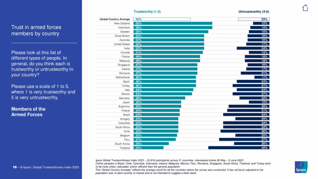
Country ranking bar chart on trust in the armed forces. Global average benchmark is 42%. Darker and lighter bars differentiate trust levels.
Customer and Market Segmentation
Government & Public Sector
This slide presents trust scores for members of the armed forces across various countries. New Zealand and Indonesia score highest; South Korea and Thailand score lowest. It reflects how military perception varies globally.
military trust, armed forces, global opinion, Ipsos, national differences, perception
false
Customer and Market Segmentation
Government & Public Sector
Mixed Chart
IPSOS
Add to my slides
Remove from favorites
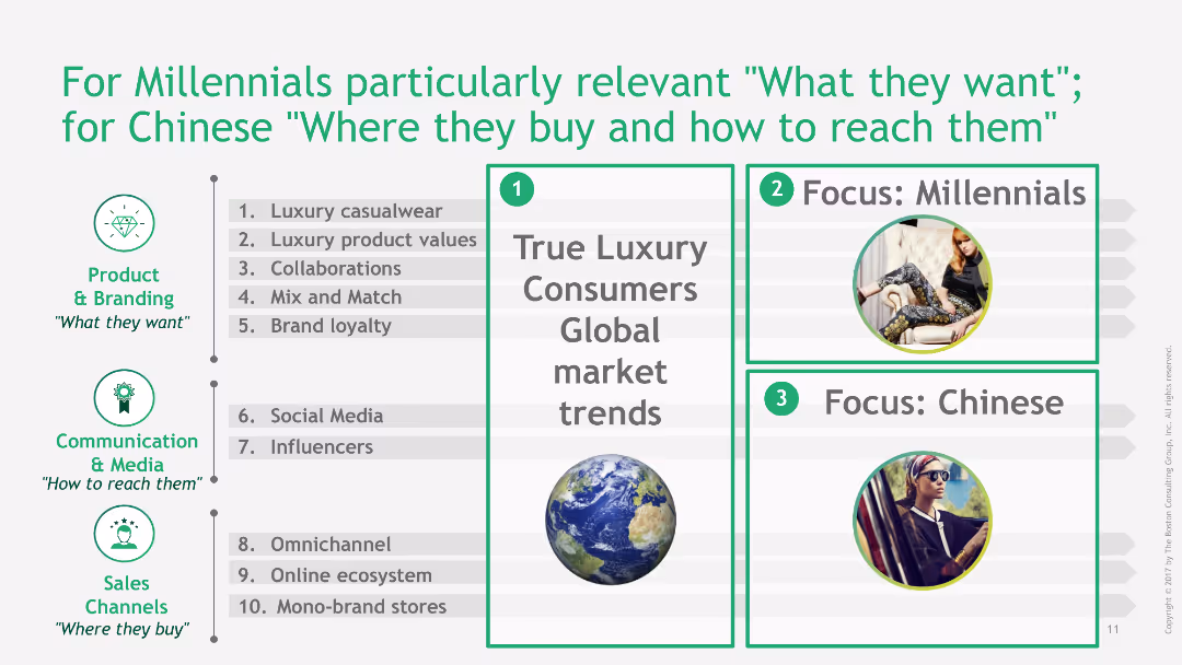
This slide is divided into three sections: global market trends, focus on Millennials, and focus on Chinese consumers. It uses text and images to emphasize key points.
Market Analysis and Trends
Consumer Goods
The slide focuses on the preferences and buying behaviors of Millennials and Chinese consumers, identifying specific trends and strategies to target these demographics effectively.
millennials, Chinese consumers, market trends, buying behavior, targeting strategy
false
Market Analysis and Trends
Consumer Goods
Header Vertical
BCG
Add to my slides
Remove from favorites
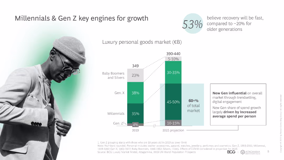
Includes bar graphs, line charts, and detailed statistical data, blue and gray color themes.
Market Analysis and Trends
Consumer Goods
Analyzes younger generations' workplace preferences and consumer willingness to pay for sustainable products.
Millennials, Gen Z, consumer behavior, sustainability, market trends
false
Market Analysis and Trends
Consumer Goods
Multiple Chart
McKinsey
Add to my slides
Remove from favorites
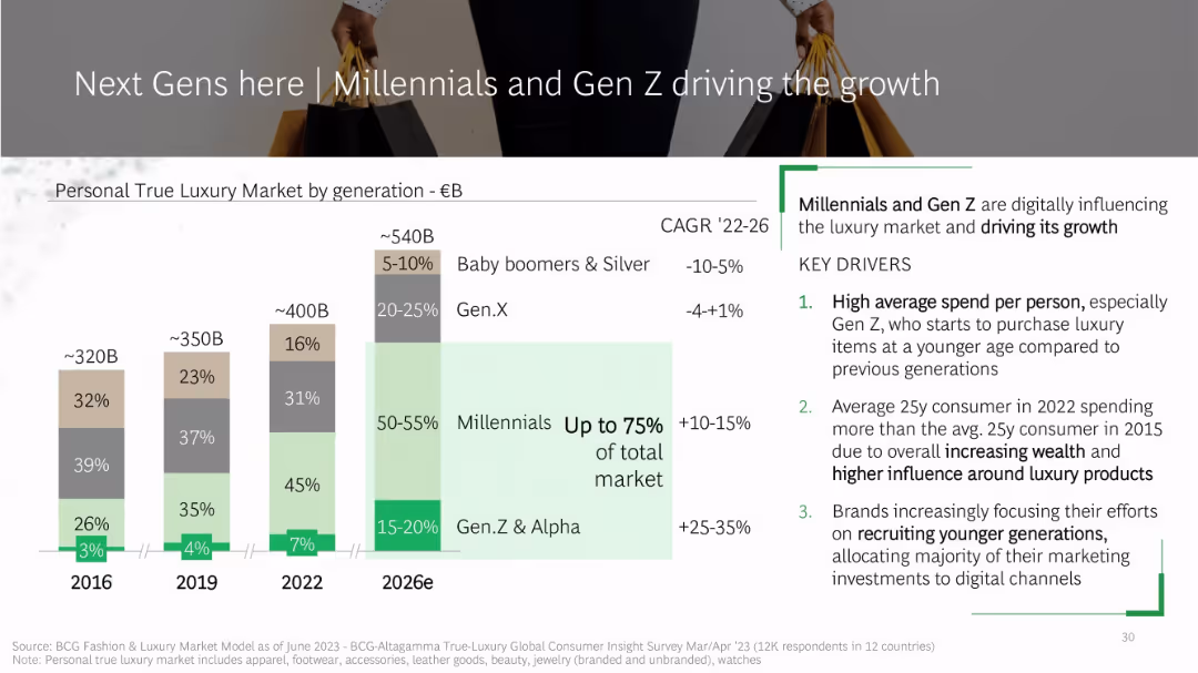
Slide features a bar chart comparing generational market shares (2016–2026e) with color-coded segments per generation. Right side includes key drivers and CAGR stats.
Market Analysis and Trends
Consumer Goods
The slide analyzes the generational shifts in the personal luxury goods market, forecasting that Millennials and Gen Z will make up to 75% of the market by 2026. It highlights factors such as higher per-person spending, earlier luxury adoption by Gen Z, and digital marketing targeting younger consumers.
Millennials, Gen Z, luxury market, generational trends, CAGR, BCG, spending behavior, digital influence, consumer insights, market share
false
Market Analysis and Trends
Consumer Goods
Mixed Chart
BCG
Add to my slides
Remove from favorites
The slide includes a column chart showing market segments by generation and a photo of a young person, highlighting the influence of Millennials and Gen Z on luxury market growth.
Market Analysis and Trends
Retail & E-commerce
The slide discusses the impact of Millennials and Gen Z on the luxury personal goods market, noting their increasing share and influence on market trends and spending.
Millennials, Gen Z, market growth, luxury goods, generational trends, spending patterns, market influence, personal luxury, consumer segments
false
Market Analysis and Trends
Retail & E-commerce
Mixed Chart
BCG
Add to my slides
Remove from favorites
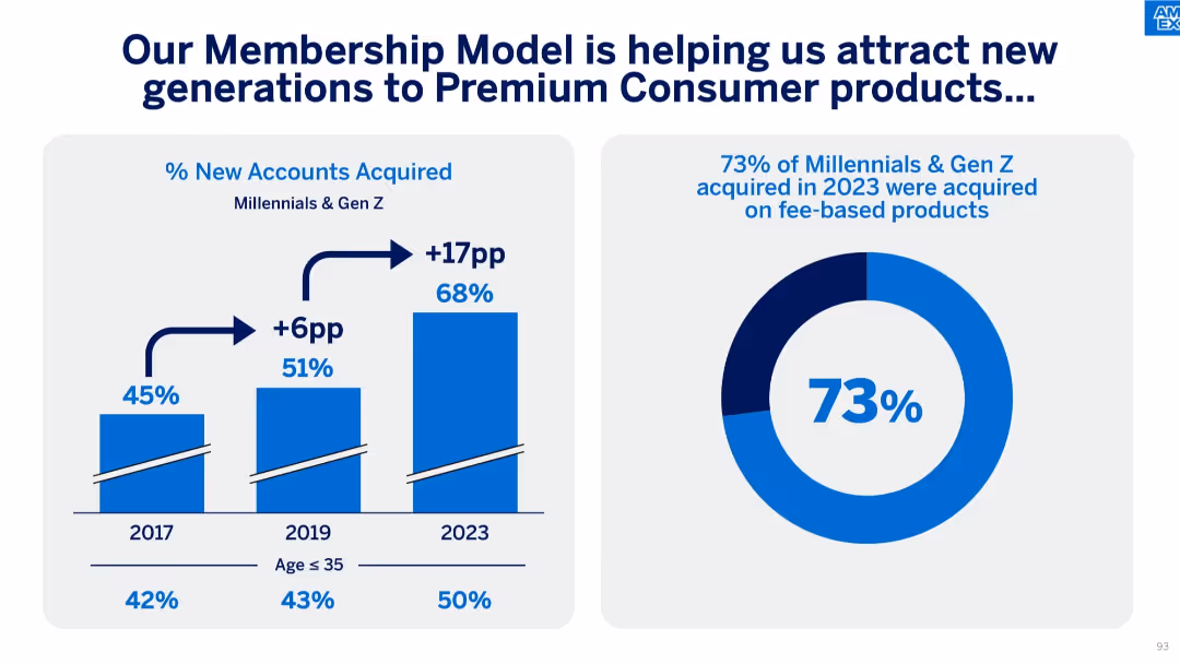
Two-panel layout with a vertical bar chart on the left and a donut chart on the right.
Customer and Market Segmentation
Financial Services
This slide outlines how American Express is attracting Millennials and Gen Z to premium products, with data showing significant increases in fee-based account acquisition among those under 35.
Millennials, Gen Z, Membership Model, Premium Products, New Accounts, Age Segmentation, Fee-based Acquisition
false
Customer and Market Segmentation
Financial Services
Multiple Chart
McKinsey
Add to my slides
Remove from favorites
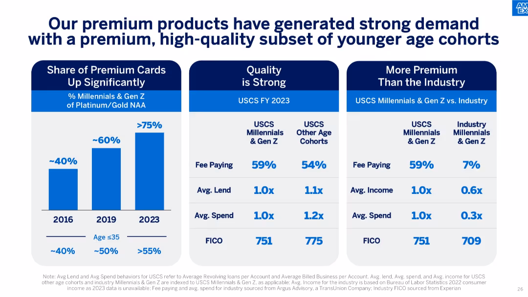
Three-column comparison format with charts and tables about Millennials & Gen Z behavior and metrics.
Customer and Market Segmentation
Financial Services
Highlights strong engagement from Millennials & Gen Z with premium AXP cards, including high fee-paying rates and FICO scores, comparing favorably to other age groups and industry benchmarks.
millennials, gen Z, premium products, customer quality, fee-paying, FICO score, card demand
false
Customer and Market Segmentation
Financial Services
Mixed Chart
McKinsey
Add to my slides
Remove from favorites
Slide uses light purple background with circular graphs and line charts depicting spending trends by generation from 2020 to 2030. Visuals are complemented by minimalistic icons and clear annotations to emphasize future trends.
Market Analysis and Trends
Retail & E-commerce
Analyzes the increasing spending power and trends of Millennials and Gen Z from 2020 to 2030, highlighting their future market significance. Useful for market strategy and demographic targeting.
Millennials, Gen Z, Spending Trends, 2030, Retail
false
Market Analysis and Trends
Retail & E-commerce
Multiple Chart
Accenture
Add to my slides
Remove from favorites
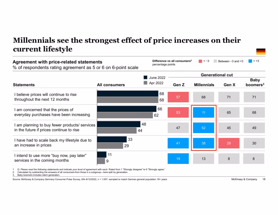
Table chart comparing consumer agreement with price-related statements across generations. Highlights % differences vs. average, using color coding. Five behavioral statements evaluated.
Customer and Market Segmentation
Financial Services
This slide reveals how different generations perceive the impact of rising prices. Millennials stand out as the most concerned and responsive, particularly in lifestyle changes and future consumption plans. The data is based on agreement with five specific inflation-related statements.
Millennials, inflation impact, generational comparison, price concern, consumption behavior, Germany, Gen Z, lifestyle changes
false
Customer and Market Segmentation
Financial Services
Multiple Chart
McKinsey
Add to my slides
Remove from favorites
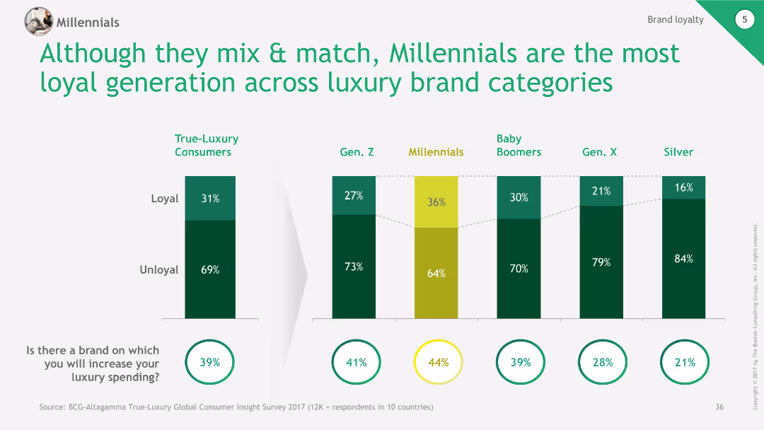
The slide presents a comparative column chart showing the loyalty levels across different generations. It compares True-Luxury Consumers, Gen. Z, Millennials, Baby Boomers, Gen. X, and Silver. Each group is divided into Loyal and Unloyal percentages. Additionally, there are circles at the bottom indicating the percentage of respondents likely to increase luxury spending.
Customer and Market Segmentation
Consumer Goods
This slide compares brand loyalty across generations, showing Millennials as the most loyal generation. It also indicates the likelihood of respondents to increase their luxury spending.
Millennials, loyalty, generations, luxury, brand
false
Customer and Market Segmentation
Consumer Goods
Multiple Chart
BCG
Add to my slides
Remove from favorites
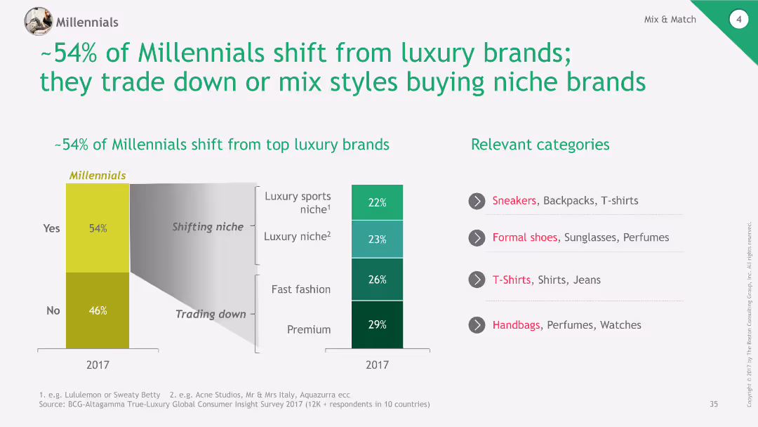
The slide features a column chart on the left showing the percentage of Millennials shifting from luxury brands (54%) and those not shifting (46%). On the right, it shows a breakdown of the niches they are shifting to: Luxury sports niche (22%), Luxury niche (23%), Fast fashion (26%), and Premium (29%). Relevant categories are listed to the right.
Market Analysis and Trends
Consumer Goods
This slide analyzes the trend of Millennials shifting away from top luxury brands, highlighting the niches they are moving towards and listing relevant product categories.
Millennials, luxury, brands, niches, fashion
false
Market Analysis and Trends
Consumer Goods
Multiple Chart
BCG
Add to my slides
Remove from favorites
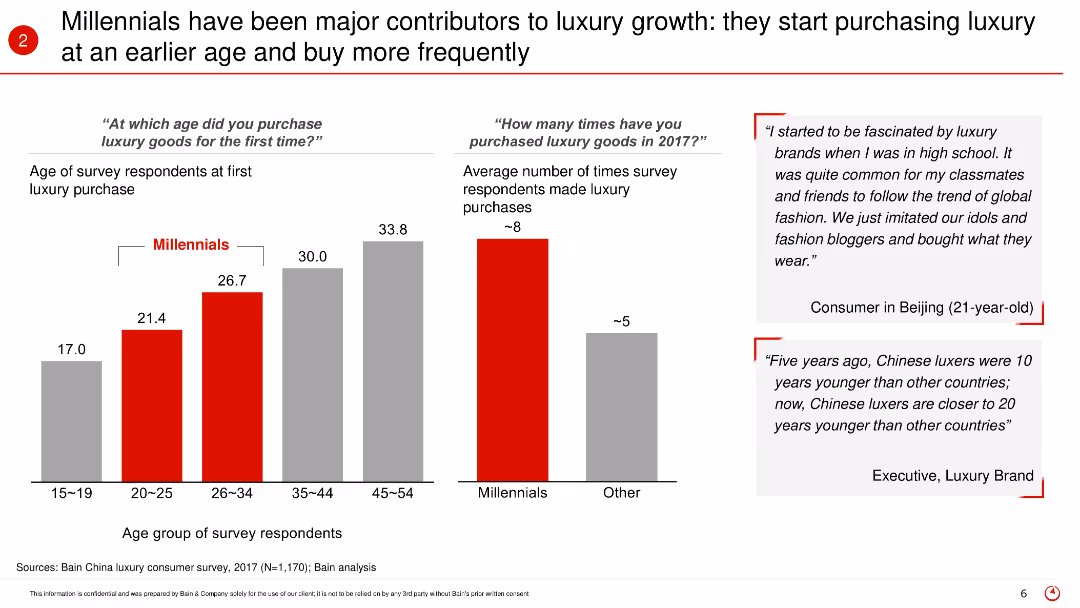
The slide includes bar charts showing the age at which Millennials first purchase luxury goods and the average number of luxury purchases made in 2017. It also features quotes from consumers and industry experts, highlighting the early adoption and frequent purchasing behavior of Millennials.
Market Analysis and Trends
Retail & E-commerce
The slide emphasizes the role of Millennials in driving luxury market growth by starting to purchase luxury goods at an earlier age and making frequent purchases. It provides data on the average age of first luxury purchase and the average number of purchases, supported by quotes from consumers and industry experts.
Millennials, luxury growth, early adoption, frequent purchasing, consumer behavior, age groups, 2017, market trends, luxury goods
false
Market Analysis and Trends
Retail & E-commerce
Multiple Chart
Bain
Add to my slides
Remove from favorites
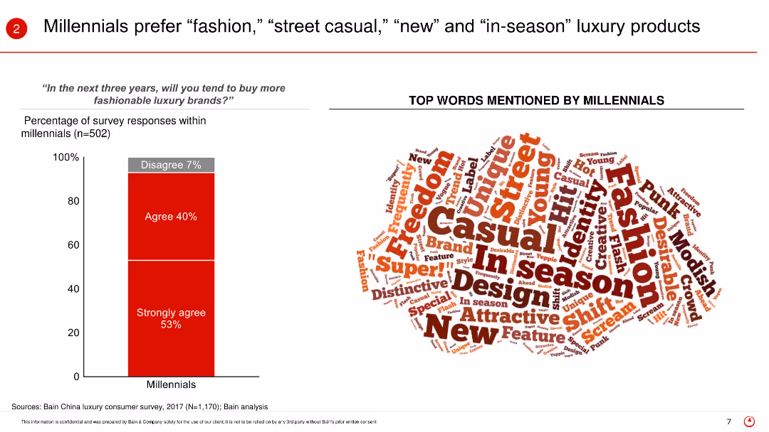
The slide uses a bar (column) chart to present the percentage of Millennials agreeing or strongly agreeing to buy more fashionable luxury brands in the next three years. It also features a word cloud illustrating the top words mentioned by Millennials when describing their luxury preferences.
Market Analysis and Trends
Retail & E-commerce
The slide focuses on the preferences of Millennials for luxury products, indicating a strong inclination towards fashion, street casual, new, and in-season items. It shows the survey results where a significant percentage of Millennials agree or strongly agree to buy more fashionable luxury brands in the coming years.
Millennials, luxury preferences, fashion, street casual, in-season, word cloud, consumer survey, future trends, buying behavior
false
Market Analysis and Trends
Retail & E-commerce
Mixed Chart
Bain
Add to my slides
Remove from favorites
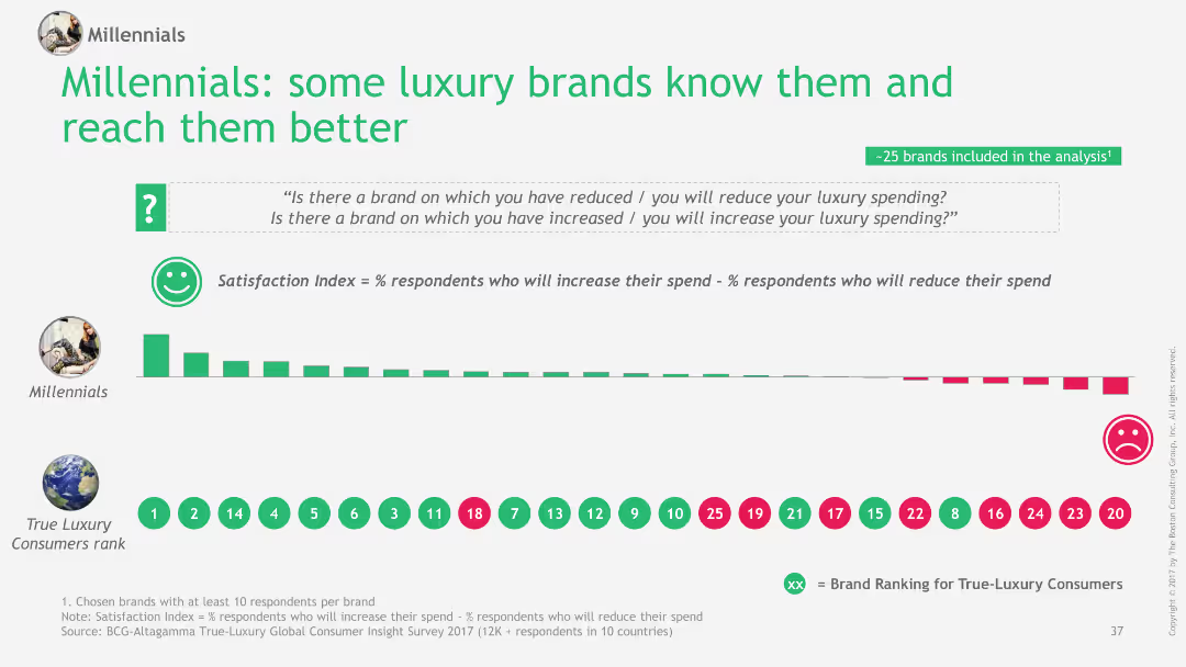
The slide uses a bar chart to show the satisfaction index of luxury brands among Millennials, compared to True-Luxury Consumers. Brands are ranked based on the percentage of respondents who will increase vs. reduce their luxury spending.
Customer and Market Segmentation
Consumer Goods
This slide illustrates how some luxury brands achieve higher satisfaction among Millennials compared to True-Luxury Consumers, using a satisfaction index to compare brand performance.
Millennials, satisfaction, luxury, brands, index
false
Customer and Market Segmentation
Consumer Goods
Single Chart
BCG
Add to my slides
Remove from favorites
The slide features column charts comparing the usage rates of mindfulness services between 2020 and 2022, segmented into app-based and in-person services. It includes future spending intent and change in spending.
Product and Service Analysis
Healthcare & Pharmaceuticals
Evaluates the growth in mindfulness and meditation services, highlighting a strong shift towards digital and app-based platforms. Useful for analyzing consumer trends in mental health and wellness applications, particularly the integration of technology in personal health practices.
Mindfulness, meditation, digital trends, consumer behavior, health and wellness
false
Product and Service Analysis
Healthcare & Pharmaceuticals
Mixed Chart
McKinsey
Add to my slides
Remove from favorites
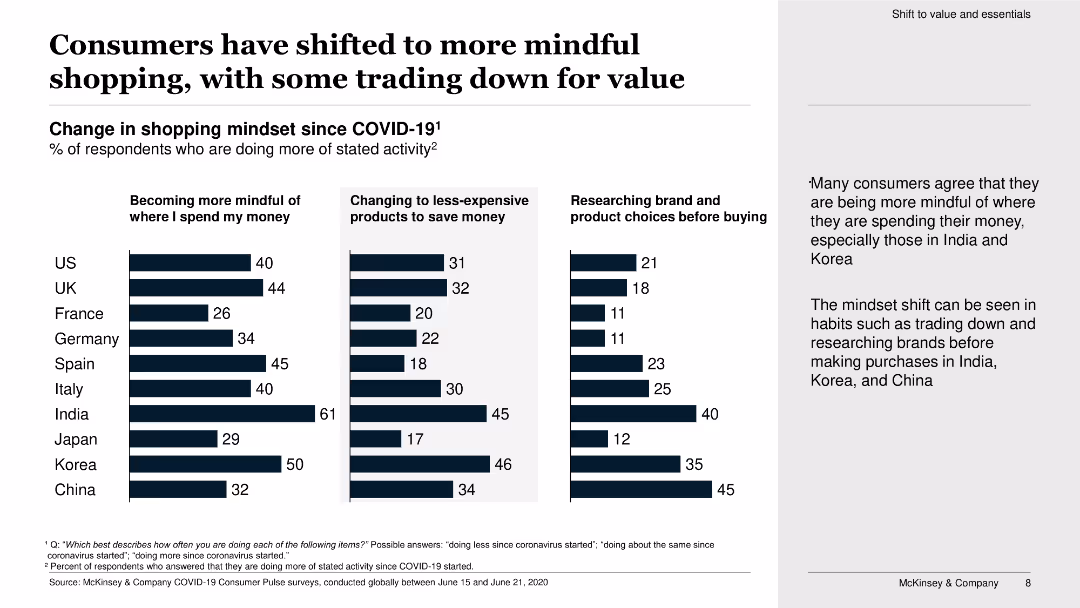
The slide contains three vertical bar charts showing the percentage of respondents becoming more mindful of spending, changing to less-expensive products, and researching before buying.
Market Analysis and Trends
Retail & E-commerce
The slide shows changes in consumer shopping mindsets since COVID-19, highlighting an increase in mindful spending, trading down for value, and product research.
mindful shopping, trading down, value, COVID-19, bar chart, consumer behavior, spending, research, products, survey
false
Market Analysis and Trends
Retail & E-commerce
Multiple Chart
McKinsey
Add to my slides
Remove from favorites
Contains a central diagram surrounded by four quadrants depicting demand, supply, financing, and responsibility, all linking back to technology's central role in mineral criticality.
Strategic Planning
Environmental Services & Sustainability
Outlines the impact of technology on mineral criticality, emphasizing political, technological, and financial interactions. Useful for discussions on sustainable resource management.
mineral criticality, technology, sustainability, supply and demand, diagram, strategic planning, environmental impact
false
Strategic Planning
Environmental Services & Sustainability
Diagram
McKinsey
Add to my slides
Remove from favorites
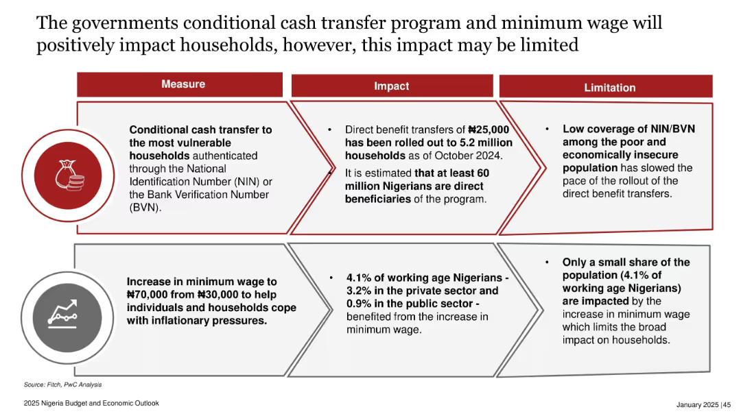
Two stacked horizontal sections, each with a three-column layout: Measure, Impact, and Limitation. Icons included to represent each initiative.
Strategic Planning
Government & Public Sector
The slide explains two government initiatives—conditional cash transfers and minimum wage increases—intended to help households cope with inflation. While impactful, the measures have limitations due to low ID coverage and limited reach, affecting their broad efficacy.
minimum wage, conditional cash transfer, NIN, BVN, household income, inflation mitigation, Nigeria policy, social intervention
false
Strategic Planning
Government & Public Sector
Table
PwC/Strategy&
Add to my slides
Remove from favorites
Displays column charts and a line graph illustrating the mining industry's revenue against investments over years. The slide includes annotations to point out investment strategies.
Investment Analysis
Industrial & Manufacturing
Evaluates the effectiveness of investment strategies in the mining industry, useful for assessing financial decisions and market conditions for potential investors.
mining industry, investment strategies, column charts, industry revenue, market analysis, financial assessment
false
Investment Analysis
Industrial & Manufacturing
Single Chart
McKinsey
Add to my slides
Remove from favorites
Includes title, bar charts representing different digital initiatives like "Smart Sensors" and "Remote Operations Centre", and their potential impacts.
Operational Efficiency
Industrial & Manufacturing
Outlines the transformative impact of digital technologies in mining and metals, focusing on operational efficiencies, safety improvements, and environmental benefits.
mining, metals, digital transformation, operational efficiency, environmental benefits
false
Operational Efficiency
Industrial & Manufacturing
Mixed Chart
Accenture
Add to my slides
Remove from favorites
Slide with multiple line graphs on a white background, comparing the projected demand and mine supply of nickel, lithium, and cobalt up to 2032.
Market Analysis and Trends
Industrial & Manufacturing
Analyzes the future trends in the mining of essential minerals for battery production, highlighting potential shortages and growth in demand. The focus shifts to nickel due to its significant role in battery technology.
mining, minerals, battery, nickel, lithium, cobalt
false
Market Analysis and Trends
Industrial & Manufacturing
Multiple Chart
McKinsey
Add to my slides
Remove from favorites
The slide shows a line graph comparing the productivity index of the mining industry with other sectors, accompanied by column charts showing equipment OEE percentages.
Operational Efficiency
Industrial & Manufacturing
Analyzes mining productivity trends over time compared to other industries, discussing factors influencing these trends and suggesting areas for operational improvements.
mining productivity, industry comparison, line graph, bar charts, operational efficiency, trend analysis, equipment OEE
false
Operational Efficiency
Industrial & Manufacturing
Multiple Chart
McKinsey
Add to my slides
Remove from favorites
Four recommendation blocks at right, stress bar chart at left, central narrative explains sector pain points and suggested actions
Market Analysis and Trends
Industrial & Manufacturing
Covers Materials, Metals, and Mining sector. Highlights stress from productivity issues, regulatory burdens, and input cost inflation. Suggests owner-led improvements, better commercial models, cash liquidity buffers, and capex management. Emphasizes the cyclical nature of the sector.
mining, productivity, inflation, supply chain, construction delays, regulatory impact, liquidity, metals, operations
false
Market Analysis and Trends
Industrial & Manufacturing
Mixed Chart
Alvarez & Marsal
Add to my slides
Remove from favorites
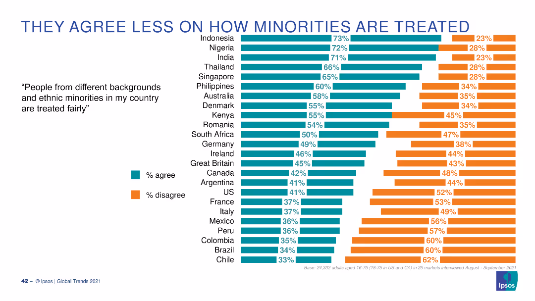
A bar chart with horizontal bars illustrating the percentage of people who agree or disagree that ethnic minorities are treated fairly in their country, across various countries.
Market Analysis and Trends
Government & Public Sector
This slide presents global survey data on the perception of fair treatment of ethnic minorities, showing significant differences in agreement levels across countries.
minorities, treatment, fairness, global, survey
false
Market Analysis and Trends
Government & Public Sector
Multiple Chart
IPSOS
Add to my slides
Remove from favorites
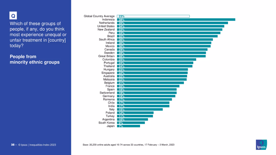
Split-screen layout: left side has a blue panel with the question and topic; right side shows a horizontal bar chart.
Market Analysis and Trends
Government & Public Sector
The slide presents survey data on perceived unfair treatment of minority ethnic groups across various countries. Indonesia, Netherlands, and U.S. top the list.
minority, ethnic, inequality, perception, treatment, survey, bar chart, countries, global average, Ipsos
false
Market Analysis and Trends
Government & Public Sector
Mixed Chart
IPSOS
Add to my slides
Remove from favorites
A line graph showing the top 10 minutes viewed by P2+ in 2020 versus 2021, with lines representing each year and a noticeable decline in 2021.
Market Analysis and Trends
Media & Entertainment
The slide compares the top 10 minutes viewed in 2020 and 2021, showing a 9% year-over-year decline, reflecting changing viewer engagement patterns.
minutes viewed, comparison, 2020, 2021, decline
false
Market Analysis and Trends
Media & Entertainment
Single Chart
Nielsen
Add to my slides
Remove from favorites
A column chart displaying the share of minutes viewed by different platforms over various months, with different colored segments representing platforms like Netflix, YouTube, Hulu, etc. A legend on the right explains the color coding for each platform.
Market Analysis and Trends
Media & Entertainment
This slide shows the monthly breakdown of minutes viewed by different platforms from May 2021 to January 2022. The data highlights trends in viewership across linear TV and various streaming services.
minutes viewed, streaming platforms, viewership trends, linear TV, monthly breakdown
false
Market Analysis and Trends
Media & Entertainment
Single Chart
Nielsen
Add to my slides
Remove from favorites
The slide features a column chart showing changes in assets under management over time, with callout boxes indicating specific factors contributing to the increases or decreases, and an annotation explaining equity movements. The chart uses shades of blue and gray for visual differentiation.
Financial Performance
Financial Services
This slide presents the movements in Macquarie Infrastructure and Real Assets (MIRA) Equity Under Management (EUM), highlighting the impact of new equity raised, listed security price movements, and foreign exchange movements, suitable for financial analysis and investor presentations.
MIRA, EUM, equity, investment, financial analysis, Macquarie, bar graph, performance, capital, foreign exchange
false
Financial Performance
Financial Services
Single Chart
Goldman Sachs
Add to my slides
Remove from favorites
The slide features a mixed chart with column chart and a line graph illustrating MIRA's historical income, base fees, and EUM over fiscal years.
Financial Performance
Financial Services
Presents the historical income of MIRA, comparing performance fees, base fees, and end-of-period EUM, aimed at evaluating past financial performance and informing investment decisions.
MIRA, income, performance fees, base fees, EUM, historical, financial analysis
false
Financial Performance
Financial Services
Single Chart
Goldman Sachs
Add to my slides
Remove from favorites
The slide features a prominent title at the top, a brief introductory paragraph, and a complex column chart with multiple data points colored differently for various statistics. The chart is supported by explanatory text that analyzes trends in misinformation recognition over the past year.
Market Analysis and Trends
Technology & Software
This slide examines the trend of misinformation online, presenting data on how frequently users identify false information and changes in this perception over time. Useful in discussions on digital literacy and media consumption.
misinformation, digital users, media, online trends, data analysis, internet, perception, literacy, public awareness, statistics
false
Market Analysis and Trends
Technology & Software
Mixed Chart
Deloitte
Add to my slides
Remove from favorites
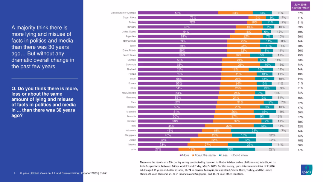
Stacked bar chart showing country-level responses about perceived increase in political/media misinformation over 30 years. Purple, orange, teal, and gray segments.
Market Analysis and Trends
Media & Entertainment
This slide shows that a global majority believes misinformation in politics/media has increased over the last 30 years. Countries like South Africa and Turkey show the highest concern. Despite regional variation, no major shift in perception has occurred recently.
misinformation, media trust, political facts, global opinion, public perception, Ipsos, disinformation
false
Market Analysis and Trends
Media & Entertainment
Mixed Chart
IPSOS
Add to my slides
Remove from favorites
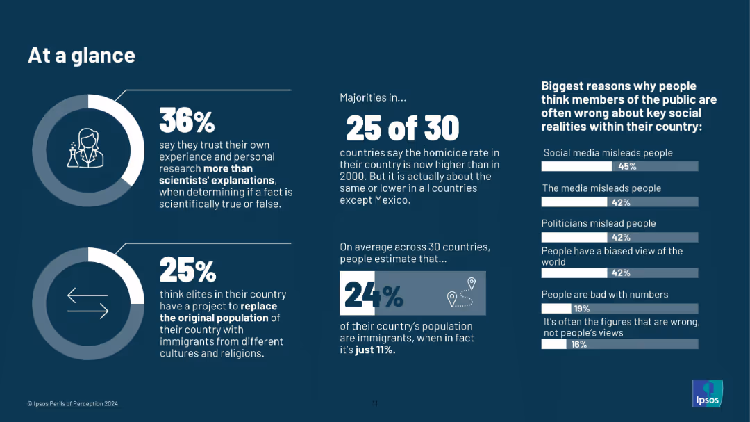
Infographic layout; icons, donut charts, large typography; dark background with white and blue text; no country-level breakdown.
Market Analysis and Trends
Education & Training
A summary slide offering highlights from the broader report. It shows 36% trust their own research over science, 25% believe in elite-driven population replacement, and 24% overestimate immigrant share. Misperceptions are tied to media, politicians, and biases.
misinformation, public opinion, perception gap, media influence, science trust, demographic myths, Ipsos, 2024, infographic, elite theories
false
Market Analysis and Trends
Education & Training
Multiple Chart
IPSOS
Add to my slides
Remove from favorites
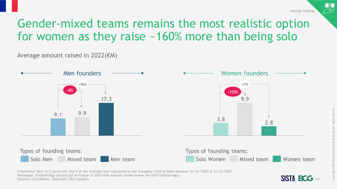
Two-column charts showing average amount raised in 2022 by different team compositions for men and women founders, highlighting mixed teams.
Market Analysis and Trends
Professional Services
The slide indicates that gender-mixed teams raised more funds in 2022 compared to solo or single-gender teams, making them a realistic option for women.
mixed teams, funding, gender diversity, realistic option
false
Market Analysis and Trends
Professional Services
Multiple Chart
BCG
Add to my slides
Remove from favorites
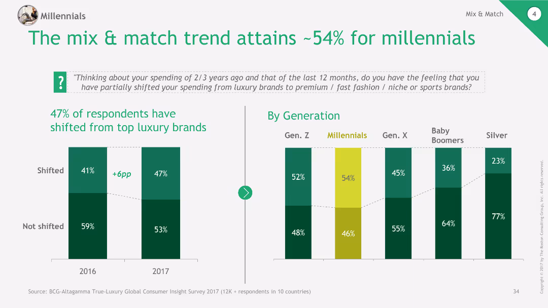
Column chart showing shift in spending from top luxury brands to premium, fast fashion, and niche brands among different generations.
Market Analysis and Trends
Retail & E-commerce
The slide discusses the trend of mix & match fashion, with millennials showing significant shifts in spending from luxury to other types of brands.
mix & match, millennials, spending trends, luxury, retail
false
Market Analysis and Trends
Retail & E-commerce
Multiple Chart
BCG
Add to my slides
Remove from favorites
Two columns addressing debates: 'Impact of ML industrialization' and 'Selection criteria for solutions that industrialize ML'.
Technology and Digital Transformation
Technology & Software
Covers various debate topics about the impact of ML industrialization on organizations and the criteria for selecting solutions to industrialize ML.
ML, debate, industrialization, selection criteria, organizational impact
false
Technology and Digital Transformation
Technology & Software
Header Vertical
McKinsey
Add to my slides
Remove from favorites
Pie chart displaying the distribution of approaches to ML governance among various firms.
Regulatory and Compliance
Technology & Software
Provides an overview of how different organizations are handling ML governance and framework adaptation.
ML governance, framework, adaptation, distribution
false
Regulatory and Compliance
Technology & Software
Single Chart
PwC/Strategy&
Add to my slides
Remove from favorites
Continuation of the previous slide, with value levers on the left and impact potential within 1 year on the right.
Technology and Digital Transformation
Technology & Software
Discusses the impact of industrializing ML across all industries by detailing specific value levers and expected impact within a year.
ML, impact, value, performance, risk, productivity
false
Technology and Digital Transformation
Technology & Software
Header Vertical
McKinsey
Add to my slides
Remove from favorites
Describes the expected impact of ML industrialization across various sectors, with representative icons for each.
Technology and Digital Transformation
Technology & Software
Explores the potential impact of ML industrialization across a variety of industries and how it could offer competitive advantages.
ML, industries, impact, tech trend, competitive advantage
false
Technology and Digital Transformation
Technology & Software
Header Vertical
McKinsey
Add to my slides
Remove from favorites
Split design detailing the benefits of engaging with ML on the left, and the risks and uncertainties on the right.
Technology and Digital Transformation
Technology & Software
Discusses the advantages and risks involved in ML industrialization, aiming to guide leadership in their strategic decisions.
ML, leadership, benefits, risks, AI adoption
false
Technology and Digital Transformation
Technology & Software
Boxed
McKinsey
Add to my slides
Remove from favorites
Comparison of outdated ML workflow elements on the left ("From") with the new approach on the right ("To").
Technology and Digital Transformation
Technology & Software
Describes the move toward simplicity, scalability, and interoperability in ML workflows, comparing the old and new methods.
ML, technologies, simplicity, scalability, interoperability
false
Technology and Digital Transformation
Technology & Software
Vertical Flow
McKinsey
Add to my slides
Remove from favorites
Diagram of ML workflow, future progression circular graphic, and side notes explaining the model deployment into production.
Technology and Digital Transformation
Technology & Software
Explanation of machine learning workflows, the process of bringing AI and ML into production, and future progression with scalable deployment.
ML workflow, AI, production, scalability, future progression
false
Technology and Digital Transformation
Technology & Software
Linear Flow
McKinsey
Add to my slides
Remove from favorites
Outlines ML sub-processes and examples of technology solutions within each stage of the ML workflow.
Technology and Digital Transformation
Technology & Software
Details the noteworthy software solutions that facilitate each stage of the ML workflow from data management to live-model operations.
ML workflow, data management, model development, operations
false
Technology and Digital Transformation
Technology & Software
Linear Flow
McKinsey
Add to my slides
Remove from favorites
Two bar charts displaying MMIS spend and cost savings opportunities over fiscal years, with detailed explanatory text boxes. Dense layout.
Regulatory and Compliance
Government & Public Sector
Review of MMIS contract costs and potential cost savings for the state, emphasizing shifting enhancement costs to vendors in future MMIS contracts.
MMIS, Costs, Savings, Fiscal Year, Contract
false
Regulatory and Compliance
Government & Public Sector
Multiple Chart
Alvarez & Marsal
Add to my slides
Remove from favorites
Contains line charts comparing the growth of mobile versus wired internet advertising revenues in India from 2016 to 2025.
Market Analysis and Trends
Media & Entertainment
Explores the shift towards mobile internet advertising in India, noting it as a major growth driver in digital advertising revenues.
mobile advertising, growth driver, India, digital revenue, 2025 forecast, internet advertising
false
Market Analysis and Trends
Media & Entertainment
Mixed Chart
PwC/Strategy&
Add to my slides
Remove from favorites
Includes multiple pie charts and a side comparison of figures in a column chart format, highlighting the growth of mobile display advertising from 2018 to 2027. The visual elements are complemented by text explaining the CAGR rates and the overall market share increase, with global comparisons subtly integrated into the design.
Market Analysis and Trends
Media & Entertainment
Evaluates the significant growth in mobile display advertising within Hong Kong’s market, offering insights into its increasing share and the projected dominance over other formats. Useful for strategies focusing on digital marketing and mobile advertising trends.
mobile advertising, Hong Kong, market dominance, growth projection, CAGR, digital marketing
false
Market Analysis and Trends
Media & Entertainment
Multiple Chart
PwC/Strategy&
Add to my slides
Remove from favorites
Slide features three smartphone screens showing different user interface designs of a new app, set against a pink background with three bullet points highlighting key features.
Technology and Digital Transformation
Financial Services
Discusses the development of a new mobile application aimed at enhancing user engagement, with a focus on daily insights and utility, thereby increasing revenue potential through user interaction.
mobile app, user engagement, daily insights, revenue growth, technology
false
Technology and Digital Transformation
Financial Services
Mixed Chart
Barclays
Add to my slides
Remove from favorites
Slide displays bar charts comparing digital audio advertising revenue from desktop and mobile between 2019 and 2020, with mobile showing higher values.
Market Analysis and Trends
Media & Entertainment
Analyzes the growth in digital audio advertising, with a focus on the dominance of mobile platforms in generating revenue over desktop, indicating a 13% YoY growth.
mobile, audio, advertising, revenue, growth, 2019-2020
false
Market Analysis and Trends
Media & Entertainment
Single Chart
PwC/Strategy&
Add to my slides
Remove from favorites
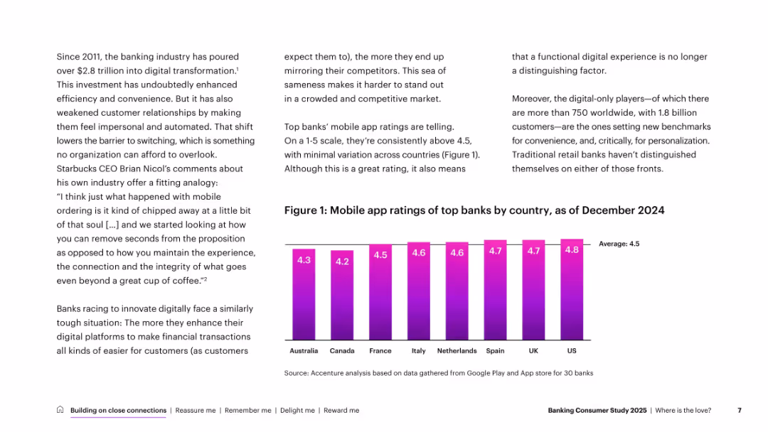
Vertical bar chart with mobile app scores by country. Set in a clean 3-column layout with text and data on white background. Purple gradient bars for ratings.
Customer and Market Segmentation
Financial Services
Reviews customer sentiment by country using mobile app ratings, reflecting consistency but also lack of differentiation. Suggests banks need to go beyond digital convenience to stand out.
mobile banking, app ratings, customer experience, digital, country
false
Customer and Market Segmentation
Financial Services
Mixed Chart
Accenture
Add to my slides
Remove from favorites
This slide contains a large area chart comparing mobile banking's growth to branch banking over a six-year period. There are additional blue boxes with concise texts highlighting the significance of the mobile banking trend.
Technology and Digital Transformation
Financial Services
The slide depicts the growth trend of mobile banking versus branch banking in the U.S., indicating customer preferences. Useful for discussing changes in consumer behavior and the importance of mobile banking solutions.
Mobile Banking, Branch Banking, Customer Preference, Growth Trend, Digital Disruption, Banking Anytime, Unsatisfied Demand
false
Technology and Digital Transformation
Financial Services
Mixed Chart
Morgan Stanley
Add to my slides
Remove from favorites
This slide presents three data points with icons: mobile app logins, users of a payment service, and percentage of check deposits via a digital platform. Each data point is accompanied by an increase percentage and compared to previous years. The slide layout is balanced, with clear delineation between each metric and the usage statistics shown in large bold numbers for emphasis.
Operational Efficiency
Financial Services
It highlights key performance metrics in digital services offered by Chase, such as mobile banking logins, peer-to-peer payments, and digital check deposits. The slide is intended to convey the effectiveness of digital investments and customer adoption rates for digital banking services.
mobile banking, digital platforms, user growth, customer adoption
false
Operational Efficiency
Financial Services
Table
JP Morgan
Add to my slides
Remove from favorites
Shows a series of column charts detailing the year-to-date growth of mobile banking apps in different Southeast Asian countries, with a clear legend for reference.
Market Analysis and Trends
Financial Services
Examines the increase in app engagement among leading financial institutions across Southeast Asia, detailing user growth percentages by country.
Mobile Banking, User Growth, Financial Institutions, SEA
false
Market Analysis and Trends
Financial Services
Single Chart
Bain
Add to my slides
Remove from favorites
Slide includes multiple column charts depicting mobile broadband subscription data from 2013 to 2020. Colors differentiate between operators and market share. Annotated percentages highlight consolidation in the telco industry.
Market Analysis and Trends
Telecommunications
Discusses the consolidation of the telco industry from ten operators to five, and the coverage of 4G networks, noting that a significant portion of mobile broadband subscribers now have 4G access. Highlights the regulatory impacts on subscription rates.
mobile broadband, 4G access, market share, consolidation, operators, subscription rates
false
Market Analysis and Trends
Telecommunications
Multiple Chart
BCG
Add to my slides
Remove from favorites
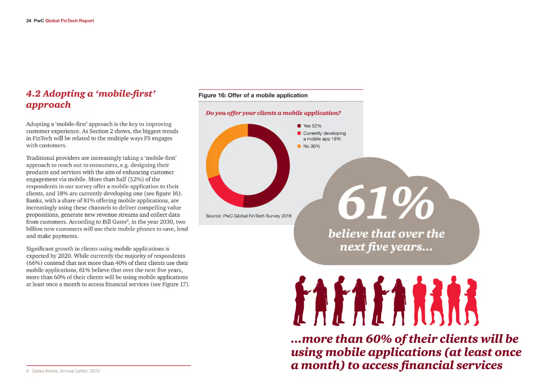
The slide includes a pie chart and text. The chart indicates the offer of mobile applications to clients.
Technology and Digital Transformation
Financial Services
The slide discusses the growing trend of adopting a mobile-first approach to enhance customer engagement in financial services.
Mobile-first, customer engagement, financial services, mobile applications, technology
false
Technology and Digital Transformation
Financial Services
Mixed Chart
PwC/Strategy&
Add to my slides
Remove from favorites
The slide includes a pie chart and text. The chart indicates trends and statistics on mobile application adoption among clients.
Technology and Digital Transformation
Financial Services
The slide discusses the anticipated growth in mobile application usage and its impact on financial services by 2020.
Mobile-first, trends, financial services, mobile applications, technology
false
Technology and Digital Transformation
Financial Services
Mixed Chart
PwC/Strategy&
Add to my slides
Remove from favorites
A single column chart depicts the increase in mobile gaming revenue per gamer from 2015 to 2025, with key growth drivers listed.
Market Analysis and Trends
Media & Entertainment
The slide centers on the revenue per mobile gamer in SEA, highlighting a 3.6x increase and mobile gaming's share of total gaming revenue.
mobile gaming, revenue, SEA, growth
false
Market Analysis and Trends
Media & Entertainment
Multiple Chart
Bain
Add to my slides
Remove from favorites
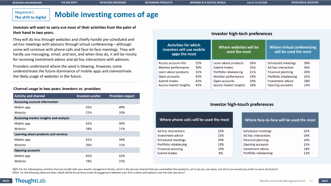
The slide includes a table comparing investor and provider expectations and a section on investor high-tech preferences.
Technology and Digital Transformation
Financial Services
The slide explores the rise of mobile investing, detailing how investors and providers are adapting to this trend with mobile apps and other technologies.
Mobile investing, Financial Services, Technology, Preferences, High-tech
false
Technology and Digital Transformation
Financial Services
Header Vertical
Deloitte
Add to my slides
Remove from favorites
Slide contains a line chart depicting the declining trend in the impact of mobile marketing on company performance, along with sector-specific performance ratings.
Performance Metrics and KPIs
Professional Services
Reviews the diminishing returns from mobile marketing on overall business performance, stressing the need for reevaluation of strategies.
mobile marketing, company performance, performance evaluation, strategy reevaluation, line graph
false
Performance Metrics and KPIs
Professional Services
Mixed Chart
Deloitte
Add to my slides
Remove from favorites
Slide contains dual-bar column chart comparing the contribution of mobile marketing to company performance across different sectors, with numerical ratings.
Market Analysis and Trends
Telecommunications
Evaluates mobile marketing's effectiveness across different sectors, highlighting its varying impact on company performance. Suitable for KPI assessment in telecommunications.
mobile marketing, performance, telecommunications, impact, evaluation, KPI, sector, comparison, effectiveness, rating
false
Market Analysis and Trends
Telecommunications
Mixed Chart
Deloitte
Add to my slides
Remove from favorites
Features a line chart tracking past and projected future spending on mobile activities, separated by B2B and B2C sectors.
Market Analysis and Trends
Professional Services
Analyzes trends and forecasts in mobile marketing expenditure, with a focus on sectoral differences and future predictions.
mobile marketing, spending trends, sector analysis, future forecast, line graph
false
Market Analysis and Trends
Professional Services
Mixed Chart
Deloitte
Add to my slides
Remove from favorites
Column chart within a mobile phone outline, comparing in-store and mobile shopping trends between 2020 and 2021.
Market Analysis and Trends
Retail & E-commerce
This slide examines the shift towards mobile shopping compared to in-store shopping during the COVID-19 pandemic.
mobile shopping, in-store, trends, 2020, 2021, COVID-19, comparison
false
Market Analysis and Trends
Retail & E-commerce
Mixed Chart
PwC/Strategy&
Add to my slides
Remove from favorites
The slide presents column charts comparing device usage for online shopping among different generations and nationalities from 2014 to 2024.
Market Analysis and Trends
Retail & E-commerce
The slide highlights the shift towards mobile devices for online shopping, particularly among Chinese and younger consumers, with future growth expected.
Mobile shopping, PC, Generations, Chinese consumers, Online shopping
false
Market Analysis and Trends
Retail & E-commerce
Multiple Chart
BCG
Add to my slides
Remove from favorites
Text with pie charts showing the frequency of shopping by mobile, tablet, and PC on a daily and weekly basis. Highlights the rise of mobile shopping.
Market Analysis and Trends
Retail & E-commerce
The slide explores the prevalence of mobile shopping, comparing it to tablet and PC usage, indicating a trend towards increased mobile shopping. Useful for analyzing shopping trends.
mobile, shopping, trends, frequency, device
false
Market Analysis and Trends
Retail & E-commerce
Multiple Chart
PwC/Strategy&
Add to my slides
Remove from favorites
Slide displays a line chart depicting the trend of mobile spending over several years, with projected future values indicated by a dashed line.
Market Analysis and Trends
Professional Services
Discusses the decline and expected rebound in mobile spending, valuable for financial analysis and planning in consumer goods and telecommunications industries.
mobile spending, trend, future, projection, consumer goods, telecommunications, financial, analysis, decline, rebound
false
Market Analysis and Trends
Professional Services
Mixed Chart
Deloitte
Add to my slides
Remove from favorites
Pie charts and images depicting the share of digital ad spending and consumer behavior on mobile devices.
Technology and Digital Transformation
Media & Entertainment
This slide explores how the mobile user experience is transforming advertising and user behavior, with a focus on app usage and digital spending.
mobile user experience, digital advertising, app usage, platform shift
false
Technology and Digital Transformation
Media & Entertainment
Multiple Chart
PwC/Strategy&
Add to my slides
Remove from favorites
Features a line chart tracking the revenue of different types of mobile internet advertising in Hong Kong from 2015 to 2024, including mobile video, mobile search, and other mobile display advertising. Each line is color-coded, with highlighted circles emphasizing the CAGR for each category. The slide also includes bullet points summarizing the key drivers of mobile video advertising growth.
Market Analysis and Trends
Media & Entertainment
Focuses on the increasing significance of mobile video in internet advertising revenue in Hong Kong, detailing the growth rates and the impact of factors like 5G and social media platforms on this trend. The slide is intended to inform on the trajectory of mobile advertising expenditures and the evolving landscape of digital media consumption.
mobile video, advertising, growth, CAGR, Hong Kong, 2025, revenue, line chart
false
Market Analysis and Trends
Media & Entertainment
Mixed Chart
PwC/Strategy&
Add to my slides
Remove from favorites
Features a line graph tracking the revenue growth of various internet advertising types from 2018 to 2027. Each line is color-coded, representing different advertising formats like mobile video, other display, and paid search, making it easy to follow their growth trajectories. The layout is simple with an emphasis on the graphical data, supported by bullet points highlighting key drivers such as 5G technology and social media.
Market Analysis and Trends
Media & Entertainment
Highlights the trends in mobile video advertising, showcasing its rapid growth as a primary driver in the internet advertising sector. Useful for digital marketing professionals looking to leverage the rising trend of video in advertising strategies.
mobile video, internet advertising, growth drivers, 5G technology, social media, Hong Kong
false
Market Analysis and Trends
Media & Entertainment
Mixed Chart
PwC/Strategy&
Add to my slides
Remove from favorites
Two circular charts showing the format share split between mobile and desktop; bar icons represent various advertising types with percentages listed for each.
Market Analysis and Trends
Media & Entertainment
Discusses the significant revenue growth from video advertising on mobile devices, emphasizing the ongoing shift from desktop to mobile platforms in digital advertising.
mobile, video revenue, growth, desktop, advertising formats, FY 2020
false
Market Analysis and Trends
Media & Entertainment
Multiple Chart
PwC/Strategy&
Add to my slides
Remove from favorites
A continuation from the previous slide, it maintains the same color scheme and design style with descriptive text for each technology.
Technology and Digital Transformation
Transportation & Logistics
Expands on the previous slide, providing detailed descriptions of various mobility technologies such as radar, lidar, and cybersecurity for connected vehicles.
mobility, autonomy, radar, lidar, cybersecurity, digital twin, hydrogen fuel cells
false
Technology and Digital Transformation
Transportation & Logistics
Header Vertical
McKinsey
Add to my slides
Remove from favorites
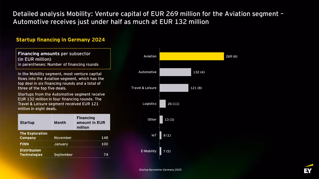
Bar chart shows Aviation as top sector, highlighted in yellow; accompanying text explains funding distribution; top deals listed below.
Investment Analysis
Transportation & Logistics
Aviation dominates mobility startup funding in 2024 with EUR 269M. Automotive and Travel & Leisure follow. Deals from The Exploration Company and FINN are featured.
mobility, aviation, automotive, logistics, Germany, venture capital, 2024, startups
false
Investment Analysis
Transportation & Logistics
Mixed Chart
EY
Add to my slides
Remove from favorites
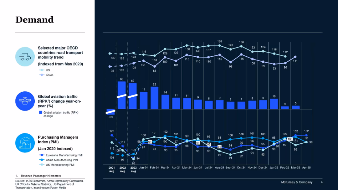
Multi-line chart on dark background; shows trends in road transport, aviation traffic, and PMIs with historical context.
Market Analysis and Trends
Transportation & Logistics
This slide tracks global and regional demand signals including road transport, aviation traffic, and manufacturing activity. It shows moderate recovery trends and fluctuating industrial activity.
Mobility, Aviation, PMI, Demand Indicators, Recovery, OECD, Manufacturing Trends
false
Market Analysis and Trends
Transportation & Logistics
Multiple Chart
McKinsey
Add to my slides
Remove from favorites
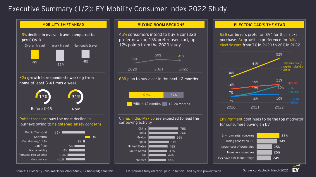
This slide includes column charts and textual highlights. It covers the shift in mobility trends, car buying intentions, and the rise of electric vehicles based on survey responses.
Market Analysis and Trends
Transportation & Logistics
The slide provides a summary of mobility trends, including changes in travel behavior, car buying intentions, and the increasing preference for electric vehicles among consumers in the EY Mobility Consumer Index 2022 Study.
Mobility, Consumer Trends, Electric Vehicles, Survey, Transportation, 2022, Car Buying, Market Analysis, Travel Behavior
false
Market Analysis and Trends
Transportation & Logistics
Multiple Chart
EY
Add to my slides
Remove from favorites
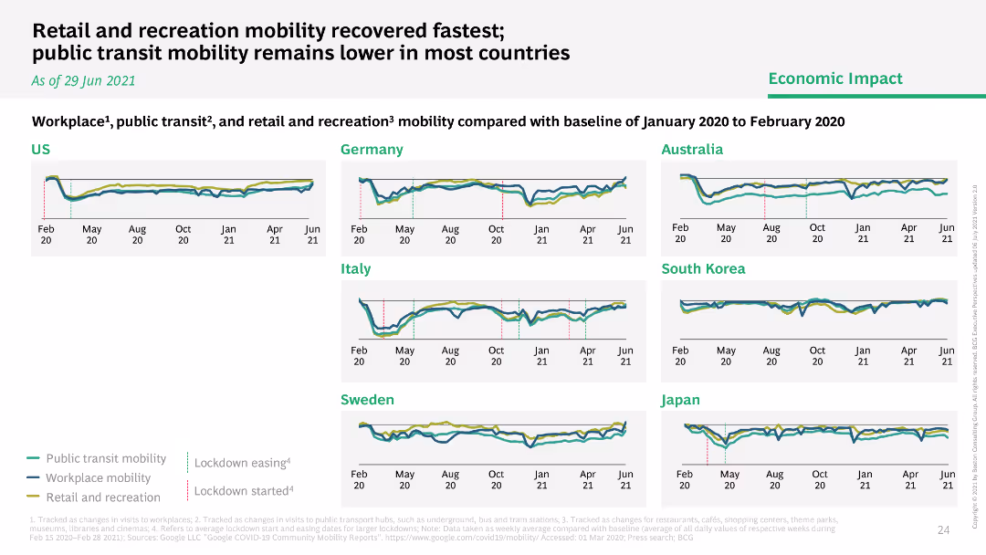
This slide presents line graphs tracking the mobility trends related to workplaces, public transit, and retail & recreation areas across multiple countries (US, Sweden, Italy, Germany, South Korea, Japan). Each country's trends are plotted on a distinct graph with lines representing different mobility aspects, using a consistent color code. The graphs are annotated with key events such as lockdowns, making it easier to correlate changes in mobility with pandemic-related restrictions. The layout facilitates cross-country comparisons.
Operational Efficiency
Retail & E-commerce
Analyzing changes in mobility patterns can help understand the economic and operational impact of COVID-19 on different sectors. This slide offers insights into how mobility levels correlate with lockdown measures and the gradual reopening of economies. It is particularly useful for retail and e-commerce industries to gauge consumer behavior changes and plan logistics or marketing strategies accordingly. The data can guide decisions on store reopenings, staff allocations, and inventory management based on regional consumer mobility trends.
mobility, COVID-19, retail, public transit, workplaces, lockdown, reopening, consumer behavior
false
Operational Efficiency
Retail & E-commerce
Multiple Chart
BCG
Add to my slides
Remove from favorites
Multiple line charts displaying mobility trends in various sectors across different countries, with annotations for key events.
Market Analysis and Trends
Transportation & Logistics
Analyzes changes in mobility patterns due to COVID-19 impacts, aiding in understanding sector-specific recoveries and ongoing restrictions.
mobility, COVID-19, sector analysis, restrictions, recovery trends
false
Market Analysis and Trends
Transportation & Logistics
Multiple Chart
BCG
Add to my slides
Remove from favorites
Moderate visual complexity is presented here, with circular diagrams that show statistics on the expectations of international mobility and transparency desired by employees. The slide uses a balanced distribution of text and imagery with a cohesive color scheme to aid comprehension.
Human Resources and Talent Management
Professional Services
The slide addresses the need for creating a culture that values international mobility. It presents statistics on organizations’ expectations of mobility and the desire for transparency among women regarding overseas opportunities, advocating for proactive efforts to embed mobility into the company culture.
Mobility culture, Transparency, Employee expectations, Organizational culture
false
Human Resources and Talent Management
Professional Services
Multiple Chart
PwC/Strategy&
Add to my slides
Remove from favorites
This slide presents a complex grid of color-coded performance metrics, indicating mobility levels in different countries.
Market Analysis and Trends
Transportation & Logistics
Analyzes the mobility levels in major economies as an indicator of recovery from the COVID-19 pandemic's impact.
mobility, economic recovery, COVID-19 impact, global analysis
false
Market Analysis and Trends
Transportation & Logistics
Single Chart
BCG
Add to my slides
Remove from favorites
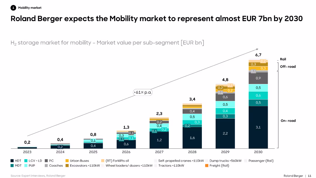
Features a column chart showing the projected market value for H2 storage in the mobility market by sub-segment (on-road, off-road, rail) from 2023 to 2030.
Market Analysis and Trends
Transportation & Logistics
Predicts the growth of the mobility market for H2 storage, emphasizing significant increases in market value across various vehicle types by 2030.
mobility market, H2 storage, projections, on-road, off-road, rail, sub-segment, market value, 2030
false
Market Analysis and Trends
Transportation & Logistics
Single Chart
Roland Berger
Add to my slides
Remove from favorites
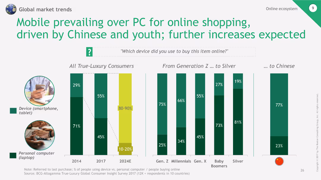
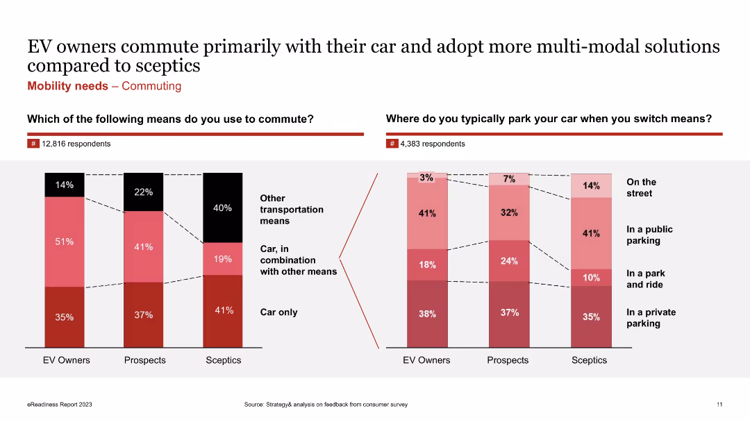
The slide compares commuting methods and parking locations of three consumer clusters (EV owners, EV prospects, EV sceptics) using bar charts and text boxes. It includes data on transportation means and parking preferences.
Customer and Market Segmentation
Consumer Goods
The slide examines the mobility needs of different consumer clusters, focusing on commuting methods and parking preferences. It shows that EV owners tend to use their cars more often and adopt multi-modal solutions compared to sceptics, providing insights into consumer behavior for targeted strategies.
Mobility Needs, Commuting, EV Owners, EV Prospects, EV Sceptics, Transportation, Parking, Multi-modal Solutions
false
Customer and Market Segmentation
Consumer Goods
Multiple Chart
PwC/Strategy&
Add to my slides
Remove from favorites
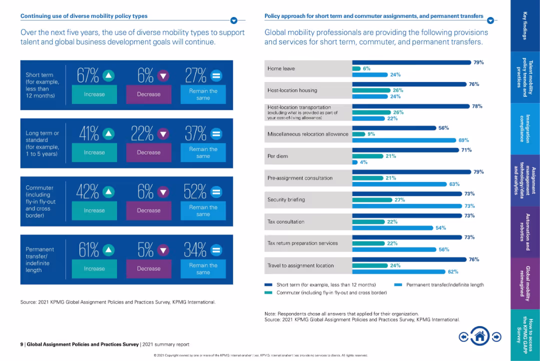
Split-panel layout with infographic bars and percentage stats on left, and horizontal bar chart on right.
Strategic Planning
Professional Services
The slide outlines the expected evolution in mobility policy types over the next five years, showing a strong trend toward increasing short-term and permanent transfers. It also lists provisions most often offered for short-term and commuter assignments.
mobility policies, short-term assignment, permanent transfer, global workforce, relocation provisions, commuter assignment, global mobility, policy trends, workforce planning
false
Strategic Planning
Professional Services
Mixed Chart
KPMG
Add to my slides
Remove from favorites
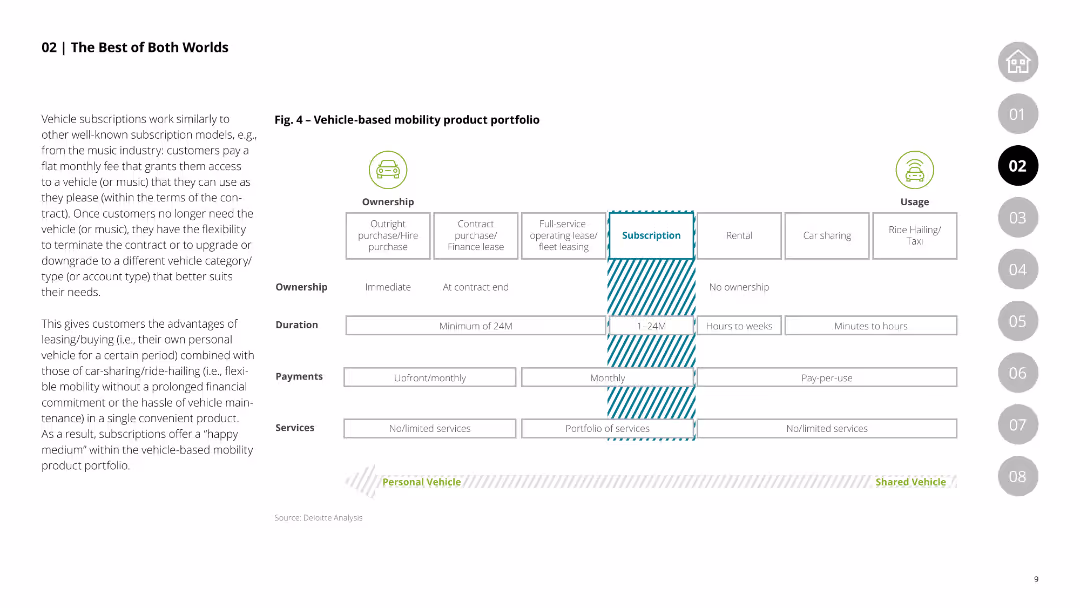
This slide features a comparative table showing the characteristics of vehicle-based mobility products, including ownership types, duration, payments, and services, comparing outright purchase, leasing, and subscription models.
Product and Service Analysis
Transportation & Logistics
Compares various vehicle-based mobility products, highlighting the flexibility and advantages of subscription models over traditional purchase and leasing options.
mobility products, vehicle ownership, leasing, subscription models, comparative analysis
false
Product and Service Analysis
Transportation & Logistics
Table
Deloitte
Add to my slides
Remove from favorites
Line charts comparing mobility changes in retail, recreation, and public transit across different countries, benchmarked to pre-pandemic levels.
Market Analysis and Trends
Consumer Goods
Analyzes the recovery of mobility in retail, recreation, and public transit sectors across several countries, showing varying recovery rates.
mobility, recovery, retail, recreation, transit
false
Market Analysis and Trends
Consumer Goods
Multiple Chart
BCG
Add to my slides
Remove from favorites
Features multiple line graphs showing mobility trends in different sectors across various countries.
Strategic Planning
Transportation & Logistics
Analyzes recovery in mobility across sectors like retail and public transit post-COVID-19, comparing several countries to highlight varying speeds of economic recovery.
mobility, retail, public transit, trends
false
Strategic Planning
Transportation & Logistics
Multiple Chart
BCG
Add to my slides
Remove from favorites
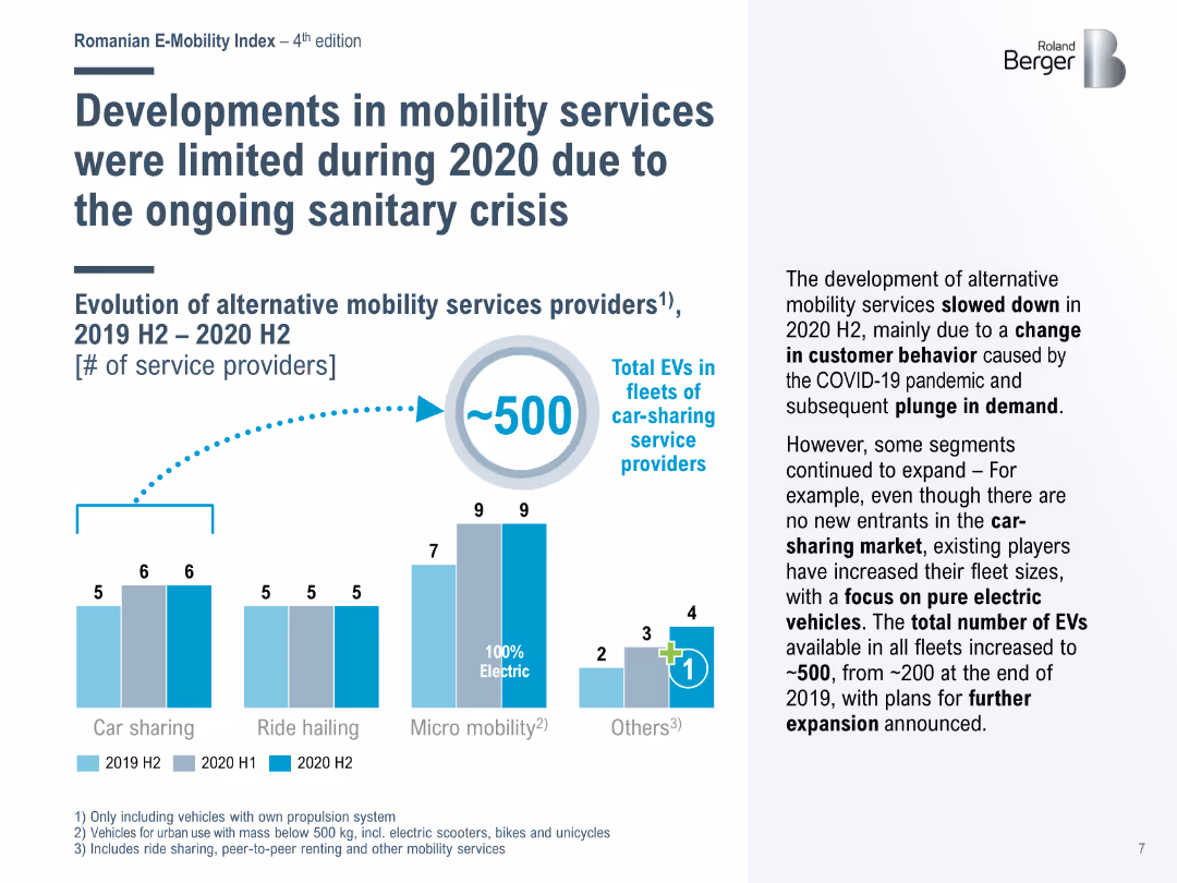
Bar chart showing the number of service providers for car sharing, ride hailing, and micro mobility from 2019 H2 to 2020 H2, highlighting the impact of COVID-19 on services.
Market Analysis and Trends
Transportation & Logistics
Discusses the limited growth in alternative mobility services during 2020 due to the pandemic, with car-sharing services increasing EV fleet sizes despite no new entrants.
mobility services, COVID-19, car sharing, ride hailing, micro mobility
false
Market Analysis and Trends
Transportation & Logistics
Mixed Chart
Roland Berger
Add to my slides
Remove from favorites
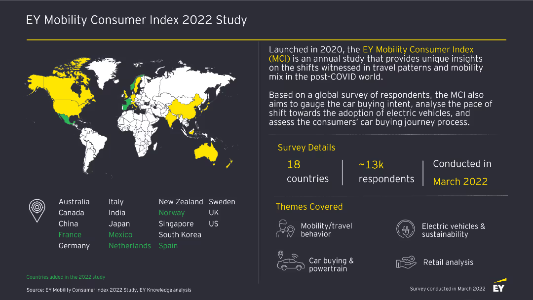
This slide features a world map highlighting countries included in the study, with accompanying text detailing survey details, themes, and respondent demographics.
Market Analysis and Trends
Transportation & Logistics
The slide introduces the EY Mobility Consumer Index 2022 Study, outlining the survey details, themes covered, and the global reach of the study across 18 countries and 13k respondents.
Mobility, Survey, 2022, Consumer Index, Transportation, Trends, Global, Study, Market Analysis
false
Market Analysis and Trends
Transportation & Logistics
Graphic
EY
Add to my slides
Remove from favorites
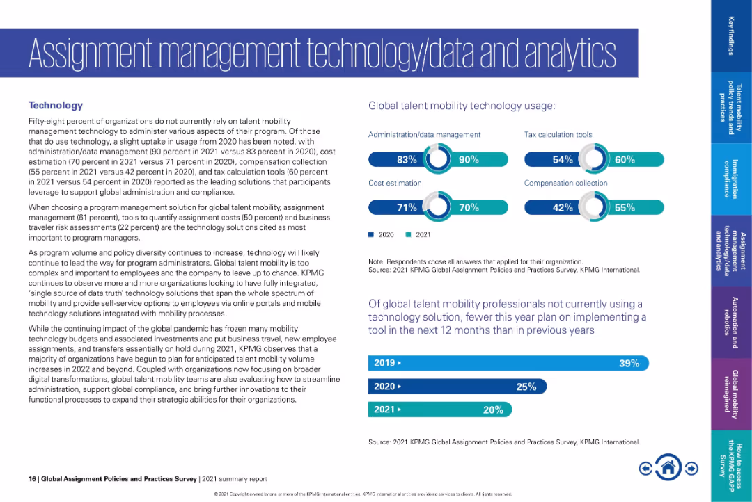
Text on left; bar and donut charts on right showing tool usage and future plans.
Technology and Digital Transformation
Technology & Software
Shows usage statistics for global mobility technologies, with highest adoption in admin/data management and tax tools. Notes declining intent to adopt new tech and highlights trends in integrating systems for better data transparency.
mobility technology, admin tools, tax tools, cost estimation, data management, digital transformation
false
Technology and Digital Transformation
Technology & Software
Multiple Chart
KPMG
Add to my slides
Remove from favorites
This slide presents a concept breakdown with a central header and two columns, one for ACES and the other for adjacent technologies. Each concept is represented by an icon and includes a brief explanatory text. The layout is clean, using contrasting blue and black text on a white background for readability.
Market Analysis and Trends
Transportation & Logistics
Discussing the transformative shift in mobility towards ACES and related technologies, this slide is designed to provide insights into the disruption of transportation markets and the push for more sustainable practices. The content is suited for audiences interested in market trends and technological advancements within the transportation and logistics industry, such as industry analysts, strategic planners, and innovation managers.
mobility trends, ACES, autonomous, connected vehicles, electrification, smart mobility, sustainability, transportation, logistics, market disruption, technological innovation
false
Market Analysis and Trends
Transportation & Logistics
Boxed
McKinsey
Add to my slides
Remove from favorites
This slide contains a series of column charts and a bar chart representing mobility pattern changes globally and for various countries (US, UK, Germany, France, Italy, China, Japan) during three survey waves. The column charts use shades of blue to indicate degrees of mobility increase, and grey for decrease. Each country's flag is shown for identification.
Market Analysis and Trends
Transportation & Logistics
The slide examines the changes in travel frequency and trip length among global respondents since COVID-19, highlighting recovery signs in specific markets.
mobility trends, COVID-19 impact, global survey, travel patterns, market analysis, data visualization, recovery tracking, comparative analysis
false
Market Analysis and Trends
Transportation & Logistics
Multiple Chart
McKinsey
Add to my slides
Remove from favorites
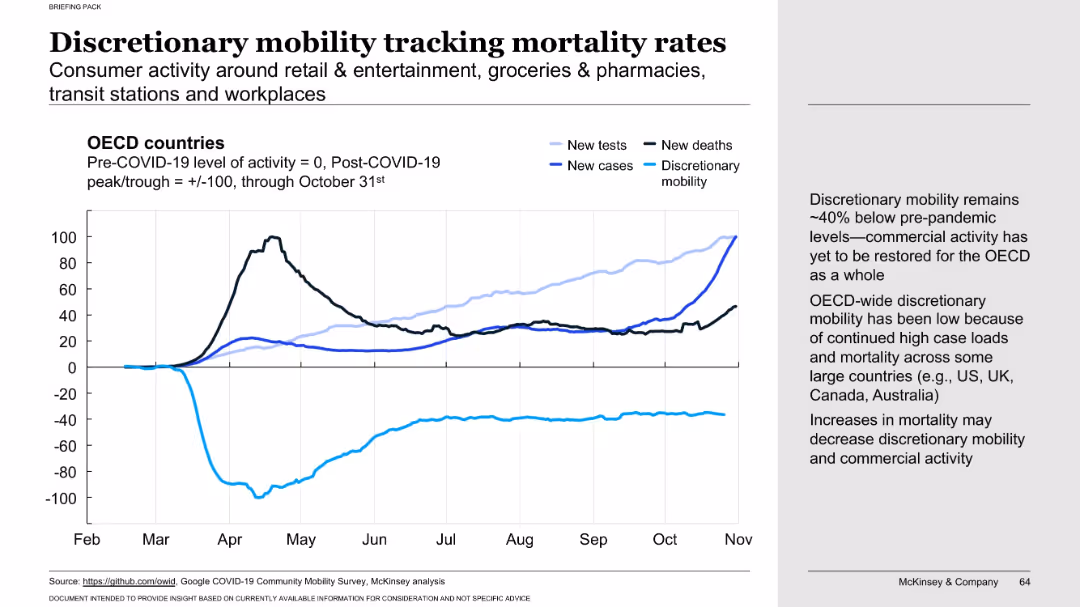
Line chart comparing discretionary mobility with testing, cases, and deaths across OECD countries. Commentary on right explains commercial activity and mobility patterns.
Market Analysis and Trends
Retail & E-commerce
Shows that discretionary consumer mobility (e.g., retail, transit) remained ~40% below pre-pandemic levels in late 2020, linked to sustained case and death rates. Indicates economic recovery is still constrained by ongoing public health concerns.
mobility trends, discretionary spending, commercial activity, COVID-19, consumer behavior, OECD, pandemic impact, health vs economy, mobility vs mortality, retail
false
Market Analysis and Trends
Retail & E-commerce
Mixed Chart
McKinsey
Add to my slides
Remove from favorites
Features line graphs with mobility data compared to baseline, with indicators for workplace, public transit, and retail & recreation.
Strategic Planning
Transportation & Logistics
Reviews mobility recovery trends and suggests a rise in the work from home practice due to the ongoing pandemic.
mobility trends, work from home, pandemic response
false
Strategic Planning
Transportation & Logistics
Multiple Chart
BCG
Add to my slides
Remove from favorites
Detailed graphical representation of the mobility value chain, showing segments like infrastructure, vehicles, and end-user experience with icons and names of key players in each segment, using various colors and labels.
Technology and Digital Transformation
Transportation & Logistics
Describes the evolving mobility landscape, identifying key players and segments within the infrastructure and vehicle operations. Useful for understanding shifts in transport and technology sectors.
mobility, value chain, infrastructure, technology, transport innovation
false
Technology and Digital Transformation
Transportation & Logistics
Linear Flow
BCG
Add to my slides
Remove from favorites
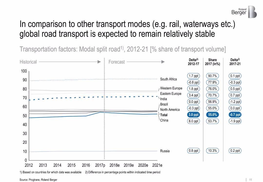
Line chart showing percentage share of transport volume via road from 2012–2021, comparing regions. Horizontal layout with data labels and shift indicators.
Market Analysis and Trends
Transportation & Logistics
The chart illustrates the share of road transport compared to other modes like rail or waterways. While total road usage remains stable globally, regional differences are shown, particularly China's increase and India's steady share.
['modal split', 'road transport', 'market share', 'China', 'India', 'logistics', 'transport modes', 'CAGR']
false
Market Analysis and Trends
Transportation & Logistics
Single Chart
Roland Berger
Add to my slides
Remove from favorites
Left side shows percentage bubbles, right side has a column chart and text
Technology and Digital Transformation
Technology & Software
Insights into the use of synthetic data for model improvement and efficiency, highlighting challenges
model accuracy, efficiency, synthetic data, challenges
false
Technology and Digital Transformation
Technology & Software
Multiple Chart
Gartner
Add to my slides
Remove from favorites
Previous
Next
You don't have any favorites yet.
Please wait loading your favorites slides...
Create a FREE account to continue browsing
Receive Instant Access to 1,000+ slides from companies like McKinsey, Google, and Goldman Sachs
First Name
Last Name
Email
Password
I agree to all
Terms & Privacy Policy
Thank you! Your submission has been received!
Oops! Something went wrong while submitting the form.
Have an account?
Sign in
Upgrade to PRO to Save slides
Advanced Search and Filters
Access to 15,000+ slides
Access to Category Pages
Save/Bookmark Slides
PowerPoint Template Library
Pick a Plan
MONTHLY
$12/month
Billed every month, Cancel anytime.
YEARLY
$9/year
Billed $108 annually, Cancel anytime.
Checkout for $12/month
Checkout for $108/yr
Secured by Stripe | AES-256 bit encryption