My Account
My Slides
Search by Category
Pricing
Templates
View All Templates
Download Template Slides
✦ AI Search
Feedback
Login
Logout
Get Started
Browse all Slides
Browse all Slides
Create a FREE Account
Instant access to 1,000+ real slides from top companies like McKinsey, BCG, Goldman Sachs, Google and many more!
First Name
Last Name
Email
Password
I agree to all
Terms & Privacy Policy
Thank you! Your submission has been received!
Oops! Something went wrong while submitting the form.
Have an account?
Sign in
Saved Slides
Total No. of slides saved
0
↻ Refresh
✖ Clear all
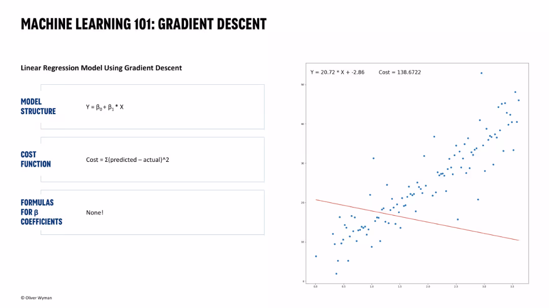
Same layout with updated plot. Line is still poorly fit but slightly improved. Cost is lower (138.6722).
Technology and Digital Transformation
Artificial Intelligence
Depicts progression in gradient descent learning. Shows improved model fitting compared to previous iteration, indicating the algorithm is adjusting toward lower cost.
model iteration, regression error, machine learning training, gradient descent, cost reduction, predictive model, convergence
false
Technology and Digital Transformation
Artificial Intelligence
Single Chart
Oliver Wyman
Add to my slides
Remove from favorites
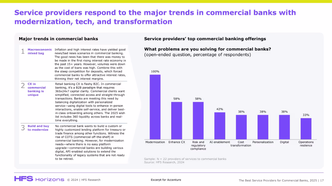
Split into two halves: left side uses a numbered list with text in shaded boxes to show three key trends; right side is a vertical bar chart with labeled percentages in purple, all on a clean white background with purple accents and headers.
Strategic Planning
Financial Services
The slide identifies three key trends affecting commercial banks (macroeconomic volatility, unique CX needs, and modernization via hybrid models) and highlights the top commercial banking offerings from service providers, with modernization as the top issue (100%), followed by CX and regulatory compliance (58% each).
Modernization, CX, Compliance, Commercial Banks, Trends, Bar Chart, 2025, Digital, Service Providers, AI Enablement
false
Strategic Planning
Financial Services
Mixed Chart
Accenture
Add to my slides
Remove from favorites
Includes two key images symbolizing fashion trends, with accompanying pie charts showing market shares for modest and inclusive fashion.
Product and Service Analysis
Consumer Goods
Discusses the growing influence of cultural and societal trends on fashion, particularly focusing on modest and inclusive apparel within the luxury segment.
modest fashion, inclusivity, cultural trends, market share, luxury apparel
false
Product and Service Analysis
Consumer Goods
Multiple Chart
Bain
Add to my slides
Remove from favorites
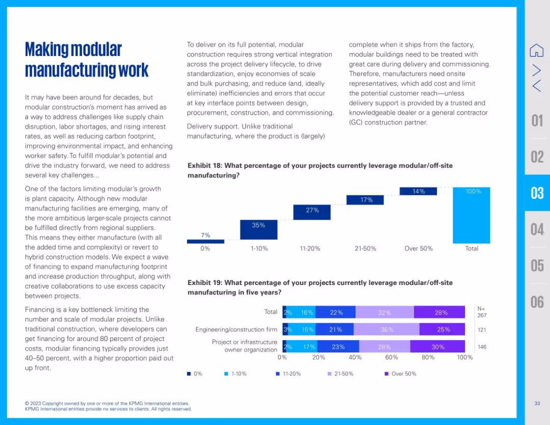
Text-heavy layout with two supporting bar charts below. Left text outlines the challenges and opportunities in modular construction. The first chart shows current use, the second projects future adoption across firm types.
Strategic Planning
Real Estate & Construction
Describes the strategic push toward modular/off-site manufacturing. It addresses current adoption barriers like plant capacity and financing, while showing increased expectations for usage over the next five years across engineering and infrastructure firms.
modular construction, off-site, prefab, financing, plant capacity, engineering, infrastructure
false
Strategic Planning
Real Estate & Construction
Multiple Chart
KPMG
Add to my slides
Remove from favorites
Diagram contrasting current monolithic MMIS with future modular MMIS approach. Visual elements include flowcharts and labeled components.
Technology and Digital Transformation
Technology & Software
Presentation of a modular MMIS approach to enable state procurement of "best of breed" functionality, enhancing flexibility and competitive bidding.
Modular MMIS, Architecture, Procurement, Functionality, Bidding
false
Technology and Digital Transformation
Technology & Software
Diagram
Alvarez & Marsal
Add to my slides
Remove from favorites
Slide with circular icons and bullet points, contrasting significant and limited progress in key areas.
Market Analysis and Trends
Technology & Software
Analyzes factors driving the Internet economy's momentum, with an emphasis on talent as a critical element.
momentum, drivers, Internet economy, talent, funding, logistics, SEA
false
Market Analysis and Trends
Technology & Software
Header Vertical
Bain
Add to my slides
Remove from favorites
This slide showcases a title at the top, a vertical axis dividing the slide into two parts, with the left side listing momentum drivers such as payments and logistics, and the right side displaying icons representing emerging enablers like ESG and digital inclusion. The layout is clean with a white background and contrasting blue and green elements.
Strategic Planning
Technology & Software
The slide emphasizes the progress in momentum drivers for the digital economy and introduces new enablers emerging for the 'Digital Decade'. It could be used to discuss strategic planning in various industries, assessing the progress and planning for the integration of these enablers to enhance digital transformation initiatives and sustainable growth.
Momentum Drivers, Progress, Digital Economy, ESG, Digital Inclusion, Data Infrastructure, Sustainable Growth, Strategic Planning
false
Strategic Planning
Technology & Software
Header Horizontal
Bain
Add to my slides
Remove from favorites
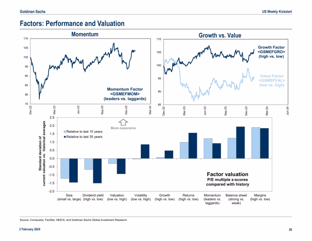
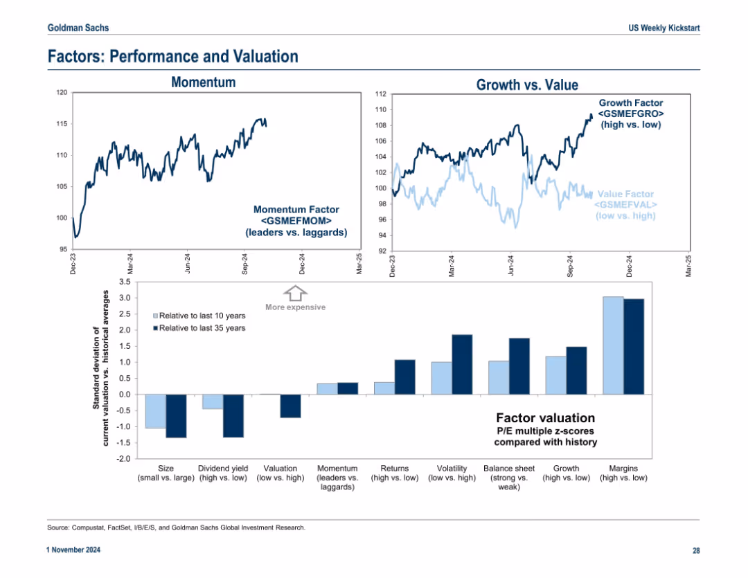
Top half features two line charts (Momentum, Growth vs. Value). Bottom half is a bar chart showing standard deviations from historical valuation averages. Clear visual separation and annotation.
Investment Analysis
Financial Services
This slide explores performance and valuation trends across investment factors such as momentum, growth vs. value, and various valuation spreads. It uses historical z-scores to assess relative expensiveness and compares short- and long-term valuation contexts for better investment decisions.
momentum, growth, value, factor investing, valuation, z-score
false
Investment Analysis
Financial Services
Multiple Chart
Goldman Sachs
Add to my slides
Remove from favorites
Combines three parts: momentum chart, growth vs. value chart, and a bar chart showing factor valuations against historical norms. Consistent font and axes styles.
Performance Metrics and KPIs
Financial Services
The slide compares key investment factors like momentum, growth vs. value, and other valuation factors. The lower chart uses Z-scores to measure deviation from long-term valuation averages across various factor categories.
momentum, growth, value, factor valuation, Z-score, returns, volatility, margins
false
Performance Metrics and KPIs
Financial Services
Multiple Chart
Goldman Sachs
Add to my slides
Remove from favorites
Features a line chart on the left comparing YTD returns relative to MSCI USA Index and a table on the right showing 3M percentage change in FY1 revenue estimates across various sectors.
Investment Analysis
Financial Services
The slide suggests that the dip in the momentum factor presents an opportunity to buy quality stocks, supported by positive revenue estimate revisions and selective cyclical exposure.
Momentum, MSCI USA, Revenue Estimates, Investment, Quality Stocks, Financial Performance
false
Investment Analysis
Financial Services
Mixed Chart
Morgan Stanley
Add to my slides
Remove from favorites
This slide presents a column chart showing a progressive increase over four years with an upward arrow, two pie charts with percentages, and bullet point descriptions. The color scheme includes blue and grey tones with minimal text, facilitating a clear visual representation of data. The pie charts are simplistic, using contrasting colors to highlight different segments.
Market Analysis and Trends
Industrial & Manufacturing
The slide portrays the company's growing order book over the years, emphasizing the current year's strong momentum. It details the portion of the order book dedicated to zero-emission vehicles and the geographical diversification of orders. It could be used in a strategy meeting or investor briefing to highlight commercial success and future opportunities, particularly in the sustainable and global markets.
Momentum, Order Book, Zero-Emission Vehicles, Geographical Diversification, Column Chart, Pie Chart, Industrial, Sustainable
false
Market Analysis and Trends
Industrial & Manufacturing
Multiple Chart
Goldman Sachs
Add to my slides
Remove from favorites
Two-column layout with bar and line charts showing real GDP growth in selected economies and the higher for longer inflation scenario.
Strategic Planning
Financial Services
Discusses the risks of delayed monetary easing and sticky inflation trends leading to potential recessionary conditions in advanced economies.
monetary easing, inflation trends, recession, advanced economies, central banks
false
Strategic Planning
Financial Services
Multiple Chart
EY
Add to my slides
Remove from favorites
The slide features two main charts: a column chart on the left showing developed market central bank bond purchases in USD billions over a rolling 12-month period, and a line chart on the right depicting historical policy rates and forward curves for Fed, ECB, BoE, and BoJ.
Market Analysis and Trends
Financial Services
This slide analyzes central bank bond purchases and policy rates, highlighting trends and forward curves for major economies. Useful for understanding monetary policy impacts.
monetary policy, central bank, bond purchases, policy rates, forward curves, Fed, ECB, BoE, BoJ
false
Market Analysis and Trends
Financial Services
Multiple Chart
JP Morgan
Add to my slides
Remove from favorites
A data-rich slide featuring graphs of central bank policy rates and market expectations for future central bank rates.
Risk Assessment and Management
Financial Services
The slide examines monetary policy by illustrating current and historical central bank policy rates and future market expectations.
monetary policy, central bank, market expectations, data-driven, policy rates
false
Risk Assessment and Management
Financial Services
Multiple Chart
Morgan Stanley
Add to my slides
Remove from favorites
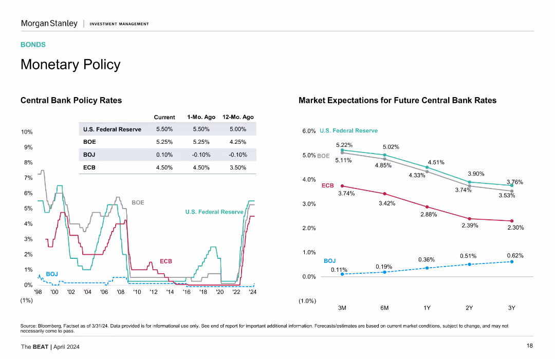
The slide features a line chart showing central bank policy rates over time and a column chart for market expectations for future rates.
Market Analysis and Trends
Financial Services
Presents current, 1-month, and 12-month ago central bank policy rates for the US, BOE, BOJ, and ECB, with future rate expectations.
Monetary Policy, Central Banks, Interest Rates, Trends, Forecasts
false
Market Analysis and Trends
Financial Services
Multiple Chart
Morgan Stanley
Add to my slides
Remove from favorites
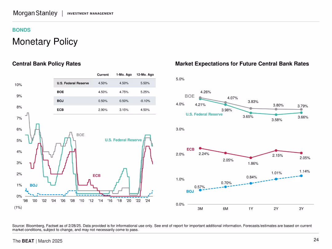
The slide features a line chart tracking central bank policy rates over time and a line chart predicting future market expectations for these rates.
Regulatory and Compliance
Financial Services
This slide analyzes monetary policy through historical and projected central bank policy rates, with visual aids to compare different regions. It's crucial for understanding the impact of central bank decisions on financial markets.
Monetary Policy, Central Banks, Market Expectations, Rates, Policy, Trends, Forecast
false
Regulatory and Compliance
Financial Services
Multiple Chart
Morgan Stanley
Add to my slides
Remove from favorites
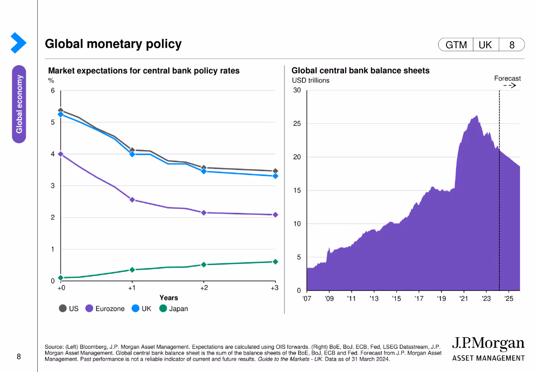
Two charts are displayed: a line chart showing market expectations for central bank policy rates across the US, Eurozone, UK, and Japan, and an area chart of global central bank balance sheets.
Strategic Planning
Financial Services
The slide illustrates market expectations for central bank policy rates and the projected size of global central bank balance sheets, relevant for understanding monetary policy trends and strategies.
Monetary policy, central banks, policy rates, balance sheets, global economy
false
Strategic Planning
Financial Services
Multiple Chart
JP Morgan
Add to my slides
Remove from favorites
Split-screen format with two sections: left shows historical central bank policy rates (line chart), right shows market expectations for future rates (line forecast). Four banks (Fed, BOE, BOJ, ECB) tracked.
Market Analysis and Trends
Financial Services
This slide tracks and projects policy rates from major central banks. It illustrates rate cuts or pauses across the ECB, Fed, BOJ, and BOE, signaling easing monetary policy ahead. The content informs interest rate expectations impacting bond and equity valuations.
monetary policy, central banks, rate forecasts, ECB, Fed, BOE, BOJ, interest rates, macroeconomic outlook, policy changes
false
Market Analysis and Trends
Financial Services
Multiple Chart
Morgan Stanley
Add to my slides
Remove from favorites
Two line charts compare policy rates in various economies with commentary text on the right. The y-axis shows percentage rates, and the x-axis shows months/years.
Regulatory and Compliance
Financial Services
The slide examines the pause in rate hikes by central banks across major economies, analyzing policy rates for the US, Euro area, UK, Japan, Australia, China, India, and Brazil.
Monetary policy, central banks, rate hikes, economic conditions, policy rates
false
Regulatory and Compliance
Financial Services
Multiple Chart
Accenture
Add to my slides
Remove from favorites
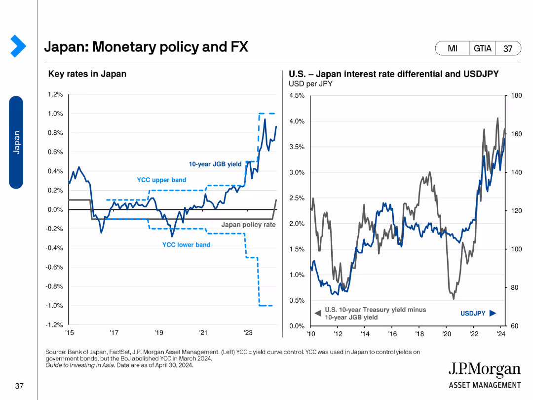
The slide includes two line charts. The left chart shows key rates in Japan. The right chart shows the U.S.-Japan interest rate differential and USD/JPY exchange rate.
Regulatory and Compliance
Financial Services
This slide analyzes Japan's monetary policy and foreign exchange trends, focusing on key interest rates and the U.S.-Japan rate differential.
Monetary Policy, FX, Japan, Interest Rates, USD
false
Regulatory and Compliance
Financial Services
Multiple Chart
JP Morgan
Add to my slides
Remove from favorites
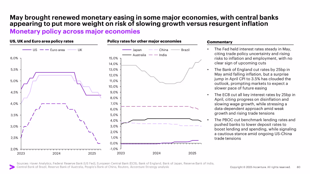
Two graphs comparing central bank policy rates across global regions, accompanied by textual commentary on interest rate changes.
Strategic Planning
Financial Services
Highlights central bank policy moves in response to inflation and growth risks. Notes May 2025 easing in Europe and UK, while India and Brazil keep rates high. Commentary emphasizes cautious monetary stance amid trade tensions and inflation uncertainty.
monetary policy, interest rates, central banks, inflation, Fed, ECB, BOE, PBOC, trade tensions
false
Strategic Planning
Financial Services
Multiple Chart
Accenture
Add to my slides
Remove from favorites
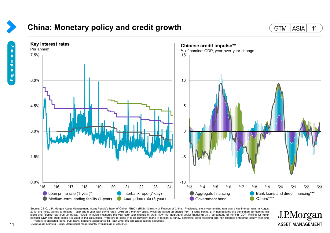
The slide has two line charts detailing key interest rates and Chinese credit impulse, showing changes over several years.
Market Analysis and Trends
Financial Services
Reviews China's monetary policy by tracking interest rates and credit growth, offering insights into financial conditions and economic policy impacts.
Monetary policy, Interest rates, China, Credit growth, Economic trends, Financial data, Forecasting, Banking
false
Market Analysis and Trends
Financial Services
Multiple Chart
JP Morgan
Add to my slides
Remove from favorites
The slide displays a line graph charting the trend in Eurozone interest rates, with a predictive dotted line extending into the future. There are also infographic elements, such as icons, describing the factors impacting monetary policy. The design is professional with a blue and grey color scheme.
Risk Assessment and Management
Financial Services
It examines the impact of monetary policy on interest rates and how these changes could affect a company's earnings. It's valuable for financial analysts, CFOs, and investors in discussions about interest rate risk, strategic financial planning, or forecasting economic conditions.
monetary policy, interest rates, Eurozone, inflation, earnings impact
false
Risk Assessment and Management
Financial Services
Mixed Chart
Morgan Stanley
Add to my slides
Remove from favorites
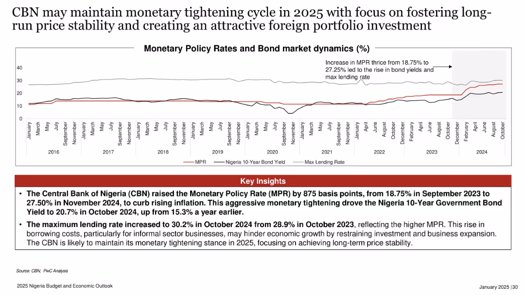
Line chart with three data series (MPR, 10-Year Bond Yield, Max Lending Rate) and annotation; bold heading and key insights box at bottom in red.
Strategic Planning
Financial Services
Shows the CBN’s aggressive interest rate hikes from 2023–2024 to curb inflation, resulting in increased bond yields and lending rates. Suggests continued monetary tightening in 2025 aimed at stabilizing long-term prices and attracting portfolio investment.
monetary policy, MPR, bond yield, lending rate, inflation, Nigeria, 2025, CBN, interest rate hike, portfolio investment
false
Strategic Planning
Financial Services
Mixed Chart
PwC/Strategy&
Add to my slides
Remove from favorites
Shows mobile app interfaces for shopping insurance and a diagram linking expansion plans to various monetization strategies.
Market Analysis and Trends
Financial Services
Outlines monetization strategies through new business verticals, including a digital marketplace for auto insurance and premium membership features, focusing on enhancing consumer interaction and shopping experience for financial products.
monetization, insurance, digital marketplace, premium, expansion
false
Market Analysis and Trends
Financial Services
Mixed Chart
Barclays
Add to my slides
Remove from favorites
A flowchart illustrating a complex money laundering scheme, with various entities and financial flows depicted.
Risk Assessment and Management
Financial Services
This slide explains the complexity of money laundering schemes, detailing the roles of different entities and the financial transactions involved.
Money laundering, flowchart, financial transactions, sophisticated criminals, risk assessment
false
Risk Assessment and Management
Financial Services
Diagram
Credit Suisse
Add to my slides
Remove from favorites
Dual-axis line chart tracking money supply (M2), inflation, and MPR from 2016 to October 2024.
Risk Assessment and Management
Government & Public Sector
With money supply increasing by 48.2% YoY and inflation rising to 34.6%, the slide highlights challenges in Nigeria’s monetary policy. It emphasizes the need for disciplined liquidity control to curb inflation and ensure macroeconomic stability.
money supply, inflation, MPR, liquidity, monetary policy, Nigeria, CBN
false
Risk Assessment and Management
Government & Public Sector
Mixed Chart
PwC/Strategy&
Add to my slides
Remove from favorites
The slide has a white background with text describing the process for routine updates to scalars every ~3 years. It includes a table with industry-average capital ratios across various regions from 2019 to 2022. The proposed threshold for review is a 10% change in capital ratios, aiming to ensure data quality and relevance.
Regulatory and Compliance
Financial Services
This slide outlines the proposed process for ongoing monitoring of industry-average capital ratios, including routine updates every ~3 years and a threshold for review based on a 10% change. It emphasizes the importance of data quality and identifying factors driving changes.
monitoring, scalars, capital ratios, review, process
false
Regulatory and Compliance
Financial Services
Table
Oliver Wyman
Add to my slides
Remove from favorites
The slide includes a monthly account activity line chart and a bar graph. Both charts use different colors to represent various data points.
Performance Metrics and KPIs
Hospitality & Tourism
This slide analyzes monthly trends and relationships in revenue and account activity, comparing expectations with actual outcomes to identify patterns and key events affecting revenue.
monthly trends, revenue analysis, occupancy rates, key events, data comparison
false
Performance Metrics and KPIs
Hospitality & Tourism
Mixed Chart
EY
Add to my slides
Remove from favorites
A column chart showing the average monthly turnover (in million CHF) of various Swiss real estate funds from January 2023 to December 2023.
Financial Performance
Financial Services
This slide details the average monthly turnover of Swiss real estate funds over the course of 2023, comparing the performance of different funds.
Monthly Turnover, Real Estate Funds, Performance, 2023
false
Financial Performance
Financial Services
Single Chart
Credit Suisse
Add to my slides
Remove from favorites
This slide includes two column charts, one for Millennials and one for Gen Z, showing mood scores by geography. The bars are color-coded to distinguish between primary and pulse survey results.
Market Analysis and Trends
Media & Entertainment
The slide provides a geographical breakdown of mood scores for Millennials and Gen Z, based on primary and pulse surveys. It visualizes how different regions are feeling, offering insights into regional variations in sentiment and the impact of the pandemic on young people's outlook.
Mood Index, Geography, Millennials, Gen Z, Sentiment
false
Market Analysis and Trends
Media & Entertainment
Multiple Chart
Deloitte
Add to my slides
Remove from favorites
The slide showcases infographics with a mood index scorecard, pie charts, and a brief textual explanation on the left side.
Market Analysis and Trends
Professional Services
Provides an annual snapshot of the sentiment and optimism levels of Millennials and Gen Z regarding different aspects of life and business.
Mood, Millennials, Gen Z, Index, Survey, Optimism, Business Impact, Environment
false
Market Analysis and Trends
Professional Services
Mixed Chart
Deloitte
Add to my slides
Remove from favorites
The slide contains a line chart showing the Mood Monitor scores for Gen Zs and Millennials from 2019 to 2022. The layout includes a description of the Mood Monitor index and the questions used to gauge respondents' mood.
Performance Metrics and KPIs
Technology & Software
The slide tracks the Mood Monitor scores for Gen Zs and Millennials, indicating their optimism levels about economic, social/political, personal finance, environmental, and business outlooks over the years, showing a general decline in optimism.
Mood Monitor, Gen Z, Millennials, optimism, economic outlook
false
Performance Metrics and KPIs
Technology & Software
Mixed Chart
Deloitte
Add to my slides
Remove from favorites
This slide includes text, icons representing different mood factors, and a line chart showing Mood Monitor scores over several years.
Risk Assessment and Management
Healthcare & Pharmaceuticals
The slide presents the Mood Monitor, which gauges Gen Zs' and millennials' optimism about the future, based on responses to various questions about their mood.
mood monitor, optimism, Gen Z, millennials, mental health, future outlook
false
Risk Assessment and Management
Healthcare & Pharmaceuticals
Mixed Chart
Deloitte
Add to my slides
Remove from favorites
Split layout: dark blue panel with title/question on the left, and ranked horizontal bar chart on the right showing country-level agreement percentages.
Strategic Planning
Government & Public Sector
This slide displays global public opinion on whether individual countries should act as moral leaders on the world stage. It ranks 30 countries based on the share of respondents who agree or strongly agree, with comparative year-on-year changes.
moral leadership, global opinion, Ipsos, public sentiment, international role, comparative data, country ranking, global affairs, responsibility, 2024 survey
false
Strategic Planning
Government & Public Sector
Mixed Chart
IPSOS
Add to my slides
Remove from favorites
Horizontal chart showing country views on moral leadership, with % agreement, Canada at 79%
Strategic Planning
Government & Public Sector
Evaluates the perception that a country should serve as a moral leader. Canada and U.S. score similarly (79% and 80% respectively), both above global average (72%).
moral leadership, international ethics, national role, diplomacy, Canada, US, public responsibility
false
Strategic Planning
Government & Public Sector
Single Chart
IPSOS
Add to my slides
Remove from favorites
Horizontal timeline with four phases of business transformation, each phase marked with milestones and client asset goals.
Strategic Planning
Financial Services
Outlines Morgan Stanley's business transformation journey over time, detailing key phases and growth in client assets.
Morgan Stanley, business transformation, timeline, client assets, strategy
false
Strategic Planning
Financial Services
Linear Flow
Morgan Stanley
Add to my slides
Remove from favorites
Two column charts showing growth in client relationships from 2020 to 2023 and drivers of client relationship growth on the right.
Sales and Business Development
Financial Services
Details the various sources and strategies Morgan Stanley uses to grow client relationships, showing historical growth and future projections.
Morgan Stanley, client relationships, growth, strategy, sources
false
Sales and Business Development
Financial Services
Mixed Chart
Morgan Stanley
Add to my slides
Remove from favorites
Funnel diagram illustrating two focus areas: Path to Advice and Scaled & Differentiated Platform, with associated strategies.
Strategic Planning
Financial Services
Explains Morgan Stanley's two key focus areas for growth, detailing strategies to add client relationships, grow assets, and migrate to fee-based accounts.
Morgan Stanley, focus areas, strategy, client relationships, assets
false
Strategic Planning
Financial Services
Diagram
Morgan Stanley
Add to my slides
Remove from favorites
Column chart showing growth metrics for client relationships, net new assets, fee-based flows, and asset management revenues from 2019 to 2023.
Strategic Planning
Financial Services
Highlights significant growth in Morgan Stanley's Path to Advice program, illustrating metrics for client relationships, new assets, fee-based accounts, and revenues.
Morgan Stanley, growth, client relationships, assets, fee-based
false
Strategic Planning
Financial Services
Multiple Chart
Morgan Stanley
Add to my slides
Remove from favorites
Vertical bar chart comparing flu vs. COVID-19 deaths by age group, side panel of implications and stats.
Risk Assessment and Management
Healthcare & Pharmaceuticals
Emphasizes the severe mortality of COVID-19, especially among those aged 65+, with ~80% of deaths in that group. Shows how COVID-19 compares to historical flu seasons. Notes effects on long-term care residents.
mortality, age groups, flu comparison, COVID-19, comorbidities
false
Risk Assessment and Management
Healthcare & Pharmaceuticals
Mixed Chart
McKinsey
Add to my slides
Remove from favorites
Side-by-side vertical stacked bar chart (2019 vs. 2045); right-aligned bullet list; strong magenta and grey tones
Market Analysis and Trends
Healthcare & Pharmaceuticals
This slide compares the top 10 causes of death in 2019 and projected for 2045, showing growth in age-related and lifestyle diseases like Alzheimer’s. It highlights the growing disease burden from non-communicable diseases as a result of aging populations and lifestyle changes.
Mortality, Chronic Disease, Dementia, Forecast, Aging, Non-communicable
false
Market Analysis and Trends
Healthcare & Pharmaceuticals
Mixed Chart
Roland Berger
Add to my slides
Remove from favorites
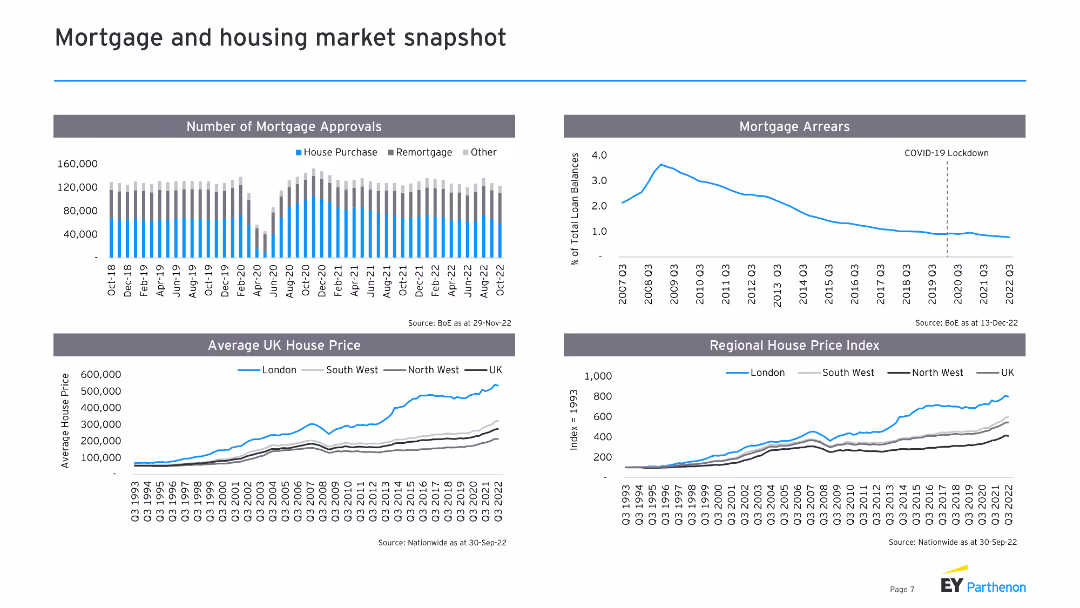
The slide includes four sections with line charts and column charts: number of mortgage approvals, mortgage arrears, average UK house price, and regional house price index. Supporting text provides context for each chart.
Market Analysis and Trends
Real Estate & Construction
This slide presents an overview of the UK mortgage and housing market, showing trends in mortgage approvals, arrears, and house prices. It provides data-driven insights into the state of the housing market and regional variations.
Mortgage approvals, housing market, UK, house prices, regional index
false
Market Analysis and Trends
Real Estate & Construction
Multiple Chart
EY
Add to my slides
Remove from favorites
This slide has two line charts and one column chart. The line charts display commercial mortgage spreads over Treasury for different asset classes, and the column chart shows commercial mortgage yields by sector for 1Q24.
Market Analysis and Trends
Financial Services
The slide analyzes commercial mortgage loans, focusing on spreads over Treasury and yields by sector, offering insights into the commercial real estate lending market.
mortgage loans, spreads, yields, commercial real estate, market analysis
false
Market Analysis and Trends
Financial Services
Multiple Chart
JP Morgan
Add to my slides
Remove from favorites
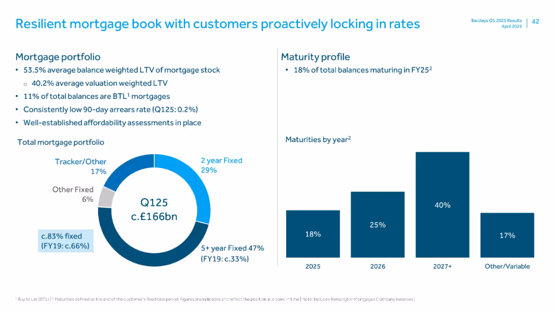
Left side pie chart for mortgage types, right side bar chart for maturities by year
Risk Assessment and Management
Financial Services
Provides a snapshot of Barclays’ mortgage portfolio in Q125, detailing fixed vs variable rate mix, loan-to-value ratios, maturity profile, and low arrears, reflecting customer resilience and sound underwriting standards.
mortgage, LTV, arrears, fixed rate, tracker, maturity
false
Risk Assessment and Management
Financial Services
Multiple Chart
Barclays
Add to my slides
Remove from favorites
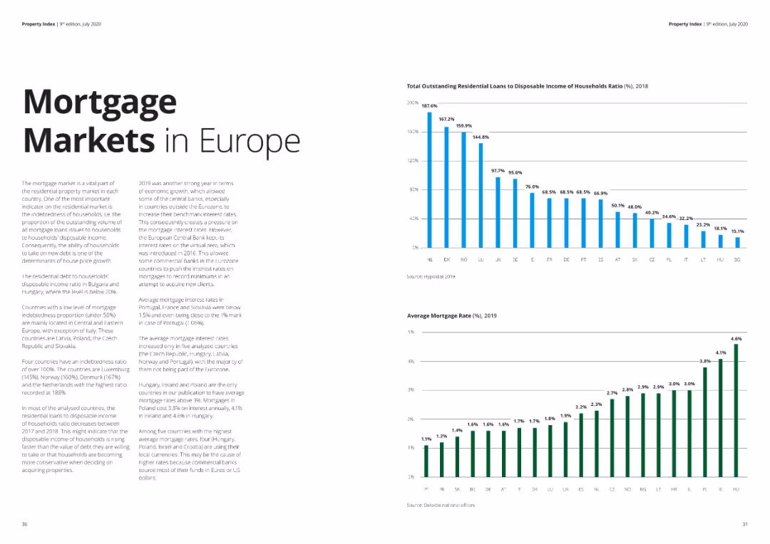
Two column charts: one showing the ratio of outstanding residential loans to household disposable income, another showing mortgage rates.
Market Analysis and Trends
Financial Services
The slide provides data on residential mortgage loans' burden on household income and the average mortgage rates across Europe.
mortgage market, residential loans, household income, mortgage rates, Europe, financial analysis
false
Market Analysis and Trends
Financial Services
Multiple Chart
Deloitte
Add to my slides
Remove from favorites
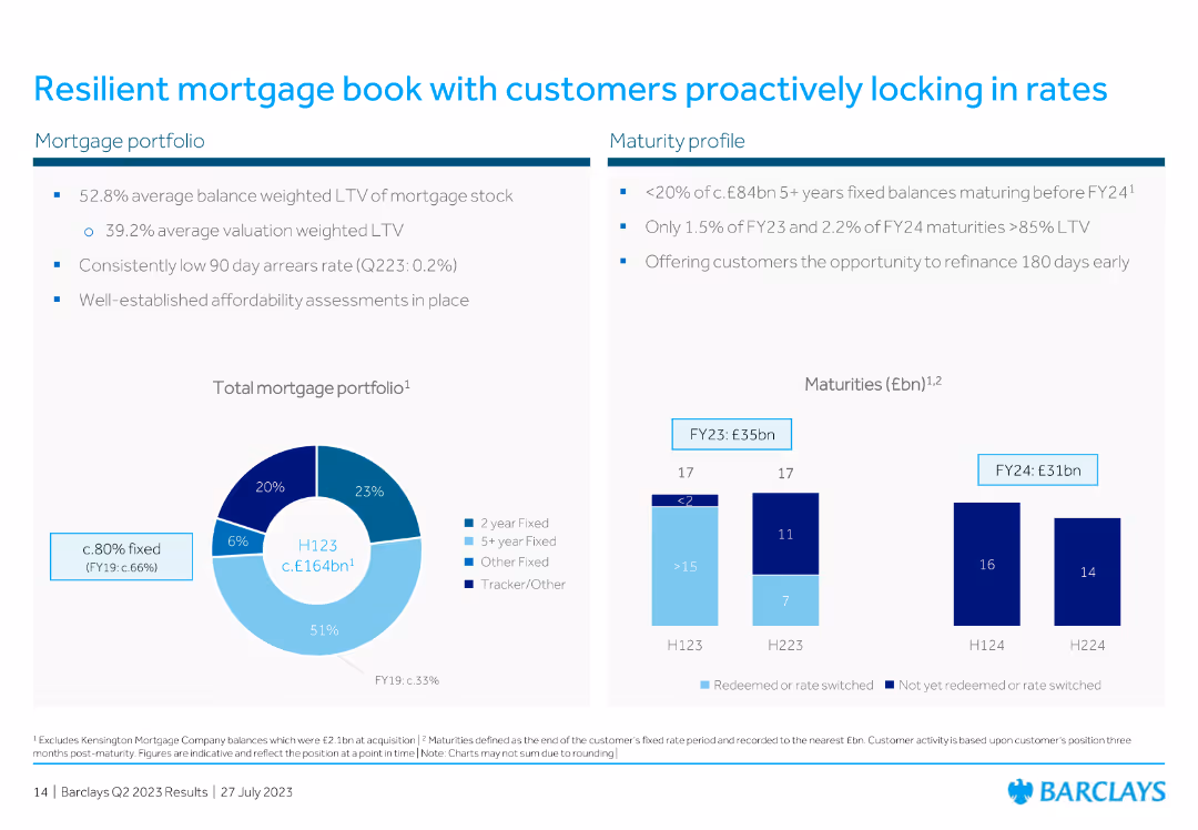
The slide includes a pie chart for mortgage portfolio composition and a column chart for maturity profiles over different periods.
Risk Assessment and Management
Financial Services
The slide discusses the resilience of the mortgage book, with data on average loan-to-value ratios and maturity profiles, emphasizing customer behavior in locking rates.
mortgage, portfolio, resilience, customer, rates, LTV, maturity, financial, pie chart, column chart
false
Risk Assessment and Management
Financial Services
Multiple Chart
Barclays
Add to my slides
Remove from favorites
Features a line chart for mortgage rates, column charts for mortgage market origination projections, and a line chart for home price index against housing inventory, all indicating significant changes and trends.
Market Analysis and Trends
Financial Services
Addresses the current state of the mortgage rates, originations market, and home price trends, signaling a changing macroeconomic environment impacting the home lending landscape.
Mortgage Rates, Market Origination, Home Prices, Inventory Shortage, Macroeconomics
false
Market Analysis and Trends
Financial Services
Multiple Chart
JP Morgan
Add to my slides
Remove from favorites
Bar chart comparing pre-approved mortgage rates among those pre-approved, with different colors representing data from Fall 2018, Fall 2019, and Fall 2020.
Market Analysis and Trends
Real Estate & Construction
The slide presents a comparison of pre-approved mortgage rates over three years, showing shifts in mortgage rate preferences.
mortgage rates, pre-approved, comparison, Fall 2018-2020, trends
false
Market Analysis and Trends
Real Estate & Construction
Single Chart
IPSOS
Add to my slides
Remove from favorites
Uses column chart to depict portfolio loans over time, with a color differentiation between average and period-end. Also, includes a bar chart for FICO score distribution.
Market Analysis and Trends
Real Estate & Construction
Evaluates the residential mortgage portfolio, showing historical loan amounts and current credit score distribution. Typically used by lenders and investors to understand the risk profile and trends in the residential mortgage sector.
Mortgage, Residential, Credit, Analysis, Trends
false
Market Analysis and Trends
Real Estate & Construction
Multiple Chart
Morgan Stanley
Add to my slides
Remove from favorites
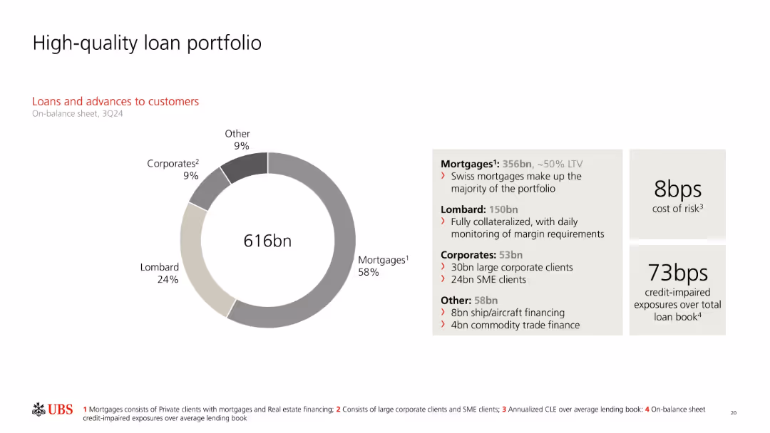
Donut chart visualizing loan breakdown; text box describes composition and values; metrics on cost of risk and impaired exposures on right.
Product and Service Analysis
Financial Services
UBS’s loan book totals 616bn, mostly consisting of mortgages (58%) and Lombard loans (24%). The slide includes loan distribution details and metrics like cost of risk (8bps) and credit-impaired exposures (73bps), highlighting portfolio quality and risk management.
mortgages, Lombard loans, loan portfolio, cost of risk, impaired exposures, SMEs, collateralized, UBS
false
Product and Service Analysis
Financial Services
Mixed Chart
UBS
Add to my slides
Remove from favorites
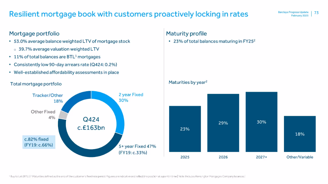
Left: donut chart of mortgage types; Right: bar chart of maturity profile; bulleted insights above; blue/white palette
Risk Assessment and Management
Financial Services
Highlights characteristics of Barclays’ mortgage portfolio, such as LTV, arrears rates, and type distribution. Shows that 82% of balances are fixed-rate, with a strong maturity profile and low default risk. Emphasis is on resilience and proactive customer behavior in securing fixed rates.
mortgages, LTV, arrears, fixed rate, portfolio maturity, residential lending
false
Risk Assessment and Management
Financial Services
Multiple Chart
Barclays
Add to my slides
Remove from favorites
Uses pie charts and a column chart to depict mortgage portfolio statistics and maturity profiles.
Investment Analysis
Financial Services
Details the composition and health of the mortgage portfolio, including LTV ratios and fixed rates.
mortgages, LTV, risk management, portfolio, rates
false
Investment Analysis
Financial Services
Multiple Chart
Barclays
Add to my slides
Remove from favorites
Contains a large column chart detailing the yearly trends in mortgage inquiries.
Market Analysis and Trends
Financial Services
Analyzes the trends in mortgage inquiries over the years, highlighting significant decreases and their implications for the market.
Mortgage, Trends, Market, Analysis, Inquiries
false
Market Analysis and Trends
Financial Services
Single Chart
Barclays
Add to my slides
Remove from favorites
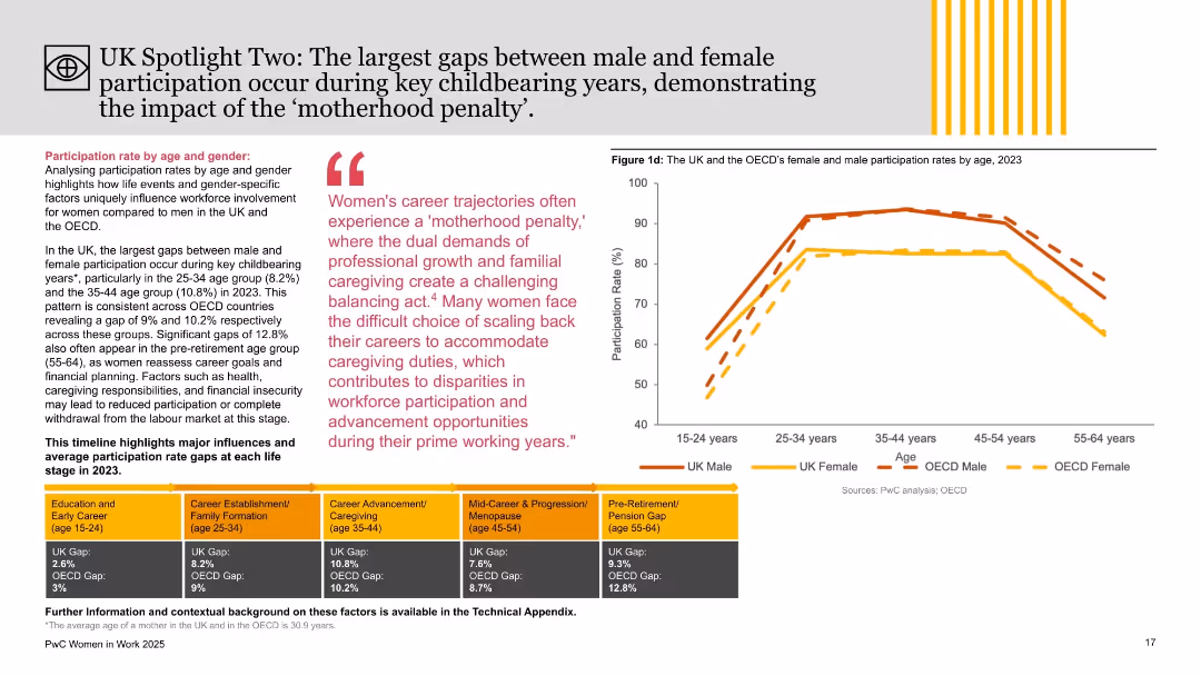
Right side features age-segmented participation chart; left side includes thematic analysis with colored blocks and quote on ‘motherhood penalty.’
Market Analysis and Trends
Government & Public Sector
This slide explores age-related gender participation gaps in the UK and OECD, emphasizing childbearing years (25–44) as periods with the widest disparities. It links challenges like caregiving and career progression with reduced female workforce involvement, using the “motherhood penalty” concept.
motherhood penalty, gender gap, age analysis, workforce participation, UK, OECD, PwC, employment trends, caregiving, labor market
false
Market Analysis and Trends
Government & Public Sector
Mixed Chart
PwC/Strategy&
Add to my slides
Remove from favorites
The final slide features bold text with graphic icons in a minimalistic style, delivering a clear and motivational message.
Strategic Planning
Financial Services
A conclusive slide with a motivational statement, often used as a call to action in marketing or closing presentations.
motivation, forward, progress, action
false
Strategic Planning
Financial Services
Title
JP Morgan
Add to my slides
Remove from favorites
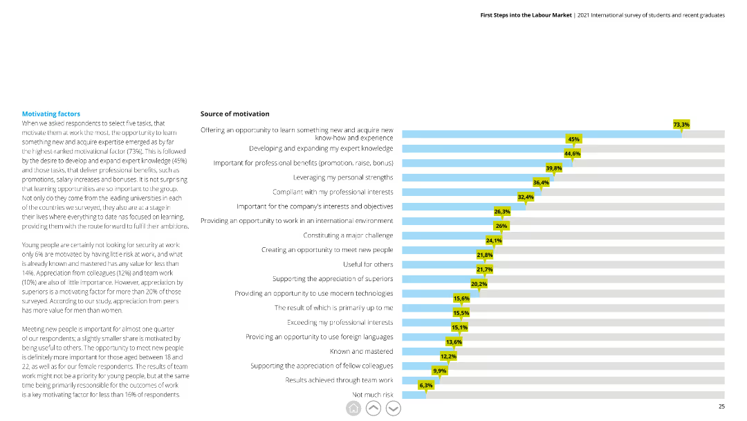
Horizontal bar chart depicting different motivating factors with percentages, alongside detailed text explaining the significance of each factor.
Human Resources and Talent Management
Education & Training
This slide highlights key factors that motivate young professionals, emphasizing learning opportunities, professional development, and appreciation from peers.
motivation, learning, professional development, appreciation, young professionals
false
Human Resources and Talent Management
Education & Training
Mixed Chart
Deloitte
Add to my slides
Remove from favorites
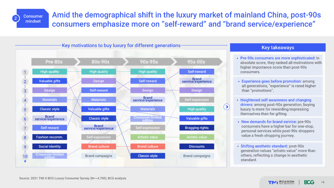
The slide uses a comparative list format to display key motivations for buying luxury across different generations, using lines and boxes in multiple colors for clarity.
Customer and Market Segmentation
Consumer Goods
It highlights the motivations of different generations for purchasing luxury items, emphasizing self-reward and brand experience for post-90s consumers.
Motivations, Generations, Luxury, Self-reward, Brand Experience
false
Customer and Market Segmentation
Consumer Goods
Boxed
BCG
Add to my slides
Remove from favorites
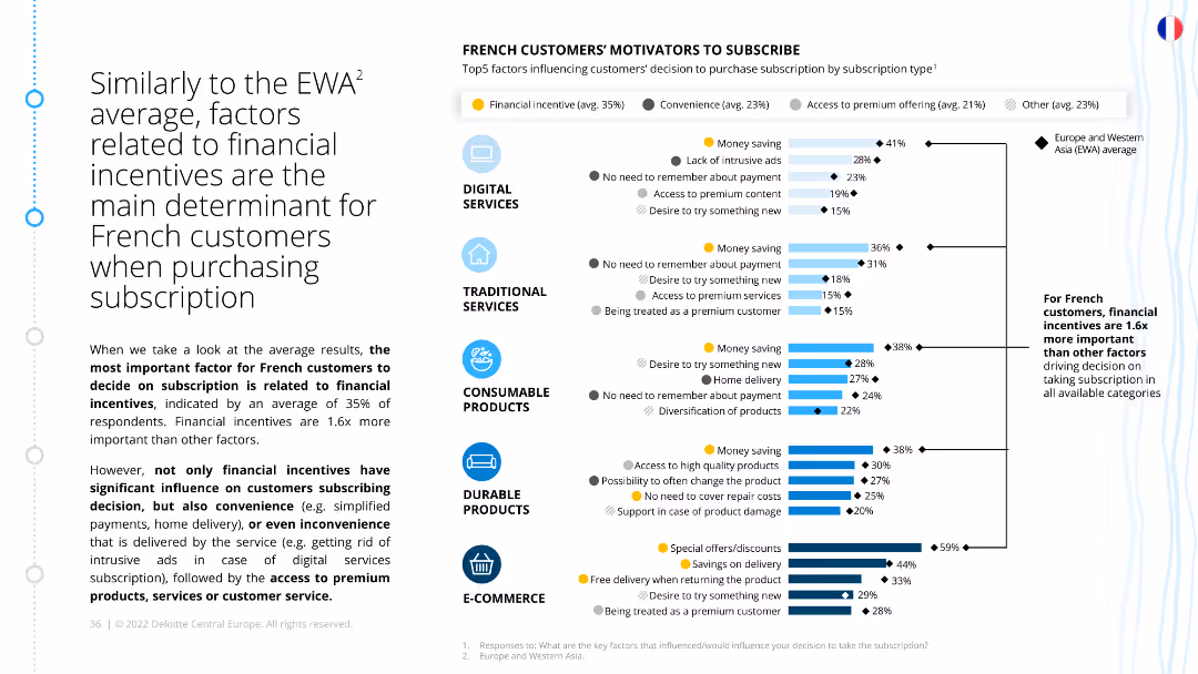
The slide features a column chart listing the top factors motivating French customers to subscribe, categorized by service type. Financial incentives are prominently highlighted.
Market Analysis and Trends
Consumer Goods
This slide explores the key motivators for French customers to subscribe, with financial incentives being the most significant factor. It provides insights into how different service types influence customer decisions.
motivators, French customers, subscriptions, financial incentives, customer behavior, ecommerce, retail
false
Market Analysis and Trends
Consumer Goods
Multiple Chart
Deloitte
Add to my slides
Remove from favorites
Split block layout separating motor and controller components with localization, cost %, and opportunity/risk sections. National flag icons denote sourcing.
Operational Efficiency
Industrial & Manufacturing
This slide outlines the domestic manufacturing potential for electric vehicle motors and controllers, showcasing localization levels, cost structures, and sourcing countries. It identifies key opportunities in customization, software design, and material innovation, while also flagging risks like rare earth dependence and limited semiconductor capabilities.
motors, EV, localization, manufacturing, India, components, electronics, rare earths, cost structure, R&D
false
Operational Efficiency
Industrial & Manufacturing
Mixed Chart
BCG
Add to my slides
Remove from favorites
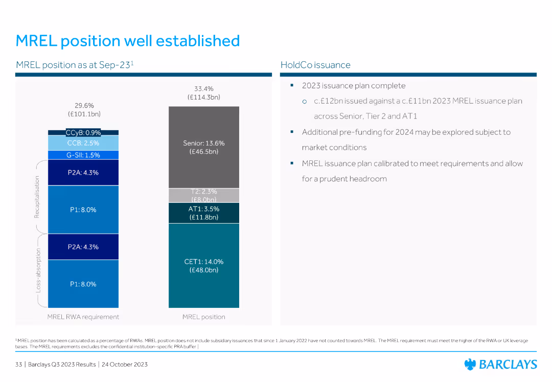
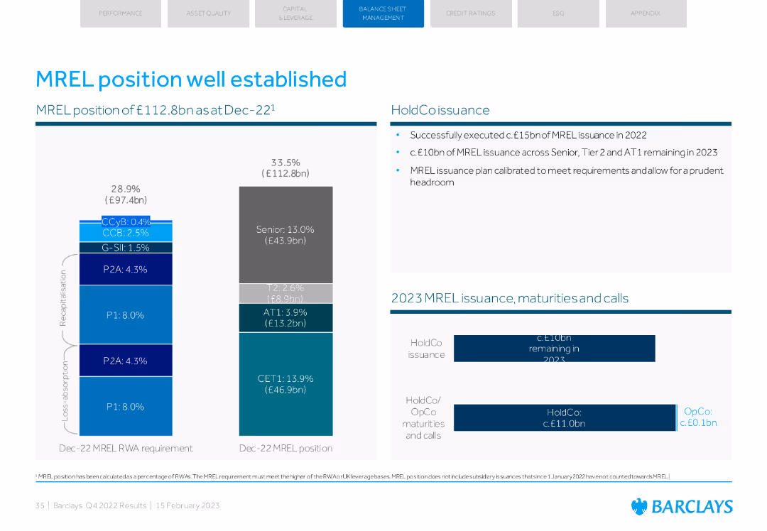
The slide is divided into two sections. The left section has a stacked column chart showing MREL positions with color-coded segments. The right section lists bullet points.
Risk Assessment and Management
Financial Services
This slide explains Barclays' MREL position as of Sep-23, breaking down various capital components and issuance plans for 2023 to ensure compliance with regulatory requirements.
MREL, capital, Barclays, issuance, compliance, regulatory, financial, risk, management
false
Risk Assessment and Management
Financial Services
Multiple Chart
Barclays
Add to my slides
Remove from favorites
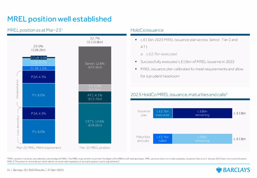
The slide features a bar chart on the left showing the MREL position and requirements, and a table on the right detailing issuance plans, maturities, and calls.
Risk Assessment and Management
Financial Services
This slide outlines the MREL (Minimum Requirement for own funds and Eligible Liabilities) position as of March 2023, highlighting the capital issuance plan and the status of MREL compliance.
MREL, issuance, compliance, risk management, capital
false
Risk Assessment and Management
Financial Services
Multiple Chart
Barclays
Add to my slides
Remove from favorites
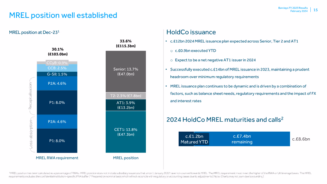
Features a column chart displaying MREL position at Dec-23 and MREL RWA requirement, along with text boxes for HoldCo issuance details.
Risk Assessment and Management
Financial Services
Explains the MREL position and issuance plans, highlighting the successful execution of MREL issuance and its impact on regulatory requirements.
MREL position, HoldCo issuance, regulatory requirements, MREL RWA, senior issuance, Tier 2, AT1, CET1, balance sheet, FX impact
false
Risk Assessment and Management
Financial Services
Multiple Chart
Barclays
Add to my slides
Remove from favorites
Column charts showing MREL RWA requirement and MREL position, along with text on issuance and maturities.
Risk Assessment and Management
Financial Services
Explains the MREL position and requirements, including the issuance plan for 2023. Highlights senior, Tier 2, and AT1 components.
MREL, position, issuance, Tier 2, AT1
false
Risk Assessment and Management
Financial Services
Multiple Chart
Barclays
Add to my slides
Remove from favorites
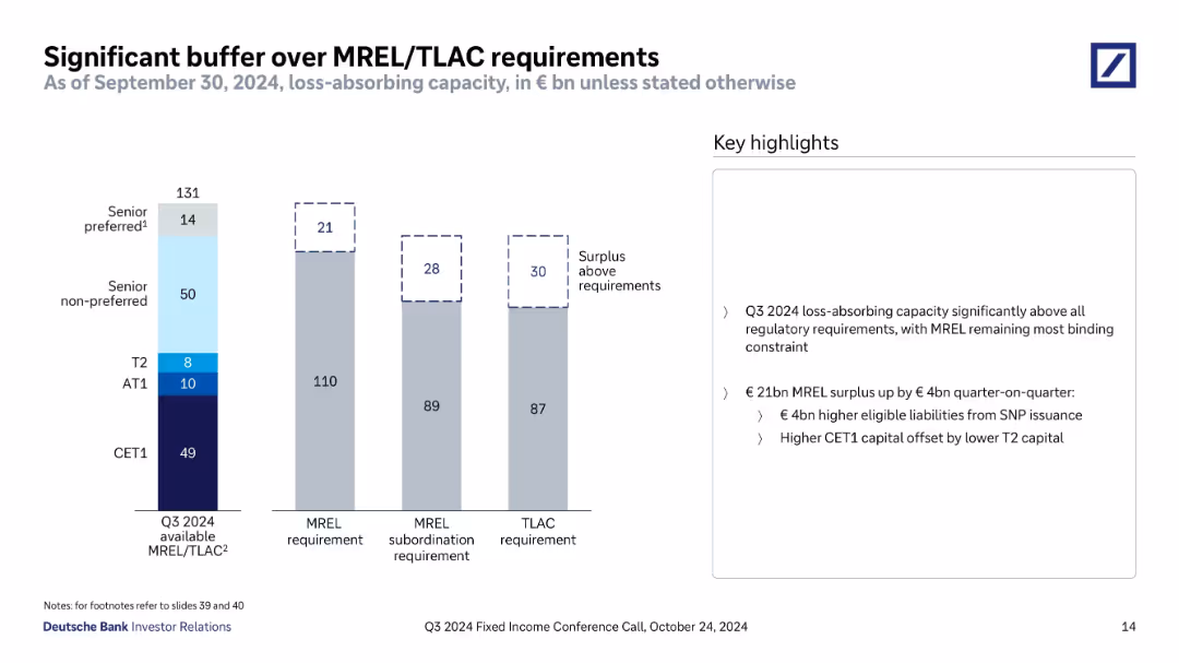
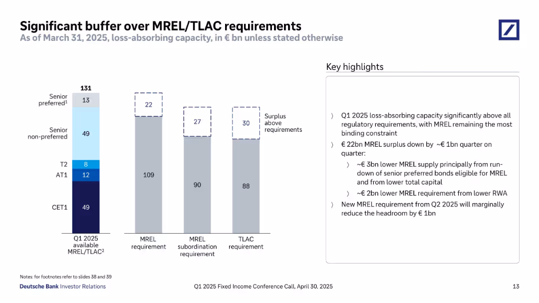
Vertical bar chart comparing Q3 2024 available MREL/TLAC with MREL, subordination, and TLAC requirements; key highlights in a text box to the right.
Regulatory and Compliance
Financial Services
The slide shows Deutsche Bank's substantial capital buffer exceeding MREL and TLAC regulatory requirements as of Q3 2024, highlighting €21bn, €28bn, and €30bn surpluses. It attributes the MREL surplus increase to €4bn from senior non-preferred issuance and offsetting capital shifts.
MREL, TLAC, capital buffer, CET1, regulatory, surplus, Deutsche Bank, Q3 2024
false
Regulatory and Compliance
Financial Services
Mixed Chart
Deutsche Bank
Add to my slides
Remove from favorites
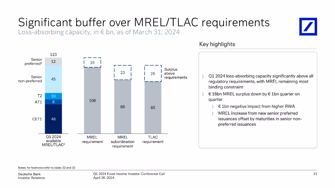
Column chart showing MREL/TLAC requirements vs. available capacity, with key highlights on the right.
Risk Assessment and Management
Financial Services
Shows the loss-absorbing capacity against MREL/TLAC requirements and highlights the surplus above regulatory requirements.
MREL, TLAC, financial regulation, loss-absorbing, capacity, surplus, requirements
false
Risk Assessment and Management
Financial Services
Mixed Chart
Deutsche Bank
Add to my slides
Remove from favorites
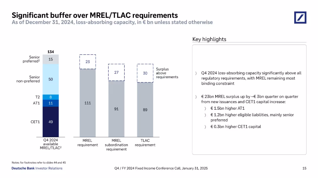
Vertical stacked bar charts compare MREL/TLAC capacity vs requirements. Components include CET1, AT1, T2, senior non-preferred and preferred. Surplus bars are dashed outlines. Key highlights are on the right.
Regulatory and Compliance
Financial Services
This slide emphasizes that Deutsche Bank's MREL and TLAC buffers exceed regulatory requirements by €22–30bn. It breaks down the components of MREL capital and explains the surplus. The highlights cite a €1bn drop in surplus driven by reduced senior preferred supply and lower capital, partly offset by lower requirements. It also previews a potential marginal reduction in headroom due to Q2 2025 changes.
MREL, TLAC, loss-absorbing capacity, capital surplus, CET1, AT1, regulatory buffer, senior debt
false
Regulatory and Compliance
Financial Services
Mixed Chart
Deutsche Bank
Add to my slides
Remove from favorites
Vertical stacked bar chart comparing available vs. required capital buffers. Uses color-coded segments for different debt instruments. Key highlights are listed on the right in a text box.
Regulatory and Compliance
Financial Services
This slide highlights Deutsche Bank's strong capital position at the end of Q4 2024, with available MREL/TLAC significantly exceeding regulatory requirements. The €23bn surplus results from AT1 and senior preferred issuances. Requirements and subordination buffers are visualized to show surplus against thresholds.
MREL, TLAC, surplus, AT1, CET1, senior preferred, regulatory buffer, Q4 2024, capital instruments
false
Regulatory and Compliance
Financial Services
Mixed Chart
Deutsche Bank
Add to my slides
Remove from favorites
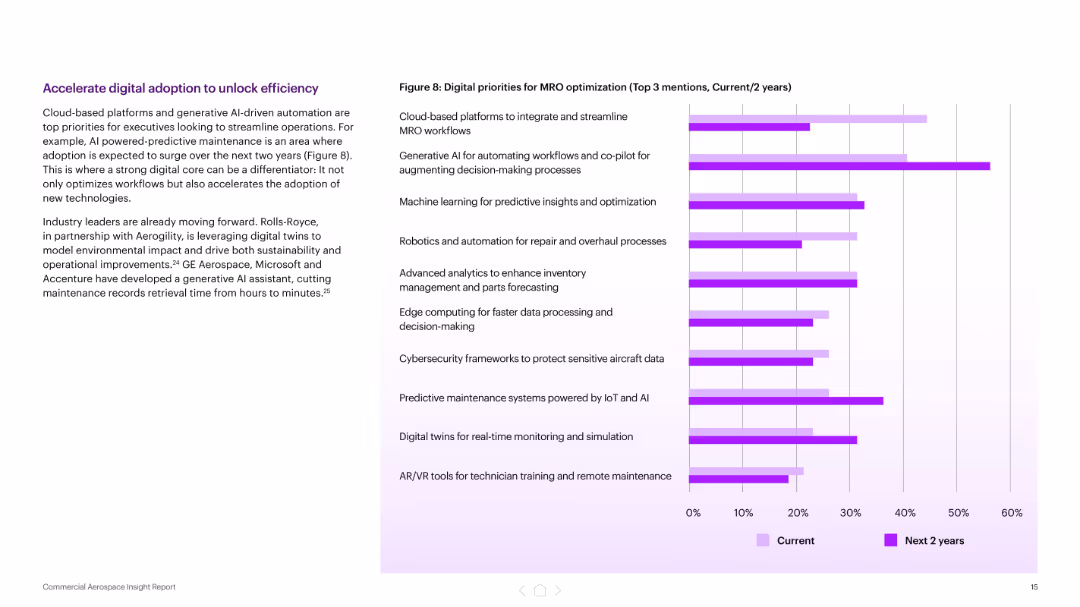
Left-aligned text block with a title and paragraph, right side features a horizontal bar chart comparing current vs. 2-year digital priorities for MRO. Purple theme with gradient bars.
Technology and Digital Transformation
Industrial & Manufacturing
The slide outlines top digital priorities for MRO optimization, emphasizing cloud platforms, AI, and predictive technologies. It highlights the shift toward generative AI and automation to streamline operations, with examples from Rolls-Royce, GE Aerospace, Microsoft, and Accenture.
MRO, digital adoption, AI, predictive maintenance, cloud platforms, generative AI, workflow automation, aerospace, digital transformation
false
Technology and Digital Transformation
Industrial & Manufacturing
Mixed Chart
Accenture
Add to my slides
Remove from favorites
Split layout: left text with MRO forecast chart; right has photo of aircraft being serviced
Operational Efficiency
Industrial & Manufacturing
This slide outlines the challenges and expected increase in MRO (maintenance, repair, overhaul) spending, projecting a 14% YoY rise in 2025. It highlights executive expectations, supply chain constraints, and the need for digital tools and workforce expansion to maintain fleet readiness.
MRO, maintenance, spending, supply chain, capacity, aircraft, workforce, digital tools
false
Operational Efficiency
Industrial & Manufacturing
Mixed Chart
Accenture
Add to my slides
Remove from favorites
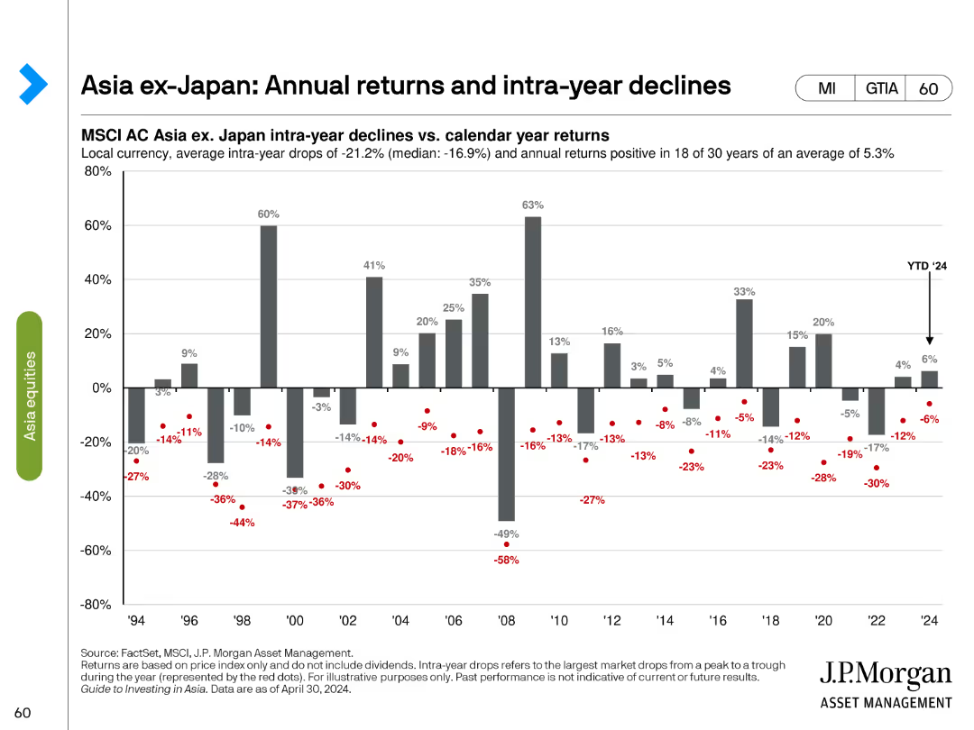
This slide contains a column chart showing annual returns and intra-year declines for MSCI AC Asia ex-Japan index. The bars represent annual returns while red dots show the intra-year declines.
Market Analysis and Trends
Financial Services
The slide illustrates the annual performance of the MSCI AC Asia ex-Japan index from 1994 to 2024, highlighting the average intra-year drops and annual returns to provide a historical perspective of market volatility and recovery trends.
MSCI AC Asia, annual returns, intra-year, financial services, market analysis, volatility, recovery, historical trends, 1994-2024, investment analysis
false
Market Analysis and Trends
Financial Services
Single Chart
JP Morgan
Add to my slides
Remove from favorites
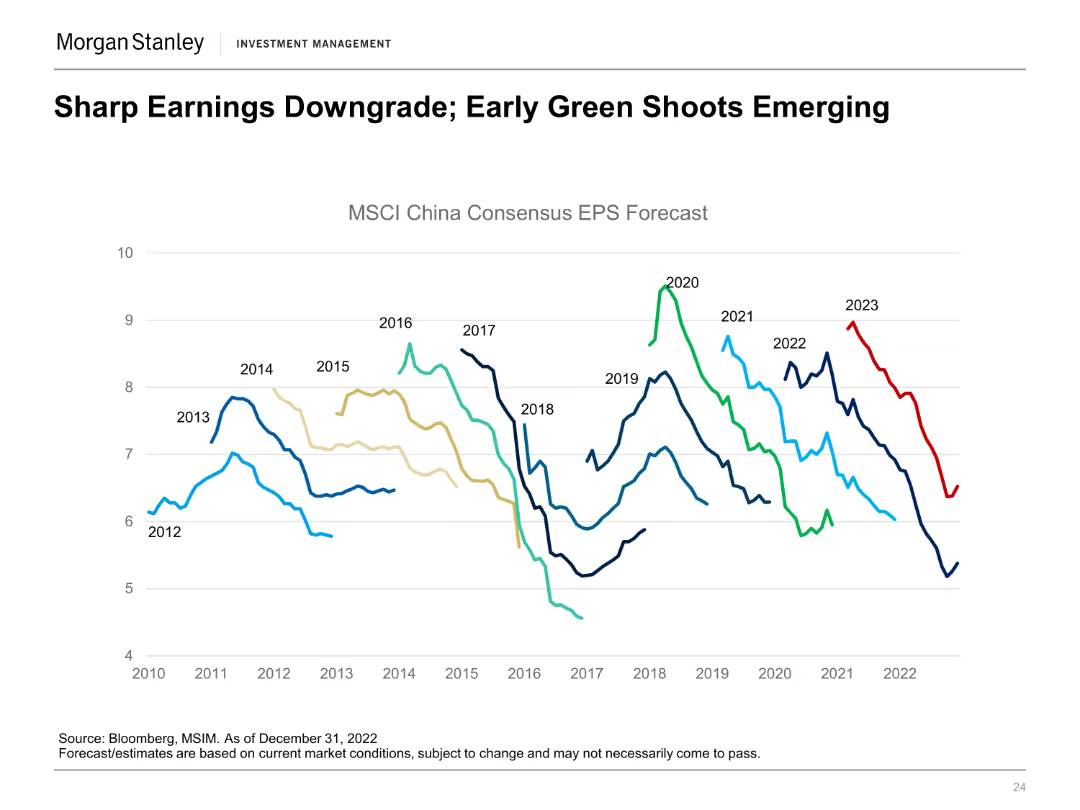
A line chart showing the MSCI China Consensus EPS Forecast from 2012 to 2023 with different colored lines representing each year's forecast.
Market Analysis and Trends
Financial Services
The slide highlights the downgrading of earnings forecasts for MSCI China while identifying early signs of recovery, projecting future trends.
MSCI China, EPS Forecast, Earnings, Downgrade, Recovery
false
Market Analysis and Trends
Financial Services
Single Chart
Morgan Stanley
Add to my slides
Remove from favorites
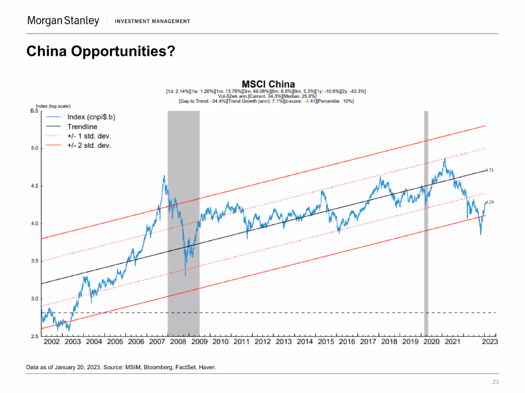
A line chart on a log scale showing the MSCI China Index with trendlines and standard deviation bands from 2002 to 2023.
Market Analysis and Trends
Financial Services
The slide examines investment opportunities in China by analyzing the MSCI China Index's performance and potential trend growth, indicating investment prospects.
MSCI China, Investment, Trends, Opportunities, Index
false
Market Analysis and Trends
Financial Services
Single Chart
Morgan Stanley
Add to my slides
Remove from favorites
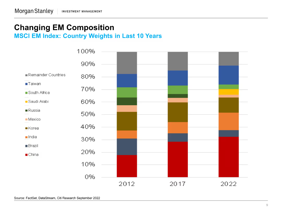
The slide features a stacked column chart comparing the country weights in the MSCI EM Index for the years 2012, 2017, and 2022, with various colors representing different countries.
Market Analysis and Trends
Financial Services
This slide examines how the country weights in the MSCI EM Index have evolved over the last 10 years, focusing on the proportion of different emerging markets.
MSCI, EM Index, Country Weights, China, India, Brazil, Market Trends, Country Comparison, Emerging Markets, Weight Distribution, Regional Analysis
false
Market Analysis and Trends
Financial Services
Single Chart
Morgan Stanley
Add to my slides
Remove from favorites
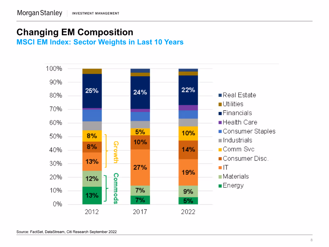
The slide presents a column chart displaying the MSCI EM Index sector weights over the last 10 years (2012, 2017, 2022). Each column is color-coded to represent different sectors.
Market Analysis and Trends
Financial Services
This slide shows the changes in sector weights within the MSCI EM Index over a decade, highlighting shifts in sectors like Financials, IT, and Consumer sectors.
MSCI, EM Index, Sector Weights, Financials, IT, Consumer Staples, Market Trends, Sector Growth, Commodities, Sector Comparison, Equity Returns
false
Market Analysis and Trends
Financial Services
Single Chart
Morgan Stanley
Add to my slides
Remove from favorites
The slide includes two visual elements: the left chart shows MSCI Europe ex-UK earnings and performance, and the right chart shows earnings per share growth across various metrics.
Financial Performance
Financial Services
The slide examines European earnings by analyzing the performance of MSCI Europe ex-UK and tracking earnings per share growth in different regions.
MSCI Europe, earnings, performance, Europe ex-UK, earnings growth, financial performance
false
Financial Performance
Financial Services
Multiple Chart
JP Morgan
Add to my slides
Remove from favorites
The slide contains four column charts comparing MSCI World and Net IRR across different investment types: Corporate Equity, Corporate Credit, Real Estate, and Open Architecture Private Assets. Each chart has two vertical bars with percentages, against a white and blue background.
Financial Performance
Financial Services
The slide presents a performance comparison of various investment types, highlighting their long-term track record and returns. This can be used for illustrating investment opportunities and analyzing alternative asset management strategies.
MSCI, IRR, Corporate Equity, Real Estate, Performance
false
Financial Performance
Financial Services
Multiple Chart
Goldman Sachs
Add to my slides
Remove from favorites
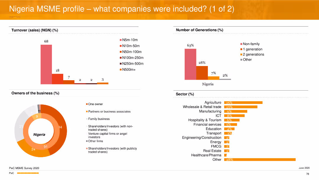
The slide contains multiple column charts and a pie chart to represent various data points about MSMEs in Nigeria. The color scheme is orange, red, and gray, with minimal text.
Market Analysis and Trends
Financial Services
The slide provides an analysis of the Nigerian MSME sector, including turnover, ownership, generations involved in business, and sector distribution.
MSME, Nigeria, turnover, ownership, sectors
false
Market Analysis and Trends
Financial Services
Multiple Chart
PwC/Strategy&
Add to my slides
Remove from favorites
The slide includes a column chart and a pictorial image. The column chart shows the number of years in operation and staff strength percentages. The image depicts two people working on a whiteboard.
Market Analysis and Trends
Financial Services
This slide gives further insights into the Nigerian MSME sector, focusing on the number of years in operation and the distribution of staff strength across different sizes of businesses.
MSME, Nigeria, years in operation, staff strength, businesses
false
Market Analysis and Trends
Financial Services
Multiple Chart
PwC/Strategy&
Add to my slides
Remove from favorites
This comparative slide features a bar chart that contrasts active and passive business activities among Indonesian MSMEs.
Operational Efficiency
Financial Services
The slide compares active versus passive business activity levels among MSMEs, suggesting underutilization of potential in the Indonesian market. It could serve to examine strategies to activate MSMEs' full capabilities and encourage more dynamic engagement in business practices.
MSMEs, Business Activities, Market Potential, Engagement Strategy, Indonesia
false
Operational Efficiency
Financial Services
Single Chart
Kearney
Add to my slides
Remove from favorites
Slide displays doughnut charts representing the adoption of online business activities by MSMEs, with percentages and a descriptive sidebar.
Operational Efficiency
Financial Services
The slide quantifies the adoption of online methods in business practices among MSMEs, indicating minimal digital engagement even among active businesses. The visual data supports discussion on the need for digital onboarding to enhance operational efficiency within the sector.
MSMEs, Digital Adoption, Online Activities, Business Practices, Efficiency, Engagement
false
Operational Efficiency
Financial Services
Multiple Chart
Kearney
Add to my slides
Remove from favorites
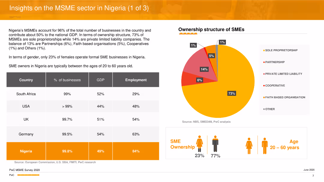
The slide features a pie chart showing the ownership structure of MSMEs in Nigeria, and a comparative table listing statistics on MSMEs in Nigeria versus other countries. Additional icons and text summarize key insights about gender distribution and age demographics of SME owners.
Industry Overview
Professional Services
The slide provides an overview of the MSME sector in Nigeria, highlighting the ownership structure, gender distribution, and age demographics of SME owners. It compares Nigerian MSMEs with those in other countries and discusses their contribution to the economy in terms of GDP and employment.
MSME sector, Nigeria, ownership structure, gender distribution, economic contribution
false
Industry Overview
Professional Services
Mixed Chart
PwC/Strategy&
Add to my slides
Remove from favorites
The slide presents a bar chart detailing the percentage of MSMEs in Nigeria and other African countries identifying electricity as a key business constraint. Clean layout with country flags for identification and comparative analysis.
Regulatory and Compliance
Industrial & Manufacturing
This slide surveys the critical constraint of unreliable electricity for MSMEs in various African countries, emphasizing that about 50% of Nigerian MSMEs consider it a major challenge, impacting their operational efficiency and business growth.
MSMEs, electricity, constraints, Nigeria, business challenges, Africa, survey, comparison
false
Regulatory and Compliance
Industrial & Manufacturing
Mixed Chart
BCG
Add to my slides
Remove from favorites
Slide features a large column chart comparing annual sales losses from various sources of market fire, and a pie chart illustrating percentage of total sales lost from fires.
Market Analysis and Trends
Energy & Utilities
This slide presents data on the financial impact of generator-linked fires on MSMEs in markets, highlighting significant sales losses which account for approximately 1% of gross sales annually.
MSMEs, generator, fire, sales, loss
false
Market Analysis and Trends
Energy & Utilities
Mixed Chart
BCG
Add to my slides
Remove from favorites
This slide contrasts types of MSMEs with a focus on their business mindset and digital practices through a bar graph and text annotations.
Market Analysis and Trends
Financial Services
Analyzing MSME types in tier 2 and tier 3 cities, the slide presents a predominant 'wait-and-see' approach to digital adoption. It may be used to examine digital strategy and its adoption in these markets, reflecting the conservative mindset of most MSMEs towards new practices.
MSMEs, Tier 2 and 3 Cities, Digital Adoption, Business Mindset, Market Analysis
false
Market Analysis and Trends
Financial Services
Mixed Chart
Kearney
Add to my slides
Remove from favorites
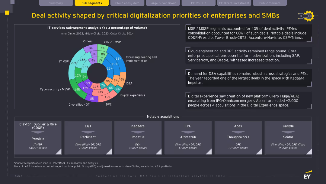
Dark theme with concentric donut chart on IT services sub-segments; sidebar with four bullet insights and lower third showing major acquisitions by buyer; well-structured and data-rich layout.
Product and Service Analysis
Technology & Software
This slide breaks down deal activity by IT service sub-segments, showing strong focus on MSP, cybersecurity, cloud, and D&A. It highlights PE-led consolidation, ongoing enterprise modernization, and notable M&A including large-scale platform plays. Strategic focus areas are clearly linked to digital priorities of enterprise buyers.
MSP, cybersecurity, D&A, digital experience, PE-led M&A, IT services, sub-segments
false
Product and Service Analysis
Technology & Software
Mixed Chart
EY
Add to my slides
Remove from favorites
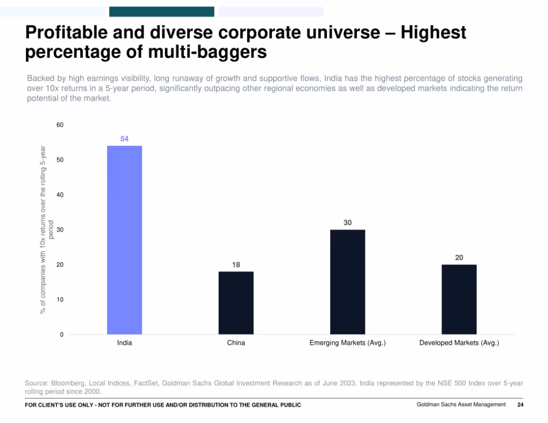
Single bar chart comparing the percentage of companies delivering 10x returns across countries/regions (India, China, EM, DM); clean layout with color-coded bars.
Investment Analysis
Financial Services
Emphasizes that India has the highest percentage of companies with 10x returns over a rolling 5-year period, far outpacing China, emerging markets, and developed markets. It highlights India’s market potential and wealth creation opportunity through multi-bagger investments.
multi-baggers, India equities, stock returns, investment opportunity, wealth generation, 10x returns
false
Investment Analysis
Financial Services
Single Chart
Goldman Sachs
Add to my slides
Remove from favorites
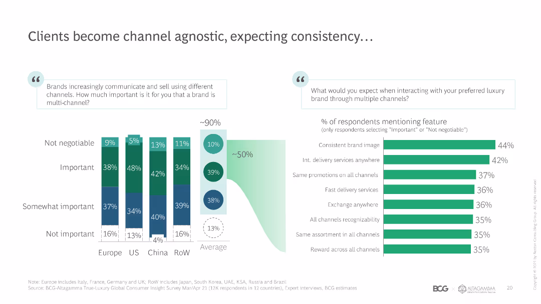
Stacked bar chart showing the importance of multi-channel communication for luxury brands across different regions, and the expected features from luxury brands.
Customer and Market Segmentation
Retail & E-commerce
Highlights the importance of multi-channel strategies for luxury brands, showing regional preferences and the top features expected by luxury consumers.
multi-channel, luxury brands, customer expectations, regional preferences, consistency
false
Customer and Market Segmentation
Retail & E-commerce
Multiple Chart
BCG
Add to my slides
Remove from favorites
Two-part slide; the left discusses the Multi-Earner Era with line graphs on search trends, the right examines Obesity x Social Media with a spike graph and thematic analysis.
Market Analysis and Trends
Financial Services
The slide examines the rise of the multi-earner era due to AI advancements and the impact of social media on obesity-related product growth, relevant for market strategists and health industry analysts.
Multi-earner, generative AI, social media, obesity, market trends, health products, AI impact, search trends, health industry analysis, product growth
false
Market Analysis and Trends
Financial Services
Mixed Chart
Morgan Stanley
Add to my slides
Remove from favorites
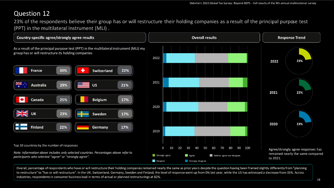
This slide features a comparative layout with country-specific results in bar charts and a column chart for overall results. It includes country flags and percentages.
Risk Assessment and Management
Financial Services
The slide shows survey results on the restructuring of holding companies due to the Principal Purpose Test in the Multilateral Instrument (MLI). It highlights country-specific and overall responses, including trends from 2019 to 2022.
Multilateral Instrument, Principal Purpose Test, survey results, restructuring, financial services
false
Risk Assessment and Management
Financial Services
Multiple Chart
Deloitte
Add to my slides
Remove from favorites
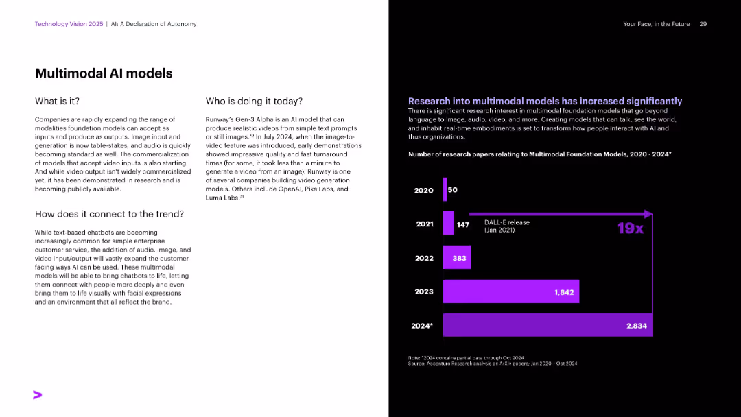
Split layout: white text section on left; black right side with vertical bar graph in bright purple, using a clean, corporate style.
Technology and Digital Transformation
Artificial Intelligence
This slide discusses the rise of multimodal AI models capable of processing text, audio, image, and video. It highlights the expansion of input/output modalities in AI systems and presents data on the sharp rise in research papers related to multimodal foundation models from 2020–2024, showcasing significant momentum in the field.
Multimodal AI, video generation, Runway, DALL·E, input/output AI
false
Technology and Digital Transformation
Artificial Intelligence
Mixed Chart
Accenture
Add to my slides
Remove from favorites
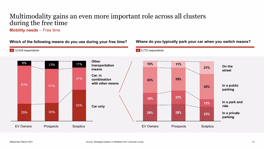
Column charts showing the usage of transportation means during free time and parking preferences among EV owners, prospects, and skeptics.
Market Analysis and Trends
Transportation & Logistics
Shows survey results on transportation means used during free time and typical parking locations when switching means.
Multimodality, EV owners, free time, parking, transportation, survey
false
Market Analysis and Trends
Transportation & Logistics
Multiple Chart
PwC/Strategy&
Add to my slides
Remove from favorites
Line charts showing preferred modes for multimodal travel across different generations
Market Analysis and Trends
Transportation & Logistics
Explores preferred modes of transportation for multimodal travel among different generations
Multimodal travel, transportation, generations, survey, EY
false
Market Analysis and Trends
Transportation & Logistics
Multiple Chart
EY
Add to my slides
Remove from favorites
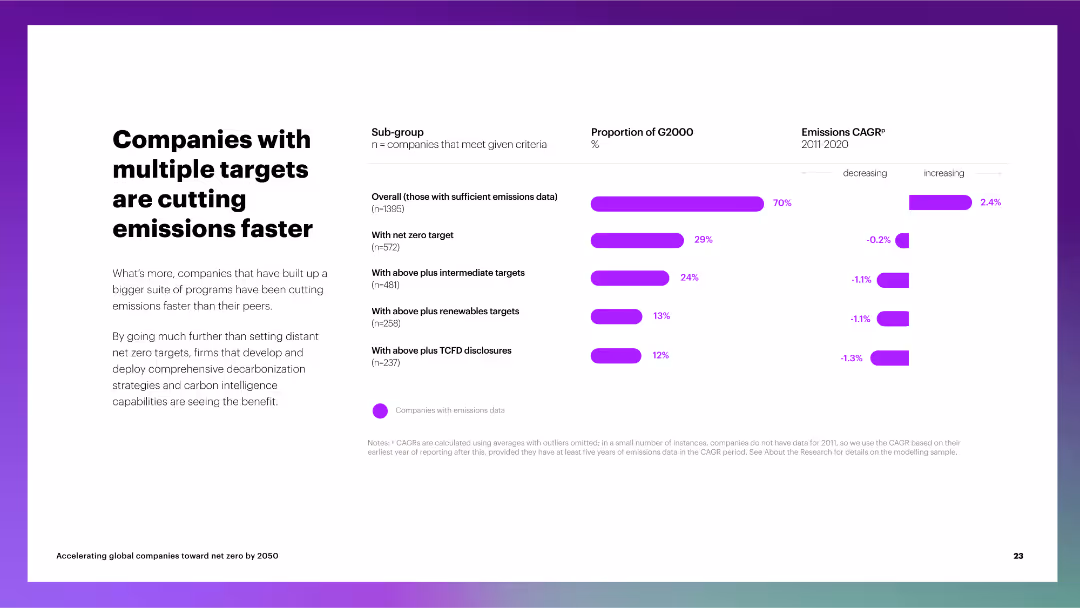
The slide includes a column chart depicting the proportion of G2000 companies with multiple emissions targets and their CAGR for emissions reduction.
Performance Metrics and KPIs
Environmental Services & Sustainability
The slide discusses the impact of multiple net zero targets on emissions reduction, showing that companies with comprehensive strategies perform better than their peers.
multiple targets, emissions reduction, G2000, net zero, intermediate targets, renewable targets, TCFD disclosures, CAGR
false
Performance Metrics and KPIs
Environmental Services & Sustainability
Multiple Chart
Accenture
Add to my slides
Remove from favorites
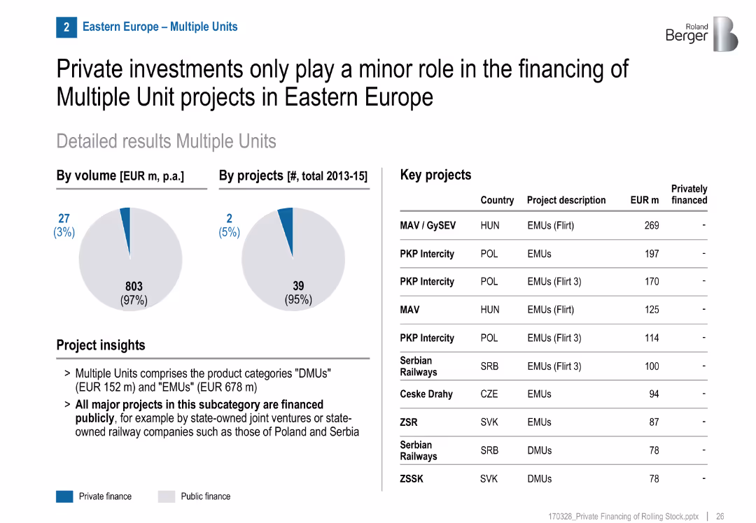
Similar visual format to others, project list shows no private projects
Market Analysis and Trends
Transportation & Logistics
Almost all multiple unit projects (EMU/DMU) in Eastern Europe are publicly financed. Projects are managed by state-owned or joint ventures in Poland, Hungary, Serbia, etc.
multiple units, public funding, Eastern Europe, EMU, DMU, rail projects, state-owned
false
Market Analysis and Trends
Transportation & Logistics
Mixed Chart
Roland Berger
Add to my slides
Remove from favorites
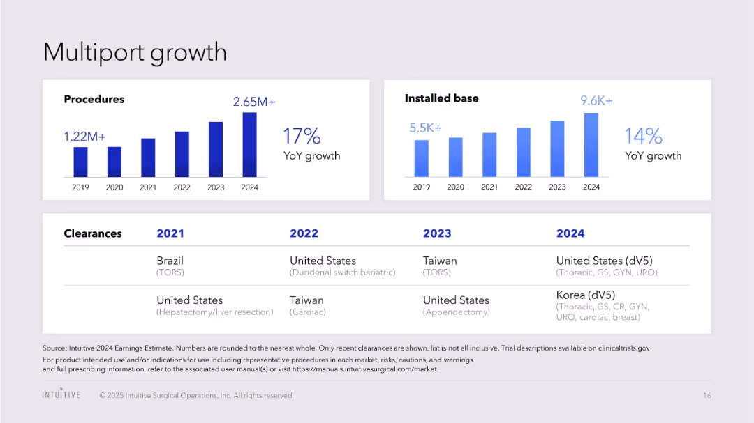
Two bar charts showing growth in procedures and installed base; table of country-specific clearances
Product and Service Analysis
Healthcare & Pharmaceuticals
Analyzes global expansion of multiport da Vinci procedures and system installations, including regional regulatory clearances across four years.
multiport, procedures, installations, regulatory clearance, global expansion, da Vinci, growth
false
Product and Service Analysis
Healthcare & Pharmaceuticals
Multiple Chart
JP Morgan
Add to my slides
Remove from favorites
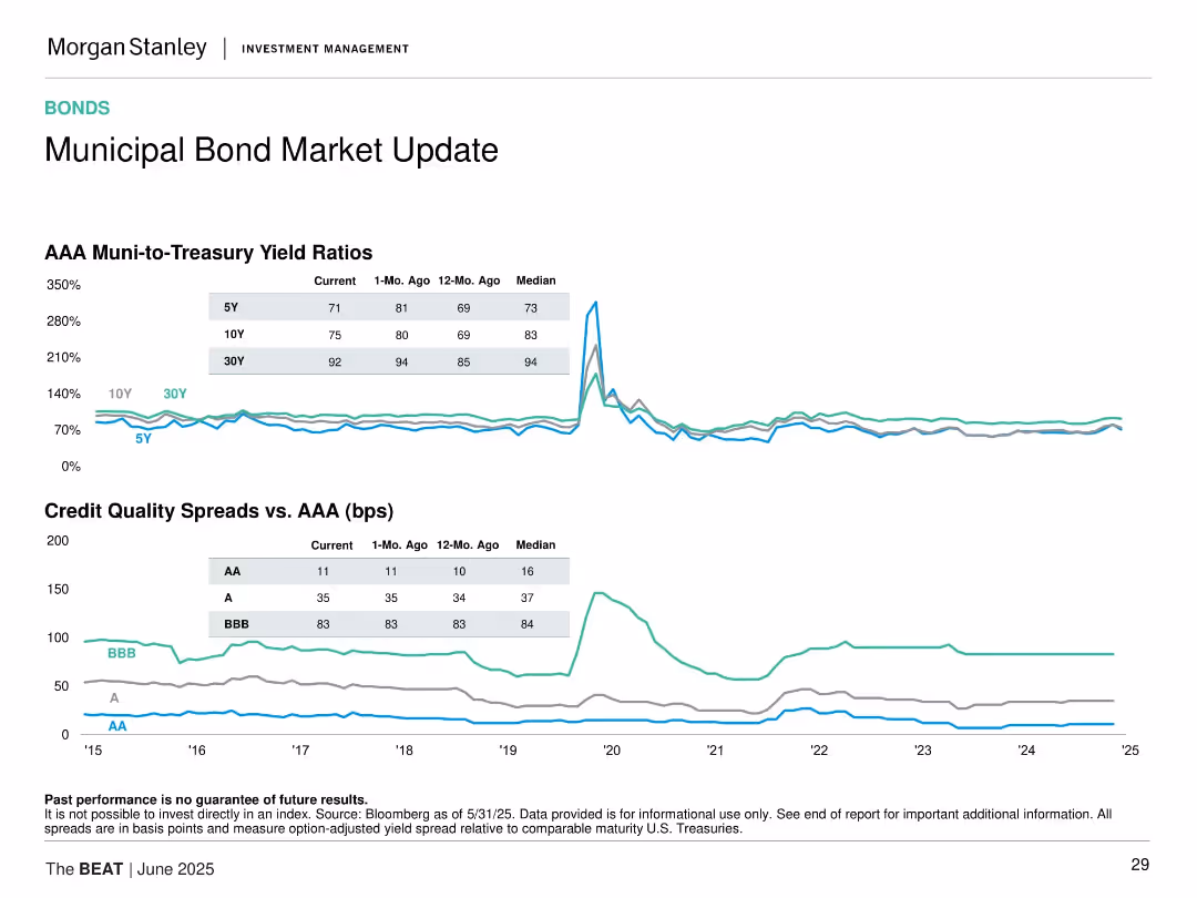
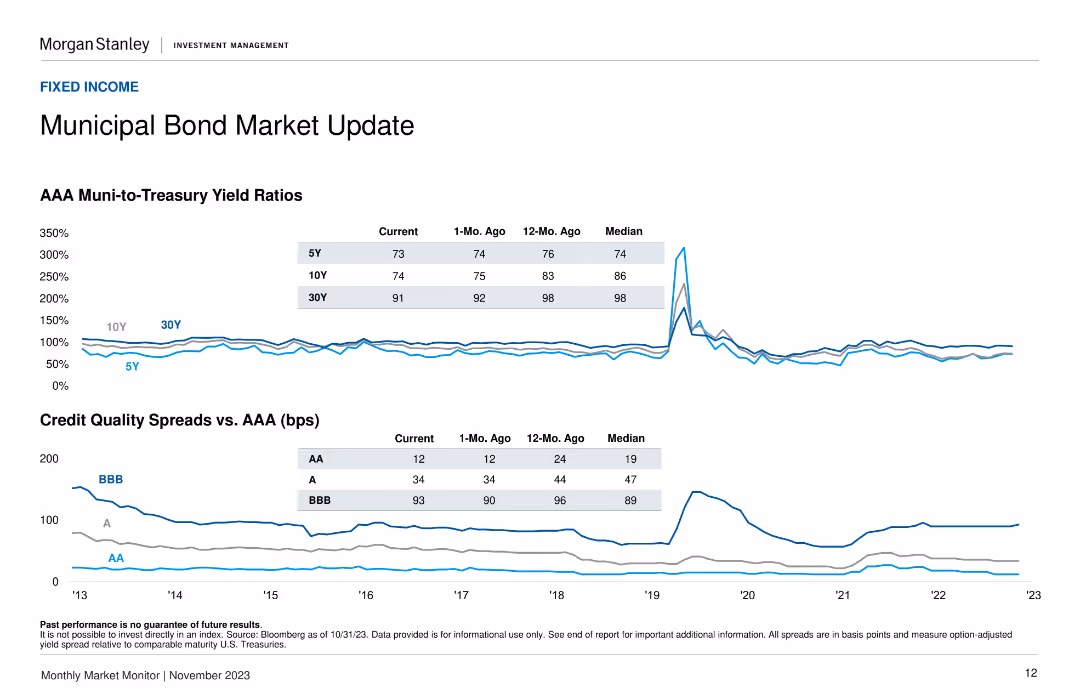
Two line charts: one for AAA muni-to-Treasury yield ratios, one for credit quality spreads vs. AAA; tables overlayed.
Market Analysis and Trends
Financial Services
Provides yield ratio and credit quality spread analysis in the municipal bond market, comparing AAA vs. lower ratings (AA, A, BBB) and against Treasury.
municipal bonds, AAA, credit spread, yield ratios, fixed income, U.S. Treasuries, credit quality, risk analysis
false
Market Analysis and Trends
Financial Services
Multiple Chart
Morgan Stanley
Add to my slides
Remove from favorites
A column chart displaying tax-equivalent yields of various bonds and a column chart showing 5-year correlations with municipal bonds. The design is clean and data-focused.
Financial Performance
Financial Services
The slide compares the tax-equivalent yields of different bond types and their 5-year correlations with municipal bonds, useful for evaluating bond investment strategies.
municipal bonds, tax-equivalent yield, correlation, investment, bonds
false
Financial Performance
Financial Services
Multiple Chart
Morgan Stanley
Add to my slides
Remove from favorites
Column charts showing tax-equivalent yield and correlation with municipals.
Investment Analysis
Financial Services
Analysis of municipal bonds yields, assessing tax implications and correlations for investment choices.
Municipal Bonds, Tax-equivalent Yield, Correlation, Investment Choices, Bar Chart, Column Chart, Morgan Stanley, Market Monitor
false
Investment Analysis
Financial Services
Multiple Chart
Morgan Stanley
Add to my slides
Remove from favorites
Line charts showing AAA muni-to-treasury yield ratios and credit quality spreads versus AAA.
Market Analysis and Trends
Financial Services
Offers insights into the municipal bond market by comparing muni-to-treasury yield ratios and credit quality spreads, helping assess municipal bond attractiveness.
Municipal bonds, yield ratios, credit
false
Market Analysis and Trends
Financial Services
Multiple Chart
Morgan Stanley
Add to my slides
Remove from favorites
Previous
Next
You don't have any favorites yet.
Please wait loading your favorites slides...
Create a FREE account to continue browsing
Receive Instant Access to 1,000+ slides from companies like McKinsey, Google, and Goldman Sachs
First Name
Last Name
Email
Password
I agree to all
Terms & Privacy Policy
Thank you! Your submission has been received!
Oops! Something went wrong while submitting the form.
Have an account?
Sign in
Upgrade to PRO to Save slides
Advanced Search and Filters
Access to 15,000+ slides
Access to Category Pages
Save/Bookmark Slides
PowerPoint Template Library
Pick a Plan
MONTHLY
$12/month
Billed every month, Cancel anytime.
YEARLY
$9/year
Billed $108 annually, Cancel anytime.
Checkout for $12/month
Checkout for $108/yr
Secured by Stripe | AES-256 bit encryption