My Account
My Slides
Search by Category
Pricing
Templates
View All Templates
Download Template Slides
✦ AI Search
Feedback
Login
Logout
Get Started
Browse all Slides
Browse all Slides
Create a FREE Account
Instant access to 1,000+ real slides from top companies like McKinsey, BCG, Goldman Sachs, Google and many more!
First Name
Last Name
Email
Password
I agree to all
Terms & Privacy Policy
Thank you! Your submission has been received!
Oops! Something went wrong while submitting the form.
Have an account?
Sign in
Saved Slides
Total No. of slides saved
0
↻ Refresh
✖ Clear all
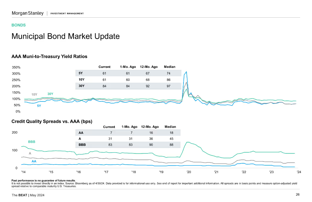
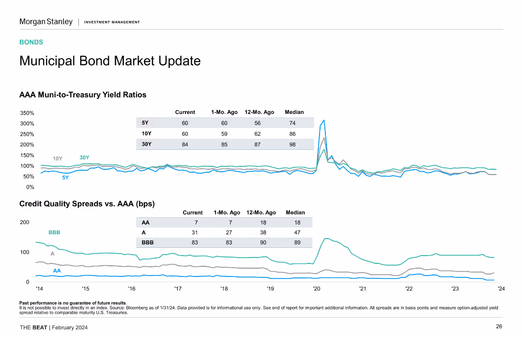
This slide contains two line charts. The first chart shows AAA Muni-to-Treasury yield ratios for 5Y, 10Y, and 30Y bonds. The second chart displays credit quality spreads vs. AAA for AA, A, and BBB bonds. Both charts are accompanied by data tables summarizing the current, 1-Mo. Ago, 12-Mo. Ago, and Median values.
Market Analysis and Trends
Financial Services
The slide updates on municipal bond market conditions, focusing on AAA Muni-to-Treasury yield ratios and credit quality spreads compared to AAA bonds.
Municipal bonds, yield ratios, credit quality, AAA bonds, spreads
false
Market Analysis and Trends
Financial Services
Multiple Chart
Morgan Stanley
Add to my slides
Remove from favorites
Two line charts are shown: one for AAA muni-to-treasury yield ratios and one for credit quality spreads versus AAA. Data is color-coded by bond rating.
Market Analysis and Trends
Financial Services
The slide updates on the municipal bond market, comparing AAA muni-to-treasury yield ratios and credit quality spreads, highlighting bond performance metrics.
Municipal Bonds, Yield Ratios, Credit Quality, Bond Ratings, Performance
false
Market Analysis and Trends
Financial Services
Multiple Chart
Morgan Stanley
Add to my slides
Remove from favorites
Line charts illustrating AAA muni-to-treasury yield ratios and credit quality spreads vs. AAA over time.
Market Analysis and Trends
Financial Services
Provides updates on municipal bond market, focusing on yield ratios and credit quality spreads for different time frames.
Municipal Bonds, Yield Ratios, Credit Quality, Market Update, Financial Analysis
false
Market Analysis and Trends
Financial Services
Multiple Chart
Morgan Stanley
Add to my slides
Remove from favorites
The slide includes line charts comparing AAA muni-to-treasury yield ratios and credit quality spreads vs. AAA for different rating categories (AA, A, BBB).
Market Analysis and Trends
Financial Services
The slide offers insights into municipal bonds, focusing on yield ratios and credit spreads. Useful for evaluating municipal bond investments.
municipal bonds, yield ratios, credit quality, spreads, AAA, financial analysis
false
Market Analysis and Trends
Financial Services
Multiple Chart
Morgan Stanley
Add to my slides
Remove from favorites
The slide showcases line graphs for yield ratios and credit quality spreads, with annotations for current, 1-month ago, 12-months ago, and median values.
Market Analysis and Trends
Financial Services
Focuses on the investment attractiveness of municipal bonds by comparing yields and credit spreads with benchmarks, useful for trend analysis and strategic decision-making in fixed income investments.
municipal bonds, yield ratios, credit spreads, line graphs, market trends, investment analysis
false
Market Analysis and Trends
Financial Services
Multiple Chart
Morgan Stanley
Add to my slides
Remove from favorites
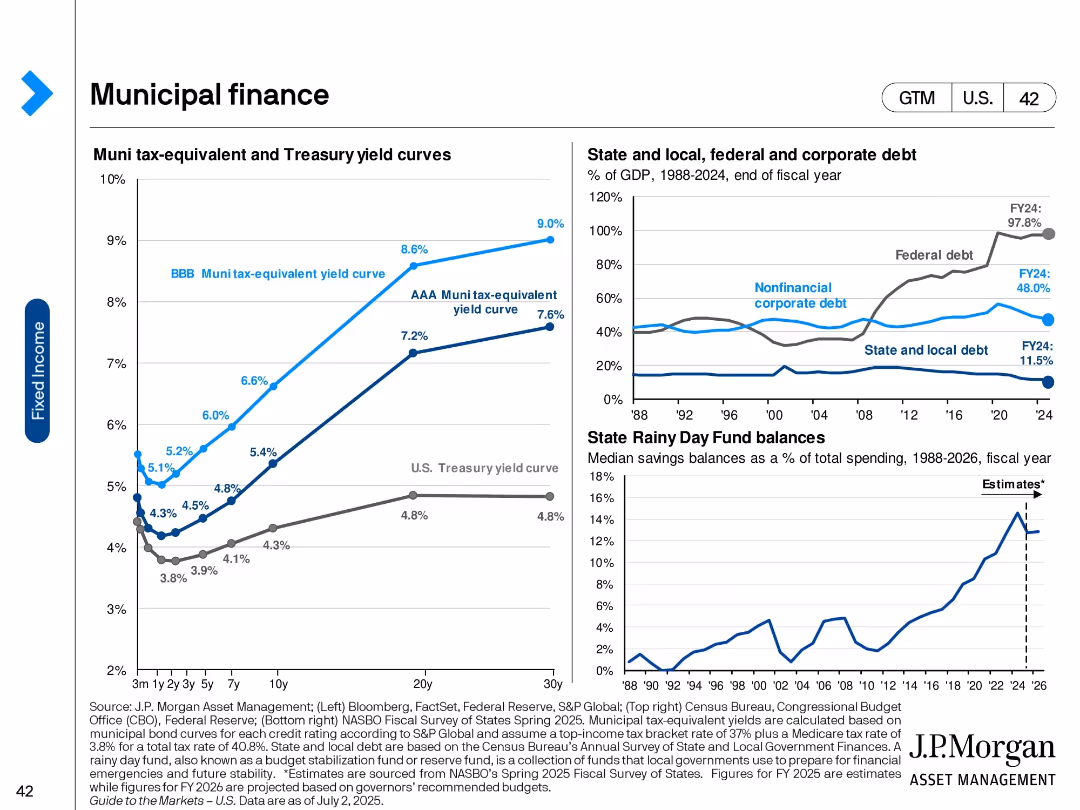
Three-panel slide with yield curves, government debt as % of GDP, and state savings fund balances.
Regulatory and Compliance
Government & Public Sector
This slide explores the municipal finance landscape with a focus on tax-equivalent muni yields, debt levels across sectors (federal, state, corporate), and fiscal preparedness through rainy day funds.
Municipal bonds, yields, government debt, state finance, treasury curve, savings funds, tax-equivalent, fiscal policy
false
Regulatory and Compliance
Government & Public Sector
Multiple Chart
JP Morgan
Add to my slides
Remove from favorites
The slide features a diagram and detailed table presenting the total potential of municipal solid waste (MSW) for energy production by 2060, including theoretical, technical, and sustainable potentials, and various factors affecting its scalability and sustainability constraints.
Technology and Digital Transformation
Energy & Utilities
This slide provides a deep-dive into the potential of municipal solid waste as a feedstock for energy production, analyzing its total potential by 2060 and highlighting the scalability issues and sustainability constraints associated with its use.
municipal solid waste, MSW, feedstock, total potential, energy production, 2060, scalability, sustainability constraints
false
Technology and Digital Transformation
Energy & Utilities
Mixed Chart
Kearney
Add to my slides
Remove from favorites
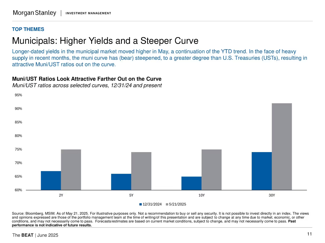
Bar chart comparing Muni/UST ratios at 2Y, 5Y, 10Y, and 30Y; clean layout with labeled bars and subdued color tones.
Investment Analysis
Financial Services
The slide discusses recent steepening in the municipal yield curve and shows how Muni/UST ratios have become more attractive, especially at longer durations, supported by a bar comparison between Dec 2024 and May 2025.
municipals, UST, yield curve, ratios, interest rates, bonds, fixed income, investment, steepening, Morgan Stanley
false
Investment Analysis
Financial Services
Single Chart
Morgan Stanley
Add to my slides
Remove from favorites
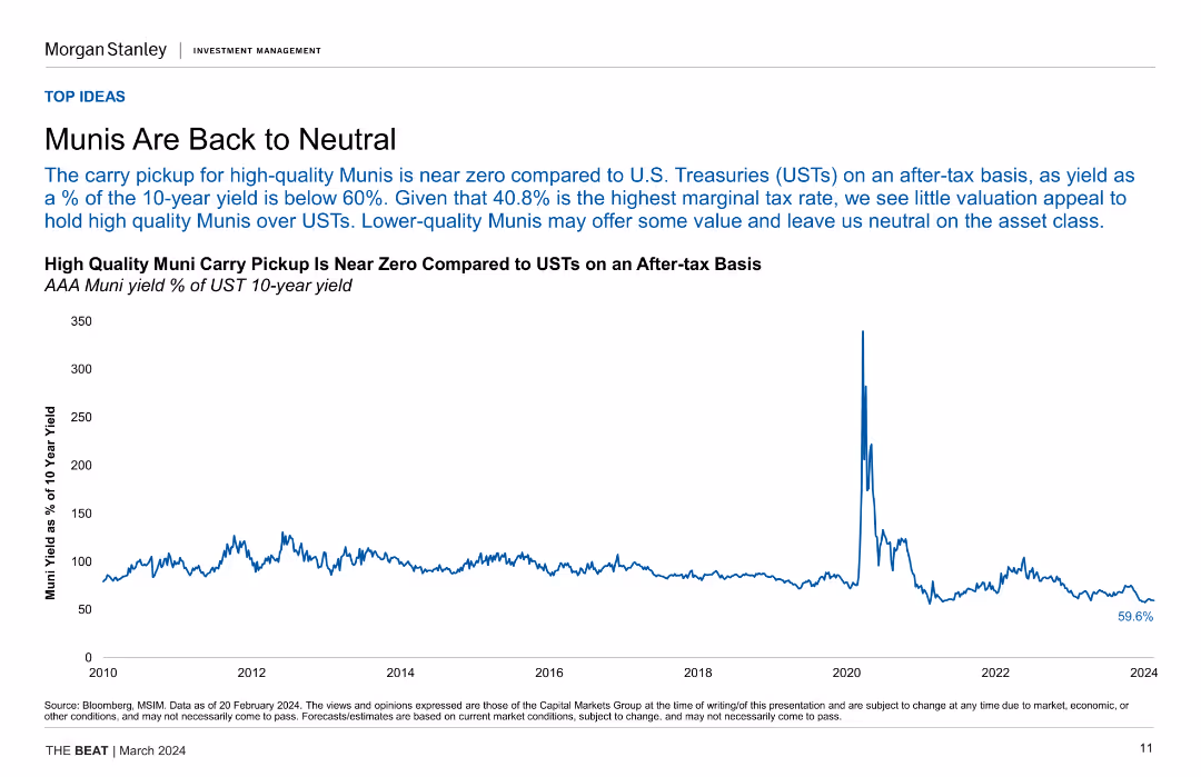
Line chart depicting the yield of AAA Muni bonds as a percentage of UST 10-year yields, indicating the near-zero carry pickup for high-quality Munis.
Investment Analysis
Financial Services
This slide analyzes the yield comparison between high-quality Munis and USTs, suggesting limited valuation appeal for Munis on an after-tax basis and a neutral stance.
Munis, UST, Yields, Investment, Valuation, After-tax, Financial Analysis
false
Investment Analysis
Financial Services
Single Chart
Morgan Stanley
Add to my slides
Remove from favorites
Column chart showing the annual total music revenue in Scandinavia, split by physical, live, and digital music from 2014 to 2023.
Market Analysis and Trends
Media & Entertainment
The slide highlights trends in the music industry in Scandinavia, emphasizing the steady growth in live and digital music revenues.
music industry, revenue growth, digital music, Scandinavia
false
Market Analysis and Trends
Media & Entertainment
Single Chart
PwC/Strategy&
Add to my slides
Remove from favorites
Slide includes column charts and segmented bar charts with revenue data across years.
Market Analysis and Trends
Media & Entertainment
Presents the forecasted growth of music, radio, and podcasts revenue in India, mentioning shifts in media consumption patterns.
music, radio, podcasts, India, revenue
false
Market Analysis and Trends
Media & Entertainment
Multiple Chart
PwC/Strategy&
Add to my slides
Remove from favorites
Shows a column chart breaking down music subscription rates by age group, indicating higher rates among younger demographics.
Market Analysis and Trends
Media & Entertainment
Investigates the high prevalence of paid music subscriptions among younger age groups compared to older demographics.
music streaming, age demographics, subscription rates, market trends, consumer behavior
false
Market Analysis and Trends
Media & Entertainment
Mixed Chart
Deloitte
Add to my slides
Remove from favorites
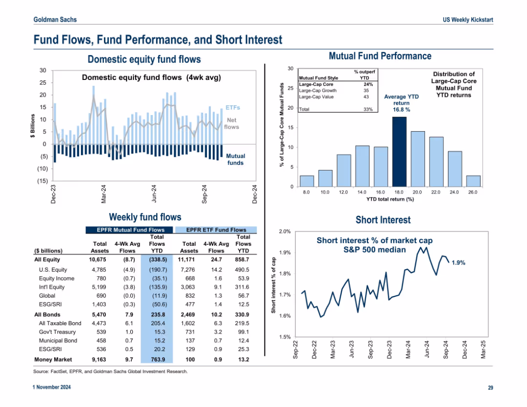
Divided into 3 sections: equity fund flows (bar chart), mutual fund performance (histogram), and short interest (line chart). Uses blue tones for fund type differentiation.
Investment Analysis
Financial Services
This slide tracks domestic fund flows into equities and bonds, mutual fund return distributions, and the level of short interest in the market. It provides insight into investor sentiment and positioning.
mutual funds, ETFs, fund flows, short interest, returns, equity inflow, sentiment
false
Investment Analysis
Financial Services
Multiple Chart
Goldman Sachs
Add to my slides
Remove from favorites
The slide contains a large percentage graphic and horizontal bar charts showing the fee payment status for selling mutual funds during the pandemic. Clean white background.
Market Analysis and Trends
Financial Services
This slide discusses the payment of fees by Canadian investors for selling mutual funds during the pandemic, indicating that most did not pay a fee, while some had to pay or had fees waived.
mutual funds, fee payment, pandemic, Canadian investors, investment fees
false
Market Analysis and Trends
Financial Services
Mixed Chart
IPSOS
Add to my slides
Remove from favorites
Features percentage breakdowns, focusing on mutual fund performance over time in blue tones.
Financial Performance
Financial Services
Used to display a financial institution's mutual fund performance, comparing various investment types over different time periods.
Mutual Funds, Performance, Investment, Equity, Fixed Income, Quantitative, Morningstar Funds
false
Financial Performance
Financial Services
Table
Goldman Sachs
Add to my slides
Remove from favorites
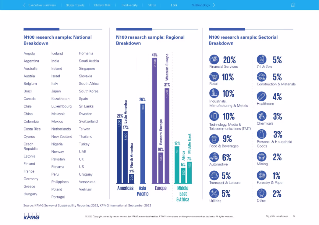
Triple-column layout with country list, regional chart, and industry breakdown using bars and icons.
Industry Overview
Professional Services
This slide shows the composition of the N100 research sample by country, region, and sector. It emphasizes where most data was collected and which industries were most represented (e.g., Financial Services 20%).
N100 sample, country list, regional breakdown, sector data, industry representation, financial services, research demographics
false
Industry Overview
Professional Services
Mixed Chart
KPMG
Add to my slides
Remove from favorites
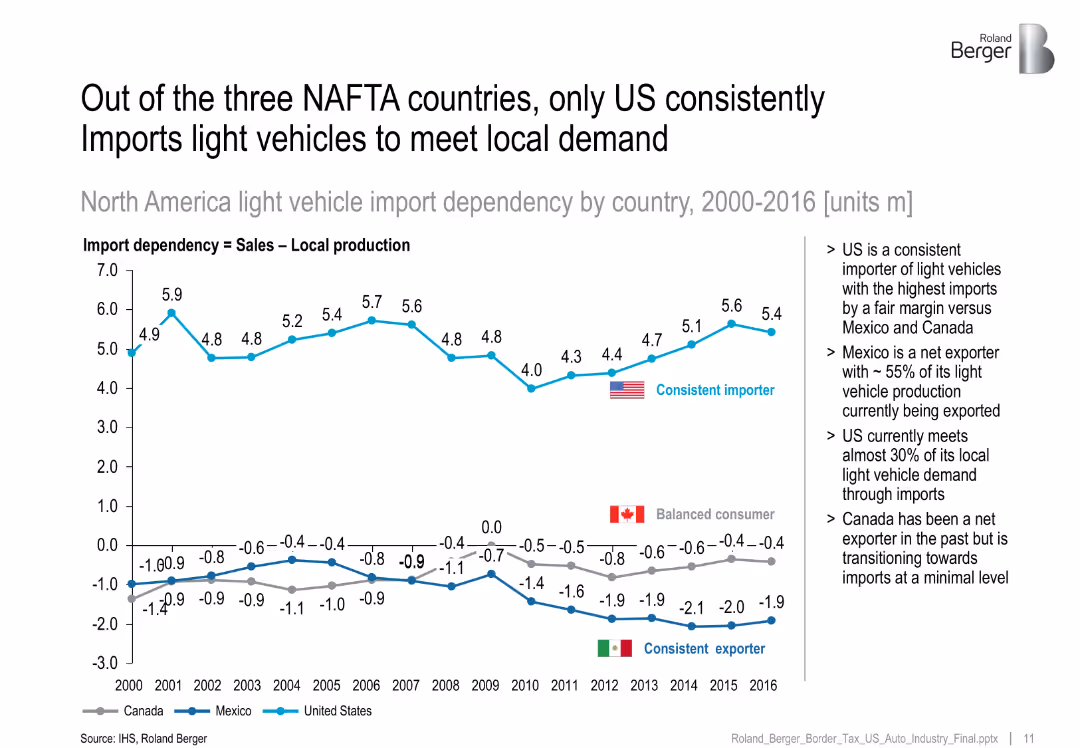
Line chart showing import dependency by country (2000–2016), with annotations.
Market Analysis and Trends
Industrial & Manufacturing
Demonstrates that the US consistently imports light vehicles, while Mexico exports ~55% of its production and Canada moves from exporter to balanced consumption.
NAFTA, import dependency, US imports, Mexico exports, trade balance
false
Market Analysis and Trends
Industrial & Manufacturing
Mixed Chart
Roland Berger
Add to my slides
Remove from favorites
Three line charts depict trends in NA Class 8 Truck, Brazilian truck and bus, and global light vehicle production from 2005 to 2019. Charts are on a green gradient background.
Industry Overview
Transportation & Logistics
Focuses on the production trends in heavy and light vehicles across North America and Brazil, showing growth in some areas while others decline, impacting industry analysis.
NAFTA, vehicles, production, trends, Brazil
false
Industry Overview
Transportation & Logistics
Multiple Chart
Deutsche Bank
Add to my slides
Remove from favorites
Features a bar chart displaying budget and expenditure metrics.
Financial Performance
Government & Public Sector
Provides an overview of Namibia's budget, focusing on operational expenditure, revenue vs. expenditure, and tax vs. non-tax revenue, highlighting fiscal metrics.
Namibia, budget, finance, government, expenditure
false
Financial Performance
Government & Public Sector
Single Chart
PwC/Strategy&
Add to my slides
Remove from favorites
Slide shows a map of Namibia with key economic statistics presented in a segmented arrow design, highlighting data like unemployment rate, GDP growth, and inflation.
Industry Overview
Government & Public Sector
Provides a concise overview of Namibia’s current economic status, detailing key statistics like unemployment, GDP growth, and inflation rates.
Namibia, economic statistics, unemployment, GDP growth, inflation, economic overview
false
Industry Overview
Government & Public Sector
Graphic
PwC/Strategy&
Add to my slides
Remove from favorites
Timeline showing the projected development of nanotechnologies from passive nanostructures in the 2000s to molecular nanosystems by 2050.
Technology and Digital Transformation
Technology & Software
The slide presents the evolution of nanotechnology, from early applications of passive nanostructures to advanced molecular nanosystems by 2050. It highlights the transformative potential of nanotechnology across various industries and applications, emphasizing its role in future innovations.
Nanotechnology, Material Science, Evolution
false
Technology and Digital Transformation
Technology & Software
Linear Flow
Roland Berger
Add to my slides
Remove from favorites
Features a quote from Namibia's Minister of Finance, an image of a person at a desk, and three highlighted goals represented by vertical bars of varying colors (yellow, grey, red), each with a brief label. The design is clean, utilizing ample whitespace and balanced text placement.
Strategic Planning
Government & Public Sector
Outlines the strategic goals of Namibia's national budget for 2024/25, focusing on stimulating domestic demand, investing in infrastructure, and fiscal prudence. Aims to communicate governmental fiscal priorities and public sector planning.
National Budget, Fiscal Planning, Namibia, Public Sector, Economic Strategy
false
Strategic Planning
Government & Public Sector
Pillar
PwC/Strategy&
Add to my slides
Remove from favorites
Contains a mixed chart with columns and a line graph illustrating Namibia's national debt from 2017/18 to 2024/25. Columns represent domestic and foreign debt in two shades of red, while the line graph shows total debt as a percentage of GDP. Includes minimal textual annotations.
Financial Performance
Government & Public Sector
Provides an overview of Namibia's national debt trends, highlighting increases in domestic and foreign debt over time. Useful for understanding fiscal health and governmental financial strategies.
National Debt, Fiscal Health, Namibia, Government Finance, Debt Trends
false
Financial Performance
Government & Public Sector
Single Chart
PwC/Strategy&
Add to my slides
Remove from favorites
Line graph comparing regional trends of perceived national decline (LATAM, North America, etc.); similar format to 19035.
Market Analysis and Trends
Government & Public Sector
Regional perspective of perceived national decline from 2016–2023, with Europe showing recent increases while APAC remains lowest.
national decline, region-level, public sentiment, Ipsos, decline perception
false
Market Analysis and Trends
Government & Public Sector
Mixed Chart
IPSOS
Add to my slides
Remove from favorites
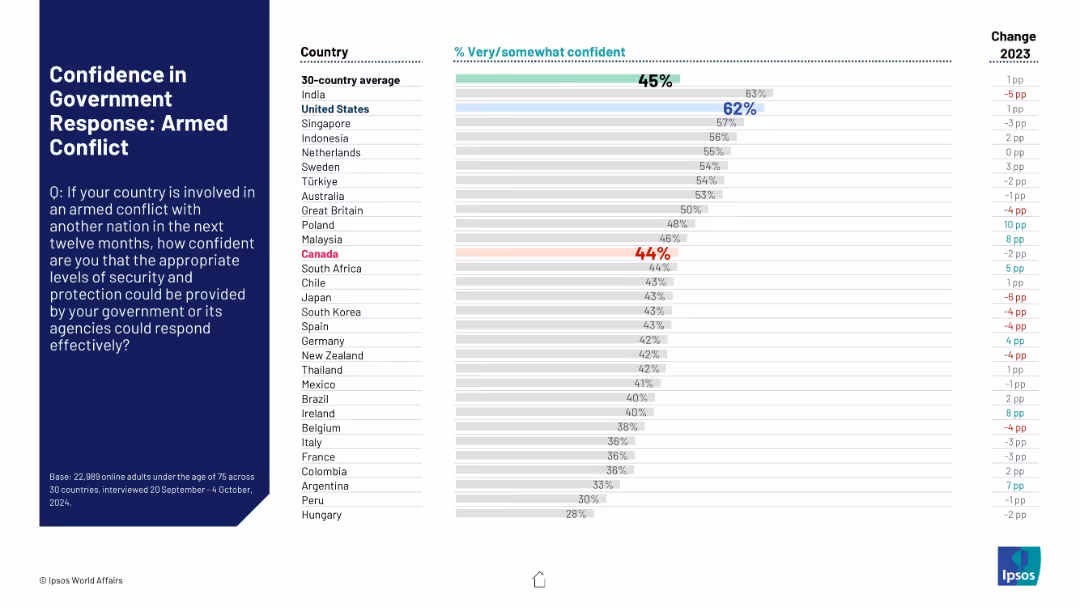
Bar graph format maintained. Emphasis on armed conflict between nations. Blue and red colors highlight US and Canada respectively. Includes percentage shift from previous year.
Risk Assessment and Management
Government & Public Sector
Survey responses illustrate citizens' confidence in their government’s readiness to handle an armed conflict with another nation. Confidence levels vary widely, with Canada below the 30-country average.
national defense, military conflict, public opinion, trust, Canada, USA, Ipsos survey, international readiness
false
Risk Assessment and Management
Government & Public Sector
Mixed Chart
IPSOS
Add to my slides
Remove from favorites
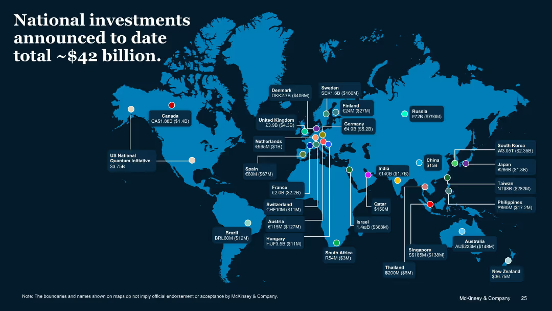
World map with labeled investment amounts per country
Financial Performance
Government & Public Sector
A geographic visualization of national QT funding initiatives. Major contributors include the US, China, Germany, and the UK. The slide conveys total announced public investments and emphasizes global distribution and policy support.
National Funding, QT, Investment Map, Global Strategy, Government Support
false
Financial Performance
Government & Public Sector
Uncategorized
McKinsey
Add to my slides
Remove from favorites
Horizontal bar chart with “Important” and “Not important” segments; ranked by importance of being born in country
Customer and Market Segmentation
Government & Public Sector
This slide shows how people in different countries perceive the importance of birthplace in defining national identity. The chart indicates high importance in Malaysia, Colombia, and Thailand, and lower importance in Western countries like Sweden and the Netherlands.
nationalism, birthplace, national identity, belonging, survey results, Ipsos, importance ranking, patriotism
false
Customer and Market Segmentation
Government & Public Sector
Mixed Chart
IPSOS
Add to my slides
Remove from favorites
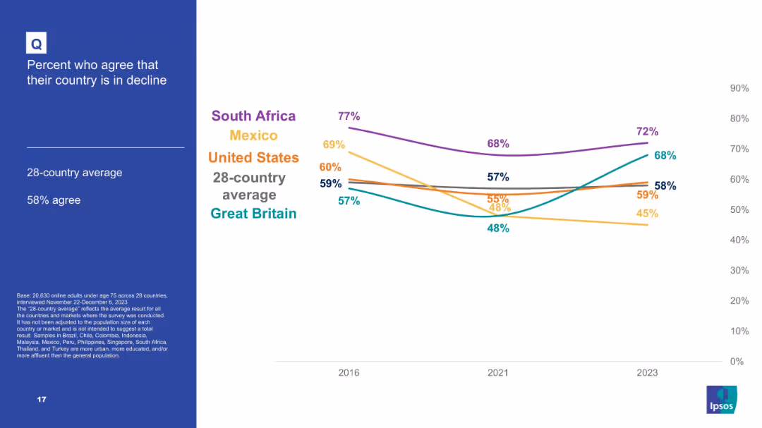
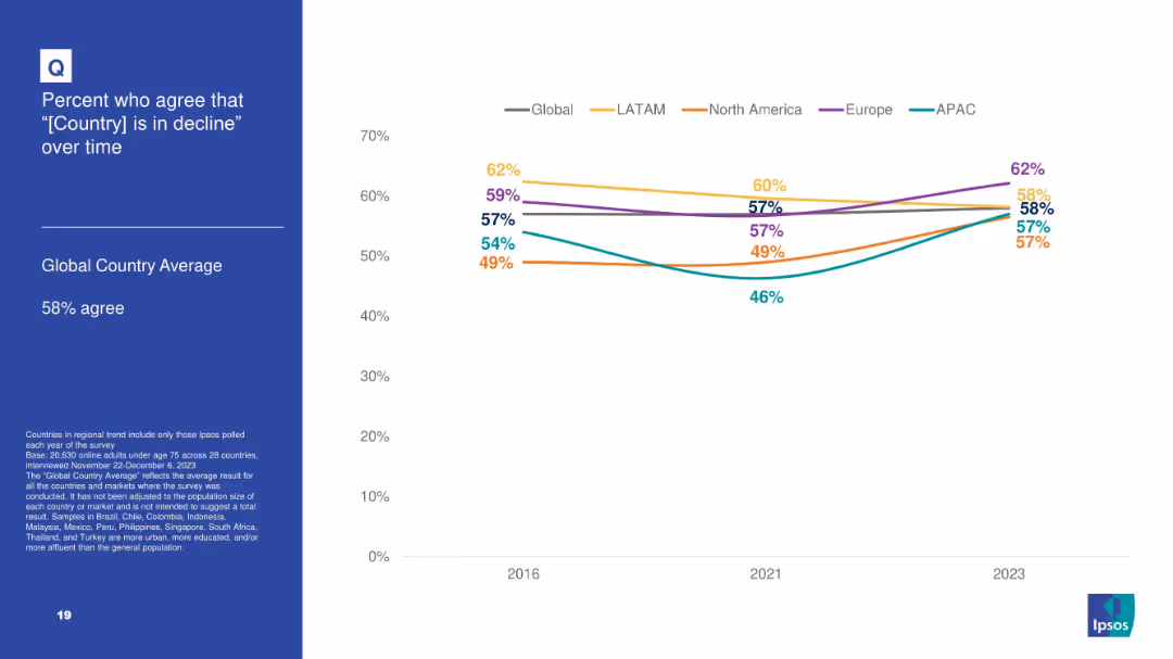
Line chart showing five-country comparison over time (2016–2023) for agreement that country is in decline.
Market Analysis and Trends
Government & Public Sector
A trend analysis chart of citizens’ views on national decline. South Africa and Mexico show a strong sentiment of decline, while Great Britain shows some improvement. The U.S. remains close to the average.
national pessimism, country decline, Ipsos timeline, trend analysis, political mood, perception over time, global snapshot
false
Market Analysis and Trends
Government & Public Sector
Mixed Chart
IPSOS
Add to my slides
Remove from favorites
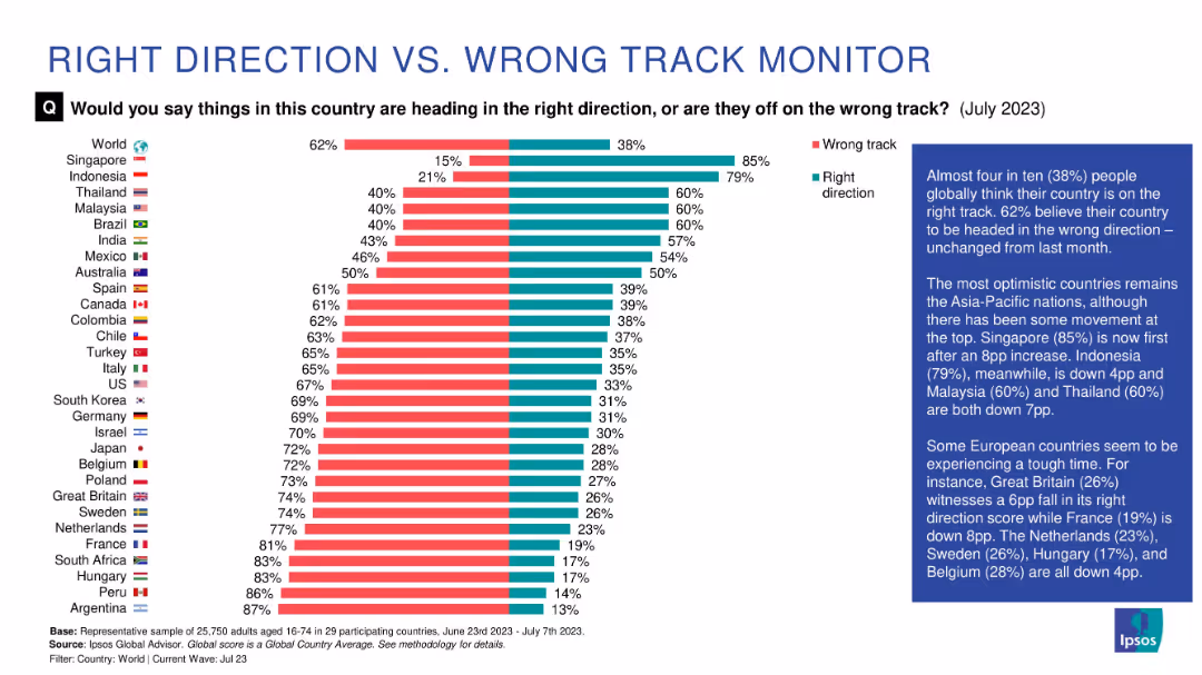
Country-ranked horizontal bar chart showing percentage who think their country is heading in the right vs. wrong direction. Color-coded (red/green) with sidebar summary.
Market Analysis and Trends
Professional Services
The slide compares global perceptions of national direction, with many countries expressing pessimism. Singapore ranks highest for optimism, while several European nations show strong belief that their country is off track.
national sentiment, direction, optimism, pessimism, Ipsos, global rankings, public opinion, wrong track
false
Market Analysis and Trends
Professional Services
Mixed Chart
IPSOS
Add to my slides
Remove from favorites
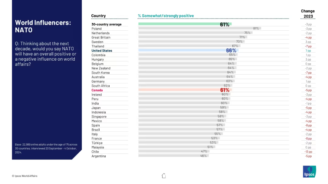
Same layout as previous: title and question on left, bar graph showing country-specific positive ratings on right.
Market Analysis and Trends
Government & Public Sector
This slide evaluates how countries perceive NATO’s future role in global affairs. It presents the percentage of people who see NATO as a positive influence, highlighting variation across nations and change from 2023.
NATO, global influence, public perception, international relations, bar chart, Ipsos, survey, 2024, alliance, opinion trends
false
Market Analysis and Trends
Government & Public Sector
Mixed Chart
IPSOS
Add to my slides
Remove from favorites
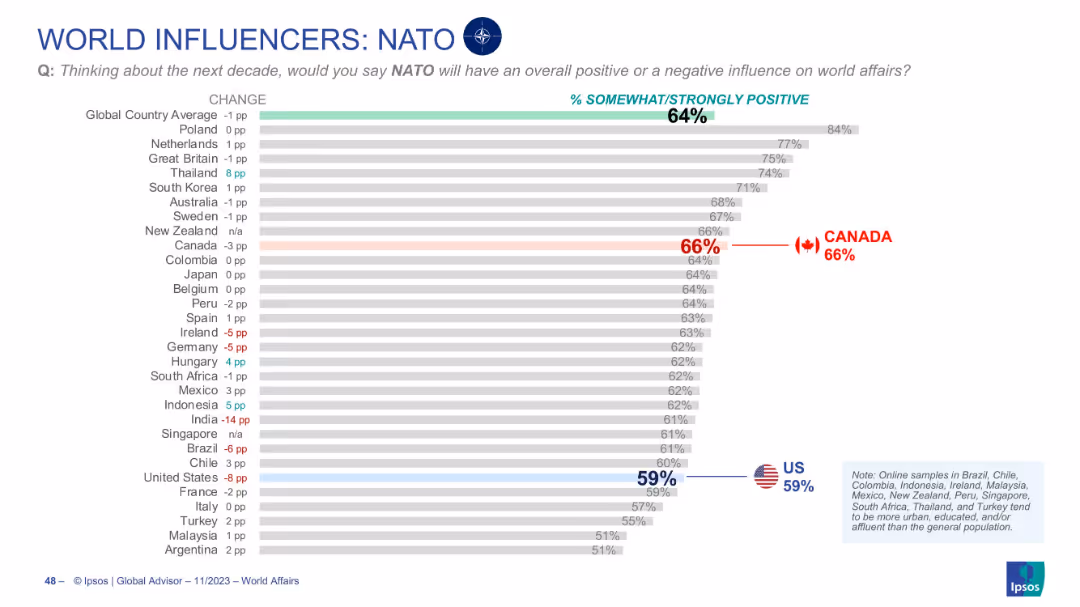
Horizontal bar chart ranking countries' perception of NATO’s future global influence
Market Analysis and Trends
Government & Public Sector
Examines global sentiment toward NATO’s influence in the coming decade. Canada views NATO positively (66%), above the global average (64%), while the U.S. falls below at 59%. Chart includes deltas from prior year.
NATO, global opinion, Canada, military alliance, perception, Ipsos, geopolitical, world affairs, public sentiment, chart
false
Market Analysis and Trends
Government & Public Sector
Single Chart
IPSOS
Add to my slides
Remove from favorites
Horizontal bar chart ranking countries by agreement on whether the U.S. and NATO make the world more secure.
Risk Assessment and Management
Government & Public Sector
This slide ranks countries by agreement that the U.S. and NATO increase global security. The U.S., India, and Poland show higher support, while Türkiye and Japan rank low. Canada and Germany are near the 30-country average.
NATO, security, alliances, global stability, defense
false
Risk Assessment and Management
Government & Public Sector
Mixed Chart
IPSOS
Add to my slides
Remove from favorites
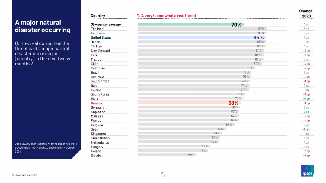
Horizontal bar chart showing likelihood of major disaster by country; global average at top, Canada highlighted.
Risk Assessment and Management
Environmental Services & Sustainability
This slide reflects how real people think the threat of a major natural disaster is in their country. The global average is 70%, with high concern in the U.S., Thailand, and Indonesia (85%). Canada, at 68%, shows a 10-point rise over last year.
natural disaster, climate risk, environmental concern, public safety, Ipsos, disaster prediction, regional threat, global average, year-over-year
false
Risk Assessment and Management
Environmental Services & Sustainability
Mixed Chart
IPSOS
Add to my slides
Remove from favorites
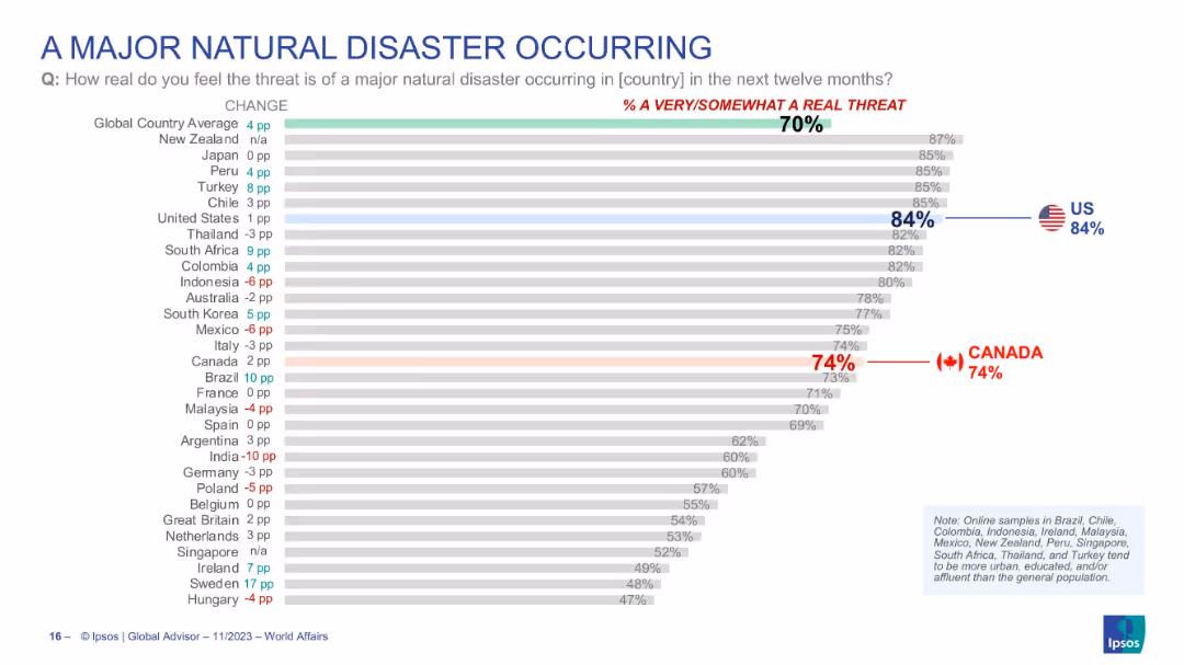
Horizontal bar chart with country-level data on perceived threat of a major natural disaster occurring. Highlights the U.S. and Canada values.
Risk Assessment and Management
Environmental Services & Sustainability
Survey-based assessment of global views on the risk of a major natural disaster. U.S. leads with 84% perceiving a real threat. Canada also shows high concern (74%). Slide presents the global average and individual country results, indicating increasing awareness or anxiety over climate-driven disasters.
natural disaster, climate risk, perception, Canada, USA, threat awareness, environmental concern, Ipsos
false
Risk Assessment and Management
Environmental Services & Sustainability
Single Chart
IPSOS
Add to my slides
Remove from favorites
Slide presents a column chart of the economic impact of Copernicus data, alongside lists and bullet points illustrating the products related to natural disaster management.
Market Analysis and Trends
Environmental Services & Sustainability
Focuses on how Copernicus data aids in natural disaster management, emphasizing the economic benefits and the importance of satellite images in emergency responses.
natural disasters, Copernicus, economic benefits, satellite images, emergency response, data utilization
false
Market Analysis and Trends
Environmental Services & Sustainability
Mixed Chart
PwC/Strategy&
Add to my slides
Remove from favorites
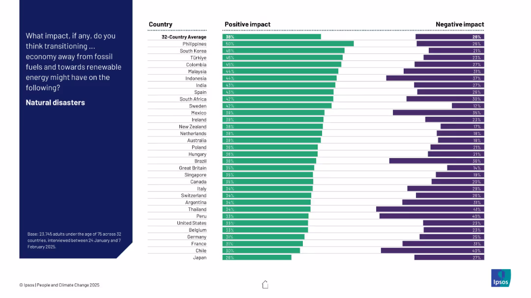
Ranked bar chart displaying countries’ perceptions of renewable energy’s effect on natural disaster occurrence, showing both positive and negative responses.
Technology and Digital Transformation
Environmental Services & Sustainability
This chart shows whether citizens believe switching to renewable energy will reduce natural disasters. Perceptions are mixed but lean slightly positive. The Philippines shows highest optimism, while Japan has the lowest confidence.
natural disasters, energy transition, perception, climate risk, Ipsos, country comparison, survey, renewables
false
Technology and Digital Transformation
Environmental Services & Sustainability
Mixed Chart
IPSOS
Add to my slides
Remove from favorites
Consists of various graphical representations showing the frequency of natural disasters and the number of people affected, along with commentary on economic losses.
Risk Assessment and Management
Environmental Services & Sustainability
Provides a comprehensive view of global natural disaster trends and impacts, underlining the need for effective risk assessment and management using updated data sources.
natural disasters, global impact, risk management, data sources, disaster trends, economic losses
false
Risk Assessment and Management
Environmental Services & Sustainability
Multiple Chart
PwC/Strategy&
Add to my slides
Remove from favorites
Horizontal bar chart; countries on the Y-axis; Likely/Unlikely in teal/dark blue; change vs. 2022 shown on the right.
Risk Assessment and Management
Government & Public Sector
This slide presents public opinion on the likelihood of a major natural disaster hitting a city in their country. Indonesia and Peru top the list with over 70% agreement. It includes change vs. 2022 perception, giving temporal insight into risk awareness trends.
natural disasters, public perception, urban risk, climate change, Ipsos, preparedness, 2024 forecast, country comparison, trends, resilience
false
Risk Assessment and Management
Government & Public Sector
Mixed Chart
IPSOS
Add to my slides
Remove from favorites
The slide uses a line chart to show the relationship between CAC vs. CO₂ emissions from electricity generation in 2030 across various countries. Detailed and focused.
Regulatory and Compliance
Energy & Utilities
Discusses the challenges for top natural gas consumers in reducing carbon emissions when coupling electrolyzers with the grid, using future projections and compliance.
natural gas, carbon emissions, electrolyzer, grid coupling, CAC, CO₂ emissions, 2030, regulatory challenges
false
Regulatory and Compliance
Energy & Utilities
Mixed Chart
Kearney
Add to my slides
Remove from favorites
A bubble chart showing the timeline and capacity of natural gas processing combined with CCUS projects.
Market Analysis and Trends
Energy & Utilities
Highlights the historical and future significance of natural gas processing in CCS applications.
Natural gas, CCS, timeline, capacity, projects
false
Market Analysis and Trends
Energy & Utilities
Single Chart
Kearney
Add to my slides
Remove from favorites
The slide features a bar chart showing global natural gas demand (bcm) from 2022 to 2050, with segments for Petrochemicals, Power with CCUS, Residential, Power, Industrial, and Commercial. The chart indicates a decline in demand, particularly in residential and conventional power segments.
Strategic Planning
Energy & Utilities
This slide projects the stabilization and eventual decline in global natural gas demand by 2050, emphasizing the significant drop in residential and conventional power applications. It also highlights the role of CCUS in the transition to greener energy solutions.
Natural Gas, Demand, Decline, 2050, Residential, Power, CCUS
false
Strategic Planning
Energy & Utilities
Mixed Chart
EY
Add to my slides
Remove from favorites
Contains a single, bold line graph with different scenario projections, showing natural gas demand trends over time.
Strategic Planning
Energy & Utilities
Projects growth in natural gas demand across various scenarios, with implications for strategic energy planning, particularly concerning decarbonization efforts.
Natural Gas, Demand Growth, Scenario Analysis, Strategic Energy Planning, Decarbonization
false
Strategic Planning
Energy & Utilities
Single Chart
McKinsey
Add to my slides
Remove from favorites
The slide has two line charts showing EU natural gas reserves as a percentage of storage capacity and gas prices, with annotations explaining key events and a commentary section.
Market Analysis and Trends
Energy & Utilities
The slide analyzes EU natural gas reserves and price trends, highlighting the impact of high storage levels and slowing economic demand on prices.
natural gas, EU, reserves, prices, trends
false
Market Analysis and Trends
Energy & Utilities
Multiple Chart
Accenture
Add to my slides
Remove from favorites
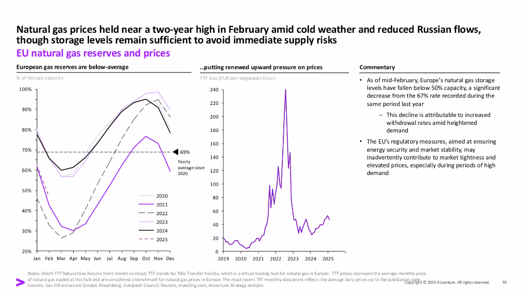
Dual chart layout: reserves by year (left), gas prices (right), plus commentary box on the side.
Risk Assessment and Management
Energy & Utilities
The slide provides an overview of declining EU gas reserves as of early 2025 and how this correlates with higher prices, especially amid colder weather and reduced Russian flows. Regulatory impact is also addressed.
Natural gas, EU, storage, TTF prices, energy security, regulation, Russia, demand
false
Risk Assessment and Management
Energy & Utilities
Multiple Chart
Accenture
Add to my slides
Remove from favorites
The slide includes a column chart with data on natural gas imports from Russia from 2010 to 2022. It uses green shades to differentiate data points and includes a percentage change indicator. The chart is detailed, showing various entry points and their contributions over time. The layout is moderately complex, providing clear comparative data.
Market Analysis and Trends
Energy & Utilities
The slide details the reduction in natural gas imports from Russia and the plans to replace these imports in the second half of 2023. It presents data on various entry points for natural gas and their respective percentages, highlighting significant changes and trends in the import patterns over the years.
natural gas, import, Russia, entry points, trends
false
Market Analysis and Trends
Energy & Utilities
Multiple Chart
EY
Add to my slides
Remove from favorites
Contains a text description of natural H2 production sources, a map highlighting Mali, and key features of the Bourakebougou field.
Market Analysis and Trends
Energy & Utilities
Discusses various natural sources of hydrogen production discovered in different geological settings, with a focus on the Bourakebougou field in Mali.
Natural hydrogen, production sources, geology, Mali, Bourakebougou field
false
Market Analysis and Trends
Energy & Utilities
Graphic
Kearney
Add to my slides
Remove from favorites
The slide has two line charts plotted on the same axes, showing the price trend of natural rubber (TSR20 and RSS3) over several years. Below the chart, a legend differentiates the two types of rubber with color coding.
Market Analysis and Trends
Industrial & Manufacturing
The slide compares historical price data of TSR20 and RSS3 natural rubber from 2016 to 2023, represented by two fluctuating line charts. This could serve as a market analysis tool to forecast pricing trends or to evaluate material costs in production planning for industries reliant on rubber, such as automotive manufacturing.
natural rubber, price trend, line chart, market analysis
false
Market Analysis and Trends
Industrial & Manufacturing
Single Chart
Morgan Stanley
Add to my slides
Remove from favorites
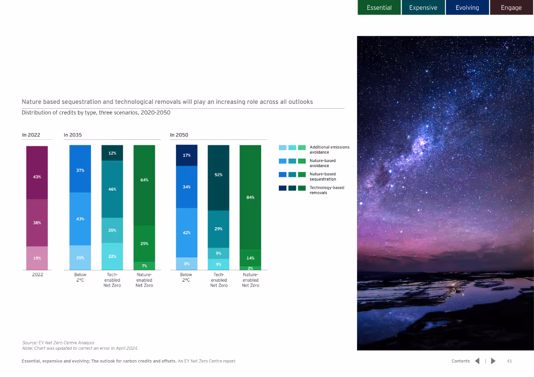
Dark background with column charts showing the distribution of credits by type over different years. Detailed and colorful visualization.
Market Analysis and Trends
Environmental Services & Sustainability
Examines the role of nature-based and technological removals in different scenarios and their increasing importance.
nature-based sequestration, technological removals
false
Market Analysis and Trends
Environmental Services & Sustainability
Multiple Chart
EY
Add to my slides
Remove from favorites
Column chart comparing ability to connect with nature, sleep quality, sense of purpose, and space adequacy in May 2020 and Dec 2020.
Market Analysis and Trends
Healthcare & Pharmaceuticals
Compares people's ability to connect with nature and their challenges with sleep and living space during the COVID-19 pandemic.
nature, sleep quality, sense of purpose, living space, COVID-19
false
Market Analysis and Trends
Healthcare & Pharmaceuticals
Single Chart
IPSOS
Add to my slides
Remove from favorites
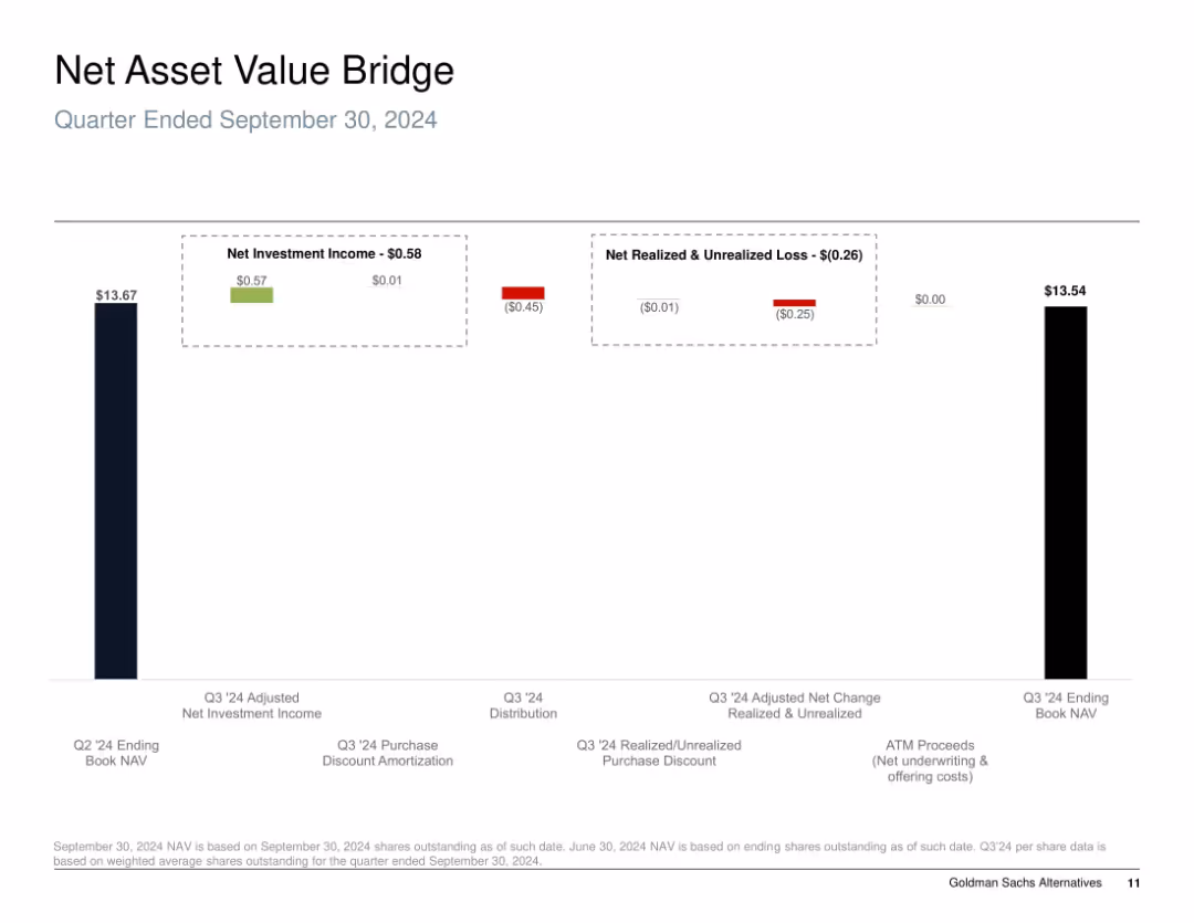
Bar chart "bridge" style; shows progression of NAV from start to end of quarter using segmented columns with color-coded gains and losses.
Financial Performance
Financial Services
The slide illustrates the change in Net Asset Value (NAV) for Q3 2024, detailing sources of gains and losses. It breaks down net investment income, realized/unrealized losses, and distributions, highlighting how the NAV declined slightly from $13.67 to $13.54 during the quarter due to negative market valuation adjustments.
NAV, investment income, unrealized loss, realized loss, distribution, equity performance, Q3 2024
false
Financial Performance
Financial Services
Single Chart
Goldman Sachs
Add to my slides
Remove from favorites
Column chart showing the changes in net asset value (NAV) over a specific quarter, with detailed components.
Financial Performance
Financial Services
Details the changes in NAV, including investment income, realized and unrealized gains/losses, and other factors affecting NAV.
NAV, net asset value, investment income, gains
false
Financial Performance
Financial Services
Single Chart
Goldman Sachs
Add to my slides
Remove from favorites
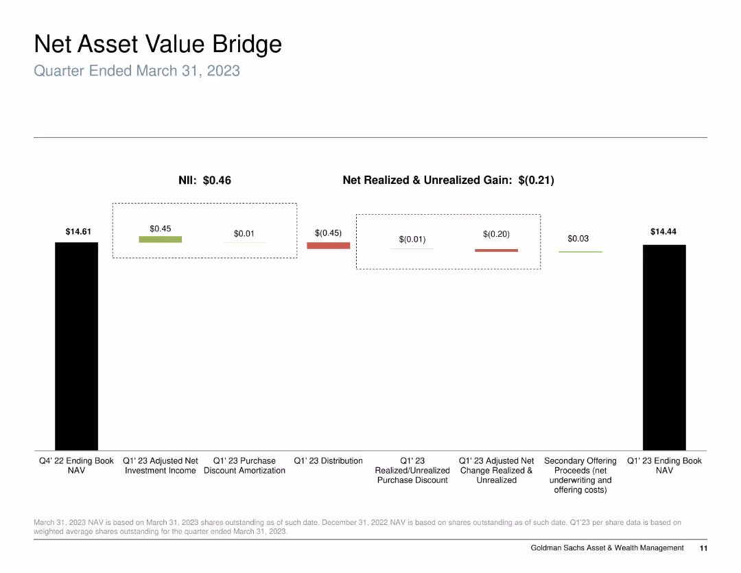
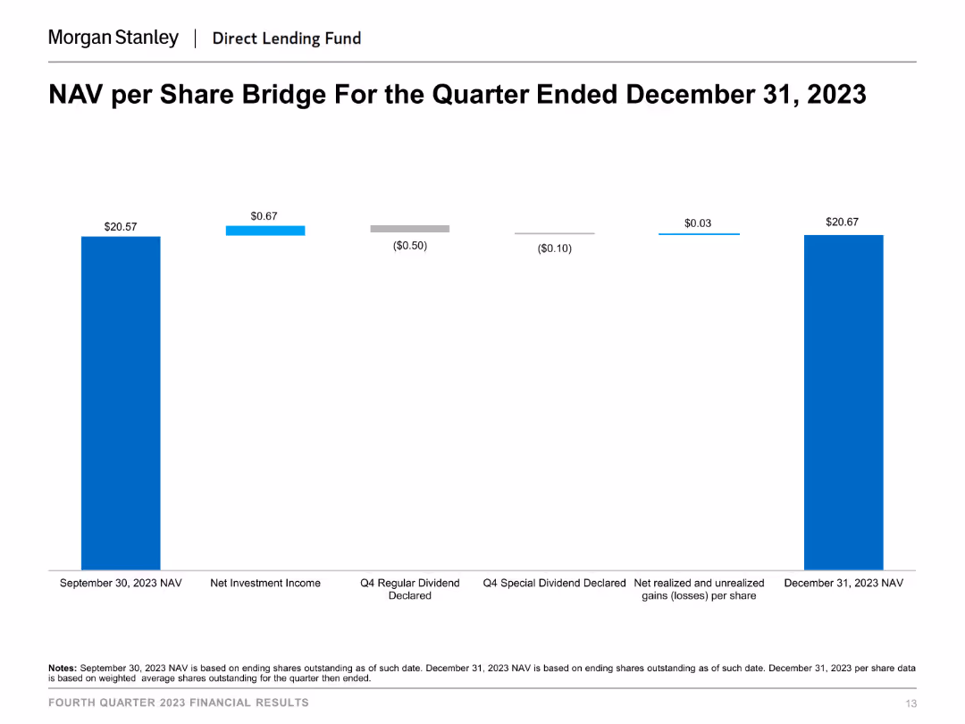
This slide shows a column chart illustrating the NAV per share bridge for the quarter ended December 31, 2023. The chart uses different colors to indicate various components affecting NAV, such as net investment income and dividends declared.
Financial Performance
Financial Services
The slide presents the changes in NAV per share over a quarter, breaking down the impact of different financial activities like net investment income and dividends declared, useful for understanding NAV fluctuations and financial performance.
NAV per share, financial performance, investment income, dividends, financial analysis, quarter-end NAV
false
Financial Performance
Financial Services
Single Chart
Morgan Stanley
Add to my slides
Remove from favorites
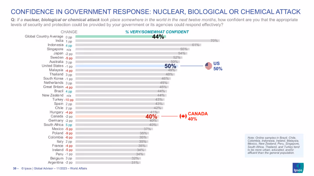
Horizontal bar chart with similar design as previous slide, red and blue highlights for Canada and US respectively
Risk Assessment and Management
Government & Public Sector
This chart assesses the confidence level of citizens in their governments' ability to respond to a nuclear, biological, or chemical attack. Global average is 44%, with Canada at 40% and the U.S. at 50%.
NBC attack, government trust, defense readiness, Canada, US, Ipsos, public opinion, comparative confidence
false
Risk Assessment and Management
Government & Public Sector
Single Chart
IPSOS
Add to my slides
Remove from favorites
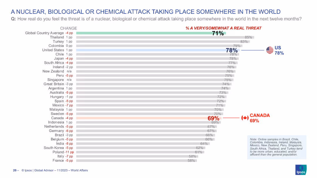
Bar chart ranking countries by concern over such attacks occurring globally; threat perception shown on the right; Canada and US again highlighted.
Risk Assessment and Management
Government & Public Sector
This slide illustrates the public’s view on the likelihood of a nuclear, biological, or chemical (NBC) attack somewhere in the world over the next year. The global average perceived threat is 71%, with 78% of Americans and 69% of Canadians regarding it as a real threat. The slide visualizes concern levels on global catastrophic risks.
NBC attack, public concern, global threats, terrorism, weapons, survey, perception, USA, Canada, Ipsos
false
Risk Assessment and Management
Government & Public Sector
Single Chart
IPSOS
Add to my slides
Remove from favorites
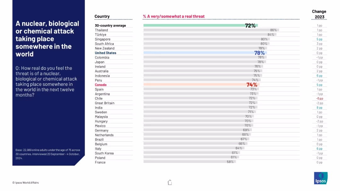
Horizontal bar chart ranking countries on perceived threat likelihood; global average at top, key changes noted on right.
Risk Assessment and Management
Government & Public Sector
This slide explores global perceptions of the risk of large-scale attacks using nuclear, biological, or chemical weapons. Türkiye, Singapore, and Thailand show the highest concern. The global average is 72%, and many countries report rising fear compared to 2023.
NBC threat, public fear, security concern, geopolitical risk, Ipsos, global threat perception, 2024 forecast, year-over-year change, global risks
false
Risk Assessment and Management
Government & Public Sector
Mixed Chart
IPSOS
Add to my slides
Remove from favorites
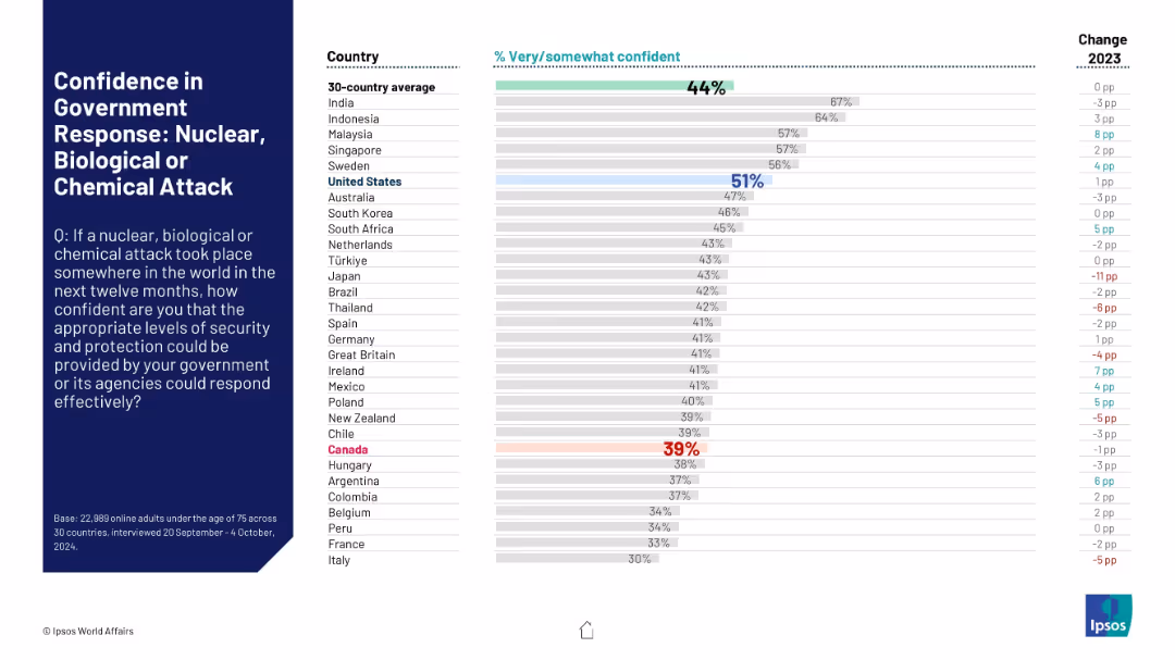
Follows consistent layout. Bars show perceived preparedness for a global NBC (nuclear, biological, chemical) attack. Canada again highlighted in red for low confidence.
Risk Assessment and Management
Government & Public Sector
Compares international public perceptions of governmental preparedness for catastrophic NBC attacks. Shows varying degrees of confidence, with many countries showing decreased confidence from the previous year.
NBC threats, chemical attack, biohazard, nuclear, public security, international perceptions, crisis response
false
Risk Assessment and Management
Government & Public Sector
Mixed Chart
IPSOS
Add to my slides
Remove from favorites
Contains a brief history timeline of nbn, a large text block describing the nbn's purpose, and a note on the report's scope.
Regulatory and Compliance
Telecommunications
Provides an overview of the nbn network, detailing its purpose, historical milestones, and the role it plays in enhancing broadband access.
nbn, Australia, broadband, history, technology, regulation, telecommunications, government
false
Regulatory and Compliance
Telecommunications
Header Vertical
Accenture
Add to my slides
Remove from favorites
Multiple column charts showing broadband connections by type over years with a legend indicating nbn and non-nbn technologies.
Operational Efficiency
Telecommunications
Analyzes the growth and distribution of nbn broadband connections in Australia since 2011, showing significant infrastructure expansion.
nbn, broadband, Australia, infrastructure, rollout, internet, connectivity, growth
false
Operational Efficiency
Telecommunications
Single Chart
Accenture
Add to my slides
Remove from favorites
A title slide with a large, bold title, a person working from home indicating connectivity, and a clean design with ample negative space for a focused message.
Industry Overview
Telecommunications
The introductory slide to a report highlighting the nbn™ network's impact on everyday connectivity and its broader value to Australian users.
nbn, Connectivity, Telecommunications, Value, Introduction
false
Industry Overview
Telecommunications
Title
Accenture
Add to my slides
Remove from favorites
Contains a color-coded map of Australia with detailed GDP uplift and job creation figures for each state and territory. Various colors represent different levels of economic benefit.
Market Analysis and Trends
Telecommunications
Analyzes the economic benefits of the nbn network across Australia, detailing GDP uplift, job creation, and business development in each state and territory from 2012 to 2022.
nbn, Economic, Australia, States, GDP
false
Market Analysis and Trends
Telecommunications
Graphic
Accenture
Add to my slides
Remove from favorites
The slide uses pie charts and diagram to show how nbn has impacted employment and income outcomes, with specific metrics and examples.
Market Analysis and Trends
Telecommunications
This slide evaluates the impact of nbn on employment and income, detailing the benefits and statistics associated with increased connectivity.
nbn, employment, income, internet impact, connectivity, statistics
false
Market Analysis and Trends
Telecommunications
Multiple Chart
Accenture
Add to my slides
Remove from favorites
The slide displays bar charts and percentage data highlighting the positive impacts on First Nations communities, using colors to differentiate between various impact levels.
Market Analysis and Trends
Telecommunications
Discusses the significant positive impact of the nbn network on the life satisfaction of First Nations users, emphasizing employment, education, and environmental benefits.
nbn, First Nations, Satisfaction, Impact, Positive
false
Market Analysis and Trends
Telecommunications
Multiple Chart
Accenture
Add to my slides
Remove from favorites
This slide uses a column chart to show the GDP uplift from 2012 to 2030 due to the NBN network, with annotations and color coding to differentiate between years and projections.
Financial Performance
Telecommunications
The slide presents the economic impact of the NBN network in Australia, highlighting the GDP contribution and projected future benefits, useful for discussing telecommunications' economic impact.
NBN, GDP, Australia, economic impact, telecommunications, projection, financial analysis
false
Financial Performance
Telecommunications
Mixed Chart
Accenture
Add to my slides
Remove from favorites
This slide uses multiple pie charts to show the percentage impact of nbn on various domains like health, education, and income.
Client Case Studies
Telecommunications
This slide illustrates the broad impact of nbn-enabled internet on users' overall wellbeing, segmented into areas like health, education, and social connectivity.
nbn, internet impact, wellbeing, health, education, social connectivity
false
Client Case Studies
Telecommunications
Multiple Chart
Accenture
Add to my slides
Remove from favorites
Includes a bar chart and detailed statistical breakdowns to illustrate job growth over periods due to broadband expansion. The slide uses color coding to differentiate between past and projected figures.
Market Analysis and Trends
Telecommunications
Highlights the employment impact of the nbn network, which has significantly increased job numbers nationwide, especially benefiting women's employment more than men's.
nbn, Jobs, Growth, Women, Projection
false
Market Analysis and Trends
Telecommunications
Multiple Chart
Accenture
Add to my slides
Remove from favorites
Features column charts, with icons and data points detailing job creation and income boost figures. Emphasizes savings through color contrasts and visual hierarchy in design.
Market Analysis and Trends
Telecommunications
Details how the nbn network has facilitated job creation, increased incomes through remote work, and provided cost savings by enabling cheaper online alternatives to traditional services.
nbn, Jobs, Savings, Remote Work, Business Creation
false
Market Analysis and Trends
Telecommunications
Multiple Chart
Accenture
Add to my slides
Remove from favorites
Slide uses bar charts and color coding to showcase the positive impact of broadband on low-income users, particularly highlighting the differences in various wellbeing categories.
Market Analysis and Trends
Telecommunications
Focuses on how low-income households have experienced significant improvements in various aspects of life due to access to the nbn network, with negligible negative feedback.
nbn, Low-Income, Wellbeing, Impact, Positive
false
Market Analysis and Trends
Telecommunications
Multiple Chart
Accenture
Add to my slides
Remove from favorites
A comparative slide with vertical bars showing data over time and a diagram explaining 'value,' supported by clear text annotations and monetary figures.
Technology and Digital Transformation
Telecommunications
Discusses the increasing value that users derive from the nbn™ network over the years, including explanations of the calculations and implications for consumer choices.
nbn, Market Value, Consumer Choice, Analysis, Economic Trends
false
Technology and Digital Transformation
Telecommunications
Multiple Chart
Accenture
Add to my slides
Remove from favorites
The slide includes a split purple and violet background with two illustrative images and text. On the left are icons representing 'Essential tasks' and 'Enriching activities'.
Technology and Digital Transformation
Technology & Software
It showcases key messages about the nbn network's role in providing essential services and enriching lives, emphasizing its value and necessity.
nbn network, essential services, enriching activities, connectivity, online tasks, value proposition, brand messaging
false
Technology and Digital Transformation
Technology & Software
Agenda
Accenture
Add to my slides
Remove from favorites
This slide contains a table and two bar graphs on a split background, depicting the number of households prioritizing essential tasks and the breakdown of time spent on specific tasks.
Market Analysis and Trends
Technology & Software
It provides data on how 5.6 million households use the nbn network primarily for essential tasks, detailing the most important tasks and average hours spent.
nbn network, household data, essential tasks, online activity, user data, average hours, task importance
false
Market Analysis and Trends
Technology & Software
Multiple Chart
Accenture
Add to my slides
Remove from favorites
Two large numeric points on the right, a simple text box on the left, and a bright purple background. The design is clean and segmented with bold text for easy reading.
Strategic Planning
Telecommunications
This slide serves as an introduction, highlighting the key values and essentialities of the nbn™ network, setting the stage for the discussion to follow.
nbn network, introduction, essential tasks, enriching activities, presentation, connectivity, digital value, network importance
false
Strategic Planning
Telecommunications
Agenda
Accenture
Add to my slides
Remove from favorites
This slide displays a pie chart and bar graphs showing time saved per year and per task, with a purple and white color theme.
Operational Efficiency
Technology & Software
It reports that the average nbn user saves 169 hours a year by performing essential tasks like telehealth and remote work over the network.
nbn network, time savings, annual hours, telehealth, remote work, efficiency, essential tasks
false
Operational Efficiency
Technology & Software
Multiple Chart
Accenture
Add to my slides
Remove from favorites
The slide presents a graph depicting the importance of various online activities categorized as Essentials, Social, and Entertainment based on user enjoyment and hours spent. It features a purple color scheme, with circles representing data points.
Market Analysis and Trends
Technology & Software
The slide illustrates how users on the nbn network prioritize essential tasks but spend more time on activities they enjoy, with large circles for music streaming and social media indicating significant user importance and time investment.
nbn, user behavior, online activities, streaming, social media, essentials, enjoyment, engagement
false
Market Analysis and Trends
Technology & Software
Single Chart
Accenture
Add to my slides
Remove from favorites
The slide features multiple pie charts and percentage statistics showcasing the positive impact of the nbn network on various aspects of wellbeing like employment, health, and social connections.
Market Analysis and Trends
Telecommunications
Explores the positive effects of the nbn network on users' wellbeing across several domains, indicating substantial benefits in employment, health, education, and community connectivity.
nbn, Wellbeing, Impact, Satisfaction, Positive
false
Market Analysis and Trends
Telecommunications
Multiple Chart
Accenture
Add to my slides
Remove from favorites
Includes bar charts and comparative data blocks across various wellbeing categories, using contrasting colors to highlight differences between regional and national impacts.
Market Analysis and Trends
Telecommunications
Compares the wellbeing impacts of the nbn network on users in regional and remote areas to the national average, showing broadly similar benefits across key life aspects.
nbn, Wellbeing, Regional, Remote, Comparison
false
Market Analysis and Trends
Telecommunications
Multiple Chart
Accenture
Add to my slides
Remove from favorites
The slide presents a column charts detailing NCDOT disaster spending from 2009 to 2019, with separate colors representing declared and non-declared disasters. It includes a trend line showing a consistent increase in expenditures.
Regulatory and Compliance
Government & Public Sector
This slide analyzes disaster-related spending trends at NCDOT, illustrating an increase in both declared and non-declared disaster spending over a decade, emphasizing the growth rate and spending compared to forecasts.
NCDOT, disaster spending, financial trends, declared disasters, non-declared disasters
false
Regulatory and Compliance
Government & Public Sector
Mixed Chart
McKinsey
Add to my slides
Remove from favorites
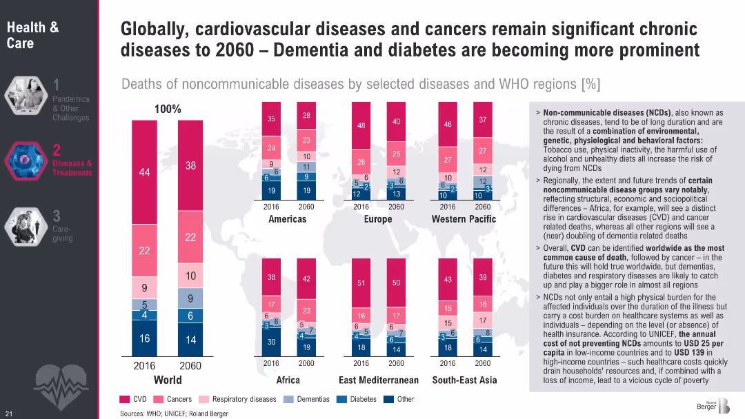
Stacked bar charts by region showing NCD death proportions by disease type (2016 vs. 2060). Sidebar explains future trends and cost burden.
Strategic Planning
Healthcare & Pharmaceuticals
The slide analyzes noncommunicable disease death shares by category and region. Cardiovascular disease remains the top cause, but dementia and diabetes are on the rise. Africa shows a notable increase in CVD and cancer. It emphasizes the long-term health system costs of NCDs and the need for prevention strategies, including insurance coverage in low-income regions.
NCDs, cardiovascular disease, cancer, dementia, diabetes, health systems, global trends
false
Strategic Planning
Healthcare & Pharmaceuticals
Multiple Chart
Roland Berger
Add to my slides
Remove from favorites
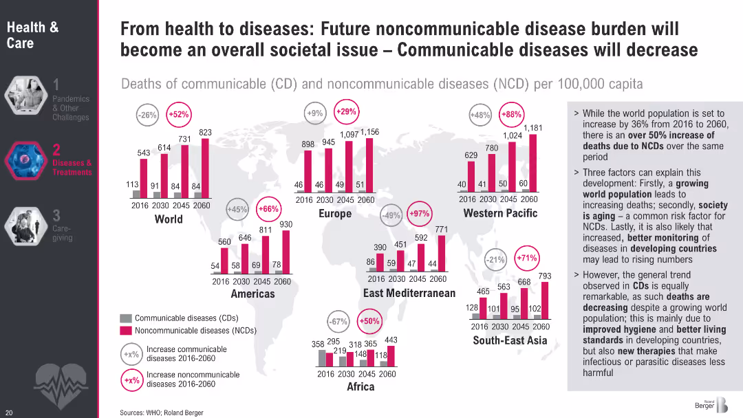
Multiple bar charts by region, comparing death rates from communicable and noncommunicable diseases (2016–2060). Includes global and regional trends.
Market Analysis and Trends
Healthcare & Pharmaceuticals
This slide forecasts a rise in noncommunicable diseases (NCDs) and a decline in communicable diseases (CDs) globally by 2060. Aging populations, urbanization, and better disease monitoring are cited as drivers. Regional comparisons highlight sharp increases in NCDs across Europe, Asia, and the Americas.
NCDs, CDs, global trends, mortality, disease transition, future burden, WHO
false
Market Analysis and Trends
Healthcare & Pharmaceuticals
Multiple Chart
Roland Berger
Add to my slides
Remove from favorites
Includes a map displaying state-wise social return on investment and family impact numbers from the NCHP.
Strategic Planning
Government & Public Sector
Evaluates the regional impact of the National Community Hubs Program, showing differences in social returns and outreach by state.
NCHP, regional impact, social return, state comparison, family outreach
false
Strategic Planning
Government & Public Sector
Graphic
Deloitte
Add to my slides
Remove from favorites
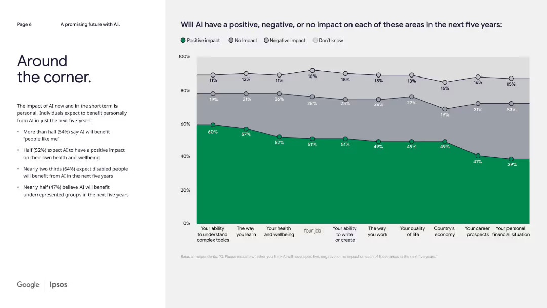
Left-aligned text bullets with a horizontal stacked line graph on the right showing perceived AI impact by category.
Strategic Planning
Artificial Intelligence
The slide predicts AI's short-term personal and societal benefits. More than half expect positive impacts on health, work, and underrepresented groups in the next five years, though optimism varies across categories.
near-future AI, personal benefit, societal impact, short-term outlook, public opinion
false
Strategic Planning
Artificial Intelligence
Mixed Chart
IPSOS
Add to my slides
Remove from favorites
Diagram with a map of Central America and icons representing various benefits of nearshoring, such as growth in value chains and productivity.
Market Analysis and Trends
Transportation & Logistics
This slide explores the benefits of nearshoring for Central America, including promoting value chains, boosting productivity through R&D, and revitalizing the economy by developing local supply chains.
Nearshoring, Central America, benefits, productivity, economy
false
Market Analysis and Trends
Transportation & Logistics
Diagram
Deloitte
Add to my slides
Remove from favorites
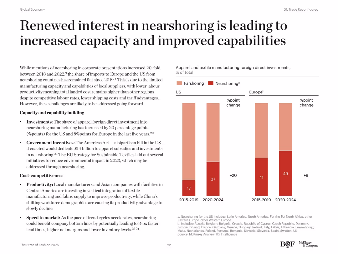
Bar charts on nearshoring vs farshoring FDI changes in the US and Europe. Bullet-point text explains investments, policies, and productivity. Modern clean layout.
Operational Efficiency
Consumer Goods
This slide highlights rising foreign direct investments in nearshoring for apparel manufacturing in the US and Europe. It attributes the growth to new policy incentives, improved productivity, and faster speed to market. The Americas Act and EU sustainability goals are noted as enablers.
nearshoring, farshoring, FDI, US, Europe, productivity, policy incentives, apparel, capacity building, local manufacturing
false
Operational Efficiency
Consumer Goods
Mixed Chart
McKinsey
Add to my slides
Remove from favorites
Contains text blocks and minimalistic design elements, focusing on interviews and statistical data.
Investment Analysis
Financial Services
Provides insights into near-term investment opportunities in Southeast Asia through sector screening and interviews with investors.
near-term opportunities, SEA, investment screening, investor interviews, sectors
false
Investment Analysis
Financial Services
Header Horizontal
Bain
Add to my slides
Remove from favorites
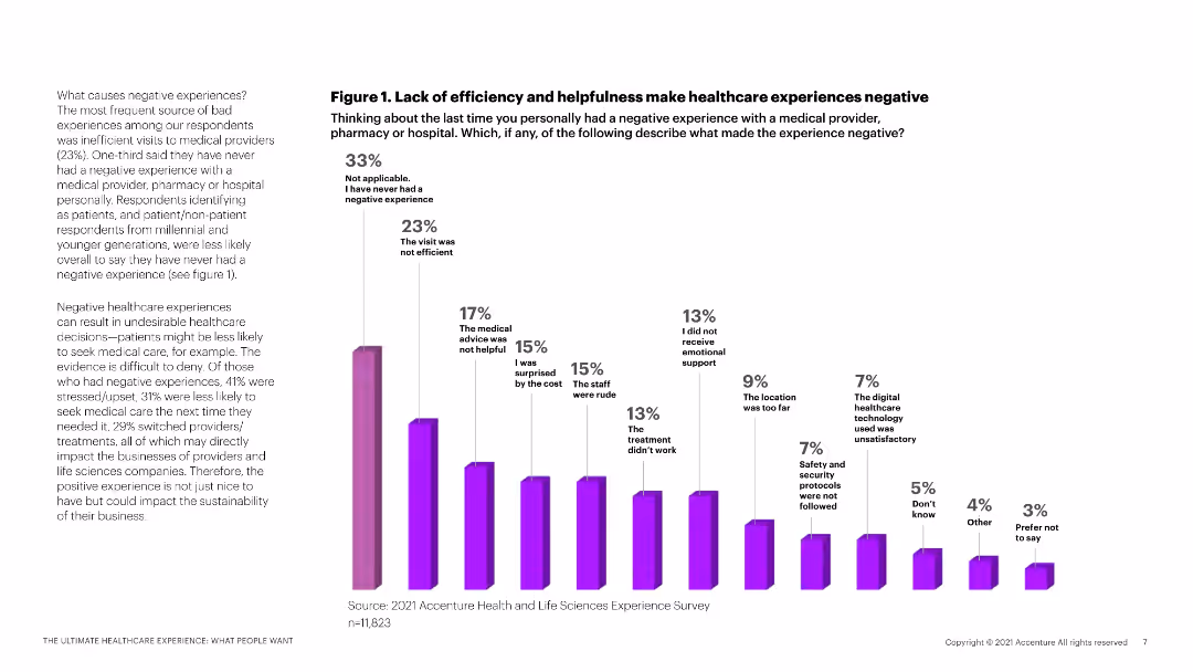
The slide features a column chart with multiple bars depicting different reasons for negative healthcare experiences, accompanied by explanatory text.
Market Analysis and Trends
Healthcare & Pharmaceuticals
This slide analyzes the primary causes of negative healthcare experiences based on survey data, highlighting inefficiencies and other factors.
negative experiences, healthcare, survey data, inefficiency, patient feedback
false
Market Analysis and Trends
Healthcare & Pharmaceuticals
Mixed Chart
Accenture
Add to my slides
Remove from favorites
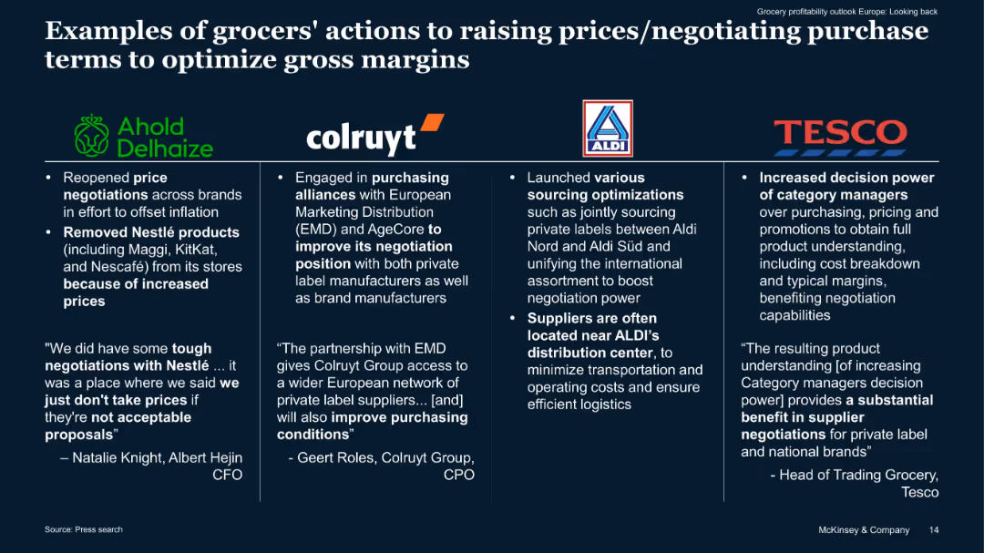
Four-column layout with logos and quotes. Each column highlights negotiation tactics by different grocers like Ahold, Aldi, Colruyt, Tesco.
Pricing Strategies
Retail & E-commerce
Describes specific actions taken by leading grocers to manage gross margins through renegotiations, sourcing alliances, and pricing strategies. Quotes and anecdotes enhance credibility, highlighting defensive pricing measures against inflationary pressure.
negotiation, gross margin, inflation, sourcing, pricing, grocery
false
Pricing Strategies
Retail & E-commerce
Pillar
McKinsey
Add to my slides
Remove from favorites
The slide has a title at the top, text in the middle, and a pie chart at the bottom showing the sense of belonging to the neighborhood.
Risk Assessment and Management
Government & Public Sector
Indicates that 77% of respondents feel they belong strongly to their neighborhood. The data is represented in a pie chart, showing varying degrees of belonging.
Neighborhood, Belonging, Survey, Community, Data
false
Risk Assessment and Management
Government & Public Sector
Mixed Chart
IPSOS
Add to my slides
Remove from favorites
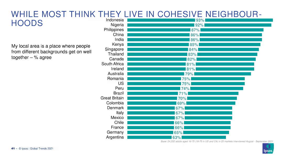
A bar chart with horizontal bars depicting the percentage of people who agree that their local area is cohesive, across various countries.
Market Analysis and Trends
Government & Public Sector
The slide shows global survey results on the perception of neighborhood cohesiveness, presenting data from multiple countries and highlighting high agreement percentages.
neighborhood, cohesiveness, global, survey, perceptions
false
Market Analysis and Trends
Government & Public Sector
Single Chart
IPSOS
Add to my slides
Remove from favorites
The slide has a title at the top, text in the middle, and a column chart at the bottom showing reliance on neighborhood help.
Risk Assessment and Management
Government & Public Sector
Highlights that 83% of respondents believe they can rely on someone in their neighborhood for help. The data compares responses from May and December 2020.
Neighborhood, Help, Survey, Community, Data
false
Risk Assessment and Management
Government & Public Sector
Single Chart
IPSOS
Add to my slides
Remove from favorites
The slide has a title at the top, text in the middle, and a column chart at the bottom showing trust levels in neighborhoods.
Risk Assessment and Management
Government & Public Sector
Presents data on neighborhood trust levels, with 81% of respondents agreeing they trust people in their neighborhood. The data compares trust levels from May and December 2020.
Neighborhood, Trust, Survey, Community, Data
false
Risk Assessment and Management
Government & Public Sector
Single Chart
IPSOS
Add to my slides
Remove from favorites
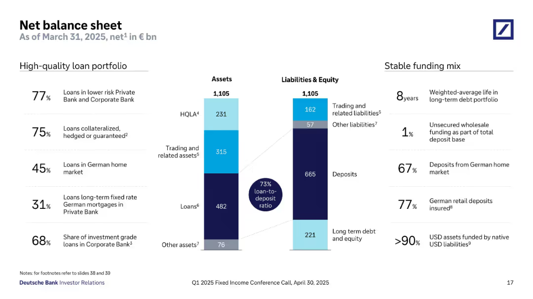
Two vertical bar charts represent total assets and liabilities (€1,105bn each), segmented into loans, HQLA, trading assets, deposits, etc. Annotations and stats highlight portfolio quality and funding mix. Side notes list loan quality and deposit stability percentages.
Financial Performance
Financial Services
This slide presents a balanced asset-liability snapshot with a 73% loan-to-deposit ratio. Key asset categories include loans and trading assets, while liabilities are dominated by deposits. High-quality metrics show a strong deposit base and minimal reliance on unsecured wholesale funding. The asset breakdown reflects conservative lending, strong deposit coverage, and high collateralization levels. The funding mix is shown to be stable and mostly domestic.
net balance sheet, loan-to-deposit ratio, HQLA, deposits, trading assets, stable funding, German market
false
Financial Performance
Financial Services
Mixed Chart
Deutsche Bank
Add to my slides
Remove from favorites
A pie chart on the left showing net buyers and sellers, with a table on the right detailing their views on unexpected expenses, financial situation changes, and other financial concerns.
Market Analysis and Trends
Financial Services
This slide explores the differences between net buyers and sellers during the pandemic, focusing on unexpected expenses, changes in financial situation, and financial concerns.
net buyers, net sellers, financial, pandemic, views
false
Market Analysis and Trends
Financial Services
Mixed Chart
IPSOS
Add to my slides
Remove from favorites
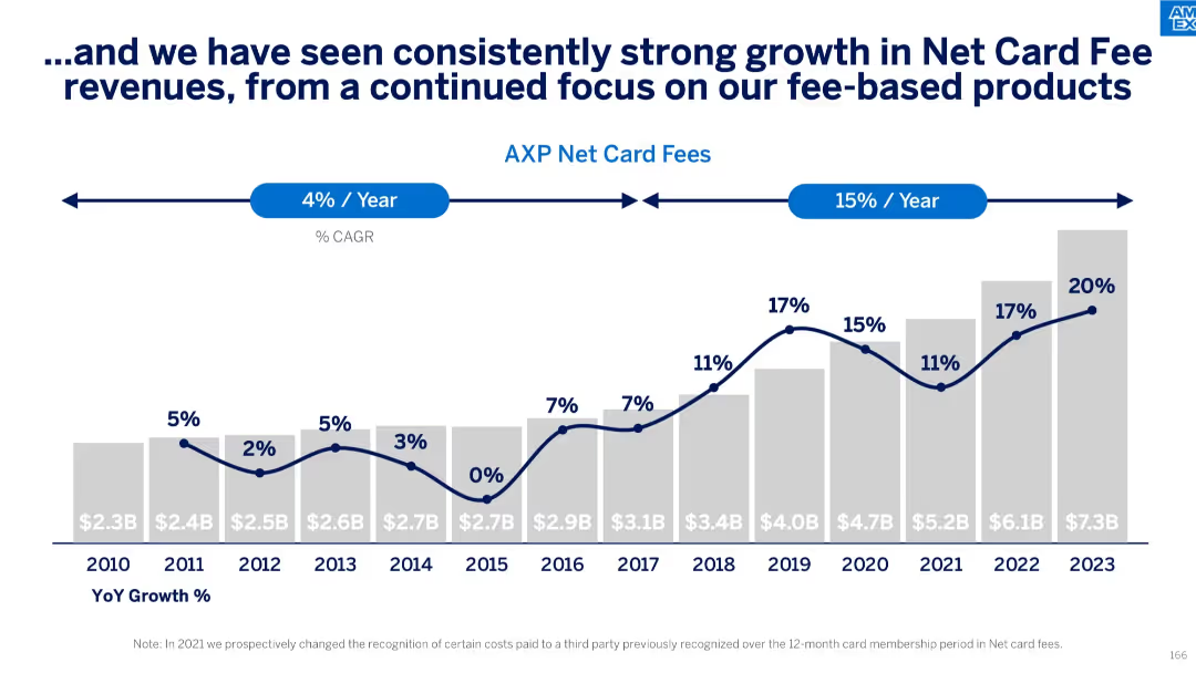
Vertical bar chart with year-over-year growth rates and Net Card Fees in $B from 2010 to 2023; CAGR annotations
Performance Metrics and KPIs
Financial Services
Demonstrates strong historical and recent growth in net card fees, with a notable acceleration to 15% CAGR in recent years. Highlights year-by-year growth percentages and emphasizes the success of fee-based business strategy.
net card fees, CAGR, year-over-year growth, fee products, revenue stream, financial metrics
false
Performance Metrics and KPIs
Financial Services
Single Chart
McKinsey
Add to my slides
Remove from favorites
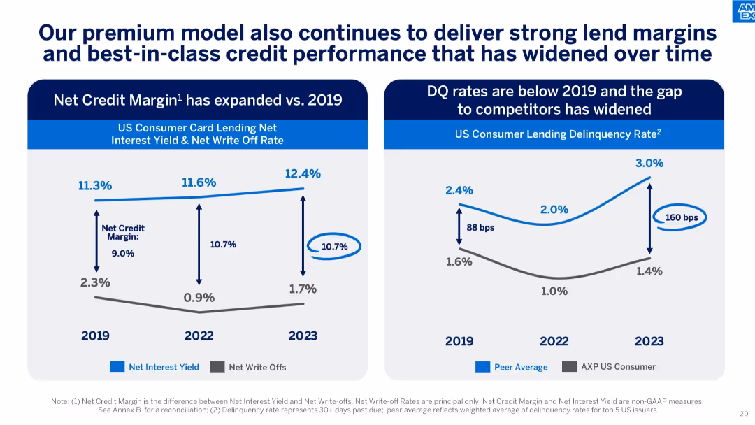
Dual-chart layout showing Net Credit Margin expansion and improved delinquency rate gap over time.
Risk Assessment and Management
Financial Services
Demonstrates how AXP’s lending model yields strong margins and lower delinquency rates compared to peers, with performance improving from 2019 to 2023.
net credit margin, delinquency rate, lending performance, peer comparison, write-offs, interest yield, credit quality
false
Risk Assessment and Management
Financial Services
Multiple Chart
McKinsey
Add to my slides
Remove from favorites
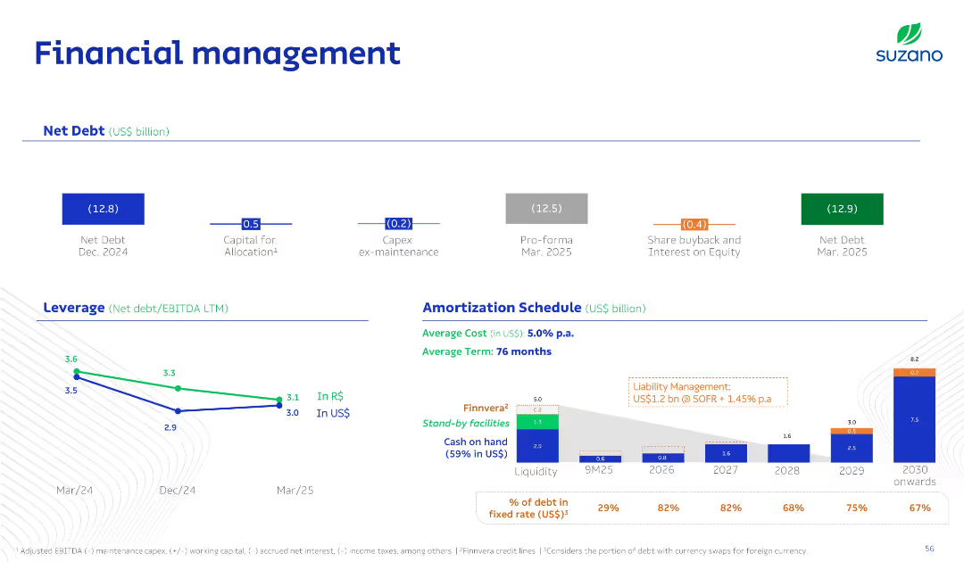
Clean multi-zone slide: top for net debt summary, bottom for leverage ratio trend and amortization bar chart; color-coded debt types and facilities.
Corporate Finance and Valuation
Consumer Goods
This slide presents Suzano's debt structure, including net debt positions, leverage ratios in R$/US$, and a debt amortization schedule through 2030. It details cost of debt, liquidity, and upcoming obligations.
Net Debt, Leverage, Amortization, Liquidity, Finance
false
Corporate Finance and Valuation
Consumer Goods
Multiple Chart
Goldman Sachs
Add to my slides
Remove from favorites
A bar chart listing the top Netflix original shows in Q4 2021 by the number of weeks they appeared in the Nielsen Top 10. The chart uses bars of varying lengths to represent the number of weeks, with a legend for reference.
Competitive Landscape
Media & Entertainment
This slide lists the top Netflix original shows in Q4 2021, indicating how many weeks each show appeared in the Nielsen Top 10. It highlights the popularity and staying power of these shows during the quarter.
Netflix originals, top shows, Nielsen Top 10, weekly appearance, Q4 2021
false
Competitive Landscape
Media & Entertainment
Single Chart
Nielsen
Add to my slides
Remove from favorites
A line chart comparing Netflix's penetration rates in MVPD (Multichannel Video Programming Distributor) and Non-MVPD U.S. TV households over several quarters. The chart uses two lines to represent each category's penetration trend.
Market Analysis and Trends
Media & Entertainment
This slide compares the penetration of Netflix in MVPD versus Non-MVPD U.S. TV households, showing trends and growth patterns over multiple quarters from Q1 2018 to Q4 2021.
Netflix penetration, MVPD, Non-MVPD, U.S. households, quarterly trends
false
Market Analysis and Trends
Media & Entertainment
Single Chart
Nielsen
Add to my slides
Remove from favorites
A column chart showing the share of total time viewed on Netflix for its top 10 shows over various weeks. The bars are segmented into categories like Movies, Acquired, and Originals, with a legend for reference.
Competitive Landscape
Media & Entertainment
This slide illustrates the weekly share of total viewing time on Netflix for its top 10 shows, categorized by type (Movies, Acquired, Originals), highlighting the platform's content performance from October to December.
Netflix, viewing time, top 10 shows, content performance, weekly data
false
Competitive Landscape
Media & Entertainment
Single Chart
Nielsen
Add to my slides
Remove from favorites
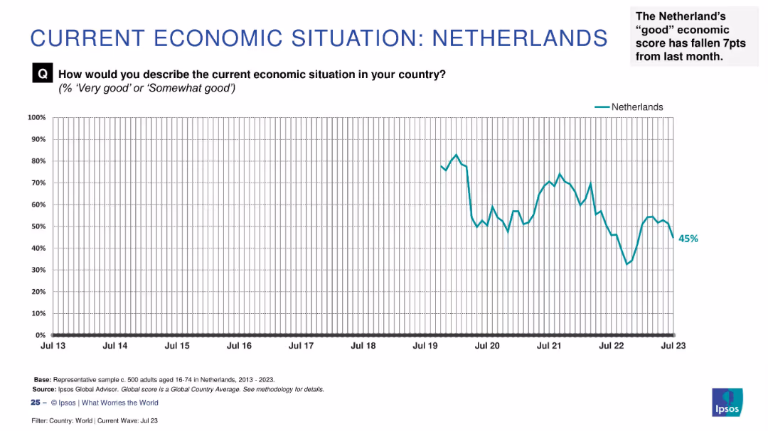
Line chart displaying trend from 2013 to 2023, showing a recent decline to 45%, annotated with recent -7pt drop.
Market Analysis and Trends
Financial Services
This slide shows a decline in economic optimism in the Netherlands, highlighting a 7-point decrease from the previous month. The chart shows fluctuations over the past decade with recent downturns.
Netherlands, economic trend, Ipsos survey, recent decline, -7 points, 2023 data, public sentiment, economic confidence, country analysis
false
Market Analysis and Trends
Financial Services
Single Chart
IPSOS
Add to my slides
Remove from favorites
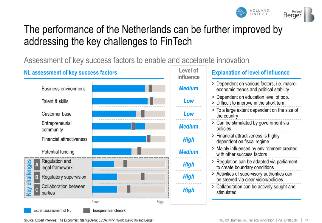
Horizontal bar chart of key success factors vs. European benchmark with commentary on level of influence
Strategic Planning
Financial Services
The slide assesses the Netherlands' strengths and gaps in FinTech success factors compared to European averages, highlighting regulatory and collaboration challenges with improvement suggestions.
Netherlands, FinTech, success factors, regulation, funding, talent, collaboration, benchmarking
false
Strategic Planning
Financial Services
Mixed Chart
Roland Berger
Add to my slides
Remove from favorites
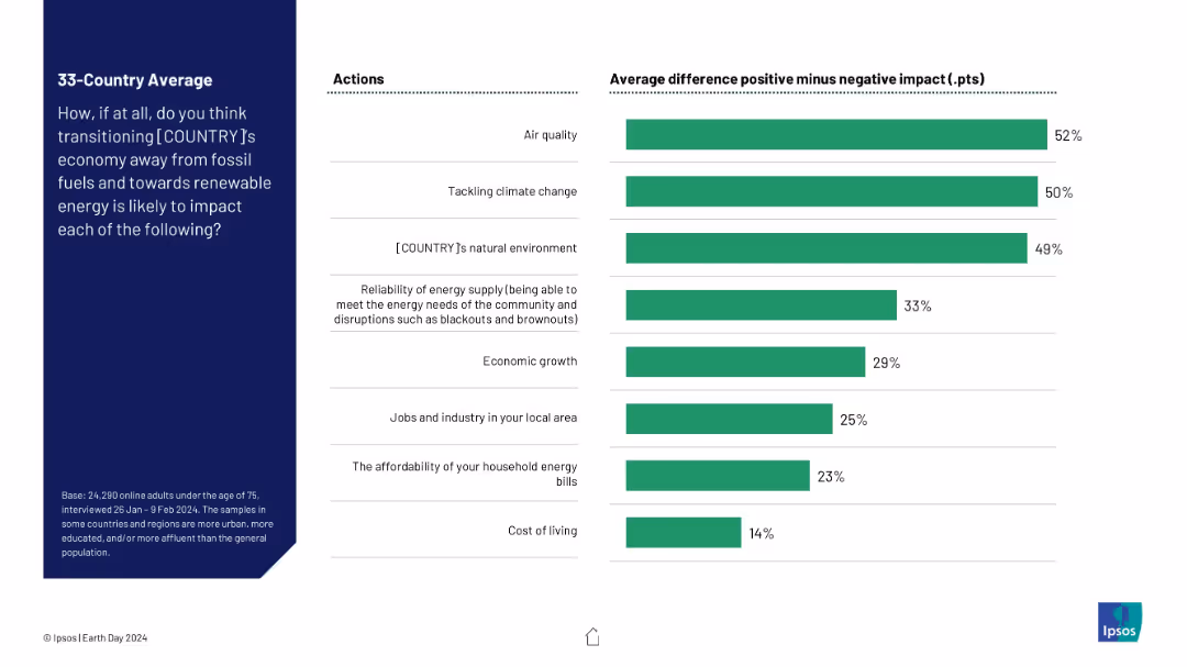
Horizontal bar chart showing net positive perception (positive minus negative) for various outcomes of switching to renewable energy.
Technology and Digital Transformation
Environmental Services & Sustainability
This slide presents a clearer comparison of public sentiment, showing net support for renewable energy transition across multiple domains. Air quality, climate change, and natural environment are seen as most positively impacted, with cost of living seen as least.
net impact, renewable transition, energy policy, public perception, sustainability, Ipsos, climate benefits, economic effects
false
Technology and Digital Transformation
Environmental Services & Sustainability
Mixed Chart
IPSOS
Add to my slides
Remove from favorites
Previous
Next
You don't have any favorites yet.
Please wait loading your favorites slides...
Create a FREE account to continue browsing
Receive Instant Access to 1,000+ slides from companies like McKinsey, Google, and Goldman Sachs
First Name
Last Name
Email
Password
I agree to all
Terms & Privacy Policy
Thank you! Your submission has been received!
Oops! Something went wrong while submitting the form.
Have an account?
Sign in
Upgrade to PRO to Save slides
Advanced Search and Filters
Access to 15,000+ slides
Access to Category Pages
Save/Bookmark Slides
PowerPoint Template Library
Pick a Plan
MONTHLY
$12/month
Billed every month, Cancel anytime.
YEARLY
$9/year
Billed $108 annually, Cancel anytime.
Checkout for $12/month
Checkout for $108/yr
Secured by Stripe | AES-256 bit encryption


![Having been born in… [COUNTRY]](https://cdn.prod.website-files.com/654e70fb59937215cac87b19/6899bb1ae84fc87b0bfe59ed_Rn5Ew6f6kDr6DPBjBS-f8-NAgveLmqK5mnMrbj4Cv7I.avif)