My Account
My Slides
Search by Category
Pricing
Templates
View All Templates
Download Template Slides
✦ AI Search
Feedback
Login
Logout
Get Started
Browse all Slides
Browse all Slides
Create a FREE Account
Instant access to 1,000+ real slides from top companies like McKinsey, BCG, Goldman Sachs, Google and many more!
First Name
Last Name
Email
Password
I agree to all
Terms & Privacy Policy
Thank you! Your submission has been received!
Oops! Something went wrong while submitting the form.
Have an account?
Sign in
Saved Slides
Total No. of slides saved
0
↻ Refresh
✖ Clear all
Graphical representation of net income distribution between 2022 and 2025 with planned distribution rates. The slide also contains bullet points detailing capital management strategies.
Financial Performance
Financial Services
Focuses on the growth in net income and the strategies for capital management and shareholder distributions in a financial services context. Highlights the balance between retention and distribution of income.
net income, financial performance, capital management, distributions, shareholder
false
Financial Performance
Financial Services
Mixed Chart
Deutsche Bank
Add to my slides
Remove from favorites
This slide is rich with column charts, dotted lines, and textual annotations, displaying financial growth trends in navy blue and light blue.
Financial Performance
Financial Services
Demonstrates a decade of financial performance, emphasizing consistent growth and strong returns, relevant for investors and analysts.
net income, ROTCE, TBVPS growth, financial growth, performance, decade, trends, investment
false
Financial Performance
Financial Services
Multiple Chart
JP Morgan
Add to my slides
Remove from favorites
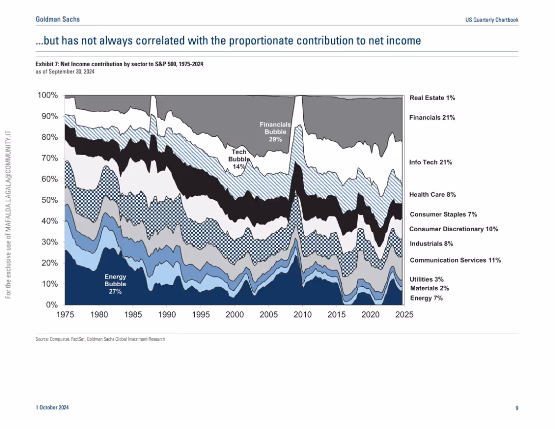
Similar streamgraph as previous slide but shows net income contribution by sector instead of market cap.
Industry Overview
Financial Services
This slide contrasts sector market capitalization with net income contribution over time, showing that dominance in market cap doesn't always translate to proportional profitability. It reveals discrepancies during bubbles and highlights the underperformance or overperformance of certain sectors relative to their size.
net income, sector comparison, S&P 500, market cap, profitability, energy, tech
false
Industry Overview
Financial Services
Single Chart
Goldman Sachs
Add to my slides
Remove from favorites
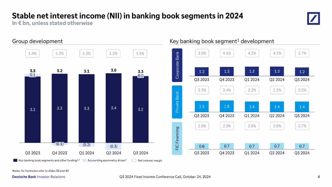
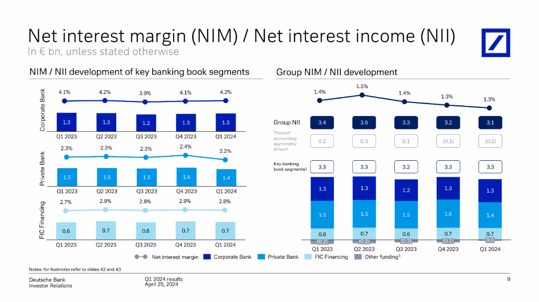
Dual-panel slide with grouped bar charts: one for total NII (with margin overlays), another segmented by business line. Tables show values and margins across quarters.
Financial Performance
Financial Services
Demonstrates that net interest income remains stable despite slight margin pressure. Provides breakdown by Corporate Bank, Private Bank, and FIC Financing. Highlights consistent NII performance across 2024 with minor variance.
net interest income, banking book, NII margin, FIC, Corporate Bank, Private Bank, Q3 2024, 2024 trend
false
Financial Performance
Financial Services
Multiple Chart
Deutsche Bank
Add to my slides
Remove from favorites
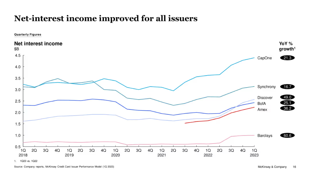
Multi-line graph tracking issuer-specific net-interest income from 1Q18 to 1Q23. YoY % growth listed next to issuer names.
Financial Performance
Financial Services
All tracked issuers saw improvements in net-interest income YoY, with Barclays and Discover showing the highest gains. The chart visualizes long-term recovery and growth momentum from earlier dips in 2020-2021.
Net Interest Income, Barclays, Discover, CapOne, Income Growth, Credit
false
Financial Performance
Financial Services
Single Chart
McKinsey
Add to my slides
Remove from favorites
Features column charts illustrating the drivers of net interest income, such as deposit margin and volume, annotated for clarity and detail.
Financial Performance
Financial Services
Explores the main drivers behind net interest income in 2023, emphasizing the impact of hedging and volume changes.
net interest income, financial drivers, 2023 analysis, banking, hedging impact
false
Financial Performance
Financial Services
Mixed Chart
Deutsche Bank
Add to my slides
Remove from favorites
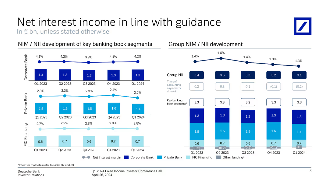
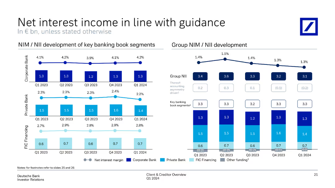
The slide features line charts and vertical column charts showing the development of net interest income and margins for different banking segments.
Financial Performance
Financial Services
The slide presents Deutsche Bank's net interest income and margin trends, showing alignment with guidance and segment performance from Q1 2023 to Q1 2024.
net interest income, financial guidance, banking segments, performance, Deutsche Bank, Q1 2024, investor relations, financial metrics, quarterly trends
false
Financial Performance
Financial Services
Multiple Chart
Deutsche Bank
Add to my slides
Remove from favorites
This slide presents a bar chart showing net interest income trends along with key financial metrics and expectations for future quarters. It uses a combination of graphical and textual data.
Financial Performance
Financial Services
It analyzes the net interest income trends, detailing the drivers behind the changes and providing expectations for future financial performance.
net interest income, financial trends, metrics, future expectations, 3Q22
false
Financial Performance
Financial Services
Mixed Chart
UBS
Add to my slides
Remove from favorites
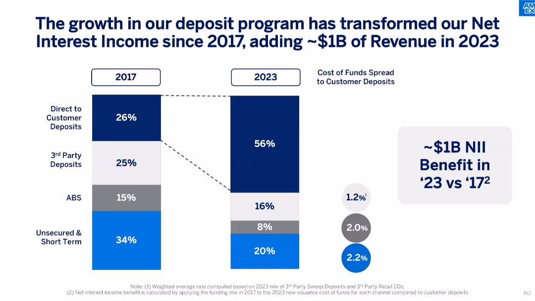
Side-by-side vertical bar charts comparing funding mix in 2017 vs 2023 with color-coded segments; callout text box highlighting $1B benefit; circular icons showing cost of funds spread
Financial Performance
Financial Services
This slide demonstrates the evolution of the funding mix from 2017 to 2023, showing a major shift toward direct customer deposits, which now make up a majority share. It quantifies the impact of this shift as a $1B increase in Net Interest Income in 2023, underscoring improved cost efficiency.
net interest income, funding mix, customer deposits, financial growth, revenue benefit, cost of funds, 2023 performance, financial strategy
false
Financial Performance
Financial Services
Single Chart
McKinsey
Add to my slides
Remove from favorites
With a series of column charts and a table, this slide breaks down net interest income by segment and loan categories, using color coding to differentiate between segments. It's a heavy data slide with a professional and straightforward layout.
Financial Performance
Financial Services
The slide provides a financial snapshot of net interest income and loan distributions across different segments. It could be utilized to discuss interest income trends, lending activities, and performance metrics within corporate and wealth management sectors.
Net interest income, Loans, Financial snapshot, Lending activities, Performance metrics
false
Financial Performance
Financial Services
Multiple Chart
Goldman Sachs
Add to my slides
Remove from favorites
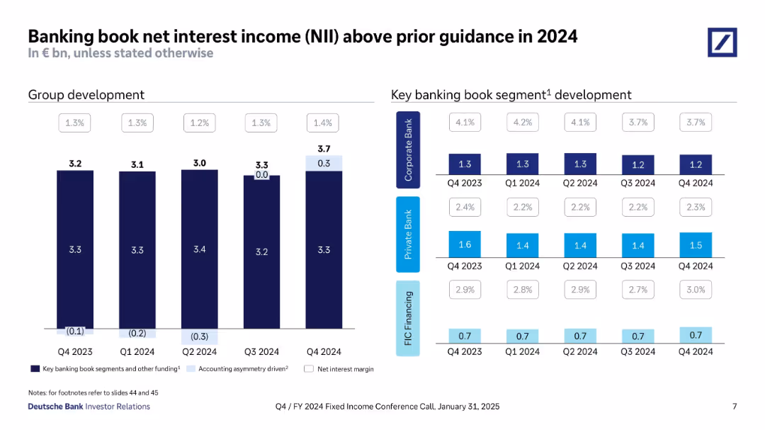
Dual-panel slide with bar charts on the left showing quarterly group NII development and a grid chart on the right showing NII by banking segments and quarters.
Financial Performance
Financial Services
The slide tracks Deutsche Bank’s NII performance in 2024, noting consistent NII levels above guidance. It presents data by quarter and segment, revealing stable or improving margins in key divisions like Private Bank and FIC Financing.
net interest income, NII, banking book, segment performance, FY2024, Deutsche Bank
false
Financial Performance
Financial Services
Multiple Chart
Deutsche Bank
Add to my slides
Remove from favorites
Includes line charts and column charts showing NIM/NII development across key banking book segments and the group as a whole from Q1 2023 to Q1 2024.
Financial Performance
Financial Services
Tracks net interest income and margin development, comparing key banking segments over several quarters. The slide aligns with financial guidance, demonstrating consistent performance and interest margin trends within the banking book segments and group level.
net interest income, NIM, banking segments, financial performance, guidance
false
Financial Performance
Financial Services
Multiple Chart
Deutsche Bank
Add to my slides
Remove from favorites
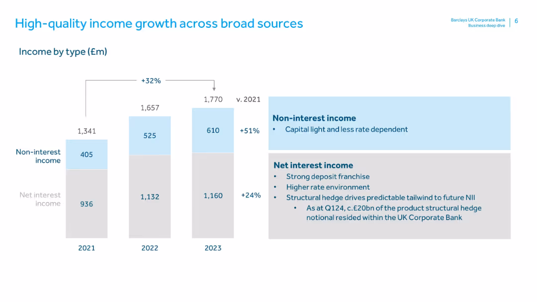
Features a stacked bar chart (2021–2023) showing Non-interest and Net Interest Income with growth percentages. Right side contains text boxes explaining both income types. Consistent blue-gray theme.
Financial Performance
Financial Services
This slide breaks down income sources into net interest income and non-interest income, highlighting a 51% increase in the latter from 2021 to 2023. It emphasizes the importance of a strong deposit franchise, structural hedging, and a capital-light, rate-independent non-interest stream.
net interest income, non-interest income, revenue composition, capital light, interest rate, structural hedge, income sources, financial performance
false
Financial Performance
Financial Services
Mixed Chart
Barclays
Add to my slides
Remove from favorites
Consists of a large column chart with additional small charts and text to explain changes in net interest income over time.
Investment Analysis
Financial Services
Projects net interest income with breakdowns of contributing factors, vital for financial planning and forecasting.
net interest income, rates, deposit growth, forecast
false
Investment Analysis
Financial Services
Single Chart
JP Morgan
Add to my slides
Remove from favorites
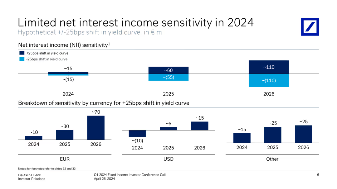
Slide displays column charts showing net interest income sensitivity over different years and currencies.
Risk Assessment and Management
Financial Services
This slide analyzes the sensitivity of net interest income to changes in the yield curve for 2023-2025, with breakdowns by currency and highlights the impact of interest rate changes on the bank's income.
net interest income, sensitivity, yield curve, currencies
false
Risk Assessment and Management
Financial Services
Multiple Chart
Deutsche Bank
Add to my slides
Remove from favorites
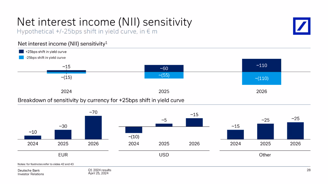
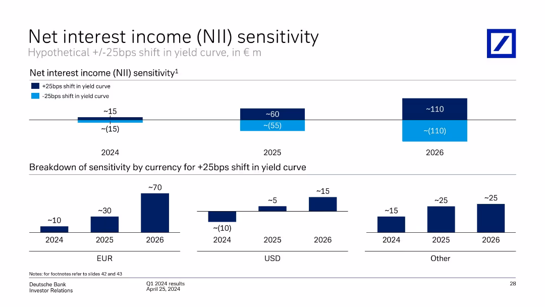
This slide includes column charts showing the sensitivity of net interest income to shifts in the yield curve for different currencies (EUR, USD, Other) across 2024, 2025, and 2026.
Financial Performance
Financial Services
The slide discusses the sensitivity of Deutsche Bank's net interest income to hypothetical shifts in the yield curve, broken down by currency (EUR, USD, Other) and year (2024-2026). It provides projections and potential impacts.
net interest income, sensitivity, yield curve, projections, currency, Deutsche Bank, Q1 2024
false
Financial Performance
Financial Services
Multiple Chart
Deutsche Bank
Add to my slides
Remove from favorites
Slide uses column charts to analyze hypothetical shifts in yield curves affecting net interest income, broken down by year and currency, supplemented with textual explanations.
Risk Assessment and Management
Financial Services
Explores the impact of yield curve fluctuations on Deutsche Bank's net interest income from 2024 to 2026, providing insights into future financial risk management strategies.
Net interest income, yield curve, financial risk management, future forecasting, Deutsche Bank, sensitivity analysis
false
Risk Assessment and Management
Financial Services
Multiple Chart
Deutsche Bank
Add to my slides
Remove from favorites
The slide includes a bar chart depicting net interest income sensitivity to yield curve shifts, with additional breakdowns by currency.
Risk Assessment and Management
Financial Services
The slide analyzes the sensitivity of Deutsche Bank's net interest income to changes in the yield curve, with projections for different scenarios up to 2026.
net interest income, yield curve, financial sensitivity, risk assessment, Deutsche Bank, Q1 2024, financial projections, currency sensitivity, investor relations
false
Risk Assessment and Management
Financial Services
Multiple Chart
Deutsche Bank
Add to my slides
Remove from favorites
Two stacked bar graphs: Top section shows NII sensitivity for 2024–2026 under +/-25bps yield shifts; bottom section breaks down +25bps impact by currency (EUR, USD, Other).
Financial Performance
Financial Services
The slide models Deutsche Bank's net interest income sensitivity to a hypothetical ±25bps shift in the yield curve across 2024 to 2026, showing increasing sensitivity over time. The second chart segments the +25bps impact by currency, revealing EUR as the dominant contributor.
net interest income, yield curve, interest rate sensitivity, EUR, USD, projections, 2024–2026, Deutsche Bank
false
Financial Performance
Financial Services
Multiple Chart
Deutsche Bank
Add to my slides
Remove from favorites
The slide features a series of column charts comparing net interest income by segment across different quarters, accompanied by table detailing loan distribution and metrics. Various shades of blue and gray are used.
Financial Performance
Financial Services
This slide provides a detailed financial analysis, breaking down net interest income by business segment and loan types, and comparing quarter-on-quarter and year-on-year changes. It's intended for presenting to stakeholders interested in the financial health and lending performance of the company.
Net Interest, Loans, Financial Analysis, QoQ, YoY
false
Financial Performance
Financial Services
Mixed Chart
Goldman Sachs
Add to my slides
Remove from favorites
Comprising column charts, a table, and metrics presented in a well-organized manner, this slide compares net interest income and loans across different sectors.
Operational Efficiency
Financial Services
Examines the net interest income by segment, detailing loan categories and providing metrics on the allocation and growth of loans. It serves to analyze financial health and operational efficiency within the company's loan management strategy.
Net Interest, Loans, Financial Health, Operational Efficiency, Metrics
false
Operational Efficiency
Financial Services
Multiple Chart
Goldman Sachs
Add to my slides
Remove from favorites
Features table and column charts on net interest income by segment and detailed tables on loan types and amounts.
Financial Performance
Financial Services
Focuses on net interest income across different business segments and provides a detailed breakdown of loans. It is suitable for financial review meetings to discuss income trends and loan allocations in various sectors.
Net Interest, Loans, Segments, Income Trends, Corporate, Wealth Management, Real Estate, Consumer, Credit, Asset Management, Investment Banking
false
Financial Performance
Financial Services
Multiple Chart
Goldman Sachs
Add to my slides
Remove from favorites
Incorporates line and column charts comparing net interest margins and net interest income across several quarters, with a focus on clear, easy-to-read visual data points.
Financial Performance
Financial Services
Discusses trends in net interest margin and net interest income for key banking segments over recent quarters.
net interest margin, income analysis, banking segments, quarterly trends, financial metrics
false
Financial Performance
Financial Services
Multiple Chart
Deutsche Bank
Add to my slides
Remove from favorites
Contains multiple line charts and column charts showing NIM and NII development for key banking segments and overall group. The slide is detailed with several visual elements and annotations.
Financial Performance
Financial Services
The slide shows the development of NIM and NII for Deutsche Bank across key banking segments and the group, highlighting trends over different quarters.
Net interest margin, net interest income, banking segments, quarterly trends
false
Financial Performance
Financial Services
Multiple Chart
Deutsche Bank
Add to my slides
Remove from favorites
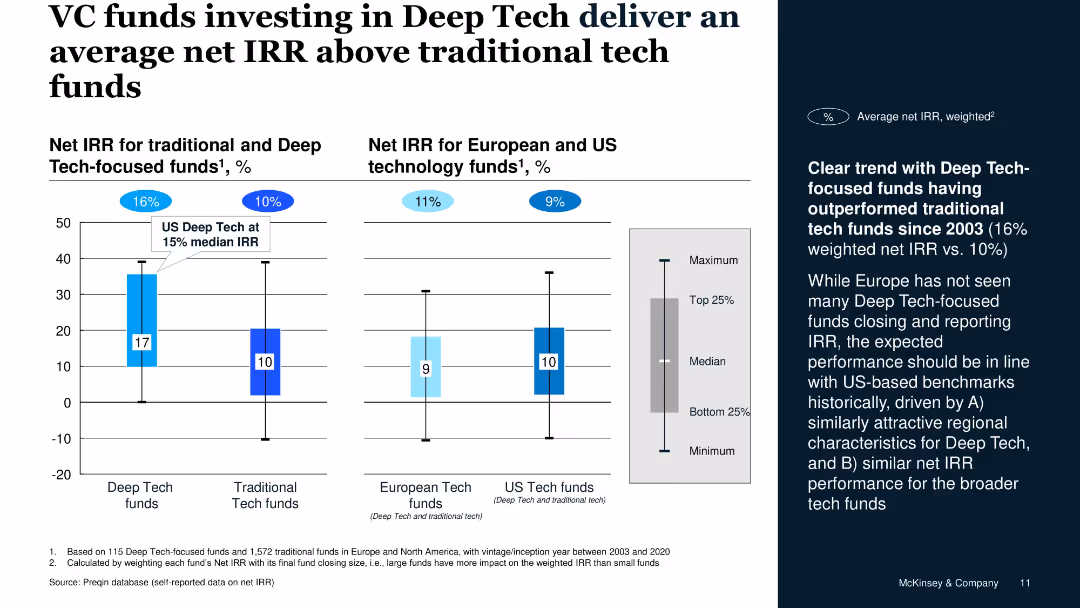
Vertical bar charts for IRR, segregated by fund type and geography, includes side commentary on trend data
Investment Analysis
Financial Services
The slide illustrates that Deep Tech-focused VC funds have historically outperformed traditional tech funds with a 16% weighted net IRR versus 10%, supported by Preqin data. U.S. Deep Tech shows a 15% median IRR.
net IRR, Deep Tech, VC funds, performance, US vs. Europe, investment returns
false
Investment Analysis
Financial Services
Mixed Chart
McKinsey
Add to my slides
Remove from favorites
The slide includes column charts showing adjusted net margin, gross margin, net revenues, pre-tax income, and average assets under management for wealth management and Swiss bank segments across several quarters.
Financial Performance
Financial Services
This slide provides a detailed look at net and gross margins, revenues, pre-tax income, and assets under management for wealth management and Swiss bank segments. It is used to evaluate financial performance and efficiency.
Net margin, gross margin, revenues, pre-tax income, assets, wealth management, Swiss bank, quarterly performance, financial efficiency
false
Financial Performance
Financial Services
Multiple Chart
Credit Suisse
Add to my slides
Remove from favorites
Column chart showing rolling three-year net new assets with a $1Tn target line. Years listed below each bar. Graph has blue color coding and is simple in design.
Financial Performance
Financial Services
Outlines Morgan Stanley's achievement of a $1 trillion target for net new assets over three-year periods, showing consistent growth.
Net new assets, financial target, Morgan Stanley, growth, wealth management, three-year period, $1Tn
false
Financial Performance
Financial Services
Single Chart
Goldman Sachs
Add to my slides
Remove from favorites
The slide showcases three column charts displaying net profit contribution, BFS deposits, and loan and lease portfolio amounts over time. The visual layout is well-structured with a timeline and financial metrics clearly labeled.
Financial Performance
Financial Services
Displaying the firm's financial performance metrics, this slide provides a historical trend analysis of net profit contributions, BFS deposits, and Australian loan and lease portfolios. The time-sequenced data enables a snapshot comparison of performance across key financial areas.
net profit, BFS deposits, loan, lease, portfolio, financial services, trend analysis
false
Financial Performance
Financial Services
Multiple Chart
Morgan Stanley
Add to my slides
Remove from favorites
The slide displays a large column chart for net profit contribution over time and a donut chart for net operating income composition. It is clean and well-organized, with a white background and the Macquarie logo at the bottom left.
Financial Performance
Financial Services
Providing a financial performance review, this slide depicts the net profit contribution and net operating income sources for the commodities and global markets division. The visual data demonstrates the division's financial trajectory and income distribution across different areas.
net profit contribution, operating income, commodities, global markets, financial review, chart
false
Financial Performance
Financial Services
Multiple Chart
Morgan Stanley
Add to my slides
Remove from favorites
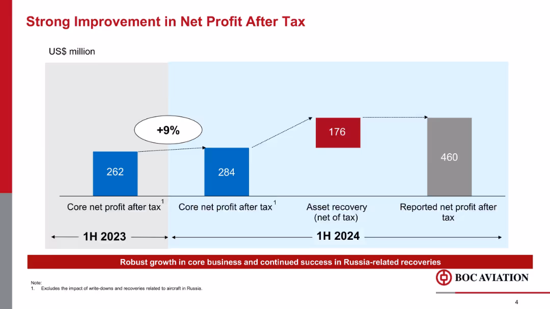
Step-style bar chart showing progression of core net profit and total reported profit, color-coded with % increase indicator.
Financial Performance
Transportation & Logistics
The slide presents a 9% increase in core net profit after tax from 1H 2023 to 1H 2024, along with additional gains from asset recovery related to Russia, resulting in a significantly higher reported net profit of $460 million.
net profit, core earnings, asset recovery, financial growth, Russia, BOC Aviation, 1H2024, profitability
false
Financial Performance
Transportation & Logistics
Single Chart
Goldman Sachs
Add to my slides
Remove from favorites
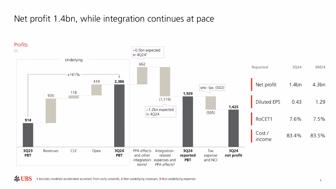
Waterfall bar chart with segment-wise contribution to PBT and net profit; metrics listed on the right.
Financial Performance
Financial Services
Shows a detailed breakdown of UBS's Q3 2024 profit progression including revenues, costs, integration expenses, and tax effects. It also lists reported metrics like EPS, RoCET1, and cost/income ratio to communicate financial health.
net profit, EPS, integration, PBT, cost/income, RoCET1, UBS, Q3 2024
false
Financial Performance
Financial Services
Single Chart
UBS
Add to my slides
Remove from favorites
This slide includes a bar chart and tables highlighting net profit, PBT, RoCET1, and other financial ratios for the third quarter of 2022. It uses clear numerical data and graphical elements.
Financial Performance
Financial Services
It presents the financial results for the third quarter of 2022, emphasizing net profit, return on common equity tier 1 (RoCET1), and other key performance indicators.
net profit, financial results, RoCET1, PBT, financial ratios
false
Financial Performance
Financial Services
Mixed Chart
UBS
Add to my slides
Remove from favorites
The slide features three key areas: 'Net Profit Contribution' shown as a column chart, 'Income by region' displayed as a donut chart, and 'Regulatory capital' in a stacked column chart. It has a clear title at the top.
Financial Performance
Financial Services
This slide presents Macquarie Capital's financial overview, with a focus on net profit, income distribution by region, and regulatory capital allocation. It's intended for financial review and investment strategy discussions.
Net Profit, Income, Regulatory, Capital, Financial Overview, Investment Strategy
false
Financial Performance
Financial Services
Multiple Chart
Morgan Stanley
Add to my slides
Remove from favorites
The slide displays a column chart depicting net profit contribution over five years, paired with a pie chart outlining net operating income by category. The visuals are paired with clear descriptive texts.
Market Analysis and Trends
Financial Services
It outlines the company's profit growth over time and breaks down income by category. The pie chart shows the distribution of operating income, providing insights into the financial structure of the company’s commodities and global markets segment.
Net Profit, Operating Income, Commodities, Financial Analysis, Growth
false
Market Analysis and Trends
Financial Services
Multiple Chart
Goldman Sachs
Add to my slides
Remove from favorites
The slide compares Net Promoter Scores (NPS) across food delivery platforms, featuring graphical data visualization on the right and explanatory text on the left. The clear, professional design aids in understanding the content.
Performance Metrics and KPIs
Retail & E-commerce
Evaluates customer loyalty in the food delivery sector through Net Promoter Scores, providing a metric for comparing consumer satisfaction across platforms. The data indicates a significant opportunity for improvement and competition.
Net Promoter Score, customer loyalty, food delivery, consumer satisfaction, Southeast Asia, market competition, business metrics
false
Performance Metrics and KPIs
Retail & E-commerce
Multiple Chart
Bain
Add to my slides
Remove from favorites
This slide contains column chart depicting 'Net Revenues by Segment' for different quarters, alongside a table comparing financial metrics like net earnings and EPS for Q1 2023 against previous periods.
Financial Performance
Financial Services
A comprehensive financial review of Q1 2023, showing performance metrics across various business segments and overall company profitability. It serves to present trends and results to stakeholders for strategic and investment decisions.
Net Revenue, Financial Metrics, Earnings, EPS, ROE, Segment Analysis, Profitability, Quarter Comparison, Banking, Asset Management
false
Financial Performance
Financial Services
Mixed Chart
Goldman Sachs
Add to my slides
Remove from favorites
The slide has a detailed table displaying net revenues with comparison percentages and bullet point highlights on the right. It employs a moderate design that focuses on data presentation.
Market Analysis and Trends
Financial Services
The slide presents detailed net revenue figures in various banking market segments. It likely serves the purpose of analyzing trends and informing strategic decisions in financial management meetings or investor relations.
Net Revenues, Investment Banking, FICC, Equities
false
Market Analysis and Trends
Financial Services
Table
Goldman Sachs
Add to my slides
Remove from favorites
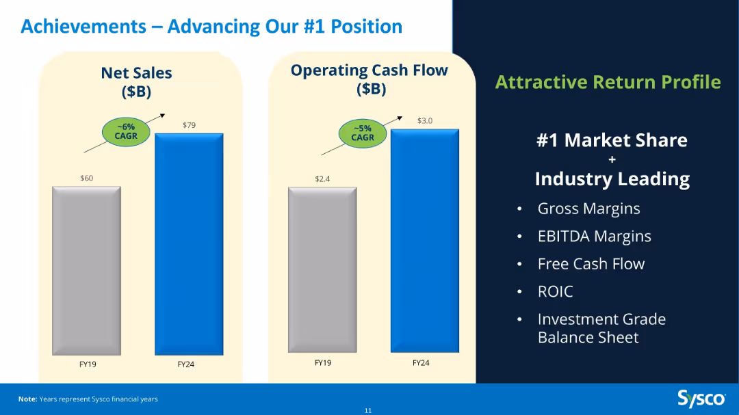
Two bar charts comparing FY19 vs FY24 Net Sales and Operating Cash Flow; right-side list of return drivers.
Financial Performance
Consumer Goods
Highlights Sysco’s 5-year progress with ~6% CAGR in net sales and ~5% CAGR in operating cash flow. Supports its #1 market position with strong metrics in gross margins, ROIC, and a robust balance sheet.
net sales, operating cash flow, CAGR, Sysco, financials, performance, FY24, growth
false
Financial Performance
Consumer Goods
Mixed Chart
Barclays
Add to my slides
Remove from favorites
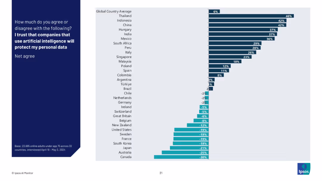
Simplified bar graph showing net agreement percentages (Agree minus Disagree) by country, highlighting positive and negative sentiment regions.
Risk Assessment and Management
Artificial Intelligence
This slide illustrates the net trust score for each country in regard to companies using AI to safeguard personal data. Countries with negative values show public distrust, while positive values suggest confidence in AI-related data protection.
net trust, AI security, personal data, public perception, Ipsos, international attitudes, AI ethics, country ranking
false
Risk Assessment and Management
Artificial Intelligence
Mixed Chart
IPSOS
Add to my slides
Remove from favorites
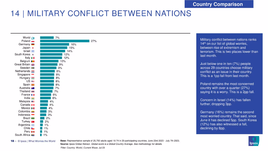
Horizontal bar chart with 29-country comparison on concern over international conflict; text box to the right.
Risk Assessment and Management
Government & Public Sector
Military conflict is a lesser global concern (7% globally), but significant in Poland (27%). The text notes declining concerns in Israel, South Korea, and Germany, with comparative analysis from the previous month.
net trust, profession ranking, Ipsos survey, societal trust, ethics, role credibility, distrust
false
Risk Assessment and Management
Government & Public Sector
Mixed Chart
IPSOS
Add to my slides
Remove from favorites
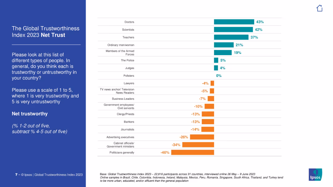
Vertical bar chart showing net trust score (positive % minus negative %) for various professions. Includes color-coded bars for positive and negative values.
Market Analysis and Trends
Professional Services
This slide summarizes the net trustworthiness of different professions based on global survey results. Doctors, scientists, and teachers are the most positively viewed, while politicians and advertisers hold highly negative scores.
net trust, public perception, professions, global survey, Ipsos, credibility, media trust, political distrust
false
Market Analysis and Trends
Professional Services
Mixed Chart
IPSOS
Add to my slides
Remove from favorites
Slide with two US maps showing the growth in branch network coverage from 2017 to 2022, with a focus on demographic coverage and strategic goals.
Strategic Planning
Financial Services
Details the strategic expansion of the bank's branch network coverage nationwide, aiming to increase market and demographic reach, and to deepen community trust.
network coverage, strategic expansion, branch network, banking, demographic coverage, market reach, community trust, Chase, strategic goals
false
Strategic Planning
Financial Services
Multiple Chart
JP Morgan
Add to my slides
Remove from favorites
Includes column charts and a list with icons, showing branch network investment and performance indicators with a focus on deposit growth and market share.
Strategic Planning
Financial Services
Discusses strategic network expansion and investment outcomes, linking branch growth to deposit performance and market presence enhancement.
network expansion, deposit growth, performance, banking, investment, branch network, market presence, strategic investment, Chase
false
Strategic Planning
Financial Services
Single Chart
JP Morgan
Add to my slides
Remove from favorites
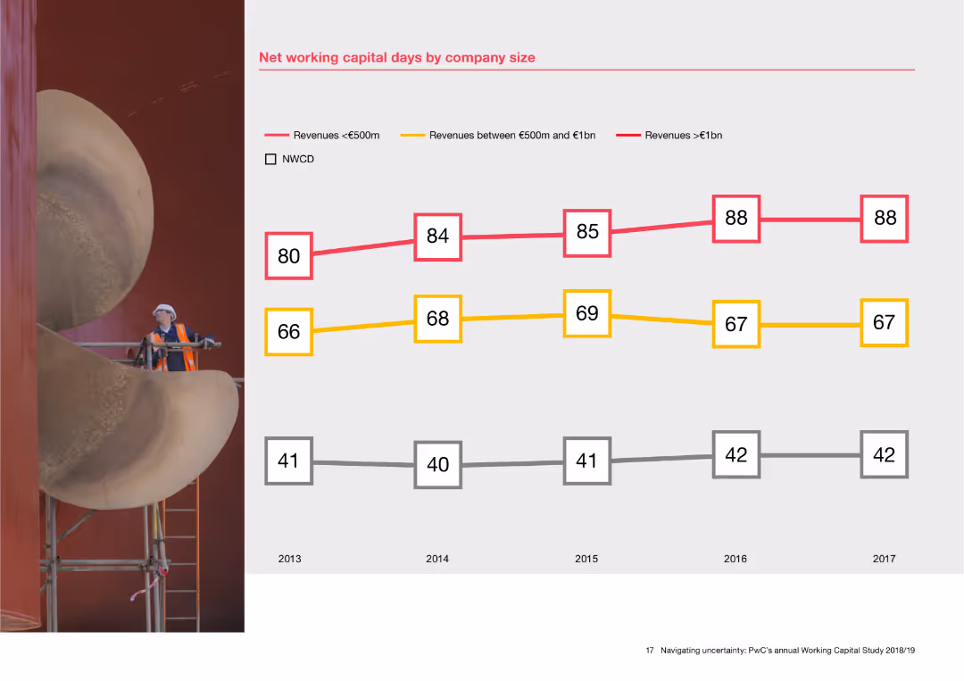
The slide features a line chart with data points showing net working capital days for companies of different sizes from 2013 to 2017. Three lines represent companies with revenues less than €500m, between €500m and €1bn, and greater than €1bn. A background image of an industrial worker is on the left.
Financial Performance
Financial Services
This slide analyzes net working capital days based on company size, presenting data over five years. The line chart helps in understanding how companies with different revenue sizes manage their working capital, offering insights into financial performance and capital efficiency.
Net working capital, company size, financial performance, revenue, line chart, capital efficiency
false
Financial Performance
Financial Services
Mixed Chart
PwC/Strategy&
Add to my slides
Remove from favorites
Contains a column chart comparing percentages of network budget spent on maintenance vs. modernization over four years.
Operational Efficiency
Telecommunications
Discusses changes in network spending focusing on the shift from maintenance to modernization, illustrating strategic network investments.
network modernization, budget allocation, operational efficiency, strategic investment, technology upgrades
false
Operational Efficiency
Telecommunications
Mixed Chart
Accenture
Add to my slides
Remove from favorites
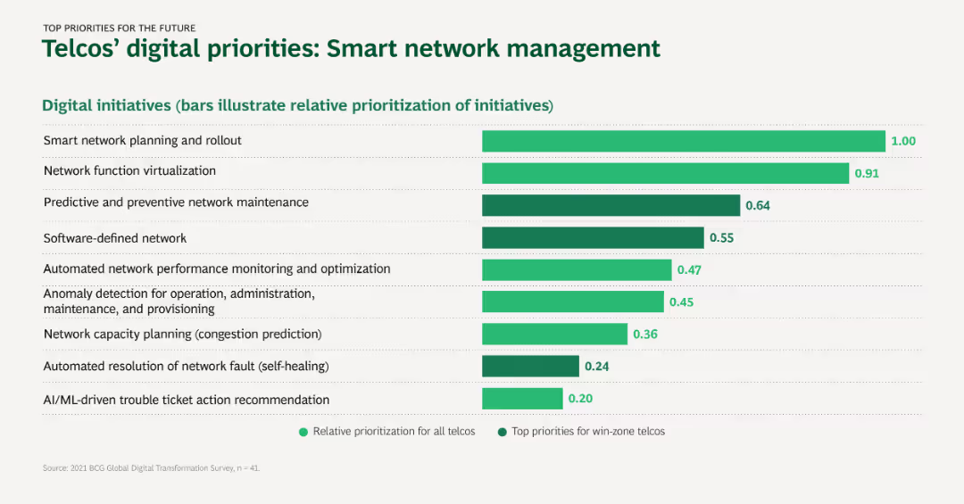
Horizontal bar chart illustrating the prioritization of digital initiatives among telcos. Bars are color-coded for relative prioritization and top priorities.
Strategic Planning
Telecommunications
The slide highlights the digital initiatives prioritized by telcos for smart network management, focusing on areas like network planning, virtualization, and AI-driven solutions.
Network planning, Virtualization, Predictive maintenance, AI, Smart network management
false
Strategic Planning
Telecommunications
Single Chart
BCG
Add to my slides
Remove from favorites
Text boxes and icons on a dark background describe potential disruptions in network services and the enablement of new services, painting a picture of the future landscape altered by edge computing.
Technology and Digital Transformation
Technology & Software
Discussing the transformative potential of edge computing, this slide explores how the trend could improve network services and unlock new services for both B2B and B2C segments. It delves into how this technological advancement can lead to improvements in content delivery, active-device location tracking, and more immersive end-user experiences.
Network Services, B2B, B2C, Technological Disruption
false
Technology and Digital Transformation
Technology & Software
Header Horizontal
McKinsey
Add to my slides
Remove from favorites
This slide features a purple gradient background with three main columns titled 'Sync the network strategy', 'The network dimensions of success', and 'Build future network talent'. Contains bullet points and subtitles.
Technology and Digital Transformation
Technology & Software
Describes best practices in network strategy integration across a company's lifecycle, emphasizing resilience, cost efficiency, and innovation in network management. Designed for strategic planning and technology enhancement initiatives.
network, strategy, best practices, innovation, technology, resilience, cost efficiency, management
false
Technology and Digital Transformation
Technology & Software
Header Vertical
Accenture
Add to my slides
Remove from favorites
Diagram outlining a three-step strategy for network evolution, including stabilization, modernization, and innovation acceleration.
Technology and Digital Transformation
Telecommunications
Lays out a strategic framework for network modernization, focusing on stabilizing, modernizing, and leveraging networks for innovation.
network strategy, digital transformation, strategic planning, innovation acceleration, network modernization
false
Technology and Digital Transformation
Telecommunications
Linear Flow
Accenture
Add to my slides
Remove from favorites
This slide has a split composition with text on the left and an image of wind turbines and solar panels on the right. Blue bullet points emphasize the areas of focus: demand, costs, capital allocation, and jobs.
Market Analysis and Trends
Environmental Services & Sustainability
Discusses the economic shifts necessary for achieving net-zero emissions by 2050, including a scenario-based analysis of the NGFS Net Zero 2050 scenario. Highlights sectors responsible for the majority of emissions and areas of economic consideration.
Net-Zero, 2050, Economic Shifts, Emissions, Energy, Jobs, Capital Allocation, Demand, NGFS
false
Market Analysis and Trends
Environmental Services & Sustainability
Agenda
McKinsey
Add to my slides
Remove from favorites
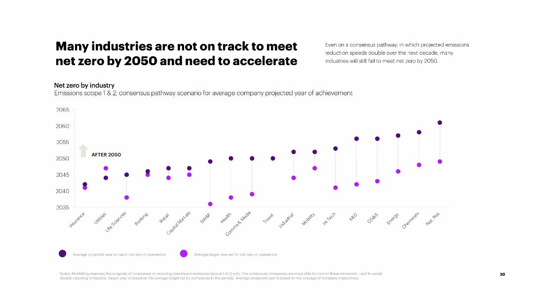
The slide shows a scatter plot chart indicating the projected years for industries to achieve net zero under consensus pathways.
Risk Assessment and Management
Environmental Services & Sustainability
The slide assesses the progress of various industries in meeting net zero targets by 2050, indicating that many are off track and need accelerated efforts.
net zero, 2050, industries, consensus pathways, emissions reduction, acceleration, projected year, achievement
false
Risk Assessment and Management
Environmental Services & Sustainability
Single Chart
Accenture
Add to my slides
Remove from favorites
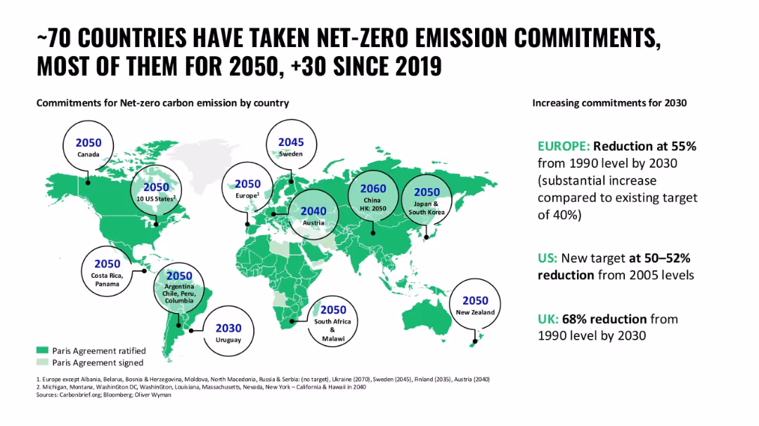
World map with circular year markers indicating country-level net-zero targets; bright green color scheme
Regulatory and Compliance
Government & Public Sector
A global overview of countries' net-zero commitments, focusing on their targeted years for carbon neutrality and interim 2030 goals, especially in Europe, US, and UK.
net-zero, carbon emissions, commitments, global policy, sustainability, 2030 targets
false
Regulatory and Compliance
Government & Public Sector
Header Horizontal
Oliver Wyman
Add to my slides
Remove from favorites
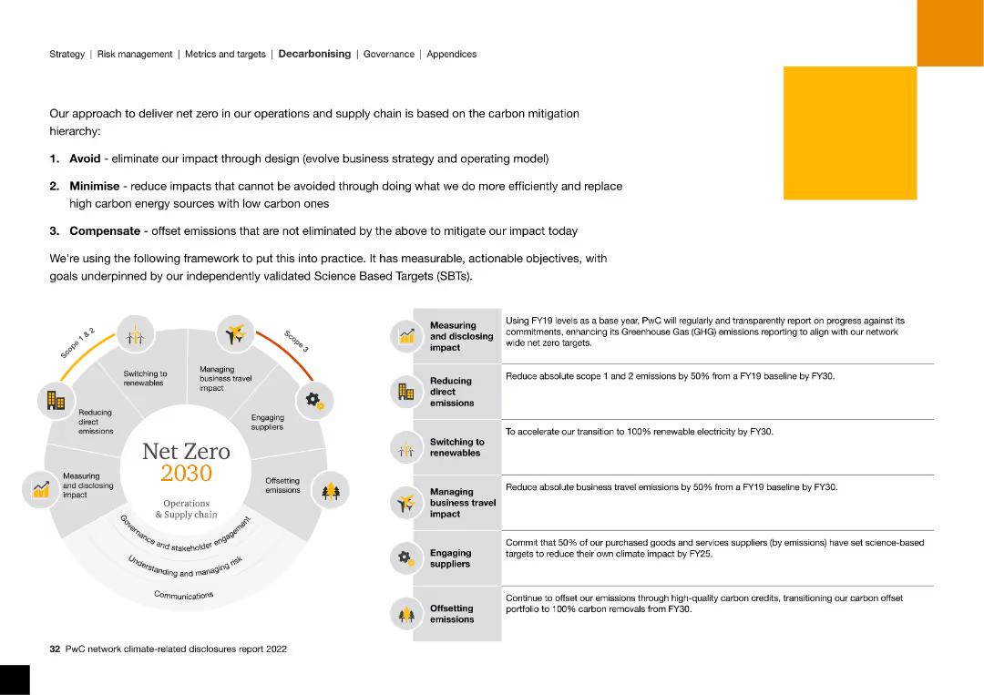
The slide features a circular diagram and text blocks, explaining the approach to achieving net zero emissions by 2030, including strategies like minimizing.
Strategic Planning
Energy & Utilities
The slide outlines a strategic framework for achieving net zero emissions by 2030 through avoidance, minimization, and compensation of carbon emissions.
net zero, carbon mitigation, 2030, emissions, science-based targets, framework, renewable
false
Strategic Planning
Energy & Utilities
Diagram
PwC/Strategy&
Add to my slides
Remove from favorites
Features a large pie chart detailing responses from organizations in Hong Kong regarding their net-zero carbon commitments. The chart is divided into segments representing different stances on the commitment aligned with science-based targets.
Industry Overview
Environmental Services & Sustainability
This slide provides an overview of the commitment levels to carbon neutrality among companies in Hong Kong. It highlights the lack of a scientific approach in many firms’ environmental strategies, emphasizing the need for more rigorous, science-aligned frameworks to ensure these commitments lead to tangible environmental benefits.
net-zero, carbon neutrality, Hong Kong, commitments, 2023
false
Industry Overview
Environmental Services & Sustainability
Single Chart
PwC/Strategy&
Add to my slides
Remove from favorites
Features text with a line chart showing projected temperature anomalies under different emissions pathways from 2020 to 2100.
Strategic Planning
Environmental Services & Sustainability
Emphasizes the necessity of committing to net zero emissions to prevent climate damage, highlighting the significant impacts of inaction on future temperatures.
Net zero, climate change, emissions, temperature, projection, pathway, 2100, sustainability
false
Strategic Planning
Environmental Services & Sustainability
Mixed Chart
EY
Add to my slides
Remove from favorites
Features a global map showing countries with varying levels of commitment to achieving net-zero emissions. The countries are color-coded based on their current commitment status, ranging from no target to net-zero commitments, with a legend explaining the color coding.
Regulatory and Compliance
Environmental Services & Sustainability
Analyzes global commitments to achieving net zero emissions, highlighting the disparities in climate ambition across different regions. Useful for evaluating the progress and commitments of countries in terms of climate action.
Net zero, Climate commitments, Global analysis, 2050
false
Regulatory and Compliance
Environmental Services & Sustainability
Mixed Chart
BCG
Add to my slides
Remove from favorites
The slide shows a stacked bar chart illustrating the status of net-zero CO2 policy implementations by country as of August 2020, with categories such as under discussion, pledged, proposed, political agreement, and in law.
Regulatory and Compliance
Government & Public Sector
The slide provides an overview of the status of net-zero CO2 policy implementations across more than 125 countries as of August 2020, categorizing them based on their implementation stage. It highlights the share of global CO2 emissions covered by these policies.
net-zero, CO2 policy, global, emissions
false
Regulatory and Compliance
Government & Public Sector
Single Chart
Kearney
Add to my slides
Remove from favorites
Features text with a bar chart showing the acceleration of net zero commitments from different organizations and countries between 2020 and 2021.
Strategic Planning
Environmental Services & Sustainability
Discusses the acceleration of decarbonization commitments by governments and businesses, highlighting the significant increase in net zero targets within a year.
Net zero, commitment, government, business, decarbonization, target, emissions, sustainability
false
Strategic Planning
Environmental Services & Sustainability
Multiple Chart
EY
Add to my slides
Remove from favorites
The slide has multiple icons and a comparative table showing the cost increase for various products if they adopt net-zero supply chains. It uses bright colors and bold text to emphasize key statistics and public opinion data.
Market Analysis and Trends
Professional Services
The slide highlights public demand for corporations to adopt environmental considerations and the average cost increase for products with net-zero supply chains. It also shows the percentage of companies committed to reaching net-zero by 2050.
net-zero, cost increase, public demand, corporations, supply chain
false
Market Analysis and Trends
Professional Services
Header Vertical
BCG
Add to my slides
Remove from favorites
This slide contains a horizontal bar chart showing the distribution of companies on track for net zero by region and industry, with percentages for various categories.
Risk Assessment and Management
Environmental Services & Sustainability
It reveals that only 18% of companies are on track to achieve net zero by 2050, with an analysis of different industries and regions' progress towards decarbonization.
Net Zero, Decarbonization, Companies, Progress, 2050
false
Risk Assessment and Management
Environmental Services & Sustainability
Mixed Chart
Accenture
Add to my slides
Remove from favorites
A grey-scale donut chart shows the percentage of GDP generated by sectors with varying degrees of exposure to the net-zero transition. Blue accents highlight key sections. Additional text provides context and analysis.
Risk Assessment and Management
Environmental Services & Sustainability
Addresses the uneven impact of the net-zero transition across the economy, specifying which sectors are most exposed in terms of GDP contribution. Offers insights into potential risk areas within the economic shift.
Net-Zero, Economic Exposure, GDP, Sectors, Transition, Risk Management
false
Risk Assessment and Management
Environmental Services & Sustainability
Single Chart
McKinsey
Add to my slides
Remove from favorites
The slide features a pie chart illustrating the distribution of financed emissions in various sectors. It includes key points and percentages, with text explanations.
Regulatory and Compliance
Financial Services
The slide emphasizes Deutsche Bank's commitment to achieving net zero emissions through partnerships with clients. It highlights the distribution of emissions across sectors.
Net zero, emissions, partnership, finance, strategy, sustainability, CO2, targets, banking, environment
false
Regulatory and Compliance
Financial Services
Mixed Chart
Deutsche Bank
Add to my slides
Remove from favorites
The slide includes a column chart and a text box detailing the technology gap in achieving net-zero emissions. It uses a gradient color scheme to show the progress and remaining gap, with additional explanatory text on the side.
Technology and Digital Transformation
Environmental Services & Sustainability
The slide presents the role of existing technologies in achieving about 65% of the emissions reduction required for the net-zero goal. It highlights investment opportunities and the need for new business models and policy changes.
net-zero, emissions reduction, technology, investment, policy
false
Technology and Digital Transformation
Environmental Services & Sustainability
Mixed Chart
BCG
Add to my slides
Remove from favorites
Features a line graph tracking Scope 1 and 2 GHG emissions over time, with annotations for highlights in 2023, and additional textual elements detailing emissions reduction strategies and goals.
Operational Efficiency
Financial Services
Discusses Barclays' efforts towards a net zero operations strategy, showcasing significant reductions in GHG emissions, and outlines future goals in alignment with sustainable operations practices.
net zero, GHG emissions, sustainability, operational efficiency, emissions reduction, climate goals
false
Operational Efficiency
Financial Services
Mixed Chart
Barclays
Add to my slides
Remove from favorites
The slide features a horizontal bar chart comparing the agreement and disagreement levels of awareness of government plans regarding net zero commitments across markets.
Market Analysis and Trends
Government & Public Sector
Shows survey results on public awareness of government plans for climate change across various countries, highlighting the correlation with legally binding net zero goals.
net zero, government, awareness, climate change, survey
false
Market Analysis and Trends
Government & Public Sector
Multiple Chart
IPSOS
Add to my slides
Remove from favorites
Features simple icons and text highlighting key statistics about the green economy in Southeast Asia, including financial commitments and investment figures.
Financial Performance
Financial Services
Offers a numerical summary of recent investments and environmental commitments in Southeast Asia, highlighting the potential economic opportunities and necessary investments to achieve net zero emissions targets.
net zero, investments, Southeast Asia, green economy
false
Financial Performance
Financial Services
Table
Bain
Add to my slides
Remove from favorites
The slide includes a set of column charts comparing current trends, consensus pathways, and accelerated actions for reaching net zero emissions.
Market Analysis and Trends
Environmental Services & Sustainability
The slide evaluates the likelihood of companies reaching net zero operational emissions under different scenarios, highlighting significant gaps in current trends.
net zero, operational emissions, current trends, consensus pathways, accelerated actions, projections
false
Market Analysis and Trends
Environmental Services & Sustainability
Multiple Chart
Accenture
Add to my slides
Remove from favorites
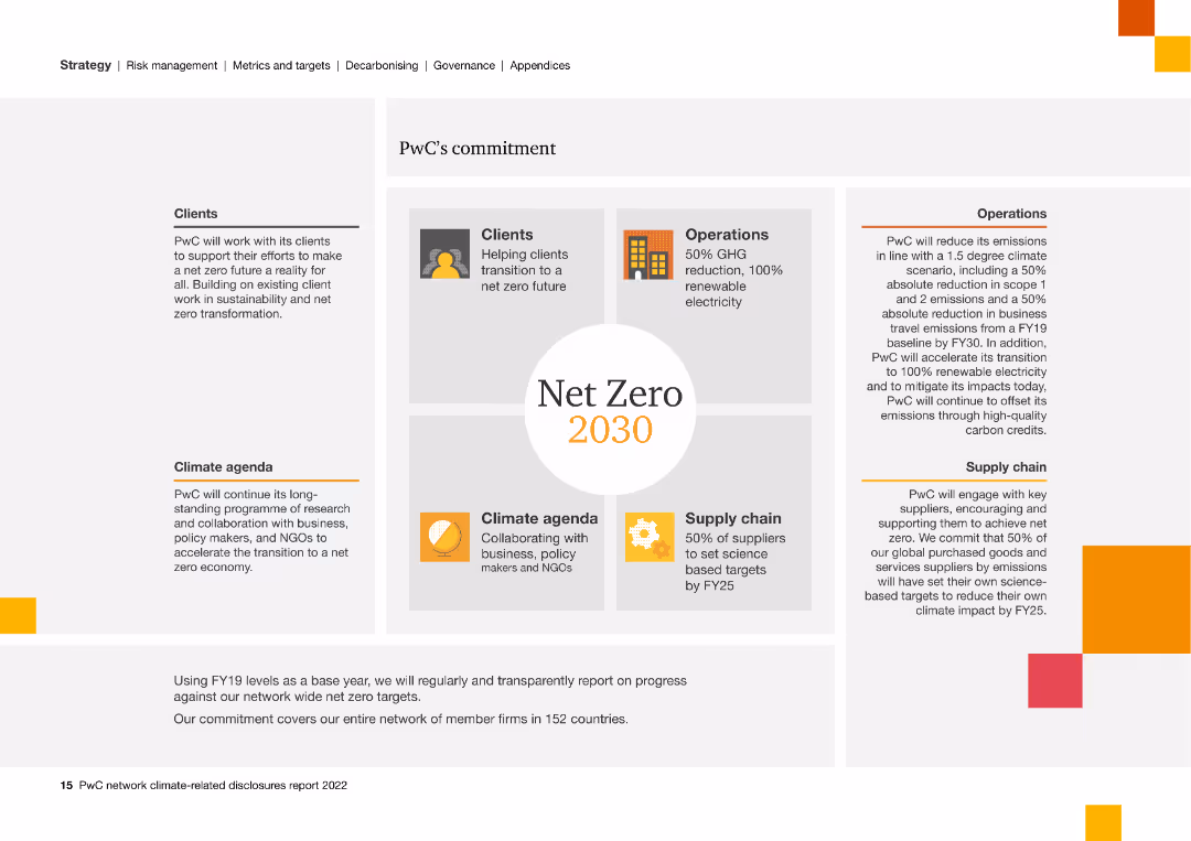
Visual layout with text blocks and icons outlining PwC's commitment to net-zero emissions by 2030, including operational and supply chain strategies.
Strategic Planning
Professional Services
Highlights PwC's strategic commitment to achieving net-zero emissions by 2030, detailing their approaches in operations, supply chain, and client engagement.
net zero, PwC, commitment, 2030, emissions, operations, supply chain, strategy, client engagement
false
Strategic Planning
Professional Services
Framework
PwC/Strategy&
Add to my slides
Remove from favorites
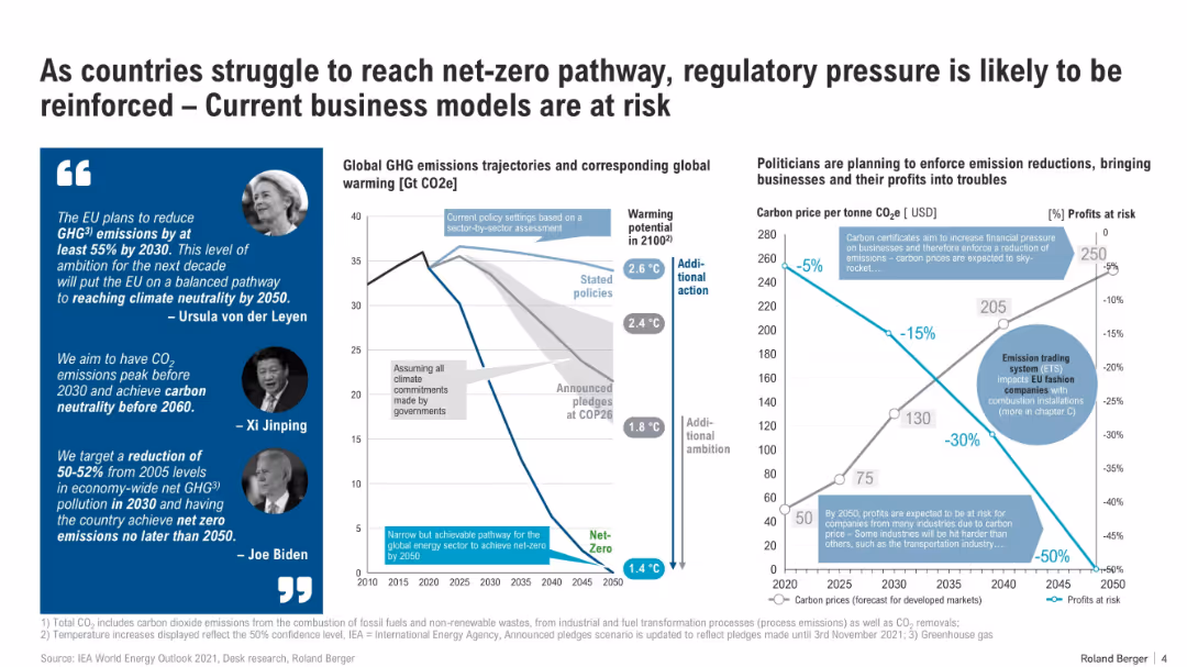
Split layout: quotes with images on the left, central graph showing GHG trajectories, and right graph comparing carbon prices vs profits at risk. Uses icons, line graphs, and infographics.
Regulatory and Compliance
Environmental Services & Sustainability
The slide outlines increasing regulatory pressures toward net-zero goals and the economic impact on businesses. It shows projected global warming scenarios, policy-based emission paths, and the potential financial risks from rising carbon prices, especially for emissions-heavy industries.
net-zero, regulation, carbon pricing, emissions, business risk, climate policy, COP26, GHG, ETS, profit impact
false
Regulatory and Compliance
Environmental Services & Sustainability
Multiple Chart
Roland Berger
Add to my slides
Remove from favorites
This slide features a complex table comparing elements of Net Zero plans across various countries with color-coded indicators of progress.
Strategic Planning
Environmental Services & Sustainability
Slide displays a comprehensive table analyzing the effectiveness and comprehensiveness of Net Zero plans in SEA countries, highlighting areas lacking robust strategies. Suitable for policy developers.
Net Zero, SEA, policy, effectiveness, table, strategic planning, color-coded, countries, comparison, environmental
false
Strategic Planning
Environmental Services & Sustainability
Table
Bain
Add to my slides
Remove from favorites
The slide includes a bar chart with detailed annotations. It contrasts current spending with projected spending in a net-zero transition scenario, using blue tones to differentiate data segments.
Investment Analysis
Environmental Services & Sustainability
Analyzes the financial aspects of a net-zero transition, focusing on the increase in annual spending required on physical assets for energy and land-use systems. Emphasizes the scale of new and reallocated investments.
Net-Zero, Spending, Investments, Energy Systems, Land-Use, Transition Scenario
false
Investment Analysis
Environmental Services & Sustainability
Single Chart
McKinsey
Add to my slides
Remove from favorites
The slide features a timeline comparing the carbon neutrality commitments and reduction targets of leading global steel companies, with milestones from 2020 to 2050.
Regulatory and Compliance
Environmental Services & Sustainability
This slide highlights the net-zero commitments of major global steel players, detailing their reduction targets and timelines for achieving carbon neutrality by 2050.
Net Zero, steel players, carbon neutrality, commitments, timelines, reduction targets, global, environmental
false
Regulatory and Compliance
Environmental Services & Sustainability
Single Chart
BCG
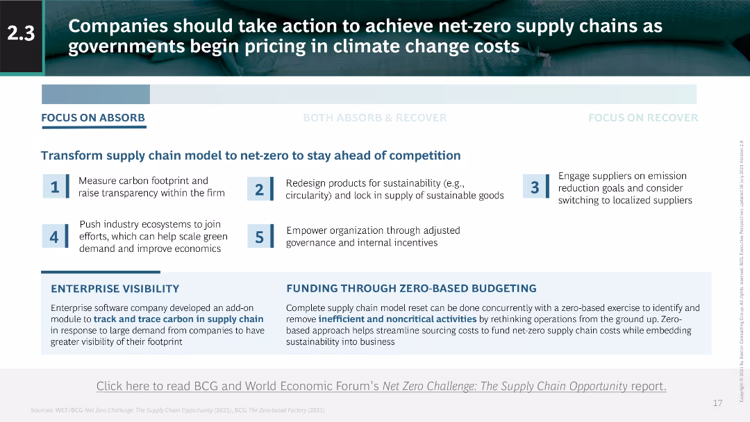
Add to my slides
Remove from favorites
The slide uses text to describe steps for companies to transform their supply chains to net-zero emissions. Key actions are listed with a supporting narrative on the left and bottom sections.
Technology and Digital Transformation
Environmental Services & Sustainability
The slide provides steps for companies to achieve net-zero supply chains, emphasizing the importance of carbon footprint tracking, sustainable product design, and ecosystem engagement.
net-zero, supply chain, carbon footprint, sustainability, transformation
false
Technology and Digital Transformation
Environmental Services & Sustainability
Linear Flow
BCG
Add to my slides
Remove from favorites
The slide shows a horizontal bar chart of net zero commitments by G2000 companies across regions from 2021 to 2023, with detailed percentages.
Regulatory and Compliance
Environmental Services & Sustainability
It reports the progress of G2000 companies towards net zero targets, showing regional variations and increases in commitments from 2021 to 2023.
Net Zero, Sustainability, Commitments, G2000, Regions
false
Regulatory and Compliance
Environmental Services & Sustainability
Multiple Chart
Accenture
Add to my slides
Remove from favorites
The slide has a balanced composition with text on the left and logos of strategic acquisitions on the right, along with additional descriptive details below.
Strategic Planning
Environmental Services & Sustainability
This McKinsey slide highlights their investments and innovations aimed at achieving net-zero emissions. It outlines the firm's strategic moves, including partnerships and acquisitions, to lead in sustainability consulting and transformation services.
Net Zero, Sustainability, Investments, McKinsey, Climate Change
false
Strategic Planning
Environmental Services & Sustainability
Text Only
McKinsey
Add to my slides
Remove from favorites
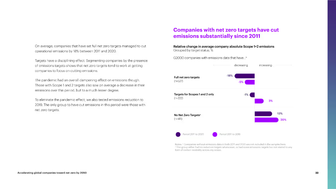
The slide features a column chart comparing the relative change in average company emissions by target status from 2011 to 2020.
Performance Metrics and KPIs
Environmental Services & Sustainability
The slide shows that companies with full net zero targets have significantly reduced their operational emissions compared to those with limited or no targets.
net zero targets, emissions reduction, average company, full targets, scopes 1 and 2, no targets, operational emissions, 2011-2020
false
Performance Metrics and KPIs
Environmental Services & Sustainability
Mixed Chart
Accenture
Add to my slides
Remove from favorites
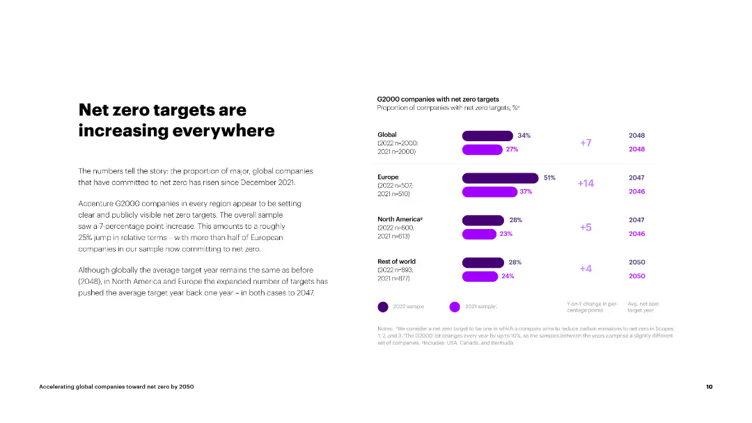
The slide includes a column chart on the right displaying the proportion of G2000 companies with net zero targets by region and their average target years.
Strategic Planning
Environmental Services & Sustainability
The slide explains the increase in global companies committing to net zero targets since December 2021, with regional comparisons and average target years.
net zero, targets, G2000, global, Europe, North America, rest of world, average target year
false
Strategic Planning
Environmental Services & Sustainability
Mixed Chart
Accenture
Add to my slides
Remove from favorites
Features a wind turbine image with blue text highlighting six key characteristics of the economic transition to net-zero. Each characteristic is numbered and spaced evenly across the slide.
Market Analysis and Trends
Environmental Services & Sustainability
Elaborates on the six characteristics of the economic transition to net-zero, including universal, significant, front-loaded, uneven, exposed to risks, and rich with opportunity. Provides an overview before diving into specifics.
Net-Zero Transition, Economic Characteristics, Universal, Significant, Risk, Opportunity
false
Market Analysis and Trends
Environmental Services & Sustainability
Agenda
McKinsey
Add to my slides
Remove from favorites
This is a cover slide with a creative design depicting a world map made of plant leaves on a deep blue background, representing the concept of a 'green' or eco-friendly world. The title is prominently displayed at the top.
Industry Overview
Environmental Services & Sustainability
As the introductory slide, it sets the theme for the presentation, signaling a focus on the costs and benefits of the net-zero transition within the global energy sector.
Net-Zero, Transition, Global Energy, Sustainability, Eco-Friendly, Introduction, McKinsey, 2022, Cover Slide
false
Industry Overview
Environmental Services & Sustainability
Title
McKinsey
Add to my slides
Remove from favorites
The slide presents a bar chart displaying job gains and losses across sectors, with a clear division line at zero. Colors and sizes differentiate positive and negative values, providing an immediate visual assessment of the data.
Human Resources and Talent Management
Environmental Services & Sustainability
Analyzes the impact of the net-zero transition on job reallocation, showing where job gains and losses may occur across various sectors. It brings attention to the operational and maintenance job shifts versus capital expenditure-related jobs.
Net-Zero Transition, Jobs, Reallocation, Sectors, Employment Shifts, 2050
false
Human Resources and Talent Management
Environmental Services & Sustainability
Single Chart
McKinsey
Add to my slides
Remove from favorites
Blue panel with topic on left, bar chart by country on right.
Market Analysis and Trends
Healthcare & Pharmaceuticals
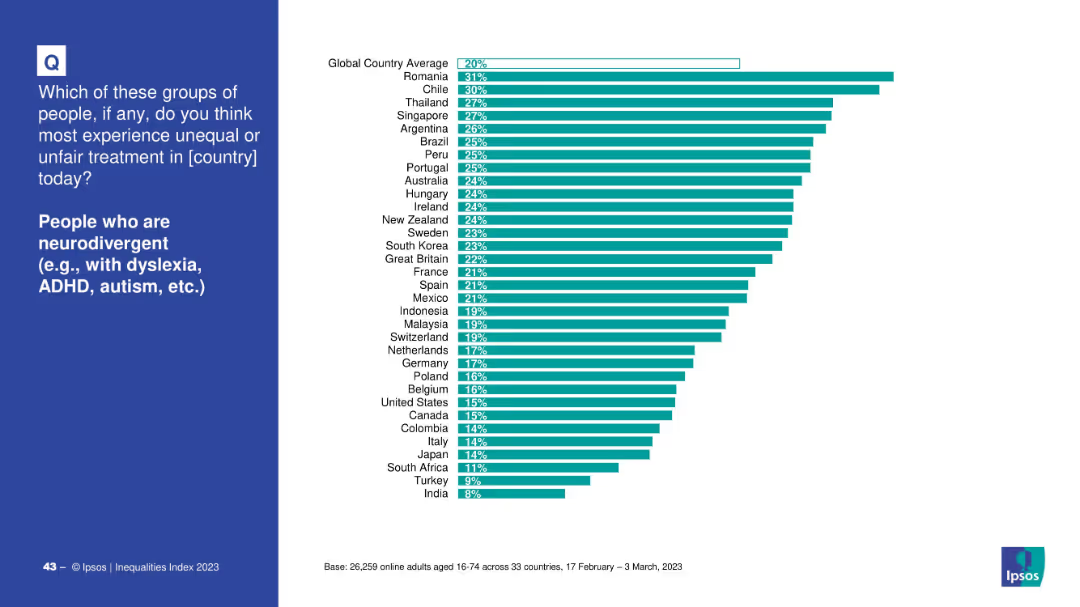
Displays cross-national perceptions of discrimination against neurodivergent individuals. Romania, Chile, and Thailand are highest; global average is 20%.
neurodivergence, ADHD, autism, dyslexia, inequality, global ranking, public opinion, discrimination
false
Market Analysis and Trends
Healthcare & Pharmaceuticals
Mixed Chart
IPSOS
Add to my slides
Remove from favorites
Demographic-based segmented horizontal bar chart.
Market Analysis and Trends
Healthcare & Pharmaceuticals
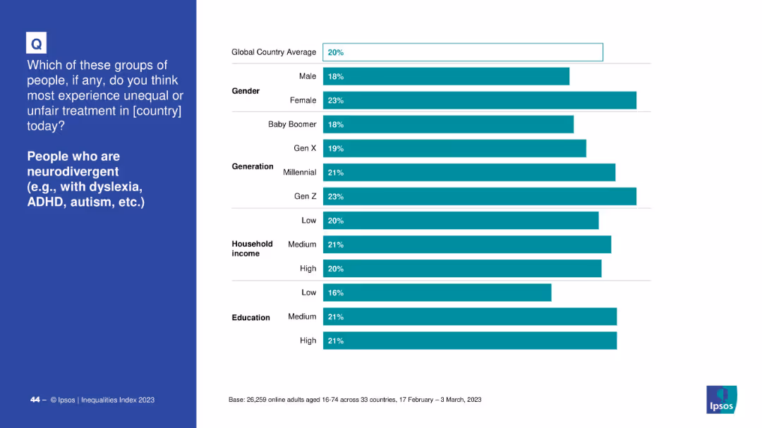
Global perception of unfair treatment of neurodivergent individuals shown by gender, generation, household income, and education levels.
neurodivergent, education, gender, generation, treatment, inequality, survey, global perception
false
Market Analysis and Trends
Healthcare & Pharmaceuticals
Mixed Chart
IPSOS
Add to my slides
Remove from favorites
Displays a bar graph comparing NEV models planned by various OEMs for 2025, with selected quotes on electrification strategies from CEOs.
Strategic Planning
Transportation & Logistics
Details the strategic planning of OEMs for NEV rollouts by 2025, with insights into commitments to vehicle electrification and market readiness.
NEVs, OEM strategies, electrification, automotive industry, 2025 projections, CEO quotes
false
Strategic Planning
Transportation & Logistics
Mixed Chart
BCG
Add to my slides
Remove from favorites
Multiple column charts present data on the orderbook as a percentage of the total drybulk fleet, comparing several quarters and highlighting industry trends.
Market Analysis and Trends
Transportation & Logistics
Highlights trends in new vessel orders within the drybulk sector, offering insights into fleet development and investment opportunities.
newbuilding orderbook, drybulk fleet, market trends, investment opportunities, fleet development
false
Market Analysis and Trends
Transportation & Logistics
Single Chart
Deutsche Bank
Add to my slides
Remove from favorites
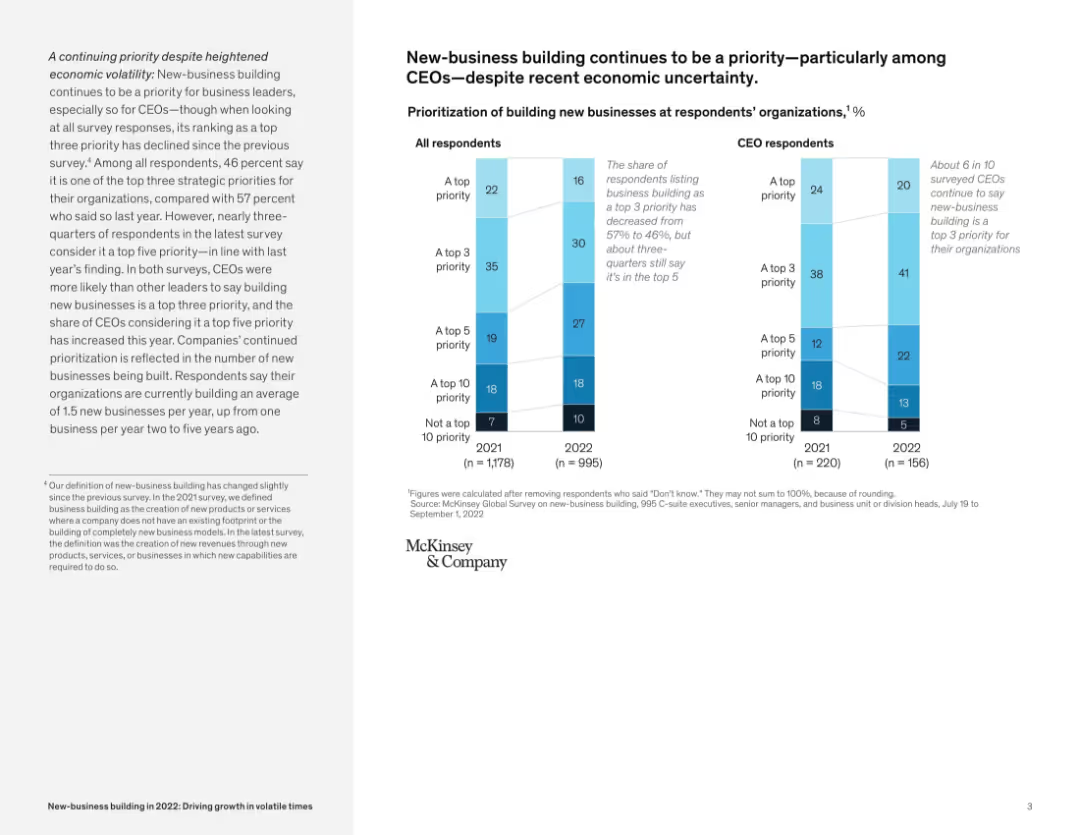
Bar chart with dual segmentation (all respondents vs CEOs), aligned with descriptive text on the left; neutral color palette.
Strategic Planning
Professional Services
This slide shows survey data highlighting that business leaders, especially CEOs, prioritize new-business building despite economic uncertainty. CEOs were more likely to rate it as a top 5 priority compared to other roles.
new-business, CEOs, survey, prioritization, growth, uncertainty, strategic planning, McKinsey survey
false
Strategic Planning
Professional Services
Mixed Chart
McKinsey
Add to my slides
Remove from favorites
Detailed bullet points with strategic advice on channel exploration, accompanied by colorful icons and case study examples.
Strategic Planning
Retail & E-commerce
Provides guidance on the exploration of new channels, emphasizing the importance of value understanding and experimentation for growth.
New Channels, Experimentation, Value Drivers, Strategy, Market Opportunities
false
Strategic Planning
Retail & E-commerce
Graphic
BCG
Add to my slides
Remove from favorites
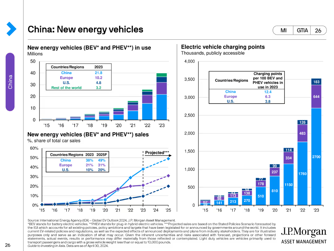
The slide features multiple bar and line charts. The left chart shows the number of new energy vehicles (BEV and PHEV) in use from 2015 to 2023. The middle chart displays electric vehicle charging points per 100 BEV/PHEV vehicles. The right chart shows new energy vehicle sales as a percentage of total car sales from 2015 to 2023.
Market Analysis and Trends
Transportation & Logistics
This slide tracks the growth of new energy vehicles in China, including the number of vehicles in use, the availability of charging infrastructure, and the market share of BEV and PHEV sales. It highlights trends and projections for the adoption of new energy vehicles.
new energy vehicles, BEV, PHEV, China, electric vehicles, charging points, sales, market share, bar chart
false
Market Analysis and Trends
Transportation & Logistics
Multiple Chart
JP Morgan
Add to my slides
Remove from favorites
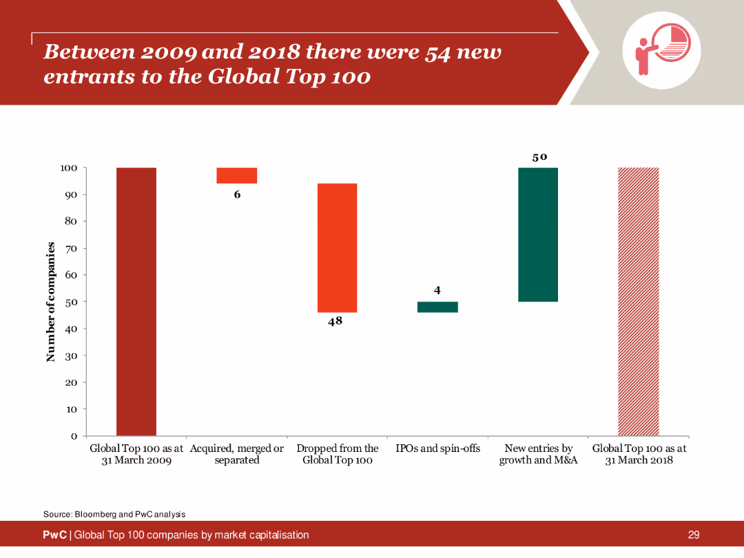
Column chart illustrating the number of companies entering and exiting the Global Top 100 from 2009 to 2018, with sections for mergers and new entries.
Market Analysis and Trends
Financial Services
Overview of the new entrants to the Global Top 100 between 2009 and 2018, showing significant changes and the impact of mergers and acquisitions.
new entrants, global top 100, 2009, 2018, analysis
false
Market Analysis and Trends
Financial Services
Single Chart
PwC/Strategy&
Add to my slides
Remove from favorites
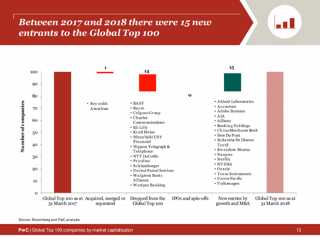
The slide includes a column chart showing the number of companies entering and exiting the Global Top 100 between 2017 and 2018, with textual analysis on the right side.
Market Analysis and Trends
Financial Services
Summary of new entries and exits in the Global Top 100 companies from 2017 to 2018, identifying companies and reasons for changes.
new entrants, global top 100, 2017, 2018, analysis
false
Market Analysis and Trends
Financial Services
Single Chart
PwC/Strategy&
Add to my slides
Remove from favorites
Similar design to previous: horizontal bar graphs by FY, segmented by role and region; rates shown with values.
Human Resources and Talent Management
Professional Services
Breaks down the rate of new hires by gender for three fiscal years. The data is grouped by leadership, management, and team members, and by geographic region. Includes overall new hire rate by gender. Helps track hiring trends and equality initiatives.
new hire rate, gender, inclusion, regions, FY metrics, leadership, hiring trends, HR
false
Human Resources and Talent Management
Professional Services
Mixed Chart
KPMG
Add to my slides
Remove from favorites
The slide displays column charts showing data on new hires in business services teams and BCG X + other specialty business units, segmented by race and gender for the years 2021, 2022, and 2023.
Human Resources and Talent Management
Professional Services
The slide provides data on new hires in business services teams and specialty business units, focusing on race and gender diversity over three years.
new hires, business services, BCG X, specialty units, diversity
false
Human Resources and Talent Management
Professional Services
Multiple Chart
BCG
Add to my slides
Remove from favorites
The slide features multiple column charts displaying data on the total workforce and consulting team across different races and identities for the years 2021, 2022, and 2023.
Human Resources and Talent Management
Professional Services
The slide gives insights into the diversity of new hires in the total workforce and consulting team, segmented by race, gender, and other identities over three years.
new hires, workforce, diversity, consulting team, representation
false
Human Resources and Talent Management
Professional Services
Multiple Chart
BCG
Add to my slides
Remove from favorites
Line chart comparing the trends in purchasing new versus resale homes from Fall 2015 to Fall 2020, with two lines representing each category.
Market Analysis and Trends
Real Estate & Construction
The slide analyzes the preferences between new and resale homes over several years, showing a shift in consumer preferences.
new homes, resale homes, purchase trends, Fall 2015-2020, consumer preferences
false
Market Analysis and Trends
Real Estate & Construction
Single Chart
IPSOS
Add to my slides
Remove from favorites
Column chart showing most attractive sectors for investors in 2021, with Apparel & Accessories and Cosmetics & Fragrances leading. Includes a change in 2020-21 sentiment chart.
Investment Analysis
Financial Services
Personal Luxury Goods sectors like Apparel & Accessories and Cosmetics & Fragrances are most attractive for 2021 investments, with significant sentiment changes from 2020.
new investments, 2021, sector attractiveness, investor perspective, sentiment change
false
Investment Analysis
Financial Services
Multiple Chart
Deloitte
Add to my slides
Remove from favorites
The slide compares two markets using photographs of cityscapes (Los Angeles and Chicago), side-by-side column charts, and key data points annotated around the images. The use of visuals and text is balanced, with emphasis on growth rates and market opportunities in both new and legacy markets.
Market Analysis and Trends
Financial Services
This comparative slide examines the performance and market opportunities in two distinct markets, Los Angeles (new) and Chicago (legacy). It highlights key statistics such as client numbers and CAGR, using column charts to contrast the revenue and loan growth in both cities. The visual representation aids in understanding the market dynamics and potential for expansion in each location.
new markets, Los Angeles, Chicago, market opportunity, revenue growth, loans, clients, prospects, CAGR
false
Market Analysis and Trends
Financial Services
Multiple Chart
JP Morgan
Add to my slides
Remove from favorites
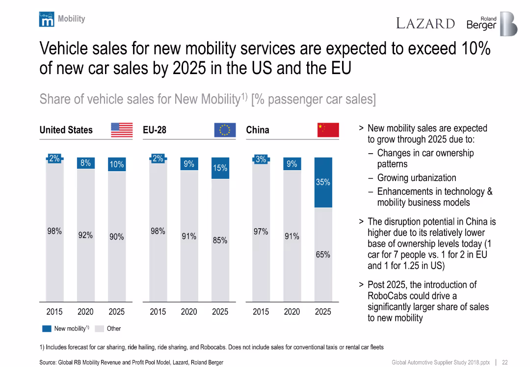
Clustered column chart showing forecasted share of new mobility vehicle sales by region (US, EU, China) from 2015–2025.
Market Analysis and Trends
Industrial & Manufacturing
Forecasts sharp growth in new mobility vehicle sales, especially in China. Drivers include urbanization, tech innovation, and ownership changes. China expected to leap ahead due to low current car ownership.
new mobility, car sharing, China, EU, US, ownership, future trends
false
Market Analysis and Trends
Industrial & Manufacturing
Mixed Chart
Roland Berger
Add to my slides
Remove from favorites
Featuring two line charts, the slide compares budget trends for new product and service introductions post-COVID, with annotations detailing significant changes and projections.
Product and Service Analysis
Professional Services
Discusses trends in budgets allocated to new product and service introductions in the post-COVID era, providing insights for strategic planning and investment.
new products, services, budgets, COVID, trends
false
Product and Service Analysis
Professional Services
Single Chart
Deloitte
Add to my slides
Remove from favorites
Detailed descriptions of seven key priorities for people management in the new reality post-COVID-19, including smarter work models and health initiatives.
Human Resources and Talent Management
Professional Services
Provides insights into how businesses can adapt their people management strategies to the post-pandemic world, focusing on health, flexibility, and new skills.
new reality, people management, health, flexibility, skills
false
Human Resources and Talent Management
Professional Services
Header Vertical
BCG
Add to my slides
Remove from favorites
Contains column charts and a bar chart comparing news source usage over time and social media news access frequency in various countries.
Market Analysis and Trends
Media & Entertainment
Details the evolution of news consumption in Western Europe, with a focus on increasing reliance on social media for news.
news consumption, social media, Western Europe, trends, news sources, access frequency, media shift, countries, comparison
false
Market Analysis and Trends
Media & Entertainment
Multiple Chart
Accenture
Add to my slides
Remove from favorites
The slide has a column chart showing the share of new services in total revenue from 2015 to 2025, with icons and text explaining service categories.
Strategic Planning
Professional Services
It projects that new services will contribute over 30% of revenues by 2025, detailing various new service offerings and their impact.
new services, revenue, projections, Ipsos, growth
false
Strategic Planning
Professional Services
Mixed Chart
IPSOS
Add to my slides
Remove from favorites
Previous
Next
You don't have any favorites yet.
Please wait loading your favorites slides...
Create a FREE account to continue browsing
Receive Instant Access to 1,000+ slides from companies like McKinsey, Google, and Goldman Sachs
First Name
Last Name
Email
Password
I agree to all
Terms & Privacy Policy
Thank you! Your submission has been received!
Oops! Something went wrong while submitting the form.
Have an account?
Sign in
Upgrade to PRO to Save slides
Advanced Search and Filters
Access to 15,000+ slides
Access to Category Pages
Save/Bookmark Slides
PowerPoint Template Library
Pick a Plan
MONTHLY
$12/month
Billed every month, Cancel anytime.
YEARLY
$9/year
Billed $108 annually, Cancel anytime.
Checkout for $12/month
Checkout for $108/yr
Secured by Stripe | AES-256 bit encryption