My Account
My Slides
Search by Category
Pricing
Templates
View All Templates
Download Template Slides
✦ AI Search
Feedback
Login
Logout
Get Started
Browse all Slides
Browse all Slides
Create a FREE Account
Instant access to 1,000+ real slides from top companies like McKinsey, BCG, Goldman Sachs, Google and many more!
First Name
Last Name
Email
Password
I agree to all
Terms & Privacy Policy
Thank you! Your submission has been received!
Oops! Something went wrong while submitting the form.
Have an account?
Sign in
Saved Slides
Total No. of slides saved
0
↻ Refresh
✖ Clear all
Title, extensive data presentation through multiple bar charts detailing digital themes like "Asset Life Cycle Management" and "Energizing New Energies".
Investment Analysis
Energy & Utilities
Examines digitalization's role in reshaping the oil and gas industry, highlighting potential economic and societal benefits, including substantial emission reductions.
oil and gas, digitalization, economic impact, emission reductions, societal benefits
false
Investment Analysis
Energy & Utilities
Mixed Chart
Accenture
Add to my slides
Remove from favorites
Contains a mix of text and a column chart titled 'Copernicus economic impact (2018)'. The layout is balanced with clear separation between textual information and visual data representation.
Market Analysis and Trends
Energy & Utilities
Discusses the economic impact of the oil and gas industry with a focus on the Copernicus program's contribution, highlighting sectors such as exploration and monitoring with benefits like cost savings and risk reduction.
Oil and Gas, Economic Impact, Exploration
false
Market Analysis and Trends
Energy & Utilities
Mixed Chart
PwC/Strategy&
Add to my slides
Remove from favorites
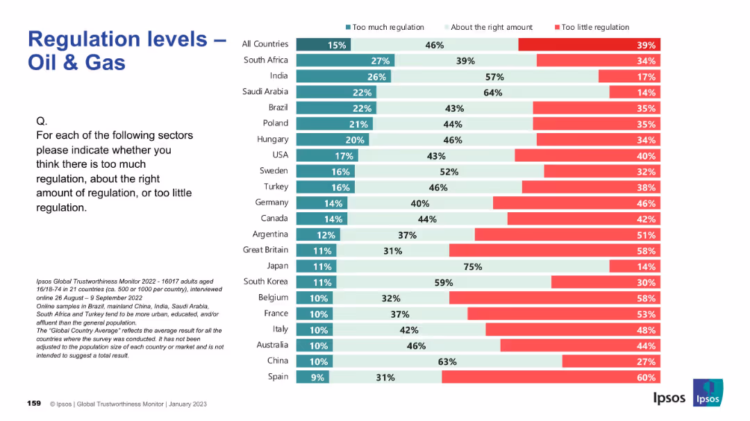
Standard Ipsos slide format; horizontally stacked bars by country; color-coded for perception categories.
Regulatory and Compliance
Energy & Utilities
This slide focuses on the oil and gas sector, indicating where populations believe regulation is excessive or insufficient. The global average shows a concern toward underregulation, particularly in Europe and Latin America. Great Britain and Belgium have the highest levels of perceived underregulation.
oil and gas, energy policy, regulation, Ipsos, compliance, governance, international, public sentiment, industry oversight, survey
false
Regulatory and Compliance
Energy & Utilities
Mixed Chart
IPSOS
Add to my slides
Remove from favorites
Includes a line graph showing 'Growth in world oil supply and demand', and extensive text explaining the current status and challenges of the oil and gas sector post-market collapse.
Industry Overview
Energy & Utilities
Analyzes the recovery trends in the oil and gas industry, noting new projects and changes in market dynamics, alongside challenges like decline in new discoveries and geopolitical issues.
Oil and Gas, Recovery, Challenges, Market Trends
false
Industry Overview
Energy & Utilities
Mixed Chart
PwC/Strategy&
Add to my slides
Remove from favorites
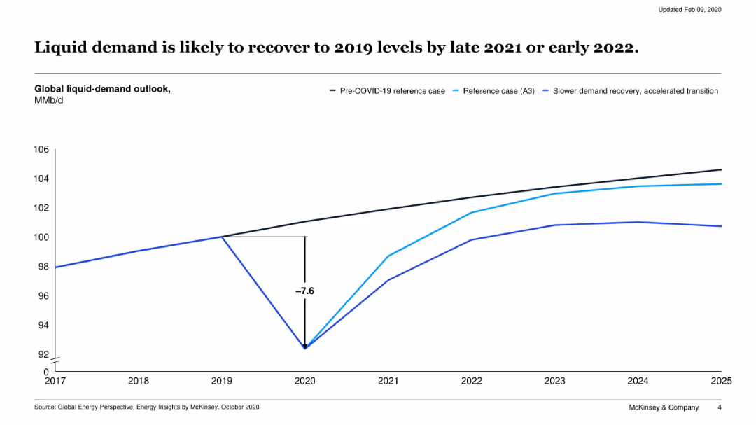
Line chart showing three global liquid-demand outlook scenarios from 2017 to 2025: pre-COVID, reference case, and accelerated transition.
Market Analysis and Trends
Energy & Utilities
This slide models the impact of COVID-19 on global liquid fuel demand, showing a sharp dip in 2020 followed by a recovery trajectory. It compares multiple scenarios including slower and faster transitions.
oil demand, COVID-19 impact, recovery, energy demand, liquid fuels, 2020, forecast
false
Market Analysis and Trends
Energy & Utilities
Single Chart
McKinsey
Add to my slides
Remove from favorites
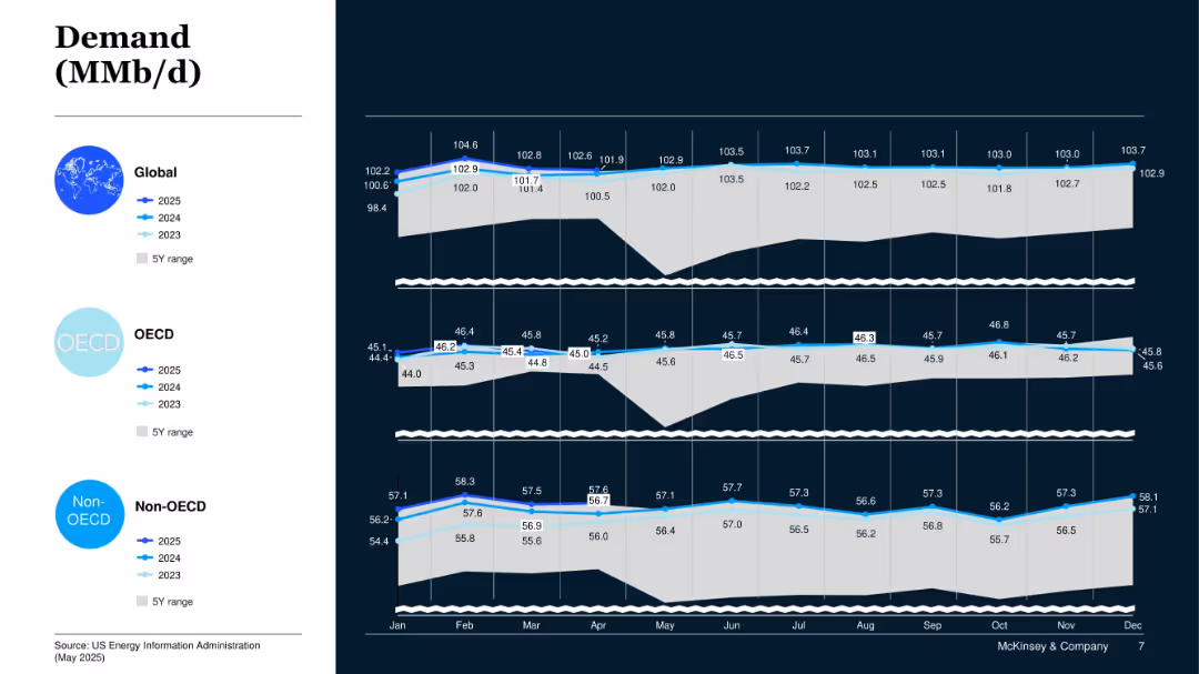
Layered line area chart across three panels: Global, OECD, Non-OECD; shows 2023–2025 demand outlook and 5Y range.
Market Analysis and Trends
Energy & Utilities
This slide compares global oil demand trends across OECD and non-OECD regions. It indicates steady global demand growth led by non-OECD consumption.
Oil Demand, OECD, Non-OECD, Global Energy, Consumption Forecast, 2025 Outlook
false
Market Analysis and Trends
Energy & Utilities
Mixed Chart
McKinsey
Add to my slides
Remove from favorites
Features two line graphs and a bar chart illustrating the historical and predicted oil demand, key drivers for peak demand, and global EV sales share.
Risk Assessment and Management
Energy & Utilities
Details the potential peak in oil demand due to electric vehicle uptake, highlighting key factors like historical growth rates and changes in road transport, aiding in risk assessment for the oil industry.
Oil Demand Peak, EV Adoption, Historical Data, Transport Sector, Growth Rates, Risk Management
false
Risk Assessment and Management
Energy & Utilities
Multiple Chart
McKinsey
Add to my slides
Remove from favorites
The slide is split into two parts, with one bar chart on the left showing oil demand and supply balance, and one column chart on the right showing global refining margins.
Market Analysis and Trends
Energy & Utilities
This slide discusses oil market fundamentals, highlighting supply-demand balance and refining margins, useful for understanding market dynamics in the energy sector.
oil demand, supply, refining margins, energy, market fundamentals
false
Market Analysis and Trends
Energy & Utilities
Multiple Chart
EY
Add to my slides
Remove from favorites
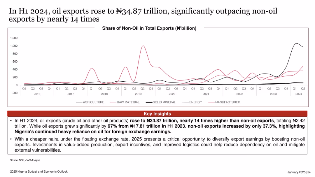
Line graph showing non-oil exports across various categories from 2016 to 2024. Key insights highlighted in red below.
Strategic Planning
Energy & Utilities
This slide emphasizes Nigeria’s overwhelming dependence on oil exports, which in H1 2024 were 14 times higher than non-oil exports. It calls for export diversification through policy reform and investment in non-oil sectors.
oil exports, non-oil exports, trade imbalance, diversification, 2024, foreign exchange, policy reform
false
Strategic Planning
Energy & Utilities
Mixed Chart
PwC/Strategy&
Add to my slides
Remove from favorites
Slide is a table layout detailing figures, with clear demarcation and legible text.
Risk Assessment and Management
Energy & Utilities
Analyzes BBVA's exposure to the Oil & Gas sector, with a breakdown by region and subsegment.
Oil, Gas, exposure, BBVA, risk
false
Risk Assessment and Management
Energy & Utilities
Table
Morgan Stanley
Add to my slides
Remove from favorites
The slide features two column charts displaying oil & gas and leveraged finance exposure over different quarters.
Risk Assessment and Management
Financial Services
This slide provides an overview of Credit Suisse's exposure to oil & gas and leveraged finance, showing trends in non-investment and investment grade loans.
oil & gas exposure, leveraged finance, non-investment grade, investment grade, financial trends
false
Risk Assessment and Management
Financial Services
Multiple Chart
Credit Suisse
Add to my slides
Remove from favorites
The slide includes a column chart and text blocks. It details oil and gas net lending exposures by geography, division, rating, and segment.
Risk Assessment and Management
Financial Services
This slide analyzes the oil and gas exposure, showing a reduction in exposure and the distribution across different segments, used for managing and assessing financial risks in the energy sector.
Oil, Gas, Exposure, Risk, Lending
false
Risk Assessment and Management
Financial Services
Mixed Chart
UBS
Add to my slides
Remove from favorites
The slide contains a column chart illustrating the global crude oil demand (mmbpd) from 2022 to 2050, with segments for Aviation, Petrochemicals, Transport, Residential, Power, and Industrial. The chart shows a notable decline in demand post-2030, particularly in the transport sector.
Strategic Planning
Energy & Utilities
This slide discusses the transition from traditional oil and gas to greener alternatives. It projects a significant reduction in global crude oil demand by 2050, driven mainly by declines in the transport sector, and highlights the shift towards cleaner energy sources.
Oil, Gas, Green, Transition, Demand, 2050, Crude, Decline
false
Strategic Planning
Energy & Utilities
Mixed Chart
EY
Add to my slides
Remove from favorites
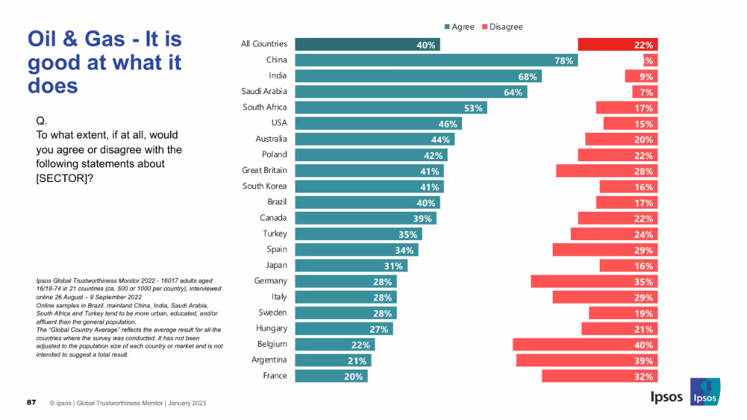
Horizontal bar chart for multiple countries with title and question on left. Sector changed to "Oil & Gas"; maintains same color-coded structure.
Market Analysis and Trends
Energy & Utilities
This slide evaluates how competent people think the oil and gas sector is at its core functions. China, India, and Saudi Arabia again show highest agreement, while European countries like France and Belgium are the most skeptical. This differs slightly from pharmaceutical sentiment.
oil & gas, performance, sector perception, Ipsos, energy industry, global opinion, agreement levels, international comparison, competence
false
Market Analysis and Trends
Energy & Utilities
Mixed Chart
IPSOS
Add to my slides
Remove from favorites
The slide includes a bar chart illustrating the evolution of the oil and gas portfolio (illustrative) from 2022 to 2050. Segments include Synthetic Fuels, Hydrogen and Ammonia, Biofuels and Biogas, Renewable Power, Natural with CCUS offsets, and Crude Oil with CCUS offsets.
Strategic Planning
Energy & Utilities
This slide presents an illustrative forecast of the future energy portfolio of major oil and gas companies, showing a shift towards renewable and decarbonized energy sources by 2050. It emphasizes the diversification of energy sources to meet energy transition goals.
Oil, Gas, Portfolio, Evolution, Renewable, 2050, Decarbonization
false
Strategic Planning
Energy & Utilities
Mixed Chart
EY
Add to my slides
Remove from favorites
Multiple overlaid line charts showing projected changes in oil and gas production over time, based on data from IOC and IEA with a growth indicator.
Investment Analysis
Financial Services
Discusses oil and gas production forecasts, comparing different sources and highlighting growth expectations in the sector, suggesting ongoing investment viability despite broader market shifts.
oil, gas, production, forecasts, investment
false
Investment Analysis
Financial Services
Single Chart
BCG
Add to my slides
Remove from favorites
Column chart comparing the total shareholder return (TSR) of oil and gas with other sectors over five years, shown in different shades of green with performance markers.
Competitive Landscape
Energy & Utilities
Evaluates the attractiveness of the oil and gas sector by comparing its performance against other industries, emphasizing its place within the competitive landscape of various sectors over the past five years.
oil, gas, sectors, performance, competitiveness
false
Competitive Landscape
Energy & Utilities
Single Chart
BCG
Add to my slides
Remove from favorites
Scatter plot correlating the S&P 500 share of oil and gas with Brent oil prices over time, differentiated between 2000-2015 and 2016-June 2019.
Market Analysis and Trends
Financial Services
This slide presents the declining trend of oil and gas industries' share in the S&P 500 index relative to oil prices, suggesting shifts in energy sector valuations influenced by market and price factors.
oil, gas, S&P 500, market trends, Brent oil
false
Market Analysis and Trends
Financial Services
Single Chart
BCG
Add to my slides
Remove from favorites
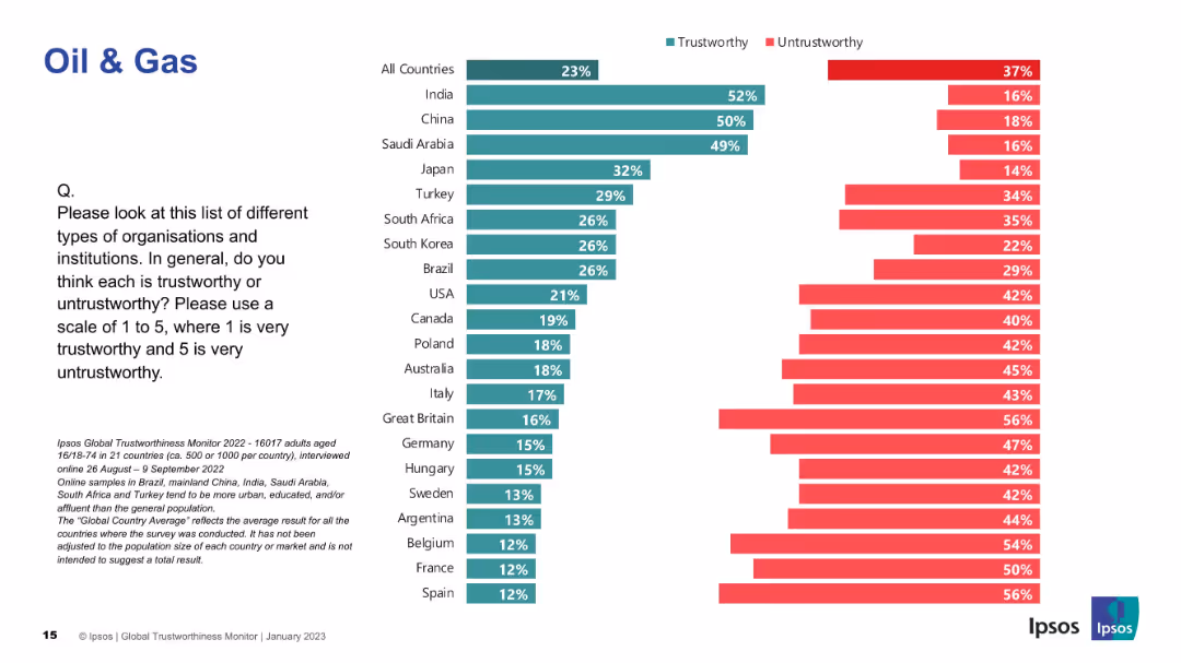
Bar chart of countries' trust in oil & gas companies; uses consistent visual design with prior slides.
Market Analysis and Trends
Energy & Utilities
Public perception of trust in oil & gas companies is shown across 21 countries. India and China again top trust rankings, while Europe ranks lower.
oil, gas, trust, energy, global survey, perception, Ipsos, untrustworthy, bar chart, country data
false
Market Analysis and Trends
Energy & Utilities
Mixed Chart
IPSOS
Add to my slides
Remove from favorites
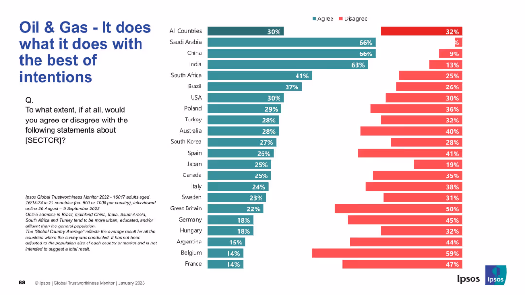
Bar chart comparing agreement and disagreement across countries with the statement. Left-aligned title and question, horizontal bars with green (agree) and red (disagree).
Market Analysis and Trends
Energy & Utilities
This slide presents public opinion across 21 countries on whether the oil & gas sector operates with the best of intentions. Agreement is highest in Saudi Arabia, China, and India, with European countries showing more disagreement.
Oil & Gas, Trust, Global Survey, Intentions, Public Perception, Ipsos, Country Comparison, Sector Sentiment, Energy, Opinions
false
Market Analysis and Trends
Energy & Utilities
Mixed Chart
IPSOS
Add to my slides
Remove from favorites
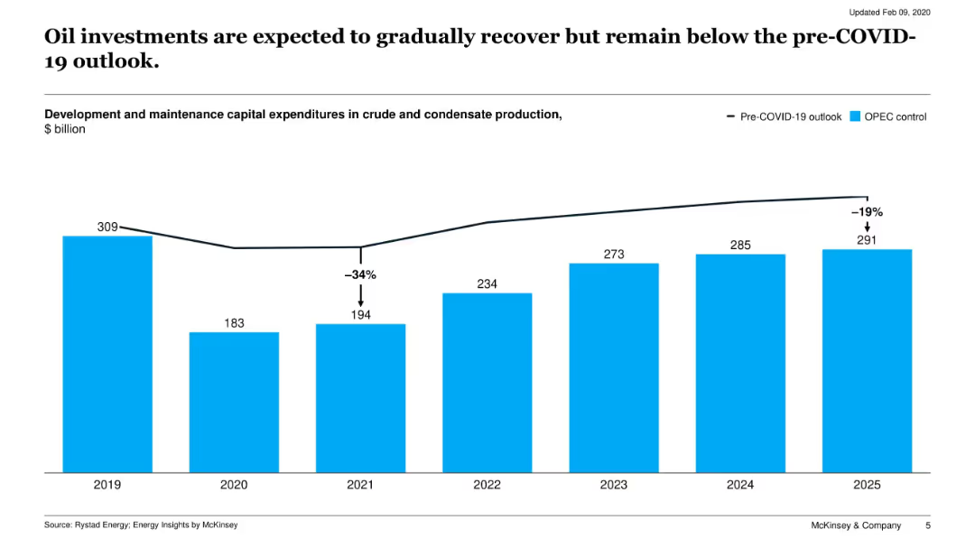
Bar chart of capital expenditures in crude and condensate production from 2019 to 2025, contrasting actual vs. pre-COVID-19 projections.
Investment Analysis
Energy & Utilities
The slide examines oil sector investment trends, showing a steep drop in 2020 followed by gradual recovery through 2025. It highlights the gap between actual spending and pre-COVID expectations.
oil investment, capex, COVID-19, recovery, energy outlook, production costs
false
Investment Analysis
Energy & Utilities
Single Chart
McKinsey
Add to my slides
Remove from favorites
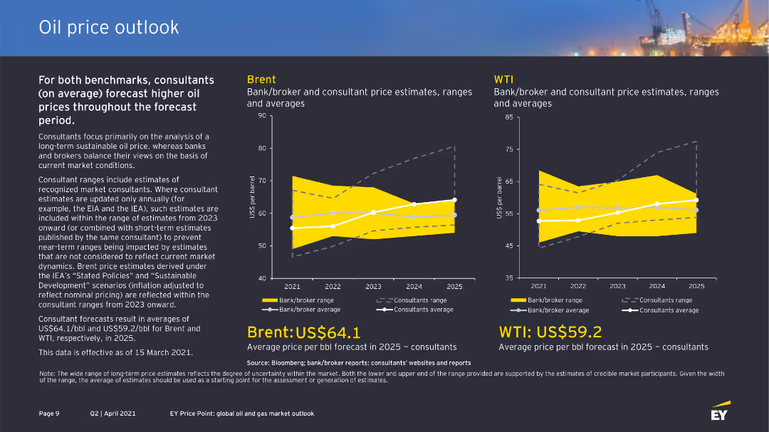
The slide presents two column charts comparing bank/broker and consultant price estimates for Brent and WTI oil prices from 2021 to 2025. The layout is clear with highlighted price forecasts and ranges.
Market Analysis and Trends
Energy & Utilities
This slide provides a comparison of Brent and WTI oil price forecasts by banks, brokers, and consultants, highlighting higher price expectations over the forecast period. It includes detailed estimates and influencing factors.
oil price, Brent, WTI, forecast, consultants, banks
false
Market Analysis and Trends
Energy & Utilities
Multiple Chart
EY
Add to my slides
Remove from favorites
Two column charts showing Brent and WTI price estimates from banks and brokers. Each chart has consultant and bank/broker ranges with data points from 2020 to 2024.
Market Analysis and Trends
Energy & Utilities
This slide forecasts higher oil prices for Brent and WTI, with consultant ranges suggesting long-term sustainable prices. Provides average price per barrel estimates.
Oil, price, forecast, Brent, WTI, bank, broker, consultant, estimate, range
false
Market Analysis and Trends
Energy & Utilities
Multiple Chart
EY
Add to my slides
Remove from favorites
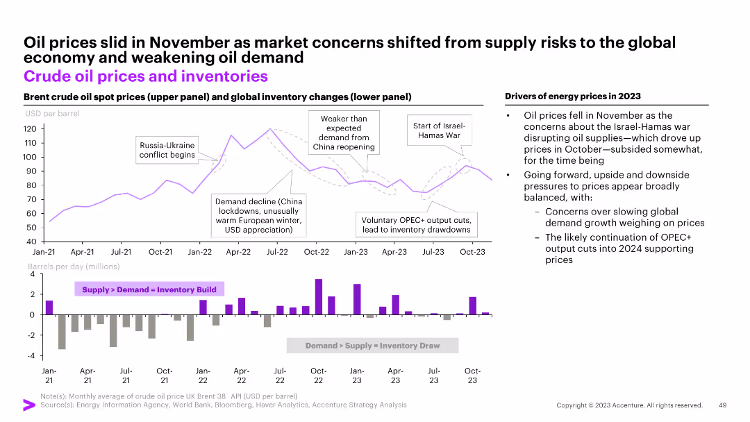
The slide features a line chart of crude oil prices and a bar chart of global inventory changes, with annotations marking significant events and a commentary section.
Market Analysis and Trends
Energy & Utilities
The slide examines the trends in crude oil prices and inventories, discussing the impacts of geopolitical events and market shifts on supply and demand.
oil prices, inventories, global, trends, geopolitical
false
Market Analysis and Trends
Energy & Utilities
Multiple Chart
Accenture
Add to my slides
Remove from favorites
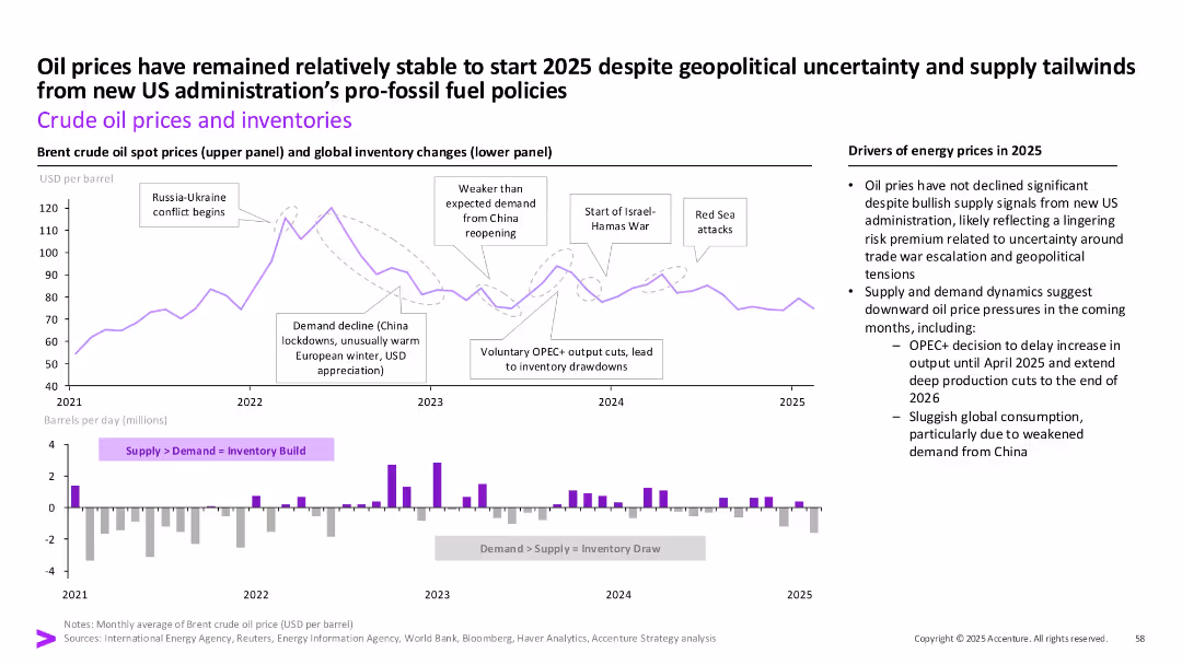
Two-panel chart: oil price trends and inventory changes. Includes timeline of events and commentary on the right.
Market Analysis and Trends
Energy & Utilities
This slide illustrates crude oil price stability entering 2025 despite geopolitical instability and policy changes. It also charts inventory dynamics influenced by OPEC+ decisions and demand shifts, especially from China.
Oil prices, inventory, OPEC, geopolitics, Red Sea, demand, energy policy, consumption
false
Market Analysis and Trends
Energy & Utilities
Multiple Chart
Accenture
Add to my slides
Remove from favorites
The slide includes a line graph with historical and projected oil prices from 1990 to 2040. The graph shows different scenarios for future oil prices based on various economic factors.
Financial Performance
Energy & Utilities
Discusses the factors influencing oil prices with projections up to 2040, offering a detailed analysis of trends and potential future scenarios. The slide helps in understanding market volatility and can be crucial for economic forecasting and investment decisions in the energy sector.
oil prices, market trends, projections, energy, economics
false
Financial Performance
Energy & Utilities
Mixed Chart
Roland Berger
Add to my slides
Remove from favorites
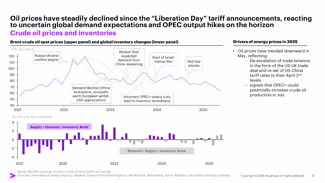
Two-panel chart: top showing Brent crude oil spot prices, bottom showing global inventory changes (bar graph), annotated with key events.
Market Analysis and Trends
Energy & Utilities
Explains price volatility in crude oil markets from 2021–2025, attributing changes to OPEC+ output adjustments, demand fluctuations, and geopolitical factors like Russia-Ukraine and Israel-Hamas conflicts. Oil prices fell post-tariff announcements amid easing tensions.
oil prices, OPEC+, inventory, Russia, demand, tariff, energy markets, supply shock, war, crude
false
Market Analysis and Trends
Energy & Utilities
Multiple Chart
Accenture
Add to my slides
Remove from favorites
Multi-line and bar combo chart on a dark background; shows Brent price, demand/supply, and inventories over time.
Market Analysis and Trends
Energy & Utilities
This slide presents the key fundamentals of the oil market from 2021 to 2025, including price trends, supply-demand balance, and inventory levels. It reveals falling prices despite stable demand and supply.
Oil Price, Supply-Demand, Inventories, Brent Spot Price, Global Liquids, Energy Market, Stock Change
false
Market Analysis and Trends
Energy & Utilities
Mixed Chart
McKinsey
Add to my slides
Remove from favorites
Features a line chart on the left comparing WTI crude oil price and US rig count, and a line chart on the right showing crude oil production by country.
Market Analysis and Trends
Energy & Utilities
This slide provides insights into the oil market, comparing WTI crude oil prices with US rig counts and analyzing oil production trends across different countries.
oil prices, WTI crude, rig count, production, countries
false
Market Analysis and Trends
Energy & Utilities
Multiple Chart
JP Morgan
Add to my slides
Remove from favorites
Two side-by-side line charts showing WTI oil price history and U.S. net oil imports as % of GDP; key data points annotated.
Market Analysis and Trends
Energy & Utilities
This slide tracks historical WTI crude oil prices and U.S. net oil imports as a share of GDP. It shows key peaks and troughs, with recent prices and import levels, highlighting the U.S.'s shift to net oil exporter status.
oil prices, WTI, GDP, imports, energy, trade balance, commodity, trend analysis, crude oil
false
Market Analysis and Trends
Energy & Utilities
Multiple Chart
JP Morgan
Add to my slides
Remove from favorites
The slide features a stacked bar chart showing global oil supply growth from 2020 to 2040, including sanctioned and unsanctioned projects.
Operational Efficiency
Energy & Utilities
It highlights the need for significant new crude oil production from unsanctioned projects to meet demand by 2040, outlining sources like OPEC, shale oil, and oil sands.
oil production, unsanctioned projects, demand, supply growth, E&P companies
false
Operational Efficiency
Energy & Utilities
Single Chart
McKinsey
Add to my slides
Remove from favorites
The slide uses a flowchart to illustrate projected oil revenues and other revenue sources for the 2024 budget. It is moderately complex, with a focus on clear and structured information.
Market Analysis and Trends
Energy & Utilities
The slide outlines the projected oil revenue for the 2024 budget, showing the distribution of revenue sources and emphasizing the need for fiscal management reforms.
Oil Revenue, Projection, Budget, Fiscal, Sources
false
Market Analysis and Trends
Energy & Utilities
Diagram
PwC/Strategy&
Add to my slides
Remove from favorites
This slide features two line charts; one shows global oil supply and demand, and the other shows historical oil prices with notable peaks and troughs marked.
Market Analysis and Trends
Energy & Utilities
The slide examines short-term market dynamics in the oil industry, focusing on supply and demand trends and significant price movements.
oil supply, demand, market dynamics, price trends, energy market
false
Market Analysis and Trends
Energy & Utilities
Multiple Chart
JP Morgan
Add to my slides
Remove from favorites
This slide includes a column chart on the left showing contributions to global oil production by country and a line chart on the right showing U.S. crude oil inventories and rig count.
Market Analysis and Trends
Energy & Utilities
It presents data on global oil supply and U.S. crude oil inventories, useful for understanding supply dynamics and market trends in the oil industry.
oil supply, global production, crude oil, inventories, rig count
false
Market Analysis and Trends
Energy & Utilities
Multiple Chart
JP Morgan
Add to my slides
Remove from favorites
Line chart tracking four major oil supply sources over time on dark background, including Non-OPEC, OPEC, US shale, and others.
Operational Efficiency
Energy & Utilities
This slide visualizes global oil supply dynamics from major sources over time. It highlights steady increases in non-OPEC and US shale outputs, with some fluctuation in OPEC nations.
Oil Supply, Non-OPEC, OPEC, Shale Oil, Energy Production, Crude Oil
false
Operational Efficiency
Energy & Utilities
Mixed Chart
McKinsey
Add to my slides
Remove from favorites
Horizontal bar chart of Likely/Unlikely responses per country; includes global average.
Strategic Planning
Media & Entertainment
The slide captures national confidence in Olympic performance for 2024. China (86%) leads expectations, while Romania (25%) ranks lowest. The global average is 47%. This reflects sports optimism and national pride ahead of the Summer Olympics.
Olympics, sports prediction, national pride, medal tally, 2024 games, public opinion, Ipsos, country comparison, athletic performance, sentiment
false
Strategic Planning
Media & Entertainment
Mixed Chart
IPSOS
Add to my slides
Remove from favorites
Features a vertical column chart showing the key advantages of data analytics tools with percentages for B2C, B2B2C, B2B, and C2C. Text boxes and an illustrative flowchart are present on the right.
Market Analysis and Trends
Retail & E-commerce
The slide compares the adoption of omnichannel approaches in retail, highlighting the rise of B2B2C models and their advantages in the Southeast Asia market.
omnichannel, B2C, B2B2C, retail, e-commerce, market analysis, data analytics, consumer behavior, Southeast Asia
false
Market Analysis and Trends
Retail & E-commerce
Mixed Chart
Deloitte
Add to my slides
Remove from favorites
The slide contains two column charts and a pie chart depicting customer engagement through various banking channels and related transaction statistics.
Financial Performance
Financial Services
Presents the bank's omnichannel service model, emphasizing the balance between self-service transactions and branch visits, highlighting digital and in-branch engagement.
omnichannel, banking, customer engagement, digital transactions, branch services, self-service, multi-channel, financial services, transaction statistics
false
Financial Performance
Financial Services
Multiple Chart
JP Morgan
Add to my slides
Remove from favorites
Includes stacked column charts displaying transaction mixes over years and comparative metrics, with clear demarcation between digital and physical channels.
Technology and Digital Transformation
Financial Services
Suitable for presentations on digital transformation, showing the shift in banking transactions from physical to digital channels over time.
omni-channel, banking, digital transformation, transactions, customer satisfaction, technology, services, growth, engagement, channels
false
Technology and Digital Transformation
Financial Services
Multiple Chart
JP Morgan
Add to my slides
Remove from favorites
Comparative analysis of three omnichannel models used by a regional bank, a digital fashion retailer, and a global consumer electronics player. Text boxes explain key features and impacts for each.
Operational Efficiency
Retail & E-commerce
Provides case studies of omnichannel strategies across different sectors, comparing their implementation and impact on transaction volumes and customer engagement.
omnichannel, case study, retail, banking, fashion, consumer electronics, digital commerce, customer engagement, impact
false
Operational Efficiency
Retail & E-commerce
Pillar
Deloitte
Add to my slides
Remove from favorites
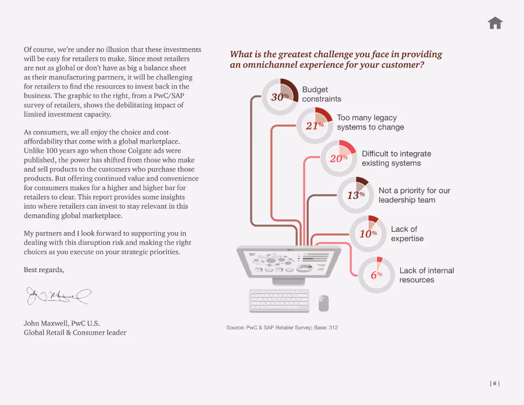
Text with a flowchart illustrating the greatest challenges faced in providing an omnichannel experience, with percentages for budget constraints, legacy systems, etc.
Market Analysis and Trends
Retail & E-commerce
The slide identifies key challenges in providing an omnichannel customer experience, emphasizing budget constraints and system integration issues. Useful for market trend analysis.
omnichannel, challenges, budget, systems, customer
false
Market Analysis and Trends
Retail & E-commerce
Mixed Chart
PwC/Strategy&
Add to my slides
Remove from favorites
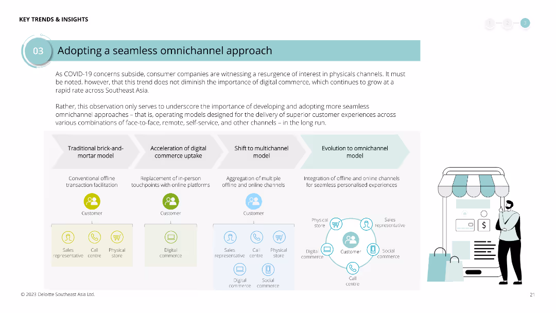
Diagram illustrating the evolution from traditional brick-and-mortar to omnichannel models, with text boxes explaining each phase. Icons represent various channels and stages.
Strategic Planning
Retail & E-commerce
Highlights the importance of developing seamless omnichannel approaches in the post-COVID era, detailing the steps from traditional models to integrated omnichannel experiences for customer satisfaction.
omnichannel, COVID-19, retail, e-commerce, digital commerce, customer experience, strategic planning, evolution
false
Strategic Planning
Retail & E-commerce
Linear Flow
Deloitte
Add to my slides
Remove from favorites
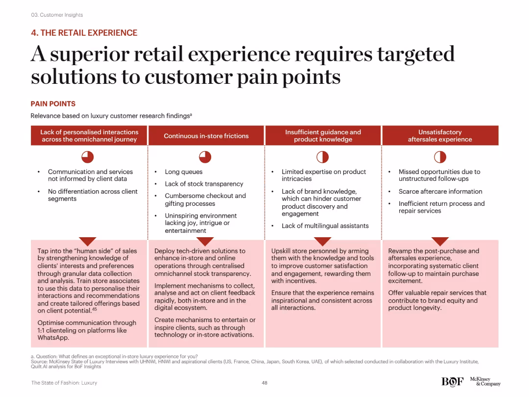
Matrix layout: four major pain point categories across top, each with corresponding red icons and bulleted descriptions below. Solutions for each category are outlined at the bottom of the slide in light pink boxes.
Customer and Market Segmentation
Consumer Goods
This slide offers a structured framework to address luxury retail pain points across personalization, in-store friction, staff expertise, and aftersales. Suggested solutions include tech integration, training, communication improvements, and enhanced service standards.
omnichannel, customer service, personalization, staff training, luxury retail, tech-driven solutions, aftersales
false
Customer and Market Segmentation
Consumer Goods
Mixed Chart
McKinsey
Add to my slides
Remove from favorites
Slide with a mix of icons, text, and percentages. It displays digital log-ins, a branch network, and personnel details, all contributing to an omnichannel banking experience.
Operational Efficiency
Financial Services
Describes the digital and physical banking services provided by Chase, emphasizing the scope and reach of their offerings to serve clients through various channels.
Omnichannel, Digital, Physical Network, Chase, Banking, Client Service, Multi-channel, Relationship Management
false
Operational Efficiency
Financial Services
Framework
JP Morgan
Add to my slides
Remove from favorites
The slide includes two columns of text with accompanying images, trend assessments with bar charts for impact and time of adoption.
Technology and Digital Transformation
Retail & E-commerce
Describes omnichannel shopping and instant shopping, emphasizing seamless customer experiences across different channels.
Omnichannel, Instant Shopping, Customer Experience, Retail, Shopping Experience, Real-time Data, Omnichannel Strategies
false
Technology and Digital Transformation
Retail & E-commerce
Mixed Chart
Deloitte
Add to my slides
Remove from favorites
The slide contains a column chart showing last purchase channel evolution from 2013 to 2017, with annotations explaining the trends.
Market Analysis and Trends
Retail & E-commerce
The slide discusses the stabilization of omnichannel and the growth of online-solo purchases among seniors, highlighting store recovery signs.
Omnichannel, Online-solo, Store recovery, Trends, Retail
false
Market Analysis and Trends
Retail & E-commerce
Multiple Chart
BCG
Add to my slides
Remove from favorites
The slide presents bar graphs comparing current and future use of digital services. It has a title, a subtitle, and a source citation at the bottom.
Market Analysis and Trends
Retail & E-commerce
The slide shows the usage of digital services during COVID-19, with an expectation that consumers will continue using these services post-pandemic.
Omnichannel, Retail, COVID-19, Digital Services, Consumer Behavior, Future Trends, Bar Graphs, Usage Statistics
false
Market Analysis and Trends
Retail & E-commerce
Mixed Chart
Accenture
Add to my slides
Remove from favorites
Divided into two main sections with text, the slide features an image of a woman looking at merchandise in the lower left corner. The right side of the slide emphasizes 'no-regret' moves businesses can make.
Strategic Planning
Retail & E-commerce
Provides a strategic framework for creating an integrated channel strategy that addresses customer needs and drives lifetime loyalty. It's intended for businesses seeking to blend online and offline retail experiences seamlessly. The slide suggests starting with understanding consumers and driving towards lifetime loyalty to build a strong omnichannel retail presence, offering steps to remove barriers to conversion, and considering future physical retail space requirements.
Omnichannel, Retail, Strategy, Consumers, Loyalty
false
Strategic Planning
Retail & E-commerce
Boxed
Bain
Add to my slides
Remove from favorites
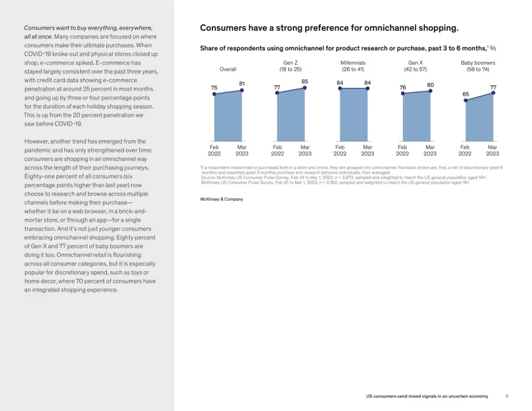
Side-by-side layout with text on the left and bar charts on the right. The bar charts show omnichannel usage trends across different generations from 2022 to 2023. The design uses soft blue tones with consistent data visualization styling.
Customer and Market Segmentation
Retail & E-commerce
This slide presents data on consumer preferences for omnichannel shopping, showing a clear upward trend across all age groups. It emphasizes the increased integration of online and offline channels for product research and purchases, especially for discretionary items. Omnichannel engagement rose from 75% to 81% overall from 2022 to 2023.
omnichannel, shopping behavior, Gen Z, Millennials, trends, retail
false
Customer and Market Segmentation
Retail & E-commerce
Mixed Chart
McKinsey
Add to my slides
Remove from favorites
The slide contains a bar chart comparing the importance of on-demand car functions across different countries. The layout is moderately dense with text and visual elements.
Product and Service Analysis
Consumer Goods
Highlights the importance of various on-demand car functions, such as traffic jam and parking pilot, across different countries.
on-demand functions, car features, traffic jam pilot, parking pilot, air condition activation
false
Product and Service Analysis
Consumer Goods
Multiple Chart
PwC/Strategy&
Add to my slides
Remove from favorites
Stacked column chart showing the growth of Scandinavian filmed entertainment revenues by segment from 2014 to 2023.
Market Analysis and Trends
Media & Entertainment
Analyzing the Scandinavian filmed entertainment market, this slide shows how on-demand video services are expected to be major growth drivers.
on-demand video, entertainment revenues, Scandinavian market, market growth
false
Market Analysis and Trends
Media & Entertainment
Single Chart
PwC/Strategy&
Add to my slides
Remove from favorites
The slide includes bar charts comparing on-farm storage costs and capacity in Australia, Canada, and Ukraine, along with contextual notes.
Operational Efficiency
Agriculture & Food Production
The slide highlights Australia's limited on-farm storage capacity compared to Canada and Ukraine, discussing the cost advantages and market impacts of this limitation.
On-farm storage, Australia, Canada, Ukraine, storage costs, storage capacity, agriculture, food production, operational efficiency
false
Operational Efficiency
Agriculture & Food Production
Multiple Chart
LEK
Add to my slides
Remove from favorites
This slide uses a bar graph and segmented bars in a purple and grey color scheme to compare essential tasks and enriching activities' relative importance and projected annual growth.
Market Analysis and Trends
Technology & Software
It displays the perceived importance of various online activities over the nbn network, highlighting a trend towards more time spent on enriching activities like gaming and virtual reality.
online activities, nbn network, importance, growth trends, enriching activities, essentials, gaming, virtual reality
false
Market Analysis and Trends
Technology & Software
Multiple Chart
Accenture
Add to my slides
Remove from favorites
A data-heavy slide, it showcases a comparison of online activity incidence with color-coded bars, highlighting the low digital activity levels across sectors.
Market Analysis and Trends
Technology & Software
This slide analyzes the incidence of various online activities in metropolitan versus non-metropolitan areas, illustrating a stark contrast in digital adoption.
online activity, digital adoption, e-commerce, payments, food delivery, metropolitan, non-metropolitan
false
Market Analysis and Trends
Technology & Software
Table
Kearney
Add to my slides
Remove from favorites
Depicts multiple bar charts showing the increase in online adoption across various retail categories, with a particular focus on groceries.
Market Analysis and Trends
Retail & E-commerce
Details the significant increase in online retail adoption in Southeast Asia, with an emphasis on the rapid rise of online grocery shopping.
Online adoption, retail categories, Southeast Asia, groceries, bar chart
false
Market Analysis and Trends
Retail & E-commerce
Multiple Chart
Bain
Add to my slides
Remove from favorites
Column charts illustrate the SEA online ad market size for 2015 and 2025, with digital percentages and a descriptive sidebar.
Market Analysis and Trends
Media & Entertainment
The slide predicts a fivefold increase in the SEA online ads market by 2025 and emphasizes the significance of Indonesia and Thailand in the market.
online ads, SEA, market growth, Indonesia, Thailand
false
Market Analysis and Trends
Media & Entertainment
Multiple Chart
Bain
Add to my slides
Remove from favorites
Features a pie chart detailing the sources of online advertising revenue in 2019, with annotations explaining the growth from new markets and traditional sources. The slide highlights the significant increase in the total online advertising market size from 2003 to 2019.
Market Analysis and Trends
Media & Entertainment
Discusses the expansion of the online advertising sector, identifying major growth drivers and the sectors contributing to its rise. This slide is particularly useful for digital marketers and media planners, providing insights into evolving advertising practices and potential areas for innovation or increased investment.
online advertising, market growth, revenue sources, digital marketing, strategic planning
false
Market Analysis and Trends
Media & Entertainment
Mixed Chart
Accenture
Add to my slides
Remove from favorites
A slide showing three circular diagrams representing different times and their associated data points.
Market Analysis and Trends
Technology & Software
Shows the increase in time spent online by consumers before, during, and after lockdowns, providing a comparison.
online behavior, lockdown, time spent, comparison, consumers
false
Market Analysis and Trends
Technology & Software
Multiple Chart
Bain
Add to my slides
Remove from favorites
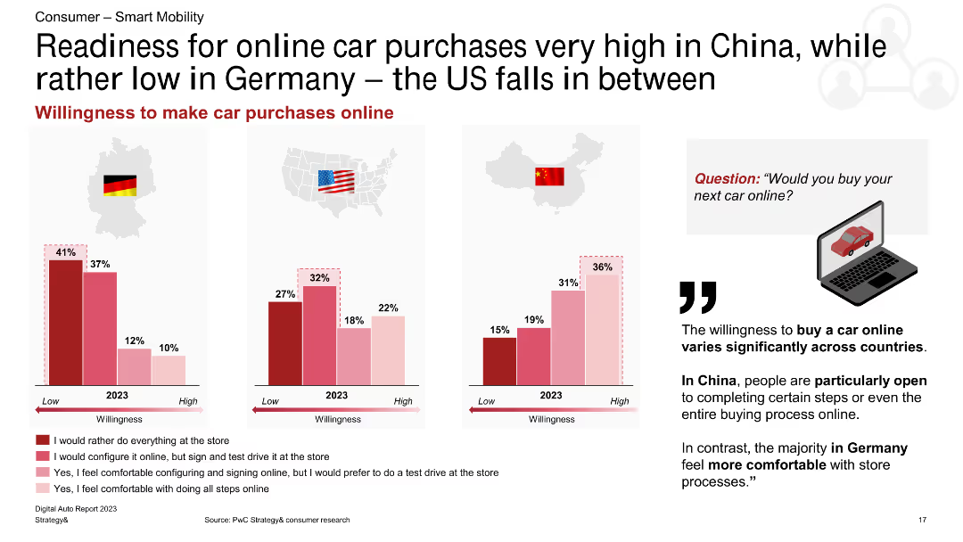
This slide includes a column chart showing the willingness to purchase cars online in Germany, the US, and China, with different levels of comfort represented.
Market Analysis and Trends
Transportation & Logistics
The slide illustrates varying levels of readiness to buy cars online, with high readiness in China, moderate in the US, and low in Germany, highlighting regional differences in consumer behavior.
online car purchase, willingness, Germany, US, China, consumer behavior, automotive, market trends, e-commerce
false
Market Analysis and Trends
Transportation & Logistics
Multiple Chart
PwC/Strategy&
Add to my slides
Remove from favorites
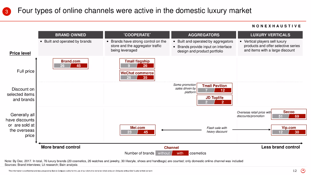
The slide presents a matrix chart categorizing online channels into brand owned, cooperate, aggregators, and luxury verticals, with various metrics such as price level and number of brands with/without cosmetics.
Market Analysis and Trends
Retail & E-commerce
This slide categorizes the different types of online channels in the luxury market, explaining their price levels and brand control, highlighting the role of cosmetics in each category.
Online channels, luxury market, brand control, cosmetics, price level, domestic market
false
Market Analysis and Trends
Retail & E-commerce
Table
Bain
Add to my slides
Remove from favorites
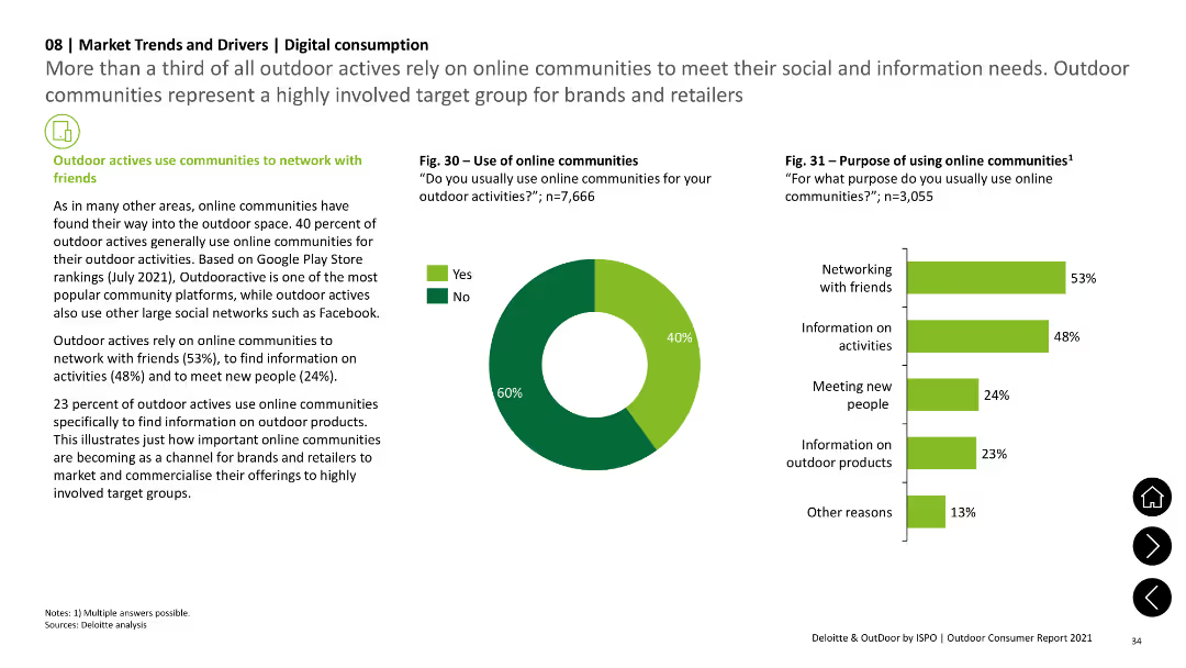
The slide includes a pie chart showing the use of online communities and a column chart detailing the purposes, such as networking with friends and finding information on activities. Text sections provide context.
Technology and Digital Transformation
Technology & Software
The slide discusses the role of online communities in outdoor activities, with survey data indicating the purposes for using these platforms, such as networking, finding information, and meeting new people.
online communities, social networking, outdoor activities, survey data, digital consumption
false
Technology and Digital Transformation
Technology & Software
Multiple Chart
Deloitte
Add to my slides
Remove from favorites
Pie chart and small bar graph showing the growth of video in online discovery channels, header, and text.
Customer and Market Segmentation
Retail & E-commerce
Focuses on the rise of social media videos as the fastest-growing channel for online discovery.
online discovery, social media, video content, market trends, retail
false
Customer and Market Segmentation
Retail & E-commerce
Single Chart
Bain
Add to my slides
Remove from favorites
The slide contains column charts comparing school connectivity across various countries, and quotes about the challenges faced by Indonesian students in remote learning.
Strategic Planning
Education & Training
Discusses the disparity in internet access among students in Indonesia compared to other countries, emphasizing the difficulties in implementing online education.
online education, internet access, Indonesia, school connectivity, remote learning, students
false
Strategic Planning
Education & Training
Mixed Chart
BCG
Add to my slides
Remove from favorites
Multiple bubble charts and graphs with annotations, a large header, and a footnotes section, against a purple background.
Product and Service Analysis
Technology & Software
Illustrates how online entertainment has become a significant leisure activity, especially post-COVID-19, with an increase in time spent on streaming and gaming.
online entertainment, COVID-19 impact, leisure activities, streaming, gaming, social media, user trends, time allocation
false
Product and Service Analysis
Technology & Software
Multiple Chart
Accenture
Add to my slides
Remove from favorites
Displays a bar chart on weekly active usage by paying users across different media types, segmented by user demographics. The chart uses different shades to differentiate segments.
Customer and Market Segmentation
Media & Entertainment
Analyzes weekly usage rates of paid online entertainment services among various demographic segments, highlighting trends among affluent users and young digital natives.
online entertainment, user demographics, music, video, gaming, paid services, affluent users, digital natives
false
Customer and Market Segmentation
Media & Entertainment
Single Chart
Bain
Add to my slides
Remove from favorites
Displays a split bar chart contrasting online and offline penetration in grocery vs. non-grocery e-commerce, accompanied by explanatory text.
Market Analysis and Trends
Retail & E-commerce
This slide identifies online grocery as a relatively untapped segment within e-commerce, presenting it as an area ripe for growth and innovation. It might be used to argue for investment in online grocery platforms or to inform strategic moves within the retail sector.
Online Grocery, E-commerce, Opportunity
false
Market Analysis and Trends
Retail & E-commerce
Mixed Chart
Bain
Add to my slides
Remove from favorites
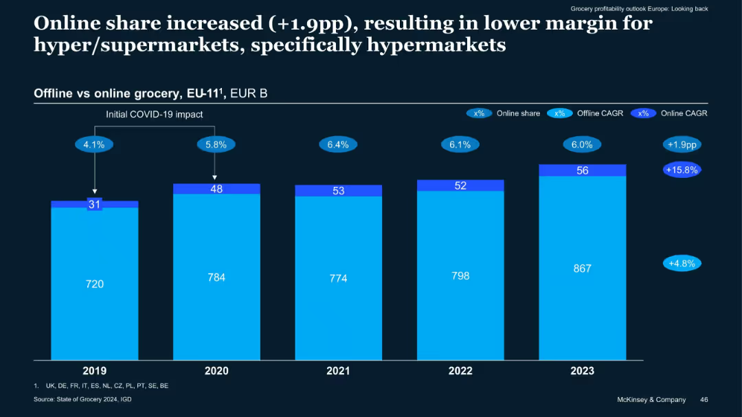
Stacked bar chart of online vs offline grocery sales (EUR B) from 2019–2023
Market Analysis and Trends
Retail & E-commerce
Online grocery sales grew by 1.9 percentage points from 2019 to 2023 in EU-11, with a high CAGR, affecting hypermarket margins. The trend reflects post-COVID consumer behavior favoring convenience, despite operational challenges for large-format retailers.
Online Grocery, Offline Sales, EU-11, E-commerce Growth, Hypermarkets
false
Market Analysis and Trends
Retail & E-commerce
Single Chart
McKinsey
Add to my slides
Remove from favorites
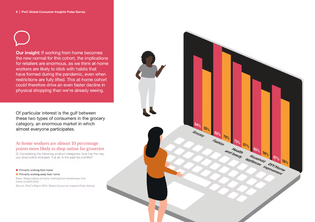
Column chart showing the likelihood of online grocery shopping among workers at home vs. those working away.
Market Analysis and Trends
Retail & E-commerce
The slide highlights the trend towards online grocery shopping, emphasizing the differences between at-home and away workers.
online grocery, shopping, trend, at-home workers, comparison, consumer behavior
false
Market Analysis and Trends
Retail & E-commerce
Mixed Chart
PwC/Strategy&
Add to my slides
Remove from favorites
Features a funnel diagram and pie charts to show the influence of online interactions on luxury purchases from 2018 to 2025.
Technology and Digital Transformation
Retail & E-commerce
Explores how digital platforms influence the luxury goods purchasing process, predicting that by 2025, online interactions will affect almost every luxury purchase and enable half of them through technologies like VR and IoT.
Online Influence, Luxury Purchases, Digital Transformation
false
Technology and Digital Transformation
Retail & E-commerce
Multiple Chart
Bain
Add to my slides
Remove from favorites
The slide features a box plot and a column chart displaying the distribution of average daily time spent on online intermediaries. Two tables provide detailed statistics about the average time and proportion of online time spent.
Market Analysis and Trends
Telecommunications
This slide presents data on the average daily time spent on Online Intermediaries (OIs), showing detailed statistics, including the mean, median, and percentile distributions, based on panelist data from Ipsos Iris Clickstream Data.
Online Intermediaries, Daily Time, Statistics, Box Plot, Column Chart
false
Market Analysis and Trends
Telecommunications
Mixed Chart
IPSOS
Add to my slides
Remove from favorites
Features a column chart showing the growth of the online luxury goods market from 2015 to 2025F.
Market Analysis and Trends
Retail & E-commerce
Highlights the explosive growth of the online luxury goods market, predicting continued expansion and digital influence through 2025.
online, luxury, market, growth, 2025
false
Market Analysis and Trends
Retail & E-commerce
Multiple Chart
Bain
Add to my slides
Remove from favorites
The slide presents online market growth for luxury goods in 2017, with detailed segment analysis including hard luxury, beauty, apparel, and accessories. It uses a mix of a column chart and texts in a dynamic layout, employing red to highlight growth areas and gray for the background.
Market Analysis and Trends
Consumer Goods
Discusses the significant growth of the online luxury goods market, breaking down the performance by product category and business model. Highlights how strategic partnerships and a focus on specific segments like e-tailers and brand websites have driven substantial growth.
online market, luxury goods, growth analysis, digital strategy
false
Market Analysis and Trends
Consumer Goods
Single Chart
Bain
Add to my slides
Remove from favorites
Text and circular graph detailing online marketplace spend.
Customer and Market Segmentation
Retail & E-commerce
Examines the dominance of online marketplaces and alternative eCommerce at the purchase stage.
online marketplaces, eCommerce, purchase stage, consumer trends, retail
false
Customer and Market Segmentation
Retail & E-commerce
Single Chart
Bain
Add to my slides
Remove from favorites
Features bar graphs displaying the percentage of online spending by platform for the years 2020, 2021, and 2022 with clear, labeled sections and percentages.
Market Analysis and Trends
Retail & E-commerce
Highlights the dominance of eCommerce marketplaces in digital shopping space and shows a year-by-year comparison of online spend allocation by platform.
online, marketplaces, e-commerce, shopping, digital, spend allocation, comparison, dominance, platform
false
Market Analysis and Trends
Retail & E-commerce
Multiple Chart
Bain
Add to my slides
Remove from favorites
Two-column split slide, each side with a chart and a few paragraphs. Consistent use of red highlights and structured formatting for clarity.
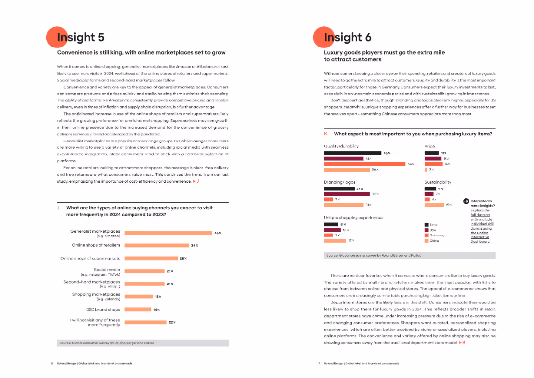
Market Analysis and Trends
Retail & E-commerce
Insight 5 discusses the growing dominance of generalist marketplaces like Amazon for online shopping due to convenience and cost. Insight 6 focuses on luxury goods purchasing drivers, noting quality, sustainability, and unique experiences as critical factors.
Online marketplaces, luxury goods, consumer behavior, shopping trends, generalist platforms, branding, sustainability, price sensitivity
false
Market Analysis and Trends
Retail & E-commerce
Multiple Chart
Roland Berger
Add to my slides
Remove from favorites
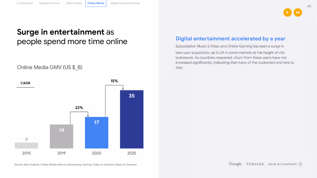
Bar chart displaying the GMV for Online Media from 2015 to a 2025 forecast, with a breakdown of different online media types. Text on the right outlines the acceleration of digital entertainment during the pandemic.
Market Analysis and Trends
Technology & Software
Forecasts growth in the online media sector and highlights the acceleration of digital entertainment adoption due to the pandemic. Useful for media companies and investors looking at digital trends and customer retention post-pandemic.
Online media, Digital entertainment, Growth forecast, Pandemic impact, Customer retention
false
Market Analysis and Trends
Technology & Software
Single Chart
Bain
Add to my slides
Remove from favorites
Shows a column chart for online media GMV with a detailed breakdown of sub-sectors like video, gaming, and music.
Market Analysis and Trends
Media & Entertainment
The slide presents a comprehensive look at the online media industry, indicating strong growth amidst changing consumption patterns due to the pandemic. It can inform media companies' strategic planning, especially in areas like video streaming and gaming.
Online Media, GMV, Growth, Trends
false
Market Analysis and Trends
Media & Entertainment
Mixed Chart
Bain
Add to my slides
Remove from favorites
A column chart outlines the GMV of various online media sectors with CAGR and YoY growth rates. The design is clean with a blue and white theme and organized data presentation.
Market Analysis and Trends
Media & Entertainment
This slide evaluates the slowing growth in online media sectors post-pandemic, detailing sector-specific trends and future growth projections.
online media, growth rates, pandemic, video, music, gaming, digital ads, CAGR, YoY
false
Market Analysis and Trends
Media & Entertainment
Single Chart
Bain
Add to my slides
Remove from favorites
The slide presents a timeline-style layout with icons and percentages. The visual elements are straightforward and focus on the impact of digital platforms in job creation and business opportunities. The blue and teal color scheme is consistent and professional.
Market Analysis and Trends
Retail & E-commerce
The slide argues for the positive impacts of digital platforms, such as job creation and improved livelihood, as perceived by digital merchants. Statistical data is used to emphasize the significant role of digital platforms in sustaining revenue and creating opportunities during the pandemic, suggesting a reliance on these platforms for economic stability.
online platforms, impact, job creation, revenue, business opportunities, pandemic, digital merchants
false
Market Analysis and Trends
Retail & E-commerce
Pillar
Bain
Add to my slides
Remove from favorites
A set of icons and key focus areas represent shifts in platform strategy with clear demarcation between core and adjacent services. The layout is organized with a balance of text and visuals.
Operational Efficiency
Technology & Software
Discusses strategic realignment of online platforms, indicating a pivot in core operations and adjacent areas, providing insights into market adaptations and focus shifts within the industry.
online platforms, strategy, core, adjacencies
false
Operational Efficiency
Technology & Software
Header Vertical
Bain
Add to my slides
Remove from favorites
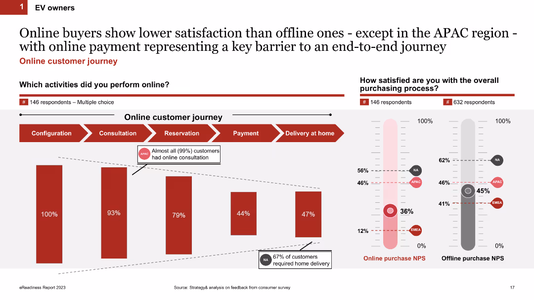
Two sections: a column chart on online customer journey activities and a satisfaction comparison between online and offline purchases.
Market Analysis and Trends
Transportation & Logistics
Examines the online purchasing process and highlights the lower satisfaction levels of online buyers compared to offline buyers, especially regarding payment barriers.
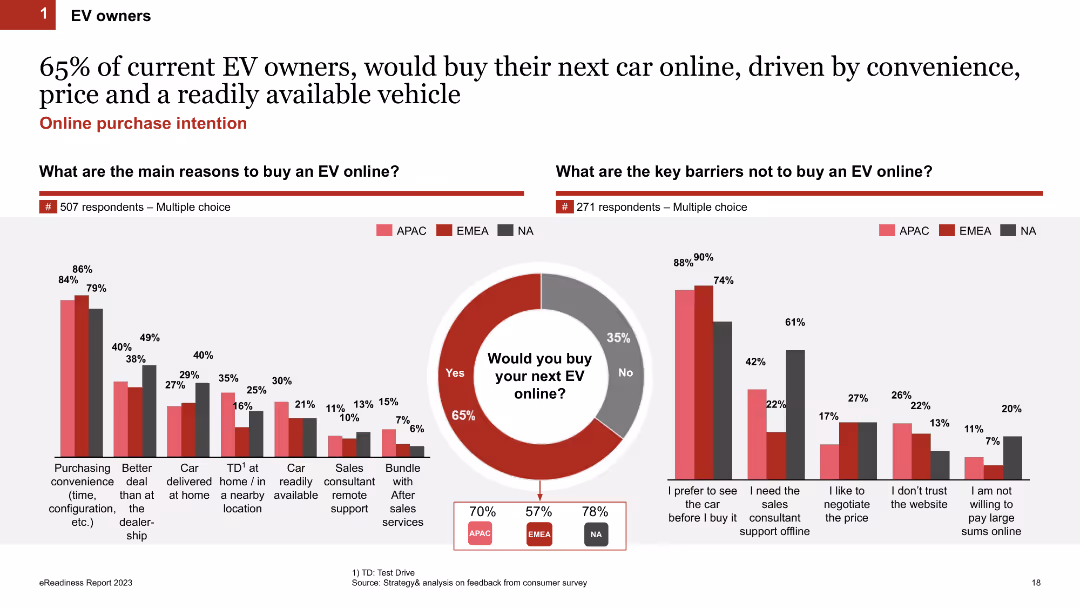
online purchase, customer journey, satisfaction, EV buyers, survey
false
Market Analysis and Trends
Transportation & Logistics
Multiple Chart
PwC/Strategy&
Add to my slides
Remove from favorites
Comparative column charts showing the main reasons for buying an EV online and key barriers preventing online purchases, alongside a purchase intention pie chart.
Market Analysis and Trends
Transportation & Logistics
Investigates the motivations and deterrents for EV owners regarding online car purchases, revealing a high inclination towards online buying for convenience.
online purchase, motivations, barriers, EV owners, survey
false
Market Analysis and Trends
Transportation & Logistics
Multiple Chart
PwC/Strategy&
Add to my slides
Remove from favorites
Utilizes a bar graph to display the growth in the number of categories purchased online by consumers in Southeast Asia, comparing 2019 and 2020 data.
Customer and Market Segmentation
Retail & E-commerce
Demonstrates the broadening of online purchases among Southeast Asian consumers, who are expanding the variety of categories they buy from.
Online purchases, consumer expansion, Southeast Asia, category growth, graph
false
Customer and Market Segmentation
Retail & E-commerce
Single Chart
Bain
Add to my slides
Remove from favorites
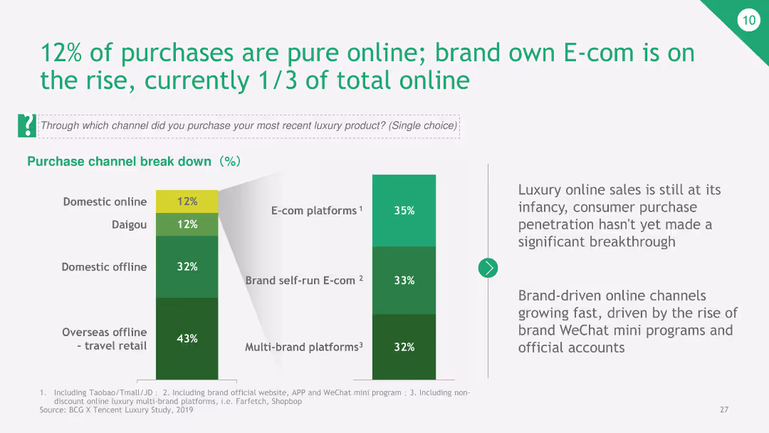
The slide presents a bar chart showing the breakdown of purchase channels, focusing on online sales, including brand self-run E-commerce platforms and multi-brand platforms.
Market Analysis and Trends
Retail & E-commerce
The slide reveals that 12% of luxury product purchases are online, with a growing share of brand-run E-commerce platforms. It highlights the emerging trend of online luxury shopping and the significant role of brand-owned platforms.
online purchases, E-commerce, luxury products, brand platforms, multi-brand platforms
false
Market Analysis and Trends
Retail & E-commerce
Multiple Chart
BCG
Add to my slides
Remove from favorites
Bar graphs showing the average number of online purchases in various categories from 2021 to 2022 with a clear decline.
Market Analysis and Trends
Retail & E-commerce
Analyzes the decrease in online purchase frequency for various product categories, offset by an increase in categories like household appliances and beauty.
online purchases, frequency decline, product categories, household, beauty
false
Market Analysis and Trends
Retail & E-commerce
Multiple Chart
Bain
Add to my slides
Remove from favorites
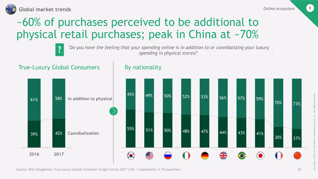
The slide features a column chart showing perceptions of online spending in addition to physical purchases, segmented by nationality.
Market Analysis and Trends
Retail & E-commerce
The slide examines the perception that a significant portion of online purchases adds to physical retail, with a peak in China.
Online purchases, Physical retail, China, Perception, Nationality
false
Market Analysis and Trends
Retail & E-commerce
Multiple Chart
BCG
Add to my slides
Remove from favorites
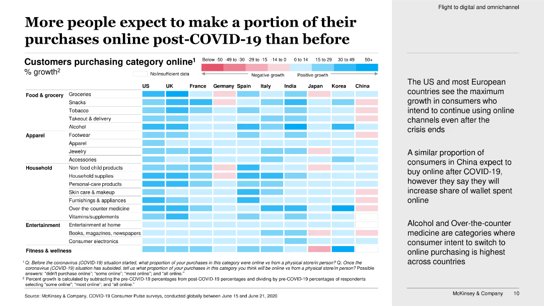
This slide features a heatmap chart showing the percentage growth of customers purchasing online in various categories post-COVID-19.
Market Analysis and Trends
Retail & E-commerce
The slide presents data on the expected increase in online purchases post-COVID-19, highlighting significant growth in online consumer behavior across multiple categories.
online purchases, post-COVID-19, growth, consumer behavior, heatmap, purchasing categories, survey, increase
false
Market Analysis and Trends
Retail & E-commerce
Boxed
McKinsey
Add to my slides
Remove from favorites
This slide features a horizontal bar chart depicting how potential car buyers gather information before purchasing. It includes data on online sources, dealerships, and other channels.
Market Analysis and Trends
Transportation & Logistics
It presents data on the ways consumers gather information before purchasing a new car, highlighting the importance of online research and dealership websites in the decision-making process.
online research, dealerships, car buyers, digital advertising, information sources
false
Market Analysis and Trends
Transportation & Logistics
Multiple Chart
EY
Add to my slides
Remove from favorites
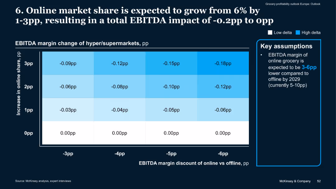
Matrix heatmap showing EBITDA impact by change in online share and margin discount
Financial Performance
Retail & E-commerce
A heatmap showing how increased online market share (up to +3pp) impacts EBITDA margins of hypermarkets, based on online vs. offline margin discount. Online shift could reduce margins by 0.02 to 0.18pp, depending on discount severity.
online retail, EBITDA impact, market shift, margin discount, hypermarkets
false
Financial Performance
Retail & E-commerce
Mixed Chart
McKinsey
Add to my slides
Remove from favorites
A comprehensive chart illustrating online retail penetration in SEA with comparisons to India and China.
Market Analysis and Trends
Retail & E-commerce
Projects the growth of online retail penetration in SEA, analyzing the contribution of ecommerce to total retail and highlighting the expected rise in groceries.
online retail, growth, SEA, ecommerce contribution, retail penetration
false
Market Analysis and Trends
Retail & E-commerce
Multiple Chart
Bain
Add to my slides
Remove from favorites
Combines informative text with simple iconography to contrast the growth of online retail markets in Southeast Asia and India.
Competitive Landscape
Retail & E-commerce
Analyzes the recent developments in the online retail market in Southeast Asia, demonstrating how it has outpaced India's growth.
Online retail, market analysis, Southeast Asia, India, comparative growth
false
Competitive Landscape
Retail & E-commerce
Single Chart
Bain
Add to my slides
Remove from favorites
The slide has two column charts. The left chart shows U.S. online retail sales by segment as a percentage of total retail sales for 2Q18 and 1Q24. The right chart details the change in the number of physical retail establishments from 2Q13 to 3Q23.
Market Analysis and Trends
Real Estate & Construction
This slide analyzes U.S. online retail sales by segment and tracks changes in the number of physical retail establishments over time. It provides insights into the shifting landscape of retail and e-commerce trends.
online retail, sales segments, physical retail, e-commerce, market trends, retail analysis
false
Market Analysis and Trends
Real Estate & Construction
Multiple Chart
JP Morgan
Add to my slides
Remove from favorites
Bar graphs showing the average number of categories purchased online with annotations for yearly changes.
Market Analysis and Trends
Retail & E-commerce
Maintains that despite a dip in purchase frequency, the average number of categories bought online remains steady, with Vietnam and Malaysia showing growth.
online sales, category consistency, Vietnam, Malaysia, purchase habits
false
Market Analysis and Trends
Retail & E-commerce
Multiple Chart
Bain
Add to my slides
Remove from favorites
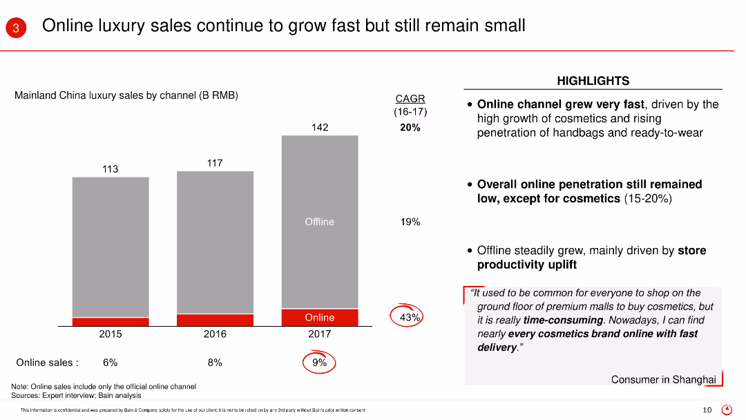
The slide contains a column chart showing Mainland China luxury sales by channel from 2015 to 2017, highlighting online and offline sales. Key points are highlighted in red circles, and there is a text box with consumer feedback.
Market Analysis and Trends
Retail & E-commerce
The slide discusses the growth of online luxury sales in Mainland China, emphasizing the faster growth of online channels compared to offline, and includes consumer insights about shopping preferences.
Online sales, luxury market, China, growth, consumer behavior, sales channels, CAGR
false
Market Analysis and Trends
Retail & E-commerce
Mixed Chart
Bain
Add to my slides
Remove from favorites
The slide includes several pie charts showing the willingness of different age groups to share their digital size and fit details with brands.
Customer and Market Segmentation
Retail & E-commerce
This slide presents data on online shoppers' willingness to share digital size and fit details with brands, highlighting generational differences.
online shoppers, digital size, fit details, brands, retail
false
Customer and Market Segmentation
Retail & E-commerce
Multiple Chart
Roland Berger
Add to my slides
Remove from favorites
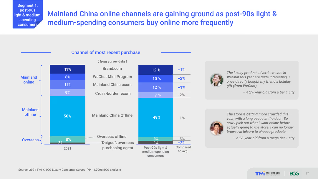
Column chart showing the most recent purchase channels for Mainland China and Overseas. The chart compares percentages between online and offline purchases in 2021. Text boxes with user quotes are placed beside the chart.
Market Analysis and Trends
Retail & E-commerce
Shows the shift in purchase behavior of post-90s light and medium-spending consumers in Mainland China towards online channels. Indicates the percentages of purchases through different online and offline channels.
Online shopping, consumer behavior, China, retail trends, WeChat Mini Program
false
Market Analysis and Trends
Retail & E-commerce
Multiple Chart
BCG
Add to my slides
Remove from favorites
Features pie charts showing percentages of online shopping and the influence of customer reviews, accompanied by a descriptive example.
Customer and Market Segmentation
Technology & Software
Discusses the shopping habits and preferences of young, digitally-savvy consumers, focusing on the importance of online reviews and the overall customer experience.
online shopping, consumer preferences, digital natives, customer reviews, e-commerce strategies, market insights, customer experience, engagement strategies
false
Customer and Market Segmentation
Technology & Software
Multiple Chart
Accenture
Add to my slides
Remove from favorites
A series of comparative column charts depicting the primary reasons consumers shop online across different product categories, such as price, quality, and convenience, with percentage breakdowns for each category.
Market Analysis and Trends
Retail & E-commerce
The slide examines the main reasons for online shopping, focusing on factors like price, quality, and convenience across various product categories, based on consumer survey responses.
online shopping, consumer reasons, price, quality, convenience, product categories
false
Market Analysis and Trends
Retail & E-commerce
Multiple Chart
PwC/Strategy&
Add to my slides
Remove from favorites
Slide includes column charts showing customer spending by channel for various price ranges and an illustration highlighting industry biases in purchasing high-priced fashion products.
Market Analysis and Trends
Retail & E-commerce
Discusses customer confidence in purchasing high-priced items online and the persistence of industry-specific biases, offering insight into consumer spending behaviors across different retail channels.
online shopping, customer behavior, high-priced items, retail channels, consumer confidence
false
Market Analysis and Trends
Retail & E-commerce
Multiple Chart
Bain
Add to my slides
Remove from favorites
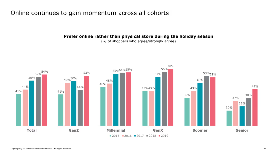
The slide contains a grouped bar chart showing preferences for online versus physical store shopping across different demographic cohorts from 2015 to 2019.
Market Analysis and Trends
Retail & E-commerce
The slide illustrates the increasing preference for online shopping among different demographic groups during the holiday season.
online shopping, demographic trends, consumer behavior, retail, e-commerce, holiday shopping, 2019, preferences, generational differences
false
Market Analysis and Trends
Retail & E-commerce
Single Chart
Deloitte
Add to my slides
Remove from favorites
Previous
Next
You don't have any favorites yet.
Please wait loading your favorites slides...
Create a FREE account to continue browsing
Receive Instant Access to 1,000+ slides from companies like McKinsey, Google, and Goldman Sachs
First Name
Last Name
Email
Password
I agree to all
Terms & Privacy Policy
Thank you! Your submission has been received!
Oops! Something went wrong while submitting the form.
Have an account?
Sign in
Upgrade to PRO to Save slides
Advanced Search and Filters
Access to 15,000+ slides
Access to Category Pages
Save/Bookmark Slides
PowerPoint Template Library
Pick a Plan
MONTHLY
$12/month
Billed every month, Cancel anytime.
YEARLY
$9/year
Billed $108 annually, Cancel anytime.
Checkout for $12/month
Checkout for $108/yr
Secured by Stripe | AES-256 bit encryption