My Account
My Slides
Search by Category
Pricing
Templates
View All Templates
Download Template Slides
✦ AI Search
Feedback
Login
Logout
Get Started
Browse all Slides
Browse all Slides
Create a FREE Account
Instant access to 1,000+ real slides from top companies like McKinsey, BCG, Goldman Sachs, Google and many more!
First Name
Last Name
Email
Password
I agree to all
Terms & Privacy Policy
Thank you! Your submission has been received!
Oops! Something went wrong while submitting the form.
Have an account?
Sign in
Saved Slides
Total No. of slides saved
0
↻ Refresh
✖ Clear all
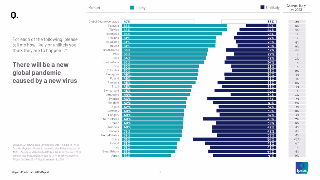
Horizontal bar chart with teal and navy bars; countries listed vertically with likelihood percentages; minimalistic layout
Market Analysis and Trends
Healthcare & Pharmaceuticals
The slide presents survey data on public perception of the likelihood of a new global pandemic. It ranks countries by the percentage of respondents who believe another pandemic is likely, and compares this to previous year data.
pandemic, global risk, public opinion, health crisis, virus, likelihood, survey, international, perception, 2025
false
Market Analysis and Trends
Healthcare & Pharmaceuticals
Mixed Chart
IPSOS
Add to my slides
Remove from favorites
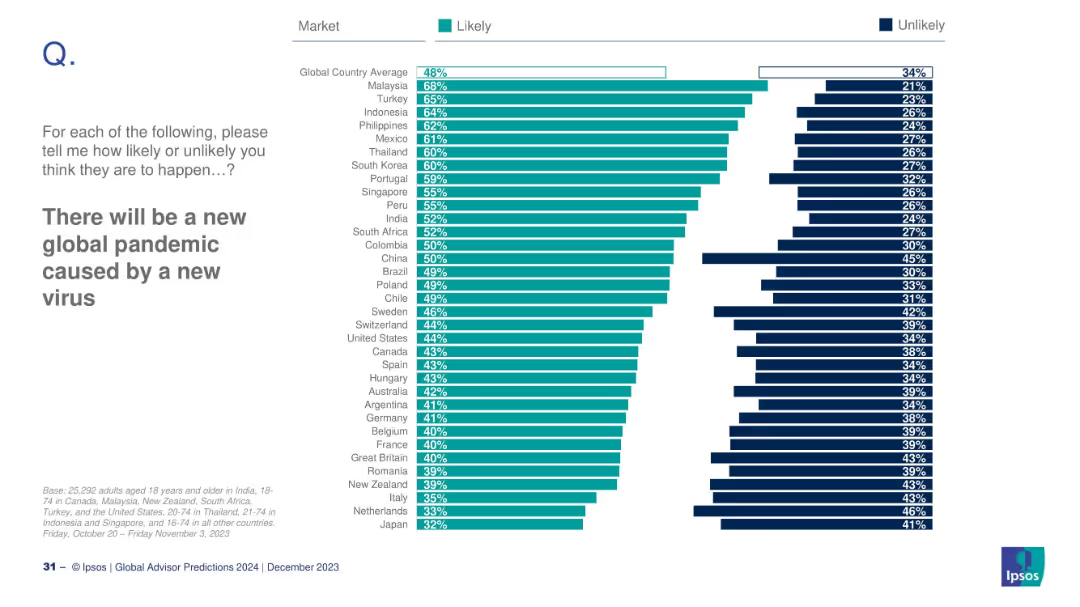
Horizontal bar chart comparing countries' likelihood responses; sorted by descending order.
Risk Assessment and Management
Healthcare & Pharmaceuticals
This slide ranks countries by how likely their citizens believe a new global pandemic will occur. Malaysia and Turkey top the list with high likelihood perceptions. The global average is 48%, and comparisons include "likely" vs. "unlikely" percentages by market.
pandemic, health crisis, virus, global risk, Ipsos, country comparison, 2024 outlook, survey
false
Risk Assessment and Management
Healthcare & Pharmaceuticals
Mixed Chart
IPSOS
Add to my slides
Remove from favorites
Shows a masked woman in a grocery store, symbolizing the changes in shopping due to the pandemic. The text explains the permanence of these changes.
Market Analysis and Trends
Retail & E-commerce
Describes the substantial and enduring changes in how consumers live, work, and shop because of the pandemic, with an emphasis on health, finance, and sustainability.
pandemic impact, consumer changes, health concerns, financial behaviors, retail shifts, sustainability
false
Market Analysis and Trends
Retail & E-commerce
Boxed
Accenture
Add to my slides
Remove from favorites
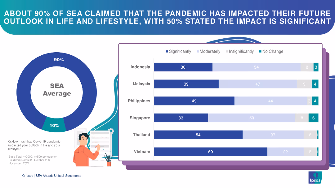
Circle chart and bar charts illustrating the pandemic's impact on future outlook in SEA countries.
Market Analysis and Trends
Financial Services
This slide details the significant impact of the pandemic on future outlook among SEA respondents, with varying degrees.
pandemic impact, future outlook, SEA, bar chart, survey
false
Market Analysis and Trends
Financial Services
Multiple Chart
IPSOS
Add to my slides
Remove from favorites
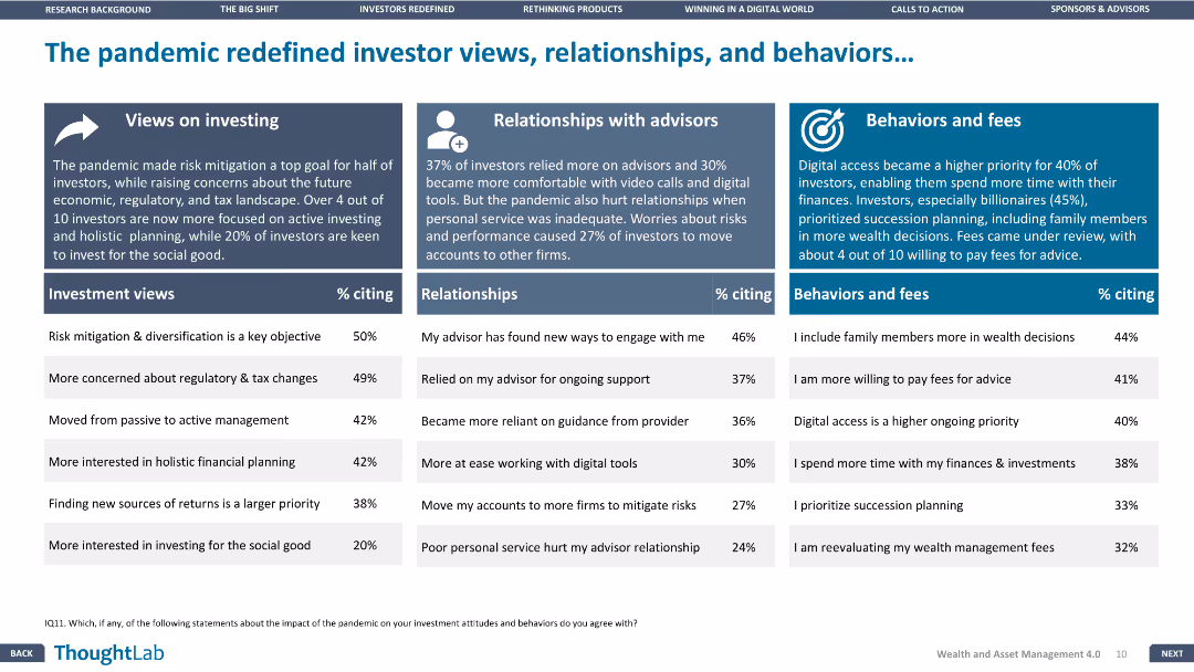
The slide has three sections: investment views, relationships with advisors, and behaviors and fees, each with a supporting column chart.
Market Analysis and Trends
Financial Services
The slide analyzes the changes in investor behavior and attitudes towards investment due to the pandemic, focusing on views, relationships, and behaviors.
Pandemic impact, Investor views, Relationships, Financial Services, Trends
false
Market Analysis and Trends
Financial Services
Pillar
Deloitte
Add to my slides
Remove from favorites
Icons representing percentages of companies changing their market research practices due to the pandemic.
Market Analysis and Trends
Professional Services
Discusses changes in market research methods during the pandemic, such as increases in studying online consumer behavior and video interviews.
pandemic, market research, online behavior, video interviews
false
Market Analysis and Trends
Professional Services
Pillar
Deloitte
Add to my slides
Remove from favorites
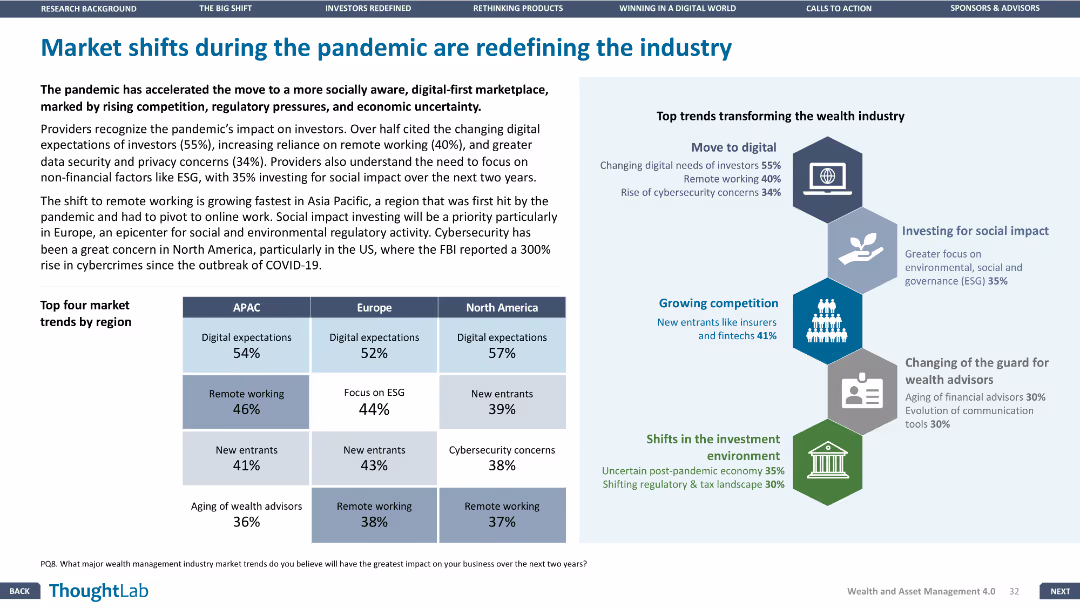
Column chart and infographic showing top market trends by region and major trends transforming the industry. Clear and informative visual layout.
Market Analysis and Trends
Financial Services
Highlights major market shifts due to the pandemic, with emphasis on digital expectations, remote working, and competition, and the impact on different regions.
pandemic, market, trends, digital, regions
false
Market Analysis and Trends
Financial Services
Header Vertical
Deloitte
Add to my slides
Remove from favorites
Features descriptive text and proportional bar graphics illustrating perspectives on learning new work capabilities and solidarity during the pandemic.
Client Case Studies
Healthcare & Pharmaceuticals
Highlights the responses of millennials and Gen Z to the pandemic, focusing on new work capabilities, sense of community, and solidarity.
Pandemic, Millennials, Gen Z, Work Capabilities, Solidarity
false
Client Case Studies
Healthcare & Pharmaceuticals
Mixed Chart
Deloitte
Add to my slides
Remove from favorites
Slide with a timeline graph, text, and color-coded phases representing pandemic response strategies.
Market Analysis and Trends
Government & Public Sector
Analyzes strategies for dealing with COVID-19's impact over time, including flattening the curve and economic recovery.
Pandemic Recovery, COVID-19, Flatten, Fight, Future, Economic Impact, Government Policy
true
Market Analysis and Trends
Government & Public Sector
Linear Flow
BCG
Add to my slides
Remove from favorites
Contains a large green area chart showing the relative impact of public health measures, virus monitoring, and vaccines over time throughout 2021.
Strategic Planning
Healthcare & Pharmaceuticals
Analyzes the steps required to defeat the pandemic by Q3 2021 through a multi-phase approach, focusing on public health measures, virus monitoring, and vaccine rollout.
pandemic, recovery, public health, monitoring, vaccines
false
Strategic Planning
Healthcare & Pharmaceuticals
Mixed Chart
BCG
Add to my slides
Remove from favorites
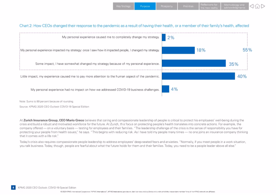
Full-width layout with bar chart showing CEO responses, supported by narrative and a quote from Zurich CEO
Strategic Planning
Professional Services
Shows how CEOs altered their strategies due to personal or family health impacts from COVID-19. Includes multiple response categories and a leadership quote from Zurich’s CEO Mario Greco on compassionate leadership.
pandemic response, CEO strategy, health impact, leadership, KPMG Outlook, bar chart, Mario Greco, employee well-being, emotional leadership
false
Strategic Planning
Professional Services
Mixed Chart
KPMG
Add to my slides
Remove from favorites
Complex flow chart that maps different pandemic phases like Flatten, Fight, and Future with economic implications, asking critical questions for each phase.
Strategic Planning
Financial Services
This slide serves to dissect the potential economic trajectories in response to pandemic phases, providing a strategic framework for assessing impacts.
pandemic response, economic impact, Flatten phase, Fight phase, Future phase, economic trajectories, strategic framework
false
Strategic Planning
Financial Services
Mixed Chart
BCG
Add to my slides
Remove from favorites
This slide includes a bar chart with horizontal bars showing survey responses on employer performance during the pandemic. The chart is complemented by a detailed text analysis on the left side.
Operational Efficiency
Professional Services
The slide evaluates how employers responded to the pandemic, with high scores in communication, employee support, and maintaining operations. It highlights the positive feedback from Millennials and Gen Z regarding their employers' crisis management strategies, providing a benchmark for effective organizational responses in future crises.
Pandemic Response, Employer, Millennials, Gen Z, Survey
false
Operational Efficiency
Professional Services
Mixed Chart
Deloitte
Add to my slides
Remove from favorites
This slide features a line graph with six differently colored dashed lines representing various countries, plotted against time from February 2020 to October 2021. The graph is titled "Commute volume adjustment, indexed to January 2020". On the left side, there is a bullet-pointed section titled "Ride-hailing is the preferred transport option".
Market Analysis and Trends
Transportation & Logistics
The slide provides a comparative analysis of the adjustments in commute volumes in response to persistent lockdowns across different countries, highlighting the growing preference for ride-hailing services as a safer alternative during the pandemic, using indexed data from Google Mobility Report and Kantar SEA e-Conomy Research 2021.
pandemic, ride-hailing, transport, commute adjustment, lockdown, safety, Southeast Asia, trend analysis, mobility report
false
Market Analysis and Trends
Transportation & Logistics
Mixed Chart
Bain
Add to my slides
Remove from favorites
This slide uses line charts to compare GDP growth and recovery patterns after various flu outbreaks (SARS, H2N2, H3N2, Spanish Flu) with COVID-19. It uses color highlights to draw attention to specific data points and recovery phases.
Strategic Planning
Healthcare & Pharmaceuticals
Compares economic impacts of various pandemics, providing a historical perspective to gauge the potential recovery trajectory from COVID-19. Useful for healthcare policy planning and economic forecasting discussions.
pandemics, GDP, economic impact, recovery, SARS, Spanish Flu, COVID-19, healthcare policy
false
Strategic Planning
Healthcare & Pharmaceuticals
Multiple Chart
BCG
Add to my slides
Remove from favorites
Timeline-style layout from year 1300 to 2050; annotated with major pandemics and estimated death tolls; icons and labels in pink; includes quote at the bottom from a medical expert; background features faint virus imagery.
Market Analysis and Trends
Healthcare & Pharmaceuticals
The slide presents a historical overview of pandemics, illustrating their recurrence and growing impact over time. It highlights key pandemics including the Black Death, Smallpox, HIV/AIDS, and COVID-19. It ends with a forward-looking statement that future pandemics may be more severe. The expert quote reinforces the inevitability of more pandemics with potentially higher mortality.
pandemics, history, timeline, future risks, mortality, COVID-19, smallpox, HIV/AIDS, global health
false
Market Analysis and Trends
Healthcare & Pharmaceuticals
Linear Flow
Roland Berger
Add to my slides
Remove from favorites
Compares the trajectory of past pandemics (Spanish Flu, MERS) using line graphs to show death and case rates over time. The design includes color coding and clear labeling to enhance understanding of the data.
Risk Assessment and Management
Government & Public Sector
Reviews historical pandemic data to discuss the effects of public health decisions on pandemic management and recovery. This analysis can inform current health policy and risk management strategies during COVID-19 and future pandemics.
pandemics, public health, historical analysis, Spanish Flu, MERS, COVID-19, health policy
false
Risk Assessment and Management
Government & Public Sector
Multiple Chart
BCG
Add to my slides
Remove from favorites
The slide uses a simple layout with color blocks to denote different stages of a pandemic response. Icons and brief descriptions provide quick visual cues to the viewer.
Operational Efficiency
Healthcare & Pharmaceuticals
This content-oriented slide breaks down the various stages of pandemic response, from identification to recovery, with accompanying descriptions of epidemiological, economic, and social indicators, serving as an educational or planning resource in healthcare and government contexts.
Pandemic Stages, Healthcare, Response, Epidemiological Indicators, Economic Impacts, Social Indicators, Education, Planning
false
Operational Efficiency
Healthcare & Pharmaceuticals
Vertical Flow
McKinsey
Add to my slides
Remove from favorites
Visual timeline of major 2020 global events including the COVID-19 pandemic, stock market crash, and various crises.
Operational Efficiency
Healthcare & Pharmaceuticals
Provides a detailed timeline of key global and healthcare events in 2020, useful for historical analysis and educational purposes.
pandemic, timeline, global events, COVID-19, healthcare, 2020
false
Operational Efficiency
Healthcare & Pharmaceuticals
Mixed Chart
Bain
Add to my slides
Remove from favorites
World map showing COVID-19 case doubling times in various shades of green. Includes additional graphs with timelines of case numbers and recovery figures.
Regulatory and Compliance
Healthcare & Pharmaceuticals
Displays the global spread of COVID-19, the rate of case doubling, and recovery rates by country as of April 2020, useful for health analysts and policy makers.
pandemic, tracking, healthcare, global, recovery, COVID-19, data visualization, spread, rate
false
Regulatory and Compliance
Healthcare & Pharmaceuticals
Multiple Chart
BCG
Add to my slides
Remove from favorites
The slide presents three columns of information, each titled and color-coded (green, yellow, pink). Each section contains lists and a checkmark icon for key points.
Market Analysis and Trends
Healthcare & Pharmaceuticals
Discusses three possible future scenarios for pandemic recovery, detailing differences in vaccine efficacy, rollout speeds, and public health responses under each scenario.
pandemic, vaccines, scenarios, rollout, public health
false
Market Analysis and Trends
Healthcare & Pharmaceuticals
Table
BCG
Add to my slides
Remove from favorites
A pie chart dominates this slide, showing the percentage of employees in offices pre-pandemic. A subdued image in the background depicts two individuals in a work setting, adding contextual relevance. The chart's colors correspond to the legend, aiding in data interpretation and visual appeal.
Organizational Structure and Change
Professional Services
Reflecting on the pre-pandemic office presence, this slide offers a statistical breakdown to facilitate discussions on how workplace dynamics have shifted. It could serve as a baseline for measuring the impact of the pandemic on work arrangements and informing future work policies.
Pandemic, Workplace Trends, Pre-Pandemic Office, Employee Statistics, Policy
false
Organizational Structure and Change
Professional Services
Single Chart
EY
Add to my slides
Remove from favorites
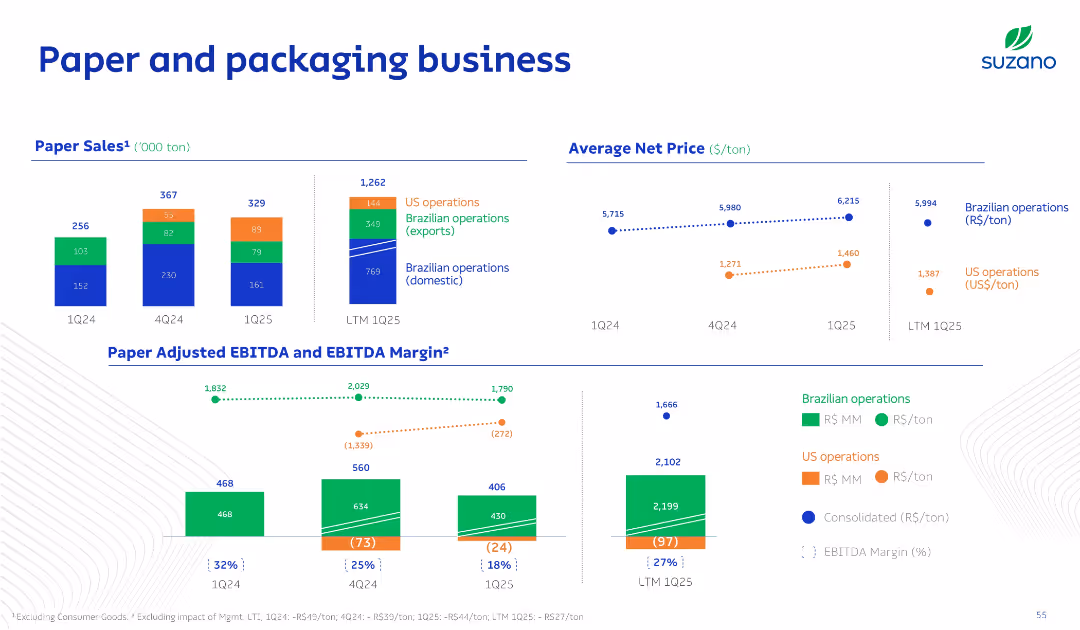
Multisection layout with bar charts for sales and EBITDA, dotted line charts for net pricing, and stacked bars by operation types; uses segmented color coding.
Product and Service Analysis
Consumer Goods
The slide breaks down the paper and packaging business into regional operations and evaluates pricing trends and margins. It distinguishes between domestic and international performance and highlights profitability metrics.
Paper, Packaging, Sales, Pricing, EBITDA
false
Product and Service Analysis
Consumer Goods
Multiple Chart
Goldman Sachs
Add to my slides
Remove from favorites
Column chart depicting parallel market premiums from 2004 to 2023. Red bars highlight significant premium changes over the years. Insights section below with bullet points.
Market Analysis and Trends
Financial Services
The slide shows the widening parallel market premium in 2023, driven by increased import bills and a decline in crude oil exports. It provides insights on the Central Bank of Nigeria's control over the FX market and shifts in dollar demand composition.
parallel market, import bills, crude oil, FX market, Nigeria
false
Market Analysis and Trends
Financial Services
Mixed Chart
PwC/Strategy&
Add to my slides
Remove from favorites
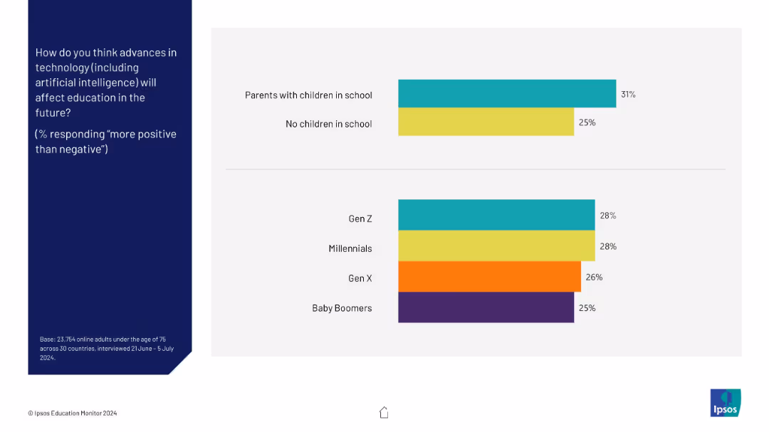
Two horizontal bar charts segmented by parental status and generation; left-aligned question text in blue
Market Analysis and Trends
Education & Training
This slide compares perceptions of tech’s positive impact on education by parental status and generation. Parents and younger generations are slightly more optimistic, though only marginally.
parental status, generation, Gen Z, education, technology, positive impact, perception
false
Market Analysis and Trends
Education & Training
Mixed Chart
IPSOS
Add to my slides
Remove from favorites
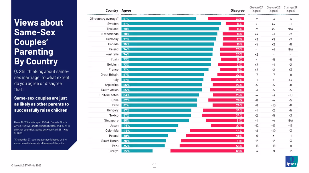
Horizontal bar chart showing agreement levels across countries on same-sex couples' ability to raise children.
Regulatory and Compliance
Government & Public Sector
The slide displays agreement percentages across countries on whether same-sex couples are equally capable of raising children. Disagreement and annual change rates are also displayed, helping track global attitude shifts.
parenting, LGBTQ+ families, public opinion, child development, family equality, cross-country comparison, adoption, survey data
false
Regulatory and Compliance
Government & Public Sector
Mixed Chart
IPSOS
Add to my slides
Remove from favorites
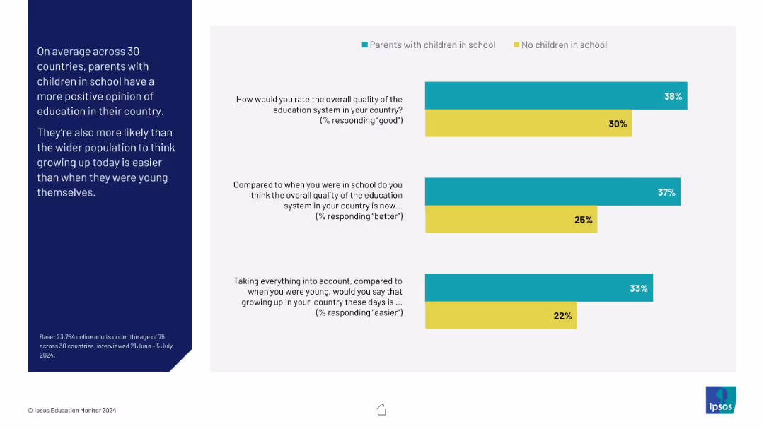
Side-by-side comparison of views between parents with school-aged children and those without. Uses horizontal bar charts for three core questions.
Customer and Market Segmentation
Education & Training
This slide compares perceptions between parents and non-parents on education system quality and upbringing difficulty. Parents tend to have a more positive outlook on both, possibly due to direct involvement or recency of experience.
parents, education perception, childhood, Ipsos, comparison, survey
false
Customer and Market Segmentation
Education & Training
Mixed Chart
IPSOS
Add to my slides
Remove from favorites
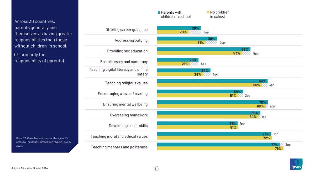
Split horizontal bar chart showing parent vs non-parent views on educational responsibility across topics
Organizational Structure and Change
Education & Training
This slide contrasts views of parents vs non-parents on who should be responsible for education-related tasks. Parents generally assign themselves more responsibility across categories like safety, literacy, and values.
parents, responsibilities, education, comparison, safety, digital literacy, school roles
false
Organizational Structure and Change
Education & Training
Mixed Chart
IPSOS
Add to my slides
Remove from favorites
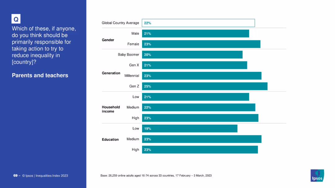
Layout mirrors other demographic slides with a horizontal bar chart showing group-level support; blue question box on left.
Market Analysis and Trends
Education & Training
The slide provides insight into how support for parents and teachers varies by demographics, with Gen Z and higher-educated groups showing higher endorsement.
parents, teachers, inequality, demographic breakdown, education levels, generation, income
false
Market Analysis and Trends
Education & Training
Mixed Chart
IPSOS
Add to my slides
Remove from favorites
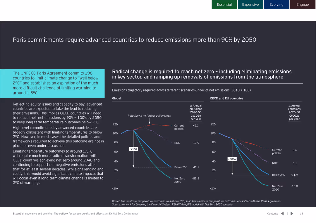
Contains detailed text with a line chart showing emissions trajectories for different scenarios from 2020 to 2050.
Regulatory and Compliance
Government & Public Sector
Highlights the need for OECD countries to reduce emissions by 90-100% by 2050 to meet Paris Agreement targets, emphasizing advanced countries' responsibilities.
Paris Agreement, emissions, reduction, 2050, OECD, targets, climate change, policy
false
Regulatory and Compliance
Government & Public Sector
Multiple Chart
EY
Add to my slides
Remove from favorites
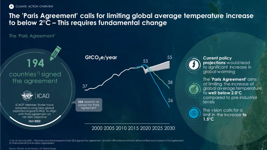
Dark background with green/white text overlay, includes a trend line chart for GtCO₂e/year, agreement highlights, and future emissions projections.
Regulatory and Compliance
Environmental Services & Sustainability
This slide emphasizes the importance of the Paris Agreement, signed by 194 countries, to limit global warming to under 2°C. A chart illustrates past emissions trends and scenarios based on current vs. targeted policy pathways.
Paris Agreement, GHG, global warming, emissions, policy projections, climate goals
false
Regulatory and Compliance
Environmental Services & Sustainability
Mixed Chart
Roland Berger
Add to my slides
Remove from favorites
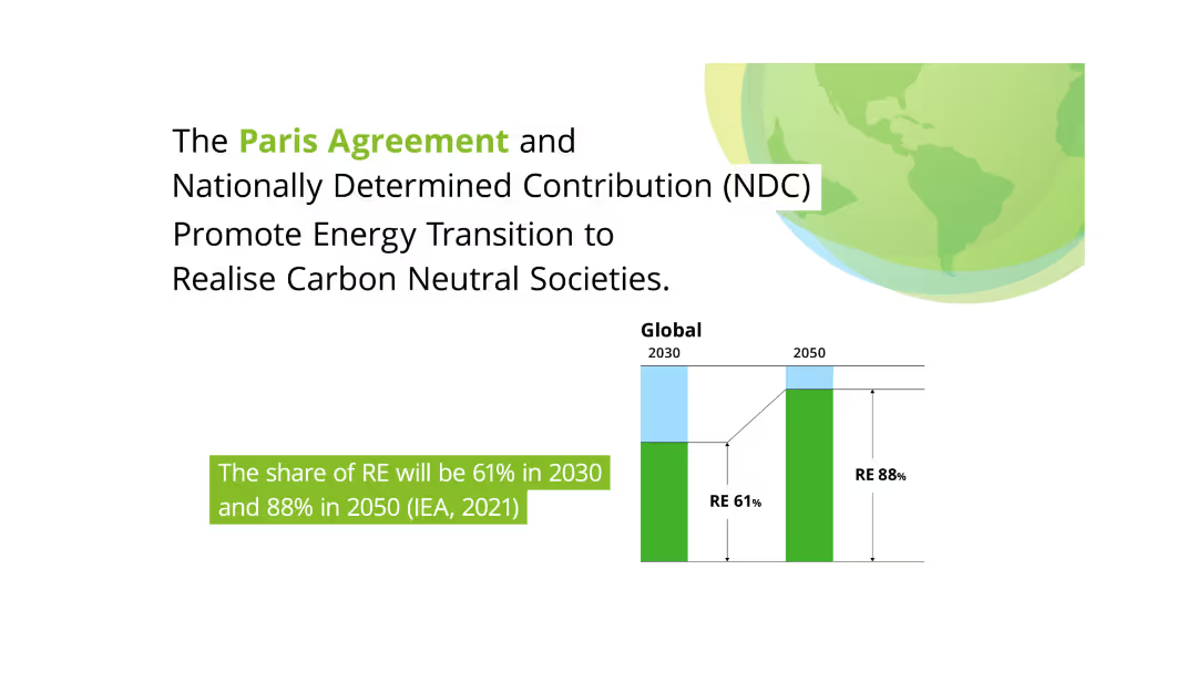
This slide features a large green globe and two column charts comparing the share of renewable energy (RE) in 2030 and 2050. Text on the left discusses the Paris Agreement and its role in promoting energy transition towards carbon neutrality.
Regulatory and Compliance
Environmental Services & Sustainability
Highlights the Paris Agreement's impact on promoting energy transition and achieving carbon-neutral societies. It projects significant increases in renewable energy share by 2030 and 2050, stressing the importance of national contributions (NDC) in this transformation.
Paris Agreement, Renewable Energy, Carbon Neutral, Energy Transition, NDC
false
Regulatory and Compliance
Environmental Services & Sustainability
Mixed Chart
Deloitte
Add to my slides
Remove from favorites
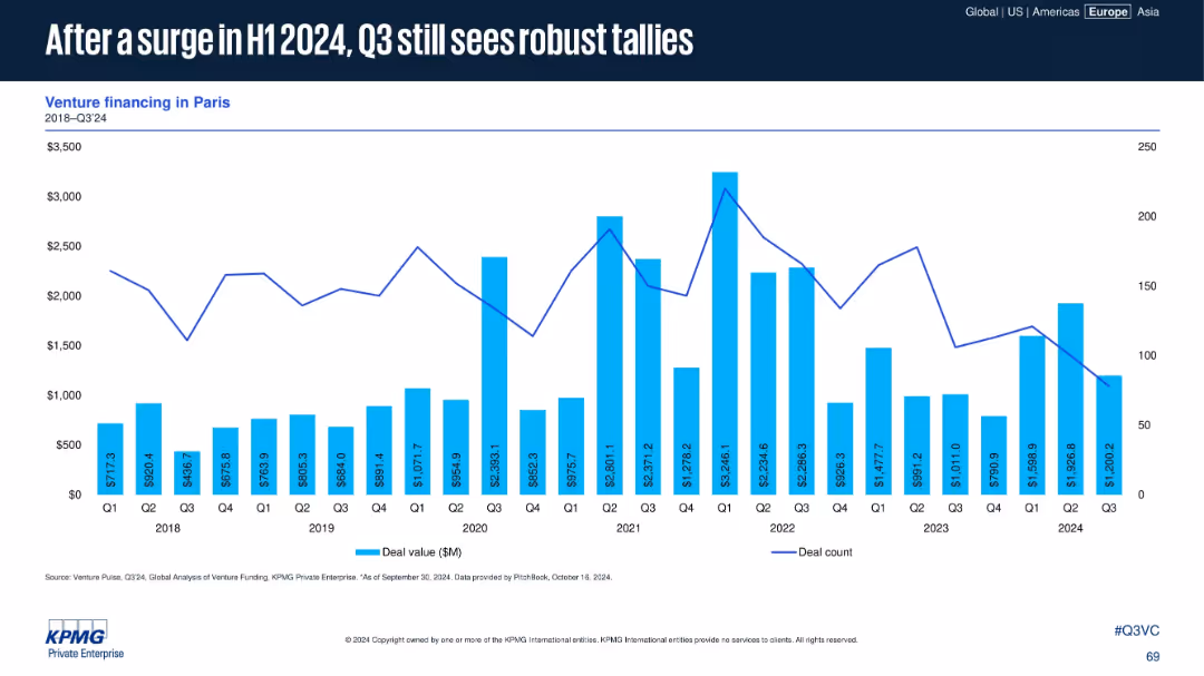
Venture data for Paris (2018–Q3 2024) shown in bar and line format. Commentary absent but trendline illustrates recent patterns.
Market Analysis and Trends
Financial Services
Paris continues to record strong VC activity into Q3 2024 after a notable increase in H1. While Q3 is slightly lower, deal value and count remain high compared to historical trends, indicating sustained investor interest in the region.
Paris, venture capital, 2024 H1 surge, robust Q3, deal volume, capital trends, funding activity, French ecosystem
false
Market Analysis and Trends
Financial Services
Single Chart
KPMG
Add to my slides
Remove from favorites
The slide features three pie charts detailing the type of companies, origin of participants, and type of respondents in the survey, with different colors and sections.
Market Analysis and Trends
Financial Services
The slide provides demographic details about the participants of the FinTech survey, including company types, regional distribution, and roles of respondents.
Participant profile, Demographics, Survey, FinTech, Analysis
false
Market Analysis and Trends
Financial Services
Mixed Chart
PwC/Strategy&
Add to my slides
Remove from favorites
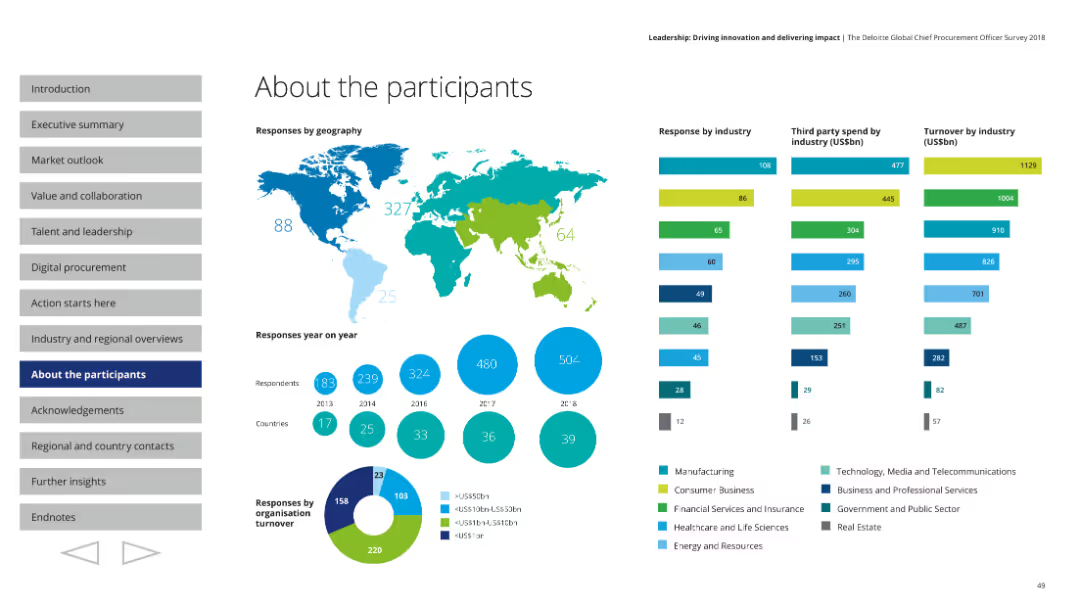
This slide contains various visual elements including a world map, column charts, pie charts, and segmented bars, with detailed information on participant demographics.
Market Analysis and Trends
Professional Services
The slide details the demographic breakdown of survey participants, including their geographic locations, industry sectors, and organizational turnover. It features visual data representations to illustrate responses by geography, industry, third-party spend, and turnover.
Participants, demographics, world map, industry sectors, survey data
false
Market Analysis and Trends
Professional Services
Multiple Chart
Deloitte
Add to my slides
Remove from favorites
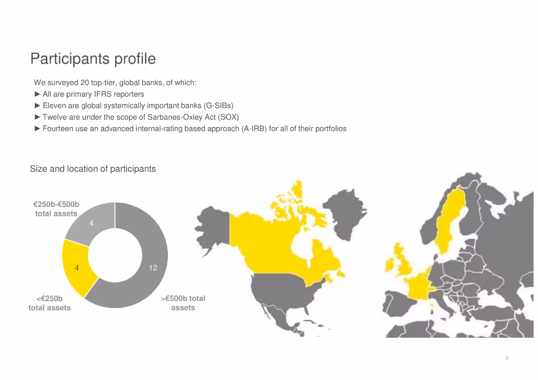
The slide contains a pie chart and a map showing the size and location of participants, along with textual information on the surveyed banks' profiles.
Customer and Market Segmentation
Financial Services
Describes the profiles of 20 top-tier global banks, including their total assets and geographic distribution.
participants, global banks, assets, profiles, geographic distribution, IFRS, G-SIBs, SOX, A-IRB
false
Customer and Market Segmentation
Financial Services
Mixed Chart
EY
Add to my slides
Remove from favorites
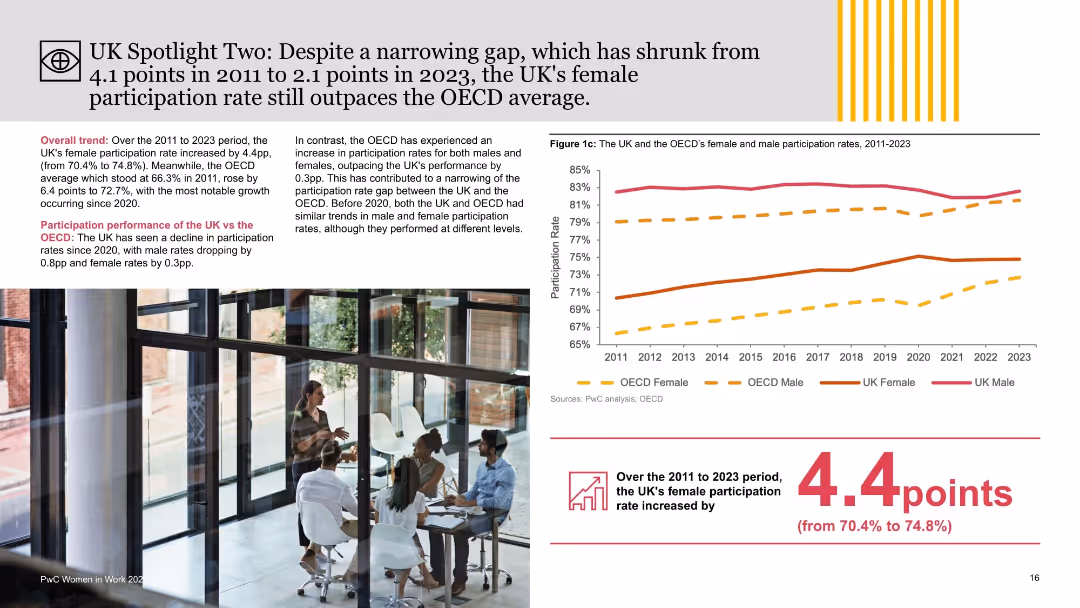
Combination of narrative text, line chart of participation rates, and photo insert; focus on gender participation trends across OECD and UK.
Performance Metrics and KPIs
Government & Public Sector
This slide highlights the narrowing gender participation rate gap in the UK, which fell from 4.1 to 2.1 points between 2011 and 2023. It contrasts UK and OECD participation trends, emphasizing the UK’s relatively strong female participation and recent declines in overall rates post-2020.
participation gap, female workforce, UK vs OECD, gender trends, employment rates, PwC, labor force, policy insight, gender dynamics, labor participation
false
Performance Metrics and KPIs
Government & Public Sector
Mixed Chart
PwC/Strategy&
Add to my slides
Remove from favorites
Displays maps of Africa from 2015-2019 with data points indicating female participation in the program.
Strategic Planning
Government & Public Sector
Tracks the change in country representation and female participation in the program over five years.
participation, trends, Africa, women, analysis
false
Strategic Planning
Government & Public Sector
Graphic
Accenture
Add to my slides
Remove from favorites
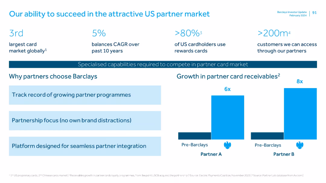
Two-column layout: key statistics on top, reasons for partner preference in the middle left, and bar chart comparison (growth in receivables) on the right. Clean, corporate design with icons and color highlights.
Strategic Planning
Financial Services
Highlights Barclays' competitive position in the US partner card market, emphasizing its growth capabilities, large addressable market, and unique partner-focused approach. A bar chart demonstrates a significant rise in partner card receivables post-Barclays engagement.
partner cards, US market, growth, receivables, customer base, integration, rewards, CAGR, financial partnerships, scalability
false
Strategic Planning
Financial Services
Mixed Chart
Barclays
Add to my slides
Remove from favorites
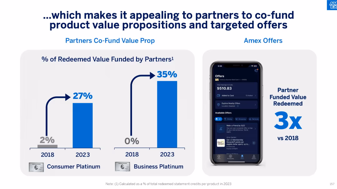
Split panel slide: bar charts on left showing rise in partner-funded redeemed value (2018–2023), right showing Amex Offers UI on phone and 3x increase in partner-funded value.
Product and Service Analysis
Financial Services
This slide illustrates how growing partner engagement has increased the share of redeemed value they fund—27% for Consumer Platinum and 35% for Business Platinum in 2023—up from 2% and 0% respectively in 2018. It supports the effectiveness of co-funded offers and digital engagement tools.
partner funding, value proposition, targeted offers, consumer engagement, co-funded redemption, Amex Offers, digital interface
false
Product and Service Analysis
Financial Services
Mixed Chart
McKinsey
Add to my slides
Remove from favorites
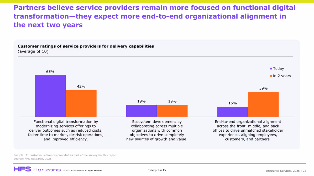
Similar bar chart format to previous slide but focused on partner perceptions; compares current and future priorities in service delivery.
Customer and Market Segmentation
Financial Services
Partners echo a sentiment similar to clients, indicating a strong current focus on cost-efficient transformation but predicting growth in end-to-end organizational alignment and ecosystem-based collaboration. The shift highlights strategic evolution in partner expectations of service delivery, aiming for deeper stakeholder integration.
Partner ratings, transformation, ecosystem, alignment, efficiency, service expectations
false
Customer and Market Segmentation
Financial Services
Single Chart
EY
Add to my slides
Remove from favorites
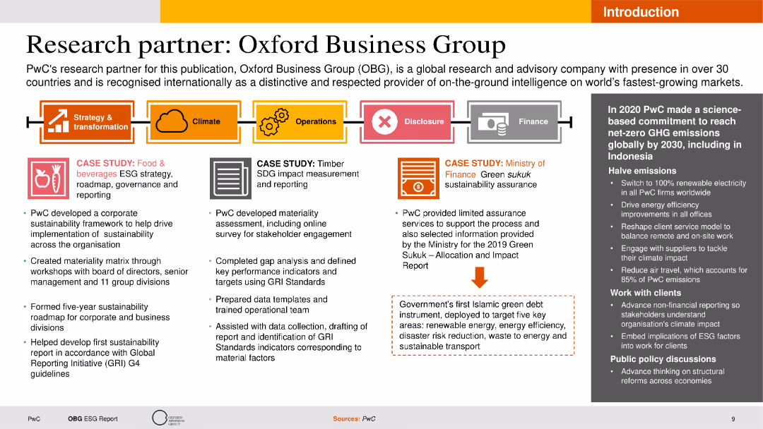
The slide features text boxes detailing case studies, a process flow diagram, and an image with a caption. The layout is moderately complex with multiple sections and clear labeling for each segment.
Client Case Studies
Professional Services
This slide showcases PwC's partnership with Oxford Business Group, highlighting case studies in ESG strategy and materiality assessment. It emphasizes the collaborative efforts and outcomes achieved through the partnership.
Partnership, Case Studies, ESG, PwC, Oxford Business Group
false
Client Case Studies
Professional Services
Header Horizontal
PwC/Strategy&
Add to my slides
Remove from favorites
The slide includes bulleted points on collaboration initiatives and a column chart on asset management net new assets from private bank channels. It features a clean layout with blue and grey tones.
Strategic Planning
Financial Services
This slide details the initiatives to strengthen partnerships with PB through collaboration and distribution enhancement. It shows cumulative NNA growth and thematic equity fund launches.
Partnership, Collaboration, Asset Management, NNA Growth, Thematic Equity Funds
false
Strategic Planning
Financial Services
Mixed Chart
Credit Suisse
Add to my slides
Remove from favorites
Contains logos and brief descriptions of three organizations: Social Progress Imperative, Play Verto, and Deloitte. Text blocks are well-organized with a clear, professional layout.
Strategic Planning
Professional Services
This slide presents three partnership organizations involved in social progress and consulting, providing brief overviews of each. It's aimed at highlighting the roles and unique selling points of each partner in the context of social impact.
partnerships, consulting, social impact, organizations
false
Strategic Planning
Professional Services
Pillar
Deloitte
Add to my slides
Remove from favorites
Timeline visual highlighting the history of partnerships and acquisitions between the companies.
Strategic Planning
Transportation & Logistics
Details the strategic partnership history, focusing on investment and growth through collaboration.
partnerships, investments, growth strategy, acquisitions, timeline
false
Strategic Planning
Transportation & Logistics
Linear Flow
Deutsche Bank
Add to my slides
Remove from favorites
The slide highlights partnerships and philanthropy using logos and bullet points, clearly laying out the firm's engagement in sustainability efforts and community support.
Strategic Planning
Financial Services
Details the firm's partnerships and philanthropic efforts, showcasing engagement in sustainability, support for small businesses and women entrepreneurs, and contributions to COVID-19 relief, highlighting the firm's commitment to social responsibility and market solutions.
Partnerships, Philanthropy, Sustainability, Small Business, Women Entrepreneurs, COVID-19 Relief
false
Strategic Planning
Financial Services
Table
Goldman Sachs
Add to my slides
Remove from favorites
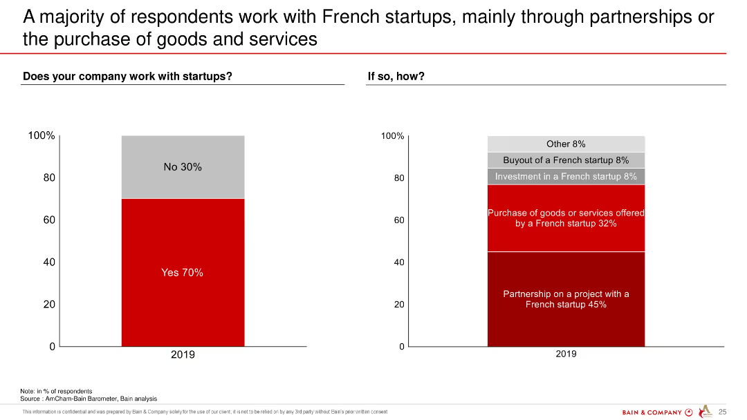
The slide features two column charts. The left chart shows the percentage of companies working with startups, while the right chart displays the ways these companies engage with startups. Colors are used to differentiate responses.
Market Analysis and Trends
Professional Services
The slide indicates that 70% of respondents' companies work with startups, with partnerships and purchases of goods/services being the most common engagement methods.
partnerships, startups, engagement, survey, French companies, collaboration, data analysis
false
Market Analysis and Trends
Professional Services
Multiple Chart
Bain
Add to my slides
Remove from favorites
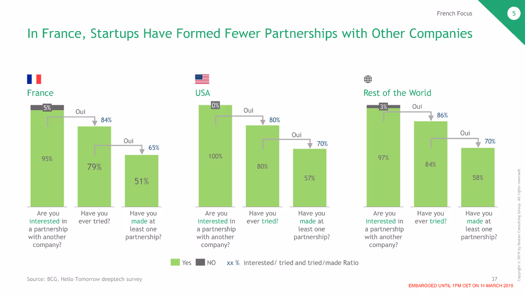
The slide presents column charts comparing partnership formation rates among startups in France, the USA, and the RoW.
Market Analysis and Trends
Professional Services
Analyzes the lower rates of partnership formation among French startups compared to their counterparts in the USA and the RoW.
partnerships, startups, France, USA, RoW
false
Market Analysis and Trends
Professional Services
Multiple Chart
BCG
Add to my slides
Remove from favorites
Dark background with column charts. Text on the right discussing platform strategy considerations
Competitive Landscape
Professional Services
It outlines the increased partnership formation among platform adopters and criteria for platform strategy
Partnerships, Strategy, Market Dynamics, Technology, Ecosystem
false
Competitive Landscape
Professional Services
Mixed Chart
Accenture
Add to my slides
Remove from favorites
Contains multiple logos and a colored block diagram categorizing various business aspects such as "Cockpit of the Future" and "Technology Platforms". Colorful and structured.
Industry Overview
Transportation & Logistics
Describes Faurecia's strategic partnerships across different sectors, emphasizing on technology and sustainable mobility, highlighting the integration with various industries and academia.
partnerships, technology, academia, sustainability, mobility, ecosystem, innovation
false
Industry Overview
Transportation & Logistics
Diagram
Deutsche Bank
Add to my slides
Remove from favorites
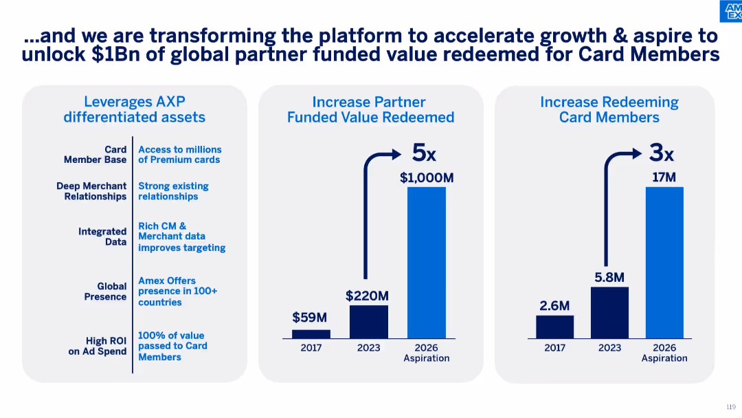
Three-column layout with bullet list (left), vertical bar chart (middle), and user growth chart (right).
Technology and Digital Transformation
Financial Services
The slide outlines Amex's strategy to grow partner-funded value and redeeming users through platform enhancements, leveraging assets like data, premium cards, and global presence. It shows significant growth from 2017 to 2026 projections.
partner value, card members, digital transformation, Amex platform, redemption growth, merchant data, global reach
false
Technology and Digital Transformation
Financial Services
Mixed Chart
McKinsey
Add to my slides
Remove from favorites
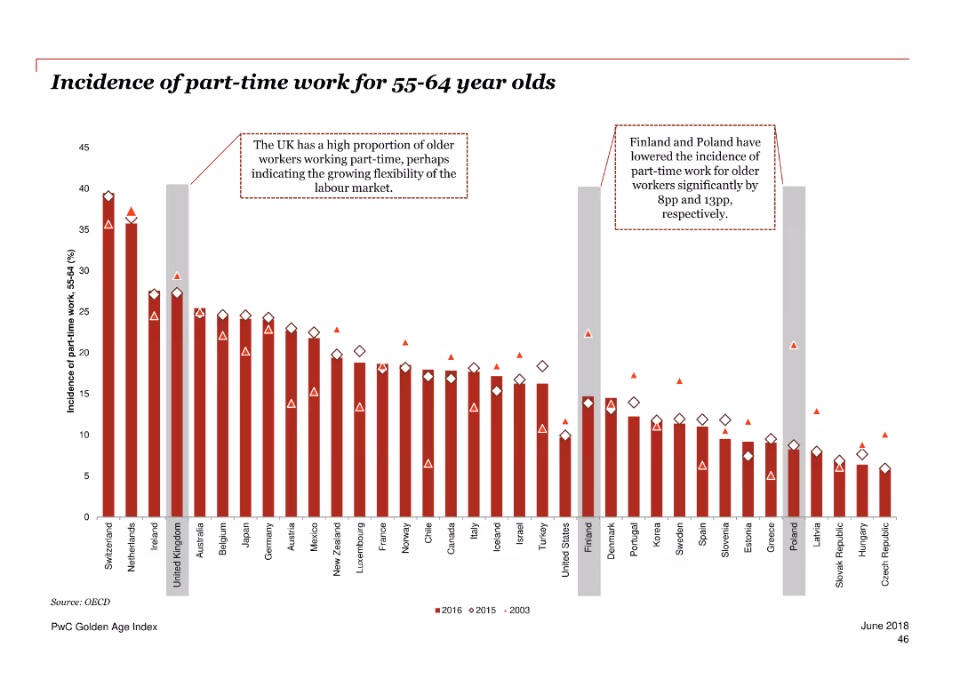
Column chart illustrating the incidence of part-time work for 55-64 year olds in various countries over three periods.
Market Analysis and Trends
Professional Services
The slide presents data on the proportion of older adults working part-time across multiple countries over 2003, 2015, and 2016.
part-time work, employment, older adults, OECD, trend
false
Market Analysis and Trends
Professional Services
Single Chart
PwC/Strategy&
Add to my slides
Remove from favorites
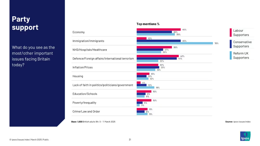
Horizontal bar chart comparing top concerns by political party (Labour, Conservative, Reform UK).
Customer and Market Segmentation
Government & Public Sector
Compares top political concerns among supporters of UK political parties. Key issues differ by affiliation, e.g., Labour prioritizes economy and NHS; Reform UK focuses on immigration.
party politics, voter concerns, political segmentation, economy, NHS, immigration, Ipsos, UK issues
false
Customer and Market Segmentation
Government & Public Sector
Mixed Chart
IPSOS
Add to my slides
Remove from favorites
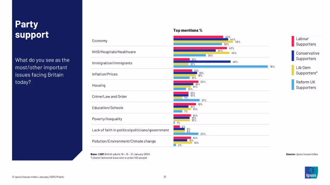
Horizontal bar chart segmented by political party support, showing top concerns (e.g. Economy, NHS, Immigration).
Customer and Market Segmentation
Government & Public Sector
The slide breaks down public concerns by political party support (Labour, Conservative, Lib Dem, Reform UK). Economy and NHS are top issues across all parties, while immigration is notably high for Reform UK supporters.
party support, economy, NHS, immigration, Ipsos, survey, public opinion
false
Customer and Market Segmentation
Government & Public Sector
Mixed Chart
IPSOS
Add to my slides
Remove from favorites
Features a dark blue and light blue chart displaying the growth in passive AUM. It contains a comparison of passive equity and fixed income AUM with a percentage scale on the right. The slide number is 10.
Investment Analysis
Financial Services
Highlights the growth of passive asset management and compares it with active funds globally, offering insights into investment trends and asset management preferences.
passive AUM, active funds, investment trends, asset management
false
Investment Analysis
Financial Services
Single Chart
Goldman Sachs
Add to my slides
Remove from favorites
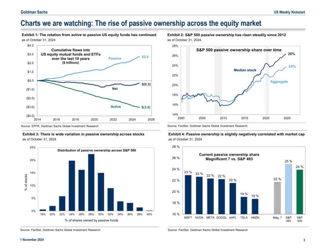
Dashboard layout with five graphs focused on passive vs. active fund trends; timeline and distribution visuals dominate.
Market Analysis and Trends
Financial Services
Analyzes the ongoing shift from active to passive equity fund management. Charts show passive inflows, rising passive ownership in the S&P 500, correlation with market cap, and concentration in large tech stocks. Reflects structural market transformation.
passive funds, S&P 500, ETF inflows, market cap, equity market, ownership trends, active vs. passive, investment strategy
false
Market Analysis and Trends
Financial Services
Multiple Chart
Goldman Sachs
Add to my slides
Remove from favorites
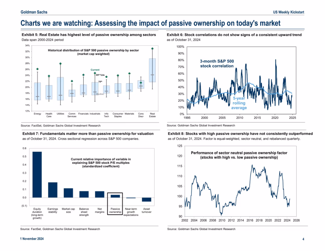
Four-panel layout with distinct exhibits including bar charts, line charts, and regression graphs; clean and data-dense presentation with legends and source annotations
Market Analysis and Trends
Financial Services
The slide examines how passive ownership affects various market aspects: sector ownership levels, stock correlations, valuation determinants, and relative performance. It concludes that passive ownership alone does not explain performance trends, with fundamentals having a stronger influence.
passive ownership, S&P 500, valuation, sector analysis, correlations, equity performance, investment trends, fundamentals
false
Market Analysis and Trends
Financial Services
Multiple Chart
Goldman Sachs
Add to my slides
Remove from favorites
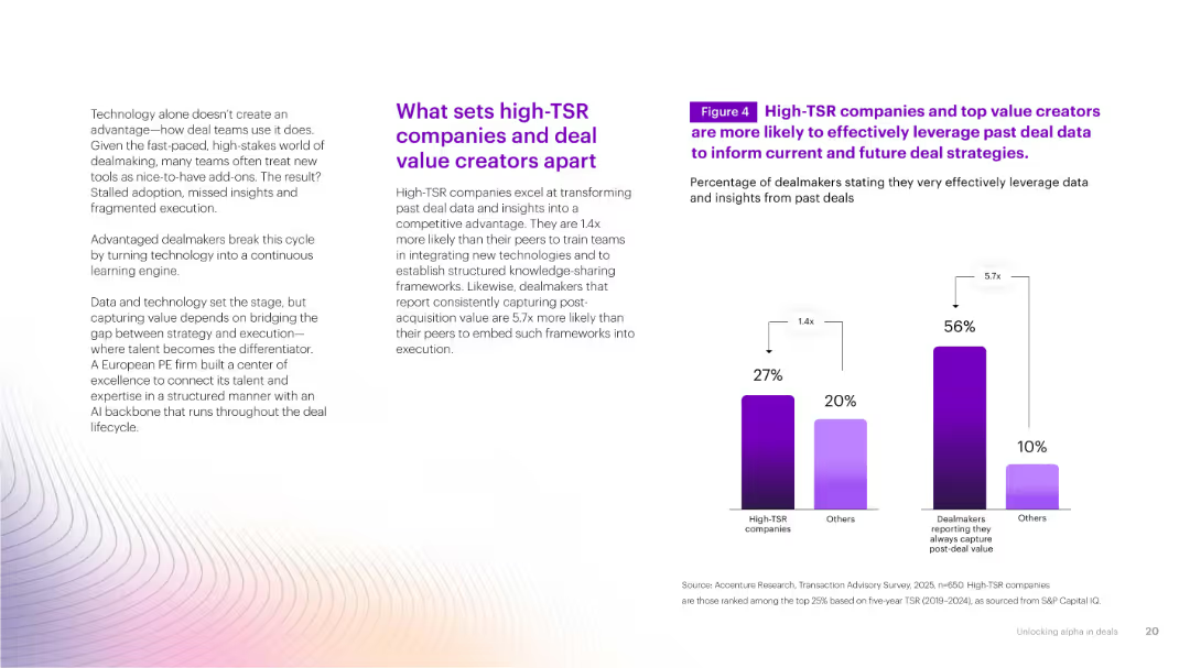
Two bar charts comparing high-TSR vs. others in data usage effectiveness. Light gradient background with supportive text and statistical insights.
Investment Analysis
Financial Services
Highlights how high-TSR companies and consistent value creators excel at utilizing past deal data to inform future strategies, creating a competitive edge through structured knowledge application.
past deal data, TSR, insights, performance, execution
false
Investment Analysis
Financial Services
Mixed Chart
Accenture
Add to my slides
Remove from favorites
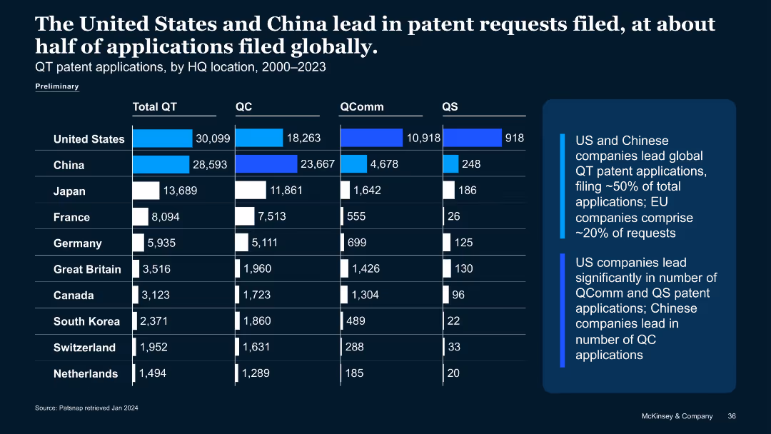
Similar structure to previous slide, showing bar chart of quantum patent applications (2000–2023) by country and QT type.
Strategic Planning
Technology & Software
Compares quantum tech patent filings, showing U.S. and China dominate with ~50% of global submissions. Breaks down QC, QComm, QS patent applications. Notes China leads QC filings; U.S. leads QComm and QS.
patent applications, QT, China, U.S., QC, QComm, QS, IP filings
false
Strategic Planning
Technology & Software
Mixed Chart
McKinsey
Add to my slides
Remove from favorites
Another line chart like previous, but for patent applications from 2016–2022. Top 10 firms including Baidu, Origin Quantum etc.
Performance Metrics and KPIs
Technology & Software
Tracks filing behavior for top QT firms from 2016–2022. Most peaked pre-2021 and declined after. Baidu is an exception, continuing to rise. Google and IBM saw the sharpest declines. Indicates shifting strategies or R&D reallocations.
patent applications, QT companies, IBM, Baidu, filing trends, R&D, IP filings
false
Performance Metrics and KPIs
Technology & Software
Mixed Chart
McKinsey
Add to my slides
Remove from favorites
Line graph showing 2016–2022 trend in granted QT patents for top 10 companies with legend and brief insights.
Performance Metrics and KPIs
Technology & Software
Depicts declining trend in granted QT patents post-2020. IBM, Microsoft, and Google peaked earlier. Indicates reduced private investments and downturn in patent grants across sectors. IBM showed steepest decline post-2019.
patent grants, IBM, Microsoft, private investment, QT slowdown, IP trend, 2021–2022
false
Performance Metrics and KPIs
Technology & Software
Mixed Chart
McKinsey
Add to my slides
Remove from favorites
A timeline with logos of companies and key events, accompanied by bullet points and a side section with impacts
Competitive Landscape
Healthcare & Pharmaceuticals
Discusses the impact of the expiration of Intuitive's patents on global competition, technological advancements, and cost reduction
patents, competition, innovation, cost, healthcare
false
Competitive Landscape
Healthcare & Pharmaceuticals
Header Horizontal
LEK
Add to my slides
Remove from favorites
Area chart depicting the number of global patents in various industries (e.g., electrical machinery, digital communication) from 1980 to 2019.
Market Analysis and Trends
Technology & Software
The slide shows the growth in global patents across different industries from 1980 to 2019, highlighting the explosion of patents related to digitalization and Industry 4.0. It illustrates the increasing innovation activity in fields like computer technology, semiconductors, and medical technology.
Patents, Digitalization, Industry 4.0, Innovation
false
Market Analysis and Trends
Technology & Software
Mixed Chart
Roland Berger
Add to my slides
Remove from favorites
Column chart displaying the percentage of patents filed domestically by companies in Europe, APAC, and North America.
Market Analysis and Trends
Technology & Software
The slide shows the percentage of patents filed in the home regions of companies, with Europe lagging behind APAC and North America.
patents, domestic, Europe, APAC, North America, innovation, technology
false
Market Analysis and Trends
Technology & Software
Single Chart
Accenture
Add to my slides
Remove from favorites
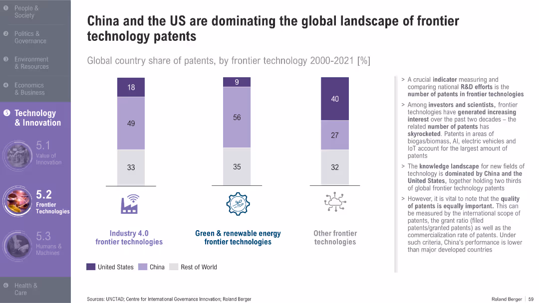
Bar chart with segmented vertical bars; right-aligned bullet text; purple-themed icons and section header
Technology and Digital Transformation
Technology & Software
The slide shows the share of patents in various frontier technologies from 2000–2021, highlighting the dominance of China and the US. It discusses patent distribution in Industry 4.0, renewable energy, and other technologies, and emphasizes the importance of patent quality, not just quantity.
Patents, Frontier Technology, Industry 4.0, China, US, R&D, Innovation
false
Technology and Digital Transformation
Technology & Software
Mixed Chart
Roland Berger
Add to my slides
Remove from favorites
Bar chart layout comparing 10 countries by quantum patent grants (Total QT, QC, QComm, QS) with key insights on the side.
Strategic Planning
Technology & Software
Shows cumulative QT patents granted (2000–2023), where the U.S. leads followed by Japan. EU countries collectively outpace both. It highlights China's rise in quantum communication patents and the distribution of granted patents across subfields.
patents, quantum communication, quantum computing, country comparison, IP, QC, QS
false
Strategic Planning
Technology & Software
Mixed Chart
McKinsey
Add to my slides
Remove from favorites
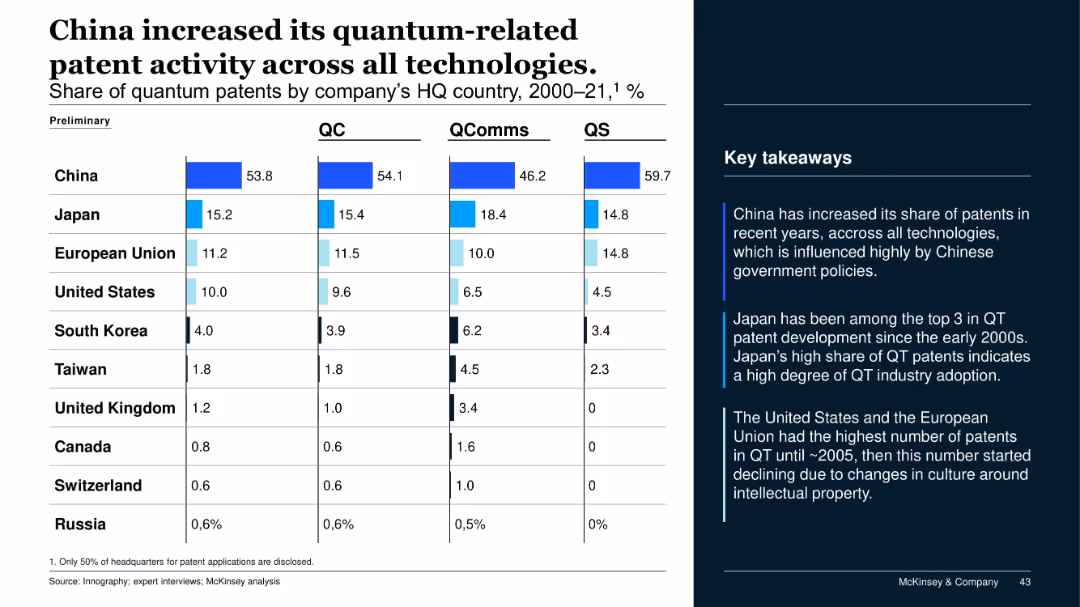
Table with stacked bar graphs and country-level shares of patent filings (QC, QComms, QS) from 2000–2021; summary points on the right.
Regulatory and Compliance
Government & Public Sector
This slide shows China’s leading position in quantum technology patents across all categories, followed by Japan and the EU. Insights note China's policy-driven growth, Japan's steady innovation, and the US/EU's early decline post-2005.
patents, quantum tech, China, Japan, US, EU, IP, innovation, regulatory
false
Regulatory and Compliance
Government & Public Sector
Mixed Chart
McKinsey
Add to my slides
Remove from favorites
The slide features an area chart showing the annual number of patents filed for various low-carbon technologies from 1996-2018, categorized by technology type. Annotations highlight key trends and milestones in patent filings.
Financial Performance
Energy & Utilities
This slide examines the trends in R&D efforts as indicated by patents filed for low-carbon technologies. It shows an acceleration in patents for various technologies during 2004-2012, with a focus on the growing interest in CCUS and other renewables.
patents, R&D, low-carbon technologies, trends
false
Financial Performance
Energy & Utilities
Mixed Chart
Kearney
Add to my slides
Remove from favorites
Displays screenshots of a mobile app in various stages of patient interaction. Uses a clear and informative layout with accompanying descriptions.
Customer and Market Segmentation
Healthcare & Pharmaceuticals
Demonstrates the patient engagement process through a mobile app, highlighting improvements in scheduling and registration. Designed for presentations on customer experience enhancements in healthcare.
patient experience, mobile healthcare, engagement, customer journey
false
Customer and Market Segmentation
Healthcare & Pharmaceuticals
Linear Flow
Barclays
Add to my slides
Remove from favorites
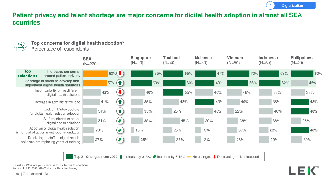
Column chart showing top concerns for digital health adoption, such as patient privacy and talent shortage, across SEA countries.
Technology and Digital Transformation
Healthcare & Pharmaceuticals
This slide discusses the primary concerns regarding digital health adoption in SEA, highlighting patient privacy and the shortage of skilled talent.
Patient privacy, digital health, concerns, SEA, talent shortage
false
Technology and Digital Transformation
Healthcare & Pharmaceuticals
Multiple Chart
LEK
Add to my slides
Remove from favorites
The slide uses a column chart to show the top concerns for digital health adoption in SEA countries, focusing on patient privacy and talent shortage. It includes comparisons of these concerns across different countries and indicates changes from 2022.
Risk Assessment and Management
Healthcare & Pharmaceuticals
The slide details the main concerns for digital health adoption in SEA, such as increased patient privacy concerns and talent shortages. It compares these concerns across various countries, highlighting changes in perception from 2022.
Patient privacy, talent shortage, digital health, adoption, concerns, SEA, countries, comparison, 2022
false
Risk Assessment and Management
Healthcare & Pharmaceuticals
Multiple Chart
LEK
Add to my slides
Remove from favorites
Same format as prior slides. Horizontal bar chart with country-level percentages under "Important" and "Not important" responses.
Market Analysis and Trends
Government & Public Sector
The chart presents international responses on whether defending one’s country from criticism is an important trait. Responses are more divided here compared to previous slides, with a lower average (73%) considering it important. Cultural and regional differences are evident.
patriotism, national pride, defense, criticism, public opinion, Ipsos, bar chart, national identity
false
Market Analysis and Trends
Government & Public Sector
Mixed Chart
IPSOS
Add to my slides
Remove from favorites
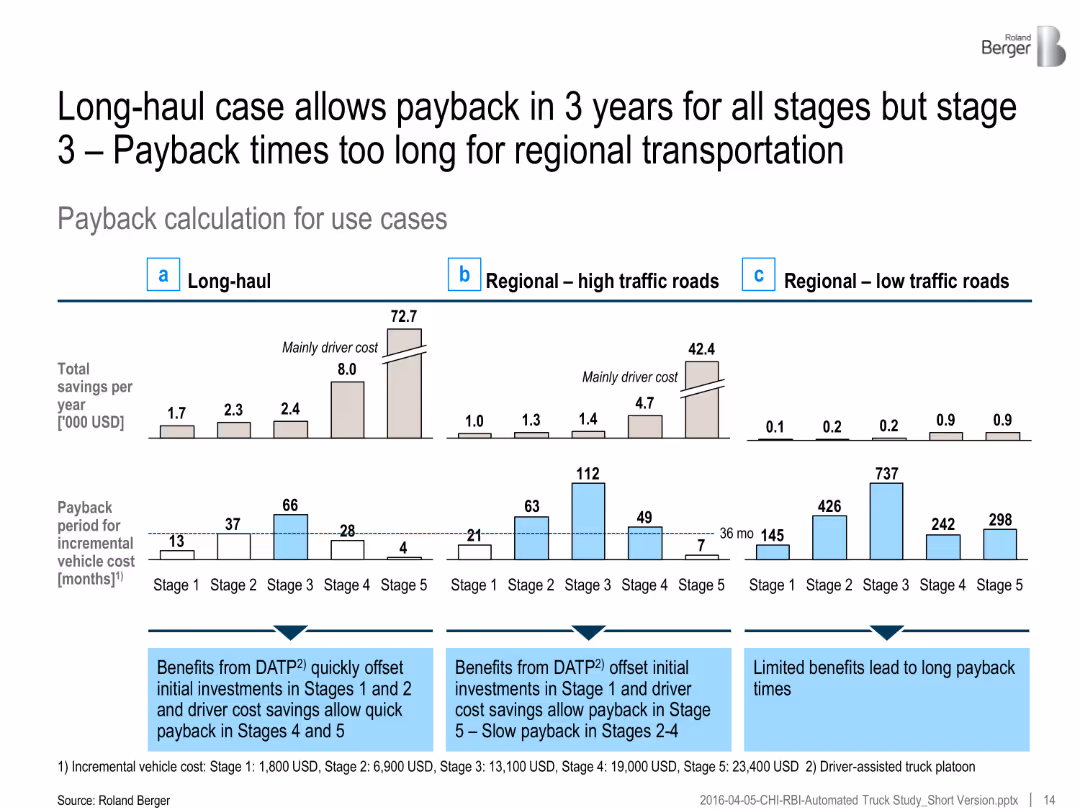
Comparative bar chart for long-haul and regional use cases shows total savings and payback periods for automation stages.
Strategic Planning
Transportation & Logistics
Long-haul trucks benefit from automation investment with payback periods under 3 years in most cases. Regional use cases show significantly longer return periods.
payback period, truck automation, long-haul, regional transport, cost-benefit, investment recovery, driver cost reduction
false
Strategic Planning
Transportation & Logistics
Multiple Chart
Roland Berger
Add to my slides
Remove from favorites
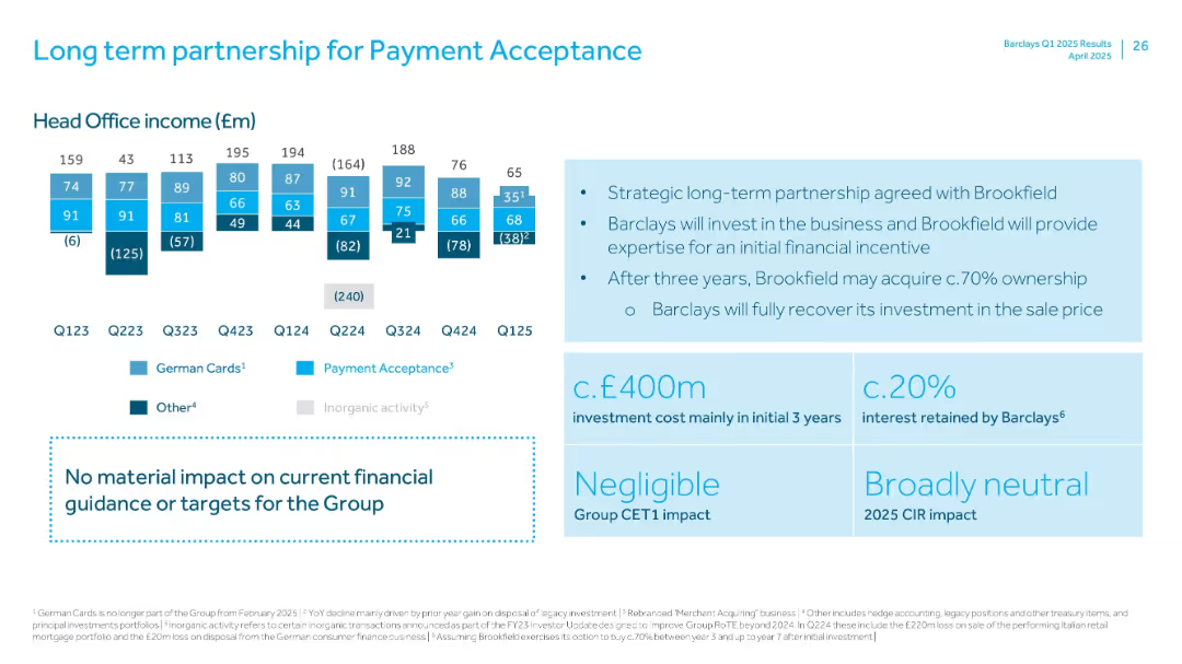
Combination of small income bar charts and large right-side callouts on strategy and financial impact.
Strategic Planning
Financial Services
Describes new strategic partnership between Barclays and Brookfield for payment acceptance. Includes historical Head Office income and outlines expected investment, ownership terms, and financial neutrality.
Payment Acceptance, Brookfield, Strategic Partnership, Investment, Income, Q125, CIR
false
Strategic Planning
Financial Services
Mixed Chart
Barclays
Add to my slides
Remove from favorites
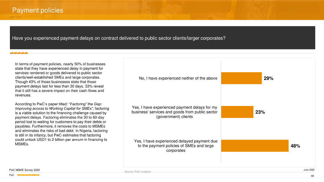
A column chart showing responses about experiencing payment delays, split into categories such as no delays, delays from public sector clients, and delays due to SME policies.
Regulatory and Compliance
Financial Services
The slide presents data on payment delays experienced by firms, with nearly half reporting delays due to the payment policies of SMEs and large corporations, and another significant portion reporting delays from public sector clients.
payment delays, financial services, regulatory compliance, column chart
false
Regulatory and Compliance
Financial Services
Mixed Chart
PwC/Strategy&
Add to my slides
Remove from favorites
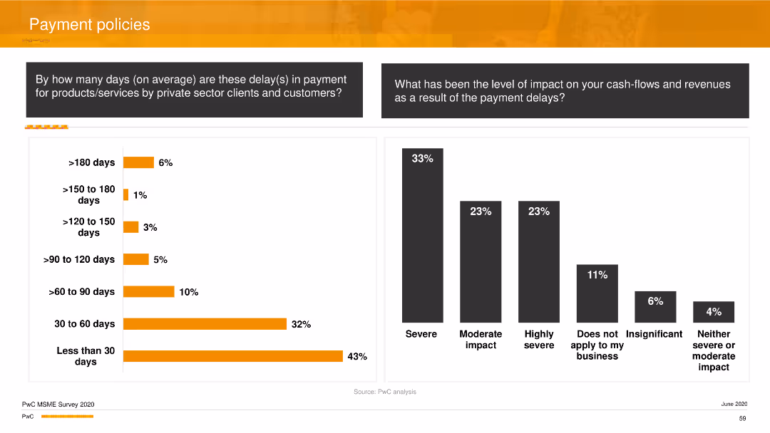
Two column charts, one showing the average delay duration for private sector clients, and the other showing the impact level on cash flows and revenues due to these delays.
Operational Efficiency
Financial Services
The slide provides an overview of the duration of payment delays from private sector clients and the subsequent impact on business cash flows and revenues, highlighting severe impacts for many firms.
payment delays, impact analysis, financial services, operational efficiency, column chart
false
Operational Efficiency
Financial Services
Multiple Chart
PwC/Strategy&
Add to my slides
Remove from favorites
Graphs and charts illustrating payment fee revenues and sales volume growth, juxtaposed with sector-specific data. The color scheme is blue, green, and gray.
Operational Efficiency
Financial Services
Examines the resurgence in payment processing sectors, underlining the economic recovery's impact on sales volumes. It's for evaluating operational performance in the payment services domain.
Payment Fees, Revenue, Growth, Sales
false
Operational Efficiency
Financial Services
Multiple Chart
Goldman Sachs
Add to my slides
Remove from favorites
Utilizes a balanced combination of text and large percentage figures to highlight statistics on payment fraud, with a minimalistic design focusing on key data points.
Risk Assessment and Management
Technology & Software
Discusses the rise in payment fraud with the advance of payment technology, showing key statistics likely used to emphasize the need for robust security measures.
payment fraud, technology, cybersecurity, JPMorgan, ACH, email compromise
false
Risk Assessment and Management
Technology & Software
Pillar
JP Morgan
Add to my slides
Remove from favorites
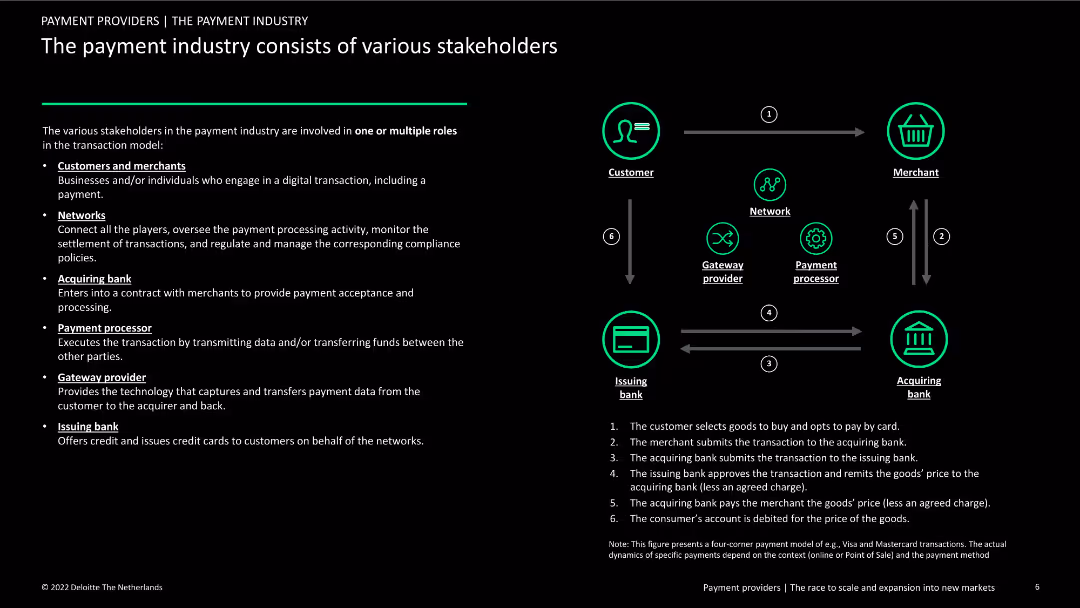
The slide illustrates the roles of various stakeholders in the payment industry with a flow diagram. Text on the left explains the functions of each stakeholder, while the right side shows the transactional process visually.
Organizational Structure and Change
Financial Services
This slide explains the roles and interactions of different stakeholders in the payment industry, including customers, networks, banks, and processors. It uses a flow diagram to depict the payment transaction process step-by-step.
payment industry, stakeholders, roles, transaction process
false
Organizational Structure and Change
Financial Services
Diagram
Deloitte
Add to my slides
Remove from favorites
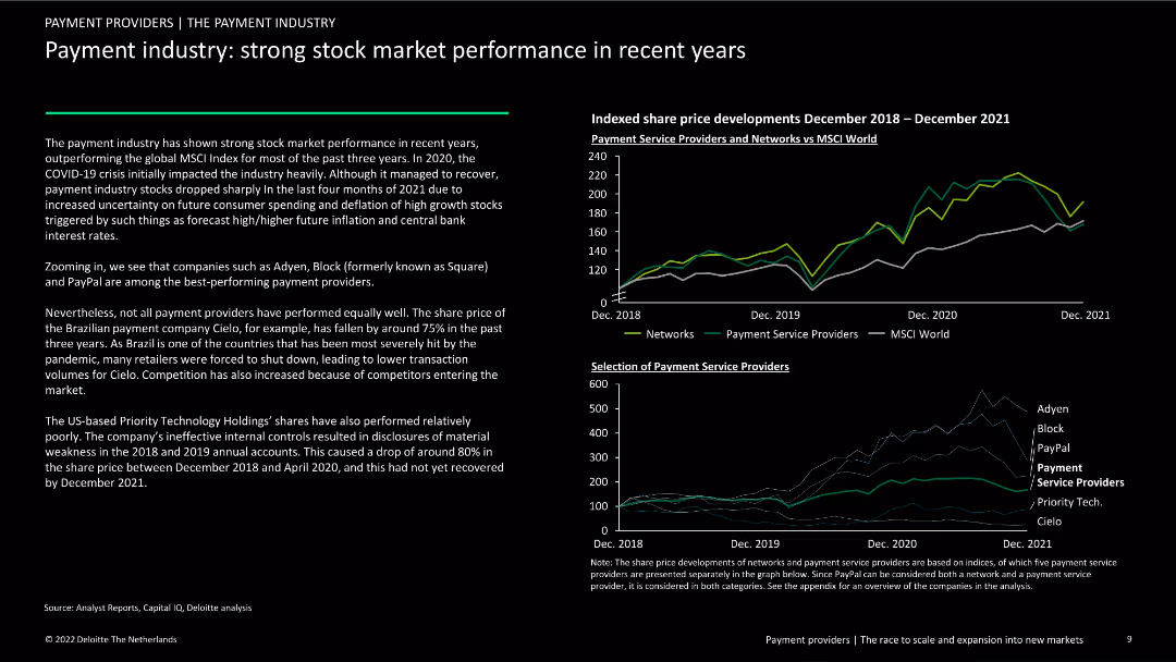
The slide includes two column charts: one showing the indexed share price developments of payment service providers and networks vs. MSCI World, and another comparing the performance of selected payment service providers. Text analyzes trends.
Financial Performance
Financial Services
This slide reviews the stock market performance of payment industry players from December 2018 to December 2021, comparing them with the MSCI World index. It highlights top performers like Adyen and PayPal and discusses the impact of COVID-19.
payment industry, stock market, performance, trends, COVID-19
false
Financial Performance
Financial Services
Multiple Chart
Deloitte
Add to my slides
Remove from favorites
The slide is divided into two main sections, each with a heading and bulleted points, complemented by iconography. The left side emphasizes customer experience while the right focuses on business and developer tools. The design is straightforward with a good balance of text and imagery.
Operational Efficiency
Financial Services
This slide discusses the implementation of secure and convenient payment options to enhance customer experience and business operations. It's used to promote efficient in-app payment solutions and developer-friendly tools for creating secure payment environments.
payment methods, cart abandonment, in-app experience, business value, developer tools, security solutions, transaction flow, automation
false
Operational Efficiency
Financial Services
Boxed
JP Morgan
Add to my slides
Remove from favorites
The slide includes a pie chart and a heatmap to present data on payment prediction using machine learning algorithms. It shows invoice status distribution and customer rating distribution, using various colors to highlight different data points.
Financial Performance
Energy & Utilities
The slide demonstrates the use of machine learning algorithms for predicting payment outcomes, showing data input analysis and correlation heatmap, helping in financial performance forecasting and decision-making.
Payment Prediction, Machine Learning, Algorithm, Invoice Status, Customer Rating
false
Financial Performance
Energy & Utilities
Multiple Chart
EY
Add to my slides
Remove from favorites
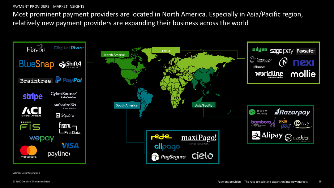
Contains a world map highlighting major payment providers by region, including logos of prominent companies. Includes text explaining regional differences and expansions.
Competitive Landscape
Financial Services
Overview of the geographical distribution of major payment providers, emphasizing the concentration in North America and expansion activities in Asia/Pacific and other regions.
payment providers, North America, global distribution, competitive landscape, financial services, regional analysis, company expansion, market overview
false
Competitive Landscape
Financial Services
Graphic
Deloitte
Add to my slides
Remove from favorites
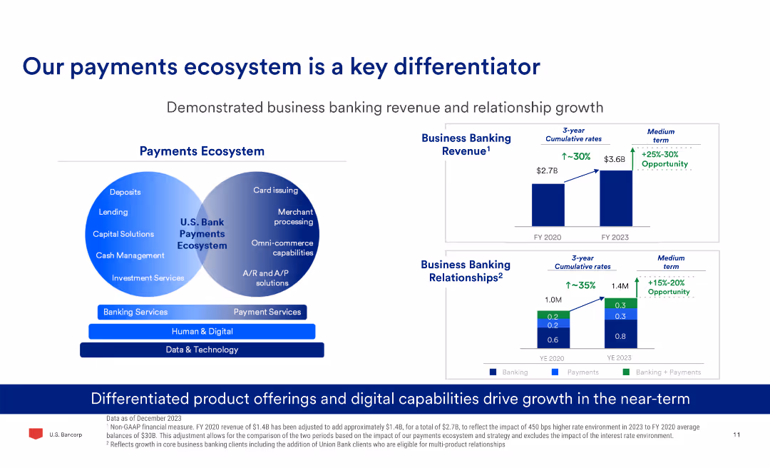
The slide has a Venn diagram comparing banking and payment services, two column charts showing business banking revenue and relationships growth, and text explaining product offerings.
Market Analysis and Trends
Financial Services
The slide demonstrates the growth in business banking revenue and relationships, highlighting the differentiated product offerings and digital capabilities driving this growth.
Payments, Banking, Revenue, Growth, Digital, Ecosystem
false
Market Analysis and Trends
Financial Services
Multiple Chart
Barclays
Add to my slides
Remove from favorites
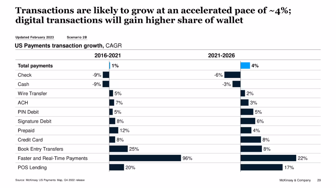
Dual bar chart showing CAGR of payment types for 2016–2021 and 2021–2026
Market Analysis and Trends
Financial Services
This slide tracks payment method CAGR over two periods, showing a projected acceleration in digital payment adoption. Credit cards, POS lending, and real-time payments are forecasted to grow significantly from 2021–2026, while traditional methods like checks and cash are expected to decline.
payments CAGR, digital transactions, credit card, real-time payments, POS lending, decline of cash
false
Market Analysis and Trends
Financial Services
Single Chart
McKinsey
Add to my slides
Remove from favorites
This slide utilizes a balanced layout with grouped content boxes that feature numerical highlights, percentages, and short descriptive texts, maintaining a clear visual hierarchy in a blue and white theme.
Operational Efficiency
Financial Services
It emphasizes strategic imperatives and priorities in payments, detailing the growth, customer experiences, and infrastructure modernization. It's intended to communicate specific goals in payment processing, customer experience improvements, and technology upgrades to maintain market position.
Payments, Customer experience, Infrastructure, Strategic priorities
false
Operational Efficiency
Financial Services
Table
JP Morgan
Add to my slides
Remove from favorites
Contains multiple infographics and text blocks detailing the components of Barclays' payment systems, including partnerships and technological capabilities.
Operational Efficiency
Financial Services
This slide explains the structure of Barclays' payments ecosystem, emphasizing its market leadership and partnerships in SME and large corporate sectors, detailing services like card issuing and merchant acquiring.
payments, ecosystem, SME, corporate, partnerships
false
Operational Efficiency
Financial Services
Table
Barclays
Add to my slides
Remove from favorites
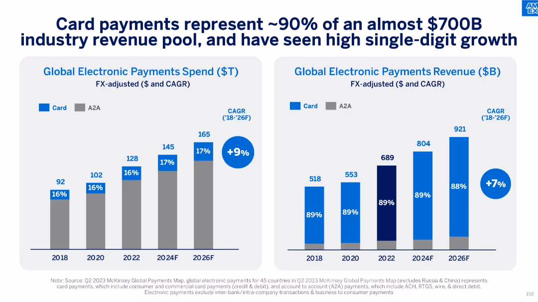
Two bar charts showing global electronic payments spend and revenue growth by Card and A2A types (2018–2026F), with CAGR annotations.
Market Analysis and Trends
Financial Services
This slide presents card payments as the dominant component (~90%) of a ~$700B global electronic payments revenue pool. It shows a 9% CAGR in spend and 7% in revenue between 2018 and 2026F, emphasizing the steady growth and market strength of card transactions over time.
payments growth, CAGR, global revenue, card payments, A2A, market trends, spend analysis, revenue forecasting
false
Market Analysis and Trends
Financial Services
Multiple Chart
McKinsey
Add to my slides
Remove from favorites
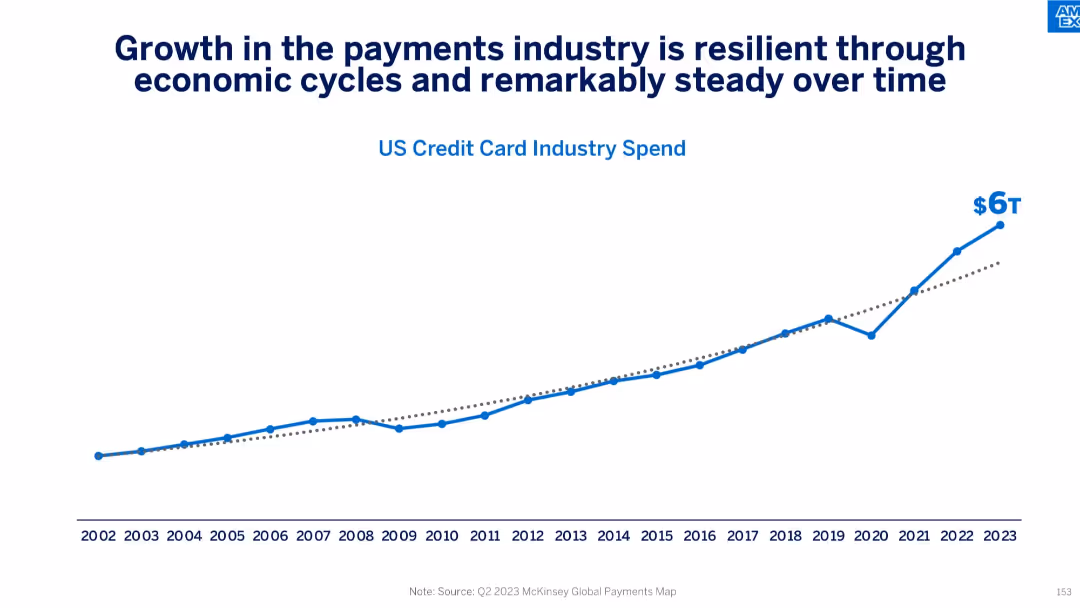
Line graph showing historical growth in US credit card industry spend from 2002 to 2023, reaching $6T in 2023.
Market Analysis and Trends
Financial Services
This slide emphasizes the resilience and consistent growth of the U.S. credit card industry despite economic cycles. With spend rising from under $1T in 2002 to $6T in 2023, it underlines the industry's long-term momentum and consumer reliance on credit-based transactions.
payments industry, growth trend, credit card spend, economic cycles, resilience, US market, long-term trends
false
Market Analysis and Trends
Financial Services
Single Chart
McKinsey
Add to my slides
Remove from favorites
A comprehensive slide with multiple data points arranged in a structured layout, predominantly using blue and white colors.
Market Analysis and Trends
Financial Services
Provides an overview of strategic objectives and strengths in payments, lending, and commerce. The slide is meant for illustrating the company's position and future directions in key business areas, highlighting objectives like maintaining a payments franchise and capturing a market share in lending.
Payments, Lending, Commerce, Market share, Strategic objectives
false
Market Analysis and Trends
Financial Services
Table
JP Morgan
Add to my slides
Remove from favorites
A mix of checkmarks, icons, and arrows indicate progress and future goals with text describing key milestones, current platforms, and upcoming developments in payment technology.
Operational Efficiency
Financial Services
It highlights the advancements and roadmap for payment platforms, showcasing the progress and future plans to improve global scalability and technology. Useful for operational strategy and tech innovation discussions.
Payments, Milestones, Technology, Scalability, Innovation, Roadmap
false
Operational Efficiency
Financial Services
Table
JP Morgan
Add to my slides
Remove from favorites
Features a data table with revenue, client numbers, deposits, and income figures, as well as diagrams depicting business segments and LOBs.
Financial Performance
Financial Services
Provides a snapshot of the firm’s performance in the payments sector, showing revenue, clients, and income data.
Payments, Revenue, Clients, Deposits, Income, Corporate Banking, Treasury Services
false
Financial Performance
Financial Services
Header Horizontal
JP Morgan
Add to my slides
Remove from favorites
The slide contains two column charts displaying trends in payments revenue and average deposit balances. Textual content with bullet points offers additional context on the side.
Financial Performance
Financial Services
This slide demonstrates the growth in payments revenue and deposit balances, emphasizing the company's strength in market share gains and liquidity management. It showcases numerical data reflecting the trend over several years, with a focus on continued momentum and market dynamics.
Payments revenue, deposit balances, market growth, liquidity
false
Financial Performance
Financial Services
Multiple Chart
JP Morgan
Add to my slides
Remove from favorites
Displays a column chart showing payments revenue growth and a list detailing leadership positions and growth statistics.
Financial Performance
Financial Services
Highlights record growth in the payments sector and the firm’s leadership across various performance metrics.
Payments Revenue, Growth, Leadership, Market Share, Digital Banking, Transaction Value
false
Financial Performance
Financial Services
Mixed Chart
JP Morgan
Add to my slides
Remove from favorites
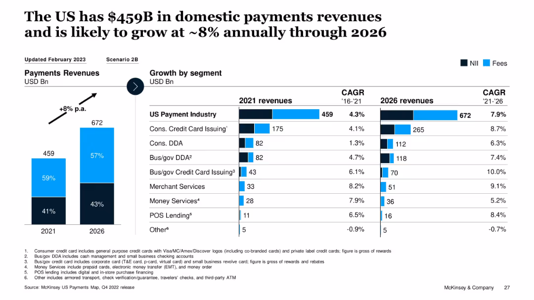
Vertical bar graph with growth projections and CAGR table by segment; color-coded NII and Fees split
Market Analysis and Trends
Financial Services
This slide shows the current and projected revenue for the US payments industry, expecting growth from $459B in 2021 to $672B by 2026 (~8% CAGR). It breaks down growth by segment, with high growth seen in POS Lending, Merchant Services, and Bus/gov Credit Card Issuing. Segment-wise CAGR from 2021–2026 is also provided.
payments, revenue growth, POS, CAGR, segments, forecast, McKinsey, fees, interest income, US market
false
Market Analysis and Trends
Financial Services
Multiple Chart
McKinsey
Add to my slides
Remove from favorites
Slide features column charts comparing the revenue from fees and net interest income between 2017 and 2021, alongside strategic focus areas for the payments business.
Financial Performance
Financial Services
Details the growth of JP Morgan's payments business, focusing on revenue improvements from 2017 to 2021. It highlights strategic areas such as treasury services and technology investments that contribute to their position as a leading payments provider, demonstrating effective financial and operational management.
payments, revenue growth, strategy
false
Financial Performance
Financial Services
Mixed Chart
JP Morgan
Add to my slides
Remove from favorites
This slide uses a three-column layout, each representing a concept: 'Scale', 'Innovation', 'Durable Differentiation'. It includes bullet points and sub-sections with graphical elements, such as icons and shaded boxes.
Financial Performance
Financial Services
The slide compares the strengths of banks and fintechs and how they combine to form J.P.Morgan's unique approach in payments, with a focus on scale, innovation, and differentiation.
Payments, Scale, Innovation, Differentiation, Banks, Fintechs, Services, J.P.Morgan, Efficiency, Relationships
false
Financial Performance
Financial Services
Table
JP Morgan
Add to my slides
Remove from favorites
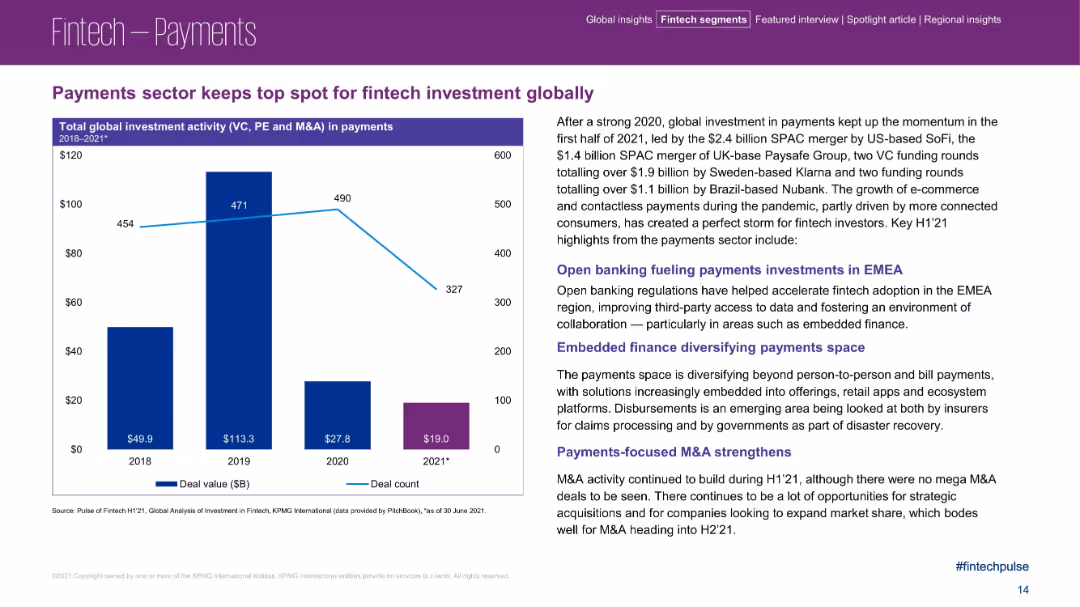
Left side has a bar chart; right side contains text-heavy analysis with highlighted headings.
Product and Service Analysis
Financial Services
This slide focuses on payments remaining the top sector in global fintech investment through early 2021. It covers major funding rounds, SPAC activity, and strategic themes such as open banking, embedded finance, and M&A trends fueling investor interest.
payments sector, fintech investment, open banking, embedded finance, SPAC, M&A
false
Product and Service Analysis
Financial Services
Mixed Chart
KPMG
Add to my slides
Remove from favorites
Two column charts showcase the growth of CB payments fee revenue and average CB deposit balances over five years, complemented by circular icons with key insights.
Operational Efficiency
Financial Services
Discusses the impact of JPMC's integrated and digital payment solutions on fostering client relationships and deposit growth, reflecting strong momentum and digital capability enhancement.
payments solutions, deposit growth, JPMC, digital transformation, client relationships, fee revenue, market trends
false
Operational Efficiency
Financial Services
Multiple Chart
JP Morgan
Add to my slides
Remove from favorites
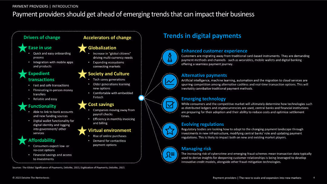
The slide is divided into two sections: the left lists drivers and accelerators of change in the payment industry, and the right outlines trends in digital payments. The layout is text-heavy with supportive icons and minimal imagery.
Strategic Planning
Financial Services
This slide highlights the drivers, accelerators of change, and emerging trends in the payment industry. It discusses factors like ease of use, globalization, cost savings, and technology that are shaping the future of digital payments.
payments, trends, digital, drivers, accelerators, technology
false
Strategic Planning
Financial Services
Header Horizontal
Deloitte
Add to my slides
Remove from favorites
Previous
Next
You don't have any favorites yet.
Please wait loading your favorites slides...
Create a FREE account to continue browsing
Receive Instant Access to 1,000+ slides from companies like McKinsey, Google, and Goldman Sachs
First Name
Last Name
Email
Password
I agree to all
Terms & Privacy Policy
Thank you! Your submission has been received!
Oops! Something went wrong while submitting the form.
Have an account?
Sign in
Upgrade to PRO to Save slides
Advanced Search and Filters
Access to 15,000+ slides
Access to Category Pages
Save/Bookmark Slides
PowerPoint Template Library
Pick a Plan
MONTHLY
$12/month
Billed every month, Cancel anytime.
YEARLY
$9/year
Billed $108 annually, Cancel anytime.
Checkout for $12/month
Checkout for $108/yr
Secured by Stripe | AES-256 bit encryption


![Defending [COUNTRY] when it is criticized](https://cdn.prod.website-files.com/654e70fb59937215cac87b19/6899bb31df0232a8a24f5889_qvBeDt21lyNdAQo81I-B9odvh0kcc792ylPZrvKQH_Y.avif)