My Account
My Slides
Search by Category
Pricing
Templates
View All Templates
Download Template Slides
✦ AI Search
Feedback
Login
Logout
Get Started
Browse all Slides
Browse all Slides
Create a FREE Account
Instant access to 1,000+ real slides from top companies like McKinsey, BCG, Goldman Sachs, Google and many more!
First Name
Last Name
Email
Password
I agree to all
Terms & Privacy Policy
Thank you! Your submission has been received!
Oops! Something went wrong while submitting the form.
Have an account?
Sign in
Saved Slides
Total No. of slides saved
0
↻ Refresh
✖ Clear all
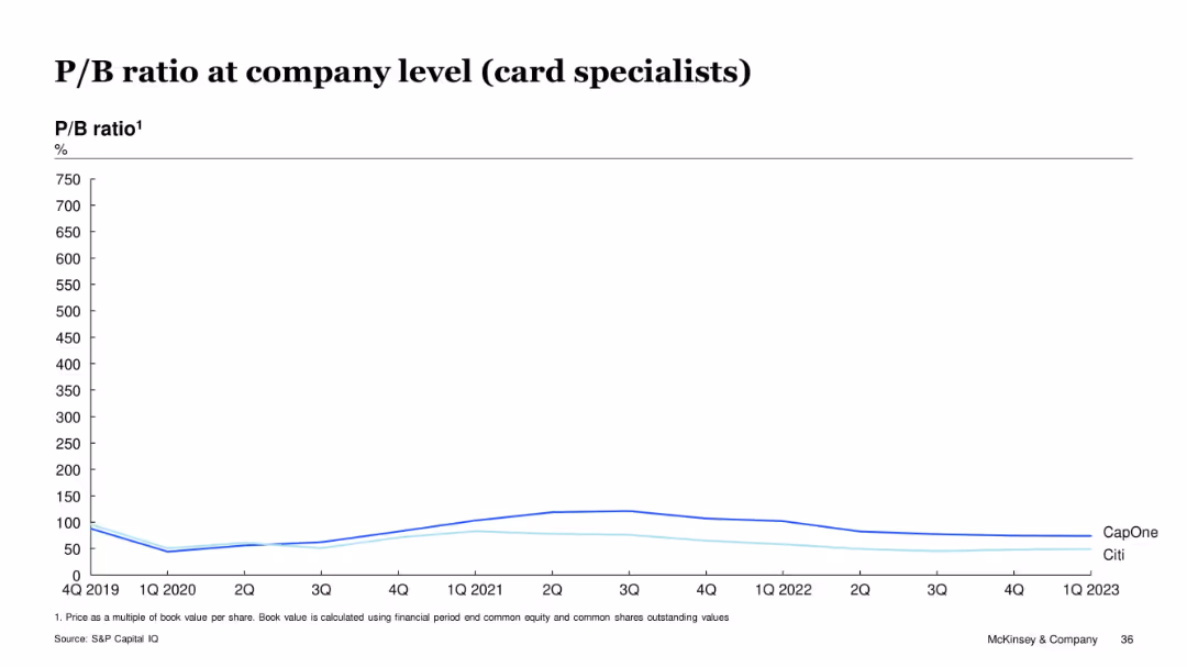
Line chart on white background comparing P/B ratios (%) over time (2019–2023) for CapOne and Citi, with a clean layout and minimal design.
Financial Performance
Financial Services
This slide compares the price-to-book (P/B) ratio trends for Capital One and Citibank over several years, showing fluctuations and relative valuations of these card-specialist companies. CapOne consistently shows a higher P/B ratio than Citi across the timeframe.
P/B ratio, CapOne, Citi, card specialists, valuation, financial trend, equity, bank performance, S&P Capital IQ
false
Financial Performance
Financial Services
Single Chart
McKinsey
Add to my slides
Remove from favorites
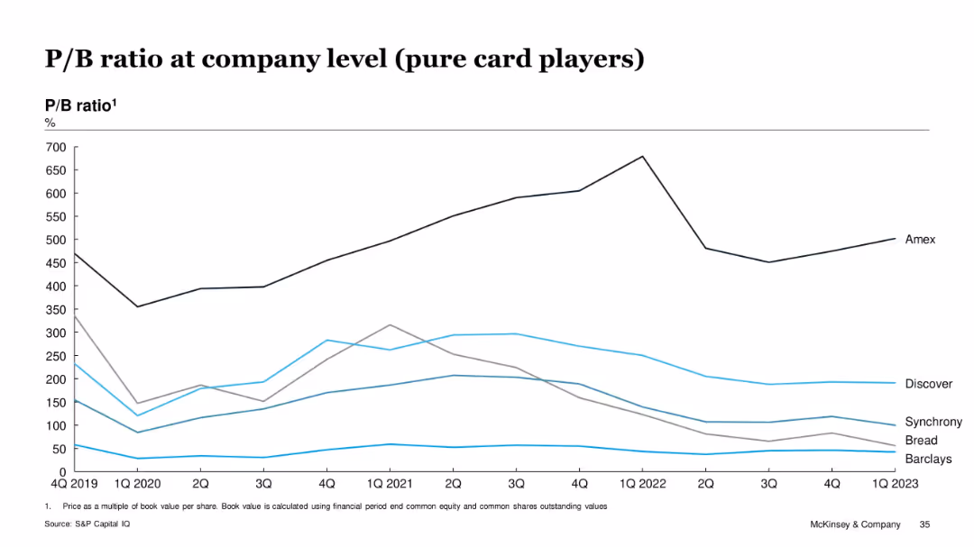
Line chart of price-to-book ratios for Amex, Discover, Synchrony, Barclays, and Bread
Investment Analysis
Financial Services
The slide shows the price-to-book ratio trends of pure card players. Amex consistently trades at a premium (above 500%), while other players like Barclays and Bread show lower valuations. These ratios reflect investor confidence and balance sheet strength differences across players.
P/B ratio, valuation, book value, Amex, credit issuers, financial strength, McKinsey
false
Investment Analysis
Financial Services
Single Chart
McKinsey
Add to my slides
Remove from favorites
Column chart detailing quarterly profit before tax (PBT) changes with various contributing factors and a breakdown of 4Q23 results versus previous quarters.
Financial Performance
Financial Services
Analyzes UBS's quarterly profit before tax for 4Q23, highlighting underlying versus reported figures and factors affecting results.
PBT, Financial Performance, UBS, 4Q23, Analysis
false
Financial Performance
Financial Services
Mixed Chart
UBS
Add to my slides
Remove from favorites
The slide includes a bar chart projecting underlying PBT for 2H23 with annotations for cost savings, revenue stabilization, and other factors. Text outlines steps to drive profitability.
Strategic Planning
Financial Services
The slide forecasts UBS's positive underlying profit before tax (PBT) for the second half of 2023, detailing strategic actions to drive profitability, including cost savings and revenue stabilization measures.
PBT, forecast, profitability, strategic actions, 2H23
false
Strategic Planning
Financial Services
Mixed Chart
UBS
Add to my slides
Remove from favorites
The slide features a vertical column chart displaying profits and various contributing factors for Q3 2023.
Financial Performance
Financial Services
This slide highlights the financial results for Q3 2023, focusing on underlying PBT, revenues, and cost reductions.
PBT, revenues, costs, financial results, Q3 2023
false
Financial Performance
Financial Services
Mixed Chart
UBS
Add to my slides
Remove from favorites
Pie charts and text boxes showing key performance metrics, client coverage, and strategic priorities.
Market Analysis and Trends
Financial Services
The slide presents P&C's market position and strategic priorities, highlighting client coverage and financial performance metrics.
P&C, market position, client coverage, strategic priorities, financial performance
false
Market Analysis and Trends
Financial Services
Multiple Chart
UBS
Add to my slides
Remove from favorites
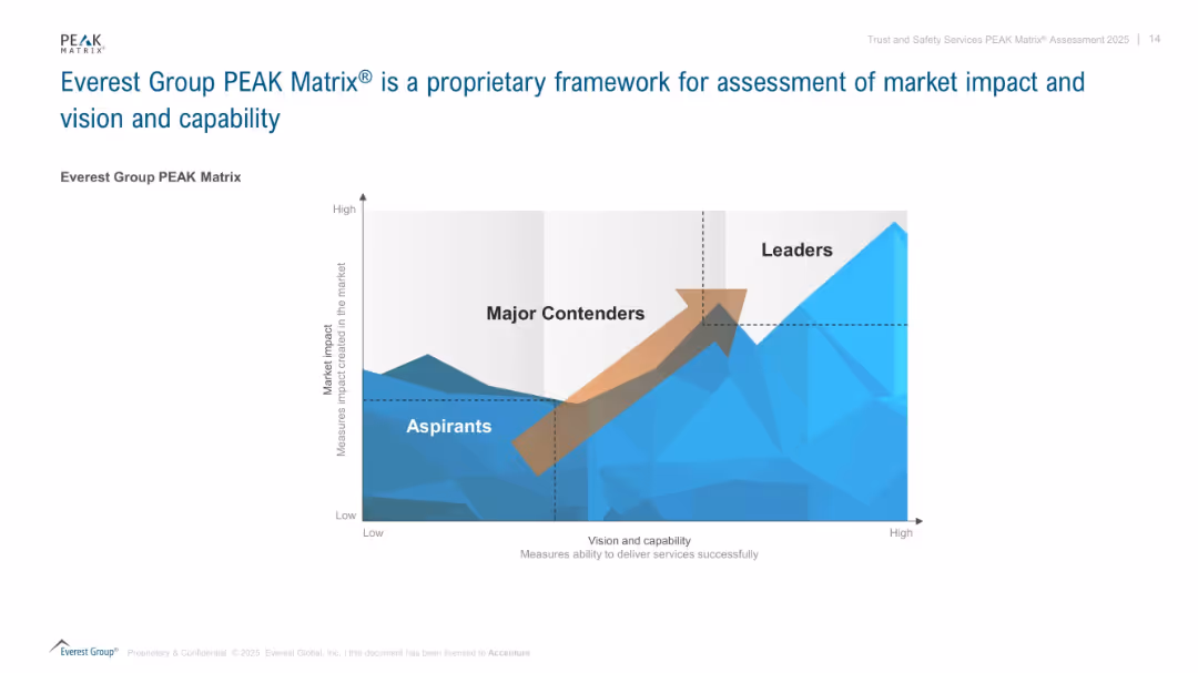
A quadrant-style matrix diagram with a 3D mountain range background and labeled axes for "Market impact" and "Vision and capability". Uses blue tones and gradient shading. Includes arrow to show movement from Aspirants to Leaders.
Competitive Landscape
Professional Services
This slide introduces the Everest Group PEAK Matrix®, a visual framework that classifies organizations into three categories—Aspirants, Major Contenders, and Leaders—based on their market impact and delivery capability. It is used to evaluate players in a competitive landscape and indicates movement toward leadership with an upward arrow.
PEAK Matrix, Everest Group, vision, capability, market impact, framework, strategy, assessment, competitive position
false
Competitive Landscape
Professional Services
Single Chart
Accenture
Add to my slides
Remove from favorites
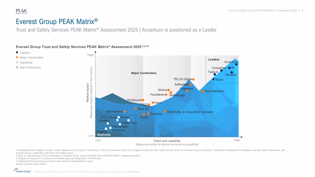
Scatterplot matrix comparing companies on “vision and capability” vs. “market impact” in trust & safety services; color-coded by tier.
Competitive Landscape
Technology & Software
Shows the positioning of companies offering trust and safety services in the 2025 PEAK Matrix. Leaders like Accenture and Concentrix score high in both capability and impact. Includes Major Contenders, Aspirants, and Star Performers.
PEAK Matrix, trust and safety, service providers, Accenture, capability, market impact, rankings
false
Competitive Landscape
Technology & Software
Single Chart
Accenture
Add to my slides
Remove from favorites
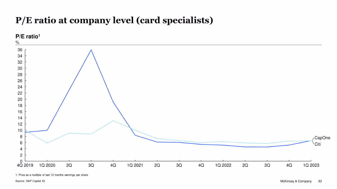
Line graph showing P/E ratio trends for CapOne and Citi from Q4 2019 to Q1 2023
Investment Analysis
Financial Services
This slide focuses on P/E ratio trends for Capital One and Citibank, both considered card specialists. After a peak in mid-2020, their P/E ratios declined and remained stable below 10x through 2023. The data reflects muted investor sentiment and earnings performance in the segment.
P/E, card specialists, Citi, Capital One, investor sentiment, valuation trends
false
Investment Analysis
Financial Services
Single Chart
McKinsey
Add to my slides
Remove from favorites
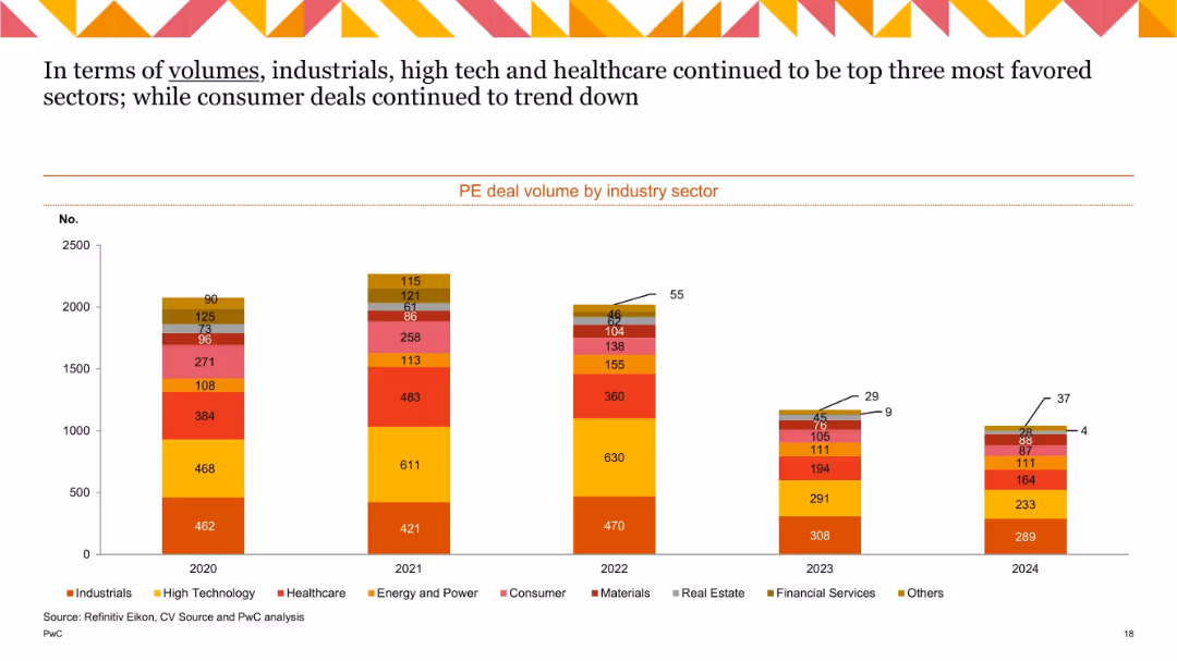
Stacked bar chart with 5 bars (2020–2024), using color-coded segments to represent different industries. Includes numeric labels on each segment.
Market Analysis and Trends
Financial Services
This slide shows private equity (PE) deal volumes across industry sectors from 2020 to 2024. Industrials, High Tech, and Healthcare consistently led in deal counts, while Consumer sector activity declined. The data is visualized using a stacked bar chart, allowing for quick comparison across years and sectors.
PE deals, industry sectors, volume trend, Industrials, High Tech, Healthcare, Consumer, annual comparison
false
Market Analysis and Trends
Financial Services
Single Chart
PwC/Strategy&
Add to my slides
Remove from favorites
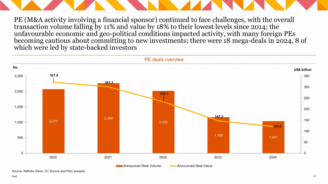
Bar and line chart comparing PE deal volume and value (2020–2024); values declining consistently; numbers labeled within bars.
Financial Performance
Financial Services
Tracks PE-backed M&A activity. PE deals declined by 11% in volume and 18% in value in 2024, reaching decade lows. Economic and geopolitical instability, plus foreign PE hesitancy, contributed to weaker market performance.
PE deals, private equity, deal value, deal volume, M&A, 2024
false
Financial Performance
Financial Services
Single Chart
PwC/Strategy&
Add to my slides
Remove from favorites
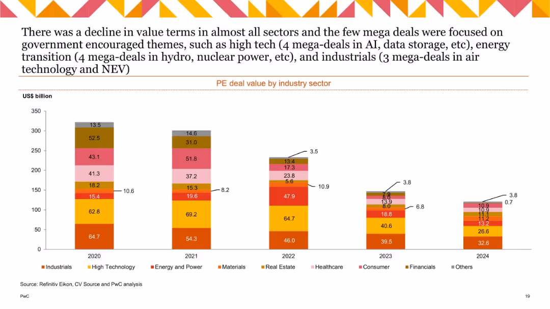
Stacked bar chart with 5 bars (2020–2024), segmented by industry and labeled with US$ billion values.
Financial Performance
Financial Services
This slide depicts the total value of private equity deals by industry from 2020 to 2024. A notable decline in value is observed across all sectors, with some mega-deals in industrials, energy, and high tech standing out due to government support themes such as AI and energy transition.
PE deal value, industry breakdown, mega-deals, AI, energy transition, decline trend, annual data
false
Financial Performance
Financial Services
Single Chart
PwC/Strategy&
Add to my slides
Remove from favorites
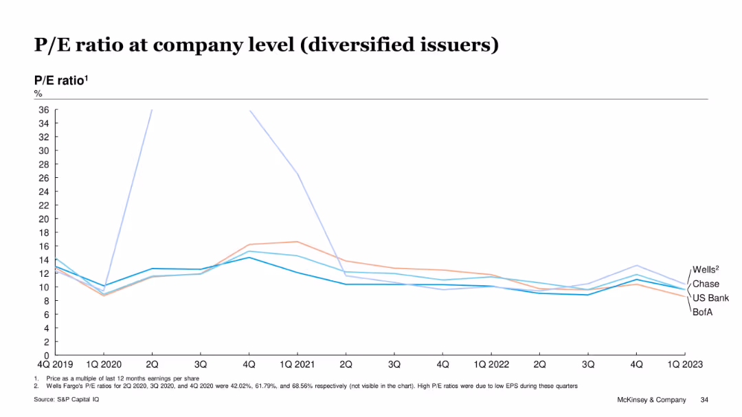
Line chart showing P/E ratios for Wells, Chase, US Bank, and BofA over time
Investment Analysis
Financial Services
Diversified issuers had fluctuating but generally declining P/E ratios from 2019 to 2023. Wells showed anomalies in 2020 due to low EPS. By Q1 2023, all issuers converged around 10–12x range. The slide illustrates reduced market enthusiasm for diversified card lenders post-COVID.
P/E, diversified issuers, stock performance, EPS, valuation, Wells Fargo, McKinsey
false
Investment Analysis
Financial Services
Single Chart
McKinsey
Add to my slides
Remove from favorites
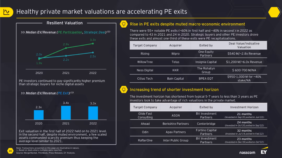
Left side contains valuation trend line charts and bar charts; right side lists exits and investment horizon data with transaction examples.
Investment Analysis
Financial Services
This slide details the acceleration of private equity exits due to resilient market valuations. It presents median EV/Revenue multiples and emphasizes the trend toward shorter investment horizons. Example deals such as Rizing and WillowTree illustrate high valuations. Strategic buyers and PE recapitalizations are key exit routes, with shorter holding periods becoming more common.
PE exits, valuations, EV/Revenue, strategic buyers, investment horizon
false
Investment Analysis
Financial Services
Multiple Chart
EY
Add to my slides
Remove from favorites
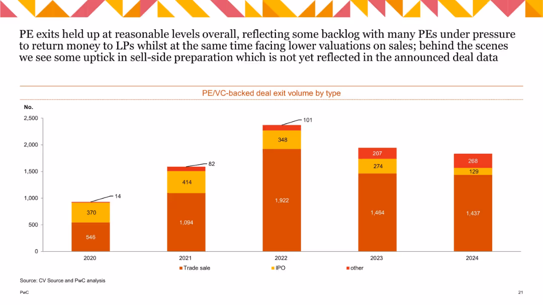
Stacked bar chart (2020–2024) split into trade sale, IPO, and other exits, with numeric values on each component.
Mergers and Acquisitions
Financial Services
The chart compares exit volumes for private equity and venture capital deals by type over five years. Trade sales dominate the exit types, with IPOs and "other" showing smaller but fluctuating volumes. The chart suggests steady overall exit activity with minor year-to-year shifts.
PE exits, VC exits, trade sale, IPO, exit types, M&A, annual trends
false
Mergers and Acquisitions
Financial Services
Single Chart
PwC/Strategy&
Add to my slides
Remove from favorites
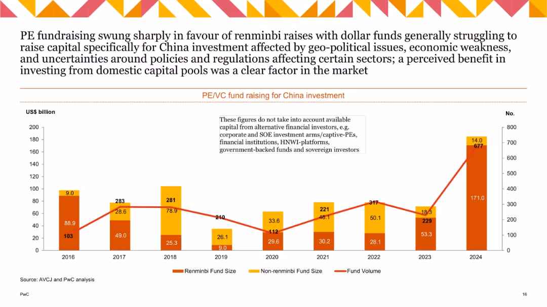
Dual-axis bar and line chart showing renminbi vs non-renminbi fund sizes and fund volume; notable spike in renminbi funding in 2024.
Investment Analysis
Financial Services
Depicts trends in PE/VC fundraising for China from 2016–2024. Highlights a shift toward domestic renminbi funding, peaking in 2024. Dollar funds struggled due to policy/regulation uncertainty, favoring domestic capital pools.
PE fundraising, VC, renminbi, capital sources, China investment, 2024
false
Investment Analysis
Financial Services
Single Chart
PwC/Strategy&
Add to my slides
Remove from favorites
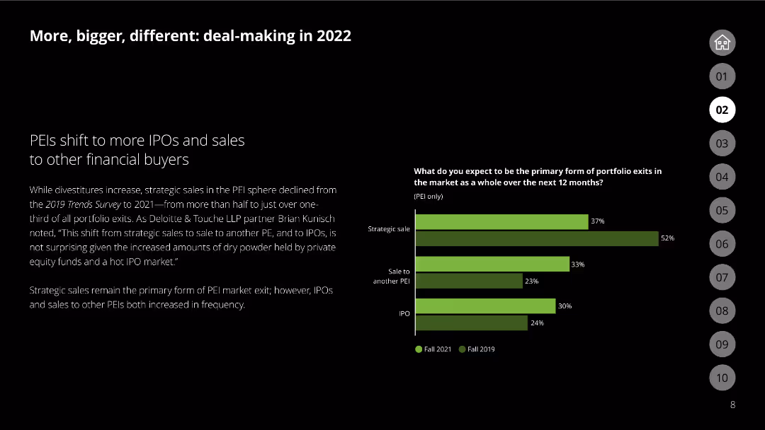
This slide features a bar chart comparing strategic sales, sales to another PEI, and IPOs in 2021 vs. 2019.
Mergers and Acquisitions
Financial Services
Discusses the shift in PEI market exits towards more IPOs and sales to other financial buyers.
PEI, IPO, strategic sales, financial buyers, market exits
false
Mergers and Acquisitions
Financial Services
Mixed Chart
Deloitte
Add to my slides
Remove from favorites
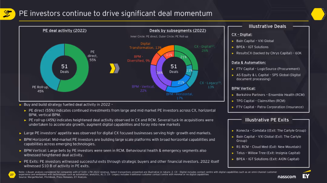
Large doughnut charts split PE direct vs roll-up and subsegment distribution; supported by summary of drivers and illustrative deals/exits.
Investment Analysis
Financial Services
This slide illustrates how private equity continues to drive deal activity, especially in CX and BPM verticals. It differentiates between direct investments and roll-ups, details illustrative transactions, and highlights the strong interest in scalable, digital, and automated capabilities across industries.
PE, investment, CX, BPM, roll-up, digital, deal momentum, exits, RCM
false
Investment Analysis
Financial Services
Multiple Chart
EY
Add to my slides
Remove from favorites
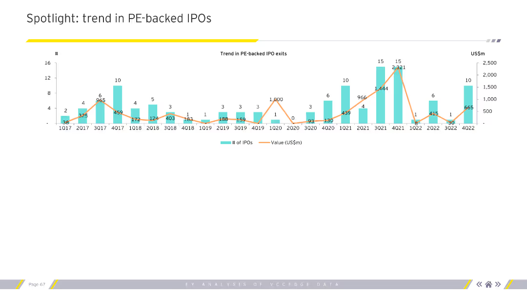
The slide includes a column chart showing the trend in PE-backed IPO exits over multiple quarters.
Market Analysis and Trends
Financial Services
This slide provides an analysis of trends in PE-backed IPO exits, focusing on the number of IPOs and their value over time.
PE, IPO, exits, trends, quarterly, value, number of IPOs
false
Market Analysis and Trends
Financial Services
Single Chart
EY
Add to my slides
Remove from favorites
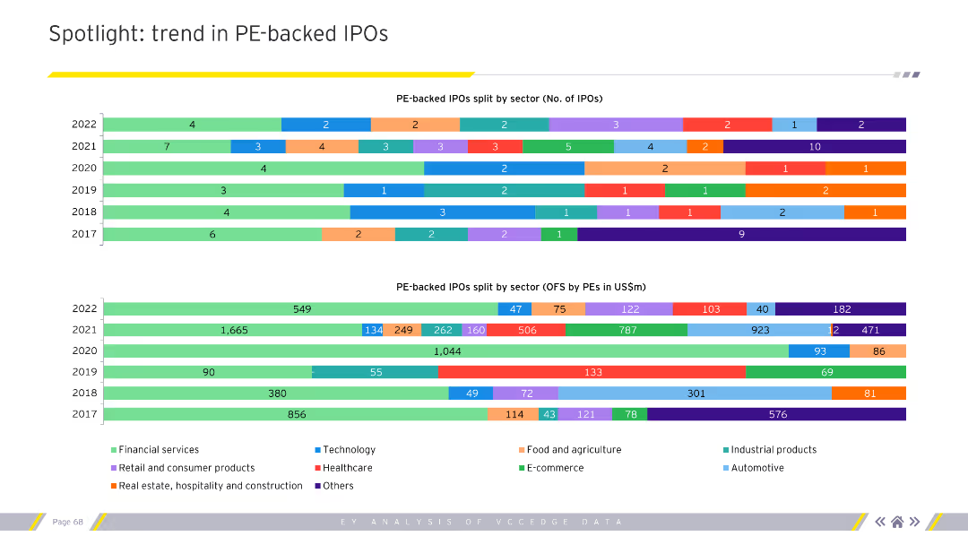
The slide features two bar charts. The top chart shows PE-backed IPOs split by sector. The bottom chart shows the OFS component by sector.
Market Analysis and Trends
Financial Services
This slide details the sector-wise split of PE-backed IPOs and the OFS component over several years.
PE, IPO, sector split, OFS component, financial services
false
Market Analysis and Trends
Financial Services
Multiple Chart
EY
Add to my slides
Remove from favorites
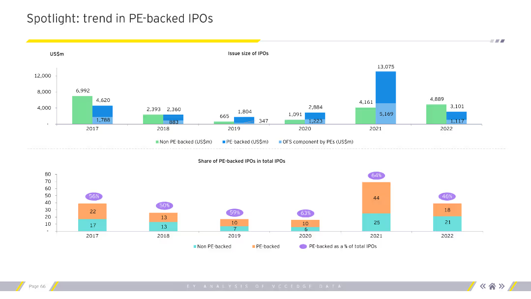
The slide features two charts. The top chart is a column chart showing the issue size of IPOs over several years. The bottom chart shows the share of PE-backed IPOs in total IPOs.
Market Analysis and Trends
Financial Services
This slide highlights trends in PE-backed IPOs, showing issue sizes and shares of total IPOs over multiple years.
PE, IPO, trends, issue size, share, financial services
false
Market Analysis and Trends
Financial Services
Multiple Chart
EY
Add to my slides
Remove from favorites
A slide with multiple charts showing EV/EBITDA multiples, median deal size, and valuation differences between PE-backed and non-financial-backed IPOs. The visual complexity is advanced, with detailed financial data.
Investment Analysis
Financial Services
The slide presents the momentum for PE-backed IPO exits in 2024, with statistics on deal sizes, valuation multiples, and survey findings predicting a rise in IPO activity. It highlights the superior performance and valuations of PE-backed IPOs compared to non-financial-backed IPOs.
PE, IPO, Valuation, Exit, 2024, Investment
false
Investment Analysis
Financial Services
Multiple Chart
EY
Add to my slides
Remove from favorites
Column chart showing penetration levels of private K-12 education in various cities, with supporting financial data.
Market Analysis and Trends
Education & Training
Provides data on the penetration levels of private K-12 education across major cities and related financial metrics.
penetration, K-12, cities, private, education
false
Market Analysis and Trends
Education & Training
Multiple Chart
LEK
Add to my slides
Remove from favorites
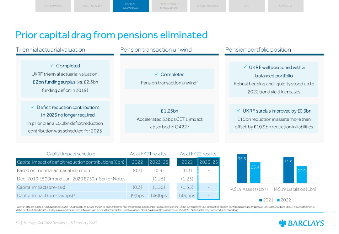
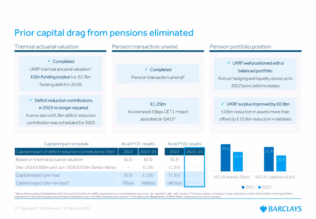
A combination of text boxes with key points and a capital impact schedule in a table format.
Regulatory and Compliance
Financial Services
Details the elimination of prior capital drag from pensions, including actuarial valuations, pension transaction unwind, and capital impact schedule.
pensions, capital drag, actuarial, transaction unwind, capital impact
false
Regulatory and Compliance
Financial Services
Mixed Chart
Barclays
Add to my slides
Remove from favorites
Three-panel layout with text blocks summarizing pension developments, a capital impact table, and bar chart comparing 2021 vs 2022 IAS19 assets/liabilities.
Corporate Finance and Valuation
Financial Services
Barclays communicates that pension-related capital drag has been addressed through a triennial valuation, a pension transaction unwind, and improvements in portfolio balance. The result is elimination of deficit reduction requirements and improved CET1 impact.
pensions, CET1, capital impact, surplus, liabilities
false
Corporate Finance and Valuation
Financial Services
Mixed Chart
Barclays
Add to my slides
Remove from favorites
Contains bullet points detailing the main challenges in achieving transformation and scale, focusing on people, culture, and collaborations.
Organizational Structure and Change
Environmental Services & Sustainability
Explores challenges such as knowledge gaps, collaboration difficulties, and transparency issues that companies face during transformation towards more sustainable practices. Suitable for discussions on change management and improving organizational culture and collaboration in corporate settings.
People and culture, Collaboration, Transparency, Transformation challenges, Sustainability, Governance, Corporate strategy, Organizational change, Knowledge management, Value proposition
false
Organizational Structure and Change
Environmental Services & Sustainability
Header Vertical
Accenture
Add to my slides
Remove from favorites
Purple background with six colorful labels describing core people drivers; collaboration with Oxford Saïd Business School mentioned.
Human Resources and Talent Management
Professional Services
Presents research-backed people drivers that help organizations achieve transformation success. The six drivers—purposeful vision, psychological safety, technology enablement, discipline freedom, adaptive leadership, and collaboration—are positioned as critical to enabling cultural and operational transformation, especially in times of change.
people drivers, transformation, Oxford study, collaboration, leadership, HR effectiveness
false
Human Resources and Talent Management
Professional Services
Linear Flow
EY
Add to my slides
Remove from favorites
This slide features a balanced layout with a section titled "Our people" followed by bullet points, a circular diagram labeled "Evolution in the business", and a pie chart on the right side titled "Supported by the Corporate Centre".
Organizational Structure and Change
Financial Services
The slide presents the central role of personnel in driving Macquarie's growth, outlines the global presence of the business, and shows how the corporate center supports various functions like risk management and funding. Intended for stakeholders interested in organizational strategy.
people, evolution, business, growth, global, support, strategy, corporate, management, personnel
false
Organizational Structure and Change
Financial Services
Mixed Chart
Goldman Sachs
Add to my slides
Remove from favorites
The slide has a minimalist design with four quadrants containing questions in red boxes, linked with dotted lines. The layout is sparse, with large areas of negative space.
Strategic Planning
Professional Services
The slide prompts organizational self-assessment regarding adaptation to future people management changes, considering different scenarios and the necessary actions to get there. It invites reflection on the impact of environmental changes on organizational culture, necessary transformations in resourcing, and understanding the current state through evaluation techniques.
People management, future, change, evaluation, organizational culture
false
Strategic Planning
Professional Services
Diagram
PwC/Strategy&
Add to my slides
Remove from favorites
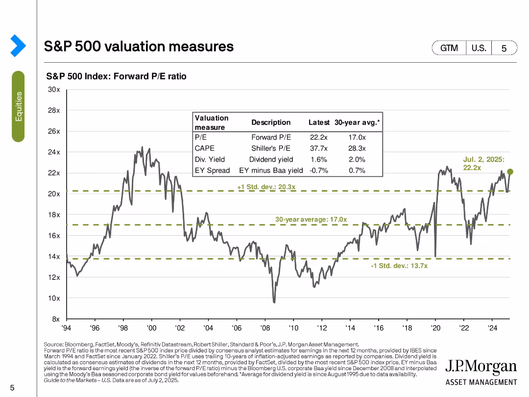
Line chart with horizontal benchmark lines and a data table overlay, tracking forward P/E ratio over time. Bold green text highlights recent data point.
Market Analysis and Trends
Financial Services
The slide presents the forward P/E ratio of the S&P 500, comparing the latest value (22.2x) with long-term averages and standard deviation bands. It includes a historical line chart from 1994 to 2025 and a summary table of related valuation metrics like CAPE, dividend yield, and EY spread.
P/E ratio, CAPE, EY spread, valuation, dividends, historical trend, market valuation, standard deviation, S&P 500, equity markets
false
Market Analysis and Trends
Financial Services
Single Chart
JP Morgan
Add to my slides
Remove from favorites
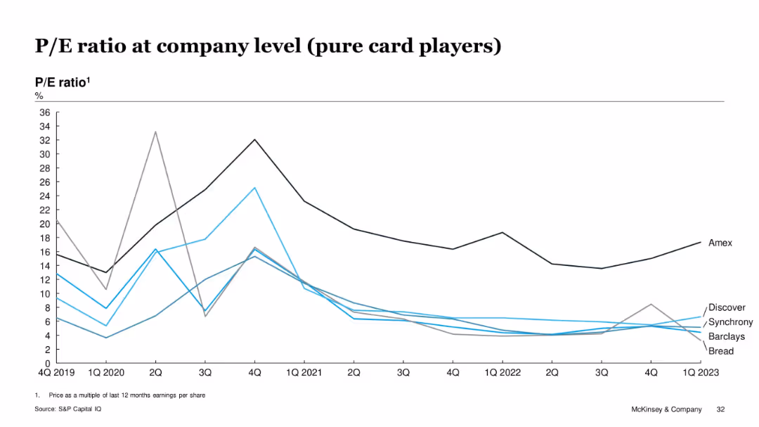
Line chart of P/E ratio trends from Q4 2019 to Q1 2023 for select pure card issuers
Investment Analysis
Financial Services
This slide tracks the P/E ratios of pure card issuers (Amex, Discover, Barclays, Synchrony, Bread) over time. Amex consistently maintains higher ratios, while others remain below, showing weaker earnings multiples. Peaks in early 2021 align with pandemic recovery effects.
P/E ratio, earnings, valuation, pure card issuers, McKinsey, stock analysis, Amex, Discover
false
Investment Analysis
Financial Services
Single Chart
McKinsey
Add to my slides
Remove from favorites
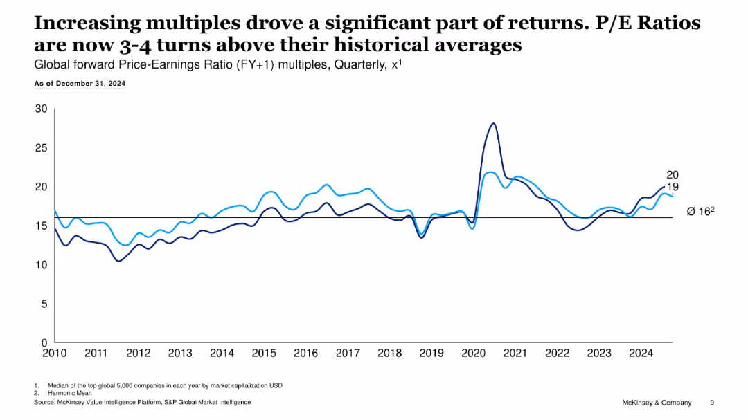
Line chart tracking P/E ratio over time (2010–2024) with two data lines
Investment Analysis
Financial Services
Shows that forward P/E multiples have risen 3–4 turns above historical averages, contributing notably to 2024 returns, indicating valuation-driven performance.
P/E ratio, market multiples, earnings, valuation trends, return drivers
false
Investment Analysis
Financial Services
Single Chart
McKinsey
Add to my slides
Remove from favorites
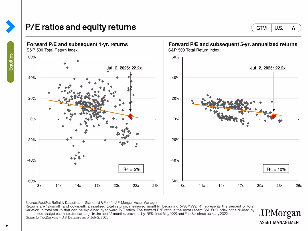
Two scatter plots with trendlines; left shows 1-year returns, right shows 5-year annualized returns, based on forward P/E ratio.
Investment Analysis
Financial Services
This slide analyzes the relationship between forward P/E ratios and subsequent equity returns. It demonstrates weak correlations, with R² values of 5% (1-year) and 12% (5-year), suggesting limited predictive power of P/E for short- and mid-term returns. Current P/E is marked at 22.2x.
P/E ratio, returns, scatter plot, S&P 500, equity analysis, forward valuation, performance forecasting, R-squared, investment strategy
false
Investment Analysis
Financial Services
Multiple Chart
JP Morgan
Add to my slides
Remove from favorites
The slide contains two visual elements: a column chart on the left showing global forward P/E ratios across different regions, and a line chart on the right showing relative equity valuations compared to the US.
Market Analysis and Trends
Financial Services
The slide compares global forward P/E ratios and relative equity valuations, showing trends and comparisons of various regions over time.
P/E ratios, global, equity valuations, US, regions, market analysis, trends
false
Market Analysis and Trends
Financial Services
Multiple Chart
JP Morgan
Add to my slides
Remove from favorites
A column chart shows global forward P/E ratios with historical ranges. Key regions are color-coded. The slide background is white with the 'Equities' category highlighted in green.
Investment Analysis
Financial Services
This slide, featuring P/E ratios for different regions, suggests strategies for balancing investment portfolios. It is aimed at investors or financial advisors looking for diversification strategies and regional assessments to optimize stock and bond allocations across global markets.
P/E Ratios, Stocks, Bonds, Balance, Investment, Global, Markets, Strategy
false
Investment Analysis
Financial Services
Single Chart
JP Morgan
Add to my slides
Remove from favorites
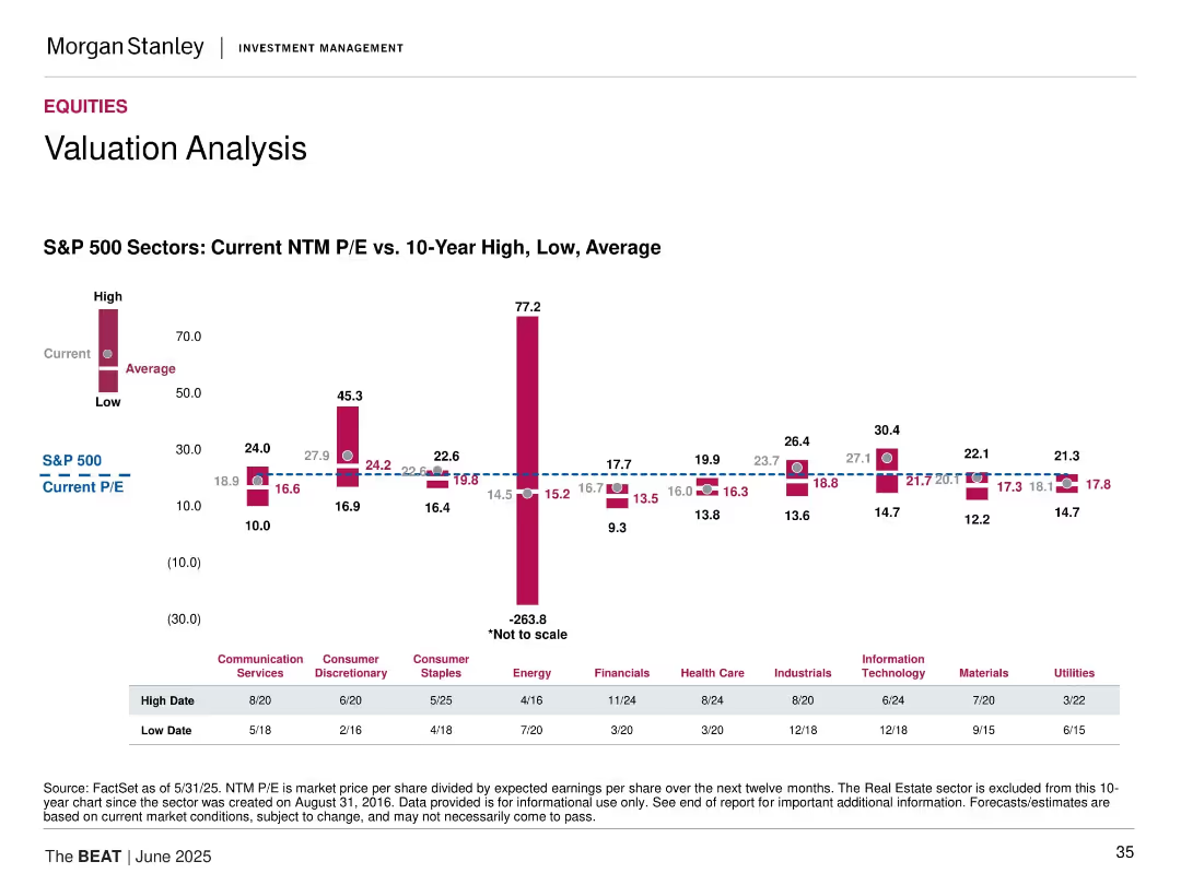
Bar chart comparing Current, Average, and High/Low 10-Year NTM P/E ratios across S&P 500 sectors. Includes color-coded bars and dashed reference lines.
Market Analysis and Trends
Financial Services
This slide compares the current NTM P/E ratios of S&P 500 sectors with their 10-year high, low, and average values. It highlights how the current valuations sit relative to historical trends, with Energy showing an extreme deviation (note: not to scale). S&P 500's current P/E is marked for comparison.
P/E ratios, valuation, equities, sector analysis, S&P 500, historical averages, extremes, earnings, financial metrics, data visualization
false
Market Analysis and Trends
Financial Services
Mixed Chart
Morgan Stanley
Add to my slides
Remove from favorites
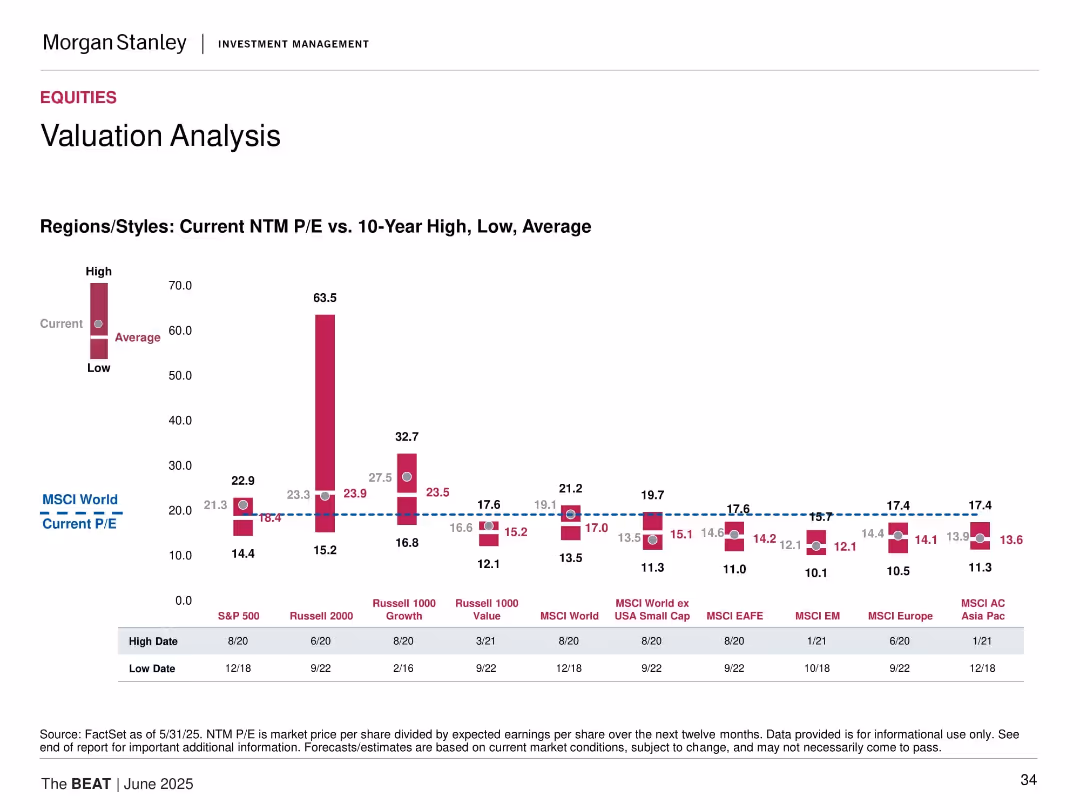
Bar graph of current vs. historical P/E ratios across global regions/styles, including high, low, and average.
Market Analysis and Trends
Financial Services
Compares current forward P/E ratios to 10-year highs/lows/averages for equity markets including S&P 500, Russell 2000, MSCI EM, EAFE, and Asia Pacific.
P/E ratio, valuation, equities, global markets, historical comparison, Russell, MSCI, earnings, valuation metrics
false
Market Analysis and Trends
Financial Services
Mixed Chart
Morgan Stanley
Add to my slides
Remove from favorites
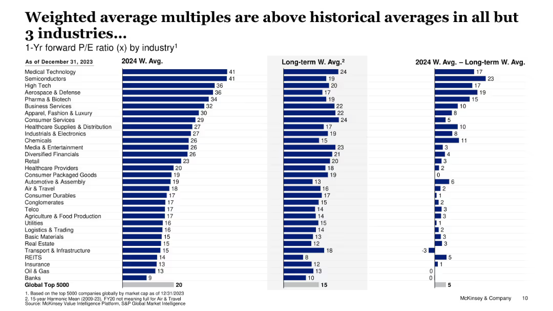
Bar charts comparing 2024 vs historical P/E ratios by industry
Financial Performance
Financial Services
Compares forward P/E ratios in 2024 against long-term averages across industries, showing elevated valuations in most, particularly in tech and medical sectors.
P/E ratio, valuation multiples, sector analysis, financial trends, overvaluation
false
Financial Performance
Financial Services
Single Chart
McKinsey
Add to my slides
Remove from favorites
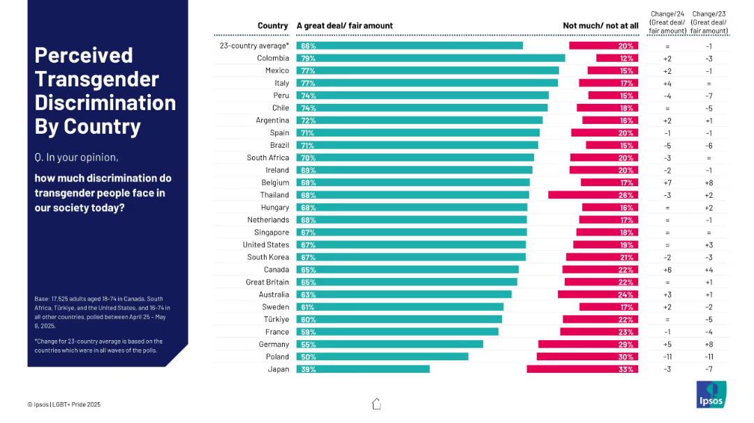
Bar chart showing perceived level of discrimination ("great deal/fair amount")
Risk Assessment and Management
Government & Public Sector
The slide reports public perceptions of transgender discrimination by country. Colombia, Mexico, and Italy top the list with the highest perceived levels. The slide also includes change data, indicating whether perceptions have risen or fallen in recent years.
perceived discrimination, transgender, global survey, public opinion, social risks, Ipsos, comparison
false
Risk Assessment and Management
Government & Public Sector
Mixed Chart
IPSOS
Add to my slides
Remove from favorites
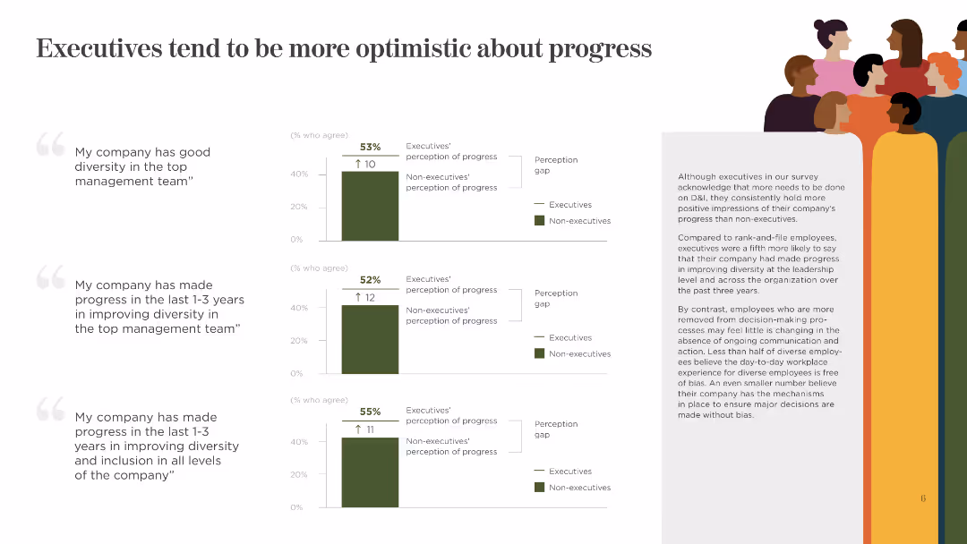
This slide shows three column charts comparing executives' and non-executives' perceptions of progress in diversity. It uses green and gray colors and includes short text explanations.
Human Resources and Talent Management
Government & Public Sector
The slide presents data on executives' and non-executives' differing views on the progress made in improving diversity and inclusion within top management and overall company levels.
Perception, Executives, Non-Executives, Progress, Diversity, Inclusion, Management, Company, Views
false
Human Resources and Talent Management
Government & Public Sector
Multiple Chart
BCG
Add to my slides
Remove from favorites
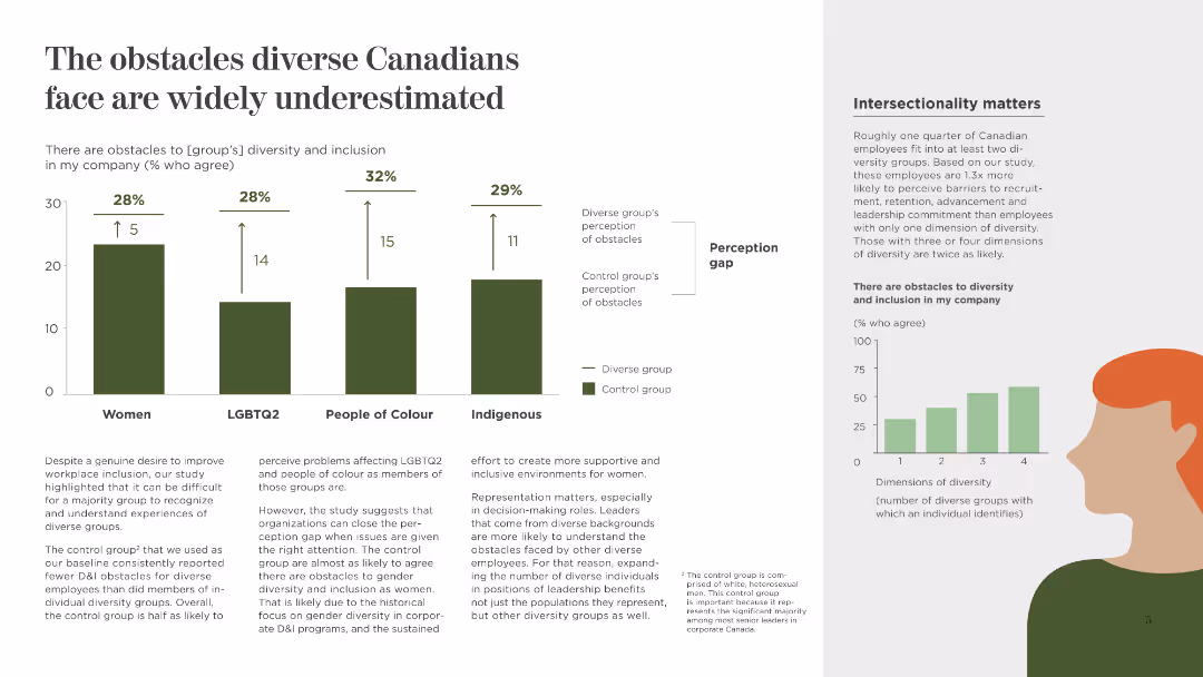
This slide includes a column chart with percentages and a perception gap analysis, using contrasting colors to highlight the differences. It has a moderate density of text and visuals.
Human Resources and Talent Management
Government & Public Sector
The slide focuses on the perception gaps between diverse groups and the control group regarding workplace obstacles, emphasizing the need for better recognition and support for diversity.
Perception Gap, Diversity, Workplace, Recognition, Support, Women, LGBTQ2, People of Colour, Indigenous
false
Human Resources and Talent Management
Government & Public Sector
Multiple Chart
BCG
Add to my slides
Remove from favorites
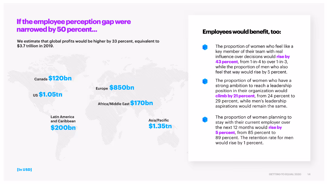
This slide includes a world map with regional profit increase estimates and a bullet point list of the potential benefits to employees if the perception gap is narrowed by 50%.
Risk Assessment and Management
Professional Services
It estimates that narrowing the employee perception gap would significantly increase global profits and outlines the benefits to employees, such as higher influence and leadership ambition.
perception gap, global profits, employee benefits, regional impact
false
Risk Assessment and Management
Professional Services
Header Horizontal
Accenture
Add to my slides
Remove from favorites
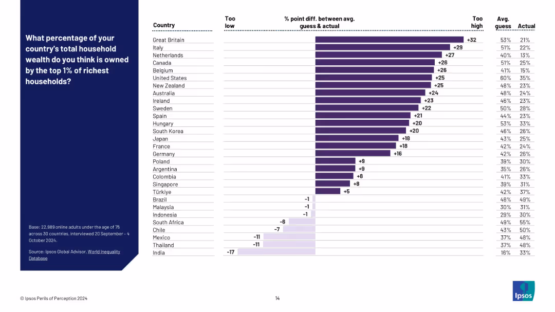
Bar chart ranked by % point difference between perceived and actual values, with numeric deltas noted.
Market Analysis and Trends
Professional Services
This slide quantifies the disparity between public perception and reality by displaying the difference (in percentage points) between the guessed and actual wealth share of the top 1%. Countries are sorted from most overestimated to underestimated.
perception gap, wealth distribution, misperception, inequality, data gap, top 1%, global comparison, Ipsos, survey error
false
Market Analysis and Trends
Professional Services
Mixed Chart
IPSOS
Add to my slides
Remove from favorites
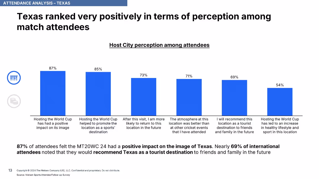
Horizontal bar chart with blue bars illustrating various positive perceptions of Texas; includes stats and commentary.
Performance Metrics and KPIs
Hospitality & Tourism
This slide captures positive attendee sentiment about Texas, with 87% indicating a positive image due to the event and 69% saying they’d recommend Texas as a tourist destination.
perception, image boost, Texas, tourism, attendee sentiment, KPIs, destination feedback
false
Performance Metrics and KPIs
Hospitality & Tourism
Single Chart
Nielsen
Add to my slides
Remove from favorites
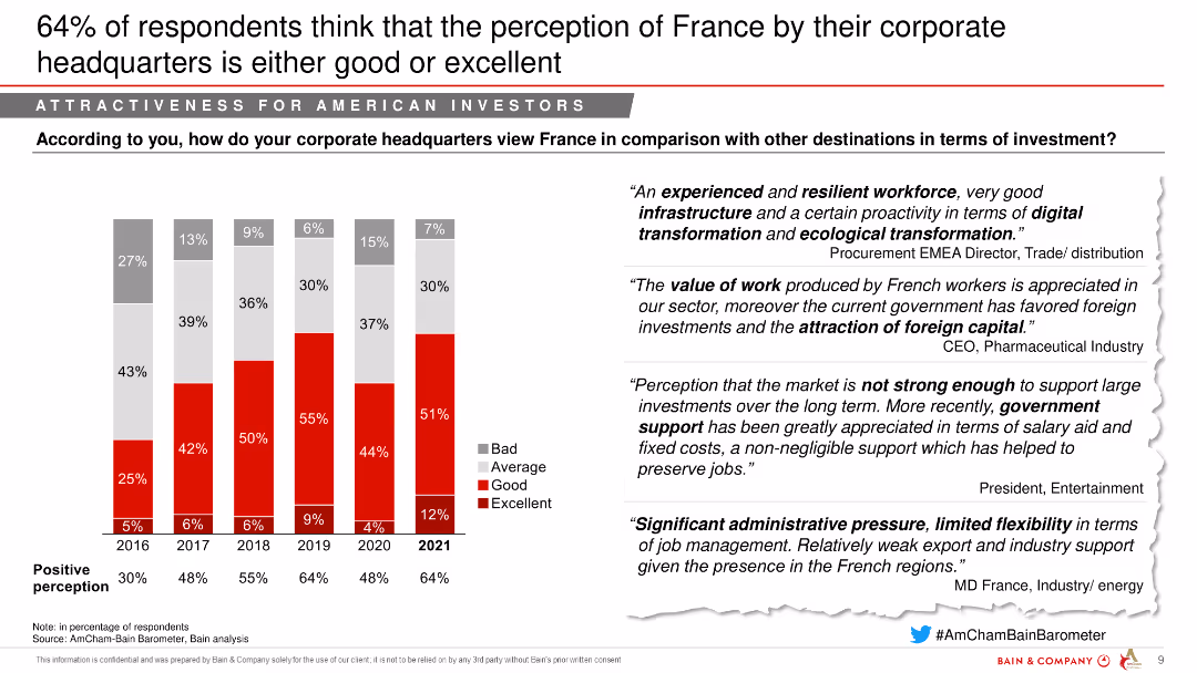
The slide includes a column chart showing the perception of France's investment attractiveness from 2016 to 2021, segmented into bad, average, good, and excellent. Quotes from industry leaders are on the right.
Market Analysis and Trends
Financial Services
The slide shows an improving perception of France by corporate headquarters, indicating good or excellent ratings from a majority of respondents.
Perception, Investment attractiveness, Corporate headquarters, Financial services
false
Market Analysis and Trends
Financial Services
Mixed Chart
Bain
Add to my slides
Remove from favorites
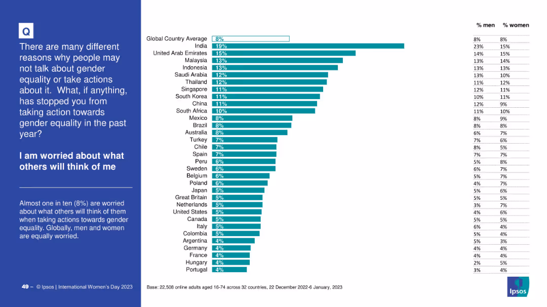
Standard bar chart with country-level responses and right-side gender table; includes title and intro on a blue background panel to the left.
Risk Assessment and Management
Government & Public Sector
This chart details the share of people who refrained from taking gender equality actions out of fear of judgment. India ranks highest (19%), while the global average is 8%. The data suggests similar concern levels between men and women globally.
perception, judgment, gender, equality action, stigma, social pressure, Ipsos survey
false
Risk Assessment and Management
Government & Public Sector
Mixed Chart
IPSOS
Add to my slides
Remove from favorites
Bar chart with various response categories regarding the effectiveness of performance management systems.
Human Resources and Talent Management
Professional Services
Showcases different perceptions towards current performance management systems in organizations.
perceptions, performance, management, effectiveness, systems
false
Human Resources and Talent Management
Professional Services
Single Chart
PwC/Strategy&
Add to my slides
Remove from favorites
A comprehensive slide with a tabulated performance analysis of various indices including coupon, yield, spread, and total returns.
Investment Analysis
Financial Services
The slide breaks down the performance of various financial indices, providing a granular look at coupons, yields, and total returns.
performance analysis, financial indices, coupon, yield, returns
false
Investment Analysis
Financial Services
Table
Morgan Stanley
Add to my slides
Remove from favorites
Complex heat maps for yearly asset class returns, color-coded, with a key at the bottom. High data density with multiple time series.
Investment Analysis
Financial Services
Analysis of yearly performance of various asset classes, indicating potential investment decisions. Suitable for financial analysts or investors looking at market trends.
Performance, Assets, Heat Map, Financial, Analysis, Investment, Trends, Color-coded, Yearly, Data
false
Investment Analysis
Financial Services
Table
Morgan Stanley
Add to my slides
Remove from favorites
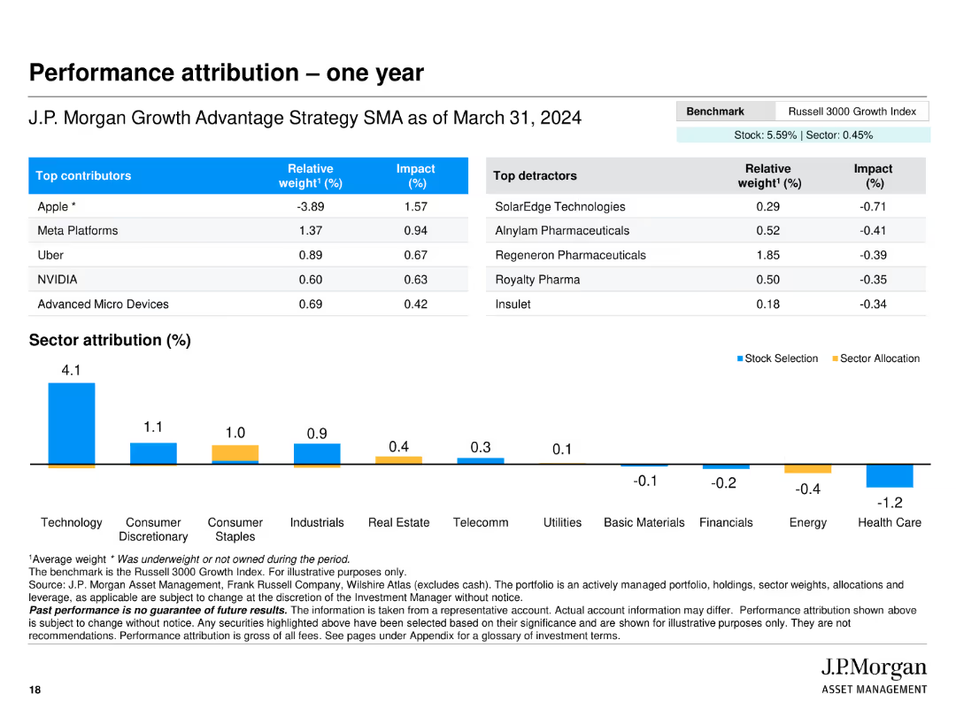
The slide includes tables showing top contributors and detractors to performance, along with sector attribution presented in a bar chart with stock selection and sector allocation data.
Investment Analysis
Financial Services
Analyzes the performance of J.P. Morgan Growth Advantage Strategy, detailing top contributing and detracting companies and the impact of stock selection and sector allocation.
performance, attribution, contributors, detractors, sector, allocation, bar chart, table
false
Investment Analysis
Financial Services
Mixed Chart
JP Morgan
Add to my slides
Remove from favorites
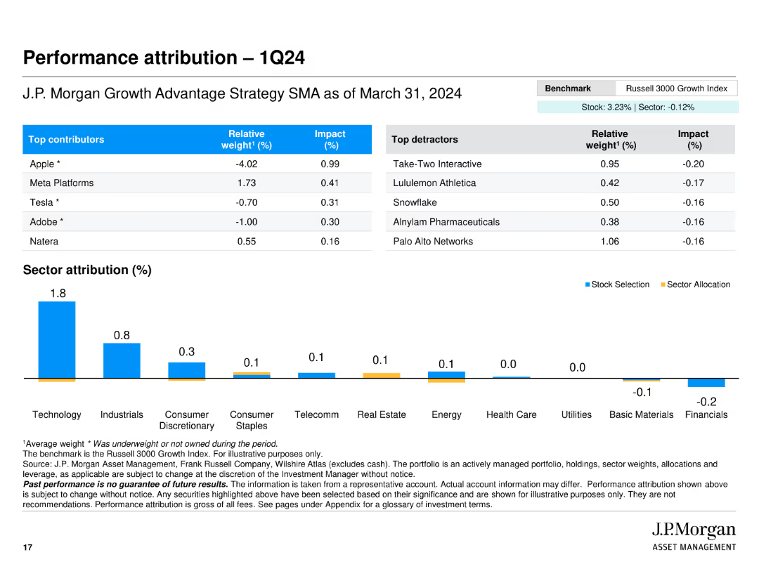
The slide features a table and a bar chart. The table lists the top contributors and detractors to performance, including relative weight and impact. The bar chart shows sector attribution percentages.
Financial Performance
Financial Services
Analyzes the performance attribution for the first quarter of 2024, detailing the contributions of specific stocks and sectors to the overall portfolio performance.
performance attribution, contributors, detractors, sector attribution, portfolio
false
Financial Performance
Financial Services
Mixed Chart
JP Morgan
Add to my slides
Remove from favorites
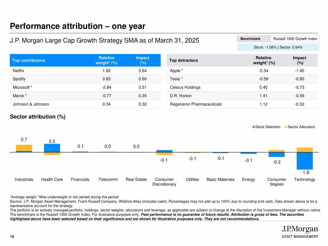
Two-column table layout with top contributors and detractors, a sector attribution bar chart, and clean color-coded impact visuals
Financial Performance
Financial Services
This slide presents a one-year performance attribution for the J.P. Morgan Large Cap Growth Strategy SMA, showing the top contributing and detracting stocks with respective weights and impacts. It also includes a sector-level attribution chart, highlighting stock selection and sector allocation contributions.
performance, attribution, sector, impact, contributors, detractors, stocks, strategy, J.P. Morgan, Russell 1000
false
Financial Performance
Financial Services
Mixed Chart
JP Morgan
Add to my slides
Remove from favorites
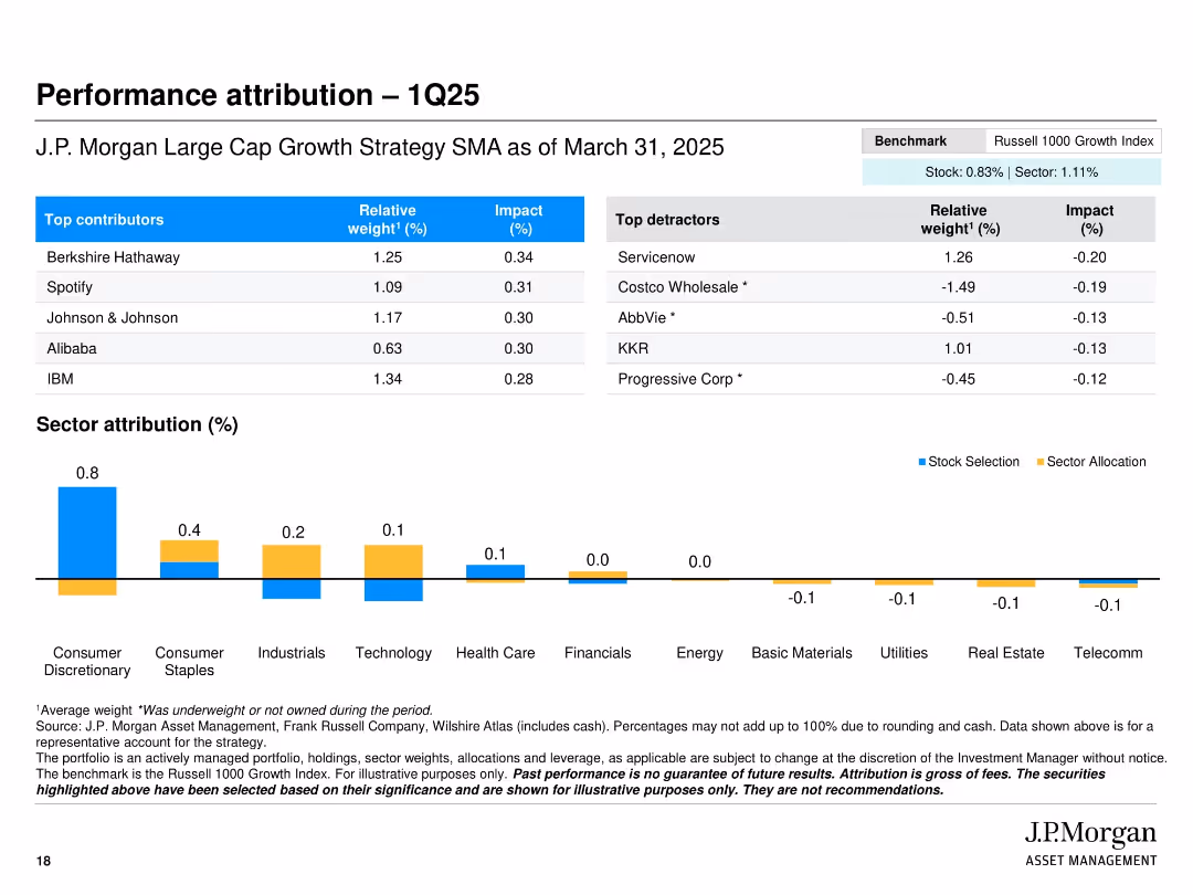
Split layout with tables of top contributors/detractors and a bar chart for sector attribution; clean benchmarking notes
Performance Metrics and KPIs
Financial Services
The slide presents performance attribution for Q1 2025, identifying top-performing and underperforming stocks in the J.P. Morgan Large Cap Growth Strategy. It includes relative weights and impact percentages, alongside sector attribution, helping to assess value-added performance sources.
Performance attribution, top contributors, detractors, sector performance, portfolio impact, Q1 2025, benchmark comparison, asset management
false
Performance Metrics and KPIs
Financial Services
Mixed Chart
JP Morgan
Add to my slides
Remove from favorites
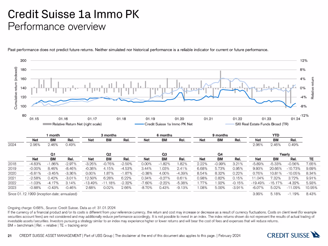
The slide displays a line chart and a table summarizing the performance of the Credit Suisse 1a Immo PK Real Estate Fund.
Financial Performance
Financial Services
It provides a performance overview of the 1a Immo PK fund, showing comparative metrics with benchmarks and historical performance data.
performance, Credit Suisse, Real Estate Fund, 1a Immo PK, benchmarks
false
Financial Performance
Financial Services
Mixed Chart
Credit Suisse
Add to my slides
Remove from favorites
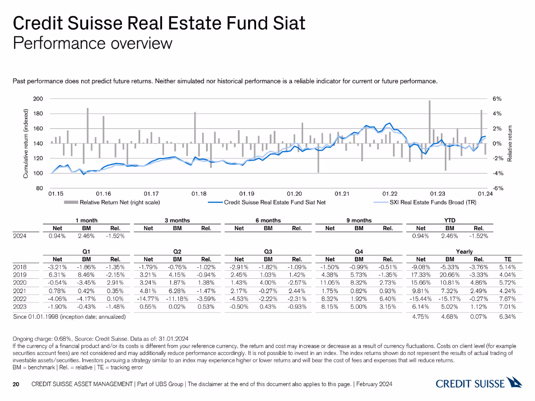
This slide presents a line chart and a table detailing the performance of the Credit Suisse Real Estate Fund Siat.
Financial Performance
Financial Services
It reviews the performance of the Siat fund, comparing it with benchmarks and historical data, offering insights into its financial health and trends.
performance, Credit Suisse, Real Estate Fund, benchmarks, historical data
false
Financial Performance
Financial Services
Mixed Chart
Credit Suisse
Add to my slides
Remove from favorites
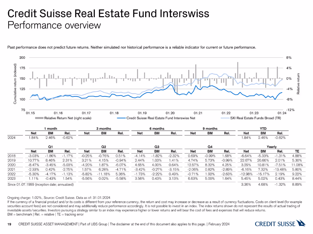
The slide features a line chart and a table summarizing the performance of the Credit Suisse Real Estate Fund Interswiss.
Financial Performance
Financial Services
It provides a detailed performance review of the fund, comparing it with benchmarks and showing historical returns.
performance, Credit Suisse, Real Estate Fund, benchmarks, historical returns
false
Financial Performance
Financial Services
Mixed Chart
Credit Suisse
Add to my slides
Remove from favorites
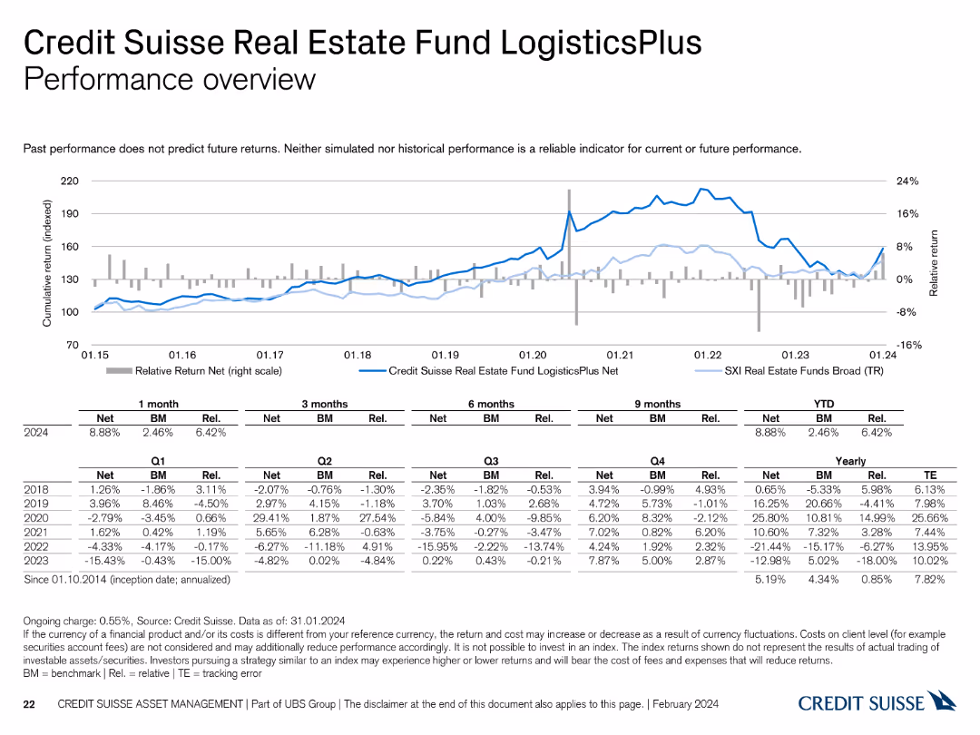
This slide features a line chart and a table summarizing the performance of the Credit Suisse Real Estate Fund LogisticsPlus.
Financial Performance
Financial Services
It reviews the performance of the LogisticsPlus fund, highlighting its returns and comparison with benchmarks and historical trends.
performance, Credit Suisse, Real Estate Fund, LogisticsPlus, benchmarks
false
Financial Performance
Financial Services
Mixed Chart
Credit Suisse
Add to my slides
Remove from favorites
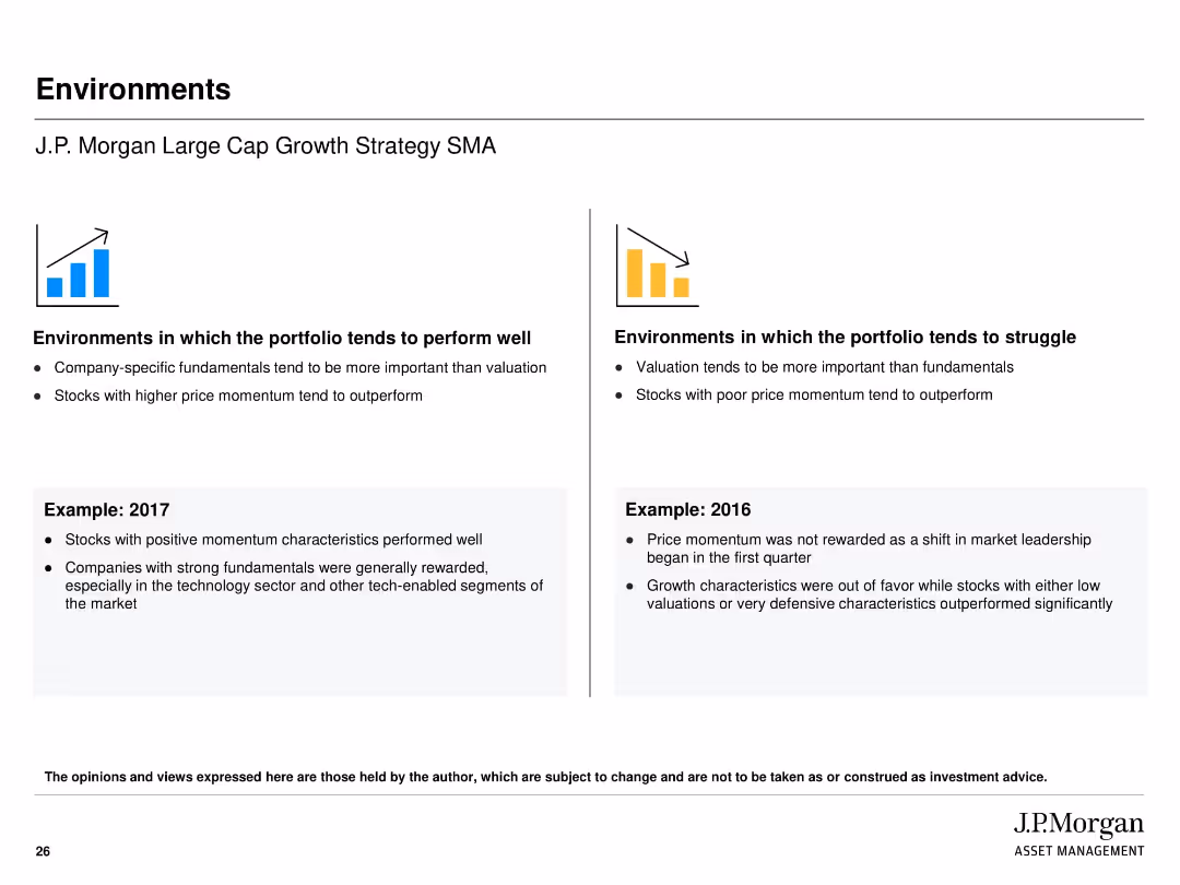
Two-column comparison layout showing "perform well" vs "struggle" environments; includes iconography and historical examples
Strategic Planning
Financial Services
Outlines the types of market environments where the strategy typically performs well or struggles. Highlights company-specific fundamentals and momentum as performance drivers. Includes real-world examples from 2016 and 2017 to illustrate favorable and unfavorable market conditions.
performance drivers, momentum, valuation, market environment, strategy, J.P. Morgan, growth
false
Strategic Planning
Financial Services
Header Horizontal
JP Morgan
Add to my slides
Remove from favorites
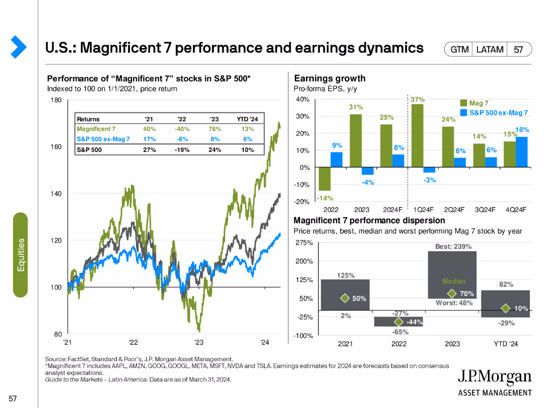
This slide contains two line charts and two column charts. The line charts show the performance of "Magnificent 7" stocks vs. S&P 500. The column charts depict earnings growth and performance dispersion.
Financial Performance
Financial Services
This slide analyzes the performance and earnings growth of the "Magnificent 7" stocks compared to the broader S&P 500, highlighting significant trends and data points.
performance, earnings, Magnificent 7, S&P 500, trends
false
Financial Performance
Financial Services
Multiple Chart
JP Morgan
Add to my slides
Remove from favorites
The slide contains an image of people in a meeting on the left, with two column charts on the right comparing asset class performance relative to expectations for 2021 and 2022.
Human Resources and Talent Management
Financial Services
This slide assesses how different asset classes performed relative to investor expectations for the years 2021 and 2022, highlighting overperformance and underperformance.
performance, expectations, asset classes, 2021, 2022, overperformance, underperformance
false
Human Resources and Talent Management
Financial Services
Multiple Chart
EY
Add to my slides
Remove from favorites
The slide features a column chart listing financial metrics over three years (2021-2023), such as income, cost, and return on equity.
Financial Performance
Financial Services
Highlights Barclays' financial performance over three years, focusing on metrics like income, costs, and profitability, useful for financial analysis.
performance, financial, metrics, analysis, costs
false
Financial Performance
Financial Services
Multiple Chart
Barclays
Add to my slides
Remove from favorites
Column chart showing headwinds impacting recent performance and drivers to achieve 2024 RoRC ambition.
Strategic Planning
Financial Services
Analyzes recent performance challenges and outlines strategies to achieve growth and sustainable returns by 2024.
performance, growth, strategic planning, headwinds, returns
false
Strategic Planning
Financial Services
Mixed Chart
Credit Suisse
Add to my slides
Remove from favorites
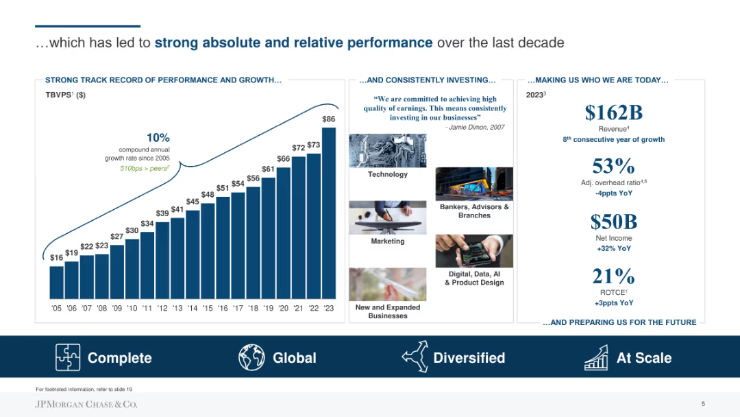
Column chart showing historical TBVPS growth with key performance indicators and future growth commitments on the right.
Performance Metrics and KPIs
Financial Services
Highlights the company's track record of performance and growth, including historical TBVPS growth and future investment commitments to maintain this trend.
performance, growth, TBVPS, investment, commitments, historical data
false
Performance Metrics and KPIs
Financial Services
Mixed Chart
JP Morgan
Add to my slides
Remove from favorites
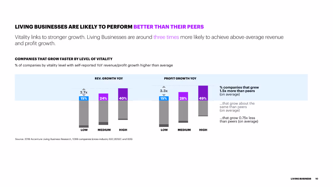
The slide includes two sets of column charts showing revenue growth and profit growth by level of vitality. Percentages and growth comparisons are highlighted above each column.
Performance Metrics and KPIs
Technology & Software
The slide illustrates the correlation between business vitality and performance, indicating that higher vitality leads to better revenue and profit growth.
performance, growth, vitality, revenue, profit, comparison
false
Performance Metrics and KPIs
Technology & Software
Multiple Chart
Accenture
Add to my slides
Remove from favorites
Contains a dual-layer diagram comparing traditional consulting with A&M's approach, focusing on Performance Improvement, with clear visual distinction.
Investment Analysis
Professional Services
This slide contrasts traditional consulting with A&M’s unique performance improvement approach, emphasizing the integration of hands-on interim management.
Performance, Improvement, Consulting, A&M, Strategy
false
Investment Analysis
Professional Services
Diagram
Alvarez & Marsal
Add to my slides
Remove from favorites
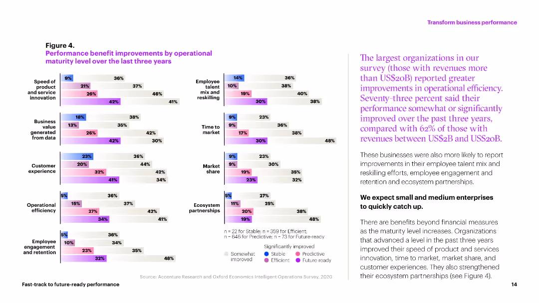
The slide includes multiple column charts showing performance improvements in various operational metrics over three years. Colors differentiate levels of improvement across categories like market share and efficiency.
Operational Efficiency
Professional Services
This slide illustrates the operational improvements achieved by organizations in areas like customer experience, market share, and operational efficiency over the past three years.
performance, improvements, metrics, efficiency, market share
false
Operational Efficiency
Professional Services
Multiple Chart
Accenture
Add to my slides
Remove from favorites
Multiple sections with icons and brief lists describe various improvement strategies like Rapid Results, Revenue & Margin Growth. Structured and clear layout.
Investment Analysis
Professional Services
Slide details various strategies for performance improvement across different business functions, highlighting Alvarez & Marsal's approach to enhancing operational and financial outcomes.
Performance, Improvement, Strategy, Operational, Financial
false
Investment Analysis
Professional Services
Table
Alvarez & Marsal
Add to my slides
Remove from favorites
Organizes services into five core areas using bullet points and headers, maintaining a clean layout with a blue and white color scheme for easy distinction between sections.
Operational Efficiency
Professional Services
Describes how Alvarez & Marsal supports its clients in Asia through five main areas including performance improvement and transaction advisory. This slide is tailored to emphasize the firm's specialized services in managing complex market challenges in Asia.
performance improvement, transaction advisory, Asia, client support, services
false
Operational Efficiency
Professional Services
Table
Alvarez & Marsal
Add to my slides
Remove from favorites
Slide includes graphs, text, and icons, visually dense with information about financial and investment performance.
Investment Analysis
Financial Services
Evaluates Q1 FY21 performance with an investment lens, offering insights into market position and financial returns. For presenting to investors or in strategic planning meetings.
Performance, Investment, Revenue Growth, EBITDA, Capital Deployment
false
Investment Analysis
Financial Services
Pillar
Booz Allen Hamilton
Add to my slides
Remove from favorites
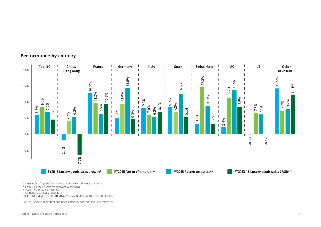
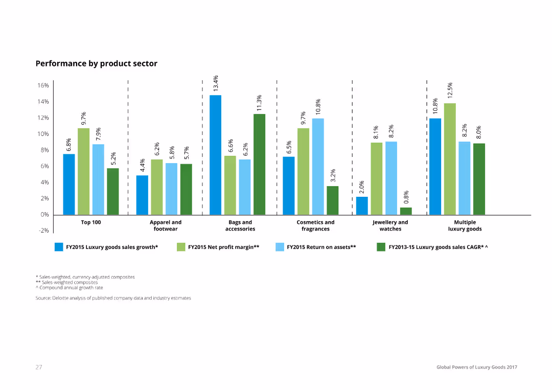
A column chart showing various financial metrics (luxury goods sales growth, net profit margin, return on assets, CAGR) for different countries, including Top 100, China/Hong Kong, France, Germany, Italy, Spain, Switzerland, UK, US, and other countries.
Financial Performance
Financial Services
The slide presents the performance of luxury goods by country, showing sales growth, net profit margin, return on assets, and compound annual growth rate for 2015. This data can be used to analyze market performance in the luxury sector.
performance, luxury goods, financial metrics, country comparison, sales growth
false
Financial Performance
Financial Services
Single Chart
Deloitte
Add to my slides
Remove from favorites
Pie chart depicting the percentage of "Yes" responses across sectors with corresponding bar chart.
Strategic Planning
Professional Services
Discusses the connection between performance management frameworks and reward systems across sectors.
performance, management, rewards, sectors, linkage
false
Strategic Planning
Professional Services
Multiple Chart
PwC/Strategy&
Add to my slides
Remove from favorites
Bar chart displaying sector performance percentages; dominant orange theme; clear 80% "Yes" response visualization.
Human Resources and Talent Management
Professional Services
Highlights the adoption of formal performance management processes across various sectors.
performance, management, sector, adoption, visualization
false
Human Resources and Talent Management
Professional Services
Multiple Chart
PwC/Strategy&
Add to my slides
Remove from favorites
Circular diagram showing weekly performance management cycle with descriptive nodes around the cycle.
Operational Efficiency
Professional Services
Details a weekly performance management cycle for rapid progress in organizational transformations.
performance, management, weekly, cycle, progress
false
Operational Efficiency
Professional Services
Linear Flow
McKinsey
Add to my slides
Remove from favorites
Contains column charts showing performance metrics of categories like Shoes, Jewelry, Leather, etc. Each category is marked in a circle with colors like red indicating negative trends. The layout is dense with textual annotations.
Market Analysis and Trends
Consumer Goods
This slide presents a 2020 performance review of various consumer categories such as Shoes, Jewelry, and Apparel, highlighting their market resilience. It shows performance metrics, like percentage changes and market values, providing a detailed comparison of year-over-year performance impacted by the COVID-19 pandemic.
performance, market, COVID-19, resilience, consumer goods
false
Market Analysis and Trends
Consumer Goods
Mixed Chart
Bain
Add to my slides
Remove from favorites
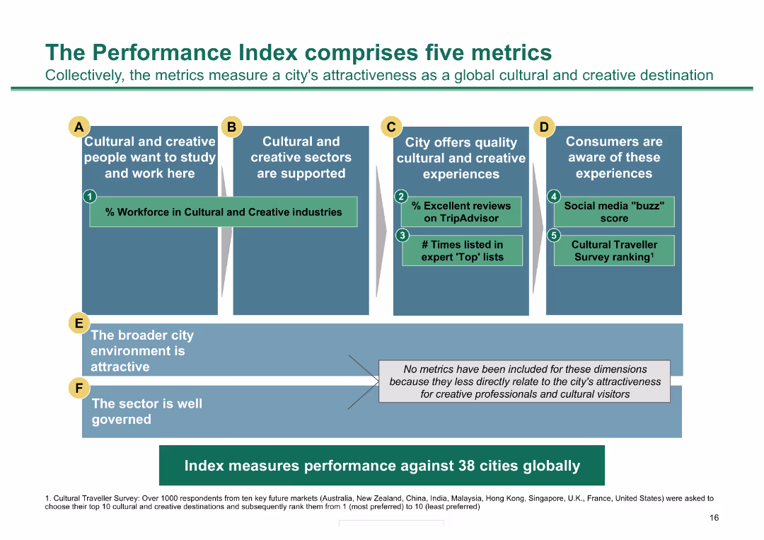
Column chart outlining five metrics for measuring city attractiveness; detailed with icons and color-coded
Performance Metrics and KPIs
Hospitality & Tourism
Presents five metrics for evaluating a city's cultural and creative appeal, useful for performance assessment
Performance metrics, cultural sectors, creative experiences, consumer awareness, city environment
false
Performance Metrics and KPIs
Hospitality & Tourism
Diagram
BCG
Add to my slides
Remove from favorites
Several bar charts, well-organized text sections, uses shades of blue and green.
Customer and Market Segmentation
Telecommunications
Examines the effectiveness of various performance metrics in enhancing customer satisfaction.
performance metrics, customer satisfaction, assessment
false
Customer and Market Segmentation
Telecommunications
Multiple Chart
Deloitte
Add to my slides
Remove from favorites
A column chart showing the number of workdays after month-end when key KPIs are reported. The bars are vertical, with different segments representing workday ranges
Operational Efficiency
Financial Services
This slide presents data on how many workdays after month-end CFOs report key KPIs to top management, emphasizing the length of the closing process.
performance metrics, KPI reporting, workdays, closing process, top management
false
Operational Efficiency
Financial Services
Mixed Chart
PwC/Strategy&
Add to my slides
Remove from favorites
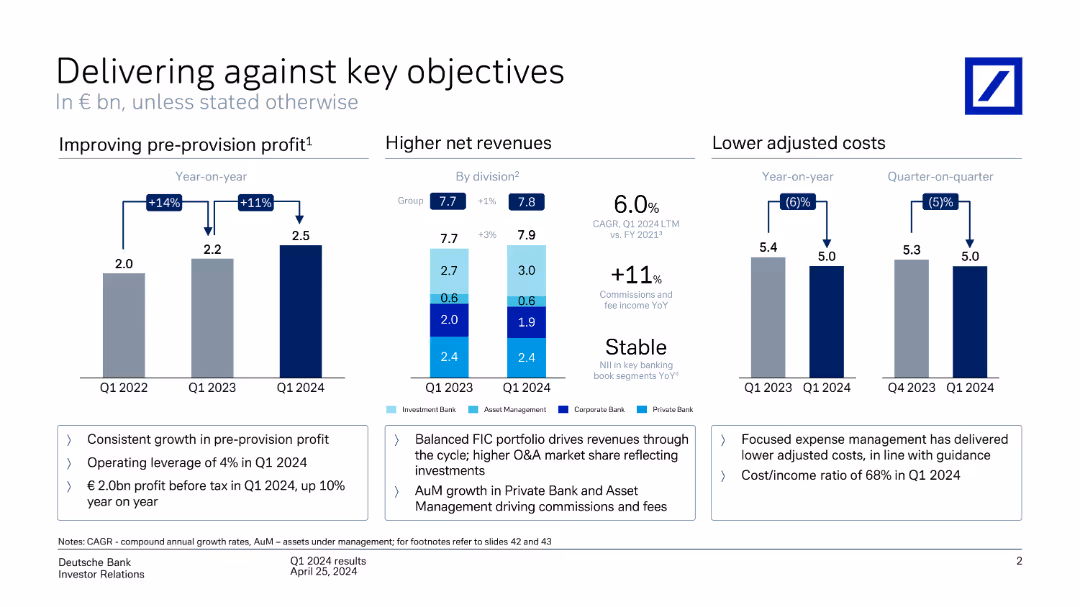
This slide includes column charts depicting performance metrics such as improving pre-provision profit, higher net revenues by division, and lower adjusted costs year-on-year.
Strategic Planning
Financial Services
It reviews Deutsche Bank's performance against key objectives, showcasing improvements in profit, revenues, and cost management over various quarters and divisions.
performance metrics, pre-provision profit, net revenues, adjusted costs, Deutsche Bank, financial objectives, strategic planning
false
Strategic Planning
Financial Services
Multiple Chart
Deutsche Bank
Add to my slides
Remove from favorites
This Text and Image Slide presents three sections titled 'PEOPLE', 'PROFIT', and 'PLANET' each with a dedicated icon and bullet points. It's well-organized, with a clear visual hierarchy that guides the viewer through each section. The use of icons and strategic spacing of content facilitates comprehension and provides an engaging visual experience.
Strategic Planning
Professional Services
The slide outlines Michelin's commitment to enhancing performance in three areas: people, profit, and the planet. It discusses career opportunities, engagement and safety in 'PEOPLE', revenue growth and financial metrics in 'PROFIT', and sustainability efforts in 'PLANET'. The slide effectively conveys Michelin's integrated approach to success, balancing human, financial, and environmental considerations.
performance, people, profit, planet, opportunities, growth, sustainability, R&D, materials, safety
false
Strategic Planning
Professional Services
Pillar
Morgan Stanley
Add to my slides
Remove from favorites
A column chart comparing the performance of different luxury product sectors, showing luxury goods sales growth, net profit margin, and return on assets. Each bar is segmented and color-coded to represent different performance metrics.
Performance Metrics and KPIs
Consumer Goods
The slide provides a performance comparison across luxury product sectors, detailing sales growth, net profit margins, and return on assets. It helps in understanding the financial health and performance metrics of various luxury product categories.
Performance, Product, Sector, Luxury, Metrics
false
Performance Metrics and KPIs
Consumer Goods
Single Chart
Deloitte
Add to my slides
Remove from favorites
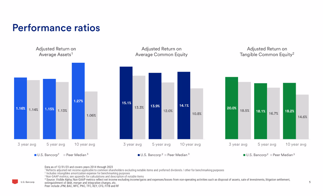
The slide contains three column charts showing adjusted return on average assets, adjusted return on average common equity, and adjusted return on tangible common equity for different time periods.
Financial Performance
Financial Services
Compares performance ratios of U.S. Bancorp with peer median across three metrics: return on average assets, return on average common equity, and return on tangible common equity over three, five, and ten years.
performance, ratios, return, equity, assets, comparison, financial, banking, metrics
false
Financial Performance
Financial Services
Multiple Chart
Barclays
Add to my slides
Remove from favorites
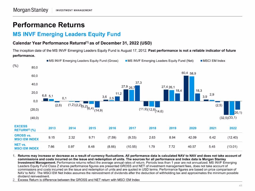
A column chart displaying calendar year performance returns of the MS INVF Emerging Leaders Equity Fund compared to the MSCI EM Index.
Financial Performance
Financial Services
This slide presents the annual performance returns of the MS INVF Emerging Leaders Equity Fund, providing a yearly comparison with the MSCI EM Index.
Performance, Returns, Emerging Leaders, Equity Fund, MSCI, Index, Investment, Annual, Financial, Comparison
false
Financial Performance
Financial Services
Mixed Chart
Morgan Stanley
Add to my slides
Remove from favorites
A column chart comparing the performance returns of the MS INVF Emerging Leaders Equity Fund against the MSCI EM Index over various time periods.
Financial Performance
Financial Services
This slide shows the performance returns of the MS INVF Emerging Leaders Equity Fund, highlighting excess returns and performance benchmarks.
Performance, Returns, Emerging Leaders, Equity Fund, MSCI, Index, Investment, Financial, Comparison, Benchmark
false
Financial Performance
Financial Services
Mixed Chart
Morgan Stanley
Add to my slides
Remove from favorites
Column chart showing performance returns of the MS INVF Sustainable Asia Equity Fund over various periods.
Financial Performance
Financial Services
Displays fund performance for different time horizons, compared to a blended index, emphasizing past performance metrics.
Performance, returns, fund, equity, index
false
Financial Performance
Financial Services
Mixed Chart
Morgan Stanley
Add to my slides
Remove from favorites
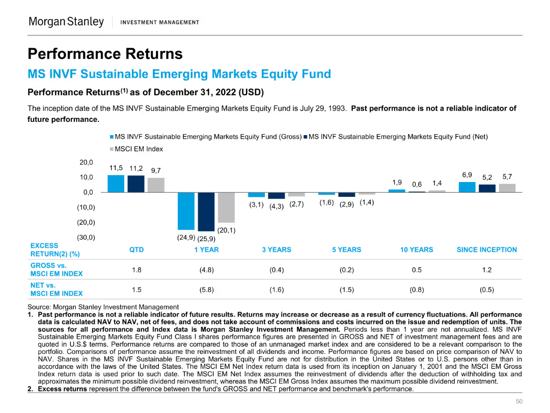
A column chart showing the performance returns of the MS INVF Sustainable Emerging Markets Equity Fund against the MSCI EM Index over different periods.
Financial Performance
Financial Services
This slide compares the performance returns of the MS INVF Sustainable Emerging Markets Equity Fund to the MSCI EM Index, highlighting excess returns.
Performance, Returns, Sustainable, Emerging Markets, Equity Fund, MSCI, Index, Financial, Comparison, Investment
false
Financial Performance
Financial Services
Mixed Chart
Morgan Stanley
Add to my slides
Remove from favorites
Features comparative column charts for 'Orders and Backlog', 'Revenues', 'EBITA', and 'FOCF' across multiple years, emphasizing trends and performance with the exclusion of Aerostructures. Includes textual annotations with key takeaways.
Strategic Planning
Financial Services
The slide illustrates a historical performance comparison, highlighting achievements and trends that align with or exceed expectations, emphasizing a strategic outlook for future business decisions.
Performance, Revenue, EBITA, FOCF, Historical Data, Business Results, Trend Analysis, Strategic Outlook, Defence, Government
false
Strategic Planning
Financial Services
Multiple Chart
Goldman Sachs
Add to my slides
Remove from favorites
Slide includes multiple column charts presenting financial data like revenue CAGR and CET1 ratio development across various banking divisions.
Performance Metrics and KPIs
Financial Services
Analyzes Deutsche Bank’s key performance metrics such as revenue growth, cost/income ratio, and liquidity, comparing current data with previous fiscal years.
performance, revenue, financial metrics, banking, growth
false
Performance Metrics and KPIs
Financial Services
Multiple Chart
Deutsche Bank
Add to my slides
Remove from favorites
The slide displays a series of column charts comparing revenue, net income, loans, and deposits over a decade, alongside bullet points that articulate strategic priorities such as client focus and innovation.
Financial Performance
Financial Services
Highlights JPMC's long-term performance metrics, emphasizing strong revenue and net income growth, increased loans and deposits, and the strategic priorities that drive such sustainable growth.
performance, revenue, net income, loans, deposits, JPMC, long-term strategy, client focus, innovation
false
Financial Performance
Financial Services
Multiple Chart
JP Morgan
Add to my slides
Remove from favorites
Shows two column charts on revenue and operating margin over time, with text on the left highlighting key performance achievements.
Financial Performance
Financial Services
Evaluates the performance of Securities Services, highlighting revenue growth and operating margin improvement, reinforced by data on two column charts.
Performance, Revenue, Operating Margin, Securities Services
false
Financial Performance
Financial Services
Multiple Chart
JP Morgan
Add to my slides
Remove from favorites
A slide with a balanced mix of text and graphs, featuring a column chart with color differentiation to display market data. It is well-organized, facilitating a quick grasp of complex market performance data.
Financial Performance
Financial Services
The slide provides an analysis of fixed income markets performance with key highlights and market review. It serves to convey critical market trends and data, likely to inform investment decisions or economic forecasts.
Performance, Review, Markets, Data
false
Financial Performance
Financial Services
Multiple Chart
Morgan Stanley
Add to my slides
Remove from favorites
This slide contrasts a column chart of average ROE with a list of structural improvements and their impacts on the firm's long-term performance.
Financial Performance
Financial Services
Reflects on the firm's long-term performance with a bar chart of ROE and text on structural enhancements since the last investor day.
performance, ROE, growth, efficiency, capital
false
Financial Performance
Financial Services
Mixed Chart
Goldman Sachs
Add to my slides
Remove from favorites
Features grouped column charts showing year-over-year changes in company performance metrics such as sales, customer acquisition, and profits.
Financial Performance
Financial Services
Discusses increases in key performance indicators from the previous year across different sectors, with a focus on financial services.
performance, sales, financial services, customer acquisition, profits, year-over-year, metrics
false
Financial Performance
Financial Services
Mixed Chart
Deloitte
Add to my slides
Remove from favorites
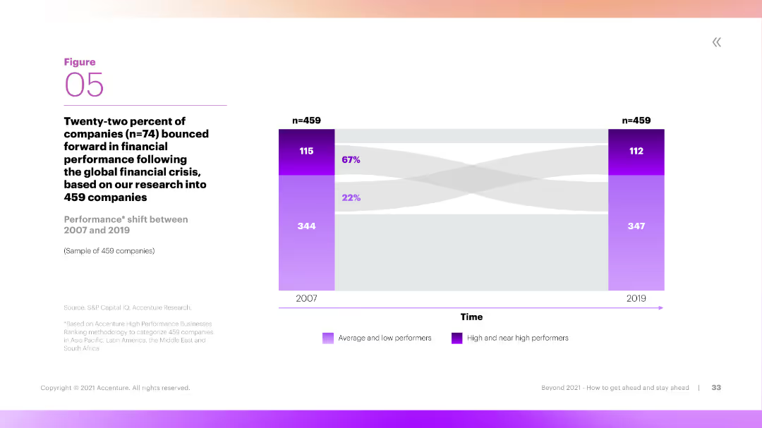
This slide includes a Sankey diagram showing the performance shift of companies between 2007 and 2019. The diagram is color-coded to differentiate between average, low, and high performers, with clear labels and flow directions.
Performance Metrics and KPIs
Financial Services
The slide illustrates the performance shift of companies over time, showing how many transitioned from low or average performance to high performance between 2007 and 2019. It provides insights into long-term financial performance trends.
Performance, Shift, Companies, Long-Term, Trends
false
Performance Metrics and KPIs
Financial Services
Mixed Chart
Accenture
Add to my slides
Remove from favorites
Contains a table comparing performance targets across several years with headers and rows for different banking services, such as 'Business Banking' and 'Card Services'.
Financial Performance
Financial Services
This slide showcases JP Morgan's performance targets for different sectors within consumer and community banking, reflecting past data and future outlooks. Useful in presenting measurable objectives to investors or stakeholders.
Performance Targets, Banking, Forecast, ROE, Net Charge-Off Rate
false
Financial Performance
Financial Services
Table
JP Morgan
Add to my slides
Remove from favorites
The slide includes text summarizing Greece's performance and a table listing sustainability-related factors with percentages indicating performance comparison.
Technology and Digital Transformation
Technology & Software
This slide compares Greece's performance in technology, sustainability, and talent, noting that it is on par with other countries in most factors, with specific insights into regulatory support and innovation.
performance, technology, sustainability, talent, comparison, Greece
false
Technology and Digital Transformation
Technology & Software
Mixed Chart
EY
Add to my slides
Remove from favorites
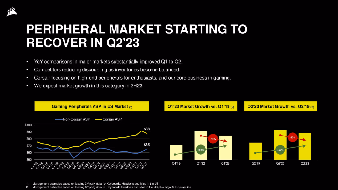
Three-part layout: line graph of ASP trends, and two bar charts comparing Q1/Q2 market growth vs. 2019. Clear labeling and high contrast visual elements.
Market Analysis and Trends
Technology & Software
The slide outlines early signs of recovery in the gaming peripheral market, with ASP (Average Selling Price) rebounding. It shows Corsair maintaining a premium ASP, while competitors reduce discounts, projecting renewed market growth ahead.
peripherals, ASP, Corsair, market recovery, growth, pricing, gaming hardware, Q2’23
false
Market Analysis and Trends
Technology & Software
Multiple Chart
Goldman Sachs
Add to my slides
Remove from favorites
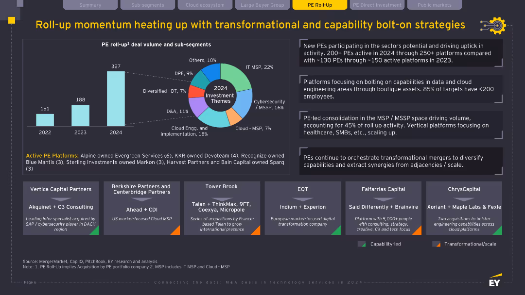
Bar chart, pie chart, multiple text callouts and company boxes at the bottom; dark background with bright accents; structured into segments and highlights.
Mergers and Acquisitions
Technology & Software
The slide illustrates the acceleration of PE roll-up deals, particularly in the IT MSP and cybersecurity segments. It outlines 2024 investment themes, details top PE platforms and notable acquisitions, and highlights the strategic focus on transformation and data/cloud capabilities. It also emphasizes the increasing involvement of new PE firms and preference for small targets (<200 employees).
PE roll-up, MSP, bolt-on strategy, cybersecurity, cloud, data engineering, transformation
false
Mergers and Acquisitions
Technology & Software
Multiple Chart
EY
Add to my slides
Remove from favorites
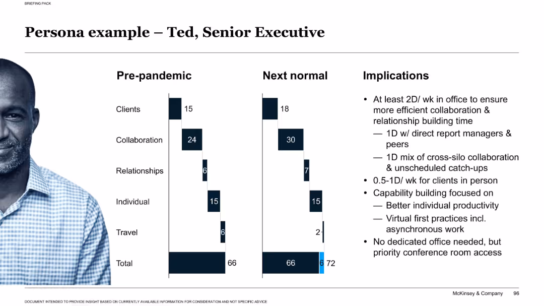
Split layout: bar charts comparing pre-pandemic vs. next-normal time allocations, photo of a person on left, text implications on right.
Human Resources and Talent Management
Professional Services
This persona example visualizes a senior executive’s workweek evolution due to the pandemic. It includes recommendations for office presence, collaboration, and capability building to support productivity in hybrid settings.
persona, executive, hybrid work, implications, collaboration, productivity, remote, office use, strategy
false
Human Resources and Talent Management
Professional Services
Mixed Chart
McKinsey
Add to my slides
Remove from favorites
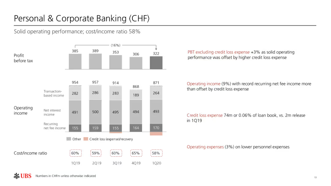
Column chart shows profit before tax, operating income, and cost/income ratios over several quarters.
Financial Performance
Financial Services
Reviews solid operating performance in personal and corporate banking, with a focus on credit loss expenses.
personal banking, corporate banking, financial performance, operating income, credit loss
false
Financial Performance
Financial Services
Multiple Chart
UBS
Add to my slides
Remove from favorites
Column charts and tables showing revenues, profit before tax, and various financial metrics for personal banking.
Financial Performance
Financial Services
Presents data on the performance of personal and corporate banking, including revenue and profit metrics for Q3 2022.
Personal banking, corporate banking, revenues, profit, UBS, financial performance, 3Q22, net interest income
false
Financial Performance
Financial Services
Multiple Chart
UBS
Add to my slides
Remove from favorites
Previous
Next
You don't have any favorites yet.
Please wait loading your favorites slides...
Create a FREE account to continue browsing
Receive Instant Access to 1,000+ slides from companies like McKinsey, Google, and Goldman Sachs
First Name
Last Name
Email
Password
I agree to all
Terms & Privacy Policy
Thank you! Your submission has been received!
Oops! Something went wrong while submitting the form.
Have an account?
Sign in
Upgrade to PRO to Save slides
Advanced Search and Filters
Access to 15,000+ slides
Access to Category Pages
Save/Bookmark Slides
PowerPoint Template Library
Pick a Plan
MONTHLY
$12/month
Billed every month, Cancel anytime.
YEARLY
$9/year
Billed $108 annually, Cancel anytime.
Checkout for $12/month
Checkout for $108/yr
Secured by Stripe | AES-256 bit encryption