My Account
My Slides
Search by Category
Pricing
Templates
View All Templates
Download Template Slides
✦ AI Search
Feedback
Login
Logout
Get Started
Browse all Slides
Browse all Slides
Create a FREE Account
Instant access to 1,000+ real slides from top companies like McKinsey, BCG, Goldman Sachs, Google and many more!
First Name
Last Name
Email
Password
I agree to all
Terms & Privacy Policy
Thank you! Your submission has been received!
Oops! Something went wrong while submitting the form.
Have an account?
Sign in
Saved Slides
Total No. of slides saved
0
↻ Refresh
✖ Clear all
The slide features a column chart comparing historical and projected Gross Merchandise Value (GMV) for the Philippines’ internet economy from 2015 to 2025. It includes a title, the chart with incremental values, legends, and a source.
Market Analysis and Trends
Technology & Software
The slide presents the growth of the internet economy in the Philippines, with data points from 2015 and projections until 2025. It highlights the resilience of the e-conomy, likely used to discuss market trends and investment potential in the digital economy sector.
Philippines, e-Conomy, GMV, Growth, Resilience, Projection
false
Market Analysis and Trends
Technology & Software
Single Chart
Bain
Add to my slides
Remove from favorites
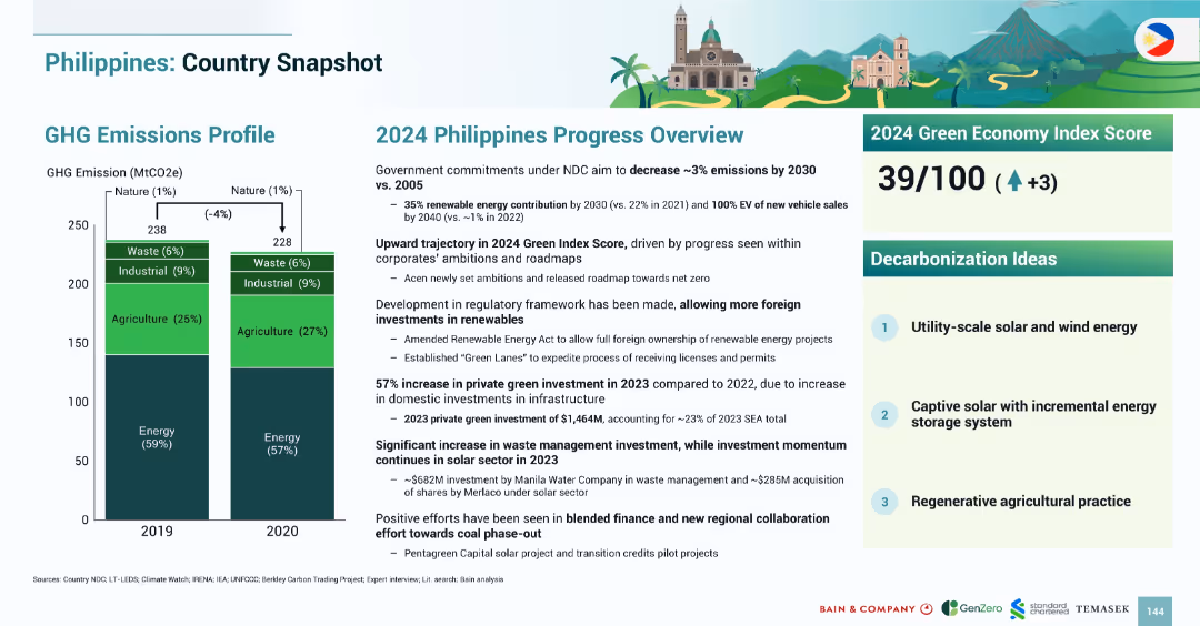
Similar structure to Malaysia snapshot with bar chart on left and textual progress overview and Green Index Score on right.
Strategic Planning
Government & Public Sector
The slide highlights the Philippines’ GHG emissions profile and national progress in 2024. Emissions dropped by 4% from 2019 to 2020. The 2024 Green Economy Index Score rose to 39. Foreign renewable investment has increased due to favorable policy changes. Key decarbonization priorities include utility-scale solar/wind and regenerative agriculture.
Philippines, emissions, renewable energy, policy, 2024, solar, agriculture, Green Index
false
Strategic Planning
Government & Public Sector
Mixed Chart
Bain
Add to my slides
Remove from favorites
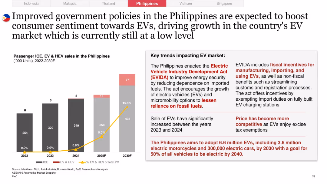
Left panel with EV/ICE bar chart and line graph tracking EV % of PV; right side highlights policy acts and incentives
Technology and Digital Transformation
Industrial & Manufacturing
Analyzes the impact of the Electric Vehicle Industry Development Act (EVIDA) on EV growth in the Philippines. Notes increased competitiveness, fiscal incentives, and a national goal of 6.6M EVs by 2030, although EV adoption is currently at low levels.
Philippines, EV policy, EVIDA, fiscal incentives, excise tax, EV growth targets, micromobility, energy security
false
Technology and Digital Transformation
Industrial & Manufacturing
Mixed Chart
PwC/Strategy&
Add to my slides
Remove from favorites
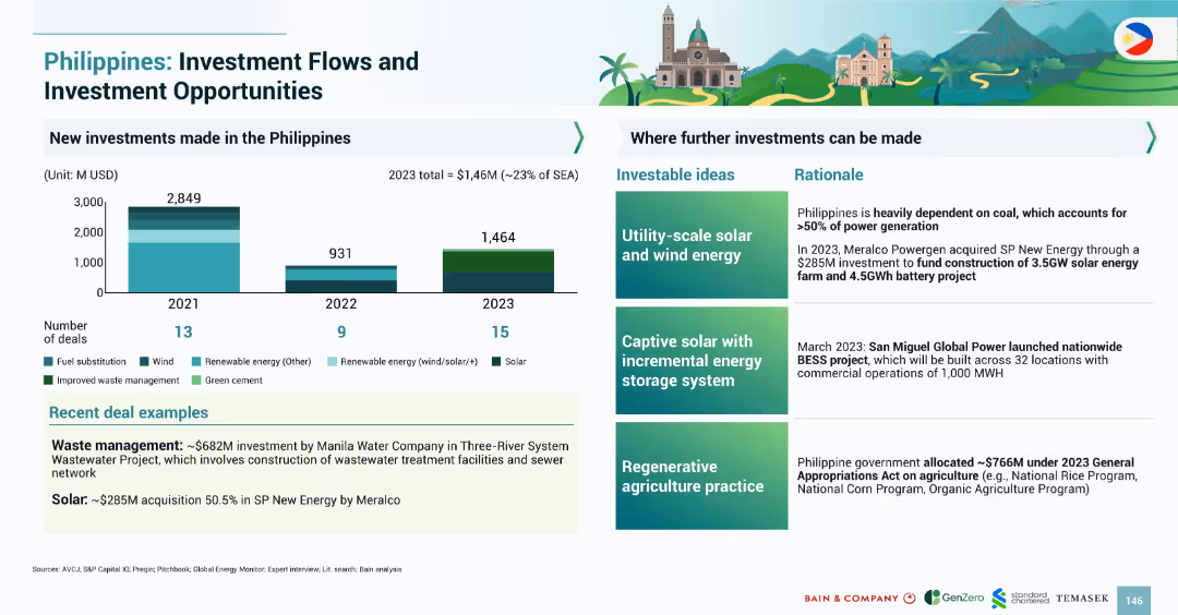
Left panel includes bar charts showing deal volume by year and sector. Right panel details 3 investable ideas with rationales and recent deal examples.
Investment Analysis
Government & Public Sector
The slide covers the Philippines’ green investment growth to $1.46B in 2023, or ~23% of SEA total. It identifies future investment areas: solar/wind, storage systems, and regenerative agriculture. Notable deals include $682M in wastewater and $285M in solar by Meralco.
Philippines, green investment, solar, wind, agriculture, BESS, wastewater, 2023
false
Investment Analysis
Government & Public Sector
Mixed Chart
Bain
Add to my slides
Remove from favorites
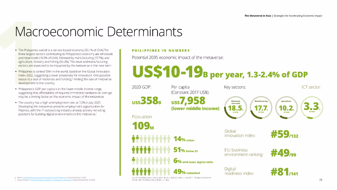
Text describing the Philippines' economic impact of the metaverse, with data on GDP, per capita income, and key sectors such as wholesale trade, manufacturing, and agriculture. Background is white with green and black text.
Market Analysis and Trends
Financial Services
Discusses the Philippines' economic conditions and metaverse impact, focusing on GDP, innovation index ranking, and challenges such as unemployment and limited digital readiness.
Philippines, metaverse, economic impact, wholesale trade, innovation
false
Market Analysis and Trends
Financial Services
Mixed Chart
Deloitte
Add to my slides
Remove from favorites
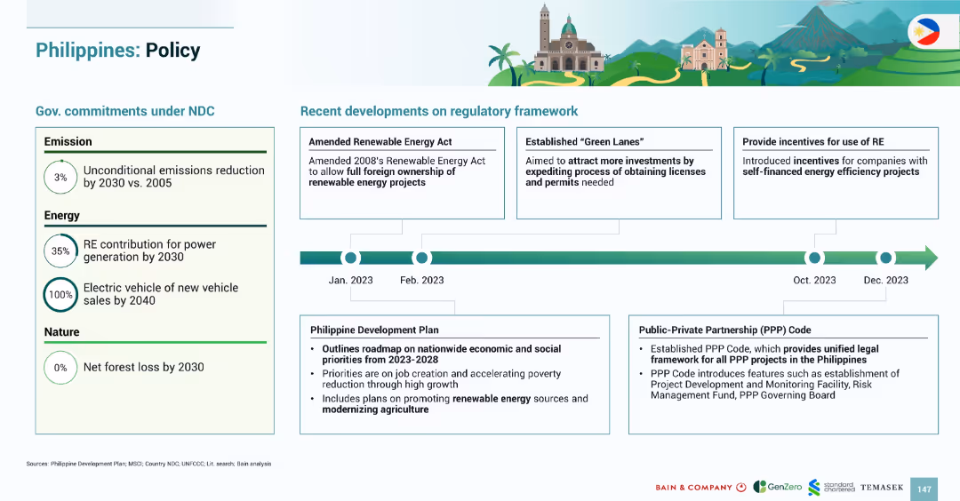
Clean bifurcated layout with left-side policy targets and right-side timeline from Jan–Dec 2023 highlighting legislative and regulatory actions.
Regulatory and Compliance
Government & Public Sector
The slide details the Philippines’ NDC targets (3% emissions cut, 35% RE by 2030) and regulatory progress in 2023. It includes full foreign RE ownership, “Green Lanes” for permit ease, and incentives for energy efficiency. The development plan emphasizes RE growth and agricultural modernization.
Philippines, policy, regulation, RE ownership, incentives, Green Lanes, development plan
false
Regulatory and Compliance
Government & Public Sector
Mixed Chart
Bain
Add to my slides
Remove from favorites
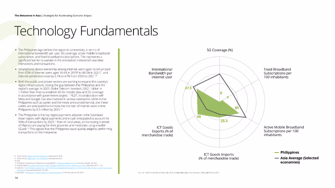
Displays a spider chart showing the Philippines' 5G coverage, broadband subscriptions, mobile broadband subscriptions, ICT goods imports, and international bandwidth per internet user compared to Asia average. Background is white with green highlights.
Technology and Digital Transformation
Technology & Software
Analyzes the Philippines' connectivity and digital infrastructure, highlighting smartphone penetration, digital payment adoption, and initiatives to improve internet access and 5G coverage.
Philippines, technology, 5G, digital payments, connectivity
false
Technology and Digital Transformation
Technology & Software
Mixed Chart
Deloitte
Add to my slides
Remove from favorites
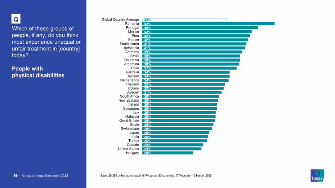
Left panel with category, right side bar chart with cross-country comparison.
Market Analysis and Trends
Government & Public Sector
Illustrates how people perceive unequal treatment toward individuals with physical disabilities across different countries. Romania and Portugal top the chart.
physical disabilities, inequality, discrimination, global comparison, treatment, countries, public perception
false
Market Analysis and Trends
Government & Public Sector
Mixed Chart
IPSOS
Add to my slides
Remove from favorites
Column chart displaying the percentage of respondents agreeing they need to do more about physical health, with countries sorted from highest to lowest agreement.
Customer and Market Segmentation
Healthcare & Pharmaceuticals
Illustrates the global drive to improve physical health, showing agreement levels across countries. Nigeria has the highest agreement, while Netherlands has the lowest.
physical health, global, agreement, survey, improvement
false
Customer and Market Segmentation
Healthcare & Pharmaceuticals
Multiple Chart
IPSOS
Add to my slides
Remove from favorites
Column chart comparing the top ten countries where physical health is prioritized over mental health, along with text comparing mental and physical health priorities in selected countries.
Customer and Market Segmentation
Healthcare & Pharmaceuticals
This slide compares the emphasis on physical versus mental health across various countries, identifying those where physical health is given more priority, with specific data from Kenya, Panama, etc.
physical health, mental health, priority, comparison, survey
false
Customer and Market Segmentation
Healthcare & Pharmaceuticals
Mixed Chart
IPSOS
Add to my slides
Remove from favorites
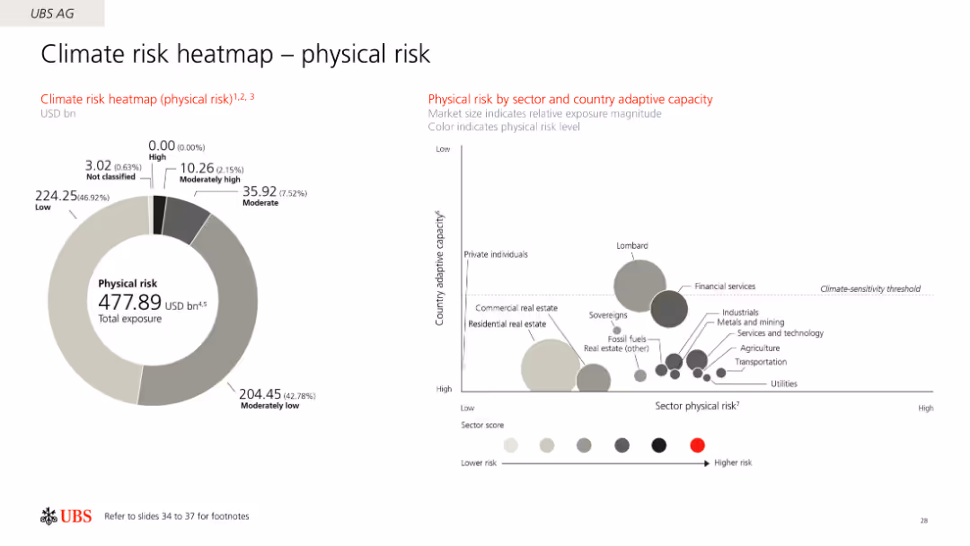
This slide displays a circular diagram showing UBS AG's physical risk exposure across sectors, with a secondary bubble chart depicting sector and country adaptive capacity.
Risk Assessment and Management
Financial Services
It shows UBS AG's physical risk exposure to climate change, breaking down risks by sectors and countries' adaptive capacities, using both circular and bubble charts.
Physical risk, climate change, UBS, sector risk, adaptive capacity
false
Risk Assessment and Management
Financial Services
Multiple Chart
UBS
Add to my slides
Remove from favorites
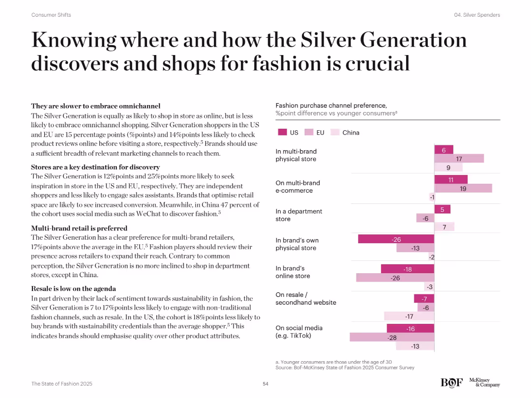
Left-aligned narrative and right horizontal bar chart. Chart compares purchase channel preferences of older vs younger shoppers across US, EU, China. Violet bars show % point differences.
Customer and Market Segmentation
Retail & E-commerce
Explains older consumers' preference for physical and multi-brand stores over digital/social channels. Highlights aversion to resale and omnichannel, and the importance of tailoring marketing and retail experience to their habits.
physical stores, multi-brand retail, omnichannel, resale aversion, Silver Generation
false
Customer and Market Segmentation
Retail & E-commerce
Mixed Chart
McKinsey
Add to my slides
Remove from favorites
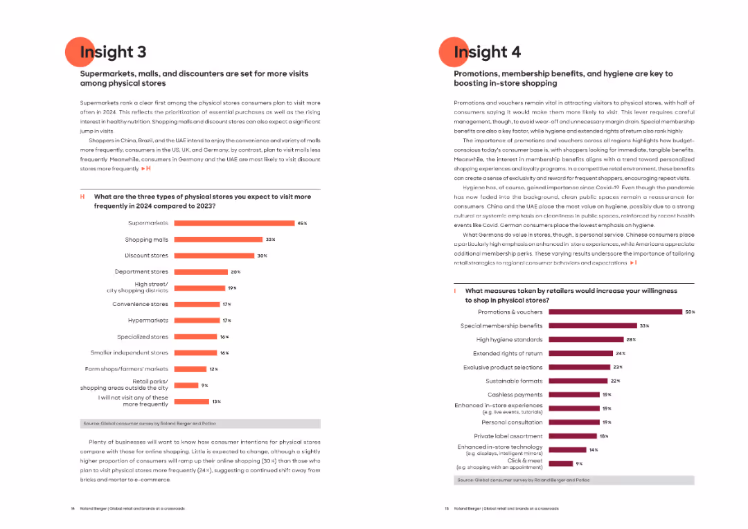
Split layout: two-column format, left slide (Insight 3) with a bar chart and paragraph text; right slide (Insight 4) also with a bar chart and multiple paragraph blocks. Bold headers and red highlights used.
Market Analysis and Trends
Retail & E-commerce
Insight 3 highlights increased visits to physical stores such as supermarkets, malls, and discounters in 2024. Insight 4 emphasizes that promotions, hygiene, and loyalty benefits are strong incentives for in-store shopping. Regional variations in preferences are also discussed.
Physical stores, supermarkets, promotions, consumer trends, hygiene, membership, retail incentives, discount stores, shopper behavior
false
Market Analysis and Trends
Retail & E-commerce
Multiple Chart
Roland Berger
Add to my slides
Remove from favorites
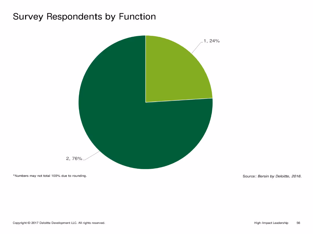
Pie chart indicating the percentage distribution of survey respondents by function. The chart is simple with two main colors differentiating the segments.
Market Analysis and Trends
Professional Services
Shows the breakdown of survey respondents by their functional roles within their organizations, aiding in understanding their professional backgrounds.
Pie chart, survey, function, distribution, roles
false
Market Analysis and Trends
Professional Services
Single Chart
Deloitte
Add to my slides
Remove from favorites
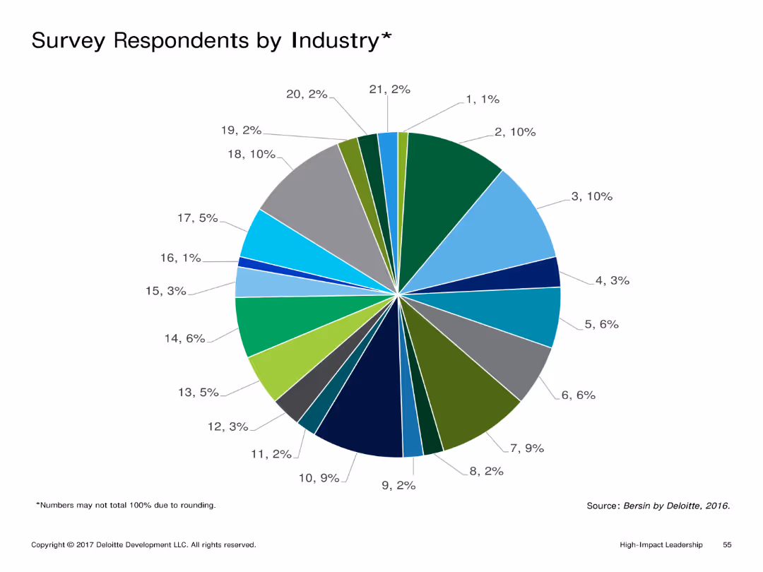
Pie chart detailing the percentage of survey respondents from various industries. The chart uses a variety of colors to differentiate between industry segments.
Market Analysis and Trends
Professional Services
Illustrates the distribution of survey respondents across different industries, highlighting the diversity of sectors represented in the survey.
Pie chart, survey, industry distribution, segments, variety
false
Market Analysis and Trends
Professional Services
Single Chart
Deloitte
Add to my slides
Remove from favorites
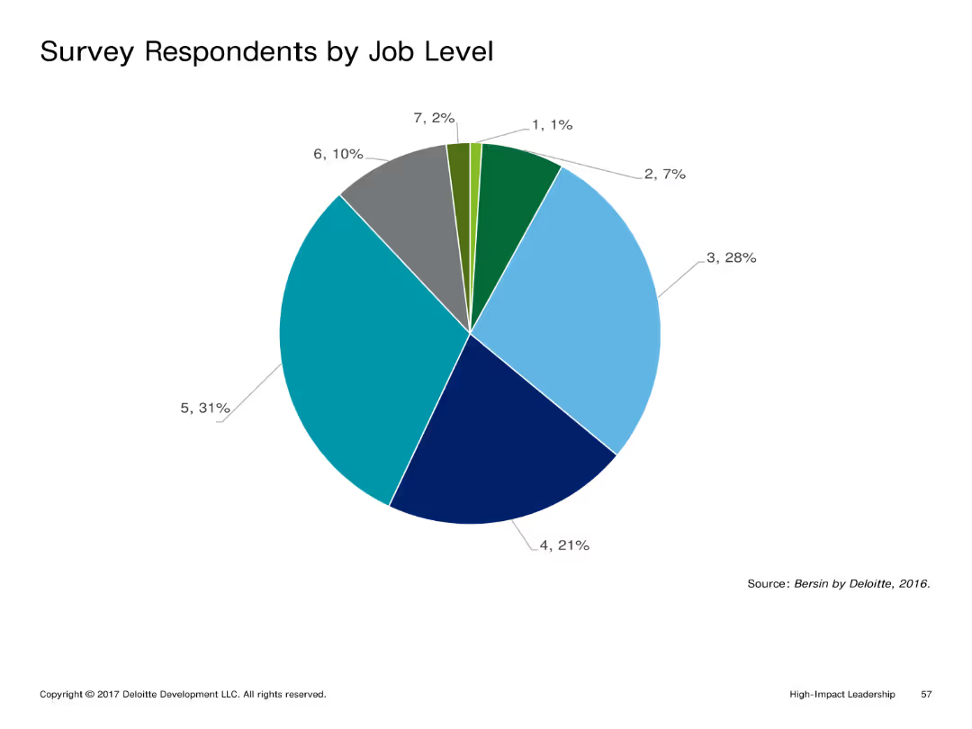
Pie chart presenting the percentage distribution of survey respondents by job level. The chart uses multiple colors for different job levels.
Market Analysis and Trends
Professional Services
Highlights the distribution of survey respondents by their job levels, offering insights into the hierarchical diversity of the participants.
Pie chart, survey, job level, distribution, hierarchy
false
Market Analysis and Trends
Professional Services
Single Chart
Deloitte
Add to my slides
Remove from favorites
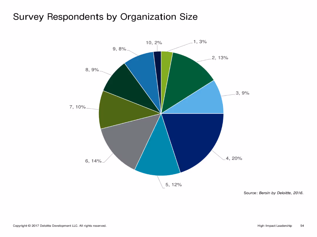
Pie chart showing percentage distribution of survey respondents by organization size. The chart is visually clear with different colors representing each segment.
Market Analysis and Trends
Professional Services
Displays the distribution of survey respondents by organization size, providing insight into the range of company sizes participating in the survey.
Pie chart, survey, organization size, distribution, segments
false
Market Analysis and Trends
Professional Services
Single Chart
Deloitte
Add to my slides
Remove from favorites
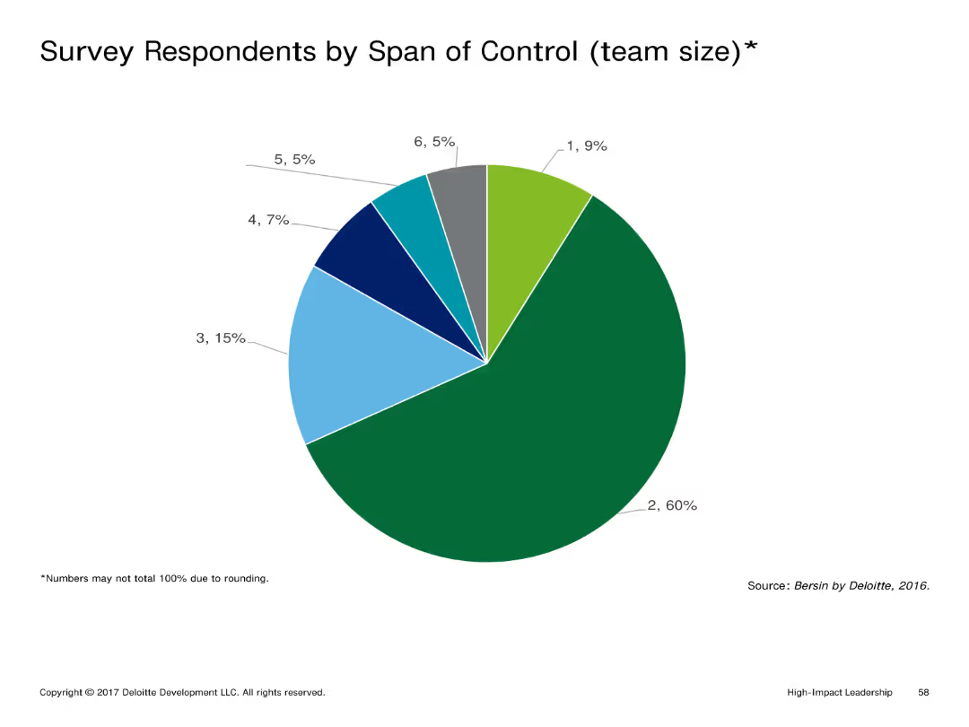
Pie chart depicting the percentage distribution of survey respondents by their span of control (team size). Different colors represent various team sizes.
Market Analysis and Trends
Professional Services
Depicts the distribution of survey respondents based on their span of control, which can help understand the managerial scope of the respondents.
Pie chart, survey, span of control, team size, distribution
false
Market Analysis and Trends
Professional Services
Single Chart
Deloitte
Add to my slides
Remove from favorites
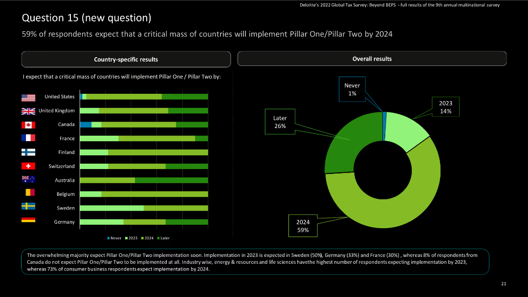
This slide includes horizontal bar charts for country-specific results and a donut chart for overall results, showing implementation expectations.
Risk Assessment and Management
Financial Services
The slide presents survey responses on the expected implementation of Pillar One/Pillar Two by 2024, with country-specific and overall data. It highlights percentages and timeline expectations.
Pillar One, Pillar Two, implementation, survey, financial services
false
Risk Assessment and Management
Financial Services
Multiple Chart
Deloitte
Add to my slides
Remove from favorites
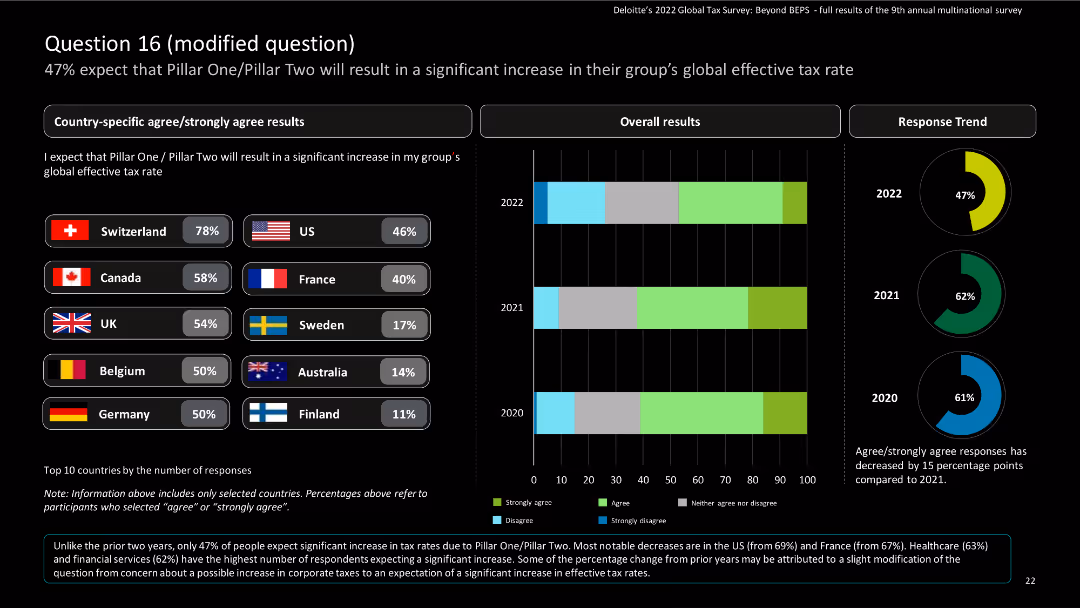
The slide features country-specific results using bar charts and a column chart for overall results, including a donut chart for response trends.
Risk Assessment and Management
Financial Services
The slide provides survey results on the expected increase in global effective tax rates due to Pillar One/Pillar Two. It shows country-specific and overall responses from 2020 to 2022.
Pillar One, Pillar Two, tax rates, survey, financial services
false
Risk Assessment and Management
Financial Services
Multiple Chart
Deloitte
Add to my slides
Remove from favorites
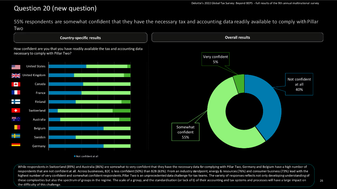
The slide contains horizontal bar charts for country-specific results and a donut chart for overall results, highlighting confidence levels.
Risk Assessment and Management
Financial Services
The slide summarizes survey findings on confidence in having the necessary tax and accounting data for complying with Pillar Two. It includes country-specific and overall responses.
Pillar Two, compliance, tax data, survey, financial services
false
Risk Assessment and Management
Financial Services
Multiple Chart
Deloitte
Add to my slides
Remove from favorites
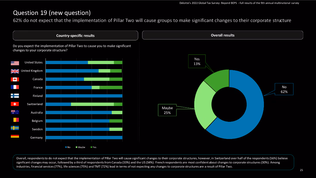
The slide features horizontal bar charts for country-specific results and a donut chart for overall results, showing expectations on corporate structure changes.
Risk Assessment and Management
Financial Services
The slide provides survey results on expectations regarding corporate structure changes due to the implementation of Pillar Two. It shows country-specific and overall responses.
Pillar Two, corporate structure, survey, financial services, expectations
false
Risk Assessment and Management
Financial Services
Multiple Chart
Deloitte
Add to my slides
Remove from favorites
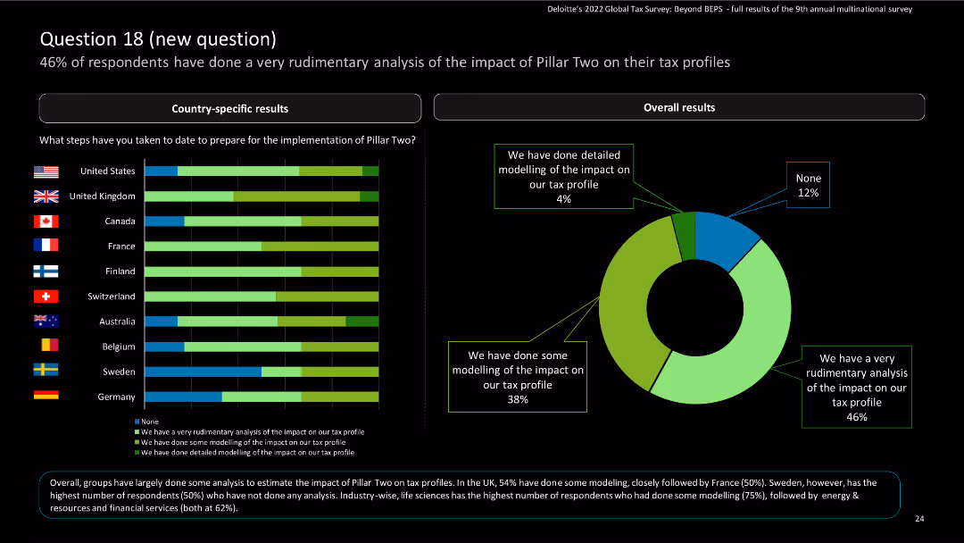
This slide includes horizontal bar charts for country-specific results and a donut chart for overall results, showing preparation steps.
Risk Assessment and Management
Financial Services
The slide presents survey responses on the preparation steps taken for the implementation of Pillar Two, with country-specific and overall data. It highlights different levels of modeling and analysis.
Pillar Two, implementation, survey, preparation, financial services
false
Risk Assessment and Management
Financial Services
Multiple Chart
Deloitte
Add to my slides
Remove from favorites
Slide features a map and a pie chart detailing Enbridge's pipeline divisions and their contribution to EBIT, with accompanying bar charts for revenue sources.
Operational Efficiency
Energy & Utilities
Provides an overview of the distribution and financial impact of Enbridge's pipeline segments, useful for operational strategy and resource allocation.
Pipeline Distribution, Financial Impact, Operational Strategy, Resource Allocation
false
Operational Efficiency
Energy & Utilities
Multiple Chart
Barclays
Add to my slides
Remove from favorites
Map with projected pipeline expansions and a list of potential projects with a timeline. Very detailed and specific.
Strategic Planning
Energy & Utilities
Discusses potential future expansions in pipeline capacity, including strategic increments and market solutions.
pipeline, expansion, strategy, capacity, market
false
Strategic Planning
Energy & Utilities
Graphic
Barclays
Add to my slides
Remove from favorites
The slide includes a circular diagram representing four seasons, each with specific financial planning tasks, and text descriptions for each season.
Strategic Planning
Financial Services
The slide provides a seasonal checklist for financial planning, detailing specific tasks to address during Winter, Spring, Summer, and Fall.
Planning, Checklist, Seasons, Financial, Tasks
false
Strategic Planning
Financial Services
Diagram
UBS
Add to my slides
Remove from favorites
The slide features text divided into three sections: open enrollment, gift giving, and philanthropy. It is moderately complex with detailed text content.
Financial Performance
Financial Services
The slide provides a checklist for fall financial planning, covering health insurance, gift giving, and philanthropic activities.
planning, fall, enrollment, gift, philanthropy
false
Financial Performance
Financial Services
Pillar
UBS
Add to my slides
Remove from favorites
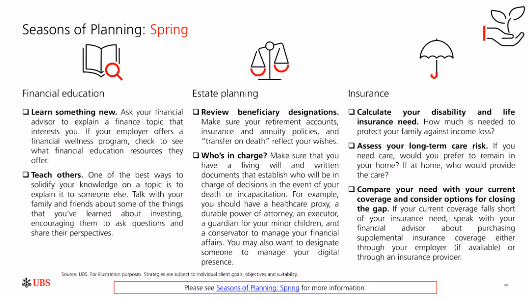
The slide features text divided into three sections: financial education, estate planning, and insurance. It is moderately complex with detailed text content.
Financial Performance
Financial Services
The slide provides a checklist for spring financial planning, covering financial education, estate planning, and insurance needs.
planning, spring, education, estate, insurance
false
Financial Performance
Financial Services
Pillar
UBS
Add to my slides
Remove from favorites
The slide features text divided into three sections: college savings, saving for retirement, and preparing for retirement. It is moderately complex with detailed text content.
Financial Performance
Financial Services
The slide provides a checklist for summer financial planning, covering college savings, retirement saving, and preparing for retirement.
planning, summer, savings, retirement, college
false
Financial Performance
Financial Services
Pillar
UBS
Add to my slides
Remove from favorites
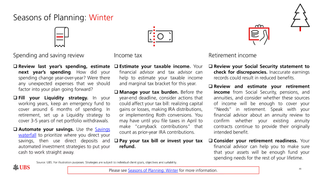
The slide features text divided into three sections: spending and saving review, income tax, and retirement income. It is moderately complex with detailed text content.
Financial Performance
Financial Services
The slide provides a checklist for winter financial planning, covering spending review, tax management, and retirement income assessment.
planning, winter, spending, saving, tax, retirement
false
Financial Performance
Financial Services
Pillar
UBS
Add to my slides
Remove from favorites
The slide has a text block on the left and three growing bar charts on the right, representing growth in different types of workers.
Financial Performance
Professional Services
Highlights the growth in contractor, freelancer, and gig worker use from Deloitte’s HC Trends report. Could be used to discuss strategic planning and workforce transformation financials.
Planning, Workforce, Trends, Gig Economy
false
Financial Performance
Professional Services
Pillar
Deloitte
Add to my slides
Remove from favorites
The slide displays multiple product images under the brand "The Vegetarian Butcher," with accompanying text boxes and a pie chart detailing market segments.
Product and Service Analysis
Consumer Goods
Focuses on the growth and expansion of The Vegetarian Butcher, detailing product offerings and market integration strategies post-acquisition.
plant-based, growth, product expansion, market strategy, acquisition
false
Product and Service Analysis
Consumer Goods
Mixed Chart
Deutsche Bank
Add to my slides
Remove from favorites
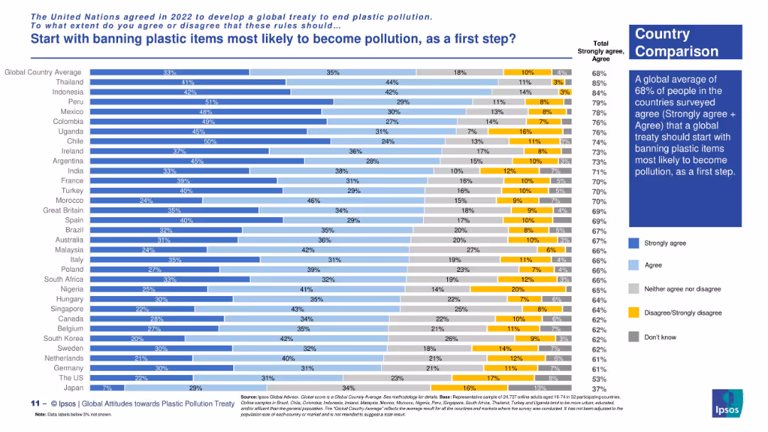
Country-level stacked bar chart. Summary box on right, bars sorted by agreement levels.
Regulatory and Compliance
Environmental Services & Sustainability
The slide shows global country responses to a proposed first step in a plastic treaty: banning high-risk plastic items. Peru, Indonesia, and Thailand lead in support; the global average is 68%.
plastic bans, treaty strategy, environmental policy, high-risk plastics, country comparisons, Ipsos data, first-step approach, public support
false
Regulatory and Compliance
Environmental Services & Sustainability
Mixed Chart
IPSOS
Add to my slides
Remove from favorites
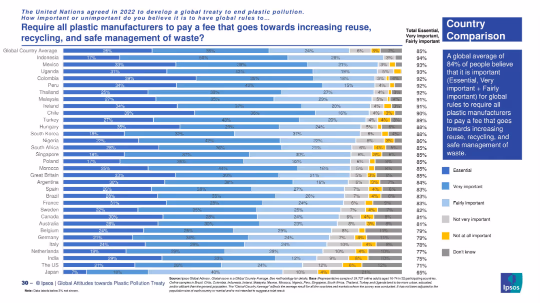
Vertical bar chart with country-level opinion data. Uses colored segments to indicate levels of support and disagreement. Sidebar summarizes global insight.
Regulatory and Compliance
Environmental Services & Sustainability
This slide presents international views on imposing fees on plastic manufacturers to support waste management systems. Global support averages at 84%, with Indonesia, Mexico, and Uganda showing highest agreement.
plastic fees, waste management, sustainability, regulation, global survey, Ipsos, environmental responsibility, country comparison
false
Regulatory and Compliance
Environmental Services & Sustainability
Mixed Chart
IPSOS
Add to my slides
Remove from favorites
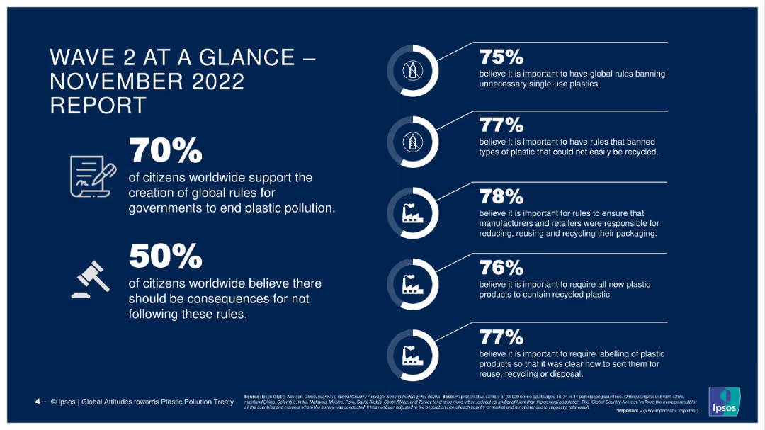
A dashboard-style layout with icon-supported statistics and percentage callouts arranged vertically on a dark blue background.
Industry Overview
Environmental Services & Sustainability
The slide summarizes global public attitudes toward plastic pollution regulations, emphasizing strong support for international rules to end plastic waste. Highlights include 70% supporting global rule creation and 78% backing producer accountability.
plastic pollution, global rules, sustainability, public opinion, Ipsos survey, waste management, single-use plastics, environmental concern, consumer attitudes
false
Industry Overview
Environmental Services & Sustainability
Mixed Chart
IPSOS
Add to my slides
Remove from favorites
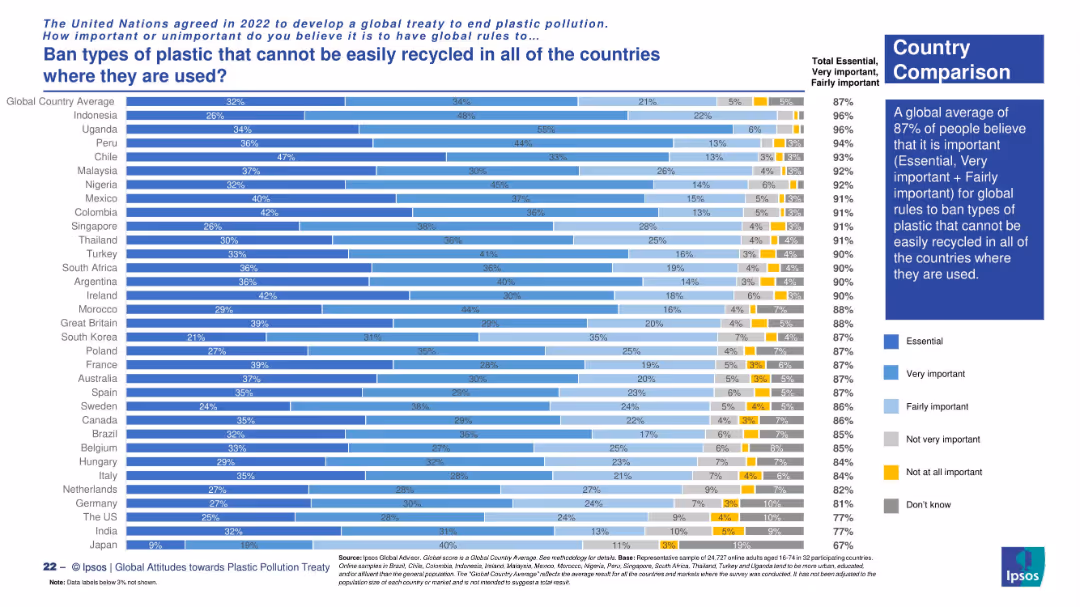
Vertical bar chart with country-level comparison. Uses six-color segments to represent varying degrees of opinion.
Operational Efficiency
Environmental Services & Sustainability
This slide shows public opinion by country on banning hard-to-recycle plastics. A global average of 87% consider it important, with highest support in Indonesia, Uganda, and Peru.
plastic recycling, global ban, sustainability, Ipsos survey, consumer views, international agreement
false
Operational Efficiency
Environmental Services & Sustainability
Mixed Chart
IPSOS
Add to my slides
Remove from favorites
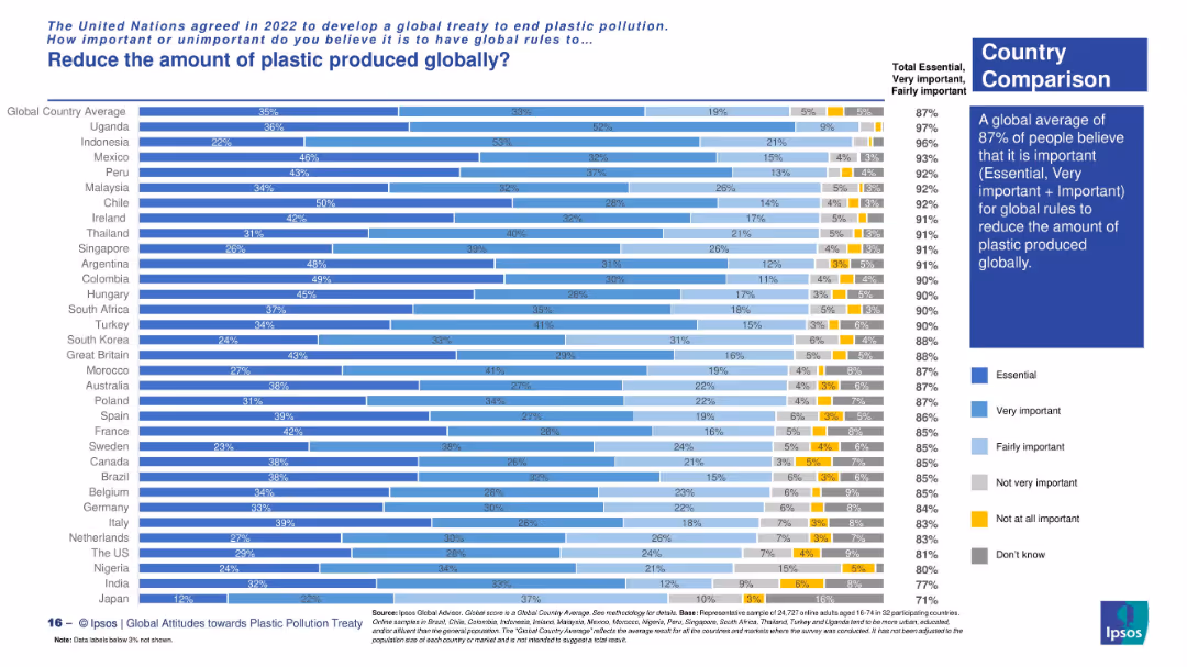
Vertical bar chart showing country-level opinions with five shades indicating importance levels. A summary box on the right highlights global sentiment.
Market Analysis and Trends
Environmental Services & Sustainability
This slide presents public opinion across countries on the importance of reducing global plastic production. The vast majority (87% globally) consider it essential or important. Country-level comparisons show highest support in Uganda, Indonesia, and Mexico.
plastic reduction, global rules, environmental awareness, country comparison, Ipsos survey, public opinion, global treaty
false
Market Analysis and Trends
Environmental Services & Sustainability
Mixed Chart
IPSOS
Add to my slides
Remove from favorites
Horizontal bar chart with segmented bars showing survey results across regions. Blue color gradients indicate importance levels. Includes a sidebar summary with key regional comparison insight.
Market Analysis and Trends
Environmental Services & Sustainability
This slide presents a regional comparison of public opinion on the importance of global rules requiring reuse and refill systems by manufacturers and retailers. Latin America and Africa show the highest support (91%). It visualizes the extent to which people view such measures as essential, very important, or fairly important.
plastic reuse, refill systems, public opinion, global treaty, sustainability, regional comparison, Ipsos survey, environmental policy, Latin America, Africa
false
Market Analysis and Trends
Environmental Services & Sustainability
Mixed Chart
IPSOS
Add to my slides
Remove from favorites
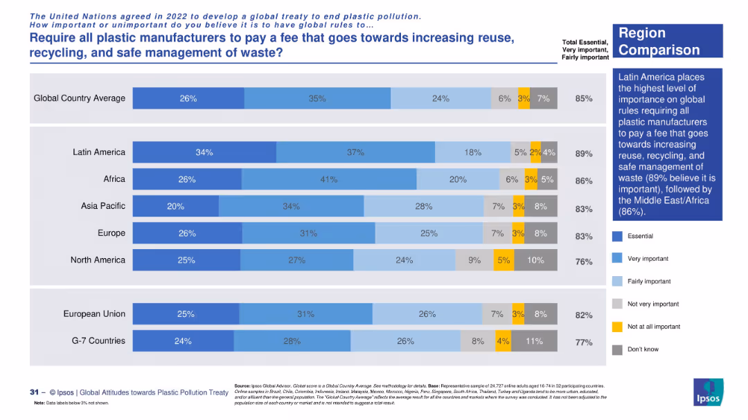
Regional comparison using horizontal stacked bar chart. Color-coded by level of importance. Includes side commentary box with global and regional insights.
Regulatory and Compliance
Environmental Services & Sustainability
This slide breaks down regional views on mandatory fees for plastic producers. Latin America expresses the highest level of support (89%), followed by Africa (86%). It supports global regulatory alignment in plastic waste reduction efforts.
plastic waste fee, regulation, regional data, environmental sustainability, Ipsos, global treaty, public support, recycling systems
false
Regulatory and Compliance
Environmental Services & Sustainability
Mixed Chart
IPSOS
Add to my slides
Remove from favorites
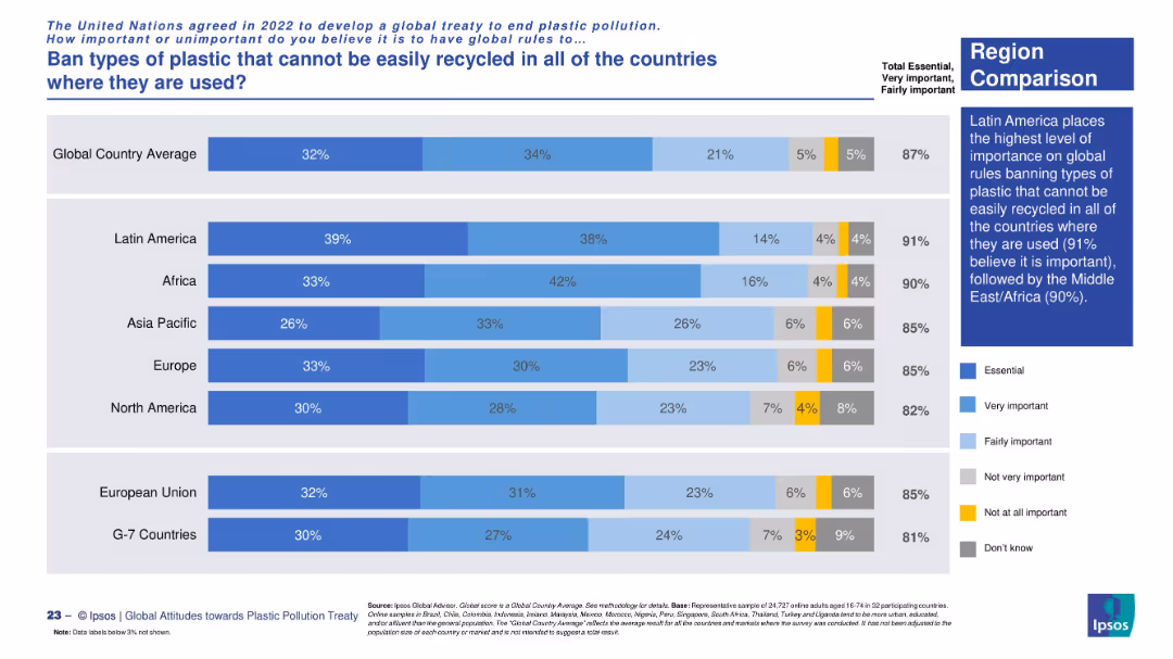
Horizontal bar chart by region. Uses segmented color-coded bars with a regional summary highlighting Latin America’s strong support.
Operational Efficiency
Environmental Services & Sustainability
The slide emphasizes high regional support, especially in Latin America and Africa, for banning non-recyclable plastics across global jurisdictions.
plastic waste, regional opinion, recycling policy, sustainability, Ipsos research, UN treaty
false
Operational Efficiency
Environmental Services & Sustainability
Mixed Chart
IPSOS
Add to my slides
Remove from favorites
A structured slide with headers and a linear array of hexagons indicating financial services such as "Risk" and "Payments", with arrows pointing downwards, signifying the translation into a platform service with the assistance of "VOICE and APIs".
Technology and Digital Transformation
Financial Services
Transitioning Goldman Sachs' financial services into a more accessible platform, integrating technology like APIs to streamline services such as risk management, data analytics, and payments for better client engagement and operational efficiency.
platform, APIs, financial services, transformation, efficiency
false
Technology and Digital Transformation
Financial Services
Diagram
Goldman Sachs
Add to my slides
Remove from favorites
Featuring a central circular diagram labeled 'Connected Commerce,' this slide juxtaposes consumer benefits against brand partnerships. It utilizes icons and brand logos to visually support the textual data.
Market Analysis and Trends
Financial Services
This slide communicates the benefits of a financial platform for both consumers and partnering brands, indicating a market-leading position with key statistics and affiliations.
platform, consumers, brands, partnerships, commerce
false
Market Analysis and Trends
Financial Services
Table
JP Morgan
Add to my slides
Remove from favorites
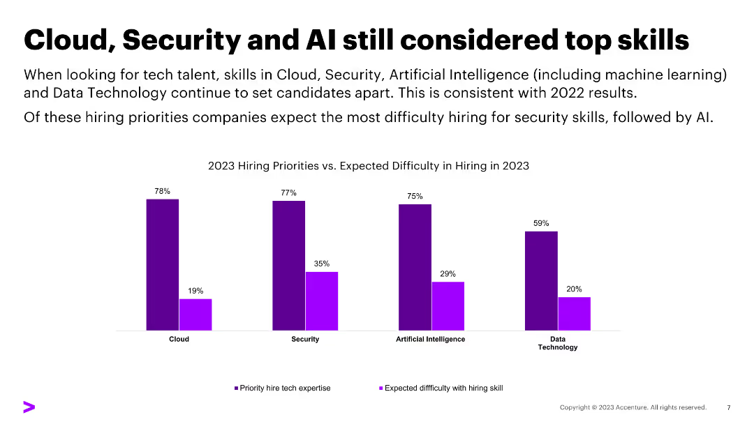
Features a list layout with five main priorities, each accompanied by an icon and a brief description underneath. The priorities are shown in colorful blocks, arranged horizontally across the slide.
Strategic Planning
Financial Services
Highlights the key IT priorities for Northern Trust, focusing on core platform reimagination, risk and resiliency, innovation in the operating model, productivity optimization, and talent management. The slide serves to convey strategic initiatives aimed at strengthening IT and business growth.
Platform, Cybersecurity, Innovation, Productivity, Talent Management
false
Strategic Planning
Financial Services
Pillar
Morgan Stanley
Add to my slides
Remove from favorites
Purple background with white text and a column chart. Includes text on the value of platform strategies
Competitive Landscape
Technology & Software
The slide explains the value of platform strategies, citing examples like Shell and American Express
Platform, Ecosystem, Value, Collaboration, Technology
false
Competitive Landscape
Technology & Software
Mixed Chart
Accenture
Add to my slides
Remove from favorites
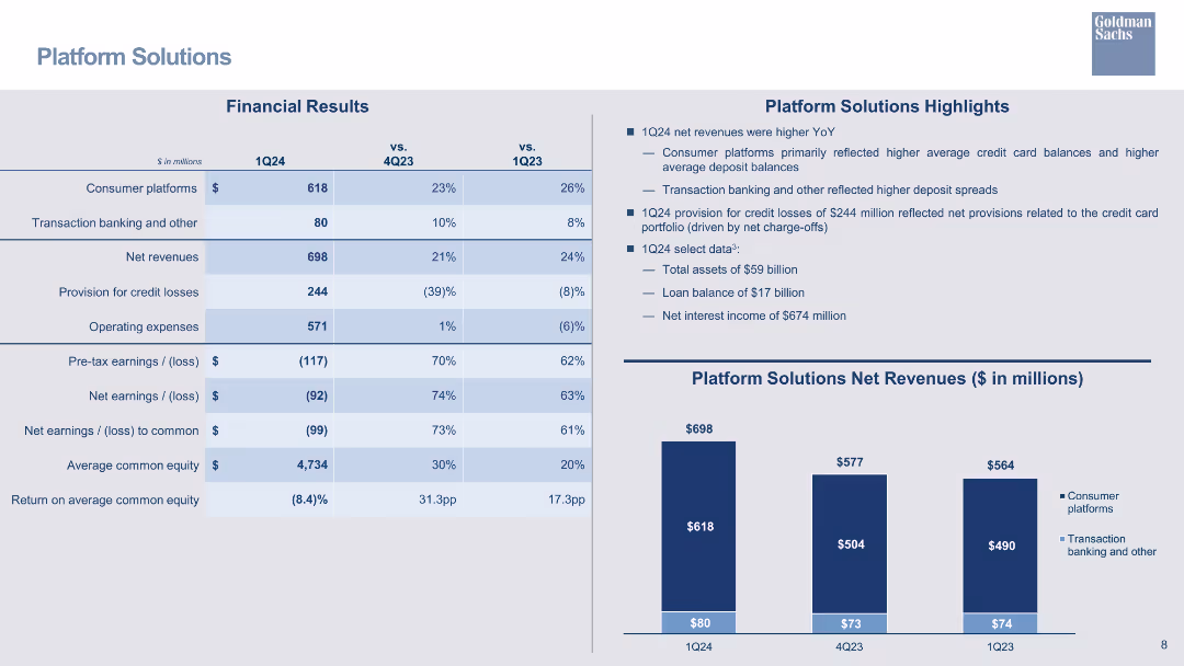
A moderate design, the slide showcases a title, a table of financial results, column chart illustrating net revenues, and highlights in bullet points. The visual complexity is balanced to aid interpretation.
Operational Efficiency
Financial Services
Outlines the financial outcomes for platform solutions, comparing quarterly and yearly data. It's used for evaluating operational efficiency, financial planning, or in presentations to investors, showing areas such as consumer platforms and transaction banking.
Platform Solutions, Consumer Platforms, Net Revenues, Operational Expenses
false
Operational Efficiency
Financial Services
Mixed Chart
Goldman Sachs
Add to my slides
Remove from favorites
The slide is visually dense, with a combination of column charts and extensive textual information. It analyzes the financial results of platform solutions, using color highlights to denote statistical changes and contrasts.
Operational Efficiency
Financial Services
Targeting decision-makers in financial services, the slide compares platform solutions' financial metrics, highlighting net revenues, losses, and consumer platform metrics to evaluate operational performance and strategic planning.
platform solutions, financial analysis, operational performance, net revenues, consumer platforms
false
Operational Efficiency
Financial Services
Mixed Chart
Goldman Sachs
Add to my slides
Remove from favorites
A table summarizing financial results for the Platform Solutions segment, including net revenues, operating expenses, and earnings, with bar charts.
Financial Performance
Financial Services
Reviews financial results for Platform Solutions, focusing on net revenues, credit losses, and net interest income.
platform solutions, financial results, net revenue, credit losses, operating expenses, bar chart
false
Financial Performance
Financial Services
Mixed Chart
Goldman Sachs
Add to my slides
Remove from favorites
Includes column chart showcasing 'Platform Solutions Net Revenues' and financial results tables focusing on consumer platforms and banking services, accompanied by textual highlights of key data points.
Operational Efficiency
Financial Services
Discusses the financial outcomes of Platform Solutions, highlighting net revenue changes and factors affecting profitability. This slide is essential for assessing the segment's operational efficiency and financial trends.
Platform Solutions, Net Revenues, Consumer Platforms, Transaction Banking, Operational Expenses, Revenue Growth, Profitability Analysis
false
Operational Efficiency
Financial Services
Mixed Chart
Goldman Sachs
Add to my slides
Remove from favorites
Diagram of a central circle labeled 'Goldman Sachs' with connecting lines to various entities representing API connections.
Technology and Digital Transformation
Technology & Software
Outlines the central role of Goldman Sachs in connecting different sectors through APIs with a focus on technology development and service externalization.
platforms, technology, APIs, Goldman Sachs, development, externalization, developers, service
false
Technology and Digital Transformation
Technology & Software
Framework
Goldman Sachs
Add to my slides
Remove from favorites
Title at top, large segmented circular graphic in the center divided into strategic and operational parts, various text annotations.
Strategic Planning
Professional Services
Explains the integration of platform strategies and operational capabilities within a digital ecosystem, emphasizing the need for a "platform mindset" and collaboration.
platform strategies, operational capabilities, digital ecosystem, collaboration
false
Strategic Planning
Professional Services
Diagram
Accenture
Add to my slides
Remove from favorites
White background with purple text boxes listing factors for considering a platform strategy
Strategic Planning
Technology & Software
The slide provides a list of factors companies should consider when evaluating a platform strategy
Platform Strategy, Considerations, Industry Dynamics, Technology Capabilities, Ecosystem
false
Strategic Planning
Technology & Software
Single Chart
Accenture
Add to my slides
Remove from favorites
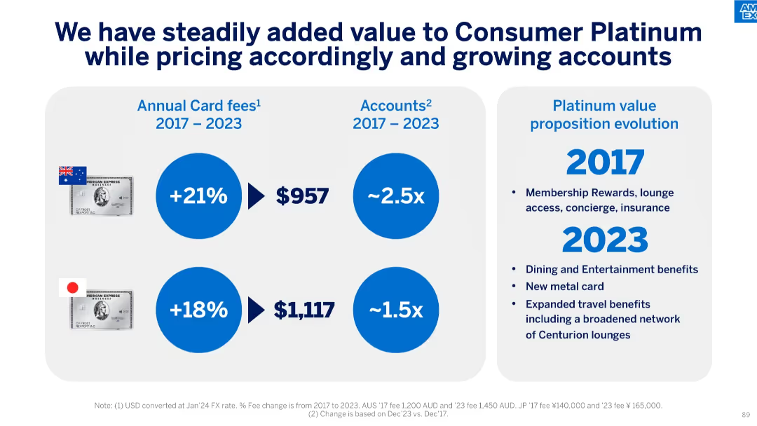
Split slide with two sections: fee/account growth with country flags and card images on the left, and value evolution timeline on the right.
Product and Service Analysis
Financial Services
This slide showcases how the Consumer Platinum Card has evolved between 2017–2023 in Australia and Japan. It highlights card fee increases, account growth multipliers, and added benefits like entertainment perks and lounge access.
Platinum Card, Account Growth, Fee Increase, Japan, Australia, Rewards, Entertainment, Lounge Access, Concierge, Travel Benefits
false
Product and Service Analysis
Financial Services
Mixed Chart
McKinsey
Add to my slides
Remove from favorites
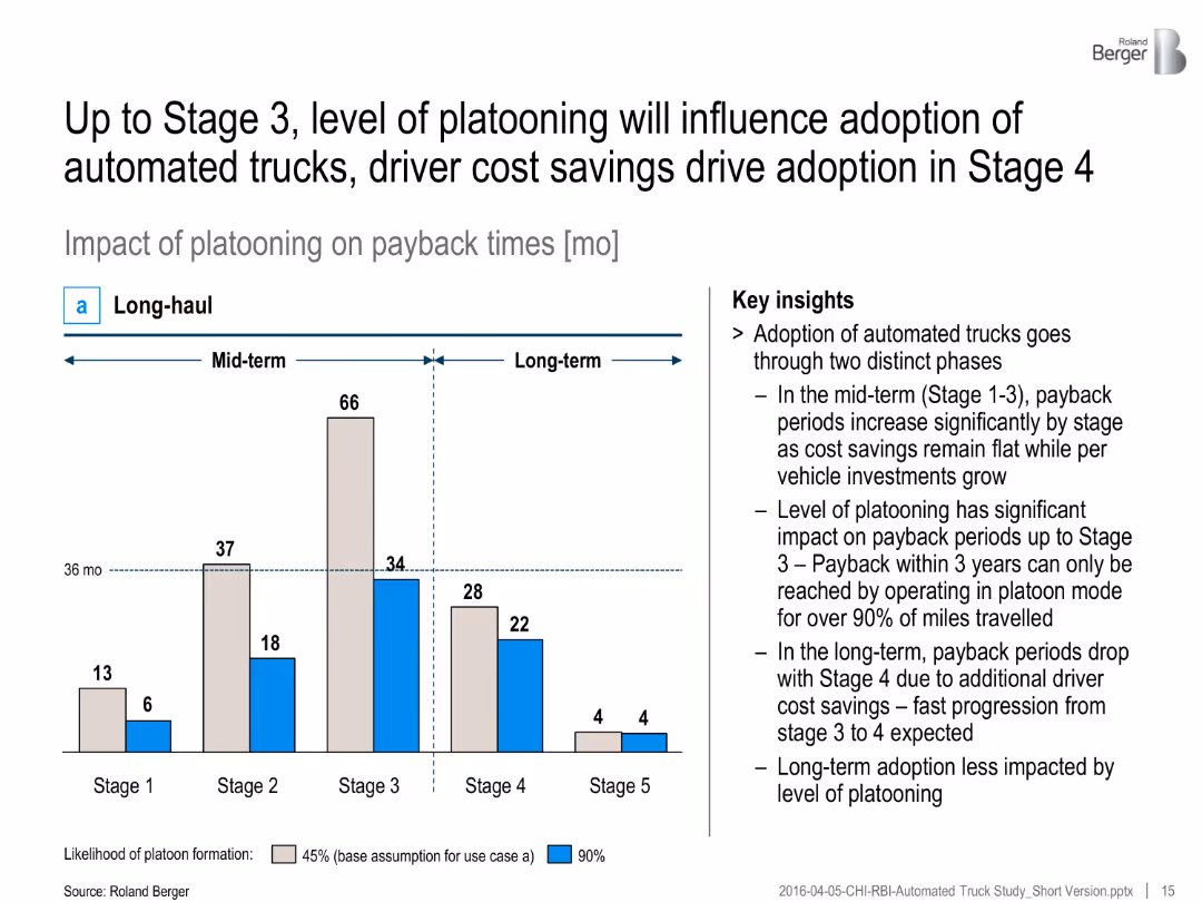
Bar chart with two color-coded bars per stage (45% and 90% platooning), timeline split into mid- and long-term, with insights
Investment Analysis
Transportation & Logistics
The slide outlines the impact of platooning on payback times for automated trucks, indicating faster payback with higher platooning. Key insights emphasize two adoption phases and cost savings.
Platooning, automated trucks, payback time, cost savings, adoption stages, investment, long-haul, automation, ROI
false
Investment Analysis
Transportation & Logistics
Mixed Chart
Roland Berger
Add to my slides
Remove from favorites
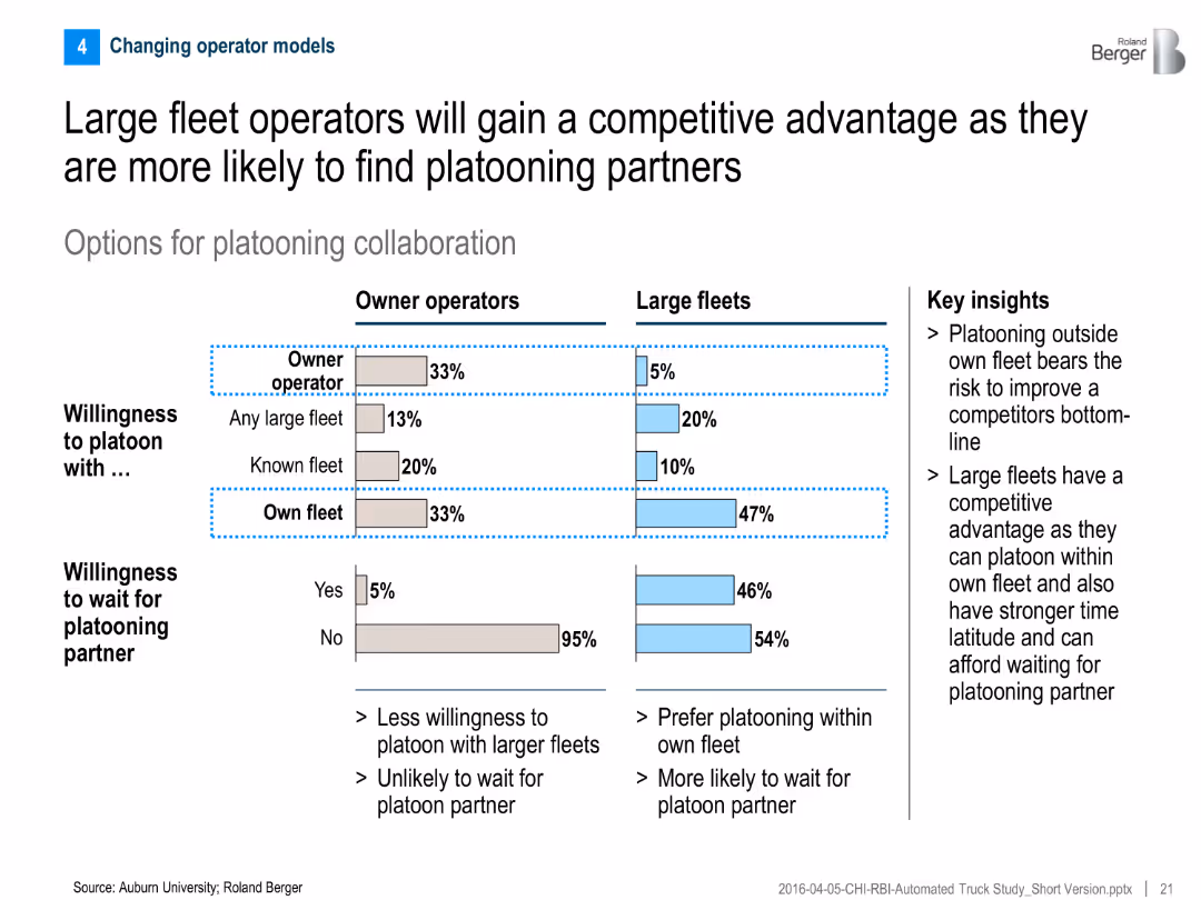
Comparative bar chart for owner operators vs. large fleets on willingness to platoon; includes key insight text on right
Competitive Landscape
Transportation & Logistics
The slide compares platooning preferences between owner operators and large fleets, showing that large fleets are more willing and able to platoon, giving them a strategic advantage.
Platooning, fleet operators, collaboration, competitive advantage, willingness to wait, truck automation
false
Competitive Landscape
Transportation & Logistics
Mixed Chart
Roland Berger
Add to my slides
Remove from favorites
The slide has a title at the top, two main content sections divided by icons, each with bullet points. The design incorporates a contrast of black, white, and yellow highlights, focusing on gaming in the Web3 space.
Strategic Planning
Media & Entertainment
Discusses how Web3 could revolutionize the gaming industry's business models, shifting from traditional models to play-and-earn and addressing potential risks and uncertainties associated with this transition.
Play-and-Earn, Gaming, Business Model, Web3, Risks
false
Strategic Planning
Media & Entertainment
Boxed
McKinsey
Add to my slides
Remove from favorites
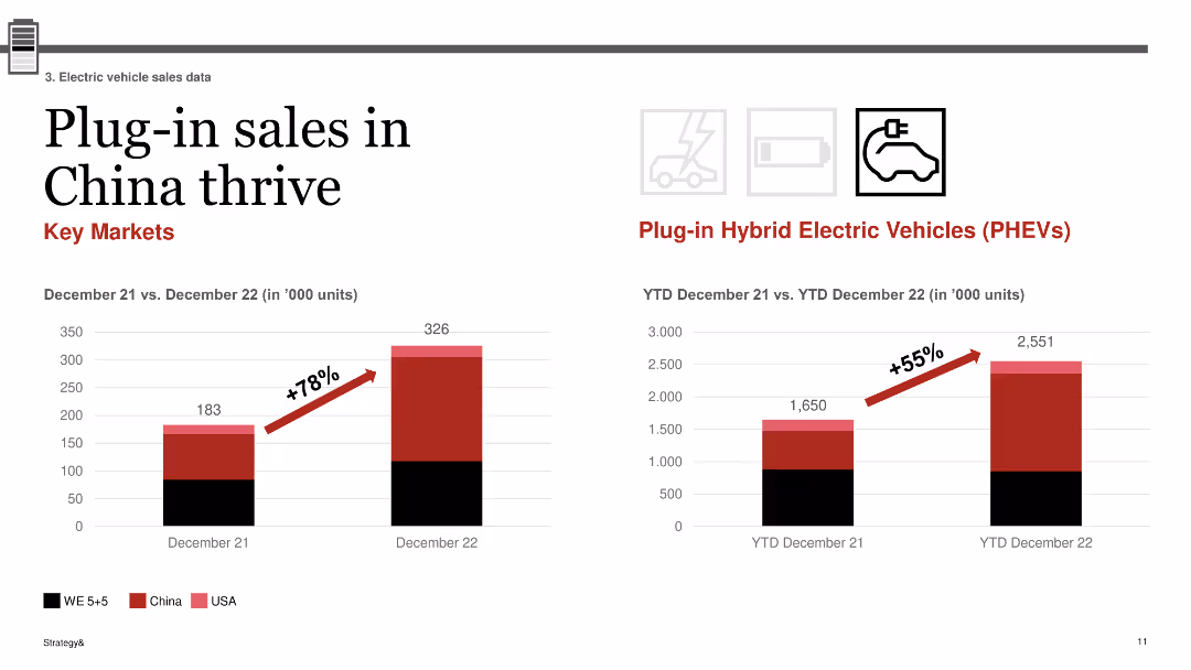
The slide contains two column charts: one depicting the increase in plug-in sales in China from December 21 to December 22, and the other showing YTD plug-in hybrid electric vehicle (PHEV) sales growth.
Market Analysis and Trends
Transportation & Logistics
This slide focuses on the thriving plug-in vehicle sales in China, showing a 78% increase from December 2021 to December 2022 and a 55% growth in PHEV sales year-to-date, underscoring China's strong market for plug-in vehicles.
plug-in sales, China, PHEV, growth, market trends
false
Market Analysis and Trends
Transportation & Logistics
Multiple Chart
PwC/Strategy&
Add to my slides
Remove from favorites
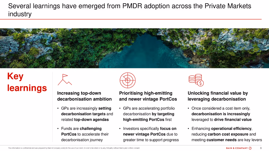
Three-column format with icons and bold section headers summarizing key learnings. Background image of a natural environment provides contrast.
Performance Metrics and KPIs
Financial Services
Summarizes insights from PMDR adoption including the importance of top-down ambition, prioritization of high-emitting assets, and the financial value of decarbonization. Highlights operational and strategic leverage points.
PMDR, financial value, top-down, high-emitting, ambition, KPIs
false
Performance Metrics and KPIs
Financial Services
Pillar
Bain
Add to my slides
Remove from favorites
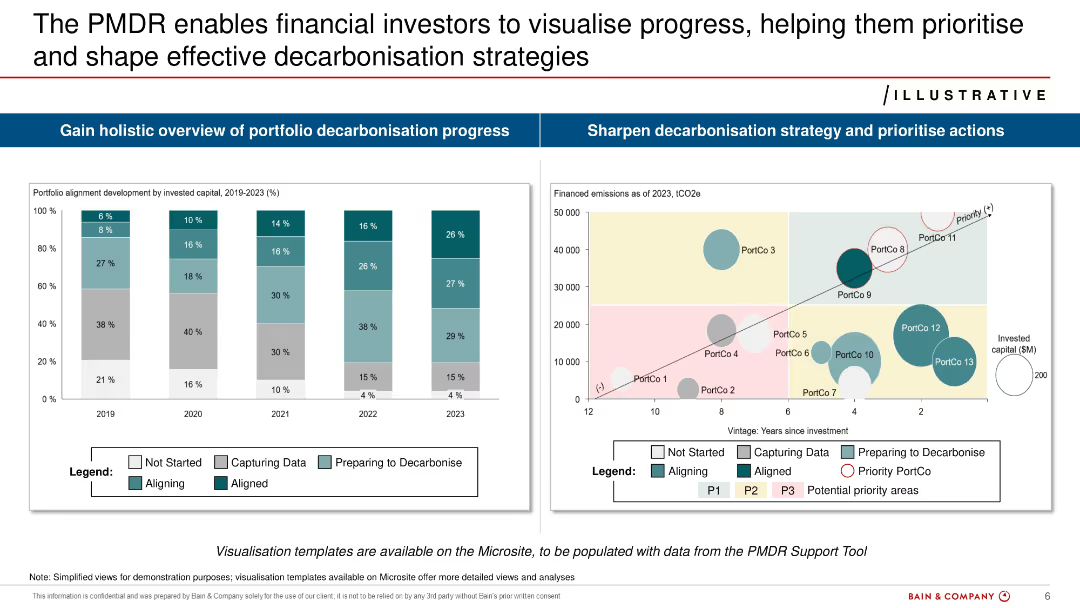
Split layout with two main graphs: bar chart of portfolio alignment (2019–2023) and bubble chart of financed emissions vs. investment age.
Risk Assessment and Management
Financial Services
Demonstrates how financial investors can use PMDR to assess decarbonization progress. Provides alignment metrics over time and visualizes emissions by portfolio company. Aims to guide prioritization and strategy.
PMDR, investors, decarbonization, emissions, portfolio, alignment, risks
false
Risk Assessment and Management
Financial Services
Multiple Chart
Bain
Add to my slides
Remove from favorites
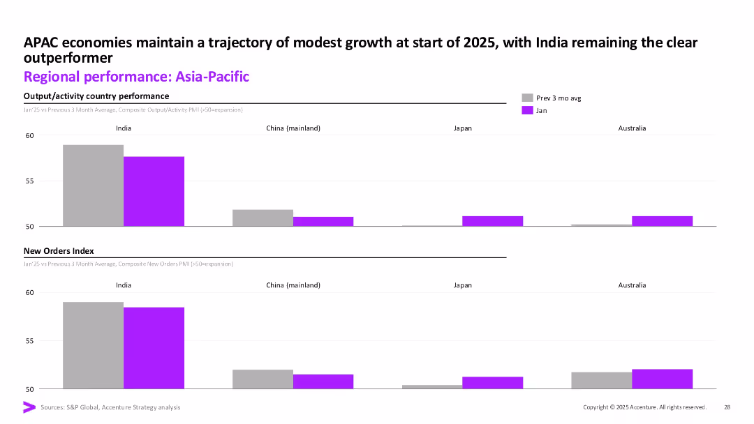
Two stacked bar charts comparing output/activity and new orders for Jan vs. 3-month avg; color-coded bars by country (India, China, Japan, Australia).
Market Analysis and Trends
Financial Services
This slide shows composite PMI data for output and new orders across key Asia-Pacific economies. India outperforms its peers, maintaining stronger momentum in both categories. Other countries show minimal changes or stagnation.
PMI, Asia-Pacific, India, Output Index, New Orders, Economic Activity, APAC, January 2025, Accenture, Market Comparison
false
Market Analysis and Trends
Financial Services
Multiple Chart
Accenture
Add to my slides
Remove from favorites
Column chart showing PMI output/activity for different countries, with a line graph for trend analysis
Market Analysis and Trends
Financial Services
The slide presents mid-month readings of business activity health for March, comparing it across various countries.
PMI, business activity, March, country snapshot, trends
false
Market Analysis and Trends
Financial Services
Multiple Chart
Accenture
Add to my slides
Remove from favorites
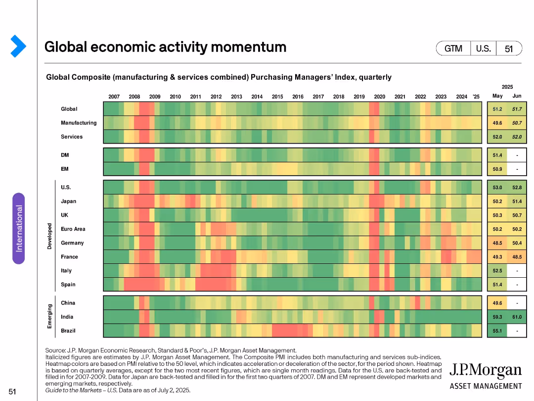
Heatmap showing global and regional Purchasing Managers’ Index (PMI) from 2007 to 2025 by quarter; color gradient.
Market Analysis and Trends
Financial Services
Tracks momentum in global economic activity through PMI data over time for various regions and sectors. Highlights recovery patterns and sector-level divergences, with color codes indicating contraction or expansion trends.
PMI, economic activity, global momentum, heatmap, manufacturing, services, recovery trends
false
Market Analysis and Trends
Financial Services
Single Chart
JP Morgan
Add to my slides
Remove from favorites
A bar chart comparing PMI survey scores for manufacturing and services across different countries, and a line chart showing composite scores over time for various economies.
Market Analysis and Trends
Professional Services
This slide presents a snapshot of PMI survey results, indicating sluggish economic activity in most major economies by the end of 2023, with some improvement in China and the US showing resilience.
PMI, Economic Activity, Manufacturing, Services, Global
false
Market Analysis and Trends
Professional Services
Multiple Chart
Accenture
Add to my slides
Remove from favorites
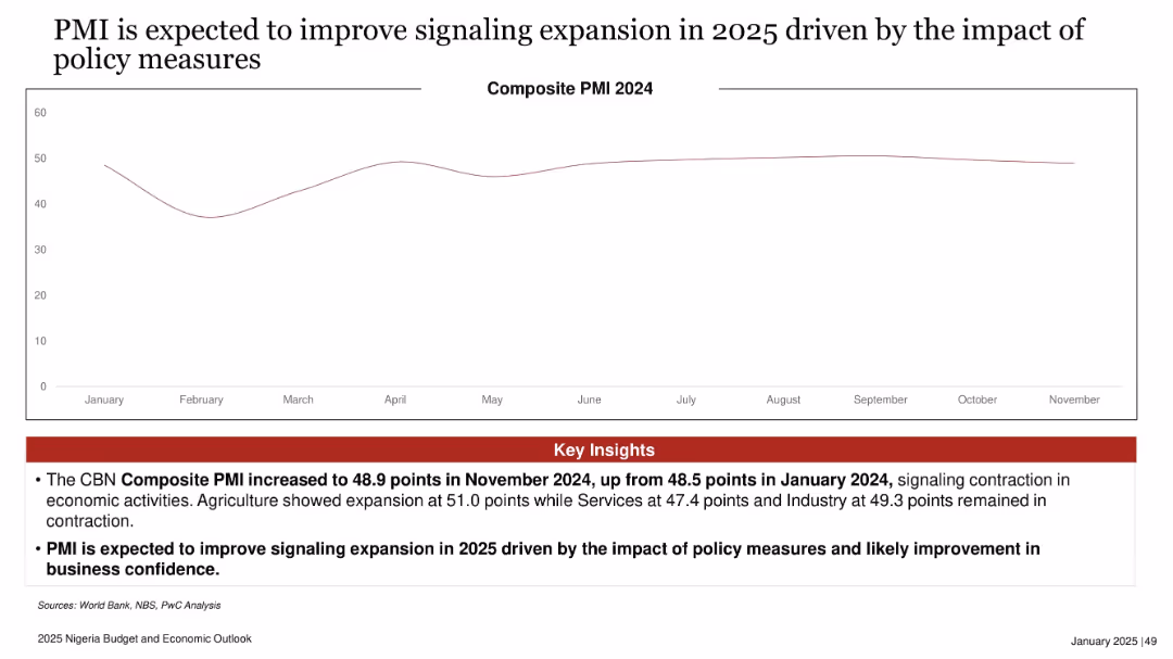
Line chart tracking Composite PMI across 2024, with key insights in red box below. Clean, spacious layout.
Performance Metrics and KPIs
Financial Services
The slide displays Nigeria's 2024 PMI trend, noting a slight improvement in November and projecting expansion in 2025 due to policy impacts. The insights emphasize sectoral variations and growing business confidence.
PMI, economic expansion, policy impact, business sentiment, composite index, Nigeria 2025, sectoral growth
false
Performance Metrics and KPIs
Financial Services
Mixed Chart
PwC/Strategy&
Add to my slides
Remove from favorites
The slide shows a line chart comparing composite PMI scores of the US, Eurozone, and UK. The background is white with a blue graphical element at the bottom. A legend is provided for color-coded lines.
Market Analysis and Trends
Financial Services
This content slide displays a line chart comparing PMI scores over time to assess the resilience of different economies. It is likely used in financial presentations to analyze economic trends, with an emphasis on recent developments and the UK's performance in relation to the US and Eurozone.
PMI, Economies, Resilience, Trends, US, Eurozone, UK, Finance, 2023
false
Market Analysis and Trends
Financial Services
Single Chart
JP Morgan
Add to my slides
Remove from favorites
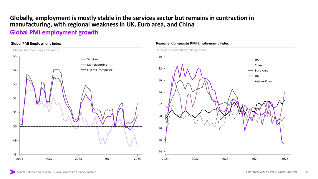
Two line charts showing global and regional PMI employment trends from 2021 to 2025, broken out by services, manufacturing, and composite.
Operational Efficiency
Professional Services
Global PMI data reveals stable employment in services but contraction in manufacturing. Regionally, UK, Euro Area, and China show persistent employment weakness, affecting overall PMI indexes.
PMI, Employment Index, Services vs Manufacturing, Global Labor Trends, Regional PMI
false
Operational Efficiency
Professional Services
Multiple Chart
Accenture
Add to my slides
Remove from favorites
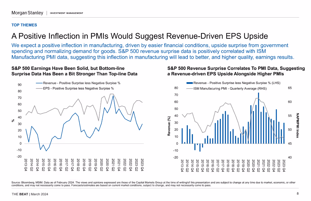
Two column charts comparing revenue positive surprises with negative surprises and ISM Manufacturing PMI data, indicating a relationship between PMI and revenue growth.
Financial Performance
Financial Services
The slide suggests that improvements in PMI data could drive revenue and EPS growth in the S&P 500. It shows historical data and correlation between PMI and revenue surprises.
PMI, EPS, S&P 500, Revenue, Correlation, Manufacturing, Financial Conditions, Growth
false
Financial Performance
Financial Services
Multiple Chart
Morgan Stanley
Add to my slides
Remove from favorites
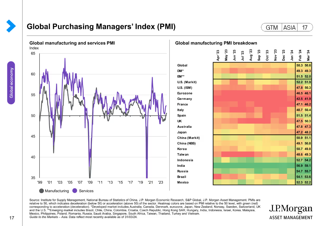
The slide includes a line chart and a heatmap. The line chart depicts the global manufacturing and services PMI over time. The heatmap provides a breakdown of global manufacturing PMIs by country, using colors to indicate performance levels.
Market Analysis and Trends
Financial Services
The slide analyzes the global Purchasing Managers' Index (PMI) for manufacturing and services, providing insights into economic activity and performance across various countries. It is used to assess economic health and trends.
PMI, global manufacturing, services, heatmap, economic performance, market analysis, country comparison, global economy
false
Market Analysis and Trends
Financial Services
Mixed Chart
JP Morgan
Add to my slides
Remove from favorites
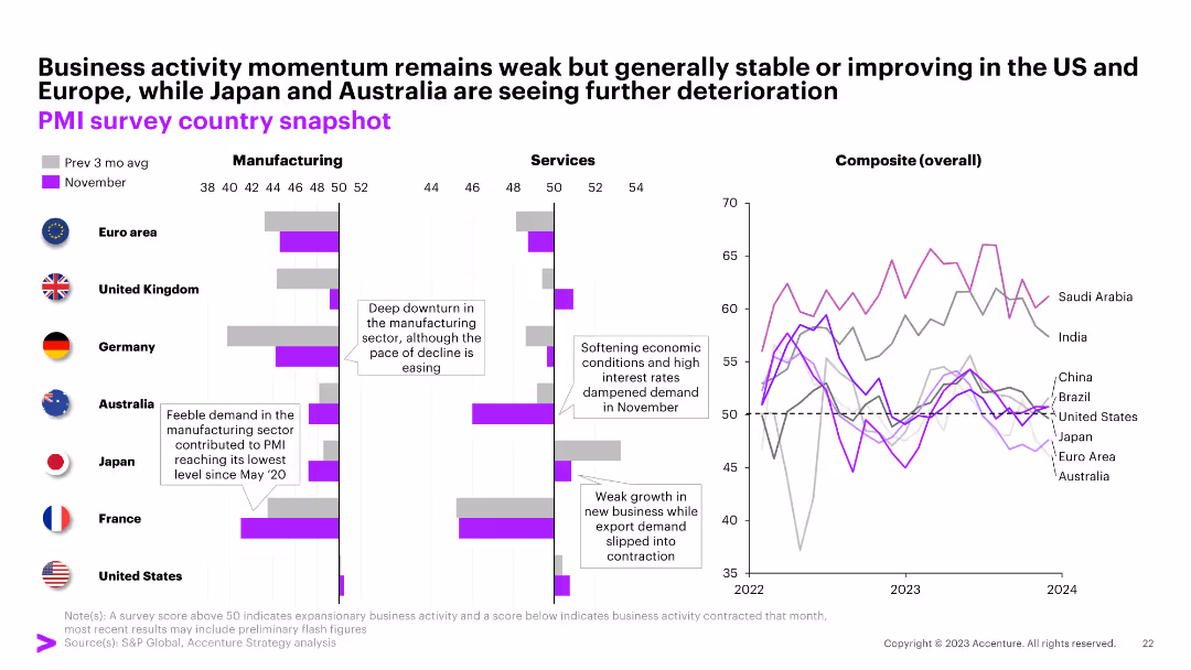
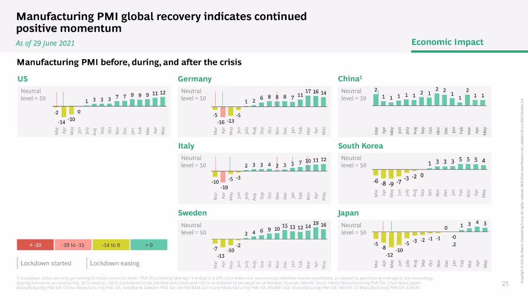
This slide features multiple bar graphs comparing the Manufacturing PMI across several countries (US, Germany, Italy, Sweden, China, South Korea, Japan) before, during, and after the crisis. Each country's graph shows monthly PMI values from January to July, with bars color-coded to indicate different levels of manufacturing activity (negative growth, neutral, positive growth). The graphs are aligned horizontally for easy comparison, with annotations indicating significant events like lockdowns, providing a clear timeline of economic activity.
Operational Efficiency
Industrial & Manufacturing
The slide compares global manufacturing performance using PMI as an indicator, making it valuable for assessing the impact of COVID-19 on the manufacturing sector. It helps stakeholders understand which regions are experiencing recovery and which are still struggling, facilitating targeted strategic decisions in supply chain management and production planning. The visual representation of PMI trends provides a quick overview of economic resilience and recovery patterns, essential for operational planning and investment decisions in the manufacturing sector.
PMI, manufacturing, COVID-19, economic recovery, global comparison, operational planning, supply chain management
false
Operational Efficiency
Industrial & Manufacturing
Multiple Chart
BCG
Add to my slides
Remove from favorites
This slide showcases bar graphs comparing manufacturing PMI before, during, and after COVID-19, with a color gradient for performance levels.
Market Analysis and Trends
Industrial & Manufacturing
Analyzes the manufacturing PMI to illustrate the economic impact of COVID-19 on different countries and recovery momentum.
PMI, manufacturing, economic impact, COVID-19, recovery
false
Market Analysis and Trends
Industrial & Manufacturing
Multiple Chart
BCG
Add to my slides
Remove from favorites
The slide contains a line chart on the left showing the global PMI for manufacturing and services from 2007 to 2023. On the right, there is a heatmap displaying the global PMI for manufacturing by country (U.S., Japan, Australia, Eurozone, China, etc.) from April 2023 to March 2024.
Market Analysis and Trends
Industrial & Manufacturing
The slide provides a detailed view of global manufacturing performance through PMI indices, offering insights into the health of the manufacturing sector across different countries.
PMI, Manufacturing, Global, Services, Heatmap
false
Market Analysis and Trends
Industrial & Manufacturing
Mixed Chart
JP Morgan
Add to my slides
Remove from favorites
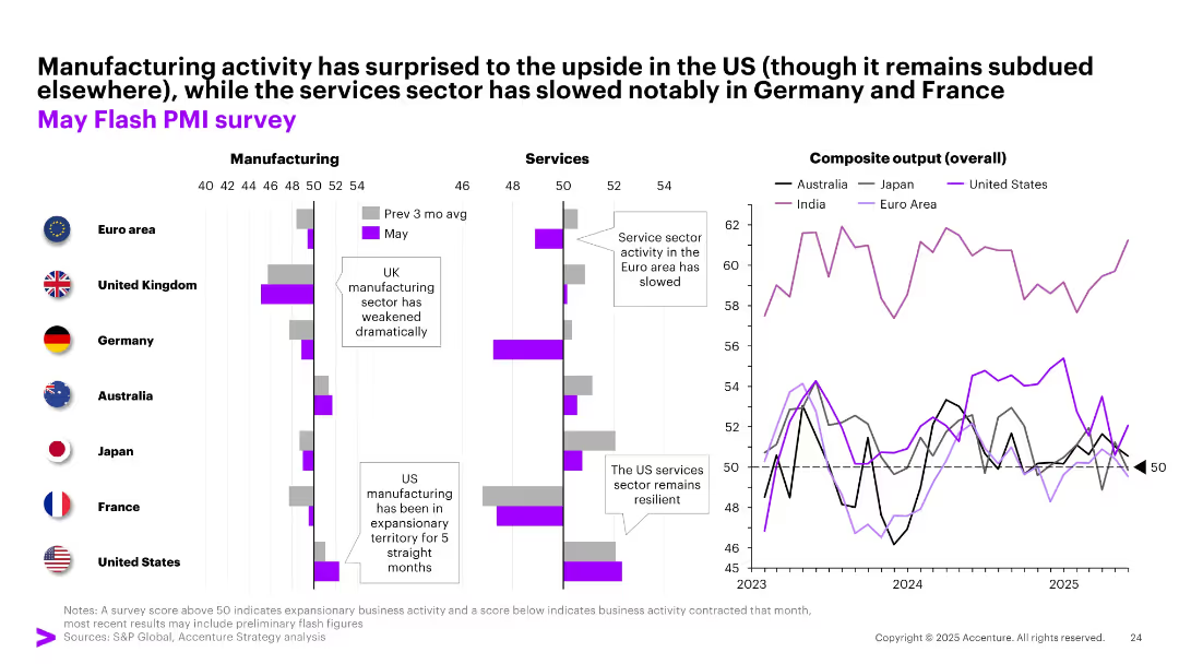
Three-section layout showing PMI data for manufacturing, services, and overall output across regions; bar and line charts used with color-coded country legends.
Performance Metrics and KPIs
Industrial & Manufacturing
This slide presents May PMI data across major economies. While US manufacturing shows resilience, services sectors in Europe have slowed. Composite output highlights divergent momentum. Corporates are encouraged to monitor sector-specific trends for better forecasting and strategy.
PMI, manufacturing, services, composite output, regional trends, US, Europe, Asia
false
Performance Metrics and KPIs
Industrial & Manufacturing
Multiple Chart
Accenture
Add to my slides
Remove from favorites
Multiple bar and line charts comparing manufacturing, services, and composite PMIs across countries. Callouts highlight US rebound and EU slowdown.
Performance Metrics and KPIs
Industrial & Manufacturing
This slide provides a snapshot of economic activity across key regions, highlighting contraction in manufacturing but resilience in the services sector, especially in the Euro area and US. Composite PMI trends indicate mixed outlooks.
PMI, manufacturing, services, economic activity, US, EU, survey
false
Performance Metrics and KPIs
Industrial & Manufacturing
Multiple Chart
Accenture
Add to my slides
Remove from favorites
The slide features two line charts with time-series data from 2007 to 2023. The charts depict the JPMorgan Global Purchasing Managers’ Index for Manufacturing and Services. The visual elements are placed on a white background with a top header in blue containing the slide title and source information.
Market Analysis and Trends
Industrial & Manufacturing
This slide presents the stability of the global manufacturing sector and the visible expansion in services as of July, with a detailed analysis of the JPMorgan Global PMI. It could be used to discuss market trends and economic outlooks.
PMI, Manufacturing, Services, Economic Outlook, Stability, Expansion, JPMorgan, Index, Global Sector, July
false
Market Analysis and Trends
Industrial & Manufacturing
Mixed Chart
McKinsey
Add to my slides
Remove from favorites
Multiple column charts showing PMI data for manufacturing and services across various countries. Includes a line chart with composite overall PMI data.
Market Analysis and Trends
Financial Services
The slide presents a snapshot of business activity momentum globally, comparing manufacturing and services PMI data across different countries, highlighting economic conditions.
PMI, manufacturing, services, global, economic
false
Market Analysis and Trends
Financial Services
Multiple Chart
Accenture
Add to my slides
Remove from favorites
The slide includes two sets of data visualizations. On the left, there are dual line graphs for manufacturing and service purchasing managers' indexes (PMIs), and on the right, there are two stock market index graphs. It uses a blue and purple color scheme, with a clear visual distinction between the datasets.
Market Analysis and Trends
Financial Services
This slide focuses on the recent performance of service and manufacturing PMIs in China and stock market trends, indicating economic activity levels. It may serve analysts and investors in evaluating the current business climate, informing decisions in the finance and manufacturing sectors.
PMI, Manufacturing, Services, Stock Market, Economic Indicators, China, Market Trends, Business Climate
false
Market Analysis and Trends
Financial Services
Multiple Chart
McKinsey
Add to my slides
Remove from favorites
The slide displays two line charts: the left chart shows monthly PMI trends for manufacturing and services, while the right chart shows stock market indexes for Shanghai SE and Shenzhen SE.
Market Analysis and Trends
Industrial & Manufacturing
The slide analyzes PMI data indicating slight increases in manufacturing and services in January. It also examines the performance of stock market indexes in February, providing insights into economic activities and market responses.
PMI, manufacturing, services, stock market indexes, economic activities
false
Market Analysis and Trends
Industrial & Manufacturing
Multiple Chart
McKinsey
Add to my slides
Remove from favorites
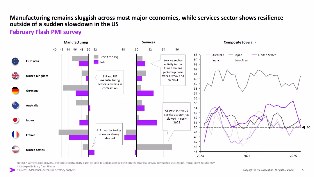
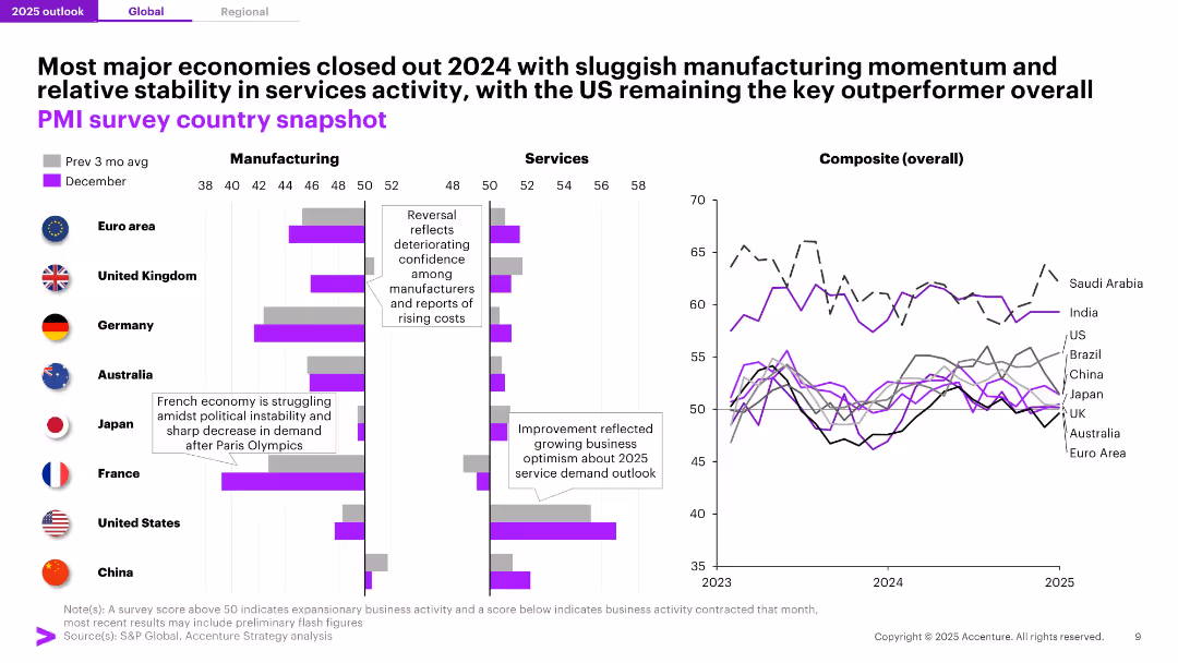
Three-column comparison of PMI indicators for manufacturing, services, and overall composite across countries; line and bar charts are used with national flags as icons. Uses purple as highlight color.
Industry Overview
Financial Services
This slide presents a snapshot of global PMI data by region and sector, showing sluggish manufacturing but more stable services activity. The U.S. stands out as an outperformer, while Europe and Asia display weakness. Includes composite economic trend lines through 2023–2025.
PMI, Manufacturing, Services, US, Eurozone, Economic Trends, Composite Index, 2024, Snapshot, Growth Outlook
false
Industry Overview
Financial Services
Multiple Chart
Accenture
Add to my slides
Remove from favorites
Column charts depicting PMI before, during, and after the crisis across different countries, with color-coded categories indicating lockdown status.
Market Analysis and Trends
Industrial & Manufacturing
Presents the global recovery of the manufacturing PMI, highlighting trends before, during, and after the COVID-19 crisis across multiple countries.
PMI, recovery, manufacturing, global, crisis
false
Market Analysis and Trends
Industrial & Manufacturing
Multiple Chart
BCG
Add to my slides
Remove from favorites
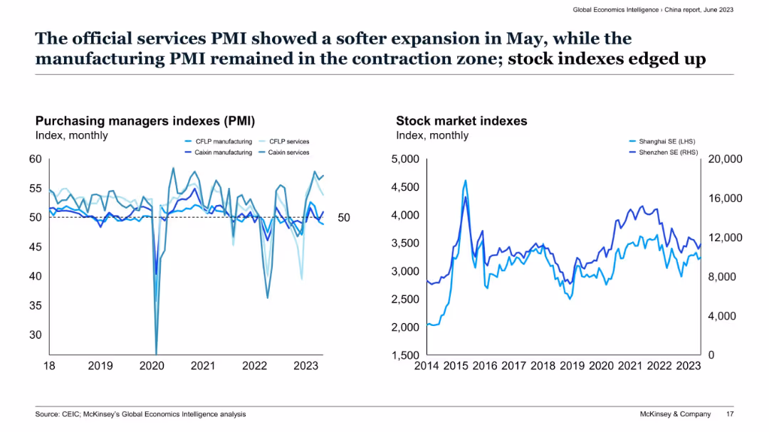
Two-panel layout with line graphs of PMI indexes (left) and stock market indexes (right) for China.
Market Analysis and Trends
Financial Services
This slide tracks monthly Purchasing Managers Indexes (PMI) for services and manufacturing in China, showing services remaining above 50 while manufacturing lags. The right chart highlights volatility in Shanghai and Shenzhen stock indexes, showing cautious optimism despite manufacturing contraction.
PMI, services sector, China economy, stock indexes, manufacturing, Caixin, CFLP, contraction, expansion, market sentiment
false
Market Analysis and Trends
Financial Services
Multiple Chart
McKinsey
Add to my slides
Remove from favorites
The slide presents a color-coded heatmap comparing global manufacturing PMIs, with varying shades indicating performance levels. The complex data is efficiently organized for at-a-glance analysis.
Market Analysis and Trends
Industrial & Manufacturing
Offering a comparative analysis of global manufacturing health, this slide is critical for assessing economic activity and could influence investment decisions in financial and manufacturing sectors. It is structured to provide quick insights into industry performance trends.
PMIs, Global, Manufacturing, Analysis
false
Market Analysis and Trends
Industrial & Manufacturing
Table
Morgan Stanley
Add to my slides
Remove from favorites
Two sets of line charts, one for Purchasing Managers' Indexes (PMIs) and one for stock market indexes, with descriptive text above.
Market Analysis and Trends
Financial Services
Shows trends in PMIs and stock market indexes, indicating economic health and investment potential, aimed at investors or market analysts.
PMIs, stock market, economic indicators, services, manufacturing, investment analysis
false
Market Analysis and Trends
Financial Services
Multiple Chart
McKinsey
Add to my slides
Remove from favorites
Two bar charts comparing PMPM costs in New England and with comparable enrollees. Text boxes explain key points and data. Moderate layout.
Financial Performance
Government & Public Sector
Comparison of MMIS spending per member per month (PMPM) in New Hampshire versus other states, suggesting cost minimization strategies.
PMPM, MMIS, Costs, Comparison, Strategy
false
Financial Performance
Government & Public Sector
Multiple Chart
Alvarez & Marsal
Add to my slides
Remove from favorites
Slide featuring bar charts detailing the share of podcast ad revenue by buy type (annual, quarterly, etc.) from 2019 to 2021, noting a return to pre-pandemic levels.
Market Analysis and Trends
Media & Entertainment
Observes the recovery of annual ad buying commitments in podcasting post-pandemic, suggesting market stabilization.
Podcast, Ad Buying, Market Recovery, Trends
false
Market Analysis and Trends
Media & Entertainment
Single Chart
PwC/Strategy&
Add to my slides
Remove from favorites
Two donut charts comparing the proportion of ad spend by delivery mechanism between 2015 and 2016, showing a shift towards dynamically inserted ads.
Market Analysis and Trends
Media & Entertainment
Analyzes shifts in podcast ad delivery mechanisms, highlighting an increase in dynamically inserted ads over the period, useful for strategic planning in advertising approaches within the media industry.
podcast, ad delivery, media trends, advertising
false
Market Analysis and Trends
Media & Entertainment
Multiple Chart
PwC/Strategy&
Add to my slides
Remove from favorites
Two donut charts displaying the distribution of podcast ad revenue by type of ad read mechanism between 2015 and 2016, noting a preference for host-read ads.
Market Analysis and Trends
Media & Entertainment
Explores revenue distribution by ad read mechanisms in podcasting, indicating a growing preference for host-read ads. Useful for media companies evaluating engagement strategies and ad format effectiveness.
podcast, ad revenue, host read, media
false
Market Analysis and Trends
Media & Entertainment
Multiple Chart
PwC/Strategy&
Add to my slides
Remove from favorites
Stacked line chart depicting quarterly podcast ad revenues from 2015 to 2020.
Financial Performance
Media & Entertainment
Analyzes seasonal trends and growth in podcast advertising revenues.
podcast, ad revenue, quarterly trends, revenue distribution
false
Financial Performance
Media & Entertainment
Single Chart
PwC/Strategy&
Add to my slides
Remove from favorites
Contains multiple column charts comparing the distribution of podcast ad lengths from 2019 to 2020, emphasizing longer ads.
Market Analysis and Trends
Media & Entertainment
Analyzes trends in podcast ad lengths, noting a significant portion exceeding 30 seconds, indicating a shift towards more detailed messaging.
podcast ads, ad lengths, detailed messaging, 2019-2020
false
Market Analysis and Trends
Media & Entertainment
Single Chart
PwC/Strategy&
Add to my slides
Remove from favorites
Slide with a column chart comparing the percentage share of podcast ad revenue by ad type (announcer-read/pre-produced, host-read, etc.) from 2019 to 2021.
Operational Efficiency
Media & Entertainment
Evaluates the shift towards announcer-read ads in podcasts, reflecting on its efficiency in ad creation and deployment.
Podcast, Ads, Announcer-Read, Efficiency
false
Operational Efficiency
Media & Entertainment
Single Chart
PwC/Strategy&
Add to my slides
Remove from favorites
This slide displays two column charts comparing the types of podcast ads by announcer-read/pre-produced versus host-read and other ads between 2019 and 2020, showing growth in announcer-read ads.
Market Analysis and Trends
Media & Entertainment
Examines the preference shift in podcast advertising towards announcer-read/pre-produced ads, suggesting a trend towards greater control in ad messaging.
podcast ads, announcer-read, pre-produced, supplied ads, messaging control, 2019-2020
false
Market Analysis and Trends
Media & Entertainment
Single Chart
PwC/Strategy&
Add to my slides
Remove from favorites
Column chart illustrating the distribution of podcast ad inventory by spot length (up to 15 seconds to over 91 seconds) across three years.
Product and Service Analysis
Media & Entertainment
Compares the standardization of podcast ad lengths to those typical in digital media, highlighting industry adoption of shorter ad formats.
Podcast, Ads, Digital Media, Ad Lengths
false
Product and Service Analysis
Media & Entertainment
Single Chart
PwC/Strategy&
Add to my slides
Remove from favorites
This slide includes a bar chart contrasting the percentage share of dynamically inserted ads (DAI) vs. edited-in/baked-in ads from 2019 to 2021.
Technology and Digital Transformation
Media & Entertainment
Highlights the significant shift towards dynamically inserted ads in podcast advertising, indicating a trend towards more agile ad delivery.
Podcast, Ads, Dynamic Insertion, Trends
false
Technology and Digital Transformation
Media & Entertainment
Single Chart
PwC/Strategy&
Add to my slides
Remove from favorites
Features a bar chart displaying the share of podcast ad revenue by ad placement (pre-roll, mid-roll, post-roll) from 2019 to 2021, showing growth in pre-roll ad placement.
Market Analysis and Trends
Media & Entertainment
Discusses the adaptation of podcasters to increased ad demand, particularly through the use of more pre-roll ads over the years.
Podcast, Ads, Placement, Trends
false
Market Analysis and Trends
Media & Entertainment
Single Chart
PwC/Strategy&
Add to my slides
Remove from favorites
Includes two bar charts detailing the share of podcast advertising revenue by placement (pre-roll, mid-roll, post-roll) from 2019 to 2020.
Market Analysis and Trends
Media & Entertainment
Discusses revenue distribution by ad placement in podcasts, with mid-roll placements remaining predominant.
podcast advertising, ad placements, mid-roll, revenue share, 2019-2020
false
Market Analysis and Trends
Media & Entertainment
Single Chart
PwC/Strategy&
Add to my slides
Remove from favorites
Two donut charts showing the buy types for podcast ads in 2017 and 2018 with color coding and detailed percentages.
Market Analysis and Trends
Media & Entertainment
Examines the purchasing patterns of podcast ads, noting an increase in programmatic buying from 2017 to 2018.
Podcast, Advertising, Buying Patterns, Programmatic, Quarterly, 2017, 2018
false
Market Analysis and Trends
Media & Entertainment
Multiple Chart
PwC/Strategy&
Add to my slides
Remove from favorites
Includes pie charts for 2019, 2020, and 2021 showing podcast ad revenue percentage by campaign type (Direct Response, Brand Awareness, etc.).
Strategic Planning
Media & Entertainment
Discusses the strategic use of direct response and brand awareness campaigns in podcast advertising to engage consumers throughout the purchase funnel.
Podcast, Advertising, Campaigns, Strategy
false
Strategic Planning
Media & Entertainment
Multiple Chart
PwC/Strategy&
Add to my slides
Remove from favorites
Displays three pie charts showing the evolution of podcast advertising campaigns by type from 2018 to 2020, highlighting a shift towards branding.
Strategic Planning
Media & Entertainment
Evaluates changes in the types of advertising campaigns in podcasts, moving from direct response to a focus on branding.
podcast advertising, campaign types, branding, direct response, 2018-2020
false
Strategic Planning
Media & Entertainment
Multiple Chart
PwC/Strategy&
Add to my slides
Remove from favorites
Two donut charts comparing the types of ads in podcasting for 2017 and 2018 with annotations and color coding.
Market Analysis and Trends
Media & Entertainment
Details the types of podcast ads used over 2017 and 2018, showing a preference for host-read ads and a decline in announcer-read/pre-produced ads.
Podcast, Advertising, Host-Read, Announcer-Read, 2017, 2018
false
Market Analysis and Trends
Media & Entertainment
Multiple Chart
PwC/Strategy&
Add to my slides
Remove from favorites
This slide uses multiple color-coded column charts to depict podcast ad revenue share by industry category between 2021 and 2022. Each industry's revenue share is represented by two bars (for each year), with annotations for percentages.
Market Analysis and Trends
Media & Entertainment
Highlights the diversity in podcast ad revenue distribution by industry, showing growth in sectors like retail and stability in others. Useful for market analysis and understanding industry-specific advertising trends.
Podcast Advertising, Industry Distribution, Revenue Trends, Media
false
Market Analysis and Trends
Media & Entertainment
Mixed Chart
PwC/Strategy&
Add to my slides
Remove from favorites
Features a bar chart showing changes in podcast advertising investments by buy type (annual, quarterly, remnant) from 2019 to 2020.
Market Analysis and Trends
Media & Entertainment
Discusses a trend shift in podcast advertising investments moving from annual to more flexible remnant buys, reflecting market agility.
podcast advertising, investment trends, annual buys, remnant buys, 2019-2020
false
Market Analysis and Trends
Media & Entertainment
Single Chart
PwC/Strategy&
Add to my slides
Remove from favorites
Presents a multi-series column chart comparing podcast advertising revenue share across various content genres from 2019 to 2020.
Market Analysis and Trends
Media & Entertainment
Analyzes shifts in podcast advertising revenue share among different genres, noting significant gains in Science and Health & Fitness.
podcast advertising, market share, content genres, science, health & fitness, 2019-2020
false
Market Analysis and Trends
Media & Entertainment
Single Chart
PwC/Strategy&
Add to my slides
Remove from favorites
Previous
Next
You don't have any favorites yet.
Please wait loading your favorites slides...
Create a FREE account to continue browsing
Receive Instant Access to 1,000+ slides from companies like McKinsey, Google, and Goldman Sachs
First Name
Last Name
Email
Password
I agree to all
Terms & Privacy Policy
Thank you! Your submission has been received!
Oops! Something went wrong while submitting the form.
Have an account?
Sign in
Upgrade to PRO to Save slides
Advanced Search and Filters
Access to 15,000+ slides
Access to Category Pages
Save/Bookmark Slides
PowerPoint Template Library
Pick a Plan
MONTHLY
$12/month
Billed every month, Cancel anytime.
YEARLY
$9/year
Billed $108 annually, Cancel anytime.
Checkout for $12/month
Checkout for $108/yr
Secured by Stripe | AES-256 bit encryption