My Account
My Slides
Search by Category
Pricing
Templates
View All Templates
Download Template Slides
✦ AI Search
Feedback
Login
Logout
Get Started
Browse all Slides
Browse all Slides
Create a FREE Account
Instant access to 1,000+ real slides from top companies like McKinsey, BCG, Goldman Sachs, Google and many more!
First Name
Last Name
Email
Password
I agree to all
Terms & Privacy Policy
Thank you! Your submission has been received!
Oops! Something went wrong while submitting the form.
Have an account?
Sign in
Saved Slides
Total No. of slides saved
0
↻ Refresh
✖ Clear all
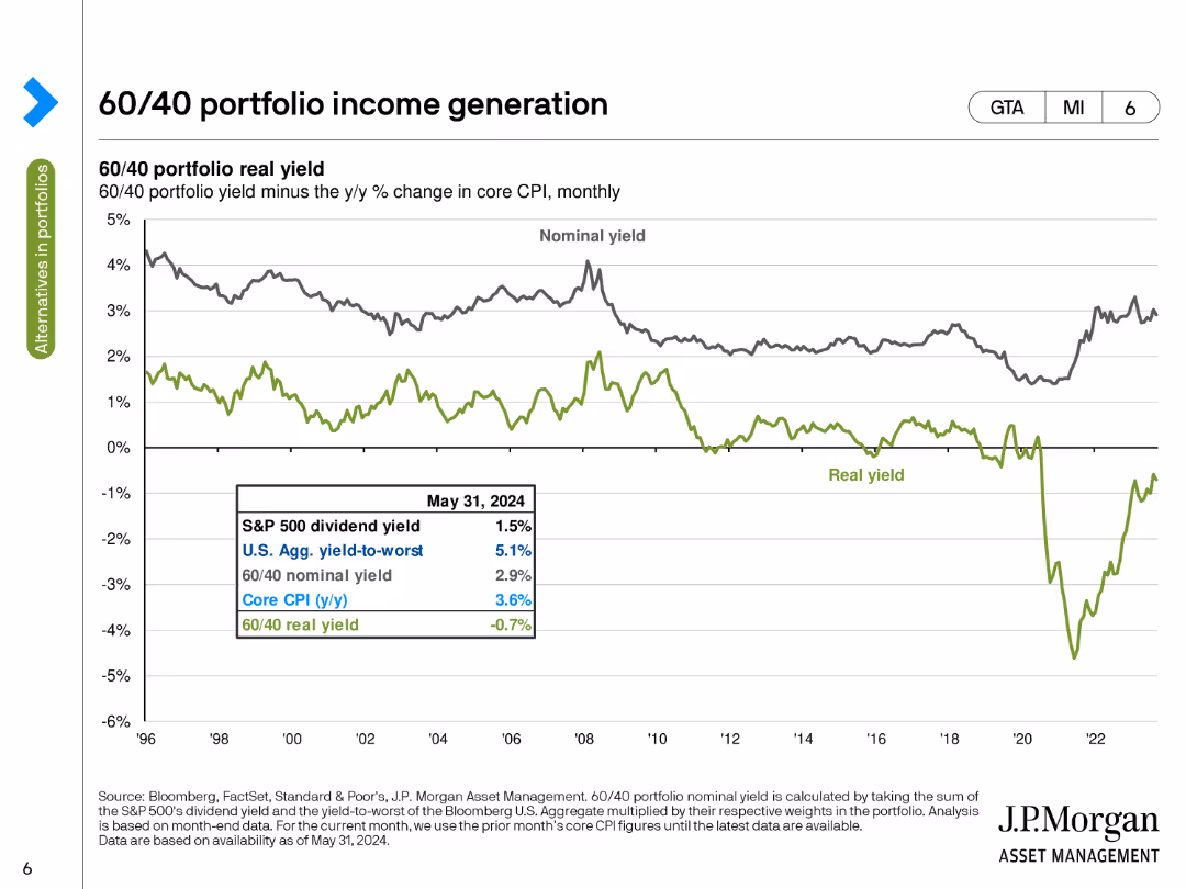
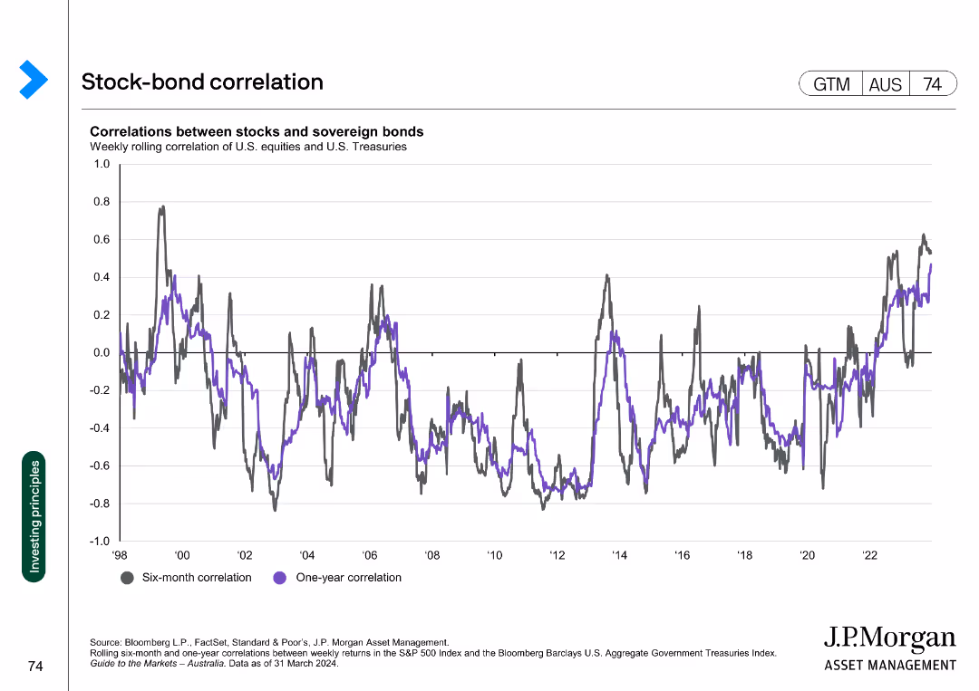
Features a line chart comparing the real and nominal yields of a 60/40 portfolio, factoring in core CPI changes over time.
Investment Analysis
Financial Services
Evaluates the real income generation of a 60/40 portfolio by comparing its yield minus the year-over-year change in core CPI.
portfolio, income, real yield, nominal yield, CPI
false
Investment Analysis
Financial Services
Single Chart
JP Morgan
Add to my slides
Remove from favorites
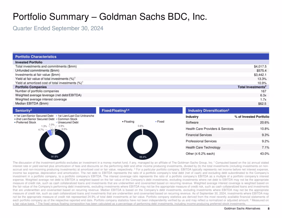
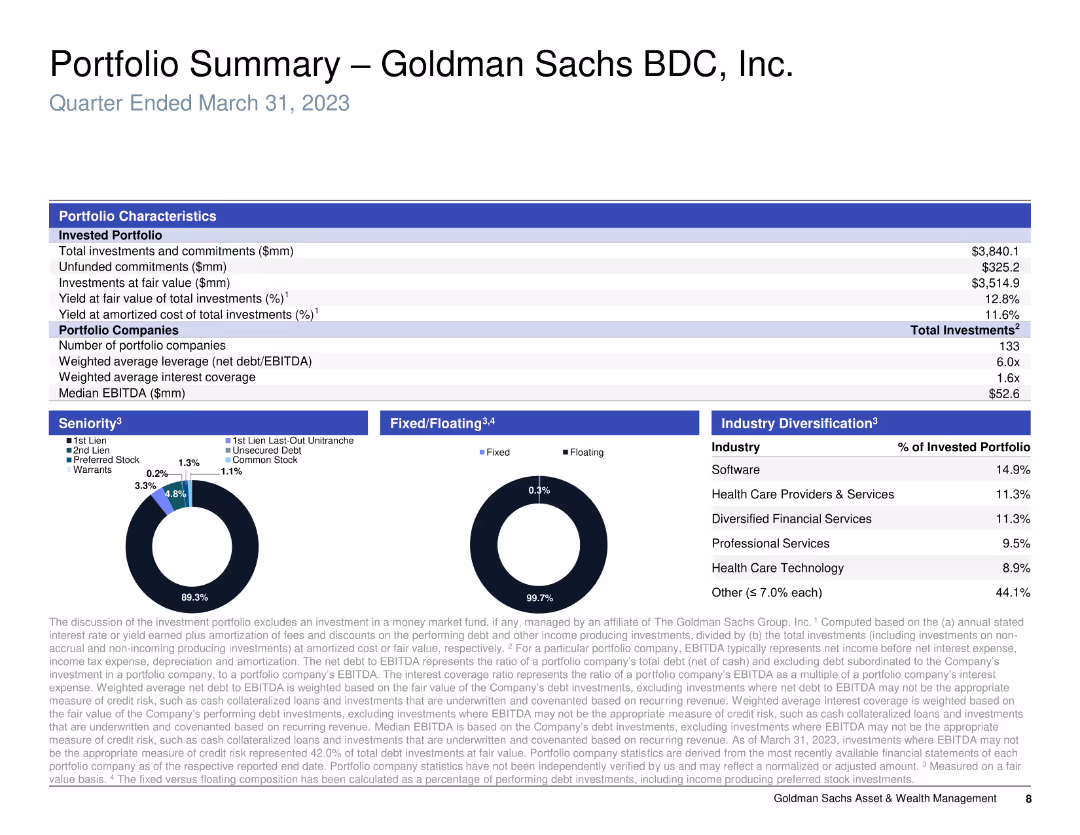
Tabular and pie chart layout; heavy use of structured text data with supporting pie charts for debt and investment diversification.
Investment Analysis
Financial Services
This slide summarizes the investment portfolio of Goldman Sachs BDC as of Q3 2024, including total investment value, sector allocation, leverage ratios, and seniority mix. It presents a snapshot of portfolio structure and performance metrics, highlighting diversification across software, healthcare, and financial services.
portfolio, investment, diversification, seniority, software, healthcare, leverage, BDC, fixed/floating
false
Investment Analysis
Financial Services
Multiple Chart
Goldman Sachs
Add to my slides
Remove from favorites
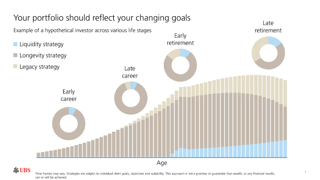
The slide features a column chart depicting different stages of life (early career to late retirement) with colored sections representing various strategies.
Market Analysis and Trends
Financial Services
The slide shows how investment strategies shift through different life stages, emphasizing the importance of adjusting the portfolio to changing goals.
Portfolio, Investment, Strategies, Goals, Lifecycle
false
Market Analysis and Trends
Financial Services
Multiple Chart
UBS
Add to my slides
Remove from favorites
The slide shows pie charts illustrating the allocation of assets in original and leveraged portfolios.
Investment Analysis
Financial Services
This slide provides an example of implementing portfolio leverage, detailing asset allocation changes before and after leveraging.
portfolio leverage, asset allocation, investment strategy, pie charts, leverage
false
Investment Analysis
Financial Services
Multiple Chart
UBS
Add to my slides
Remove from favorites
This slide has a dual-topic layout with text summaries. It discusses the need for business portfolio adjustments and activism risk management, with a straightforward design for clear communication.
Strategic Planning
Professional Services
Discusses the importance for companies to adapt their business portfolios and address activism risks, useful in strategic business planning sessions.
Portfolio Management, Activism Risk, Business Strategy, Acquisitions, Divestitures, Market Adaptation, Risk Mitigation, Business Fundamentals, Strategic Decisions, Investor Advice
false
Strategic Planning
Professional Services
Text Only
BCG
Add to my slides
Remove from favorites
Includes before and after pie charts comparing the portfolio distribution over time, alongside images of products and brands.
Financial Performance
Consumer Goods
Details the strategic shift in the company's product portfolio towards more profitable and growing market segments from 2018 to 2021.
portfolio management, strategic shift, market growth, financial performance, product focus
false
Financial Performance
Consumer Goods
Multiple Chart
Deutsche Bank
Add to my slides
Remove from favorites
The slide includes column charts depicting activity by year and asset class, along with a table of completed transactions in 2019. An image of a city street scene complements the data.
Market Analysis and Trends
Financial Services
This slide reviews the portfolio market, focusing on transaction activity by year and asset class, with detailed information on completed transactions in 2019.
portfolio market, transactions, asset class
false
Market Analysis and Trends
Financial Services
Multiple Chart
Deloitte
Add to my slides
Remove from favorites
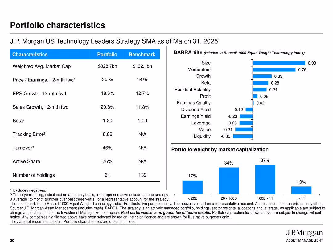
Left side contains a metrics table comparing portfolio vs. benchmark (market cap, EPS growth, beta, etc.). Right side includes BARRA tilt chart and bar graph showing portfolio weight by market capitalization. Uses blue for highlights. Grid layout with two vertical sections.
Financial Performance
Financial Services
This slide provides an overview of portfolio metrics and characteristics versus the benchmark. Key differentiators include higher market cap, EPS and sales growth, and beta. It also includes BARRA factor tilts to indicate style exposures (size, momentum, growth) and a market cap breakdown chart. These metrics help assess the risk/return profile and investment focus of the strategy.
portfolio metrics, benchmark comparison, BARRA factors, J.P. Morgan, market cap, beta, EPS growth, portfolio overview, financial characteristics
false
Financial Performance
Financial Services
Multiple Chart
JP Morgan
Add to my slides
Remove from favorites
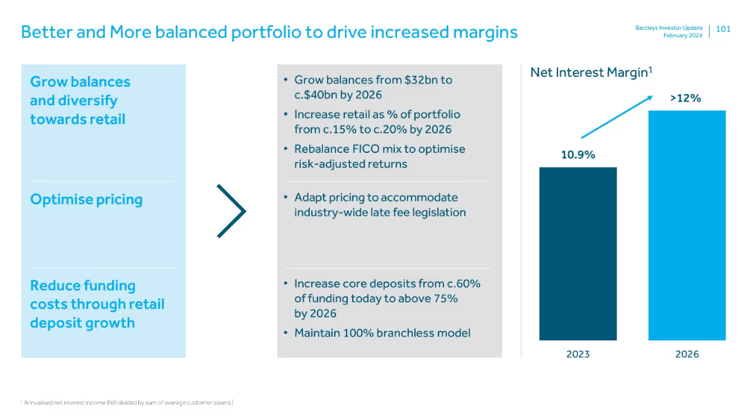
Left panel lists strategic actions; center arrow connects to NIM bar chart. Text-heavy but well-structured.
Pricing Strategies
Financial Services
Focuses on portfolio balancing and pricing strategies to increase net interest margins by 2026. Goals include higher retail mix, optimized FICO profiles, and adapting to pricing legislation while maintaining a branchless model.
portfolio mix, retail growth, pricing strategy, net interest margin, risk-adjusted returns
false
Pricing Strategies
Financial Services
Mixed Chart
Barclays
Add to my slides
Remove from favorites
The slide shows column charts comparing percentages of net sales before and after portfolio divestiture in pet categories.
Financial Performance
Consumer Goods
Analyzes changes in a company's sales structure within the pet industry, emphasizing improvements in margin and sales mix after strategic divestitures.
portfolio, net sales, pet industry, divestiture, financial analysis, margin improvement, sales mix, column chart
false
Financial Performance
Consumer Goods
Single Chart
Barclays
Add to my slides
Remove from favorites
This slide displays a column chart and a line graph. The column chart shows half-yearly rent reversion percentages, and the line graph tracks portfolio occupancy rates over time. The colors in the bar graph correlate with the periods shown on the x-axis. The line graph is superimposed to demonstrate the relationship between occupancy and rent reversion. There's also a note clarifying the occupancy calculation.
Financial Performance
Real Estate & Construction
Examines the portfolio's performance in terms of occupancy rates and rent reversion, suggesting high levels of retention and positive financial trends.
Portfolio Occupancy, Rent Reversion, Asset Management, Performance Analysis, Tenant Retention, Financial Indicators
false
Financial Performance
Real Estate & Construction
Single Chart
Morgan Stanley
Add to my slides
Remove from favorites
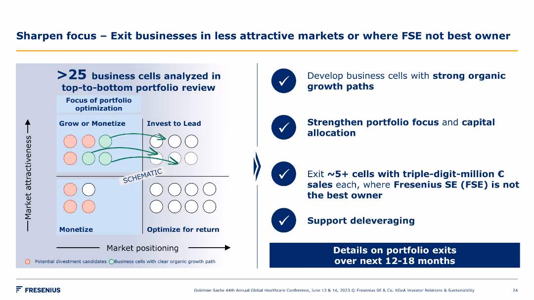
This slide features a grid chart illustrating market positioning against market attractiveness. The chart includes colored circles and arrows indicating business cell movements.
Strategic Planning
Industrial & Manufacturing
This slide analyzes over 25 business cells to develop strong organic growth paths, strengthen portfolio focus, and exit non-strategic cells to support deleveraging.
portfolio, optimization, market positioning, exits
false
Strategic Planning
Industrial & Manufacturing
Diagram
Goldman Sachs
Add to my slides
Remove from favorites
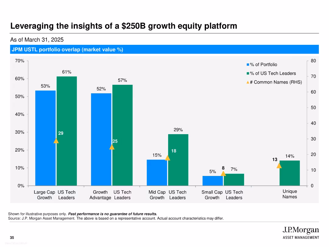
Bar chart with dual y-axes showing overlap in portfolio composition among various funds. Uses blue and green bars with yellow triangles for data points.
Investment Analysis
Financial Services
This slide shows the overlap in market value (%) between JPM USTL portfolio and various JPM funds, highlighting common stock holdings. It illustrates the extent of shared investments across fund categories like Large Cap Growth and US Tech Leaders.
portfolio overlap, JPM, growth equity, market value, tech leaders, investment platform, fund comparison, equity allocation, asset management, common holdings
false
Investment Analysis
Financial Services
Single Chart
JP Morgan
Add to my slides
Remove from favorites
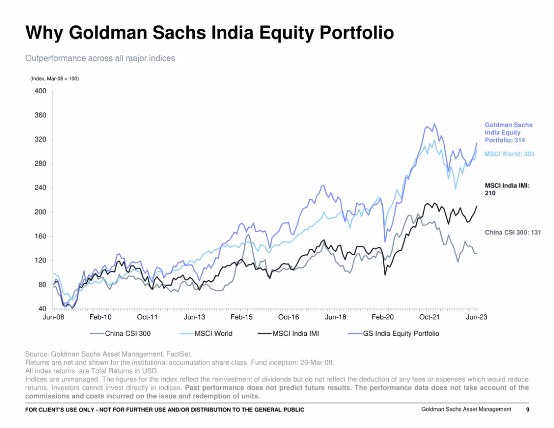
Full-slide line chart comparing multiple indices over time from 2008 to 2023; dark background lines over a white grid; minimal text, with index labels annotated directly on lines.
Financial Performance
Financial Services
Depicts the outperformance of the Goldman Sachs India Equity Portfolio versus major global indices (MSCI World, India IMI, China CSI 300) since 2008. The portfolio line leads above the others, reinforcing consistent superior returns over 15+ years.
portfolio returns, index comparison, GS India, MSCI, CSI 300, equity performance, long-term growth
false
Financial Performance
Financial Services
Single Chart
Goldman Sachs
Add to my slides
Remove from favorites
The slide contains a column chart displaying annual returns on a 60/40 stock-bond portfolio from 1994 to 2024. The chart shows equity contribution in gray, bond contribution in purple, and total return in green.
Investment Analysis
Financial Services
This slide provides an analysis of the returns on a 60/40 stock-bond portfolio, highlighting the contributions of stocks and bonds to the overall performance.
Portfolio returns, stock-bond, investment analysis, financial performance, equity, bond, annual returns, column chart
false
Investment Analysis
Financial Services
Single Chart
JP Morgan
Add to my slides
Remove from favorites
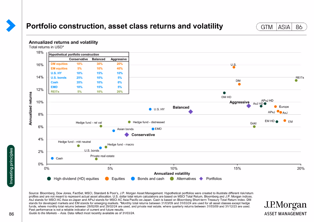
Scatter plot showing annualized returns and volatility for various asset classes and hypothetical portfolio constructions in USD.
Investment Analysis
Financial Services
This slide evaluates different asset classes in terms of returns and volatility, offering insights into portfolio construction strategies for balanced, conservative, and aggressive profiles.
portfolio, returns, volatility, asset classes, construction
false
Investment Analysis
Financial Services
Single Chart
JP Morgan
Add to my slides
Remove from favorites
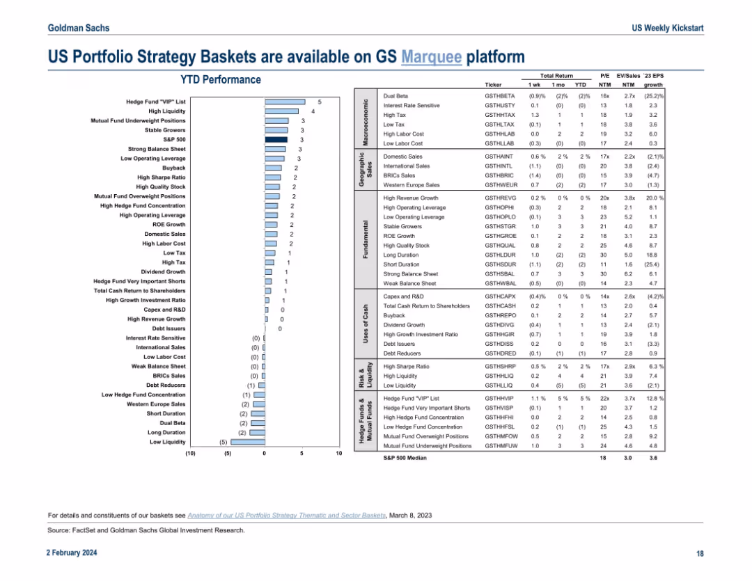
Left-side bar chart showing YTD performance of various strategy baskets. Right side contains detailed data table with tickers, returns, valuations, and EPS growth metrics. Uses a clean, side-by-side layout.
Strategic Planning
Financial Services
The slide showcases the performance and attributes of Goldman Sachs’ US portfolio strategy baskets, such as High Liquidity, Stable Growers, and Buybacks. It provides YTD performance alongside valuation multiples (P/E, EV/Sales) and earnings growth. The data supports portfolio construction and thematic investment decisions, highlighting which strategic themes are delivering returns.
portfolio strategy, GS Marquee, YTD performance, valuation, earnings growth, liquidity, stable growers, buybacks, EPS
false
Strategic Planning
Financial Services
Mixed Chart
Goldman Sachs
Add to my slides
Remove from favorites
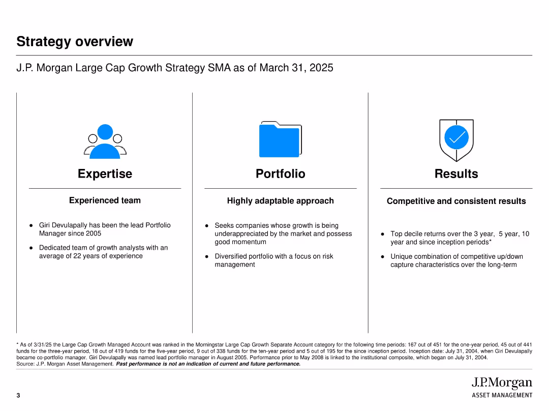
Clean three-column layout (Expertise, Portfolio, Results) with icons above each section; black-and-white design with blue highlights
Strategic Planning
Financial Services
This slide provides a strategic overview of the J.P. Morgan Large Cap Growth Strategy, emphasizing the expertise of the portfolio team, a highly adaptable investment approach, and consistently strong long-term performance metrics. It underscores the firm's experienced leadership and competitive track record.
Portfolio strategy, investment expertise, J.P. Morgan, asset management, performance, long-term results, growth investing, SMA
false
Strategic Planning
Financial Services
Pillar
JP Morgan
Add to my slides
Remove from favorites
Various charts and tables summarizing portfolio characteristics, investments, and diversification.
Financial Performance
Financial Services
Summarizes key metrics and diversification of Goldman Sachs BDC, Inc.’s portfolio, including investments and sector allocation.
portfolio, summary, Goldman Sachs, BDC
false
Financial Performance
Financial Services
Multiple Chart
Goldman Sachs
Add to my slides
Remove from favorites
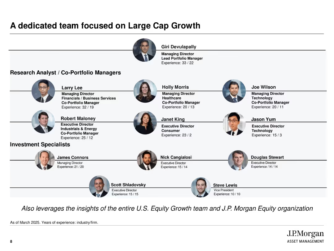
Organizational chart format with headshots and titles of team members; hierarchical structure grouped by role
Human Resources and Talent Management
Financial Services
This slide presents the structure and experience of the team managing the J.P. Morgan Large Cap Growth Strategy. It includes roles, titles, and years of experience, showcasing the depth and specialization of the research analysts, co-portfolio managers, and investment specialists.
Portfolio team, asset management, experience, large cap growth, investment specialists, J.P. Morgan, team structure, equity team
false
Human Resources and Talent Management
Financial Services
Uncategorized
JP Morgan
Add to my slides
Remove from favorites
Slide with column chart showing portfolio loans and a pie chart for commercial portfolio mix. The layout is clean, using contrasting colors for clarity.
Financial Performance
Financial Services
The slide presents the financial state of commercial portfolio loans, highlighting changes over quarters and the distribution of different loan types. It’s typically used for analyzing financial trends and the makeup of portfolio investments in a business setting.
Portfolio, Trends, Finance, Commercial, Analysis
false
Financial Performance
Financial Services
Multiple Chart
Morgan Stanley
Add to my slides
Remove from favorites
Features a comparative layout with two graphical representations of asset valuations at different times. The first part shows asset values as of December 2021, and the second part shows them for December 2022. Below, a line graph comparing net initial yield by asset class over several years is shown, correlating with German 5Y Bonds for reference. There is an explanatory note and references to valuation reports.
Financial Performance
Real Estate & Construction
Compares portfolio valuations at different time points to demonstrate resilience, especially considering economic factors such as interest rate increases.
Portfolio Valuation, Asset Management, Yield Analysis, Economic Resilience, Real Estate, Financial Assessment, Interest Rate Impact
false
Financial Performance
Real Estate & Construction
Multiple Chart
Morgan Stanley
Add to my slides
Remove from favorites
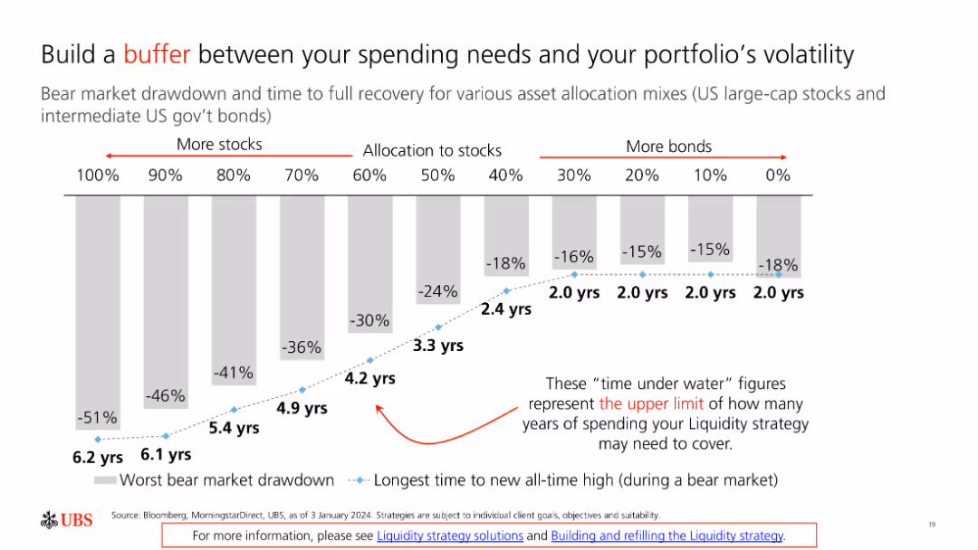
The slide includes a bar chart showing bear market drawdowns and recovery times for different asset allocation mixes, from 100% stocks to 100% bonds.
Risk Assessment and Management
Financial Services
The slide discusses strategies to mitigate portfolio volatility by adjusting asset allocation, highlighting the importance of having a financial buffer.
Portfolio, Volatility, Buffer, Asset Allocation, Risk
false
Risk Assessment and Management
Financial Services
Single Chart
UBS
Add to my slides
Remove from favorites
A column chart showing relative weightings of countries in a portfolio as of December 31, 2022. Includes India, China, South Africa, etc.
Market Analysis and Trends
Financial Services
Compares the portfolio's country allocations against the MSCI EM Index, highlighting over/under-weighted countries.
Portfolio, weightings, country, MSCI, equity
false
Market Analysis and Trends
Financial Services
Mixed Chart
Morgan Stanley
Add to my slides
Remove from favorites
A pie chart with segments in different shades of red and orange representing different positions within firms, like CEOs and HR managers, indicating the distribution of respondents by position.
Market Analysis and Trends
Professional Services
Provides insights into the distribution of different executive and managerial positions within firms, useful for understanding organizational structures and decision-making hierarchies.
positions, firms, executives, managers, organizational structure
false
Market Analysis and Trends
Professional Services
Single Chart
PwC/Strategy&
Add to my slides
Remove from favorites
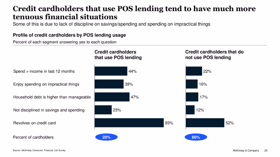
Two-column bar chart comparing POS vs. non-POS credit card users; bold title, subtitle, and segmented percentages
Customer and Market Segmentation
Financial Services
The slide compares financial behaviors of credit cardholders who use Point-of-Sale (POS) lending with those who do not. It highlights that POS users are more likely to overspend, have unmanageable debt, and lack financial discipline. 20% of cardholders use POS lending, while 80% do not.
POS lending, credit behavior, debt, overspending, financial discipline, McKinsey, segmentation, survey, consumer finance, usage comparison
false
Customer and Market Segmentation
Financial Services
Single Chart
McKinsey
Add to my slides
Remove from favorites
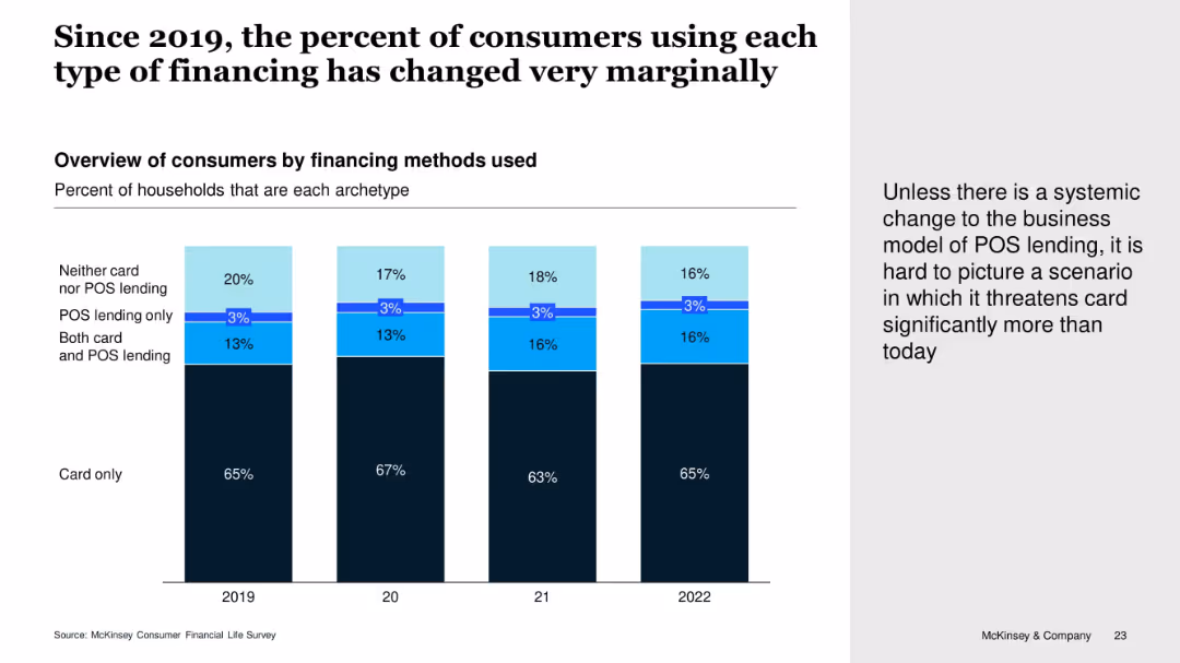
Vertical stacked bar chart showing consumer financing preferences by year (2019–2022), segmented by card use and POS lending combinations. Includes callout text on the right.
Customer and Market Segmentation
Financial Services
The slide shows little change over time in the types of consumer financing used. The majority continue to rely solely on cards, while POS lending adoption remains minimal. The narrative suggests POS lending isn't significantly threatening card use without a structural change.
POS Lending, Credit Cards, Consumer Behavior, Lending Trends, McKinsey Survey
false
Customer and Market Segmentation
Financial Services
Mixed Chart
McKinsey
Add to my slides
Remove from favorites
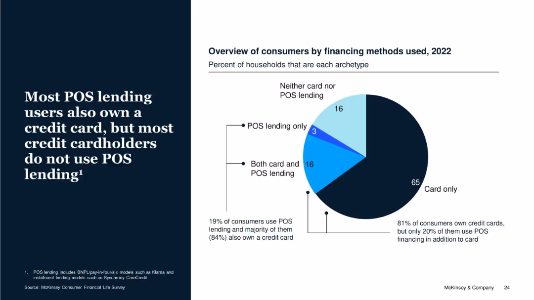
Pie chart with 2022 data on financing types among consumers. Includes explanatory text on the left with supporting percentages on chart.
Customer and Market Segmentation
Financial Services
The slide emphasizes that while 19% of consumers use POS lending, the majority also have credit cards. It highlights that POS lending is supplementary rather than substitutive to credit cards, with 81% of consumers owning cards and most not using POS lending.
POS Lending, Credit Cards, Consumer Types, Ownership, Financing, BNPL
false
Customer and Market Segmentation
Financial Services
Mixed Chart
McKinsey
Add to my slides
Remove from favorites
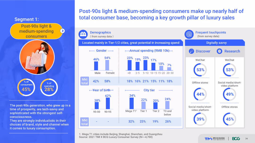
The slide uses a content layout with demographic charts, spending data, and touchpoint information. It details the demographics and spending behavior of post-90s light & medium-spending consumers, highlighting their role in luxury sales growth. The visual complexity is moderate, with well-organized sections.
Customer and Market Segmentation
Consumer Goods
This slide provides a detailed profile of post-90s light and medium-spending consumers, including demographics, spending habits, and preferred touchpoints. It emphasizes their importance in driving luxury sales growth.
post-90s consumers, demographics, spending behavior, luxury market, touchpoints
false
Customer and Market Segmentation
Consumer Goods
Multiple Chart
BCG
Add to my slides
Remove from favorites
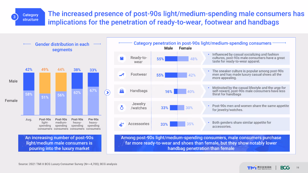
The slide presents gender distribution and category penetration data through column charts and text. It compares the purchasing behaviors of male and female consumers within the post-90s segment. The visual complexity is moderate, with clear segmentation and color-coding.
Market Analysis and Trends
Consumer Goods
This slide explores the impact of post-90s male consumers on the luxury market, focusing on ready-to-wear, footwear, and handbags. It provides gender-based comparisons and insights into purchasing patterns.
post-90s consumers, gender distribution, luxury market, trends, consumer behavior
false
Market Analysis and Trends
Consumer Goods
Multiple Chart
BCG
Add to my slides
Remove from favorites
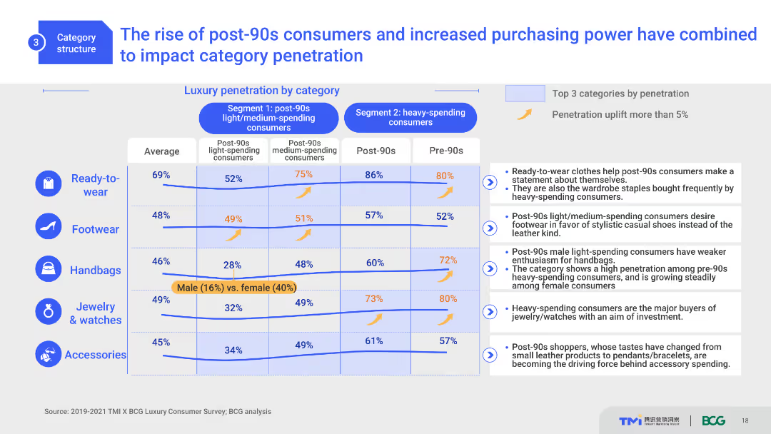
This slide includes a comparative layout with column charts and a table. It shows luxury category penetration by different consumer segments, highlighting the impact of post-90s consumers. The design is moderately complex with clear distinctions between segments and categories.
Market Analysis and Trends
Consumer Goods
This slide analyzes the influence of post-90s consumers on luxury market penetration across different categories. It compares segment-specific data, highlighting purchasing trends and the significant impact of younger consumers.
post-90s consumers, luxury market, category penetration, trends, consumer segments
false
Market Analysis and Trends
Consumer Goods
Mixed Chart
BCG
Add to my slides
Remove from favorites
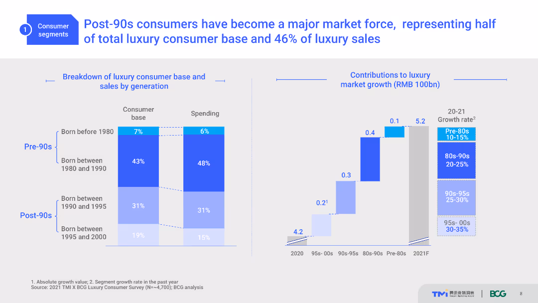
The slide includes a column chart showing the breakdown of luxury consumer base and sales by generation, highlighting the contributions to market growth.
Market Analysis and Trends
Retail & E-commerce
This slide details the impact of post-90s consumers on the luxury market, showing their substantial contribution to total luxury sales and market growth, emphasizing the significance of this demographic group.
Post-90s consumers, luxury market, generation, market growth, consumer base
false
Market Analysis and Trends
Retail & E-commerce
Multiple Chart
BCG
Add to my slides
Remove from favorites
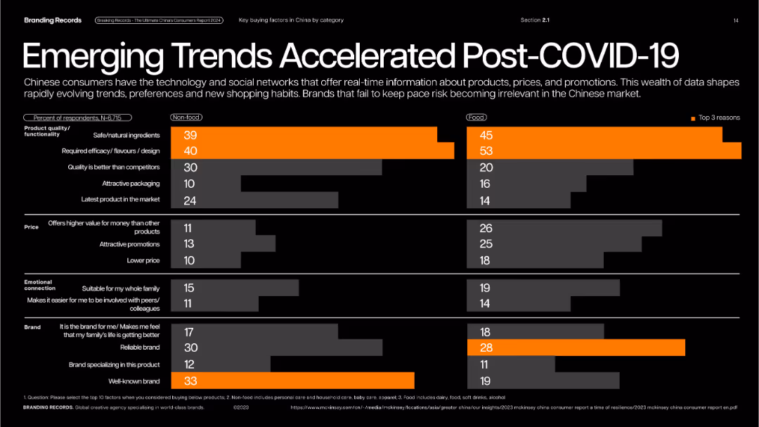
Black background with horizontal bar charts comparing food and non-food factors; color-coded highlights.
Performance Metrics and KPIs
Consumer Goods
Compares post-COVID trends driving purchases—natural ingredients, efficacy, value for money, and brand trust across food and non-food categories. Focus on evolving consumer priorities and expectations.
post-COVID, product quality, value, branding, food vs non-food, buying behavior
false
Performance Metrics and KPIs
Consumer Goods
Single Chart
McKinsey
Add to my slides
Remove from favorites
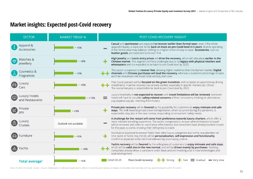
The slide features bar charts and textual analysis to project market recovery trends post-COVID-19, including expected growth rates for different sectors.
Market Analysis and Trends
Retail & E-commerce
Projects the post-COVID recovery of the luxury market, detailing expected recovery rates and key insights across various sectors like apparel and watches.
post-COVID, recovery, market, luxury, retail, e-commerce, growth, projections, sectors
false
Market Analysis and Trends
Retail & E-commerce
Mixed Chart
Deloitte
Add to my slides
Remove from favorites
This slide features a bar chart comparing post-harvest losses as a percentage of agricultural produce among different countries, with Nigeria highlighted for its particularly high loss rate.
Strategic Planning
Agriculture & Food Production
The slide presents a stark comparison of post-harvest losses across countries, emphasizing Nigeria's challenges within the agricultural sector and advocating for improvements in food storage and transportation systems to mitigate these losses.
Post-Harvest Loss, Agriculture, Nigeria, Comparison, Global
false
Strategic Planning
Agriculture & Food Production
Single Chart
BCG
Add to my slides
Remove from favorites
The slide shows a bar chart on the right side and an illustration of a man with a briefcase on the left, set against a gradient background. The design is modern with clean lines and simple icons.
Market Analysis and Trends
Professional Services
It reflects on the eagerness of different generations to return to normalcy post-pandemic, focusing on activities such as dining out and travel. This slide is ideal for discussing market shifts and consumer behavior in a post-pandemic economy.
post-pandemic, consumer behavior, millennials, Gen Z, market trends, dining out, work preferences, travel
false
Market Analysis and Trends
Professional Services
Mixed Chart
Deloitte
Add to my slides
Remove from favorites
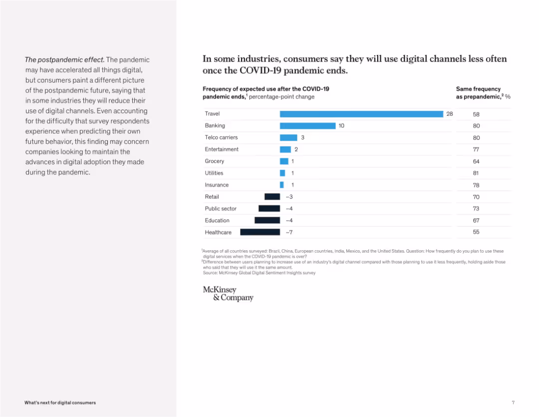
Left-aligned narrative with a horizontal bar chart on right. Simple black-and-white scheme with blue bars.
Market Analysis and Trends
Technology & Software
This slide illustrates expected changes in digital channel usage post-pandemic across industries. Travel and banking show large decreases, while sectors like insurance and utilities are expected to remain stable. This shift may challenge companies that benefitted from temporary digital adoption.
post-pandemic, digital usage, trends, industry change, travel, banking, decline, survey, COVID-19, future outlook
false
Market Analysis and Trends
Technology & Software
Mixed Chart
McKinsey
Add to my slides
Remove from favorites
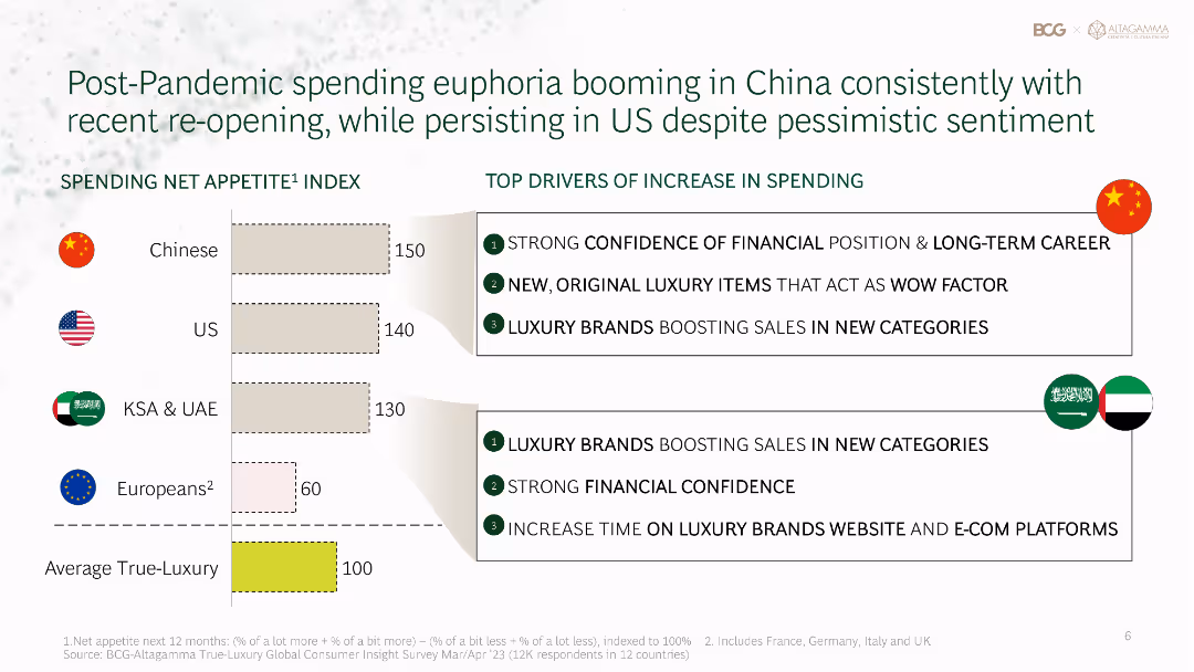
Bar chart and text showing the spending net appetite index across different regions, with a focus on the top drivers of increased spending post-pandemic.
Market Analysis and Trends
Consumer Goods
Highlights post-pandemic spending trends in the luxury market, with a focus on increased spending in China and the US, driven by financial confidence and new categories.
post-pandemic, spending trends, luxury market, China, US
false
Market Analysis and Trends
Consumer Goods
Mixed Chart
BCG
Add to my slides
Remove from favorites
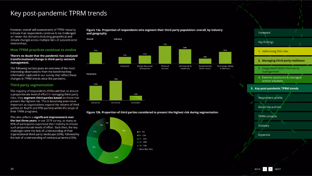
The slide has multiple column charts and a pie chart, showing the proportion of respondents segmenting third-party population by industry and geography.
Market Analysis and Trends
Professional Services
It highlights trends in third-party risk management (TPRM) post-pandemic, focusing on segmentation practices and the highest risk third parties.
post-pandemic trends, third-party segmentation, pie chart, column charts, TPRM, professional services
false
Market Analysis and Trends
Professional Services
Multiple Chart
Deloitte
Add to my slides
Remove from favorites
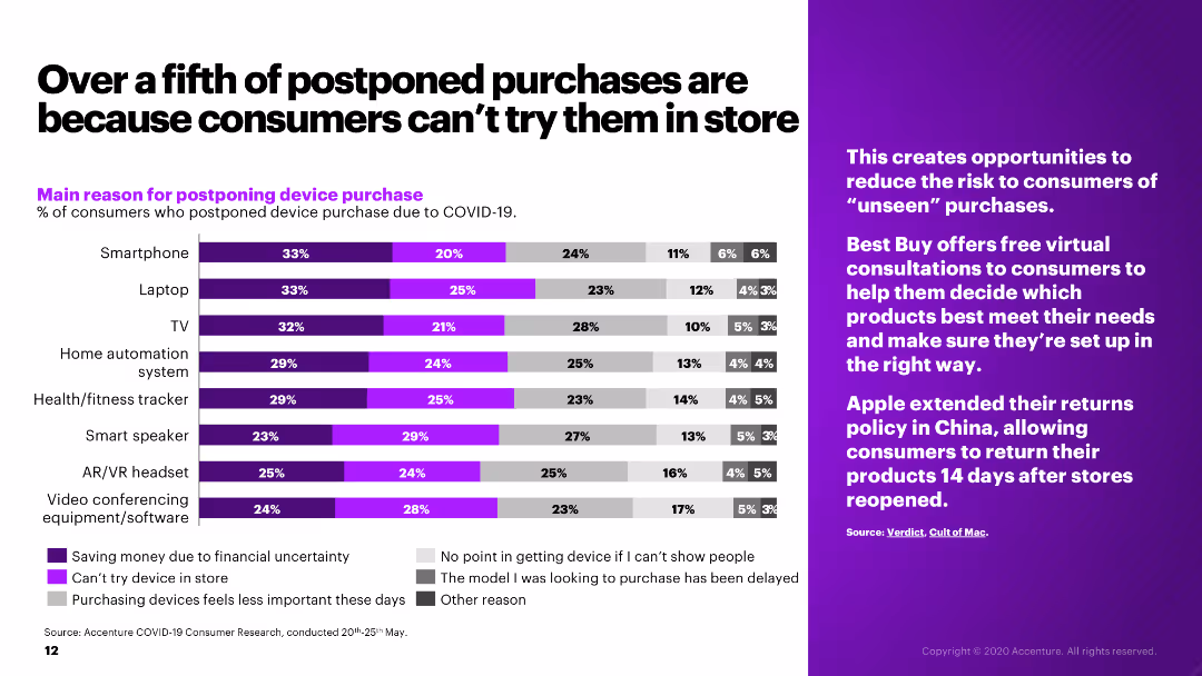
The slide presents a bar chart showing the main reasons for postponing device purchases due to COVID-19, alongside a sidebar with relevant industry insights.
Market Analysis and Trends
Retail & E-commerce
The slide examines the reasons for postponing electronic device purchases during COVID-19, such as financial uncertainty and inability to try products in-store.
postponed purchases, COVID-19, consumer behavior, electronics, retail
false
Market Analysis and Trends
Retail & E-commerce
Mixed Chart
Accenture
Add to my slides
Remove from favorites
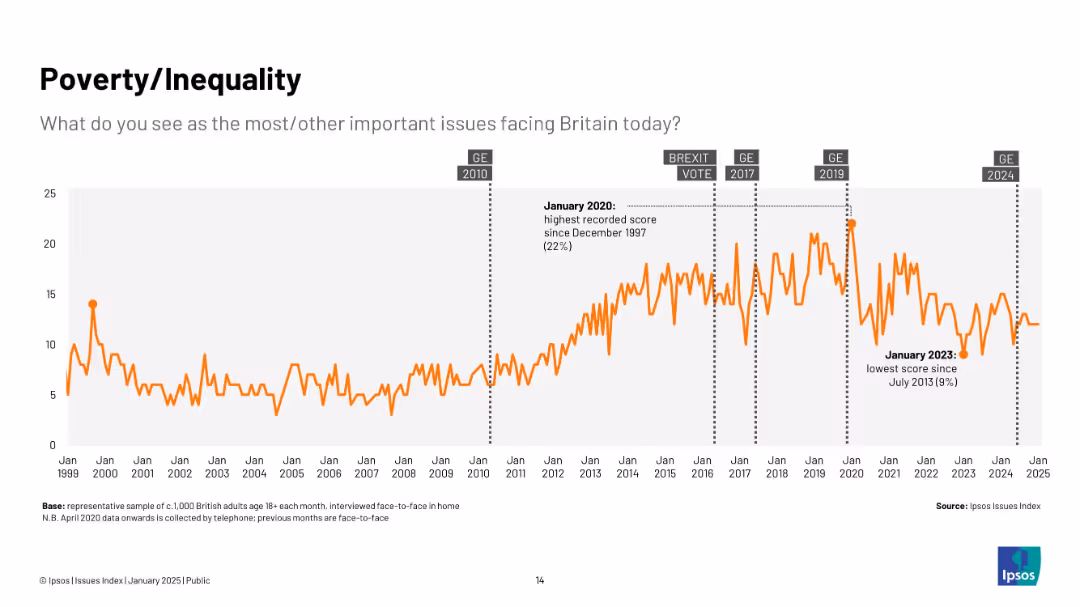
Line chart from 1999–2025; orange line tracks concern over poverty/inequality, with annotations at high (2020) and low (2023) points.
Market Analysis and Trends
Government & Public Sector
Shows growing concern over poverty and inequality, especially post-2010, with a spike in 2020 and a notable dip in 2023.
poverty, inequality, economic concern, trends, UK, public sentiment, Ipsos, social issues
false
Market Analysis and Trends
Government & Public Sector
Single Chart
IPSOS
Add to my slides
Remove from favorites
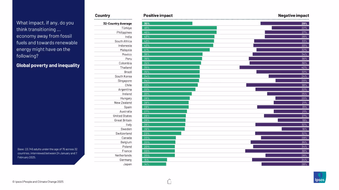
Bar chart of 32 countries comparing positive and negative views on how energy transition might impact global poverty and inequality.
Technology and Digital Transformation
Environmental Services & Sustainability
The slide focuses on the perceived social equity impact of moving to renewables. Public opinion is divided; countries like Türkiye, Philippines, and India show higher optimism, while Germany and Japan are more pessimistic. Overall perceptions are cautiously hopeful.
poverty, inequality, energy transition, social impact, renewables, survey, Ipsos, perception, global development
false
Technology and Digital Transformation
Environmental Services & Sustainability
Mixed Chart
IPSOS
Add to my slides
Remove from favorites
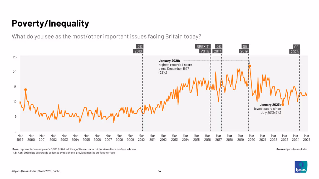
Line graph in orange; vertical spikes over time from 1999 to 2025; annotated with political events.
Market Analysis and Trends
Government & Public Sector
The slide visualizes public concern about poverty and inequality in Britain over time. Concern rises notably around elections and economic events, peaking in January 2020.
poverty, inequality, social issues, Ipsos, UK, trends, economy, general election, public opinion, 2020 peak
false
Market Analysis and Trends
Government & Public Sector
Single Chart
IPSOS
Add to my slides
Remove from favorites
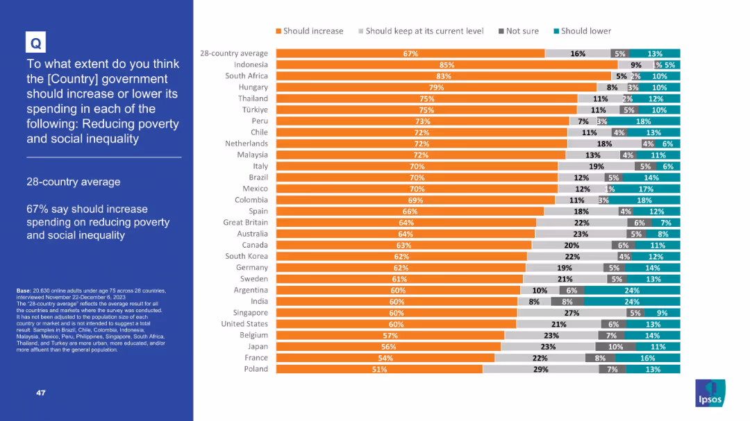
Bar chart with stacked segments showing support levels for increasing social spending
Strategic Planning
Government & Public Sector
Respondents from 28 countries were asked about increasing government spending to reduce poverty and inequality. 67% on average support it. Highest support comes from Indonesia (85%) and South Africa (83%).
Poverty, inequality, social spending, global policy, public opinion, Ipsos, economic justice, government strategy
false
Strategic Planning
Government & Public Sector
Mixed Chart
IPSOS
Add to my slides
Remove from favorites
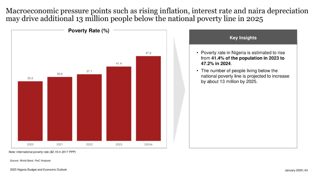
Bar chart showing poverty rate from 2020 to 2024e; side box with key insights; red and gray design.
Risk Assessment and Management
Government & Public Sector
Projects Nigeria’s poverty rate will rise to 47.2% in 2024, with 13 million more people expected to fall below the poverty line by 2025. Highlights inflation, interest rate hikes, and naira depreciation as key contributing macroeconomic pressures.
poverty rate, inflation, naira depreciation, interest rate, Nigeria, 2025, economic stress, social impact
false
Risk Assessment and Management
Government & Public Sector
Mixed Chart
PwC/Strategy&
Add to my slides
Remove from favorites
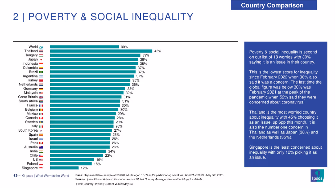
Horizontal bar chart on the left showing percentage of people concerned about poverty and inequality across countries. Flags and country names on left; bars extend right with percentages. Right panel has a narrative box in dark blue. Clear, minimalist design.
Market Analysis and Trends
Government & Public Sector
The slide highlights concern levels around poverty and social inequality globally. Thailand ranks highest (45%), while Singapore is the least concerned (12%). The global average concern is 30%, tied with February 2022 as the lowest recent level. The slide provides insights into public perception trends and highlights countries where inequality is the top concern.
poverty, social inequality, concern levels, Ipsos, survey results, global sentiment, economic disparity, regional comparison, public perception, inequality trend
false
Market Analysis and Trends
Government & Public Sector
Mixed Chart
IPSOS
Add to my slides
Remove from favorites
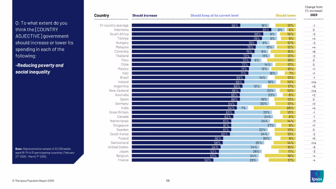
Horizontal bar chart comparing 31 countries on views regarding government spending on poverty/social inequality; segmented by "Should increase", "Keep", and "Should lower".
Strategic Planning
Government & Public Sector
The slide presents public opinion from 31 countries on whether their governments should increase, maintain, or lower spending on reducing poverty and social inequality. The chart shows a strong majority favoring increased spending across most countries.
poverty, social inequality, public spending, government, Ipsos, support, policy, countries, survey, budget
false
Strategic Planning
Government & Public Sector
Mixed Chart
IPSOS
Add to my slides
Remove from favorites
The slide features a column chart forecasting power energy consumption by fuel type (fossil fuels, nuclear, hydro, other renewables, bioenergy) from 2018 to 2040 under a stated scenario. It includes data on the contribution of bioenergy growth in the power segment and economic competitiveness of bioenergy.
Market Analysis and Trends
Energy & Utilities
This slide projects power energy consumption by different fuel types until 2040, focusing on the competitive advantage of bioenergy in the power segment and its expected growth compared to other renewable and non-renewable sources.
power energy consumption, forecast, fuel type, 2018-2040, bioenergy, fossil fuels, nuclear, hydro, renewables, economic competitiveness
false
Market Analysis and Trends
Energy & Utilities
Mixed Chart
Kearney
Add to my slides
Remove from favorites
The slide features a column chart comparing electricity generation per capita for various African countries in 2022. Key insights and outlooks discuss Nigeria's investment needs to increase power generation capacity by 2043.
Investment Analysis
Energy & Utilities
The slide discusses Nigeria's requirement for substantial investment to increase power generation capacity by 2043, comparing current electricity generation levels with other African countries. It highlights the implications for economic growth and productivity.
power generation, investment, electricity generation, economic growth, productivity
false
Investment Analysis
Energy & Utilities
Mixed Chart
PwC/Strategy&
Add to my slides
Remove from favorites
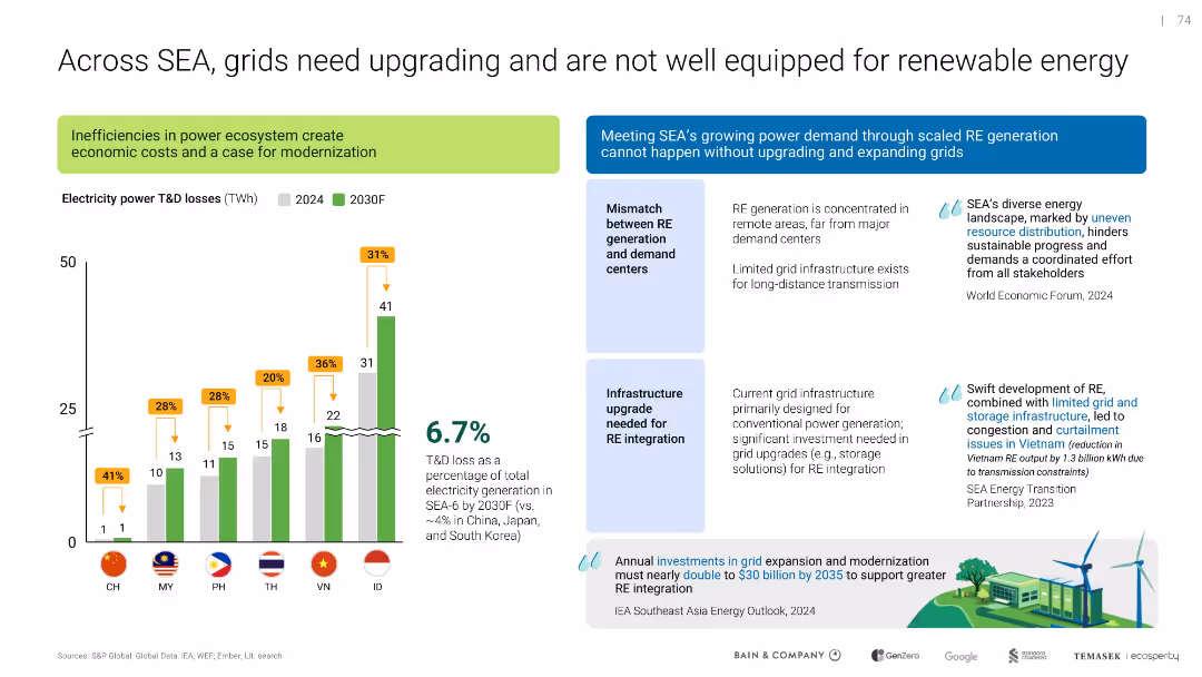
Combination of bar graphs, callout boxes, and key statistics; left-aligned chart shows T&D losses; text blocks explain challenges and proposed investments
Operational Efficiency
Energy & Utilities
Highlights the inefficiencies in Southeast Asia’s power transmission and distribution systems, which lead to high losses and hinder renewable energy adoption. Emphasizes the need for grid upgrades to support RE integration.
power grid, renewable energy, T&D losses, modernization, infrastructure, SEA
false
Operational Efficiency
Energy & Utilities
Mixed Chart
Bain
Add to my slides
Remove from favorites
Slide with moderate visual complexity containing a blue color theme and icons for power storage, distribution, and an electric vehicle, alongside categorized text sections.
Operational Efficiency
Energy & Utilities
Covers aspects of power storage and distribution, including smart grids and electric vehicle charging infrastructure, crucial for the future of clean energy.
power storage, power distribution, smart grid, electric vehicle, clean energy, infrastructure, energy optimization, future
false
Operational Efficiency
Energy & Utilities
Header Horizontal
McKinsey
Add to my slides
Remove from favorites
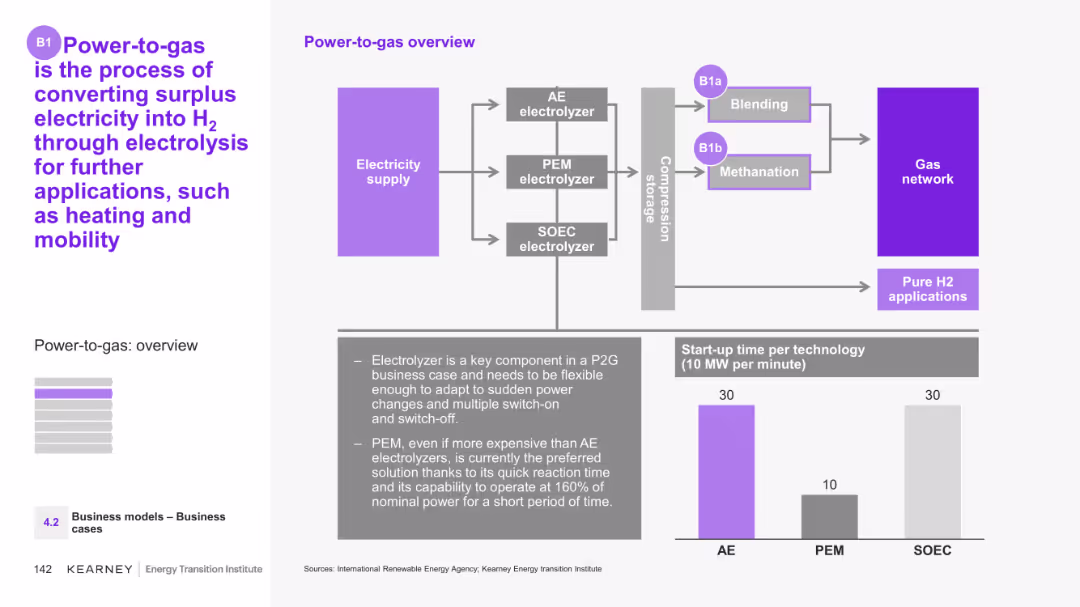
The slide includes a detailed diagram showing the Power-to-gas process, illustrating the flow from electricity supply through different types of electrolyzers to various end uses. It also includes a bar chart comparing start-up times for different technologies.
Technology and Digital Transformation
Energy & Utilities
This slide provides an overview of the Power-to-gas process, explaining how surplus electricity is converted into hydrogen via electrolysis. It details the technologies involved and their applications in heating and mobility.
Power-to-gas, electrolysis, surplus electricity, hydrogen, technology comparison
false
Technology and Digital Transformation
Energy & Utilities
Mixed Chart
Kearney
Add to my slides
Remove from favorites
The slide features a graph comparing carbon reduction potential versus carbon abatement cost for different power-to applications and renewable productions.
Technology and Digital Transformation
Energy & Utilities
The slide discusses the high potential of various power-to applications and renewable production methods to decarbonize their respective sectors at low cost.
power-to-mobility, power-to-power, injection, renewable production, decarbonization
false
Technology and Digital Transformation
Energy & Utilities
Single Chart
Kearney
Add to my slides
Remove from favorites
The slide shows a complex diagram outlining the value chain of hydrogen-based energy conversion solutions. It includes multiple boxes connected by arrows, illustrating the flow from power-to-power, power-to-gas, and power-to-mobility applications.
Technology and Digital Transformation
Energy & Utilities
This slide explains the Power-to-X process, detailing how electricity is converted into hydrogen for various applications, including power generation, gas blending, and mobility. It highlights the different stages and technologies involved.
Power-to-X, hydrogen, energy conversion, power generation, mobility
false
Technology and Digital Transformation
Energy & Utilities
Diagram
Kearney
Add to my slides
Remove from favorites
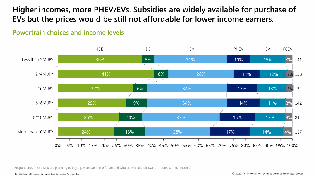
Horizontal bar chart displaying the preferences for different powertrain types across various income levels. Higher incomes show a preference for PHEV/EV, while lower incomes favor ICE.
Market Analysis and Trends
Transportation & Logistics
This slide shows the correlation between income levels and powertrain preferences, indicating that higher-income individuals are more likely to choose PHEV/EV, while lower-income groups prefer ICE.
powertrain, income levels, ICE, PHEV, EV, preference
false
Market Analysis and Trends
Transportation & Logistics
Single Chart
Deloitte
Add to my slides
Remove from favorites
This slide features a column chart showing the powertrain preferences (gasoline, PHEV, BEV) of consumers across different age groups in Germany, the US, and China.
Market Analysis and Trends
Transportation & Logistics
The slide compares preferences for gasoline, PHEV, and BEV engines among consumers in Germany, the US, and China, highlighting differences in age groups and regional trends.
powertrain, preferences, gasoline, BEV, PHEV, Germany, US, China, consumer trends, automotive
false
Market Analysis and Trends
Transportation & Logistics
Multiple Chart
PwC/Strategy&
Add to my slides
Remove from favorites
Presents bar charts comparing the powertrain prices for PC, LCV, and HDT across H2 ICE, FCEV, and BEV technologies, highlighting key cost components.
Financial Performance
Transportation & Logistics
Compares the competitiveness of different powertrain technologies (H2 ICE, FCEV, BEV) in heavy-duty transport, focusing on cost efficiency and battery requirements.
powertrain, price comparison, H2 ICE, FCEV, BEV, cost components, competitiveness, HDT, battery requirements, transport
false
Financial Performance
Transportation & Logistics
Multiple Chart
Roland Berger
Add to my slides
Remove from favorites
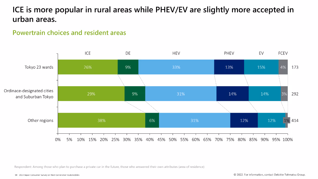
Horizontal bar chart showing the popularity of different powertrain types across various residential areas. ICE is more popular in rural areas, while PHEV and EV are slightly more accepted in urban areas.
Market Analysis and Trends
Transportation & Logistics
The slide presents the distribution of powertrain preferences among residents in different areas, showing that ICE is more popular in rural regions, whereas PHEV and EV have higher acceptance in urban settings.
powertrain, resident areas, ICE, PHEV, EV, rural, urban
false
Market Analysis and Trends
Transportation & Logistics
Single Chart
Deloitte
Add to my slides
Remove from favorites
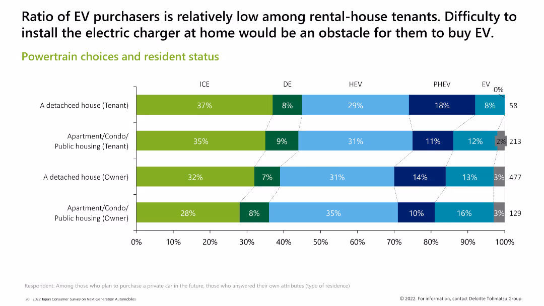
Horizontal bar chart showing powertrain preferences among different types of residents (tenants vs. owners). EV purchase is low among rental-house tenants due to installation challenges for home chargers.
Market Analysis and Trends
Transportation & Logistics
The slide highlights how residential status impacts powertrain choices, with EVs being less popular among tenants due to difficulties in installing home chargers, compared to owners of detached houses or apartments.
powertrain, resident status, ICE, PHEV, EV, tenant, owner
false
Market Analysis and Trends
Transportation & Logistics
Single Chart
Deloitte
Add to my slides
Remove from favorites
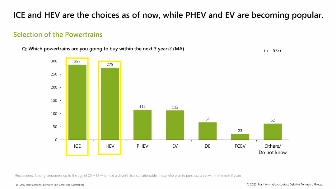
Column chart displaying preferences for different powertrain types among consumers planning to buy a car in the next 3 years. Bars for ICE and HEV are highlighted in yellow, indicating they are the most popular choices.
Market Analysis and Trends
Transportation & Logistics
This slide shows the preferred powertrain types among consumers planning to buy a car in the next 3 years. ICE and HEV are the most popular choices, followed by PHEV, EV, DE, FCEV, and others.
powertrains, ICE, HEV, consumer preference, EV, PHEV
false
Market Analysis and Trends
Transportation & Logistics
Single Chart
Deloitte
Add to my slides
Remove from favorites
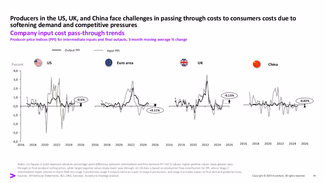
Line charts showing output and input PPI trends from 2016 to 2026 for US, Euro area, UK, and China, with callouts for PPI pass-through values.
Pricing Strategies
Industrial & Manufacturing
This slide presents producer price index (PPI) data, comparing intermediate input costs and final output prices across regions. The data highlights difficulties in cost pass-through to consumers, particularly in the US and UK, due to weak demand and competitive pressures.
PPI, cost pass-through, producer prices, inflation, input cost, output prices, US, UK
false
Pricing Strategies
Industrial & Manufacturing
Single Chart
Accenture
Add to my slides
Remove from favorites
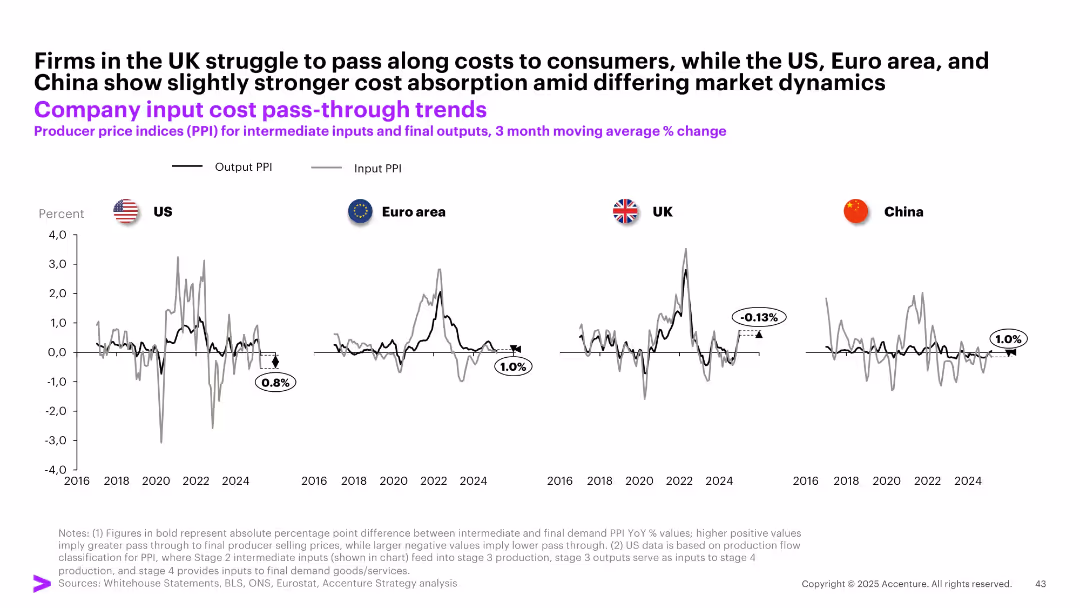
Four-panel line chart comparing Output PPI vs Input PPI across US, UK, Euro area, and China; subtle grid; black and gray lines
Performance Metrics and KPIs
Financial Services
The slide analyzes the extent to which companies in different regions can pass input costs to final prices. The UK shows weak pass-through (-0.13%), whereas the US, Euro area, and China demonstrate better absorption of input cost increases with positive output-input PPI spreads.
PPI, input cost, output prices, pass-through, UK, China, US, Euro area, producer prices
false
Performance Metrics and KPIs
Financial Services
Multiple Chart
Accenture
Add to my slides
Remove from favorites
The slide features line charts comparing input and output PPI trends for the US, Euro area, and UK, with annotations explaining key points and a commentary section.
Market Analysis and Trends
Financial Services
The slide explores how companies in the US, Euro area, and UK pass through input costs to final outputs, analyzing margin compression trends.
PPI, input costs, output, trends, US, Euro area, UK
false
Market Analysis and Trends
Financial Services
Multiple Chart
Accenture
Add to my slides
Remove from favorites
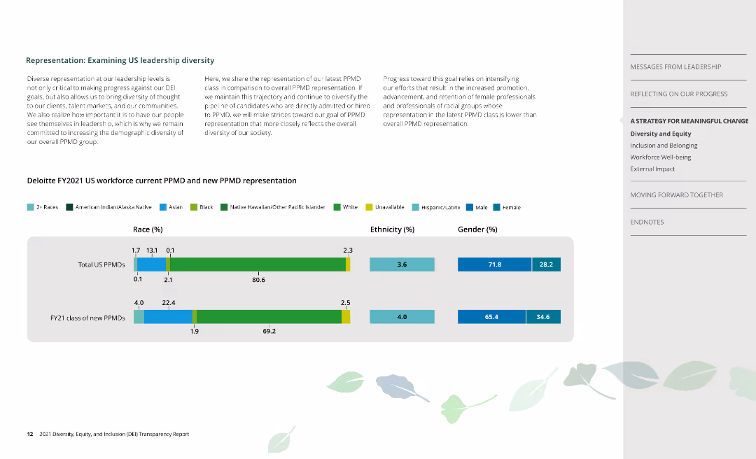
Column charts depict racial, ethnic, and gender representation of current and new PPMDs at Deloitte.
Human Resources and Talent Management
Professional Services
Examines leadership diversity at Deloitte, focusing on current and new Partner, Principal, and Managing Directors.
PPMD, leadership, race, ethnicity, gender
false
Human Resources and Talent Management
Professional Services
Mixed Chart
Deloitte
Add to my slides
Remove from favorites
Comprehensive tables and lists showing the status of PPP projects in the Philippines by status, sector, and area, with a professional and organized layout.
Operational Efficiency
Government & Public Sector
Provides an overview of public-private partnership projects in the Philippines, detailing their stages, sectors, and geographic distribution.
PPP, projects, Philippines, public-private, government, sectors, distribution
false
Operational Efficiency
Government & Public Sector
Table
Deloitte
Add to my slides
Remove from favorites
The slide has three main sections, each with an icon and descriptive text, suggesting practical steps for businesses to start with sustainability initiatives.
Operational Efficiency
Technology & Software
This slide provides practical tips for businesses to start sustainability efforts, such as leveraging data sources, creating personalized nudges, and using AI.
Practical tips, sustainability, business start, data sources, personalized nudges, AI, collaboration, operational efficiency, business strategy
false
Operational Efficiency
Technology & Software
Pillar
Accenture
Add to my slides
Remove from favorites
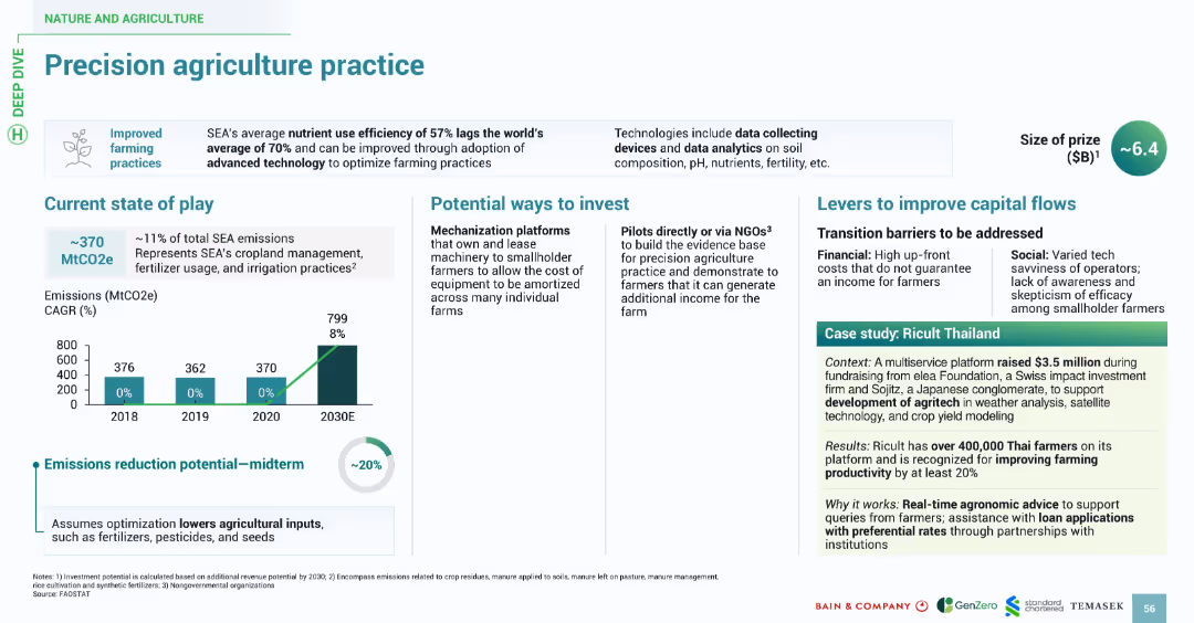
Features a similar design style: title banner, bullet-point sections, bar chart for emissions, and a boxed case study. Uses consistent fonts and icons with green highlights for visual continuity.
Technology and Digital Transformation
Agriculture & Food Production
Highlights the inefficiencies in SEA's current agricultural nutrient usage (57%) and promotes the use of data-driven precision farming to optimize practices. Investment avenues include tech-enabled mechanization platforms and NGO-led pilots. The slide identifies barriers like cost and tech savviness. Ricult Thailand is cited as a successful example leveraging tech to boost productivity by over 20%.
precision agriculture, nutrient use, farming, emissions, Ricult, SEA, agritech, data
false
Technology and Digital Transformation
Agriculture & Food Production
Multiple Chart
Bain
Add to my slides
Remove from favorites
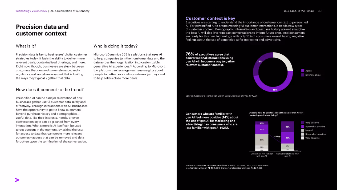
Left side white with dense text; right side black with pie and bar charts in purple and white.
Customer and Market Segmentation
Artificial Intelligence
This slide focuses on precision data as a core element in customer strategy, using real-time interactions to derive personalized insights. It features Microsoft Dynamics 365 as an example and survey stats showing executive agreement on conversational AI for customer context. Also compares consumer sentiment between gen AI-familiar and unfamiliar users.
Precision data, customer insights, Microsoft, conversational AI, surveys
false
Customer and Market Segmentation
Artificial Intelligence
Multiple Chart
Accenture
Add to my slides
Remove from favorites
This slide has moderate visual complexity with a mix of graphical elements and text. A timeline graph depicts the evolution of maintenance regimes with various icons representing different stages of sophistication. Colored blocks and arrows organize the information, and side text adds detailed explanations.
Technology and Digital Transformation
Industrial & Manufacturing
This slide discusses the increasing sophistication in asset maintenance, moving from basic, scheduled maintenance to more advanced predictive approaches based on asset health indicators. It outlines the evolution from reactive to proactive maintenance strategies, highlighting the benefits of adopting such advanced methodologies in asset management.
Predictive maintenance, Asset management, Maintenance evolution, Sophistication
false
Technology and Digital Transformation
Industrial & Manufacturing
Linear Flow
LEK
Add to my slides
Remove from favorites
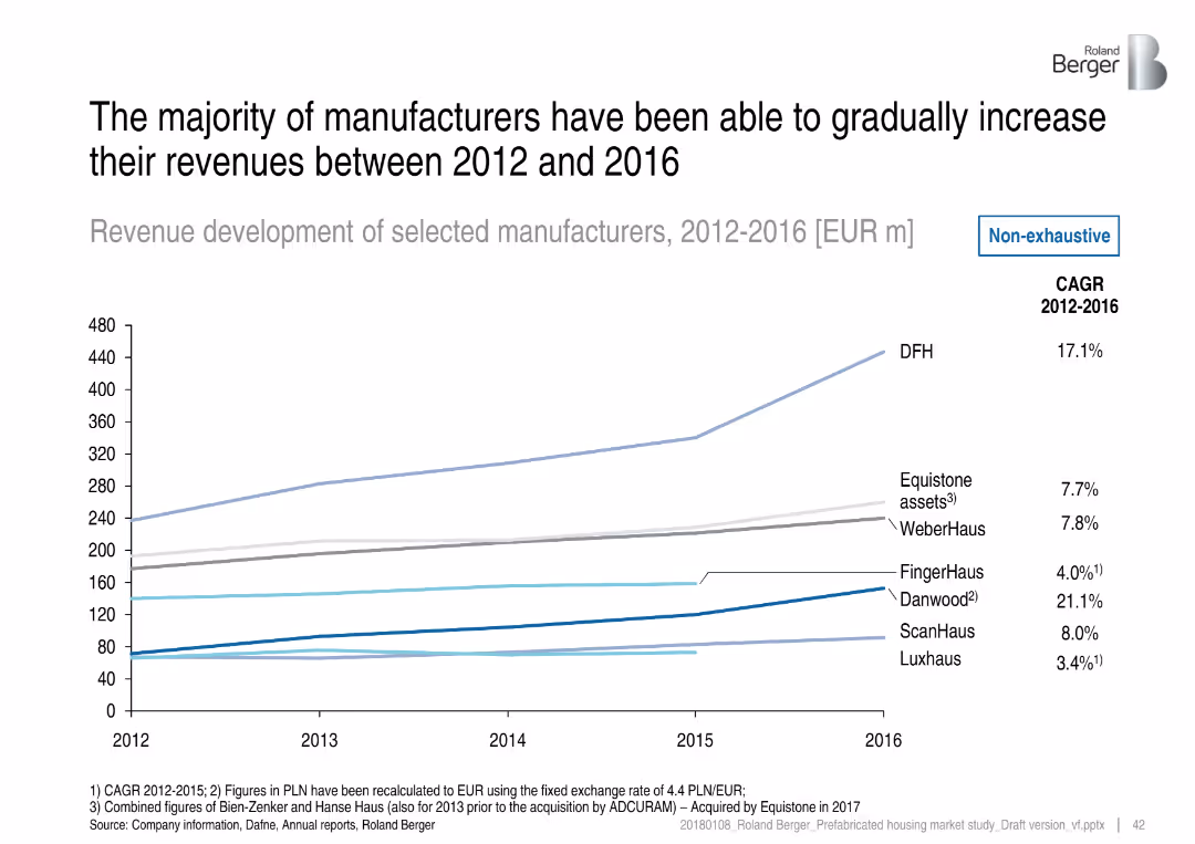
Line graph with seven lines showing revenue trends; CAGR values listed on the right; minimalistic and data-driven design
Financial Performance
Industrial & Manufacturing
This slide showcases revenue growth from 2012 to 2016 for selected prefab housing manufacturers. DFH and Danwood show the strongest growth, with Danwood achieving the highest CAGR of 21.1%. The data illustrates a steady upward trend in revenues across most companies.
prefab manufacturers, revenue growth, CAGR, DFH, Danwood, WeberHaus, FingerHaus, financial trends
false
Financial Performance
Industrial & Manufacturing
Single Chart
Roland Berger
Add to my slides
Remove from favorites
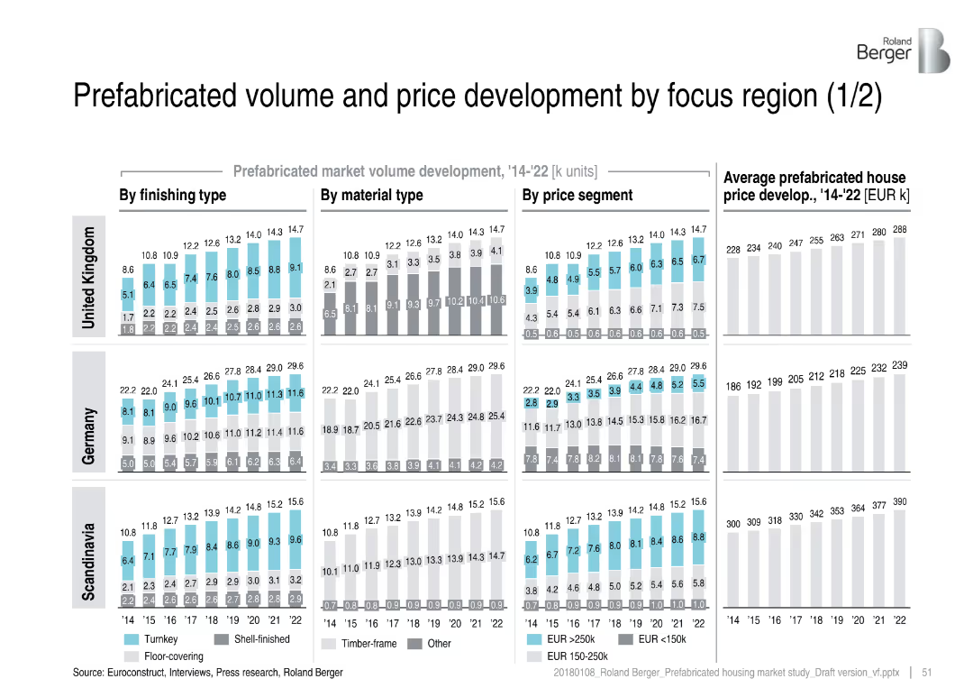
Grid layout of bar charts for UK, Germany, and Scandinavia by finishing type, material, price segment, and price trend; consistent structure
Market Analysis and Trends
Real Estate & Construction
This slide compares prefabricated housing volume and pricing trends from 2014–2022 in the UK, Germany, and Scandinavia. It breaks down data by finishing, materials, and price segments, showing steady growth across all regions with different cost dynamics.
prefab market, volume trends, price development, UK, Germany, Scandinavia, timber-frame, turnkey, shell-finished
false
Market Analysis and Trends
Real Estate & Construction
Multiple Chart
Roland Berger
Add to my slides
Remove from favorites
Stacked bar chart showing prefabricated housing volumes from 2014–2022 across countries, with CAGR metrics and insights.
Market Analysis and Trends
Real Estate & Construction
This slide focuses on the rising importance of prefabricated housing within the broader 1+2 family housing segment. It shows that prefabricated solutions are gaining momentum, especially in Germany, UK, and Scandinavia, with notable growth in Poland.
prefabricated housing, market growth, construction trends, housing demand, CAGR, regional analysis, volume forecast
false
Market Analysis and Trends
Real Estate & Construction
Mixed Chart
Roland Berger
Add to my slides
Remove from favorites
Bubble chart showing turnkey vs. prefab housing shares across European regions, with supporting bullet points on the right.
Market Analysis and Trends
Real Estate & Construction
This slide visualizes the share of turnkey solutions vs. prefabricated housing among various regions, highlighting Scandinavia and Switzerland. It emphasizes regional differences and infers market preferences and structural focuses (e.g., solid vs. prefab constructions).
prefabricated housing, turnkey solutions, regional segmentation, market share, construction methods, Scandinavia, Switzerland, bubble chart
false
Market Analysis and Trends
Real Estate & Construction
Mixed Chart
Roland Berger
Add to my slides
Remove from favorites
Similar layout to 15124, covering Austria, Switzerland, and Poland with the same visual breakdowns
Market Analysis and Trends
Real Estate & Construction
This slide continues the analysis from slide 15124, focusing on Austria, Switzerland, and Poland. It shows slower growth in Poland, high price levels in Switzerland, and moderate growth in Austria. It maintains consistent metrics for cross-region comparison.
prefab volume, price trends, Austria, Switzerland, Poland, timber-frame, regional comparison, housing market
false
Market Analysis and Trends
Real Estate & Construction
Multiple Chart
Roland Berger
Add to my slides
Remove from favorites
Split layout with text on the left and pie charts on the right showing various factors influencing healthcare choices by consumers.
Market Analysis and Trends
Healthcare & Pharmaceuticals
Describes the evolving preferences of consumers across different ages, emphasizing the importance of convenience and affordability in medical care decisions.
preferences, healthcare, transformation, convenience, choices
false
Market Analysis and Trends
Healthcare & Pharmaceuticals
Multiple Chart
Accenture
Add to my slides
Remove from favorites
The slide features column charts comparing pre-COVID-19 premium and volume car purchase intent with recent months.
Market Analysis and Trends
Transportation & Logistics
Focuses on how premium versus volume car brands have fared in terms of purchase intent during COVID-19.
premium brands, car sales, COVID-19 impact, global analysis
false
Market Analysis and Trends
Transportation & Logistics
Multiple Chart
McKinsey
Add to my slides
Remove from favorites
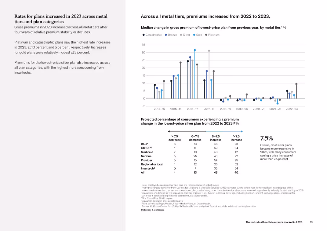
Layout includes a left-aligned summary with a grid of small bar charts by insurer category on the right, each chart displaying median premium changes for lowest-price silver plans. A comparison table is also included.
Financial Performance
Healthcare & Pharmaceuticals
This slide explores premium shifts by insurer category, showing that Insurtech and Medicaid plans experienced the highest median increases in 2023. Provider and CO-OP insurers had the most stable premiums. The grid of mini bar charts offers a side-by-side comparison of premium change trends from 2015 to 2023 across different plan types.
premium changes, insurer type, Medicaid, Insurtech, silver plan
false
Financial Performance
Healthcare & Pharmaceuticals
Mixed Chart
McKinsey
Add to my slides
Remove from favorites
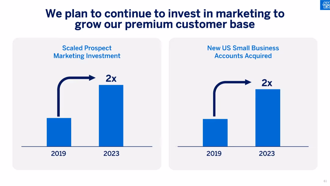
Side-by-side bar charts comparing 2019 vs. 2023 values for marketing investment and small business accounts acquired.
Strategic Planning
Financial Services
The slide presents a strategy to grow premium customer acquisition through doubling marketing investments, which has resulted in a twofold increase in small business accounts acquired.
premium customer, marketing investment, account growth, strategic plan, small business, ROI, acquisition
false
Strategic Planning
Financial Services
Single Chart
McKinsey
Add to my slides
Remove from favorites
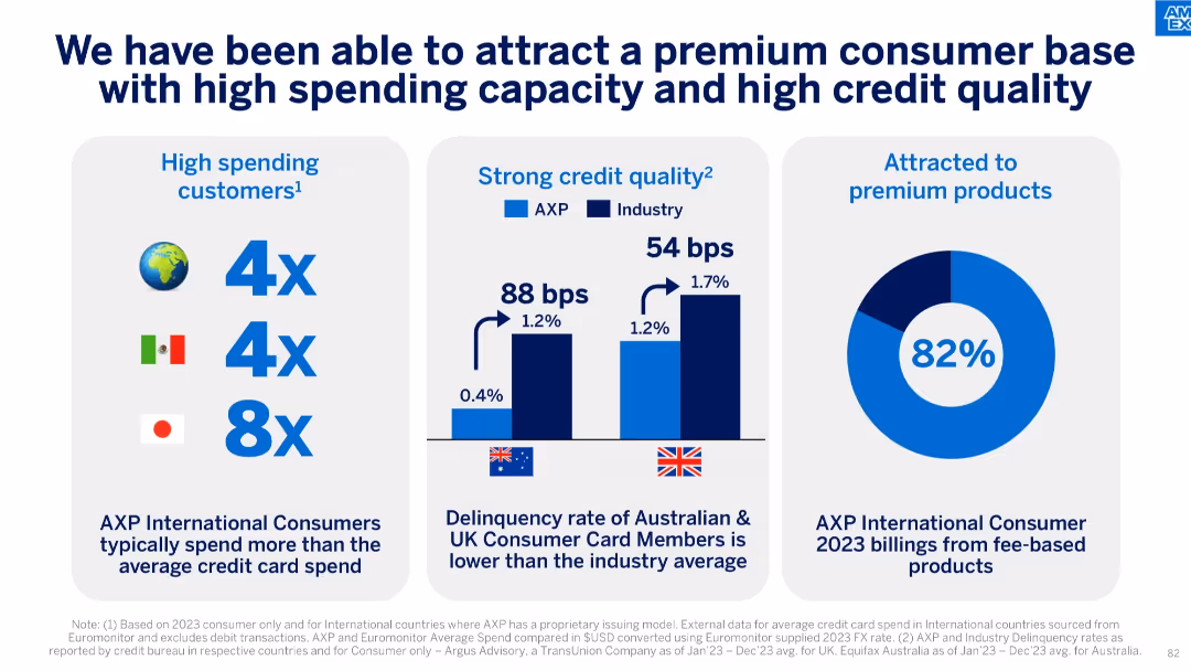
Three-column layout with charts and text; shows high spend, low delinquency, and premium product adoption.
Customer and Market Segmentation
Financial Services
Emphasizes that AXP attracts high-spending and low-risk international consumers, particularly in Japan, Mexico, UK, and Australia. Also shows that 82% of 2023 international consumer billing came from premium fee-based products.
premium customers, credit quality, card spend, delinquency rate, fee-based products, international consumers, segmentation
false
Customer and Market Segmentation
Financial Services
Multiple Chart
McKinsey
Add to my slides
Remove from favorites
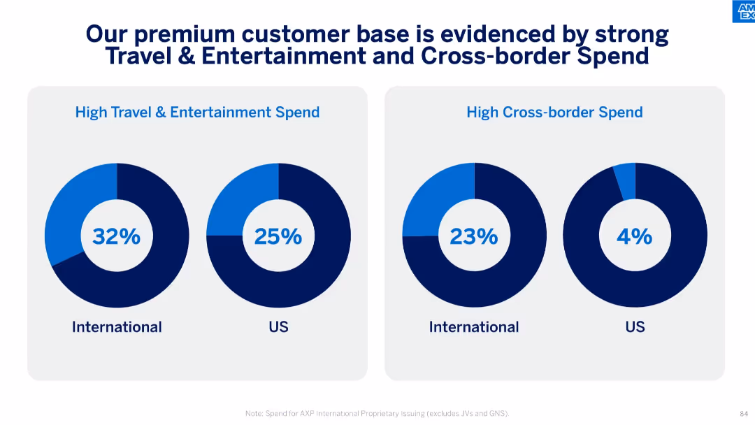
Dual donut charts showing % of spend in T&E and cross-border categories for International vs US.
Customer and Market Segmentation
Financial Services
AXP's international customers show higher spending in travel, entertainment, and cross-border transactions compared to US customers. This slide reinforces the brand's alignment with affluent and globally active users.
premium customers, travel spend, entertainment, cross-border, international, consumer behavior, T&E, global usage
false
Customer and Market Segmentation
Financial Services
Single Chart
McKinsey
Add to my slides
Remove from favorites
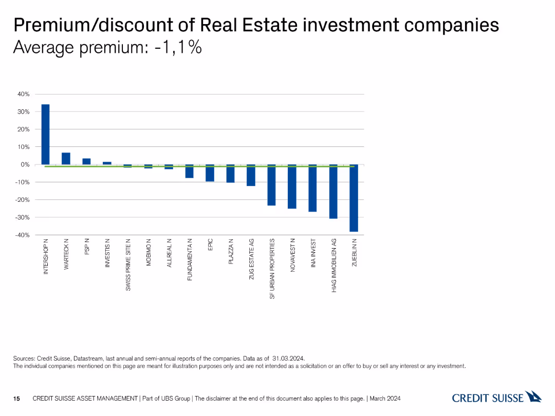
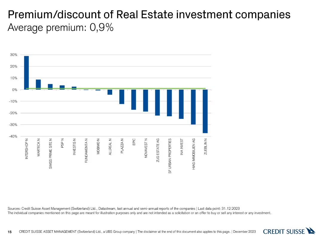
The slide displays a column chart showing the premium or discount percentages of various Real Estate investment companies, with bars in blue for discounts and green for premiums.
Market Analysis and Trends
Real Estate & Construction
This slide compares the market premium or discount for different Real Estate investment companies, providing a snapshot of market sentiment and valuation disparities.
premium, discount, investment companies, real estate, market sentiment
false
Market Analysis and Trends
Real Estate & Construction
Single Chart
Credit Suisse
Add to my slides
Remove from favorites
The slide has a column chart showing the premium or discount of various real estate investment companies.
Market Analysis and Trends
Real Estate & Construction
This slide compares the premium and discount percentages of different real estate investment companies, highlighting an average premium of 0.9% as of December 31, 2023.
premium, discount, real estate, investment, companies
false
Market Analysis and Trends
Real Estate & Construction
Single Chart
Credit Suisse
Add to my slides
Remove from favorites
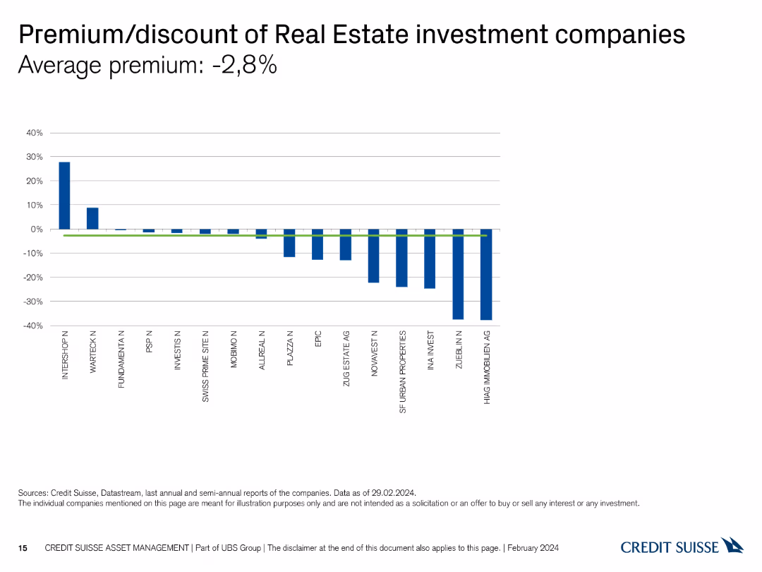
The slide shows a column chart comparing the premium/discount rates of various Real Estate investment companies.
Market Analysis and Trends
Real Estate & Construction
It highlights the average premium and discount rates, allowing for the analysis of investment values in Real Estate companies.
premium, discount, Real Estate, investment, companies
false
Market Analysis and Trends
Real Estate & Construction
Single Chart
Credit Suisse
Add to my slides
Remove from favorites
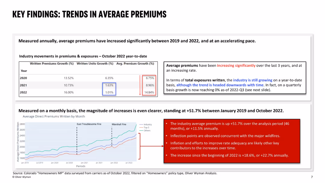
Upper section shows a yearly premium growth table; bottom section has a line chart showing monthly premium trends; highlights notable fire events and uses red callout boxes to emphasize observations.
Pricing Strategies
Financial Services
This slide analyzes significant increases in average premiums between 2019 and 2022, both annually and monthly. It links major premium spikes to wildfire events, inflation, and insurer efforts to restore rate adequacy. Premiums rose +51.7% overall in the period, with sharper increases in 2022 alone.
premium growth, rate adequacy, wildfires, inflation, pricing trends, homeowners, Colorado, insurance, premium trend analysis
false
Pricing Strategies
Financial Services
Mixed Chart
Oliver Wyman
Add to my slides
Remove from favorites
This slide presents a column chart and several smaller column charts comparing various consumer sectors and their dynamics.
Market Analysis and Trends
Consumer Goods
Analyzes consumer behavior trends with a focus on premium product purchases across different sectors, including beauty and bottled water.
premiumization, consumer behavior, market trends, beauty, bottled water
false
Market Analysis and Trends
Consumer Goods
Multiple Chart
Deutsche Bank
Add to my slides
Remove from favorites
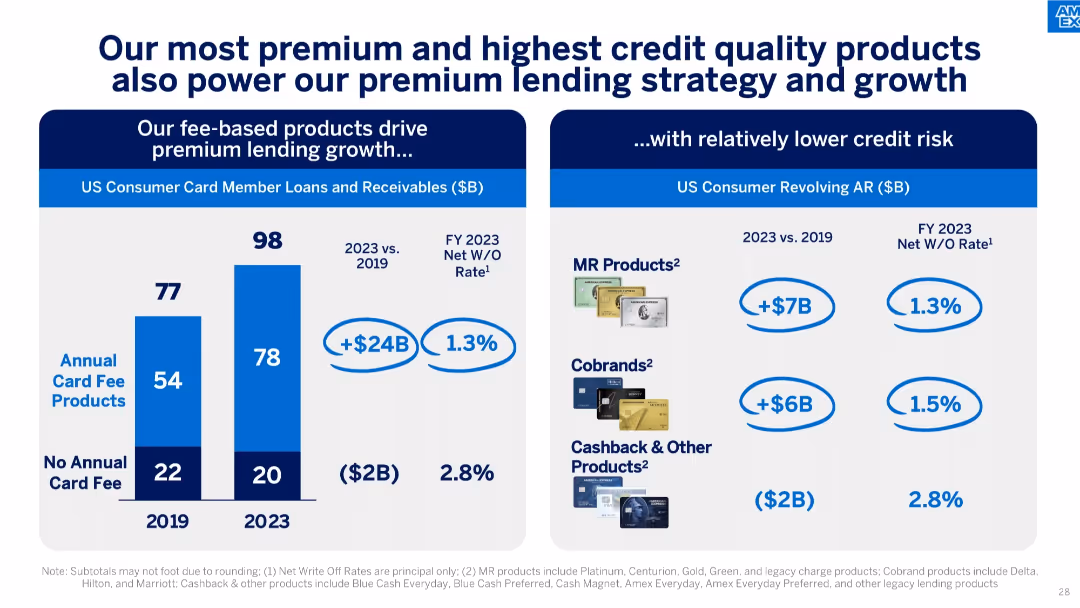
Split layout with loan growth by product type on the left and revolving AR by card type on the right.
Corporate Finance and Valuation
Financial Services
Details loan growth driven by fee-based products with relatively low write-off rates. Includes breakdown of loan balances and performance by product category.
premium lending, card products, net write-offs, fee-based strategy, loan growth, credit quality
false
Corporate Finance and Valuation
Financial Services
Mixed Chart
McKinsey
Add to my slides
Remove from favorites
Illustrates the segmentation of customer base into free and premium members, with a diagram showing current features and expansion potential.
Market Analysis and Trends
Financial Services
This slide provides an analysis of the premium membership model, showcasing the transition from a free user base to a more comprehensive premium service, highlighting the potential for substantial growth through added features and services.
premium membership, customer base, expansion, segmentation, services
false
Market Analysis and Trends
Financial Services
Mixed Chart
Barclays
Add to my slides
Remove from favorites
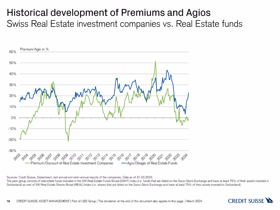
A line chart with two lines, one representing Premium/Discount of Real Estate Investment Companies and the other for Agio of Real Estate Funds. The chart spans from 2003 to 2024, with values on the Y-axis ranging from -30% to 60%.
Market Analysis and Trends
Real Estate & Construction
The slide shows the historical development of premiums and agios for Swiss real estate investment companies versus real estate funds.
premiums, agios, real estate, investment, historical, comparison, Swiss, development, trends, analysis
false
Market Analysis and Trends
Real Estate & Construction
Single Chart
Credit Suisse
Add to my slides
Remove from favorites
Line chart with three data series (Industry, Top 5, Others) showing premium growth over time; key fire events are annotated.
Financial Performance
Financial Services
Tracks the growth in average direct premiums from 2019 to 2022, with notable surges following the East Troublesome and Marshall wildfires. The slide emphasizes accelerated premium increases in 2022, especially post-disaster.
premiums, insurance pricing, wildfire impact, Colorado, cost increase
false
Financial Performance
Financial Services
Mixed Chart
Oliver Wyman
Add to my slides
Remove from favorites
Text on left; two data visuals on right: a bar graph showing median premium change (2014–2023) and a matrix showing % of consumers experiencing changes in silver plan premiums by insurer category.
Financial Performance
Healthcare & Pharmaceuticals
This slide tracks premium changes in the health insurance market, particularly focusing on 2023. It reveals that premiums rose across all metal tiers for the first time in years. Insurtechs and Medicaid plans had the highest share of consumers experiencing premium increases over 7.5%.
premiums, silver plan, cost increase, insurer types, 2023, healthcare
false
Financial Performance
Healthcare & Pharmaceuticals
Mixed Chart
McKinsey
Add to my slides
Remove from favorites
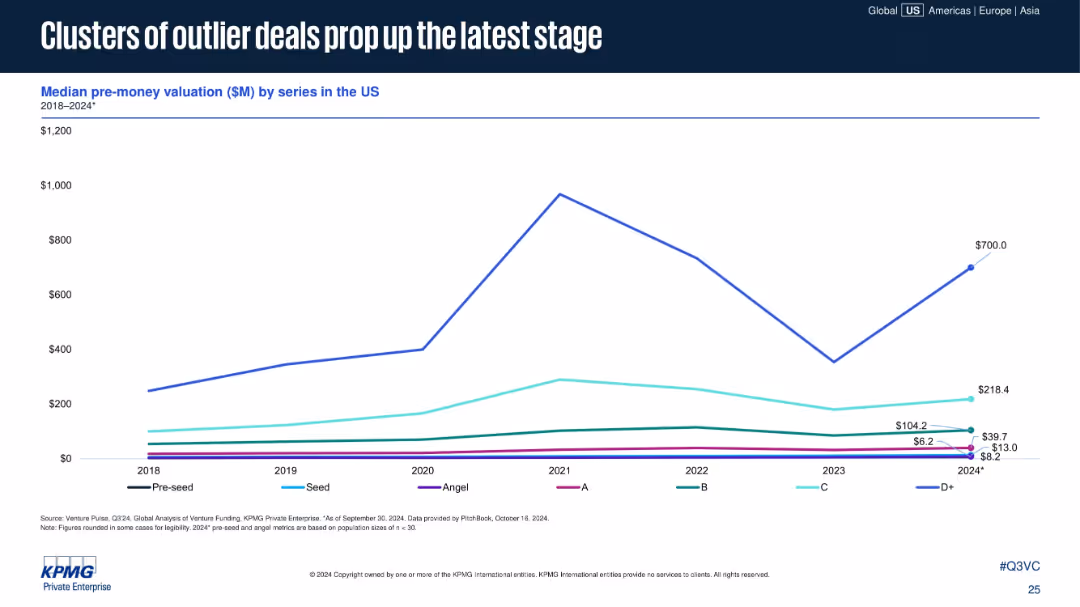
Single line chart showing median pre-money valuation by series from 2018–2024*. Uses a clean grid with legends for each series (Pre-seed to D+).
Investment Analysis
Financial Services
The chart reveals that while most early-stage valuations remain flat or slowly rise, D+ stage valuations have spiked in 2024, driven by outlier deals. This reflects increased valuation concentration at later funding stages.
pre-money valuation, D+ stage, venture funding, outlier deals, late-stage investment, valuation trends, 2024 VC
false
Investment Analysis
Financial Services
Single Chart
KPMG
Add to my slides
Remove from favorites
Table with two columns: threat types and corresponding global preparedness gap (concern minus confidence). Horizontal bars visualize the negative gaps.
Risk Assessment and Management
Government & Public Sector
Visualizes the global discrepancy between concern about various threats and perceived governmental preparedness. Highlights largest concern-preparedness gaps in NBC attacks and hacking across a 30-country average.
preparedness gap, risk perception, global concern, NBC threats, cyber attacks, Ipsos data
false
Risk Assessment and Management
Government & Public Sector
Mixed Chart
IPSOS
Add to my slides
Remove from favorites
The slide shows a bar chart with text, discussing how Canadians would manage a $5,000 unexpected expense with key methods.
Risk Assessment and Management
Financial Services
It outlines various methods Canadians would use to handle an unexpected $5,000 expense, based on survey responses.
Preparedness, Unexpected Expenses, Management, Canadians, $5,000, Bar Chart, Financial, Risk, Assessment, Methods
false
Risk Assessment and Management
Financial Services
Mixed Chart
IPSOS
Add to my slides
Remove from favorites
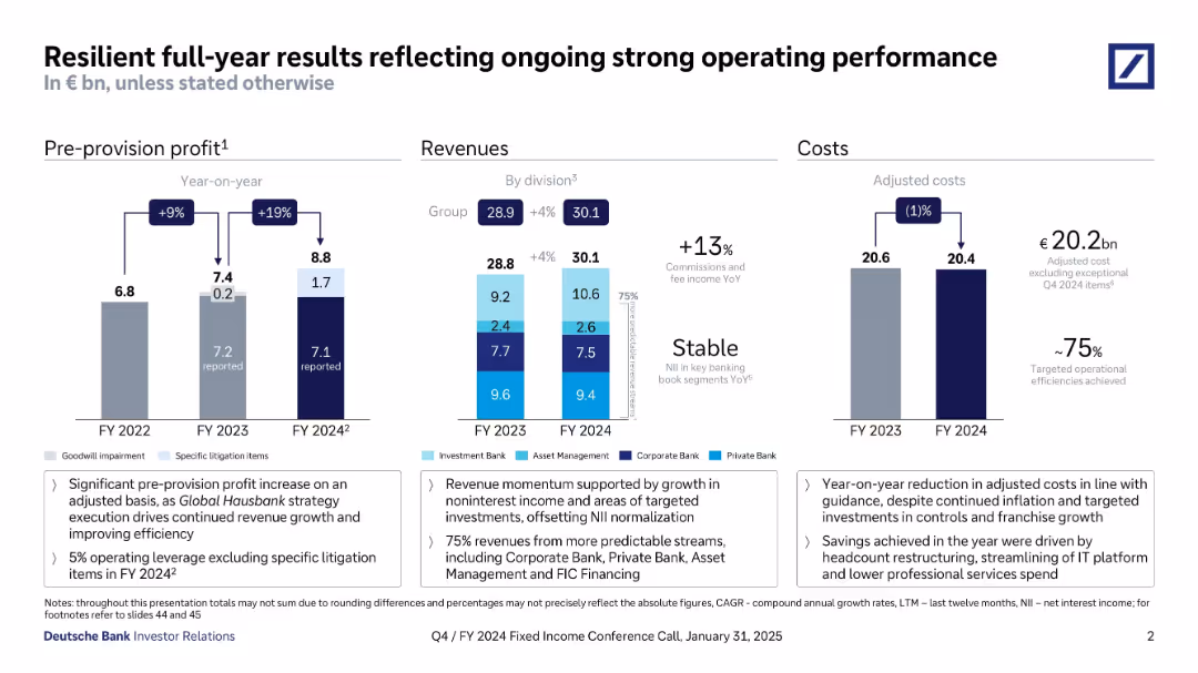
Three-column layout with bar charts under Pre-provision profit, Revenues, and Costs. Text boxes below charts summarize key takeaways. Uses consistent Deutsche Bank color palette and iconography.
Financial Performance
Financial Services
The slide highlights Deutsche Bank’s strong financial performance in FY 2024, showing increases in pre-provision profits, stable and growing revenues across divisions, and reduced adjusted costs. It emphasizes operational efficiencies, revenue stream stability, and targeted cost savings as key drivers of performance.
pre-provision profit, revenue, costs, efficiency, FY2024, Deutsche Bank, net interest, cost savings, financials, investor relations
false
Financial Performance
Financial Services
Multiple Chart
Deutsche Bank
Add to my slides
Remove from favorites
Column charts comparing focus on present vs. future preparations across different periods and industries.
Strategic Planning
Professional Services
Discusses current vs. future focus in company strategy, offering insights into planning priorities across sectors, useful for strategic decision-making.
present management, future planning, strategic focus, industry comparison, operational planning
false
Strategic Planning
Professional Services
Mixed Chart
Deloitte
Add to my slides
Remove from favorites
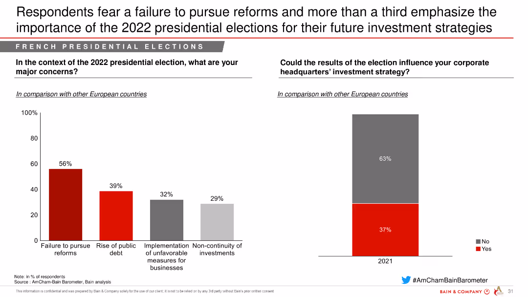
This slide has column charts showing major concerns related to the 2022 presidential elections, such as failure to pursue reforms and implementation of unfavorable measures for businesses.
Risk Assessment and Management
Government & Public Sector
The slide highlights concerns regarding the 2022 presidential elections in France, focusing on the potential failure to pursue reforms and other unfavorable measures affecting businesses.
presidential elections, concerns, reforms, public debt, measures, businesses, government, public sector
false
Risk Assessment and Management
Government & Public Sector
Multiple Chart
Bain
Add to my slides
Remove from favorites
Features stacked column charts for pre-tax income, line graphs for the macroeconomic environment, and quantitative data points.
Financial Performance
Financial Services
Describes the growth of pre-tax income across various business units and macroeconomic conditions.
Pre-tax income, economic growth, GDP growth, federal funds rate, business units
false
Financial Performance
Financial Services
Multiple Chart
JP Morgan
Add to my slides
Remove from favorites
The slide has a column chart showing SRU adjusted results in USD bn for 9M16 and 9M17, with segments for net revenues, pre-tax income, and operating expenses.
Financial Performance
Financial Services
This slide shows the reduction in pre-tax income drag on Group results from -2.5 bn to -1.5 bn, highlighting changes in net revenues and operating expenses.
pre-tax income, net revenues, operating expenses, income drag, financial results
false
Financial Performance
Financial Services
Single Chart
Credit Suisse
Add to my slides
Remove from favorites
This slide includes a waterfall chart showing the pre-tax loss of Credit Suisse AG for 2Q23, with detailed breakdowns of acquisition-related effects and other adjustments.
Financial Performance
Financial Services
The slide presents a detailed financial analysis of Credit Suisse AG's pre-tax loss in the second quarter of 2023, including various adjustments and effects, to explain the financial impact of the acquisition.
pre-tax loss, Credit Suisse, acquisition effects, financial analysis, adjustments
false
Financial Performance
Financial Services
Single Chart
UBS
Add to my slides
Remove from favorites
The slide features a bar chart illustrating the adjusted pre-tax income progression in USD mn from 2017 estimate to 2019 target, detailing loss components.
Financial Performance
Financial Services
It estimates the pre-tax loss of less than USD 2.0 bn in 2017 and projects the reduction to USD 500 mn by 2019, detailing loss reduction steps.
pre-tax loss, income progression, financial estimate, loss reduction, strategic planning
false
Financial Performance
Financial Services
Single Chart
Credit Suisse
Add to my slides
Remove from favorites
Previous
Next
You don't have any favorites yet.
Please wait loading your favorites slides...
Create a FREE account to continue browsing
Receive Instant Access to 1,000+ slides from companies like McKinsey, Google, and Goldman Sachs
First Name
Last Name
Email
Password
I agree to all
Terms & Privacy Policy
Thank you! Your submission has been received!
Oops! Something went wrong while submitting the form.
Have an account?
Sign in
Upgrade to PRO to Save slides
Advanced Search and Filters
Access to 15,000+ slides
Access to Category Pages
Save/Bookmark Slides
PowerPoint Template Library
Pick a Plan
MONTHLY
$12/month
Billed every month, Cancel anytime.
YEARLY
$9/year
Billed $108 annually, Cancel anytime.
Checkout for $12/month
Checkout for $108/yr
Secured by Stripe | AES-256 bit encryption