My Account
My Slides
Search by Category
Pricing
Templates
View All Templates
Download Template Slides
✦ AI Search
Feedback
Login
Logout
Get Started
Browse all Slides
Browse all Slides
Create a FREE Account
Instant access to 1,000+ real slides from top companies like McKinsey, BCG, Goldman Sachs, Google and many more!
First Name
Last Name
Email
Password
I agree to all
Terms & Privacy Policy
Thank you! Your submission has been received!
Oops! Something went wrong while submitting the form.
Have an account?
Sign in
Saved Slides
Total No. of slides saved
0
↻ Refresh
✖ Clear all
The slide features a bar chart showing adjusted pre-tax income progression in USD mn from 9M16 to 2019, with detailed segments for loss components.
Risk Assessment and Management
Financial Services
It projects the pre-tax loss reduction to around USD 800 mn by year-end 2019, comparing with prior targets and breaking down the components of loss reduction.
pre-tax loss, income progression, loss reduction, risk management, financial targets
false
Risk Assessment and Management
Financial Services
Single Chart
Credit Suisse
Add to my slides
Remove from favorites
Column chart with key drivers of growth listed and an arrow pointing to the longer-term profit goal. Simple blue and white design.
Financial Performance
Financial Services
Showcases the strategy for doubling Morgan Stanley's Wealth Management pre-tax profit, highlighting key growth drivers and goals.
Pre-tax profit, wealth management, growth drivers, Morgan Stanley, doubling profit, strategic goals
false
Financial Performance
Financial Services
Single Chart
Goldman Sachs
Add to my slides
Remove from favorites
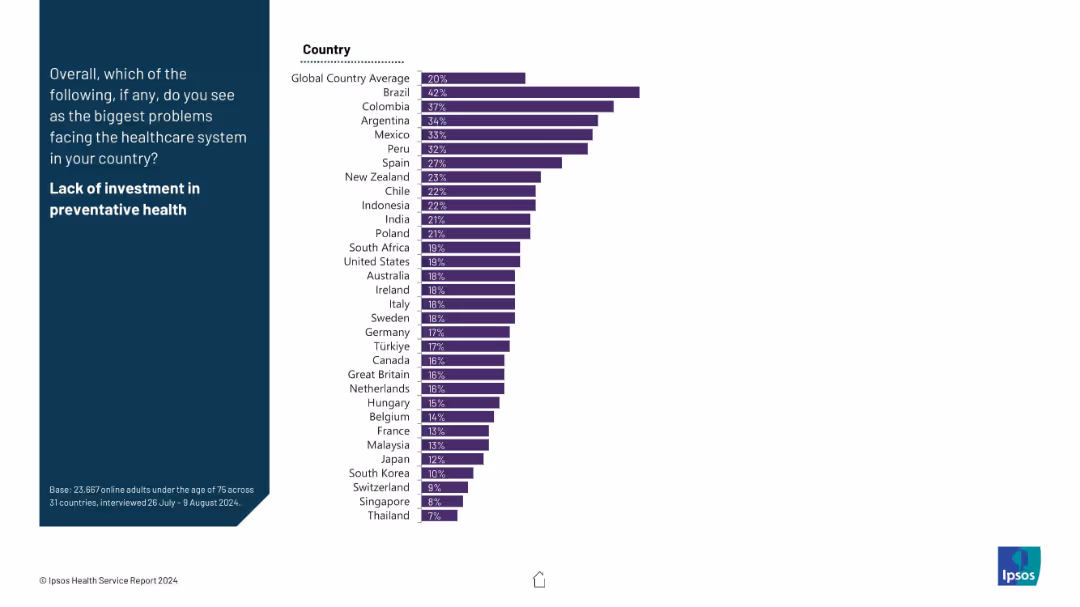
A ranked bar chart by country; left section includes title and prompt on a blue background.
Strategic Planning
Healthcare & Pharmaceuticals
This slide presents concern levels around preventative health investment. Brazil, Colombia, and Argentina show the highest levels of concern. It points to long-term strategic gaps in healthcare planning.
preventative care, healthcare planning, underinvestment, health systems, strategic gap, regional comparison
false
Strategic Planning
Healthcare & Pharmaceuticals
Mixed Chart
IPSOS
Add to my slides
Remove from favorites
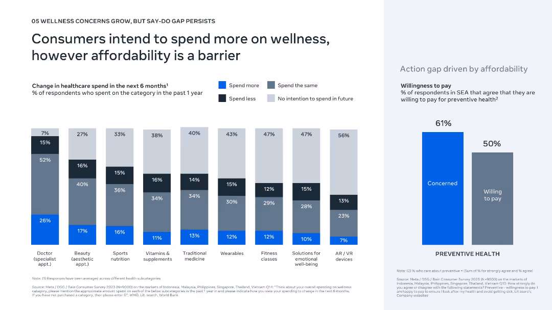
Bar charts show expected changes in wellness spending by category; right panel shows gap between concern and willingness to pay for preventive health.
Strategic Planning
Healthcare & Pharmaceuticals
This slide reveals that while Southeast Asian consumers plan to increase spending on wellness categories such as supplements, fitness, and emotional well-being, affordability remains a significant barrier. A notable “say-do” gap exists between concern for preventive health and actual willingness to pay.
preventive health, spending intention, affordability, wellness gap, SEA
false
Strategic Planning
Healthcare & Pharmaceuticals
Multiple Chart
Bain
Add to my slides
Remove from favorites
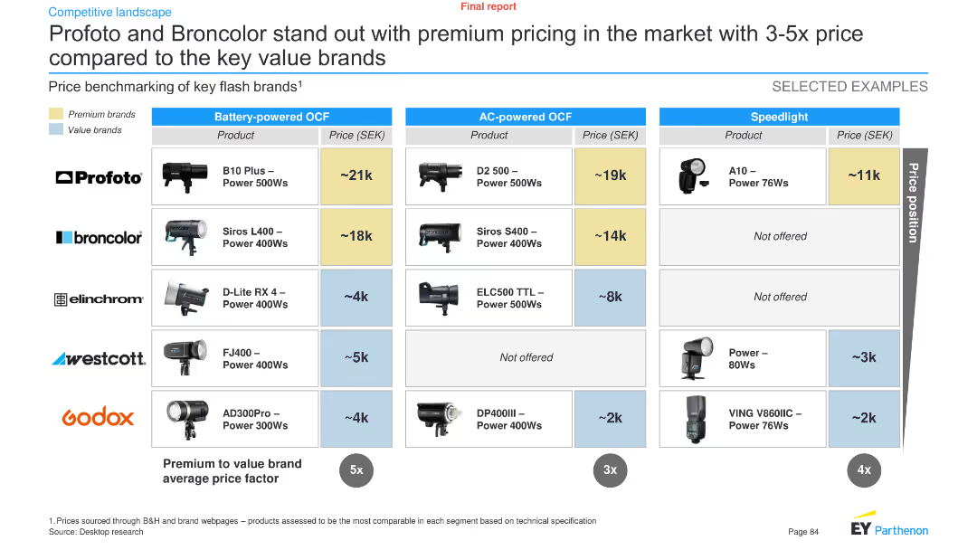
The slide features a comparative chart showing the price benchmarking of key flash brands' products in three categories: battery-powered OCF, AC-powered OCF, and speedlight.
Pricing Strategies
Technology & Software
It highlights the premium pricing of Profoto and Broncolor compared to value brands, showing price differences across various product categories.
Price benchmarking, flash brands, Profoto, Broncolor, premium pricing, technology, analysis, pricing strategies, comparison
false
Pricing Strategies
Technology & Software
Table
EY
Add to my slides
Remove from favorites
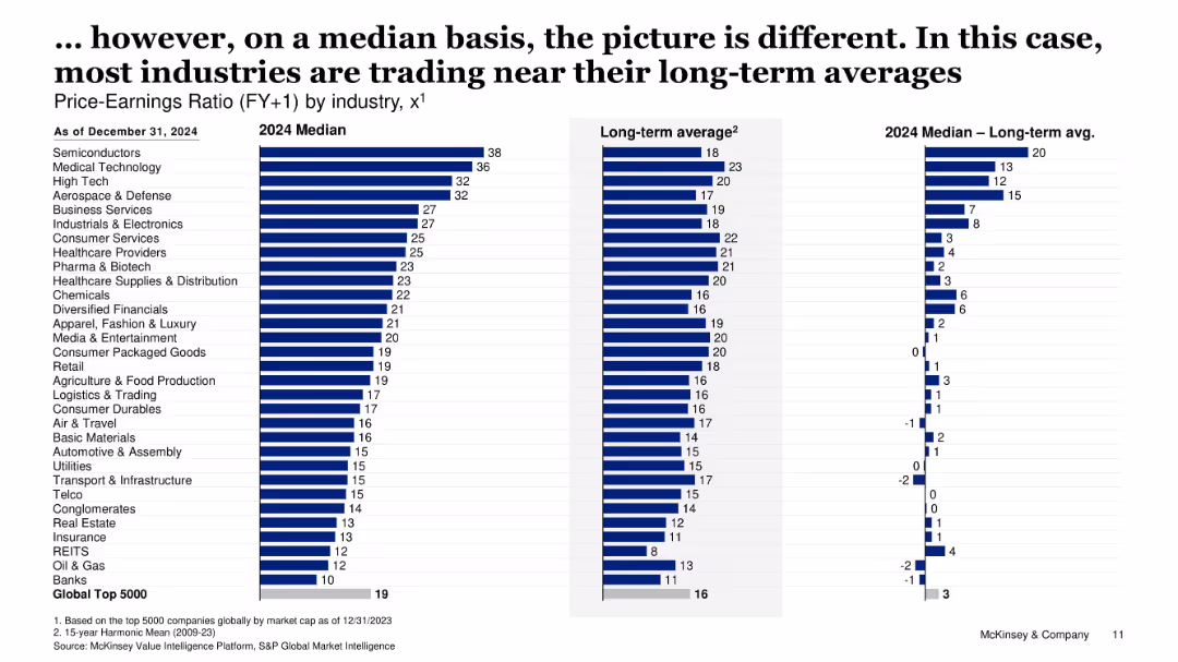
Bar chart layout comparing 2024 median P/E ratios by industry vs long-term averages; divided into three vertical bars for 2024, historical average, and deviation.
Market Analysis and Trends
Financial Services
This slide presents a comparative analysis of median forward P/E ratios across industries as of December 2024. It highlights how current valuations align with or deviate from long-term averages, indicating which sectors are over- or under-valued.
Price-Earnings Ratio, Valuation, Sector Comparison, 2024 Forecast, Long-term Average, Financial Metrics, Equity Market, Investment Valuation, Forward P/E
false
Market Analysis and Trends
Financial Services
Single Chart
McKinsey
Add to my slides
Remove from favorites
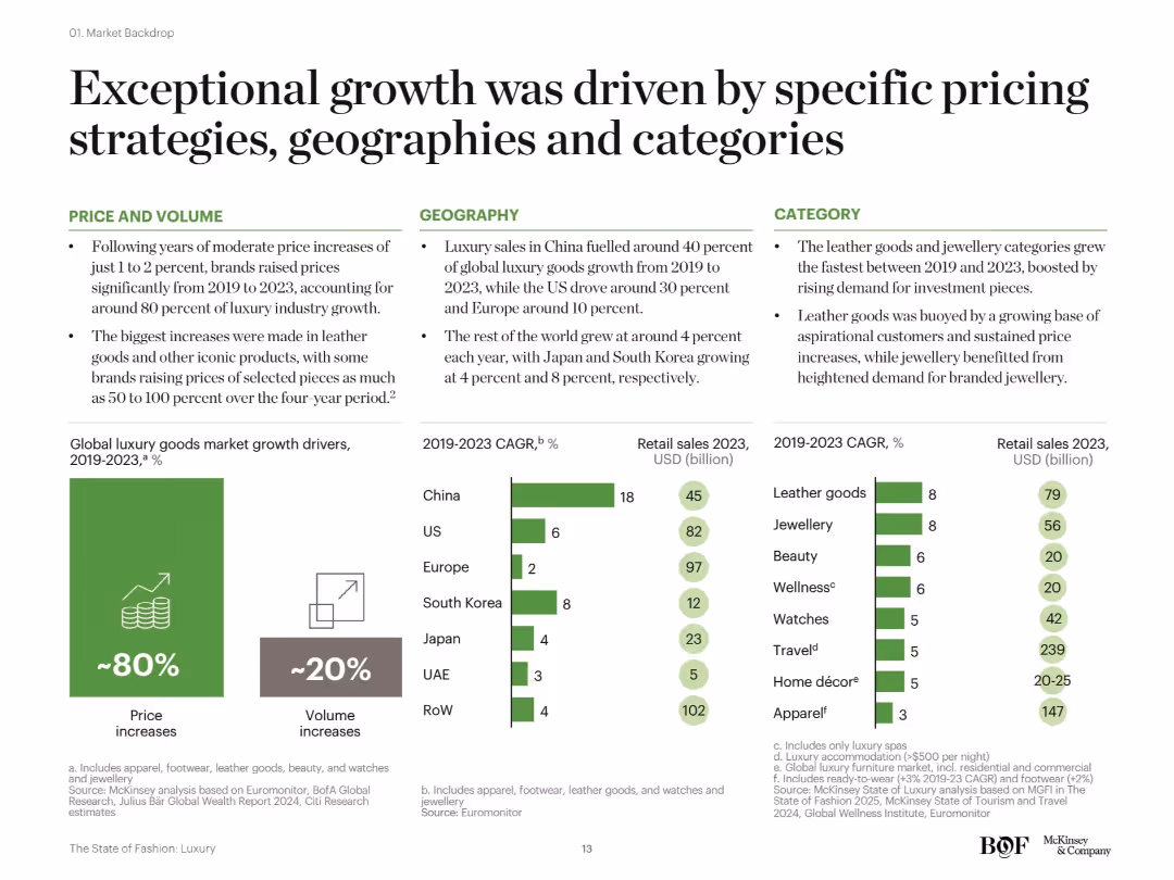
Three-column layout (Price & Volume, Geography, Category) with accompanying bullet points and bar graphs below showing 2019–2023 CAGR by region and category.
Market Analysis and Trends
Consumer Goods
This slide attributes luxury sector growth from 2019–2023 primarily to price increases (80%), geographic contribution from China, the US, and Europe, and category strength in leather goods and jewellery. It also includes comparative CAGR and revenue data for major product segments.
price increase, luxury categories, geographic growth, CAGR, retail sales, volume, McKinsey
false
Market Analysis and Trends
Consumer Goods
Multiple Chart
McKinsey
Add to my slides
Remove from favorites
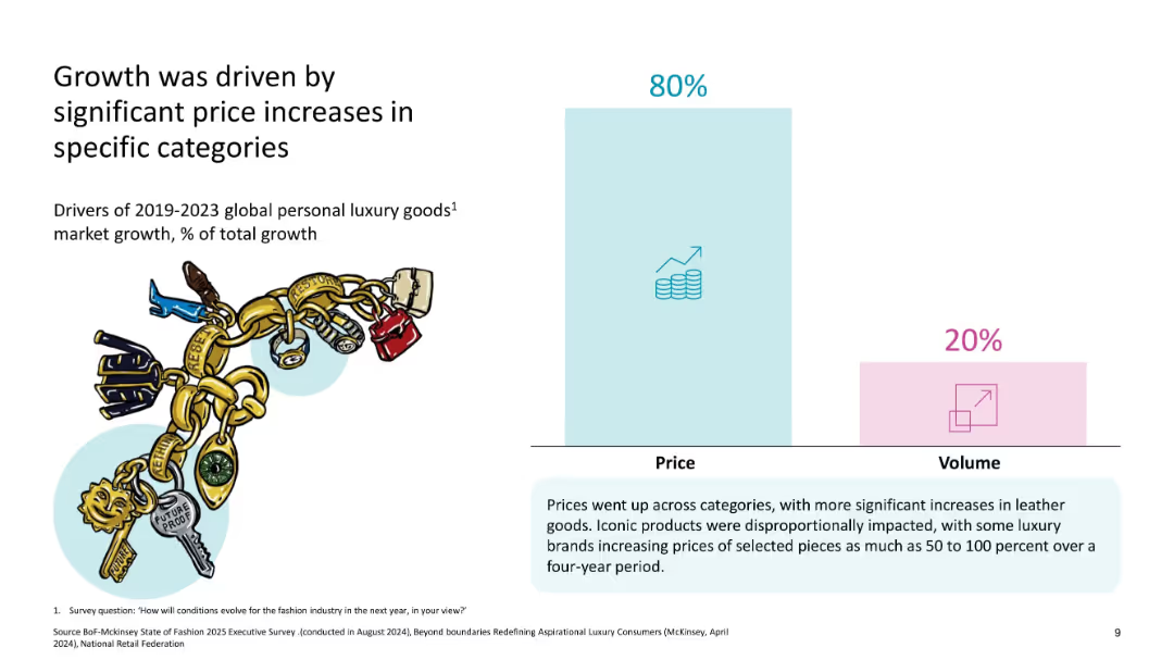
One large bar chart showing 80% of growth from price vs 20% from volume
Pricing Strategies
Consumer Goods
The slide highlights that the majority of growth in luxury goods from 2019–2023 was due to price increases, especially in leather goods, rather than volume, reflecting brand pricing power.
price increase, volume, luxury growth, leather goods, pricing power, market drivers
false
Pricing Strategies
Consumer Goods
Mixed Chart
McKinsey
Add to my slides
Remove from favorites
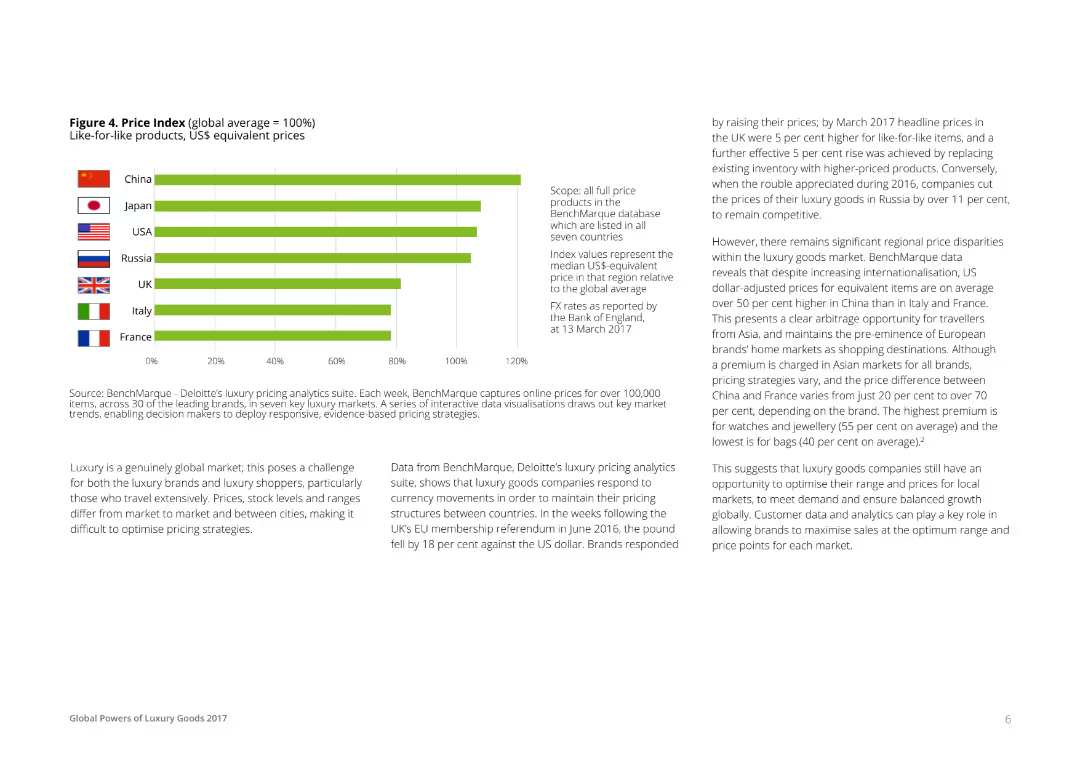
A horizontal bar chart comparing the price index of like-for-like luxury products in different countries. Bars represent the median US$ equivalent prices relative to the global average, with each country labeled and color-coded for clarity.
Pricing Strategies
Consumer Goods
This slide provides a comparative analysis of the price index for luxury goods across various countries, indicating regional price disparities and opportunities for strategic pricing adjustments based on currency movements and market conditions.
Price, Index, Global, Luxury, Goods
false
Pricing Strategies
Consumer Goods
Mixed Chart
Deloitte
Add to my slides
Remove from favorites
The slide includes a multi-line chart tracking the percentage deviation from the 2018-2019 trend for core goods and services price levels globally. It shows three lines representing goods, services, and the total, indicating various changes over the years 2018 through 2022.
Market Analysis and Trends
Financial Services
The slide analyzes the normalization of price levels for goods and services after pandemic-related adjustments, showing deviations from previous trends. It is intended for discussions on global economic recovery, inflation trends, and pricing strategies post-pandemic.
Price Levels, Pandemic, Global Economy, Goods, Services, Inflation Trends, Economic Recovery
false
Market Analysis and Trends
Financial Services
Single Chart
JP Morgan
Add to my slides
Remove from favorites
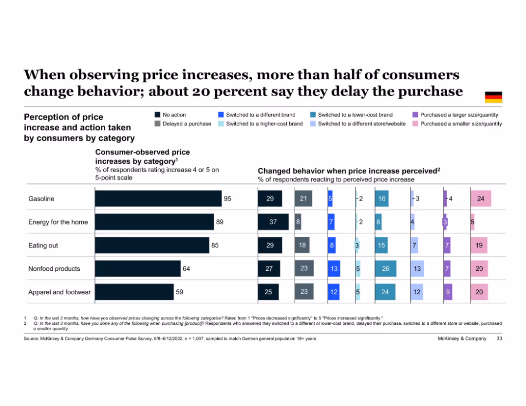
Clustered bar chart showing consumer behavioral response to perceived price increases by category (e.g., gas, apparel); action types color-coded
Pricing Strategies
Retail & E-commerce
Consumers are highly responsive to perceived price increases. Across categories like gasoline, energy, and food, many switch to lower-cost brands or delay purchases. Delaying purchases is particularly common for gas and non-essentials. The slide emphasizes behavior changes in response to inflationary pressure.
price perception, delayed purchase, inflation response, price sensitivity, category behavior, Germany, consumer change
false
Pricing Strategies
Retail & E-commerce
Single Chart
McKinsey
Add to my slides
Remove from favorites
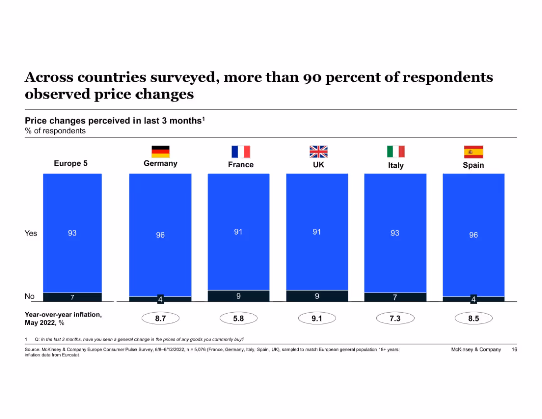
Clustered bar chart showing % of respondents perceiving price changes in the past 3 months across Europe 5 and individual countries. Accompanied by inflation figures at bottom. National flags label each vertical bar.
Market Analysis and Trends
Financial Services
This slide reports that a large majority of European consumers—especially in Germany and Spain—noticed recent price increases. The visual emphasizes a pan-European perception of inflationary pressure, correlating with actual national inflation rates shown at the bottom.
price perception, inflation, Germany, Europe, consumer behavior, price awareness, inflation rates, economic pressure
false
Market Analysis and Trends
Financial Services
Single Chart
McKinsey
Add to my slides
Remove from favorites
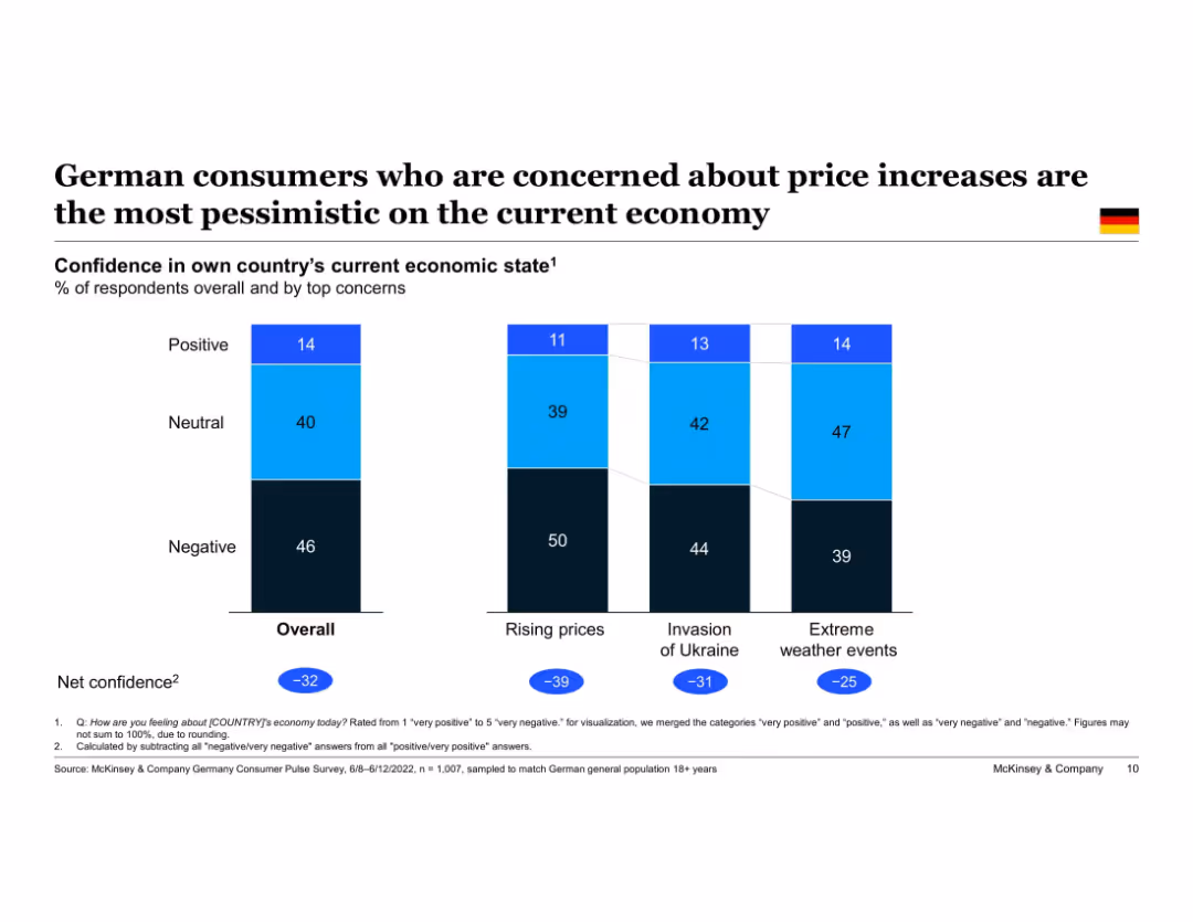
Bar charts showing economic confidence based on respondents' top concerns. Net confidence values included. Consistent style with earlier slides.
Market Analysis and Trends
Consumer Goods
This slide connects consumer concerns with economic sentiment, showing that those focused on rising prices are significantly more pessimistic than those concerned with other issues like the Ukraine conflict or climate change.
price sensitivity, inflation impact, pessimism, economic sentiment, Germany, survey insights, concern correlation
false
Market Analysis and Trends
Consumer Goods
Single Chart
McKinsey
Add to my slides
Remove from favorites
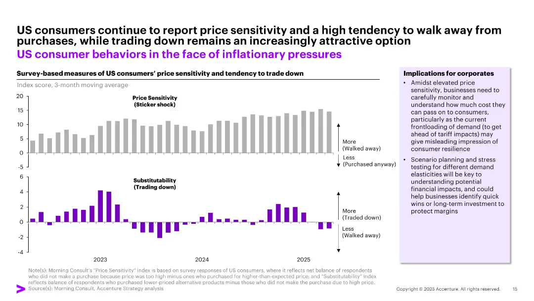
Bar chart layout with two horizontal panels showing survey-based indices for price sensitivity and product substitutability; key implications provided in a side box.
Market Analysis and Trends
Consumer Goods
The slide highlights increasing price sensitivity among US consumers, shown by a growing tendency to avoid purchases due to sticker shock and a shift toward lower-priced alternatives. Implications stress the importance of pricing strategy, demand forecasting, and margin protection amid uncertain inflationary trends.
price sensitivity, trading down, consumer behavior, inflation, elasticity, demand planning
false
Market Analysis and Trends
Consumer Goods
Multiple Chart
Accenture
Add to my slides
Remove from favorites
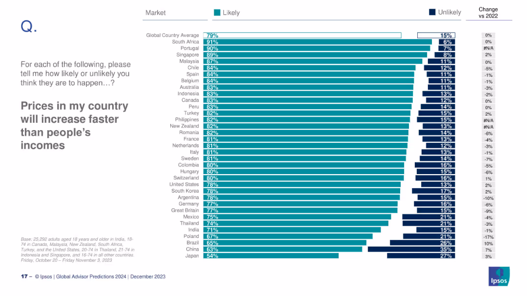
Country-level bar chart on likelihood of price growth outpacing income; includes % change vs 2022.
Financial Performance
Professional Services
This slide shows country-level expectations of price increases exceeding income growth. South Africa (91%) and Portugal (90%) are most concerned; Japan is lowest at 54%.
prices, income, inflation, global ranking, Ipsos, 2024 expectations
false
Financial Performance
Professional Services
Mixed Chart
IPSOS
Add to my slides
Remove from favorites
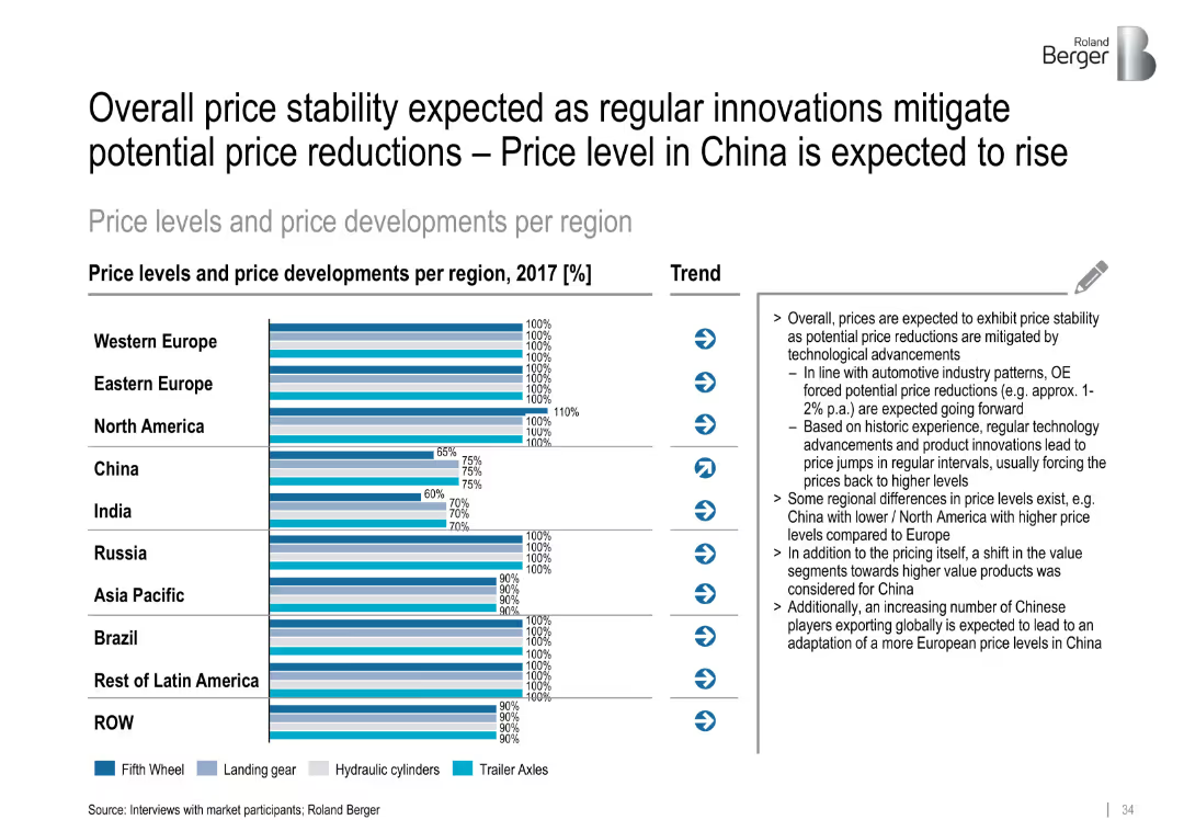
Horizontal bar chart with four component types per region; trend arrows and right-aligned detailed notes
Pricing Strategies
Transportation & Logistics
The slide highlights regional price levels and developments for trailer components in 2017. Western markets show uniform 100% pricing, while developing markets show lower relative price levels. Innovations are expected to stabilize prices, especially in China.
price stability, trailer components, China, pricing forecast, innovation impact, global regions, trailer axles, fifth wheel
false
Pricing Strategies
Transportation & Logistics
Mixed Chart
Roland Berger
Add to my slides
Remove from favorites
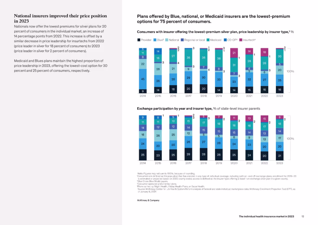
Left panel provides narrative analysis, while the right includes two bar charts: one showing insurer types with lowest silver plan premiums (2014–2023), the other showing exchange participation share by insurer type.
Pricing Strategies
Healthcare & Pharmaceuticals
The slide demonstrates that national insurers gained price competitiveness in 2023, offering the lowest-price silver plans for 20% of consumers. This was a 14-point increase from 2022. It contrasts with Insurtechs, whose share of price leadership declined sharply. Medicaid and Blues continue to lead in offering affordable silver plans to most consumers.
pricing, silver plan, national insurers, Medicaid, affordability
false
Pricing Strategies
Healthcare & Pharmaceuticals
Mixed Chart
McKinsey
Add to my slides
Remove from favorites
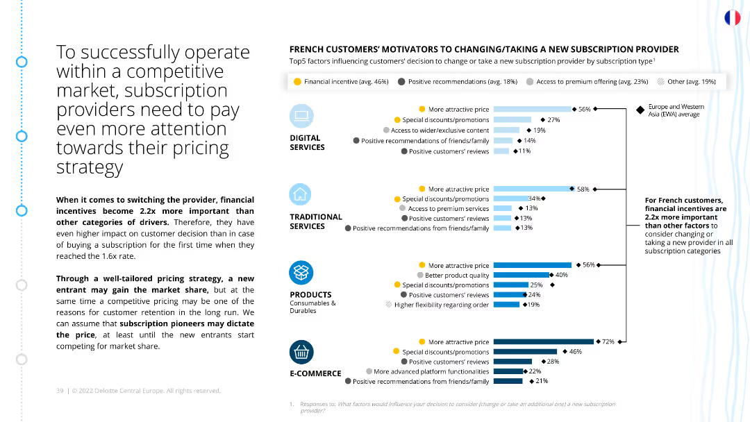
The slide contains a column chart displaying the top factors influencing French customers to change or take new subscription providers. The chart includes categories such as financial incentives, special discounts, access to premium services, and customer reviews.
Strategic Planning
Consumer Goods
The slide emphasizes the importance of pricing strategy for subscription providers in a competitive market. It highlights financial incentives as a key driver for customer decision-making and details other motivators like discounts and premium access.
Pricing strategy, competitive market, financial incentives, subscription motivators, customer decision-making, strategic planning, French market
false
Strategic Planning
Consumer Goods
Multiple Chart
Deloitte
Add to my slides
Remove from favorites
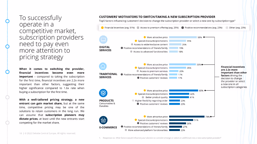
The slide has a column chart listing the top motivators for customers to switch subscription providers, categorized by type. It emphasizes financial incentives and their significance compared to other factors.
Market Analysis and Trends
Consumer Goods
This slide discusses the importance of pricing strategies for subscription providers in competitive markets. It details how financial incentives are crucial in influencing customer decisions to switch providers.
pricing strategy, financial incentives, competitive market, customer motivators, subscription providers, ecommerce, retail
false
Market Analysis and Trends
Consumer Goods
Multiple Chart
Deloitte
Add to my slides
Remove from favorites
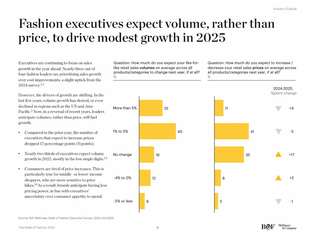
Two-bar chart columns comparing 2024 vs. 2025 executive expectations for volume and price changes. Yellow theme consistent with related slides. Additional commentary on trends provided in side text.
Market Analysis and Trends
Consumer Goods
Executives are shifting their focus from price-driven growth to volume growth for 2025, especially in low single-digit ranges. Fewer expect price increases than in 2024. This reflects consumer resistance to pricing and a focus on affordability and competitive market positioning.
pricing strategy, volume growth, executive expectations, consumer spending, fashion industry, 2025 forecast
false
Market Analysis and Trends
Consumer Goods
Mixed Chart
McKinsey
Add to my slides
Remove from favorites
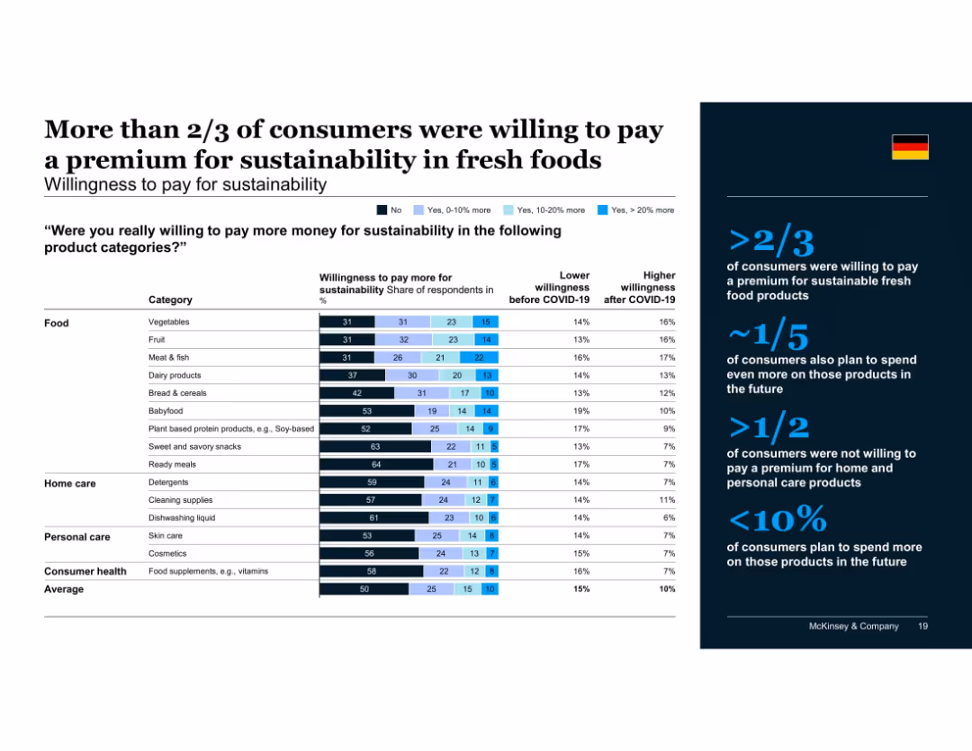
Contains a matrix bar chart showing detailed willingness to pay (none, 0-10%, 10-20%, >20%) for sustainability by product category, along with change before and after COVID-19; right-hand summary in dark blue with German flag.
Pricing Strategies
Retail & E-commerce
Over two-thirds of consumers were willing to pay more for sustainable fresh foods like vegetables, fruits, and meat. In contrast, willingness to pay for home and personal care products was low. Some intent to pay even more post-COVID-19 is also noted.
pricing, sustainability, premium products, food categories, fresh food, COVID-19, consumer trends, willingness to pay, market behavior
false
Pricing Strategies
Retail & E-commerce
Mixed Chart
McKinsey
Add to my slides
Remove from favorites
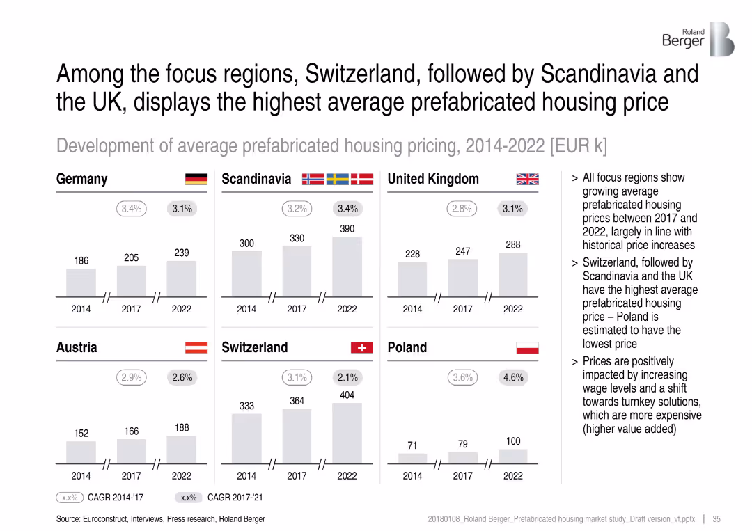
Bar graphs showing average prices across regions; price growth CAGR shown
Performance Metrics and KPIs
Real Estate & Construction
This slide compares average prefabricated housing prices from 2014 to 2022 across key regions. Switzerland leads in pricing, followed by Scandinavia and the UK. Price increases are driven by wage growth and the shift to high-value turnkey homes.
pricing, Switzerland, Scandinavia, UK, prefabricated, turnkey, average housing prices
false
Performance Metrics and KPIs
Real Estate & Construction
Multiple Chart
Roland Berger
Add to my slides
Remove from favorites
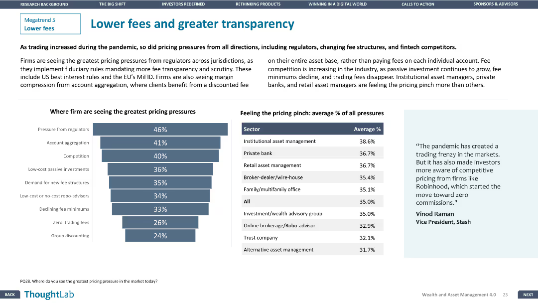
Column chart showing pricing pressures on firms. Another chart displays average percentage of pricing pressures by sector. Design is balanced and engaging.
Pricing Strategies
Financial Services
Addresses pricing pressures on firms from various factors including regulators and competitors, with detailed sector-wise analysis of average pricing pressures.
pricing, transparency, competition, fees, sectors
false
Pricing Strategies
Financial Services
Mixed Chart
Deloitte
Add to my slides
Remove from favorites
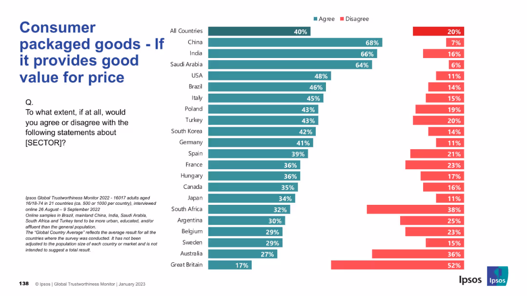
Value perception chart comparing agreement rates that CPG products offer good value for money across countries.
Pricing Strategies
Consumer Goods
This slide shows public agreement/disagreement with the idea that the CPG sector offers good value for money, a key factor in pricing strategy evaluation.
pricing, value, perception, affordability, CPG, trust, Ipsos, consumer evaluation, international data
false
Pricing Strategies
Consumer Goods
Mixed Chart
IPSOS
Add to my slides
Remove from favorites
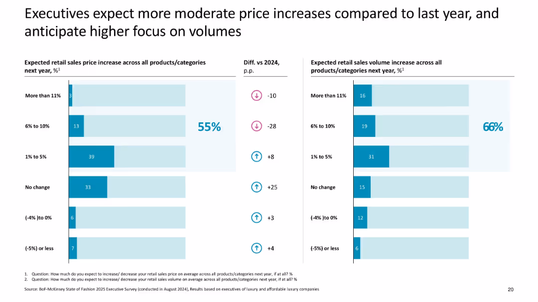
Dual bar charts with pricing and volume expectations; uses % comparisons and trend arrows
Pricing Strategies
Consumer Goods
Highlights expected moderation in retail price increases across luxury categories in 2025, with 55% of execs forecasting small increases and 66% expecting sales volume growth, shifting focus from pricing to volume.
pricing, volume, 2025 forecast, executive expectations, luxury, moderate increases, price strategy
false
Pricing Strategies
Consumer Goods
Multiple Chart
McKinsey
Add to my slides
Remove from favorites
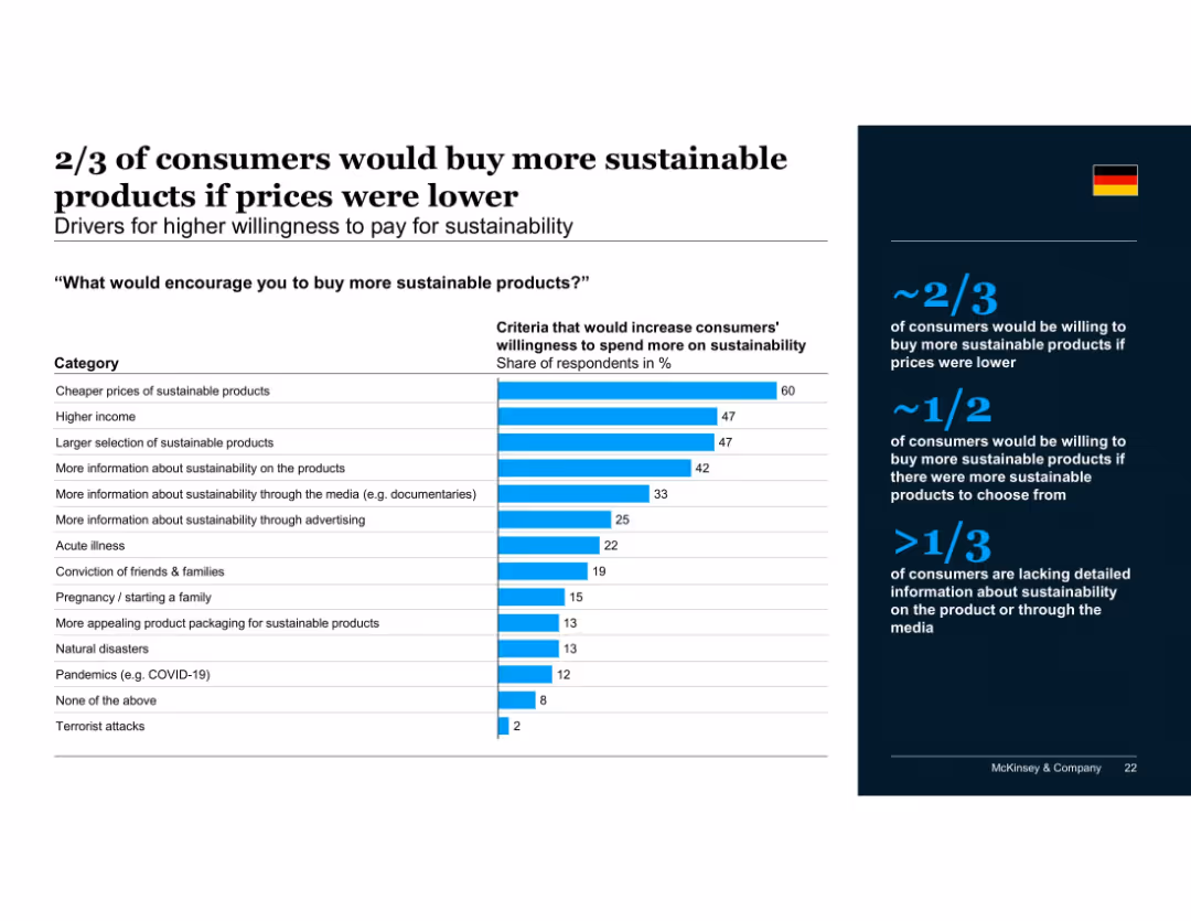
Vertical bar chart showing criteria that would increase willingness to pay, sorted by response rate; summary panel on the right with supporting percentages and insights.
Pricing Strategies
Consumer Goods
Shows that price is the most important barrier to buying sustainable products. Income level, product availability, and lack of information also limit consumer willingness to pay. Over one-third cite the need for more information to make sustainable choices.
pricing, willingness to pay, consumer motivation, affordability, product selection, media influence, sustainable products
false
Pricing Strategies
Consumer Goods
Mixed Chart
McKinsey
Add to my slides
Remove from favorites
The slide includes a stacked bar chart showing where pregnant women receive antenatal care, with a specific focus on primary healthcare centers in Nigeria. The design effectively highlights the significant reliance on these centers.
Investment Analysis
Healthcare & Pharmaceuticals
Evaluates the role of primary healthcare centers in providing antenatal care in Nigeria, discussing the potential for solar adoption to address power shortages that impact service delivery.
primary care, antenatal services, solar adoption, healthcare investment, Nigeria
false
Investment Analysis
Healthcare & Pharmaceuticals
Multiple Chart
BCG
Add to my slides
Remove from favorites
A slide with text and image showcasing a woman using a tablet, with data presented on income sources in households.
Technology and Digital Transformation
Professional Services
Addresses the financial dynamics in households, focusing on women’s roles as earners and the impact on career priorities.
primary earners, household income, gender roles, financial security, career priorities, women's earnings
false
Technology and Digital Transformation
Professional Services
Multiple Chart
Deloitte
Add to my slides
Remove from favorites
The slide features a column chart depicting primary energy demand by fuel from 2000 to 2040 under stated policies scenario. It includes advanced biofuels, primary solid biofuels, hydro, nuclear, other renewables, gas, oil, and coal, with growth rates for each type.
Market Analysis and Trends
Energy & Utilities
This slide analyzes the projected growth rates of different energy sources, showing that wind and solar energies are expected to grow faster than advanced biomass by 2040.
primary energy demand, fuel, growth rate, wind energy, solar energy, biomass, 2040, stated policies scenario
false
Market Analysis and Trends
Energy & Utilities
Mixed Chart
Kearney
Add to my slides
Remove from favorites
Features a column chart for Prime Finance Client Balances by Product Region and a column chart for Synthetics as a percentage of Total Global Prime Finance Revenue.
Financial Performance
Financial Services
Examines the growth in Prime Finance across different regions and the increasing revenue contribution from synthetic products.
prime finance, growth, revenue, synthetic products
false
Financial Performance
Financial Services
Multiple Chart
JP Morgan
Add to my slides
Remove from favorites
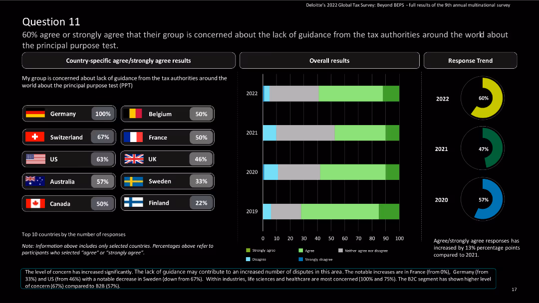
The slide features country-specific results and a column chart showing overall and response trend results over the years.
Regulatory and Compliance
Financial Services
The slide highlights concerns about the lack of guidance from tax authorities regarding the principal purpose test (PPT).
Principal purpose test, tax guidance, concerns, global tax, Deloitte, agree, strongly agree, survey, multinational
false
Regulatory and Compliance
Financial Services
Multiple Chart
Deloitte
Add to my slides
Remove from favorites
This slide uses multiple column charts to depict the revenue trends for printed publications versus digital media in Hong Kong, Singapore, and Taiwan from 2022 to 2027. The graphs are clearly marked and color-coded, making it easy to distinguish between the regions and media types. The design is clean, focusing on the visual data complemented by minimal text to provide context and clarity.
Market Analysis and Trends
Media & Entertainment
Offers a comparative analysis of revenue trends in printed and digital media across multiple regions, highlighting the ongoing decline in print. Useful for strategic planning in media and advertising sectors focusing on digital growth.
printed publications, digital media, revenue trends, Hong Kong, Singapore, Taiwan, market shift
false
Market Analysis and Trends
Media & Entertainment
Multiple Chart
PwC/Strategy&
Add to my slides
Remove from favorites
Slide includes column charts showing trends in print and digital newspaper display revenues from 2003 to 2019.
Financial Performance
Media & Entertainment
Analyzes the trends in newspaper advertising revenue, noting the substantial decline in print and the slight offset by digital gains.
print media, digital gains, advertising revenue, newspaper, trend analysis, decline, media market, revenue analysis, print vs digital
false
Financial Performance
Media & Entertainment
Multiple Chart
Accenture
Add to my slides
Remove from favorites
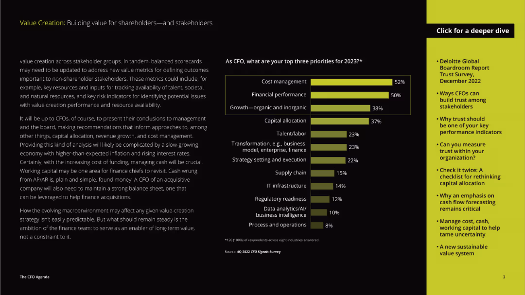
The layout includes a detailed paragraph on the left and a vertical column chart on the right. The text discusses priorities for CFOs in 2023, while the chart visualizes the top priorities.
Strategic Planning
Professional Services
The slide discusses the priorities of CFOs for the year 2023, focusing on cost management, financial performance, and growth, emphasizing the evolving role of CFOs in strategic decision-making.
priorities, CFOs, cost management, financial performance, growth, strategic planning, value creation, stakeholders, 2023
false
Strategic Planning
Professional Services
Mixed Chart
Deloitte
Add to my slides
Remove from favorites
Textual content with minimal visuals and icons
Strategic Planning
Hospitality & Tourism
Outlines strategic priorities for developing high-end tourism in Europe, focusing on sustainability, nature tourism, and infrastructure improvements.
priorities, development, tourism, strategy, sustainability
false
Strategic Planning
Hospitality & Tourism
Pillar
Bain
Add to my slides
Remove from favorites
The slide presents a comparative analysis of priorities across various industries, with bar charts showing certainty levels for different priorities per industry.
Strategic Planning
Professional Services
It provides a summary of the key priorities in different industries, comparing the levels of certainty for each priority, offering a strategic planning overview.
Priorities, industries, comparative analysis, certainty, strategic planning, overview
false
Strategic Planning
Professional Services
Multiple Chart
Roland Berger
Add to my slides
Remove from favorites
Contains a timeline and structured text boxes outlining strategic priorities and goals from 2023 to 2028.
Strategic Planning
Financial Services
The slide outlines strategic priorities over time, focusing on sustainable growth and value creation through 2028.
priorities, strategic planning, sustainable growth, timeline, goals
false
Strategic Planning
Financial Services
Linear Flow
UBS
Add to my slides
Remove from favorites
A flowchart with various privacy controls and methods, ranging from basic to advanced, listed in red blocks on the left side of the slide.
Risk Assessment and Management
Professional Services
Outlines different privacy controls and methods for protecting consumer data, from encryption and redaction to advanced techniques like random noise injection.
privacy controls, consumer data, encryption, redaction, privacy methods
false
Risk Assessment and Management
Professional Services
Vertical Flow
IPSOS
Add to my slides
Remove from favorites
Includes a circular diagram with four key steps towards designing customer-centric data experiences, accompanied by a text block.
Regulatory and Compliance
Technology & Software
Provides guidelines for creating trust-centric marketing strategies, focusing on consumer empowerment and integrated privacy measures.
privacy, data, customer, trust, marketing, strategy, technology, guidelines, empowerment, integration
false
Regulatory and Compliance
Technology & Software
Linear Flow
Deloitte
Add to my slides
Remove from favorites
Displays a text block with a circular infographic highlighting consumer attitudes towards data tracking and a scenic image with birds.
Regulatory and Compliance
Technology & Software
Explores consumer perceptions of privacy in data tracking, highlighting the potential for security functions to foster customer trust.
privacy, data, marketing, tracking, consumer, trust, security, technology, perception, engagement
false
Regulatory and Compliance
Technology & Software
Mixed Chart
Deloitte
Add to my slides
Remove from favorites
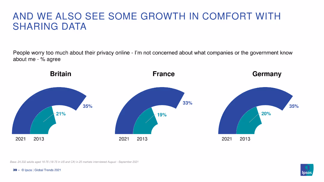
A combination of line and bar charts showing the percentage of people in Britain, France, and Germany who are not concerned about online privacy in 2013 and 2021.
Market Analysis and Trends
Technology & Software
This slide presents the change in attitudes towards online privacy from 2013 to 2021 in Britain, France, and Germany, indicating a growth in comfort with data sharing.
privacy, data sharing, trends, Europe, survey
false
Market Analysis and Trends
Technology & Software
Multiple Chart
IPSOS
Add to my slides
Remove from favorites
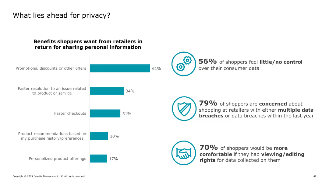
The slide features bar charts and infographics detailing shopper concerns and desired benefits regarding data privacy, including percentages for each data point.
Regulatory and Compliance
Retail & E-commerce
It discusses shopper concerns about data privacy, highlighting desired benefits from retailers in exchange for personal information and current data security concerns.
privacy, data, shoppers, concerns, benefits
false
Regulatory and Compliance
Retail & E-commerce
Mixed Chart
Deloitte
Add to my slides
Remove from favorites
Text-heavy slide detailing privacy engineering and explainable AI, with descriptions and benefits listed.
Technology and Digital Transformation
Technology & Software
Analyzes the role of privacy engineering in data protection and the benefits of explainable AI in making technology trustworthy.
privacy engineering, explainable AI, data privacy, ethical AI, trust in technology
false
Technology and Digital Transformation
Technology & Software
Header Horizontal
McKinsey
Add to my slides
Remove from favorites
Contains a series of bar charts arranged horizontally, showing various data points related to user willingness to share different types of personal information. Each bar chart is color-coded to represent different levels of willingness.
Regulatory and Compliance
Technology & Software
Discusses consumer perspectives on privacy and data sharing with law enforcement, specifically for online fraud protection. Useful for presentations on digital privacy and security.
privacy, law enforcement, data sharing, consumer behavior, online security, fraud prevention, digital rights, public opinion, cybersecurity, trust
false
Regulatory and Compliance
Technology & Software
Mixed Chart
Deloitte
Add to my slides
Remove from favorites
This slide presents a column chart detailing how marketers rate the importance of managing customer privacy in their roles, with additional data breakdowns by industry. The layout is efficient, utilizing colors and labels to enhance readability and ensure quick comprehension of the data. An insights section provides additional analysis and context.
Human Resources and Talent Management
Healthcare & Pharmaceuticals
Highlighting the integration of privacy management in marketing roles, this slide is vital for understanding the emphasis on privacy across different sectors, especially in healthcare. It is useful for training and development sessions focused on enhancing privacy practices within marketing teams.
privacy management, healthcare, marketing roles, industry comparison, training
false
Human Resources and Talent Management
Healthcare & Pharmaceuticals
Mixed Chart
Deloitte
Add to my slides
Remove from favorites
Column chart showing net agreement percentages (agree-disagree) about privacy concerns across various markets, highlighting significant variations from market to market.
Risk Assessment and Management
Technology & Software
Demonstrates the varying levels of concern about privacy across different markets, with India showing the highest concern and Japan showing the lowest, indicating diverse perspectives globally.
privacy, markets, concern, survey, variation
false
Risk Assessment and Management
Technology & Software
Mixed Chart
IPSOS
Add to my slides
Remove from favorites
The slide includes a header, a background image, and two sections: a text block on the left and a bar chart on the right. The bar chart compares survey responses on the desire for control over personal health data versus the desire for personalized advice, using different colors for levels of agreement and disagreement.
Technology and Digital Transformation
Technology & Software
Explores the tension between privacy and personalization in health data management. The bar chart displays survey data on people's preferences for controlling personal health data versus receiving personalized health advice, showing varying levels of agreement and disagreement.
Privacy, personalization, health data, survey, preferences
false
Technology and Digital Transformation
Technology & Software
Mixed Chart
IPSOS
Add to my slides
Remove from favorites
A flowchart diagram showing the interconnectivity of privacy-preserving technologies, including data platforms, clean rooms, and activation channels.
Technology and Digital Transformation
Technology & Software
Depicts the interconnectivity of various privacy-preserving technologies, emphasizing the integration of data platforms and clean rooms for secure data management.
privacy-preserving, interconnectivity, data platforms, clean rooms, technology
false
Technology and Digital Transformation
Technology & Software
Diagram
IPSOS
Add to my slides
Remove from favorites
Column chart showing the percentage of respondents agreeing or disagreeing with statements about privacy concerns, highlighting the inevitability of privacy loss due to new technology.
Risk Assessment and Management
Technology & Software
Addresses the global concern about loss of privacy due to technology, with significant agreement that privacy loss is inevitable and concerns about government and corporate data collection.
privacy, technology, concern, survey, inevitability
false
Risk Assessment and Management
Technology & Software
Mixed Chart
IPSOS
Add to my slides
Remove from favorites
The slide features a title at the top, followed by a bar chart showing the percentage of U.S. marketers using different technologies like DMPs and CDPs. The chart bars are horizontal.
Technology and Digital Transformation
Technology & Software
The slide discusses the adoption rates of various privacy-preserving technologies among U.S. marketers, highlighting the usage of DMPs and CDPs.
privacy, technology, DMPs, CDPs, adoption
false
Technology and Digital Transformation
Technology & Software
Mixed Chart
IPSOS
Add to my slides
Remove from favorites
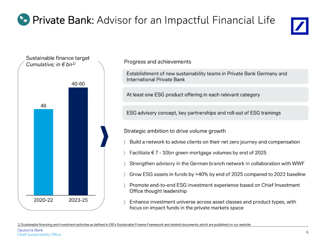
The slide includes a title, a vertical bar chart on the left, and bullet points on the right detailing progress and strategic goals.
Client Case Studies
Financial Services
Describes the progress and strategic ambitions of the Private Bank, emphasizing sustainable finance and ESG advisory services.
private, advisor, financial, ESG, impact
false
Client Case Studies
Financial Services
Mixed Chart
Deutsche Bank
Add to my slides
Remove from favorites
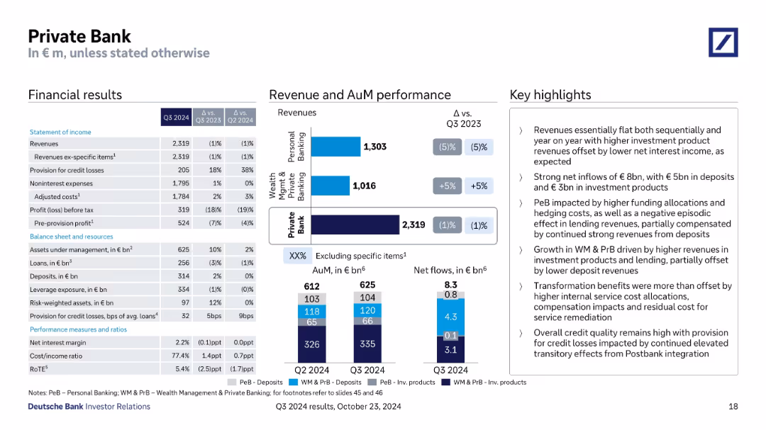
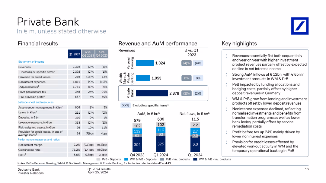
Financial results, revenue & AuM bar charts, and highlight box; segmented view of business areas.
Financial Performance
Financial Services
Reviews Private Bank’s Q3 2024 outcomes: stable revenues, net inflows of €8bn, cost impacts from service allocations, and continued Postbank integration effects. Includes breakdowns of revenue sources and net flows in deposits and investment products.
Private Bank, AuM, deposits, investment products, Postbank integration
false
Financial Performance
Financial Services
Multiple Chart
Deutsche Bank
Add to my slides
Remove from favorites
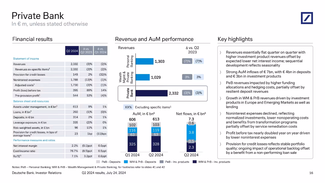
Three-column format: income statement and balance sheet on the left, bar and stacked column charts in the center for revenue and net flows, and summary highlights on the right.
Financial Performance
Financial Services
Q2 2024 Private Bank results showing stable revenues with investment product growth, strong net flows of €7.3bn, and significant YoY improvement in pre-tax profit. Emphasis on AuM growth, cost reduction, and deposit resilience.
private bank, AuM, deposits, loans, costs, net flows, revenues
false
Financial Performance
Financial Services
Multiple Chart
Deutsche Bank
Add to my slides
Remove from favorites
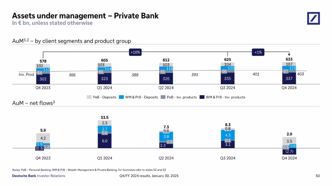
Stacked bar charts segmented by client and product groups for four quarters, along with net flows in a separate bottom bar graph
Financial Performance
Financial Services
The slide illustrates changes in assets under management (AuM) across client segments for Deutsche Bank's Private Bank, showing a gradual increase in total AuM and positive net flows throughout 2024.
Private Bank, AuM, net flows, client segments, deposits, investment products, quarterly growth, Deutsche Bank
false
Financial Performance
Financial Services
Multiple Chart
Deutsche Bank
Add to my slides
Remove from favorites
Contains several pie charts and column charts depicting revenues by client segment, assets under management, and new client segments within personal and wealth management.
Customer and Market Segmentation
Financial Services
Analyzes new client segments and key metrics for private banking, highlighting revenues, assets under management, and focused client segments.
private bank, client segments, revenues, assets under management, personal banking, wealth management
false
Customer and Market Segmentation
Financial Services
Multiple Chart
Deutsche Bank
Add to my slides
Remove from favorites
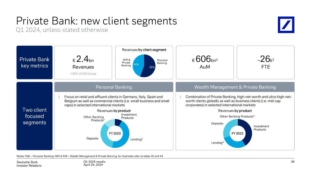
Multi-panel layout with revenue figures, donut charts, and segment descriptions. Structured into key metrics and two client segments.
Customer and Market Segmentation
Financial Services
This slide details Q1 2024 performance in Deutsche Bank’s Private Bank, including €2.4bn revenue, client segmentation (Personal vs. Wealth Management), and regional and product-based focuses. Charts show revenue by client segment and product types.
Private Bank, Client Segments, Wealth Management, Personal Banking, Revenue, Q1 2024, AuM, FTE, Client Focus
false
Customer and Market Segmentation
Financial Services
Multiple Chart
Deutsche Bank
Add to my slides
Remove from favorites
Presents detailed financial results and revenue trends through multiple graphs and comparative metrics.
Financial Performance
Financial Services
Highlights Q1 2023 financial and operational performance of a private bank, with focus on revenue and asset management, essential for financial strategy discussions.
private bank, financial performance, Q1 2023, revenue, asset management
false
Financial Performance
Financial Services
Multiple Chart
Deutsche Bank
Add to my slides
Remove from favorites
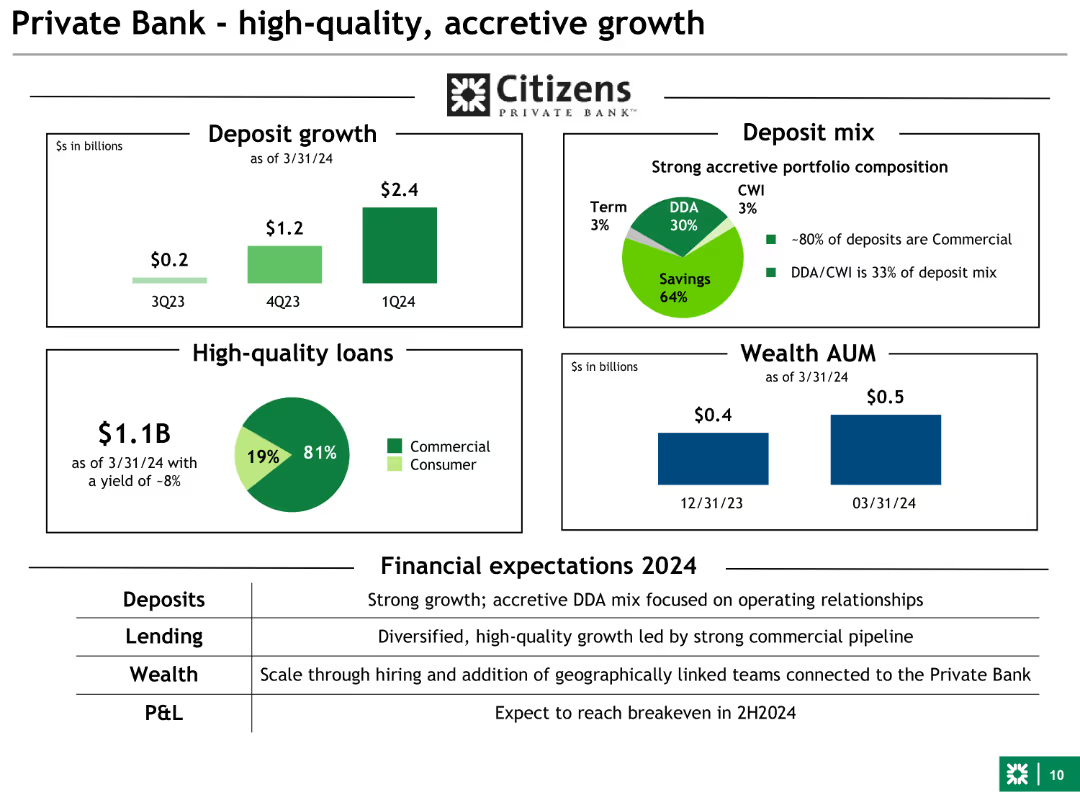
Combination of bar charts and pie charts showing deposit growth, loan quality, and wealth AUM. Uses green and other colors for different data points.
Financial Performance
Financial Services
This slide focuses on the Private Bank's growth, highlighting deposit increases, high-quality loans, and wealth management assets under management (AUM).
private bank, growth, deposits, loans, AUM
false
Financial Performance
Financial Services
Multiple Chart
Barclays
Add to my slides
Remove from favorites
The slide includes column charts comparing data from different years.
Investment Analysis
Financial Services
Shows the growth of the Global Private Bank by comparing the number of hires, training hours, and advisor revenue contribution across years.
Private Bank, Growth, Hires, Training
false
Investment Analysis
Financial Services
Multiple Chart
JP Morgan
Add to my slides
Remove from favorites
Layout with financial results table, bar charts for revenue and AuM, and highlights
Financial Performance
Financial Services
Shows Q1 2024 financials for Private Bank with minor revenue decline but strong profit growth due to reduced expenses. Net flows in investment products and asset growth are emphasized, along with temporary credit loss drivers.
private banking, AuM, deposits, loans, credit losses, PeB, WM & PrB
false
Financial Performance
Financial Services
Multiple Chart
Deutsche Bank
Add to my slides
Remove from favorites
The slide includes bar and column charts depicting financial results and revenue details, complemented by comprehensive financial data and changes over the quarter. Textual highlights emphasize performance metrics.
Financial Performance
Financial Services
Discusses the Q2 2023 financial results of Deutsche Bank's Private Bank, showing significant revenue growth driven by net interest income and other key financial metrics.
Private banking, financial results, revenue growth, net interest income, financial analysis, Deutsche Bank, Q2 2023
false
Financial Performance
Financial Services
Multiple Chart
Deutsche Bank
Add to my slides
Remove from favorites
Consisting of column charts, this slide provides an analysis of private banking and lending revenues, with growth metrics.
Operational Efficiency
Financial Services
Meant for stakeholders interested in the private banking and lending sector, showing revenue growth and providing insights into market expansion strategies, excluding specific product lines for focused analysis.
private banking, lending, revenue growth, strategy, market expansion
false
Operational Efficiency
Financial Services
Single Chart
Goldman Sachs
Add to my slides
Remove from favorites
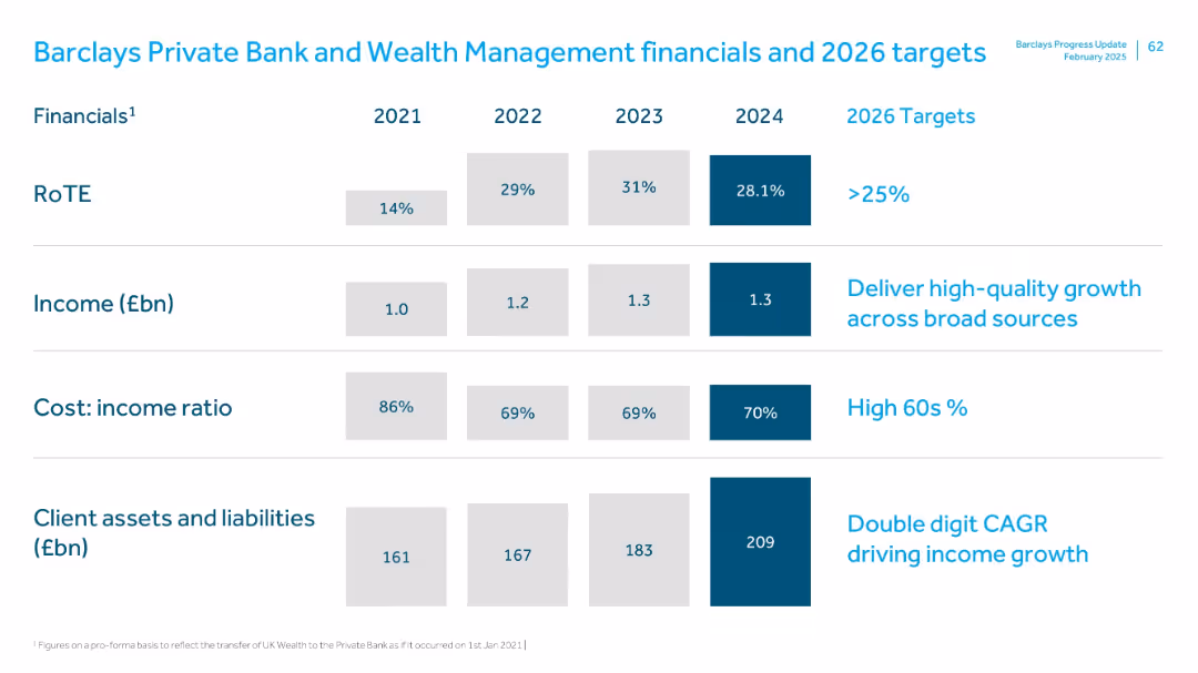
Similar tabular format as previous, showing metrics over time with 2026 targets; bold blue used to highlight 2024 figures
Financial Performance
Financial Services
This slide tracks financial performance from 2021 to 2024 for the Private Bank & Wealth Management division. Key metrics include RoTE, income, cost-income ratio, and client assets/liabilities. The 2026 targets aim for over 25% RoTE and double-digit CAGR in client assets and income.
Private banking, wealth management, RoTE, CAGR, income growth, client assets
false
Financial Performance
Financial Services
Single Chart
Barclays
Add to my slides
Remove from favorites
A column chart and bar chart showing revenue and assets under management performance, with a table of financial results and key highlights. The slide is detailed with a balance of text and visuals.
Financial Performance
Financial Services
The slide presents Q1 2024 financial results for the Private Bank, including revenue, profit, and assets under management, with a detailed breakdown of performance across different segments.
Private Bank, revenue performance, financial results, assets under management
false
Financial Performance
Financial Services
Multiple Chart
Deutsche Bank
Add to my slides
Remove from favorites
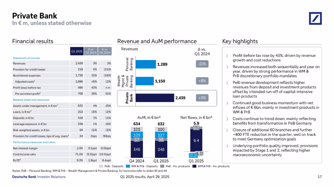
Three-column format: detailed financials, revenue & AuM breakdown with bar charts, and textual highlights.
Financial Performance
Financial Services
Q1 2025 Private Bank results include a 3% revenue increase, significant cost reductions, and a 43% rise in pre-tax profit. Revenue gains from Wealth Management offset Personal Banking declines. Net inflows of €6B indicate positive momentum.
private bank, wealth management, net inflows, revenue performance, loans, deposits, discretionary portfolio
false
Financial Performance
Financial Services
Multiple Chart
Deutsche Bank
Add to my slides
Remove from favorites
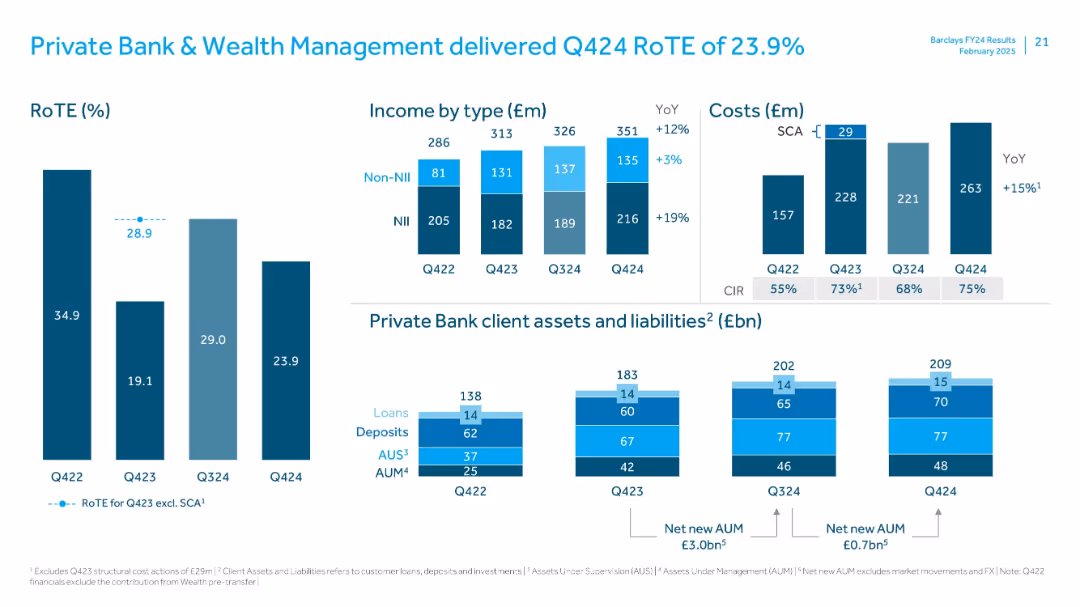
Bar charts for RoTE and income; bottom section covers client assets and liabilities using stacked bars
Financial Performance
Financial Services
Reviews Private Bank & Wealth Management’s Q424 RoTE performance. Income rose YoY, driven by NII growth. Assets under management and supervision increased, highlighting strong net new inflows. CIR and cost movements also explained.
Private Bank, Wealth Management, RoTE, AUM, AUS, NII, CIR, client assets, liabilities
false
Financial Performance
Financial Services
Multiple Chart
Barclays
Add to my slides
Remove from favorites
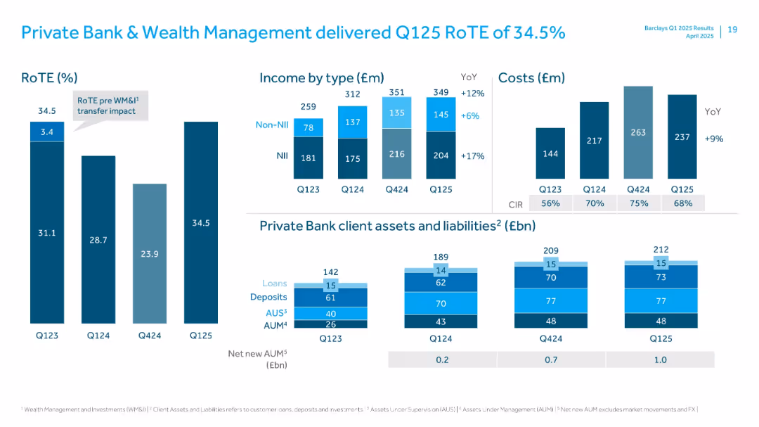
Stacked bar charts showing income, cost, RoTE, and client assets/liabilities with detailed breakdowns.
Financial Performance
Financial Services
Reports strong performance in Private Banking with RoTE of 34.5%. Provides breakdown of income types, costs, and evolution of client assets like loans, deposits, AUS, and AUM. Notes YoY growth in all income and client metric categories.
Private Bank, Wealth Management, RoTE, AUM, AUS, NII, Non-NII, Q125, Client Assets
false
Financial Performance
Financial Services
Multiple Chart
Barclays
Add to my slides
Remove from favorites
This slide is a stacked bar chart titled "Global private capital dry powder". It shows various categories of investments stacked over a timeline from 2005 to 2022. The colors differentiate types of private capital like buyout, venture capital, etc. The chart peaks in 2022, emphasizing the increase with "$3.7T".
Investment Analysis
Financial Services
Depicting the accumulation of unallocated private capital over time, this slide can be utilized to discuss investment strategies and potential market saturation with a focus on future allocations in private equity.
Private Capital, Dry Powder, Investment, Buyout, Venture Capital, Market Saturation, Equity
false
Investment Analysis
Financial Services
Multiple Chart
Bain
Add to my slides
Remove from favorites
This is a complex slide with a central circular diagram linking different business services, accompanied by images and statistics related to private capital, tech innovation, and principal investment.
Investment Analysis
Financial Services
Discusses Macquarie's multifaceted approach to combining ideas and capital to unlock business opportunities, particularly in private capital and tech innovation. Geared towards investors and businesses looking to understand investment landscapes.
Private Capital, Tech Innovation, Investment, Business Opportunities
false
Investment Analysis
Financial Services
Framework
Morgan Stanley
Add to my slides
Remove from favorites
Left-aligned bar chart over a dark gradient background; bars color-coded by region with annotations. Right side has detailed explanation in white text.
Investment Analysis
Financial Services
Illustrates the significant and steady growth in global private credit AUM since 2000, driven by non-bank lenders and structural shifts in financial services. The slide also discusses regulatory implications and market expansion potential for non-banks.
Private Credit, AUM, CAGR, Non-Banks, Regulation, Lending, Structured Finance, Dry Powder, Regional Growth
false
Investment Analysis
Financial Services
Mixed Chart
Accenture
Add to my slides
Remove from favorites
Bar graph on left showing AUM growth; right side has supporting text and projected growth forecast.
Market Analysis and Trends
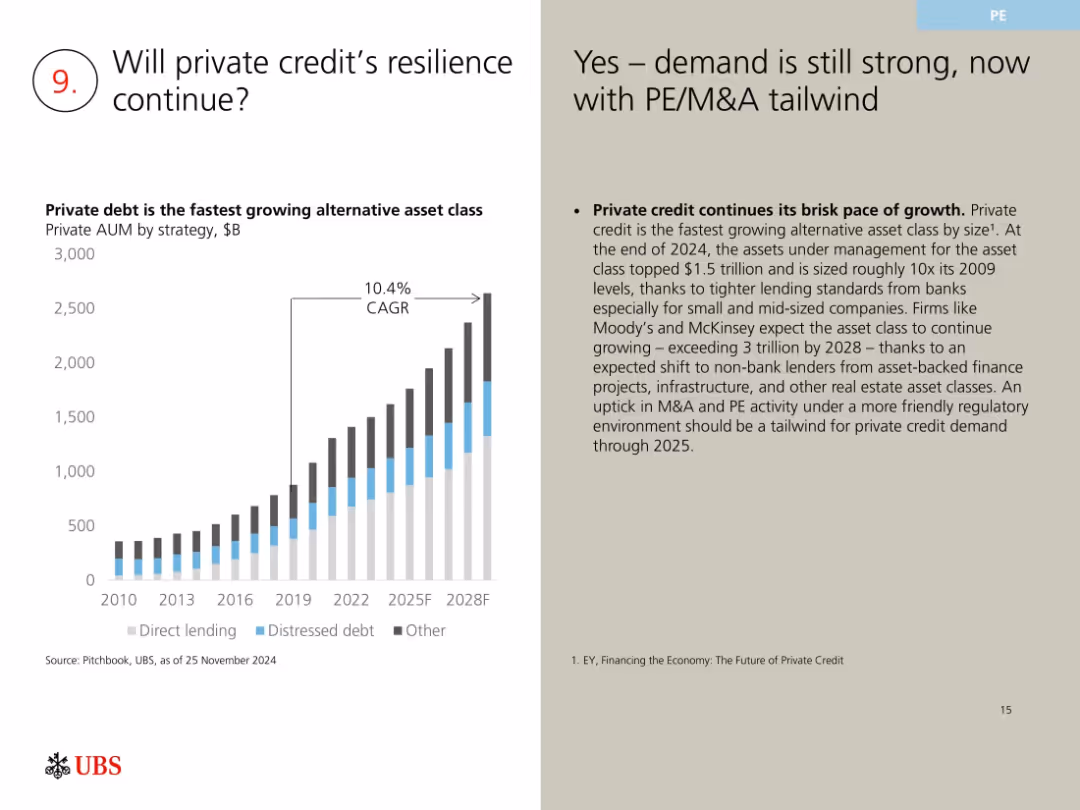
Financial Services
This slide highlights the growth trajectory of private credit, showing a 10.4% CAGR with projections exceeding $3 trillion AUM by 2028. Key drivers include tighter bank lending standards, more PE/M&A activity, and a favorable regulatory environment supporting non-bank lending models.
private credit, AUM growth, alternative assets, CAGR, M&A tailwind
false
Market Analysis and Trends
Financial Services
Mixed Chart
UBS
Add to my slides
Remove from favorites
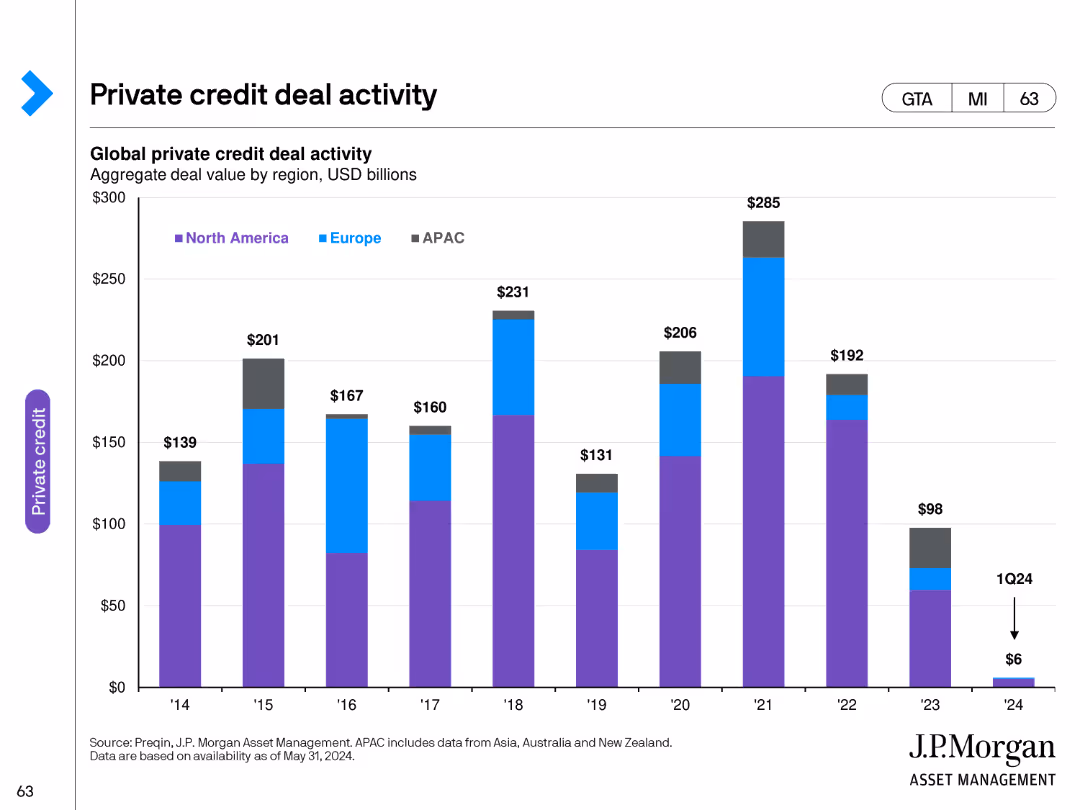
The slide contains a column chart illustrating global private credit deal activity by region from 2014 to 2024. The regions are color-coded for North America, Europe, and APAC.
Financial Performance
Financial Services
This slide shows the aggregate deal value of private credit activity across different regions, providing insights into geographical trends in the private credit market.
private credit, deal activity, regions, financial trends, global
false
Financial Performance
Financial Services
Single Chart
JP Morgan
Add to my slides
Remove from favorites
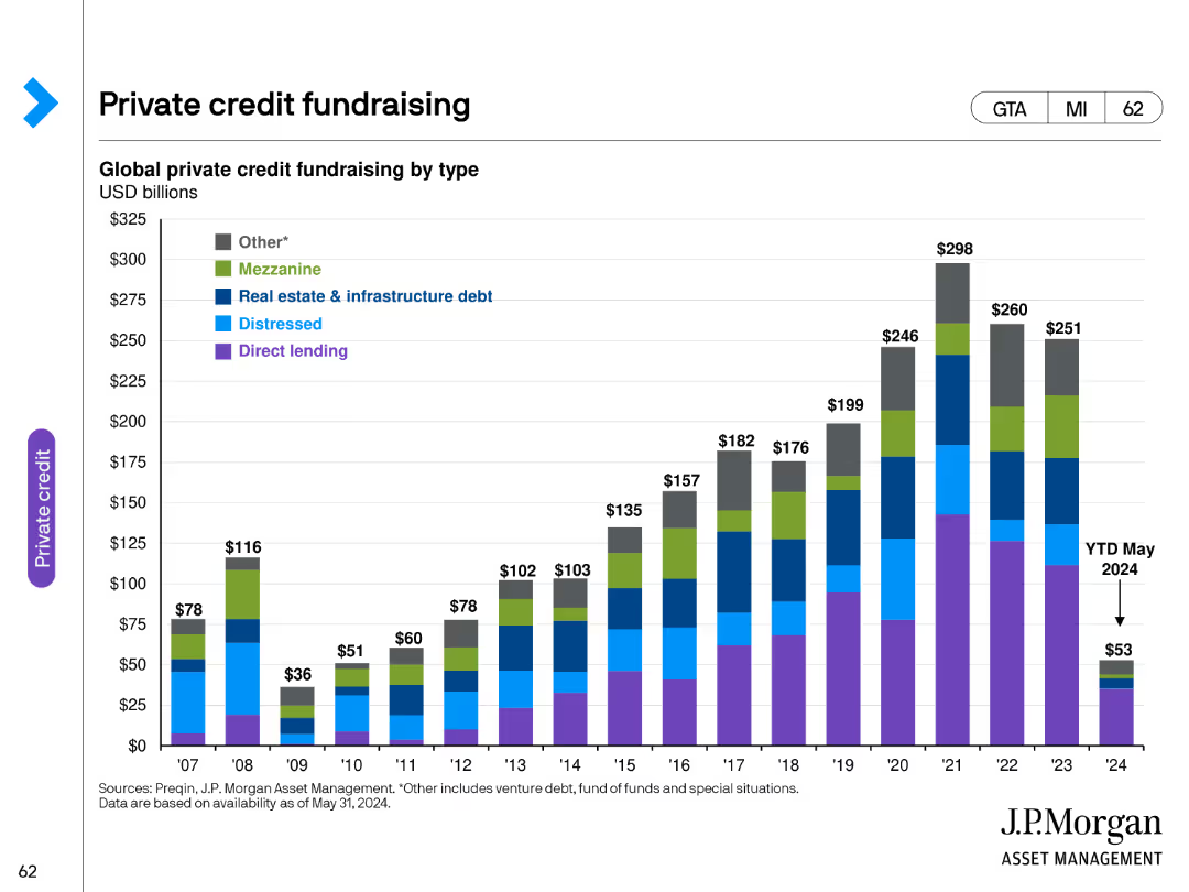
This slide features a column chart depicting global private credit fundraising by type from 2007 to May 2024. Different types of private credit fundraising are color-coded for clarity.
Financial Performance
Financial Services
The slide provides a comprehensive overview of private credit fundraising trends over the years, highlighting the growth and distribution of different types of private credit.
private credit, fundraising, financial services, trends, data
false
Financial Performance
Financial Services
Single Chart
JP Morgan
Add to my slides
Remove from favorites
The slide uses bullet points to describe private credit strategies and examples. It includes a circular diagram dividing private credit into four categories.
Investment Analysis
Financial Services
Describes private credit, its illiquidity, high yield potential, and strategies like direct lending, venture debt, and mezzanine. Provides examples of private credit.
Private credit, investment, direct lending, mezzanine, venture debt, distressed debt
false
Investment Analysis
Financial Services
Diagram
UBS
Add to my slides
Remove from favorites
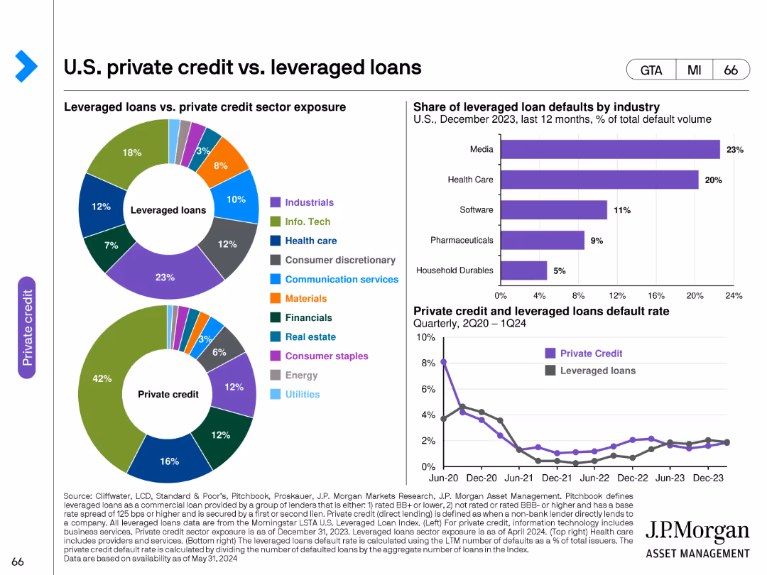
This slide features two pie charts and one line chart. The pie charts compare sector exposure between leveraged loans and private credit. The line chart shows the share of leveraged loan defaults by industry from December 2023 to 2024.
Investment Analysis
Financial Services
The slide compares the sector exposures of leveraged loans and private credit, and analyzes the default rates by industry, providing a comprehensive view of risk and sector distribution in private credit markets.
private credit, leveraged loans, sector exposure, defaults, investment
false
Investment Analysis
Financial Services
Multiple Chart
JP Morgan
Add to my slides
Remove from favorites
Column chart and line chart showing average private credit cashflow/interest expense and distressed debt & special situations dry powder over time.
Investment Analysis
Financial Services
The slide highlights the attractiveness of special situations private credit, with increasing borrower challenges and available capital for flexible solutions.
private credit, special situations, distressed debt, cashflow, interest expense, investment opportunity
false
Investment Analysis
Financial Services
Multiple Chart
Morgan Stanley
Add to my slides
Remove from favorites
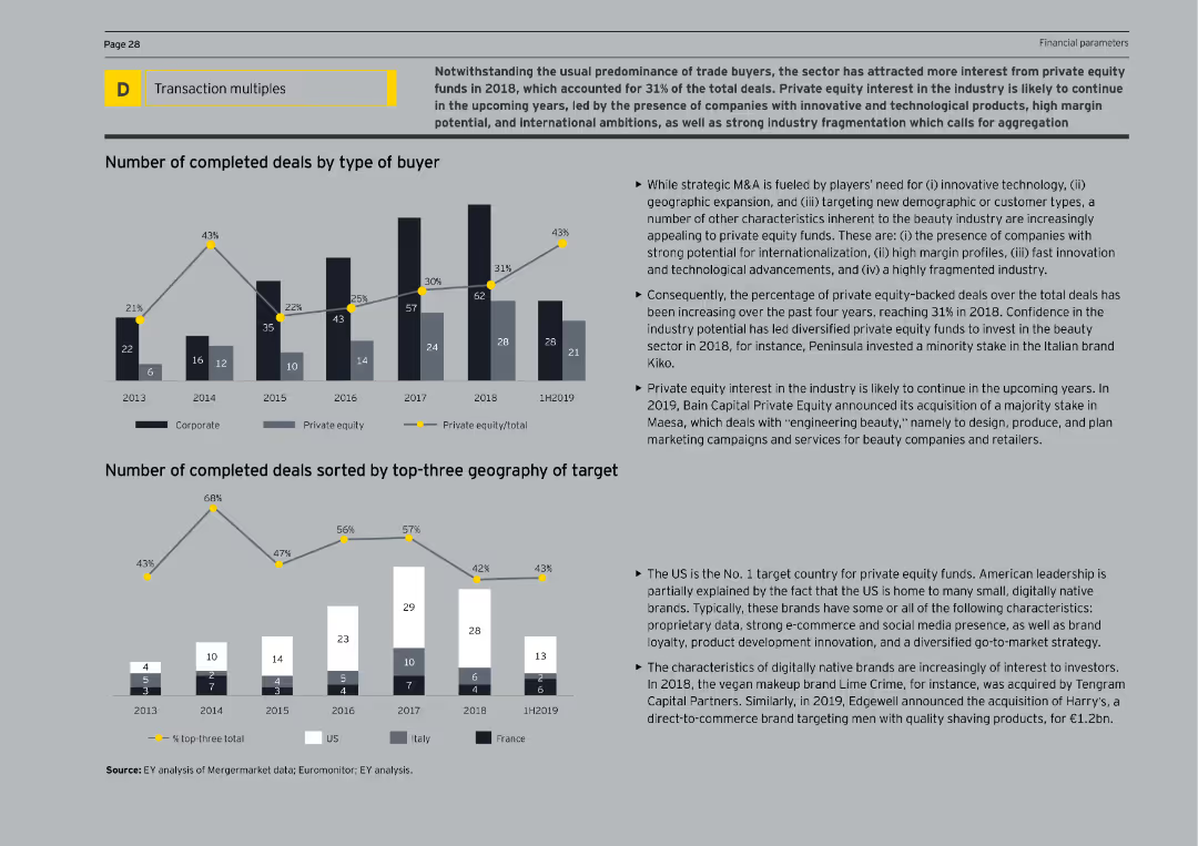
The slide features column charts showing the number of completed deals by buyer type and geography of targets from 2013 to 1H2019. The text explains the growing interest from private equity funds and the characteristics of attractive target companies.
Mergers and Acquisitions
Consumer Goods
The slide examines the growing interest of private equity funds in the beauty sector, highlighting the increasing number of deals by these investors. It provides an overview of the types of companies attracting private equity and the geographical distribution of these investments.
Private Equity, Beauty, M&A, Investments, Deals
false
Mergers and Acquisitions
Consumer Goods
Multiple Chart
EY
Add to my slides
Remove from favorites
Presents a bar chart illustrating the change in global buyout value over years, with the latest year highlighted in red.
Investment Analysis
Financial Services
Discusses the significant drop in global buyout value in 2022, providing insights into the private equity market conditions.
Private Equity, Buyout Value, Market Analysis, 2022 Drop, Investment Trends, Bar Chart, Equity Market Conditions
false
Investment Analysis
Financial Services
Mixed Chart
Bain
Add to my slides
Remove from favorites
The slide features a hexagonal diagram with different sections representing various capital financing options like private equity, venture capital, and public listing.
Investment Analysis
Financial Services
The slide explores alternative capital financing options that local firms are considering, beyond traditional bank financing, highlighting their appetite for private equity and other sources.
private equity, capital financing, venture capital, IPO, non-traditional financing
false
Investment Analysis
Financial Services
Diagram
EY
Add to my slides
Remove from favorites
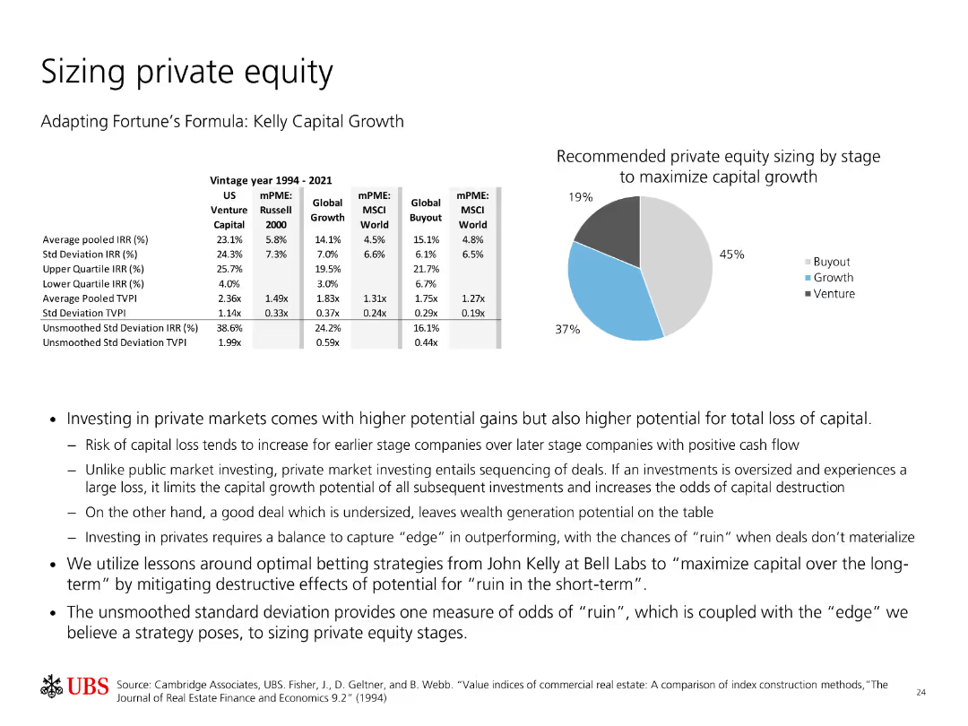
Contains a table with vintage year performance data for private equity and a pie chart showing recommended private equity sizing by stage for maximizing capital growth.
Strategic Planning
Financial Services
Discusses the performance of private equity across different stages and provides recommendations for optimal sizing to maximize capital growth based on historical data.
Private Equity, Capital Growth, Vintage Performance, Risk, Strategy, Investment, Analysis, Recommendations, Kelly Formula
false
Strategic Planning
Financial Services
Mixed Chart
UBS
Add to my slides
Remove from favorites
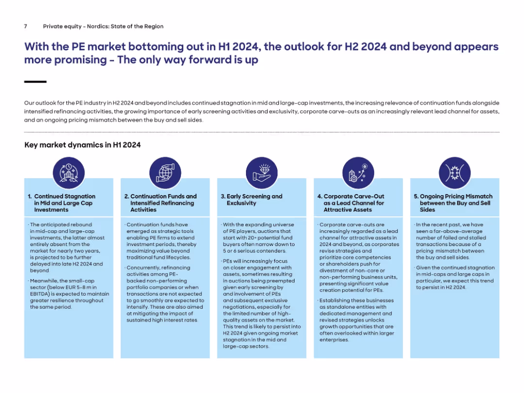
Five-column infographic with icons and text, each describing key PE market dynamics. Header text is in large font, followed by explanatory paragraph and infographic.
Market Analysis and Trends
Financial Services
The slide outlines five major dynamics affecting the private equity market in H1 2024, including stagnation in mid/large-cap investments, continuation funds, early screening, carve-outs, and pricing mismatches. Outlook for H2 2024 is more optimistic.
private equity, continuation funds, carve-outs, market dynamics, refinancing, H1 2024
false
Market Analysis and Trends
Financial Services
Pillar
Roland Berger
Add to my slides
Remove from favorites
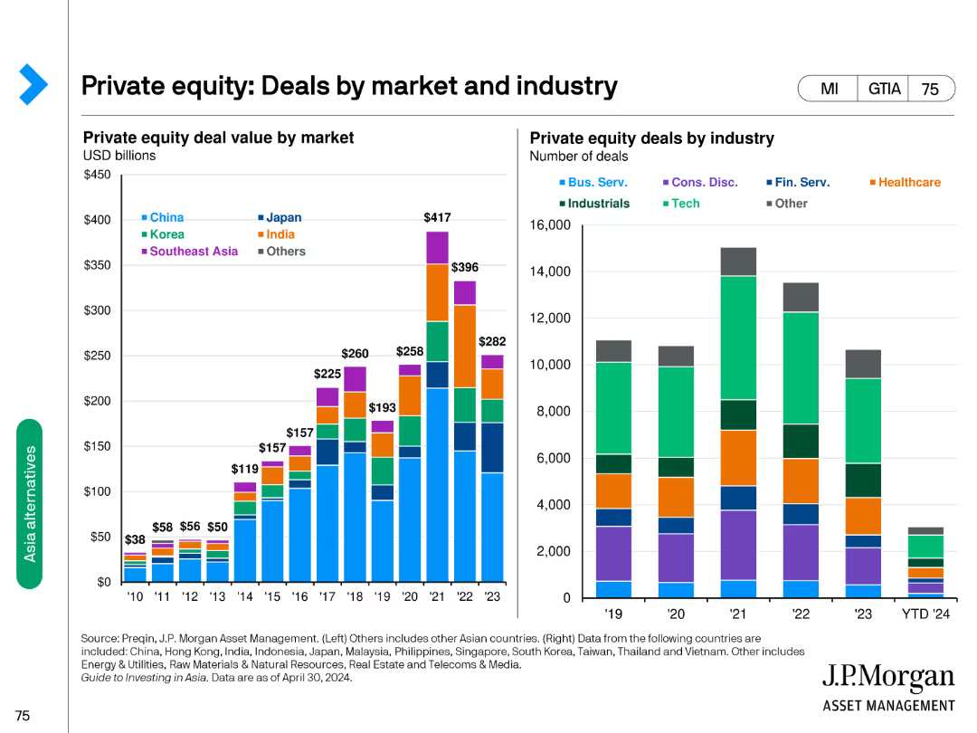
Contains column charts showing private equity deal value by market and industry, indicating variations across different regions and sectors.
Market Analysis and Trends
Financial Services
Presents private equity deal values in billions and the number of deals categorized by industry, highlighting market and industry distributions.
private equity, deals, market, industry, value
false
Market Analysis and Trends
Financial Services
Multiple Chart
JP Morgan
Add to my slides
Remove from favorites
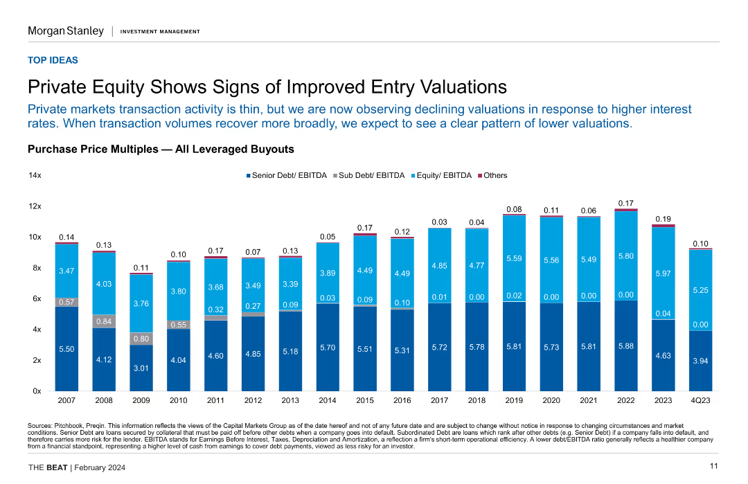
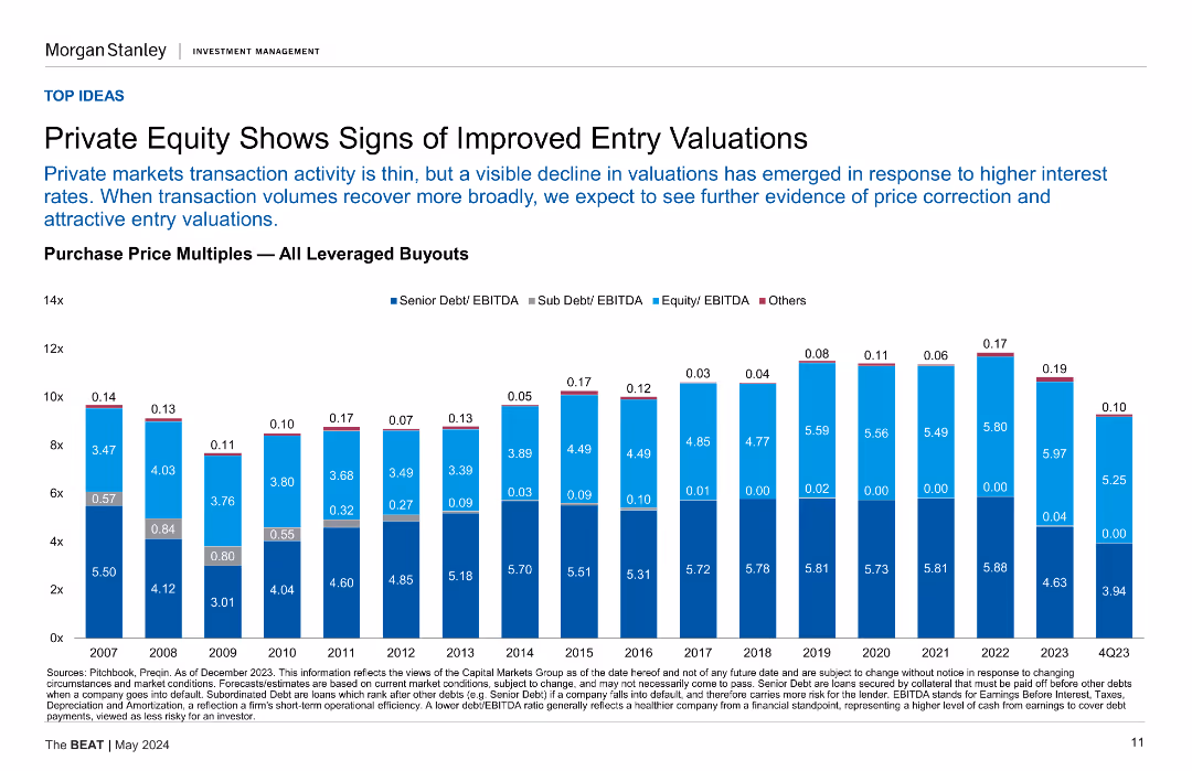
Column chart showing purchase price multiples for all leveraged buyouts over several years, highlighting senior and sub debt/EBITDA ratios.
Investment Analysis
Financial Services
This slide indicates improved entry valuations in private equity, with declining valuations due to higher interest rates, and compares historical purchase price multiples.
private equity, entry valuations, leveraged buyouts, purchase price multiples, investment analysis
false
Investment Analysis
Financial Services
Single Chart
Morgan Stanley
Add to my slides
Remove from favorites
This slide includes a column chart displaying purchase price multiples for leveraged buyouts from 2007 to 4Q2023, segmented by Senior Debt/EBITDA, Sub Debt/EBITDA, Equity/EBITDA, and Others.
Investment Analysis
Financial Services
Indicates that private equity valuations have improved, with entry multiples declining in response to higher interest rates, suggesting better entry opportunities in leveraged buyouts.
Private Equity, Entry Valuations, Leveraged Buyouts, Purchase Price Multiples, Investment, Interest Rates
false
Investment Analysis
Financial Services
Mixed Chart
Morgan Stanley
Add to my slides
Remove from favorites
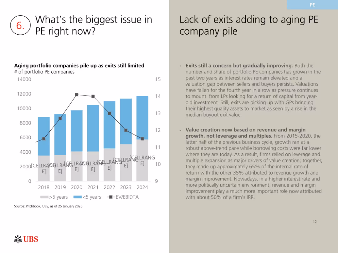
Column chart on aging PE portfolios with EV/EBITDA line; right-side explanation
Risk Assessment and Management
Financial Services
Discusses limited exit activity in private equity, leading to aging portfolios. Notes valuation compression, limited buyer interest, and shift from leverage-based value to margin/revenue-based growth due to macroeconomic shifts.
private equity, exit backlog, valuations, EV/EBITDA, aging portfolio, PE concerns
false
Risk Assessment and Management
Financial Services
Mixed Chart
UBS
Add to my slides
Remove from favorites
The slide has a central pyramid diagram detailing EY's private equity services, surrounded by text boxes explaining different service categories.
Corporate Finance and Valuation
Professional Services
This slide describes the various services EY offers for private equity clients, organized into fund services, strategy and transaction services, and portfolio services, aimed at enhancing investment value and performance.
Private Equity, EY Services, Fund Services, Strategy, Transaction, Portfolio
false
Corporate Finance and Valuation
Professional Services
Framework
EY
Add to my slides
Remove from favorites
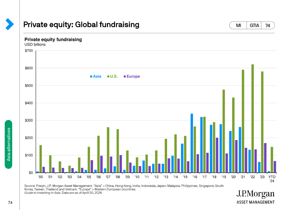
Features a column chart comparing private equity fundraising amounts in USD billions across Asia, U.S., and Europe from 2000 to 2024.
Investment Analysis
Financial Services
Tracks private equity fundraising trends globally, comparing contributions from Asia, U.S., and Europe over a period of 24 years.
private equity, fundraising, global, trends, comparison
false
Investment Analysis
Financial Services
Single Chart
JP Morgan
Add to my slides
Remove from favorites
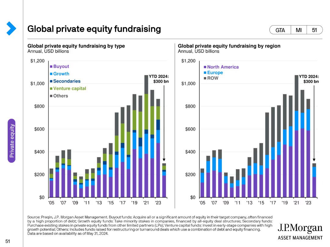
The slide contains two column charts: one showing global private equity fundraising by type and the other by region, with clear color coding for different types.
Investment Analysis
Financial Services
It offers a detailed overview of global private equity fundraising activities, breaking down the data by types and regions to highlight trends and market dynamics.
private equity, fundraising, global, type, region, data analysis, trends, investment, financial
false
Investment Analysis
Financial Services
Multiple Chart
JP Morgan
Add to my slides
Remove from favorites
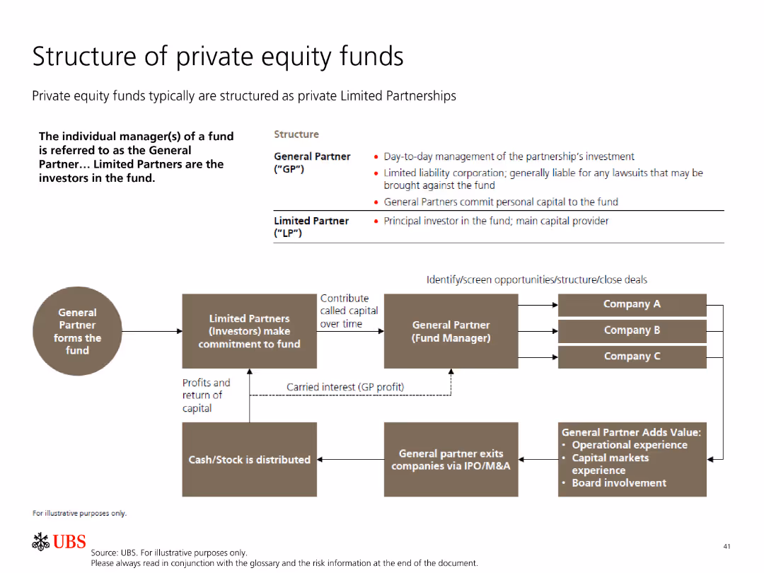
The slide includes a flowchart detailing the structure of private equity funds, showing relationships between general and limited partners.
Organizational Structure and Change
Financial Services
This slide explains the structure of private equity funds, focusing on the roles and responsibilities of general partners and limited partners.
private equity, fund structure, general partner, limited partner, investment
false
Organizational Structure and Change
Financial Services
Diagram
UBS
Add to my slides
Remove from favorites
A title slide with dramatic ocean imagery in the background and bold, white text overlaying it, presenting the report's theme.
Industry Overview
Financial Services
Serves as the introductory slide for a report on global private equity, setting the tone for the data and analysis that will follow.
Private Equity, Global Report, Financial Services, Introduction, Market Overview, Dramatic Imagery, Title Slide
false
Industry Overview
Financial Services
Title
Bain
Add to my slides
Remove from favorites
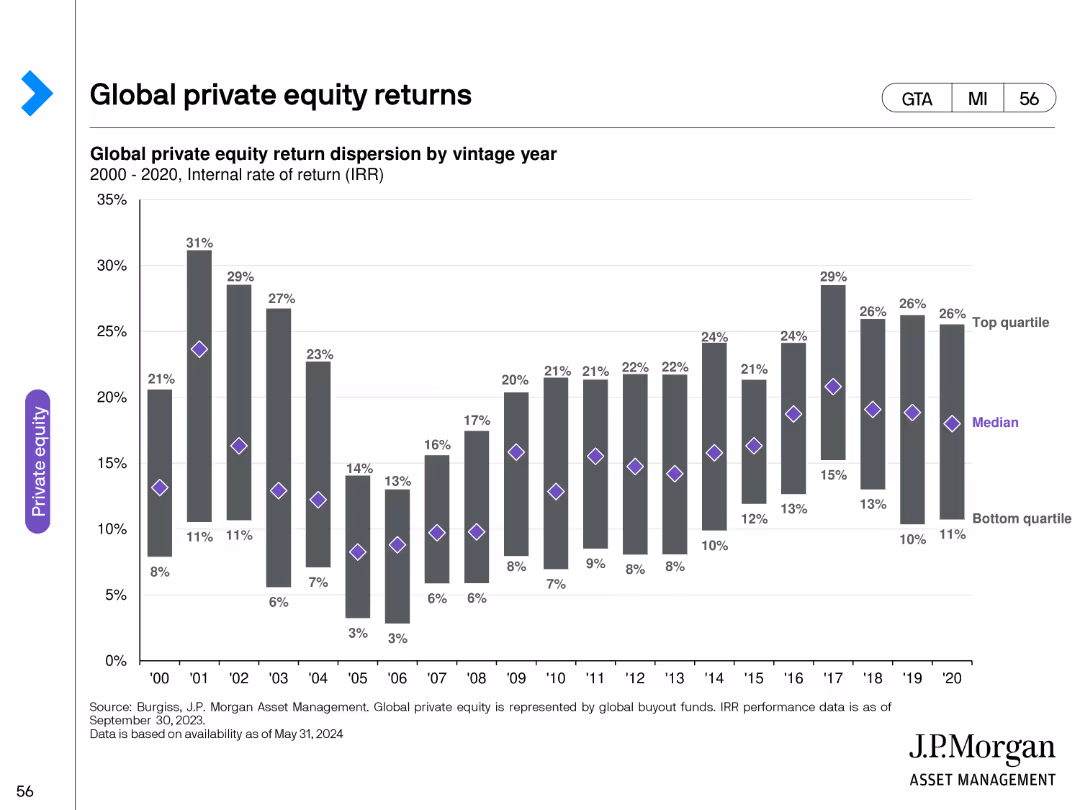
The slide features a bar chart depicting global private equity return dispersion by vintage year, with clear demarcations for top quartile, median, and bottom quartile.
Financial Performance
Financial Services
It offers insights into global private equity returns, presenting return dispersion by vintage year and highlighting performance differences among quartiles.
private equity, global, returns, vintage year, performance, dispersion, data analysis, financial
false
Financial Performance
Financial Services
Single Chart
JP Morgan
Add to my slides
Remove from favorites
This slide includes a combination of column charts and text. The charts show numerical growth in private equity and use shades of blue for visual distinction. The layout is evenly spaced with clear headers.
Investment Analysis
Financial Services
The slide outlines a strategic approach to private equity coverage, highlighting significant opportunities, middle market potential, and the company's capabilities to capture these opportunities. It provides numerical data to support the potential for growth and strategic direction.
Private equity, investment banking, market potential, capabilities
false
Investment Analysis
Financial Services
Mixed Chart
JP Morgan
Add to my slides
Remove from favorites
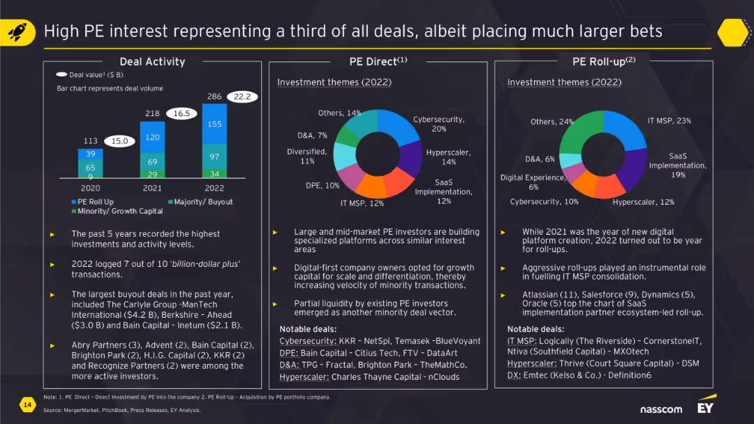
Consists of three visual charts (bar and two pie charts) and related bullet points highlighting deal types, investment themes, and PE roll-up examples.
Investment Analysis
Financial Services
The slide presents insights on private equity investment trends. PE deals formed a significant portion of 2022's M&A landscape, with themes like cybersecurity, SaaS, and IT MSP dominating. It distinguishes between direct investments and roll-ups, listing notable deals in each. Charts display proportions across themes like hyperscalers and digital experience.
private equity, investment, SaaS, cybersecurity, roll-ups, IT MSP
false
Investment Analysis
Financial Services
Multiple Chart
EY
Add to my slides
Remove from favorites
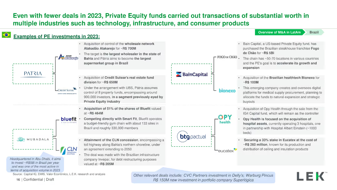
Contains logos of companies involved in PE investments in 2023, with text descriptions next to each logo detailing the investments.
Investment Analysis
Financial Services
This slide details notable PE investments in Brazil in 2023 across various industries, including technology, infrastructure, and consumer products.
Private Equity, Investments, Brazil, Technology, Infrastructure
false
Investment Analysis
Financial Services
Diagram
LEK
Add to my slides
Remove from favorites
This slide features two column charts comparing private equity investments and exits by value across different regions, with a data table summarizing averages.
Investment Analysis
Financial Services
The slide examines global private equity investments and exits, providing a comparative analysis of value trends over the years and across regions.
private equity, investments, exits, global, value, regions, data comparison, financial
false
Investment Analysis
Financial Services
Multiple Chart
JP Morgan
Add to my slides
Remove from favorites
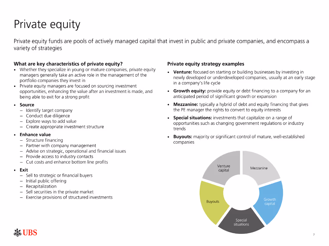
The slide contains a text description of key characteristics and strategies of private equity, along with a segmented circular diagram illustrating different strategy examples.
Investment Analysis
Financial Services
The slide provides an overview of private equity, including its key characteristics, strategies for sourcing and enhancing value, and exit options. It also describes various private equity strategies like venture, growth equity, mezzanine, and special situations.
Private equity, investment strategies, venture capital, growth equity, mezzanine
false
Investment Analysis
Financial Services
Diagram
UBS
Add to my slides
Remove from favorites
Displays column charts comparing the growth of private equity markets and strategies, using data annotations for clarity.
Investment Analysis
Financial Services
Provides an analysis of JPMorgan’s approach to private equity coverage, detailing the market's potential and the bank's strategic actions to maintain discipline and focus on middle market financial sponsors.
Private Equity, Market Analysis, Strategy, Financial Sponsorship, Growth, Investment
false
Investment Analysis
Financial Services
Multiple Chart
JP Morgan
Add to my slides
Remove from favorites
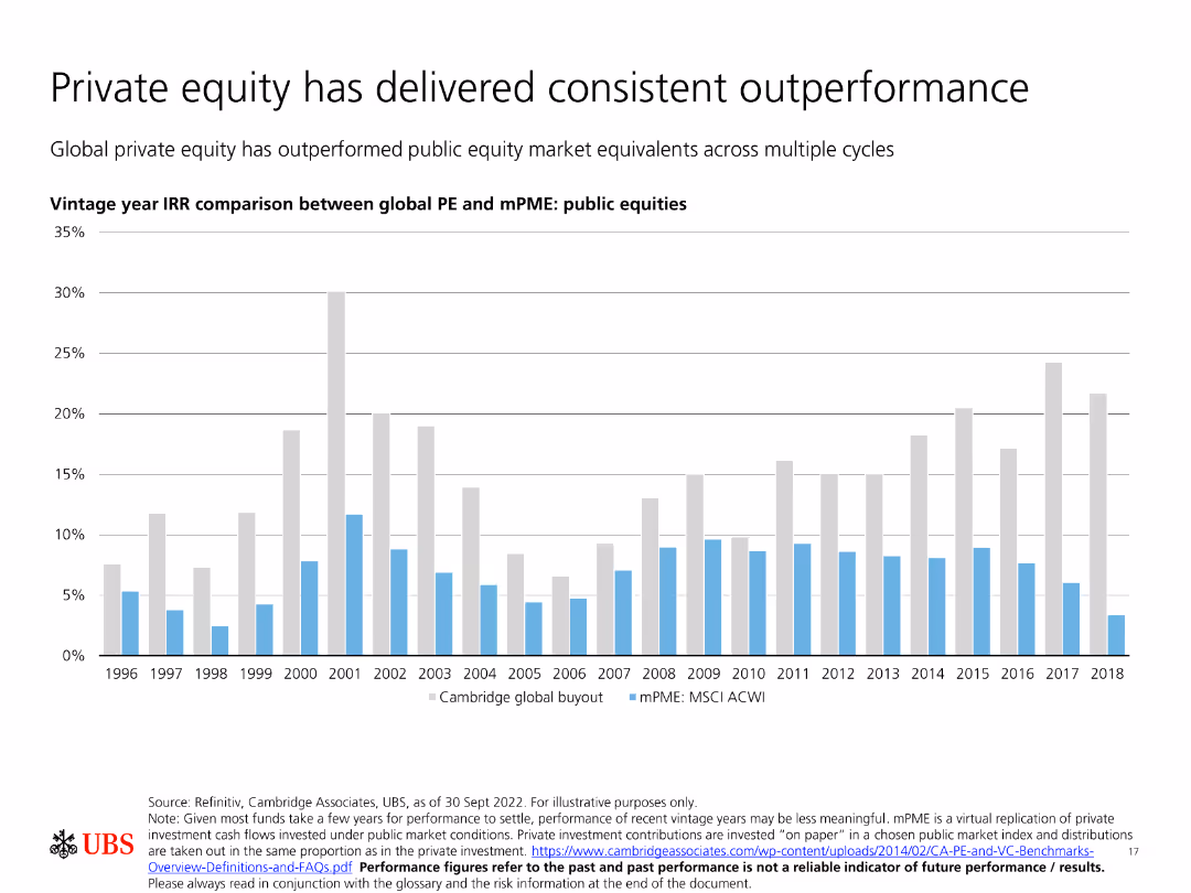
Contains a bar chart comparing vintage year IRR between global PE and mPME public equities, emphasizing private equity’s consistent outperformance.
Investment Analysis
Financial Services
Shows that private equity has consistently outperformed public equity market equivalents across multiple cycles, as demonstrated by vintage year IRR comparisons.
Private equity, outperformance, vintage year IRR, public equities, investment cycles
false
Investment Analysis
Financial Services
Single Chart
UBS
Add to my slides
Remove from favorites
The slide shows a comparative bar graph titled "End-to-end pooled net IRR" with investment horizons for US, Western Europe, and Asia-Pacific. It compares the performance of buyout funds against standard market indices in red and gray.
Investment Analysis
Financial Services
Demonstrates the performance of private equity against public markets across various investment horizons, essential for investment strategies and performance benchmarking.
Private Equity, Performance, Investment Horizons, Public Markets, Benchmarking, IRR
false
Investment Analysis
Financial Services
Multiple Chart
Bain
Add to my slides
Remove from favorites
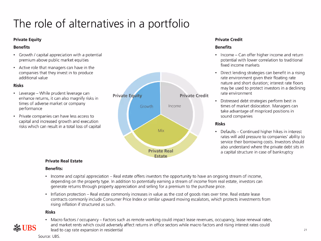
The slide is divided into three sections, each discussing the benefits and risks of Private Equity, Private Credit, and Private Real Estate. A pie chart in the center shows their roles.
Investment Analysis
Financial Services
Describes the roles, benefits, and risks associated with Private Equity, Private Credit, and Private Real Estate in a portfolio, highlighting their potential for growth and income.
Private Equity, Private Credit, Real Estate, Investment, Portfolio, Growth, Income, Risks, Benefits, Strategies
false
Investment Analysis
Financial Services
Diagram
UBS
Add to my slides
Remove from favorites
Previous
Next
You don't have any favorites yet.
Please wait loading your favorites slides...
Create a FREE account to continue browsing
Receive Instant Access to 1,000+ slides from companies like McKinsey, Google, and Goldman Sachs
First Name
Last Name
Email
Password
I agree to all
Terms & Privacy Policy
Thank you! Your submission has been received!
Oops! Something went wrong while submitting the form.
Have an account?
Sign in
Upgrade to PRO to Save slides
Advanced Search and Filters
Access to 15,000+ slides
Access to Category Pages
Save/Bookmark Slides
PowerPoint Template Library
Pick a Plan
MONTHLY
$12/month
Billed every month, Cancel anytime.
YEARLY
$9/year
Billed $108 annually, Cancel anytime.
Checkout for $12/month
Checkout for $108/yr
Secured by Stripe | AES-256 bit encryption