My Account
My Slides
Search by Category
Pricing
Templates
View All Templates
Download Template Slides
✦ AI Search
Feedback
Login
Logout
Get Started
Browse all Slides
Browse all Slides
Create a FREE Account
Instant access to 1,000+ real slides from top companies like McKinsey, BCG, Goldman Sachs, Google and many more!
First Name
Last Name
Email
Password
I agree to all
Terms & Privacy Policy
Thank you! Your submission has been received!
Oops! Something went wrong while submitting the form.
Have an account?
Sign in
Saved Slides
Total No. of slides saved
0
↻ Refresh
✖ Clear all
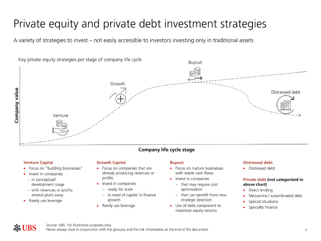
The slide features a diagram showing the company life cycle stages and key private equity strategies for each stage, along with a list of private debt strategies.
Strategic Planning
Financial Services
This slide outlines various strategies for investing in private equity and private debt, showing how they align with different stages of a company's life cycle. It highlights venture, growth, buyout, and distressed debt strategies.
Private equity, private debt, investment strategies, company life cycle, venture
false
Strategic Planning
Financial Services
Linear Flow
UBS
Add to my slides
Remove from favorites
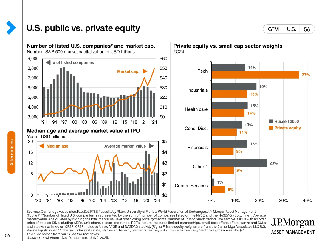
Three-part chart: Top—listed companies & market cap; Bottom Left—IPO age & value; Right—sector weights (private vs. small-cap).
Market Analysis and Trends
Financial Services
Compares the landscape of public and private equity in the U.S. through metrics like number of companies, IPO trends, and sector weightings. Highlights growing influence of private equity in sectors like tech and differences vs. public markets.
private equity, public companies, IPO trends, market cap, sector allocation, U.S. equities
false
Market Analysis and Trends
Financial Services
Multiple Chart
JP Morgan
Add to my slides
Remove from favorites
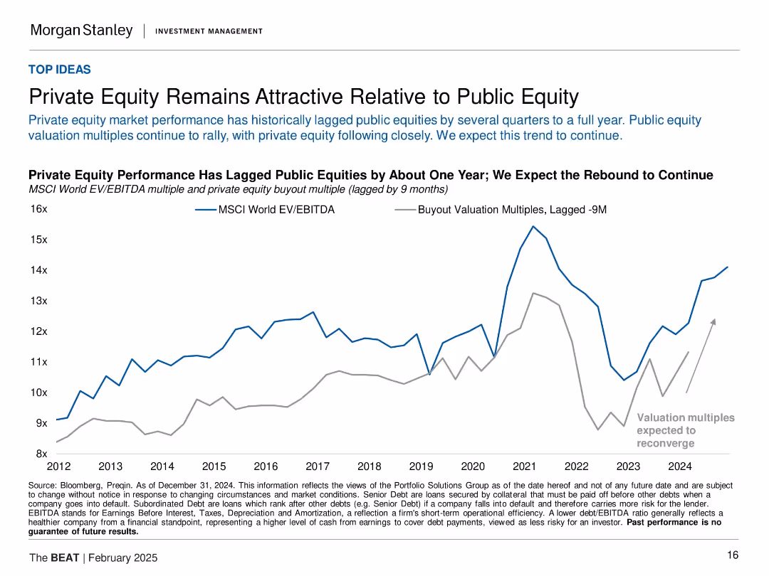
Dual-line chart (2012–2024) of MSCI World EV/EBITDA vs lagged private equity valuation multiples.
Investment Analysis
Financial Services
The slide compares public and private equity valuation trends, noting that private equity tends to lag public markets by up to a year. With public equity valuations rebounding, private equity is expected to follow. The visual argument is that private equity remains attractive and is likely to reconverge with public equity performance soon.
private equity, public equity, EV/EBITDA, valuations, lag effect, MSCI, investment strategy, buyout multiples
false
Investment Analysis
Financial Services
Single Chart
Morgan Stanley
Add to my slides
Remove from favorites
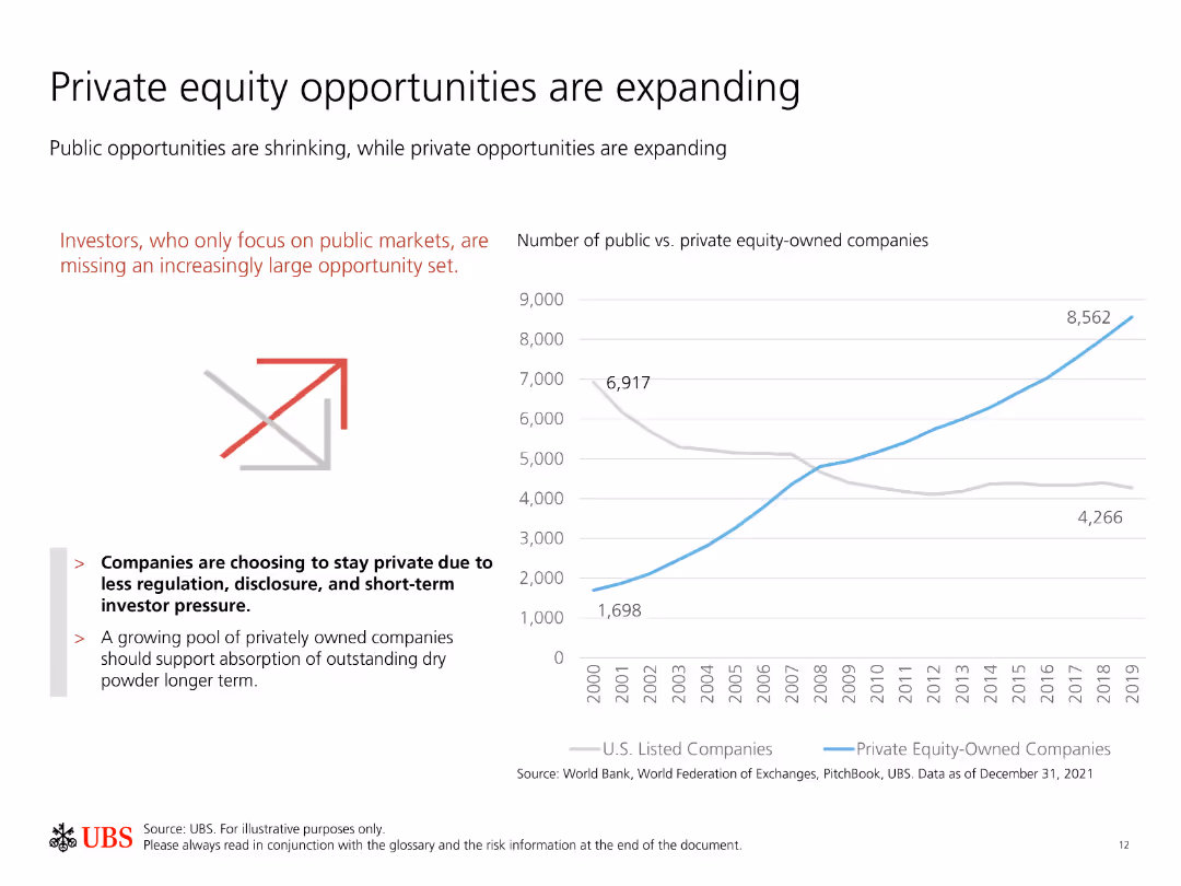
Contains a line chart comparing the number of public vs. private equity-owned companies over time, with explanatory text on the left.
Investment Analysis
Financial Services
Shows the increasing opportunities in private equity compared to public markets, highlighting a trend of companies staying private longer for various advantages.
Private equity, public markets, investment opportunities, growth, trends
false
Investment Analysis
Financial Services
Mixed Chart
UBS
Add to my slides
Remove from favorites
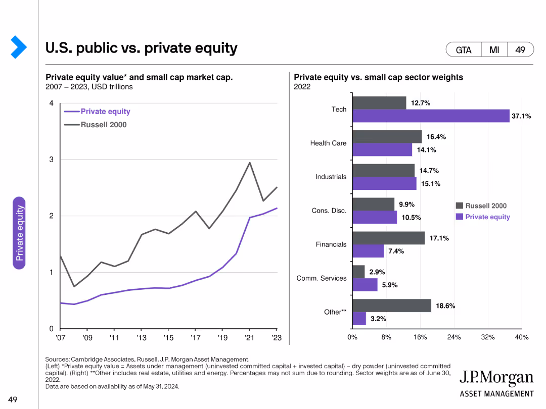
The slide features two charts: a line chart on the left showing the private equity value and small cap market cap from 2007 to 2023, and a bar chart on the right comparing private equity and small cap sector weights in 2022. The charts use distinct colors to differentiate data points and sectors.
Market Analysis and Trends
Financial Services
This slide compares the U.S. public and private equity markets, highlighting trends in private equity value, small cap market capitalization, and sector weights. It is intended to provide insights into the relative performance and sector distribution of these equity markets.
Private equity, small cap market, sector weights, equity comparison, financial analysis, investment trends
false
Market Analysis and Trends
Financial Services
Multiple Chart
JP Morgan
Add to my slides
Remove from favorites
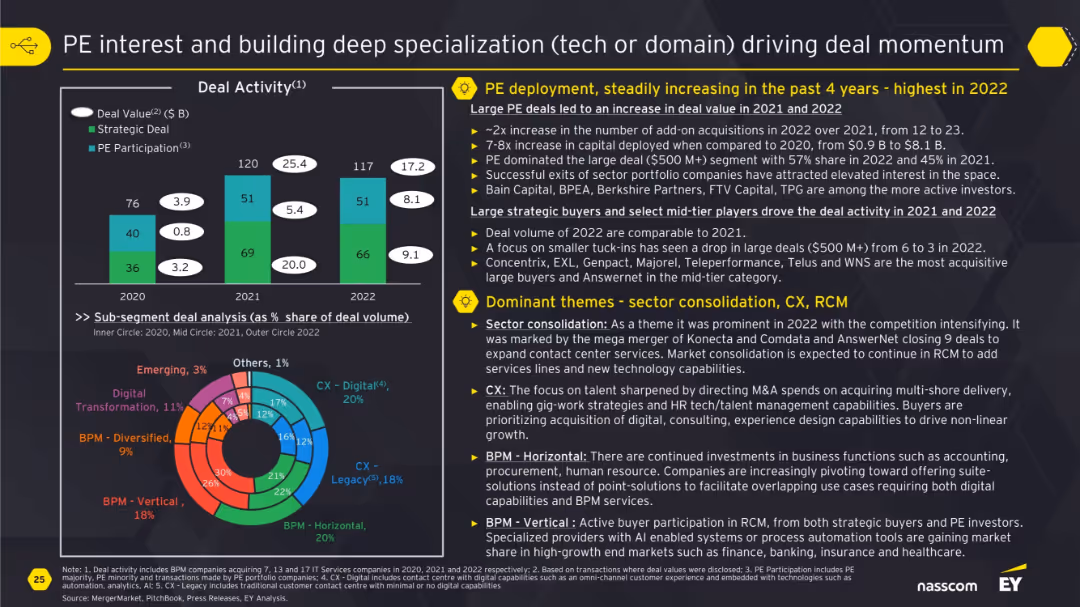
Bar chart of deal activity by type and doughnut chart of subsegment splits; descriptive blocks on PE trends and sector consolidation.
Mergers and Acquisitions
Financial Services
The slide focuses on growing private equity deployment and thematic investments in sectors like CX, BPM, and Digital. It showcases how sector consolidation and focus on specialized capabilities like automation and analytics have increased deal momentum, with more exits and large deals occurring in 2022.
private equity, specialization, CX, BPM, M&A, deal activity, sector consolidation
false
Mergers and Acquisitions
Financial Services
Multiple Chart
EY
Add to my slides
Remove from favorites
It includes two column charts: one showing U.S. private equity investments by sector and the other showing exits by type, with a summary table of sector averages.
Investment Analysis
Financial Services
The slide focuses on U.S. private equity investments and exits, presenting sector-specific investment data and types of exits to offer a comprehensive market overview.
private equity, U.S., investments, exits, sectors, types, data analysis, financial
false
Investment Analysis
Financial Services
Multiple Chart
JP Morgan
Add to my slides
Remove from favorites
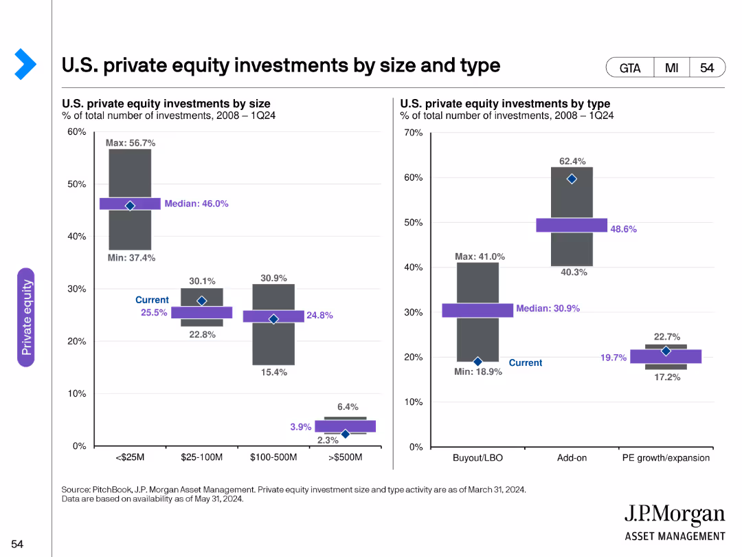
The slide features two bar charts: one depicting U.S. private equity investments by size and the other by type, with clear markers for median and current values.
Investment Analysis
Financial Services
It analyzes U.S. private equity investments, breaking down the data by investment size and type to provide insights into the distribution and trends within the market.
private equity, U.S., investments, size, type, data analysis, financial, trends
false
Investment Analysis
Financial Services
Multiple Chart
JP Morgan
Add to my slides
Remove from favorites
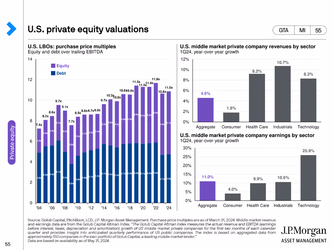
This slide includes a combination of column charts and bar charts, showing U.S. LBOs purchase price multiples and middle market private company financial metrics.
Market Analysis and Trends
Financial Services
It provides an analysis of U.S. private equity valuations, highlighting purchase price multiples for LBOs and financial performance of middle market private companies.
private equity, U.S., valuations, LBOs, multiples, financial performance, middle market, metrics
false
Market Analysis and Trends
Financial Services
Multiple Chart
JP Morgan
Add to my slides
Remove from favorites
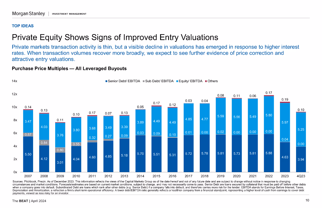
A column chart showing purchase price multiples for leveraged buyouts from 2007 to Q4'23.
Investment Analysis
Financial Services
This slide analyzes the trends in private equity valuations, indicating a decline in valuations and potential for attractive entry points in the market.
Private Equity, Valuations, Column Chart, Leveraged Buyouts, Market Trends
false
Investment Analysis
Financial Services
Mixed Chart
Morgan Stanley
Add to my slides
Remove from favorites
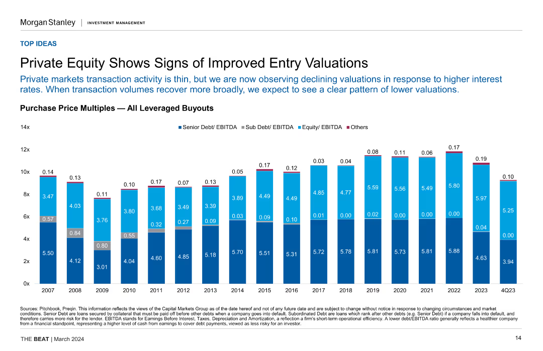
Column chart displaying purchase price multiples for leveraged buyouts over the years, highlighting trends in senior debt, sub-debt, equity, and other categories.
Financial Performance
Financial Services
The slide shows declining valuations in private equity, suggesting improved entry points for investments, and expecting a clearer pattern of lower valuations as volumes recover.
Private Equity, Valuations, Leveraged Buyouts, Debt, Equity, Investment Trends
false
Financial Performance
Financial Services
Single Chart
Morgan Stanley
Add to my slides
Remove from favorites
Slide presents bar charts showing PE/VC investment distribution in sectors like alternative proteins and mobility, with detailed annotations.
Investment Analysis
Financial Services
Explores PE/VC investment trends, focusing on alternative proteins and mobility as key investment themes.
private equity, venture capital, investment trends, startups, mobility
false
Investment Analysis
Financial Services
Mixed Chart
Bain
Add to my slides
Remove from favorites
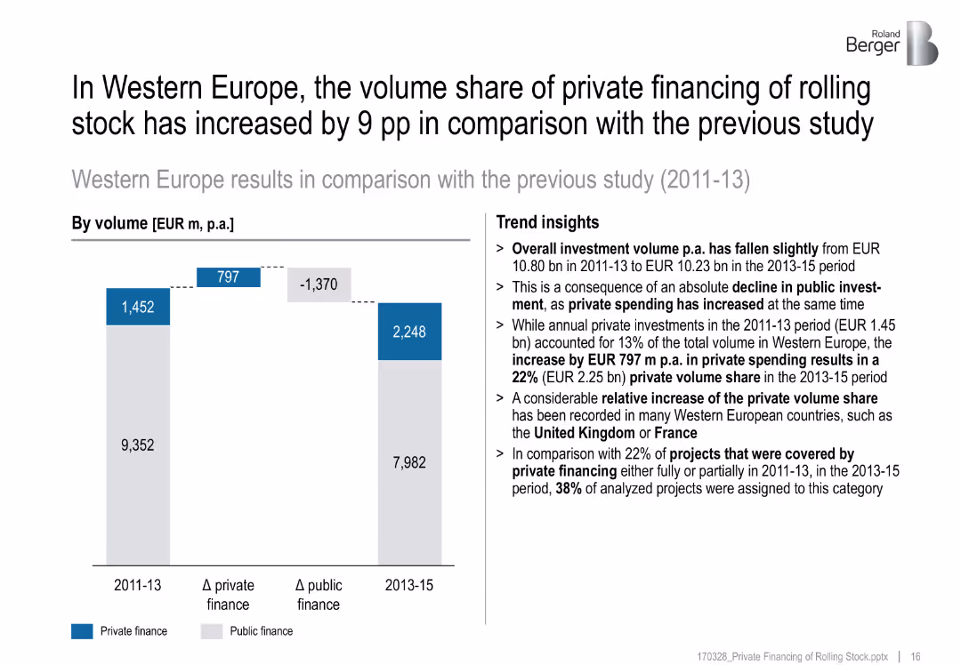
Bar chart, title on top, text block with insights, blue/gray bar visual
Financial Performance
Transportation & Logistics
Comparison of rolling stock financing in Western Europe shows a rise in private financing by 9 percentage points between 2011–13 and 2013–15. Private investment rose while public declined. Countries like UK and France drove this shift.
private finance, Western Europe, rolling stock, investment, public finance, UK, France, share increase, bar chart, infrastructure
false
Financial Performance
Transportation & Logistics
Mixed Chart
Roland Berger
Add to my slides
Remove from favorites
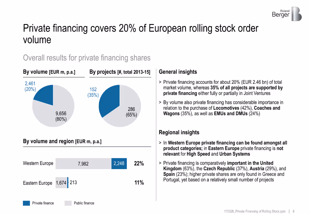
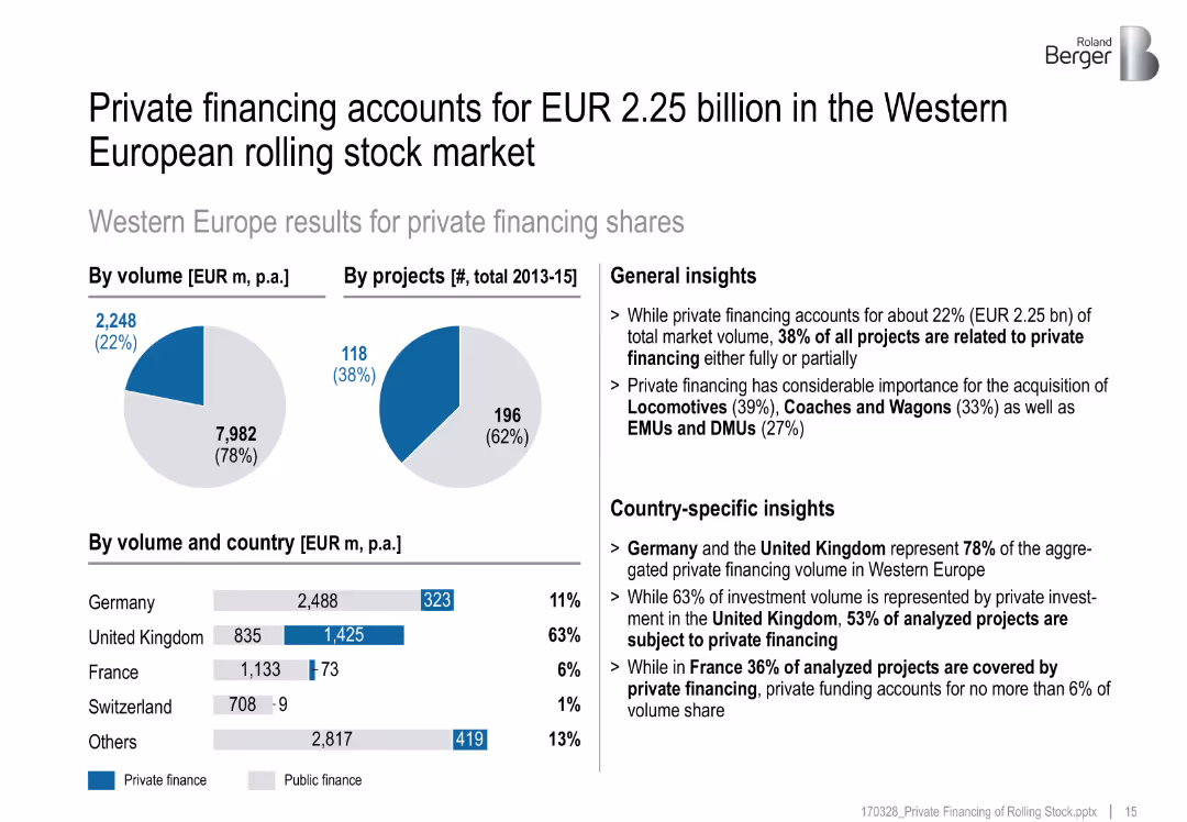
Pie charts and horizontal bar chart show volume by region and type of financing
Investment Analysis
Transportation & Logistics
Analyzes private versus public financing in European rail, showing that private funds account for 20% of volume and 35% of projects, especially relevant for locomotives and wagons.
private financing, rail projects, rolling stock, public-private share, EMUs, DMUs
false
Investment Analysis
Transportation & Logistics
Multiple Chart
Roland Berger
Add to my slides
Remove from favorites
A column chart with blue bars dominates this slide, representing the private funding value across different years, against a background of minimal text.
Investment Analysis
Financial Services
Highlighting the resilience of deal values amidst a decrease in deal activity, this slide suggests a dynamic investment landscape with a focus on high-profile investments.
private funding, deal value, investments, year-on-year, column chart, resilience
false
Investment Analysis
Financial Services
Single Chart
Bain
Add to my slides
Remove from favorites
The slide features column charts that contrast private funding values and deal counts, set against a clear white background.
Investment Analysis
Financial Services
This slide examines the digital economy's investment landscape, emphasizing the increase in deal values and activities over recent years.
private funding, digital economy, investment landscape, deal count, economy boom
false
Investment Analysis
Financial Services
Single Chart
Bain
Add to my slides
Remove from favorites
Composed of column charts with a key indicating deal value over years. Color-coded, high density of data, and well-structured with a clear hierarchy of information.
Market Analysis and Trends
Financial Services
An analytical view on private funding trends in the Indonesian market, showing deal counts and values, which would interest investors and financial analysts evaluating market dynamics and investment risks.
private funding, Indonesia, investment trends, market analysis
false
Market Analysis and Trends
Financial Services
Single Chart
Bain
Add to my slides
Remove from favorites
The slide is a mixture of column charts and color-coded segments, each representing a sector within Thailand's private funding landscape. It shows funding values from 2019 to H1 2023 and the number of deals, with a notable spike in H2 2022. The design employs a simple color scheme to differentiate sectors and effectively uses annotations to highlight key data points.
Investment Analysis
Financial Services
The content depicts the investment funding trends in Thailand, highlighting the return to typical levels after a substantial increase in the second half of 2022. It is useful for investors and financial analysts to assess the funding environment's normalcy and plan future investments in nascent sectors like travel, transport & food, digital media, e-commerce, and digital financial services (DFS).
Private Funding, Investment, Thailand, Trends, Sectors, E-commerce, DFS, Travel, Digital Media, Transport
false
Investment Analysis
Financial Services
Single Chart
Bain
Add to my slides
Remove from favorites
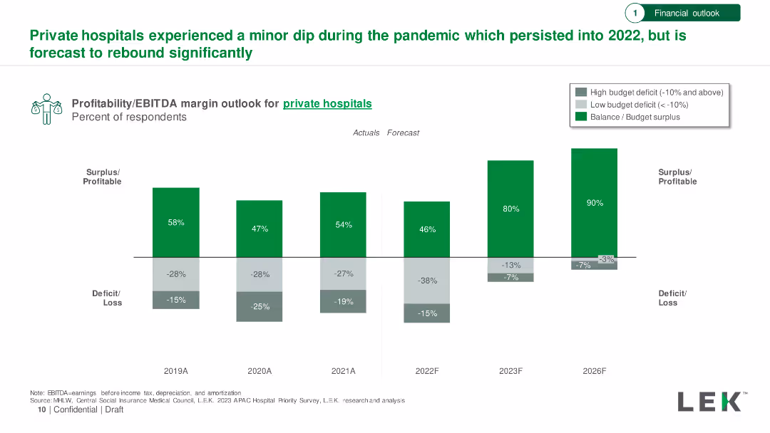
Bar chart showing profitability/EBITDA margin outlook for private hospitals from 2019 to 2026, with actuals and forecasts. Surplus/deficit percentages included.
Financial Performance
Healthcare & Pharmaceuticals
Analysis of private hospitals' financial performance during and after the pandemic, forecasting a significant rebound by 2026.
Private Hospitals, Profitability, EBITDA, Financial Forecast, Recovery
false
Financial Performance
Healthcare & Pharmaceuticals
Single Chart
LEK
Add to my slides
Remove from favorites
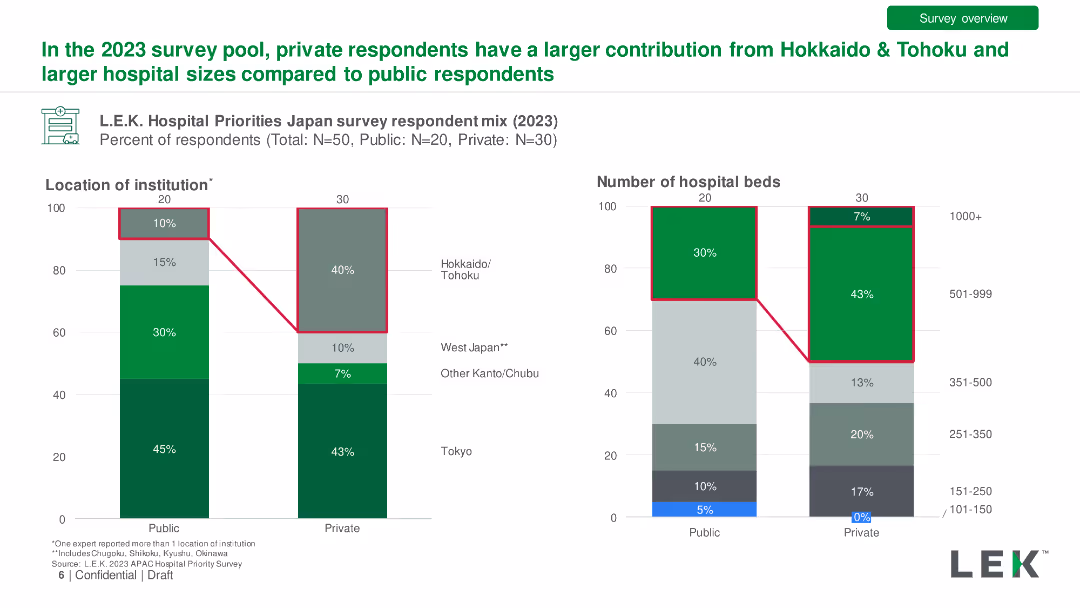
Bar charts comparing private vs. public hospital respondent mix by location and hospital size in 2023. Detailed with percentage differences.
Market Analysis and Trends
Healthcare & Pharmaceuticals
Comparison of survey responses from public and private hospitals, showing differences in regional representation and hospital sizes.
Private Hospitals, Public Hospitals, Respondents, Comparison, Location
false
Market Analysis and Trends
Healthcare & Pharmaceuticals
Multiple Chart
LEK
Add to my slides
Remove from favorites
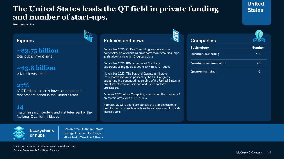
Multi-column layout with stats, news timeline, firm counts, and ecosystem map; blue themed.
Investment Analysis
Technology & Software
Highlights the U.S. leadership in quantum investment (~$7.5B total), private sector activity, and number of quantum start-ups. Lists policies, company milestones, and research hubs. Indicates strong momentum in ecosystem development and commercialization.
private investment, quantum startups, U.S., research centers, funding, policy, companies
false
Investment Analysis
Technology & Software
Table
McKinsey
Add to my slides
Remove from favorites
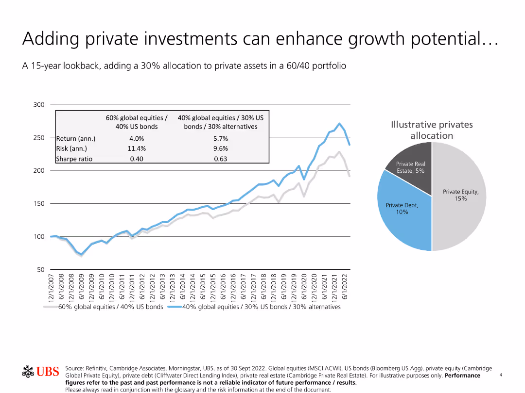
The slide features a line chart comparing returns, risk, and Sharpe ratio of portfolios with different allocations to private assets over a 15-year period. A pie chart shows allocation.
Investment Analysis
Financial Services
The slide highlights how adding a 30% allocation to private assets in a 60/40 portfolio can enhance growth potential. It shows comparative returns, risks, and Sharpe ratios, along with illustrative private asset allocations.
Private investments, growth potential, portfolio allocation, risk, Sharpe ratio
false
Investment Analysis
Financial Services
Multiple Chart
UBS
Add to my slides
Remove from favorites
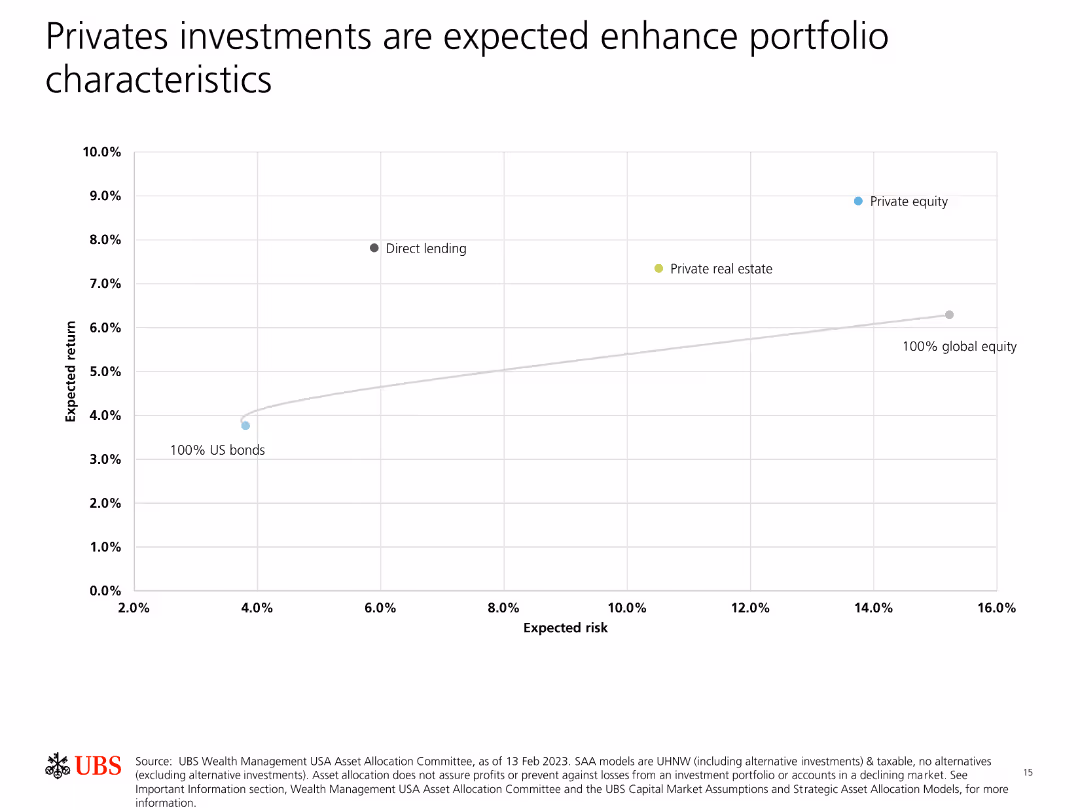
Contains a scatter plot showing expected return vs. expected risk for different asset classes, highlighting private equity and direct lending.
Investment Analysis
Financial Services
Demonstrates how private investments like private equity and direct lending can enhance portfolio returns relative to risk, compared to traditional asset classes.
Private investments, portfolio, expected return, expected risk, enhancement
false
Investment Analysis
Financial Services
Single Chart
UBS
Add to my slides
Remove from favorites
Pie charts, bar chart, and annotated insights by country
Investment Analysis
Transportation & Logistics
Highlights Western Europe’s private rail financing landscape, with country-specific breakdowns showing the UK and Germany as leading contributors.
private investment, Western Europe, rolling stock, country insights, rail market
false
Investment Analysis
Transportation & Logistics
Multiple Chart
Roland Berger
Add to my slides
Remove from favorites
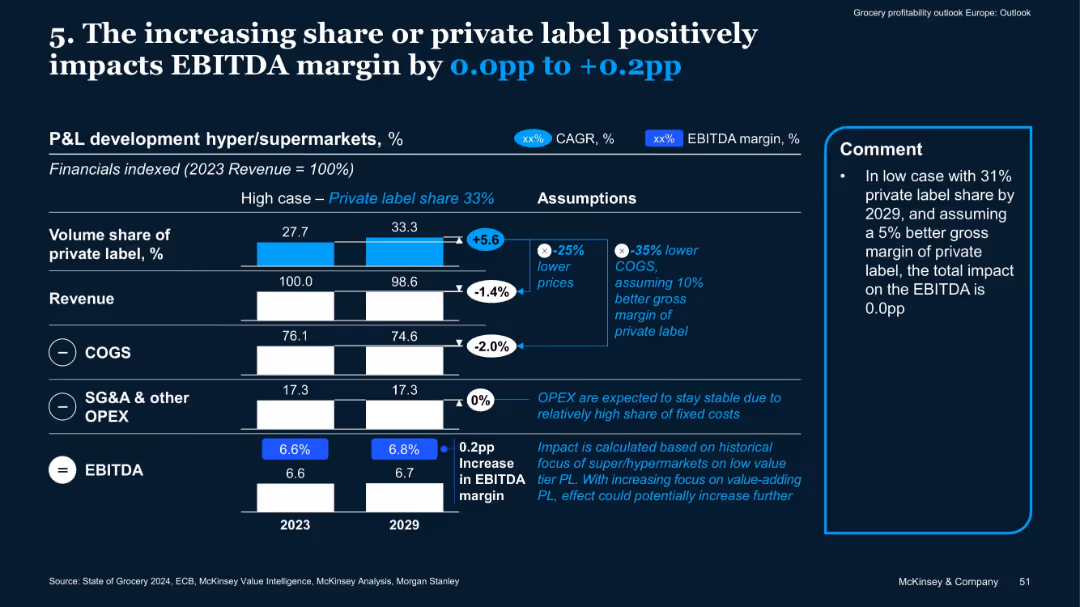
Vertical bar comparisons 2023 vs. 2029, assumptions box, side comment box
Financial Performance
Retail & E-commerce
The slide highlights how growing private label share (from 27.7% to 33.3%) can improve EBITDA margins by 0.0 to +0.2pp due to lower COGS and value-focused strategies. Stable OPEX assumptions also support margin gains.
private label, EBITDA, revenue, margins, OPEX, COGS, supermarkets
false
Financial Performance
Retail & E-commerce
Mixed Chart
McKinsey
Add to my slides
Remove from favorites
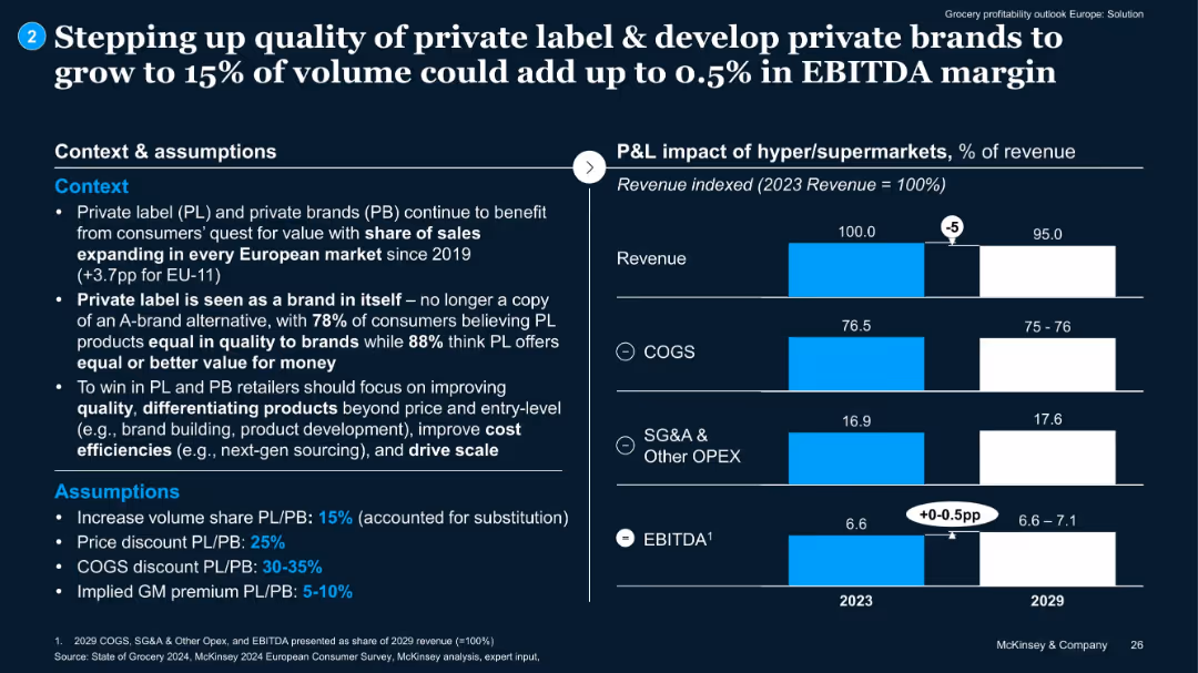
Split layout: text on left with context and assumptions; right side with bar chart comparing 2023 vs. 2029 P&L components.
Product and Service Analysis
Retail & E-commerce
Highlights that increasing private label share to 15% can add up to 0.5% EBITDA. Presents assumptions including discount rates and margin improvement. Emphasizes cost efficiency and quality improvements.
private label, EBITDA uplift, pricing, brand development, COGS
false
Product and Service Analysis
Retail & E-commerce
Mixed Chart
McKinsey
Add to my slides
Remove from favorites
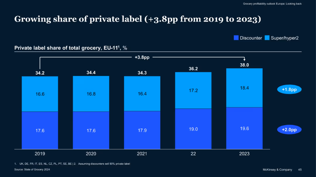
Stacked bar chart split by discounter and hyper/supermarkets; data from 2019–2023
Market Analysis and Trends
Retail & E-commerce
The slide illustrates a 3.8 percentage point growth in private label share in EU-11 groceries, driven by both discounters and supermarkets. It implies consumer shifts towards more affordable private label products in inflationary times.
Private Label, Grocery Share, Discounters, Supermarkets, EU-11, Trends
false
Market Analysis and Trends
Retail & E-commerce
Single Chart
McKinsey
Add to my slides
Remove from favorites
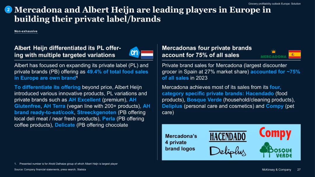
Two-column comparison with company logos and brand descriptions. Logos of private labels shown at the bottom.
Competitive Landscape
Retail & E-commerce
Case study comparing Mercadona and Albert Heijn’s private label strategies. Mercadona derives 75% of sales from four brands; Albert Heijn has diversified PL offerings tailored to consumer needs.
private label, Mercadona, Albert Heijn, brand strategy, competitive analysis
false
Competitive Landscape
Retail & E-commerce
Pillar
McKinsey
Add to my slides
Remove from favorites
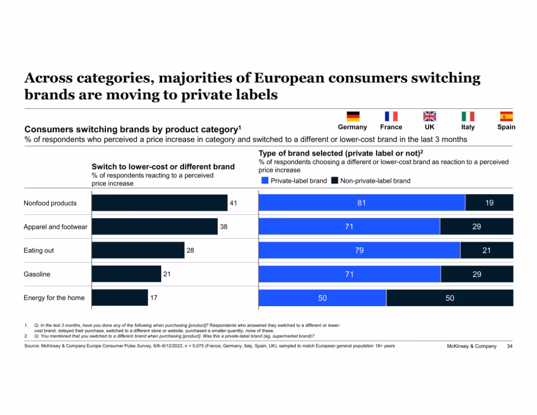
Split bar chart and horizontal bars; flags represent countries; uses blue and black color coding
Customer and Market Segmentation
Consumer Goods
Shows the percentage of consumers switching to lower-cost brands by category and highlights the share selecting private-label brands. Key insight: majority prefer private-label options in response to price increases across categories.
private-label, price sensitivity, brand switching, consumer behavior, categories, Europe, McKinsey, apparel, nonfood, eating out
false
Customer and Market Segmentation
Consumer Goods
Single Chart
McKinsey
Add to my slides
Remove from favorites
The slide includes two donut charts showing the role of private market investing in hedge fund strategies and investor requirements for limiting exposure to private equity. An image on the left shows a laptop displaying financial charts. The charts use shades of purple.
Investment Analysis
Financial Services
The slide discusses the significant growth in private market investing among hedge fund managers, driven by investor sentiment and the quest for yield, with many managers planning to increase exposure to this asset class.
Private market investing, hedge funds, private equity, investment strategies, growth
false
Investment Analysis
Financial Services
Multiple Chart
EY
Add to my slides
Remove from favorites
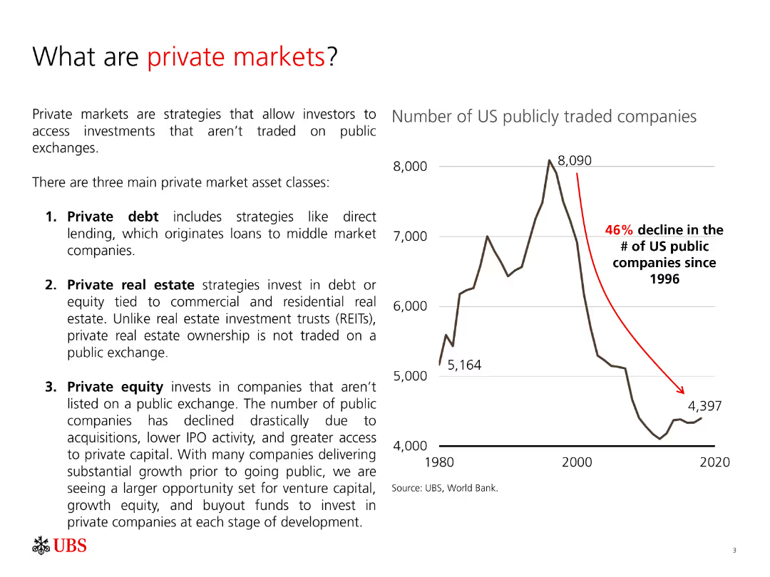
The slide includes a column chart showing the decline in the number of US publicly traded companies from 1996 to 2020. The text explains three main private market asset classes.
Market Analysis and Trends
Financial Services
The slide explains what private markets are, the types of private market asset classes, and provides a visual representation of the decline in US publicly traded companies, illustrating the growing importance of private markets.
Private markets, asset classes, private equity, private debt, private real estate
false
Market Analysis and Trends
Financial Services
Mixed Chart
UBS
Add to my slides
Remove from favorites
This slide contains column chart and a line graph. The left y-axis measures income in millions, and the right y-axis shows a percentage. The x-axis is a timeline from FY97 to 1H22. The slide background is white with the Macquarie logo at the bottom left.
Financial Performance
Financial Services
The slide presents historical income data for private markets, showcasing base fees, performance fees, and other income in relation to the closing private markets EUM. It's designed to provide a financial performance overview over multiple fiscal years, with a clear delineation of different income sources against assets under management.
private markets, income, fees, performance, EUM, historical, financial, chart, analysis
false
Financial Performance
Financial Services
Single Chart
Morgan Stanley
Add to my slides
Remove from favorites
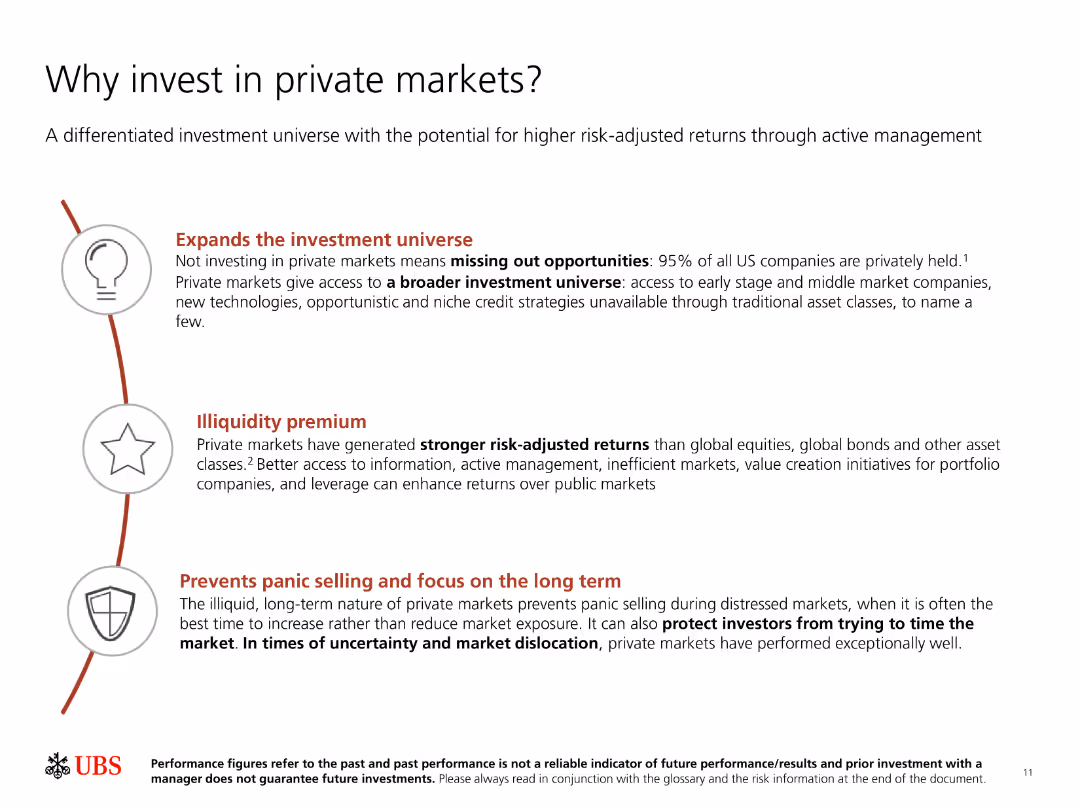
The slide has a title, three key points with icons, and a small text disclaimer at the bottom. It uses a clean layout with red and black text.
Investment Analysis
Financial Services
Highlights reasons to invest in private markets, including expanding investment universe, capturing illiquidity premium, and avoiding panic selling during downturns.
Private markets, investment, returns, illiquidity premium, risk management
false
Investment Analysis
Financial Services
Vertical Flow
UBS
Add to my slides
Remove from favorites
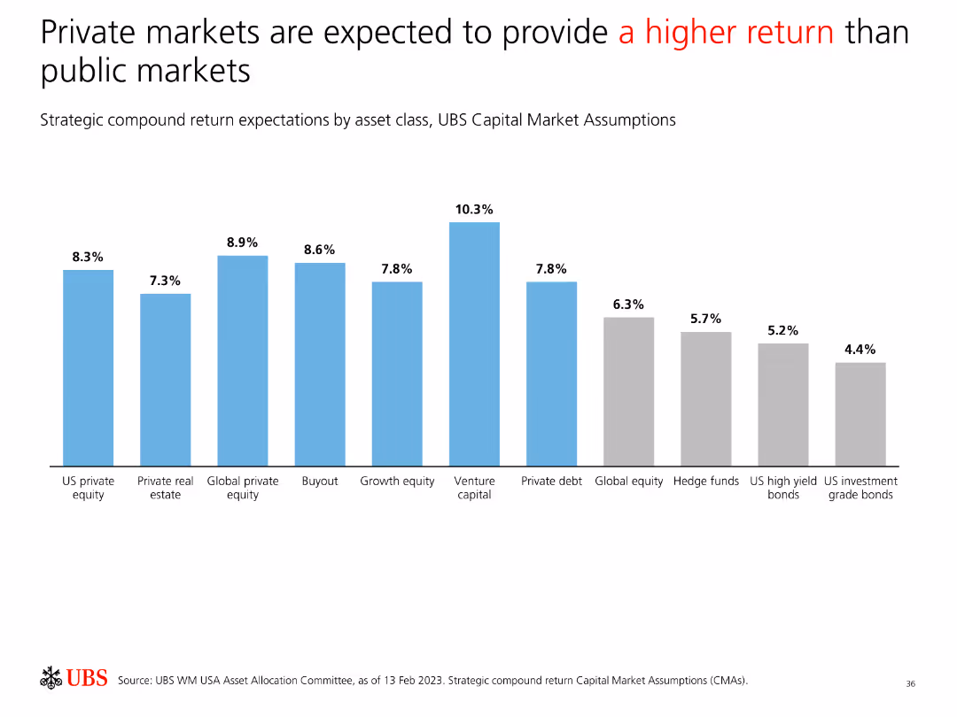
Features a bar chart comparing strategic compound return expectations by asset class, indicating higher returns for private markets compared to public markets.
Investment Analysis
Financial Services
Compares strategic compound return expectations, demonstrating that private markets are projected to offer higher returns than public markets across various asset classes.
Private Markets, Public Markets, Return Expectations, Asset Classes, Investment, Analysis, Comparison, Strategy, Performance
false
Investment Analysis
Financial Services
Single Chart
UBS
Add to my slides
Remove from favorites
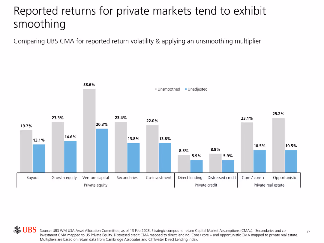
Contains bar charts comparing reported return volatility for private markets, applying an unsmoothing multiplier to show true volatility.
Risk Assessment and Management
Financial Services
Examines the smoothing effect in reported returns for private markets, applying an unsmoothing multiplier to reveal the actual return volatility compared to reported data.
Private Markets, Return Volatility, Smoothing, Unsmoothing, Analysis, Risk, Investment, Data Presentation, Strategy
false
Risk Assessment and Management
Financial Services
Single Chart
UBS
Add to my slides
Remove from favorites
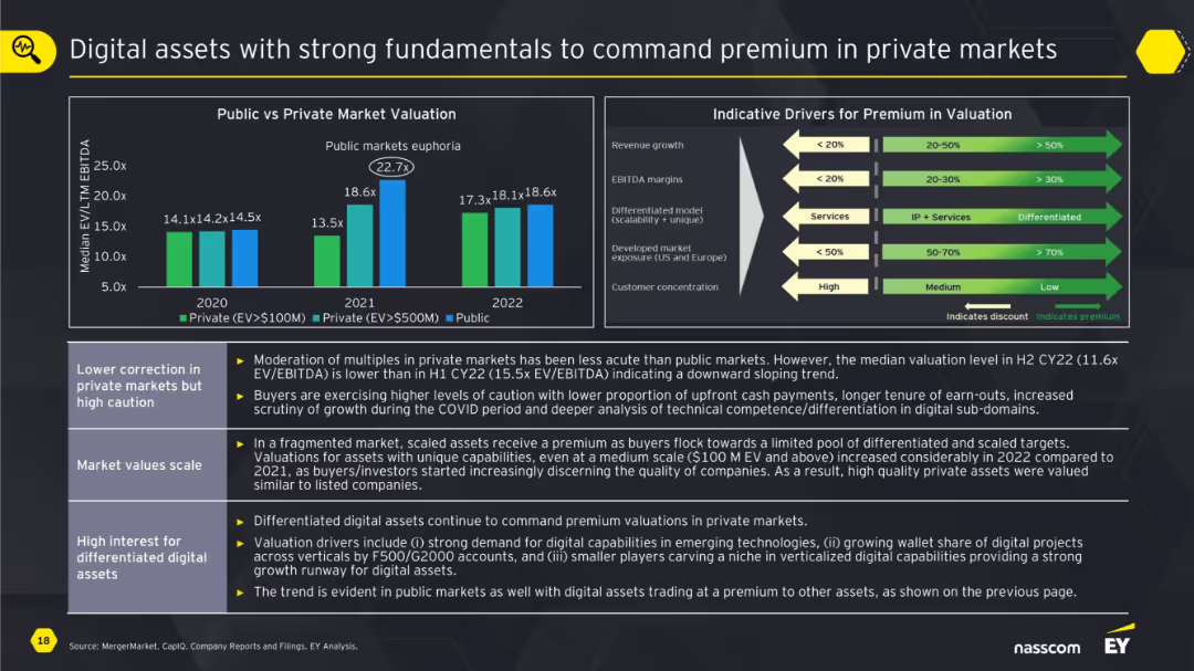
Dual chart layout with public vs private market valuation bars and a graphic outlining valuation drivers; key points below.
Investment Analysis
Technology & Software
The slide emphasizes how digital assets with solid fundamentals still command premium valuations in private markets despite corrections. It contrasts public vs private valuations and provides a framework for understanding valuation drivers like revenue growth, EBITDA margin, and differentiation.
private markets, valuation, digital assets, EBITDA, premium, drivers, growth, scalability
false
Investment Analysis
Technology & Software
Mixed Chart
EY
Add to my slides
Remove from favorites
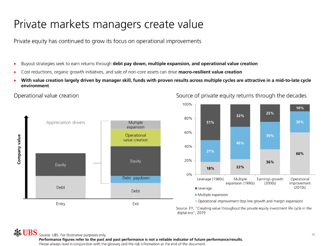
Includes a bar chart and a diagram showing operational value creation in private equity through debt paydown, multiple expansion, and operational improvements.
Operational Efficiency
Financial Services
Discusses how private equity managers create value through different strategies over time, illustrated with a bar chart showing return sources through decades.
Private markets, value creation, operational improvements, debt paydown, equity
false
Operational Efficiency
Financial Services
Multiple Chart
UBS
Add to my slides
Remove from favorites
Bar charts on the slide show changes in the importance of constant access to a private vehicle post-crisis, segmented by age and gender.
Market Analysis and Trends
Transportation & Logistics
Discusses how the importance of access to private vehicles has changed among different demographics post-crisis.
private vehicles, access importance, demographics, crisis
false
Market Analysis and Trends
Transportation & Logistics
Multiple Chart
McKinsey
Add to my slides
Remove from favorites
The slide features column charts depicting the willingness of vehicle owners and non-owners to expand the use of their vehicles to new scenarios post-crisis.
Market Analysis and Trends
Transportation & Logistics
Surveys the openness of individuals to use private vehicles for non-traditional purposes post-crisis.
private vehicles, new uses, post-crisis, willingness
false
Market Analysis and Trends
Transportation & Logistics
Multiple Chart
McKinsey
Add to my slides
Remove from favorites
A column chart showing enrollment share of private K-12 education in major markets, segmented by region.
Market Analysis and Trends
Education & Training
Discusses the trend of privatization in K-12 education across major markets and its growth between 2015 and 2019.
privatization, K-12, education, enrollment, markets
false
Market Analysis and Trends
Education & Training
Single Chart
LEK
Add to my slides
Remove from favorites
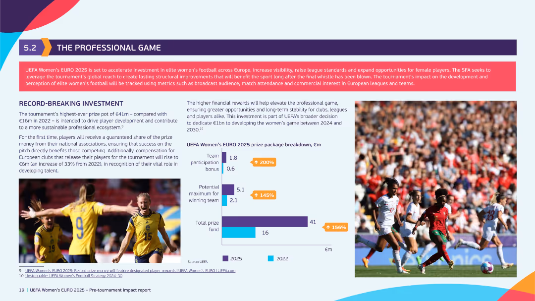
Split layout with bar graph of prize breakdown (2022 vs 2025), two images of players, and detailed explanation of record-breaking investments.
Investment Analysis
Hospitality & Tourism
The slide showcases UEFA’s increased prize fund for Women's EURO 2025 (€41m), reflecting a 156% increase from 2022. It discusses the intent to elevate the professional game, ensure financial sustainability, and drive player development through enhanced investment.
prize fund, women’s football, investment, professional game, UEFA, player development, sustainability
false
Investment Analysis
Hospitality & Tourism
Mixed Chart
EY
Add to my slides
Remove from favorites
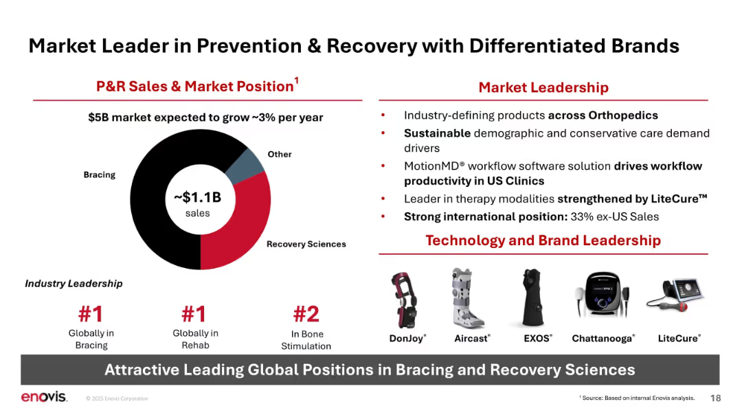
Donut chart, leadership rankings, brand visuals, and bulleted strengths; bold red/black layout.
Product and Service Analysis
Healthcare & Pharmaceuticals
Presents ~$1.1B in P&R sales divided into bracing and recovery sciences. Highlights Enovis’s #1 global position in bracing and rehab, and emphasizes brand strength and technological differentiation across therapy modalities.
P&R, market leadership, bracing, rehab, recovery sciences, brands, technology, global position
false
Product and Service Analysis
Healthcare & Pharmaceuticals
Mixed Chart
JP Morgan
Add to my slides
Remove from favorites
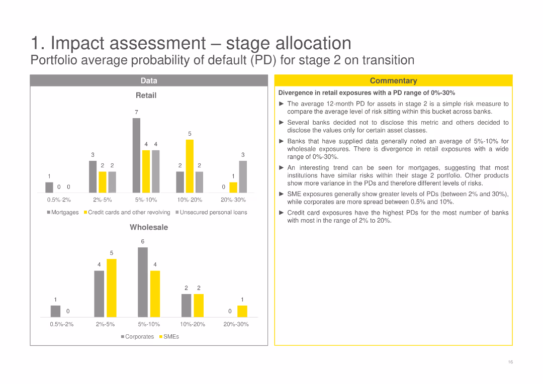
Contains column charts comparing the portfolio average probability of default (PD) for stage 2 assets in Retail and Wholesale categories, with a detailed commentary discussing divergences and implications for different asset classes.
Risk Assessment and Management
Financial Services
Evaluates the portfolio average probability of default for stage 2 assets, noting variances in risk levels among retail and wholesale exposures and analyzing the implications for different financial products.
probability of default, stage 2, retail, wholesale, financial products
false
Risk Assessment and Management
Financial Services
Multiple Chart
EY
Add to my slides
Remove from favorites
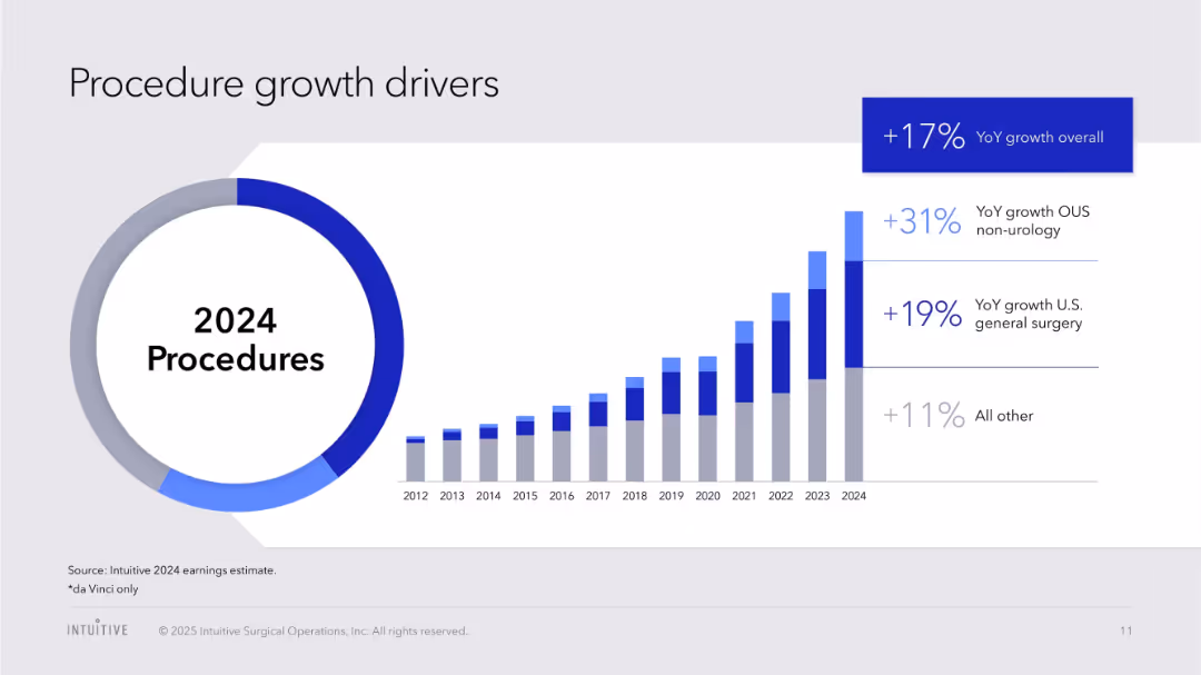
Dual visuals: donut chart with 2024 procedures, and bar chart (2012–2024) with segment breakdown and YoY stats
Performance Metrics and KPIs
Healthcare & Pharmaceuticals
Shows detailed breakdown of YoY procedure growth by category (OUS, U.S. general surgery, others) and charts the long-term increase in procedure volume.
procedure drivers, global growth, general surgery, OUS, YoY trends, historical data, healthcare robotics
false
Performance Metrics and KPIs
Healthcare & Pharmaceuticals
Single Chart
JP Morgan
Add to my slides
Remove from favorites
This slide contains a column chart showing the number of elective procedures per month performed/expected each year across different regions from 2021 to 2023.
Market Analysis and Trends
Healthcare & Pharmaceuticals
This slide highlights the recovery in procedure volumes post-COVID-19, with a detailed analysis of elective procedures across various regions and years.
procedure volume, COVID-19 recovery, elective procedures, regional analysis, year comparison
false
Market Analysis and Trends
Healthcare & Pharmaceuticals
Single Chart
LEK
Add to my slides
Remove from favorites
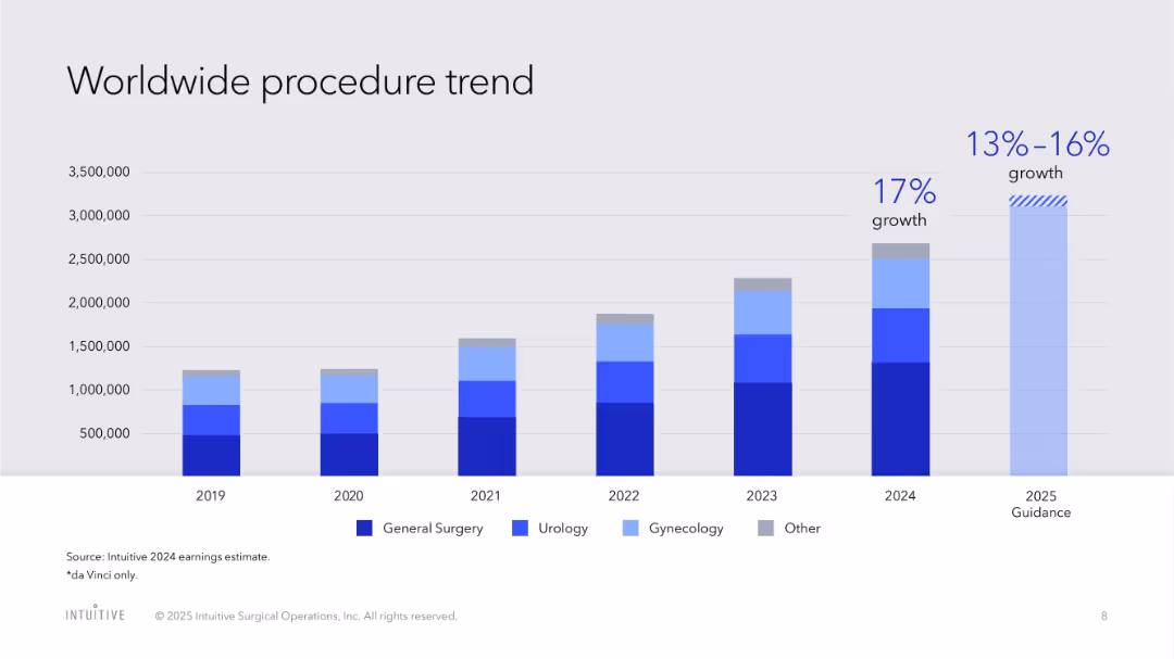
Stacked bar chart segmented by surgery type (General, Urology, Gynecology, Other), annual trend
Performance Metrics and KPIs
Healthcare & Pharmaceuticals
Tracks the annual increase in surgical procedures using da Vinci systems, with projected growth rates for 2024 and 2025 broken down by type of procedure.
procedure volume, da Vinci, surgical robotics, growth forecast, healthcare, general surgery, gynecology, urology
false
Performance Metrics and KPIs
Healthcare & Pharmaceuticals
Single Chart
JP Morgan
Add to my slides
Remove from favorites
Moderate visual complexity with a combination of text and infographic elements. The slide provides insights into common themes and strengths across leading companies in the process automation space.
Technology and Digital Transformation
Industrial & Manufacturing
This slide identifies the common strengths among leading companies in the process automation sector, highlighting key areas such as innovation, technology, product offerings, and market positions. It also discusses the role of process automation in addressing megatrends and the increasing demand for connected, software-enabled products in the global market.
Process automation, Industry analysis, Company strengths, Market trends
false
Technology and Digital Transformation
Industrial & Manufacturing
Boxed
LEK
Add to my slides
Remove from favorites
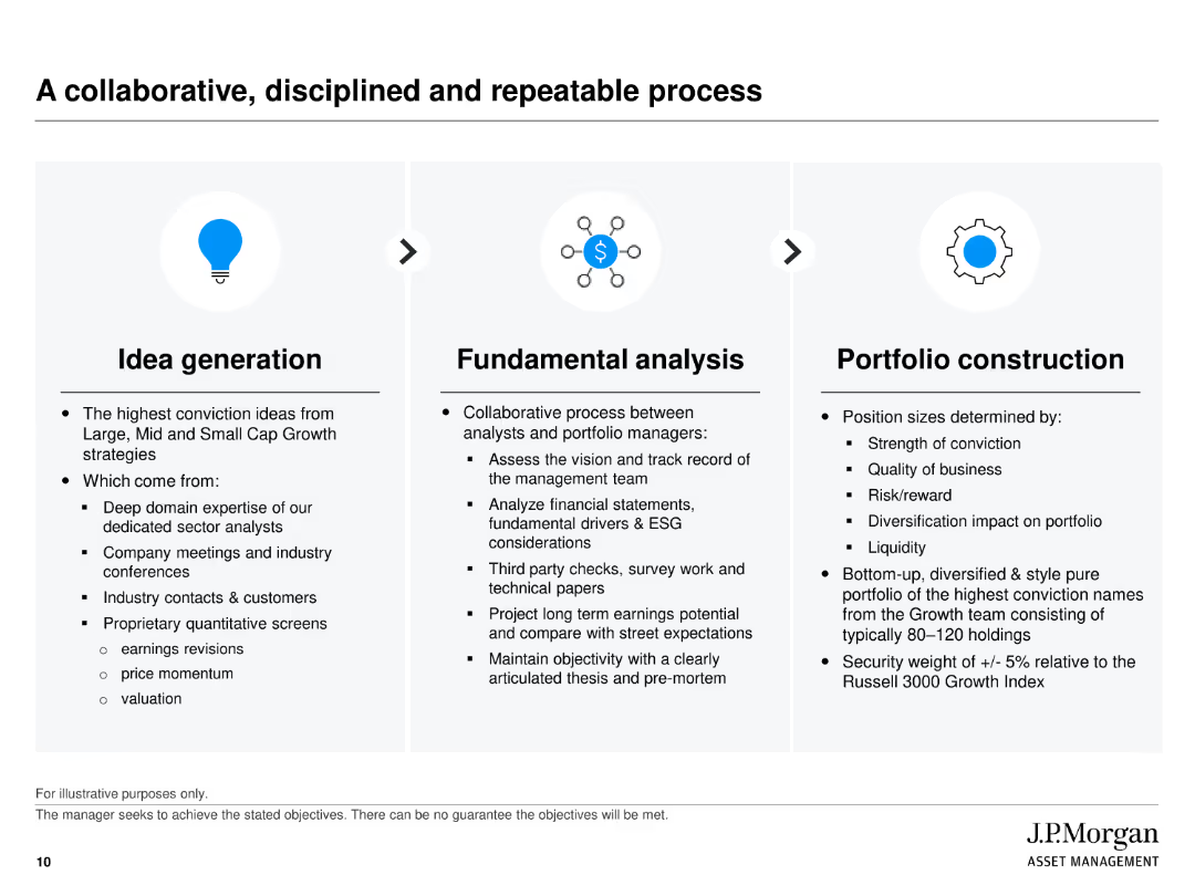
Three-column layout: Idea Generation, Fundamental Analysis, and Portfolio Construction, each described with icons and text explaining the processes.
Operational Efficiency
Financial Services
Describes the structured process used by J.P. Morgan for managing growth portfolios, from generating investment ideas to fundamental analysis and constructing the portfolio.
process, collaboration, portfolio construction, idea generation, fundamental analysis
false
Operational Efficiency
Financial Services
Pillar
JP Morgan
Add to my slides
Remove from favorites
This slide includes a central diagram depicting three interconnected cycles labeled as Inner Loop, Huddle, and Outer Loop, surrounded by various process steps and feedback loops.
Organizational Structure and Change
Professional Services
Describes the feedback and process improvement cycles within a business context. Useful for understanding organizational dynamics and improving customer service efficiency.
process improvement, customer service, feedback loops, organizational dynamics, business efficiency
false
Organizational Structure and Change
Professional Services
Diagram
Bain
Add to my slides
Remove from favorites
The slide features a comprehensive diagram summarizing the general overview of processing methods for biofuels. It includes stages from harvesting/collection, conditioning, pretreatment, intermediate, conversion, to biofuel consumption, highlighting different processes at each stage.
Technology and Digital Transformation
Energy & Utilities
This slide provides an overview of the processing methods for biofuels, detailing each stage from harvesting and collection to final biofuel consumption, emphasizing the importance of conditioning, pretreatment, and conversion processes.
processing methods, biofuels, harvesting, conditioning, pretreatment, intermediate, conversion, biofuel consumption
false
Technology and Digital Transformation
Energy & Utilities
Diagram
Kearney
Add to my slides
Remove from favorites
Features a bar chart with color-coded bars, alongside bulleted lists of key findings related to governance roles within shared services. The visual elements are clearly separated from textual elements for easy reading.
Organizational Structure and Change
Professional Services
Explores the roles of regional and global process owners within shared services, focusing on their impact on efficiency and effectiveness. This slide is suitable for discussions on structuring governance to enhance organizational processes.
Process owners, shared services, governance, efficiency, effectiveness
false
Organizational Structure and Change
Professional Services
Mixed Chart
Deloitte
Add to my slides
Remove from favorites
The slide presents a dual-axis scatter plot with varying dot sizes, contrasting past and future process reinventions across different functions like Customer Service and Finance. The use of purple hues differentiates between the past two years and the next two.
Strategic Planning
Technology & Software
Highlights the evolution in the reinvention of business processes by applying new technologies and working methods. It's useful for analyzing and planning functional improvements and technology adoption in different organizational areas.
Process Reinvention, Functional Areas, Technology Adoption, Future Planning, Customer Service, Finance, Strategic Improvement, Organizational Change, Dot Chart
false
Strategic Planning
Technology & Software
Multiple Chart
Accenture
Add to my slides
Remove from favorites
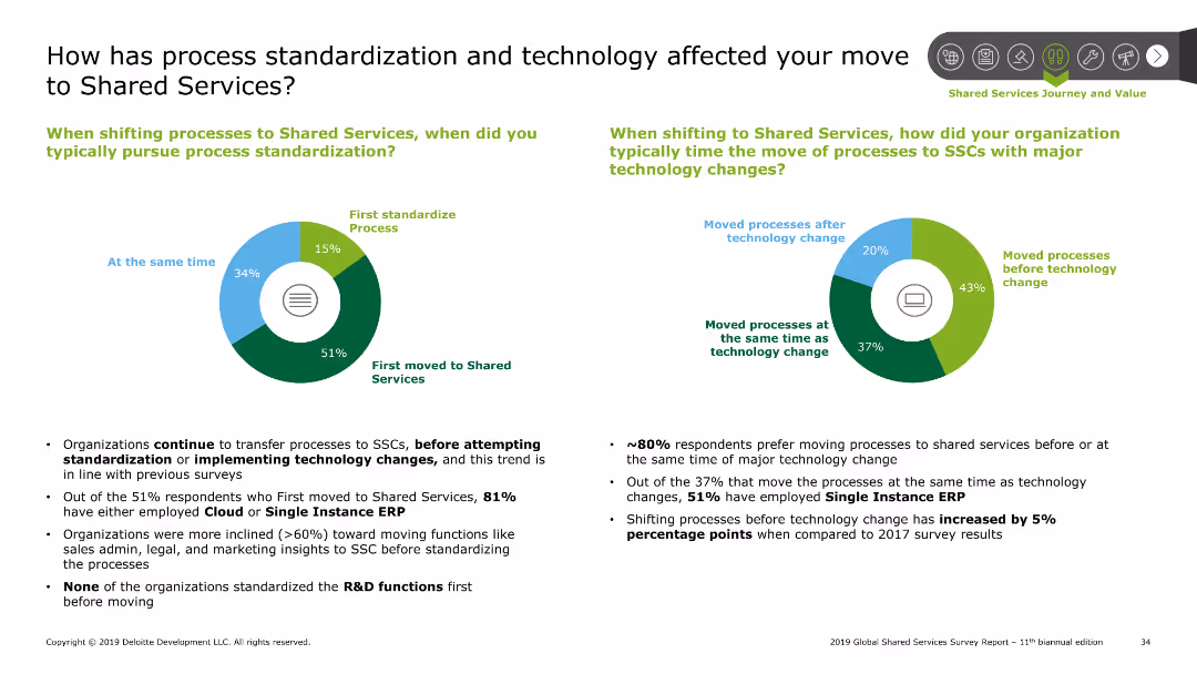
The slide features two pie charts. One chart shows when process standardization is pursued, and the other shows the timing of technology changes.
Technology and Digital Transformation
Professional Services
This slide examines the impact of process standardization and technology changes on moving to shared services, including timing and methods of implementation.
Process standardization, technology, shared services, timing
false
Technology and Digital Transformation
Professional Services
Multiple Chart
Deloitte
Add to my slides
Remove from favorites
Combines text, icons, and images to outline the modules and pathways of the Kearney Procurement Academy, including online learning.
Technology and Digital Transformation
Education & Training
Provides an overview of the Kearney Procurement Academy, its training modules, and online learning pathways for skills development.
procurement, academy, training, development, modules, online learning, pathways, education, skills
false
Technology and Digital Transformation
Education & Training
Header Vertical
Kearney
Add to my slides
Remove from favorites
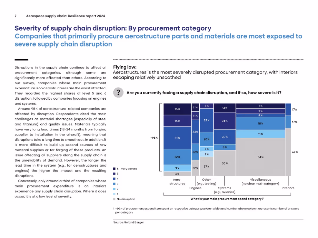
Similar layout to previous slide, now segmented by procurement categories; stacked bar chart on right with color-coded severity levels by category.
Risk Assessment and Management
Environmental Services & Sustainability
Aerostructure-related procurement is the most disrupted category, with 95% of companies affected. Disruptions are driven by material shortages (e.g., steel, titanium), long lead times, and quality issues. By contrast, interiors experience far fewer disruptions. The chart compares severity of supply chain disruption across categories like engines, systems, and miscellaneous.
procurement, aerostructures, supply chain, engines, severity, disruption, lead time, materials
false
Risk Assessment and Management
Environmental Services & Sustainability
Mixed Chart
Roland Berger
Add to my slides
Remove from favorites
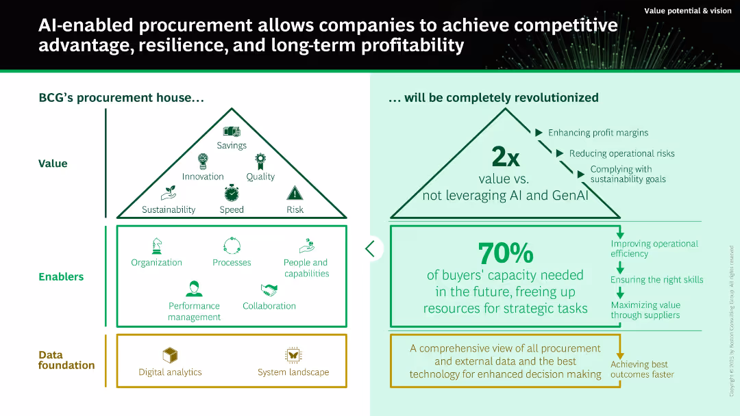
Split layout with two pyramids: left shows traditional procurement value; right shows AI-enhanced outcomes. Below are enablers and data foundation layers. Predominantly green color scheme.
Technology and Digital Transformation
Technology & Software
Illustrates how AI and GenAI can revolutionize procurement by improving value, efficiency, and sustainability. Compares traditional procurement structures with AI-enhanced models that double value creation. Highlights key enablers and foundational data systems needed.
procurement, AI, GenAI, value, digital transformation, sourcing, efficiency, savings
false
Technology and Digital Transformation
Technology & Software
Boxed
BCG
Add to my slides
Remove from favorites
Diagram of a microservices ecosystem connected through an AI hub, featuring various procurement technology tools.
Technology and Digital Transformation
Technology & Software
Envisions the future of procurement technology as a decentralized ecosystem driven by AI, highlighting integration of various tech platforms.
procurement, AI, technology, future, ecosystem
false
Technology and Digital Transformation
Technology & Software
Diagram
Kearney
Add to my slides
Remove from favorites
Displays a hierarchical pyramid diagram illustrating the House of Purchasing and Supply ManagementTM, with detailed categorizations.
Strategic Planning
Professional Services
Assesses internal effectiveness of client's procurement function through the AEP framework, covering various performance metrics.
procurement, assessment, excellence, AEP, internal effectiveness, pyramid diagram, House of Purchasing, performance metrics
false
Strategic Planning
Professional Services
Framework
Kearney
Add to my slides
Remove from favorites
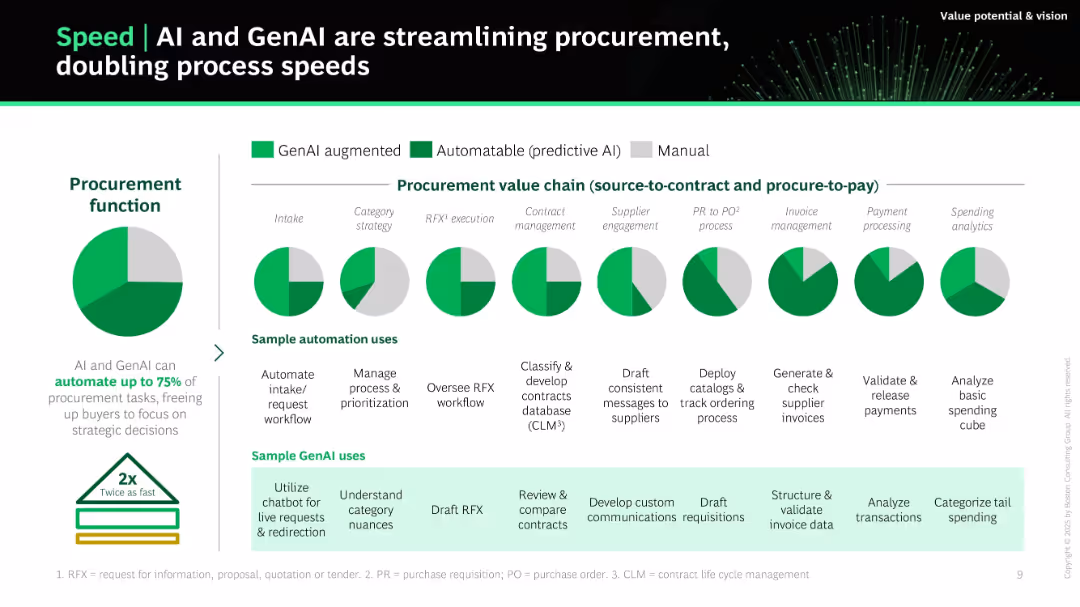
Clean layout with pie charts representing automation potential across procurement stages, supported by green/gray color-coding (GenAI, predictive AI, manual). Sample use cases and benefits are listed in structured bullet points.
Operational Efficiency
Technology & Software
This slide shows how AI and GenAI can automate up to 75% of procurement tasks, enhancing speed and freeing up resources. It details each procurement step, indicating automation levels and providing specific use case examples of automation and GenAI support to double process speed.
procurement, automation, GenAI, efficiency, sourcing, AI use cases, workflow, invoicing, supplier engagement
false
Operational Efficiency
Technology & Software
Single Chart
BCG
Add to my slides
Remove from favorites
The slide contains a diagram illustrating the typical enterprise procurement process and bullet points explaining the rationale behind starting with procurement. Key points are highlighted in yellow circles.
Technology and Digital Transformation
Technology & Software
This slide describes EY OpsChain 4.0 and its Network Procurement module, detailing the procurement process and explaining the benefits of starting with procurement in deploying the Baseline Protocol.
Procurement, Blockchain, EY OpsChain, Baseline Protocol, Digital Transformation
false
Technology and Digital Transformation
Technology & Software
Vertical Flow
EY
Add to my slides
Remove from favorites
Text and icon-driven slide discussing the drivers of change in the procurement sector, focusing on automation and technological disruption.
Market Analysis and Trends
Technology & Software
Analyzes the evolving landscape in procurement, emphasizing automation, consumerization, and the impact of disruptive technologies.
procurement, change, automation, technology, disruption
false
Market Analysis and Trends
Technology & Software
Table
Kearney
Add to my slides
Remove from favorites
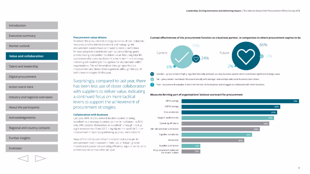
A column chart showing the measures forming part of organizations' balance scorecard for procurement. A pie chart comparing current and future effectiveness of procurement as a business partner. The layout is structured with charts on the right and text on the left, and uses shades of teal and grey.
Operational Efficiency
Professional Services
Discusses procurement value drivers, noting less use of closer collaboration with suppliers. Highlights the focus on tactical levers to achieve procurement strategies, and measures forming part of the balance scorecard, such as OPEX savings and supplier performance.
procurement, collaboration, value, scorecard, efficiency
false
Operational Efficiency
Professional Services
Mixed Chart
Deloitte
Add to my slides
Remove from favorites
Uses column bars to display different levers in procurement, emphasizing their activities and trends.
Sales and Business Development
Industrial & Manufacturing
Discusses key procurement levers, such as commercial procurement applications, supplier management, and category strategies.
Procurement, Commercial, Supplier Management, Trends
false
Sales and Business Development
Industrial & Manufacturing
Single Chart
Roland Berger
Add to my slides
Remove from favorites
Displays bar charts and segmented columns to show potential cost savings through procurement optimization, with percentage values.
Operational Efficiency
Financial Services
Highlights potential annual cost savings through various procurement optimization strategies, with detailed cost breakdowns.
procurement, cost savings, optimization, financial impact, bar charts, column charts, percentages, strategies, savings
false
Operational Efficiency
Financial Services
Multiple Chart
Kearney
Add to my slides
Remove from favorites
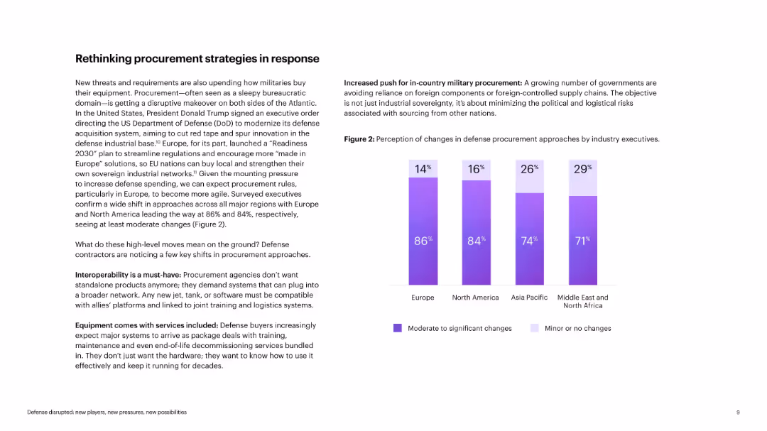
Text with bar chart showing perception of changes in procurement by region
Operational Efficiency
Government & Public Sector
The slide discusses evolving military procurement strategies, with emphasis on interoperability, bundled services, and local sourcing. The bar chart shows widespread recognition of changes across regions. Insights suggest that national security priorities are reshaping how defense contracts are structured and delivered.
procurement, defense, interoperability, local sourcing, military, strategy, contracting
false
Operational Efficiency
Government & Public Sector
Mixed Chart
Accenture
Add to my slides
Remove from favorites
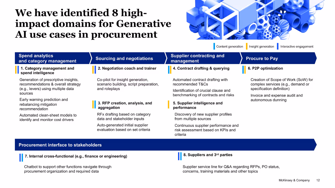
Grid layout with categorized procurement domains and color-coded bars for use case types; minimalistic icons and headers.
Product and Service Analysis
Professional Services
This slide outlines 8 major areas in procurement where Generative AI can create value—ranging from spend intelligence to supplier performance and stakeholder communication—mapped under procurement functions like P2P and sourcing.
procurement, GenAI, sourcing, supplier management, spend analysis, RFP, negotiation
false
Product and Service Analysis
Professional Services
Linear Flow
McKinsey
Add to my slides
Remove from favorites
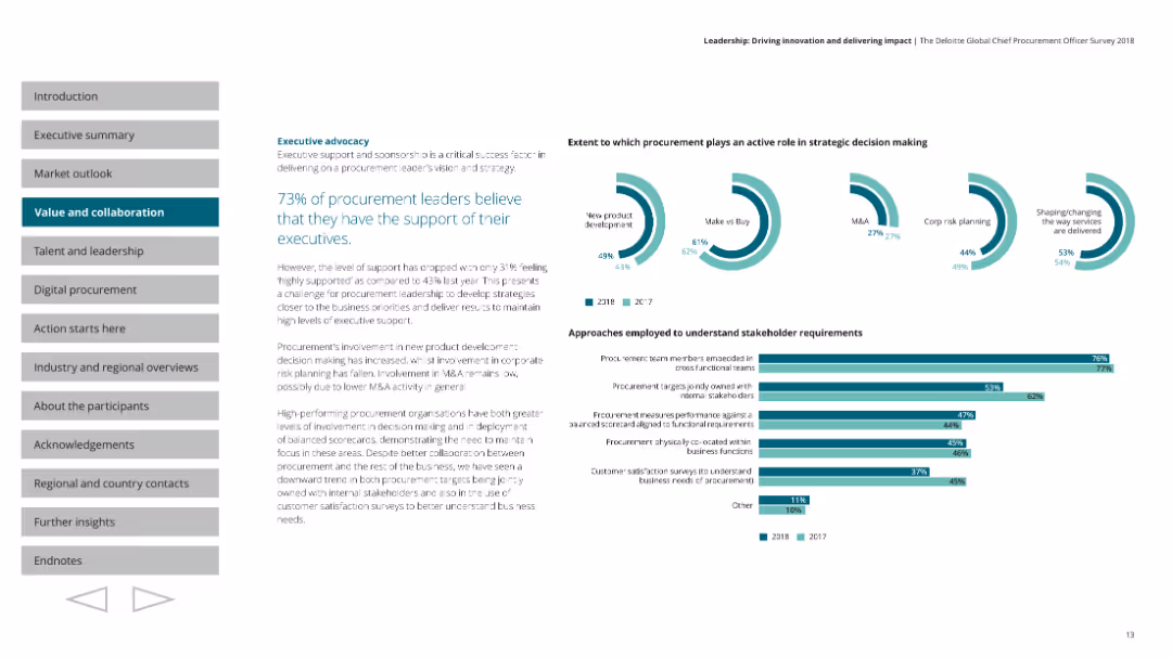
A pie chart showing the extent to which procurement leaders believe they have executive support. Multiple pie charts depicting the role of procurement in strategic decision-making. Horizontal bar charts show approaches to understanding stakeholder requirements. Text is on the left with pie charts and bar charts on the right.
Strategic Planning
Professional Services
Highlights that 73% of procurement leaders believe they have executive support, though this is a decrease from the previous year. Discusses the role of procurement in strategic decision-making and approaches to understanding stakeholder requirements.
procurement, leadership, advocacy, stakeholders, strategy
false
Strategic Planning
Professional Services
Multiple Chart
Deloitte
Add to my slides
Remove from favorites
Multi-section layout detailing A.T. Kearney’s leadership in procurement with text and graphics on strategic sourcing, procurement assessment, and transformations.
Market Analysis and Trends
Professional Services
Outlines A.T. Kearney's market-leading approaches in procurement, including strategic sourcing innovations and comprehensive procurement assessments.
procurement, leadership, strategic, sourcing, transformation
false
Market Analysis and Trends
Professional Services
Table
Kearney
Add to my slides
Remove from favorites
This slide features two bar charts showing the approach to purchasing standardization by country and by hospital type, with top selections highlighted.
Operational Efficiency
Healthcare & Pharmaceuticals
This slide analyzes the procurement strategies of hospitals, emphasizing the trend towards selecting preferred suppliers for specific procedures or products.
procurement processes, purchasing standardization, preferred supplier, hospital strategies, regional comparison
false
Operational Efficiency
Healthcare & Pharmaceuticals
Multiple Chart
LEK
Add to my slides
Remove from favorites
Flowchart depicting the traditional procurement technology flow, labeled from strategic planning to operational procurement.
Operational Efficiency
Professional Services
Illustrates a comprehensive flowchart of the procurement process, detailing stages from strategic planning to compliance management.
procurement, process, flowchart, operational, strategic
false
Operational Efficiency
Professional Services
Linear Flow
Kearney
Add to my slides
Remove from favorites
A detailed process flow diagram depicts the stages of the procurement process from product selection to payment. Includes icons and descriptions for each step, interactions with a central data hub, and customer service systems.
Operational Efficiency
Professional Services
Provides a comprehensive view of the procurement process, showing the sequence and tools involved from the initial product need to final payment, highlighting integration with technology for efficiency.
Procurement, Process, Technology, Efficiency, Integration
false
Operational Efficiency
Professional Services
Diagram
Kearney
Add to my slides
Remove from favorites
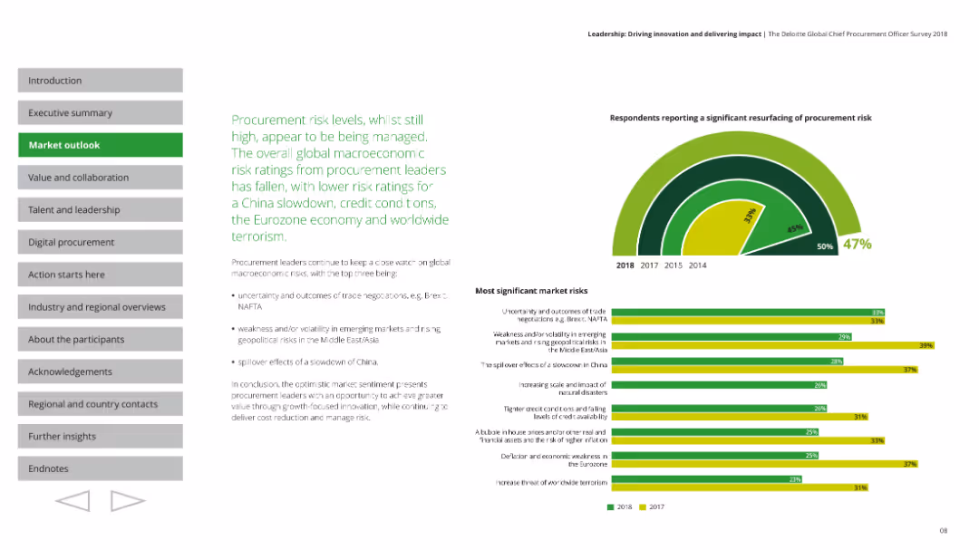
The slide includes a combination of text and charts, detailing procurement risk levels and macroeconomic risks. Consistent text formatting with highlighted key points.
Market Analysis and Trends
Professional Services
Discusses procurement risk levels and macroeconomic risks, providing insights into the challenges and strategies for procurement leaders.
procurement, risk levels, macroeconomic risks, strategies, insights
false
Market Analysis and Trends
Professional Services
Mixed Chart
Deloitte
Add to my slides
Remove from favorites
A radial bar chart illustrating the resurgence of procurement risk, alongside text detailing significant market risks.
Market Analysis and Trends
Professional Services
Analyzes procurement risk levels and significant market risks, offering insights into how these are managed.
procurement risk, market risks, analysis, management, trends
false
Market Analysis and Trends
Professional Services
Multiple Chart
Deloitte
Add to my slides
Remove from favorites
A bar chart showing the percentage of services procurement spend across various industries. Each bar is colored differently, representing sectors like insurance, financial services, and telecommunications.
Industry Overview
Professional Services
Analyzes the proportion of services procurement spending in different sectors, showing higher spend in industries like insurance and financial services compared to sectors like construction or consumer products.
Procurement, Services, Industry, Spend, Analysis
false
Industry Overview
Professional Services
Single Chart
Kearney
Add to my slides
Remove from favorites
The slide lists core, business, procurement, and digital skills, categorized by yesterday's, today's, and tomorrow's skills with a detailed skills layout table.
Technology and Digital Transformation
Professional Services
It outlines the evolving skills needed for procurement success, emphasizing digital transformation, strategic alliances, and advanced analytics.
Procurement skills, digital transformation, strategic alliances, analytics, talent development, future skills
false
Technology and Digital Transformation
Professional Services
Multiple Chart
Kearney
Add to my slides
Remove from favorites
The slide lists core, business, procurement, and digital skills, categorized by yesterday's, today's, and tomorrow's skills with a detailed skills layout table.
Technology and Digital Transformation
Professional Services
It outlines the evolving skills needed for procurement success, emphasizing digital transformation, strategic alliances, and advanced analytics.
Procurement skills, digital transformation, strategic alliances, analytics, talent development, future skills
false
Technology and Digital Transformation
Professional Services
Table
Kearney
Add to my slides
Remove from favorites
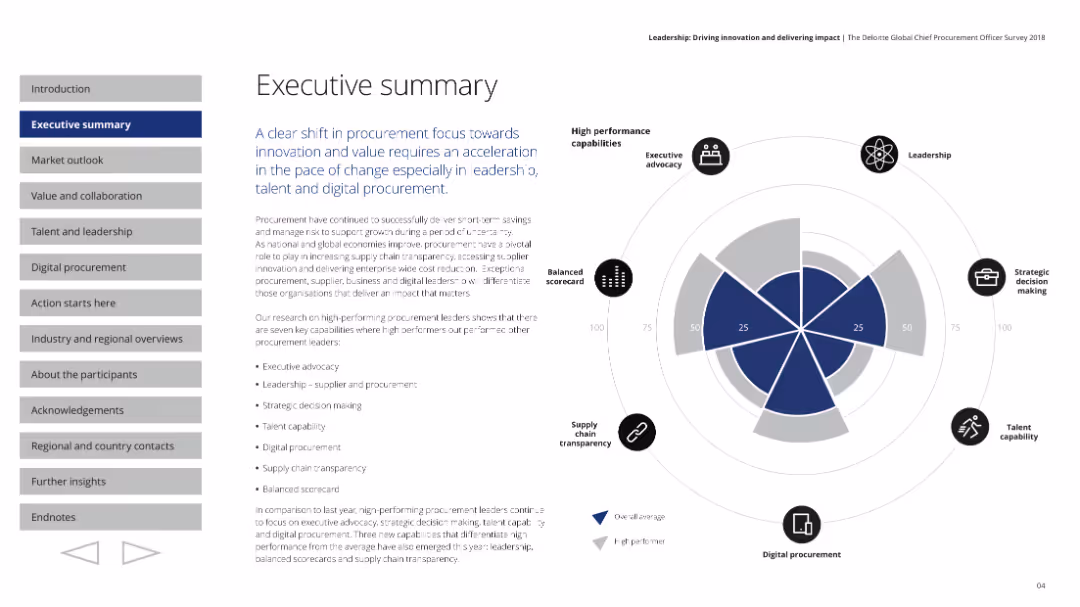
A balanced layout with text and a radar chart depicting high performance capabilities. The layout includes sections for different focus areas.
Strategic Planning
Professional Services
Summarizes procurement focus on innovation and value, highlighting key capabilities for high performance in procurement.
procurement, summary, performance, innovation, capabilities
false
Strategic Planning
Professional Services
Multiple Chart
Deloitte
Add to my slides
Remove from favorites
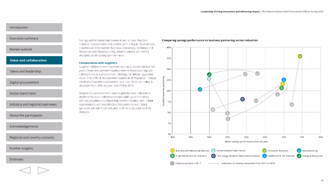
A scatter plot comparing savings performance to business partnering across industries. Text on the left and a graph on the right with colored dots representing different industries. Uses a clean layout with clear headings and data points.
Operational Efficiency
Professional Services
Discusses the importance of supplier collaboration for innovation, noting a decrease in its usage. Highlights varying industry performances in savings and business partnering, with a scatter plot to visualize the data.
procurement, suppliers, collaboration, performance, industry
false
Operational Efficiency
Professional Services
Mixed Chart
Deloitte
Add to my slides
Remove from favorites
Text and infographics on the adoption of sustainable procurement practices and market rewards.
Strategic Planning
Environmental Services & Sustainability
Discusses the impact and benefits of adopting sustainable procurement practices in companies.
procurement, sustainability, companies, practices, rewards
false
Strategic Planning
Environmental Services & Sustainability
Multiple Chart
McKinsey
Add to my slides
Remove from favorites
Features a complex diagram showing the interconnected elements of the procurement value chain, including arrows and blocks.
Strategic Planning
Professional Services
Explains the complexity and interconnectedness of modern procurement value chains with detailed breakdowns of each element.
procurement, value chain, complexity, interconnected, diagram, analytics, management, strategy, operations
false
Strategic Planning
Professional Services
Diagram
Kearney
Add to my slides
Remove from favorites
Features text outlining the importance of value and collaboration, along with key insights. Consistent text formatting with highlighted key points.
Strategic Planning
Professional Services
Discusses procurement alignment with business priorities, emphasizing transparency and collaboration for delivering value.
procurement, value, collaboration, transparency, insights
false
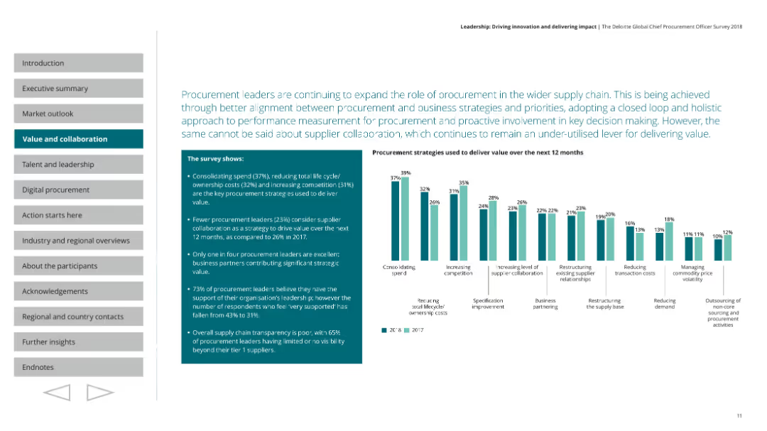
Strategic Planning
Professional Services
Mixed Chart
Deloitte
Add to my slides
Remove from favorites
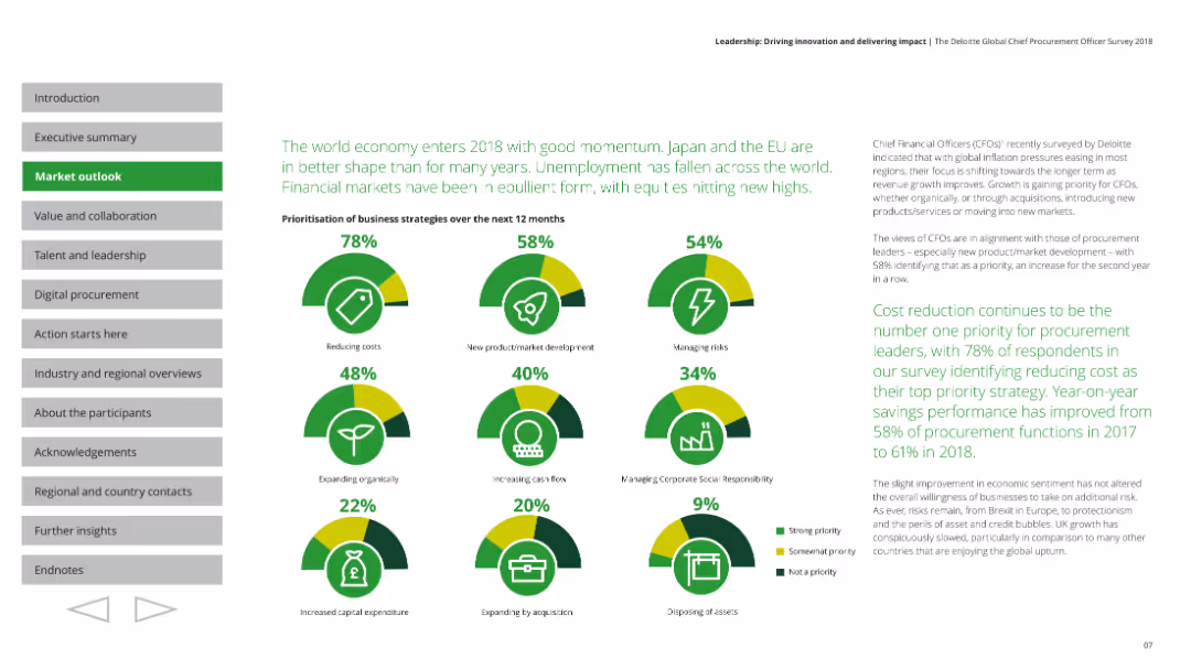
Features a column chart showing procurement strategies used to deliver value, with accompanying textual insights.
Strategic Planning
Professional Services
Explores procurement strategies over the next 12 months, focusing on consolidation, cost reduction, and collaboration.
procurement, value delivery, strategies, collaboration, cost reduction
false
Strategic Planning
Professional Services
Multiple Chart
Deloitte
Add to my slides
Remove from favorites
Diagram detailing the steps in a procure-to-pay cycle for a retail company, highlighting inefficiencies and manual processes involved in each stage.
Operational Efficiency
Financial Services
Outlines the challenges and inefficiencies in the procure-to-pay process within finance, emphasizing the risk of errors and the need for digital overhaul.
procure-to-pay, P2P, finance, inefficiencies, manual process, digital transformation, retail, operational risk
false
Operational Efficiency
Financial Services
Linear Flow
Deloitte
Add to my slides
Remove from favorites
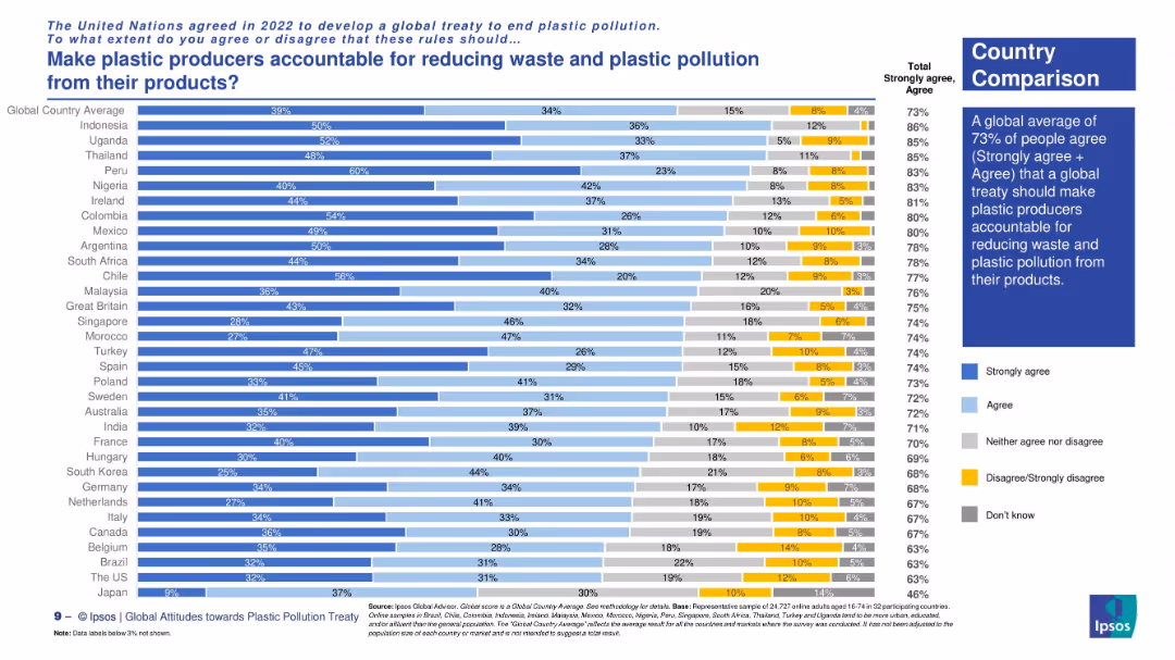
Horizontal bar chart displaying country-level agreement. Right-side text box provides global average and summary.
Regulatory and Compliance
Environmental Services & Sustainability
The slide reveals global public support for holding plastic producers accountable for pollution. It compares countries’ responses, highlighting strong agreement in Peru, Uganda, and Colombia. Global support is at 73%.
producer accountability, waste reduction, plastic treaty, environmental policy, Ipsos global survey, public opinion, sustainability, corporate responsibility
false
Regulatory and Compliance
Environmental Services & Sustainability
Mixed Chart
IPSOS
Add to my slides
Remove from favorites
Displays a pie chart of sales distribution by product type, along with multiple product images with associated pricing, categorized into 'Base', 'Value up', and 'Premiumization'.
Product and Service Analysis
Consumer Goods
Provides a comparative analysis of Nestlé's product offerings by price segmentation, illustrating potential areas for value enhancement and premium product strategies. Ideal for discussing pricing strategies and market differentiation.
product analysis, pricing strategy, sales distribution, premium products, market differentiation
false
Product and Service Analysis
Consumer Goods
Mixed Chart
Deutsche Bank
Add to my slides
Remove from favorites
The slide presents a side-by-side comparison of old vs. new product frameworks with emphasis on features like sustainability and nutrition.
Product and Service Analysis
Consumer Goods
Explains the new holistic product design framework adopted since 2019, highlighting improvements in sustainability and nutritional content.
product design, sustainability, nutrition, strategic planning, holistic approach
false
Product and Service Analysis
Consumer Goods
Framework
Deutsche Bank
Add to my slides
Remove from favorites
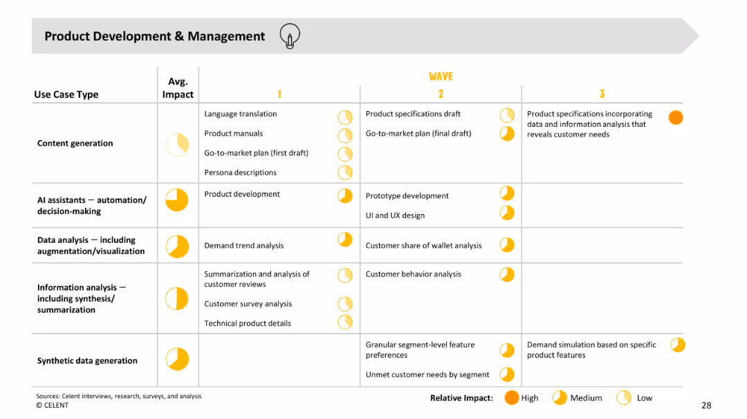
Table view; columns for Use Case Type, Avg. Impact, and Wave 1–3. Each cell includes specific examples (e.g., product specs, demand trend analysis) with impact rating icons (low, medium, high).
Product and Service Analysis
Financial Services
Maps GenAI use cases to stages of product development, showing progression from early drafts to highly tailored specs based on data insights. Tracks impact levels across waves, indicating which use cases have the greatest strategic benefit over time.
product development, AI assistant, data analysis, content generation, impact, GenAI
false
Product and Service Analysis
Financial Services
Single Chart
Oliver Wyman
Add to my slides
Remove from favorites
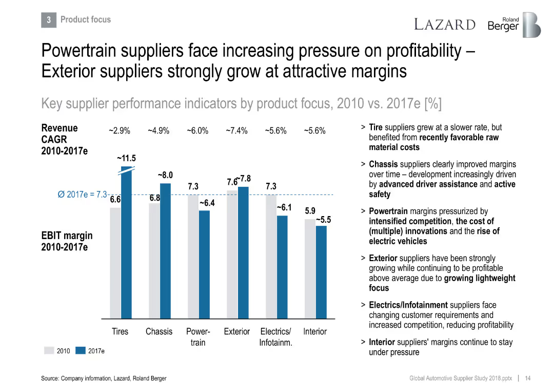
Bar chart presenting EBIT and revenue CAGR by product category (e.g., Tires, Chassis, Powertrain), with insights on right side.
Product and Service Analysis
Industrial & Manufacturing
Illustrates performance differences by product category. Powertrain and Interior lag in margins, while Exterior and Tire suppliers see attractive growth. Discusses cost pressures, innovation demands, and shifting market dynamics like EV adoption.
product focus, margin pressure, tires, chassis, powertrain, innovation, EVs
false
Product and Service Analysis
Industrial & Manufacturing
Mixed Chart
Roland Berger
Add to my slides
Remove from favorites
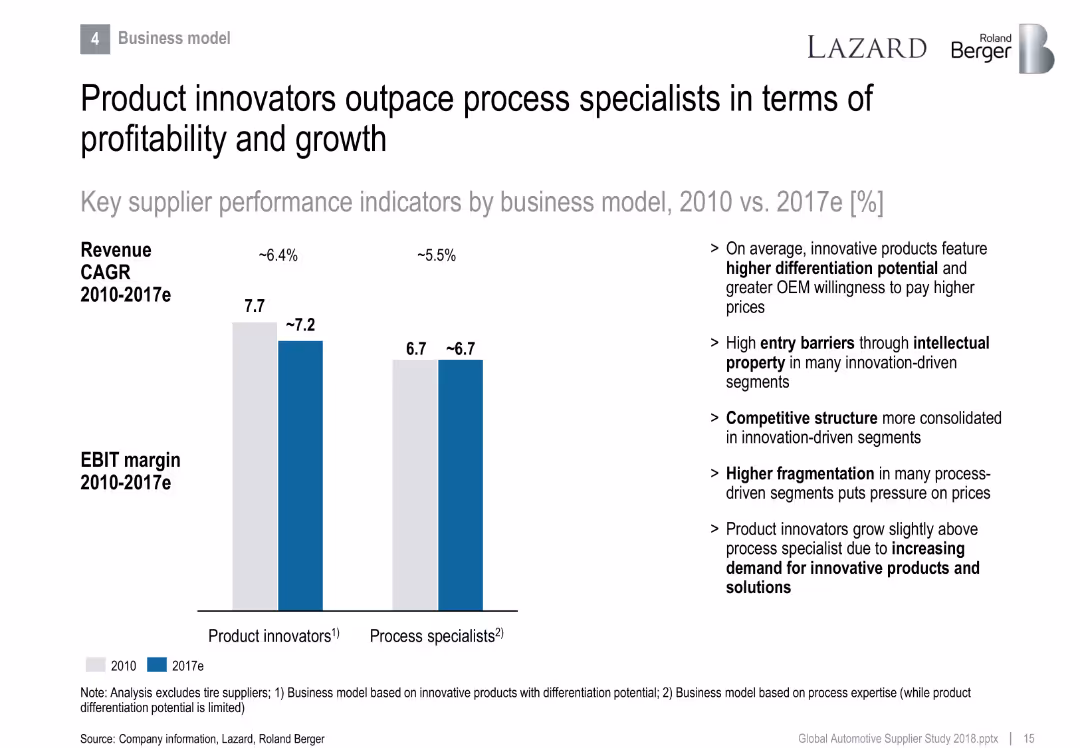
Side-by-side bar chart comparing product innovators vs. process specialists in EBIT margin and revenue CAGR.
Strategic Planning
Industrial & Manufacturing
Differentiates performance between product and process-focused suppliers. Product innovators lead in profitability due to differentiation and IP, while process specialists face fragmentation and pricing pressure.
product innovation, differentiation, process specialist, EBIT margin, growth, IP
false
Strategic Planning
Industrial & Manufacturing
Mixed Chart
Roland Berger
Add to my slides
Remove from favorites
Primarily text-based with minimalistic icons and checkmarks to denote key points, arranged in a clear, easy-to-follow format.
Strategic Planning
Financial Services
Details future strategies for product innovation, with a forward-looking perspective. Suitable for strategic forecasting and planning meetings.
product innovation, strategy, growth, ROE, customer experience
false
Strategic Planning
Financial Services
Table
JP Morgan
Add to my slides
Remove from favorites
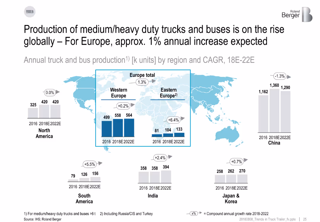
World map with bar charts over regions, CAGR labels, and production figures from 2016 to 2022E.
Market Analysis and Trends
Industrial & Manufacturing
The slide analyzes global truck and bus production trends, showing a modest increase in Europe and strong growth in Eastern Europe and South America. China shows a decline. CAGR from 2018–2022E is highlighted by region.
production, CAGR, Europe, global truck market, regional growth
false
Market Analysis and Trends
Industrial & Manufacturing
Multiple Chart
Roland Berger
Add to my slides
Remove from favorites
A combination of bar charts displays various levers for production efficiency with corresponding trends and activity levels.
Operational Efficiency
Industrial & Manufacturing
Highlights top levers in production efficiency, such as continuous improvement, optimization of production planning, and control.
Production, Efficiency, Optimization, Trends, Activities
false
Operational Efficiency
Industrial & Manufacturing
Single Chart
Roland Berger
Add to my slides
Remove from favorites
Features segmented bar charts detailing the environmental impacts of different subsystems in the production of satellite equipment, highlighting the contributions of metals and cables.
Product and Service Analysis
Environmental Services & Sustainability
Focuses on the production phase of satellite equipment, detailing the major contributors to environmental impact such as metals in electronics and the significant mass of cables.
production, environmental impact, satellite, metals, electronics, cables, bar charts, resource depletion
false
Product and Service Analysis
Environmental Services & Sustainability
Single Chart
Deloitte
Add to my slides
Remove from favorites
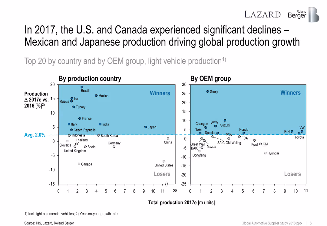
Two quadrant scatter plots showing production country and OEM group changes in 2017 vs. 2016. Average growth line divides winners and losers.
Performance Metrics and KPIs
Industrial & Manufacturing
This slide maps growth in vehicle production by country and OEM group. Winners include Mexico and Geely, while the U.S. and Canada declined. It highlights global shifts in automotive output.
production growth, OEMs, countries, vehicle output, 2017, performance, global ranking
false
Performance Metrics and KPIs
Industrial & Manufacturing
Multiple Chart
Roland Berger
Add to my slides
Remove from favorites
This slide uses a flowchart to detail the methodological steps from equipment inventory to material compositions for assessing production impacts in infrastructure projects.
Operational Efficiency
Industrial & Manufacturing
Describes the comprehensive approach for grouping similar equipment into families to streamline data collection for infrastructure production, emphasizing material and lifetime considerations.
Production, infrastructure, equipment grouping, methodological steps, material composition, lifecycle assessment, industrial efficiency
false
Operational Efficiency
Industrial & Manufacturing
Diagram
Deloitte
Add to my slides
Remove from favorites
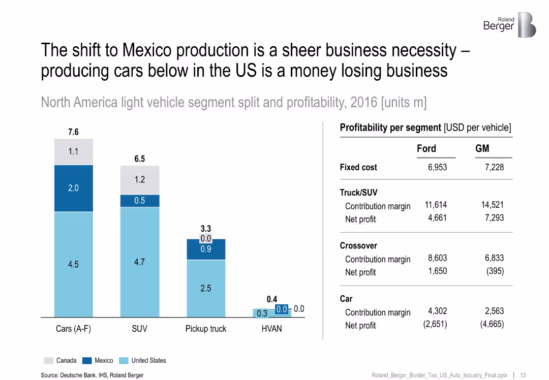
Bar chart of segment-wise production by country, with table comparing Ford vs GM profitability by segment.
Operational Efficiency
Industrial & Manufacturing
Emphasizes that car production in the US is unprofitable for major OEMs, especially for sedans, driving the shift to Mexico where margins are more sustainable.
production shift, Mexico, profitability, Ford, GM, vehicle segment
false
Operational Efficiency
Industrial & Manufacturing
Mixed Chart
Roland Berger
Add to my slides
Remove from favorites
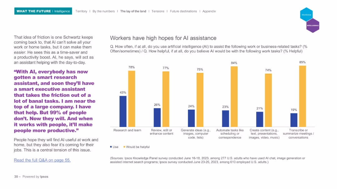
Left side features quote and description, right side features vertical bar chart showing perceived usefulness and current usage of AI for work tasks.
Strategic Planning
Technology & Software
This slide explores expectations for AI in assisting with tasks such as research, content creation, and scheduling. Workers see AI as highly beneficial, though actual usage remains significantly lower.
productivity, AI assistance, work tasks, survey
false
Strategic Planning
Technology & Software
Mixed Chart
IPSOS
Add to my slides
Remove from favorites
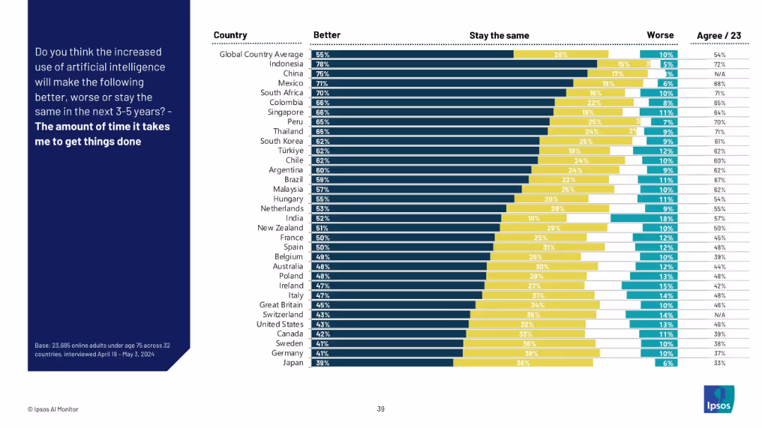
Bar chart format with country comparisons, dark blue side panel for the question.
Performance Metrics and KPIs
Technology & Software
This slide evaluates how AI is perceived to affect personal productivity in the near future. A majority across countries believe it will reduce the time needed to get tasks done. Indonesia, China, and Mexico rank highest in positive sentiment.
productivity, AI efficiency, time management, survey, global insights, AI tools, task automation, Ipsos data, personal impact
false
Performance Metrics and KPIs
Technology & Software
Mixed Chart
IPSOS
Add to my slides
Remove from favorites
Contains a bar chart showing how companies plan to allocate resources gained from productivity improvements.
Financial Performance
Professional Services
Discusses how companies intend to invest or distribute profits gained from increased productivity, including reserves and acquisitions.
productivity, allocation, reserves, acquisitions, profits
false
Financial Performance
Professional Services
Single Chart
Deloitte
Add to my slides
Remove from favorites
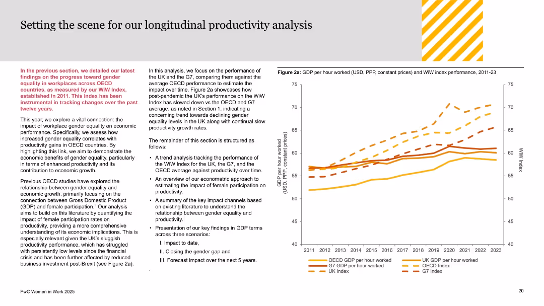
Dual-column text-heavy layout on left; performance line chart (GDP vs WiW Index) on right; orange and yellow palette used for segmentation.
Investment Analysis
Government & Public Sector
This slide sets up the productivity analysis section, connecting gender equality progress to economic output across OECD and G7 nations. It introduces the methodology and aims to correlate women’s workforce participation with GDP per hour worked. UK’s lagging productivity is noted, setting context for subsequent findings.
productivity analysis, GDP, gender equality, WiW Index, OECD, G7, UK economy, economic growth, female participation, workplace equity
false
Investment Analysis
Government & Public Sector
Mixed Chart
PwC/Strategy&
Add to my slides
Remove from favorites
Previous
Next
You don't have any favorites yet.
Please wait loading your favorites slides...
Create a FREE account to continue browsing
Receive Instant Access to 1,000+ slides from companies like McKinsey, Google, and Goldman Sachs
First Name
Last Name
Email
Password
I agree to all
Terms & Privacy Policy
Thank you! Your submission has been received!
Oops! Something went wrong while submitting the form.
Have an account?
Sign in
Upgrade to PRO to Save slides
Advanced Search and Filters
Access to 15,000+ slides
Access to Category Pages
Save/Bookmark Slides
PowerPoint Template Library
Pick a Plan
MONTHLY
$12/month
Billed every month, Cancel anytime.
YEARLY
$9/year
Billed $108 annually, Cancel anytime.
Checkout for $12/month
Checkout for $108/yr
Secured by Stripe | AES-256 bit encryption