My Account
My Slides
Search by Category
Pricing
Templates
View All Templates
Download Template Slides
✦ AI Search
Feedback
Login
Logout
Get Started
Browse all Slides
Browse all Slides
Create a FREE Account
Instant access to 1,000+ real slides from top companies like McKinsey, BCG, Goldman Sachs, Google and many more!
First Name
Last Name
Email
Password
I agree to all
Terms & Privacy Policy
Thank you! Your submission has been received!
Oops! Something went wrong while submitting the form.
Have an account?
Sign in
Saved Slides
Total No. of slides saved
0
↻ Refresh
✖ Clear all
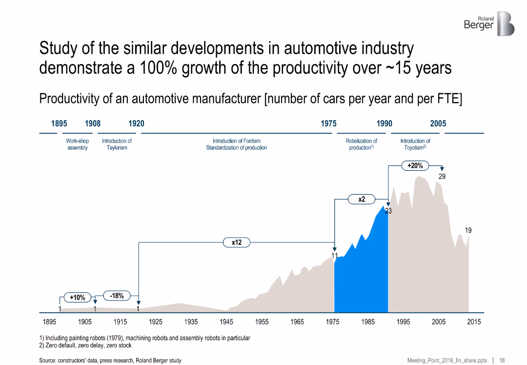
Horizontal timeline with annotations of technological milestones and a productivity bar graph. Milestones are labeled with dates and production concepts like Fordism and Toyotism.
Performance Metrics and KPIs
Industrial & Manufacturing
This slide shows the historical productivity growth in the automotive industry, highlighting a 100% productivity increase over 15 years due to process improvements and production methodologies like Fordism and Toyotism. It maps key production innovations to output per FTE.
productivity, automotive, Fordism, Toyotism, robotics, manufacturing, FTE, production history
false
Performance Metrics and KPIs
Industrial & Manufacturing
Single Chart
Roland Berger
Add to my slides
Remove from favorites
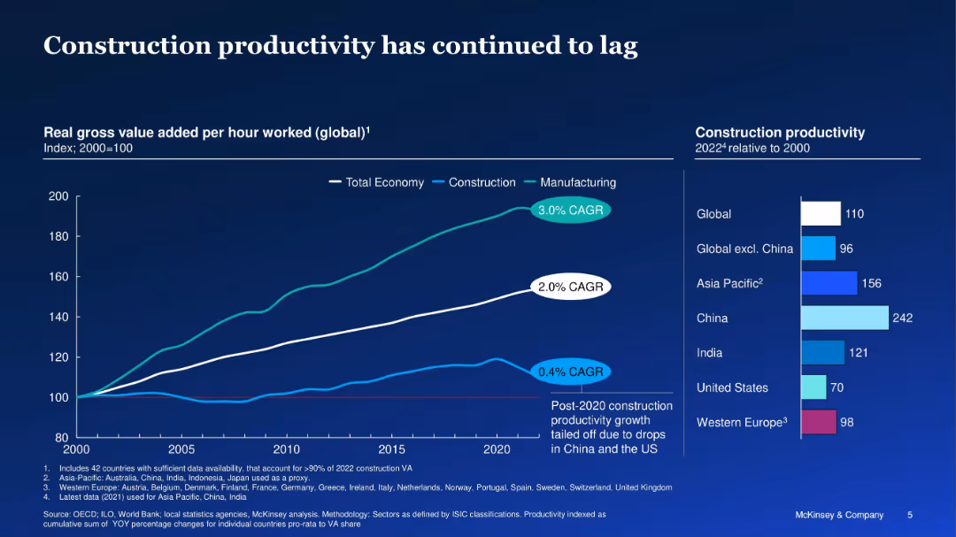
Line graph with three sectors (total economy, manufacturing, construction) and regional bars
Performance Metrics and KPIs
Real Estate & Construction
The slide compares global productivity trends from 2000–2022, showing construction lagging behind the total economy and manufacturing. Regional breakdowns show varying productivity levels, with China far ahead and the US lagging.
productivity, construction, manufacturing, economy, regional comparison
false
Performance Metrics and KPIs
Real Estate & Construction
Multiple Chart
McKinsey
Add to my slides
Remove from favorites
A balanced layout with two distinct sections—one for productivity and one for customer experience—each with relevant icons and bullet points. The slide is visually balanced and focuses on different aspects of business improvement.
Operational Efficiency
Technology & Software
This slide underscores the importance of productivity and customer experience in the digital age, indicating a need for skilled talent to enhance these areas. It likely serves to motivate the investment in digital talent to drive such improvements within companies.
productivity, customer experience, digital age, talent, business improvement
false
Operational Efficiency
Technology & Software
Header Horizontal
Kearney
Add to my slides
Remove from favorites
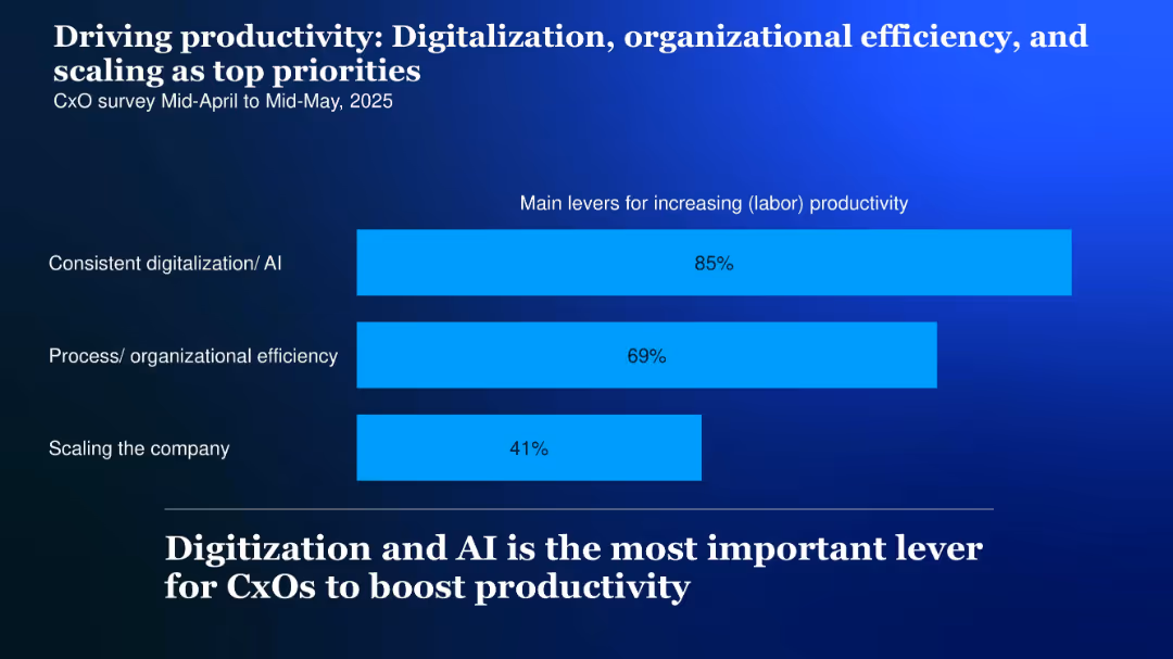
Horizontal bar chart with three bars showing productivity drivers, labeled on the left; high-contrast background and bold headline
Performance Metrics and KPIs
Technology & Software
CxOs cite digitalization and AI (85%), organizational efficiency (69%), and company scaling (41%) as top productivity levers for 2025.
Productivity, digitalization, AI, scaling, efficiency, levers, 2025
false
Performance Metrics and KPIs
Technology & Software
Single Chart
McKinsey
Add to my slides
Remove from favorites
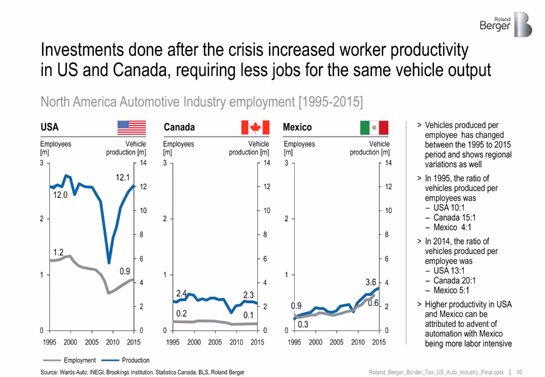
Three line charts (US, Canada, Mexico) showing employees vs. production volumes; notes on productivity ratios.
Human Resources and Talent Management
Industrial & Manufacturing
Shows how worker productivity rose across North America post-crisis, with Mexico remaining more labor-intensive but still improving its productivity.
productivity, employment, US vs Mexico, auto jobs, automation
false
Human Resources and Talent Management
Industrial & Manufacturing
Multiple Chart
Roland Berger
Add to my slides
Remove from favorites
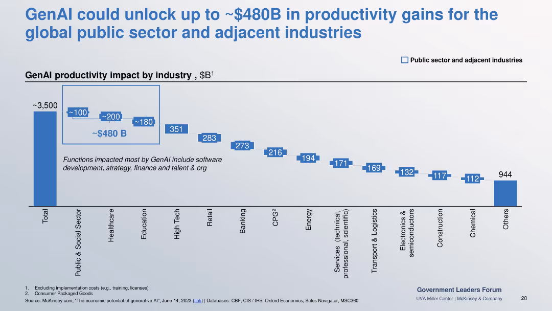
Bar chart quantifying industry-specific productivity gains from GenAI implementation, emphasizing public sector impact.
Investment Analysis
Government & Public Sector
Projects GenAI’s $480B potential impact on productivity, especially in public/social sectors, healthcare, and education. Lists functions like software, strategy, finance, and talent as most influenced.
productivity gains, genAI, impact by industry, public sector, finance, talent, strategy
false
Investment Analysis
Government & Public Sector
Single Chart
McKinsey
Add to my slides
Remove from favorites
Bar chart depicting real GDP per employed worker over several years.
Strategic Planning
Professional Services
Introduces PwC’s PPI, which incorporates various forms of capital to measure productivity potential more comprehensively.
Productivity, GDP, Economic Growth, Index, PwC
false
Strategic Planning
Professional Services
Mixed Chart
PwC/Strategy&
Add to my slides
Remove from favorites
Bar charts comparing average GDP growth contributions by multifactor productivity and average patents granted by country and year between 2000-2007 and 2010-2019.
Technology and Digital Transformation
Technology & Software
This slide compares the contributions of multifactor productivity to GDP growth and the number of patents granted across different countries. It highlights the productivity paradox where innovations are rising, but productivity contributions to GDP growth are declining.
Productivity, GDP Growth, Patents, Innovation
false
Technology and Digital Transformation
Technology & Software
Multiple Chart
Roland Berger
Add to my slides
Remove from favorites
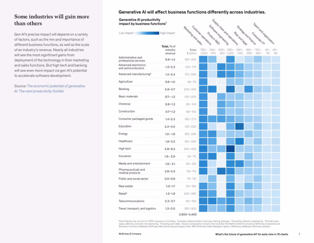
Two-column layout with text on the left and a heatmap chart on the right, indicating AI impact across industries and business functions. Blue gradient indicates impact intensity.
Strategic Planning
Artificial Intelligence
This slide illustrates the projected productivity impact of generative AI across various industries and business functions. It shows that marketing and sales are likely to benefit most, with tech and banking poised for even greater gains due to software acceleration.
productivity, generative AI, business functions, industry impact, marketing, sales, software, high tech, banking, heatmap
false
Strategic Planning
Artificial Intelligence
Table
McKinsey
Add to my slides
Remove from favorites
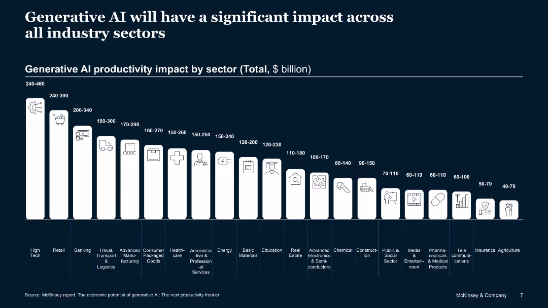
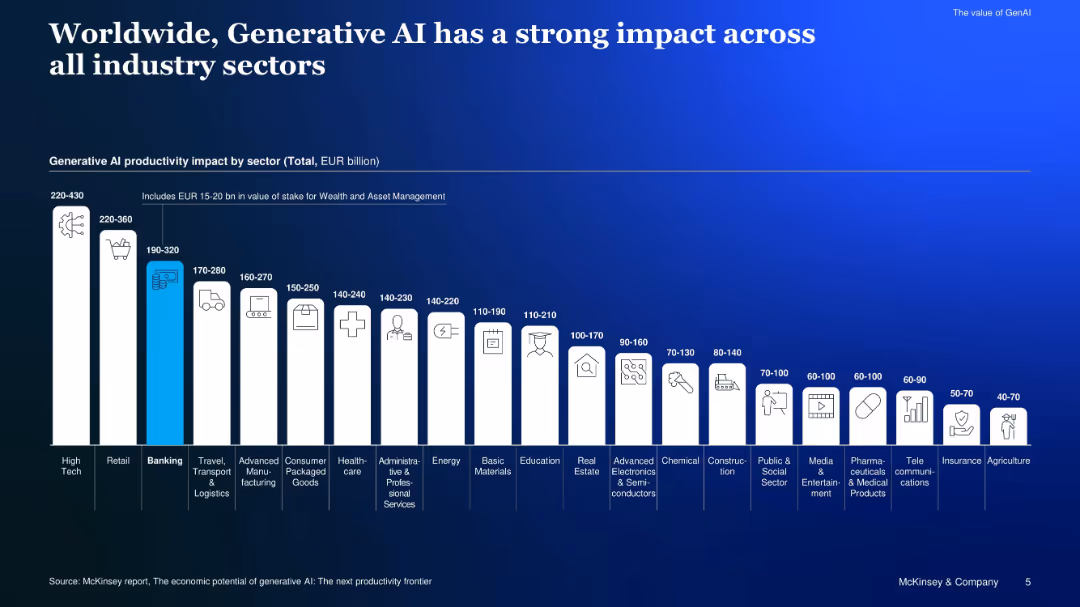
Dark-themed slide with vertical bars indicating productivity impact by industry; icon illustrations for each sector.
Market Analysis and Trends
Artificial Intelligence
This slide quantifies the economic productivity potential of generative AI across sectors such as High Tech, Retail, Banking, and more, predicting impacts ranging from $40B to $460B depending on the sector.
productivity, generative AI, sectors, economic impact, high tech, retail, healthcare
false
Market Analysis and Trends
Artificial Intelligence
Single Chart
McKinsey
Add to my slides
Remove from favorites
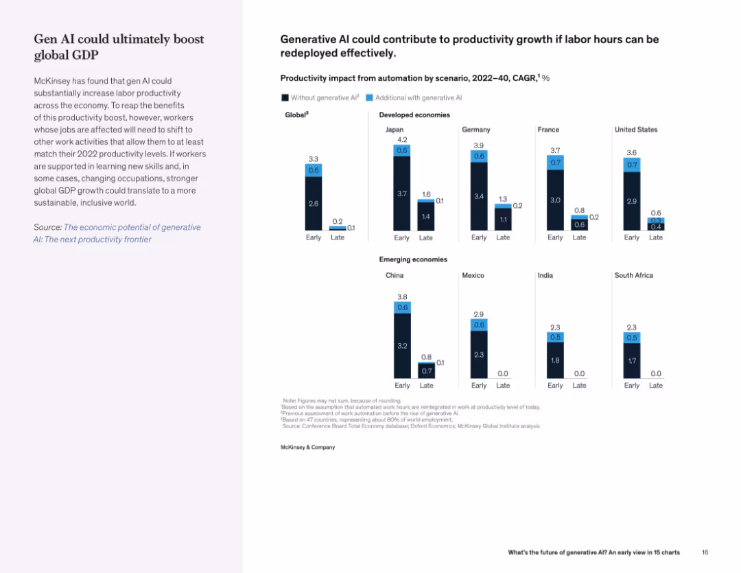
Split view with explanation on the left and a grouped bar chart on the right showing global and national productivity impact projections.
Financial Performance
Artificial Intelligence
This slide estimates productivity growth driven by generative AI across countries. Developed and emerging economies alike could benefit, especially if displaced labor is redeployed effectively.
productivity growth, AI impact, labor, economic growth, GDP, automation
false
Financial Performance
Artificial Intelligence
Mixed Chart
McKinsey
Add to my slides
Remove from favorites
Line charts depicting US unit labor cost and labor productivity growth y/y from 2007 to 2023.
Operational Efficiency
Professional Services
Highlights how robust productivity growth buffers against compensation growth, reducing unit labor costs and easing inflation pressures.
productivity growth, labor costs, compensation, inflation, line chart, labor productivity, economic buffer, 2007-2023, US economy
false
Operational Efficiency
Professional Services
Mixed Chart
EY
Add to my slides
Remove from favorites
Bar chart comparing GenAI productivity impact in EUR across sectors
Investment Analysis
Artificial Intelligence
Shows estimated GenAI-driven productivity impact by sector, highlighting high-tech, retail, and banking as top contributors, and noting EUR 15–20B stake for wealth and asset management.
productivity impact, sector, EUR billion, industry, GenAI, value
false
Investment Analysis
Artificial Intelligence
Single Chart
McKinsey
Add to my slides
Remove from favorites
Slide uses horizontal bars to compare potential impacts on organizations failing to meet productivity targets, focusing on business growth and valuation impacts.
Risk Assessment and Management
Professional Services
Evaluates potential negative outcomes for companies not achieving their productivity goals, highlighting differences between larger and smaller companies.
productivity, impacts, valuation, growth, targets
false
Risk Assessment and Management
Professional Services
Single Chart
Deloitte
Add to my slides
Remove from favorites
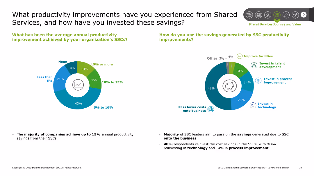
The slide includes a pie chart showing average annual productivity improvement percentages and another pie chart showing how savings are reinvested.
Operational Efficiency
Professional Services
This slide highlights the productivity improvements achieved from shared services and details how the savings generated have been reinvested within organizations.
Productivity improvement, savings, reinvestment, shared services
false
Operational Efficiency
Professional Services
Multiple Chart
Deloitte
Add to my slides
Remove from favorites
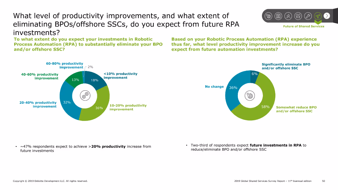
Features two pie charts displaying productivity improvements and the extent of BPO/offshore SSC elimination expectations.
Operational Efficiency
Professional Services
Explores the expected productivity improvements and reduction in Business Process Outsourcing (BPO) or offshore SSCs due to future Robotic Process Automation (RPA) investments.
productivity, improvements, BPO, SSC, RPA, investments, automation
false
Operational Efficiency
Professional Services
Multiple Chart
Deloitte
Add to my slides
Remove from favorites
The slide uses icons and text to illustrate the cohesive improvement of productivity through people, processes, and tools, focusing on key elements like skills, design thinking, and integrated tools.
Operational Efficiency
Financial Services
This slide emphasizes a cohesive approach to improving productivity in Change-the-Bank developments by leveraging people, processes, and tools, detailing specific strategies and focus areas.
productivity, people, processes, tools, improvement, design thinking, integrated tools, Change-the-Bank, skills, strategy
false
Operational Efficiency
Financial Services
Linear Flow
Credit Suisse
Add to my slides
Remove from favorites
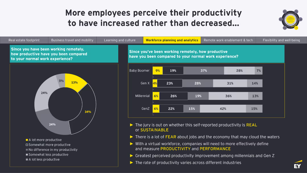
A donut chart showing productivity levels since remote work began. A column chart compares productivity across Baby Boomer, Gen X, Millennial, and Gen Z generations.
Human Resources and Talent Management
Professional Services
This slide shows perceptions of productivity changes since remote work began, comparing different generations. It questions the sustainability of self-reported productivity.
Productivity, Remote Work, Generations, Performance, Sustainability
false
Human Resources and Talent Management
Professional Services
Multiple Chart
EY
Add to my slides
Remove from favorites
The slide is divided into three main sections with a color-coded theme of purple and white. It includes a column chart for the total spend breakdown, bullet points for opportunity levers, and projected progress numbers.
Operational Efficiency
Technology & Software
This slide presents a progress update on productivity targets, detailing cost efficiency strategies and accomplishments in software development and modernizing technology.
productivity, software development, technology modernization, cost efficiency, infrastructure, financial targets, engineering, automation, cloud
false
Operational Efficiency
Technology & Software
Mixed Chart
JP Morgan
Add to my slides
Remove from favorites
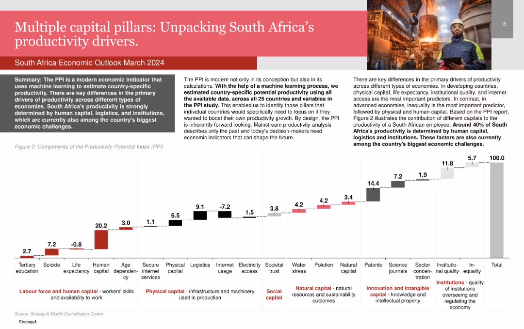
Bar chart showing the components of the Productivity Potential Index (PPI) for South Africa.
Market Analysis and Trends
Professional Services
Details the primary drivers of productivity in South Africa, emphasizing human capital, logistics, and institutions.
Productivity, South Africa, Human Capital, Logistics, Institutions
false
Market Analysis and Trends
Professional Services
Mixed Chart
PwC/Strategy&
Add to my slides
Remove from favorites
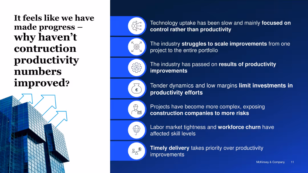
Split screen: left has question title and image; right lists 7 reasons with icons
Operational Efficiency
Real Estate & Construction
This slide outlines key reasons why productivity gains have not materialized in construction, including tech limitations, low investment, skill shortages, and focus on delivery over efficiency.
productivity stagnation, technology, skills gap, construction risks
false
Operational Efficiency
Real Estate & Construction
Boxed
McKinsey
Add to my slides
Remove from favorites
This slide features a bar chart comparing priorities for increasing productivity in the next 12 months. It uses green bars of varying lengths to visually compare the priorities.
Operational Efficiency
Professional Services
The graph highlights the top priorities for companies to enhance productivity, including hiring skilled talent and process optimization.
productivity, talent, hiring, optimization, priorities
false
Operational Efficiency
Professional Services
Single Chart
Deloitte
Add to my slides
Remove from favorites
Slide contains four columns each with a green icon (dollar sign, building blocks, light bulb) and text blocks. It uses a clean and professional design with bullet points and minimalistic icons to present statistical data.
Industry Overview
Professional Services
This slide summarizes productivity strategies and expectations among companies over the next three years, focusing on investments in talent and technology to drive growth.
productivity, talent, technology, investments, growth
false
Industry Overview
Professional Services
Pillar
Deloitte
Add to my slides
Remove from favorites
A bar chart compares the needs of smaller vs. larger companies in areas like AI, HR, and sales to meet business priorities.
Operational Efficiency
Professional Services
Highlights different strategic needs for productivity improvements across various business sectors, focusing on technology and HR.
productivity, technology, HR, sales, strategies
false
Operational Efficiency
Professional Services
Single Chart
Deloitte
Add to my slides
Remove from favorites
Infographic showing the process of realizing productivity gains through technology, involving respondent access, survey, and analysis & reporting, with mentions of Askia and Infotools platforms.
Operational Efficiency
Technology & Software
The slide outlines the workflow for improving productivity using technology, highlighting key platforms and stages such as respondent access, survey process, and data analysis & reporting.
productivity, technology, workflow, respondent access, survey process
false
Operational Efficiency
Technology & Software
Diagram
IPSOS
Add to my slides
Remove from favorites
This slide compares the productivity of the Tempest programme workers to other UK industry sectors through a series of bar graphs, which are well-aligned and easy to interpret.
Market Analysis and Trends
Industrial & Manufacturing
The slide illustrates that the productivity of Tempest programme workers is significantly higher compared to the UK national average and various industry sectors.
productivity, Tempest programme, industry comparison, GVA per worker, UK national average, bar graph
false
Market Analysis and Trends
Industrial & Manufacturing
Single Chart
PwC/Strategy&
Add to my slides
Remove from favorites
The slide features circular charts and a bar chart. The top section shows survey results on new work approaches, and the bottom lists productivity strategies.
Operational Efficiency
Professional Services
Details new approaches for maintaining productivity and work-life balance in a hybrid work environment, based on survey responses.
productivity, work-life balance, hybrid work, survey, new approaches
false
Operational Efficiency
Professional Services
Multiple Chart
EY
Add to my slides
Remove from favorites
This slide contains a bar chart illustrating leaders' agreement levels regarding manageability of workload and the effectiveness of productivity measurement at team and individual levels.
Market Analysis and Trends
Professional Services
Highlights challenges in managing workload and productivity as perceived by leaders, showing a significant portion of leaders do not strongly agree that current methods are effective. Useful for discussions on improving productivity measures within organizations.
productivity, workload management, performance metrics, leadership
false
Market Analysis and Trends
Professional Services
Single Chart
PwC/Strategy&
Add to my slides
Remove from favorites
Circular diagram showing the product lifecycle stages (Pre-Launch, At Launch, In Market) and associated services Ipsos offers, with text descriptions of each stage.
Strategic Planning
Professional Services
Outlines the different stages of a product lifecycle and the various services Ipsos provides to support clients at each stage. Emphasizes strategic planning and service integration.
Product Lifecycle, Strategic Planning, Services, Ipsos
false
Strategic Planning
Professional Services
Diagram
IPSOS
Add to my slides
Remove from favorites
Two column charts depicting the average product lifetime and percentage of revenue from long-life product designs. The charts are effectively labeled to show various time spans and revenue percentages.
Product and Service Analysis
Environmental Services & Sustainability
Summarizes survey results on product lifetimes and the economic contribution of long-life product designs, emphasizing the need for enhanced durability and modularity in products.
Product Life, Durability, Revenue, Survey, Sustainability
false
Product and Service Analysis
Environmental Services & Sustainability
Multiple Chart
Accenture
Add to my slides
Remove from favorites
Bar graphs detailing anticipated levels of product personalization by industry for 2026, with a summary callout highlighting personalization goals.
Market Analysis and Trends
Professional Services
Forecasts the degree of personalization that companies aim to achieve within the next few years, signifying a strategic shift towards tailored consumer experiences.
Product Personalization, Future Trends, Strategic Shift, Bar Graph, Industry Forecast
false
Market Analysis and Trends
Professional Services
Multiple Chart
Kearney
Add to my slides
Remove from favorites
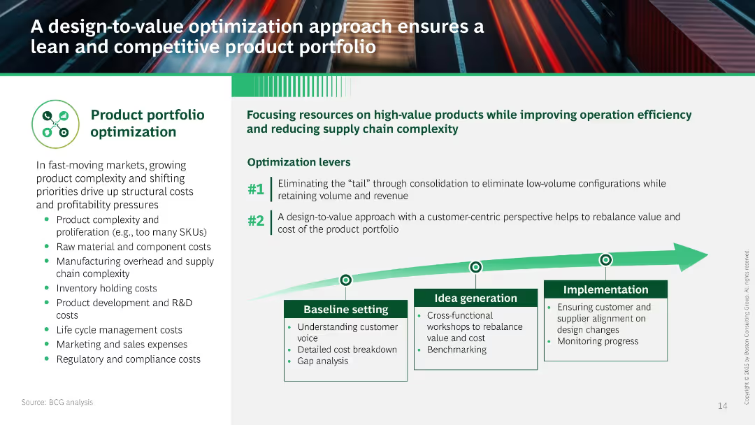
Left panel lists cost pressures; right focuses on two optimization levers with a process graphic (baseline setting to implementation). Dominated by green/white tones.
Product and Service Analysis
Consumer Goods
Describes a design-to-value strategy that reduces complexity and costs by focusing on high-value products. Emphasizes consolidating SKUs and aligning design with customer value through structured implementation stages.
product portfolio, cost reduction, design-to-value, SKU consolidation, customer-centric, complexity, efficiency
false
Product and Service Analysis
Consumer Goods
Linear Flow
BCG
Add to my slides
Remove from favorites
Features three main sections with red and blue color highlights detailing different product categories and their sales contributions. Icons and text are used to describe product features and market trends, with emphasis on megatrends in transportation.
Product and Service Analysis
Industrial & Manufacturing
Describes Stoneridge's product diversification and alignment with industry megatrends, such as safety, efficiency, and intelligence. It highlights the company’s strategic focus on key technologies and markets.
product portfolio, megatrends, technology, market, sales
false
Product and Service Analysis
Industrial & Manufacturing
Table
Deutsche Bank
Add to my slides
Remove from favorites
Three sections with icons and text, discussing product evaluation, regulatory impacts, and green messaging. Simple layout with moderate text density.
Strategic Planning
Environmental Services & Sustainability
Discusses practical steps for businesses to enhance their product portfolio with green attributes, consider regulatory impacts, and revamp their messaging for eco-conscious consumers.
product portfolio, regulatory impacts, green messaging, eco-friendly, business start
false
Strategic Planning
Environmental Services & Sustainability
Pillar
Accenture
Add to my slides
Remove from favorites
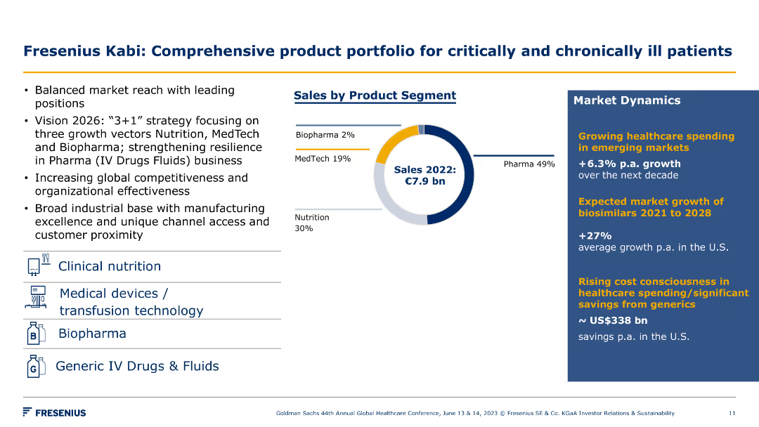
A pie chart of sales by product segment and bullet points detailing market dynamics. Visual elements include icons for each product category.
Product and Service Analysis
Healthcare & Pharmaceuticals
The slide highlights Fresenius Kabi's diverse product portfolio and market dynamics, focusing on sales distribution and strategic growth areas for critical and chronic care.
product portfolio, sales, market dynamics, critical care, chronic care, Fresenius Kabi, strategy, growth, healthcare, segments
false
Product and Service Analysis
Healthcare & Pharmaceuticals
Mixed Chart
Goldman Sachs
Add to my slides
Remove from favorites
Graphs depicting "Sustained increase in product prices" for asphalt shingle and a "Significant decrease or high volatility in product prices" for steel with bullet-pointed text explanations.
Market Analysis and Trends
Financial Services
It presents the impact of price changes on distributors of roofing shingles and steel, explaining the pricing environment's benefits and risks.
product prices, roofing shingles, steel, price index, distributors, volatility, market dynamics
false
Market Analysis and Trends
Financial Services
Multiple Chart
EY
Add to my slides
Remove from favorites
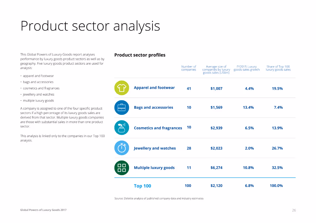
A combination of text and a table on the right, profiling luxury product sectors like apparel, accessories, cosmetics, and jewelry. Each row lists the number of companies, average size, sales growth, and share of top 100 sales for each sector.
Product and Service Analysis
Consumer Goods
This slide analyzes the performance of different luxury product sectors, providing insights into the number of companies, average size by sales, and growth rates for apparel, accessories, cosmetics, and jewelry sectors.
Product, Sector, Analysis, Luxury, Goods
false
Product and Service Analysis
Consumer Goods
Table
Deloitte
Add to my slides
Remove from favorites
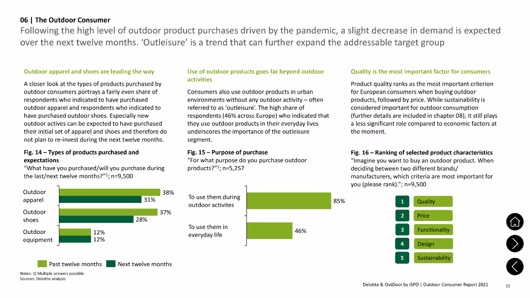
Column charts illustrating types of outdoor products purchased and purposes of purchase, highlighting 'outleisure' trend.
Market Analysis and Trends
Consumer Goods
Details types of outdoor products bought (apparel, shoes, equipment) and reasons for purchase, emphasizing urban use beyond outdoor activities.
Products, Purchase, Outdoor, Apparel, Shoes
false
Market Analysis and Trends
Consumer Goods
Multiple Chart
Deloitte
Add to my slides
Remove from favorites
Column charts depicting the budget growth for new product and service introductions over time.
Product and Service Analysis
Professional Services
Analyzes budget allocation trends for new product and service introductions, comparing current levels to pre-Covid times. Useful for product strategy development and market entry planning.
products, services, budgets, growth, covid, strategy, market, planning
false
Product and Service Analysis
Professional Services
Single Chart
Deloitte
Add to my slides
Remove from favorites
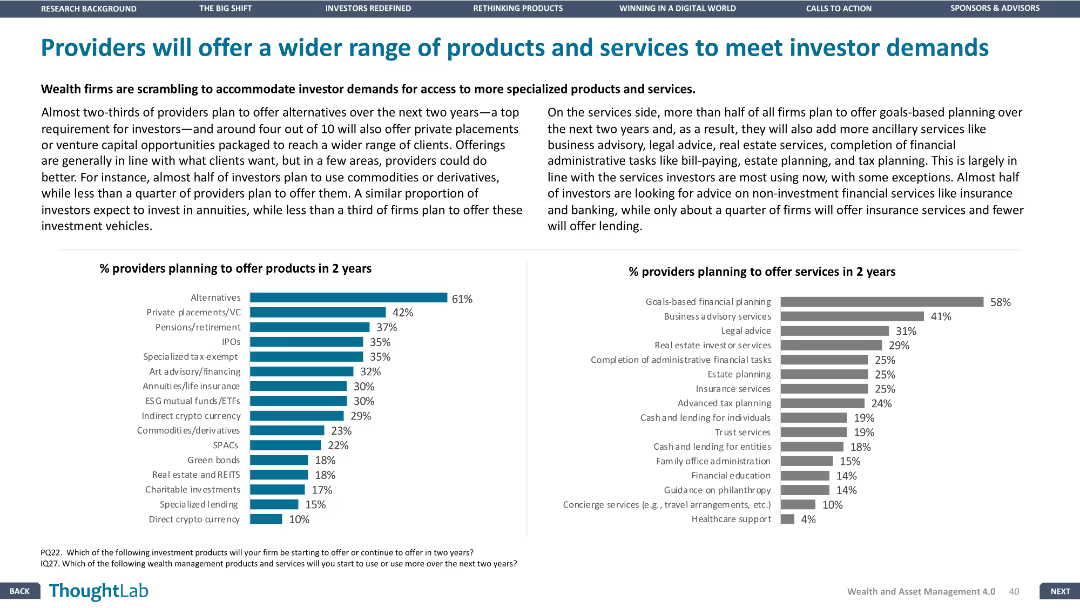
Column charts showing percentage of providers planning to offer new products and services in the next two years. Design is balanced, with clear data visualization.
Product and Service Analysis
Financial Services
Details plans of wealth firms to offer a broader range of products and services, with emphasis on specialized products and ancillary services to meet investor demands.
products, services, providers, investor, demands
false
Product and Service Analysis
Financial Services
Multiple Chart
Deloitte
Add to my slides
Remove from favorites
Stratified blocks depicting various financial products targeting different demographic groups.
Product and Service Analysis
Financial Services
Outlines the range of financial products tailored to customer segments, enhancing the company's market adaptability and consumer reach.
Products, Strategy, Demographics, Financial
false
Product and Service Analysis
Financial Services
Mixed Chart
Barclays
Add to my slides
Remove from favorites
Features a central image of a human figure overlaid with technology icons, detailed labels for "Think", "Feel", "Do", "Learn".
Technology and Digital Transformation
Professional Services
Discusses how various technologies enhance professional skills in areas like cognition, communication, and empathy, specifically in the context of professional services.
professional services, technology, human capabilities, cognition, communication
false
Technology and Digital Transformation
Professional Services
Diagram
Accenture
Add to my slides
Remove from favorites
Contains a column chart comparing positive and negative perceptions of France's professional training system from 2022 to 2023, with commentary on its impact on the country's competitive positioning in Europe.
Market Analysis and Trends
Education & Training
Provides an analysis of France's professional training system, emphasizing its high qualifications and the benefits it brings to the technology sector, supported by statements from professionals in various industries.
professional training, France, competitiveness, technology sector, workforce qualifications
false
Market Analysis and Trends
Education & Training
Mixed Chart
Bain
Add to my slides
Remove from favorites
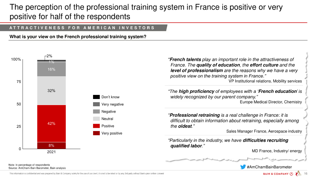
The slide features a column chart showing the perception of France's professional training system in 2021, segmented into positive, very positive, and other categories. Quotes from industry leaders are on the right.
Market Analysis and Trends
Government & Public Sector
This slide presents the perception of France's professional training system, indicating a generally positive outlook from respondents.
Professional training, Perception, Positive outlook, Aerospace, Defense
false
Market Analysis and Trends
Government & Public Sector
Mixed Chart
Bain
Add to my slides
Remove from favorites
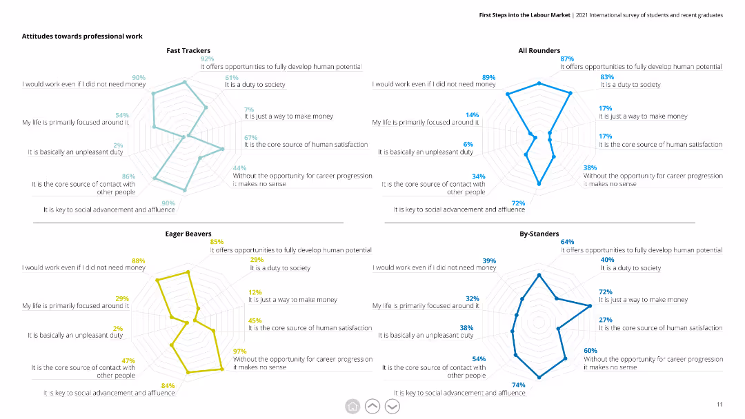
This slide contains four radar charts, each representing a different respondent group (Fast Trackers, All Rounders, Eager Beavers, By-Standers). Each chart evaluates attitudes towards professional work based on various statements.
Market Analysis and Trends
Education & Training
The slide illustrates how different groups perceive professional work, with metrics like duty to society, core satisfaction source, and need for money. It is useful for understanding diverse attitudes and tailoring career advice or programs.
professional work, radar chart, attitudes, respondents, Fast Trackers, All Rounders, Eager Beavers, By-Standers
false
Market Analysis and Trends
Education & Training
Multiple Chart
Deloitte
Add to my slides
Remove from favorites
Right side contains multi-year bar chart; left has contextual text with a bold quote box. Color-coded by year.
Performance Metrics and KPIs
Professional Services
Highlights the top five most trusted professions from 2018 to 2022: doctors, scientists, teachers, armed forces, and ordinary people. Notes recent dips in trust for teachers and doctors in specific countries but overall consistency near the top of the trust scale.
professions, trust, Ipsos, top trusted, trends, teachers, doctors, global
false
Performance Metrics and KPIs
Professional Services
Mixed Chart
IPSOS
Add to my slides
Remove from favorites
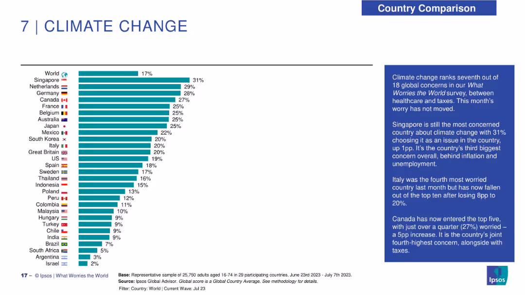
Horizontal bar chart ranking countries by concern about climate change; summary box to the right.
Market Analysis and Trends
Environmental Services & Sustainability
Climate change ranks 7th in global worries. Singapore leads concern levels, with commentary noting Italy's drop and Canada's rise. The chart displays variance in concern across countries.
profession trust, public opinion, Ipsos, social roles, credibility, ethics, professional image
false
Market Analysis and Trends
Environmental Services & Sustainability
Mixed Chart
IPSOS
Add to my slides
Remove from favorites
Bar graphs showing profitability and capital accumulation rates
Financial Performance
Financial Services
Santander's profitability leading to capital accumulation
Profitability, Capital Accumulation, CET1, Banking, Growth
false
Financial Performance
Financial Services
Single Chart
Morgan Stanley
Add to my slides
Remove from favorites
Bar graphs with comparative analysis of RoTE and RoRWA
Financial Performance
Financial Services
Santander's profitability and capital management from 2015-2019
Profitability, Capital, Acquisitions, Banking, RoTE
false
Financial Performance
Financial Services
Mixed Chart
Morgan Stanley
Add to my slides
Remove from favorites
Bar graph comparing gross and operating margins for durables and nondurables with a clear visual contrast.
Financial Performance
Financial Services
Compares profitability across verticals in the distribution industry, highlighting differences in margins.
Profitability, Distribution, Margins, Durables, Nondurables, Comparison
false
Financial Performance
Financial Services
Multiple Chart
EY
Add to my slides
Remove from favorites
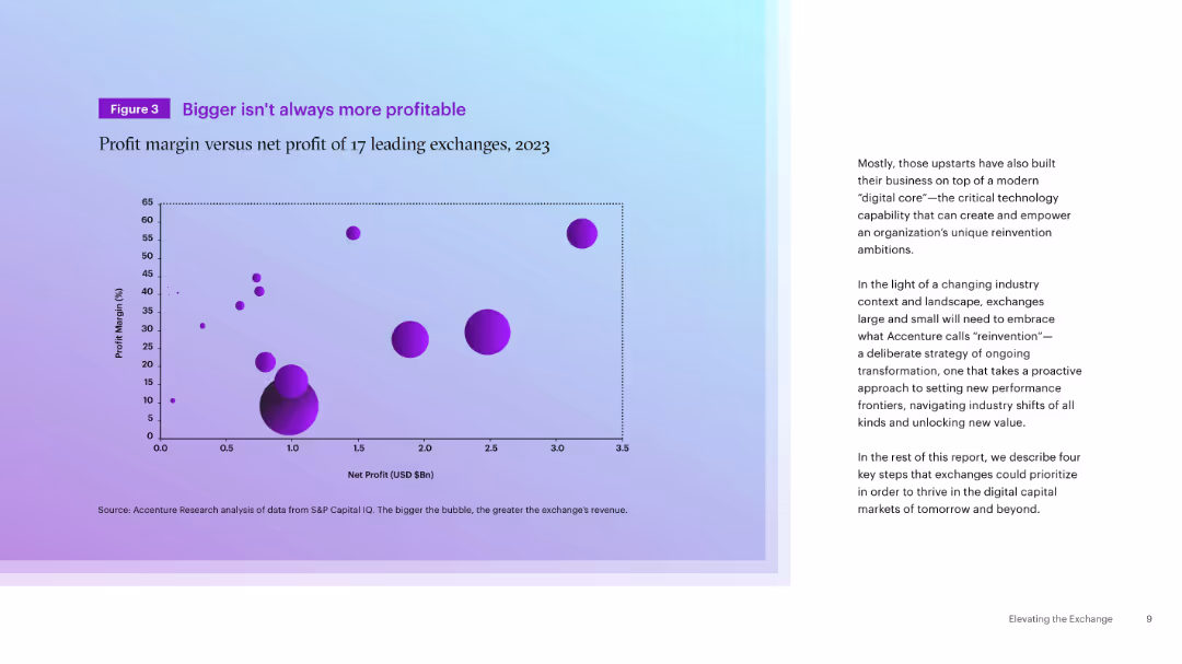
Left-aligned scatter plot with bubble chart (profit margin vs. net profit), accompanied by paragraph text on the right. Purple gradient background.
Financial Performance
Financial Services
The slide presents a bubble chart comparing the profit margins and net profits of 17 global exchanges in 2023, demonstrating that size does not equate to profitability. The accompanying text discusses the need for reinvention driven by digital transformation.
Profitability, Exchanges, Net Profit, Profit Margin, Digital Core, Reinvention, Financials, Market Performance, 2023
false
Financial Performance
Financial Services
Mixed Chart
Accenture
Add to my slides
Remove from favorites
This slide is divided, with a line graph on the left showing the return on equity (ROE) over several years and a text block with bullet points on the right over an image background.
Market Analysis and Trends
Financial Services
Discusses challenges faced by the financial industry, highlighting profitability issues with a return on equity trend analysis. The slide is used to initiate discussions about market conditions and strategic responses.
profitability, financial industry, ROE, market analysis, regulatory pressure
false
Market Analysis and Trends
Financial Services
Mixed Chart
Morgan Stanley
Add to my slides
Remove from favorites
This slide presents a comparative analysis with two distinct sections. The left side displays a blue column chart depicting 'ADJUSTED OPERATING PROFIT' in euros for five quarters. Beside it, a pie chart illustrates the 'Q1 adjusted operating profit margin.' The right side shows a column chart breaking down profits by business segment. Images of a modern office space are shown in the upper and lower right corners, offering a visual context for the financial data.
Financial Performance
Financial Services
Compares profitability across different business segments, highlighting improvements and variations, relevant for financial segment analysis or presentations to investors.
profitability, financial segments, adjusted operating profit, profit margin, quarter comparison, financial data, segment analysis, real estate, construction, financial services
false
Financial Performance
Financial Services
Multiple Chart
Goldman Sachs
Add to my slides
Remove from favorites
Text and bullet points presenting factors affecting profitability, with a clear separation of industry and company specifics.
Operational Efficiency
Professional Services
Discusses the interplay between industry-specific and company-specific factors in profitability.
Profitability, Industry Factors, Company Factors, Distribution, Efficiency
false
Operational Efficiency
Professional Services
Table
EY
Add to my slides
Remove from favorites
Four blocks highlighting industry drivers of profitability in distribution: Inventory turns, Technical expertise, Fragmentation, Regulatory environment, Pricing dynamics, each with descriptive bullet points.
Market Analysis and Trends
Financial Services
The slide outlines the key profitability drivers in distribution industries, focusing on inventory, technical knowledge, market fragmentation, regulations, and pricing trends.
profitability, inventory turns, technical expertise, fragmentation, regulations, pricing dynamics, distribution
false
Market Analysis and Trends
Financial Services
Pillar
EY
Add to my slides
Remove from favorites
Displays a large curve graph showing the contribution to profit by different classes, annotated for emphasis on key areas, alongside a simple line graph.
Investment Analysis
Financial Services
Focuses on the impact of the lowest performing 10% of classes on overall profitability at Lloyd's, using visual data to identify significant profit erosion points.
profitability, Lloyd's market, decile review, classes, investment
false
Investment Analysis
Financial Services
Single Chart
PwC/Strategy&
Add to my slides
Remove from favorites
Features a column chart displaying the pre-tax income growth of IWM Asset Management and a table comparing key metrics from 2015 to 3Q19 LTM.
Financial Performance
Financial Services
The slide showcases the significant growth in profitability and key metrics for IWM Asset Management, demonstrating the division's strong performance.
Profitability, Margins, Pre-Tax Income, IWM, Financial Growth
false
Financial Performance
Financial Services
Mixed Chart
Credit Suisse
Add to my slides
Remove from favorites
Line graphs comparing profitability trends relative to market disruptions between profitable growth companies and their peers.
Financial Performance
Financial Services
Discusses how companies that focus on profitability manage to grow despite facing significant disruptions, with comparative data over time.
profitability, market disruptions, growth companies, financial crisis, pandemic, comparative data, profitability trends
false
Financial Performance
Financial Services
Mixed Chart
Accenture
Add to my slides
Remove from favorites
A balanced slide comparing four elements of profitability drivers: market share, value-added services, private label, and sales strategy, with descriptive bullet points for each.
Strategic Planning
Financial Services
Discusses the different drivers of profitability for a company including market position and sales strategies, useful for strategic business planning.
profitability, market share, value-added, private label, sales strategy, operational efficiency, business growth
false
Strategic Planning
Financial Services
Pillar
EY
Add to my slides
Remove from favorites
The slide features bar charts showing the probability and profitability increase when applying four business levers. Color gradients indicate different stages of implementation.
Strategic Planning
Technology & Software
The slide discusses how applying four specific levers can significantly enhance profitability and the likelihood of moving up one maturity level in business, emphasizing strategic adjustments and timing for achieving such outcomes.
profitability, maturity, strategic planning, business levers, probability increase, Accenture Research, implementation, future-ready
false
Strategic Planning
Technology & Software
Multiple Chart
Accenture
Add to my slides
Remove from favorites
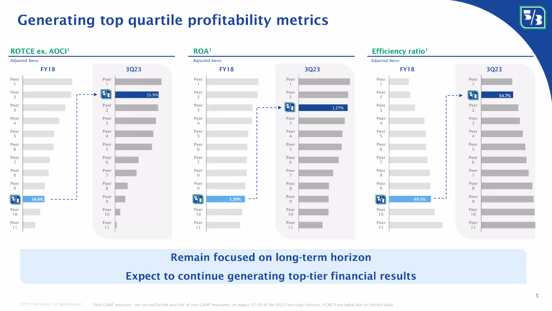
This slide displays three bar graphs comparing Fifth Third's performance metrics with peers, including ROTEC, ROA, and efficiency ratio. A textual sidebar outlines the significance of these metrics, with color coding to highlight Fifth Third's ranking. The layout is organized to facilitate direct comparison between the company and its competitors.
Financial Performance
Financial Services
The slide evaluates Fifth Third's profitability metrics, placing it within the top quartile among peers. The focus is on adjusted metrics for ROTEC, ROA, and efficiency ratio, with historical comparisons to indicate progress. This slide is useful for presentations to investors or internal stakeholders, detailing the bank's competitive financial health and operational efficiency.
Profitability, Metrics, Comparison, ROTEC, ROA, Efficiency Ratio, Financial Health, Operational Efficiency, Financial Services
false
Financial Performance
Financial Services
Multiple Chart
Goldman Sachs
Add to my slides
Remove from favorites
The slide features multiple column charts comparing ROTCE ex. AOCI, ROA, and efficiency ratios of Fifth Third Bank with peers over FY18 and 3Q23. Bullet points highlight their focus on long-term financial results.
Financial Performance
Financial Services
The slide showcases Fifth Third Bank’s top quartile profitability metrics, comparing key performance indicators like ROTCE, ROA, and efficiency ratios with peers. It emphasizes the bank’s focus on long-term financial performance and strategic financial planning.
Profitability metrics, ROTCE, ROA, efficiency ratio, financial performance, Fifth Third Bank, long-term results, peer comparison, financial planning, top quartile
false
Financial Performance
Financial Services
Multiple Chart
Goldman Sachs
Add to my slides
Remove from favorites
Column charts showing profitability metrics and PBT details
Financial Performance
Financial Services
Shows return to profitability with key metrics such as PBT, net profit, and cost/income ratio
profitability, net, profit, metrics
false
Financial Performance
Financial Services
Mixed Chart
UBS
Add to my slides
Remove from favorites
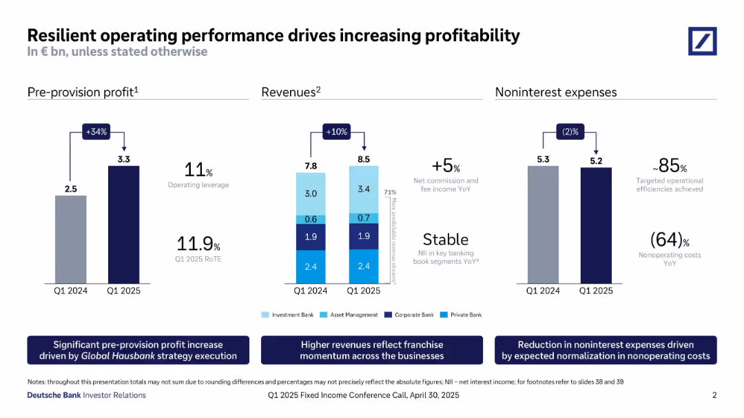
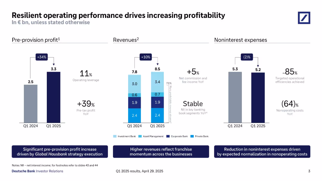
Three-column layout with bar charts showing pre-provision profit, revenues, and noninterest expenses.
Financial Performance
Financial Services
The slide demonstrates Deutsche Bank’s Q1 2025 operating performance improvements: pre-provision profit grew 34%, revenue increased 10%, and noninterest expenses decreased 2%. Highlights include RoTE, stable NII, and cost reductions.
Profitability, Operating Leverage, RoTE, Revenues, Expenses, Efficiency, Strategy Execution, Q1 2025
false
Financial Performance
Financial Services
Multiple Chart
Deutsche Bank
Add to my slides
Remove from favorites
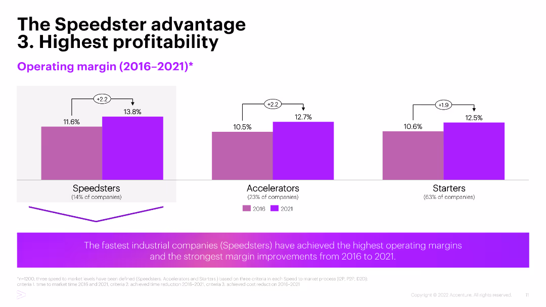
This slide contains a column chart comparing operating margins of three company types: Speedsters, Accelerators, and Starters over two time periods (2016 and 2021). The chart is visually clear, with color coding for easy comparison.
Financial Performance
Financial Services
The slide presents data on the highest profitability among industrial companies, highlighting that 'Speedsters' achieved the highest operating margins and significant improvements between 2016 and 2021.
Profitability, Operating Margins, Speedsters, Financial Performance, Comparison
false
Financial Performance
Financial Services
Mixed Chart
Accenture
Add to my slides
Remove from favorites
A text-heavy slide with a three-column layout presenting a pathway to profitability over different time horizons, complemented by performance drivers.
Operational Efficiency
Financial Services
It outlines the strategic approach to profitability in Platform Solutions, including progress markers and goals for upcoming years.
profitability, platform, strategy, efficiency
false
Operational Efficiency
Financial Services
Table
Goldman Sachs
Add to my slides
Remove from favorites
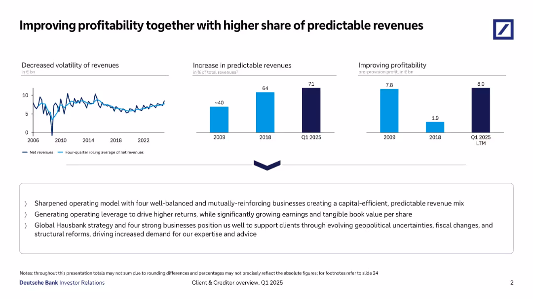
Three-panel horizontal layout showing revenue trends, predictable revenue growth, and profitability, with a strategic summary below.
Strategic Planning
Financial Services
Emphasizes reduced revenue volatility, increased share of predictable revenues (71% by Q1 2025), and strong pre-provision profitability. Highlights strategy with operational leverage, Hausbank positioning, and geopolitical risk management.
Profitability, Predictable Revenues, Strategy, Net Revenues, Hausbank
false
Strategic Planning
Financial Services
Multiple Chart
Deutsche Bank
Add to my slides
Remove from favorites
The slide features a column chart with bars representing different years from 2023 to 2028. Each bar is labeled with the corresponding year and percentage.
Strategic Planning
Financial Services
This slide presents a forecast of profitability through restructuring, showing an increase in return on capital over the years from 3% in 2023 to 18% in 2028.
profitability, restructuring, growth, capital, forecast
false
Strategic Planning
Financial Services
Single Chart
UBS
Add to my slides
Remove from favorites
Slide with a column chart showing underlying return on CET1 capital from 2H23 to 2028, with annotations for each year.
Strategic Planning
Financial Services
The slide discusses UBS's plan to rebuild profitability through restructuring for sustainable growth, with targets for CET1 capital return.
profitability, restructuring, sustainable growth, CET1 capital, UBS strategic planning
false
Strategic Planning
Financial Services
Single Chart
UBS
Add to my slides
Remove from favorites
Three-column layout with bar charts for profit, revenue, and expenses; supporting annotations and explanatory footnotes
Financial Performance
Financial Services
This slide highlights Deutsche Bank’s operational improvements in Q1 2025 with significant increases in pre-provision profit and revenue, and a small decrease in noninterest expenses, indicating strong efficiency.
profitability, revenue, expenses, operational performance, Deutsche Bank, Q1 2025, cost control
false
Financial Performance
Financial Services
Multiple Chart
Deutsche Bank
Add to my slides
Remove from favorites
Features a series of column chart and trend arrows with annotations. It is color-coded to differentiate between various financial metrics over time.
Financial Performance
Financial Services
Slide details factors contributing to profitability, using ROTE and efficiency ratio metrics. Intended for financial analysis or investor briefings.
Profitability, ROTE, Efficiency, Financial Analysis, Performance, Metrics, Trends, Improvement
false
Financial Performance
Financial Services
Single Chart
Goldman Sachs
Add to my slides
Remove from favorites
The slide displays a complex vertical column chart tracing the company's profitability over the years, with a timeline of milestones beneath the chart.
Financial Performance
Financial Services
Reviews Macquarie's historical profitability and growth, ideal for investor relations or financial history presentations.
Profitability, Shareholder Return, Growth, Financial History, Milestones
false
Financial Performance
Financial Services
Single Chart
Morgan Stanley
Add to my slides
Remove from favorites
Slide compares strategic vs. operational levers for profitability through side-by-side text columns with bulleted commentary and visual indicators for potential impact.
Operational Efficiency
Financial Services
Analyzes how strategic and operational decisions impact company profitability and returns, aimed at decision-makers evaluating business strategies.
profitability, strategic, operational, roll-up, pricing, route optimization, cash management, back-office consolidation, value-added services, partnerships
false
Operational Efficiency
Financial Services
Table
EY
Add to my slides
Remove from favorites
Three-column layout: strategic goals (left), execution agenda (center), and performance bar chart (right). Blue and dark blue thematic colors. Bullet points and shaded boxes structure the layout clearly.
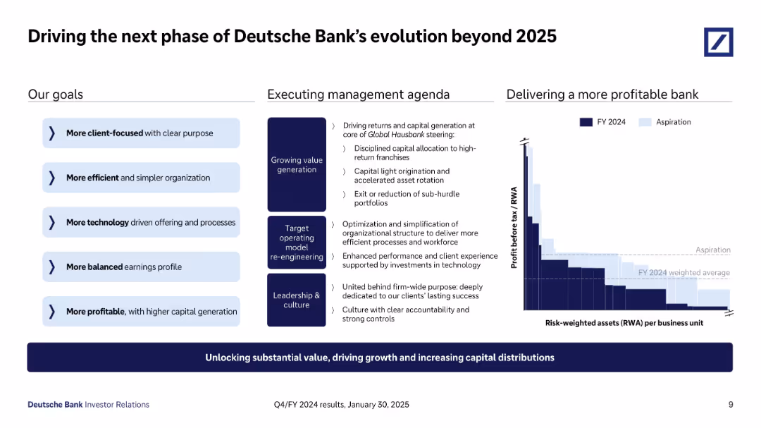
Strategic Planning
Financial Services
Describes Deutsche Bank’s forward-looking goals post-2025, focusing on client-centricity, operational efficiency, technology adoption, and profitability. It outlines the management agenda and shows a bar chart of profitability per business unit compared to FY2024 targets.
profitability, strategy, banking, capital generation, goals, FY2024
false
Strategic Planning
Financial Services
Mixed Chart
Deutsche Bank
Add to my slides
Remove from favorites
Column charts and annotations depict the profitability trends of luxury brands from 2009 to projected 2025, focusing on EBIT percentages.
Financial Performance
Retail & E-commerce
Evaluates changes in the profitability of luxury brands over time, with projections up to 2025, considering the impact of digital disruptions.
profitability trends, luxury brands, financial analysis, digital impact, future projections
false
Financial Performance
Retail & E-commerce
Mixed Chart
Bain
Add to my slides
Remove from favorites
The slide is divided into three sections, with column charts showing profitability, WM product enablement, and franchise strength. Awards and rankings are listed on the right.
Financial Performance
Financial Services
This slide showcases improvements in profitability, enablement of Wealth Management products, and maintaining franchise strength with various rankings and awards.
Profitability, WM products, franchise strength, awards, rankings
false
Financial Performance
Financial Services
Multiple Chart
Credit Suisse
Add to my slides
Remove from favorites
Two charts: a column chart comparing long-term profitable vs a bar chart showing low-growth companies across industries; a heatmap comparing industry strengths.
Industry Overview
Professional Services
Analyzes long-term profitable growth in various industries, demonstrating different resilience and performance metrics.
Profitable growth, industry comparison, resilience, performance metrics, heatmap
false
Industry Overview
Professional Services
Multiple Chart
Accenture
Add to my slides
Remove from favorites
Bar chart shows profit before tax and key financial metrics for 1Q20.
Financial Performance
Financial Services
Highlights UBS's financial performance in 1Q20, with significant profit growth and return on CET1.
profit, financial performance, CET1, growth, operating leverage
false
Financial Performance
Financial Services
Mixed Chart
UBS
Add to my slides
Remove from favorites
Triple-column layout showing pre-provision profit, revenue by division, and cost evolution; footnotes and summary boxes at the bottom.
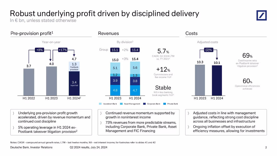
Strategic Planning
Financial Services
The slide emphasizes consistent financial performance through improved revenue and cost control. It presents year-on-year increases in pre-provision profit (+17%), supported by stable revenue growth and adjusted cost reductions. It attributes success to strategic execution, including operational efficiency and disciplined investment.
profit growth, cost discipline, revenue streams, Postbank, strategy
false
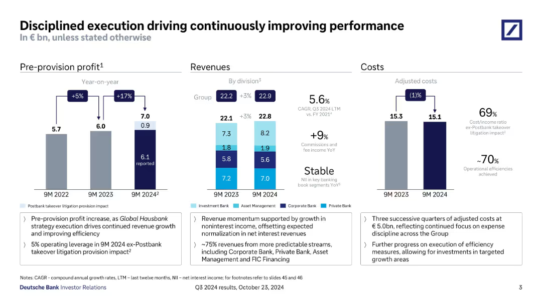
Strategic Planning
Financial Services
Multiple Chart
Deutsche Bank
Add to my slides
Remove from favorites
Three-panel layout: bar charts for profit, revenue, and costs, with text highlights at the bottom.
Strategic Planning
Financial Services
The slide presents a year-over-year analysis of pre-provision profits, revenue by division, and adjusted costs. It emphasizes revenue momentum and operational efficiency, with a notable Postbank provision. Text boxes summarize financial strategy and cost discipline measures.
profit growth, revenue, cost discipline, Postbank, adjusted costs, division revenue, Deutsche Bank
false
Strategic Planning
Financial Services
Multiple Chart
Deutsche Bank
Add to my slides
Remove from favorites
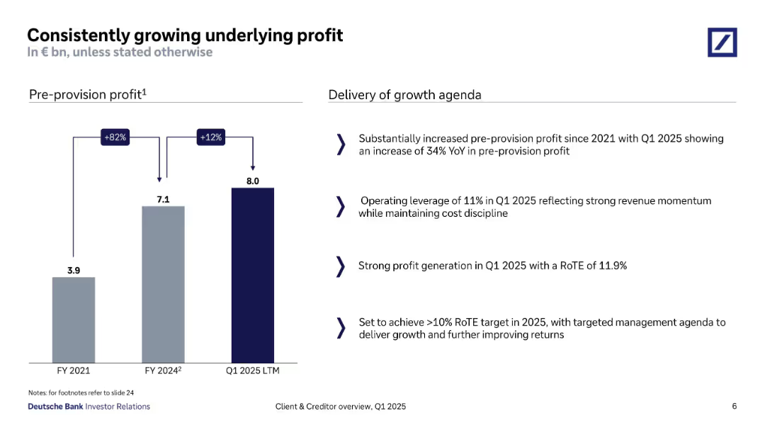
Bar chart showing pre-provision profit from FY2021 to Q1 2025; right side includes bullet-point analysis.
Financial Performance
Financial Services
Deutsche Bank demonstrates substantial pre-provision profit growth, from €3.9bn in FY2021 to €8bn in Q1 2025 LTM. Key contributors include operational leverage and a strong RoTE of 11.9%, with strategic intent to surpass the 10% RoTE target in FY2025.
profit growth, RoTE, operational leverage, pre-provision, revenue momentum, Q1 2025, cost control
false
Financial Performance
Financial Services
Mixed Chart
Deutsche Bank
Add to my slides
Remove from favorites
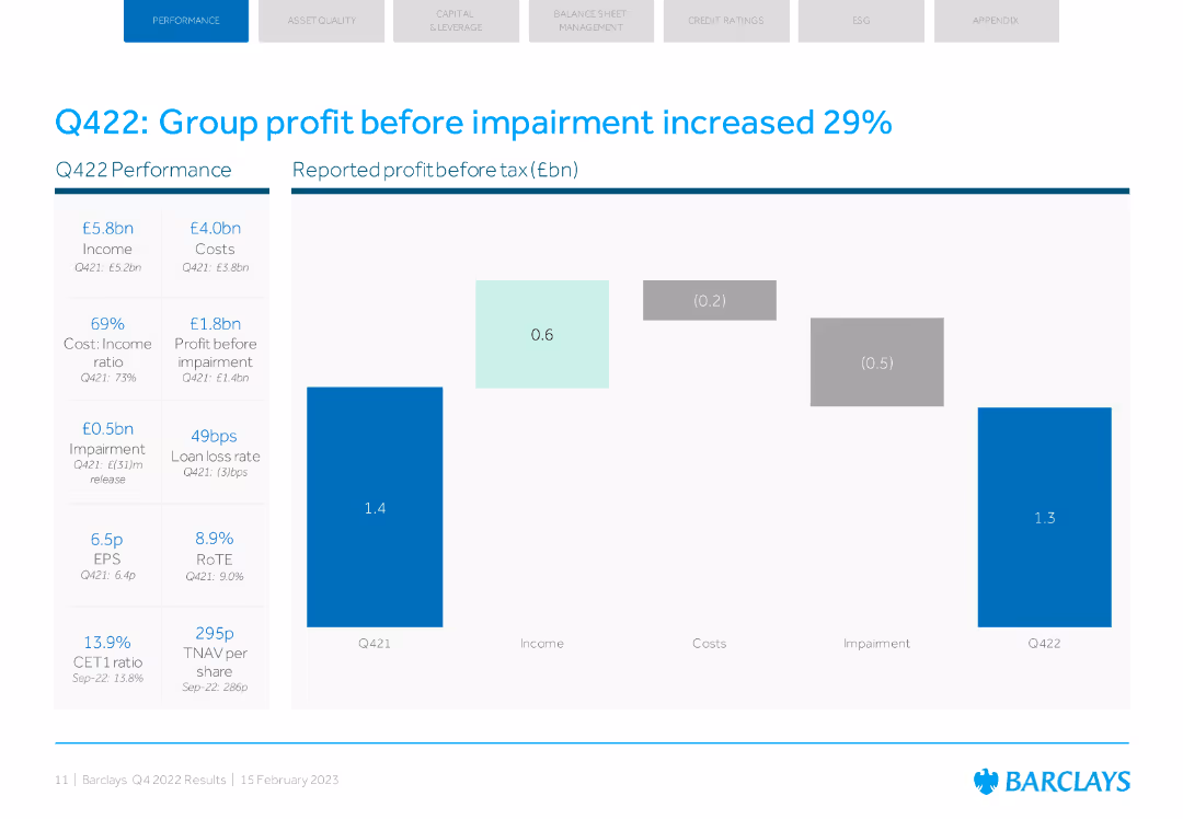
The slide includes a column chart showing profit before tax with key financial metrics. The design is simple with blue and grey colors.
Financial Performance
Financial Services
The slide highlights Barclays' Q422 performance, noting a 29% increase in group profit before impairment and key financial indicators.
profit increase, financial performance, Q422, Barclays, impairment
false
Financial Performance
Financial Services
Mixed Chart
Barclays
Add to my slides
Remove from favorites
The slide contains a column chart showing profit/loss before tax for various business divisions and group functions for 2Q23, with year-over-year percentage changes displayed above each bar.
Financial Performance
Financial Services
The slide details the financial performance of UBS's various business divisions and group functions for the second quarter of 2023, excluding Credit Suisse, to provide insights into profitability and business performance.
profit, loss, before tax, UBS, business divisions
false
Financial Performance
Financial Services
Single Chart
UBS
Add to my slides
Remove from favorites
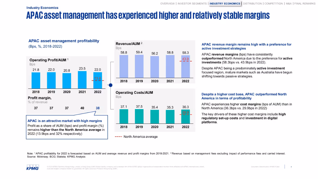
Three side-by-side graphs with profit, cost, and revenue metrics. Uses benchmarks and trend arrows.
Performance Metrics and KPIs
Financial Services
Highlights the profitability of APAC asset managers, showing higher margins and stable performance compared to North America. Explains contributing factors such as regulatory costs and digital investments.
profit margin, revenue, costs, APAC, asset management, KPIs
false
Performance Metrics and KPIs
Financial Services
Multiple Chart
KPMG
Add to my slides
Remove from favorites
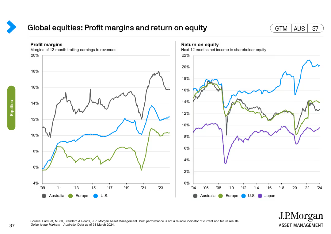
The slide includes two line charts; one shows profit margins of various regions, and the other depicts return on equity from 2004 to 2024 for different regions.
Financial Performance
Financial Services
This slide analyzes profit margins and returns on equity for different regions, offering a historical and predictive view.
profit margins, return on equity, regions, historical, predictive
false
Financial Performance
Financial Services
Multiple Chart
JP Morgan
Add to my slides
Remove from favorites
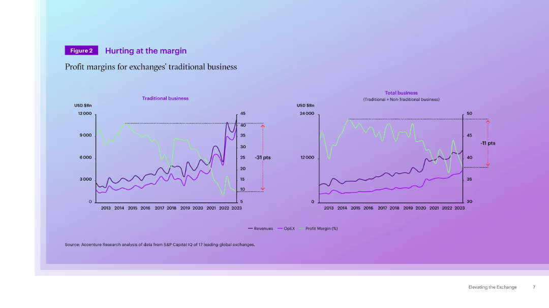
Dual-line chart layout showing traditional vs. total business trends in revenue, OPEX, and profit margin from 2013–2023. Purple background gradient.
Financial Performance
Financial Services
This slide compares trends in traditional and total business segments of exchanges over a decade. Traditional business margins fell sharply, while non-traditional services have helped mitigate the overall decline.
profit margin, traditional vs total business, revenue, OpEX, exchanges
false
Financial Performance
Financial Services
Multiple Chart
Accenture
Add to my slides
Remove from favorites
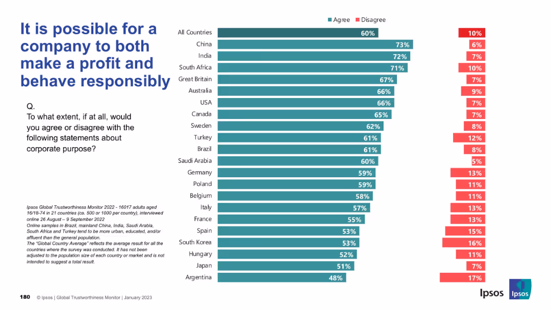
Bar chart format, green and red bars, country comparison with "Agree" and "Disagree" percentages
Strategic Planning
Professional Services
The slide reflects broad international agreement (60%) that profit and responsibility are not mutually exclusive. China, India, and South Africa show strongest agreement, reinforcing confidence in corporate ethical success.
profit, responsibility, corporate ethics, business model, Ipsos, global opinion, corporate trust
false
Strategic Planning
Professional Services
Mixed Chart
IPSOS
Add to my slides
Remove from favorites
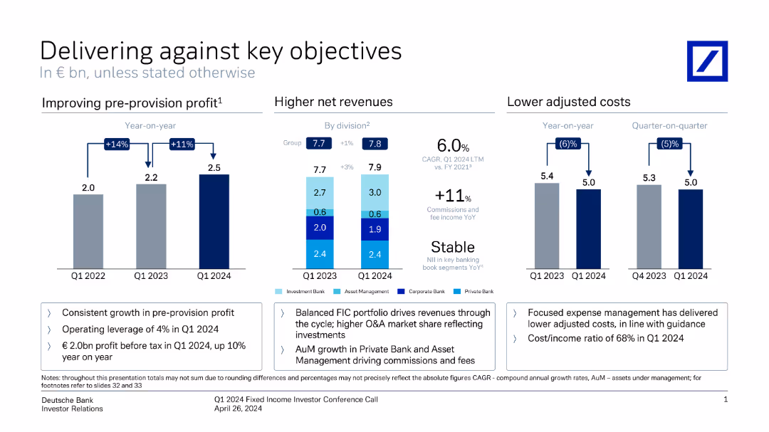
This slide contains three vertical column charts comparing pre-provision profit, net revenues, and adjusted costs over different periods. Annotations provide key metrics.
Financial Performance
Financial Services
It shows Deutsche Bank's performance metrics, highlighting improvements in profit, revenue, and cost management from Q1 2022 to Q1 2024.
profit, revenue, costs, financial performance, metrics, comparison, Deutsche Bank, investor relations, growth, Q1 2024
false
Financial Performance
Financial Services
Multiple Chart
Deutsche Bank
Add to my slides
Remove from favorites
Bar graphs and line graph showing financial trends
Financial Performance
Financial Services
Santander's profit and CET1 growth over time
Profits, Banking, CET1, Financial Trends, Growth
false
Financial Performance
Financial Services
Multiple Chart
Morgan Stanley
Add to my slides
Remove from favorites
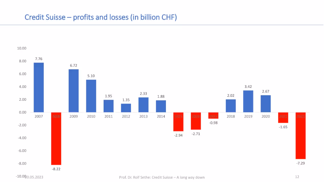
Bar chart showing annual profits and losses from 2007–2022; red bars for losses and blue for profits; financial axis in CHF.
Financial Performance
Financial Services
This chart tracks Credit Suisse’s profitability over 15 years, illustrating sharp fluctuations and sustained losses in recent years. It provides context for the bank’s financial instability and contributes to understanding its acquisition by UBS.
profits, losses, Credit Suisse, annual results, financial performance, CHF, long-term trend, UBS acquisition
false
Financial Performance
Financial Services
Single Chart
Credit Suisse
Add to my slides
Remove from favorites
Series of column charts illustrating the EBIT trends of luxury goods brands through different economic phases from 2000 to 2017.
Financial Performance
Consumer Goods
Provides an analysis of how operating profits for luxury brands have evolved through various market conditions, emphasizing their resilience and profitability.
Profits, Luxury Goods, Financial Analysis
false
Financial Performance
Consumer Goods
Single Chart
Bain
Add to my slides
Remove from favorites
The slide displays column charts showing profit before tax and income. Text sections discuss consistent profits, recurring income, and disciplined resource management.
Financial Performance
Financial Services
This slide highlights UBS's strong and steady profits in personal and corporate banking, detailing income sources and financial performance.
Profits, UBS, Banking, Income, Resource Management
false
Financial Performance
Financial Services
Multiple Chart
UBS
Add to my slides
Remove from favorites
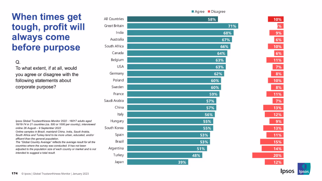
Structured bar chart showing country-level agreement on the trade-off between profit and purpose; consistent color use and layout.
Corporate Finance and Valuation
Financial Services
This chart captures the belief that businesses prioritize profit over stated social/environmental purposes during challenging times. A majority across countries agree, especially in the UK and India.
profit vs purpose, business values, financial priorities, Ipsos, public opinion, economic pressure
false
Corporate Finance and Valuation
Financial Services
Mixed Chart
IPSOS
Add to my slides
Remove from favorites
A comparative bar chart slide with a dark and light purple theme, comparing factors important for successful strategy delivery on the left with practices important for the same on the right, distinguished by shades and percentage labels.
Strategic Planning
Professional Services
This slide offers insights into program governance and related factors for successful delivery of reinvention strategies. It suggests a focus on effective governance, culture, and partnerships, critical for decision-makers and strategy planners.
Program Governance, Strategy Delivery, Success Factors, Organizational Culture, Partnerships, Leadership Engagement, Business Case, Execution Practices
false
Strategic Planning
Professional Services
Multiple Chart
Accenture
Add to my slides
Remove from favorites
Bar charts showing the increase in programmatic ad revenues from 2019 to 2020, differentiating between programmatic and non-programmatic placements.
Market Analysis and Trends
Media & Entertainment
Explores the 24.9% year-over-year growth in programmatic advertising revenues, underscoring its increasing significance within the digital advertising space.
programmatic, advertising, revenue, growth, 2019-2020
false
Market Analysis and Trends
Media & Entertainment
Single Chart
PwC/Strategy&
Add to my slides
Remove from favorites
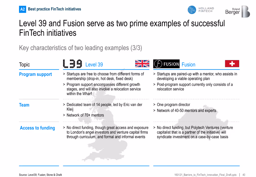
Final part of the comparison series, focusing on program support, team composition, and access to funding
Organizational Structure and Change
Financial Services
Highlights the operational structure of the FinTech programs, including support services, mentoring networks, and investor access, showcasing holistic accelerator models.
program support, funding, mentors, venture capital, FinTech, startup support
false
Organizational Structure and Change
Financial Services
Table
Roland Berger
Add to my slides
Remove from favorites
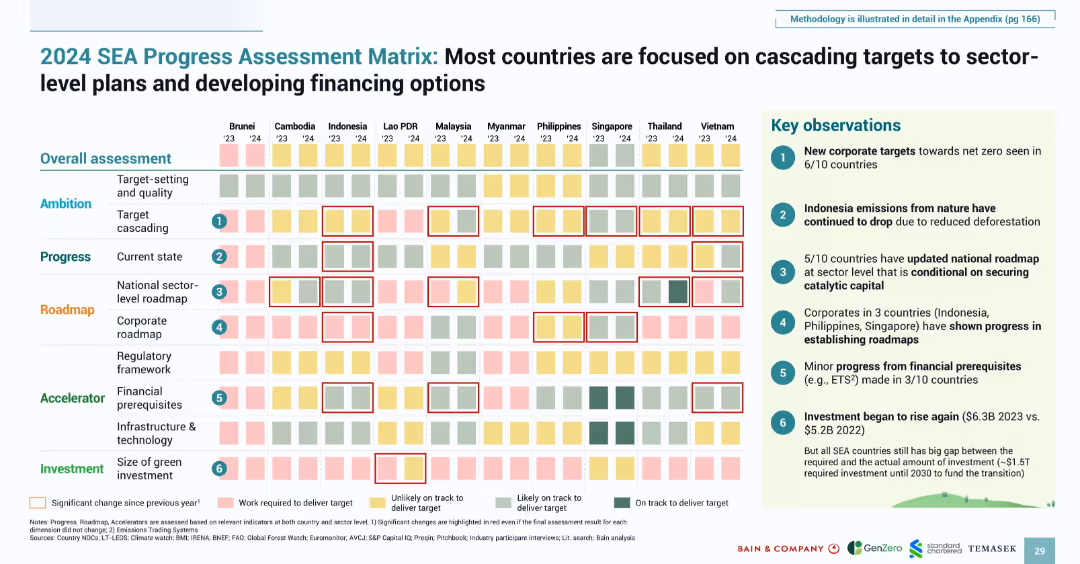
Heatmap-style matrix with qualitative color-coded indicators; boxed key insights on the right
Strategic Planning
Environmental Services & Sustainability
Provides a country-level assessment of progress in emissions reduction and green planning. It evaluates ambition, roadmap development, and financial readiness across dimensions. Key findings highlight significant advances in corporate targeting, updated roadmaps, and increasing investment.
progress matrix, SEA, roadmap, target setting, climate finance, national planning, emissions
false
Strategic Planning
Environmental Services & Sustainability
Multiple Chart
Bain
Add to my slides
Remove from favorites
The slide features a three-part comparative layout with check marks and bullet points. It is moderately dense with textual information across three distinct sections, comparing company priorities with achieved progress. The text is organized in blue and black, with green checks indicating progress.
Operational Efficiency
Financial Services
This slide outlines JPMorgan Chase & Co.'s significant progress against set priorities such as acquisition and deepening, engagement, and expenses and simplification. It uses bullet points and check marks to indicate achievements like increased deposit balances and improved digital activity rates. The slide is likely used in presentations to stakeholders to demonstrate company growth and operational achievements.
Progress, Priorities, Banking, Deposits, Engagement, Digital, Expenses, Simplification, Achievements, Growth
false
Operational Efficiency
Financial Services
Table
JP Morgan
Add to my slides
Remove from favorites
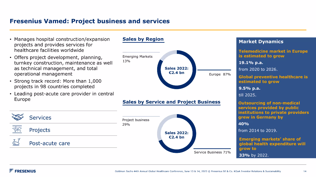
Pie charts of sales by region and by service/project business, with key points on project management and market dynamics. Icons for services and projects included.
Product and Service Analysis
Healthcare & Pharmaceuticals
The slide showcases Fresenius Vamed's project business and services, detailing sales distribution, project management expertise, and market dynamics in healthcare.
project business, healthcare, sales, services, market dynamics, Fresenius Vamed, strategy, growth, management, region
false
Product and Service Analysis
Healthcare & Pharmaceuticals
Multiple Chart
Goldman Sachs
Add to my slides
Remove from favorites
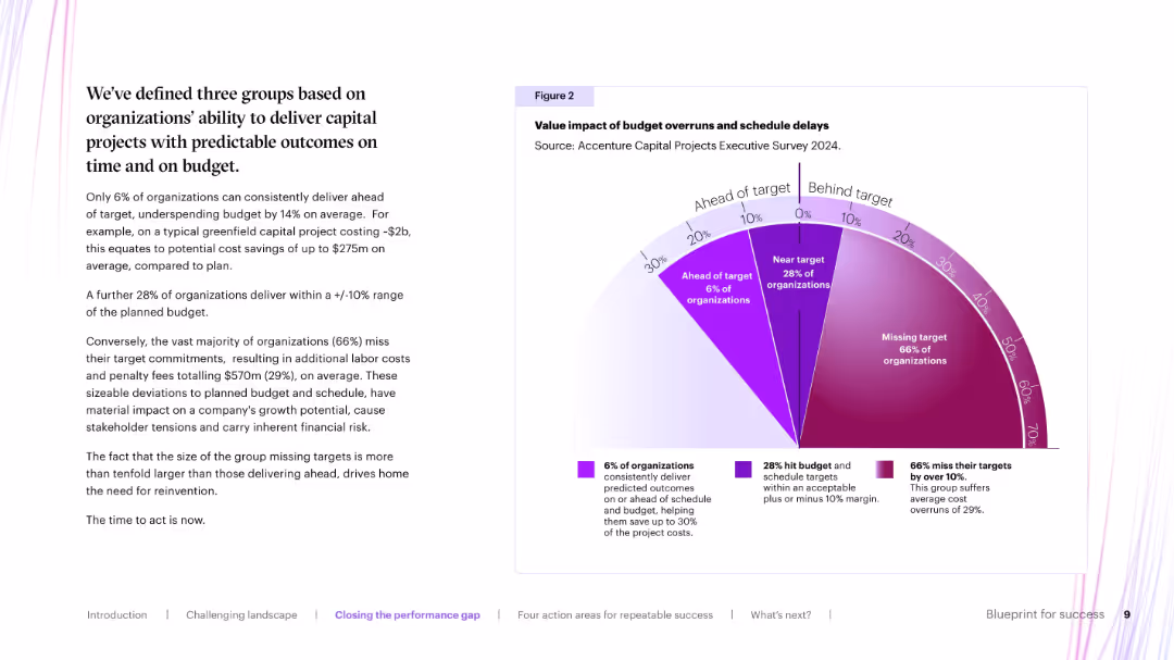
Left-side text summary with a large right-side radial bar chart divided into 3 budget adherence segments (ahead, near, behind target) in shades of purple.
Performance Metrics and KPIs
Real Estate & Construction
Illustrates the performance distribution of organizations in delivering capital projects. Only 6% deliver ahead of target; 28% are near target; 66% miss targets, often with major cost overruns, highlighting inefficiency and financial risk.
project delivery, budget impact, capital projects, schedule risk
false
Performance Metrics and KPIs
Real Estate & Construction
Mixed Chart
Accenture
Add to my slides
Remove from favorites
Previous
Next
You don't have any favorites yet.
Please wait loading your favorites slides...
Create a FREE account to continue browsing
Receive Instant Access to 1,000+ slides from companies like McKinsey, Google, and Goldman Sachs
First Name
Last Name
Email
Password
I agree to all
Terms & Privacy Policy
Thank you! Your submission has been received!
Oops! Something went wrong while submitting the form.
Have an account?
Sign in
Upgrade to PRO to Save slides
Advanced Search and Filters
Access to 15,000+ slides
Access to Category Pages
Save/Bookmark Slides
PowerPoint Template Library
Pick a Plan
MONTHLY
$12/month
Billed every month, Cancel anytime.
YEARLY
$9/year
Billed $108 annually, Cancel anytime.
Checkout for $12/month
Checkout for $108/yr
Secured by Stripe | AES-256 bit encryption