My Account
My Slides
Search by Category
Pricing
Templates
View All Templates
Download Template Slides
✦ AI Search
Feedback
Login
Logout
Get Started
Browse all Slides
Browse all Slides
Create a FREE Account
Instant access to 1,000+ real slides from top companies like McKinsey, BCG, Goldman Sachs, Google and many more!
First Name
Last Name
Email
Password
I agree to all
Terms & Privacy Policy
Thank you! Your submission has been received!
Oops! Something went wrong while submitting the form.
Have an account?
Sign in
Saved Slides
Total No. of slides saved
0
↻ Refresh
✖ Clear all
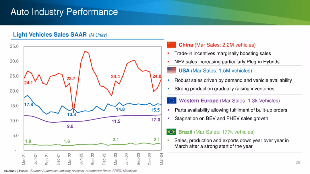
Line chart with SAAR trends for China, USA, Europe, and Brazil alongside country-specific bullet points.
Performance Metrics and KPIs
Industrial & Manufacturing
The slide tracks seasonally adjusted annual rates (SAAR) of light vehicle sales for major global markets and highlights key drivers and challenges in each region, such as incentives in China and stagnation in Europe. March 2024 sales figures are emphasized.
SAAR, auto sales, regional performance, NEV, incentives, inventory
false
Performance Metrics and KPIs
Industrial & Manufacturing
Mixed Chart
Barclays
Add to my slides
Remove from favorites
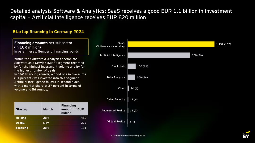
Horizontal bar chart listing subsectors within Software & Analytics by investment volume. SaaS leads, followed by Artificial Intelligence. Includes table of three top-funded startups in 2024.
Product and Service Analysis
Artificial Intelligence
Focuses on financing within the Software & Analytics sector. SaaS dominates with €1.1B across 162 deals, followed by AI with €820M from 56 rounds. The chart highlights subsector specialization and includes key examples like Helsing and DeepL.
SaaS, AI, analytics, blockchain, data, Germany, software, startup funding, subsectors
false
Product and Service Analysis
Artificial Intelligence
Mixed Chart
EY
Add to my slides
Remove from favorites
The slide contains a title at the top, followed by two sections of content, each with a subtitle, bullet points, and column charts. The left section has purple column charts showing growth in SaaS applications from 2022 to 2023, and the right section shows the volume of applications decommissioned. The right section has purple column charts depicting cloud spend as a percentage of total infra spend for 2022 and 2023, and infrastructure RTB expense growth.
Operational Efficiency
Technology & Software
This slide presents a comparison of technology infrastructure development over two years, focusing on the adoption of SaaS applications and decommissioning of legacy systems. It highlights investment in cloud services and maintaining operational costs. The slide illustrates modernization efforts, reflecting the company's strategy to balance infrastructure expansion with cost efficiency, likely aimed at investors or stakeholders to demonstrate prudent financial management and commitment to technological advancement.
SaaS, Decommissioning, Cloud, Infrastructure, Expense, Growth, Technology, Modernization, Investment, Strategy
false
Operational Efficiency
Technology & Software
Multiple Chart
JP Morgan
Add to my slides
Remove from favorites
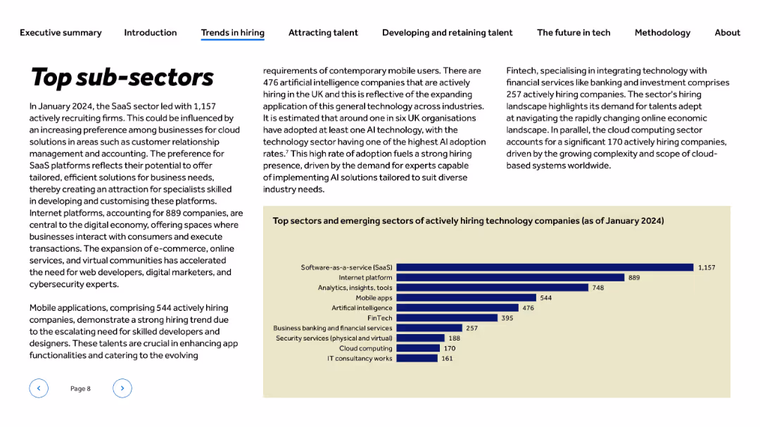
Left-aligned bold title and body text; right-aligned narrative; horizontal bar chart at bottom-right on beige background
Market Analysis and Trends
Technology & Software
The slide outlines the most active tech sub-sectors in hiring as of January 2024. SaaS dominates with 1,157 companies, followed by Internet platforms and analytics. It explores reasons for high hiring in sectors like mobile apps, AI, and FinTech, driven by demand for digital solutions, cloud infrastructure, and customer-facing platforms.
SaaS, FinTech, mobile apps, hiring trends, cloud computing, AI, analytics, UK tech, emerging sectors, internet platforms
false
Market Analysis and Trends
Technology & Software
Mixed Chart
Barclays
Add to my slides
Remove from favorites
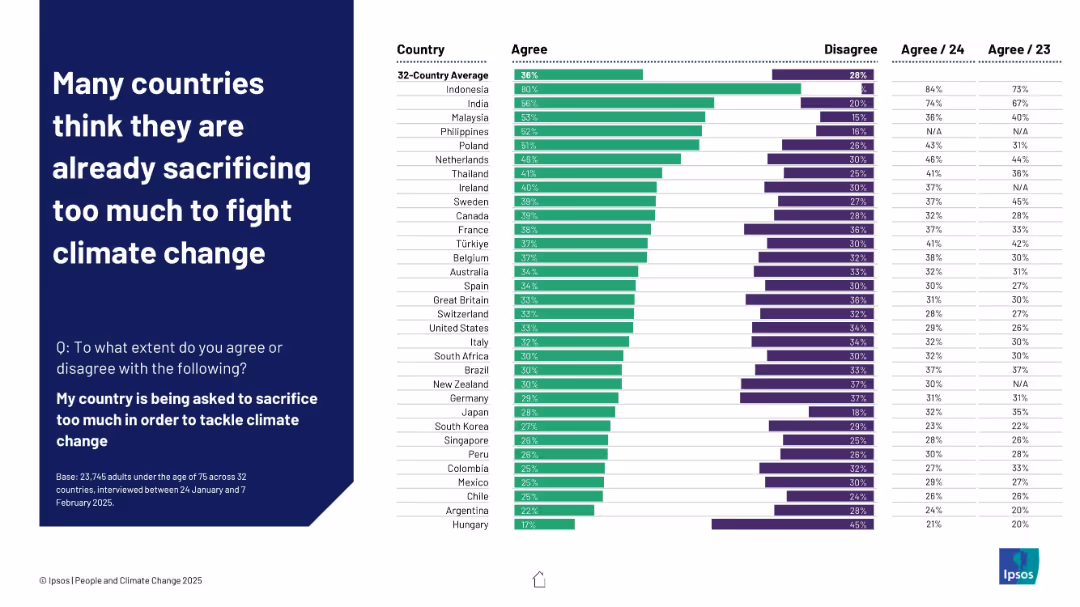
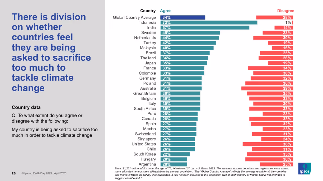
Left-aligned header on dark blue background; right side presents a horizontal bar chart ranking agreement by country with comparative historical data
Customer and Market Segmentation
Environmental Services & Sustainability
This slide shows that people in countries like Indonesia and India feel their nations are sacrificing too much to tackle climate change. The data is contextualized with agreement percentages from 2023 and 2024, indicating shifting attitudes over time.
sacrifice, climate change, public opinion, survey, Ipsos, 2025, international comparison, perception shift, sustainability
false
Customer and Market Segmentation
Environmental Services & Sustainability
Mixed Chart
IPSOS
Add to my slides
Remove from favorites
Standard visual layout: left-aligned text and a detailed bar chart ranking country responses by level of agreement/disagreement.
Risk Assessment and Management
Environmental Services & Sustainability
The slide explores perceived fairness in climate efforts, showing varied opinions on whether nations feel overburdened in tackling climate change. Countries like Indonesia express strong agreement, while others like Argentina show minimal concern, revealing a split sentiment globally.
sacrifice, fairness, climate burden, national opinion, policy reception, Ipsos data, environmental responsibility
false
Risk Assessment and Management
Environmental Services & Sustainability
Mixed Chart
IPSOS
Add to my slides
Remove from favorites
Features two column charts. The first chart depicts SACU receipts over four fiscal years. The second shows indirect tax comparisons excluding SACU receipts for three fiscal years.
Financial Performance
Government & Public Sector
Analyzing SACU receipts and indirect tax contributions in Namibia, this slide aids in understanding the impact of regional agreements and indirect taxes on the national budget.
SACU, indirect tax, Namibia, fiscal year, regional agreements, national budget, tax contributions
false
Financial Performance
Government & Public Sector
Multiple Chart
PwC/Strategy&
Add to my slides
Remove from favorites
Contains a column chart that compares SACU receipts over three fiscal years, with each year represented by a column colored in orange.
Regulatory and Compliance
Government & Public Sector
Analyzes the SACU receipts from previous, current, and projected fiscal years, providing insights into economic trends and regional financial contributions. This information is crucial for assessing economic health and regional cooperation within the Southern African Customs Union.
SACU, Receipts, Budget, Forecasting, Economic analysis
false
Regulatory and Compliance
Government & Public Sector
Single Chart
PwC/Strategy&
Add to my slides
Remove from favorites
Displays three orange vertical bars representing SACU receipts over three fiscal years, with values labeled clearly atop each bar.
Regulatory and Compliance
Government & Public Sector
The slide shows past, estimated, and projected SACU receipts, helping in financial assessment and future budgeting within the government sector.
SACU, receipts, financial review, projection, government, budgeting, past, estimate, fiscal, finance
false
Regulatory and Compliance
Government & Public Sector
Single Chart
PwC/Strategy&
Add to my slides
Remove from favorites
This slide shows a column chart and a line graph on SACU revenue over time. It illustrates actual revenues and their percentage of total revenue, highlighted with a dotted line.
Regulatory and Compliance
Government & Public Sector
Focuses on the Southern African Customs Union (SACU) revenue streams, analyzing past performance and future projections.
SACU, revenue analysis, projections, fiscal planning, customs
false
Regulatory and Compliance
Government & Public Sector
Single Chart
PwC/Strategy&
Add to my slides
Remove from favorites
This slide features a column chart comparing SACU receipts over three fiscal years. The columns are color-coded in orange, and the monetary values and fiscal years are clearly labeled above each column.
Financial Performance
Government & Public Sector
This slide shows the trends in SACU receipts over recent years, useful for discussions in economic or budgetary presentations focused on regional economic contributions within the Southern African Customs Union.
SACU, revenue trends, economic contributions, fiscal analysis
false
Financial Performance
Government & Public Sector
Single Chart
PwC/Strategy&
Add to my slides
Remove from favorites
Features a series of column charts representing SACU receipts over four fiscal years, showcasing trends and fluctuations in revenue.
Financial Performance
Government & Public Sector
This slide tracks the Southern African Customs Union (SACU) receipts from 2017 to 2020, providing insights into regional economic collaboration and financial trends affecting Namibia's budgetary considerations.
SACU, Revenue, Trends, Economic, Customs
false
Financial Performance
Government & Public Sector
Single Chart
PwC/Strategy&
Add to my slides
Remove from favorites
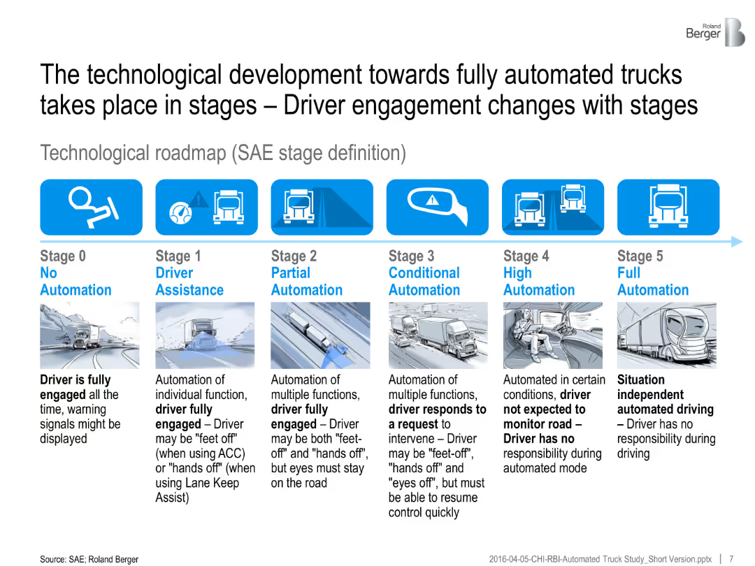
A horizontal infographic outlines six SAE automation stages, with illustrations and explanatory text below each stage.
Technology and Digital Transformation
Transportation & Logistics
The slide explains the SAE stages of truck automation, from no automation to full autonomy. It describes changes in driver engagement across each automation level.
SAE automation, driver assistance, truck technology, partial automation, full automation, roadmap, transport future
false
Technology and Digital Transformation
Transportation & Logistics
Linear Flow
Roland Berger
Add to my slides
Remove from favorites
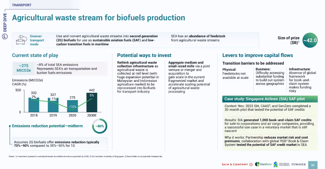
Structure consistent with transport series slides. Bar chart, investment ideas, barriers, and real-world example in green highlight box.
Investment Analysis
Transportation & Logistics
This slide discusses converting agricultural waste into second-generation biofuels (SAF) to reduce emissions from air transport and marine fuels. Emissions reduction potential is up to 80%. Investment areas include improved waste collection infrastructure and scaling small mills. The Singapore Airlines SAF pilot demonstrates market viability through book-and-claim SAF credits generation.
SAF, biofuels, agricultural waste, emissions, Singapore Airlines, SEA, transportation
false
Investment Analysis
Transportation & Logistics
Multiple Chart
Bain
Add to my slides
Remove from favorites
Slide features a column chart showing annual unlinked rides with a focus on recent years impacted by the SafeTrack program, marked with annotations and a downward trend.
Risk Assessment and Management
Transportation & Logistics
Analyzes the impact of the SafeTrack program on ridership, presenting the associated risks and losses, and highlighting the need for strategic responses to these challenges.
SafeTrack, ridership loss, risk management, transportation
false
Risk Assessment and Management
Transportation & Logistics
Single Chart
BCG
Add to my slides
Remove from favorites
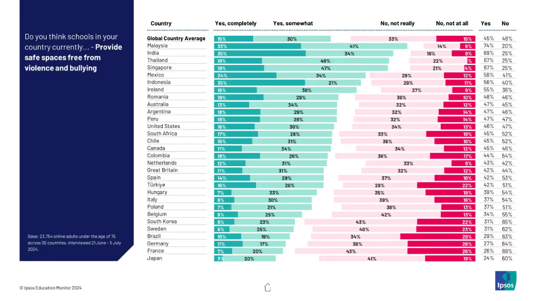
Horizontal stacked bar chart with four response categories per country; includes “Yes completely” to “No, not at all”; clean layout with legend.
Risk Assessment and Management
Education & Training
This slide visualizes opinions on whether schools provide safe spaces. Confidence is relatively low across many countries, with large portions of respondents saying “not really” or “not at all.”
safety, bullying, schools, environment, education, risk, perception, country comparison, survey
false
Risk Assessment and Management
Education & Training
Mixed Chart
IPSOS
Add to my slides
Remove from favorites
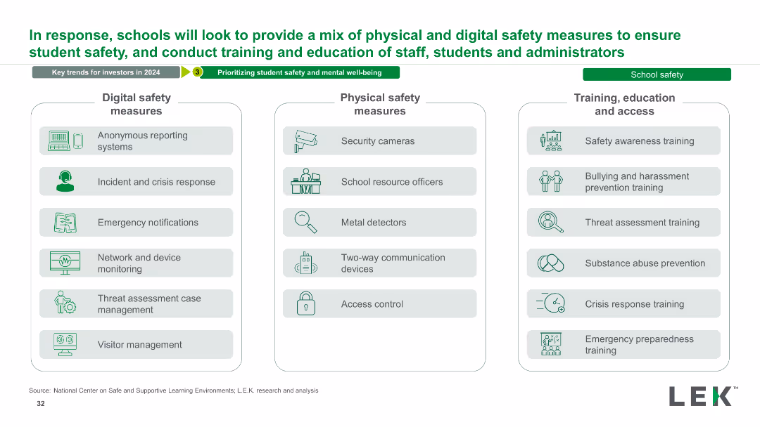
The slide has three columns listing digital safety measures, physical safety measures, and training/education/access measures. Each column includes multiple bullet points and icons representing each measure.
Strategic Planning
Education & Training
This slide outlines a comprehensive mix of safety measures for schools, covering digital and physical safety, as well as training and education for staff and students.
Safety, Measures, Training, Education, Digital, Physical, School, Security, Prevention, Strategy
false
Strategic Planning
Education & Training
Table
LEK
Add to my slides
Remove from favorites
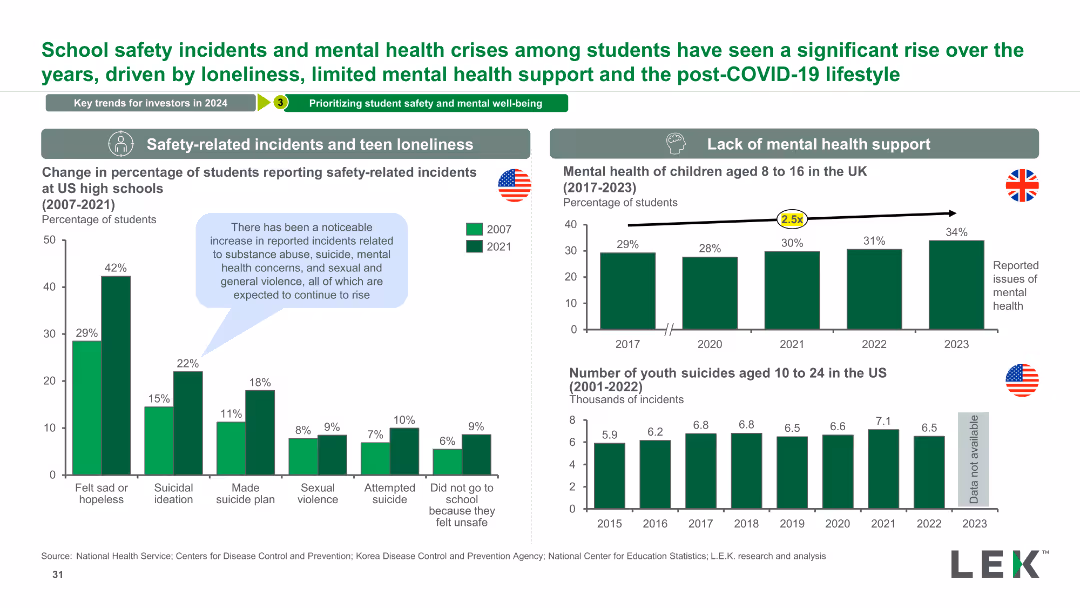
The slide contains two column charts comparing student safety incidents from 2007 to 2021 and mental health issues in children from 2017 to 2023. It includes data on youth suicides and mental health crises.
Risk Assessment and Management
Education & Training
This slide examines trends in school safety incidents and mental health crises among students, highlighting increases in various incidents and mental health issues.
Safety, Mental Health, Students, Incidents, Trends, Data, Analysis, Education, Crisis, Prevention
false
Risk Assessment and Management
Education & Training
Multiple Chart
LEK
Add to my slides
Remove from favorites
This slide features multiple column charts comparing the Total Incident Frequency (TIF) and Total Recordable Incident Frequency (TRIF) of Seadrill against industry benchmarks over several years. The graphs are color-coded to differentiate between TIF, TRIF, and a benchmark, providing a clear visual distinction. The design is clean, with minimal text to allow focus on the trends shown by the graphs. Annotations highlight significant data points and trends.
Operational Efficiency
Energy & Utilities
The slide demonstrates Seadrill's commitment to safety and efficiency, showing a downward trend in incident rates compared to industry standards. It is likely used in safety briefings, regulatory reviews, or investor meetings to underscore Seadrill's strong safety record and operational excellence. The line graphs serve to reassure stakeholders of the company’s adherence to high safety standards and its effectiveness in minimizing operational risks, which is crucial for maintaining trust and fulfilling regulatory requirements.
safety, operational efficiency, Seadrill, line graphs, incident rates, industry benchmarks, safety standards, regulatory compliance, stakeholder reassurance, trust
false
Operational Efficiency
Energy & Utilities
Multiple Chart
Barclays
Add to my slides
Remove from favorites
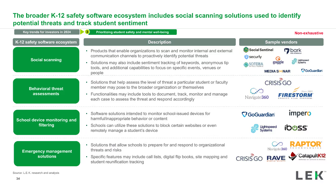
The slide contains descriptions of various safety software solutions with sample vendors listed for each type. Solutions include social scanning, behavioral threat assessments, device monitoring, and emergency management.
Technology and Digital Transformation
Education & Training
This slide provides an overview of the K-12 safety software ecosystem, detailing different types of safety solutions and their respective vendors.
Safety, Software, K-12, Solutions, Ecosystem, Vendors, Education, Technology, Digital, Management
false
Technology and Digital Transformation
Education & Training
Table
LEK
Add to my slides
Remove from favorites
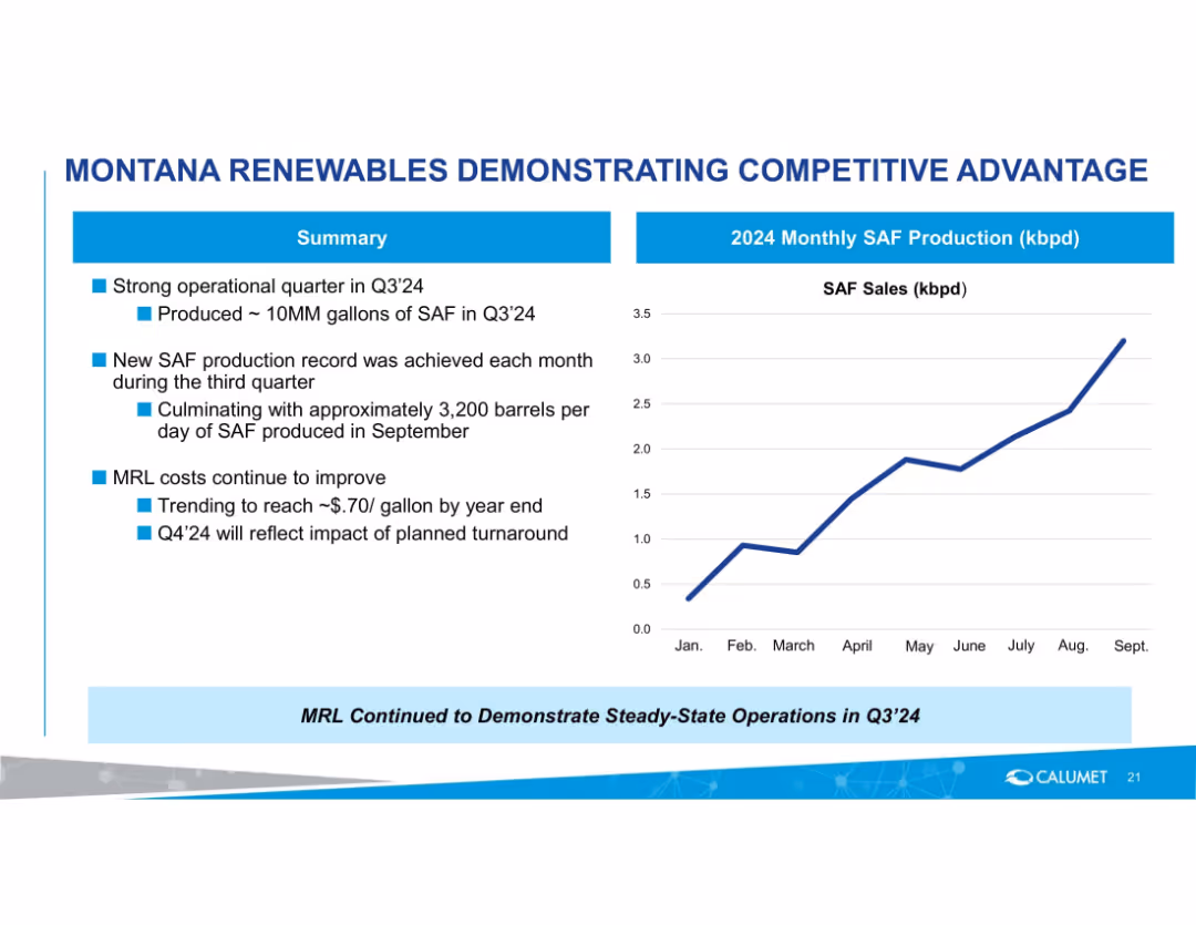
Left side summary bullets with a right side line chart showing monthly SAF production trend in 2024.
Performance Metrics and KPIs
Energy & Utilities
Reports strong Q3'24 production of SAF with monthly growth, culminating at 3,200 barrels/day in September. Notes ongoing cost improvements and anticipated impact of turnaround in Q4'24.
SAF, sustainable aviation fuel, production growth, Q3'24, cost improvement, operations, monthly metrics
false
Performance Metrics and KPIs
Energy & Utilities
Mixed Chart
Goldman Sachs
Add to my slides
Remove from favorites
Combination of bar graphs showing store format changes and a small context box with visual inset.
Client Case Studies
Retail & E-commerce
Shows how Sainsbury's restructured its store network by integrating Argos into its supermarkets, cutting standalone Argos stores by 58%. Resulted in fixed cost reduction of ~3%pp of revenue over 5 years.
Sainsbury’s, Argos, store integration, case study, fixed cost
false
Client Case Studies
Retail & E-commerce
Mixed Chart
McKinsey
Add to my slides
Remove from favorites
A color-coded bar chart compares average salaries in the US, EU, and ASEAN for digital roles. The bars represent different roles and are aligned with flags of each region. The slide background is purple, and there's a key for job roles at the top.
Market Analysis and Trends
Technology & Software
This slide shows salary discrepancies in tech roles across regions, highlighting the challenge of hiring overseas talent in ASEAN due to a large salary gap with the US/EU. It can be used to discuss talent acquisition strategies.
salary, tech roles, ASEAN, hiring, talent gap, digital roles, US, EU, salary comparison
false
Market Analysis and Trends
Technology & Software
Multiple Chart
Kearney
Add to my slides
Remove from favorites
Left side has percentage boxes, right side has a pie chart and text
Sales and Business Development
Retail & E-commerce
Analysis of generative AI's potential to replace roles in sales operations, focusing on team efficiency
sales, AI, team replacement, sales operations
false
Sales and Business Development
Retail & E-commerce
Mixed Chart
Gartner
Add to my slides
Remove from favorites
This slide is a complex column chart showing sales analysis with additional textual elements and a legend. The main feature is a series of three column charts comparing Q3 2022 and Q3 2023 figures, adjusting for currency effects. The background is light with a geometric pattern, and there's a company logo at the bottom. Annotations and color differentiation provide clarity on the data variations.
Financial Performance
Transportation & Logistics
The slide presents a financial performance comparison of tire and non-tire business sales between two quarters, highlighting the impact of currency fluctuations on total sales. It can be used to discuss strategic financial planning and market performance insights.
sales, analysis, Q3, currency, non-tire, tire business, performance, financial planning, comparison
false
Financial Performance
Transportation & Logistics
Single Chart
Morgan Stanley
Add to my slides
Remove from favorites
Split into two main sections: bar chart on the left showing quarterly sales bookings (2021–1Q25), and a vertical bar chart on the right illustrating cumulative lease-up metrics. Uses blue, green, and pink colors with a clean layout.
Performance Metrics and KPIs
Telecommunications
Highlights trends in wholesale and non-wholesale sales bookings, with a focus on lease-up contribution over time. Also shows cash yield improvement from initial anchor builds to cumulative impact, demonstrating a 27% cumulative cash yield.
sales bookings, lease-up, MRR, cash yield, wholesale, telecom, 2025
false
Performance Metrics and KPIs
Telecommunications
Multiple Chart
Goldman Sachs
Add to my slides
Remove from favorites
Dual bar charts: left shows YoY change in € sales by division; right shows % of total sales by category. Clean business-style design.
Performance Metrics and KPIs
Healthcare & Pharmaceuticals
Illustrates the H1/2024 revenue composition by operating division. Notable changes include a 34% decline in systems sales and growth in service parts and development services. Visualizes both absolute and proportional sales mix.
sales by division, diagnostics, consumables, systems, revenue mix, H1/2024, KPIs, STRATEC
false
Performance Metrics and KPIs
Healthcare & Pharmaceuticals
Multiple Chart
Goldman Sachs
Add to my slides
Remove from favorites
A slide presenting nontraditional sales channels with potential in both B2B and B2C sectors, including voice, gaming, and remote interactions, complemented by relevant statistics and expectations.
Technology and Digital Transformation
Retail & E-commerce
Discusses the rise of new sales channels such as voice and gaming, including their potential impact and growth in the B2B and B2C sectors.
Sales Channels, B2B, B2C, Voice Technology, Gaming, Remote Work, AI, Channel Strategy, Market Innovation, Customer Engagement
false
Technology and Digital Transformation
Retail & E-commerce
Header Horizontal
BCG
Add to my slides
Remove from favorites
A combination of descriptive text and graphical examples, featuring QR codes and real-world case studies on channel innovation and tech leverage.
Strategic Planning
Retail & E-commerce
Encourages redefining sales channels through the lens of customer value and technology, showcasing innovative examples from various industries.
Sales Channels, Customer Value, Technology Innovation, New Tech Adoption, Retail Strategy
false
Strategic Planning
Retail & E-commerce
Header Horizontal
BCG
Add to my slides
Remove from favorites
This slide shows column charts comparing the preferred sales channels for car purchases (in-person, by phone, online) before and during COVID-19 in the US, Europe, and Asia.
Market Analysis and Trends
Transportation & Logistics
Analyzes trends in consumer preferences for car purchase channels, highlighting the shift towards digital platforms during the pandemic.
sales channels, digital transformation, car purchases, column chart, regional trends
false
Market Analysis and Trends
Transportation & Logistics
Multiple Chart
McKinsey
Add to my slides
Remove from favorites
Flowchart showing different channels used to generate sales, such as stores, websites, mobile apps, catalogues, etc., with respective percentages.
Sales and Business Development
Retail & E-commerce
The slide details various channels used to generate sales, with percentages for each. It emphasizes the importance of stores and websites. Useful for business development strategies.
sales, channels, generate, stores, websites
false
Sales and Business Development
Retail & E-commerce
Mixed Chart
PwC/Strategy&
Add to my slides
Remove from favorites
This slide presents a data table split into two parts, displaying sales by currency, year-to-date currency changes against the euro, and the impact on segment operating income. The background is a light gradient, and the Michelin logo is placed at the bottom left.
Financial Performance
Financial Services
The slide provides a financial analysis of sales by currency and the subsequent impact on segment operating income, which is critical for financial risk assessment and management in multinational corporations, potentially as part of a quarterly or annual financial report.
sales, currency impact, operating income, financial analysis
false
Financial Performance
Financial Services
Table
Morgan Stanley
Add to my slides
Remove from favorites
A pie chart labeled "2018 Sales Mix" showing Eaton's business divisions and sales distribution among different sectors such as vehicle, aerospace, and electrical products.
Market Analysis and Trends
Industrial & Manufacturing
Showcases the sales distribution across Eaton's diverse business units, aligning with market trends and highlighting Eaton's strategic positions in multiple sectors.
sales distribution, Eaton, market trends, business units
false
Market Analysis and Trends
Industrial & Manufacturing
Mixed Chart
Deutsche Bank
Add to my slides
Remove from favorites
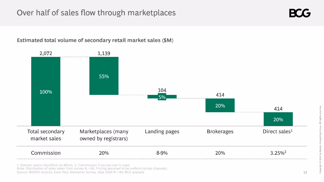
The slide shows a column chart breaking down the total volume of secondary retail market sales, with segments for marketplaces, landing pages, brokerages, and direct sales.
Market Analysis and Trends
Retail & E-commerce
It details the distribution of sales through various channels in the secondary market, noting that marketplaces account for over half of total sales, with commissions listed.
sales distribution, marketplaces, secondary market, channels, volume
false
Market Analysis and Trends
Retail & E-commerce
Single Chart
BCG
Add to my slides
Remove from favorites
Pie chart split into three segments showing the distribution of net sales across personal care, consumer tissue, and professional hygiene. Accompanied by thematic imagery related to consumer products.
Market Analysis and Trends
Consumer Goods
Highlights distribution of Essity's net sales by category for the first half of 2017, useful for market segmentation and analysis in consumer goods.
Sales Distribution, Market Segmentation, Personal Care, Consumer Tissue, Professional Hygiene
false
Market Analysis and Trends
Consumer Goods
Single Chart
Barclays
Add to my slides
Remove from favorites
Multiple pie charts showing the distribution of credit sales by product and by market vertical.
Market Analysis and Trends
Financial Services
Examines how sales diversification across different products and verticals contributes to balanced growth and market expansion.
Sales, Diversification, Credit, Market
false
Market Analysis and Trends
Financial Services
Multiple Chart
Barclays
Add to my slides
Remove from favorites
The slide contains column charts showing sales and EBITDA figures. It also includes text boxes detailing volume, currency, price, and portfolio adjustments.
Financial Performance
Healthcare & Pharmaceuticals
The slide discusses the impact of COVID-19 on consumer health sales, highlighting changes in sales and EBITDA due to trade inventory adjustments and market conditions.
sales, EBITDA, COVID-19, inventory, adjustments
false
Financial Performance
Healthcare & Pharmaceuticals
Multiple Chart
Credit Suisse
Add to my slides
Remove from favorites
Featuring a line chart with multiple series, each representing a generation's spending habits from January 2020 through 2022. The design incorporates pastel colors and minimal text for clarity.
Market Analysis and Trends
Retail & E-commerce
Discusses spending behaviors across different generations during sales events, highlighting a significant increase for Gen X. Useful for marketing and sales strategy planning during peak shopping seasons.
Sales Events, Generation Spending, Black Friday
false
Market Analysis and Trends
Retail & E-commerce
Single Chart
Accenture
Add to my slides
Remove from favorites
Includes a large column chart detailing sales performance and projections. The slide is visually complex with multiple data points and vibrant colors.
Financial Performance
Transportation & Logistics
Focuses on Faurecia's sales growth in Q3 2018, comparing it with global automotive production. Highlights regional sales achievements and the impact of currency fluctuations. Suitable for presentations on market analysis and corporate forecasting.
Sales, Forecasting, Automotive, Regional Analysis, Currency Impact
false
Financial Performance
Transportation & Logistics
Mixed Chart
Deutsche Bank
Add to my slides
Remove from favorites
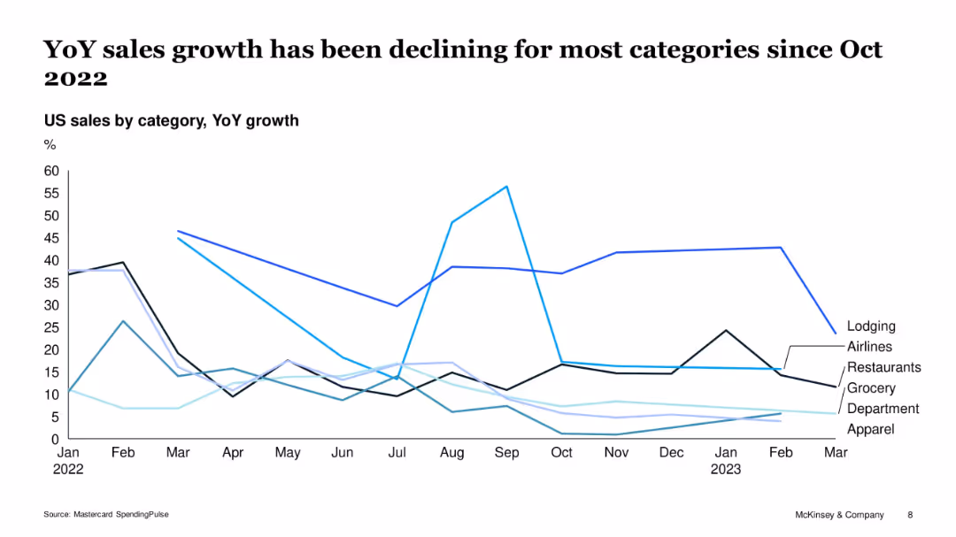
Multi-line chart tracking category-wise YoY sales growth (e.g., lodging, airlines, apparel)
Performance Metrics and KPIs
Retail & E-commerce
The chart illustrates the sharp drop in year-over-year sales growth across key consumer categories post-October 2022. Lodging and airlines initially saw large spikes but declined, while apparel and department stores experienced consistent underperformance, indicating broad retail headwinds.
sales growth, categories, apparel, restaurants, lodging, Mastercard, decline, YoY
false
Performance Metrics and KPIs
Retail & E-commerce
Single Chart
McKinsey
Add to my slides
Remove from favorites
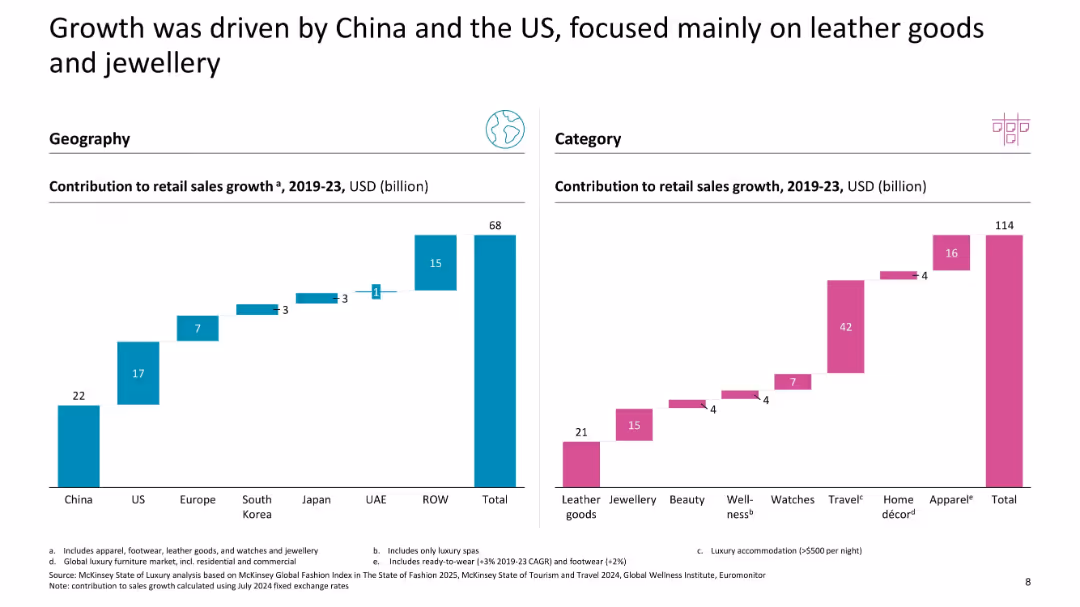
Two waterfall charts: left by region, right by category (USD contribution to retail sales growth)
Market Analysis and Trends
Consumer Goods
This slide showcases regional and categorical contributors to luxury retail sales growth between 2019–2023, with China and the US leading geographically, and leather goods and travel products leading categorically.
sales growth, China, US, leather goods, jewellery, geography, category breakdown, USD contribution
false
Market Analysis and Trends
Consumer Goods
Multiple Chart
McKinsey
Add to my slides
Remove from favorites
Three column charts show underlying sales growth and market winning by year and displays the market distribution.
Strategic Planning
Consumer Goods
Analyzes Unilever's sales performance and market competitiveness over the years with a focus on maintaining growth and addressing challenges in various markets.
Sales Growth, Competitiveness, Market Distribution, Strategic Planning, Unilever
false
Strategic Planning
Consumer Goods
Multiple Chart
Deutsche Bank
Add to my slides
Remove from favorites
Features a timeline and a column chart, visually representing sales growth across recent quarters.
Market Analysis and Trends
Consumer Goods
Showcases the accelerated growth in like-for-like sales over recent periods, highlighting the company's strong market performance.
sales growth, cosmetics, market trends, quarterly growth, performance
false
Market Analysis and Trends
Consumer Goods
Single Chart
Deutsche Bank
Add to my slides
Remove from favorites
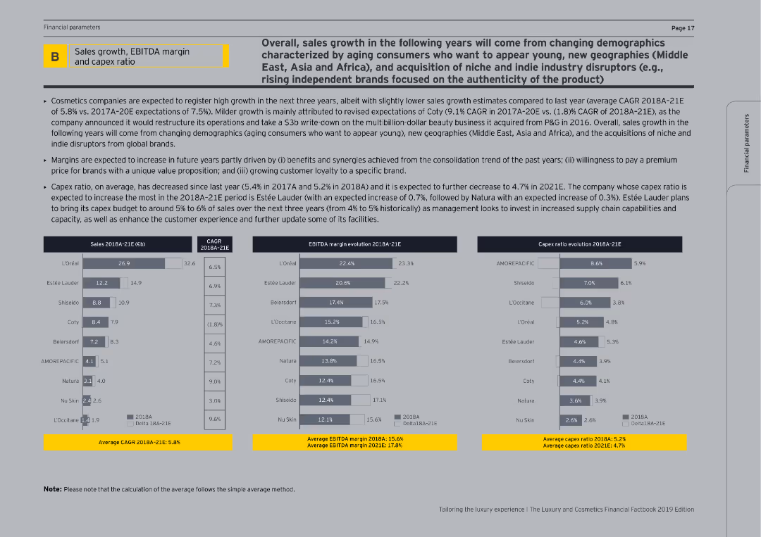
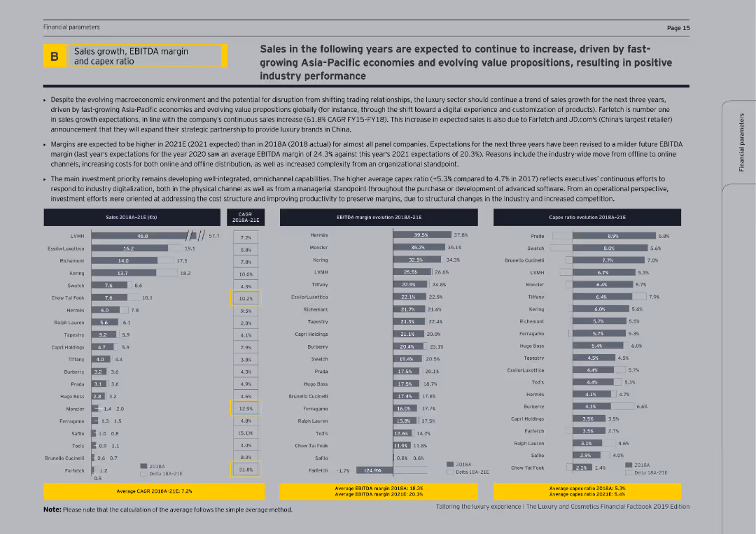
The slide features a title, a detailed description of market expectations, and three sections with bar and column charts showing sales, EBITDA margin, and capex ratio evolutions for various companies. The visual complexity level is moderate.
Financial Performance
Consumer Goods
The slide analyzes the projected sales growth, EBITDA margins, and capex ratios of cosmetics companies from 2018 to 2021. It provides insights into expected market trends, company restructuring plans, and investment strategies for improving customer experience and operational efficiency.
Sales, Growth, EBITDA, Capex, Cosmetics
false
Financial Performance
Consumer Goods
Multiple Chart
EY
Add to my slides
Remove from favorites
This slide contains tables and bar charts displaying sales growth, EBITDA margin, and capex ratio for luxury companies over time.
Financial Performance
Consumer Goods
The slide analyzes the financial performance of luxury companies, focusing on sales growth, EBITDA margins, and capital expenditure ratios, highlighting trends and future expectations.
Sales growth, EBITDA margin, capex ratio, luxury companies, financial performance
false
Financial Performance
Consumer Goods
Multiple Chart
EY
Add to my slides
Remove from favorites
This slide features two column charts and text descriptions comparing year-over-year changes. The colors orange, blue, and grey dominate, with clear labels and percentage values.
Financial Performance
Transportation & Logistics
Discusses Faurecia's H1 2018 financial results, emphasizing sales growth, operating income, and performance across different business groups and regions. Useful for assessing financial trends and operational efficiency within the automotive sector.
Sales Growth, Operating Income, Automotive, Global, Profitability
false
Financial Performance
Transportation & Logistics
Multiple Chart
Deutsche Bank
Add to my slides
Remove from favorites
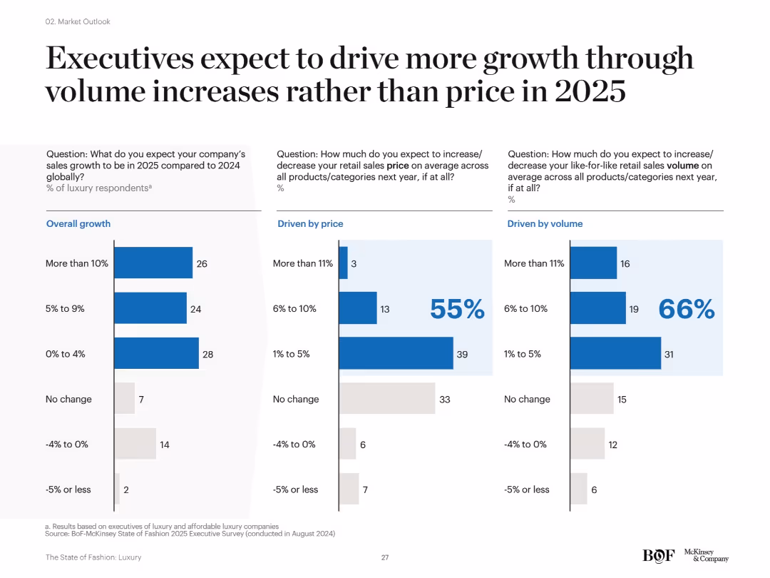
Three-column layout with bar charts: overall growth (left), price-driven (center), and volume-driven (right). Each section features labeled bar graphs with blue and gray colors, numerical values, and percentage indicators. Clear use of white space and segmented analysis.
Market Analysis and Trends
Consumer Goods
This slide presents insights from luxury executives indicating that most anticipate 2025 sales growth to come from increased volume rather than price hikes. Charts show expectations for growth in overall sales, price, and volume, highlighting a strategic pivot in growth drivers.
sales growth, volume strategy, pricing, luxury market, forecasts, 2025, bar chart, executive survey, product categories
false
Market Analysis and Trends
Consumer Goods
Single Chart
McKinsey
Add to my slides
Remove from favorites
The slide features a title and a composite image of professionals interacting with digital screens, indicative of a modern business environment.
Industry Overview
Professional Services
Sets the stage for a discussion on evolving sales and marketing tactics in the context of changing consumer behavior and technology.
Sales, Marketing, Business Trends, Consumer Behavior, Digital Transformation, Industry Overview, Market Evolution, Strategy Development, Business Innovation, Executive Perspective
false
Industry Overview
Professional Services
Title
BCG
Add to my slides
Remove from favorites
The slide includes bar charts showing various levers in sales and marketing with corresponding activity levels and trends over time.
Sales and Business Development
Consumer Goods
Highlights sales and marketing levers focusing on effectiveness and growth opportunities, with a detailed view of activities for 2019.
Sales, Marketing, Effectiveness, Growth, Trends
false
Sales and Business Development
Consumer Goods
Single Chart
Roland Berger
Add to my slides
Remove from favorites
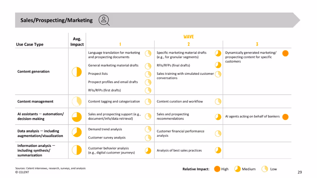
Similar format to previous slide. Use cases listed by type and impact, across three waves. Focus on prospecting materials, sales documents, and AI support.
Sales and Business Development
Financial Services
Outlines AI applications in sales and marketing—from early content generation and support tools to future-state autonomous agents generating hyper-personalized content and acting on behalf of bankers. Emphasizes high-impact opportunities in customer engagement and prospect outreach.
sales, marketing, prospecting, content, AI agent, automation, personalization
false
Sales and Business Development
Financial Services
Single Chart
Oliver Wyman
Add to my slides
Remove from favorites
The slide features a colorful pie chart breaking down sales by category and a sidebar with percentage breakdowns by international region. It includes text labels and the Clorox Company logo.
Market Analysis and Trends
Consumer Goods
This slide details $6.1B in sales for FY18, broken down by product categories like Cleaning and Household, and regions like Latin America and Canada, with future projections for Nutranext. Used for market analysis and strategic planning.
sales, market, regional distribution, projections, Clorox
false
Market Analysis and Trends
Consumer Goods
Mixed Chart
Barclays
Add to my slides
Remove from favorites
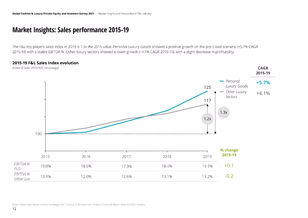
The slide features a line chart showing sales index evolution from 2015 to 2019, with CAGR values and EBITDA percentage changes.
Market Analysis and Trends
Retail & E-commerce
Reviews sales performance in the fashion and luxury market from 2015 to 2019, highlighting growth rates and profitability trends over the years.
sales, performance, market, fashion, luxury, CAGR, EBITDA, growth, profitability
false
Market Analysis and Trends
Retail & E-commerce
Mixed Chart
Deloitte
Add to my slides
Remove from favorites
Two line charts side by side, one showing average sales price changes for Devices and the other for Servers from 2020 to 2026. Different lines represent different types of devices and servers.
Market Analysis and Trends
Consumer Goods
The slide illustrates the changes in average sales prices for various devices and servers from 2020, highlighting trends and forecasting future price movements.
Sales Price, Consumer Goods, Market Trends, Device Prices, Server Prices
false
Market Analysis and Trends
Consumer Goods
Multiple Chart
Gartner
Add to my slides
Remove from favorites
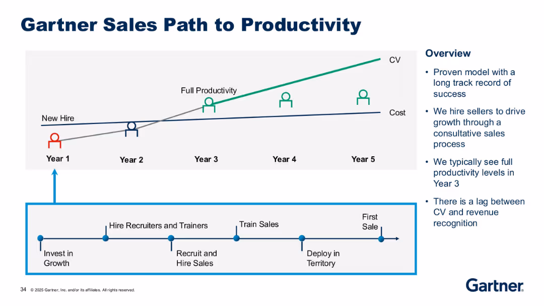
Diagram with timeline, icons of people, and dual line graph (CV vs. Cost). Sidebar with key points.
Operational Efficiency
Professional Services
This slide outlines the multi-year path from new hire to full productivity, typically achieved in Year 3. It includes stages like recruiting, training, and deployment, emphasizing the lag between CV generation and revenue recognition.
sales productivity, new hire, cost, CV, sales model, training, timeline, growth strategy, revenue lag
false
Operational Efficiency
Professional Services
Mixed Chart
Gartner
Add to my slides
Remove from favorites
Line graph showing trends in sales revenue and profits over several years, with a focus on changes since the pandemic.
Financial Performance
Professional Services
Reviews the company's financial performance, emphasizing significant growth post-pandemic but noting recent declines.
sales, profits, pandemic impact, financial trends, company performance
false
Financial Performance
Professional Services
Single Chart
Deloitte
Add to my slides
Remove from favorites
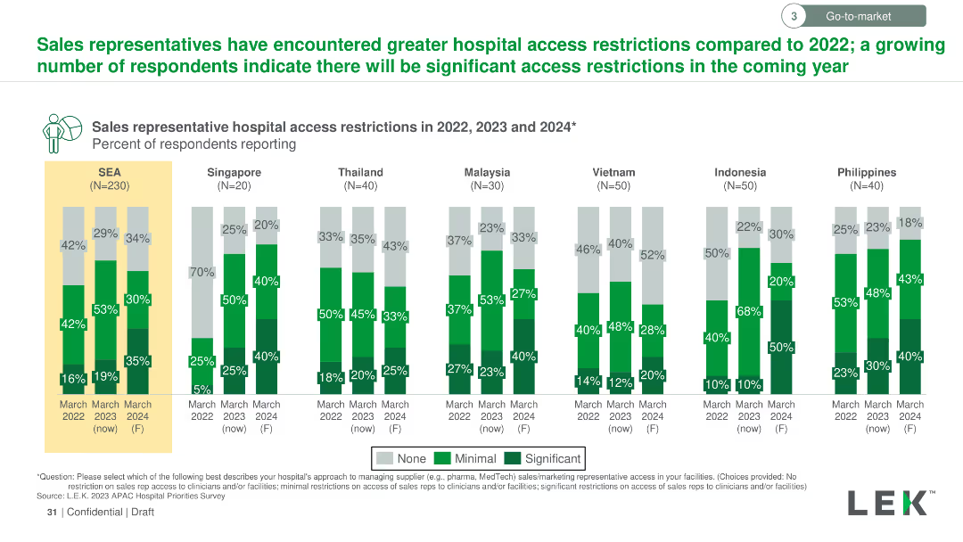
Vertical column chart comparing hospital access restrictions for sales representatives across SEA countries in 2022, 2023, and forecast for 2024.
Regulatory and Compliance
Healthcare & Pharmaceuticals
Indicates the growing access restrictions for sales representatives in hospitals across SEA countries, with significant increases expected from 2022 to 2024.
sales representatives, hospital access, restrictions, SEA, 2022-2024, regulatory compliance
false
Regulatory and Compliance
Healthcare & Pharmaceuticals
Multiple Chart
LEK
Add to my slides
Remove from favorites
The slide presents a stacked area chart illustrating total revenue by sales channel for an IT distributor over five years, complemented by a side text box with case studies.
Market Analysis and Trends
Technology & Software
This slide provides a visual and statistical analysis of sales growth in different channels and discusses strategies in distributor case studies.
sales, strategy, IT distributor, revenue growth, account management, case studies, e-commerce, tech sales, CRM, ERP
false
Market Analysis and Trends
Technology & Software
Single Chart
EY
Add to my slides
Remove from favorites
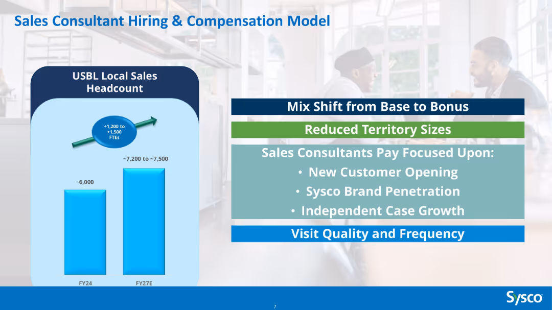
Bar chart comparing FY24 vs FY27E headcount, overlayed with text blocks listing compensation strategy shifts.
Human Resources and Talent Management
Consumer Goods
Describes a hiring plan to increase Sysco’s local sales headcount by ~1,200–1,500 FTEs by FY27. Includes pay structure shifts from base to bonus, smaller territories, and focus areas like new customer acquisition and brand penetration.
sales team, hiring, compensation, Sysco, strategy, headcount, bonuses, HR, FTE growth
false
Human Resources and Talent Management
Consumer Goods
Mixed Chart
Barclays
Add to my slides
Remove from favorites
The slide contains multiple icons and data points organized around a central IT icon, surrounded by other business functions and contract values.
Sales and Business Development
Technology & Software
This slide showcases Gartner’s Global Technology Sales, highlighting sales forces, contract values, and enterprise engagement.
Sales, Technology, Contract Value, Gartner, Enterprises
false
Sales and Business Development
Technology & Software
Diagram
Gartner
Add to my slides
Remove from favorites
A visually dense slide with key trends and leadership implications in sales and marketing, utilizing a clear segmentation to guide the viewer through complex information.
Technology and Digital Transformation
Retail & E-commerce
Summarizes the transformation of sales and marketing in light of recent trends, with a focus on digitalization, consumer expectations, and technological advancements.
Sales Trends, Marketing Evolution, Digital Transformation, Leadership Strategy, Consumer Expectations, Technological Innovation, Omnichannel Strategy, Personalization, AI, Data Privacy
false
Technology and Digital Transformation
Retail & E-commerce
Agenda
BCG
Add to my slides
Remove from favorites
Slide displays a column chart and line chart comparing sales volume and material margins from 2020 to Q2 2023. Sales volumes are represented in thousands of barrels per day across two categories: specialty products and fuels & asphalt.
Financial Performance
Energy & Utilities
Provides a summary of financial performance for SPS in Q2, showing sales volume and material margins. It also discusses factors affecting performance, such as market conditions and production issues due to weather.
sales volume, financial performance, energy, market conditions, material margins, Q2
false
Financial Performance
Energy & Utilities
Multiple Chart
Barclays
Add to my slides
Remove from favorites
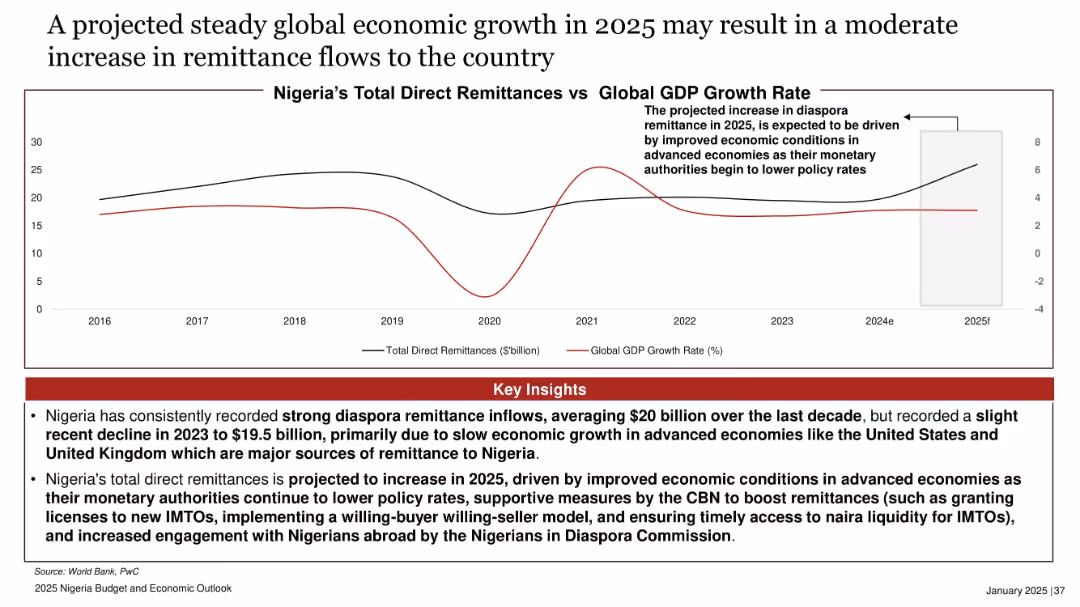
Duplicate of Slide 17812. Same dual-line chart and layout.
Market Analysis and Trends
Financial Services
Duplicate content: forecasted remittance increase in 2025 due to improved global growth and easing policy rates in source countries. Highlights CBN actions to support inflow.
(Same as Slide 17812)
false
Market Analysis and Trends
Financial Services
Mixed Chart
PwC/Strategy&
Add to my slides
Remove from favorites
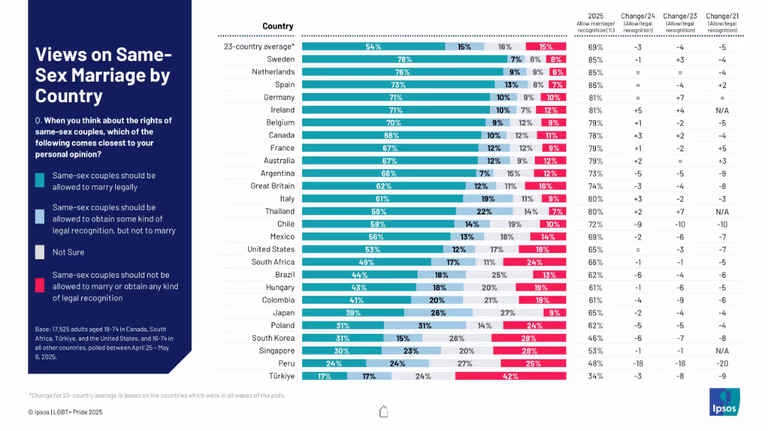
Multicolor stacked bar chart showing legal recognition support levels across countries, including "Not sure" responses.
Regulatory and Compliance
Government & Public Sector
This slide measures global sentiment toward same-sex marriage rights. It shows whether people believe same-sex couples should be allowed to marry, receive legal recognition, or be denied both. Trends over time are also included.
same-sex marriage, legal recognition, LGBTQ+ rights, marriage equality, international opinion, civil rights, public support, trends
false
Regulatory and Compliance
Government & Public Sector
Mixed Chart
IPSOS
Add to my slides
Remove from favorites
Purple dominant color, timeline, and puzzle pieces graphics representing different stages of Samsung's growth.
Market Analysis and Trends
Technology & Software
The slide traces Samsung's evolution and strategic moves that have cemented its position in the semiconductor supply chain. It provides a comparative market cap analysis from 2011 to January 2021. This can be used to illustrate a case study on market growth, strategy development, and supply chain fortification in the tech industry.
Samsung, Semiconductor, Market Growth, Strategy, Supply Chain, Technology, Evolution, Market Cap, Comparative Analysis, Case Study
false
Market Analysis and Trends
Technology & Software
Diagram
Accenture
Add to my slides
Remove from favorites
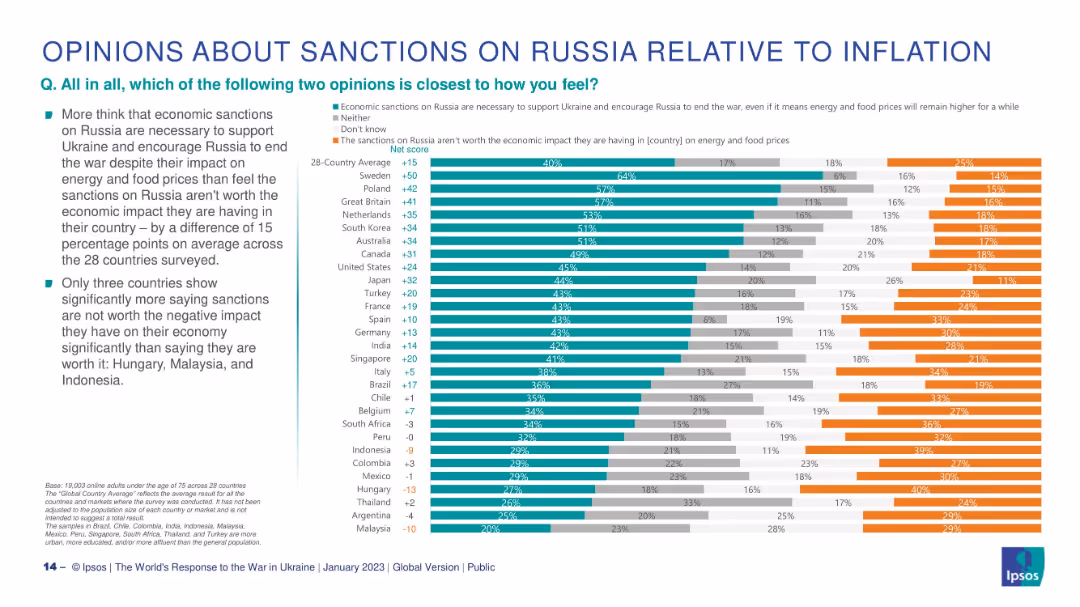
Horizontal stacked bar chart per country; green = pro-sanctions, orange = anti-sanctions, gray = neutral/don’t know.
Pricing Strategies
Government & Public Sector
This slide explores whether citizens think economic sanctions on Russia are justified despite inflation. It shows a 28-country net score comparison with only 3 countries (Hungary, Malaysia, Indonesia) predominantly opposing sanctions due to economic consequences.
sanctions, inflation, economic impact, Ukraine, public opinion, Ipsos, international response
false
Pricing Strategies
Government & Public Sector
Mixed Chart
IPSOS
Add to my slides
Remove from favorites
This slide features a column chart with vertical bars representing FL CET1 erosion under adverse scenarios, labeled with numerical values. There are dotted lines indicating peer and system averages, with a mix of icons representing different countries. The slide has a header with the Santander logo, a slide number, and the word 'Strength' in the top right corner. It employs a color scheme of light and dark blue tones.
Financial Performance
Financial Services
The slide displays the bank's resilience in adverse conditions by comparing the CET1 capital erosion against peers, indicating Santander's position as the strongest bank. It would be used in presentations to show financial stability and strength to stakeholders such as investors or analysts.
Santander, EBA Stress Test, Financial Resilience, Adverse Scenarios, European Banking, Capital Erosion, Peer Comparison, Strength, Financial Stability
false
Financial Performance
Financial Services
Single Chart
Morgan Stanley
Add to my slides
Remove from favorites
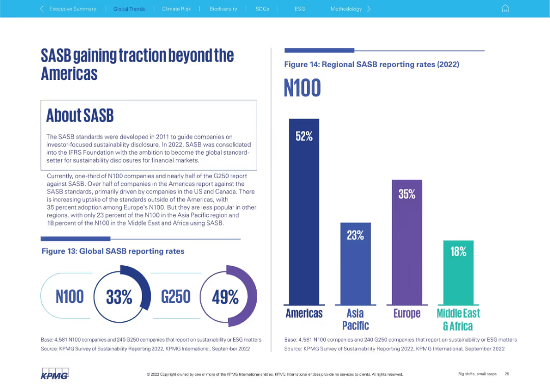
Left side explains SASB framework; right shows global and regional adoption bar charts
Regulatory and Compliance
Professional Services
Discusses adoption of the SASB framework for sustainability disclosure. It shows that the Americas lead (52%), followed by Europe (35%), with lower uptake in Asia Pacific (23%) and Middle East & Africa (18%). Global rates for N100 and G250 are also included.
SASB, sustainability disclosure, ESG standards, global adoption, Americas, G250, N100
false
Regulatory and Compliance
Professional Services
Multiple Chart
KPMG
Add to my slides
Remove from favorites
Contains multiple mini graphs showing growth rates across various industries like agriculture and renewable energies.
Market Analysis and Trends
Technology & Software
Continues from the previous slide, detailing growth rates and revenue impacts of satellite data across more specific industries.
Satellite data, industry growth, agriculture, energy, data utilization
false
Market Analysis and Trends
Technology & Software
Single Chart
PwC/Strategy&
Add to my slides
Remove from favorites
Slide contains a combination of graphs and lists detailing revenue enabled, growth rates, and data utilization across Europe.
Market Analysis and Trends
Technology & Software
Analyzes the economic benefits derived from satellite data by intermediate users in Europe, highlighting growth rates and revenue across different sectors.
Satellite data, revenue, growth rate, Europe, economic impact
false
Market Analysis and Trends
Technology & Software
Multiple Chart
PwC/Strategy&
Add to my slides
Remove from favorites
This slide lists key technological advancements in space technology with corresponding images and descriptions.
Technology and Digital Transformation
Technology & Software
Discusses advancements in satellite technology, modular assembly, and the architectural shift towards LEO constellations.
satellite technology, LEO constellations, SWaP, assembly industrialization
false
Technology and Digital Transformation
Technology & Software
Header Horizontal
McKinsey
Add to my slides
Remove from favorites
A split comparative slide, with top 5 factors for customer satisfaction listed on the left under green and red icons for promoters and detractors respectively, with simple icons and short texts.
Market Analysis and Trends
Retail & E-commerce
This slide compares customer satisfaction factors, with "Variety", "Price", and "Availability" being top drivers, and "Promotions" and "Quality" noted as well.
satisfaction, customer, variety, price, availability, promotions, quality, factors, comparison, e-commerce
false
Market Analysis and Trends
Retail & E-commerce
Boxed
Bain
Add to my slides
Remove from favorites
The slide features a column chart displaying satisfaction levels (percentage very/somewhat satisfied) with various technologies like identity solutions, DCRs, CMPs, etc.
Technology and Digital Transformation
Technology & Software
The slide compares user satisfaction across different privacy-preserving technologies, indicating that satisfaction with DCRs is comparable to more established solutions.
satisfaction, DCRs, privacy technologies, comparison
false
Technology and Digital Transformation
Technology & Software
Mixed Chart
IPSOS
Add to my slides
Remove from favorites
Two sections: a column chart on satisfaction drivers and a column chart on issues faced by EV owners, with detailed metrics on various satisfaction aspects.
Market Analysis and Trends
Transportation & Logistics
Identifies the primary drivers of EV owner satisfaction and key issues they face, with emphasis on driving experience and operating costs.
satisfaction drivers, issues, EV owners, survey, regional comparison
false
Market Analysis and Trends
Transportation & Logistics
Multiple Chart
PwC/Strategy&
Add to my slides
Remove from favorites
Two comparative charts: satisfaction levels with current EVs and willingness to switch back to ICE vehicles across different regions.
Market Analysis and Trends
Transportation & Logistics
Evaluates the satisfaction levels of EV owners and their willingness to return to ICE vehicles, showing high satisfaction but some inclination to switch back.
satisfaction, EV owners, ICE vehicles, survey, regional comparison
false
Market Analysis and Trends
Transportation & Logistics
Multiple Chart
PwC/Strategy&
Add to my slides
Remove from favorites
Left-aligned text with star icons and right-aligned circular charts comparing satisfaction levels across healthcare types.
Market Analysis and Trends
Healthcare & Pharmaceuticals
Compares satisfaction levels between non-traditional and traditional healthcare services, showing that satisfaction is similar across both types.
satisfaction, healthcare, comparison, traditional, non-traditional
false
Market Analysis and Trends
Healthcare & Pharmaceuticals
Multiple Chart
Accenture
Add to my slides
Remove from favorites
The slide features a column chart illustrating satisfaction levels across various brands, with categories for Net Satisfaction, Satisfactory, Sufficient, and Underwhelming. Background image includes a consumer.
Market Analysis and Trends
Consumer Goods
Shows consumer satisfaction with luxury brands, highlighting areas of high and low satisfaction. Useful for understanding brand performance in consumer perception.
Satisfaction, luxury, consumer, brand, analysis, trends
false
Market Analysis and Trends
Consumer Goods
Mixed Chart
BCG
Add to my slides
Remove from favorites
The slide is divided into two sections, comparing satisfaction between offline and online experiences. The left side shows offline satisfaction at 100, and the right side shows online satisfaction at 125.
Customer and Market Segmentation
Consumer Goods
Compares satisfaction levels of luxury brands' offline experiences to their online counterparts, indicating higher satisfaction with online services.
Satisfaction, online, offline, luxury, comparison
false
Customer and Market Segmentation
Consumer Goods
Single Chart
BCG
Add to my slides
Remove from favorites
Slide includes three stacked column charts for Île-de-France, Auvergne-Rhône-Alpes, and Hauts-de-France with green, gray, and red color coding representing satisfaction levels from 2022 to 2023.
Market Analysis and Trends
Government & Public Sector
Evaluates satisfaction levels with policies to attract foreign investment across three French regions, highlighting improvements or declines.
satisfaction, policies, foreign investment, Île-de-France, Auvergne-Rhône-Alpes, Hauts-de-France, 2022, 2023, regional development
false
Market Analysis and Trends
Government & Public Sector
Multiple Chart
Bain
Add to my slides
Remove from favorites
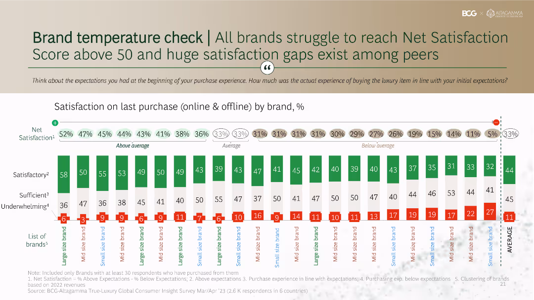
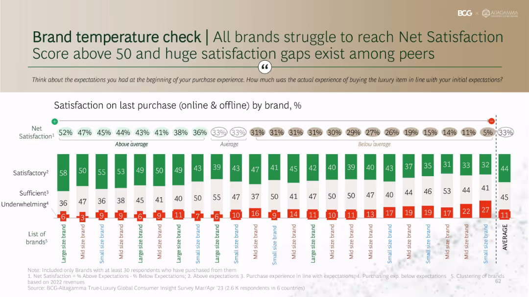
Stacked bar chart showing satisfaction levels by brand with net satisfaction scores above each. Organized by large, mid, and small-size brands.
Performance Metrics and KPIs
Consumer Goods
Benchmarks net satisfaction across brands based on purchase experiences. Shows variation in customer perception of experience quality, with most brands scoring under 50. Highlights that underwhelming experiences are frequent and satisfaction gaps persist across brand tiers.
satisfaction score, brand comparison, net promoter score, expectations, consumer evaluation
false
Performance Metrics and KPIs
Consumer Goods
Single Chart
BCG
Add to my slides
Remove from favorites
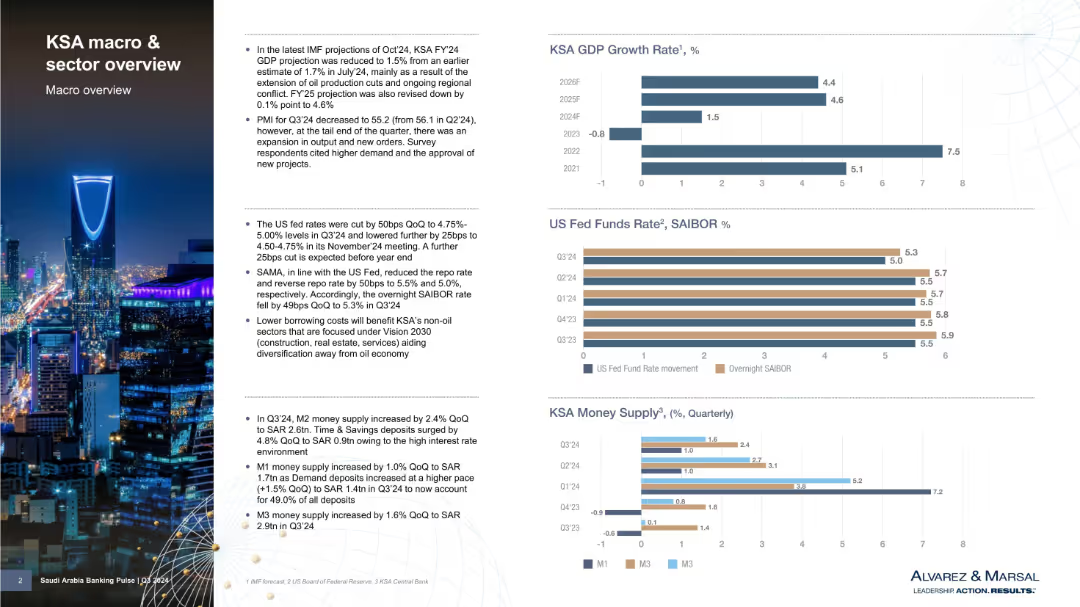
Two-column layout with bullet points on left and bar charts on right showing economic indicators; cityscape image background
Market Analysis and Trends
Government & Public Sector
Provides a macroeconomic overview of Saudi Arabia (KSA), including GDP forecasts, monetary policy shifts, and money supply data. Notes lower GDP projections due to oil cuts and outlines implications of US Fed rate changes and KSA’s monetary response. Includes three key financial indicator charts.
Saudi Arabia, GDP growth, oil production, monetary policy, money supply, SAIBOR, economic forecast, Vision 2030, IMF, financial outlook
false
Market Analysis and Trends
Government & Public Sector
Multiple Chart
Alvarez & Marsal
Add to my slides
Remove from favorites
Maintains Ipsos design format: question and title on left, bar graph of positive sentiment on right.
Market Analysis and Trends
Government & Public Sector
The slide reports international public sentiment toward Saudi Arabia’s influence over the next decade. Ratings are relatively low, with significant country-by-country differences and many showing declines.
Saudi Arabia, global influence, perception, public opinion, Ipsos, bar graph, sentiment rating, country ranking, 2024 trends
false
Market Analysis and Trends
Government & Public Sector
Mixed Chart
IPSOS
Add to my slides
Remove from favorites
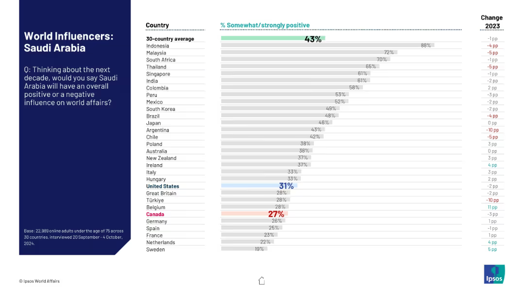
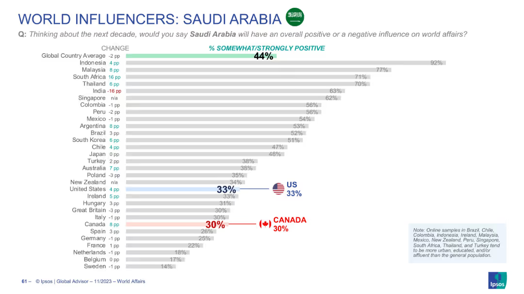
Ranked horizontal bar chart, showing global opinion by country on Saudi Arabia’s influence, with emphasis on US and Canada positions.
Market Analysis and Trends
Government & Public Sector
Opinions on Saudi Arabia’s influence are mixed globally, with a 44% average positive sentiment. Indonesia is most favorable, while Western nations like Canada and the US hover around 30%.
Saudi Arabia, influence perception, Ipsos, world opinion, comparative analysis, bar chart, global ranking
false
Market Analysis and Trends
Government & Public Sector
Single Chart
IPSOS
Add to my slides
Remove from favorites
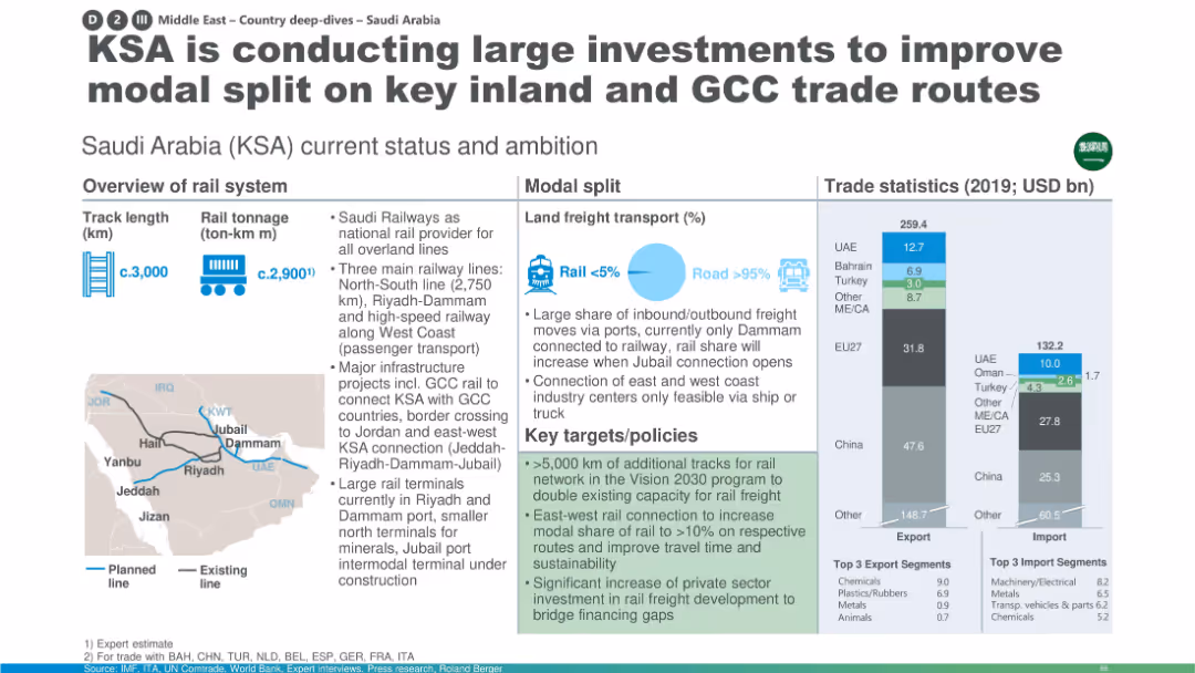
Overview map, infrastructure stats, trade bar charts, modal split pie chart, and policy box in green.
Strategic Planning
Transportation & Logistics
This slide highlights Saudi Arabia’s large-scale investments in rail to shift freight from road to rail. It describes ongoing and planned infrastructure projects, emphasizing GCC connectivity and increased private investment. Trade statistics and track maps reinforce the strategy.
Saudi Arabia, KSA rail, modal shift, GCC trade, infrastructure investment, rail terminals, freight capacity, Vision 2030
false
Strategic Planning
Transportation & Logistics
Multiple Chart
Roland Berger
Add to my slides
Remove from favorites
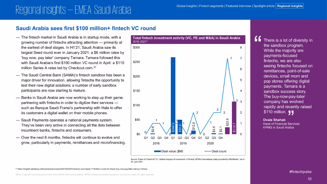
Structure includes left-side summary, chart in middle, and quote on right. Blue and purple tones. Minimalist yet data-rich visual layout.
Investment Analysis
Financial Services
Saudi Arabia’s fintech sector saw its first $100M+ VC round in H1 2021, with Tamara leading the wave. The slide discusses sandbox program support, bank partnerships, and increased fintech interest in payments and remittances.
Saudi Arabia, Tamara, VC Round, Sandbox, Fintech, Investment, Payments, Remittances
false
Investment Analysis
Financial Services
Mixed Chart
KPMG
Add to my slides
Remove from favorites
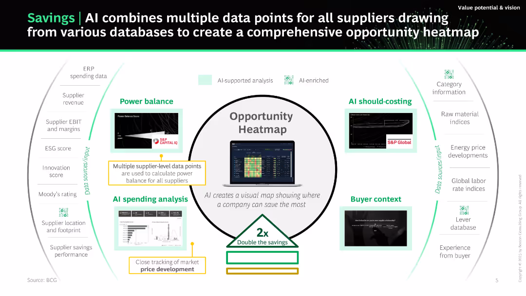
Circular central graphic ("Opportunity Heatmap") surrounded by AI modules and data input categories. Uses labeled arrows and iconography to show data interaction and outcomes.
Performance Metrics and KPIs
Technology & Software
Demonstrates how AI aggregates and analyzes data across suppliers to identify cost-saving opportunities. Modules like power balance, spending analysis, and buyer context are presented as AI-enhanced components. Aims to double cost savings through data-driven insights.
savings, AI, suppliers, data, opportunity heatmap, procurement, analytics, KPIs, ERP
false
Performance Metrics and KPIs
Technology & Software
Uncategorized
BCG
Add to my slides
Remove from favorites
This slide consists of several small graphics representing different financial contributions, alongside percentage comparisons for two consecutive years. The slide is visually balanced, with easy-to-understand icons and clear text descriptions.
Market Analysis and Trends
Financial Services
It outlines the shift in employee contributions to various savings and debt repayment plans, potentially serving as a discussion starter for financial planning trends and HR benefits design in the context of economic changes.
savings contributions, financial planning, employee behavior
false
Market Analysis and Trends
Financial Services
Boxed
Goldman Sachs
Add to my slides
Remove from favorites
Bar chart showing various savings goals among Canadians pre-COVID-19. Bars indicate the percentage of respondents with 'Yes', 'No', and 'Not applicable' responses for each savings goal. Dense text at the top explains the context.
Market Analysis and Trends
Financial Services
The slide presents data on the savings goals of Canadian investors before COVID-19, highlighting the percentage contributing to goals such as retirement, travel, and education. It notes gender differences and the high proportion of younger investors saving for these goals.
Savings, Goals, Canadians, Retirement, Travel, Education
false
Market Analysis and Trends
Financial Services
Mixed Chart
IPSOS
Add to my slides
Remove from favorites
This slide illustrates the 'say-do' gap in consumer behavior with two bar graphs, juxtaposing declared intentions against actual purchasing behavior. The bars are color-coded to distinguish between different countries in the SEA region. The layout is well-organized, facilitating comparison.
Market Analysis and Trends
Environmental Services & Sustainability
Analyzing the discrepancy between consumers' sustainability intentions and their actual purchasing actions in the SEA region. The slide is applicable for discussions on consumer behavior, marketing strategies, and the challenges in promoting sustainable practices.
say-do gap, sustainability, SEA, consumer behavior, purchasing actions, marketing strategies
false
Market Analysis and Trends
Environmental Services & Sustainability
Multiple Chart
Bain
Add to my slides
Remove from favorites
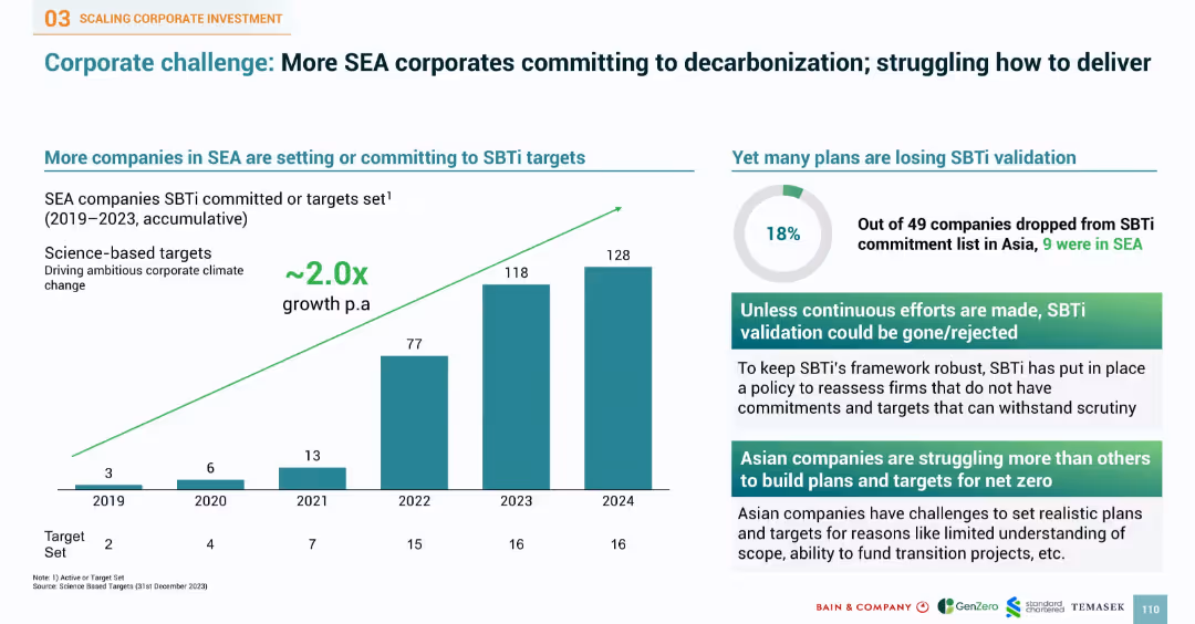
Bar chart of SBTi commitments over years and pie chart of validation loss. Right side provides insights into corporate struggles and requirements for target credibility.
Performance Metrics and KPIs
Industrial & Manufacturing
Reviews the increase in SEA companies committing to SBTi targets, with commitments doubling annually. Notes 18% failure rate in maintaining validation. Points to challenges such as plan credibility, funding gaps, and target scope issues. Underscores the need for continuous efforts to meet stringent validation frameworks and credibility in climate goal setting.
SBTi, SEA corporates, decarbonization, validation, climate targets, science-based targets, KPI, commitment, emissions
false
Performance Metrics and KPIs
Industrial & Manufacturing
Multiple Chart
Bain
Add to my slides
Remove from favorites
Slide includes two column representations. The design is comprehensive with a systematic arrangement of sections, facilitating a clear understanding of complex processes.
Strategic Planning
Environmental Services & Sustainability
Discusses strategies to enhance the viability and scale of projects within the carbon trading sector, emphasizing regulatory improvements and market accessibility. It also highlights key actions for accelerating growth and development in the sector.
scalability, carbon trading, regulations, market access, strategic actions
false
Strategic Planning
Environmental Services & Sustainability
Header Horizontal
Bain
Add to my slides
Remove from favorites
The slide contains line charts comparing scale versus valuation and growth-adjusted EBITDA multiples versus leverage for large-cap and small-cap firms.
Investment Analysis
Financial Services
The slide analyzes the impact of scale and conservative capital structures on valuations and growth potential. It shows that larger, conservatively leveraged firms receive higher valuation premiums and credits for growth. This slide is suitable for investment analysis and strategy formulation discussions.
scale, capital structure, leverage, valuation, growth
false
Investment Analysis
Financial Services
Multiple Chart
JP Morgan
Add to my slides
Remove from favorites
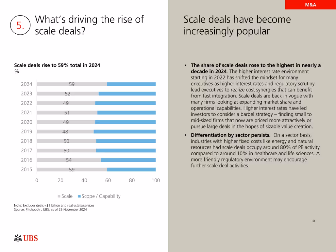
Horizontal bar chart on scale vs. scope deals; explanatory commentary on the right
Mergers and Acquisitions
Financial Services
Explores why scale deals (59% in 2024) are gaining popularity due to interest rates, regulatory pressure, and the need for rapid integration. Notes sector-specific advantages in energy and fixed cost industries.
scale deals, M&A trends, interest rates, regulatory scrutiny, value creation, private equity
false
Mergers and Acquisitions
Financial Services
Mixed Chart
UBS
Add to my slides
Remove from favorites
The slide features multiple line charts comparing valuation premiums and EBITDA multiples across different company sizes.
Investment Analysis
Financial Services
This slide examines the scale advantages in trading premiums for large companies compared to smaller ones.
Scale, trading premium, EBITDA, line chart, comparative analysis
false
Investment Analysis
Financial Services
Multiple Chart
JP Morgan
Add to my slides
Remove from favorites
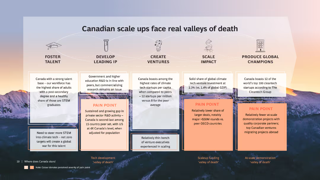
The slide includes multiple text boxes highlighting pain points for Canadian scale-ups, with icons for talent, IP, ventures, impact, and champions. It has a backdrop of mountains at sunset and a detailed discussion of various challenges.
Market Analysis and Trends
Technology & Software
Discusses the challenges faced by Canadian scale-ups in climate tech, focusing on talent, R&D, scaling, and producing global champions. Highlights specific pain points and suggests areas for improvement.
Scale-ups, Climate tech, Canada, Challenges, Analysis
false
Market Analysis and Trends
Technology & Software
Table
BCG
Add to my slides
Remove from favorites
Three-column chart with headers for WM Client Assets, Fee-Based Assets, and Client Relationships, each with key figures and ranks. Clean design with prominent blue highlights.
Financial Performance
Financial Services
Demonstrates Morgan Stanley's market position with total client assets, fee-based assets, and client relationships, emphasizing leadership and scale.
Scale, wealth management, market position, client assets, fee-based, client relationships, market leadership
false
Financial Performance
Financial Services
Table
Goldman Sachs
Add to my slides
Remove from favorites
Multiple bar and column graphs, with a clean layout displaying JPMorgan's asset management performance metrics.
Financial Performance
Financial Services
This slide aims to communicate JPMorgan's strategy and success in scaling asset management, using data visualizations to highlight growth in various investment types and to position themselves as industry leaders with effective ETFs and SMAs.
scaling, asset management, JPMorgan, ETFs, performance
false
Financial Performance
Financial Services
Multiple Chart
JP Morgan
Add to my slides
Remove from favorites
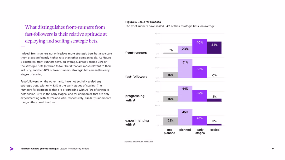
Horizontal bar chart compares four company types on strategic bet scaling. Left column text highlights key insight.
Strategic Planning
Artificial Intelligence
Illustrates how front-runners lead in scaling strategic AI bets, with 34% already scaled and 40% in early stages. Compares progress of other company groups, emphasizing slower scaling among fast-followers and those experimenting. Reinforces that the ability to scale is a differentiator in AI success.
scaling, strategic bets, front-runners, AI success, fast-followers
false
Strategic Planning
Artificial Intelligence
Mixed Chart
Accenture
Add to my slides
Remove from favorites
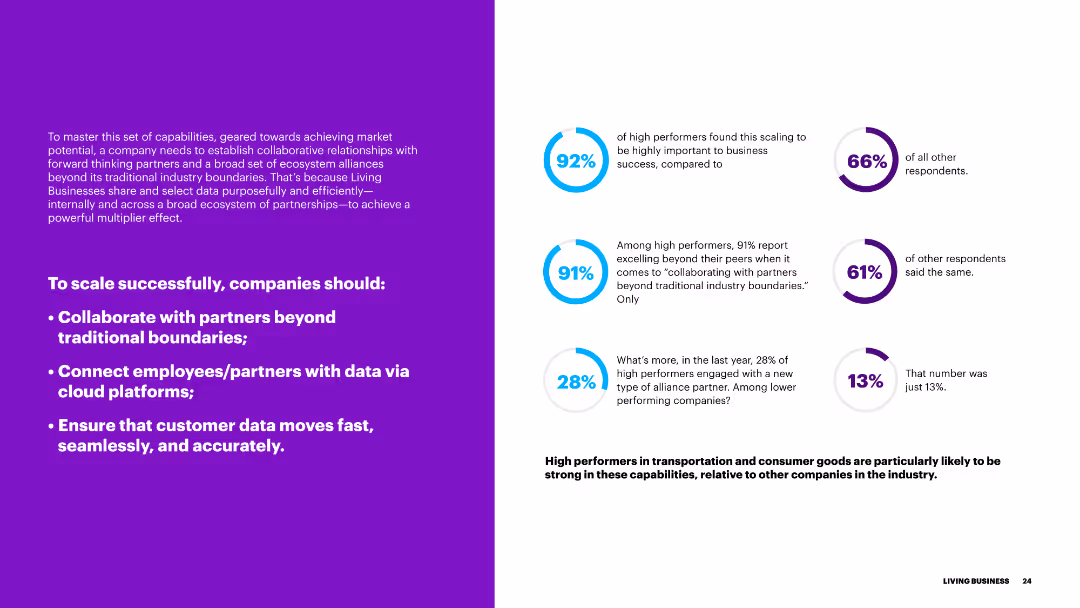
The slide includes text on the left and progress indicators on the right, discussing the key strategies for scaling a business, such as partnerships, data connectivity, and efficient data movement.
Strategic Planning
Transportation & Logistics
This slide presents strategies for successful business scaling, emphasizing collaboration, data connectivity, and efficient data management to enhance business operations.
scaling, strategies, partnerships, data connectivity, efficiency, business operations
false
Strategic Planning
Transportation & Logistics
Multiple Chart
Accenture
Add to my slides
Remove from favorites
A bar chart showing responses to an investment scam during the pandemic, with a small pie chart indicating whether respondents reported the scam to authorities.
Risk Assessment and Management
Financial Services
This slide covers how Canadian investors responded to investment scams during the pandemic, showing percentages of those who invested, realized it was a scam, or reported it to authorities.
scam, investment, pandemic, response, report
false
Risk Assessment and Management
Financial Services
Multiple Chart
IPSOS
Add to my slides
Remove from favorites
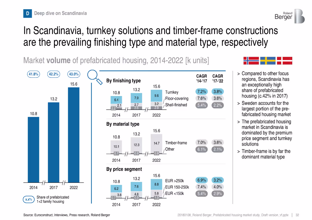
Regional deep dive with volume chart and breakdowns by finishing, material, and price
Customer and Market Segmentation
Real Estate & Construction
Scandinavia leads in share of prefabricated housing, with a strong preference for turnkey and timber-frame. Sweden is the largest contributor in the region. The market skews toward higher-price segments and premium finishes.
Scandinavia, turnkey, timber-frame, prefabricated, premium segment, Sweden, housing
false
Customer and Market Segmentation
Real Estate & Construction
Multiple Chart
Roland Berger
Add to my slides
Remove from favorites
Previous
Next
You don't have any favorites yet.
Please wait loading your favorites slides...
Create a FREE account to continue browsing
Receive Instant Access to 1,000+ slides from companies like McKinsey, Google, and Goldman Sachs
First Name
Last Name
Email
Password
I agree to all
Terms & Privacy Policy
Thank you! Your submission has been received!
Oops! Something went wrong while submitting the form.
Have an account?
Sign in
Upgrade to PRO to Save slides
Advanced Search and Filters
Access to 15,000+ slides
Access to Category Pages
Save/Bookmark Slides
PowerPoint Template Library
Pick a Plan
MONTHLY
$12/month
Billed every month, Cancel anytime.
YEARLY
$9/year
Billed $108 annually, Cancel anytime.
Checkout for $12/month
Checkout for $108/yr
Secured by Stripe | AES-256 bit encryption