My Account
My Slides
Search by Category
Pricing
Templates
View All Templates
Download Template Slides
✦ AI Search
Feedback
Login
Logout
Get Started
Browse all Slides
Browse all Slides
Create a FREE Account
Instant access to 1,000+ real slides from top companies like McKinsey, BCG, Goldman Sachs, Google and many more!
First Name
Last Name
Email
Password
I agree to all
Terms & Privacy Policy
Thank you! Your submission has been received!
Oops! Something went wrong while submitting the form.
Have an account?
Sign in
Saved Slides
Total No. of slides saved
0
↻ Refresh
✖ Clear all
This slide features a column chart displaying expected changes in second-hand consumption across various markets post-pandemic. The chart uses three color bars for "More," "About the same," and "Less." The text includes a question and survey details.
Market Analysis and Trends
Consumer Goods
The slide shows survey data on anticipated changes in second-hand purchasing behaviors post-pandemic, with comparisons across different global markets.
second-hand, consumption, market trends, survey, global behavior
false
Market Analysis and Trends
Consumer Goods
Multiple Chart
IPSOS
Add to my slides
Remove from favorites
Simple layout with a single column chart illustrating consumer responses to purchasing second-hand luxury items.
Market Analysis and Trends
Retail & E-commerce
Focuses on the reasons driving consumer interest in second-hand luxury products, including perceived value and exclusivity.
Second-hand luxury, consumer behavior, purchasing reasons, perceived value, exclusivity, market insights, consumer trends
false
Market Analysis and Trends
Retail & E-commerce
Mixed Chart
BCG
Add to my slides
Remove from favorites
Four icons representing different drivers of second-hand luxury.
Market Analysis and Trends
Retail & E-commerce
Highlights the four main drivers influencing the second-hand luxury market: professionalization, consumer preferences, broader access to products, and improved price/quality ratio.
second-hand, luxury, drivers, market, consumer
false
Market Analysis and Trends
Retail & E-commerce
Pillar
BCG
Add to my slides
Remove from favorites
Slide shows two column charts comparing the growth of the luxury second-hand market against the total personal luxury market.
Market Analysis and Trends
Retail & E-commerce
Examines the growth of the second-hand luxury market, projecting significant increases and discussing market share.
Second-hand luxury, market growth, market analysis, trends, market share, projections, personal luxury
false
Market Analysis and Trends
Retail & E-commerce
Multiple Chart
BCG
Add to my slides
Remove from favorites
Column charts, geographic distribution charts.
Market Analysis and Trends
Retail & E-commerce
Analyzes trends in the secondhand luxury goods market.
secondhand, luxury, market, growth, US
false
Market Analysis and Trends
Retail & E-commerce
Mixed Chart
Bain
Add to my slides
Remove from favorites
Slide features two sets of column charts and a list of bar charts. Colors vary across charts to differentiate data, using green and grayscale tones.
Market Analysis and Trends
Retail & E-commerce
Slide presents data on second-hand luxury goods purchasing preferences and the most commonly used online platforms by geography in 2018.
second-hand luxury, online shopping, market trends, consumer behavior, platform usage
false
Market Analysis and Trends
Retail & E-commerce
Multiple Chart
BCG
Add to my slides
Remove from favorites
Slide includes stacked column charts representing participation in the second-hand market by age group, in varying shades of green.
Market Analysis and Trends
Retail & E-commerce
Analyzes the age-related dynamics of the second-hand luxury market, showing how younger generations are more active participants.
second-hand market, consumer demographics, luxury goods, age comparison, market participation
false
Market Analysis and Trends
Retail & E-commerce
Multiple Chart
BCG
Add to my slides
Remove from favorites
Slide contains a column chart analyzing the second-hand luxury market across various products and geographies.
Market Analysis and Trends
Retail & E-commerce
Provides insights into the growth and characteristics of the second-hand luxury goods market, emphasizing its popularity among younger consumers.
second-hand market, luxury goods, market trends, consumer behavior, generational impact
false
Market Analysis and Trends
Retail & E-commerce
Mixed Chart
Bain
Add to my slides
Remove from favorites
Icons, text blocks, arrows.
Market Analysis and Trends
Retail & E-commerce
Examines new business models like co-ownership.
second-hand, rental, luxury, co-ownership
false
Market Analysis and Trends
Retail & E-commerce
Vertical Flow
Bain
Add to my slides
Remove from favorites
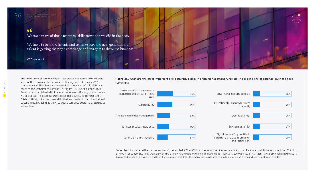
The slide contains a column chart ranking the key skills needed for the second line of defense in risk management over the next five years, highlighting communication and critical thinking.
Human Resources and Talent Management
Financial Services
It focuses on the skills necessary for the second line of defense in risk management, with a strong emphasis on soft skills like communication, leadership, and critical thinking. This is aimed at enhancing the effectiveness of the second line of defense.
second line, risk management, skills, communication, critical thinking
false
Human Resources and Talent Management
Financial Services
Multiple Chart
EY
Add to my slides
Remove from favorites
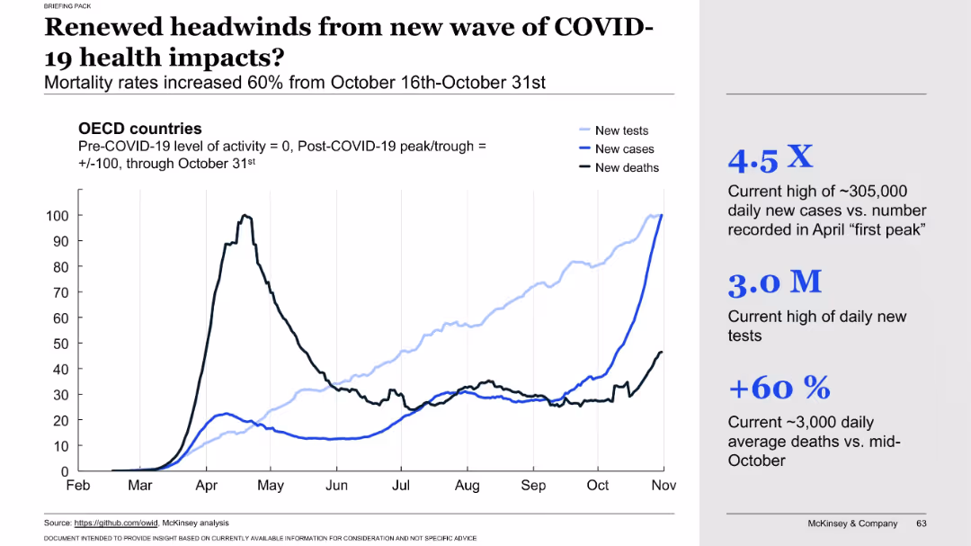
Line chart showing OECD country data (tests, cases, deaths) through October 31. Annotated metrics on the right highlight testing volume, case surge, and death rate increase.
Risk Assessment and Management
Healthcare & Pharmaceuticals
Warns of a resurgence in COVID-19 health impacts as data from late October shows significant increases in new cases, tests, and deaths. The chart visually confirms the renewed health risks and underscores the pandemic’s continued volatility.
second wave, health impact, mortality surge, new infections, testing volume, COVID-19 resurgence, OECD trends, death rate, late October data, public health threat
false
Risk Assessment and Management
Healthcare & Pharmaceuticals
Mixed Chart
McKinsey
Add to my slides
Remove from favorites
Features multiple line graphs with color coding to differentiate between sectors. Includes a sidebar with explanations and a dashed line indicating the normal state.
Market Analysis and Trends
Government & Public Sector
Shows sector-wise activity across time with a focus on the impact of COVID-19 on industrial sectors and their recovery phase.
sector activity, industrial recovery, COVID-19 impact, line graphs
false
Market Analysis and Trends
Government & Public Sector
Single Chart
BCG
Add to my slides
Remove from favorites
Contains multiple column charts showing sector distribution over five years and bar charts displaying business stage distribution.
Strategic Planning
Technology & Software
Provides a comparative analysis of sectoral shifts and business stage distribution from 2015 to 2019, highlighting trends and changes.
sectoral, distribution, trends, business, analysis
false
Strategic Planning
Technology & Software
Multiple Chart
Accenture
Add to my slides
Remove from favorites
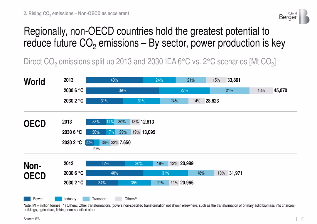
Stacked horizontal bars show CO₂ emissions by sector for World, OECD, and Non-OECD.
Market Analysis and Trends
Environmental Services & Sustainability
Breaks down current and projected CO₂ emissions by sector and region, emphasizing power sector transformation in non-OECD countries as essential for mitigation.
sectoral emissions, OECD, non-OECD, power, climate targets
false
Market Analysis and Trends
Environmental Services & Sustainability
Single Chart
Roland Berger
Add to my slides
Remove from favorites
A column chart depicting MVR employment losses in over-represented sectors with different colors for each sector, and a green line indicating aggregate share of the economy.
Market Analysis and Trends
Professional Services
This slide analyzes the impact of employment losses in various over-represented sectors in the Metro Vancouver economy, highlighting the percentage of workers affected.
Sectoral impact, employment losses, Metro Vancouver, economy, over-represented sectors
false
Market Analysis and Trends
Professional Services
Single Chart
Deloitte
Add to my slides
Remove from favorites
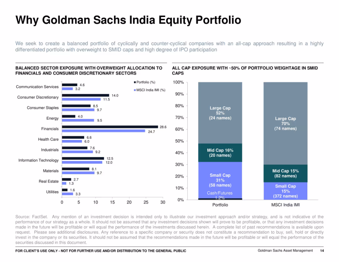
Dual-chart layout: left shows bar chart of sector allocation (Portfolio vs. MSCI India IMI), right shows stacked bar chart of cap exposure (large, mid, small caps); white background with light grid.
Customer and Market Segmentation
Financial Services
Details portfolio sector diversification and market cap exposure. It shows overweighting in Financials and Consumer Discretionary, and significant SMID cap participation compared to the benchmark, positioning the portfolio for growth opportunities and IPO exposure.
sector allocation, cap exposure, financials, SMID, India equity, portfolio diversification
false
Customer and Market Segmentation
Financial Services
Multiple Chart
Goldman Sachs
Add to my slides
Remove from favorites
Side-by-side bar chart comparing sector weightings between Mar'24 and Mar'25; directional arrows highlight changes
Strategic Planning
Financial Services
Illustrates how sector allocations within the strategy have shifted over time. The biggest change is a continued underweight in Technology. Positive shifts are seen in Industrials and Consumer Discretionary, indicating a reallocation of capital as market opportunities evolve.
sector allocation, positioning, changes, strategy evolution, J.P. Morgan, year-on-year
false
Strategic Planning
Financial Services
Single Chart
JP Morgan
Add to my slides
Remove from favorites
A bar chart comparing the absolute weightings of different sectors for the Sustainable Emerging Markets Equity Representative Account against the MSCI EM Index.
Strategic Planning
Financial Services
This slide shows the sector allocation for the Sustainable Emerging Markets Equity Representative Account, comparing it with the MSCI EM Index.
Sector Allocation, Sustainable, Emerging Markets, Equity, Financial, Planning, Investment, Weightings, Comparison, MSCI
false
Strategic Planning
Financial Services
Mixed Chart
Morgan Stanley
Add to my slides
Remove from favorites
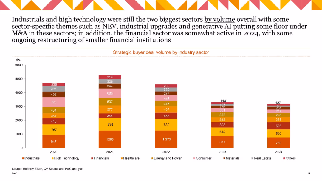
Vertical stacked bar chart with multiple colored segments representing industry sectors; years 2020–2024; moderate drop-off across all sectors.
Customer and Market Segmentation
Financial Services
Displays deal volume across sectors like industrials, tech, healthcare, and financials. Industrials and tech lead, with 2024 showing slight recovery in financials. Highlights themes like NEV, AI, and industrial upgrades.
sector analysis, M&A volume, strategic buyers, 2024, AI, NEV, industrial
false
Customer and Market Segmentation
Financial Services
Single Chart
PwC/Strategy&
Add to my slides
Remove from favorites
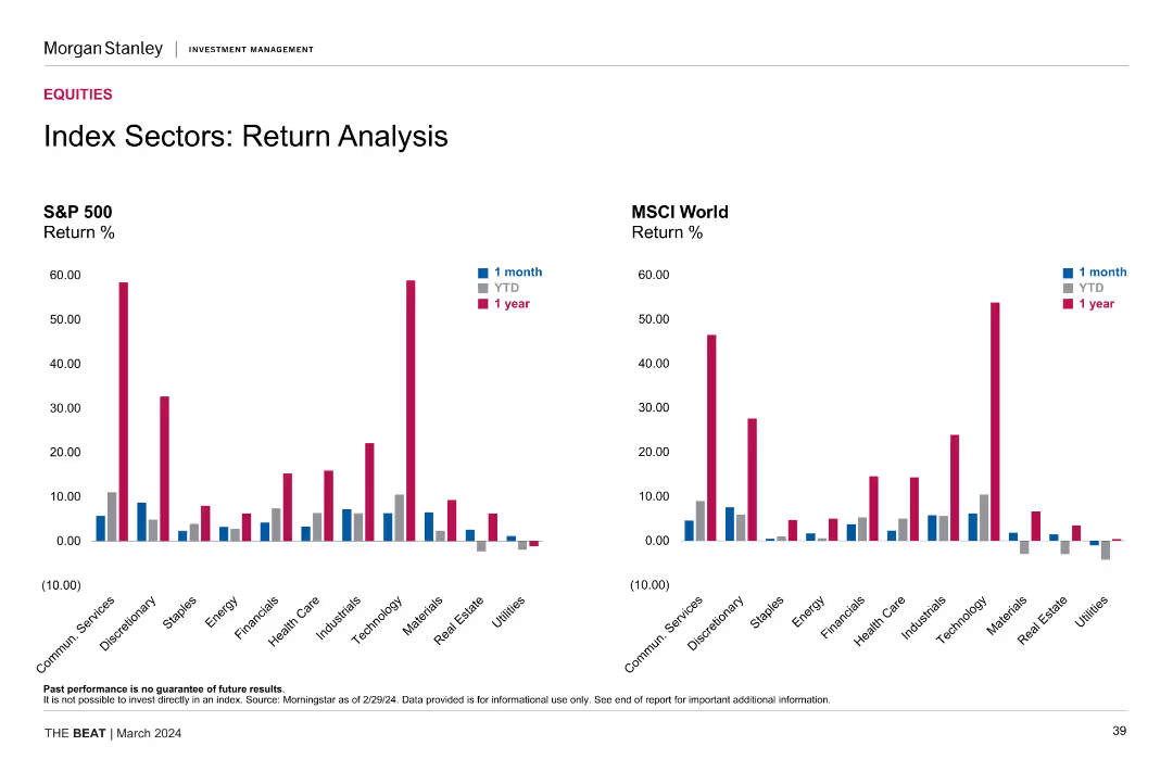
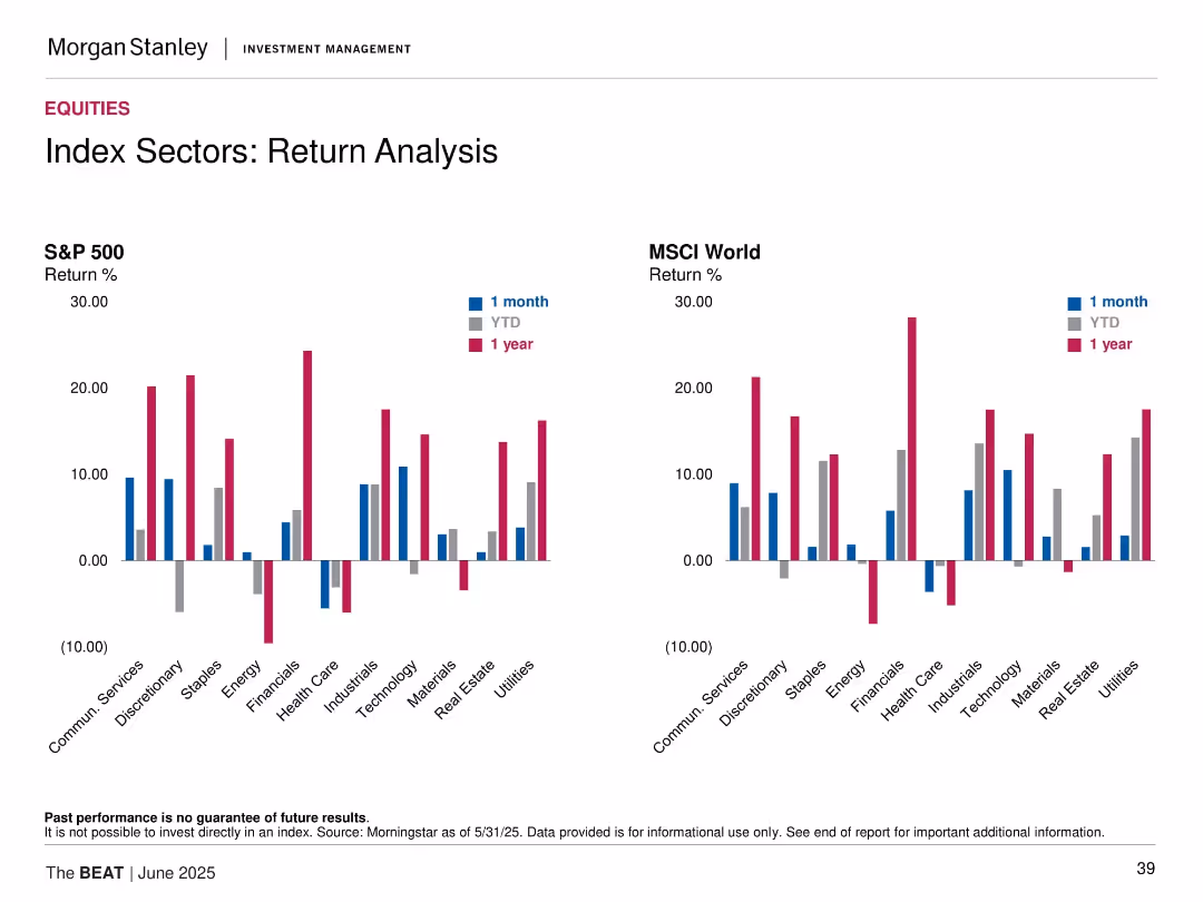
This slide showcases two sets of column charts comparing the 1-month, YTD, and 1-year returns of the S&P 500 and MSCI World indices across various sectors. Each chart uses distinct colors to differentiate between the time periods.
Financial Performance
Financial Services
The slide compares the performance of different sectors within the S&P 500 and MSCI World indices, showing returns over 1-month, YTD, and 1-year periods, helping in understanding sector-specific performance trends.
sector analysis, return analysis, S&P 500, MSCI World, performance comparison, financial metrics, sector returns
false
Financial Performance
Financial Services
Multiple Chart
Morgan Stanley
Add to my slides
Remove from favorites
Features dual comparative column charts showing the return percentage for various sectors within the S&P 500 and MSCI World indices, distinguished by time frames.
Market Analysis and Trends
Financial Services
Designed for sector-specific investment strategies, this slide compares the performance of different sectors within the S&P 500 and MSCI World indices over multiple time frames.
Sector Analysis, S&P 500, MSCI World, Return Percentage, Column Charts, Financial Comparison
false
Market Analysis and Trends
Financial Services
Multiple Chart
Morgan Stanley
Add to my slides
Remove from favorites
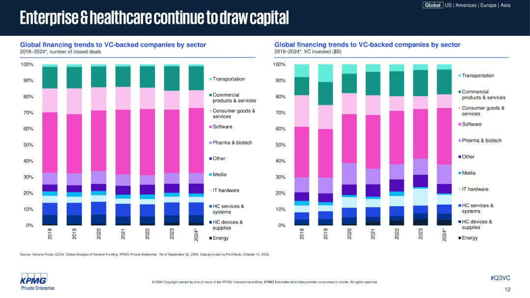
Dual stacked bar charts showing sector-wise deal and investment share, 2018–2024; sectors color-coded; consistent design with prior slides; right chart shows VC $ volume.
Market Analysis and Trends
Healthcare & Pharmaceuticals
This slide breaks down VC deal and investment volume share by industry sectors globally. Enterprise software and healthcare (pharma, biotech, HC services) remain top draws, while sectors like consumer goods and media have more modest shares. The data highlights consistent sector strength.
sector analysis, VC sectors, software, healthcare, biotech, venture funding, investment trends, 2024, sector allocation, KPMG
false
Market Analysis and Trends
Healthcare & Pharmaceuticals
Multiple Chart
KPMG
Add to my slides
Remove from favorites
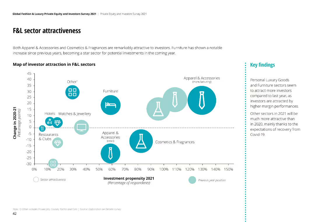
Bubble chart mapping investor attraction in F&L sectors, showing change in attractiveness from 2020-21. Sectors like Apparel & Accessories and Furniture highlighted.
Competitive Landscape
Financial Services
Apparel & Accessories and Cosmetics & Fragrances are highly attractive to investors. Furniture has shown notable increase in investment propensity for 2021.
sector attractiveness, F&L sectors, investor perspective, investment propensity, market trends
false
Competitive Landscape
Financial Services
Mixed Chart
Deloitte
Add to my slides
Remove from favorites
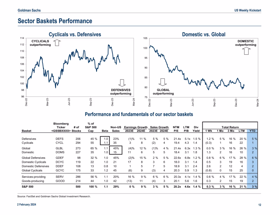
Two line graphs at the top comparing "Cyclicals vs. Defensives" and "Domestic vs. Global," followed by a detailed table showing performance and fundamentals of sector baskets. The layout is grid-based with clearly labeled rows and columns.
Performance Metrics and KPIs
Financial Services
The slide highlights that cyclicals and domestic stocks have outperformed defensives and global counterparts. The bottom table includes basket names, tickers, beta, P/E ratios, and total return performance across different periods. It also shows non-US sales and earnings/sales growth projections, offering a comprehensive view of the structural and fundamental positioning of sector baskets.
sector baskets, cyclicals, defensives, domestic, global, performance, P/E ratio, sales growth, earnings, total return
false
Performance Metrics and KPIs
Financial Services
Multiple Chart
Goldman Sachs
Add to my slides
Remove from favorites
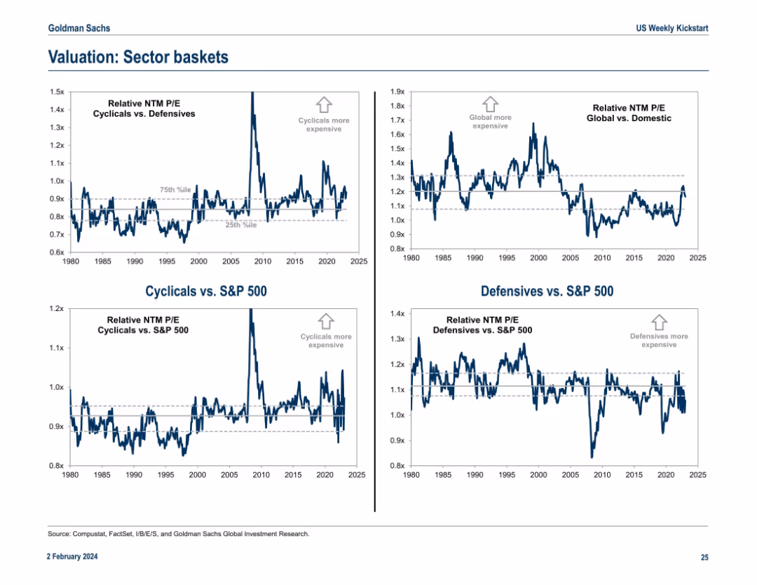
Four-panel chart layout showing NTM P/E valuation comparisons between various sector groupings vs. the S&P 500. Uses historical banding (percentiles) and annotations.
Market Analysis and Trends
Financial Services
This slide shows relative valuation comparisons across sector groupings (Cyclicals vs. Defensives, Global vs. Domestic) using forward-looking P/E ratios. Historical percentile bands help indicate over/under-valuation. It’s designed to highlight market regime shifts or valuation extremes.
sector baskets, valuation, cyclicals, defensives, P/E ratio, trends
false
Market Analysis and Trends
Financial Services
Multiple Chart
Goldman Sachs
Add to my slides
Remove from favorites
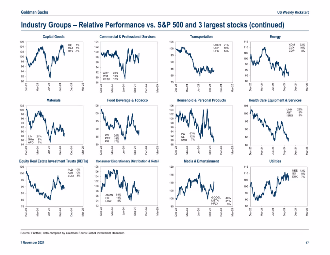
Continuation of slide 17946 with 15 additional industry group charts and key stock annotations
Market Analysis and Trends
Financial Services
Continuation of sector drill-down, covering additional industries like Utilities, Transportation, REITs, and Food & Beverage. Emphasizes leading stocks and relative strength vs. S&P 500.
sector breakdown, REITs, food & beverage, transportation, key stocks, relative trends
false
Market Analysis and Trends
Financial Services
Multiple Chart
Goldman Sachs
Add to my slides
Remove from favorites
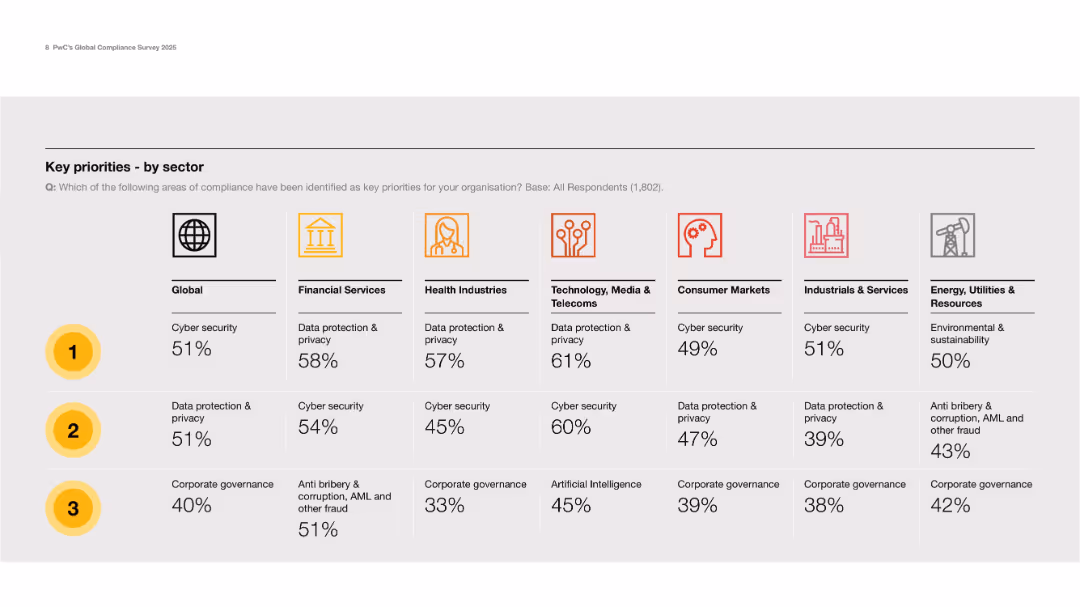
Grid layout with icons for sectors and ranking columns for top 3 priorities per sector.
Strategic Planning
Professional Services
Presents a sector-specific breakdown of top compliance priorities, with cybersecurity and data privacy leading in most sectors. Notably, sustainability and AI also appear prominently in certain industries.
sector comparison, cybersecurity, data privacy, priorities, governance
false
Strategic Planning
Professional Services
Table
PwC/Strategy&
Add to my slides
Remove from favorites
Bar charts showing percentage revenue by sector for various countries under different lockdown conditions, displaying sectors from high to low contact intensity.
Strategic Planning
Financial Services
Analyzes how different sectors are impacted economically by COVID-19 based on their exposure and contact intensity, essential for sector-specific strategies.
sector composition, economic impact, COVID-19, lockdown conditions, contact intensity, revenue impact, strategic planning
false
Strategic Planning
Financial Services
Single Chart
BCG
Add to my slides
Remove from favorites
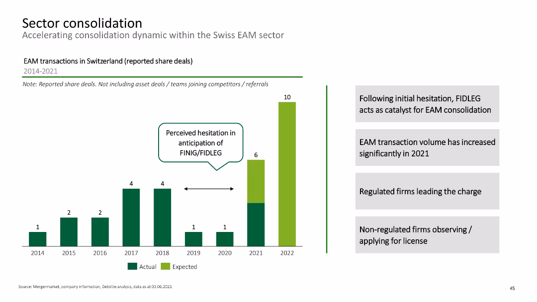
Column chart showing EAM transactions in Switzerland from 2014-2021, with annotations on consolidation catalysts.
Mergers and Acquisitions
Financial Services
This slide discusses the consolidation trends within the Swiss EAM sector, highlighting the impact of regulatory changes.
sector consolidation, EAM transactions, mergers, Swiss market, financial services
false
Mergers and Acquisitions
Financial Services
Mixed Chart
Deloitte
Add to my slides
Remove from favorites
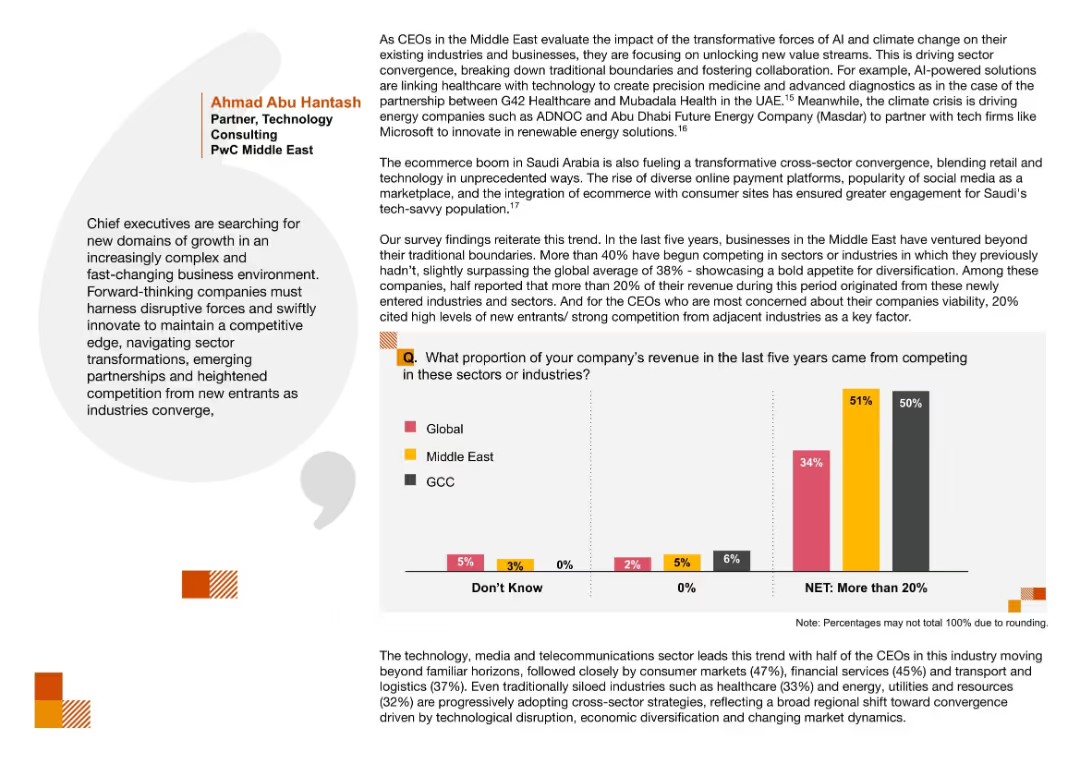
Bar chart comparing revenue from sector crossover activity; emphasis on convergence and quotes from tech/consulting leaders
Market Analysis and Trends
Technology & Software
The slide reveals a trend of cross-sector convergence, with over 50% of GCC and Middle East companies earning revenue from new industry domains. This reflects strategic innovation driven by tech and market shifts.
Sector Convergence, Revenue Diversification, Cross-industry, Innovation, Market Trends, Middle East
false
Market Analysis and Trends
Technology & Software
Mixed Chart
PwC/Strategy&
Add to my slides
Remove from favorites
Multiple bar charts depicting the importance of marketing by employee size, revenue, and sector, with a focus on top and bottom sectors.
Market Analysis and Trends
Professional Services
Analyzes the importance of marketing across different sectors and scales, providing valuable insights for strategic alignment and sector analysis.
sector differences, marketing role, strategic planning, industry comparison, employee impact
false
Market Analysis and Trends
Professional Services
Multiple Chart
Deloitte
Add to my slides
Remove from favorites
This slide uses a bar graph to show the distribution of applications across various sectors like Agriculture, ICT, and Education, alongside a pie chart depicting the business stage (e.g., Idea, Growth) of these applications.
Market Analysis and Trends
Technology & Software
Analyzing the sector distribution and business stage of applications, this slide highlights the predominance of sectors like Agriculture and ICT and shows the maturity stages of these business ideas.
Sector Distribution, Applications, Agriculture, ICT, Education, Business Stage, Analysis, Maturity, Predominance
false
Market Analysis and Trends
Technology & Software
Multiple Chart
Accenture
Add to my slides
Remove from favorites
Utilizes a bar chart and pie chart, display sector distribution and pie charts for business stage distribution.
Strategic Planning
Technology & Software
Analyzes the sector and development stage distribution of applications, focusing on agriculture, ICT, and education as key sectors.
sector, distribution, applications, stage, analysis
false
Strategic Planning
Technology & Software
Multiple Chart
Accenture
Add to my slides
Remove from favorites
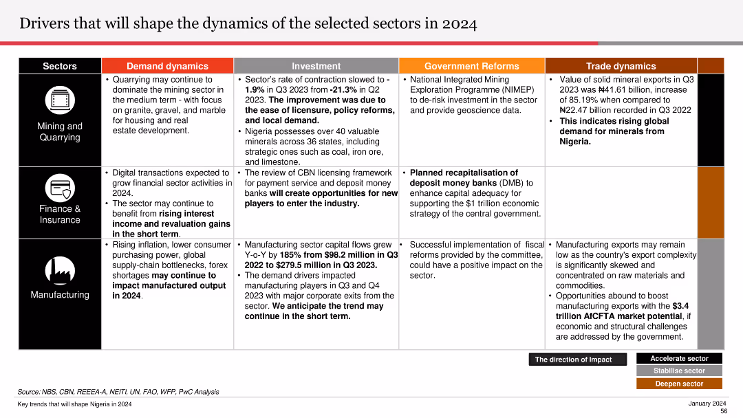
The slide is divided into sections for Mining and Quarrying, Finance & Insurance, and Manufacturing, detailing demand dynamics, investment, and reforms.
Strategic Planning
Industrial & Manufacturing
Outlines factors influencing sector dynamics in 2024, including demand, investment, and government reforms across mining, finance, and manufacturing.
sector dynamics, 2024, mining, quarrying, finance, insurance, manufacturing, investment, reforms
false
Strategic Planning
Industrial & Manufacturing
Table
PwC/Strategy&
Add to my slides
Remove from favorites
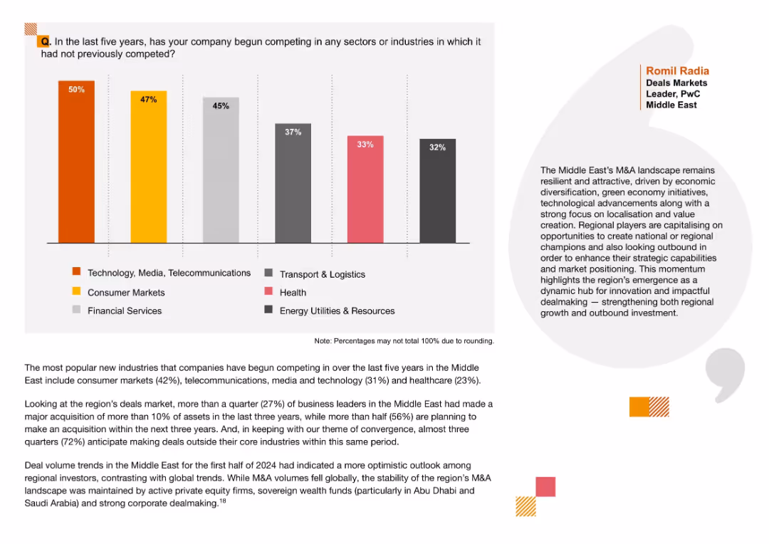
Left-aligned vertical bar chart with labeled segments in different colors; includes brief commentary and a quote on the right; clean layout with side margin and color-coded legend.
Strategic Planning
Professional Services
This slide shows the sectors companies in the Middle East have expanded into over the last five years. The most entered sector is Technology, Media, and Telecommunications (50%), followed by Consumer Markets and Financial Services. Commentary emphasizes regional momentum in M&A activity due to localization, innovation, and green economy initiatives.
sector expansion, M&A, Middle East, localization, diversification, strategic growth, outbound investment, new markets, private equity, dealmaking
false
Strategic Planning
Professional Services
Mixed Chart
PwC/Strategy&
Add to my slides
Remove from favorites
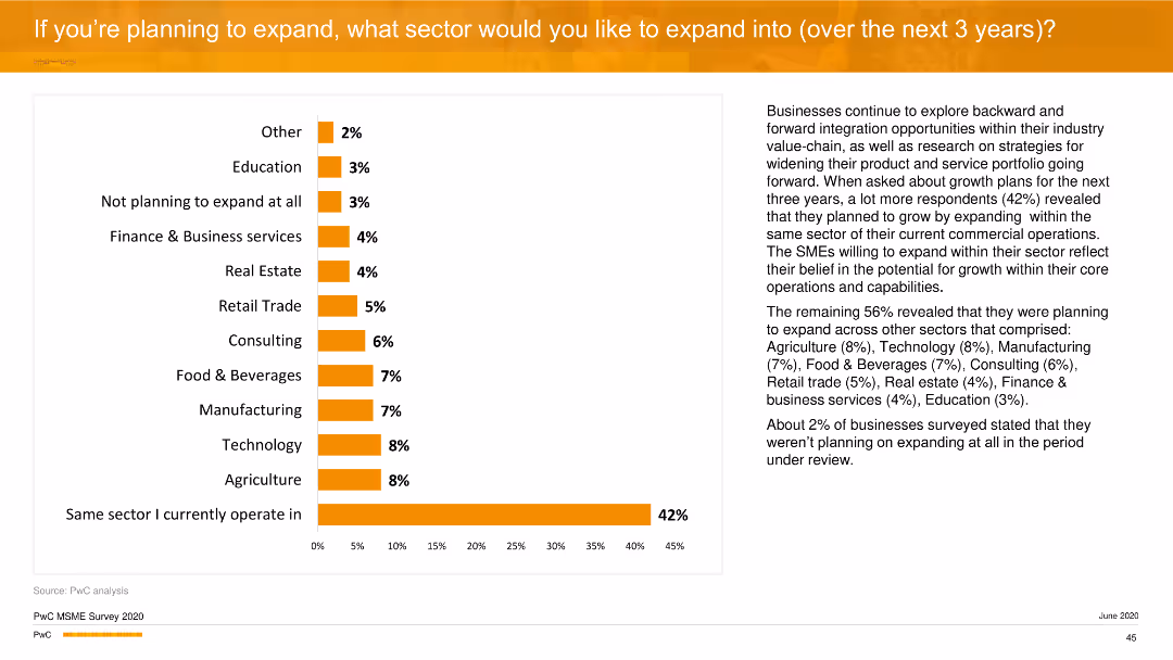
A column chart showing the sectors where businesses plan to expand. The chart uses orange bars to represent percentages, with the largest bar indicating the same sector expansion.
Strategic Planning
Professional Services
The slide details the sectors into which firms plan to expand over the next three years, with a significant number choosing to expand within the same sector they currently operate in.
sector expansion, strategic planning, column chart, professional services
false
Strategic Planning
Professional Services
Mixed Chart
PwC/Strategy&
Add to my slides
Remove from favorites
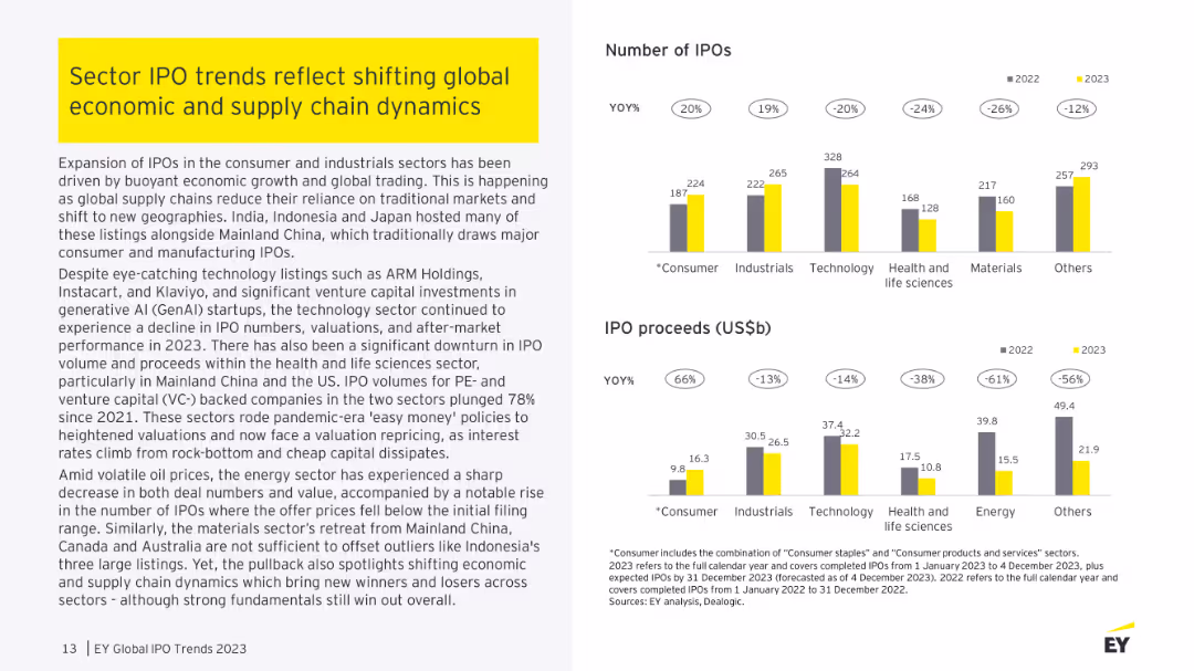
Column charts are used to show the number of IPOs and proceeds by sector for 2022 compared to 2021.
Market Analysis and Trends
Financial Services
It highlights the shift in sector focus, noting the decrease in technology IPOs and the rise in energy IPO proceeds.
sector focus, technology, energy, IPOs, proceeds
false
Market Analysis and Trends
Financial Services
Multiple Chart
EY
Add to my slides
Remove from favorites
This slide has four column charts showing the Gross Merchandise Value (GMV) across different sectors in the Philippines from 2015 with projections to 2025, a title, and source citations.
Market Analysis and Trends
Technology & Software
It analyzes the GMV in the e-commerce, transport, travel, and media sectors, emphasizing the growth in e-commerce and media, which compensates for declines in other areas, useful for sectoral investment insights.
Sector, GMV, E-commerce, Media, Transport, Food, Travel
false
Market Analysis and Trends
Technology & Software
Multiple Chart
Bain
Add to my slides
Remove from favorites
The slide is structured with multiple bar charts displaying the Gross Merchandise Value (GMV) per sector. Each chart is clearly labeled and uses a different color for each year.
Market Analysis and Trends
Technology & Software
Analyzes the performance and growth projections of different sectors in the Philippines, highlighting the exceptional growth of e-commerce and its influence on other sectors.
Sector growth, E-commerce, GMV, Market trends, Projections
false
Market Analysis and Trends
Technology & Software
Multiple Chart
Bain
Add to my slides
Remove from favorites
Comparative bar graphs showing the GMV per sector in the years 2019, 2020, 2021, and a projection for 2025. The sectors include e-commerce, online travel, and others, using contrasting colors for clarity and emphasis.
Market Analysis and Trends
Technology & Software
The slide details the impact of the pandemic on various sectors within Vietnam, showing a contraction in online travel but significant growth in other areas, with expectations of continued expansion.
Sector Growth, Online Travel, E-commerce, Vietnam, Pandemic, Projections, Expansion, Contraction
false
Market Analysis and Trends
Technology & Software
Multiple Chart
Bain
Add to my slides
Remove from favorites
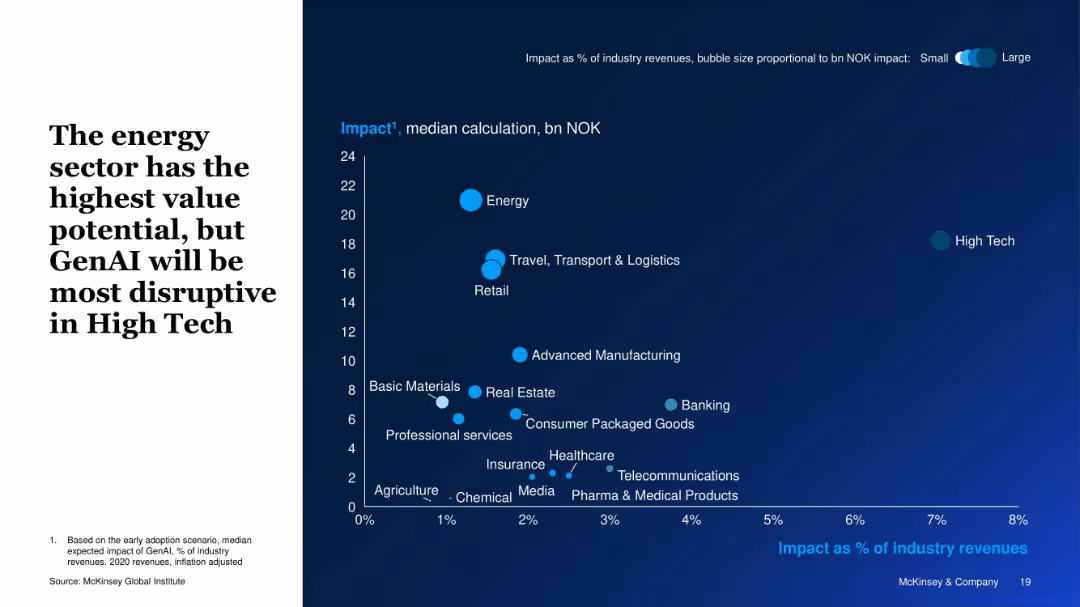
Bubble chart with axes showing impact as % of industry revenue vs. NOK value; bubble size represents overall impact.
Investment Analysis
Artificial Intelligence
This slide visually compares the expected GenAI impact across sectors. The energy sector offers the highest value (in NOK), while high tech is most disrupted (highest % revenue impact). Bubble sizes represent the magnitude of economic value potential.
Sector Impact, GenAI Disruption, Energy, High Tech, Value Potential, Bubble Chart, Revenue Impact, Industry Analysis
false
Investment Analysis
Artificial Intelligence
Single Chart
McKinsey
Add to my slides
Remove from favorites
Light background with yellow title banner, text-heavy content, and column charts showing IPO numbers and proceeds by sector.
Market Analysis and Trends
Financial Services
This slide discusses the shifting trends in sector IPOs due to global economic and supply chain changes, with a focus on consumer and industrial sectors. It features column charts comparing the number of IPOs and proceeds by sector for 2022 and 2023.
sector IPO trends, global economy, supply chain, 2023, financial services
false
Market Analysis and Trends
Financial Services
Multiple Chart
EY
Add to my slides
Remove from favorites
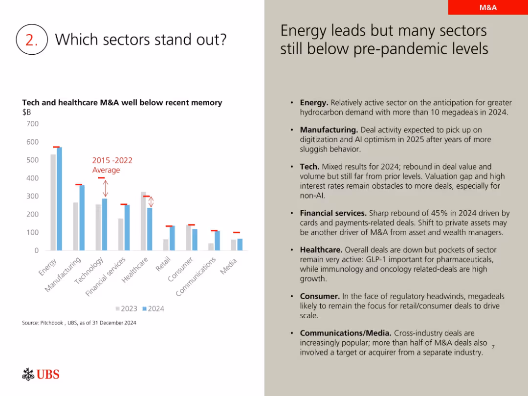
Left bar chart comparing sectors; right text outlines key sector insights
Mergers and Acquisitions
Financial Services
Analyzes sector-specific M&A trends, with energy leading and tech and healthcare lagging. Commentary discusses sector recovery expectations and challenges such as valuation gaps and regulatory issues affecting dealmaking.
sector M&A, energy, technology, healthcare, manufacturing, 2024 deals, sector trends
false
Mergers and Acquisitions
Financial Services
Mixed Chart
UBS
Add to my slides
Remove from favorites
Combination of table and column charts comparing sector performance, with emphasis on technology, financial, and communication sectors. Annotations explain key trends and figures.
Market Analysis and Trends
Financial Services
Evaluates year-over-year performance of critical economic sectors, providing a snapshot of industrial impacts on market capitalization.
sector performance, market analysis, economic trends
false
Market Analysis and Trends
Financial Services
Mixed Chart
PwC/Strategy&
Add to my slides
Remove from favorites
Column chart showing organic growth and percentage of total revenue across various sectors such as CPG, tech, pharma, and public sector, with data points for each sector.
Financial Performance
Technology & Software
This slide details the organic growth and revenue contribution across various sectors for the year, comparing the percentage of total revenue from different industries.
sector performance, revenue, organic growth, financial, comparison
false
Financial Performance
Technology & Software
Single Chart
IPSOS
Add to my slides
Remove from favorites
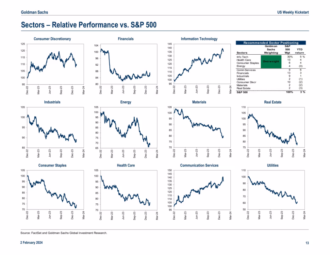
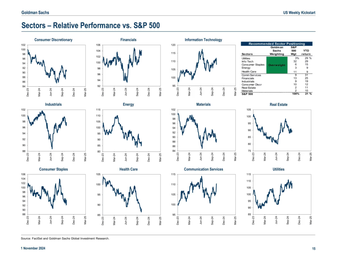
Grid of 12 small line charts showing each sector’s relative performance versus the S&P 500 over time. Includes a small summary table in the upper right titled “Recommended Sector Positioning,” which shows overweight/underweight positions and YTD returns.
Market Analysis and Trends
Financial Services
This slide compares relative sector performance against the S&P 500, showing outperformance in Information Technology and underperformance in Utilities and Real Estate. The recommended sector positioning table suggests overweight in Info Tech and Health Care. The charts offer a historical view of relative movement since Dec 2022, enabling insights into which sectors are trending or lagging.
sector performance, S&P 500, Info Tech, Health Care, Real Estate, overweight, underweight, trends, utilities, materials
false
Market Analysis and Trends
Financial Services
Multiple Chart
Goldman Sachs
Add to my slides
Remove from favorites
A column chart illustrating the sector weightings of the MS INVF Sustainable Asia Equity Fund as of December 31, 2022.
Market Analysis and Trends
Financial Services
Compares the sector allocations of the fund with the MSCI All Country Asia ex Japan Index, highlighting key differences.
Sector, portfolio, weightings, fund, equity
false
Market Analysis and Trends
Financial Services
Mixed Chart
Morgan Stanley
Add to my slides
Remove from favorites
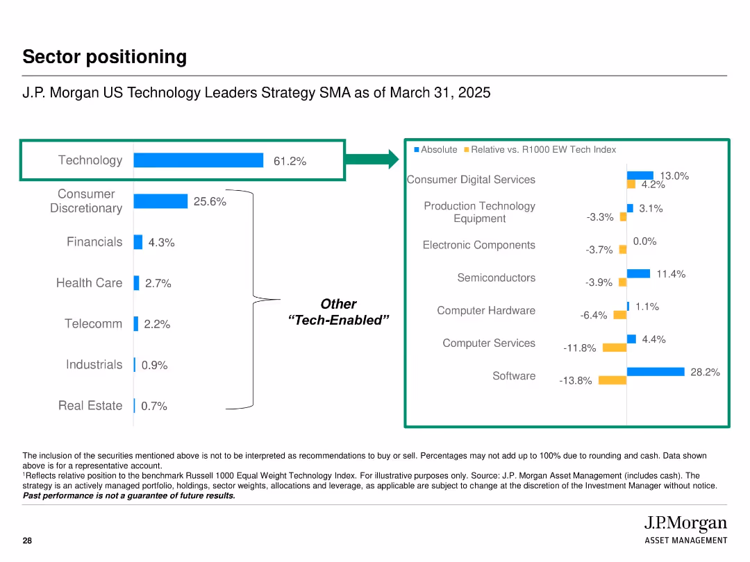
Left panel shows portfolio breakdown by sector with tech vs. “other tech-enabled” sectors. Right panel compares absolute and relative sector exposure against benchmark using horizontal bar charts. Clean white background with blue-highlighted bars.
Strategic Planning
Financial Services
This slide outlines the sector allocations of the J.P. Morgan US Technology Leaders Strategy as of March 31, 2025. It shows the portfolio is heavily weighted toward technology, with significant exposure also in consumer discretionary and other “tech-enabled” sectors. It contrasts absolute exposure with relative weights versus the R1000 EW Tech Index, providing insight into active tilts and investment themes.
sector positioning, tech-enabled, relative weight, R1000 EW Index, allocation strategy, J.P. Morgan, portfolio breakdown, technology leaders
false
Strategic Planning
Financial Services
Multiple Chart
JP Morgan
Add to my slides
Remove from favorites
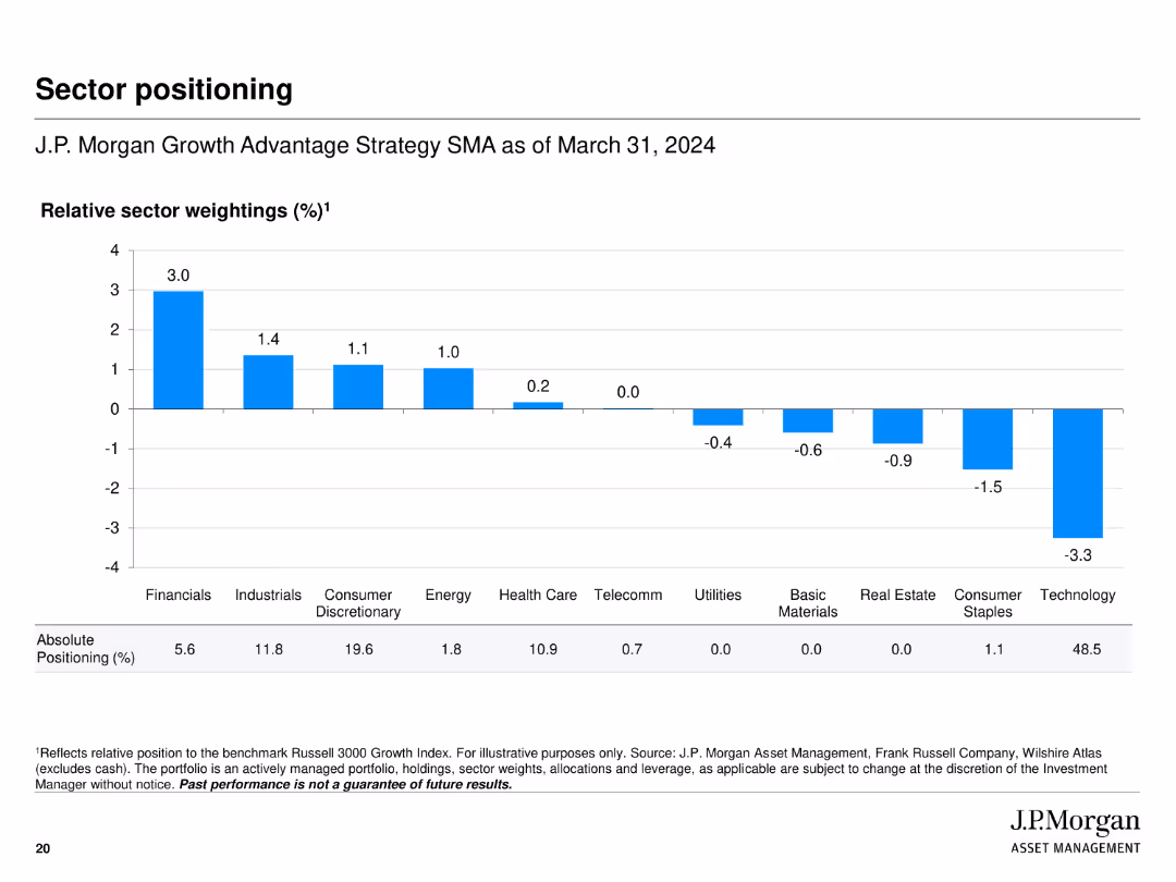
Displays a bar chart showing relative sector weightings, with positive and negative values indicating overweight and underweight positions relative to the benchmark.
Investment Analysis
Financial Services
Shows the sector positioning of J.P. Morgan Growth Advantage Strategy relative to the Russell 3000 Growth Index, highlighting over and underweights in various sectors.
sector positioning, weightings, benchmark, investment strategy, bar chart
false
Investment Analysis
Financial Services
Single Chart
JP Morgan
Add to my slides
Remove from favorites
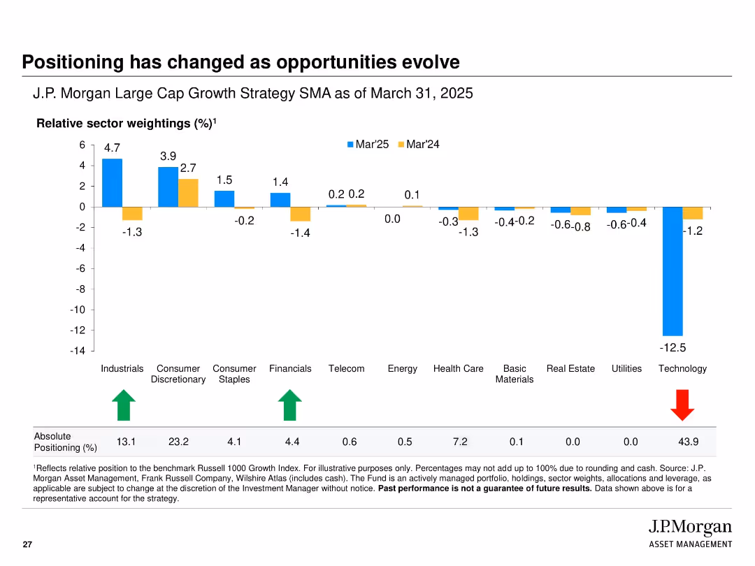
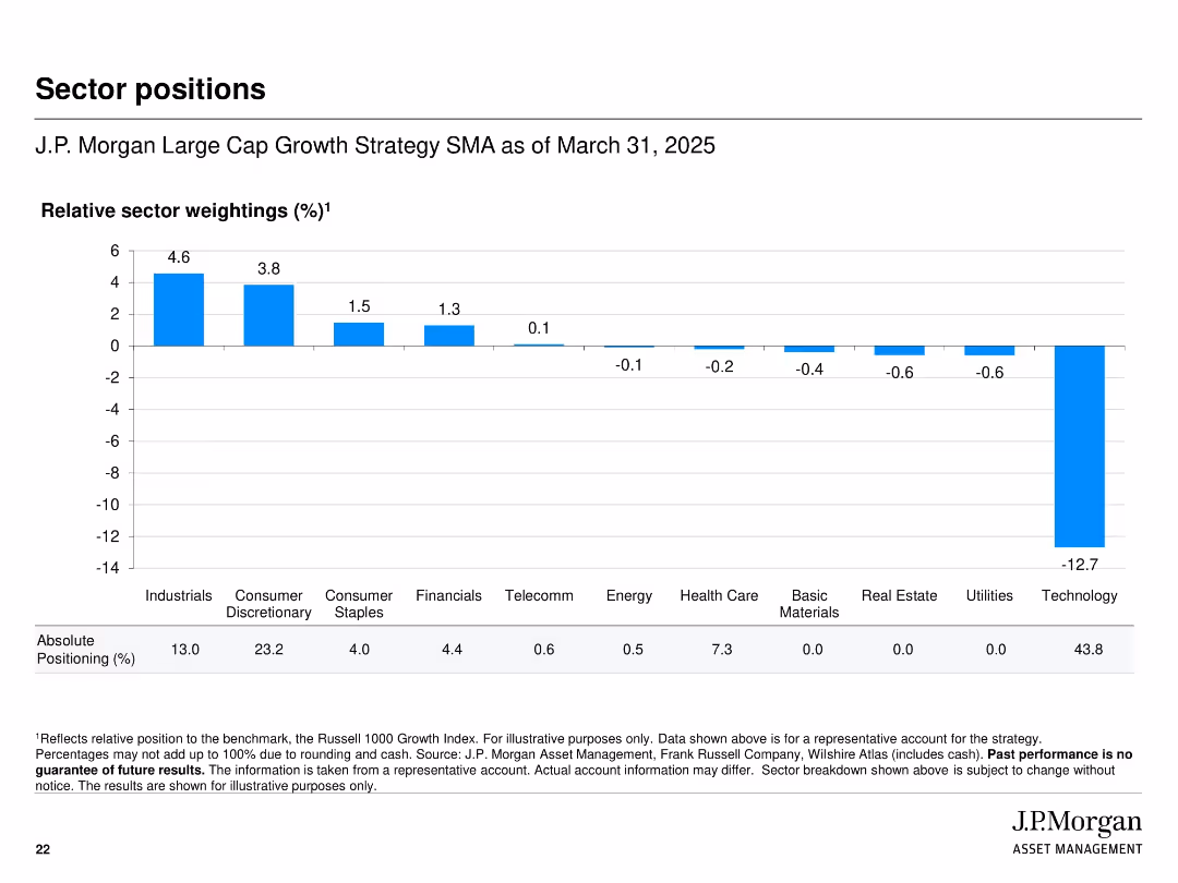
Bar chart with horizontal axis for sectors and vertical bars showing relative sector weightings
Investment Analysis
Financial Services
Shows the sector positioning of the strategy relative to the Russell 1000 Growth Index as of March 31, 2025. Technology is notably underweighted while Industrials and Consumer Discretionary are overweighted. Includes absolute positioning percentages below the chart.
sector positions, weighting, strategy, benchmark, relative position, J.P. Morgan, allocation, equity sectors
false
Investment Analysis
Financial Services
Single Chart
JP Morgan
Add to my slides
Remove from favorites
Slide presents a prioritization matrix of sectors based on potential carbon abatement and investment attractiveness, with insightful key points.
Investment Analysis
Environmental Services & Sustainability
Prioritizes sectors for investment based on carbon abatement potential and economic attractiveness in SEA.
sector prioritization, investment strategy, carbon abatement, SEA
false
Investment Analysis
Environmental Services & Sustainability
Mixed Chart
Bain
Add to my slides
Remove from favorites
This slide displays two column charts comparing the return percentages of different sectors within the S&P 500 and MSCI World indices over 1 month, YTD, and 1 year.
Market Analysis and Trends
Financial Services
The slide offers a comparative return analysis of various sectors in the S&P 500 and MSCI World indices, showing performance over multiple time periods.
sector returns, S&P 500, MSCI World, comparative analysis
false
Market Analysis and Trends
Financial Services
Multiple Chart
Morgan Stanley
Add to my slides
Remove from favorites
Dual bar charts (S&P 500 and MSCI World) showing 1-month, YTD, and 1-year returns by sector.
Market Analysis and Trends
Financial Services
This slide provides a sector-by-sector return analysis for both the S&P 500 and MSCI World indices. It illustrates the variability in performance across timeframes and highlights which sectors have been outperforming or lagging over the past year.
sector returns, S&P 500, MSCI World, YTD, 1-year, 1-month, equity performance, comparison chart
false
Market Analysis and Trends
Financial Services
Multiple Chart
Morgan Stanley
Add to my slides
Remove from favorites
Features tables categorizing sectors by TSR and debt levels, accented with red to yellow risk indicators.
Risk Assessment and Management
Financial Services
Examines different industry sectors by total shareholder return (TSR) and debt risk, indicating current financial health and vulnerability.
sector risk, TSR, default risk, financial health, industry analysis, debt levels
false
Risk Assessment and Management
Financial Services
Multiple Chart
BCG
Add to my slides
Remove from favorites
Grid of 12 mini line charts depicting each sector’s relative performance vs. S&P 500; includes recommended sector positioning table
Market Analysis and Trends
Financial Services
Shows relative performance trends for major GICS sectors vs. the S&P 500, along with a recommendation table suggesting overweights and underweights. Utilities and Info Tech are leading sectors YTD.
sector rotation, relative performance, S&P 500 comparison, overweight, sector positioning
false
Market Analysis and Trends
Financial Services
Multiple Chart
Goldman Sachs
Add to my slides
Remove from favorites
Bubble chart organized by sector activities like 'Manage' and 'Expertise' with color-coded bubbles representing different sectors and their automation potential.
Strategic Planning
Industrial & Manufacturing
Evaluates the automation potential across various sectors, identifying sectors like manufacturing and agriculture with high potential for automation based on current technology capabilities.
Sectors, Automation Potential, Technology, Manufacturing, Agriculture
false
Strategic Planning
Industrial & Manufacturing
Multiple Chart
McKinsey
Add to my slides
Remove from favorites
The slide features icons and text for various sectors, including Life Sciences, Retail, Industrials, Healthcare, Digital, and Education. Each sector is represented by an icon and listed with specific subcategories. Below the sectors, the firm’s service lines are illustrated with icons.
Industry Overview
Professional Services
This slide provides an overview of L.E.K. Consulting’s sector and capability experience, detailing their expertise across various industries and highlighting their service lines such as Strategy, Marketing & Sales, Mergers & Acquisitions, and Strategy Activation.
sectors, capabilities, consulting, experience, services
false
Industry Overview
Professional Services
Pillar
LEK
Add to my slides
Remove from favorites
The slide contains text on the left side detailing sectors expected to drive growth, and a column chart on the right with 10 categories ranked by respondents. An image of a hiker is at the bottom.
Strategic Planning
Energy & Utilities
This slide presents survey results on sectors anticipated to boost Greece's growth, highlighting the rise in tourism and logistics, along with the increasing importance of healthcare and wellbeing.
sectors, growth, Greece, tourism, logistics, healthcare, wellbeing, survey
false
Strategic Planning
Energy & Utilities
Mixed Chart
EY
Add to my slides
Remove from favorites
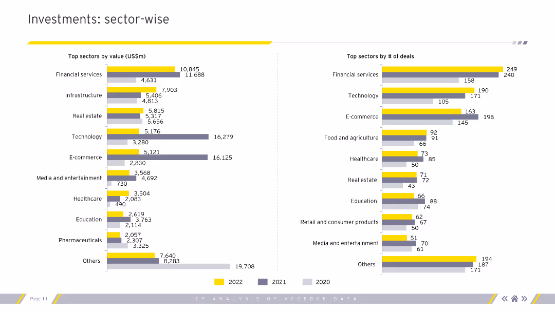
Column charts showing top sectors by value and number of deals for 2020-2022.
Market Analysis and Trends
Financial Services
Sector-wise analysis of investments by value and number of deals, highlighting top-performing sectors.
sectors, investments, value, deals, analysis
false
Market Analysis and Trends
Financial Services
Multiple Chart
EY
Add to my slides
Remove from favorites
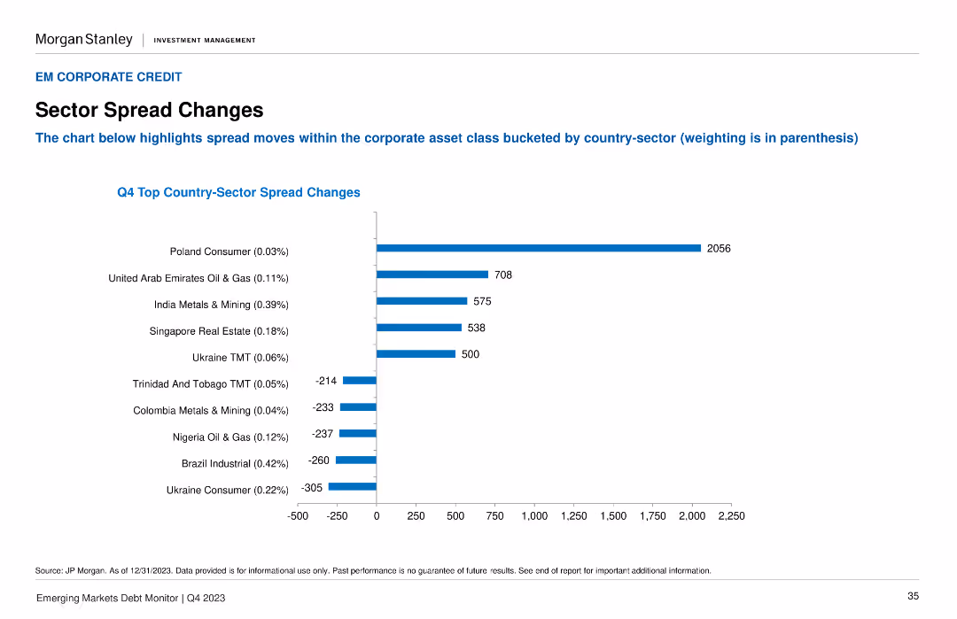
A column chart illustrates the Q4 Top Country-Sector Spread Changes, with the highest spread changes highlighted for different sectors and countries.
Market Analysis and Trends
Financial Services
It highlights the significant spread changes within the corporate asset class, broken down by country-sector combinations. Useful for sector-specific market analysis.
sector spreads, corporate asset, Q4, country-sector, market changes
false
Market Analysis and Trends
Financial Services
Single Chart
Morgan Stanley
Add to my slides
Remove from favorites
The slide uses a heatmap layout to present changes in Total Shareholder Return (TSR) across different sectors categorized into three health levels.
Market Analysis and Trends
Financial Services
Analyzes the recent performance of various sectors, categorized by their health as healthier, pressured, or vulnerable, highlighting changes in TSR over recent days.
sectors, TSR, performance, heatmap, health levels, recent change
false
Market Analysis and Trends
Financial Services
Table
BCG
Add to my slides
Remove from favorites
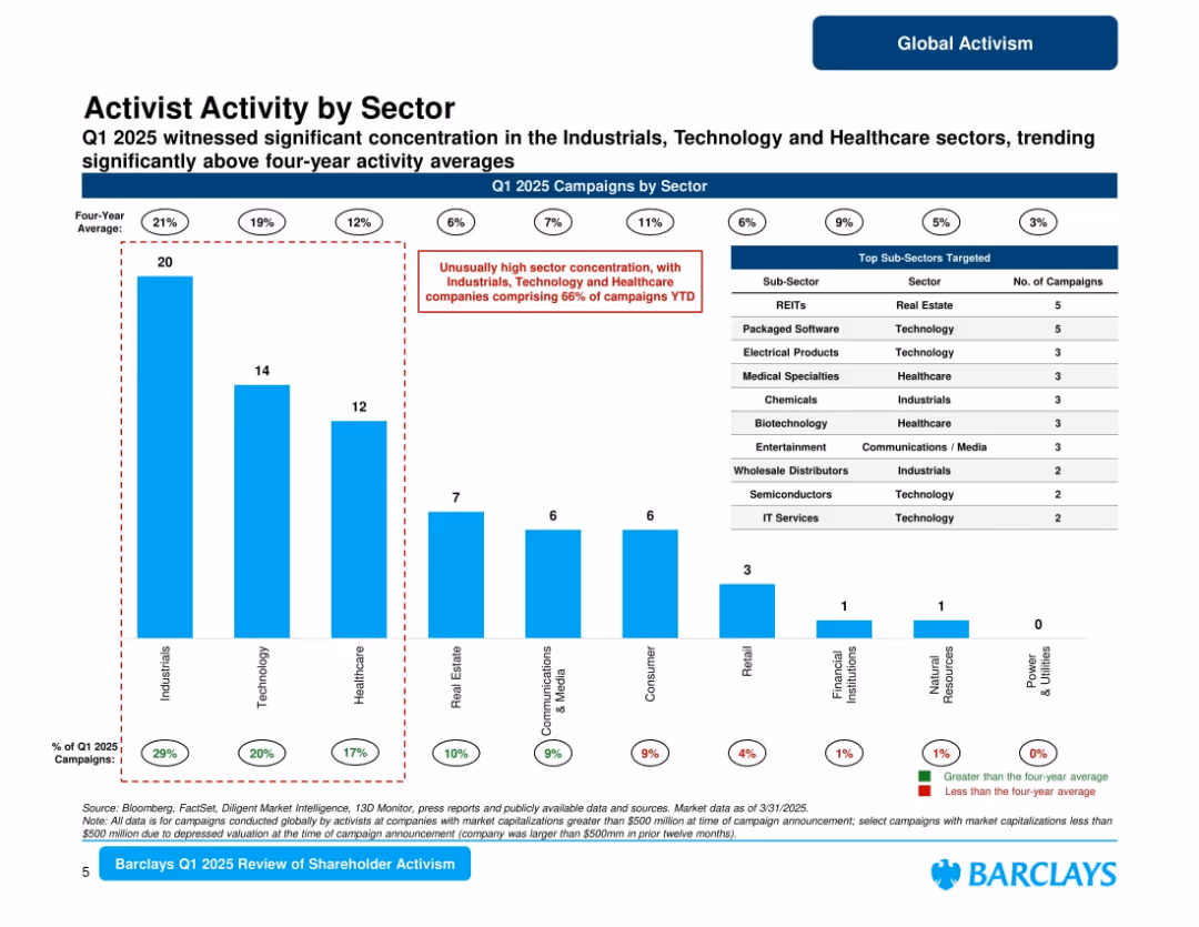
Bar chart ranking sectors by number of campaigns in Q1 2025, with sub-sector table on the right; red callout flags overrepresented sectors.
Market Analysis and Trends
Financial Services
Shows high concentration of activism in Industrials, Technology, and Healthcare sectors, which together make up 66% of campaigns YTD. Includes top targeted sub-sectors such as REITs and software. Highlights deviation from long-term averages.
sector trends, activist sectors, Q1 2025, industrials, healthcare, technology, Barclays
false
Market Analysis and Trends
Financial Services
Mixed Chart
Barclays
Add to my slides
Remove from favorites
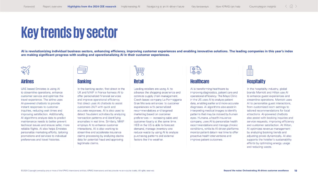
Five-column vertical section layout with sector icons and text descriptions of AI use in each industry.
Industry Overview
Artificial Intelligence
Provides examples of AI implementation across sectors: airlines, banking, retail, healthcare, and hospitality. Highlights specific use cases such as chatbots, fraud detection, diagnostics, and personalized experiences.
sector trends, AI adoption, use cases, healthcare, banking, retail, airlines, hospitality, automation, customer experience
false
Industry Overview
Artificial Intelligence
Pillar
KPMG
Add to my slides
Remove from favorites
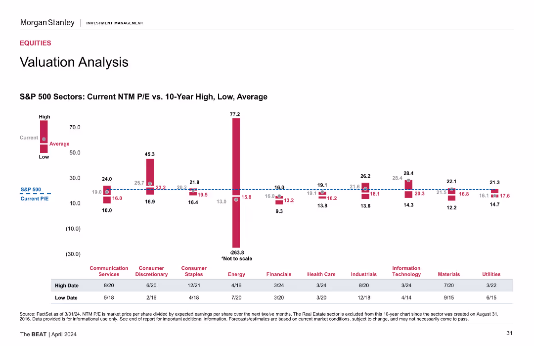
Column charts showing current NTM P/E vs. 10-year high, low, and average for different S&P 500 sectors.
Investment Analysis
Financial Services
Assesses sector-specific valuations, comparing current price-to-earnings ratios with historical data for S&P 500 sectors.
Sector Valuation, NTM P/E, S&P 500, Historical Data, Investment Analysis
false
Investment Analysis
Financial Services
Mixed Chart
Morgan Stanley
Add to my slides
Remove from favorites
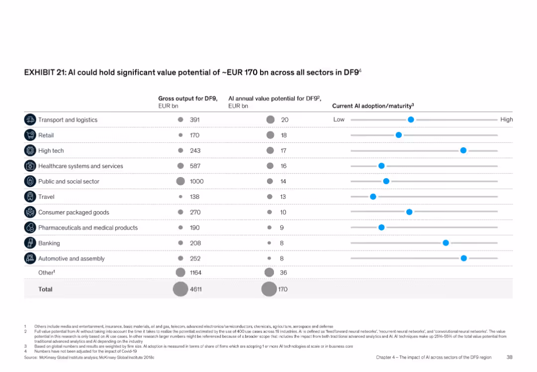
Tabular format with columns and dot-bar visualization for maturity; icons for each sector
Product and Service Analysis
Artificial Intelligence
Shows AI’s value potential across sectors in DF9, totaling EUR 170 bn annually. Sectors like transport, retail, and high tech are detailed with gross output and AI value potential. Also includes a visual representation of current AI adoption maturity for each sector.
Sector value, AI adoption, DF9, AI maturity, EUR 170 bn, industry impact
false
Product and Service Analysis
Artificial Intelligence
Multiple Chart
McKinsey
Add to my slides
Remove from favorites
This slide contains bar charts for sector wallet analysis across technology, healthcare, and consumer/retail sectors, paired with regional wallet information.
Financial Performance
Financial Services
Detailed sector and regional wallet analysis from 2015 to 2019, indicating consistent financial performance through the cycle.
Sector Wallet, Regional Wallet, Bar Chart, Financial Analysis, Technology, Healthcare, Consumer, Retail
false
Financial Performance
Financial Services
Multiple Chart
JP Morgan
Add to my slides
Remove from favorites
This slide presents column charts comparing sector and regional financial data, with a focus on technology and China from 2015 to 2019.
Financial Performance
Financial Services
The slide shows financial performance variability across sectors and regions, highlighting opportunities for capturing market share.
Sector Wallet, Regional Wallet, Financial Data, Bar Chart, Technology, China, Market Share, Opportunities
false
Financial Performance
Financial Services
Multiple Chart
JP Morgan
Add to my slides
Remove from favorites
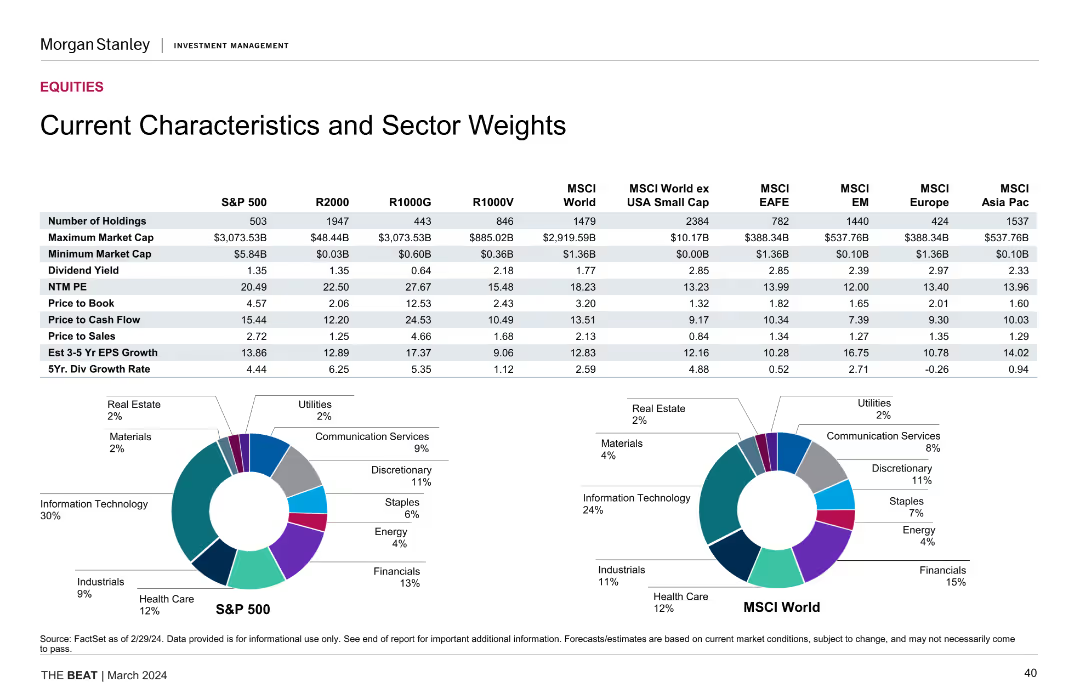
This slide presents a table comparing various financial characteristics and sector weights of different indices, including the S&P 500, R2000, R1000G, R1000V, and MSCI indices. It also includes pie charts depicting sector distributions for S&P 500 and MSCI World.
Market Analysis and Trends
Financial Services
The slide provides detailed financial characteristics and sector weight comparisons across several indices, along with visual representations of sector distributions for S&P 500 and MSCI World, useful for market analysis and investment decisions.
sector weights, financial characteristics, S&P 500, MSCI World, index comparison, market analysis, sector distribution
false
Market Analysis and Trends
Financial Services
Multiple Chart
Morgan Stanley
Add to my slides
Remove from favorites
The slide presents pie charts for sector allocation and tables for index characteristics across various indices, including S&P 500 and MSCI World, with a clean, professional layout.
Market Analysis and Trends
Financial Services
Tailored for market analysts, this slide provides an insightful overview of sector weights and key characteristics for multiple indices, serving as a tool for benchmarking and strategic investment decisions.
Sector Weights, Index Characteristics, S&P 500, MSCI, Pie Charts, Tables, Investment Planning
false
Market Analysis and Trends
Financial Services
Multiple Chart
Morgan Stanley
Add to my slides
Remove from favorites
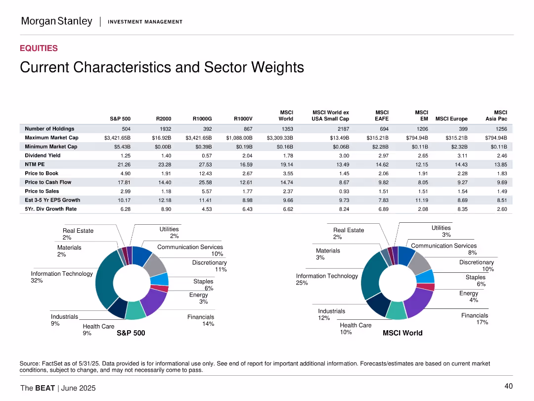
Contains two pie charts showing sector weights for S&P 500 and MSCI World, along with a detailed table comparing various characteristics such as number of holdings, market cap, dividend yield, P/E ratio, etc., across multiple indices.
Market Analysis and Trends
Financial Services
Analyzes and compares the sector weights and key characteristics of different indices including S&P 500, MSCI World, and others. Useful for understanding the composition and performance metrics of these indices.
sector weights, index comparison, S&P 500, MSCI World, financial metrics, characteristics
false
Market Analysis and Trends
Financial Services
Multiple Chart
Morgan Stanley
Add to my slides
Remove from favorites
Tabular comparison of key metrics across indices plus pie charts for S&P 500 and MSCI World sector weights.
Market Analysis and Trends
Financial Services
The slide compares valuation and performance metrics like P/E, dividend yield, and EPS growth across major indices. It also visualizes sector weights for S&P 500 and MSCI World using pie charts, highlighting the concentration in Technology and Financials.
sector weights, index comparison, valuation metrics, S&P 500, MSCI World, dividend yield, earnings growth
false
Market Analysis and Trends
Financial Services
Multiple Chart
Morgan Stanley
Add to my slides
Remove from favorites
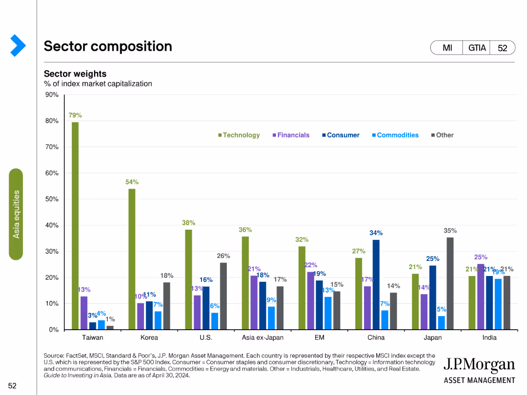
Column chart showing sector weights as a percentage of index market capitalization across different countries and regions.
Market Analysis and Trends
Financial Services
Analyzes the sector composition of various markets, focusing on the weight of sectors like technology, financials, and consumer goods in different regions.
sector weights, index, market capitalization, column chart, financial analysis, technology, regional analysis, sector comparison
false
Market Analysis and Trends
Financial Services
Single Chart
JP Morgan
Add to my slides
Remove from favorites
Table comparing various financial metrics and sector weights across different indices like S&P 500, R2000, R1000G, R1000V, MSCI World, etc. Includes a sector weight pie chart.
Market Analysis and Trends
Financial Services
This slide provides a detailed comparison of financial characteristics and sector weights for various indices, highlighting key metrics and distribution of sector weights.
sector, weights, indices, comparison, metrics
false
Market Analysis and Trends
Financial Services
Multiple Chart
Morgan Stanley
Add to my slides
Remove from favorites
The slide includes a detailed table listing various characteristics and sector weights of different indices, along with two pie charts showing sector weights distribution.
Market Analysis and Trends
Financial Services
It provides detailed data on the characteristics and sector weights of several indices, such as S&P 500, R2000, MSCI, highlighting differences in market cap, P/E, etc.
sector weights, indices, financial characteristics, market cap
false
Market Analysis and Trends
Financial Services
Multiple Chart
Morgan Stanley
Add to my slides
Remove from favorites
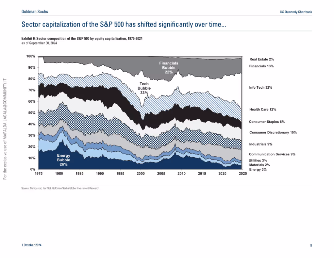
Streamgraph-style time series showing sector weight changes in the S&P 500 from 1975 to 2024; uses texture fills and layered color bands.
Industry Overview
Financial Services
This historical analysis visualizes the changing sector weights within the S&P 500 over nearly five decades. It highlights the rise of Info Tech and the decline of Energy’s dominance, identifying bubbles such as Tech and Financials. The slide provides a long-term view of equity market structural changes by sector.
sector weight, S&P 500, historical trend, tech bubble, financials, energy, equity markets
false
Industry Overview
Financial Services
Single Chart
Goldman Sachs
Add to my slides
Remove from favorites
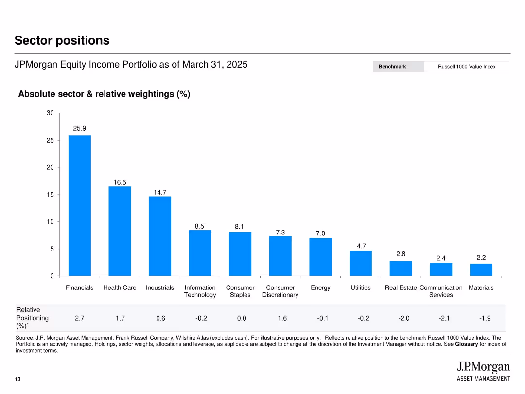
Vertical bar chart layout ranking sector exposure by absolute and relative weightings.
Investment Analysis
Financial Services
Presents sector allocation for JPMorgan’s Equity Income Portfolio, highlighting top exposures (e.g., Financials, Healthcare) as of March 31, 2025. The chart includes both absolute weight and relative position to the Russell 1000 Value Index.
sector weights, portfolio allocation, JPMorgan, financials, equity income, relative positioning, benchmark
false
Investment Analysis
Financial Services
Single Chart
JP Morgan
Add to my slides
Remove from favorites
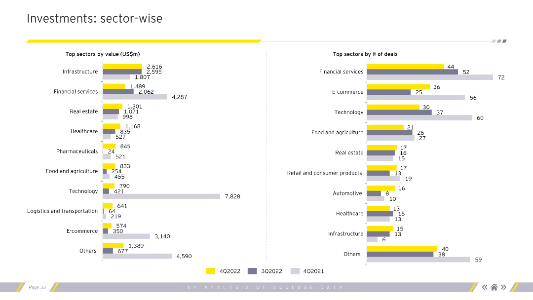
The slide presents two column charts. The left chart shows top sectors by value (US$m), while the right chart shows top sectors by number of deals. Different colors represent various quarters.
Market Analysis and Trends
Financial Services
This slide analyzes investments on a sector-wise basis, providing insights into which sectors attract the most value and deal numbers, useful for sector performance assessment.
Sector-wise analysis, investment value, deal count
false
Market Analysis and Trends
Financial Services
Multiple Chart
EY
Add to my slides
Remove from favorites
Three columns aligned left to right showing 'Secular Forces', 'Impact', and 'Opportunities' with related bullet points in blue boxes.
Market Analysis and Trends
Financial Services
Analyzing market opportunities arising from changes such as regulation, technology, and competitive dynamics, and their impacts and opportunities.
Secular Change, Regulatory Changes, Technology, Market Opportunities, Risk Intermediation, Client Financing, Client Experience
false
Market Analysis and Trends
Financial Services
Linear Flow
Goldman Sachs
Add to my slides
Remove from favorites
Simple design with two columns comparing 'Secular Forces' on the left to their 'Impact' on the right, minimal graphical elements.
Strategic Planning
Financial Services
Slide presenting strategic business changes and their implications, likely aimed at stakeholders for discussing future plans.
Secular Forces, Impact, Strategy, Business, Future
false
Strategic Planning
Financial Services
Table
Goldman Sachs
Add to my slides
Remove from favorites
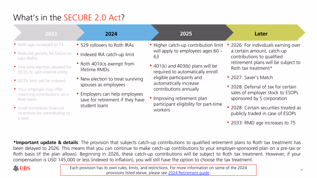
The slide includes a timeline and bullet points with text. It is moderately complex with clear visual differentiation between different years and provisions.
Regulatory and Compliance
Financial Services
The slide outlines key provisions of the SECURE 2.0 Act from 2023 to 2026 and later, emphasizing changes in retirement savings regulations.
SECURE Act, retirement, provisions, 2023, 2024, 2025, 2026
false
Regulatory and Compliance
Financial Services
Linear Flow
UBS
Add to my slides
Remove from favorites
Text outlining secured funding characteristics next to a column chart showing total collateralized financings in billions over several quarters. The slide uses check marks for key attributes such as diversification and liquidity stress testing.
Operational Efficiency
Financial Services
Highlights the characteristics and strategic approach to secured funding, including the importance of diversified counterparty risk and term composition. It shows the consistency in total collateralized financings, emphasizing robust risk management through stress testing.
secured funding, diversification, risk management, collateralized financings, column chart
false
Operational Efficiency
Financial Services
Mixed Chart
Goldman Sachs
Add to my slides
Remove from favorites
Features column charts for portfolio loans, with clear visual indicators for changes over time. Bar chart for FICO score distribution included.
Risk Assessment and Management
Financial Services
Focuses on indirectly secured consumer loans, highlighting key performance metrics and FICO score distribution. This slide is used to assess credit risk and loan performance, mainly in auto and specialty lending, such as RV and marine finance.
Secured Loans, Consumer, Auto, Finance, FICO
false
Risk Assessment and Management
Financial Services
Multiple Chart
Morgan Stanley
Add to my slides
Remove from favorites
A three-column layout with a circular flow chart in the center, bullet lists, and numerical data points. Each column corresponds to clients, businesses, and performance metrics, respectively. The design is clean with a mix of icons and text.
Industry Overview
Financial Services
Showcasing the scope of JPMorgan's Securities Services, the slide details the client types, services offered, and significant numerical achievements like revenue and market reach. It's aimed at providing a quick, comprehensive look at the strategic position and success of the division within the CIB.
securities, clients, businesses, performance, revenue, market, custody, management
false
Industry Overview
Financial Services
Diagram
JP Morgan
Add to my slides
Remove from favorites
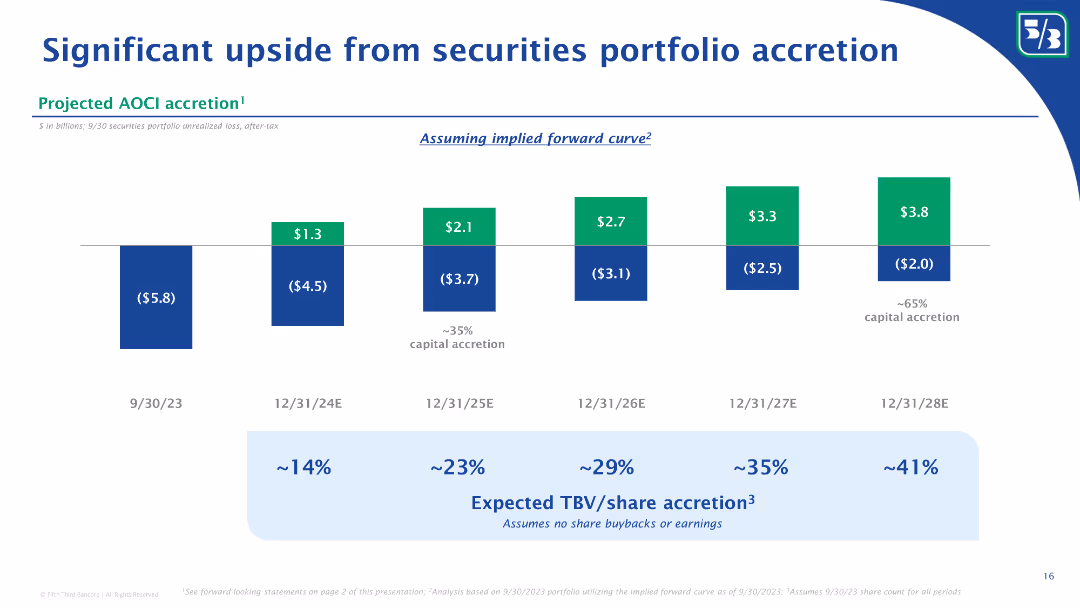
The slide displays a series of column charts projecting AOCI accretion over time, with annotations on the expected accretion percentages.
Investment Analysis
Financial Services
Projects accretion in the AOCI from the securities portfolio over the next few years, indicating potential financial benefits.
securities, portfolio accretion, AOCI, financial projection, column chart, investment, accretion percentage
false
Investment Analysis
Financial Services
Mixed Chart
Goldman Sachs
Add to my slides
Remove from favorites
A forward-looking slide with green and blue column charts representing projected capital accretion and associated annotations. The design uses contrasting colors to distinguish between negative and positive values.
Investment Analysis
Financial Services
Projects the potential upside from the bank's securities portfolio, with a focus on capital accretion over a multi-year timeline, using an implied forward curve for estimations.
securities portfolio, capital accretion, projections, AOCI, forward curve
false
Investment Analysis
Financial Services
Single Chart
Goldman Sachs
Add to my slides
Remove from favorites
The layout includes a header, three columns dividing the content into 'Our Clients', 'Our Business', and 'By the Numbers'. It features icons, bullet points, and column charts with light blue bars representing different financial metrics from 2017 and 2021, demonstrating an increase in each category.
Market Analysis and Trends
Financial Services
This slide highlights the achievements in record revenue and assets under custody for JPMorgan Chase's Securities Services. It provides a breakdown of client types, business services offered, and key financial metrics over time. Suitable for analyzing market trends and discussing strategic planning for business development and operational efficiency.
Securities, Revenue, Assets, Custody, Trading, Data Management, ETFs, Growth, Efficiency, Clients
false
Market Analysis and Trends
Financial Services
Multiple Chart
JP Morgan
Add to my slides
Remove from favorites
Contains column charts for assets under custody/administration and column charts for revenue from 2018 to 2019, with visual growth indicators.
Financial Performance
Financial Services
Shows growth in securities services and resilient revenue performance despite challenging rate environments, with emphasis on new business wins and onboarded mandates.
Securities Services, Assets, Revenue Growth, Business Expansion
false
Financial Performance
Financial Services
Multiple Chart
JP Morgan
Add to my slides
Remove from favorites
Features a circular diagram with segments and corresponding bullet points, focusing on leveraging the CIB for Securities Services.
Competitive Landscape
Financial Services
Discusses the positioning of Securities Services for the future by leveraging the Corporate & Investment Bank to enhance client relationships and service excellence.
Securities Services, CIB, Clients, Excellence
false
Competitive Landscape
Financial Services
Framework
JP Morgan
Add to my slides
Remove from favorites
The slide includes three column charts showing Assets Under Custody and corresponding revenue and operating margins from 2016 to 2018, emphasizing significant changes and growth.
Operational Efficiency
Financial Services
Targeted at operations managers and financial analysts, the slide discusses the transformation in Securities Services, illustrating how new business wins and operational model improvements have led to notable financial achievements.
securities services, transformation, assets, revenue, operating margins, financial results, growth, efficiency
false
Operational Efficiency
Financial Services
Multiple Chart
JP Morgan
Add to my slides
Remove from favorites
This slide has a three-column layout with icons at the top, text in the middle, and a blue color scheme. Each column has a bullet list. The slide title is at the top with a subtitle beneath.
Strategic Planning
Financial Services
The slide presents a three-pillar strategy for client services in securities. It includes technological investments, leveraging the corporate and investment bank's power, and delivering front-to-back integrated solutions. It suggests a comprehensive, connected, and automated approach to managing clients' investment portfolios.
securities, strategy, technology, investment, efficiency, automation, solutions, clients
false
Strategic Planning
Financial Services
Pillar
JP Morgan
Add to my slides
Remove from favorites
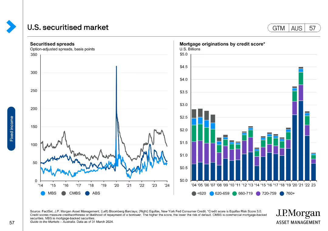
This slide includes a line chart on the left showing securitised spreads (MBS, CMBS, ABS) and a column chart on the right showing mortgage originations by credit score.
Market Analysis and Trends
Financial Services
It analyzes the U.S. securitised market by presenting spreads and mortgage originations data, useful for understanding the securitised product market.
securitised, market, spreads, mortgage, credit
false
Market Analysis and Trends
Financial Services
Multiple Chart
JP Morgan
Add to my slides
Remove from favorites
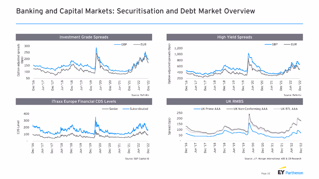
The slide contains four line charts, showing investment grade spreads, high yield spreads, iTraxx Europe financial CDS levels, and UK RMBS over time.
Market Analysis and Trends
Financial Services
This slide presents an overview of securitization and debt markets, focusing on spreads and financial CDS levels, valuable for financial market analysis.
securitization, debt market, spreads, CDS, RMBS
false
Market Analysis and Trends
Financial Services
Multiple Chart
EY
Add to my slides
Remove from favorites
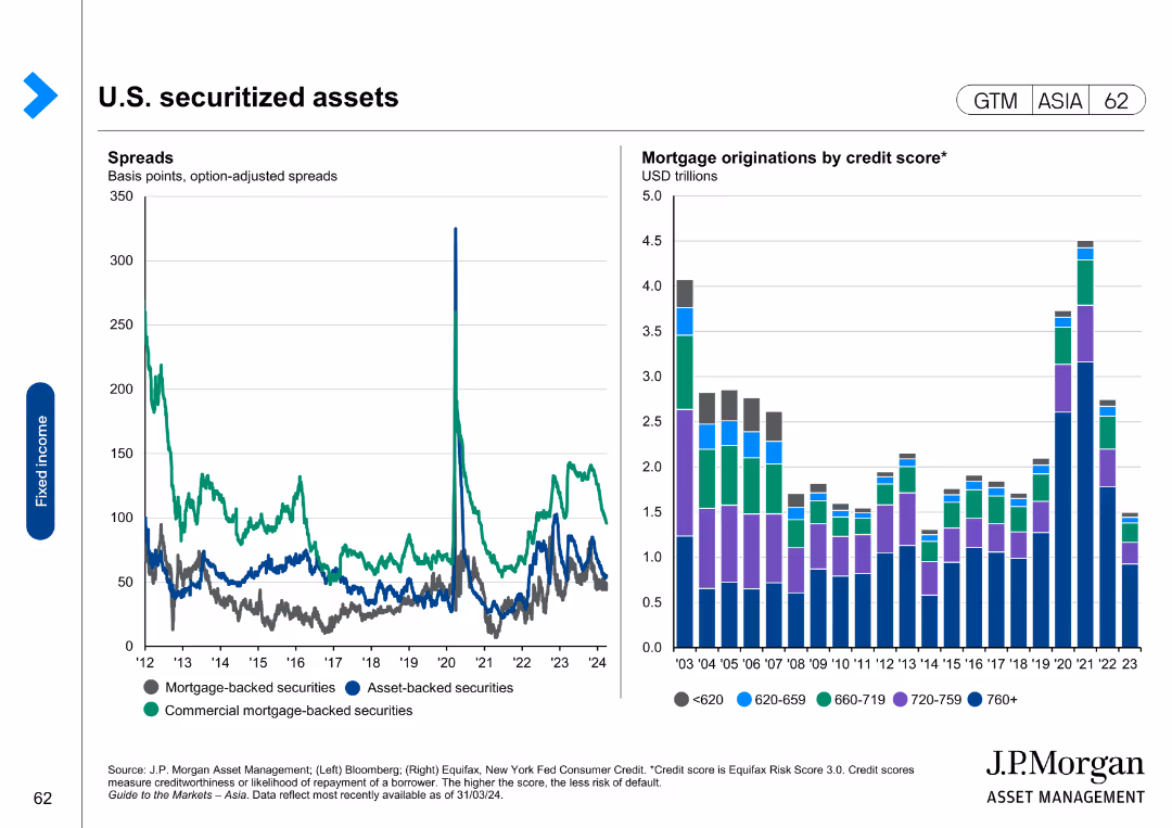
The slide contains a line chart showing spread data and a column chart on mortgage originations by credit score.
Investment Analysis
Financial Services
The slide analyzes U.S. securitized assets, focusing on spread changes and mortgage originations categorized by credit scores.
securitized assets, mortgage originations, credit scores, financial analysis, asset-backed securities
false
Investment Analysis
Financial Services
Multiple Chart
JP Morgan
Add to my slides
Remove from favorites
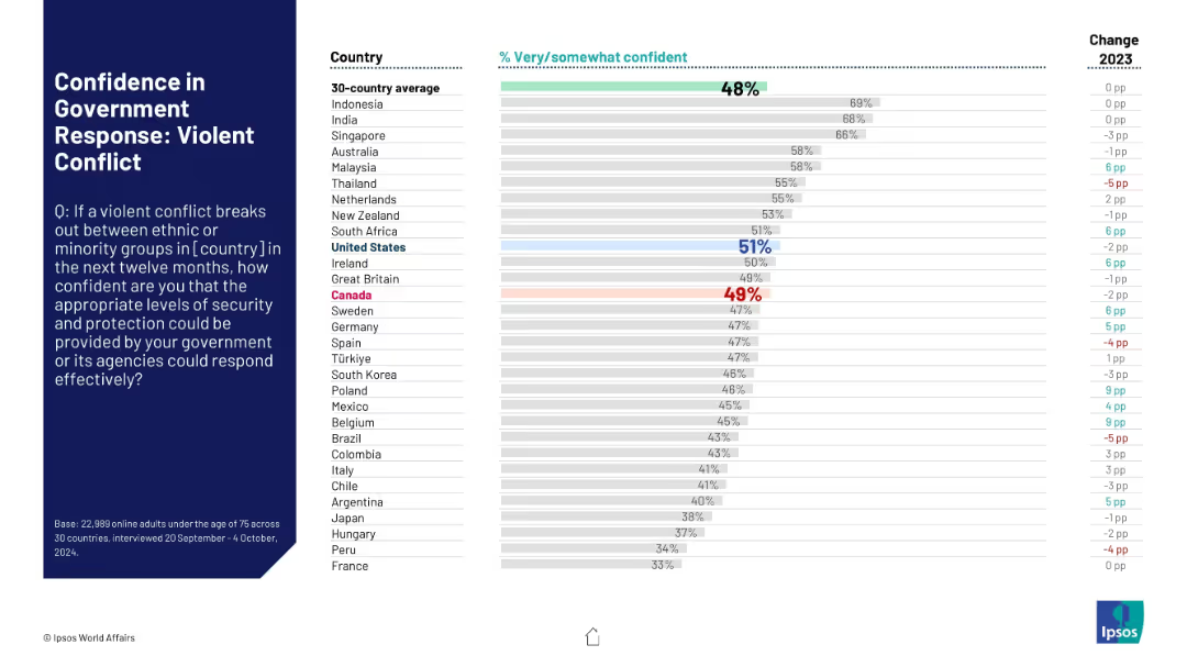
Bar chart on right with percentage values, country names on the left, and change figures on the far right. A large text box on the left presents the survey question. Colors highlight key countries like US and Canada.
Risk Assessment and Management
Government & Public Sector
Presents comparative survey results from 30 countries assessing public confidence in government response to violent ethnic or minority conflict. Highlights Canada and US with average ratings and changes from 2023.
security, conflict, public trust, government response, ethnic violence, international survey, Ipsos, Canada, United States, perception
false
Risk Assessment and Management
Government & Public Sector
Mixed Chart
IPSOS
Add to my slides
Remove from favorites
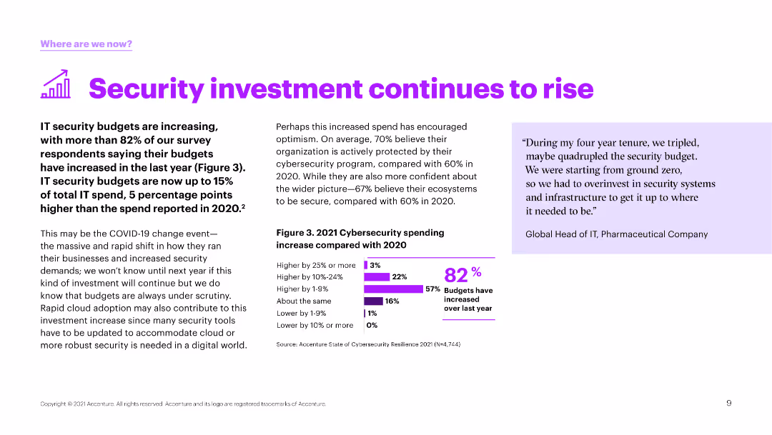
Text and a column chart showing the percentage increase in cybersecurity budgets compared to the previous year. Purple bars indicate different levels of budget increases.
Financial Performance
Technology & Software
The slide reports on the rise in IT security budgets, with over 82% of survey respondents indicating an increase. It also highlights the growing importance of cybersecurity in the digital transformation era.
security, investment, budgets, increase, cybersecurity
false
Financial Performance
Technology & Software
Mixed Chart
Accenture
Add to my slides
Remove from favorites
Light background with blue text, a bar chart displaying different objectives organizations have for security investments, such as improving operational efficiency and compliance.
Risk Assessment and Management
Technology & Software
The slide presents survey data on the objectives organizations aim to achieve with security investments, highlighting the focus on improving operational efficiency and productivity.
Security investments, objectives, operational efficiency, compliance, survey
false
Risk Assessment and Management
Technology & Software
Mixed Chart
Oliver Wyman
Add to my slides
Remove from favorites
Three-column layout with text on investment priorities, focus areas to date, and a column chart showing cyber security spend over time.
Risk Assessment and Management
Financial Services
This slide details the increased investments in security, focusing on investment priorities, current focus areas, and a visual representation of the growth in cyber security spending.
security, investments, priorities, focus, spend
false
Risk Assessment and Management
Financial Services
Mixed Chart
Credit Suisse
Add to my slides
Remove from favorites
Utilizes a blue and white color theme, includes a line graph depicting economic impacts from 2018 to 2020, and multiple flow charts that explain the data utilization impacts on security operations.
Regulatory and Compliance
Financial Services
Discusses the role of Copernicus data in enhancing maritime security and border surveillance, and its economic value in terms of reducing illegal activities and environmental harm.
security, maritime surveillance, Copernicus, illegal fishing, data analysis
false
Regulatory and Compliance
Financial Services
Mixed Chart
PwC/Strategy&
Add to my slides
Remove from favorites
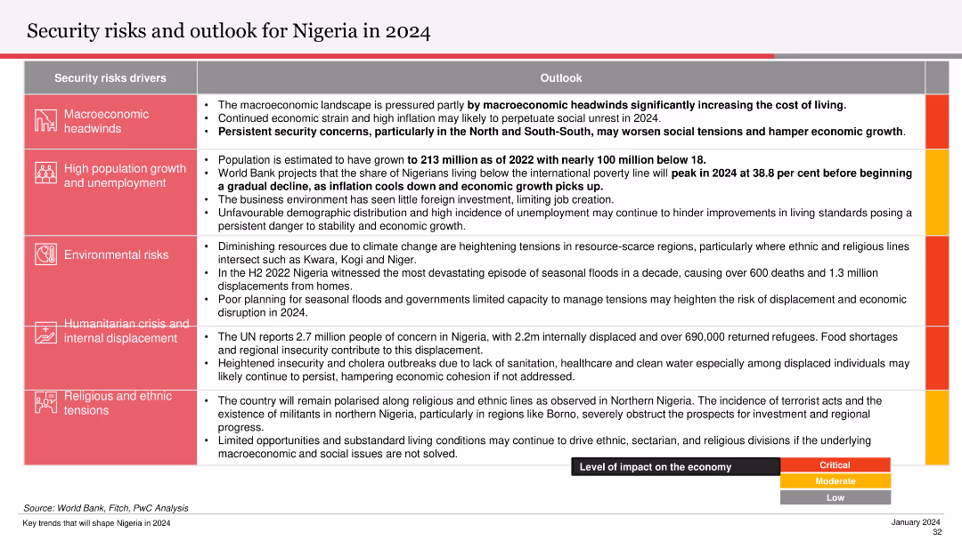
The slide includes a table outlining various security risk drivers and their economic impact levels. It discusses macroeconomic headwinds, high population growth, environmental risks, humanitarian crises, and religious tensions.
Risk Assessment and Management
Government & Public Sector
This slide provides an overview of security risks facing Nigeria in 2024, covering factors like macroeconomic headwinds, population growth, environmental risks, and internal displacement. It assesses their potential impact on the economy and social stability.
security risks, macroeconomic headwinds, population growth, environmental risks, internal displacement
false
Risk Assessment and Management
Government & Public Sector
Table
PwC/Strategy&
Add to my slides
Remove from favorites
Includes two bar charts showing areas where security incidents occurred and safeguards in place.
Risk Assessment and Management
Telecommunications
Examines the dual approach of using security safeguards and cyber insurance to protect against cyber threats, based on survey data.
security safeguards, cyber insurance, cyber threats, survey data, protection strategies
false
Risk Assessment and Management
Telecommunications
Multiple Chart
PwC/Strategy&
Add to my slides
Remove from favorites
Previous
Next
You don't have any favorites yet.
Please wait loading your favorites slides...
Create a FREE account to continue browsing
Receive Instant Access to 1,000+ slides from companies like McKinsey, Google, and Goldman Sachs
First Name
Last Name
Email
Password
I agree to all
Terms & Privacy Policy
Thank you! Your submission has been received!
Oops! Something went wrong while submitting the form.
Have an account?
Sign in
Upgrade to PRO to Save slides
Advanced Search and Filters
Access to 15,000+ slides
Access to Category Pages
Save/Bookmark Slides
PowerPoint Template Library
Pick a Plan
MONTHLY
$12/month
Billed every month, Cancel anytime.
YEARLY
$9/year
Billed $108 annually, Cancel anytime.
Checkout for $12/month
Checkout for $108/yr
Secured by Stripe | AES-256 bit encryption