My Account
My Slides
Search by Category
Pricing
Templates
View All Templates
Download Template Slides
✦ AI Search
Feedback
Login
Logout
Get Started
Browse all Slides
Browse all Slides
Create a FREE Account
Instant access to 1,000+ real slides from top companies like McKinsey, BCG, Goldman Sachs, Google and many more!
First Name
Last Name
Email
Password
I agree to all
Terms & Privacy Policy
Thank you! Your submission has been received!
Oops! Something went wrong while submitting the form.
Have an account?
Sign in
Saved Slides
Total No. of slides saved
0
↻ Refresh
✖ Clear all
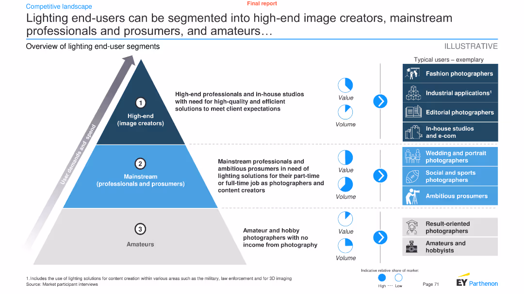
Segmented pyramid chart showing three categories of lighting end-users: high-end image creators, mainstream professionals and prosumers, and amateurs
Customer and Market Segmentation
Consumer Goods
The slide provides an overview of lighting end-user segments, detailing the needs and characteristics of each segment
segmentation, lighting, end-users, professionals, amateurs
false
Customer and Market Segmentation
Consumer Goods
Framework
EY
Add to my slides
Remove from favorites
Slide with three column charts and related imagery reflecting strategies for different customer segments like Youth and Families, Low-to-Moderate Income, and Affluent.
Customer and Market Segmentation
Financial Services
Targeted at showing tailored approaches for diverse customer segments, focusing on specific banking products and services offered.
segmentation, value proposition, banking, customers, services, youth, income, affluent, strategy, products
false
Customer and Market Segmentation
Financial Services
Multiple Chart
JP Morgan
Add to my slides
Remove from favorites
Features multiple bar charts comparing various entertainment and media segments' growth rates from 2019 to 2025, highlighting VR's significant growth.
Market Analysis and Trends
Media & Entertainment
Details the forecasted growth rates for various segments within the entertainment and media industry, emphasizing the strong growth in VR.
segment growth, VR, media industry, 2025 forecast, entertainment, CAGR, market analysis
false
Market Analysis and Trends
Media & Entertainment
Mixed Chart
PwC/Strategy&
Add to my slides
Remove from favorites
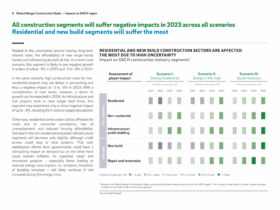
Matrix-style graphic showing impact across five construction segments for three scenarios; summary paragraph on the left
Investment Analysis
Real Estate & Construction
This slide assesses how different construction segments (residential, non-residential, public, new build, renovation) will be affected under varying economic scenarios. Residential and new builds face the largest downturn due to affordability and interest rate concerns.
segment impact, residential, construction outlook, investment, 2023, economic scenario, affordability
false
Investment Analysis
Real Estate & Construction
Table
Roland Berger
Add to my slides
Remove from favorites
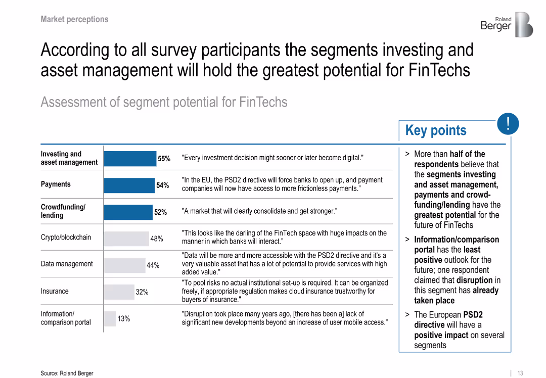
Bar chart ranks segment potential by percentage; comments and bullet points provide qualitative data
Customer and Market Segmentation
Financial Services
Survey responses rank investing, payments, and crowdfunding/lending as top segments for FinTech growth potential. Also highlights low optimism for comparison portals.
segment potential, investing, PSD2, payments, crowdfunding, blockchain
false
Customer and Market Segmentation
Financial Services
Mixed Chart
Roland Berger
Add to my slides
Remove from favorites
The slide presents a funnel infographic with stages of application selection along with a bar chart. The funnel shows three stages of filtering applications with specific numbers at each stage, leading down to the final selected 3,050 applications. The bar chart to the right shows the selected applications emphasized in red.
Market Analysis and Trends
Professional Services
This slide visualizes the multi-stage process of application selection, highlighting the final selection of 3,050 applications from a larger pool through various criteria. It is used for illustrating decision-making processes and outcomes in a corporate or professional environment.
Selection, Applications, Funnel, Process, Criteria, Decision-making, Corporate, Outcomes, Analysis, Stage
false
Market Analysis and Trends
Professional Services
Single Chart
Accenture
Add to my slides
Remove from favorites
This slide uses a multi-step flowchart with text blocks. The slide is dominated by red and white colors with bold, clear text. Three stages are visually differentiated with distinct red blocks.
Strategic Planning
Professional Services
The slide explains the three-stage process used by Accenture and TEF to select top businesses from initial screenings to final selection. Used to describe evaluation processes in business contexts.
selection, process, business, evaluation, stage
false
Strategic Planning
Professional Services
Linear Flow
Accenture
Add to my slides
Remove from favorites
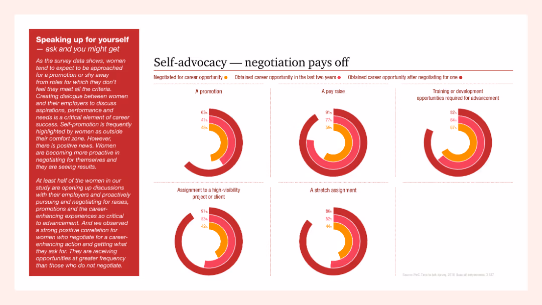
Multiple column charts showing the outcomes of self-advocacy in career advancement including promotions, pay raises, and high-visibility projects. Text emphasizes the importance of negotiation for career progression.
Human Resources and Talent Management
Professional Services
The slide illustrates the positive impacts of self-advocacy and negotiation on career opportunities for women, showing significant statistics on promotions, pay raises, and career advancement through self-advocacy.
self-advocacy, negotiation, career, women, advancement
false
Human Resources and Talent Management
Professional Services
Multiple Chart
PwC/Strategy&
Add to my slides
Remove from favorites
Donut chart showing how respondents perceive their leadership potential, with detailed text explaining the findings and gender differences in self-perception.
Human Resources and Talent Management
Education & Training
This slide reveals self-assessments of leadership potential among respondents, noting high levels of confidence, especially among younger and female participants.
self-appraisal, leadership potential, gender differences, confidence, young professionals
false
Human Resources and Talent Management
Education & Training
Mixed Chart
Deloitte
Add to my slides
Remove from favorites
Split layout with bar charts on the left, bullet points in the center, and legislation/projects in shaded boxes on the right; clean, business-style format
Market Analysis and Trends
Real Estate & Construction
This slide analyzes the UK prefabricated housing market, emphasizing that the sector is largely developer-driven, particularly for total new family houses. It presents data on self-build vs. developer-built homes, discusses the “Right to Build” legislation, and highlights projects initiated by local councils. The legislation is expected to encourage self-build growth.
self-build, UK housing market, prefabrication, developers, legislation, Right to Build, housing associations, project pipeline
false
Market Analysis and Trends
Real Estate & Construction
Multiple Chart
Roland Berger
Add to my slides
Remove from favorites
Dual-panel layout showing self-care factors and wearable device market growth; iconography and charts used
Technology and Digital Transformation
Healthcare & Pharmaceuticals
The slide advocates self-care as a strategy to prevent and manage diseases, supported by digital tools like wearables. It notes a growing market for health tech and increasing consumer responsibility in health decisions.
self-care, health tech, wearables, prevention, WHO, lifestyle, market trends, health monitoring, telehealth
false
Technology and Digital Transformation
Healthcare & Pharmaceuticals
Mixed Chart
Roland Berger
Add to my slides
Remove from favorites
This slide contains a column chart showing global agreement levels on self-determination, with countries listed along the x-axis and percentages along the y-axis.
Market Analysis and Trends
Government & Public Sector
It presents data on the global consensus regarding the right to self-determination, emphasizing the importance of individuals working out their principles to guide decisions.
self-determination, global consensus, principles, agreement, column chart, countries, percentages
false
Market Analysis and Trends
Government & Public Sector
Multiple Chart
IPSOS
Add to my slides
Remove from favorites
This slide features a column chart comparing the percentage of consumers in different countries who think fully self-driving vehicles are not safe between two years.
Market Analysis and Trends
Transportation & Logistics
It analyzes the change in consumer perception regarding the safety of self-driving cars across several countries over two years, showing a trend of increased acceptance.
self-driving, cars, safety, perception, trends
false
Market Analysis and Trends
Transportation & Logistics
Single Chart
Deloitte
Add to my slides
Remove from favorites
The slide includes a bar chart showing the top 10 items shoppers plan to purchase for themselves during the holiday season.
Market Analysis and Trends
Retail & E-commerce
This slide focuses on self-gifting trends, displaying the most common items consumers buy for themselves while holiday shopping.
self-gifting, consumer behavior, holiday shopping, retail, e-commerce, trends, popular items, 2019, spending, food
false
Market Analysis and Trends
Retail & E-commerce
Single Chart
Deloitte
Add to my slides
Remove from favorites
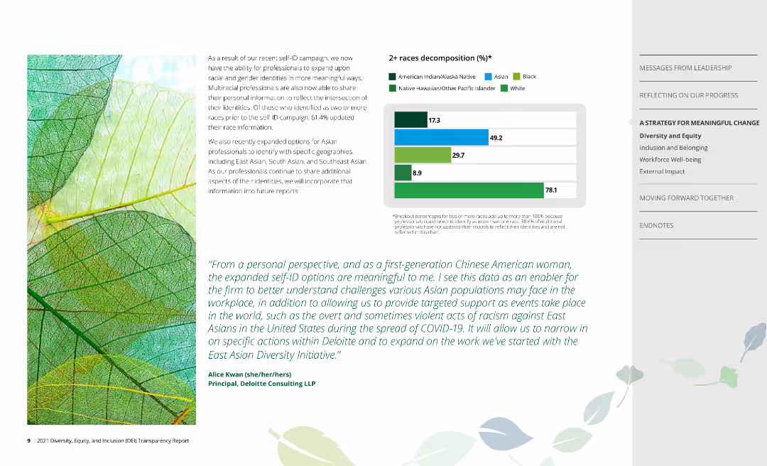
The slide features a bar chart decomposing the 2+ races demographic, with additional text explaining the significance of expanded self-ID options and personal perspectives from employees.
Human Resources and Talent Management
Professional Services
The slide highlights the impact of expanded self-identification options on the company's understanding of racial and gender identities, supported by personal perspectives and detailed demographic data on professionals identifying as 2+ races.
Self-ID, diversity, racial identity, gender identity, demographics
false
Human Resources and Talent Management
Professional Services
Mixed Chart
Deloitte
Add to my slides
Remove from favorites
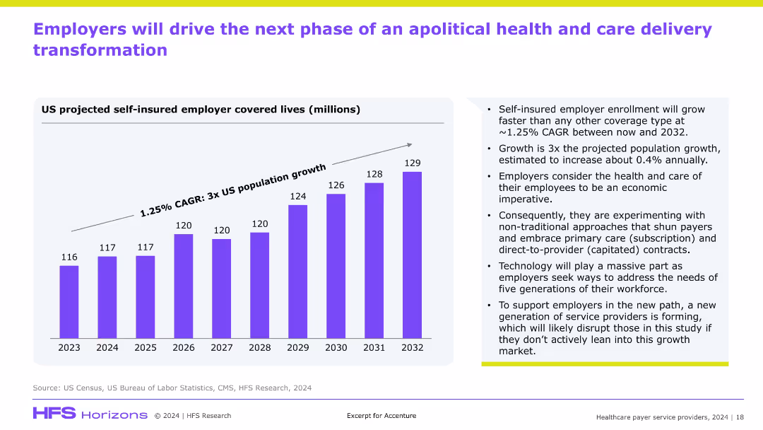
Bar graph on left showing self-insured employer lives from 2023–2032; right side features supporting bullet points; clean, modern style with purple graph and gradient background.
Market Analysis and Trends
Healthcare & Pharmaceuticals
This slide projects a rise in self-insured employer coverage through 2032, growing faster than the general population. It emphasizes employer-led transformation in healthcare through new care models (e.g., subscription, capitated), driven by economic imperatives and supported by technology, suggesting disruption opportunities for service providers.
self-insured, employers, healthcare transformation, subscription, capitated, disruption
false
Market Analysis and Trends
Healthcare & Pharmaceuticals
Mixed Chart
Accenture
Add to my slides
Remove from favorites
The slide has a title at the top, text in the middle, and a column chart at the bottom depicting reasons for self-isolation.
Risk Assessment and Management
Healthcare & Pharmaceuticals
Details reasons for self-isolation among respondents, highlighting that 30% had self-isolated due to COVID-19 symptoms or household exposure. Data is categorized by various reasons.
Self-Isolation, COVID-19, Survey, Health, Data
false
Risk Assessment and Management
Healthcare & Pharmaceuticals
Mixed Chart
IPSOS
Add to my slides
Remove from favorites
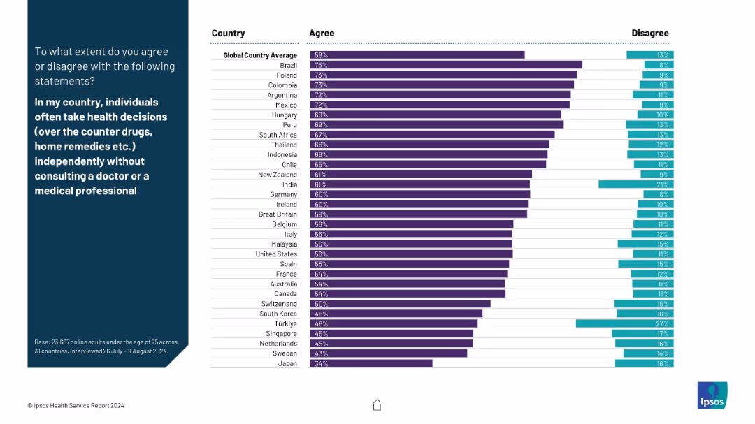
A horizontal agreement vs disagreement bar chart layout; country-wise responses are shown with clear emphasis on independent health decision-making behaviors.
Customer and Market Segmentation
Healthcare & Pharmaceuticals
This slide analyzes the extent to which people self-medicate or use home remedies without professional consultation. Brazil, Poland, and Colombia top the list with highest agreement.
self-medication, health decisions, independence, OTC, cultural behavior, survey results, patient autonomy, Ipsos
false
Customer and Market Segmentation
Healthcare & Pharmaceuticals
Mixed Chart
IPSOS
Add to my slides
Remove from favorites
Ranked horizontal bar chart showing how residents in each country perceive their own country’s influence on world affairs in the next 10 years.
Strategic Planning
Government & Public Sector
This slide highlights self-perception across 30 nations about their country's influence in future global affairs. The data compares each country's self-evaluation with the overall average and shows year-over-year changes.
self-perception, national pride, influence, public sentiment, Ipsos, strategic outlook, global affairs, national image
false
Strategic Planning
Government & Public Sector
Mixed Chart
IPSOS
Add to my slides
Remove from favorites
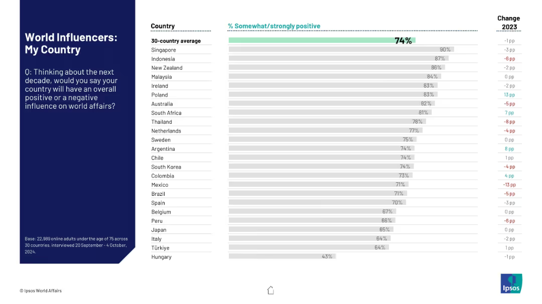
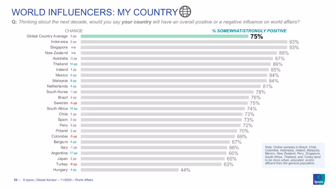
Bar chart visualizing citizens' expectations for their own country’s influence globally
Market Analysis and Trends
Government & Public Sector
Depicts how individuals from various countries feel about their own nation’s influence over the next decade. Global average is 75%. Highest scores come from Indonesia and Singapore.
self-perception, world influence, national pride, Ipsos, bar chart, country views, future outlook, public opinion
false
Market Analysis and Trends
Government & Public Sector
Single Chart
IPSOS
Add to my slides
Remove from favorites
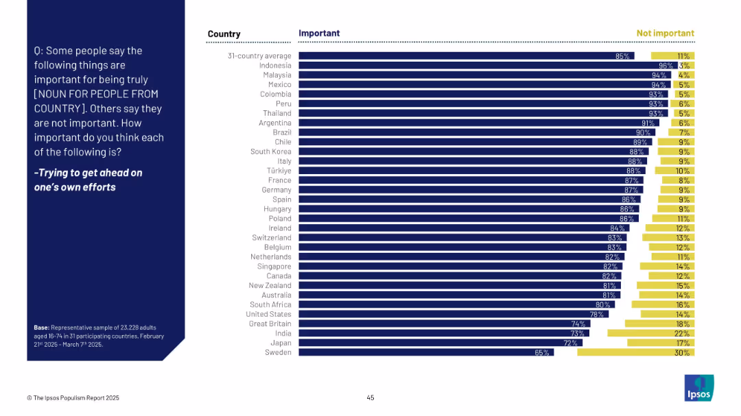
Horizontal bar chart with two categories: "Important" (dark blue) and "Not important" (yellow). Countries listed on the left; responses shown as % bars.
Market Analysis and Trends
Professional Services
This slide shows survey responses from 31 countries on the perceived importance of self-reliance for national identity. The majority in most countries consider "trying to get ahead on one’s own efforts" as important, with notable variation across countries.
self-reliance, identity, values, national perception, survey, Ipsos, global, bar chart, effort, attitudes
false
Market Analysis and Trends
Professional Services
Mixed Chart
IPSOS
Add to my slides
Remove from favorites
The slide displays a column chart side by side, one showing a decrease in 'cost to serve per CCB household' and another with icons and text highlighting efficiency examples.
Operational Efficiency
Financial Services
Focuses on JP Morgan's reduction in customer service costs and enhancements in operational efficiency, marked by self-service and workforce transformation. It targets an audience interested in operational improvements and cost management.
Self-Service, Operational Efficiency, Cost Reduction, Workforce Transformation
false
Operational Efficiency
Financial Services
Mixed Chart
JP Morgan
Add to my slides
Remove from favorites
The slide includes circular diagrams and bar charts analyzing the adoption of self-service technologies in different regions. It has a clean, modern look using blue and green tones.
Technology and Digital Transformation
Telecommunications
Discusses the increasing role and impact of self-service options in enhancing customer satisfaction and operational efficiency. Particularly relevant for sectors focusing on digital solutions and customer autonomy, such as technology and professional services.
self-service, technology adoption, customer satisfaction, operational efficiency, digital solutions
false
Technology and Digital Transformation
Telecommunications
Multiple Chart
Deloitte
Add to my slides
Remove from favorites
Contains diagrams and text explaining self-sovereign and passwordless identity verification methods.
Technology and Digital Transformation
Technology & Software
Discusses innovative identity verification technologies and their roles in enhancing digital security and user autonomy.
self-sovereign identity, passwordless identity, biometrics, digital security, innovation
false
Technology and Digital Transformation
Technology & Software
Header Horizontal
McKinsey
Add to my slides
Remove from favorites
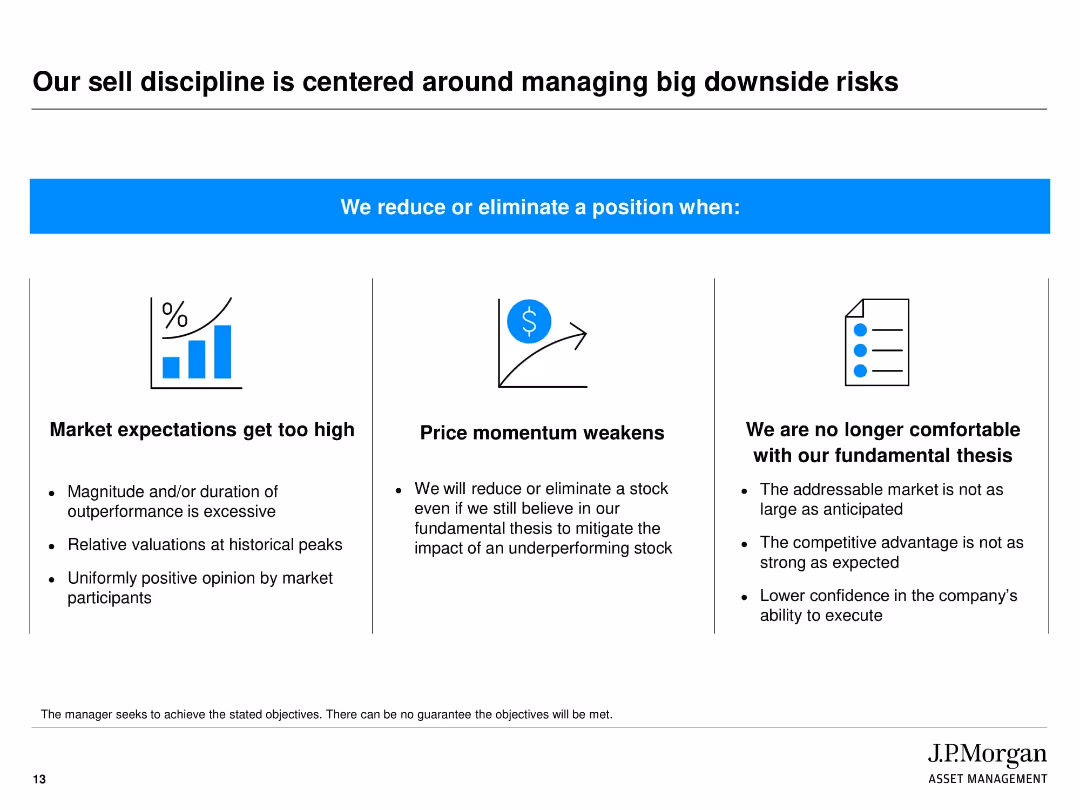
Three-column layout under a bold banner with conditions for reducing/eliminating positions, each supported by a visual icon
Risk Assessment and Management
Financial Services
This slide explains the criteria J.P. Morgan uses to reduce or eliminate investments. It lists three key triggers: market overvaluation, weakening price momentum, and failure of fundamental investment theses, highlighting the firm’s risk-averse discipline.
Sell discipline, downside risk, investment strategy, valuation, risk management, price momentum, fundamental analysis
false
Risk Assessment and Management
Financial Services
Pillar
JP Morgan
Add to my slides
Remove from favorites
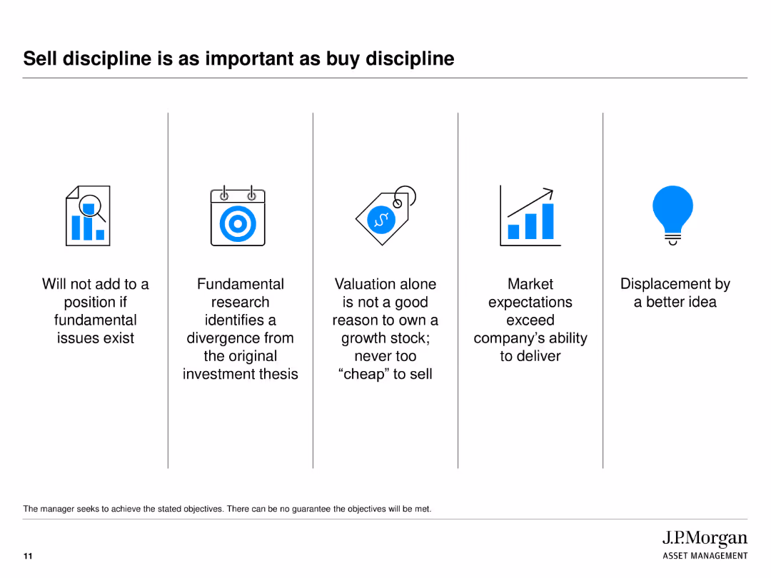
Five icons representing key principles of sell discipline: fundamental issues, divergence from thesis, valuation, market expectations, and displacement by better ideas.
Operational Efficiency
Financial Services
Highlights the importance of sell discipline in investment, explaining scenarios under which a position should not be added or should be sold, ensuring strategic decision-making.
sell discipline, investment, principles, valuation, market expectations
false
Operational Efficiency
Financial Services
Pillar
JP Morgan
Add to my slides
Remove from favorites
Column charts showing top sellers and buyers since 2014, segmented by different years and totals.
Competitive Landscape
Financial Services
Provides an overview of the top sellers and buyers in the European market since 2014, focusing on the competitive landscape.
Sellers, buyers, market, Europe, competitive
false
Competitive Landscape
Financial Services
Multiple Chart
Deloitte
Add to my slides
Remove from favorites
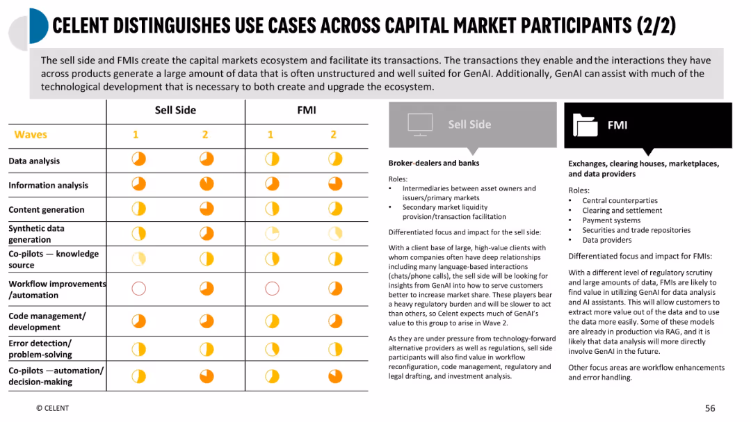
Similar format to prior slide; compares Sell Side and FMIs; includes role definitions and impact levels using pie indicators
Industry Overview
Financial Services
Shows AI-driven use cases across sell side (brokers/banks) and FMIs (market infrastructure). Highlights varying needs in data processing, regulatory burdens, and where GenAI adds value in areas like clearing, data management, and content generation.
sell side, FMIs, regulatory impact, GenAI value, data infrastructure
false
Industry Overview
Financial Services
Mixed Chart
Oliver Wyman
Add to my slides
Remove from favorites
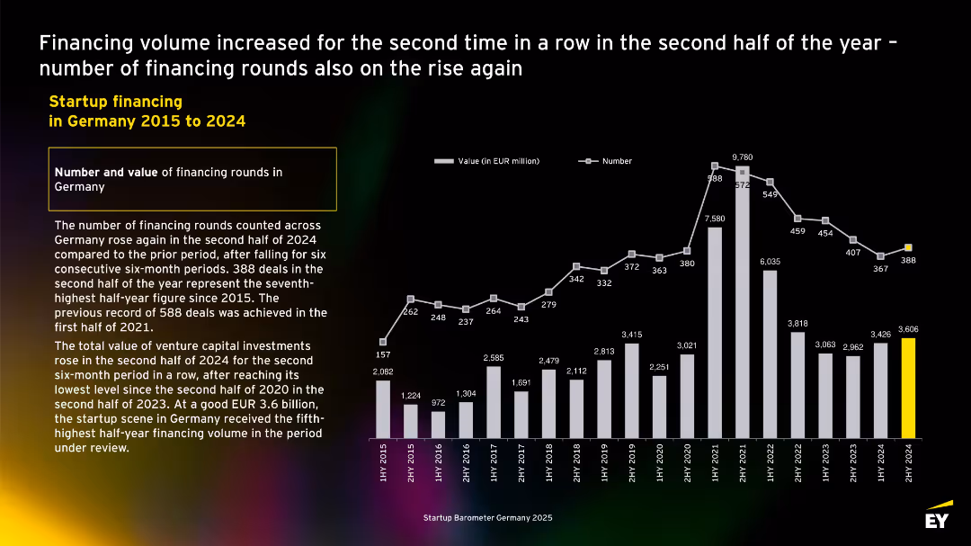
Dual-axis bar and line chart with semiannual VC data (2015–2024); left-aligned summary notes deal recovery and funding volume trends.
Investment Analysis
Financial Services
This slide presents semiannual VC trends in Germany. It highlights a funding recovery in 2H 2024, with €3.6B invested and 388 deals—the seventh-highest since 2015. The data show rebounding investor interest after prior declines.
semiannual trends, VC recovery, German startups, 2024 deals, financing volume, startup investment, historical comparison
false
Investment Analysis
Financial Services
Mixed Chart
EY
Add to my slides
Remove from favorites
Features a column chart showing the rising costs of SOC advanced design at various technology nodes from 2006 to 2020, with the costs represented in millions and a significant upward trend as the technology node size decreases. The slide is visually straightforward with a focus on the trend line highlighted in green.
Market Analysis and Trends
Technology & Software
This slide outlines the escalating costs of semiconductor design with advancements in technology, from 65nm in 2006 to 5nm in 2020. It highlights the financial implications of technological progress in the semiconductor industry, suitable for financial analysis or strategic investment discussions in technology sectors.
semiconductor, design costs, technology nodes, financial analysis, trend
false
Market Analysis and Trends
Technology & Software
Single Chart
BCG
Add to my slides
Remove from favorites
This slide uses icons and brief text to illustrate the advantages of design leadership, such as a "Virtuous Cycle of Innovation" and "Stronger Security". The layout is clear, with each benefit separated into its own section using thin dividers, and the color scheme is consistent with green highlights.
Market Analysis and Trends
Technology & Software
Highlights the benefits of leading in semiconductor design, such as attracting global talent, setting technical standards, and ensuring national security. Useful in discussions aimed at industry leaders and policymakers, focusing on strategic advantages and long-term goals in the semiconductor industry.
semiconductor, design leadership, innovation, security, employment, standards
false
Market Analysis and Trends
Technology & Software
Pillar
BCG
Add to my slides
Remove from favorites
The slide uses a green color scheme and includes four connected icons, each representing a stage of semiconductor design: Product Definition, Architecture/System Design, Integrated Circuit Design, and Post-Silicon Validation. Text descriptions provide brief insights into the activities performed at each stage.
Market Analysis and Trends
Technology & Software
This slide outlines the four critical stages of semiconductor design, from product definition to post-silicon validation, with emphasis on the technical aspects and design intricacies at each stage. Useful for educational purposes in engineering courses or professional seminars focused on semiconductor manufacturing processes.
semiconductor, design stages, product definition, system design, circuit design, validation
false
Market Analysis and Trends
Technology & Software
Linear Flow
BCG
Add to my slides
Remove from favorites
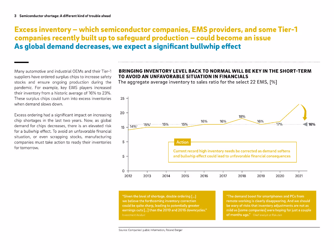
Two-column layout with a line chart on the right, text on the left, and yellow highlight boxes. Clean design with strong visual cues.
Risk Assessment and Management
Technology & Software
The slide discusses how excess inventory of semiconductor chips—accumulated by EMS and Tier-1 suppliers during the pandemic—could lead to financial trouble as demand drops. A "bullwhip effect" is predicted unless inventory levels are corrected. A chart shows inventory to sales ratio trends.
semiconductor, EMS, inventory, bullwhip effect, chip shortage, demand drop, financial risk, OEMs, pandemic, surplus chips
false
Risk Assessment and Management
Technology & Software
Mixed Chart
Roland Berger
Add to my slides
Remove from favorites
This slide uses a column chart to compare semiconductor demand by region, highlighting the top OEMs in each area. The charts are color-coded to distinguish between regions (e.g., US, China, Europe), and key OEMs like Apple and Samsung are specifically noted. The layout facilitates easy comparison between regions with a clear emphasis on US vs. international demand.
Market Analysis and Trends
Technology & Software
Highlights the global distribution of semiconductor demand, emphasizing the significant portion of demand originating from outside the US, particularly in China and Europe. It argues for the importance of maintaining open global markets, crucial for industry strategists and policymakers focused on international trade and market access strategies in the technology sector.
semiconductor, global demand, OEMs, US, China, market access
false
Market Analysis and Trends
Technology & Software
Single Chart
BCG
Add to my slides
Remove from favorites
Presents a timeline from 1990 to 2030 showing changes in the top semiconductor companies by revenue. Each decade is represented by a different color, and arrows indicate new entrants or drops from the list. The slide is visually dense but organized, allowing for clear comparisons across years.
Market Analysis and Trends
Technology & Software
This slide depicts the dynamic nature of leadership in the semiconductor industry, showing how top companies have shifted positions over the decades. Useful for discussions on market dynamics, industry evolution, and strategic planning in technology and industrial sectors.
semiconductor, industry leaders, market dynamics, revenue, historical comparison
false
Market Analysis and Trends
Technology & Software
Table
BCG
Add to my slides
Remove from favorites
This slide displays stacked bar charts showing the percentage of revenue share by region in the semiconductor design sector for different design types. Each bar uses a distinct color to represent a different region (e.g., US, Europe, China) and labels indicating specific percentages for clarity in comparison.
Market Analysis and Trends
Technology & Software
The slide analyzes the global semiconductor design market, highlighting the US's leading role and comparing it with other regions like Europe and China. It provides insights into the distribution of market share across different semiconductor types, emphasizing the R&D intensity and value-add of the industry. Useful for market analysts and professionals in strategic planning or market analysis roles.
semiconductor, market share, global leader, R&D, US, Europe, China
false
Market Analysis and Trends
Technology & Software
Single Chart
BCG
Add to my slides
Remove from favorites
A column chart showing market share by region from 2000 to 2030. Uses color-coded segments to represent different regions. Includes a dashed line for future projections. Clear, structured layout with a legend and source information at the bottom.
Market Analysis and Trends
Technology & Software
Slide analyzes the projected decline in market share for U.S. companies in the semiconductor industry by 2030, suggesting a need for strategic actions to maintain competitiveness in a global context.
semiconductor, market share, projections, U.S., decline
false
Market Analysis and Trends
Technology & Software
Single Chart
BCG
Add to my slides
Remove from favorites
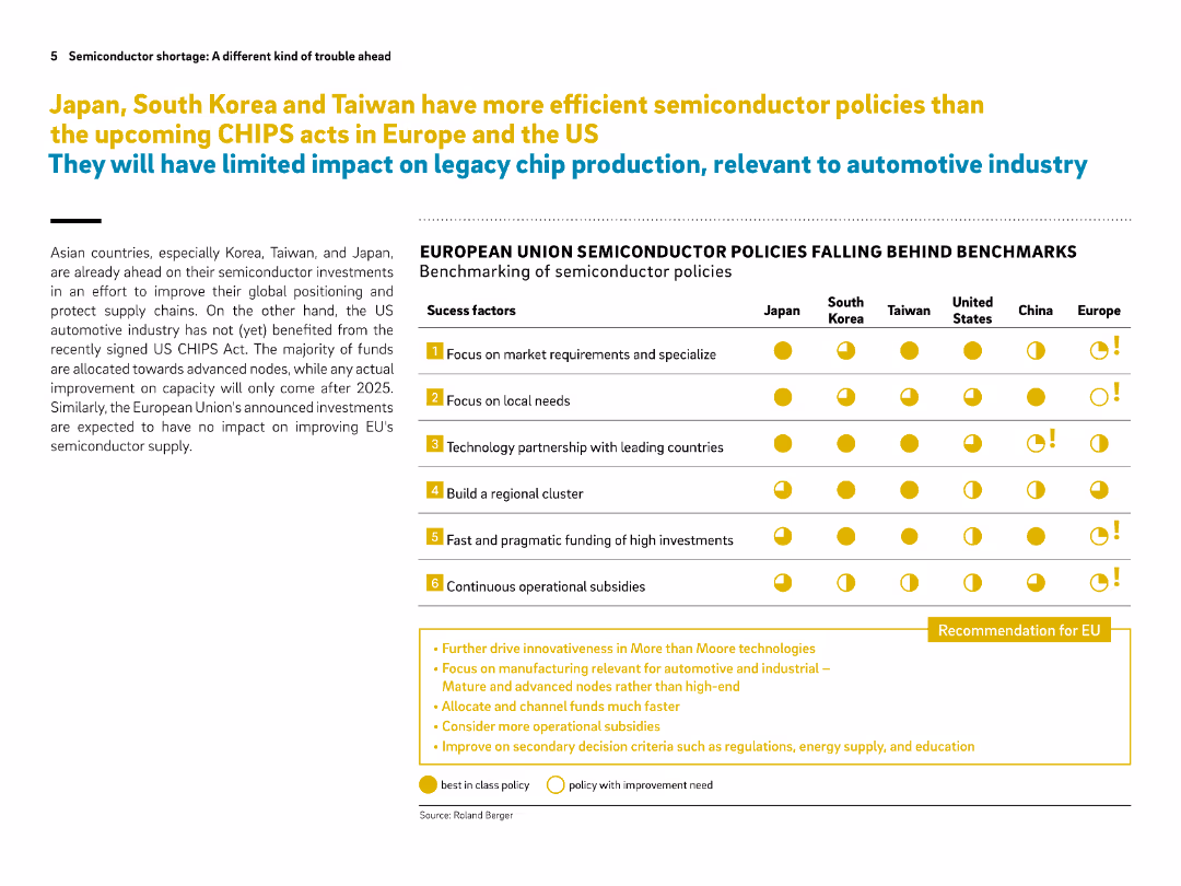
Left side contains narrative text, right side shows a benchmarking comparison table of policy success factors across regions. Bright icons emphasize comparisons.
Regulatory and Compliance
Government & Public Sector
The slide benchmarks global semiconductor policies, showing that Asian countries lead in effective policy implementation while Europe and the US lag behind. It suggests key recommendations for the EU to catch up, such as faster funding and focus on legacy chips.
semiconductor policy, CHIPS act, Europe, benchmarking, subsidies, legacy nodes, Japan, Korea, Taiwan, EU recommendations
false
Regulatory and Compliance
Government & Public Sector
Table
Roland Berger
Add to my slides
Remove from favorites
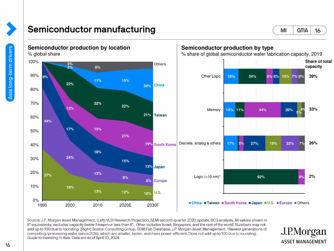
Two charts: a stacked area chart showing semiconductor production by location over time, and a stacked bar chart showing production by type.
Market Analysis and Trends
Industrial & Manufacturing
The slide provides an overview of global semiconductor production, highlighting changes in production locations and types over the years and projections for the future.
semiconductor production, manufacturing, locations, production types, global trends, industrial analysis, economic insights, technology, development, future projections
false
Market Analysis and Trends
Industrial & Manufacturing
Multiple Chart
JP Morgan
Add to my slides
Remove from favorites
The slide presents multiple pie charts comparing the percentage of semiconductor-specific design R&D funding from public vs. private sources in different regions like the US, Europe, and China. Each chart uses two-tone color schemes for easy differentiation between public and private funding, with accompanying labels and percentages.
Market Analysis and Trends
Technology & Software
Analyzes the funding landscape for semiconductor design R&D, showing a higher reliance on private investment in the US compared to other OECD countries. This slide is pertinent for discussions on policy making, investment strategies, and public-private partnerships in technology and governmental sectors.
semiconductor, R&D funding, public investment, private sector, US, OECD
false
Market Analysis and Trends
Technology & Software
Multiple Chart
BCG
Add to my slides
Remove from favorites
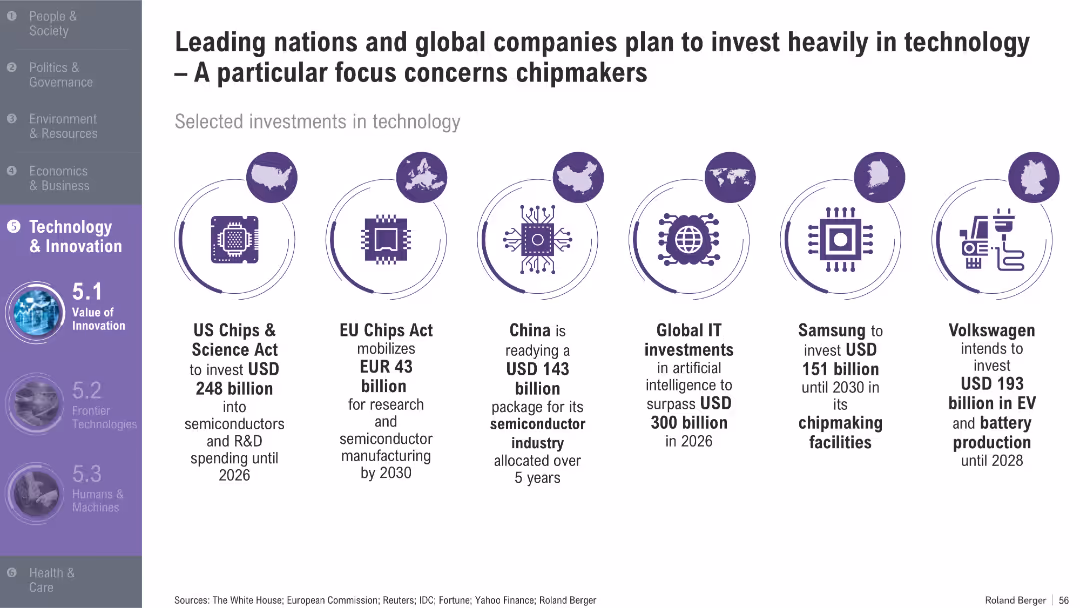
Horizontal infographic featuring icons and text describing investment commitments by countries and companies; purple theme with circular icons
Technology and Digital Transformation
Technology & Software
The slide showcases major semiconductor and technology-related investment plans from the US, EU, China, and companies like Samsung and Volkswagen. It highlights growing geopolitical and economic focus on chip manufacturing.
semiconductors, chipmakers, investment, US Chips Act, EU, China, AI, EV, technology strategy, R&D
false
Technology and Digital Transformation
Technology & Software
Pillar
Roland Berger
Add to my slides
Remove from favorites
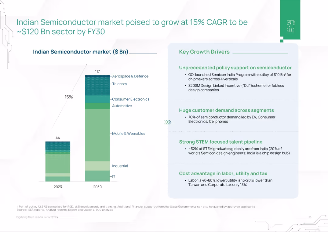
Vertical bar chart (2023–2030) showing semiconductor market size segmented by sectors. Right panel lists key growth drivers.
Market Analysis and Trends
Technology & Software
The slide forecasts strong growth in India's semiconductor market, reaching $117B by 2030, driven by policy incentives, demand across electronics sectors, STEM talent, and cost advantages. It outlines strategic sectors and supportive policies.
semiconductors, electronics, India, CAGR, market forecast, policy support, STEM talent, chip manufacturing
false
Market Analysis and Trends
Technology & Software
Mixed Chart
BCG
Add to my slides
Remove from favorites
Column chart showing semiconductor investment projects and a pie chart of low-carbon mobility projects by country.
Market Analysis and Trends
Technology & Software
Highlights investments in semiconductors and low-carbon mobility in Europe, focusing on leading countries.
semiconductors, low-carbon, mobility, investment, Europe
false
Market Analysis and Trends
Technology & Software
Multiple Chart
EY
Add to my slides
Remove from favorites
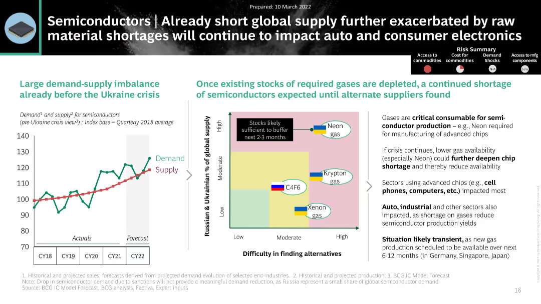
The slide contains a line chart and a matrix chart. It uses a black and white theme with green and blue highlights.
Market Analysis and Trends
Technology & Software
The slide discusses the impact of the Ukraine crisis on semiconductor supply, showing demand-supply imbalances and gas shortages.
Semiconductors, Supply Chain, Demand, Ukraine Crisis, Gases
false
Market Analysis and Trends
Technology & Software
Mixed Chart
BCG
Add to my slides
Remove from favorites
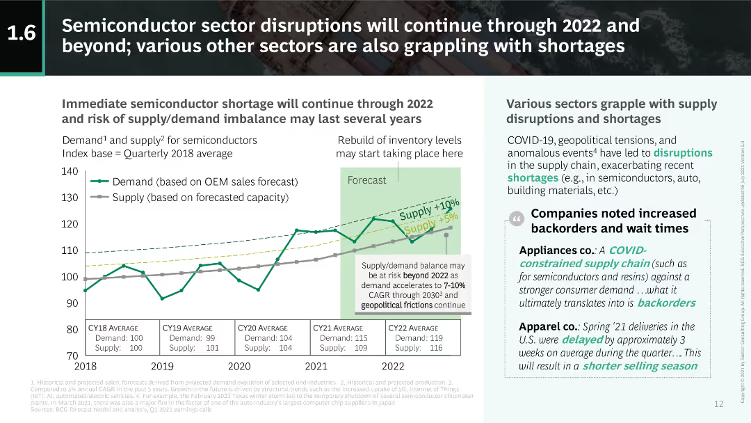
This slide includes a dual-axis line chart showing demand and supply indices for semiconductors from 2018 to 2022. Text on the right discusses broader sector impacts due to disruptions.
Risk Assessment and Management
Technology & Software
The slide details the ongoing semiconductor shortages and their impact across various sectors, emphasizing the supply-demand imbalance and its long-term implications.
semiconductors, supply-demand, shortages, disruptions, 2022
false
Risk Assessment and Management
Technology & Software
Mixed Chart
BCG
Add to my slides
Remove from favorites
A dual-axis chart showing semiconductor supply shortages and price pressures from Jan 2019 to Jan 2023, indicating supply and price trends.
Risk Assessment and Management
Technology & Software
The slide highlights the easing but still elevated semiconductor supply and price pressures, with insights into inventory improvements.
semiconductor, supply chain, price pressures, technology, risk management, inventory
false
Risk Assessment and Management
Technology & Software
Mixed Chart
Accenture
Add to my slides
Remove from favorites
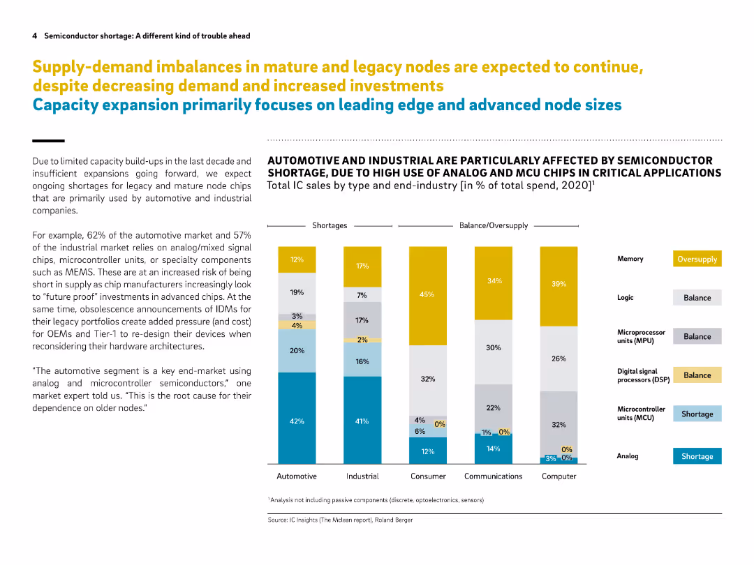
Clean, data-driven layout with stacked bar chart and bullet points. Color-coded legend and vertical segmentation by end-industry.
Market Analysis and Trends
Technology & Software
This slide illustrates ongoing supply shortages for mature semiconductor nodes, particularly affecting automotive and industrial sectors. It shows the imbalance between demand and supply by end-industry and chip type, indicating oversupply in memory but shortages in analog and MCU chips.
semiconductor, supply-demand, mature nodes, automotive, industrial, chip shortage, analog chips, MCU, MEMS, IC market
false
Market Analysis and Trends
Technology & Software
Mixed Chart
Roland Berger
Add to my slides
Remove from favorites
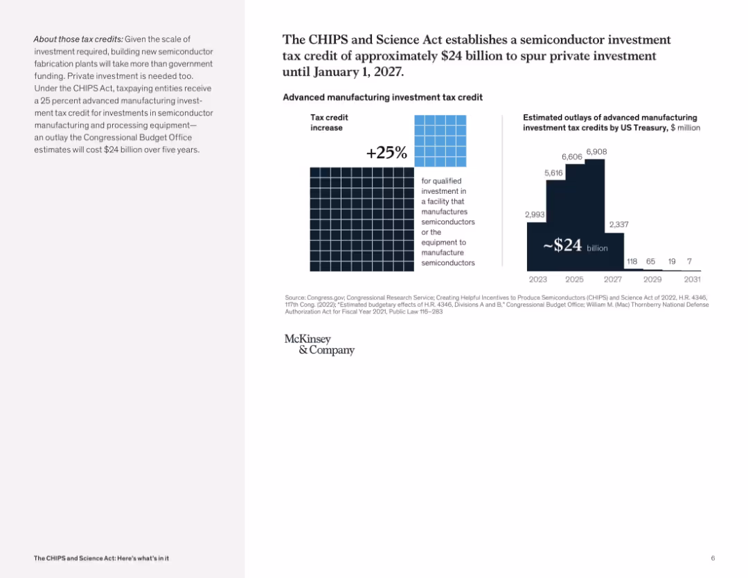
Split layout with textual explanation on the left and visual data on the right, featuring a grid of blue squares and a vertical bar chart with year-by-year cost projections.
Investment Analysis
Government & Public Sector
The slide explains a 25% tax credit for semiconductor manufacturing equipment under the CHIPS Act, amounting to a projected $24B investment incentive. It includes estimated annual outlays from 2023 to 2031 to spur private sector growth in chip manufacturing.
semiconductor, tax credit, investment, CHIPS Act, private sector, Treasury outlays, manufacturing equipment, government funding
false
Investment Analysis
Government & Public Sector
Multiple Chart
McKinsey
Add to my slides
Remove from favorites
An infographic detailing the various incentives for semiconductor manufacturing in the US, including manufacturing, development, tax incentives, and international tech security.
Strategic Planning
Technology & Software
This slide outlines the incentives provided by the US government to boost semiconductor manufacturing, covering areas such as funding for research, tax credits, and international security initiatives.
Semiconductor, US, incentives, manufacturing, strategy
false
Strategic Planning
Technology & Software
Diagram
Deloitte
Add to my slides
Remove from favorites
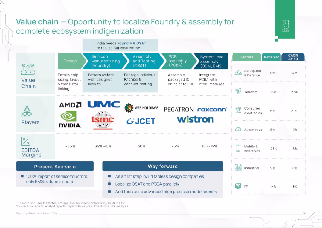
Flow diagram of the semiconductor value chain with players, EBITDA margins, and sector growth rates. Split into Present and Way Forward strategies.
Technology and Digital Transformation
Technology & Software
This slide maps the semiconductor value chain and highlights opportunities for India to localize high-value segments like foundry and OSAT. It suggests a phased roadmap to reduce dependence on imports and build a self-reliant chip ecosystem.
semiconductor, value chain, localization, foundry, OSAT, India, chip design, electronics manufacturing
false
Technology and Digital Transformation
Technology & Software
Table
BCG
Add to my slides
Remove from favorites
A flow diagram illustrating the semiconductor value chain from design to final product, including stages like manufacturing and assembly. Each stage is visually separated and described.
Technology and Digital Transformation
Technology & Software
This slide provides an overview of the semiconductor value chain, detailing each step from design through manufacturing and assembly to the final product, highlighting opportunities in each stage.
Semiconductor, value chain, manufacturing, design, assembly
false
Technology and Digital Transformation
Technology & Software
Diagram
Deloitte
Add to my slides
Remove from favorites
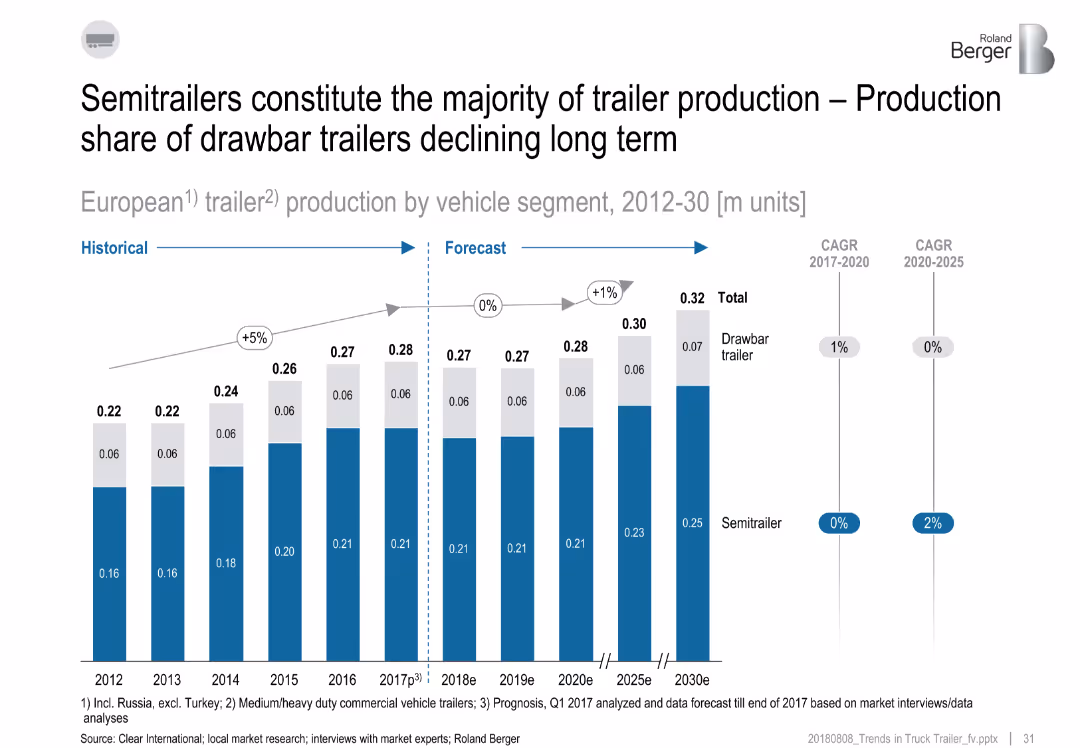
Stacked bar chart from 2012 to 2030 showing split between semitrailers and drawbar trailers.
Product and Service Analysis
Industrial & Manufacturing
The slide reveals a growing dominance of semitrailers over drawbar trailers in Europe. While total production grows slightly, semitrailers make up the majority. Drawbar trailer share declines, especially post-2020, with CAGR diverging by segment.
semitrailer, drawbar, trailer production, Europe, forecast, vehicle segment
false
Product and Service Analysis
Industrial & Manufacturing
Single Chart
Roland Berger
Add to my slides
Remove from favorites
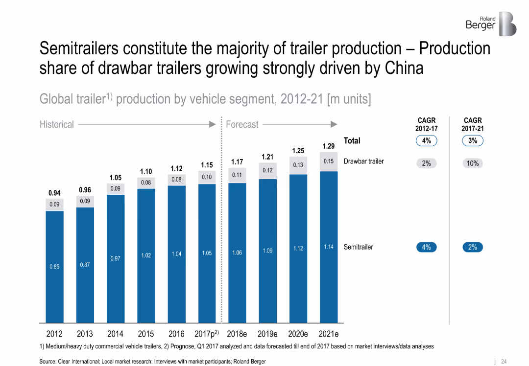
Stacked bar chart comparing semitrailers vs. drawbar trailers from 2012–2021
Product and Service Analysis
Industrial & Manufacturing
The chart shows that semitrailers dominate global production, but drawbar trailers are gaining share, especially due to demand in China. It also presents historical and forecasted production volumes with CAGR indicators.
semitrailers, drawbar trailers, trailer production, China, market shift, CAGR
false
Product and Service Analysis
Industrial & Manufacturing
Single Chart
Roland Berger
Add to my slides
Remove from favorites
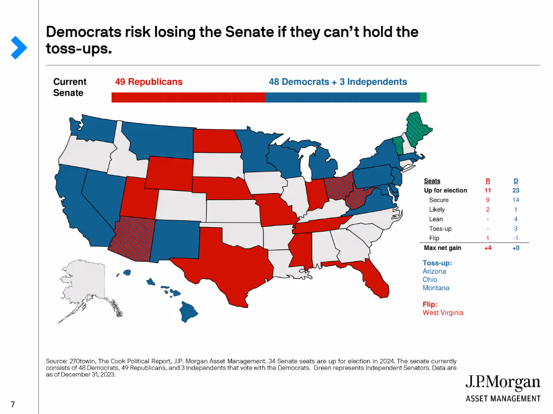
A U.S. map with states color-coded to show the likelihood of party control in the Senate, with red for Republicans, blue for Democrats, and green for toss-ups.
Market Analysis and Trends
Government & Public Sector
Analyzes the Senate races for 2024, highlighting which states are toss-ups and the potential risks for Democrats losing control of the Senate.
Senate, Toss-ups, Election, Control, 2024
false
Market Analysis and Trends
Government & Public Sector
Graphic
JP Morgan
Add to my slides
Remove from favorites
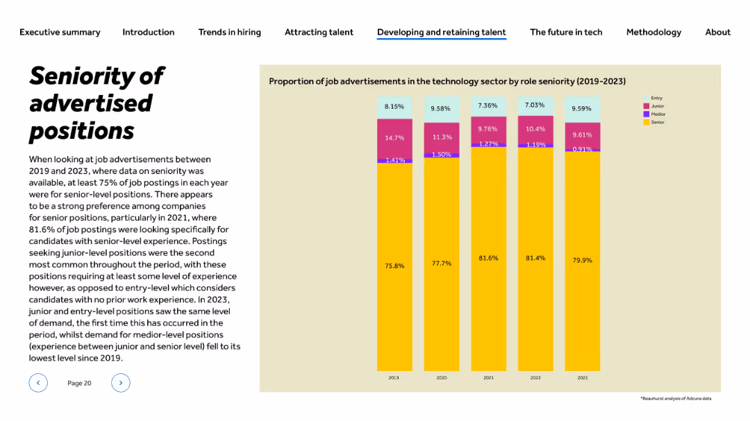
Title and paragraph left-aligned; vertical stacked bar chart on right showing role levels (2019–2023)
Human Resources and Talent Management
Technology & Software
This slide presents the distribution of job advertisements in tech by role seniority from 2019 to 2023. Senior roles consistently dominate, peaking at 81.6% in 2021. Entry and junior positions remain minor but saw parity in 2023. The slide illustrates a clear preference for experienced candidates across years, highlighting hiring practices in tech recruitment.
seniority, job levels, entry-level, hiring trends, experience, recruitment, talent demand, HR, tech roles, 2023 hiring
false
Human Resources and Talent Management
Technology & Software
Mixed Chart
Barclays
Add to my slides
Remove from favorites
The slide features three main components: bar graphs showing industry involvement, a line chart illustrating trend popularity over time, and lists highlighting target demographics and tags.
Market Analysis and Trends
Media & Entertainment
This slide analyzes the impact of cultural heritage on various demographics and industries, illustrating growth in digital engagement with art and traditional crafts.
Seniors, Gen X, Millennials, Art & Design, Craft, Traditions, Preservation, Museum
false
Market Analysis and Trends
Media & Entertainment
Multiple Chart
Bain
Add to my slides
Remove from favorites
Slide features a line chart showcasing sensitivity training across various sectors, highlighting retail's lagging performance with visual indicators.
Strategic Planning
Retail & E-commerce
Focuses on the gap in sensitivity training in the retail sector compared to other industries, emphasizing needed improvements.
sensitivity training, retail, sector comparison, line chart, performance gap, improvement needs
false
Strategic Planning
Retail & E-commerce
Mixed Chart
Accenture
Add to my slides
Remove from favorites
Depicts various types of sensors and input devices required for immersive-reality technologies, accompanied by descriptive text.
Technology and Digital Transformation
Technology & Software
Details the types of technologies and inputs that will enhance immersive-reality experiences, including on-body sensors and haptics.
sensors, haptics, immersive reality, technology peripherals, input devices
false
Technology and Digital Transformation
Technology & Software
Header Vertical
McKinsey
Add to my slides
Remove from favorites
Line and column charts, clean and effective use of space, predominantly uses teal color.
Customer and Market Segmentation
Telecommunications
Discusses how sentiment analysis from unstructured data can influence customer service strategies.
sentiment analysis, data, customer service, strategy
false
Customer and Market Segmentation
Telecommunications
Multiple Chart
Deloitte
Add to my slides
Remove from favorites
Graphical representation of investor sentiment over different timeframes regarding the economy and stock market.
Investment Analysis
Financial Services
Visualizes survey data on investor perspectives about the US economy and stock market, showing a trend towards bearish sentiment.
sentiment, investors, bull vs bear, economy, stock market, forecast
false
Investment Analysis
Financial Services
Text Only
BCG
Add to my slides
Remove from favorites
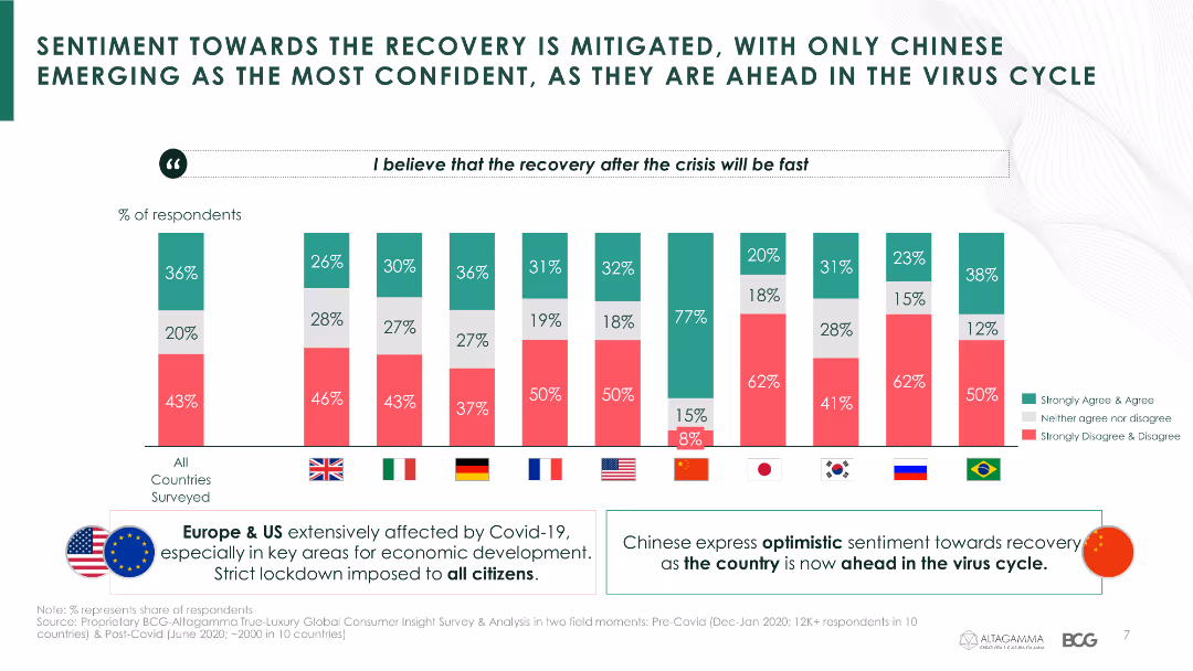
The slide contains a column chart comparing sentiment towards recovery after the crisis across different countries, with a focus on Chinese confidence levels.
Market Analysis and Trends
Consumer Goods
It discusses the differing levels of confidence in economic recovery among luxury consumers in various countries, emphasizing China's optimistic outlook.
sentiment, recovery, confidence, luxury consumers, economic impact, COVID-19, country comparison
false
Market Analysis and Trends
Consumer Goods
Mixed Chart
BCG
Add to my slides
Remove from favorites
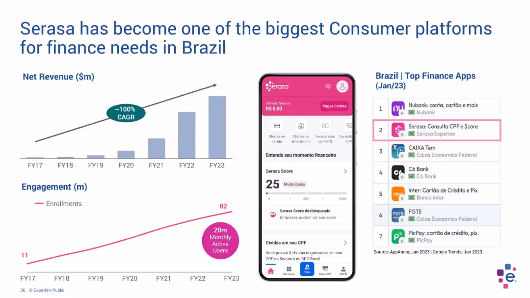
Dual layout with charts on left and mobile app interface + app ranking on right
Customer and Market Segmentation
Technology & Software
Serasa’s consumer platform growth is illustrated via a net revenue chart (FY17–FY23) and user engagement trend. The right side shows the app interface and top rankings in Brazil’s finance app category, demonstrating its high market penetration.
Serasa, Brazil, finance apps, revenue growth, engagement, mobile, CAGR
false
Customer and Market Segmentation
Technology & Software
Multiple Chart
Barclays
Add to my slides
Remove from favorites
Presents column charts tracking revenue and productivity growth alongside strategic highlights about Serasa's market position in Brazil.
Market Analysis and Trends
Financial Services
Details the growth of the Serasa platform in Brazil, highlighting its financial success and strategic position within the market as a comprehensive consumer financial platform.
Serasa, Brazil, financial growth, market analysis, consumer finance
false
Market Analysis and Trends
Financial Services
Multiple Chart
Barclays
Add to my slides
Remove from favorites
Slide includes a line graph and bar charts showing the growth of free member enrollments alongside demographic data about the Brazilian population.
Performance Metrics and KPIs
Financial Services
Showcases Serasa's expansion in Brazil, highlighting significant increases in membership enrollments and its impact on financial inclusivity in the Brazilian market.
Serasa, Brazil, membership growth, financial inclusivity, demographic data
false
Performance Metrics and KPIs
Financial Services
Multiple Chart
Barclays
Add to my slides
Remove from favorites
Displays growth metrics for web visits and active app users, including a competitive positioning bar chart, in a clean and structured layout.
Competitive Landscape
Financial Services
Discusses Serasa's rise as a dominant fintech player in Brazil, emphasizing its substantial growth in user engagement and market position compared to other financial institutions.
Serasa, fintech, Brazil, user engagement, market position
false
Competitive Landscape
Financial Services
Multiple Chart
Barclays
Add to my slides
Remove from favorites
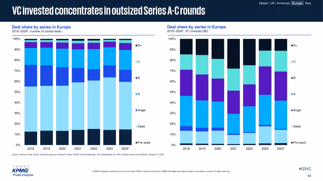
Dual bar charts: left shows deal share by count; right shows deal share by VC invested across series stages
Strategic Planning
Financial Services
The charts show how Series A to C rounds dominate VC investment allocation despite lower deal volume shares. The insights suggest investors concentrate capital into fewer, larger deals during periods of volatility or uncertainty.
Series A-C, deal share, investment volume, VC focus, funding rounds
false
Strategic Planning
Financial Services
Multiple Chart
KPMG
Add to my slides
Remove from favorites
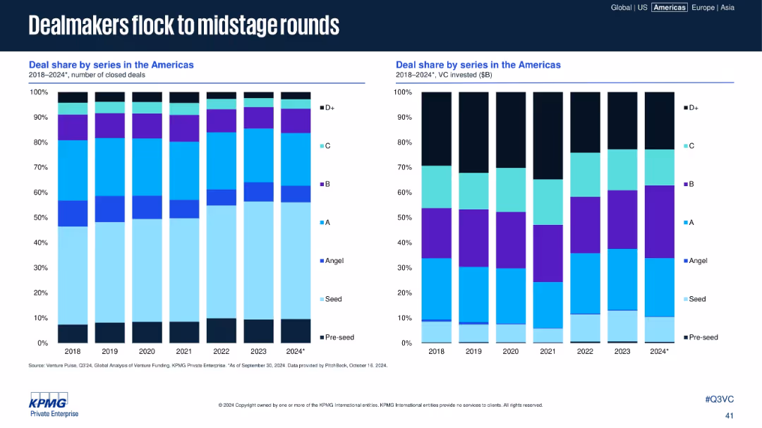
Dual stacked bar charts showing deal share by series (deal count vs. $B invested).
Strategic Planning
Financial Services
This slide reveals a trend toward midstage VC investments (Series A to C), both in number and capital deployed. It shows how investor focus has shifted toward perceived lower-risk, growth-ready startups compared to early or late stages.
Series A–C, VC stages, deal share, funding strategy, midstage focus, investment distribution, strategic planning
false
Strategic Planning
Financial Services
Multiple Chart
KPMG
Add to my slides
Remove from favorites
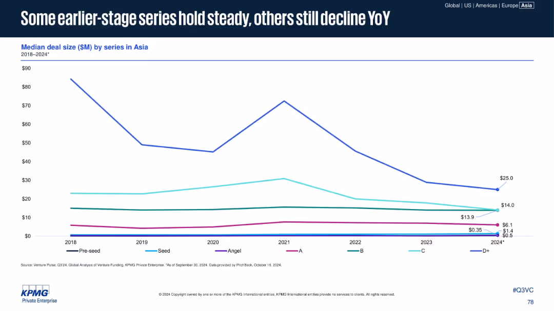
Line chart tracking median deal size by series (Pre-seed to D+) in Asia. Clean white background, each series line distinct in color.
Performance Metrics and KPIs
Financial Services
Examines annual median deal size across funding series in Asia. Later-stage rounds like D+ have declined significantly, while early stages (Angel, A) show minor fluctuations. Offers insight into shifting investor behavior.
Series A-D+, Angel, Seed, Pre-seed, Asia, VC Deal Sizes, YoY Decline
false
Performance Metrics and KPIs
Financial Services
Single Chart
KPMG
Add to my slides
Remove from favorites
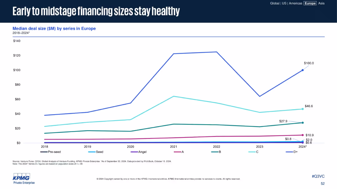
Line chart showing deal size by funding series (Pre-seed to D+) from 2018 to 2024
Performance Metrics and KPIs
Financial Services
This slide tracks the median deal size by funding series in Europe, with strong growth in D+ rounds rebounding in 2024. Early and mid-stage rounds (Series A to C) maintain consistent or growing deal sizes, signaling investor confidence.
Series A, Series B, VC financing, deal size, startup growth
false
Performance Metrics and KPIs
Financial Services
Single Chart
KPMG
Add to my slides
Remove from favorites
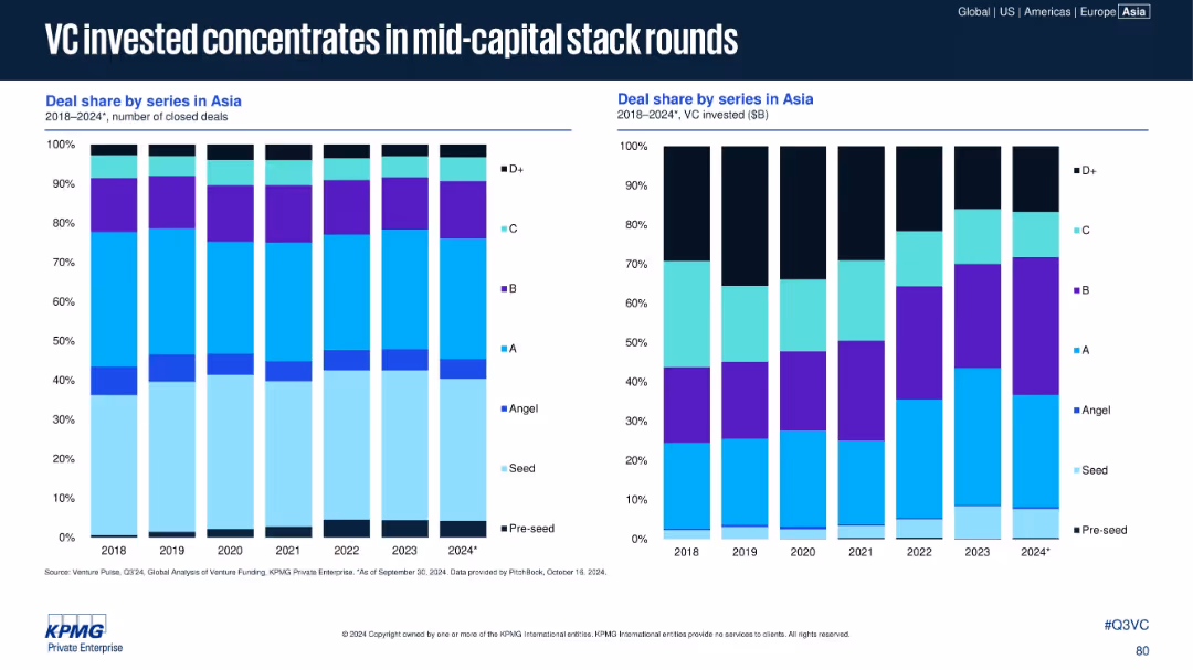
Two stacked bar charts: left for number of closed deals by series; right for VC invested ($B). Color-coded by series (Pre-seed to D+).
Customer and Market Segmentation
Financial Services
Depicts how venture investment in Asia from 2018–2024 has shifted toward mid-stage funding rounds (Series A–C). Although early-stage deals remain numerous, the bulk of capital now concentrates in mid-capital stack investments.
Series Share, VC Investment, Asia, Deal Share, Mid-stage, Series A-C, 2024
false
Customer and Market Segmentation
Financial Services
Multiple Chart
KPMG
Add to my slides
Remove from favorites
The slide features a table and bar charts displaying various levers for service and after-sales with their activity levels and trends.
Operational Efficiency
Consumer Goods
Highlights key levers in service and after-sales, focusing on performance improvement, go-to-market strategies, and customer lock-in.
Service, After-sales, Performance, Efficiency, Trends
false
Operational Efficiency
Consumer Goods
Single Chart
Roland Berger
Add to my slides
Remove from favorites
Includes tables and a process flow chart describing various service delivery models and their characteristics.
Operational Efficiency
Professional Services
Examines service delivery models focusing on efficiency, effectiveness, and the optimal allocation of tasks.
service delivery, efficiency, optimization, global, local
false
Operational Efficiency
Professional Services
Boxed
Deloitte
Add to my slides
Remove from favorites
The slide shows a clean layout with four horizontal line charts comparing different service delivery models across various organizational maturity stages. Each line represents a different model like Onshore SSC, Offshore/Near-shore SSC, Outsourcing, and Center of Excellence. The x-axis represents time intervals while the y-axis shows percentage adoption.
Strategic Planning
Professional Services
Analyzes trends in service delivery preferences among GBS organizations as they mature, showing shifts from onshore to offshore and the consistent use of centers of excellence.
service delivery, GBS, organizational maturity, outsourcing, center of excellence
false
Strategic Planning
Professional Services
Mixed Chart
Deloitte
Add to my slides
Remove from favorites
This slide includes a table-like structure categorizing the company's service evolution over decades. It uses blue and white colors, with clear distinctions between each service and time period.
Strategic Planning
Financial Services
It provides a historical overview of the company's evolution, highlighting expansion into new service areas like digital wealth and banking-as-a-service, illustrating the dynamic growth and innovation of the firm.
service evolution, digital wealth, banking-as-a-service, historical overview, innovation
false
Strategic Planning
Financial Services
Table
Goldman Sachs
Add to my slides
Remove from favorites
Slide combines text, checklists, and an upward arrow graphic to depict growth. It uses blue tones and icons to represent different strategic areas.
Market Analysis and Trends
Financial Services
Discusses the expansion of services to deliver more client value and the strategic areas of focus for the business to unlock higher margins.
Service expansion, client value, strategic focus, embedded finance, SaaS, AI/ML, payments innovation, margin expansion
false
Market Analysis and Trends
Financial Services
Table
JP Morgan
Add to my slides
Remove from favorites
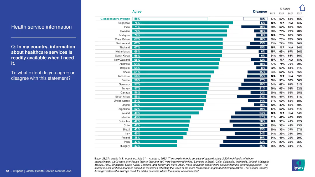
Ranked horizontal bar chart displaying agreement levels across countries about healthcare services info availability.
Operational Efficiency
Healthcare & Pharmaceuticals
The slide evaluates public perception of how accessible healthcare service information is across countries. Singapore and India top the list; Hungary and Peru rank lowest in perceived availability.
service info, healthcare accessibility, perception, country comparison, Ipsos, global average, information access
false
Operational Efficiency
Healthcare & Pharmaceuticals
Mixed Chart
IPSOS
Add to my slides
Remove from favorites
This slide features a diagram illustrating the company's multi-channel advice-led model, showing the relationship between distribution, wealth solutions, and investment management. It categorizes clients into high net worth, affluent, and mass affluent.
Customer and Market Segmentation
Financial Services
This slide demonstrates the company's service model and client segmentation, useful for explaining the business's approach to customer service across different wealth spectrums.
Service Model, Client Segmentation, Wealth Management, Advice-Led
false
Customer and Market Segmentation
Financial Services
Table
Morgan Stanley
Add to my slides
Remove from favorites
A comparative slide with a heatmap design, split into two sections: Core Service Offerings and New Service Offerings. The heatmap indicates the extent to which each service category offers specific services.
Product and Service Analysis
Professional Services
This slide analyzes the service focus of different categories, showing the breadth of core and new service offerings provided by Champions, Leaders, Strivers, and Traditionalists.
service offerings, heatmap, core services, new services, analysis
false
Product and Service Analysis
Professional Services
Table
Accenture
Add to my slides
Remove from favorites
A comparative slide featuring a pie chart on the left and a table on the right. The pie chart shows four categories: Champions, Leaders, Strivers, and Traditionalists. The table compares EBIT, SEBIT, ARR, and NSR percentages for these categories.
Market Analysis and Trends
Professional Services
This slide identifies four categories of service players based on service management maturity. It compares their EBIT, SEBIT, ARR, and NSR percentages to illustrate their performance.
service players, EBIT, SEBIT, ARR, NSR, comparison
false
Market Analysis and Trends
Professional Services
Mixed Chart
Accenture
Add to my slides
Remove from favorites
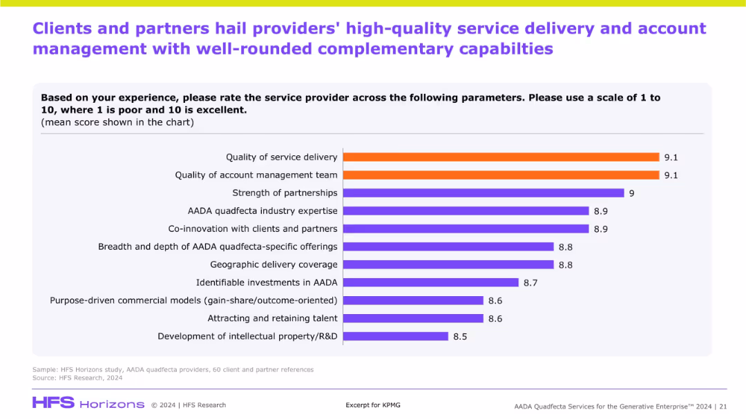
Horizontal bar chart showing top-rated service provider attributes based on client scoring. Orange bars highlight top metrics.
Human Resources and Talent Management
Artificial Intelligence
The slide presents client feedback on AADA providers, scoring highest in service delivery and account management. It also highlights strengths in partnerships, innovation, and talent attraction—reinforcing provider credibility.
service quality, AADA providers, client score, talent, delivery, management, partnerships
false
Human Resources and Talent Management
Artificial Intelligence
Single Chart
KPMG
Add to my slides
Remove from favorites
Organized layout with icons and short text blocks detailing the different services offered by the company.
Investment Analysis
Professional Services
Details the range of services offered by the company, from consulting to cybersecurity, indicating the integrated solutions approach tailored to client needs.
Services, Consulting, Cybersecurity, Solutions, Integrated
false
Investment Analysis
Professional Services
Boxed
Booz Allen Hamilton
Add to my slides
Remove from favorites
The slide includes a column chart and a photo. The chart shows the percentage of family offices offering various services like administrative support, investment advice, and tax advice.
Product and Service Analysis
Financial Services
This slide outlines the various services offered by APAC family offices, highlighting the most common services provided, such as administrative support and investment advice.
services, family offices, APAC, administrative support, investment advice
false
Product and Service Analysis
Financial Services
Mixed Chart
EY
Add to my slides
Remove from favorites
Bar charts comparing the services' share of Gross Value Added (GVA) to total GVA for various countries from 2000, 2020, and projected for 2050.
Technology and Digital Transformation
Technology & Software
The slide shows the increasing share of services in the Gross Value Added (GVA) of different countries, indicating a shift from manufacturing to service-oriented economies. It discusses the structural trends that contribute to this shift and its implications for future economic growth.
Services, GVA, Structural Trends, 2050
false
Technology and Digital Transformation
Technology & Software
Mixed Chart
Roland Berger
Add to my slides
Remove from favorites
Two-column layout with line and column charts illustrating rent growth and CPI services growth excluding shelter from 2017-2025F and 2021-2024.
Market Analysis and Trends
Real Estate & Construction
Analyzes the easing of services inflation driven by rent disinflation and wage pressures amid labor market rebalancing.
services inflation, rent growth, CPI services, labor market, disinflation
false
Market Analysis and Trends
Real Estate & Construction
Multiple Chart
EY
Add to my slides
Remove from favorites
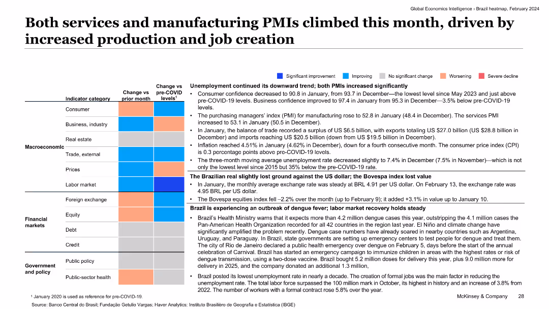
The slide features a detailed text-based analysis with color-coded economic indicators. It covers categories like consumer confidence, trade balance, inflation, and labor market in Brazil.
Market Analysis and Trends
Industrial & Manufacturing
This slide discusses the rise in both services and manufacturing PMIs, driven by increased production and job creation. It provides a comprehensive view of Brazil's economic activities and trends for the month.
services PMI, manufacturing PMI, consumer confidence, trade balance, job creation
false
Market Analysis and Trends
Industrial & Manufacturing
Table
McKinsey
Add to my slides
Remove from favorites
The slide presents a three-column layout with icons and bullet points on the left, a central section with four bar graphs, and a right column showing a list of financial data comparing 2022 to 2017.
Financial Performance
Financial Services
The slide highlights the business strengths, presence, and financial growth of a securities service provider, showing service delivery, client statistics, revenue, and market share among other financial data.
Services, Revenue, Clients, Markets, Growth
false
Financial Performance
Financial Services
Table
JP Morgan
Add to my slides
Remove from favorites
Features stacked column charts projecting the growth of various sectors within China's economy by 2030, highlighting services and industrial contributions.
Market Analysis and Trends
Financial Services
Predicts major growth in China's service sector by 2030, emphasizing financial, business, and public services. Ideal for financial and economic trend analysis.
services sector, growth, China, 2030, financial services, industrial growth, GDP contribution
false
Market Analysis and Trends
Financial Services
Single Chart
BCG
Add to my slides
Remove from favorites
This slide contains column charts and pie charts that present data on service ticket complaints. The charts show complaint types, repeat complaints, and overdue complaints, using various colors for differentiation.
Customer and Market Segmentation
Energy & Utilities
The slide analyzes service tickets and complaints, focusing on the types of complaints, the number of repeat complaints, and the overdue complaints within the utility sector.
Service Tickets, Complaints, Analysis, Repeat, Overdue
false
Customer and Market Segmentation
Energy & Utilities
Multiple Chart
EY
Add to my slides
Remove from favorites
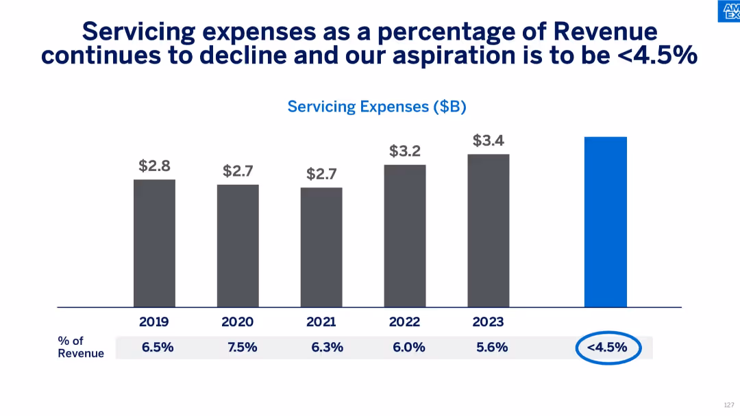
Gray vertical bar chart showing servicing costs and their percentage of revenue from 2019–2023 with future goal.
Operational Efficiency
Financial Services
The slide demonstrates a consistent decrease in servicing expenses as a percentage of revenue, with a goal of reaching under 4.5%. It supports Amex's efforts to improve operational cost efficiency and long-term financial planning.
servicing costs, efficiency, expense reduction, Amex targets, cost management, financial planning, operational strategy
false
Operational Efficiency
Financial Services
Single Chart
McKinsey
Add to my slides
Remove from favorites
The slide features two donut charts showing the composition of a servicing portfolio and a limited servicing portfolio. They are color-coded and labeled with different sectors like Fannie Mae, Freddie Mac, and others. There is a list of notes below explaining key points related to the data shown.
Financial Performance
Financial Services
It illustrates the composition and performance of a company's servicing portfolio, highlighting its diversification and year-over-year revenue increase. It is valuable for investors or management reviewing financial health and diversification in revenue sources, particularly in financial servicing sectors.
Servicing Portfolio, Revenue, TTM, Financial Health, Diversification, Fannie Mae, Freddie Mac
false
Financial Performance
Financial Services
Single Chart
Goldman Sachs
Add to my slides
Remove from favorites
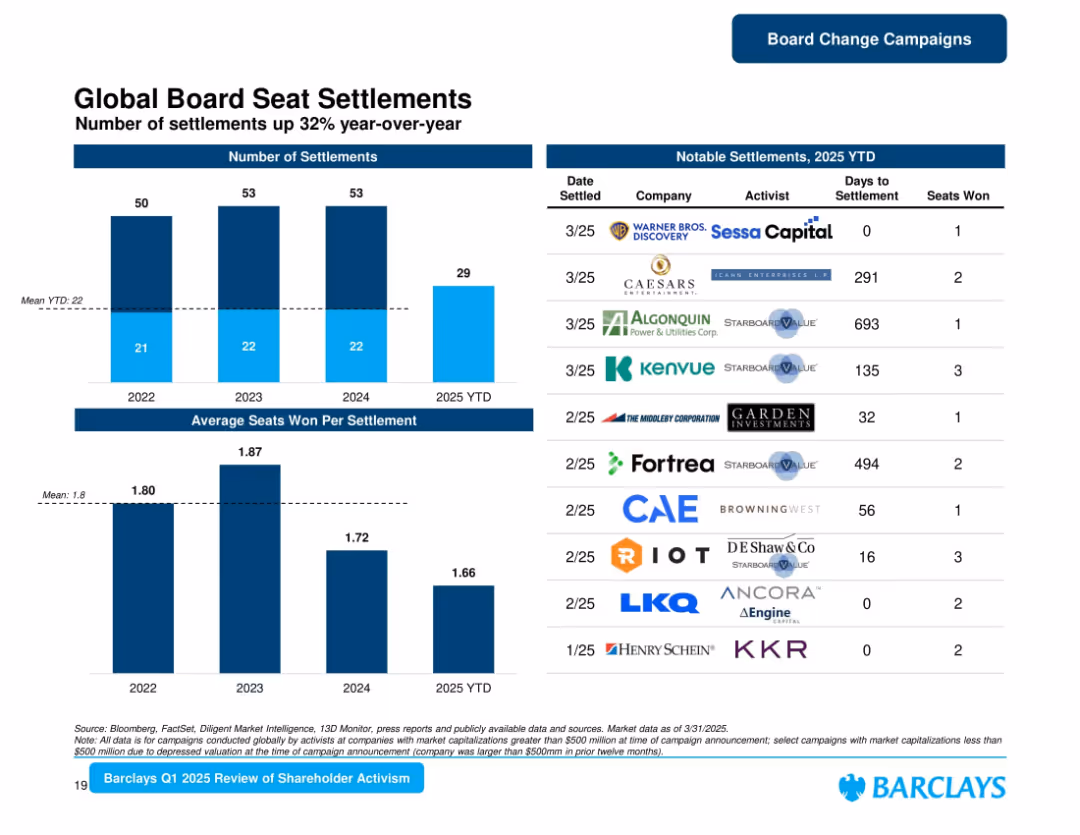
Bar charts and a detailed table of notable settlements. Includes metrics like seats won and days to settlement.
Corporate Finance and Valuation
Financial Services
Focuses on the number and nature of board seat settlements in Q1 2025, showing a 32% YoY increase. Features a table of 10 companies with corresponding activist firms, days to settlement, and board seats won.
Settlements, Board Seats, Activists, Shareholder, Governance, Campaigns, 2025, Barclays
false
Corporate Finance and Valuation
Financial Services
Multiple Chart
Barclays
Add to my slides
Remove from favorites
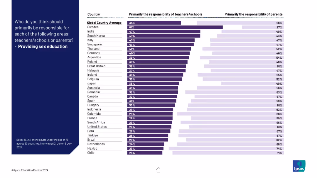
Horizontal dual-colored bar graph showing teacher vs parent responsibility levels by country.
Regulatory and Compliance
Education & Training
This slide details perspectives on who should provide sex education—teachers or parents. The data reflects cultural and national differences in this sensitive area.
sex education, responsibility, compliance, parents, schools, culture, regulation, education, global survey, Ipsos
false
Regulatory and Compliance
Education & Training
Mixed Chart
IPSOS
Add to my slides
Remove from favorites
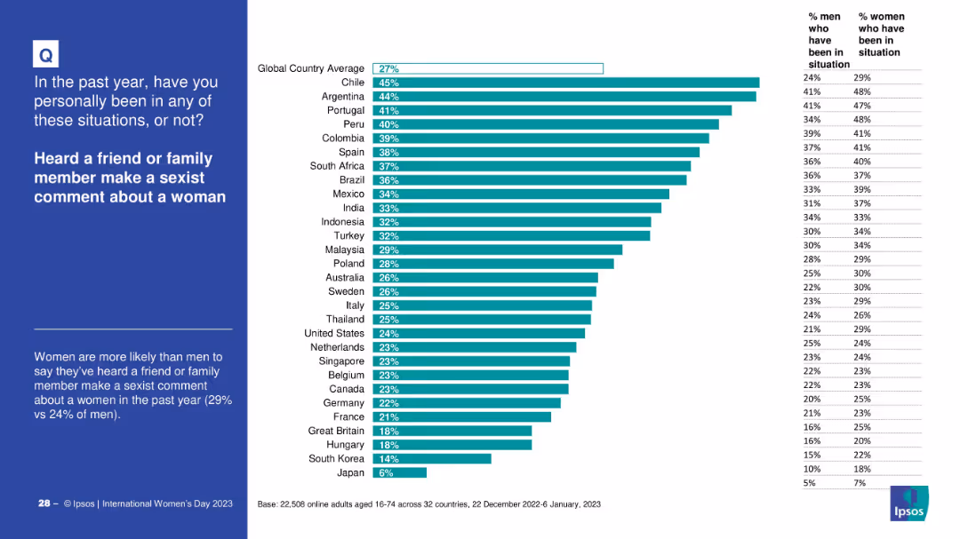
Country-level bar chart showing the percentage of people who heard sexist comments in the past year. Includes gender-specific breakdowns.
Risk Assessment and Management
Government & Public Sector
This slide highlights how prevalent it is for people to hear sexist comments from family or friends across different countries. Chile, Argentina, and Portugal top the list. Women consistently report higher exposure than men.
sexism, country comparison, family influence, public opinion, gender gap, awareness
false
Risk Assessment and Management
Government & Public Sector
Mixed Chart
IPSOS
Add to my slides
Remove from favorites
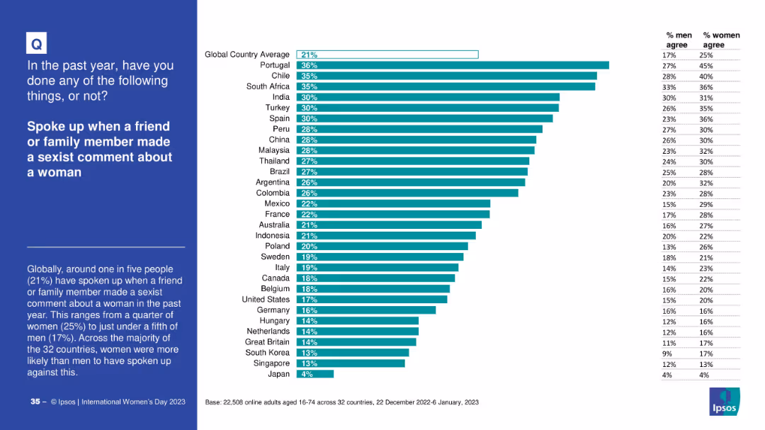
Split layout; left side has a blue text box with question and context; right side features a horizontal bar chart with country data
Risk Assessment and Management
Government & Public Sector
This slide reports survey data on how many people spoke up against sexist comments made by family or friends. It compares responses across 32 countries, showing differences between male and female responses and highlighting global trends.
sexism, gender equality, public opinion, activism, countries, Ipsos, action, gender bias, awareness, survey
false
Risk Assessment and Management
Government & Public Sector
Mixed Chart
IPSOS
Add to my slides
Remove from favorites
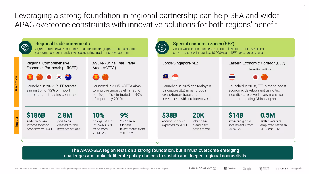
Split layout between trade agreements and SEZs; uses iconography and country flags; includes impact stats like GDP and job growth
Strategic Planning
Environmental Services & Sustainability
Describes how trade agreements and special economic zones (SEZs) across APAC and SEA can foster regional cooperation and economic growth while enabling shared climate solutions and investment flows.
SEZ, trade agreements, APAC, SEA, investment, regional cooperation
false
Strategic Planning
Environmental Services & Sustainability
Table
Bain
Add to my slides
Remove from favorites
Presents a timeline with icons and process maps outlining the steps to identify SG&A improvement opportunities.
Operational Efficiency
Professional Services
Describes a fast-track approach to identifying and implementing cost-saving measures across an organization.
SG&A, cost-saving, operational, improvement, timeline
false
Operational Efficiency
Professional Services
Diagram
Deloitte
Add to my slides
Remove from favorites
Contains a grey column chart comparing the SG&A of different companies, with a goal marker for staying below 14% of sales.
Operational Efficiency
Consumer Goods
Focuses on the operational effectiveness of maintaining low SG&A costs across various companies, with specific goals and benchmarks.
SG&A, operational efficiency, benchmark, competitors, goal
false
Operational Efficiency
Consumer Goods
Single Chart
Barclays
Add to my slides
Remove from favorites
Features a column chart showing growth in assets held by non-bank financial institutions from 2008 to 2022. Colors differentiate between banks and non-bank financial institutions across the timeline.
Market Analysis and Trends
Financial Services
The slide examines the expansion of shadow banking over the years, highlighting the shift from traditional banking to non-bank financial institutions, which now hold nearly 60% of private sector's total global financial assets.
shadow banking, financial trends, non-bank institutions, global assets
false
Market Analysis and Trends
Financial Services
Mixed Chart
Accenture
Add to my slides
Remove from favorites
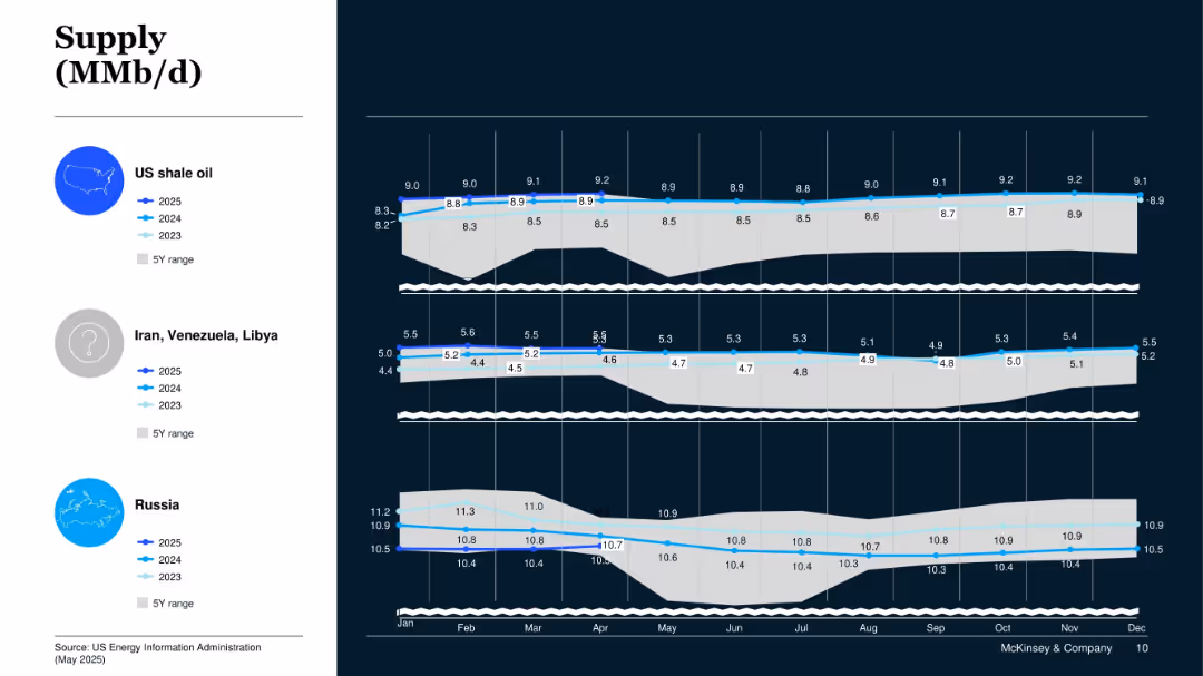
Panel chart for US shale, Iran/Venezuela/Libya, and Russia; shows 2023–2025 data with 5Y range overlay.
Operational Efficiency
Energy & Utilities
This slide presents oil production trends from specific geopolitical regions. US shale shows steady growth, while Iran/Venezuela/Libya and Russia remain relatively stable.
Shale Oil, Geopolitical Supply, Russia, Iran, Venezuela, Libya, Crude Oil
false
Operational Efficiency
Energy & Utilities
Mixed Chart
McKinsey
Add to my slides
Remove from favorites
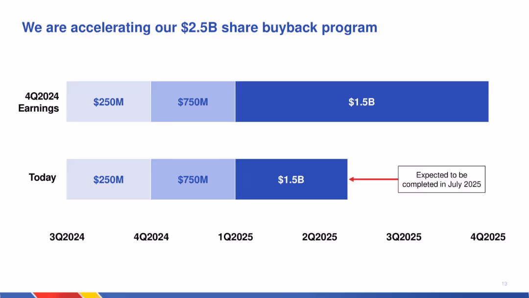
Timeline graphic comparing previous and current schedules for executing a $2.5B share repurchase; horizontal bars show acceleration.
Corporate Finance and Valuation
Transportation & Logistics
Illustrates the expedited schedule for completing a $2.5B share buyback program, with updated completion now expected by July 2025. Emphasizes return of capital to shareholders through repurchases.
share buyback, capital return, acceleration, timeline, financial planning, corporate finance, transportation, repurchase schedule
false
Corporate Finance and Valuation
Transportation & Logistics
Single Chart
JP Morgan
Add to my slides
Remove from favorites
Previous
Next
You don't have any favorites yet.
Please wait loading your favorites slides...
Create a FREE account to continue browsing
Receive Instant Access to 1,000+ slides from companies like McKinsey, Google, and Goldman Sachs
First Name
Last Name
Email
Password
I agree to all
Terms & Privacy Policy
Thank you! Your submission has been received!
Oops! Something went wrong while submitting the form.
Have an account?
Sign in
Upgrade to PRO to Save slides
Advanced Search and Filters
Access to 15,000+ slides
Access to Category Pages
Save/Bookmark Slides
PowerPoint Template Library
Pick a Plan
MONTHLY
$12/month
Billed every month, Cancel anytime.
YEARLY
$9/year
Billed $108 annually, Cancel anytime.
Checkout for $12/month
Checkout for $108/yr
Secured by Stripe | AES-256 bit encryption