My Account
My Slides
Search by Category
Pricing
Templates
View All Templates
Download Template Slides
✦ AI Search
Feedback
Login
Logout
Get Started
Browse all Slides
Browse all Slides
Create a FREE Account
Instant access to 1,000+ real slides from top companies like McKinsey, BCG, Goldman Sachs, Google and many more!
First Name
Last Name
Email
Password
I agree to all
Terms & Privacy Policy
Thank you! Your submission has been received!
Oops! Something went wrong while submitting the form.
Have an account?
Sign in
Saved Slides
Total No. of slides saved
0
↻ Refresh
✖ Clear all
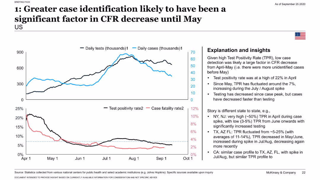
Dual-line graph comparing daily tests and cases; lower chart compares test positivity and CFR; insights presented in a right-side box.
Risk Assessment and Management
Healthcare & Pharmaceuticals
Highlights how the sharp decline in CFR through May 2020 was likely due to expanded testing identifying more mild or asymptomatic COVID-19 cases. Test positivity data from various U.S. states supports this conclusion.
testing, test positivity, CFR, COVID-19, case detection, states
false
Risk Assessment and Management
Healthcare & Pharmaceuticals
Mixed Chart
McKinsey
Add to my slides
Remove from favorites
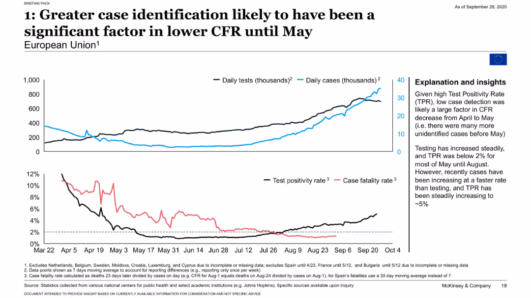
Four-line graph panels showing daily tests, cases, TPR, and CFR over time in the EU with contextual insights.
Performance Metrics and KPIs
Healthcare & Pharmaceuticals
Demonstrates that increased COVID-19 testing and reduced test positivity rate contributed to a falling CFR in the EU. Shows that case identification has outpaced test positivity, influencing trends in mortality measures.
test positivity, CFR, EU, COVID-19 testing, detection rates
false
Performance Metrics and KPIs
Healthcare & Pharmaceuticals
Mixed Chart
McKinsey
Add to my slides
Remove from favorites
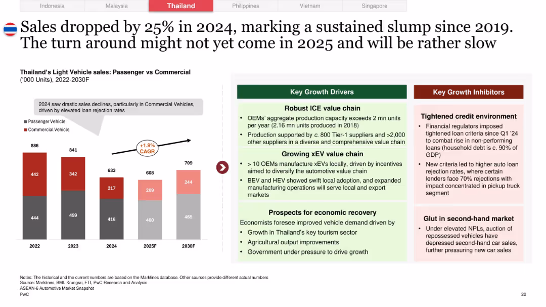
Side-by-side format: bar chart showing passenger vs commercial vehicle sales 2022–2030F, growth factors and inhibitors in colored boxes
Market Analysis and Trends
Industrial & Manufacturing
Shows a 25% decline in Thailand’s auto sales for 2024, with commercial vehicle drop being most severe. Key reasons include high loan rejections and tight credit. Growth opportunities lie in a robust ICE value chain, EV manufacturing, and macroeconomic recovery.
Thailand, automotive slump, credit risk, ICE value chain, vehicle sales forecast, pickup trucks, CAGR, EV transition
false
Market Analysis and Trends
Industrial & Manufacturing
Mixed Chart
PwC/Strategy&
Add to my slides
Remove from favorites
Slide features multiple infographics, including a column chart and a detailed roadmap. The design is dense with data, focusing on Thailand's environmental strategies and challenges.
Regulatory and Compliance
Energy & Utilities
Analyzes Thailand's environmental strategies and the required government actions to meet carbon reduction goals, highlighting the roles of infrastructure and fiscal policies.
Thailand, carbon reduction, environmental policy, government strategy, infrastructure
false
Regulatory and Compliance
Energy & Utilities
Mixed Chart
Bain
Add to my slides
Remove from favorites
The slide has a title at the top with three column charts in blue and grey, denoting percentages. It includes three sources: Google, TEMASEK, BAIN & COMPANY. The layout is clean with text labels for each chart.
Market Analysis and Trends
Technology & Software
This slide presents data on the growth of digital consumers in Thailand, including internet service adoption, continuity post-COVID-19, and average hours spent online. Ideal for discussing market potential and consumer behavior trends.
Thailand, Digital Consumers, Internet Economy Services, COVID-19, Usage Hours, Market Analysis, Growth, User Engagement, Consumer Trends
false
Market Analysis and Trends
Technology & Software
Multiple Chart
Bain
Add to my slides
Remove from favorites
The slide features multiple column charts showing growth in different sectors of Thailand's digital economy with forecast data. It's color-coded for clarity.
Market Analysis and Trends
Technology & Software
Shows the anticipated impact of travel recovery on Thailand's digital economy, suggesting a significant push towards growth by 2025.
Thailand, Digital Economy, Travel Recovery, Growth Impact, E-commerce, Online Travel, Transport, Food, 2025
false
Market Analysis and Trends
Technology & Software
Multiple Chart
Bain
Add to my slides
Remove from favorites
Divided into two sections, the left side presents column charts for e-Commerce, and the right side shows column charts for Transport & Food and Online Media. The slide utilizes shades of blue, with clear labels and percentage changes. Bain Analysis source.
Market Analysis and Trends
Technology & Software
Highlights how e-Commerce growth compensates for travel sector losses in Thailand, offering insights for strategic adjustments in business models post-pandemic.
Thailand, E-Commerce Growth, Travel Decline, Sector Comparison, Digital Economy, COVID-19 Impact, Market Strategy, Adaptation, Resilience
false
Market Analysis and Trends
Technology & Software
Multiple Chart
Bain
Add to my slides
Remove from favorites
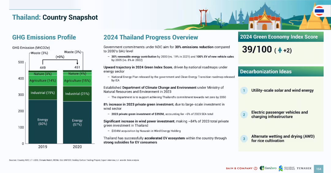
Layout mirrors previous country snapshots with emissions bar chart, 2024 progress narrative, index score, and decarbonization ideas.
Strategic Planning
Government & Public Sector
Thailand’s emissions profile remained stable between 2019–2020. The 2024 Green Index Score increased to 39/100. Green investments reached $393M in 2023, driven by wind power. Strategies emphasize EV adoption, utility-scale renewables, and rice cultivation water management.
Thailand, emissions, EV, wind power, solar, agriculture, AWD, 2024, Green Index
false
Strategic Planning
Government & Public Sector
Mixed Chart
Bain
Add to my slides
Remove from favorites
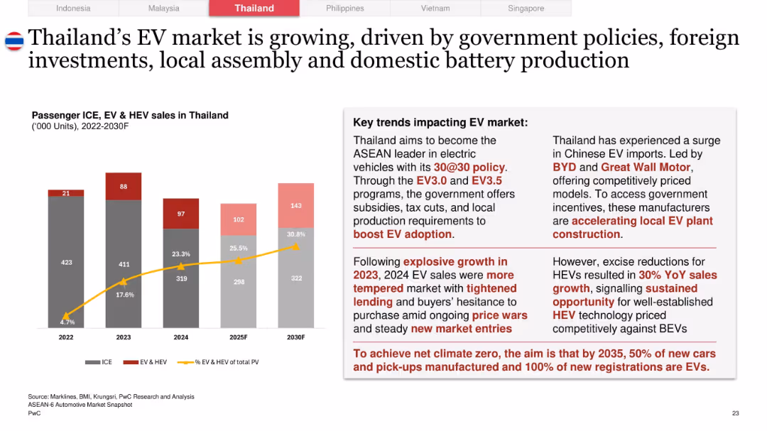
Left section features bar and line graph for EV/ICE trends 2022–2030F; right section has detailed narrative on EV policies and challenges
Technology and Digital Transformation
Industrial & Manufacturing
Thailand’s EV market sees strong growth in 2023, with 30% EV target by 2030. Government subsidies, local production, and rising Chinese imports fuel the transition. Market cooling in 2024 due to price sensitivity and lending tightness is noted.
Thailand, EV policy, BEV vs HEV, 30@30, Chinese EVs, BYD, price sensitivity, local assembly, carbon goals
false
Technology and Digital Transformation
Industrial & Manufacturing
Mixed Chart
PwC/Strategy&
Add to my slides
Remove from favorites
Contains several small images of agricultural activities, solar panels, and wind turbines, accompanied by text blocks and bullet points summarizing the investment environment in Thailand.
Market Analysis and Trends
Energy & Utilities
Provides insights into Thailand's agricultural, solar, wind energy, and electric mobility sectors, emphasizing government and financial support.
Thailand, farming, solar, wind, electric mobility, government support
false
Market Analysis and Trends
Energy & Utilities
Header Horizontal
Bain
Add to my slides
Remove from favorites
The slide has a clear column chart with historical data for 2015 & 2019 and projected for 2020 & 2025. Minimal text is present with a source citation at the bottom. Colors are used to distinguish between years, and percentage growth is indicated above columns.
Market Analysis and Trends
Technology & Software
The slide represents the growth of Thailand's internet economy, showing a significant increase from 2015 to a forecast for 2025. The focus is on the e-commerce sector's contribution to the economy with a CAGR indication.
Thailand, Internet Economy, Growth, E-commerce, CAGR, Projection, Analysis, 2015, 2025, Bain Analysis
false
Market Analysis and Trends
Technology & Software
Single Chart
Bain
Add to my slides
Remove from favorites
Contains a sequence of blue column charts representing deal value across years, with a title at the top and a key indicating the number of deals. Source includes industry reports and Bain Analysis.
Investment Analysis
Financial Services
Showcases the increasing investment in Thailand's Internet sector, useful for stakeholders analyzing the funding landscape and identifying investment trends.
Thailand, Internet Sector, Investment Trends, Deal Value, Market Analysis, Funding Landscape, Venture Capital, Financial Growth, Sector Analysis
false
Investment Analysis
Financial Services
Single Chart
Bain
Add to my slides
Remove from favorites
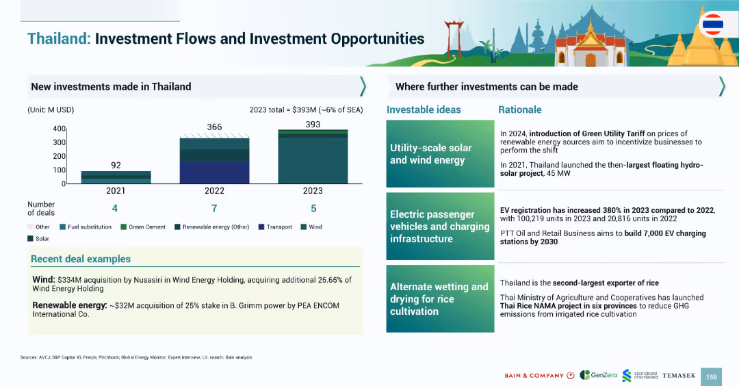
Split layout: bar chart (left) showing new investments (2021–2023), and right section with investment ideas and rationale; colorful, infographic style.
Investment Analysis
Environmental Services & Sustainability
The slide details new investments in Thailand's renewable energy and related sectors from 2021–2023. It identifies key areas for future investment, including solar/wind energy, EV infrastructure, and rice cultivation methods, supported by rationale and recent deals.
Thailand, investment, renewable energy, solar, wind, EV infrastructure, agriculture, floating solar, charging stations
false
Investment Analysis
Environmental Services & Sustainability
Mixed Chart
Bain
Add to my slides
Remove from favorites
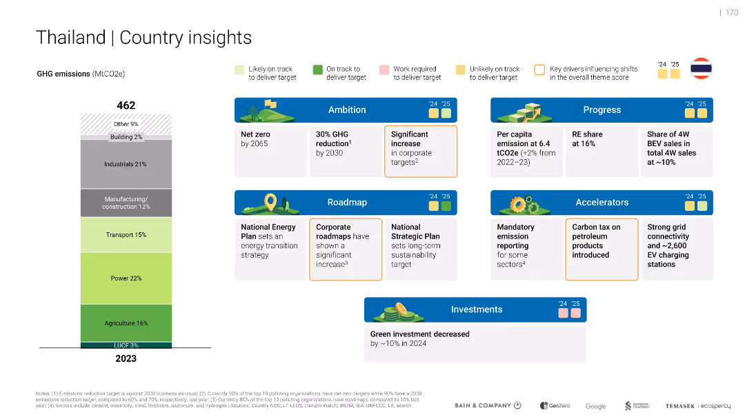
Vertical emissions bar and structured layout of “Ambition”, “Progress”, “Roadmap”, and “Accelerators” sections. Color-coded performance markers and icons.
Strategic Planning
Government & Public Sector
Shows Thailand’s 2023 emissions by sector and outlines policy actions, targets, and performance in green initiatives. Highlights mixed progress toward targets and mentions a 10% green investment decrease in 2024.
Thailand, net zero, roadmap, emission reporting, investment drop
false
Strategic Planning
Government & Public Sector
Mixed Chart
Bain
Add to my slides
Remove from favorites
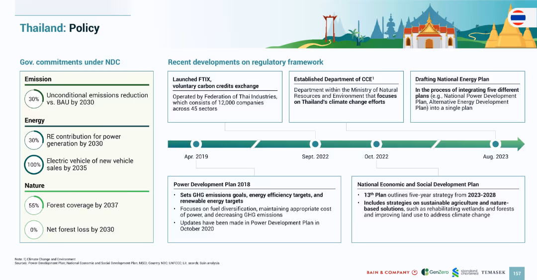
Two-part layout: government commitments on the left, regulatory developments on the right with timeline (2018–2023); clean, infographic design.
Regulatory and Compliance
Government & Public Sector
Summarizes Thailand’s climate-related policy framework. It outlines commitments under the NDC in emissions, energy, and forest conservation, and highlights key regulatory milestones including carbon credit exchange and integrated energy planning efforts.
Thailand, policy, carbon credits, renewable energy, electric vehicles, forest conservation, emissions, regulation
false
Regulatory and Compliance
Government & Public Sector
Mixed Chart
Bain
Add to my slides
Remove from favorites
Image of a temple with accompanying text about PromptPay, Thailand's instant payment system, and a line chart showing growth in transactions.
Market Analysis and Trends
Financial Services
Details the rapid growth and adoption of PromptPay in Thailand, emphasizing its impact on payment methods and transaction values.
Thailand, PromptPay, payments, growth, transactions, financial, services, instant, system
false
Market Analysis and Trends
Financial Services
Mixed Chart
PwC/Strategy&
Add to my slides
Remove from favorites
The slide features multiple data visualizations including a mekko chart showing investment flows by theme, and smaller logos and text elements detailing investor activity and examples.
Investment Analysis
Energy & Utilities
Discusses investment trends in Thailand focusing on renewable energy and infrastructure, highlighting specific deals and active investors.
Thailand, renewable energy, infrastructure, investment, bar chart
false
Investment Analysis
Energy & Utilities
Single Chart
Bain
Add to my slides
Remove from favorites
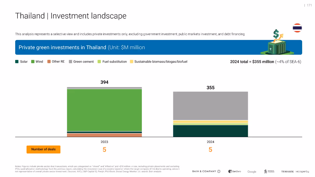
Dual bar chart for 2023 and 2024 green private investments in Thailand, broken down by solar, wind, and other RE. Color-coded bars and number of deals included.
Investment Analysis
Environmental Services & Sustainability
Compares Thailand’s private green investments from 2023 ($394M) to 2024 ($355M), showing a slight decline. Investment sectors include solar, wind, biomass, and cement. Each year had 5 deals.
Thailand, solar, wind, RE, investment decline, biomass, cement, 2024
false
Investment Analysis
Environmental Services & Sustainability
Single Chart
Bain
Add to my slides
Remove from favorites
Shows a column chart depicting the growth in assets under management for thematic equity funds, alongside a list of fund offerings and key differentiators.
Product and Service Analysis
Financial Services
The slide presents the launch and growth of a thematic equity fund family, emphasizing fund performance and the strategic approach to equity selection.
Thematic Equity, Fund Family, Assets Under Management, Equity Funds, Performance
false
Product and Service Analysis
Financial Services
Mixed Chart
Credit Suisse
Add to my slides
Remove from favorites
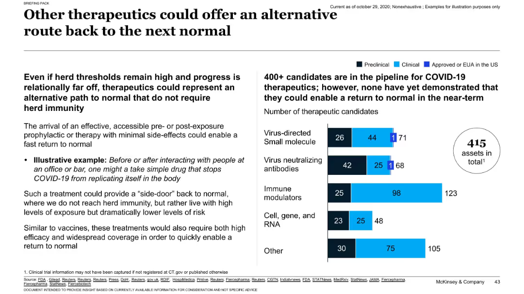
Text-heavy left panel with bullet points discussing therapeutic use, and right panel with bar chart showing pipeline stages for different therapeutic categories.
Technology and Digital Transformation
Healthcare & Pharmaceuticals
The slide suggests therapeutics as an alternative or supplement to herd immunity through vaccines. It discusses examples of pre/post-exposure treatments and shows a pipeline of over 400 therapeutic candidates in various development stages. These treatments could help return to normal even without reaching herd immunity.
therapeutics, COVID-19, drug pipeline, herd immunity, treatment options
false
Technology and Digital Transformation
Healthcare & Pharmaceuticals
Mixed Chart
McKinsey
Add to my slides
Remove from favorites
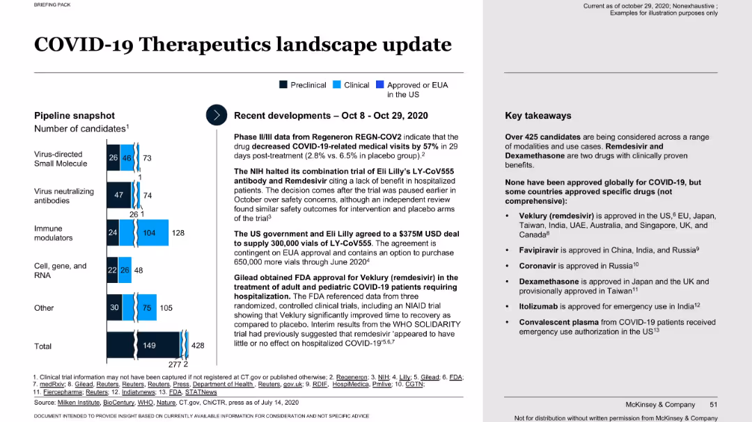
Bar chart on left shows pipeline by therapeutic type and stage; right-side text panel summarizes recent developments and key takeaways.
Product and Service Analysis
Healthcare & Pharmaceuticals
This slide outlines the state of therapeutic development for COVID-19, with over 425 candidates in various stages. It highlights key drugs like Remdesivir and Dexamethasone that show proven benefit. The slide details recent regulatory updates, U.S. government deals, and notes that while no treatment is globally approved, progress is ongoing.
therapeutics, drug approval, COVID-19, pipeline, clinical trials
false
Product and Service Analysis
Healthcare & Pharmaceuticals
Mixed Chart
McKinsey
Add to my slides
Remove from favorites
Includes pie charts and bar charts analyzing various therapeutic candidates and their phases of development, along with a focus on U.S. emergency use statuses.
Regulatory and Compliance
Healthcare & Pharmaceuticals
Details the landscape of therapeutic options for COVID-19, emphasizing ongoing clinical trials and the potential for reducing healthcare system strain.
therapeutics, trials, COVID-19, treatment
false
Regulatory and Compliance
Healthcare & Pharmaceuticals
Mixed Chart
BCG
Add to my slides
Remove from favorites
Pie chart showing the current and planned usage of third-party APIs, alongside a word cloud highlighting popular API providers such as Salesforce, Oracle, and Microsoft.
Market Analysis and Trends
Technology & Software
The slide identifies the most commonly used third-party APIs and the intent to use them, supported by a word cloud of specific providers, emphasizing Salesforce as the leading provider.
third-party APIs, Salesforce, Oracle, providers
false
Market Analysis and Trends
Technology & Software
Mixed Chart
Gartner
Add to my slides
Remove from favorites
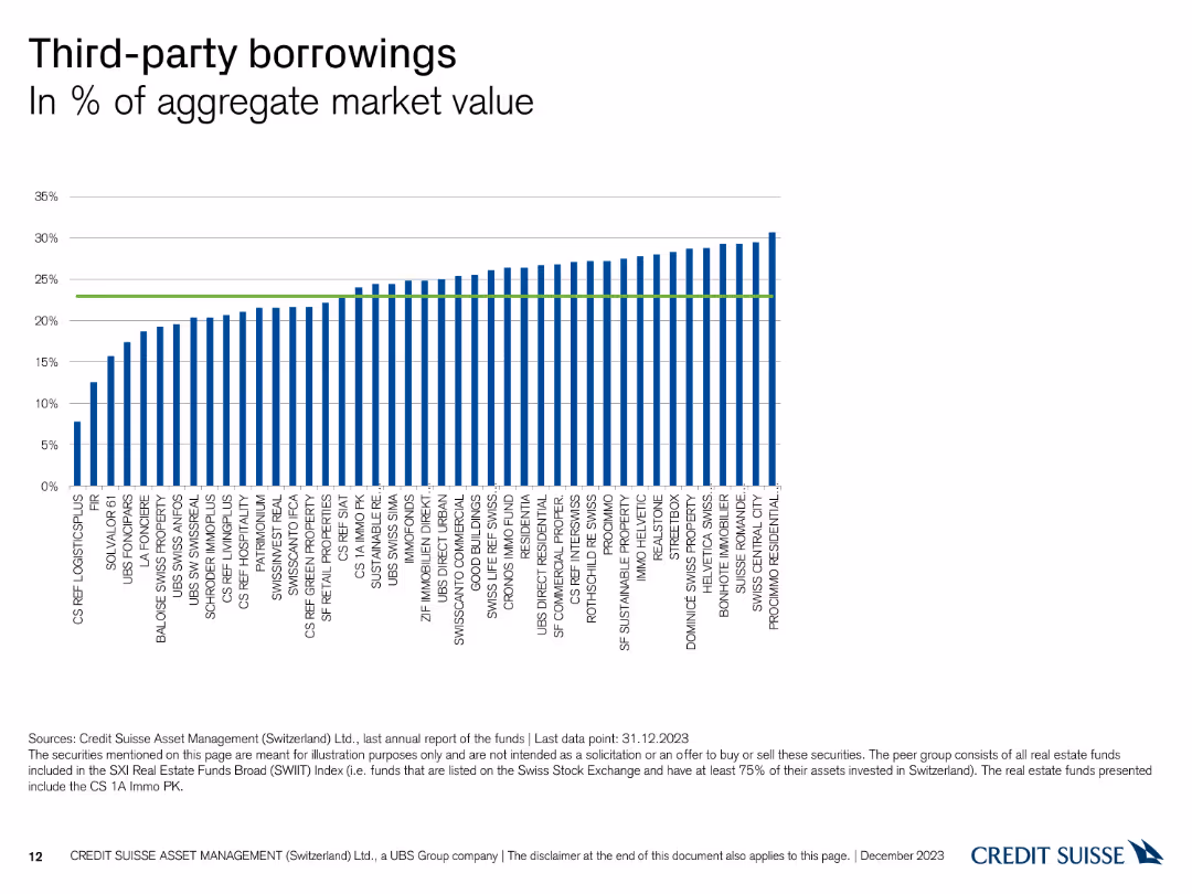
The slide features a column chart illustrating the percentage of third-party borrowings across different funds.
Financial Performance
Financial Services
This slide presents the percentage of third-party borrowings in aggregate market value for various funds managed by Credit Suisse as of December 31, 2023.
third-party, borrowings, market value, funds, Credit Suisse
false
Financial Performance
Financial Services
Single Chart
Credit Suisse
Add to my slides
Remove from favorites
Image of two people discussing while looking at a tablet. Column chart illustrating the biggest challenges related to operational resilience.
Risk Assessment and Management
Financial Services
This slide outlines the biggest challenges related to operational resilience, such as managing third-party cyber risks, identifying critical people and processes, and preventing cyber attacks. It emphasizes the importance of third-party risks and the need for comprehensive strategies to address these challenges.
third-party, cyber risks, operational resilience, challenges, strategies
false
Risk Assessment and Management
Financial Services
Mixed Chart
EY
Add to my slides
Remove from favorites
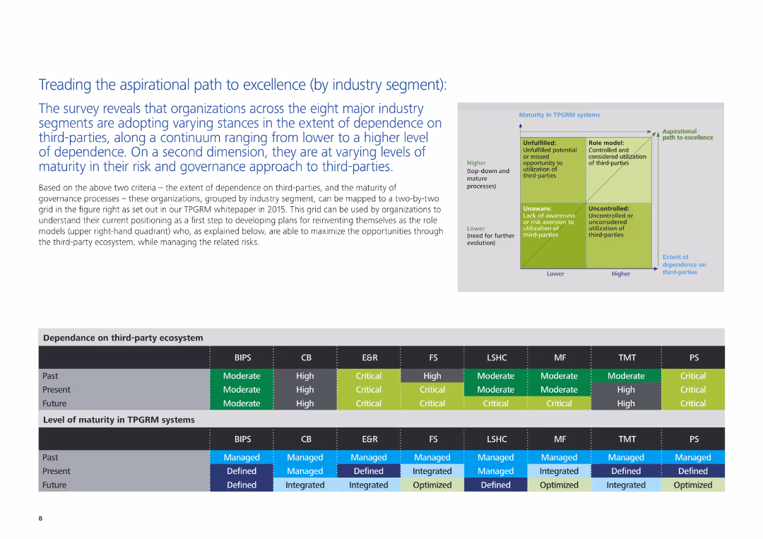
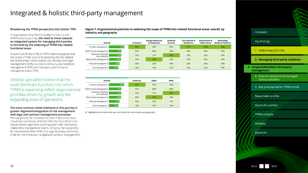
The slide includes a text description of organizational stances on third-party dependence and governance maturity, accompanied by a grid and charts illustrating these aspects across different industry segments.
Strategic Planning
Professional Services
This slide examines how organizations in various industry segments are adopting different stances on third-party dependence and governance. It maps these stances on a grid and provides insights into current and future trends in third-party risk and governance maturity.
third-party dependence, governance, industry segments, strategic planning, professional services, risk management, maturity levels
false
Strategic Planning
Professional Services
Table
Deloitte
Add to my slides
Remove from favorites
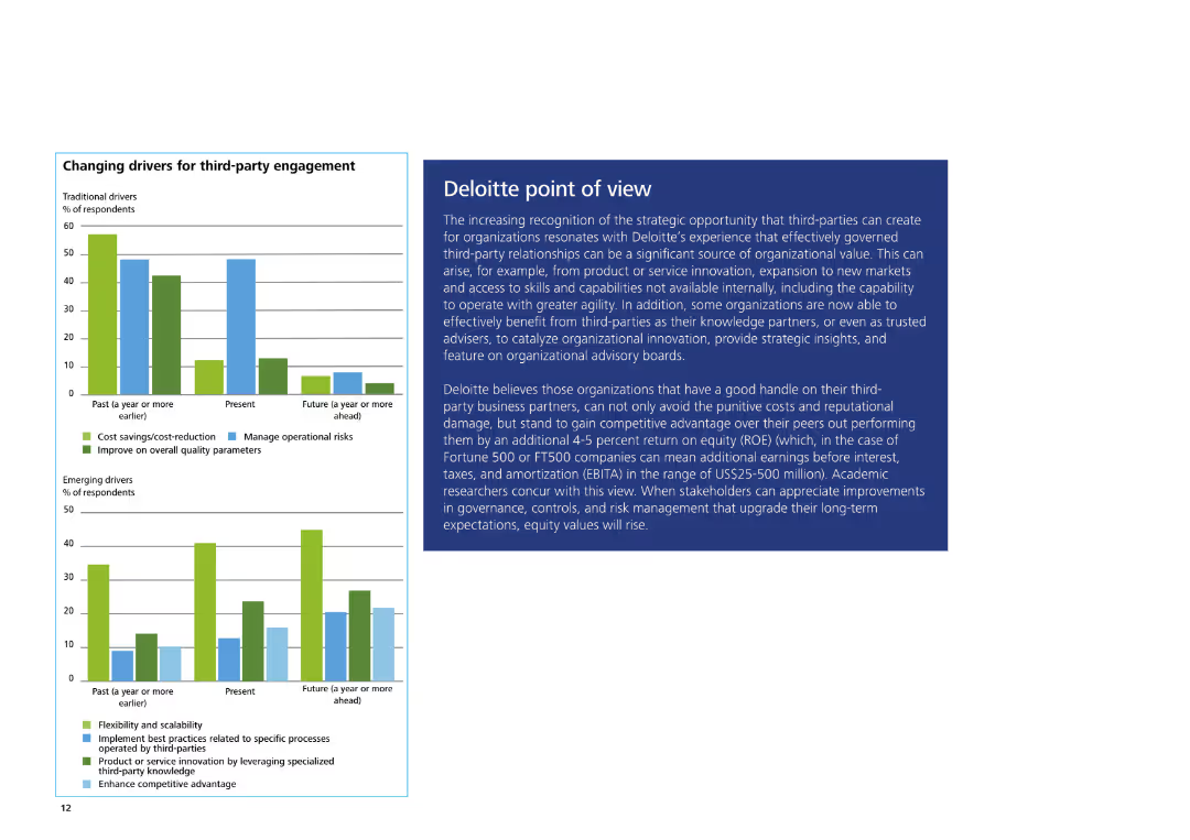
The slide features a column chart on the left showing traditional and emerging drivers for third-party engagement. On the right, there is a text box with Deloitte's POV.
Strategic Planning
Professional Services
The slide explains Deloitte's view on the strategic opportunities of third-party engagement, highlighting benefits, competitive advantage, and key organizational insights.
Third-party engagement, Deloitte, strategic opportunities, competitive advantage, organizational insights
false
Strategic Planning
Professional Services
Multiple Chart
Deloitte
Add to my slides
Remove from favorites
The slide features a pie chart showing the percentage of third-party risk on board agendas and a text box discussing third-party governance trends.
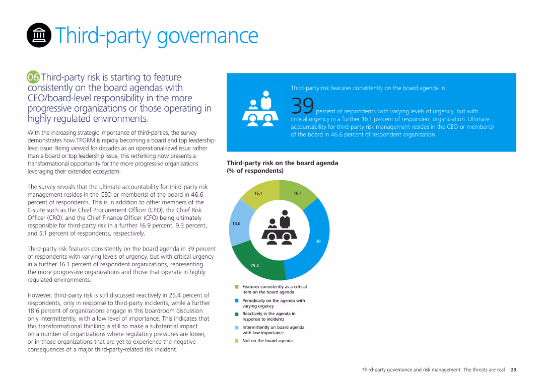
Regulatory and Compliance
Professional Services
It highlights the growing importance of third-party risk in board agendas, detailing survey results on the frequency and urgency of third-party risk discussions at the board level.
Third-party governance, board agendas, risk management, survey results, compliance
false
Regulatory and Compliance
Professional Services
Mixed Chart
Deloitte
Add to my slides
Remove from favorites
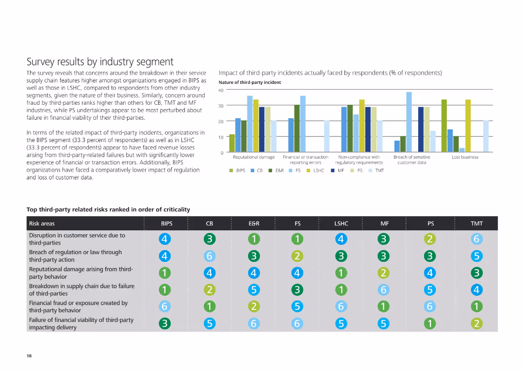
The slide features a column chart on the left showing the impact of third-party incidents, and a table below ranking top third-party risks by industry segment.
Risk Assessment and Management
Professional Services
The slide reveals survey results about the impact of third-party incidents and lists top third-party related risks ranked by criticality across different industry segments.
Third-party incidents, impact, risks, industry segment, survey results
false
Risk Assessment and Management
Professional Services
Mixed Chart
Deloitte
Add to my slides
Remove from favorites
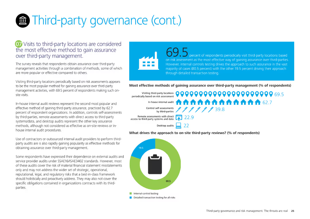
The slide features a pie chart on third-party review approaches and a column chart on methods for gaining assurance over third-party management, with explanatory text.
Regulatory and Compliance
Professional Services
It examines survey results on the most effective methods for gaining assurance over third-party management, emphasizing site visits, internal audits, and controls self-assessments.
Third-party management, assurance, survey results, site visits, internal audits, controls self-assessments
false
Regulatory and Compliance
Professional Services
Mixed Chart
Deloitte
Add to my slides
Remove from favorites
The slide features column charts about mechanisms for enhancing third-party resilience assurance.
Risk Assessment and Management
Technology & Software
This slide describes mechanisms that can enhance third-party resilience assurance, based on survey data.
third-party, resilience, assurance, mechanisms, survey
false
Risk Assessment and Management
Technology & Software
Multiple Chart
Deloitte
Add to my slides
Remove from favorites
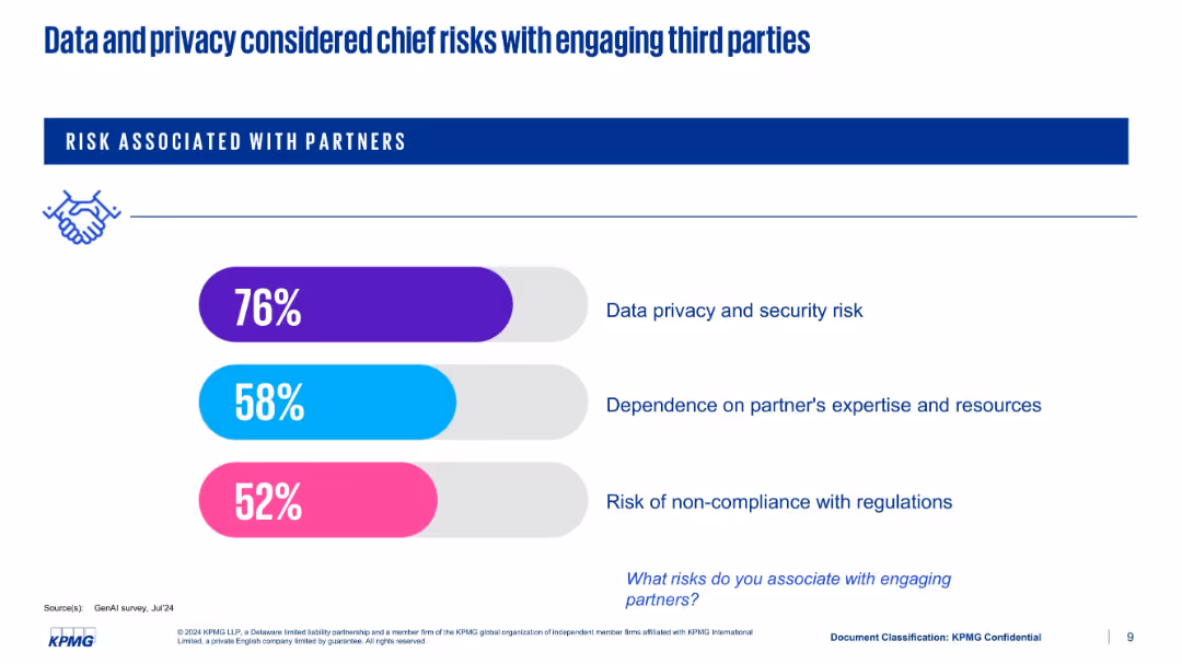
Horizontal bar chart showing risk types; vibrant color-coded bars for privacy, dependency, and compliance risks
Risk Assessment and Management
Artificial Intelligence
The slide ranks top concerns when working with external GenAI partners. Data privacy and security risks lead at 76%, followed by partner dependency and regulatory compliance. The visual style uses colored bars and text to emphasize risk priorities.
third-party risk, data privacy, compliance, KPMG, GenAI, dependency
false
Risk Assessment and Management
Artificial Intelligence
Single Chart
KPMG
Add to my slides
Remove from favorites
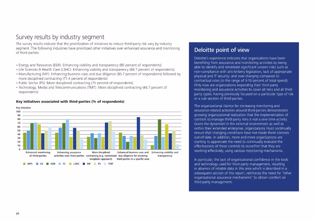
The slide includes a column chart displaying key initiatives associated with third-parties by industry segment and a text box with Deloitte's point of view on the right.
Market Analysis and Trends
Professional Services
It presents survey results on prioritization of initiatives to reduce third-party risk by industry segment, along with Deloitte's insights on third-party monitoring and assurance.
Third-party risk, key initiatives, industry segment, Deloitte, monitoring, assurance
false
Market Analysis and Trends
Professional Services
Mixed Chart
Deloitte
Add to my slides
Remove from favorites
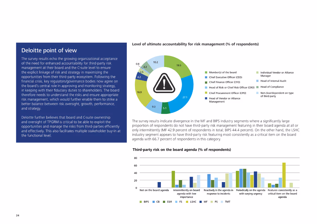
The slide includes a pie chart showing levels of ultimate accountability for risk management and a text box with Deloitte's analysis on the right.
Strategic Planning
Professional Services
The slide discusses survey results about organizational acceptance of third-party risk management accountability at the board and C-suite levels, emphasizing strategic opportunities.
Third-party risk management, accountability, Deloitte, board level, C-suite, strategic opportunities
false
Strategic Planning
Professional Services
Multiple Chart
Deloitte
Add to my slides
Remove from favorites
The slide features a column chart showing data distribution and statistics about third-party risk management practices.
Risk Assessment and Management
Professional Services
This slide presents data on third-party risk management practices and their distribution across various parameters.
third-party, risk management, data distribution, statistics
false
Risk Assessment and Management
Professional Services
Multiple Chart
Deloitte
Add to my slides
Remove from favorites
Features a column chart with green and blue bars showing the use of third-party cyber services across various categories, like cyber cloud and infrastructure security.
Technology and Digital Transformation
Technology & Software
Discusses reliance on third-party cyber services, emphasizing the benefits and complexities of using external vendors for various cyber needs, supported by survey data.
Third-party services, cyber cloud, infrastructure security, data protection, vendor reliance
false
Technology and Digital Transformation
Technology & Software
Single Chart
Deloitte
Add to my slides
Remove from favorites
The slide features a column chart with green, blue, and dark gray bars indicating value seen from third-party cyber services across different categories.
Risk Assessment and Management
Technology & Software
Examines the value derived from third-party cyber services, emphasizing data protection, infrastructure security, and vendor management, supported by survey data.
Third-party services, vendor management, data protection, infrastructure security, cyber strategy
false
Risk Assessment and Management
Technology & Software
Mixed Chart
Deloitte
Add to my slides
Remove from favorites
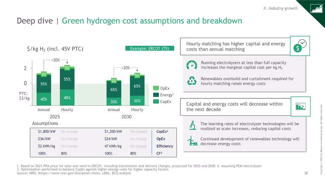
Column charts comparing OpEx, Energy, and CapEx for annual vs hourly matching in 2025 and 2030. Includes text boxes with insights on cost assumptions and learning rates.
Technology and Digital Transformation
Energy & Utilities
Column charts comparing OpEx, Energy, and CapEx for annual vs hourly matching in 2025 and 2030. Includes text boxes with insights on cost assumptions and learning rates.
This slide analyzes green hydrogen cost assumptions, focusing on the differences in costs between annual and hourly matching. It highlights key insights and future cost reductions.
false
Technology and Digital Transformation
Energy & Utilities
Mixed Chart
BCG
Add to my slides
Remove from favorites
Market Analysis and Trends
Financial Performance
Technology & Software
Slide includes a variety of column charts showing the projected growth of Indonesia's digital economy by sector. The color blue is predominantly used to highlight the future forecast.
This slide projects the robust growth of Indonesia's digital economy by 2025, focusing on the e-commerce sector despite broader macroeconomic challenges.
false
Financial Performance
Technology & Software
Multiple Chart
Bain
Add to my slides
Remove from favorites
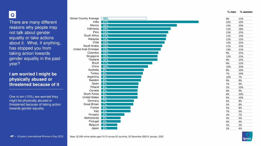
Horizontally ranked bar chart with % values by country and a gender split table on the right; left side panel in blue for context and explanation.
Risk Assessment and Management
Government & Public Sector
This slide shows the proportion of respondents by country who fear physical abuse or threats for taking action toward gender equality. India ranks highest at 21%. The global average is 10%, with a gender breakdown showing some differences.
threat, abuse, fear, gender equality, country comparison, survey data, risk, Ipsos
false
Risk Assessment and Management
Government & Public Sector
Mixed Chart
IPSOS
Add to my slides
Remove from favorites
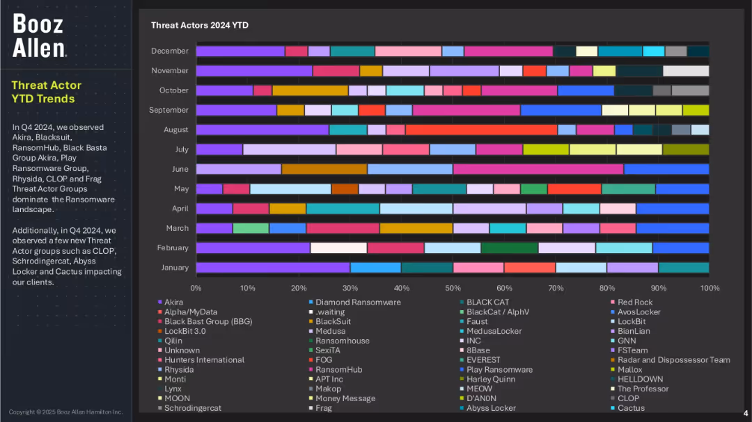
Horizontal stacked bar chart showing monthly presence of various ransomware threat actors; color-coded legend with over 30 groups; left-side text box highlights key trends.
Risk Assessment and Management
Technology & Software
This slide displays the presence and dominance of threat actor groups across 2024, with actors like Akira, BlackSuit, RansomHub, and others leading attacks in Q4. It also identifies new entrants like Cactus and CLOP. The data suggests evolving tactics and the growing complexity of the ransomware landscape, with a large number of active groups.
threat actors, ransomware groups, Booz Allen, cybercrime, 2024 trends, Akira, CLOP, malware activity, monthly threat tracking
false
Risk Assessment and Management
Technology & Software
Single Chart
Booz Allen Hamilton
Add to my slides
Remove from favorites
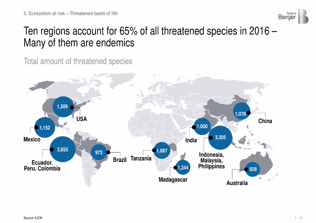
World map with data bubbles showing number of threatened species by region.
Strategic Planning
Environmental Services & Sustainability
Identifies biodiversity hotspots with high numbers of threatened species, focusing on endemic-rich regions like Ecuador, Indonesia, and Madagascar.
threatened species, biodiversity hotspots, endemic, conservation regions
false
Strategic Planning
Environmental Services & Sustainability
Mixed Chart
Roland Berger
Add to my slides
Remove from favorites
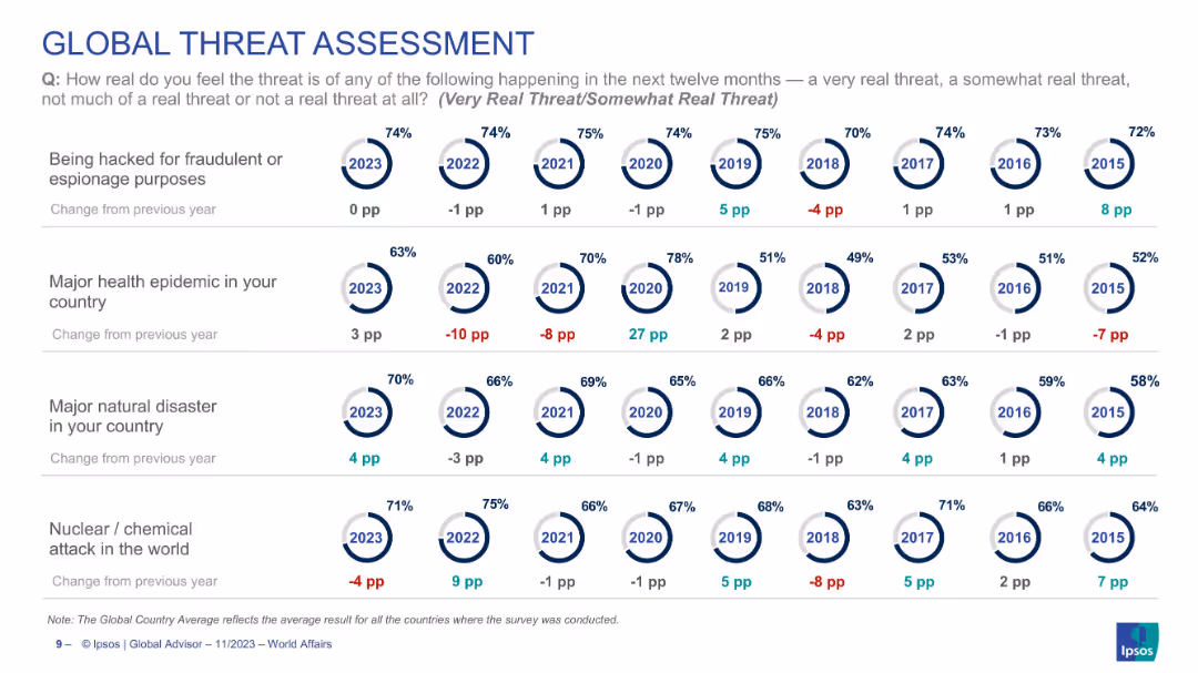
Grid layout with circular percentage indicators by year (2015–2023) across 4 threat types. Each includes a trend in percentage points.
Risk Assessment and Management
Government & Public Sector
Shows global perceptions of major threats (cyber hacking, epidemics, natural disasters, nuclear/chemical attack) over time. Each row tracks how serious the public sees these risks, indicating trend shifts (e.g., epidemic threat up 3 points in 2023). Provides historical trend context across 9 years.
threat perception, global risks, natural disaster, cyberattack, epidemic, nuclear threat, trend analysis, Ipsos, global survey
false
Risk Assessment and Management
Government & Public Sector
Single Chart
IPSOS
Add to my slides
Remove from favorites
Diagram illustrating the three-waiver model with methodology for Waiver 2 population and cost containment measures.
Strategic Planning
Government & Public Sector
Explains the three-waiver model, differentiating high needs from moderate needs, and detailing the methodology for Waiver 2 population with associated cost containment measures.
three-waiver model, high needs, moderate needs, cost containment, waiver 2 population, NH's DD population, strategic planning, funding models
false
Strategic Planning
Government & Public Sector
Multiple Chart
Alvarez & Marsal
Add to my slides
Remove from favorites
The slide is packed with visual elements like icons and small images, descriptions, and various colors to differentiate the tools. It’s well-organized despite the high information density, making use of grids and alignment to maintain clarity.
Technology and Digital Transformation
Professional Services
Introduces THRIVE, a platform with tools for cost management and digital transformation, aimed at improving operational efficiency. The slide outlines each tool’s features and intended use, enhancing understanding of how digital tools can drive business improvements.
THRIVE, digital transformation, cost management, operational efficiency, tools
false
Technology and Digital Transformation
Professional Services
Pillar
Deloitte
Add to my slides
Remove from favorites
Column charts show the development of the Tier 1 leverage ratio and changes in leverage exposure from 3Q22 to 4Q22.
Financial Performance
Financial Services
Describes the improvement in the Tier 1 leverage ratio due to capital raises and deleveraging, indicating strengthened financial leverage.
Tier 1 leverage, financial leverage, capital raises, deleveraging, banking metrics
false
Financial Performance
Financial Services
Multiple Chart
Credit Suisse
Add to my slides
Remove from favorites
Diagram showing two proposed tiered waiver approaches with a visual breakdown of support needs and costs.
Strategic Planning
Government & Public Sector
Proposes a tiered service delivery model for waiver programs, outlining two approaches with different tiers for managing support needs and controlling service costs effectively.
tiered waivers, service delivery model, support needs, cost control, waiver program, NH's DD population, strategic planning, funding models
false
Strategic Planning
Government & Public Sector
Diagram
Alvarez & Marsal
Add to my slides
Remove from favorites
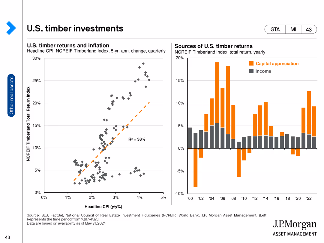
The slide contains two charts: a scatter plot on the left showing the relationship between U.S. timber returns and inflation, and a bar chart on the right displaying the sources of U.S. timber returns (capital appreciation and income) annually. The scatter plot includes a trend line, while the bar chart uses vertical bars in two colors to differentiate the sources of returns.
Investment Analysis
Real Estate & Construction
This slide examines the U.S. timber market, focusing on the relationship between timber returns and inflation, and detailing the annual sources of returns from timber investments. It is designed to provide insights for investors interested in timber as an asset class.
Timber investments, inflation, capital appreciation, income, asset class, investment analysis, U.S. timber market
false
Investment Analysis
Real Estate & Construction
Multiple Chart
JP Morgan
Add to my slides
Remove from favorites
Four pie charts showing the current percentage of time spent on different tasks. Each chart is labeled with a task and its corresponding percentage
Operational Efficiency
Financial Services
This slide asks about current time allocation for tasks like data processing, analysis, forecasting, and decision-making within finance departments.
time allocation, data processing, analysis, forecasting, decision-making
false
Operational Efficiency
Financial Services
Single Chart
PwC/Strategy&
Add to my slides
Remove from favorites
Contains bar charts showing the percentage of time spent on various activities, segmented by line of business and average account premium.
Operational Efficiency
Financial Services
Details time allocation for different types of activities by insurance underwriters, segmented by line of business and premium size, offering insights into operational focus and efficiency.
time allocation, insurance, operational efficiency, business lines, account premiums, risk analysis, sales negotiations
false
Operational Efficiency
Financial Services
Multiple Chart
Accenture
Add to my slides
Remove from favorites
Slide includes a large pie chart illustrating time spent on various activities by insurance underwriters, accompanied by a breakdown of activities in percentages.
Operational Efficiency
Financial Services
Analyzes how insurance underwriters allocate their time across different activities such as risk analysis, data entry, and sales development, highlighting operational efficiencies.
time allocation, insurance, underwriters, operational efficiency, risk analysis, sales development, data management
false
Operational Efficiency
Financial Services
Multiple Chart
Accenture
Add to my slides
Remove from favorites
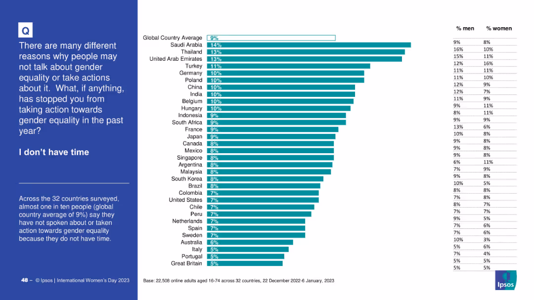
Horizontal bar graph with consistent design—country rankings, global average, gender splits; left-aligned blue panel describes the context and finding.
Operational Efficiency
Government & Public Sector
The slide presents data on people who did not take action for gender equality due to time constraints. The global average is 9%. Countries like Saudi Arabia and Thailand have higher percentages, and gender differences are also shown.
time constraints, gender action, survey, equality, barriers, Ipsos, country rankings
false
Operational Efficiency
Government & Public Sector
Mixed Chart
IPSOS
Add to my slides
Remove from favorites
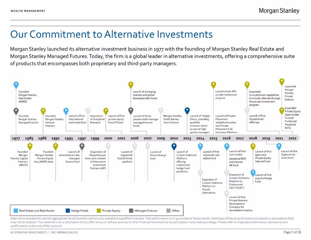
A timeline chart detailing Morgan Stanley's milestones in alternative investments from 1977 to 2022.
Strategic Planning
Financial Services
Summarizes key events and achievements in the firm's history related to alternative investment products.
Timeline, milestones, investments, history
false
Strategic Planning
Financial Services
Linear Flow
Morgan Stanley
Add to my slides
Remove from favorites
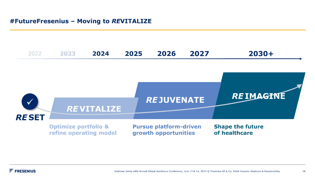
A timeline chart spanning from 2022 to 2030+, showing phases such as Reset, Revitalize, Rejuvenate, and Reimagine. Each phase is marked with key focus areas.
Strategic Planning
Healthcare & Pharmaceuticals
The slide outlines Fresenius's strategic roadmap for revitalizing, rejuvenating, and reimagining the future of healthcare through various stages and key initiatives.
timeline, revitalization, strategy, healthcare, future
false
Strategic Planning
Healthcare & Pharmaceuticals
Linear Flow
Goldman Sachs
Add to my slides
Remove from favorites
This slide is a visual timeline from 2017 to 2020, showing major milestones and events in the company’s history. It uses a green arrow to depict progress over time, with text boxes providing details on key initiatives and changes.
Strategic Planning
Financial Services
The slide outlines the company’s strategic journey, showcasing major milestones such as acquisitions and corporate changes. It is useful for illustrating a company's evolution, strategy execution, and future plans.
Timeline, Strategic Journey, Milestones, Company Evolution, Future Plans
false
Strategic Planning
Financial Services
Linear Flow
Morgan Stanley
Add to my slides
Remove from favorites
The slide features a four-phase horizontal timeline with distinct sections: Baseline, Benchmarking and Review, Strategy and Planning, and Implementation. Each phase has bullet points listing activities and goals.
Strategic Planning
Professional Services
This slide outlines a high-level approach for reducing third-party spend, detailing a four-phase process including baselining, benchmarking, strategic planning, and implementation. Each phase includes specific activities and objectives to achieve cost reduction and efficiency.
timeline, strategy, planning, implementation, cost reduction
false
Strategic Planning
Professional Services
Linear Flow
Kearney
Add to my slides
Remove from favorites
Displays bar charts showing how managers allocate their work time across various tasks.
Operational Efficiency
Professional Services
Analyzes time management among managers, highlighting inefficiencies and potential areas for improvement.
time management, task allocation, efficiency, work priorities, managerial duties
false
Operational Efficiency
Professional Services
Multiple Chart
BCG
Add to my slides
Remove from favorites
The column chart is dominant, with a pie chart on the left showing online/offline time split, bar graphs on the right detailing time spent on various activities, and a circular flow design connecting the two.
Customer and Market Segmentation
Telecommunications
The slide breaks down the hours saved per year by nbn users and how they allocate this time towards different activities, emphasizing connection with family and friends.
time savings, nbn network, family and friends, activities, broadband impact, usage data, connectivity, offline online balance
false
Customer and Market Segmentation
Telecommunications
Multiple Chart
Accenture
Add to my slides
Remove from favorites
A comparative layout with two side-by-side sections detailing time saved in remote work and telehealth appointments, using purple and violet hues.
Operational Efficiency
Technology & Software
Compares the biggest time savers for nbn users, specifically remote work and telehealth, detailing time and cost savings for each.
time savings, nbn users, remote work, telehealth, cost savings, efficiency, work from home, health consultations
false
Operational Efficiency
Technology & Software
Table
Accenture
Add to my slides
Remove from favorites
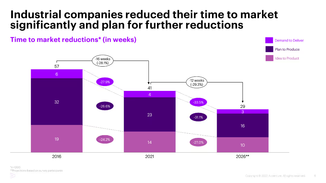
Stacked column chart showing time to market reductions in weeks from 2016 to 2026, divided into three processes: Demand to Deliver, Plan to Produce, and Idea to Product.
Performance Metrics and KPIs
Industrial & Manufacturing
The slide presents data on the reduction of time to market for industrial companies, with significant decreases observed and further reductions planned by 2026, segmented by process stages.
Time to market, Industrial companies, Performance metrics, KPIs, Process improvement
false
Performance Metrics and KPIs
Industrial & Manufacturing
Single Chart
Accenture
Add to my slides
Remove from favorites
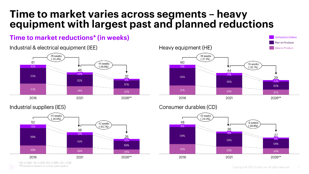
Four stacked column charts showing time to market reductions in weeks across different segments: Industrial & Electrical Equipment, Heavy Equipment, Industrial Suppliers, Consumer Durables.
Performance Metrics and KPIs
Industrial & Manufacturing
The slide compares time to market reductions across various industrial segments, highlighting heavy equipment as having the largest past and planned reductions.
Time to market, Industrial segments, Heavy equipment, Performance metrics, KPIs
false
Performance Metrics and KPIs
Industrial & Manufacturing
Multiple Chart
Accenture
Add to my slides
Remove from favorites
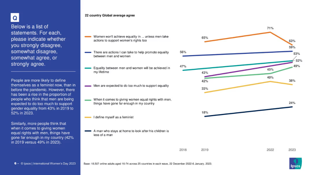
Line graph showing agreement trends from 2018 to 2023 across 7 gender equality topics; colored lines represent each statement.
Human Resources and Talent Management
Government & Public Sector
The slide depicts evolving attitudes from 2018–2023 on gender equality topics, revealing trends like increasing feminism and views on men’s roles in equality.
time trend, gender opinions, feminism rise, societal views, survey timeline, equality progress, Ipsos
false
Human Resources and Talent Management
Government & Public Sector
Mixed Chart
IPSOS
Add to my slides
Remove from favorites
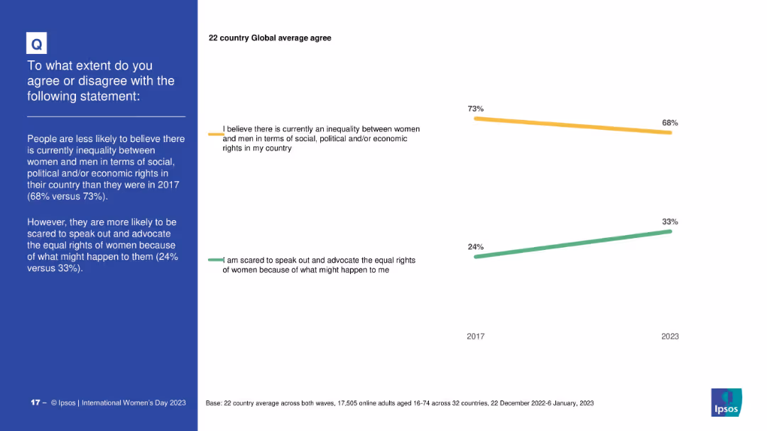
Minimalist design with two trend lines (2017 vs 2023); highlights changes over time for two statements; time comparison is the visual focus
Strategic Planning
Professional Services
This slide compares public opinion in 2017 and 2023 on gender inequality and fear of advocating for women’s rights. It shows that belief in inequality has declined slightly, while fear of advocacy has increased.
time trends, gender equality, opinion shift, advocacy, social change, Ipsos, 2017 vs 2023
false
Strategic Planning
Professional Services
Mixed Chart
IPSOS
Add to my slides
Remove from favorites
The slide shows a world map overlaid with bar charts and textual annotations representing the year-over-year change in the PC/LT tire market by region. The design uses color-coded columns and icons to differentiate between OE and RT markets. The Michelin logo is subtly included, and the design makes use of brand colors and a clear, straightforward layout.
Market Analysis and Trends
Transportation & Logistics
Offering a global overview of the PC/LT tire market for the first 9 months of 2023, the slide depicts regional trends and market shifts. It is suitable for presentations to stakeholders in business strategy meetings or industry analysis seminars to inform decisions based on regional market performance.
tire market, global, analysis, trends, OE, RT, Michelin, regional, performance, strategy
false
Market Analysis and Trends
Transportation & Logistics
Mixed Chart
Morgan Stanley
Add to my slides
Remove from favorites
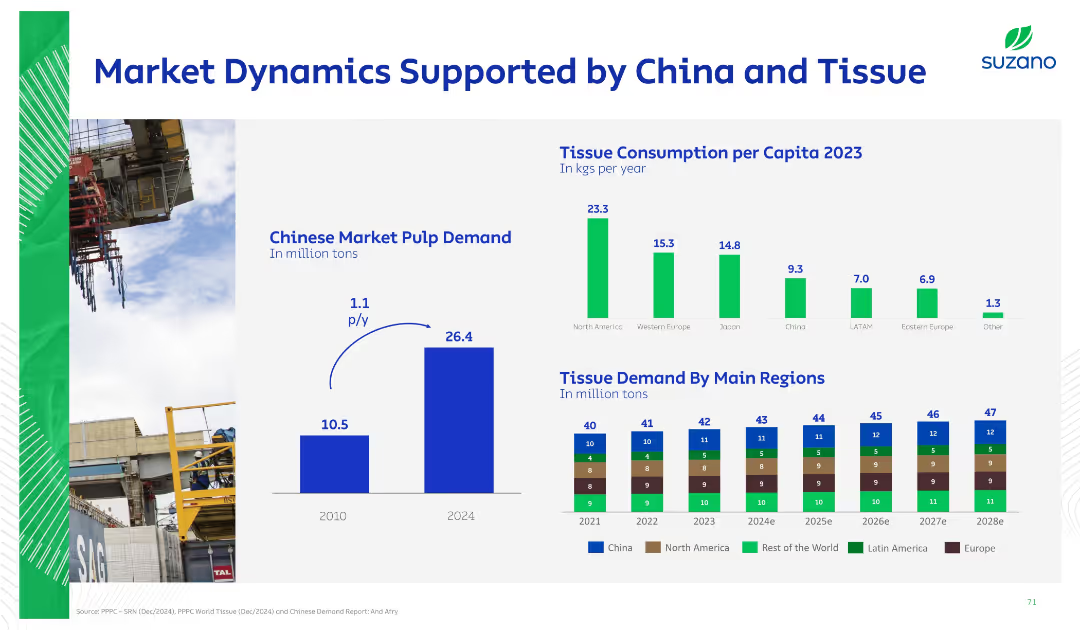
Three-section layout: bar chart, per capita tissue consumption, and a stacked bar projection. Visual-heavy with limited text and green/blue color scheme.
Market Analysis and Trends
Industrial & Manufacturing
Demonstrates China's rising pulp demand and global tissue consumption trends by region. Also shows projected increases in tissue demand through 2028, supporting demand expectations.
tissue, consumption, demand, China, market pulp, regional trends, growth, projection
false
Market Analysis and Trends
Industrial & Manufacturing
Multiple Chart
Goldman Sachs
Add to my slides
Remove from favorites
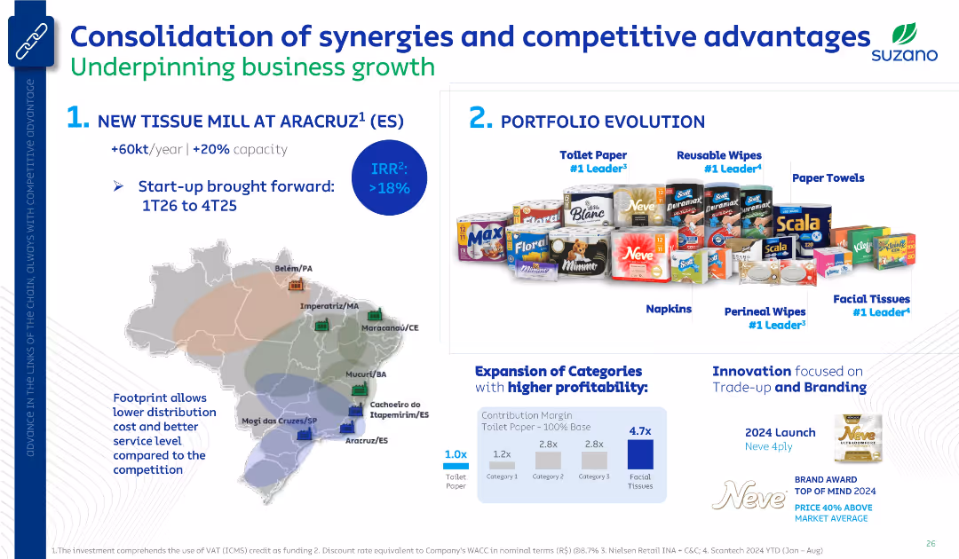
Two-section layout: left side features a map and mill expansion plan; right side shows product portfolio and profitability analysis. Clean corporate style with product visuals and icons.
Strategic Planning
Consumer Goods
The slide outlines Suzano's strategic initiatives, highlighting a new tissue mill in Aracruz and the evolution of its product portfolio. It emphasizes expansion in higher-margin categories like facial tissues and highlights innovation in branding. A map shows Suzano’s Brazilian footprint for logistical advantage.
tissue mill, product portfolio, brand leadership, Suzano, IRR, profitability, logistics, trade-up, branding
false
Strategic Planning
Consumer Goods
Mixed Chart
Goldman Sachs
Add to my slides
Remove from favorites
A minimalist title slide with a dark blue gradient background and the text "Monthly Market Monitor January 2024" on a white background.
Industry Overview
Financial Services
The slide serves as the title page for a report on the monthly market, setting the stage for financial insights and data that follow.
title, market monitor, January 2024, financial, minimalist
false
Industry Overview
Financial Services
Title
Morgan Stanley
Add to my slides
Remove from favorites
A simple title slide with the phrase "Country spotlights" centered on a blue background, accented by a pattern of lines and dots.
Regulatory and Compliance
Government & Public Sector
This is a title slide marking the transition to country-specific insights or highlights within the presentation, likely introducing a section focusing on individual SEA countries and their digital economy status.
title slide, country spotlights, section introduction, SEA, digital economy
false
Regulatory and Compliance
Government & Public Sector
Header Horizontal
Bain
Add to my slides
Remove from favorites
This slide includes a horizontal bar chart displaying the distribution of job titles among respondents. The chart uses a green color scheme with a clear legend and percentages marked along each bar.
Market Analysis and Trends
Technology & Software
The slide shows the percentage of survey respondents with various job titles, emphasizing that a significant portion are owners/partners, presidents, CEOs, and CIO/CTOs.
titles, respondents, survey, chart, job
false
Market Analysis and Trends
Technology & Software
Mixed Chart
Deloitte
Add to my slides
Remove from favorites
Column charts displaying total TLAC, CET1 capital, and leverage ratios
Financial Performance
Financial Services
Shows capital and leverage ratios, including CET1 capital ratio guidance and leverage ratio guidance
TLAC, CET1, leverage, ratios, capital
false
Financial Performance
Financial Services
Multiple Chart
UBS
Add to my slides
Remove from favorites
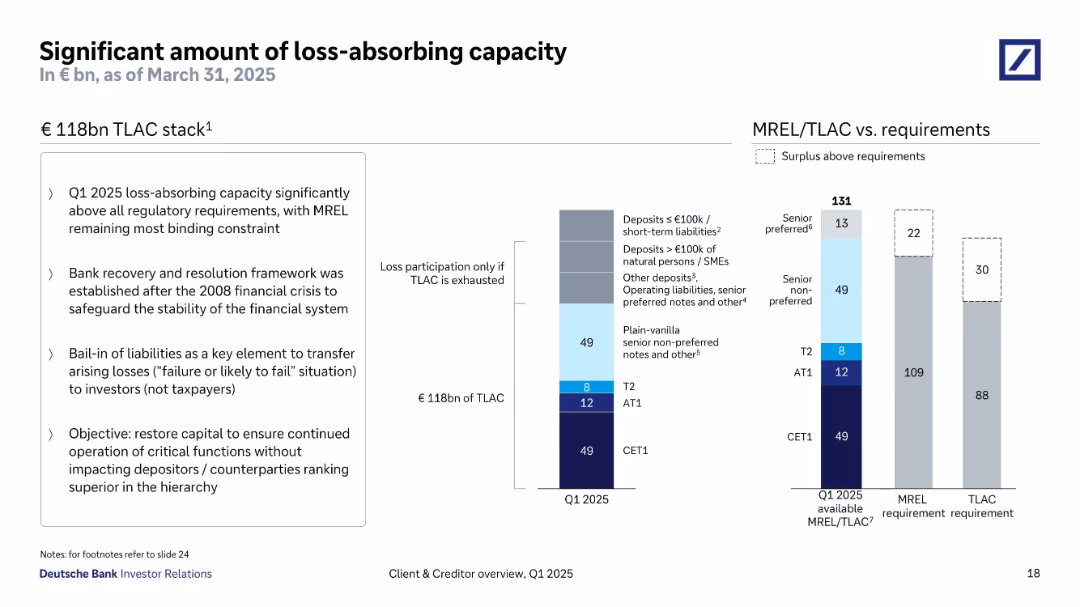
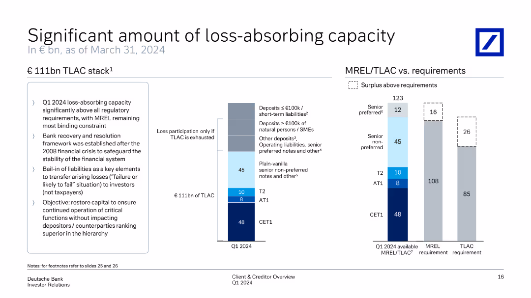
Split into three sections: left text box with bullet points, center TLAC breakdown bar chart, right MREL/TLAC requirement vs. actual chart. Clean and structured with consistent typography and muted color palette.
Risk Assessment and Management
Financial Services
Highlights Deutsche Bank’s €118bn TLAC stack as of Q1 2025, well above regulatory requirements. Emphasizes the importance of bail-in capital, regulatory compliance post-2008, and the preservation of senior claims in the capital hierarchy.
TLAC, MREL, bail-in, financial stability, capital stack, regulation
false
Risk Assessment and Management
Financial Services
Multiple Chart
Deutsche Bank
Add to my slides
Remove from favorites
Features a column chart representing €111bn TLAC stack. It explains different tiers and their contributions. On the right, another chart compares MREL/TLAC requirements vs available capacity, highlighting surplus above requirements.
Risk Assessment and Management
Financial Services
Provides a comprehensive view of loss-absorbing capacity, showing how TLAC meets regulatory requirements and safeguards financial stability. It details the distribution of capital across different tiers and surplus management to ensure robust loss absorption.
TLAC, MREL, loss-absorbing capacity, regulatory requirements, financial stability
false
Risk Assessment and Management
Financial Services
Multiple Chart
Deutsche Bank
Add to my slides
Remove from favorites
Displays column charts tracking TLTRO outstanding amounts and impacts on financial ratios over time.
Regulatory and Compliance
Financial Services
Forecasts the trajectory of TLTRO repayments and its implications on liquidity and funding ratios in a regulatory context.
TLTRO, finance, forecast, regulation, compliance, liquidity
false
Regulatory and Compliance
Financial Services
Single Chart
Deutsche Bank
Add to my slides
Remove from favorites
Contains column chart in dark and light blue shades, depicting TLTRO transactions over time.
Financial Performance
Financial Services
Reviews TLTRO metrics and future projections, highlighting impacts on liquidity and financial stability.
TLTRO, financial forecast, liquidity, NSFR, LCR, banking, financial stability, projections
false
Financial Performance
Financial Services
Single Chart
Deutsche Bank
Add to my slides
Remove from favorites
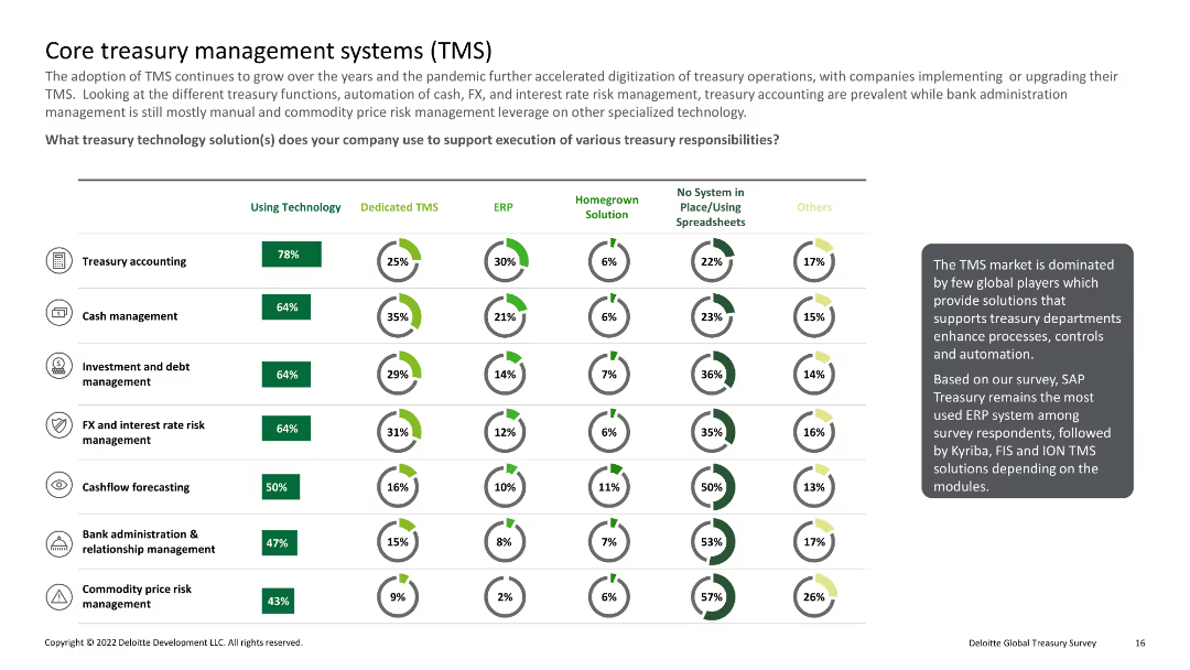
Column charts and pie charts showing usage of various treasury technology solutions such as TMS, ERP, and spreadsheets
Technology and Digital Transformation
Financial Services
Explains the adoption and use of treasury management systems (TMS) and other technologies in different treasury functions.
TMS, ERP, technology, treasury, solutions
false
Technology and Digital Transformation
Financial Services
Multiple Chart
Deloitte
Add to my slides
Remove from favorites
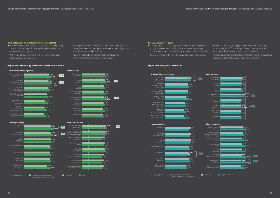
The slide includes two column charts comparing drivers of cost management, external risks, strategic priorities, and likely cost actions for Technology, Media & Telecommunications, and Energy & Resources.
Market Analysis and Trends
Professional Services
Provides detailed comparisons of cost management factors in TMT and Energy sectors. Useful for identifying key areas of focus and potential actions.
TMT, energy, cost drivers, risks, actions, priorities
false
Market Analysis and Trends
Professional Services
Multiple Chart
Deloitte
Add to my slides
Remove from favorites
The slide includes a quote from Ariane Le Port and a column chart showing organic Q1 growth in TMT vs. total Ipsos.
Client Case Studies
Telecommunications
It highlights Ipsos's success with advanced TMT firms, including a quote from Google’s Creative Effectiveness Lead and growth data for the TMT sector.
TMT, growth, clients, revenues, Ipsos
false
Client Case Studies
Telecommunications
Mixed Chart
IPSOS
Add to my slides
Remove from favorites
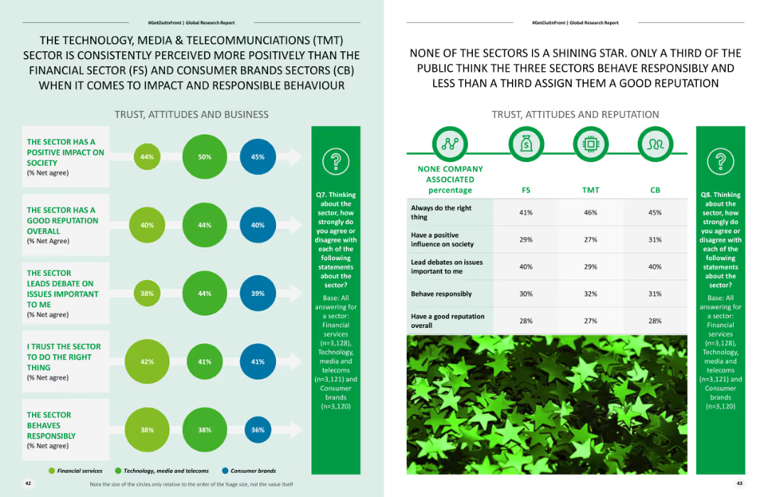
Features two column charts comparing public perceptions of different sectors, with visual elements indicating positive and negative impacts.
Competitive Landscape
Telecommunications
Analyzes public perceptions of the TMT sector compared to financial and consumer brands sectors, focusing on positive impact and responsible behavior.
TMT sector, public perception, positive impact, sector comparison, responsible behavior
false
Competitive Landscape
Telecommunications
Mixed Chart
Deloitte
Add to my slides
Remove from favorites
Bar chart displaying the percentage of "Yes" responses by sector on conducting TNA.
Human Resources and Talent Management
Education & Training
Examines the prevalence of Training Needs Analysis for identifying developmental needs in organizations.
TNA, training, needs, development, sectors
false
Human Resources and Talent Management
Education & Training
Multiple Chart
PwC/Strategy&
Add to my slides
Remove from favorites
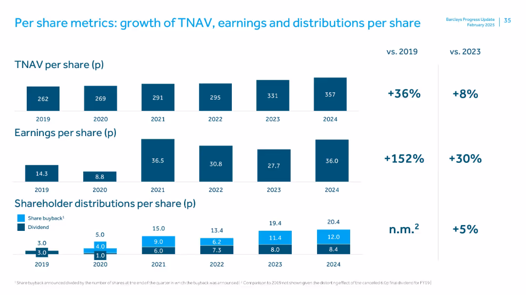
Three-panel stacked bar chart covering TNAV, earnings, and shareholder distributions per share from 2019–2024, with % change vs 2019 and 2023 shown on the right.
Financial Performance
Financial Services
The slide tracks 5-year per-share metrics. TNAV rose 36% vs. 2019; EPS grew 152%, and distributions also increased. A focus on long-term value creation through sustained earnings and return to shareholders.
TNAV, earnings per share, shareholder value, dividend, buyback, 5-year trend
false
Financial Performance
Financial Services
Multiple Chart
Barclays
Add to my slides
Remove from favorites
The slide features two column charts showing TNAV movements per share. The first chart details quarter-on-quarter movements, while the second shows year-to-date movements with various financial components like dividends, share buyback, and others illustrated.
Financial Performance
Financial Services
This slide presents the TNAV per share movements with breakdowns of different contributing factors over quarterly and yearly timelines, providing insights into the financial stability and shareholder value adjustments over time.
TNAV, financial stability, dividends, share buyback
false
Financial Performance
Financial Services
Multiple Chart
Barclays
Add to my slides
Remove from favorites
Two waterfall charts showing quarter-over-quarter and year-over-year tangible net asset value (TNAV) per share movements, with annotated drivers like profit, reserves, dividends, and pensions.
Financial Performance
Financial Services
This slide displays changes in Barclays’ tangible net asset value (TNAV) per share for Q4 and FY22. It highlights contributing factors such as attributable profit, cash flow hedge reserve, FX effects, and pension remeasurements, ending with a final TNAV of 295p in Dec-22.
TNAV, profit, reserves, share buyback, dividends, FX impact
false
Financial Performance
Financial Services
Multiple Chart
Barclays
Add to my slides
Remove from favorites
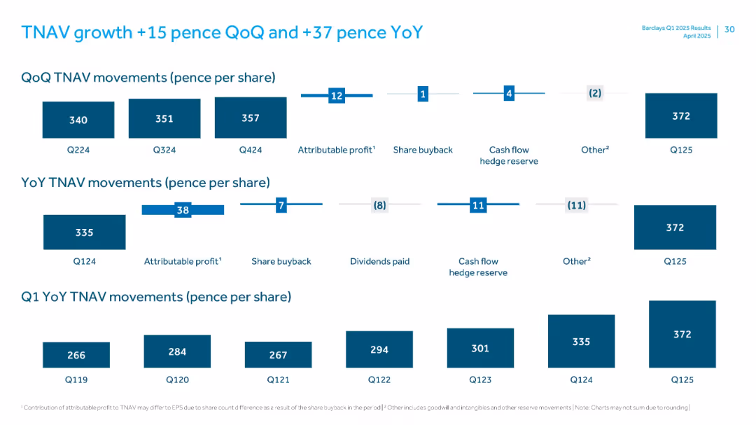
Multi-panel layout with bar charts showing TNAV changes quarterly and yearly per share
Financial Performance
Financial Services
Analyzes tangible net asset value (TNAV) per share movement quarter-over-quarter and year-over-year, attributing changes to profit, buybacks, hedge reserves, and other factors, ending at 372p in Q125.
TNAV, profit, share buyback, hedge reserve, earnings
false
Financial Performance
Financial Services
Multiple Chart
Barclays
Add to my slides
Remove from favorites
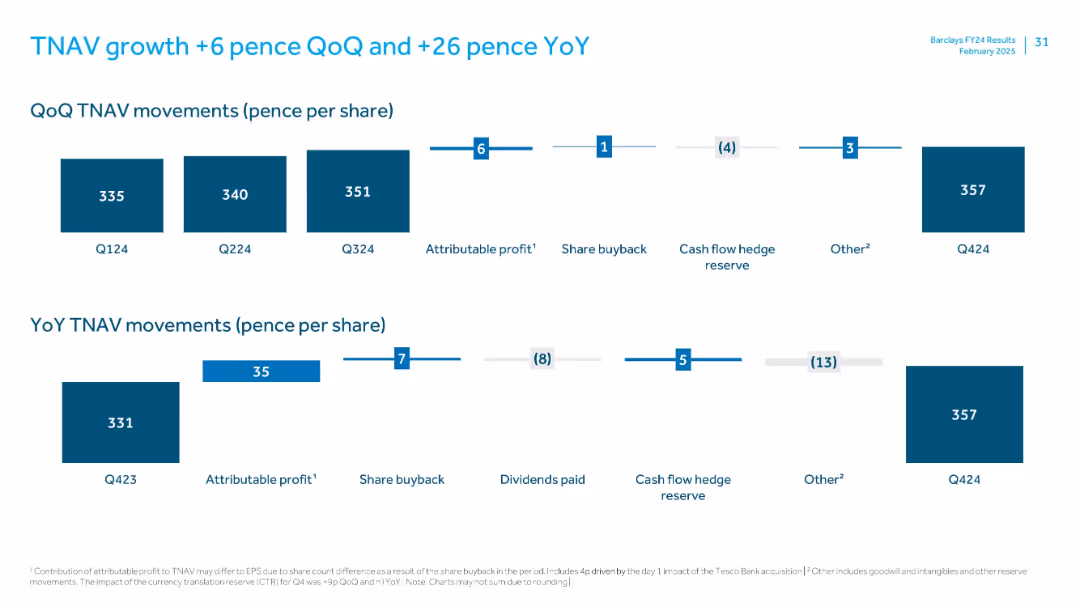
Two horizontal waterfall charts (QoQ and YoY TNAV per share movement) with contributing factors (e.g., profit, buybacks, hedge reserves).
Financial Performance
Financial Services
This slide illustrates tangible net asset value (TNAV) growth per share, with quarterly movement from 351p to 357p and YoY from 331p to 357p. Contributions include profit, share buybacks, and reserve changes.
TNAV, share buyback, profit, Q4 2024, pence per share, dividends
false
Financial Performance
Financial Services
Single Chart
Barclays
Add to my slides
Remove from favorites
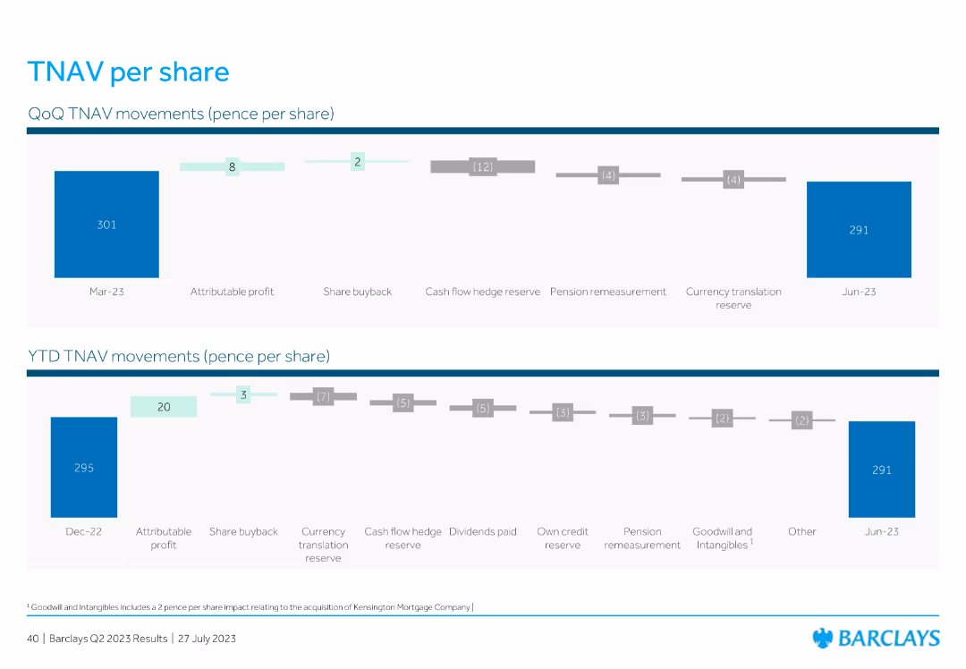
This slide features two horizontal charts: one for QoQ TNAV (Tangible Net Asset Value) movements and another for YTD TNAV movements, showing various contributing factors such as profit, share buyback, reserves, and translation reserves.
Financial Performance
Financial Services
The slide details the TNAV per share movements for the quarter and year-to-date, highlighting factors like profit, buybacks, reserves, and other elements impacting the TNAV value.
TNAV, share movements, profit, buyback, reserves
false
Financial Performance
Financial Services
Multiple Chart
Barclays
Add to my slides
Remove from favorites
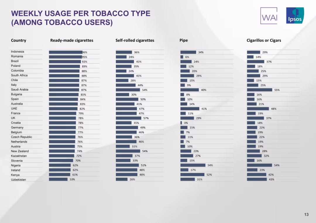
Multi-column bar chart showing country-wise weekly usage rates for four tobacco types: ready-made, self-rolled, pipe, and cigarillos/cigars. Dark grey-blue tones.
Product and Service Analysis
Healthcare & Pharmaceuticals
This slide presents comparative tobacco consumption patterns across countries, segmented by tobacco type. Ready-made cigarettes are the most commonly used, while pipe and cigarillos usage varies significantly.
tobacco usage, product segmentation, cigarette types, consumption patterns, global survey, smoking habits, Ipsos
false
Product and Service Analysis
Healthcare & Pharmaceuticals
Single Chart
IPSOS
Add to my slides
Remove from favorites
Column chart showing asset classes considered for tokenization, alongside a circular diagram detailing motivations for tokenizing assets. Highlights the interest in public funds, private funds, and real estate.
Market Analysis and Trends
Financial Services
Examines the interest in tokenizing various asset classes among institutions, with motivations including increased liquidity, operational efficiencies, and access to new investors and capital.
tokenization, asset classes, institutions, motivations, liquidity
false
Market Analysis and Trends
Financial Services
Mixed Chart
EY
Add to my slides
Remove from favorites
A table comparing benefits of asset tokenization across various asset classes, including public equity funds, private equity funds, and real estate. Benefits include increased liquidity, operational efficiency, and enhanced transparency.
Technology and Digital Transformation
Financial Services
Evaluates the benefits of tokenization for different asset classes, emphasizing increased liquidity, operational efficiency, fractional ownership, and transparency, particularly for illiquid assets like real estate.
tokenization, benefits, asset classes, liquidity, efficiency
false
Technology and Digital Transformation
Financial Services
Multiple Chart
EY
Add to my slides
Remove from favorites
Includes a column chart forecasting asset tokenization market size from FY23B to FY30F, categorized by asset types. Text on the right provides demand and supply insights for investing in tokenized assets.
Technology and Digital Transformation
Financial Services
Explores the potential value of asset tokenization to blockchains, with market forecasts and insights into the demand and supply dynamics of investing in tokenized assets.
tokenization, blockchain, market forecast, demand, supply
false
Technology and Digital Transformation
Financial Services
Mixed Chart
EY
Add to my slides
Remove from favorites
The slide features four icons representing different aspects of the future of transactions: Tokenization, Crypto (fiat), Separated (integrated), and Private (public).
Strategic Planning
Technology & Software
This slide outlines the vision for the evolution of transactions in a digital world, highlighting concepts such as tokenization, cryptocurrency, and the integration of public and private networks.
tokenization, cryptocurrency, public networks, digital evolution, strategic vision
false
Strategic Planning
Technology & Software
Pillar
EY
Add to my slides
Remove from favorites
Bar chart showing investor motivations for tokenizing assets, with text detailing benefits and hurdles. Includes icons and text highlighting factors like transaction costs, liquidity, and regulatory hurdles.
Market Analysis and Trends
Financial Services
Describes the main drivers for investors to switch to tokenization, emphasizing benefits like lower transaction costs and increased liquidity, while also highlighting hurdles such as regulatory uncertainty and lack of trusted service providers.
tokenization, investors, liquidity, transaction costs, regulatory hurdles
false
Market Analysis and Trends
Financial Services
Mixed Chart
EY
Add to my slides
Remove from favorites
The slide features a horizontal process flow with four stages: Asset tokenization validation, Business case and feasibility study, Go-to-market strategy, and Execution and deployment. Each stage is represented with an icon and brief description underneath, using a blue gradient color scheme.
Strategic Planning
Technology & Software
The slide outlines EY-Parthenon's comprehensive approach to tokenization, including stages like asset tokenization validation, business feasibility study, go-to-market strategy, and execution, aimed at thoroughly validating the tokenization concept before market entry.
tokenization, strategy, feasibility, market entry, EY-Parthenon
false
Strategic Planning
Technology & Software
Linear Flow
EY
Add to my slides
Remove from favorites
Includes a comprehensive list of tokenization companies along with key business focus points. The layout integrates logos and brief descriptions, providing a visual and textual overview of the industry landscape. Uses minimal colors to maintain a professional appearance.
Technology and Digital Transformation
Technology & Software
Provides an overview of key U.S.-based tokenization companies and their business focuses, including areas like digital assets, blockchain infrastructure, and decentralized finance. Highlights the industry's growth and the strategic importance of tokenization services.
tokenization, United States, companies, blockchain, digital assets, ecosystem
false
Technology and Digital Transformation
Technology & Software
Table
PwC/Strategy&
Add to my slides
Remove from favorites
This slide includes a structured table listing the 15 biggest token offerings since 2016, highlighting key data points like amount raised and industry focus. It uses a clean layout with alternating row colors for readability.
Investment Analysis
Financial Services
Provides a detailed list of the largest token offerings by funds raised, focusing on their end dates, industry categorization, and geographical details. It highlights major players like EOS, Telegram, and Kinesis, indicating significant activity in the blockchain and fintech sectors.
token offerings, blockchain, fintech, 2019, investments, fundraising, global
false
Investment Analysis
Financial Services
Mixed Chart
PwC/Strategy&
Add to my slides
Remove from favorites
Contains two comparative bar charts and a textual analysis section. The color scheme is consistent, using shades of red and blue to differentiate data year-over-year. It visually compares token offering metrics between countries from 2018 to 2019.
Market Analysis and Trends
Financial Services
Analyzes the leading countries in global token offerings for 2019, comparing them to previous years. It discusses the role of regulatory environments and market dynamics in influencing the token offering landscape, with specific mentions of the US, Singapore, and Hong Kong.
token offerings, countries, 2019, 2018, comparison, regulatory, market dynamics
false
Market Analysis and Trends
Financial Services
Multiple Chart
PwC/Strategy&
Add to my slides
Remove from favorites
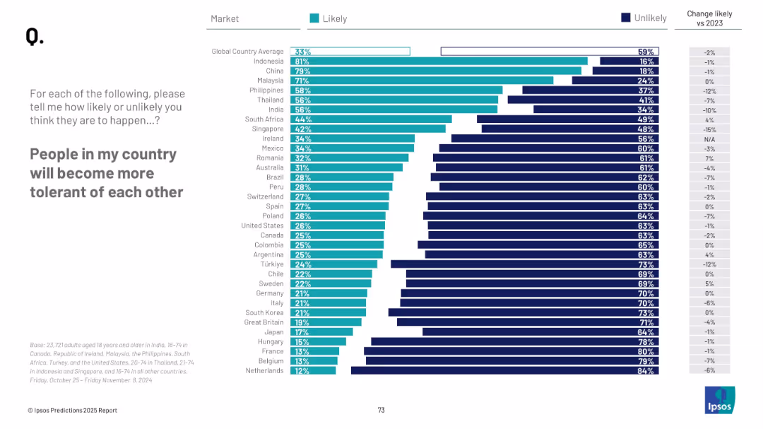
Bar chart with countries listed vertically, two-color segments (likely/unlikely), right-side numeric change column, text prompt on left.
Market Analysis and Trends
Government & Public Sector
This slide presents a global survey showing the percentage of people in various countries who believe their fellow citizens will become more tolerant. It contrasts "likely" versus "unlikely" responses and includes year-over-year changes. Indonesia and China top the list, while Western countries generally show lower optimism.
tolerance, global sentiment, social cohesion, public opinion, Ipsos, future outlook, country comparison, optimism, 2025, change tracking
false
Market Analysis and Trends
Government & Public Sector
Mixed Chart
IPSOS
Add to my slides
Remove from favorites
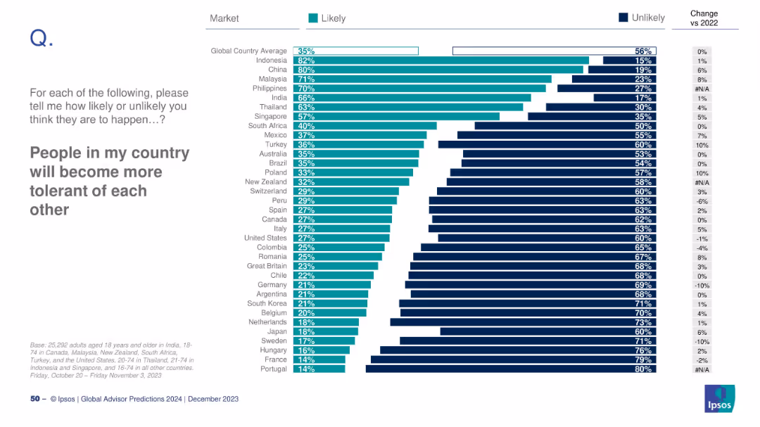
Horizontal bar chart with country-level Likely/Unlikely responses; includes delta vs. 2022 where applicable.
Strategic Planning
Education & Training
This slide measures optimism regarding increased tolerance. Indonesia (82%) is most optimistic, while France and Portugal (14%) are least. The global average is 35%. It explores shifts in social cohesion, polarization, and cultural attitudes.
tolerance, social cohesion, diversity, public opinion, 2024, Ipsos, polarization, inclusivity, societal change, perception
false
Strategic Planning
Education & Training
Mixed Chart
IPSOS
Add to my slides
Remove from favorites
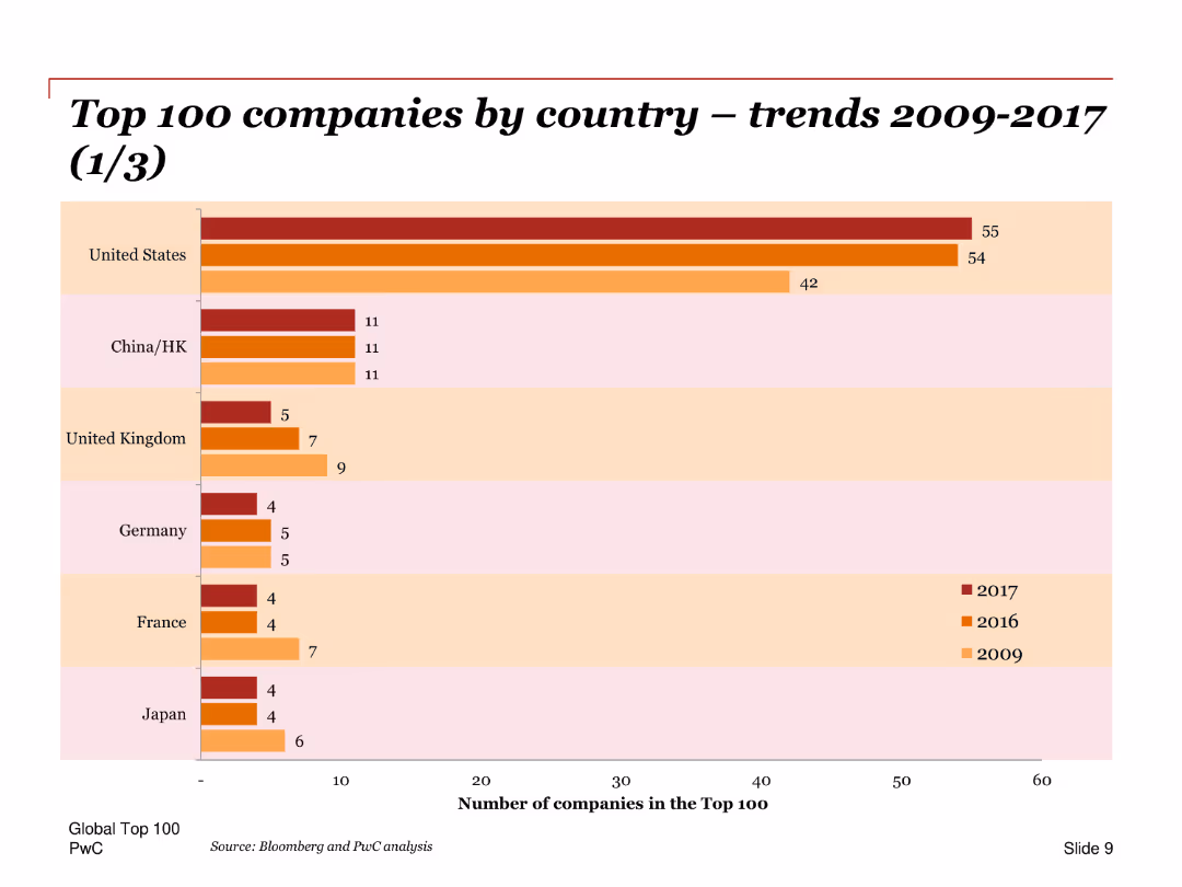
A bar chart comparing the number of top 100 companies by country for the years 2009, 2016, and 2017, with emphasis on changes over time.
Market Analysis and Trends
Financial Services
Compares the number of companies in the top 100 across different countries, highlighting the dominance of the United States and trends in other key regions like China and Europe.
Top 100 companies, countries, trends, bar chart, United States, China, Europe, comparison, changes
false
Market Analysis and Trends
Financial Services
Single Chart
PwC/Strategy&
Add to my slides
Remove from favorites
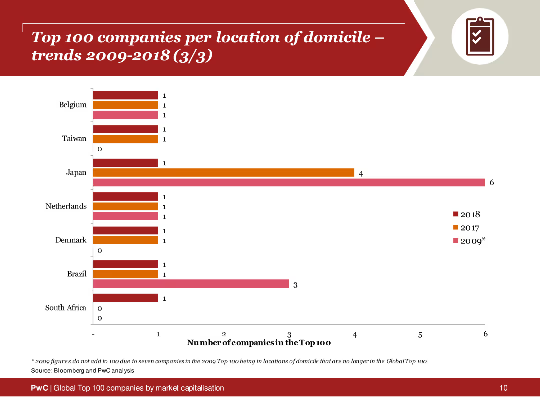
A column chart comparing the number of top 100 companies from Belgium, Taiwan, Japan, Netherlands, Denmark, Brazil, and South Africa across 2009, 2017, and 2018.
Competitive Landscape
Financial Services
Analysis of the number of top 100 companies by location, noting trends in Japan, Belgium, Brazil, and other countries over time.
top 100 companies, domicile, trends, Belgium, Japan
false
Competitive Landscape
Financial Services
Single Chart
PwC/Strategy&
Add to my slides
Remove from favorites
Previous
Next
You don't have any favorites yet.
Please wait loading your favorites slides...
Create a FREE account to continue browsing
Receive Instant Access to 1,000+ slides from companies like McKinsey, Google, and Goldman Sachs
First Name
Last Name
Email
Password
I agree to all
Terms & Privacy Policy
Thank you! Your submission has been received!
Oops! Something went wrong while submitting the form.
Have an account?
Sign in
Upgrade to PRO to Save slides
Advanced Search and Filters
Access to 15,000+ slides
Access to Category Pages
Save/Bookmark Slides
PowerPoint Template Library
Pick a Plan
MONTHLY
$12/month
Billed every month, Cancel anytime.
YEARLY
$9/year
Billed $108 annually, Cancel anytime.
Checkout for $12/month
Checkout for $108/yr
Secured by Stripe | AES-256 bit encryption